codex

Julia Gnuse Tattoos: The Illustrated Lady’s Full-Body Style

Julia Gnuse’s tattoos cover almost all of her body. Known as The Illustrated Lady, she has designs across about 95 percent of her skin, from her face and neck to her hands, torso and legs. The collection brings together cartoons, underwater scenes, portraits and bright character art; it isn’t built around one matching sleeve or a single theme.

Gnuse began getting tattooed after porphyria caused painful blisters and scarring. An early attempt to match the scars with tattoo pigment didn’t work as planned, so she turned to colorful designs instead. Over time, that first idea grew into a full-body collection and a look people recognize. What started as a response to a skin condition became a personal collection in its own right.

Photos of her work show how color, spacing and scale can connect pieces from different artists and periods. The sections below look at the placements that stand out and what their layout can teach someone planning a smaller collection.

Julia Gnuse’s face and neck work

Face and neck tattoos are hard to miss. In photos, the ink around Gnuse’s eyes, cheeks and neck changes with the light and camera angle. It sits close to her features, so a close-up can feel as visually full as a full-body shot.

A face tattoo will appear in most introductions, work photos and family pictures. Hair, makeup and collars can change what is visible, but they won’t hide it. If you’re considering facial ink, try the shape with temporary ink and check it in daylight while your face is relaxed, smiling and turned to each side.

You can use a similar framing effect on an upper arm, thigh or shoulder without making the design part of every expression. Placement decides how often a tattoo is in view.
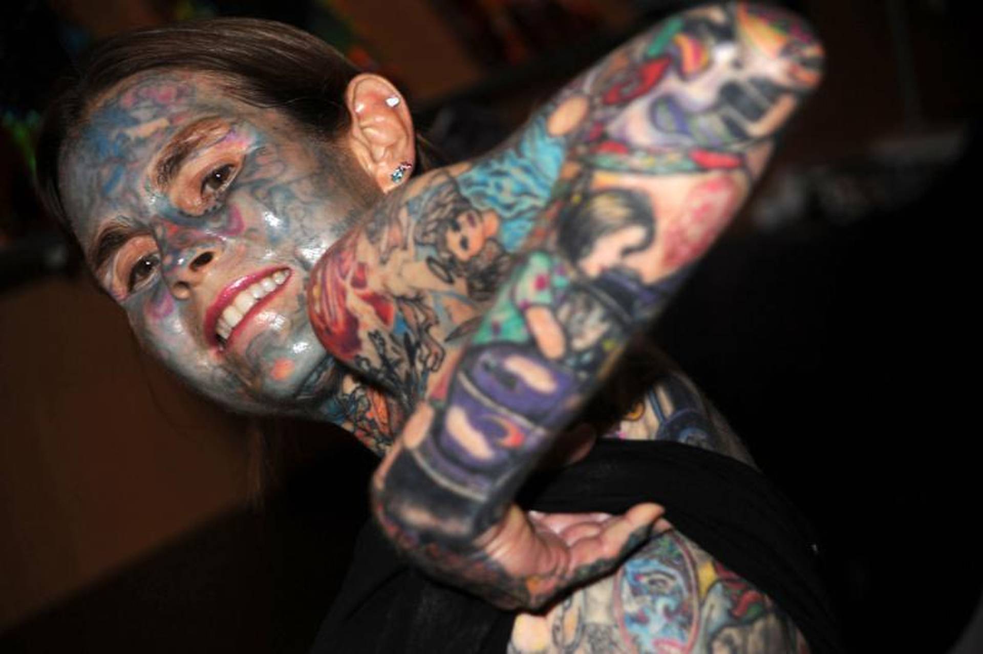
Julia Gnuse tattoos: Julia Gnuse face, neck and forearm tattoos, selected because the named tattoo areas are clearly visible in a distinct high-resolution photograph

Julia Gnuse’s hands and forearms

Close photos of Gnuse’s hands and forearms show small marks on her fingers and the backs of her hands, alongside larger images on her forearms. The pieces sit near one another, so your eye moves from the tiny details to the larger scenes without following one continuous sleeve.

Hands take a lot of wear in everyday life. Washing, sunlight and constant movement can soften fine lines, so a simpler design with open space may hold up better than a detailed picture squeezed into a narrow area. Ask an artist to show healed hand tattoos, not only fresh photos taken after an appointment.

Forearms give a design more room, though the wrist and arm change shape as you turn them. Check the stencil with your arm relaxed, palm up and palm down. A word or face may look straight in one position and angled in another. Plan for an arm that moves, not a flat picture.
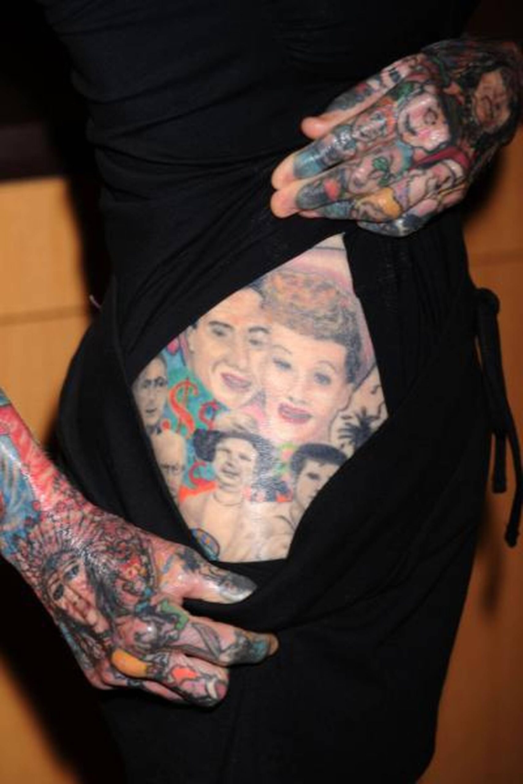
Julia Gnuse tattoos: Julia Gnuse hand and stomach portrait tattoos, selected because the named tattoo areas are clearly visible in a distinct high-resolution photograph

Julia Gnuse’s chest and upper-body scenes

Gnuse’s upper-body photos show large colorful scenes alongside smaller faces, symbols and lettering. The chest and shoulders give those pictures room, while repeated colors and line weights help the different subjects sit together.

Chest and stomach tattoos move when you breathe, sit or raise your arms. Check a stencil standing, sitting and reaching overhead. See whether the main subject stays centered and whether its edges follow the ribs or waist in a way that feels right to you.

Cartoons, underwater creatures and portraits may seem like unrelated choices on paper. They can still make sense together when they reflect one person’s interests. You don’t need to repeat the same symbol across the body; a shared mood, palette or level of detail can tie separate ideas together.
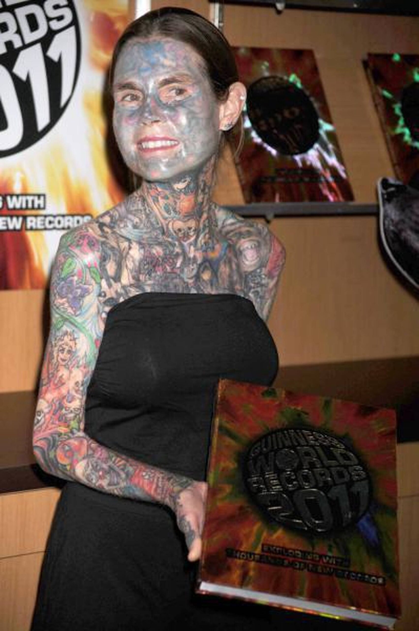
Julia Gnuse tattoos: Julia Gnuse chest and upper-body tattoo scenes, selected because the named tattoo areas are clearly visible in a distinct high-resolution photograph

Julia Gnuse’s leg tattoos and colorful character pieces

The lower-leg photo shows some of the more playful pieces in Gnuse’s collection. Bright character faces and compact scenes fit the long shape of the legs, and the outlines leave each image room to read on its own.

Legs can work well for a larger tattoo that you may want to cover. The thigh has space for a portrait or broad scene; the calf and ankle suit designs that follow the length of the limb. Check a stencil while standing and walking, since a design can sit differently when the muscle tightens.

Color depends on more than choosing bright pigments. Contrast, open skin and neighboring tones all affect how the design reads. Leave enough space around a face or central character so the colors don’t run together as the tattoo ages. Open skin is part of the palette.
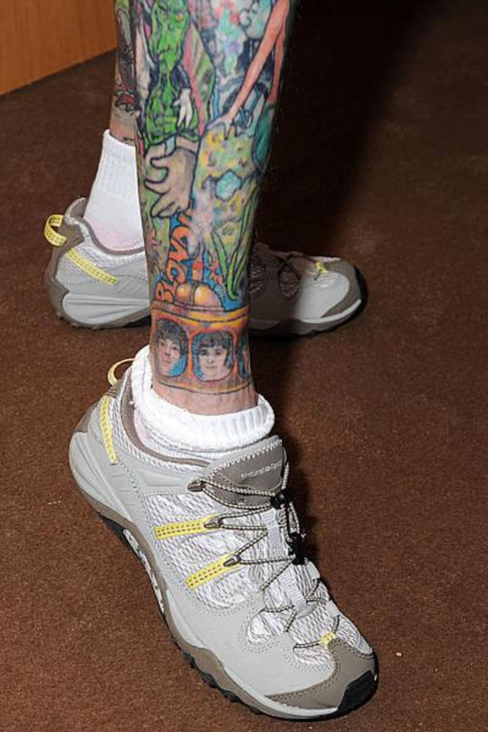
Julia Gnuse tattoos: Julia Gnuse colorful lower-leg tattoos, selected because the named tattoo areas are clearly visible in a distinct high-resolution photograph

Julia Gnuse’s full-body tattoo layout

The full-length side view shows how Gnuse’s tattoos fit across her body. The pieces face different directions, and they don’t form one large mural. Smaller marks sit near larger images, while brighter sections break up the darker ones. Each part of the body frames the design in a different way.

If you’re building a collection, you don’t have to plan every inch at once. Start with the areas that matter most to you and live with those pieces before adding more. Photograph yourself from the front, sides and back; some gaps are hard to see in a mirror. Clothing changes the layout too, whether you’re in a T-shirt, swimwear or a winter coat.

Let the size follow the subject. A face, animal or scene usually needs more room than a simple symbol. A tall design may suit a leg, while a wider one can follow the shoulder or chest. Give an important image enough space to read clearly.
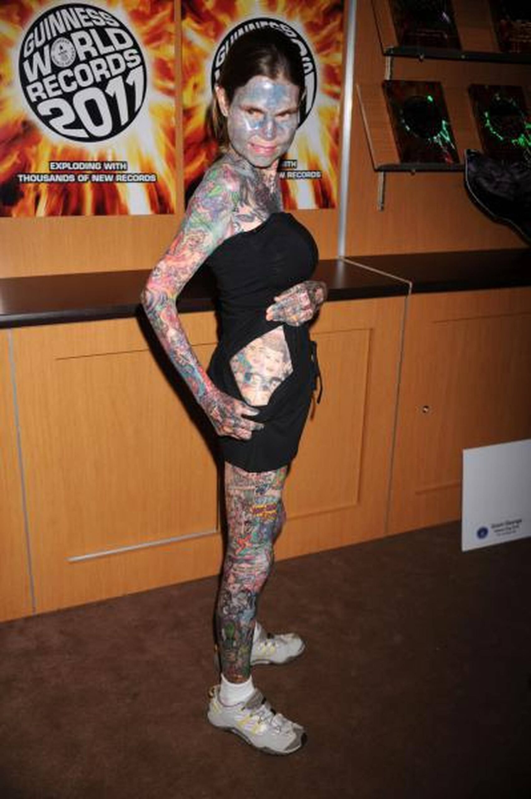
Julia Gnuse tattoos: Julia Gnuse full-length side view of tattoos, selected because the named tattoo areas are clearly visible in a distinct high-resolution photograph

What her collection teaches about commitment

Gnuse’s collection is an extreme example, but the same choices come up with a first tattoo: placement, scale, color and how one design sits beside another. The photos show that different subjects can share a body without being forced into one theme.

Start with images or stories you expect to care about after the excitement of a new appointment passes. It can help to name the part of a reference you like—the palette, cartoon style, portrait shading or the way it wraps around a joint. That gives an artist more to work with than a request to copy someone else’s photo.

Choose an artist whose work fits the design. Realism, color, lettering, blackwork and large layouts call for different experience. Look at healed tattoos and ask how the design might move, fade in sunlight or sit beside another piece. If an artist suggests simplifying a crowded design or making it larger, ask what will help it stay readable.

Visibility is part of the decision. Face, neck and hand tattoos are likely to appear in everyday photos and outfits. Legs, chest and stomach pieces give you more say over when they’re seen. Think about what fits your work, relationships and comfort level.

Leave some space if you want room to add to the collection. Open skin can keep a colorful design from feeling crowded and give a detailed portrait room to stand out. Waiting between appointments also lets you see what the body actually needs next. A pause can be part of the design process.

Healing matters as much as the next reference image. Follow your artist’s aftercare instructions, protect fresh work from strong sun and avoid picking at peeling skin. Judge the tattoo once it has healed, not only when the color is new and the surface is fresh.

Gnuse’s collection reflects her own interests and circumstances. You can borrow the confidence and sense of play without copying the exact subjects. Let each new piece earn its place in your collection.
More celebrity tattoo guides

Sinéad O’Connor Tattoos: Face, Chest and Arm Ink Explained

Sinéad O’Connor’s tattoos are direct and hard to miss. The neck lettering, chest medallion, arm script and hand ink stand out in photos of her moving, performing or speaking. They don’t rely on a bright palette; placement and the size of the lettering do much of the work.

One close portrait can’t show how the whole collection sits together. A collar may hide part of the neck piece, stage light can flatten the chest design, and a microphone can cover the hand. Looking across several photos helps separate a clear tattoo detail from a shadow, a fold of clothing or a camera angle.

This article looks at the placements that show up most clearly: the neck phrase, hand and forearm pieces, chest medallion and long arm script. It also considers how these choices shape her performance look, without treating any single photograph as a complete record.

Sinéad O’Connor’s neck lettering tattoo

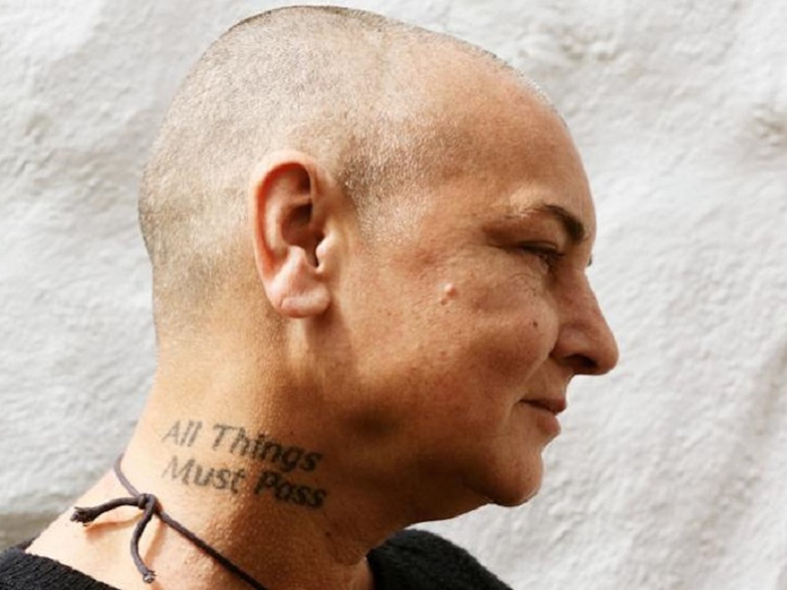
The phrase “All Things Must Pass” sits on Sinéad’s neck, above the collar and below her face. It follows the curve instead of running as a straight strip. In side-profile photos, the lettering becomes part of the line from her head to her shoulders, which helps it stand out without needing oversized letters.

Neck lettering stays visible from the side and behind, and people can see it during ordinary conversation. A short phrase may fit on a stencil but feel cramped once it follows the curve. Font matters too: thick letters read quickly, while finer script needs enough space to remain clear over time.

Her tattoo shows how a line can follow the body rather than fight it. If you’re considering something similar, ask to see the stencil with your head relaxed and turned both ways. Check how the words read while you move, not only in one still pose.

Sinéad O'Connor tattoos: Sinéad O'Connor All Things Must Pass neck tattoo, selected because the named tattoo area is clearly visible in a distinct high-resolution photograph

Sinéad O’Connor’s face and hand tattoos

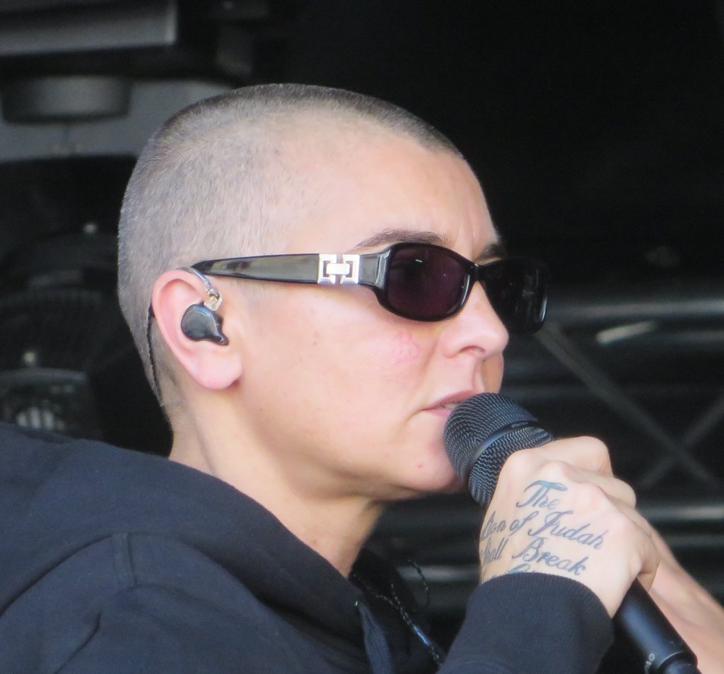
In the hand photos, small lettering and marks near Sinéad’s fingers and the back of her hand are easy to see. When she holds a microphone or gestures, the ink is part of what the audience sees. It has a different feel from the larger chest piece because the hands are constantly moving through a performance.

Hands get washed often, move all day and see plenty of sunlight. Fine lettering can soften, and tiny details may lose their shape in a narrow space. A short word or simple symbol is usually easier to read than a small, intricate picture. Ask an artist to show healed work as well as fresh photos.

Placement changes how public the design feels. The back of the hand is visible from more angles than the inside of the wrist, while a finger tattoo is hard to miss. Try the idea temporarily and look at it while making your usual gestures. Visibility affects both how a tattoo reads and how often you live with it.

Sinéad O'Connor tattoos: Sinéad O'Connor hand lettering tattoo, selected because the named tattoo area is clearly visible in a distinct high-resolution photograph

Sinéad O’Connor’s chest medallion tattoo

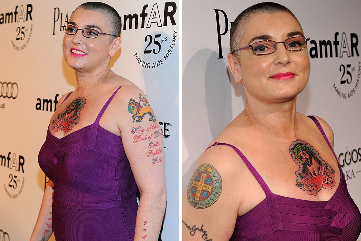
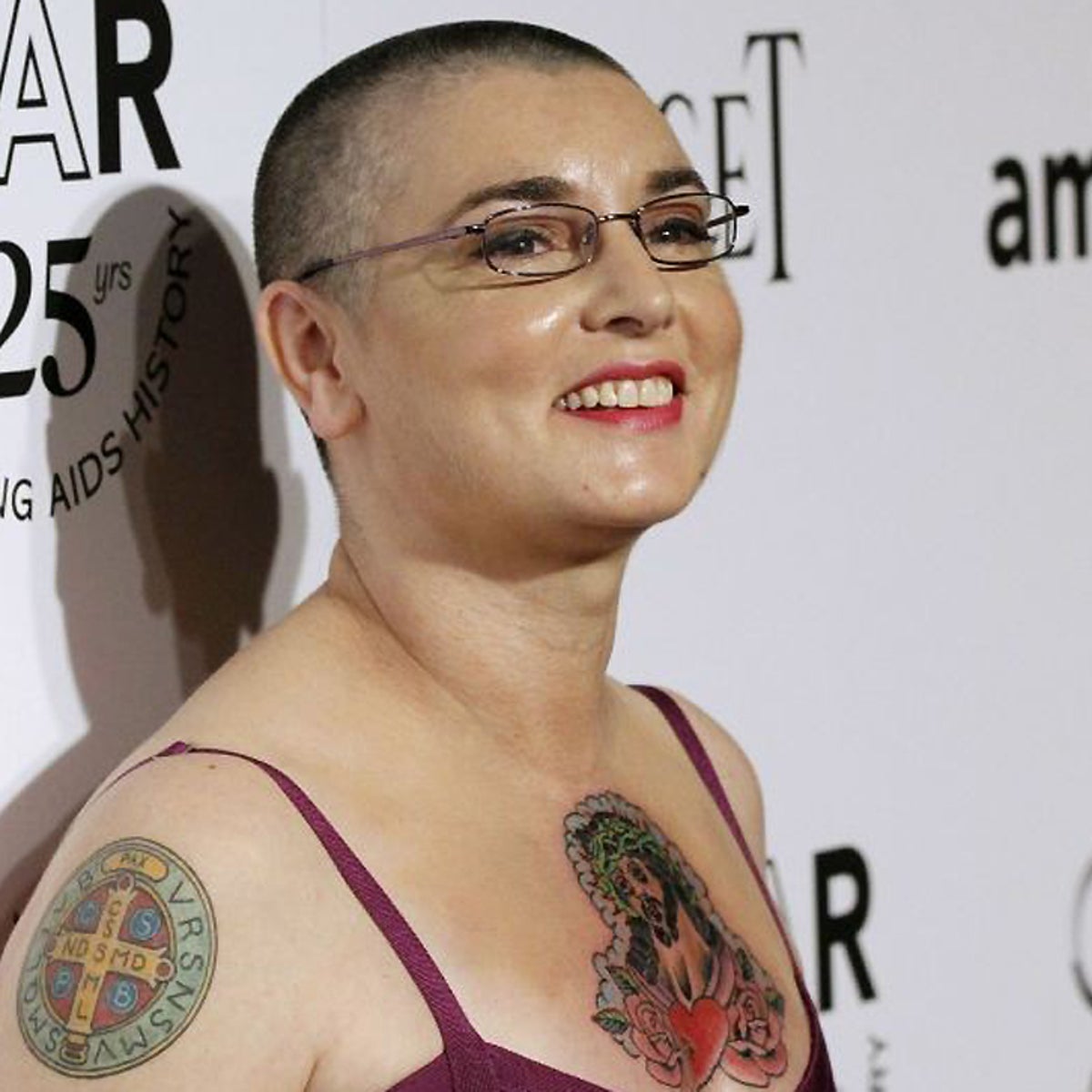
Photos from the amfAR period show a central medallion or figure on Sinéad’s chest, with lines and shapes around it. The main image reads first, and the broad placement gives it more room than a narrow strip would.

Posture changes the way a chest tattoo sits. Standing, sitting, raising your arms and taking a deep breath all pull the skin differently. Check a stencil in several positions so you can see whether the center stays where you expect it to. The same applies to a sternum piece, where a slight turn can change how symmetrical it looks.

The chest design is easier to read because the surrounding details support the central image. If you’re planning a large piece, decide what you want the eye to find first. A clear focal point can keep the smaller details from competing with one another.

Sinéad O'Connor tattoos: Sinéad O'Connor chest and upper-arm tattoos, selected because the named tattoo area is clearly visible in a distinct high-resolution photograph

Sinéad O’Connor’s arm script and figures

Photos of Sinéad’s upper arm show long lines of script, including “King of Kings Lord of Lords Earth’s Rightful Ruler.” The words take up real space and follow the length of the arm, so the eye travels along them instead of stopping at a small emblem.

Long lettering needs room for line breaks, spacing and the direction of the arm. A sentence that looks balanced in a flat reference can bunch up when the elbow bends. Check the stencil with the arm hanging naturally, bent and raised overhead.

Script is easier to live with when the words remain readable. A dramatic font can look good in a photo but feel crowded if the letters are packed together. Leave breathing room between lines and keep flourishes that help the letters, not ones that obscure them. Readability matters more than a trendy font.

Sinéad O'Connor tattoos: Sinéad O'Connor arm script and chest tattoo, selected because the named tattoo area is clearly visible in a distinct high-resolution photograph

Sinéad O’Connor’s tattooed performance style

Photos don’t show one fixed arrangement of Sinéad’s tattoos. Hair, clothing and camera angle change which pieces stand out. The neck lettering is a steady visual marker; her hands and arms come into view as she gestures. That movement ties the tattoos to her presence onstage.

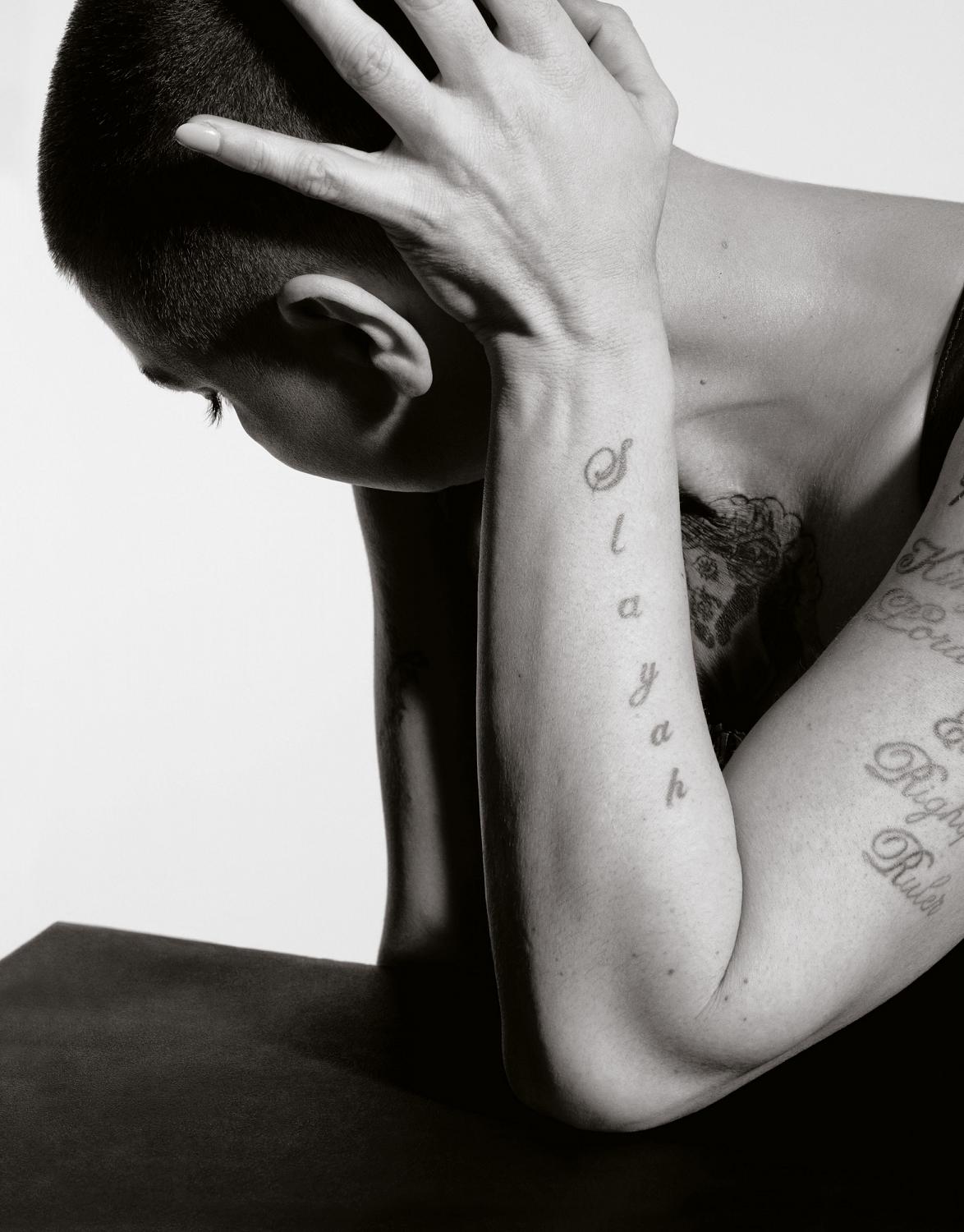
The black-and-white portrait makes it easier to follow the forearm script and see how the lines sit beside the folds of her arm. Without bright color, spacing and line weight are easier to notice. It can be a useful way to study a design even if your own tattoo will use color.

If you’re planning several pieces, think about how they’ll meet your clothes and routines. A shoulder tattoo may sit at a sleeve edge, a wrist design beside a watch, and a neck tattoo may be the first thing people see. Each placement creates a different everyday relationship with the ink. Consider how it will look at work, in different weather and during ordinary conversations.

Sinéad O'Connor tattoos: Sinéad O'Connor forearm script tattoos, selected because the named tattoo area is clearly visible in a distinct high-resolution photograph

What her collection teaches about commitment

Sinéad’s tattoos bring together clear placement and visible lettering. You don’t need a full collection to consider the same choices. Identify what you like about a reference—the wording, the weight of a medallion, script that follows an arm or a placement that stays visible—and explain that to your artist instead of asking for a copy.

Words deserve careful checking. Confirm spelling, punctuation and the exact quote before the stencil goes on. Read it in a mirror, and ask someone else to look too. Decide whether the lettering should feel formal, handwritten, heavy or quiet. With a phrase tattoo, the typeface is part of its voice.

Think about visibility as well. Face, neck and hand tattoos appear in many outfits and photos. Chest and upper-arm pieces give you more control over when they’re seen. Visible ink isn’t automatically a problem; it just changes what people see first in settings like work or family events.

Give fresh work time to heal before deciding what to add beside it. New black ink can look very dark, and swelling can change how large a design seems. Follow your artist’s aftercare directions, protect healed tattoos from strong sun and judge the piece when the skin has settled. Open skin may look better than adding another tattoo straight away.

Sinéad’s tattoos feel connected to her voice and to how she chose to be seen. You can take inspiration from their confidence without using the same words or layout. Choose a design that still feels like yours after the reference photo is gone.

More musician tattoo guides

Craig Mabbitt Tattoos: Full Sleeves, Hand Ink and Stage Style

Craig Mabbitt’s tattoos are easy to spot in Escape the Fate stage photos. Dense black and color work covers his arms, with smaller pieces on his hands, neck and chest that show when his clothes shift. The collection looks as if it grew over time, giving it a lived-in feel.

Photos show full sleeves, lettering, shaded faces, patches of color and smaller marks. Some shapes are clear; others blur under red lights or movement. This look at the collection sticks to what the photos show and to the way scale, contrast and placement work together.

The tattoos share a heavy visual feel even when the designs differ. The arms do most of that work, while the hand and neck pieces carry the ink into more visible spots. If you’re drawn to Mabbitt’s style, pay attention to the balance rather than copying an exact design.

His upper arms use large color blocks and strong contrast

Craig Mabbitt tattoos: wide high-resolution performance photograph showing the tattooed upper arms and chest

Large shapes and dark shading dominate the clear upper-arm photos. Color appears in selected areas instead of covering the whole arm evenly, so the outline still reads from a distance. The sleeve is busy, but darker and brighter patches give it a rhythm.

On Mabbitt’s left arm, the visible work runs from shoulder toward elbow in overlapping sections. Rounded forms, lettering and dark outlines sit together, and the arm reads as one field during a show rather than a single image surrounded by blank skin.

If you like a sleeve made of separate pieces, decide which one should catch the eye first. An artist can connect the rest with shading, similar line weight or a few shared colors. The connection can be quiet; the designs don’t need matching frames or logos.

Stage photos show how that scale holds up while Mabbitt moves, grips the microphone and leans toward the crowd. The main shapes remain visible from changing angles. Fine details alone would be harder to follow under stage lights.

Dense forearm coverage keeps the collection connected

Craig Mabbitt tattoos: sharp red-lit close view showing layered forearm and upper-arm tattoo coverage

The forearm is packed with images and shading, making it look darker than the upper arm in some photos. A close performance shot shows the designs continuing around the limb instead of stopping at a flat panel.

That wraparound shape matters because forearms are seen from several directions. Mabbitt’s tattoos turn with his arm as he reaches for the microphone, bends his wrist or faces the camera from another angle.

Red and other warm colors appear within the darker work, with small areas of bare skin separating the pieces. If every patch used the same saturation, the sleeve could read as one block. Those breaks help the motifs stay distinct.

Leave some open skin before filling every gap. It gives the strongest shapes room, helps around joints and cuffs, and leaves space for future additions. A dense sleeve still needs places for the eye to rest.

Hand and wrist tattoos bring the details closer to view

Craig Mabbitt tattoos: distinct stage photograph showing wrist, forearm and sleeve tattoos while he sings

The marks on Mabbitt’s hands and wrists are smaller than the sleeve pieces, but they show up in his gestures. A microphone, cable or raised hand can put the ink at the center of a photograph.

Hands are washed, exposed to sunlight and constantly moving, so fine detail can soften sooner than it might on a covered area. The bold shapes and lettering visible in his stage photos stay recognizable even when the hand is angled or partly hidden.

A wrist tattoo can join the hand to the forearm sleeve without creating a hard edge. One compact mark near the thumb or inside the wrist may be enough; there’s no need to fill every finger. The design just needs to fit the weight of the ink above it.

Try a hand design with the fingers open, curled and relaxed. Skin shifts in each position, so a word that looks level in a fist may slope when the hand opens. Plan for the movement as well as the photograph.

Chest and neck pieces frame the face and microphone

Craig Mabbitt tattoos: close performance photograph showing tattooed arms, neck and chest near the microphone

The chest and neck pieces are less dominant than the sleeves, but they frame Mabbitt’s face in performance photos. They sit near the collar, ear jewelry and microphone, and show more clearly when he wears a vest or sleeveless shirt.

A chest tattoo doesn’t have to be one enormous image. Several medium-sized pieces can carry the same visual weight if they’re spaced well. In the photos, the ink works with the neckline rather than crowding it. That can be useful if you want a design you can cover with a shirt.

The neck is hard to hide, so clear shapes matter. Fine detail can disappear under hair, shadow or stage lighting. If you’re considering that placement, check how the design reads from the front, side and three-quarter view.

The same subject can feel different in a different place. A skull or line of script on the upper arm may read casually; near the throat, it can feel more confrontational. Mabbitt’s mix keeps the upper body direct without making every piece oversized.

Stage photos show how the sleeve moves with him

Craig Mabbitt tattoos: separate high-resolution action photograph showing the sleeve wrapping around the arm in motion

A posed portrait can make a sleeve look flat. Stage photos show Mabbitt reaching, leaning, gripping the microphone and turning his shoulders while he sings. The designs shift across those movements, so the ink feels part of the performance.

Different angles bring out different pieces. One photo may show a broad patch of color; another catches a wrist detail or the back of a hand. Several images give a better sense of the layout than one close-up.

Stage lighting changes how colors appear. Red light can blend warm ink into the background, while a cool spotlight can sharpen the black outlines. Compare references in daylight and indoor light before deciding how you want color to look against your skin and clothes.

The collection’s consistent features are heavy outlines, dark shading, compact symbols and visible placement. The designs are not identical, but they sit in the same visual world. That direction can be built gradually: choose an anchor piece, decide how much color or dark coverage you want, then let later tattoos work with it.

There’s no need to guess the story behind every mark. Some are easy to see; other details remain private or unclear in photos. It’s enough to describe what is visible and leave the rest to the person wearing the tattoos.

Think about scale before your first appointment. A large upper-arm piece needs room, and a dense forearm design has to wrap cleanly. Smaller wrist and hand tattoos can bridge the areas instead of looking like add-ons. Planning the layout early leaves more options later.

If you like the rough alternative feel, bring references that show what you respond to—red color, heavy black shading, old-school forms, portraits, lettering or a particular stage look. Talk with the artist about your skin, work and how visible you want the tattoos to be. The design should fit your life as well as the reference.

Mabbitt’s sleeves show that a full collection can grow over time and still feel considered. Strong placement, recurring contrast and room between some shapes keep the pieces readable. Start with a design you’d still want years from now, then build around it patiently.

Borrow the energy, not the exact artwork. An artist can adjust the scale for your arm and make a new composition that fits your skin. That’s how a reference becomes your tattoo instead of a duplicate.

More musician tattoo guides

Kevin Holland Tattoos: Chest, Arms, Back and Fight Ink

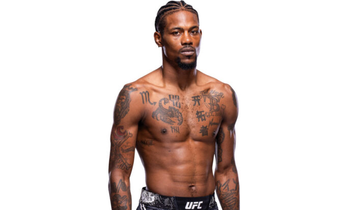
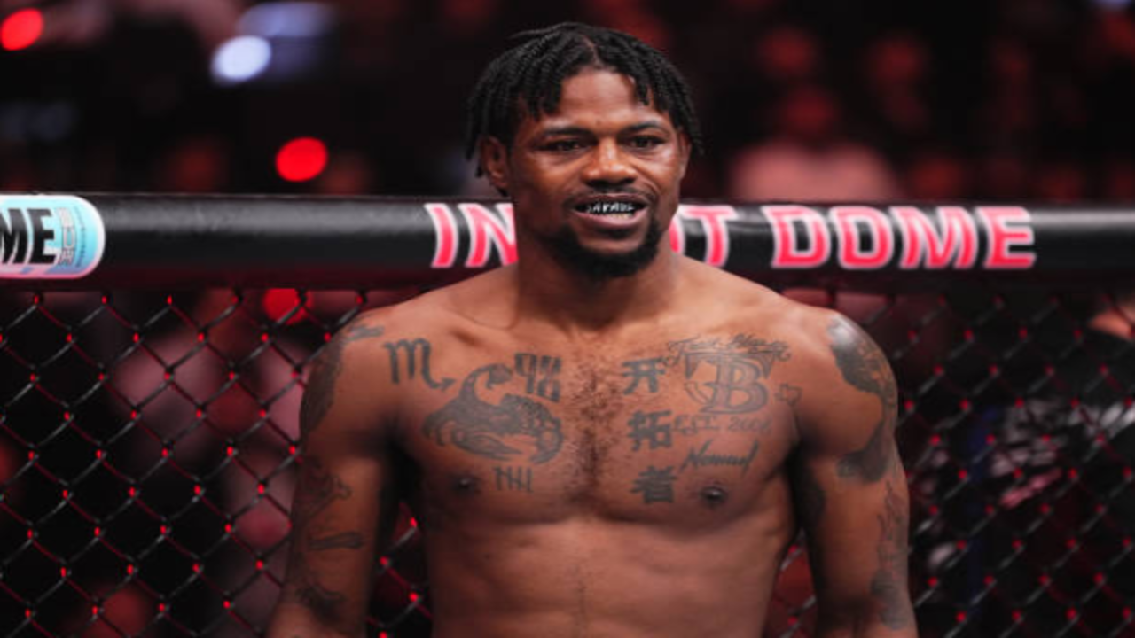
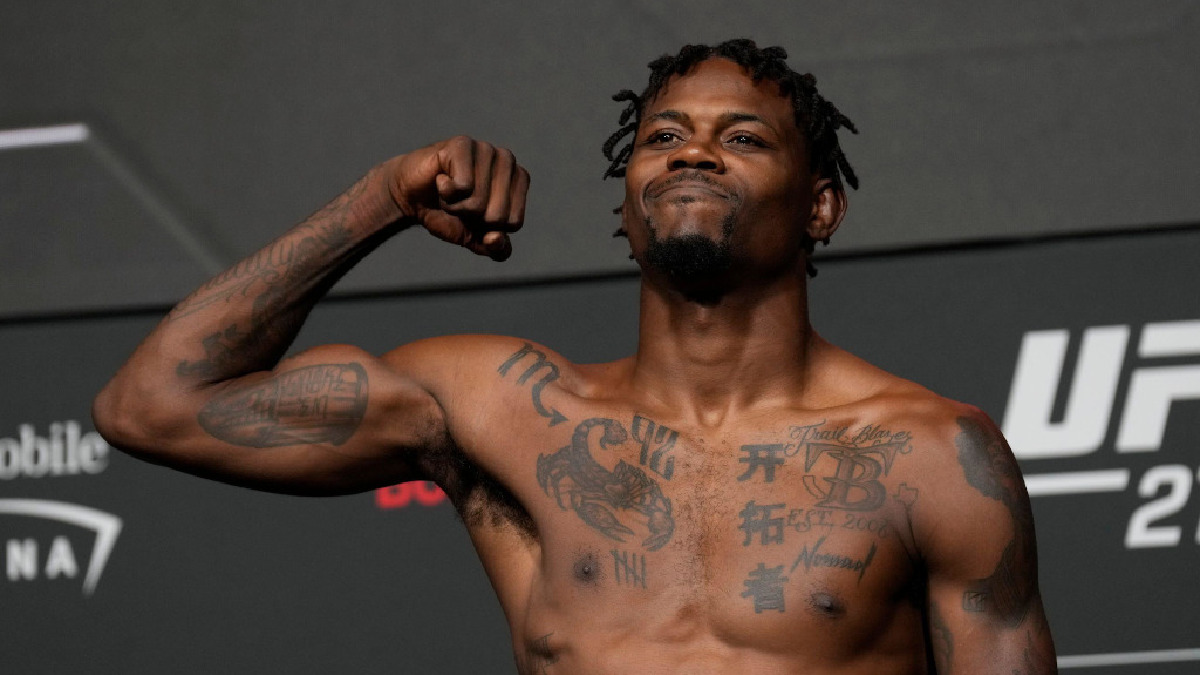
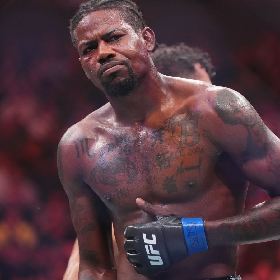
Kevin Holland’s tattoos are easy to see in fight and weigh-in photos. The UFC welterweight has chest lettering, dark symbols, script, numbers and ink across his arms. The pieces don’t look like one matching sleeve; they seem to have accumulated over time, alongside the “Trailblazer” image fans know.

Photos make some designs clear and leave others blurred among the larger chest and arm work. A tattoo can have a private story without a public explanation, so the details below stay with what the images show.

Kevin Holland’s chest scorpion and bold lettering tattoos

Kevin Holland tattoos: chest scorpion and front lettering

The chest draws the eye first. Photos show a dark, scorpion-like shape on the left side, surrounded by heavy marks and small lettering. Its curved outline stands out against the thicker black areas, and the contrast stays visible under arena lights.

Across the upper chest, blocky characters, an outlined mark and smaller script sit close together. The tight spacing makes them read as one panel, rather than a row of separate designs. Much of the visual weight comes from how the pieces are arranged, not just from each symbol on its own.

The scorpion gives the chest a clear focal point beside all that lettering. Scorpions can suggest toughness or self-protection, but there is no need to assign those meanings to Holland without his explanation. The visible contrast is enough: a curved animal shape set against straight, compact marks. That difference in shape gives the chest its strongest visual hook.

Shoulder and upper-arm tattoos that frame the chest

Kevin Holland tattoos: shoulder and upper-arm framing ink

In close fight photos, a dark rounded design covers much of Holland’s left shoulder. Both upper arms also show shading and lettering. The edges vary from piece to piece, which gives the work a collected look instead of the finish of a single matching set.

The shoulder ink carries the chest design outward. Rather than stopping at the collarbone, the dark shapes continue across the upper body. The two sides don’t have to match; one can be denser while the other leaves more skin showing.

Shoulder placement changes as the arm moves. Check a stencil with the arm down, flexed and raised, and see how the lines sit around the deltoid. Holland’s photos show the same design shifting with his stance, a reminder that a shoulder isn’t a flat surface.

Back tattoos and the ink that appears during fights

Kevin Holland tattoos: upper-back tattoo work visible during a fight

The back is harder to see in portraits because Holland usually faces the camera. Fight photos show more: one cage-side frame reveals a dark design at the center of his upper back, with other marks across his shoulders and arms. It isn’t a full view, but it shows the ink continuing beyond his chest.

A central back design can stand on its own or leave room to expand later. In the photo, the dark shape is easy to pick out, with open skin around it separating the tattoo from the motion of the fight.

Back ink stays covered under most everyday clothes and becomes visible at a weigh-in or bout. That difference between private and public placement can be part of the appeal for someone who doesn’t want a tattoo on view all day.

Forearm script, numbers and smaller arm details

Kevin Holland tattoos: forearm script and smaller arm details

Weigh-in photos show script, block lettering and smaller marks along Holland’s forearms. They’re easy to miss in a wide shot, then become visible when he raises a fist or flexes for the cameras.

The forearm gives words and numbers a long path to follow. Holland’s marks run in different directions: some along the arm, others across it. That uneven layout keeps the two sides from reading as identical sleeves.

The small pieces sit between the larger shoulder work and the wrist. They may have personal meaning, but without a direct explanation it’s better not to guess what each one says. The chest carries the main image; the arms hold the smaller details.

Recent right-arm and shin tattoo details

Kevin Holland tattoos: recent right-arm and lower-leg tattoo details

Some recent coverage points to newer tattoos on Holland’s right arm and shin. They don’t always appear in the same portrait as the chest work. As more photos surface, a new piece becomes one part of a collection that already has older ink.

A sleeve doesn’t have to be planned in one sitting. A small symbol, a line of script or a compact black design can be a starting point for later work. Leave enough space for additions, and choose an artist who can make the new piece fit the existing line weight.

The shin is a narrow surface, and the bone changes its shape. A bold design or short phrase is likely to read more clearly there than a tiny, crowded picture. Let the placement set the scale, then leave room for the collection to keep growing.

What makes Kevin Holland’s collection stand out

Holland’s tattoos don’t follow one palette or strict theme. Lettering sits beside symbols; the scorpion-like chest piece sits beside marks that are less easy to read. The collection has a dark, visible look without every design matching.

The chest carries the most ink in the photos, while more skin remains open lower on the torso. His arms carry the line outward from the shoulders to the forearms, without turning the entire front of the body into one block.

If you’re gathering ideas, think about how each tattoo will sit next to the others. Pick an anchor piece, consider where the next one might go and look at line weight and spacing. Placement and contrast can tie a collection together without forcing every piece into one style.

Ideas inspired by Kevin Holland’s style

You can borrow the overall approach without copying Holland’s designs. An animal can serve as a focal point; a short line of lettering can run along a forearm; a shoulder piece can link chest and arm tattoos. Ask your artist to make an original design from references that matter to you.

Think about when you’ll want the ink visible. Chest and shoulder tattoos are easy to show in photos; back and shin pieces can stay covered. Take time with the stencil and see how the design moves. Small details need enough space to remain clear as the tattoo ages.

Holland’s tattoos look like a collection that has changed over time. New pieces sit beside older ones without making the whole arrangement feel fixed. Start with what matters now, leave room for what comes next, and let the collection grow at its own pace.

The interview below shows Holland with some of the tattoos visible during a post-fight conversation.

More athlete tattoo guides

Daniel Agger Tattoos: Viking Back Piece, YNWA Knuckles, and Liverpool Ink

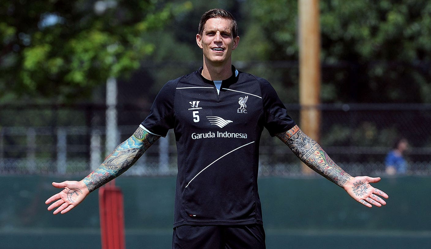
In photos from his Liverpool years, Daniel Agger’s rolled-up sleeves, knuckle lettering and large torso tattoos are hard to miss. His collection brings together Danish history, family references, football loyalty and darker images of skulls and graves. The pieces don’t look like one matching set.

Some details are clear in the photos; others are harder to read. The large back scene is the main feature, while the sleeves, chest and hands add color and personal references. The sections below stick to those visible designs and the details reported about them.

Agger’s tattoos are a useful example of a collection built around several parts of a person’s life. The designs differ, but each area has its own role in the larger picture.

Daniel Agger’s full-back Viking tattoo is the centerpiece

Daniel Agger tattoos: full-resolution view of Daniel Agger's Viking back scene and colorful sleeve work

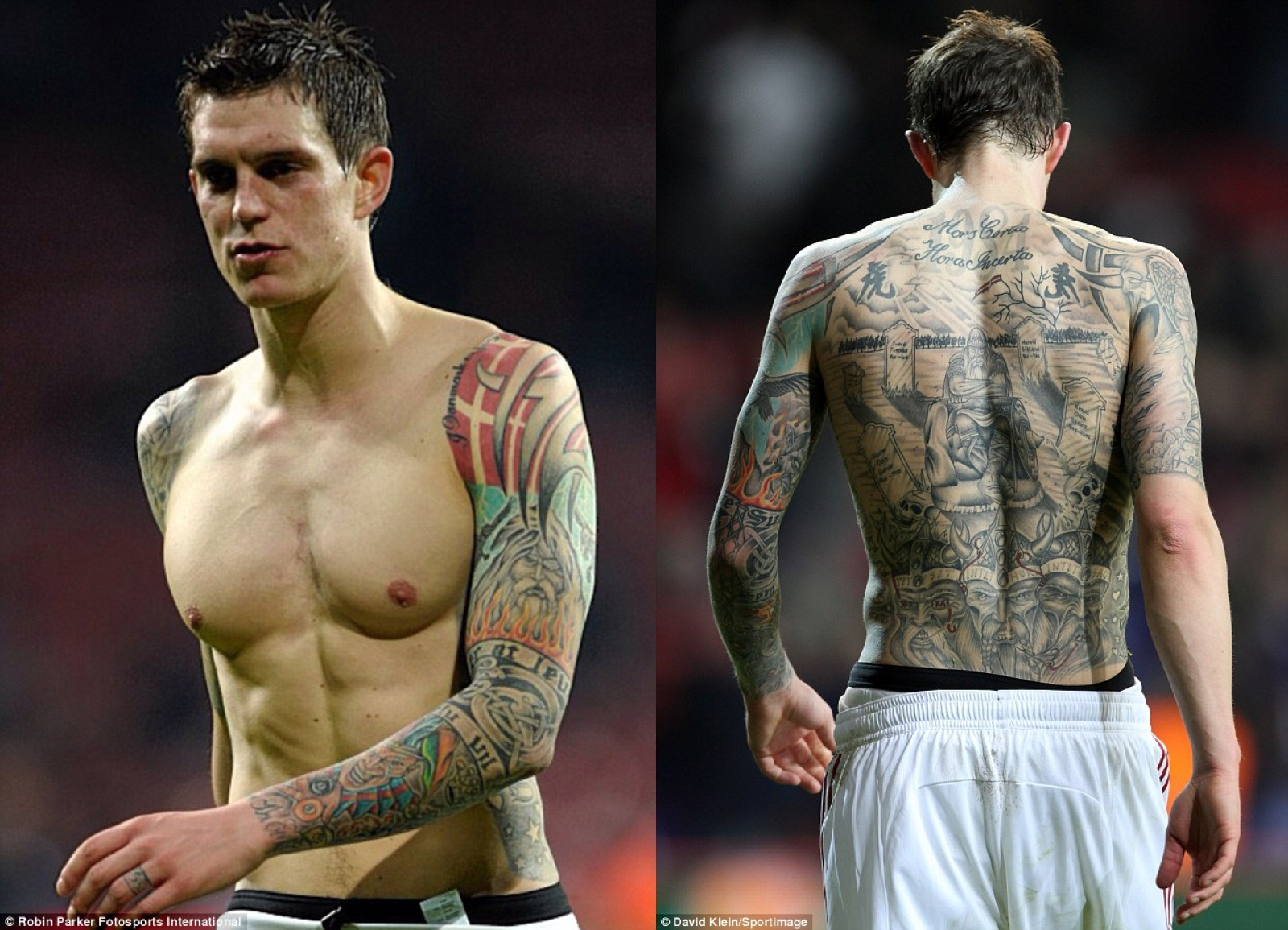
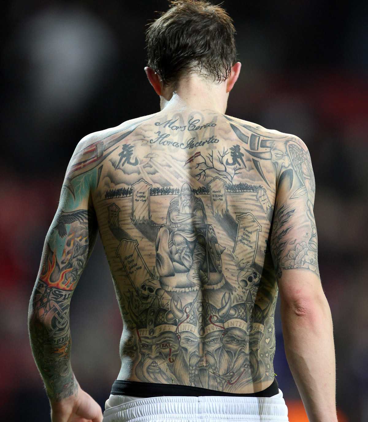
The large back piece runs from Agger’s shoulders toward his waist. Across the top, the Latin phrase Mors Certa, Hora Incerta is usually translated as “death is certain, its hour is uncertain.” Below it are gravestones, trees, skulls and a central Viking figure. Its size gives the scene the feel of a mural.

The lettering sets the tone, and the graveyard scene draws the eye toward the figure in the middle. Lower down, crowned faces and other historical references connect the image with Danish heritage. Dark shading, patches of open skin and small areas of color keep it from reading as one flat shape.

A large back tattoo needs a clear focal point. Here, the central figure anchors the scene while the lettering and surrounding details fill the space. The pieces feel part of one composition instead of unrelated designs placed side by side.

The Viking imagery also points to Agger’s Danish background. The back piece is the design most often associated with his collection because it brings the scale and historical references together in one view.

His colorful sleeve and arm tattoos make the collection feel alive

Daniel Agger tattoos: clear view of Daniel Agger's extensive arm sleeves and hand ink

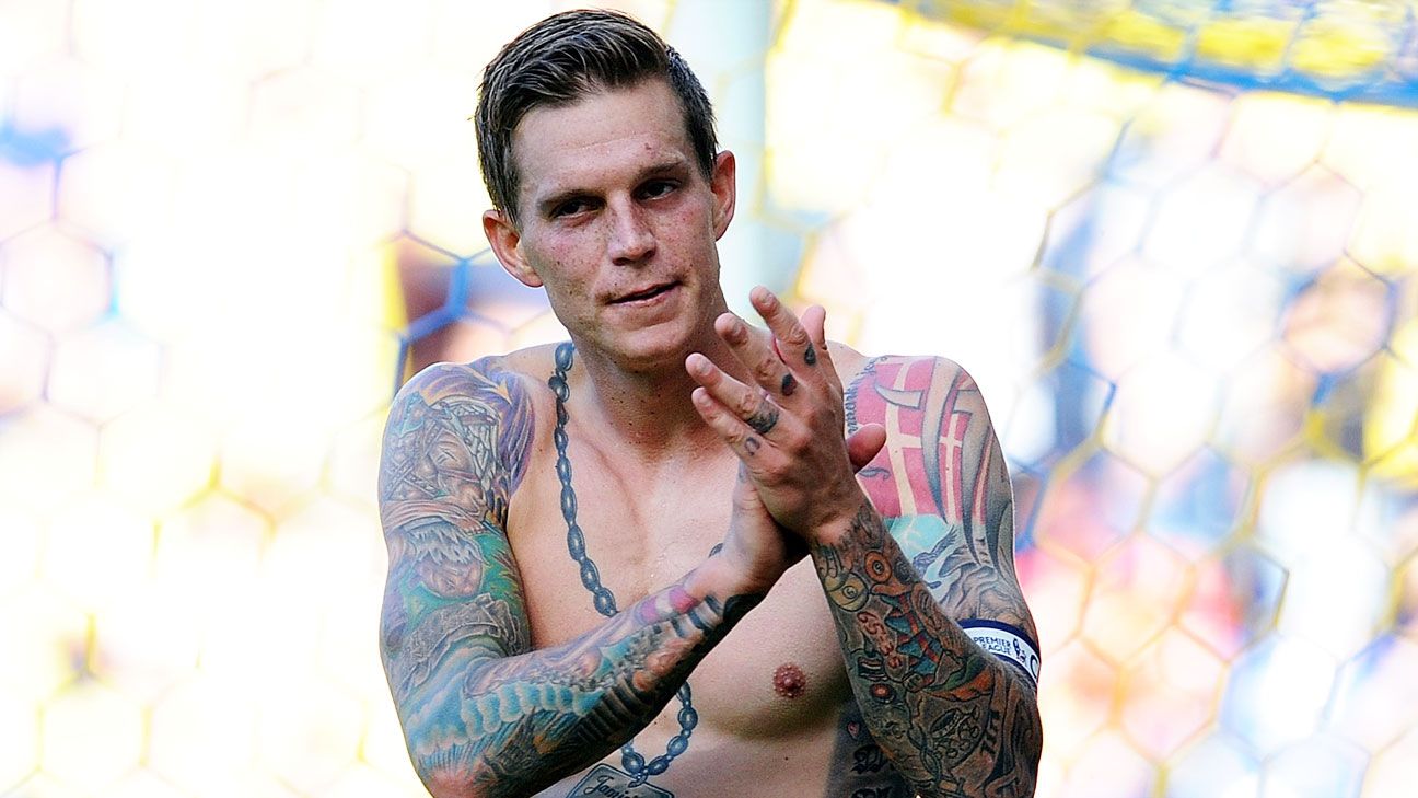
Agger’s sleeves add color against the darker back scene. Playing-day photos show reds, greens, blues and warm orange tones, along with bold outlines and illustrative shapes.

His right arm includes another Viking reference. Other sections show patterns, small symbols and designs with the look of traditional flash. The pieces don’t share one style, but their heavy outlines help them sit together.

The ink runs from the shoulders down the biceps and forearms toward the hands. That spread gives the arms movement in photos and keeps the tattoos visible in a short-sleeved shirt.

The brighter areas have open skin and darker sections around them, which keeps the sleeves from reading as a solid block. You don’t have to fill every inch or give every part the same amount of detail for a sleeve to feel complete.

The arms add color and movement, while the large back tattoo remains the main scene. Each part has a different weight in the collection.
The chest chain tattoo ties family and football together

Daniel Agger tattoos: front view of Daniel Agger's chest chain, shoulders, and torso tattoos

A chain-like design runs down the center of Agger’s chest and connects with lettering and family references. Its vertical line follows the torso, leading the eye from the neck toward the stomach.

Accounts of Agger’s tattoos describe his sons’ names and birth years, as well as heart designs for his parents on his calves. Those details give the collection a family side alongside the darker imagery and football references.

The front of the torso mixes large shapes with smaller lettering. Some parts read from a distance; others only come into focus in a closer photo. That change in scale helps a large area feel less like one uninterrupted panel.

Liverpool and Danish references appear alongside the family details. The tattoos aren’t all about football; the chest brings the personal side of the collection into view.

The chain layout could be adapted to frame names, dates, flowers or a portrait. What matters is how the center line follows the chest and how the smaller elements sit around it.

Daniel Agger’s YNWA knuckles put Liverpool right on his hands

Daniel Agger tattoos: close view of Daniel Agger's YNWA knuckles and layered chest tattoos

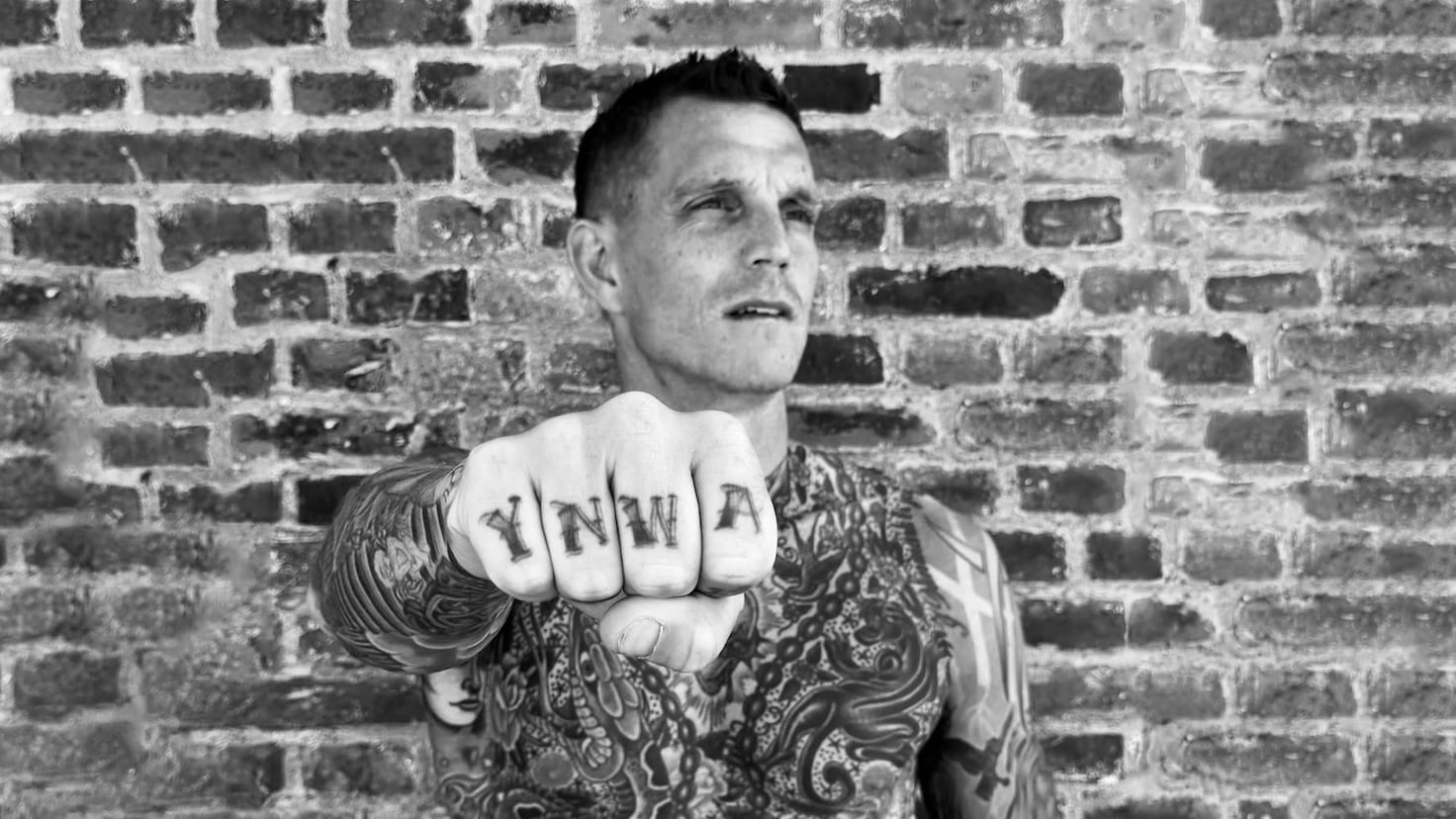
The letters YNWA run across Agger’s knuckles and stand for “You’ll Never Walk Alone,” Liverpool’s anthem. He got them while people were discussing his future at the club, so the phrase read as a statement of loyalty as well as a football reference.

Knuckle lettering is exposed and difficult to hide. The words appear whenever Agger opens his hand, which makes the tattoo easy to recognize in photos.

He later added Liver Birds to the same hand. The birds are associated with Liverpool and its city crest, extending the tribute already started by the letters.

Agger has spoken about his connection to Liverpool. Seen in that context, the lettering and birds point to the club and city where he spent several years.

Knuckle and finger tattoos take a lot of wear, and the ink can fade faster than it does on less exposed skin. Strong lettering helps it stay readable, but anyone considering similar placement should be prepared for maintenance.

The Latin motto and Viking imagery give Daniel Agger’s back ink its mood

Daniel Agger tattoos: detailed close-up of Daniel Agger's Mors Certa Hora Incerta lettering and Viking back scene

The close-up shows the Latin motto surrounded by gravestones, skulls, trees and figures. Together, they give the back piece a memento mori feel: a reminder of mortality and the passage of time, rather than shock imagery alone.

The Viking references connect the scene with Denmark. The design includes historical faces and symbols associated with Danish kings, along with Holger Danske, a figure from Danish folklore. Those details give the back piece a specific cultural setting.

A design with script, faces and scenery needs a careful layout. The lettering has to stay legible, the central figures need enough contrast, and smaller marks should support the scene instead of crowding it.

Open skin and softer gray shading separate the darker outlines. That space keeps the graveyard from becoming one black field and helps the main elements remain distinct.

The back piece is the collection’s main historical scene. The sleeves add color, the chest includes family references and the hands show Liverpool loyalty in a few letters. Each area has its own subject, but the designs sit together as part of Agger’s life.

The useful idea is to start with subjects that matter to you, then give each one enough space and the right placement. Agger’s collection draws on his family, country and football career. Those details are what make it personal; the exact Viking image or motto isn’t the part to copy.

The video below looks at Agger’s Liverpool tattoo story.

More athlete tattoo guides

Gervonta Davis Tattoos: Baltimore Back Piece, Rose Chest and Leg Sleeve

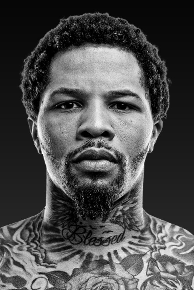
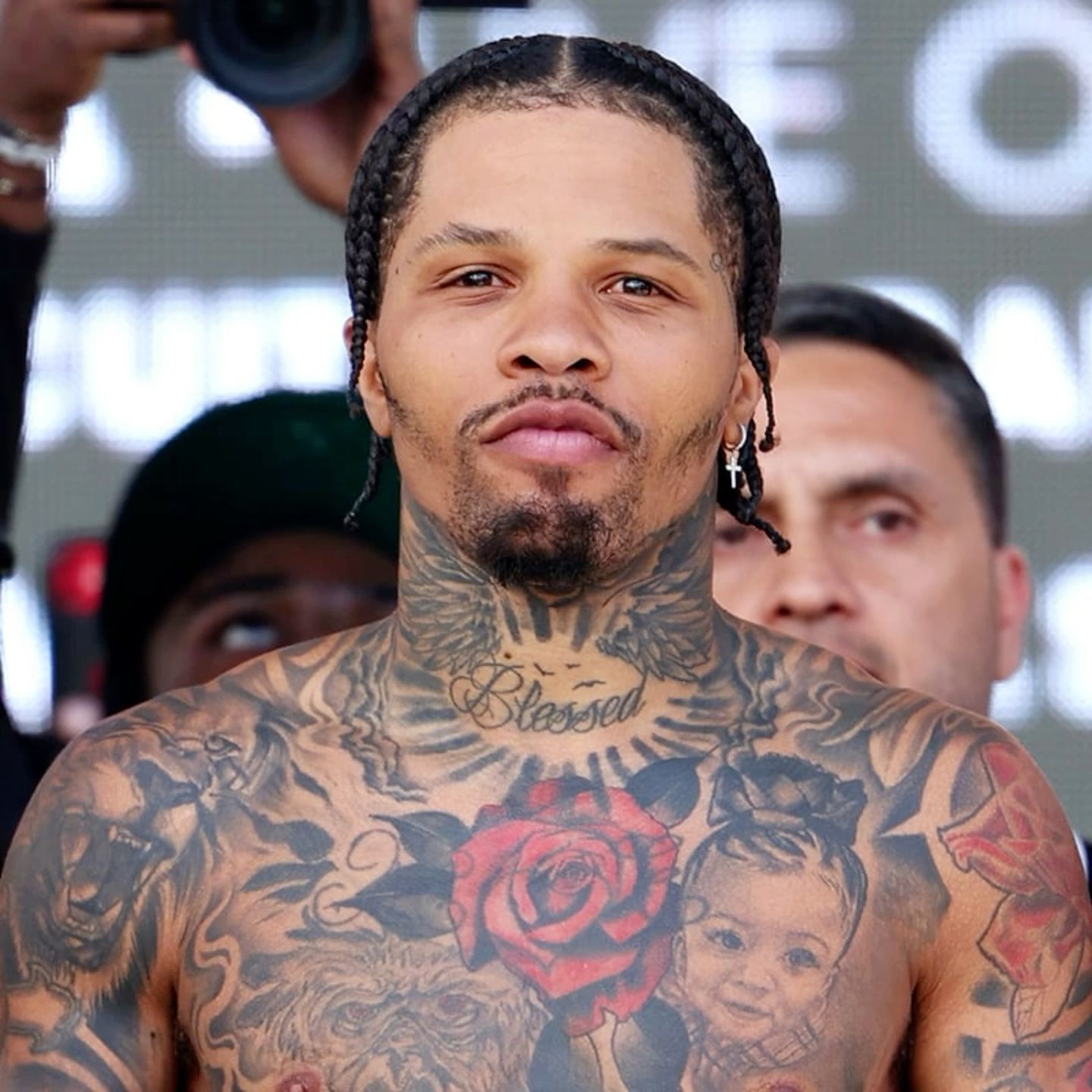
Gervonta Davis’s tattoos are easy to spot in ring, weigh-in and close-up photos. His collection includes a large Baltimore back piece, a red rose, family portraits, movie characters, animals, lettering and the word “Blessed” on his neck. The designs cover different subjects, but many use strong contrast and dark shading.

The photos show a mix of hometown pride, family, faith and pop culture. Some pieces are clear; others are hard to make out in a moving shot. Here’s a look at the designs that stand out, with their visible details kept separate from guesses about what they mean.

Gervonta Davis’s Baltimore back tattoo is his biggest statement

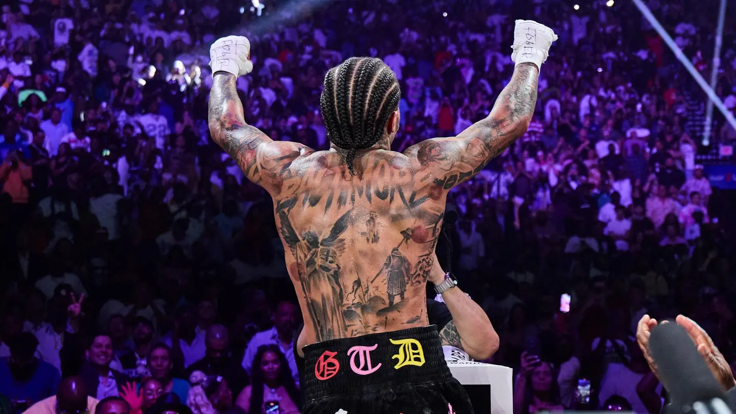
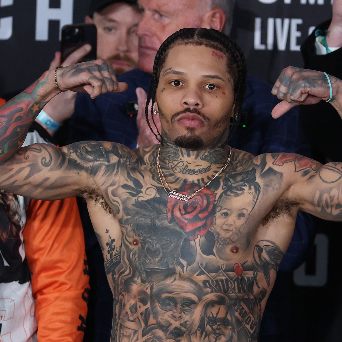
The large back piece is the main feature of the collection. “Baltimore” runs across the upper back in block letters. Below it, a black-and-gray scene includes an archangel, a samurai, wings, clouds and shaded figures. The lettering is easy to spot first, then the eye moves down through the rest of the design.
Gervonta Davis tattoos: Baltimore lettering and large back composition

The word Baltimore gives the piece a clear starting point. The darker scene can hold more detail without hiding the hometown message. For a large back tattoo, one strong focal point can help the rest of the composition read as a whole.

The archangel and samurai make the design feel like a single scene, with wings and shadow connecting the figures. It reads more like a mural than several separate flash designs, which helps it hold together in wider photos.

Gervonta Davis’s movie leg sleeve packs several portraits together

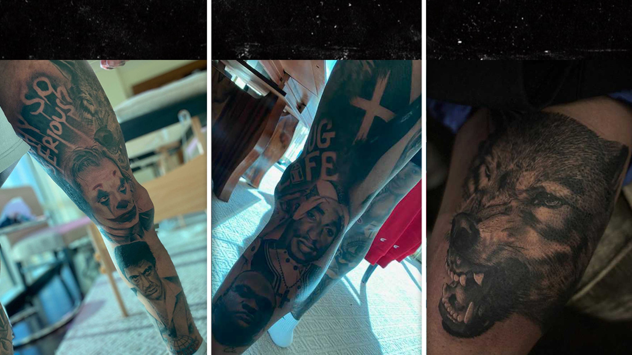
Davis’s leg sleeve shifts from a hometown scene to pop-culture portraits. Reported elements include Tony Montana from Scarface, Joaquin Phoenix’s Joker, Tupac Shakur and a wolf. The work was done over several sessions, with the images arranged along the leg rather than as one flat picture.

Gervonta Davis tattoos: Scarface, Joker, Tupac and wolf leg sleeve

The faces need room to stay recognizable as the leg bends and moves. The sleeve uses contrast and dark shading to separate them. Film lines add another layer, while the portraits remain the first thing the eye catches.

If you’re planning a sleeve with several references, choose a small group that belongs together before the drawing begins. Davis’s mix draws on crime films, music and horror, with a shared dramatic feel. Too many unrelated portraits could make the leg harder to read.

The red rose and family portraits make the chest tattoos personal

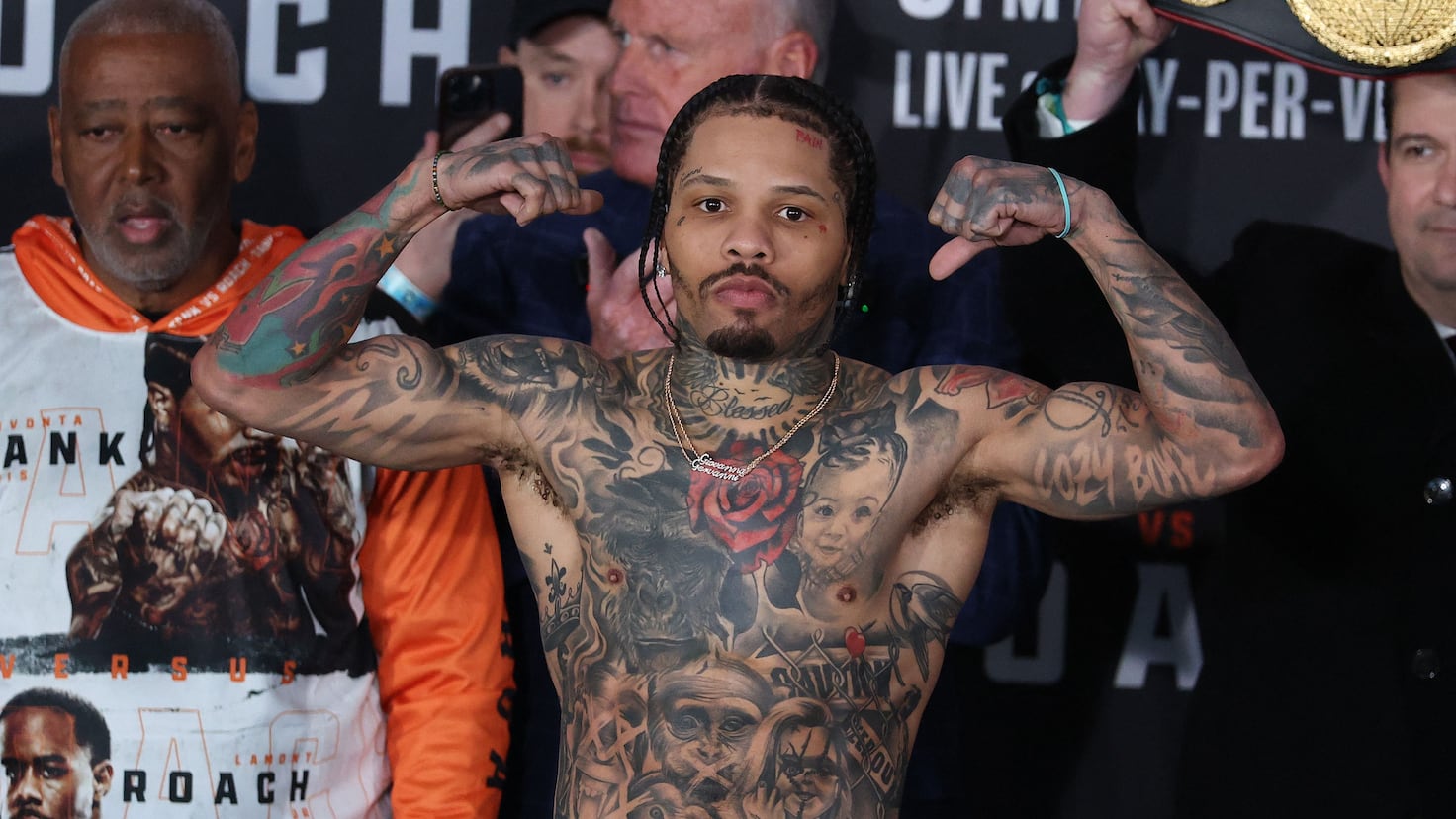
The chest is softer in tone than the back piece or leg sleeve. A red rose sits near the center, with a child’s portrait close by. Darker animal and figure designs, including a large lion-like piece, spread across the upper torso. The rose adds a clear spot of color among the black-and-gray shading.

Gervonta Davis tattoos: Rose and family portraits

Portraits can be difficult tattoos because a face carries so much expression. Here, leaves, wings and shadow give the nearby portraits some space. That framing helps them sit beside the larger chest designs without getting lost.

Most of the chest stays monochrome, so the red rose reads as a deliberate accent. A single color can draw the eye without turning a black-and-gray collection into a full-color sleeve.

Gervonta Davis’s Blessed neck tattoo ties the upper body together

“Blessed” runs across the front of Davis’s neck, surrounded by radiating lines and darker ornamental shapes. It’s visible in close portraits and stands out among the larger chest designs.

Gervonta Davis tattoos: Blessed lettering and upper-body layout

Neck lettering has little room, so a short word can work better than a long phrase. The rays behind the script fill the curve below the chin and keep the lettering from looking separate from the skin around it.

The word also gives the chest work a clear top edge. The rose, portraits and animal shading sit below it, so the eye has a place to pause before moving down the torso. It isn’t the biggest tattoo, but it helps the upper body read as one layout.

His arms mix fighter symbols, animals, names and smaller details

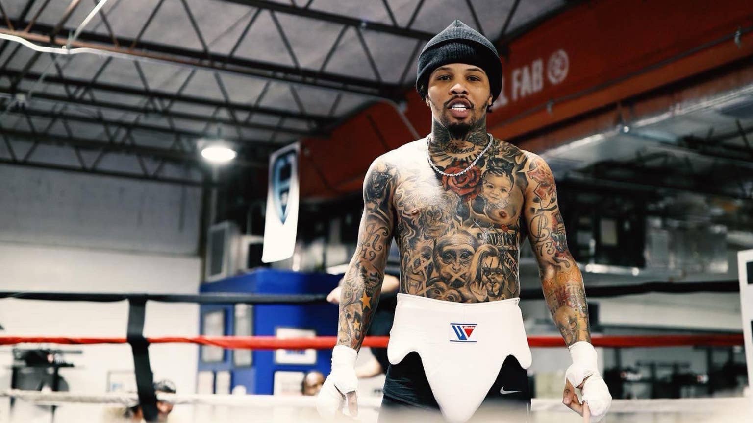
Photos of Davis flexing show script, stars, numbers, animals, dark shading and smaller symbols across his arms. Some close-ups reveal the hand and forearm pieces; others show the designs wrapping around his biceps and shoulders.

Gervonta Davis tattoos: Arm, torso and layered collection

The arms look like a collection that grew over time, not one sleeve planned all at once. Larger pieces sit beside older marks, and black shading closes some gaps so the designs don’t feel scattered.

If you’re adding to a sleeve gradually, start with a subject you care about and leave space around it. Later pieces can establish whether the collection should lean toward color, black-and-gray, realism or illustration. Consistent line weight can help separate designs feel related.

Training and weigh-in photos also show how the tattoos sit when Davis moves. A design has to read when the arm turns or the chest flexes, not only in a straight-on studio pose.

The close-up view shows how small details finish Gervonta Davis tattoos

Close photos reveal smaller marks that are easy to miss in a wide shot: a hand tattoo, short script, star or number. These pieces can bridge larger areas, follow the curve of a muscle or repeat a shape used elsewhere.

Gervonta Davis tattoos: Small arm and hand details

The smaller tattoos help the eye move from the chest into the arms without an abrupt break. They don’t need to compete with a portrait or animal; they can simply connect the larger pieces.

Why Gervonta Davis’s collection feels cohesive

The collection doesn’t fit one style label. The back is a black-and-gray scene, the leg brings together pop-culture portraits, the chest mixes a rose with family and animal imagery, and the neck uses script. The arms carry smaller marks and symbols.

Placement gives the different designs some order. The back carries the Baltimore scene, the chest includes family references, the neck word is easy to spot, and the leg keeps the movie portraits together. Each area has its own subject.

If you like the overall look, borrow the structure instead of the exact artwork. Choose a main subject, decide where another piece might go, and leave enough open skin for the focal point to read. The strongest parts of the collection each have a clear job.

The video below offers another look at Davis and his tattoos.

More athlete tattoo guides

Tai Tuivasa Tattoos: Meaning, Designs and Photos

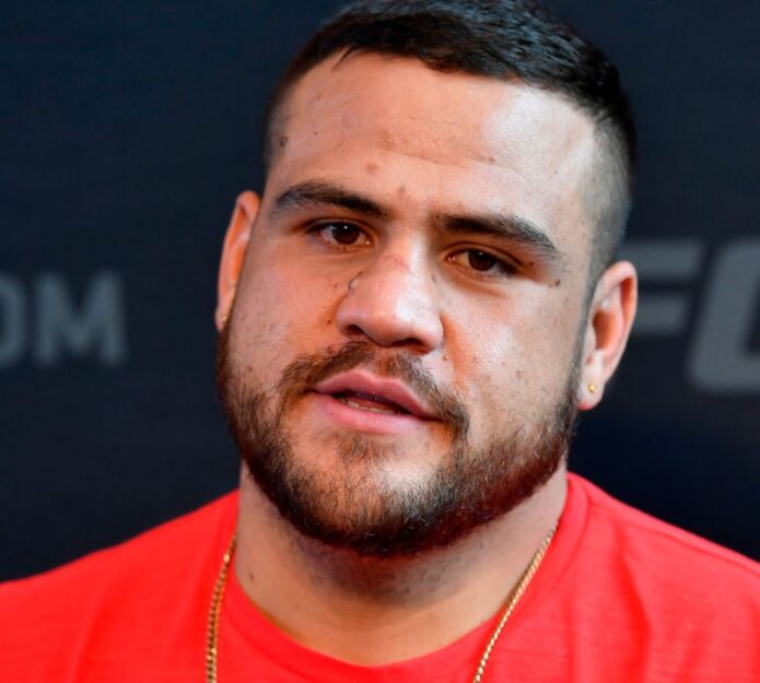
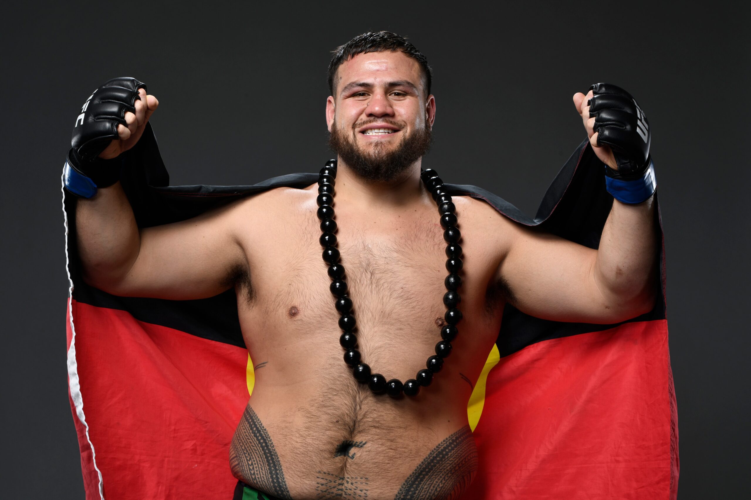
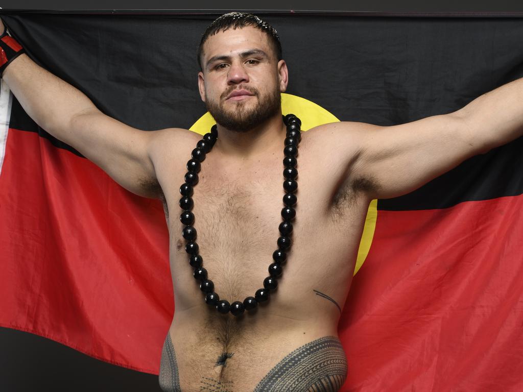
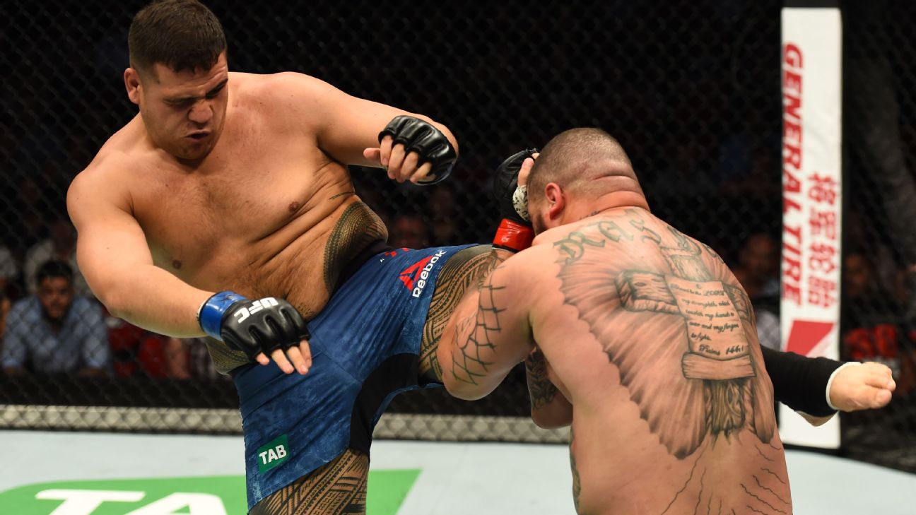
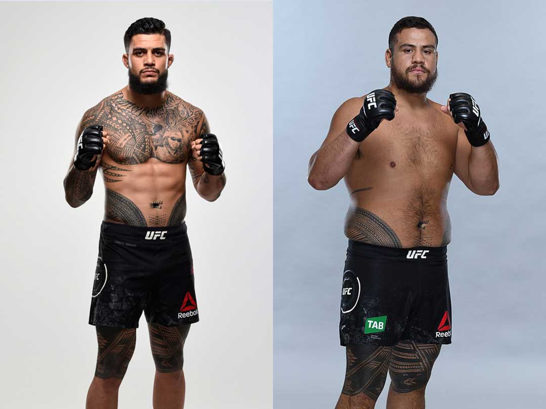
Tai Tuivasa’s largest tattoo is a traditional Samoan pe’a that wraps from his lower back around his hips, stomach and thighs. The dark geometric pattern is easy to see in fight photos, especially when he enters the cage.

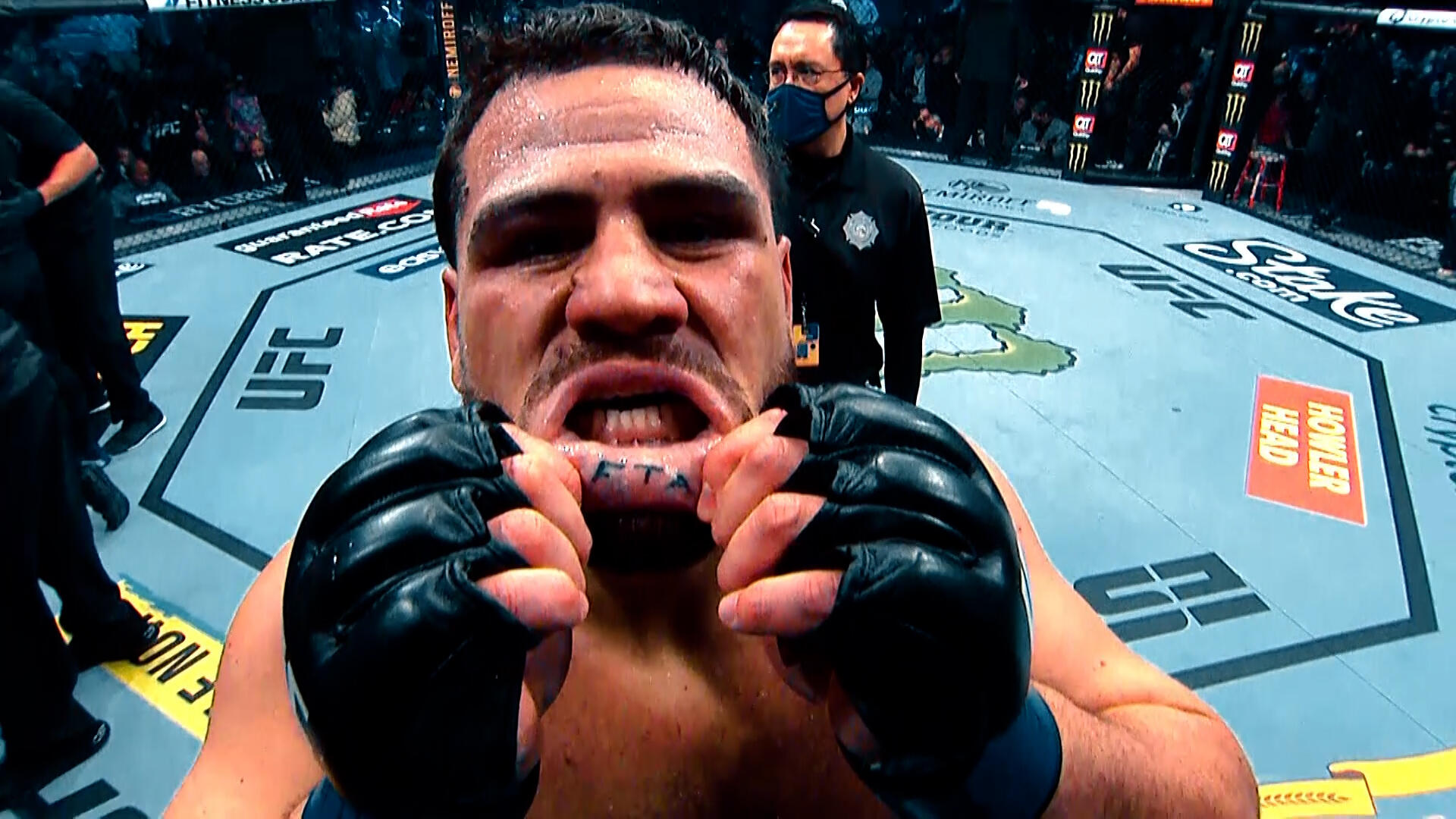
Smaller details sit within the larger design: the navel motif, lines down the stomach, repeated thigh bands and a small mark inside his lower lip. Tuivasa has spoken about the pain of getting the pe’a and said he did it for his Samoan mum. The tattoos bring together family, heritage and personal style.

This guide looks at what can be seen in public photos and at the meanings Tuivasa has discussed. Where his explanation isn’t public, the description stays with the placement and design.

Tai Tuivasa’s pe’a tattoo covers the lower back and hips

Tai Tuivasa tattoos: lower back and hip pe’a pattern

The pe’a crosses Tuivasa’s lower back and wraps around both sides of his waist. Close photos show broad black areas, narrow bands, repeated dots and geometric breaks. The pattern changes direction as it follows the hips; it isn’t one flat stripe.

That curve makes the tattoo look different from each angle. A back view shows the wide center section, while a side view shows how the lines continue toward the front. The design shifts as Tuivasa stands, crouches or turns.

The pe’a is a traditional Samoan tatau, with its own cultural history and responsibilities. Tuivasa has described the process as painful and connected it to his ancestors. That context matters; the design shouldn’t be treated as a generic pattern to copy.

The repeated bands and open skin give the black shapes a steady rhythm. The piece relies on pattern and placement rather than lettering or bright color, and it follows Tuivasa’s body instead of sitting inside a rectangular frame.

The back bands show how the pattern moves around his waist

Tai Tuivasa tattoos: front waist and stomach view

From another angle, long bands run across the lower back and break into smaller sections at the sides. Some shapes resemble steps, arrows and woven forms, though the whole design stays balanced.

No single photo shows the full pe’a. A front view captures the stomach and thighs but hides the back; a back view shows the center while missing the lines that continue around the waist. Several angles make the layout easier to follow.

The pattern bends with Tuivasa’s waist and leaves open areas around the ribs and hips. That fit is part of why it reads as a design made for his body, rather than a panel placed on top of it.

Repeated motifs sit beside larger dark shapes, and open skin helps separate them. This is a useful visual detail, though the pe’a itself belongs to a specific Samoan tradition and isn’t a generic design reference.

His thigh tattoos use repeated bands and open skin

Tai Tuivasa tattoos: upper-thigh bands during a fight

The upper thighs continue the pattern, with thick black areas, patterned strips and narrow lines running toward the knees. In fight photos, the bands appear beneath his shorts as he steps, kicks or changes stance.

The two legs aren’t exact mirror images. Some shapes repeat, but the panels and angles change as they follow each leg. The design shifts as the muscles flex or the skin bends in training.

Open skin separates the darker areas and gives the eye a path through the pattern. That contrast keeps the tattoo from becoming one solid block, even where the coverage is dense.

Shorts often hide part of the thigh work. When more of the legs are visible, the pattern reads as a continuation from the waist rather than a separate pair of tattoos.

Tai Tuivasa’s chest tattoos add another layer

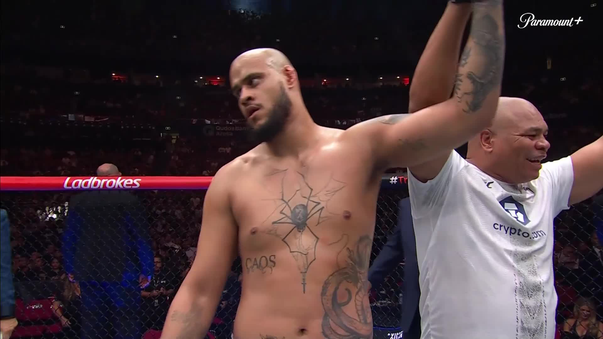
Tai Tuivasa tattoos: chest spider, CAOS lettering, and torso ink

The navel is one of the smaller details in Tuivasa’s tattoos. A dark motif sits at the center of the stomach, with rows of marks above and below it. It’s easy to miss in a wide shot, but close photos show it as a focal point in the front of the pe’a.

Accounts of Tuivasa’s tattoo journey describe the stomach and navel as part of the larger cultural design. In that context, the mark is part of the composition, not a separate logo added to fill a space.

Its smaller scale gives the eye a place to land among the broad hip panels. The surrounding marks are larger and heavier, so this central detail changes the rhythm of the front design.

A clear close-up shows the short rows and spacing around the navel. In a distant or blurry photo, those lines can merge into a dark patch.

The front stomach tattoo panels connect the hips to the thighs

Tai Tuivasa tattoos: front body layout and leg coverage

From the front, two bold panels spread from the navel toward the hips. They are heavier at the sides and break into finer marks near the center, framing the stomach without color or soft shading.

Tuivasa is often photographed wearing a kukui nut necklace or holding a flag. Those details change from one event to another; the geometric ink stays in place and carries the link to his Samoan heritage.

The pattern is built to be seen in motion. Even in an unposed fight photo, the dark bands keep their shape under arena lights.

The front panels rely on repeated lines, consistent weight and open space. They don’t need extra color to compete with the rest of the pe’a.

A small lower-lip tattoo adds a surprising detail

Tai Tuivasa tattoos: lower-lip tattoo reveal

Alongside the large Samoan tattoo, Tuivasa has a small mark inside his lower lip. He has shown it by pulling his lip down after a fight, turning a tiny tattoo into a memorable part of the collection.
The contrast is striking: most of the visible work is structured and tied to heritage, while the lip tattoo stays hidden until he chooses to reveal it.

That small piece adds a playful note beside the large, serious composition. It doesn’t need to match the pe’a to make sense in Tuivasa’s collection.
A group of tattoos can hold more than one mood. Large cultural work and a small, spontaneous mark can sit together when both belong to the person wearing them.

In the end

The pe’a is the part of Tuivasa’s collection that draws the most attention, but its meaning comes from more than its size. He has connected it to his Samoan family and to the experience of a traditional process that took many sessions.

The broad black bands and geometric panels are easy to recognize, even in a grainy photo or while he’s moving. The pattern wraps from the back to the front and down the thighs, so the shape holds across different views.

Tuivasa has also spoken about representing the people who shaped him. Family and the responsibility attached to carrying a traditional tatau are part of the story he has shared.

If the design interests you, study the placement and craftsmanship without copying its motifs. A Samoan pe’a is part of a living tradition, not a generic tribal sleeve. Approach it with respect for its cultural context and the artist’s knowledge.

The large tattoo and the smaller pieces show different sides of Tuivasa. One connects him to heritage and family; the lower-lip mark adds a more playful detail.

The strongest feature is how the sections fit together while still carrying different meanings.

Watch the related video below for a look at traditional Samoan tatau and the craft behind it:

More athlete tattoo guides

Nick Kyrgios Tattoos: Pokémon Back Piece, Meanings and Photos

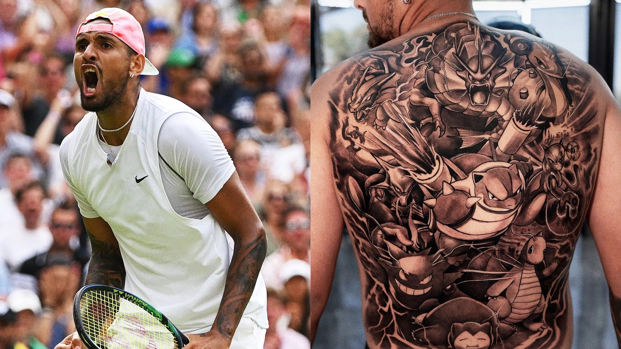
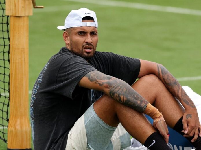
Nick Kyrgios’s tattoos move between two interests he has spoken about often: Pokémon and basketball. His back is covered by a large scene of first-generation characters, while much of one arm is devoted to NBA players and Jordan sneakers. Smaller pieces carry phrases and family references.

The Pokémon piece is the most visible design. Blastoise sits near the center, with characters including Charizard, Gyarados, Gengar, Mewtwo, Lapras, Alakazam, Dragonite and Snorlax around it. Kyrgios has said the games were part of his childhood and that he still plays them.

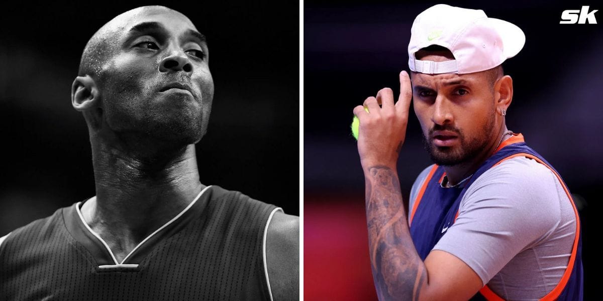
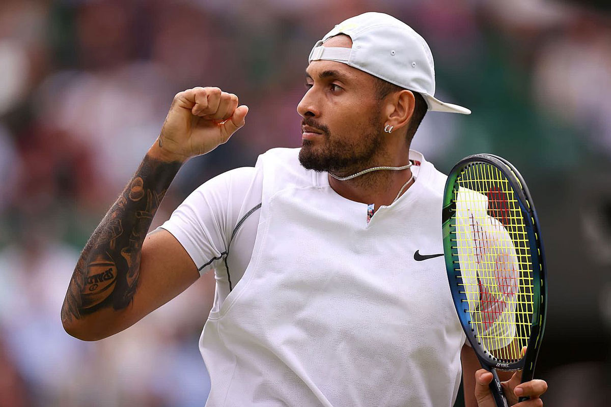
The arm has Kobe Bryant, LeBron James, Michael Jordan’s shoes and the word GOAT. Other visible pieces include “Time is Running Out,” a broken feather, “Inspire Others” and the number 74 for his grandmother. The sections below stick to details that can be identified in public photos or have been reported.

Nick Kyrgios’s Pokémon back tattoo is the centerpiece

Nick Kyrgios tattoos

The full-back tattoo runs from the shoulders toward the lower back. It is mostly black and gray, with Blastoise in the center. Kyrgios has called it his favorite Pokémon. Charizard and Gyarados sit nearby, with Gengar, Mewtwo, Lapras, Alakazam, Dragonite and Snorlax filling out the scene.

The design covers nearly the whole back, but the figures have room to read as separate characters. Dark shading outlines them, and patches of lighter skin keep the image from becoming one flat field.

Kyrgios has said he chose characters from the original generation, the ones many fans recognize from the early games. That choice also left out later favorites such as Venusaur, Lugia, Ampharos and Tyranitar.

The subject is playful, while the tattoo work is detailed. The overall silhouette catches the eye first; closer photos reveal the faces, claws, shells, wings and scales.

The back piece was completed by a full tattoo team

Nick Kyrgios tattoos

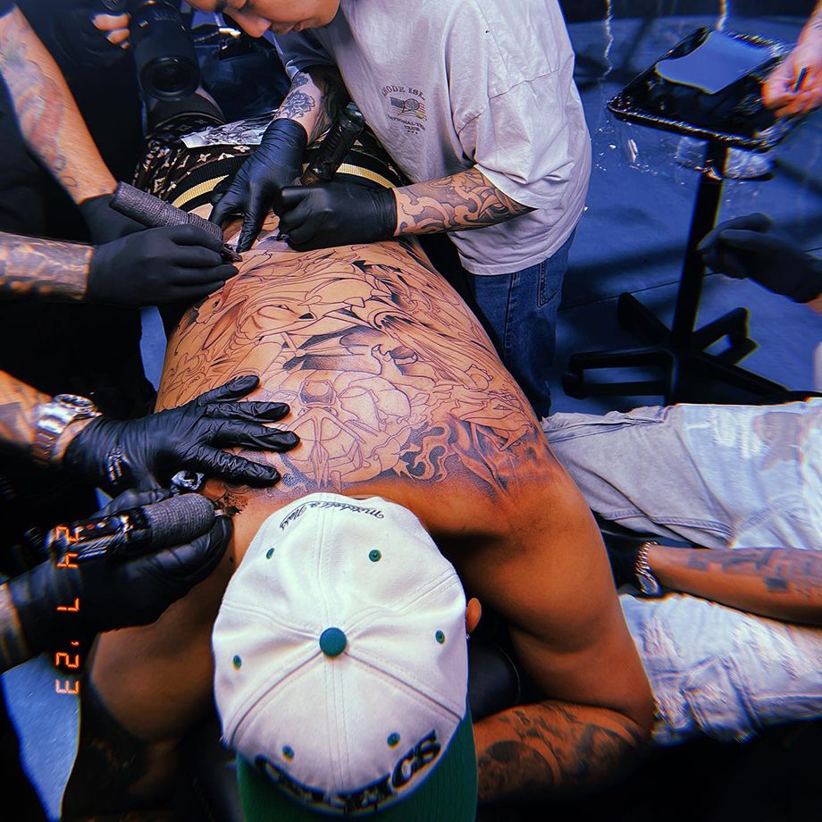
Session photos show several artists working on Kyrgios at once at Ganga Tattoo in Los Angeles. He described it as an intense appointment, with multiple machines on his back. The design had been worked out with his brother and Australian artist Alexi Bouras.

It wasn’t a walk-in decision. Kyrgios had considered a Pokémon tattoo for some time, then asked for a recommendation in Los Angeles. The team had to fit the large group of characters into one back piece.

Reports put the session at around seven and a half hours, though accounts differ slightly. Kyrgios said the first few hours were particularly painful and that his back was shaking. He also had to manage the early healing while flying back to Australia.

The black-and-gray shading gives the separate character areas a consistent look. Even with several artists involved, the finished piece reads as one scene instead of disconnected sections.

His basketball sleeve pays tribute to Kobe and LeBron

Nick Kyrgios tattoos

Kyrgios had already covered much of his arm with basketball references before getting the Pokémon back piece. A Kobe Bryant portrait was added after Bryant’s death. Kyrgios had worn a Lakers jersey in tribute at the Australian Open and later said he wanted Kobe to stay with him forever.

LeBron James appears beside Kobe, and a pair of Air Jordan 1s represents Michael Jordan. The sleeve is a tribute to the players and objects Kyrgios follows, not just one athlete.

The Kobe portrait is visible in match photos, even when his arm is bent or partly covered by a shirt. That placement gives the face enough room to remain recognizable as the arm moves.

Kyrgios has described basketball as his real sporting passion, even though tennis is his profession. The sleeve makes that interest visible on court.

The sleeve mixes portraits, GOAT details, and sneaker imagery

Nick Kyrgios tattoos

In match photos, the sleeve reads as a group of pieces. Kobe and LeBron are the main portraits; the GOAT lettering and Jordan 1 imagery fill out the rest.

The mix keeps the sleeve from feeling too formal. Portraits sit beside a sneaker reference, giving the arm the feel of a fan’s own collection rather than a single formal tribute.

The tattoo grew over time. Small early pieces were joined by larger portraits and filler work, which had to fit around what was already on the arm. That history shows in the way the designs meet.

Court photos show how the images bend with his elbow and disappear beneath a shirt sleeve. A posed picture may reveal more detail, but match photos show how the ink sits in motion.
“Time is Running Out” and the broken feather add a quieter note

Earlier photos show “Time is Running Out” along Kyrgios’s right forearm, with a broken feather above it. Both pieces are smaller than the later portraits and can be hard to spot in newer photos.

The phrase suggests urgency, but Kyrgios hasn’t given one public explanation for every possible meaning. The lettering follows the forearm, and the broken feather sits above it; that’s what the images show.

The feather’s lighter outline contrasts with the heavier portraits and sneaker imagery. Even with newer work around it, that change in shape helps the older tattoo remain distinct.

Distance, motion and stadium light can make the small lettering hard to read. Earlier, clearer photos show the design better than a zoomed-in image from a match.

“Inspire Others” and the number 74 keep the collection personal

Nick Kyrgios tattoos

The words Inspire Others appear on the outside of Kyrgios’s right hand. A small mark and the number 74 are also visible on his fingers. Tennis.com reported that 74 honors his grandmother and refers to her age when she died in 2014.

The hand lettering is direct and easy to read. The number needs the reported context to explain it, which makes it a quieter family reference.

Finger tattoos are hard to capture because hands are always moving, and a tennis grip can hide the placement. Clear public photos show the words and number, but not every small mark can be identified with confidence.

Together, the pieces give the sleeve more than one subject. The basketball portraits show who Kyrgios admires; Pokémon reflects a childhood interest; the number 74 points to family.

The overall vibe of his collection

Kyrgios’s tattoos don’t follow one theme. The back shows Pokémon characters in black and gray; the arm brings together basketball players, lettering, a feather and sneakers. Different pieces sit beside one another without being made to match.

The Pokémon tattoo is large and specific to something Kyrgios has said he enjoys. He has talked about gaming as a way to get through difficult periods and connect with friends, so the design is more than a reference to a childhood game.

The sleeve works the same way. Kobe, LeBron and Jordan are familiar names, but the combination reflects the athletes and objects Kyrgios has mentioned. The smaller phrases and family number make it more personal than a general sports tribute.

If you’re looking for ideas, start with people, games or memories that will still matter years from now. A portrait or character can look good in a photo, but its place in your life is what will keep it meaningful. The strongest designs in Kyrgios’s collection come from interests he has spoken about himself.

The video below shows Kyrgios discussing the back tattoo session and the team that worked on it:

Jesse Lingard Tattoos: Sleeve, Hand Ink and Meanings

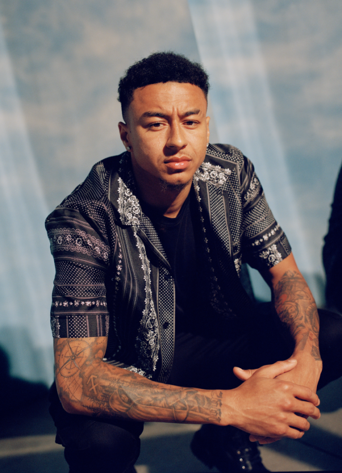
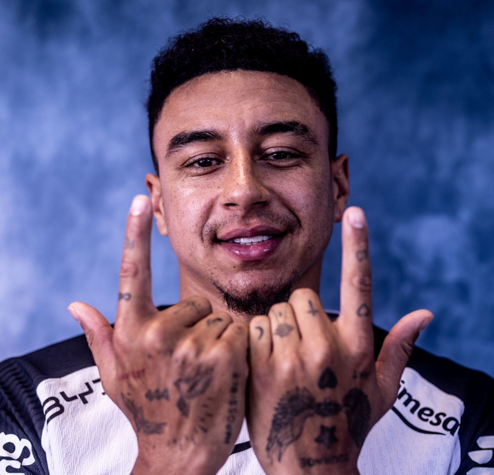
Jesse Lingard’s tattoos cover his arms, hands and wrists in blackwork, script, symbols and short phrases. The collection has grown over time; it isn’t one matching sleeve. In photos, larger shaded designs sit beside small numbers and marks on his fingers.

Some pieces are easy to see across a room. Others only show when he raises his hands or rolls up a sleeve. Lingard has spoken about his mental health and the importance of being himself, so the phrase Be Yourself has a public context beyond its lettering.

This guide sticks to the designs that can be identified in public photos and to details Lingard has shared. Where the meaning isn’t clear, it describes the placement and style instead of guessing.

Jesse Lingard’s arm tattoos build a full sleeve

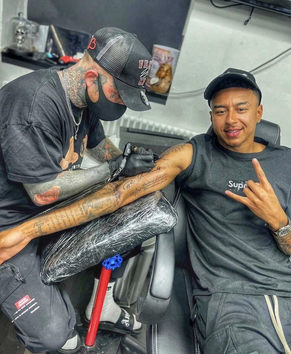
Jesse Lingard tattoos: tattoo studio session showing forearm work

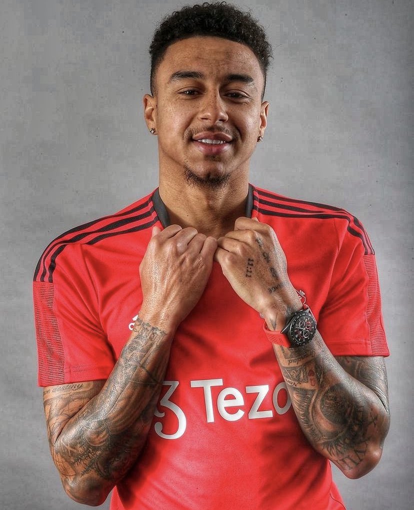
Both arms carry a lot of ink, from the hands and wrists up to the upper arms. Rather than one large picture, the sleeve brings smaller pieces together. The result is busy, but the designs don’t all compete for attention.
Much of the work uses dark outlines and shading, with script, geometric marks, illustrations and symbols mixed in. Open skin breaks up the heavier areas, so the arm doesn’t read as one solid block. The different pieces give the impression of a collection added to over time.

A sleeve can grow around earlier tattoos instead of being planned all at once. New pieces have to fit the existing work, which can give the finished arm a personal record of different moments.

Lingard often wears short sleeves, football shirts and training clothes, so the ink is visible in ordinary photos. Clear shots show the lines following his muscles and shifting when his arms bend.

The forearm designs mix script, shading, and symbols

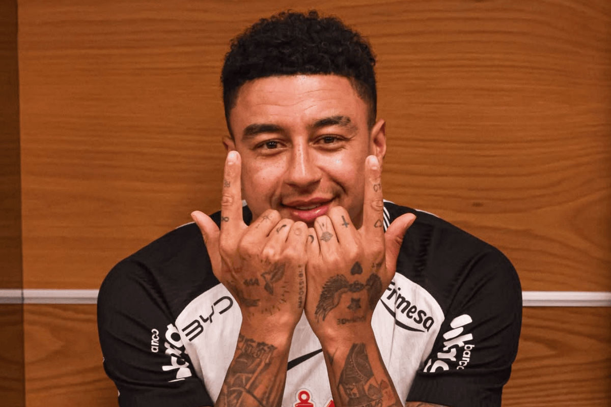
Jesse Lingard tattoos: tattooed hands and wrists in Corinthians introduction

The forearm work mixes lettering with shaded pictures and shapes. Script runs along the arm, while illustrative designs add detail around the elbow and lower forearm.

One well-known addition is Be Yourself, which Lingard showed after having it tattooed on his bicep. He has talked about not feeling like himself during difficult periods in football and about the value of speaking up instead of bottling things away.

The words are a lighter visual break among the darker designs. Script can fit into a narrow space and leave room around it, which helps when the rest of the sleeve has heavy shading.

If you’re considering lettering, choose a phrase that means something to you and give it enough room. Check how it reads with the arm relaxed, bent and turned; the direction of the text changes how it appears to someone else.

His hand and finger tattoos add small personal details

Jesse Lingard tattoos: full arm coverage in a football shirt

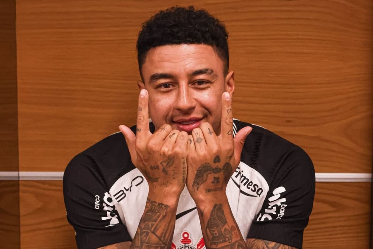
Photos show small marks on Lingard’s fingers and the backs of his hands, including numbers near the knuckles. Hand tattoos are always visible and the skin moves constantly, which can make small details harder to keep crisp.

The short marks and numbers have a different scale from the sleeve. A finger has room for only a few characters, so the idea has to be simple enough to read.

Placement changes how the tattoos show. When Lingard raises his hands toward the camera, they become part of the gesture; when he holds a football shirt, the same marks can seem quieter. The fingers and hands move, fold and turn, so a design looks different from each angle.

Hand and finger tattoos need careful aftercare and may soften sooner than ink on the upper arm. The photos show how visible Lingard’s work is, but similar placements can require touch-ups.

Jesse Lingard’s tattoo session shows how the sleeve grew

Jesse Lingard tattoos: tattooed arms at club presentation

Session photos offer a closer look at Lingard’s arm than finished portraits do. With the arm stretched out, you can see an artist working around the existing ink.

A sleeve takes more than one appointment. New lines have to sit beside healed tattoos, and the artist needs to think about how the arm will look once it moves again. That matters when script, portraits and heavy shading share the same area.

The session appears relaxed: Lingard is talking and smiling while the work is done. The tattoos are part of everyday life, alongside football shirts and personal phrases, rather than a separate performance.

Different angles can also reveal areas hidden by a shirt or missed in a distant match photo. A session image may show the inside arm, wrist or elbow more clearly.

The overall Jesse Lingard tattoo style is bold but personal

Jesse Lingard tattoos: hand tattoos and forearm coverage

Lingard’s collection combines broad arm coverage with smaller phrases and finger marks. The darker sections give the sleeves weight, while the smaller details point to individual experiences.

The tattoos don’t need to share one theme. Script, symbols, shaded illustrations and numbers can sit together when the wearer has a reason for each one. Repeated dark lines give Lingard’s arm work a thread that holds the different pieces together.

Be Yourself is a simple phrase, but Lingard has connected it with his own experience. That context gives the words a different weight than lettering chosen only for its appearance.

If you want a similar feel, start with memories or phrases that will matter after the trend has passed. Then choose a style and placement that suit the idea. Lingard’s collection reads like a timeline on his skin, rather than a set of fashionable images.

Let the sleeve grow with your life, and give the details room to stay meaningful.

More athlete tattoo guides

Jalen Ramsey Tattoos: Faith, Family and His Huge Torso Piece

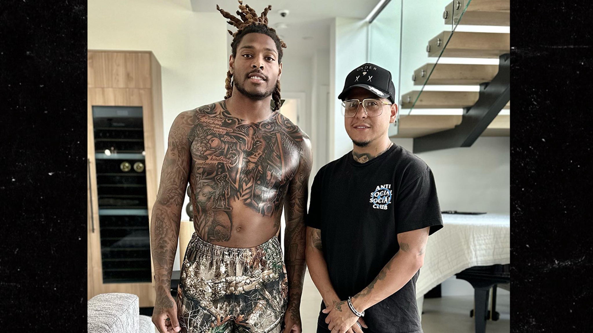
Jalen Ramsey’s tattoos include a large torso mural, dark work across his arms, lettering and personal details. The darker images sit alongside designs tied to his faith and family.

The chest and stomach piece is the best-known tattoo: a scene with religious imagery, animals, a sword, fruit and a warrior-like figure. Other marks are easier to see in close photos than in everyday shots.

Jalen Ramsey’s torso tattoo is built around faith

Jalen Ramsey tattoos: torso tattoo session

The torso piece covers the chest and stomach, with several figures and objects flowing into one scene. Its scale gives it the feel of a mural, and the composition follows the shape of Ramsey’s body.

Ramsey has described the tattoo as a reflection of his faith and his wish to protect the people close to him. The scene includes a Bible, sword, lamb, lion, fruit and a soldier-like figure. The meaning comes from the combination rather than one symbol alone.

A large tattoo across the chest and stomach has to work as the body twists, sits and stretches. Strong outlines and deep contrast help keep the main shapes readable from different angles.

The Bible, sword, lamb, and lion give the chest a story

A wider photo shows how the symbols fit together. The Bible is the spiritual center; the sword brings a harder edge, while the lamb and lion set gentleness beside strength. Together they form a scene rather than a group of unrelated images.

The lion’s face is one of the easiest details to spot. It anchors the lower part of the design, while smaller marks lead the eye through the surrounding shading. For a large tattoo, one or two main subjects can hold the composition together while other details fill the space.

Ramsey has said the piece reflects his relationship with God and his role as a protector of his family. In that context, the sword reads as defense, alongside themes of self-control, faith and responsibility.

The dark imagery gives the tattoo impact, but the animals and religious symbols add more to it than aggression. The scene has a clear center and room for the softer parts of the story.
Words such as Love and peace soften the darker imagery

Jalen Ramsey tattoos: chest lettering and mural

Short phrases and script appear among the larger torso designs. The words are easier to read in close photos and give the chest a different rhythm from the mural and arm work.

Love and peace stand out as brief messages rather than large pictures. They don’t compete with the lion or sword; they sit beside the darker pieces as reminders.

Short lettering needs clear spacing and enough size to stay legible. Ramsey’s tattoos show how a few words can sit within a larger composition without crowding the main images.

The chest combines words and pictures, but the connection is personal rather than exact matching style. The lettering sits alongside the same ideas of faith, peace, protection and family that appear in the larger work.

Ramsey’s arm ink adds portraits and full-sleeve texture

Jalen Ramsey tattoos: tattoo detail and arm coverage

Ramsey’s arms add dense shading, portraits, lettering and smaller symbols. In a training or game-day photo, the ink can read as one sleeve; a close view shows the individual designs within it.

Arm work can be added over time. New pieces have to fit around healed tattoos, and the amount of open skin varies across the arm. That mix keeps the sleeve from looking like one flat panel.

The lines also shift as Ramsey bends his arms. A tattoo can look different when the elbow is bent than when the arm hangs at his side, so photos from more than one angle show more of the layout.

The useful part to borrow is the layering: dark sections give the sleeve its shape, while lighter areas and script keep it readable. The designs share contrast and placement without using the same subject.

Jalen Ramsey’s family tattoos keep the collection grounded

Jalen Ramsey tattoos: arm sleeve and portrait ink

Public reports have noted the names of Ramsey’s daughters, Breelyn and Brooklyn, among floral details on his ribs near his heart. The names add a family reference beside the larger faith-inspired scene.

The torso mural and arm coverage are visually bold; names, flowers and short phrases bring the focus back to family and personal meaning.

The tattoos don’t have to fit one narrow theme. Faith, family and responsibility appear in the imagery and lettering, while the different placements give each area its own role. The torso mural is usually covered by a shirt; the arm pieces show during training and games; the names are more private.

The shading and smaller marks leave transitions between the main subjects. That keeps the composition readable and leaves room if Ramsey decides to add more work.

If you’re drawn to the approach, start with the people or beliefs you want to represent, then find an artist who can work those ideas into a composition. The scale of the torso piece makes a statement; the names and words carry details that matter just as much.
More athlete tattoo guides