
Jesse Lingard tattoos are easy to spot because they run across his arms, hands, and wrists in a mix of bold blackwork, script, symbols, and personal reminders. The English footballer has never treated his ink like a single matching set. It has grown with him, from early pieces and short messages to a fuller sleeve that now gives his arms a strong, instantly recognizable look.
His collection also has a nice balance. One photo can show a large shaded design running down his forearm, while another catches the tiny numbers and marks on his fingers. That contrast makes the tattoos feel lived in rather than overly planned. Some are easy to read from across a room. Others only appear when he raises his hands or rolls up a sleeve.
Lingard has also spoken about the role of identity and mental health in his life, so phrases such as Be Yourself carry extra weight. The safest way to read his tattoos is to start with what is actually visible, then use the details he has shared publicly. This guide focuses on the designs, placements, and overall style that can be seen clearly in public photos.
Jesse Lingard’s arm tattoos build a full sleeve
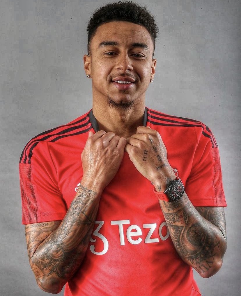
The first thing you notice in Jesse Lingard tattoos is the amount of coverage on both arms. The ink begins around the hands and wrists, continues over the forearms, and keeps moving toward the upper arms. Instead of one giant picture, the sleeve is made from many pieces that sit close together. That gives the collection a busy, layered texture without making every mark compete for attention.
Much of the work uses dark outlines and dense shading. The heavier areas give the sleeve a clear shape when Lingard is photographed on the pitch, while smaller open spaces stop the design from turning into one flat block. There are script sections, geometric marks, shaded illustrations, and smaller symbols. Together they create the look of a collection that has been added to over time.
This kind of sleeve is useful inspiration if you like tattoos that feel personal but do not look too polished. A perfectly matched sleeve can be striking, but a growing collection often has more character. New pieces have to work around old ones, so the final effect becomes a record of changing interests and different moments.
Lingard’s arm work also suits his everyday style. He often wears short sleeves, football shirts, or simple training clothes, so the tattoos remain visible without needing a dramatic pose. On a clear image, you can see how the lines follow the shape of the muscle and how the darker sections hold their form while the arm bends.
The forearm designs mix script, shading, and symbols

A closer look shows that the forearm tattoos are not all trying to say the same thing. Some areas are made from lettering, while others use pictures and shaded shapes. The script gives the arms a more direct, readable quality. The illustrative work adds movement and texture, especially around the elbow and lower forearm.
One of the best-known additions is the phrase Be Yourself, which Lingard showed after getting it placed on his bicep. It is a simple line, but simple does not mean empty. The phrase connects with the way he has talked about feeling unlike himself during difficult periods in football and the importance of opening up instead of bottling everything away.
The visible lettering also gives the sleeve a softer break from the darker artwork. Script can run along the arm in a narrow shape, leaving breathing room around it. That matters when a sleeve already contains a lot of thick shading. A few lighter sections help the eye move through the design rather than stopping at one solid patch of black.
If you are looking at the style for tattoo ideas, pay attention to the balance rather than copying the exact words. Script works best when the phrase is genuinely yours and the placement gives it room to age. On an arm, the direction of the letters matters too. A good artist will consider how the words look when the arm is relaxed, bent, and turned toward another person.
His hand and finger tattoos add small personal details
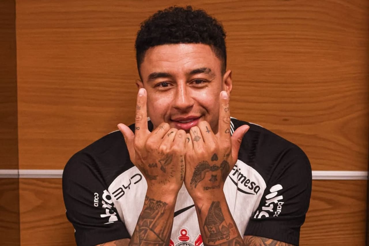
Lingard’s hands carry some of the smallest and most noticeable details in the collection. Photos show marks on the fingers, numbers near the knuckles, and little symbols spread across the backs of his hands. These pieces can look simple at first, but hand tattoos are hard to hide and even harder to keep looking crisp because the skin moves so much.
The small numbers and short marks have a different feeling from the larger sleeve. They read like private reminders that happen to be visible. A finger can hold only a few characters, so the design has to be edited down to its most useful form. That is why tiny tattoos often feel more personal than a large decorative image.
Hand placement also changes the mood of a tattoo. When Lingard raises both hands toward the camera, the ink becomes part of the expression. When he is wearing a football shirt and holding the collar, the same pieces look more relaxed. This is a good example of how the body changes the design. A tattoo is not a sticker placed on a blank surface. It moves, folds, and appears differently from every angle.
The practical side is worth remembering. Finger and hand tattoos usually need careful aftercare, and some details may soften faster than ink on the upper arm. Lingard’s photos show a collection built for visibility, but anyone considering similar work should choose an experienced artist and be realistic about touch-ups.
Jesse Lingard’s tattoo session shows how the sleeve grew
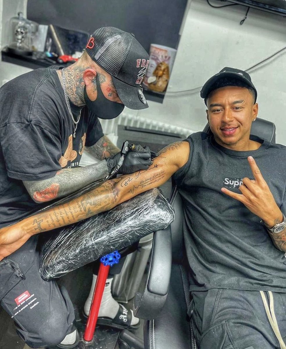
One of the clearest ways to understand Jesse Lingard tattoos is to look at a session photo rather than only finished portraits. During a tattoo appointment, the arm is stretched out and the existing work is easier to study. You can see the artist working through the lines while Lingard sits comfortably and keeps the mood casual.
The session image makes the scale of the arm work obvious. A sleeve is not just one appointment and one design. It takes planning, spacing, and patience. The artist has to think about where new lines will sit beside healed ink and how the arm will look once it is back in normal movement. That is especially important when script, portraits, and heavy shading all appear in the same area.
There is also a relaxed quality to the scene. Lingard is not presenting the tattoo as a grand performance. He is sitting in a studio, talking and smiling while the work is done. That fits the overall feel of his collection. The pieces are important, but they are also part of everyday life, the same way football shirts, family memories, and personal phrases become part of a person’s routine.
A session photo can also show details that disappear in a finished outfit. The artist may be working around the inner arm, the wrist, or the area near the elbow. Those are places that can be hidden by a sleeve or lost in a distant match image. Looking at different angles gives a fuller sense of how the designs connect.
The overall Jesse Lingard tattoo style is bold but personal
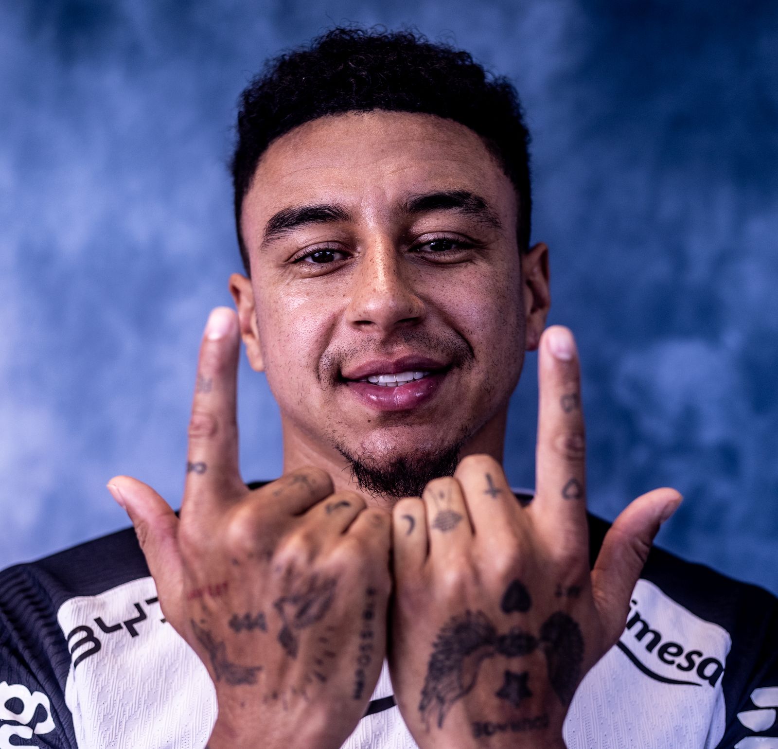
The overall style of Jesse Lingard tattoos is a mix of bold coverage and smaller reminders. The arm pieces give him the strong visual impact of a sleeve, while the words and finger marks keep the collection tied to his own experiences. That combination is what makes the ink feel recognizably his instead of like a random set of popular designs. The boldest sections sit beside quieter details, so the eye keeps finding something new.
There is no need to force every tattoo into one theme. A collection can include script, symbols, shaded pictures, numbers, and phrases as long as the wearer has a reason to keep each piece. Lingard’s ink shows how that can work. The visual language changes from the hand to the wrist and from the forearm to the upper arm, but the full effect remains cohesive because the darker lines and repeated blackwork create a common thread.
The personal side matters just as much as the artwork. Be Yourself is not a complicated design, yet it stands out because the message connects with a real part of Lingard’s story. That is a useful lesson for anyone planning a tattoo. A short phrase can stay meaningful for years when it reflects something you have actually lived through.
If you want a similar feel, start with the memories and words that still matter when the trend has passed. Then choose the placement and style around that idea. You might prefer fine script, traditional shading, or a cleaner blackwork approach. The important part is making the design belong to you. Lingard’s collection works because it feels like a timeline on skin, not a shopping list of fashionable images.
The best takeaway from Lingard’s ink is simple: let a sleeve grow with your life, keep the details meaningful, and leave enough space for the next chapter.