Athletes

David Raum Tattoos: Living the Dream, 86 Hand Ink and More

David Raum’s tattoos come into view in goal celebrations and close-up photos. The German footballer’s collection includes handwritten phrases, bold numbers, religious images, small marks near his face, and dense black-and-grey work on his arms. The pieces seem to have accumulated over time rather than being planned all at once.

The chest lettering is the most obvious place to start, but his 86 hand tattoo and layered neck work stand out too. He has smaller details near his face and throat, along with larger pieces across both arms. Raum has explained some of the designs publicly; for others, it’s better to stick to what the photos show.

The Living the dream chest tattoo marks David Raum’s rise
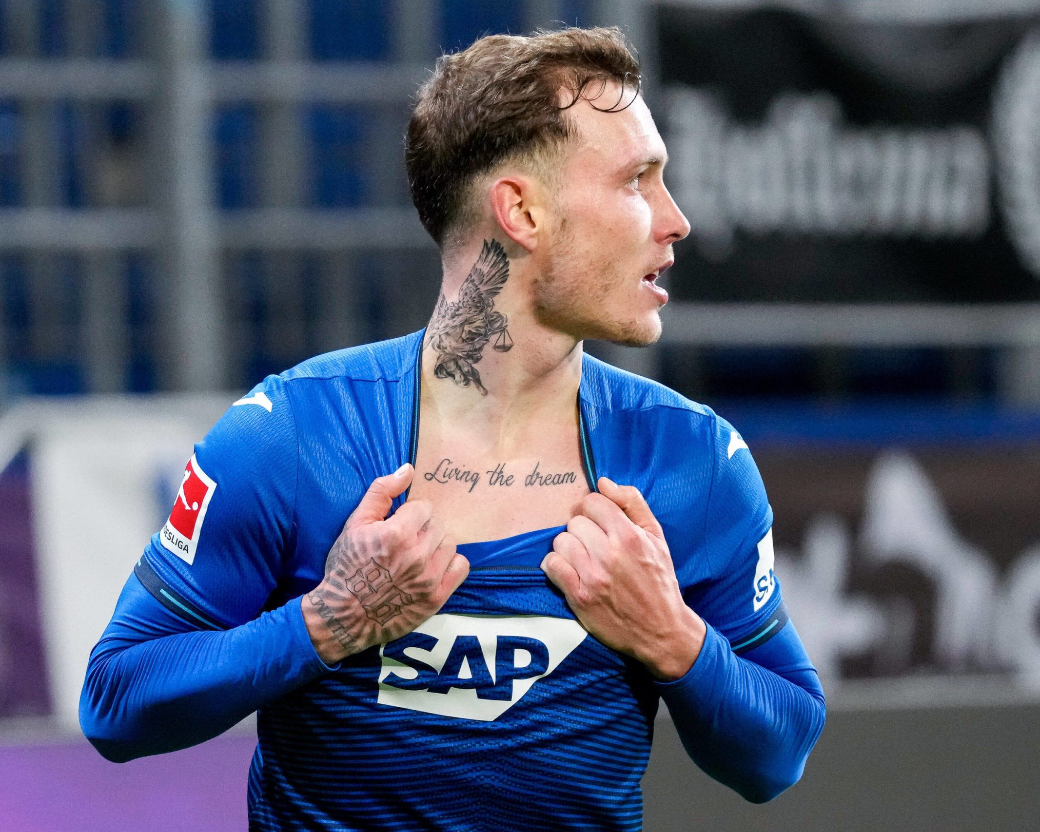
David Raum tattoos: Living the dream chest script during a goal celebration

The words Living the dream sit across Raum’s upper chest in loose handwriting. They’re easy to see when his jersey collar drops, but the script still feels personal rather than billboard-sized. In the photo above, he has his shirt open after scoring, with the words in the middle of the celebration. That’s the tattoo many people associate with him.

Raum has connected the phrase with playing at the highest level and pursuing Champions League nights. It’s a direct statement, without a long quote or symbol to decode. The lowercase script looks handwritten, which suits a career that took him from youth football in Nuremberg to the Bundesliga and Germany’s senior team.

The scale is useful if you’re considering chest lettering. A short phrase can get lost if the letters are too small or crowded. Raum’s words have space between them and follow a clean line, while the slight variation in the script keeps it from looking like a typeface. The design also leaves room by the collarbones and can sit under a shirt.

The chest script is the most readable piece in the collection, but it isn’t the darkest. The neck and arm work give it a stronger frame, and the contrast between plain lettering and detailed blackwork keeps the chest from looking flat. A simple phrase can work well when its placement and lettering have been thought through.

The 86 hand tattoo makes the collection impossible to miss
David Raum tattoos: Bold 86 hand tattoo with smaller finger lettering

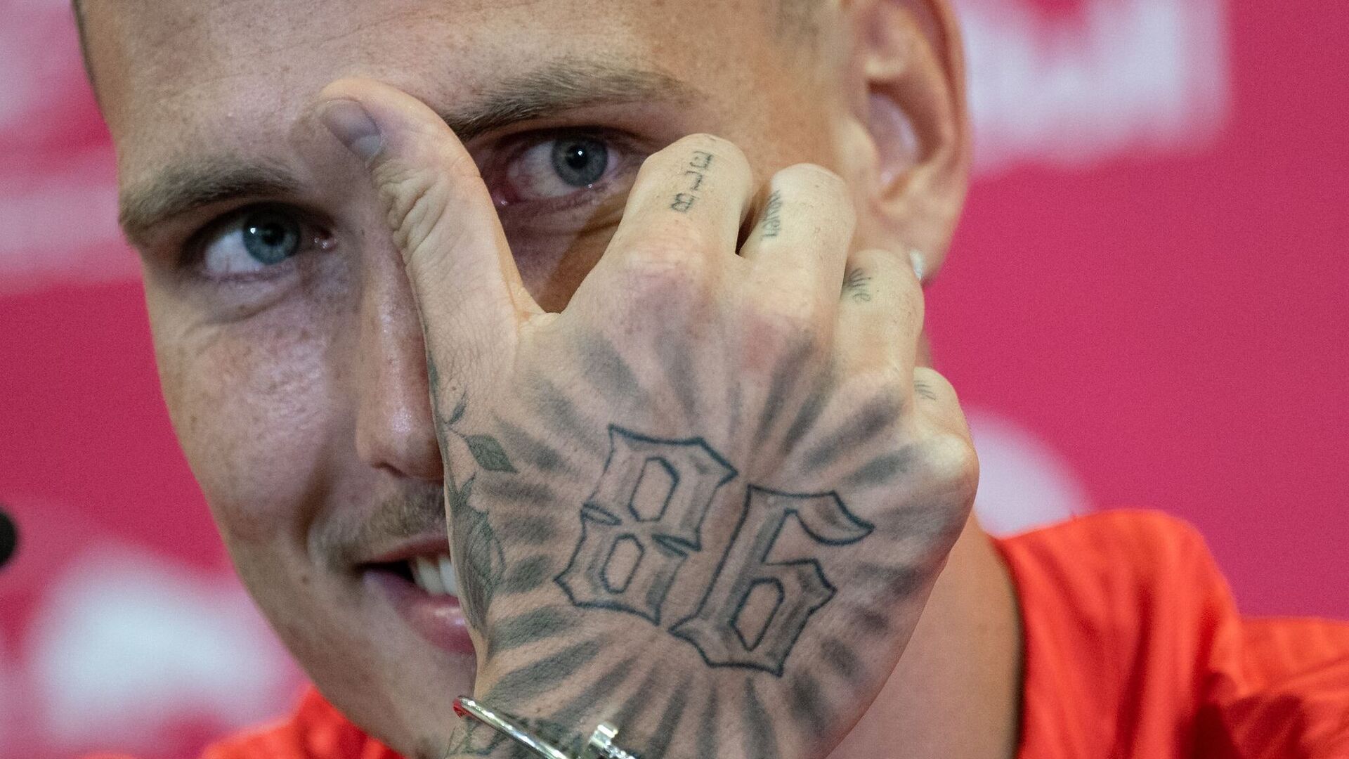
The number 86 is inked across the back of Raum’s right hand in large outlined figures. In close-up, the digits look angular, with radiating black lines around them. The design works like a small badge and gives his hand a focal point in match photos.

Public explanations have linked the number to Raum’s old phone area code and hometown. That connects the tattoo to where he came from rather than to a shirt number or a lucky number. The meaning is personal, but the design doesn’t hide from view.

Hand tattoos get washed, moved, and exposed to sunlight, so their lines are easy to see change over time. Raum’s 86 has a bold outline, and open spaces inside the digits help them stay distinct. The 86 hand tattoo doesn’t depend on small shading details to read.

There is smaller lettering on his fingers too, though it can be hard to make out in action photos. The 86 does the heavy lifting; the finer marks make the hand feel like part of a collection built over time rather than one flash design.

The tattoo also changes with his hand. Relaxed, you can see the full outline; clenched, the numbers break into sharp sections. That movement gives the same design a different look in different football photos.

The neck bird and archangel set the tone
David Raum tattoos: Neck bird, archangel and script details in a match close-up

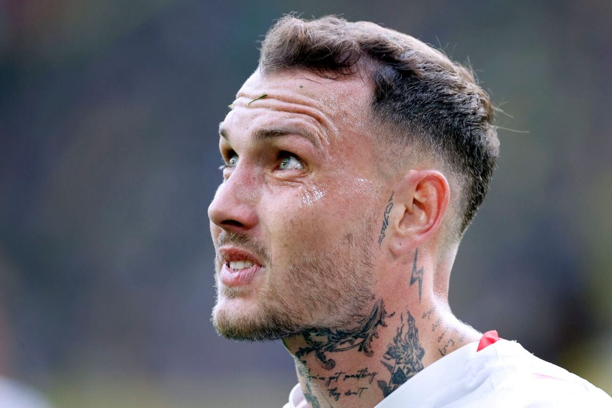
Raum’s neck has religious and ornamental designs, including a winged figure, a bird, scales, and script beneath his jaw. A tattoo artist who has worked with him has described an archangel as one of the earlier pieces. In close-up, the surrounding black-and-grey work looks layered around the images rather than built around one isolated symbol.

The bird and wing shapes follow the line from his ear toward the collar. Dark shading near the jaw gives the work a strong edge, while lighter lines keep it from reading as a single block of black. The placement is designed to move when Raum turns his head.

Religious imagery means different things to different people. The archangel has a protective, old-school look, but Raum hasn’t publicly explained every detail. In the photos, the whole arrangement feels serious and watchful without relying on a single symbol to tell the story.

The neck work changes the way every other tattoo reads. It is visible above a shirt or football kit, and a small turn of the head brings another part of the design into view. Anyone considering a neck piece should think about the whole side of the neck, rather than adding one small symbol and hoping it connects later.

Small face and throat tattoos change the look of the portrait
David Raum tattoos: Face-visible portrait showing neck and forearm tattoo coverage

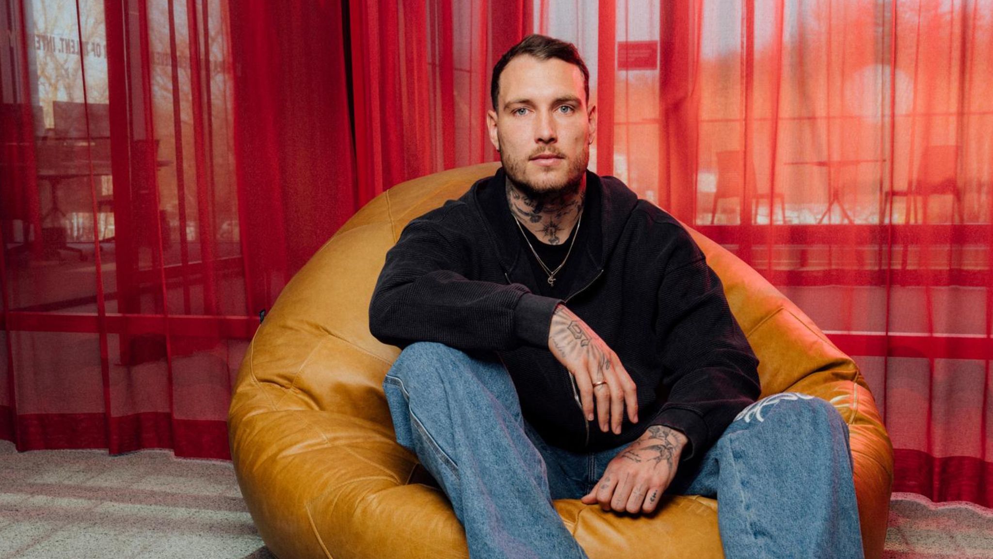
In side photos, smaller marks near Raum’s face become easier to see. The close-up shows a slim design beside his ear, a lightning-shaped mark lower on the neck, and more script around his throat. None covers his face, but together they make the profile distinctive.

Face tattoos need restraint. The lines have to fit around the ear, cheek, and jaw without crowding them. Raum’s side detail follows the angle of the ear; the lightning shape below leads toward the larger neck piece. The spacing helps keep the profile clear.

The throat script sits between heavier images, almost like a note in the gaps. Public tattoo coverage has also mentioned a candle below his throat, though it’s not clear in every photograph. A single photo doesn’t always show every part of a tattoo.

Small details can carry the mood of a portrait even when they aren’t the first thing you see. Raum’s marks sharpen his profile without taking over the face; they act as small points around the larger neck design.

If you like the look but don’t want a full face tattoo, a small design near the ear, behind the jaw, or at the side of the neck can show in profile without becoming the only thing people notice. Leave space around it and consider how its linework will sit beside existing tattoos.

His arms and legs turn career moments into a growing collection
David Raum tattoos: Germany portrait showing layered forearm and neck tattoos

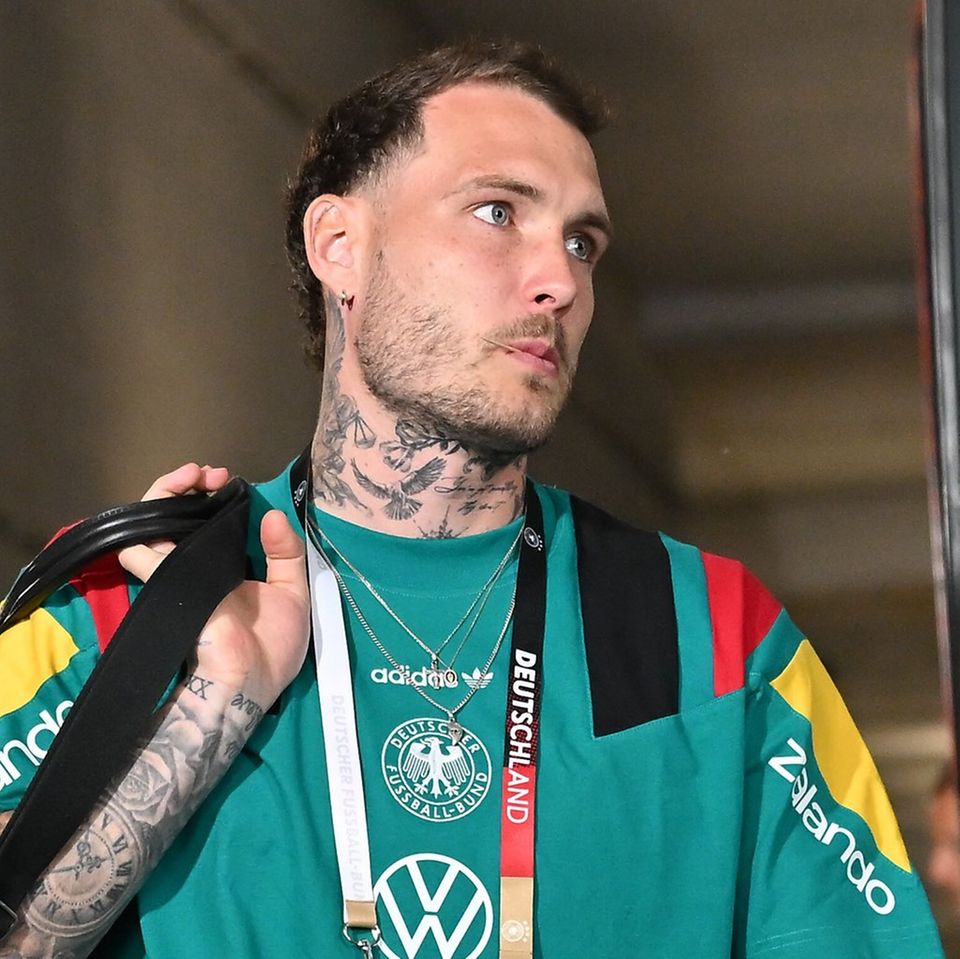
Raum’s arms carry the densest coverage. In the portrait above, both forearms show black-and-grey designs, including faces, clocks, lettering, geometric marks, and smaller symbols. The pieces come close together, though the arm doesn’t read as one uniform sleeve from every angle.

The 86 on his right hand connects with the surrounding arm work. On the other forearm, larger shaded images sit beside narrow script that shows when he rolls up a sleeve. There are strong focal pieces, then smaller details for a closer look.

Some tattoos have been linked publicly to career or personal moments; others sit under sleeves or turn away from the camera. It would be guesswork to assign a story to every mark. The visible collection isn’t limited to one theme: it includes a hometown number, a chest phrase, religious imagery, and black-and-grey designs.

The arm tattoos make the collection feel unfinished in a good way. There are open patches, different levels of shading, and room for later additions. A sleeve can take shape over several sessions, with each piece tied to a move, season, or personal decision.

The plain chest script sits against more detailed neck and arm work, while the hand adds a graphic number. Together, those choices give Raum’s tattoos a visual language without making them look matched.

If you’re collecting ideas, pay attention to placement and pacing. Give a short phrase room, use a clear outline where the tattoo will be busy, and plan the open skin between pieces. Each area here has its own focal point, but none feels entirely separate from the others.

Raum’s collection may change as his career continues. In public photos, the chest phrase, 86 hand tattoo, neck imagery, face details, and layered arms define the look. They’re useful references if you like football-related tattoos, personal lettering, bold numbers, and darker illustrative work.
Wanderlei Silva Tattoos: Faith, Forearm Script and Fight-Team Ink

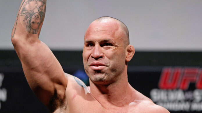
Wanderlei Silva’s tattoos are easy to spot in old fight photos. They cover his shoulders, forearms, wrists, and hands. Portuguese faith phrases run down his arms, and shoulder symbols connect him to the Wand Fight Team and to the identity he built during his Pride and UFC years.

That mix makes Wanderlei Silva tattoos a useful reference if you like meaningful lettering. The collection includes short phrases, compact symbols, and longer lines that follow the arm. The pieces weren’t all done at once. Some still look crisp; others have softened over years of training, bright arena lights, and everyday wear.

This guide looks at the designs Silva has explained and the details visible in photos. Where a meaning isn’t well documented, it stays with placement, lettering, and how the pieces work together.

Deus é Fiel on the shoulder: Wanderlei’s faith tattoo

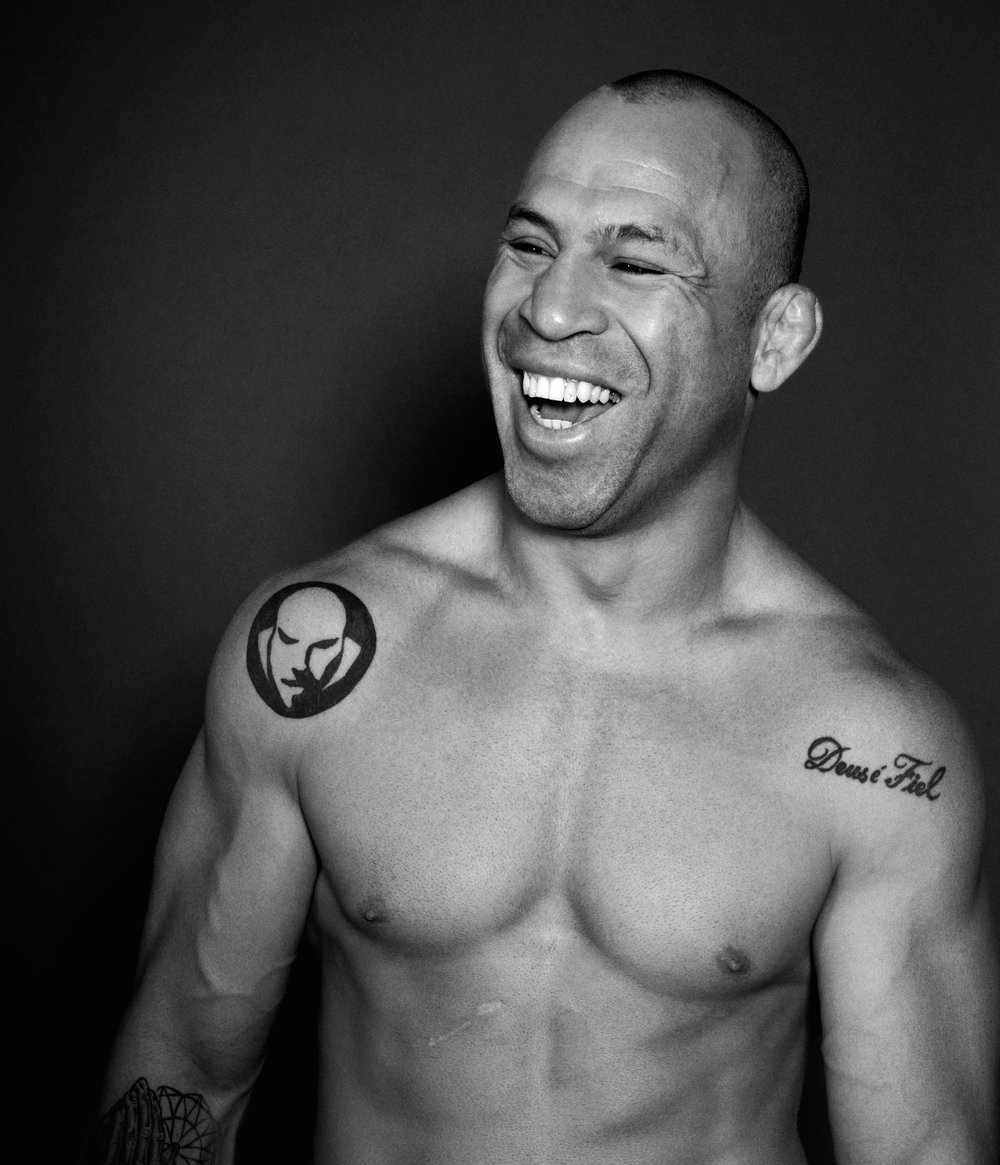
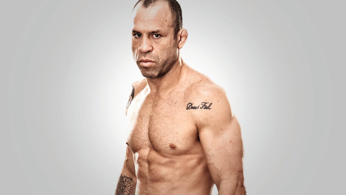
Wanderlei Silva tattoos: Deus é Fiel shoulder tattoo in a clean shirtless portrait

The phrase Deus é Fiel—“God is faithful”—sits across Silva’s shoulder in rounded black script. It follows the curve of the shoulder instead of running straight down the arm, so it stays readable when he turns or raises his hands. The tattoo is easy to see in photos of him without a shirt.

The lettering is simple. There is no banner or frame around it, and the open skin gives the words space. If you’re considering a faith tattoo, a short phrase doesn’t need heavy decoration. A clear line, a comfortable size, and placement that follows the body can be enough.

Script needs room to breathe. The letters aren’t squeezed into a narrow strip, and the dark outline shows in older photos as well as newer ones. That spacing gives the curves a better chance of staying distinct as the tattoo ages.

Silva is known for the “Axe Murderer” nickname and an aggressive fighting style, but this phrase brings a calmer note to the collection. It points to faith and gratitude. It feels like a personal tattoo rather than something chosen to match an image for the camera.

One More Day: the forearm script that reads like a daily promise

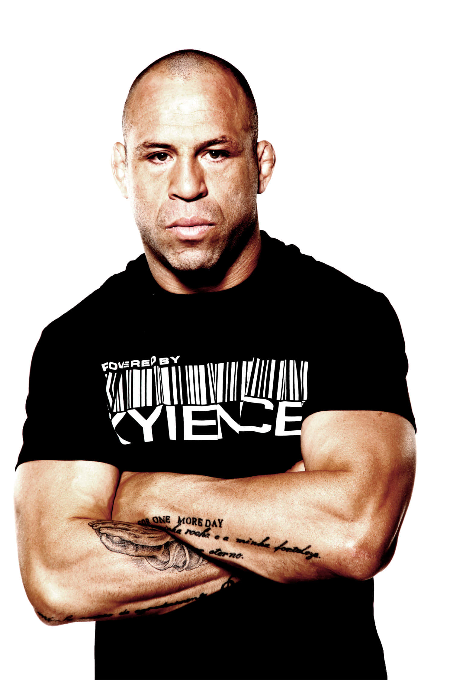
Wanderlei Silva tattoos: One More Day forearm script shown clearly across folded arms

Silva’s forearm carries a long script passage built around “One More Day.” The phrase sits among longer lines, so the tattoo reads more like a short passage than a slogan built around One More Day. When his arms are folded, it faces the camera; when he raises his fists, the writing wraps around the arm.

This uses the length of the forearm without turning the whole area into a block of black ink. The handwriting follows the arm rather than sitting inside a rigid rectangle. For long script, decide where the words should begin and how they’ll read when the arm is bent.

“One More Day” suits the daily demands of fighting: another training camp, another round, another hard day. It comes across as a reminder to keep going, without promising that things will be easy.

If you’re drawn to long script, take the placement and scale as a starting point and choose words that matter in your own life. Long quotes often need editing. An artist can help with line breaks and spacing so the words stay legible after healing. Silva’s passage works because the phrasing has a reason to be there.

Portuguese prayer lettering across both arms

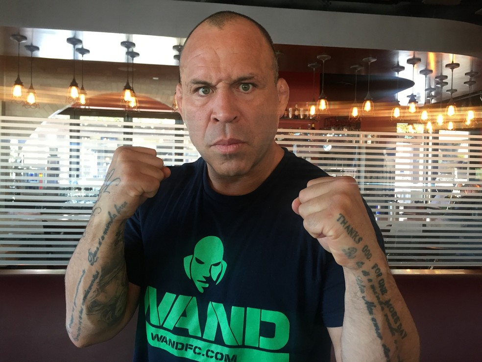
Wanderlei Silva tattoos: Portuguese prayer lettering visible on both forearms in a fighting pose

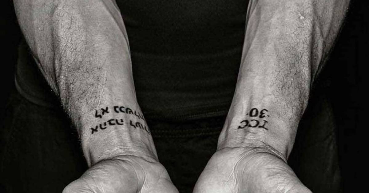
Silva’s forearms carry several Portuguese phrases about prayer, gratitude, and strength. One is commonly described as “Pai, és a minha rocha e a minha fortaleza”, followed by words about eternal love. Another reads like a prayer asking to be taught God’s commandments. Together, the lines form long paths down and across the arms.

The writing takes up space without making the forearms look solid. It follows their length and changes as Silva turns his hands. A phrase that appears straight on a stencil can shift with the arm, so the layout needs to account for movement.

Portuguese connects the tattoos to Silva’s Brazilian background, family, and faith. Translating the phrases might make them easier for more people to read, but the original language carries its own voice and history. If you want a tattoo in another language, check every word, accent, and translation with a fluent speaker.

The lettering styles aren’t identical, but they share a devotional mood. Family, faith, or resilience can connect tattoos with different shapes and sizes more naturally than making every piece match.

Wand Fight Team symbols and the shoulder identity mark

Wanderlei Silva tattoos: Wand Fight Team shoulder symbol beside the Deus é Fiel script

Silva’s shoulder tattoos also include symbols linked to the Wand Fight Team, the gym and training identity he developed after becoming a well-known MMA veteran. A circular, face-like mark appears beside the script in photos. It gives the upper body a focal point among the lines of writing on his arms.

A team tattoo can mean more than the logo. For Silva, the gym represented a place, a circle of coaches, and part of his life outside the cage. If you’re considering a team design, think about what will still matter if the name changes. A symbol for shared work or a place may outlast a logo from one season.

The shoulder is visible in a tank top and easy to cover with a shirt. Its rounded surface suits a bold shape, and open skin can keep the image clear. Beside the script, it creates a contrast between words and graphic forms.

Not every tattoo needs the same style. A round symbol can break up a run of lettering; a small dark mark can give a larger phrase somewhere to rest. The collection feels more balanced when the designs take turns catching the eye.

Layered arm artwork: symbols, script, and the lived-in finish

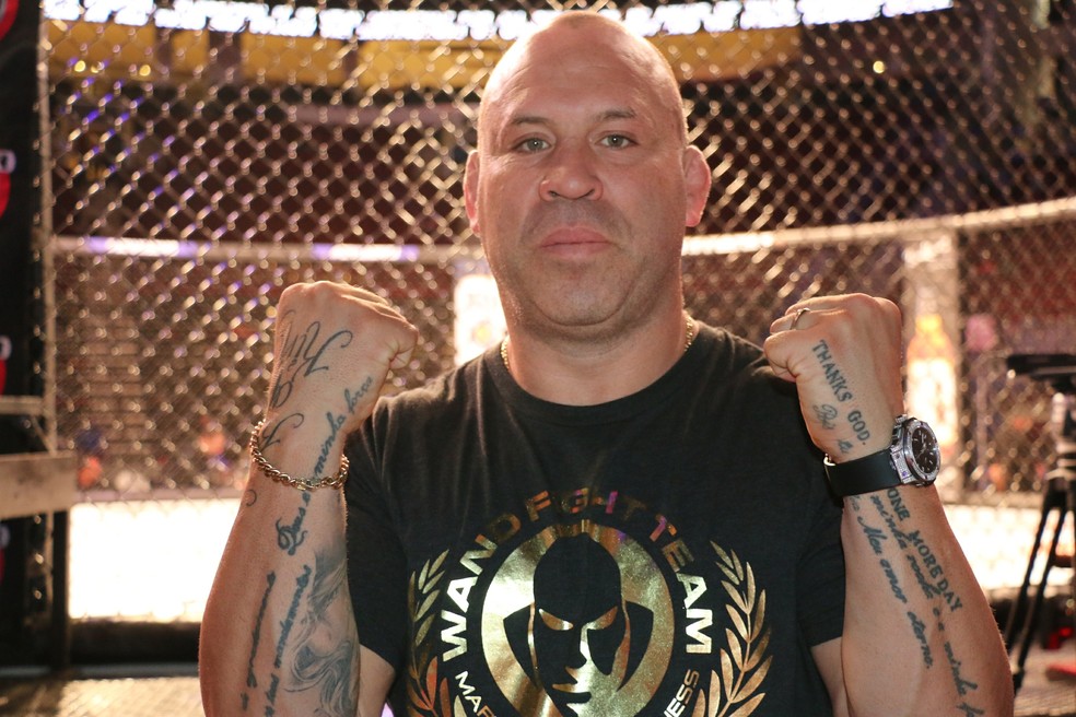
Wanderlei Silva tattoos: Layered arm lettering and symbols shown clearly at a fight event

The wider photos show how Silva’s arms have filled in over time. There are lines of text, small symbols, and larger images higher up. The collection doesn’t look like one planned sleeve. It reads like different moments: a phrase tied to faith, a team mark, and words about the mindset of fighting.

You don’t have to fill an arm all at once. Start with the piece that matters most, then add around it when a new idea earns a place. Tattoos can feel connected through their stories even if the line weight or style varies.

The age of the ink is part of what you see in these photos. Some edges have softened, while the strongest words remain clear. Sun, sweat, training, and time change tattoos. Placement and a skilled artist can help them age well, but a fresh studio image isn’t the whole story.

Silva’s collection doesn’t need a complicated explanation to feel meaningful. The words are direct, and the symbols are simple. The reason he chose them, and when they entered his life, gives them context.

His tattoos bring together faith, language, family, team pride, and a fighter’s persistence. If you want something in that vein, choose words that will still matter to you later, give the script room, and let the placement support the design. Avoid copying the exact phrase or symbol; adapt the idea to your own life.

Take your time with lettering. Ask your artist to show healed work, check foreign-language text with a fluent speaker, and look at the stencil with your arm relaxed and bent. Silva’s collection looks like it belongs to him. Your tattoo should feel that way too.

Ilia Topuria Tattoos: Winged Cross, Crowned T and Tiger Chest Ink

Ilia Topuria’s tattoos tell several stories. His chest combines a crowned T, animal faces, and a split portrait. A winged cross sits on his back above a long central design, while his arm has darker cover-up work and lettering. Together, the tattoos touch on faith, family, identity, and confidence.

Each area has a different role. The chest has a clear centre and room around the animals; the back is taller and more vertical; the sleeve is denser, with script and details that show up at close range. There is no single template to copy here. The useful idea is how the designs are fitted to each area.

This guide looks at the best-known pieces and the design choices visible in photos.

The winged cross makes the upper back the first big statement

Ilia Topuria tattoos: winged cross and back tattoo

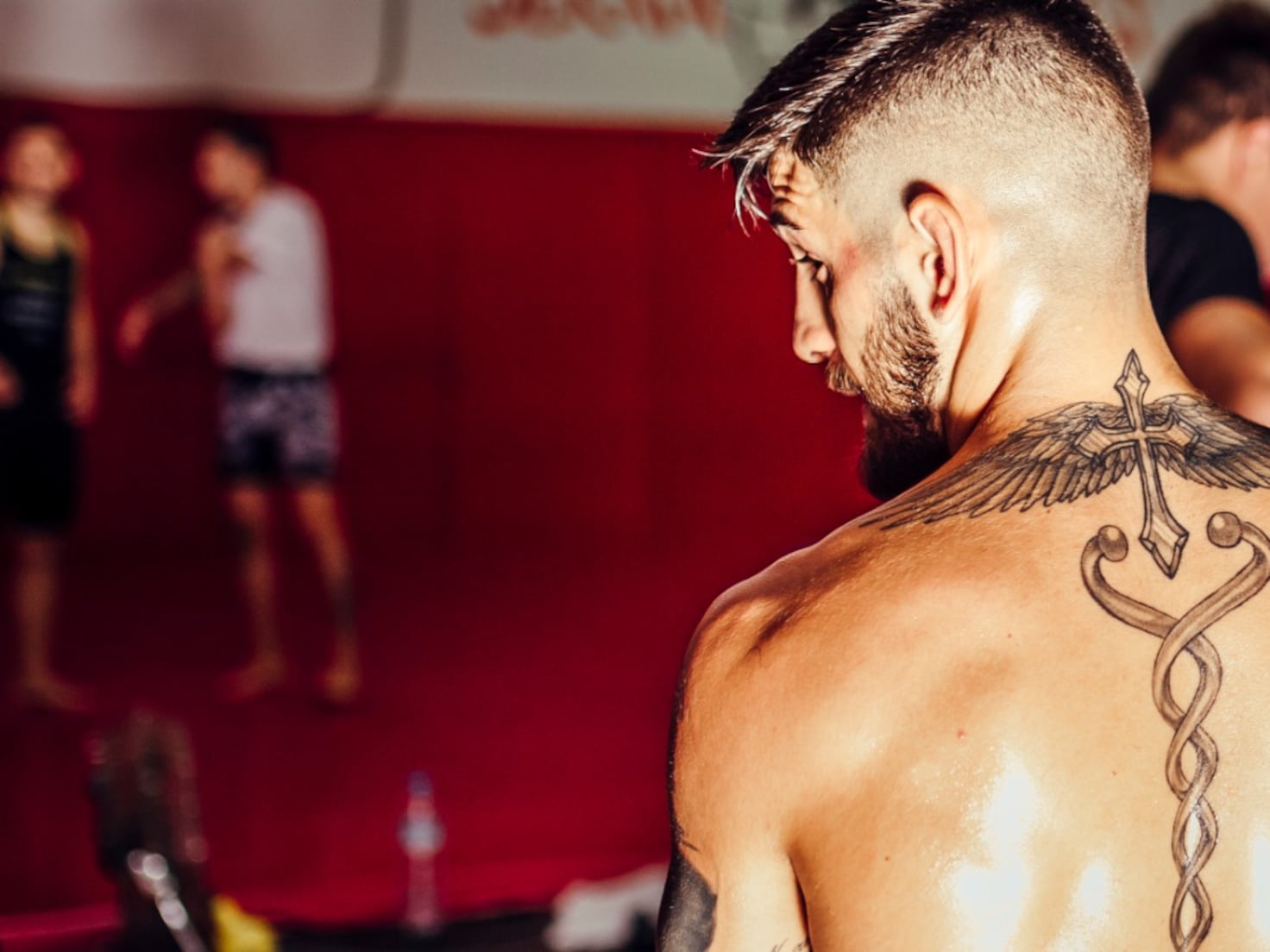
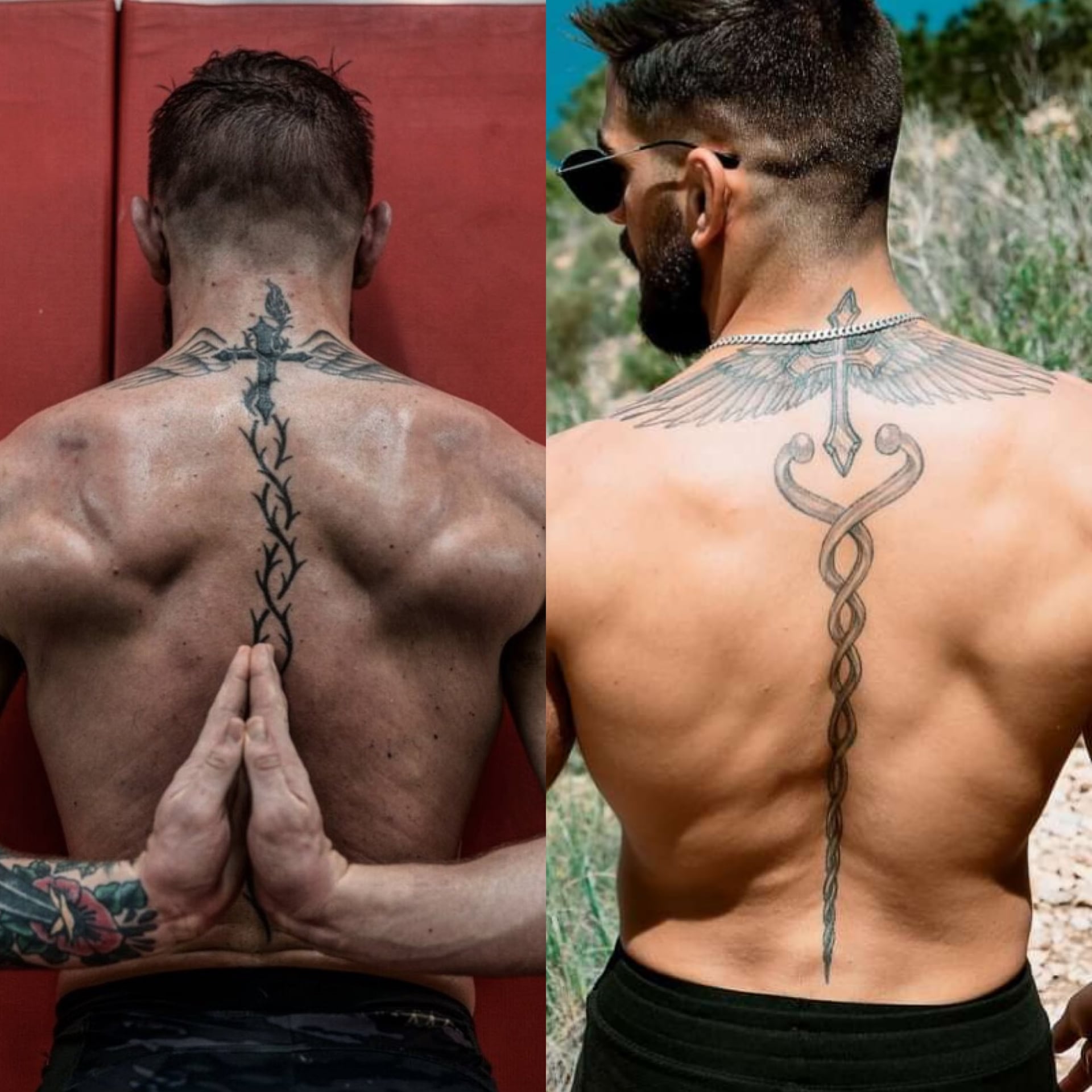
From behind, the upper-back tattoo gives Topuria’s collection its strongest outline. Wings spread over his shoulders, with a cross near the neck and a long, twisting design running down the spine. The wings make a horizontal shape; the centre gives the eye a line to follow downward.

The back is wide, so a piece can end up looking like several unrelated images without a clear focal point. Here, the cross ties the shoulders together, and the lower design carries the composition toward the middle of the back instead of stopping between the shoulder blades.

The black-and-grey work leaves small breaks of skin between the feathers and central line. The wing tips are fine, while the centre has stronger edges. Those changes in line weight give the tattoo depth without colour.

A meaningful symbol does not need to be huge to feel important, but it does need clean placement. The cross is easy to see, with smaller details around it rather than crowded inside it.

If you’re planning wings across your back, consider how the shoulder blades and spine move before settling on the drawing. A tattooist can design with those lines, so the piece still sits well when you stand, bend, or turn—not only when you’re posing.

The spine design adds a long, clean line through the back

Ilia Topuria tattoos: spine tattoo design

Below the cross, a long design runs down the centre of Topuria’s back. Its narrow middle and curved sections that open then return toward the spine make the whole piece feel longer than a single symbol between the shoulders.

Spine tattoos show even small shifts in a line. Topuria’s design follows one central route, with decorative sections to either side. The lower part has room to finish rather than being squeezed into the waist.

The ornamental lines match the cross above them through thin black outlines, light grey shading, and a vertical direction. If separate tattoos are being added in stages, repeating one or two of those choices can help them relate.

The centre line gives the tattoo scale while leaving skin open around it. Negative space is doing real work in this design. Too much shading could bury the clean shape that makes it read.

Decide whether a spine piece is the main image or a connector between larger tattoos. If it’s the main subject, keep nearby details quiet; if it’s a connector, make sure its ends lead into the other designs. That planning helps it feel intentional, not like a strip between separate pictures.

The crowned T gives the chest a clear centre

Ilia Topuria tattoos: crowned T chest emblem

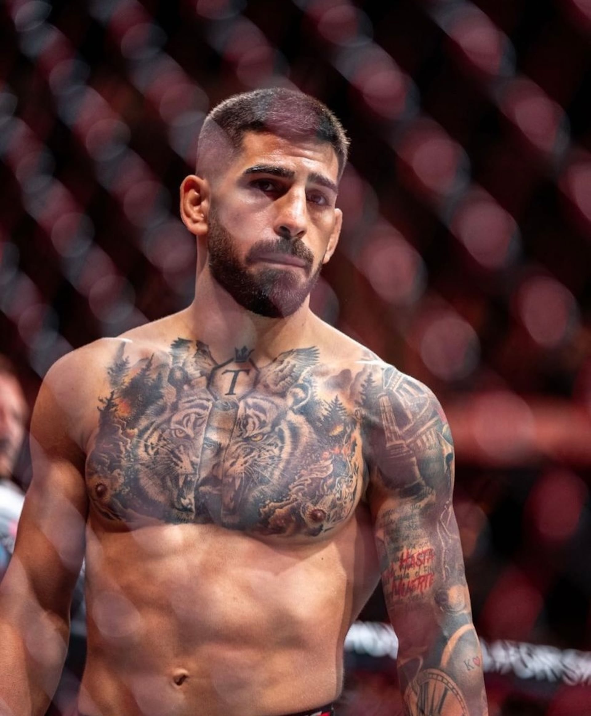
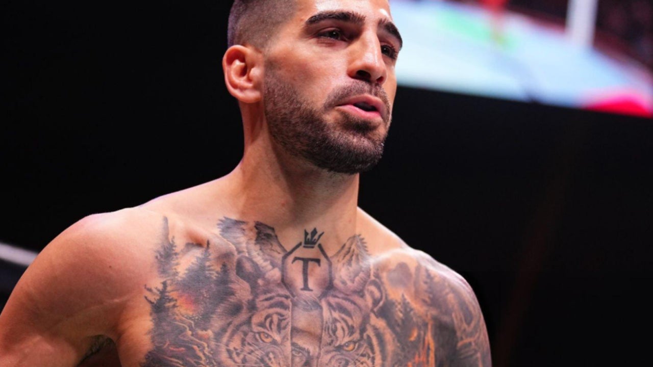
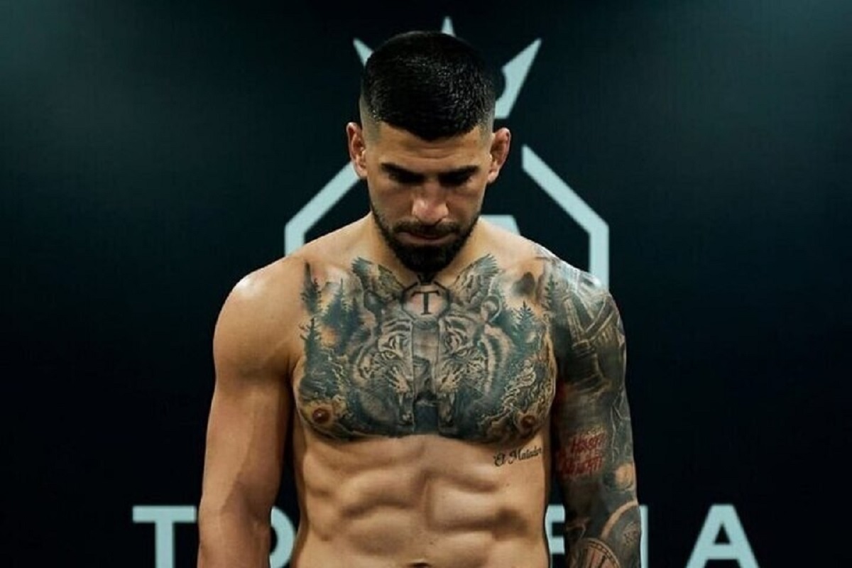
Near Topuria’s collarbone, a crowned T sits inside an octagon-like outline. The letter is tied to his surname and public identity, and it also anchors the larger chest composition.

Trees, animal faces, and shaded forms surround the emblem and lead toward the shoulders. The small crown lifts the design; the simple letter remains readable when the chest is photographed at an angle. A complicated logo can be hard to make out on a moving part of the body.

The chest’s centre line gives the composition a starting point, but the rest doesn’t have to be symmetrical. Different details on each side keep Topuria’s tattoo from looking like a mirror image. The repeated eyes and dark forest shapes bring rhythm to the two halves.

Chest lettering and logos need to be checked on the body. Muscles move, skin stretches, and the collarbone changes direction. Photograph the stencil from straight on before the needle starts. A design that looks centred on paper can shift when it wraps around the chest.

The crowned T shows how an initial or family mark can work as body art. You could use a circle, shield, open frame, or negative space around your own letter. The important parts are why it’s there and enough room for it to stay clear.

The tiger and wolf imagery turns the chest into a full scene

Ilia Topuria tattoos: tiger and wolf chest tattoo

Around the crowned T, Topuria’s chest carries black-and-grey wildlife imagery. Tigers and wolf-like faces sit among trees, shadows, and textured fur. The animals add force to the scene and give the artist shapes to work around the centre emblem.

The eyes catch your attention first. They need to stay sharp while fur and forest recede into softer shading. Darker areas near the ribs and shoulders help the eyes and letter stand out without turning the chest into one flat patch of black.

A split-face detail gives the scene another layer: one side reads as an animal, while another suggests a bearded human face. Whether you take it as a portrait or a blended symbol, it makes the chest feel more individual than a stock wildlife design.

If you’re planning a large chest piece, decide which part should lead. Keep contrast around the eyes if they’re central; don’t bury a letter in shading if that’s the main image. Good realism is often about deciding what not to sharpen.

The animals have room for their faces, whiskers, and fur. On a smaller chest, the same number of subjects could feel crowded. One animal, one symbol, and a few open lines may read better than several faces packed close together.

Tigers, wolves, and trees can suggest power and instinct, but the central emblem and lettering give this tattoo a personal frame. That combination of familiar imagery and individual details is what keeps a bold tattoo from looking like a costume.

The arm sleeve is darker, busier and more personal

Ilia Topuria tattoos: arm sleeve and cover-up tattoos

Topuria’s arm has a denser look than his chest. Darker cover-up sections, script, and layered images fill the sleeve. At close range, you can see smaller shapes and parts of older ink that have been worked over.

Cover-ups start with existing marks on the skin. Spartan-inspired sections give the arm a new direction, while lettering and small symbols add detail. Not every old line has to disappear; the newer work needs a clear value range and shapes that hold together as a composition.

The slogan “Real hasta la muerte” brings language into the sleeve. Text has a direct feel, but the lettering needs room. Tiny script may look crisp in a fresh close-up and become harder to read over time. Contrast and spacing matter along with the words themselves.

The sleeve mixes realism, symbols, and lettering without forcing them into one style. Shared black-and-grey shading links the pieces; darker outlines hold the composition while lighter skin breaks keep it readable.

If you’re planning a sleeve, don’t fill every gap first. Choose the images that matter most, place them, and let smaller details grow around them. A sleeve usually looks better when it has a few calm areas instead of the same level of detail from shoulder to wrist. Those spaces give the eye somewhere to rest.

Check the stencil with your arm straight, relaxed, and bent. A design can look balanced in one position and change shape at the elbow. That matters for tattoos you’ll see while training and moving through an ordinary day.

Topuria’s collection works as a body map: faith and a vertical design across the back, a crowned emblem and animals on the chest, and a denser sleeve with script and cover-up work. Each area has its own focus, but the black-and-grey shading helps them sit together. Borrow the placement choices if they appeal to you, and make the images your own.
Sean Brady Tattoos: Japanese Dragons, Chest Ink and Fight Stories

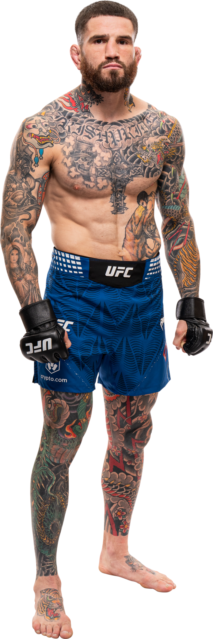
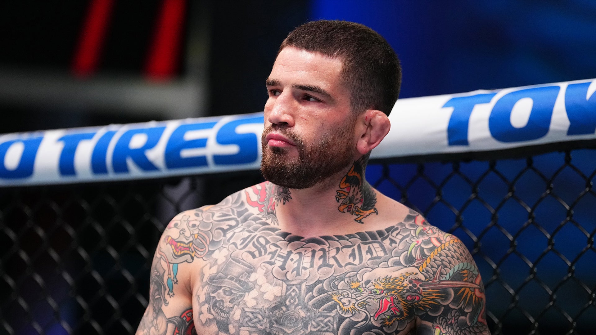
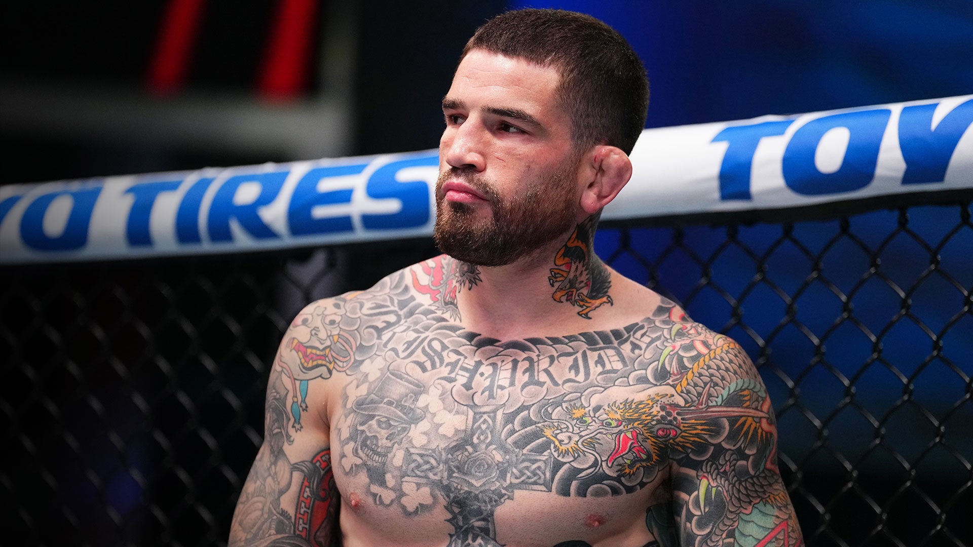
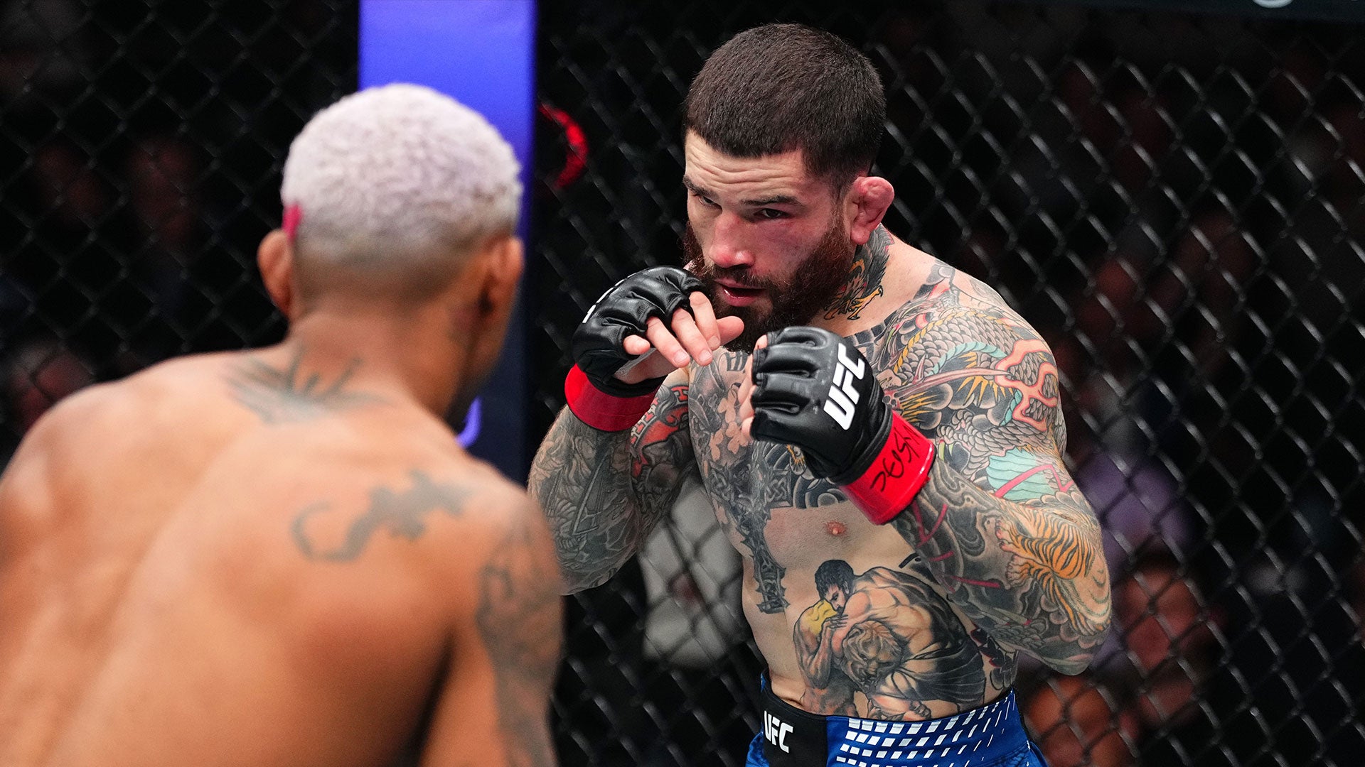
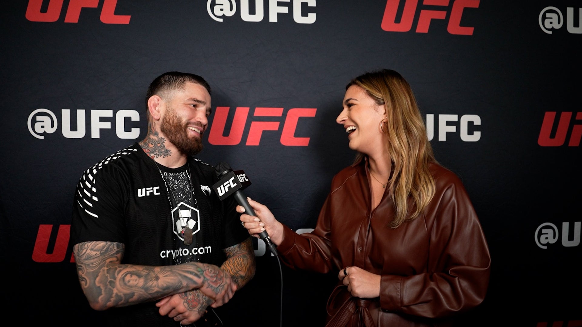
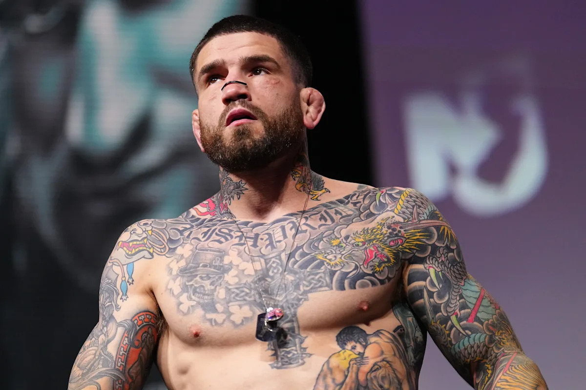
Sean Brady’s tattoos are a big part of his look. The UFC welterweight has a full chest, Japanese-inspired work across both arms, dragons on his neck, and a large back piece. New designs have been added over the years, and some older ink has been covered or reworked.

The collection mixes Japanese dragons, waves, clouds, skulls, script, and religious symbols. Colour shows up in places, while the chest uses softer greys around its lettering and central figures. Brady’s tattoos feel like a working collection rather than a single planned suit.

This guide looks at the main designs and what their placement shows about planning bold tattoos.

The chest piece brings lettering, skulls and Japanese movement together

Sean Brady tattoos: chest lettering and dragon tattoos

Brady’s chest is the first area many people notice in shirtless photos. Old English lettering runs across the upper chest; skulls, clouds, and darker shading fill the space below. The top forms a strong horizontal line, while the lower design moves toward the stomach and arms.

The Japanese-inspired imagery around the letters helps the chest read as one piece. Dragons and waves curve around the sharper letter shapes, leading the eye from the words to the animals and down the torso. That keeps the lettering from looking like a name with unrelated filler around it.

Chest tattoos shift as the shoulders roll and pectoral muscles change shape. Brady’s larger forms remain clear when his body moves; the smaller details sit inside darker areas instead of being spread thinly across the whole chest.

If you’re planning chest lettering, start with where the line will sit. Ask your artist to show the stencil from the front and both three-quarter angles. A phrase that looks level on paper may need a small adjustment around the collarbone. Good chest lettering should feel attached to the body, not pasted across it.

Brady uses brighter colour in the dragons and arms, while much of the central chest stays grey and black. That makes the colour work like an accent. A limited palette can also leave room for other pieces to connect later.

The Japanese dragons give his arms a strong sense of motion

Sean Brady tattoos: chest lettering and neck tattoos

Brady’s dragons wrap around the arms. Their bodies curve over the shoulders and down the upper arms; scales and whiskers fill the larger outlines with detail. The lines travel in different directions, so the sleeves look active even when his arms are relaxed.

The curved forms follow the shoulder and elbow. Waves and clouds soften the joins between images, while darker outlines keep the dragons readable from farther away.

The sleeve has a shared look without making every design identical. Dragons, flowers, and background elements use related line weights and colour. That visual link helps the work feel planned as new sections are added.

A crowded sleeve can happen when every image is treated as equally important. In Brady’s stronger views, the dragon faces and main curves have the clearest contrast, with softer filler behind them. Pick two or three hero shapes for a sleeve, then let the background support them.

Check a sleeve from more than one angle. A dragon that reads well from the front may disappear when the arm turns inward. A mirror, phone photos, and a stencil check with your elbow bent can show whether the design still works across the shoulder and triceps.

The neck tattoos connect the chest to the face and shoulders

Sean Brady tattoos: arm sleeve and neck tattoos

Brady’s neck work takes up less skin than the chest or arms, but it’s visible above a shirt. Dragon heads and dark ornamental shapes rise from the chest toward his jaw, linking the torso and head.

The neck is narrow and always moving. A design that looks good on a flat page can lose its shape where it crosses the throat or curves under the ear. Brady’s tattoos use recognisable outlines and bright colour accents that remain legible when he turns or speaks.

Neck ink changes the feel of the whole collection. Chest and arm tattoos can be covered; neck pieces show right away. If you want a less visible version, a small mark behind the ear or at the side of the neck can give a similar effect with less coverage. Think about how often you want it seen before choosing a front-of-neck design. Visibility is part of the meaning, even when the image itself is purely decorative.

The neck also bridges the chest and shoulders. A few connected shapes can keep a heavily tattooed shoulder from looking cut off at the top. Leave enough skin around the throat so the work doesn’t turn into one dark collar.

The back tattoo is a Japanese mask with a story behind it

Sean Brady tattoos: full torso tattoo collection

Brady’s large Japanese mask fills the upper back. Its bold shapes are visible even in a cage photo, and it has become one of his most recognisable pieces. He has spoken about his interest in Japanese tattoo culture and getting new work after fights. The piece is also linked to a sponsor relationship that helped make it possible.

A back tattoo needs a clear outline before the small details come into view. The mask gives Brady’s design that shape: heavy eyes, mouth, and surrounding lines spread across the shoulders, while lower areas hold extra shading and texture.

The back gives a large subject room to express itself. A mask, dragon, or religious scene can lose impact when squeezed onto an arm. On the back, the artist has room to shape a face and carry waves, clouds, or colour toward the shoulder blades.

A back piece can be personal without being on display all the time. Brady’s chest and neck are visible in many photos; the mask can be covered when he wants. Consider whether you want a tattoo seen often or kept more private.

If you’re planning a large back design, work from a full-body photo and consider the space between the shoulders, ribs, and waist. The best large tattoos are composed for the whole back, not enlarged from a tiny flash image.

Smaller symbols and cover-ups keep the collection changing

Sean Brady tattoos: tiger arm and smaller tattoos

Alongside the dragons and mask, Brady has religious images, skulls, script, fighter references, and parts of older tattoos that have been covered or darkened. Those details make the collection feel like it has grown over time, as his preferences changed.

A cover-up can mean someone wants a new style or a larger design. Brady’s darker, Japanese-inspired arm work gives the area a new direction while absorbing some of the older lines. The new subject needs enough contrast and structure to stand out, even if every trace of the previous tattoo doesn’t disappear.

The religious imagery adds another note beside the dragons and skulls. Crosses and sacred figures carry a different tone, and the collection lets those designs sit together without forcing them to say the same thing.

Smaller tattoos on hands, wrists, and inner arms see more friction, sunlight, and movement. Simple symbols and stronger outlines tend to be easier to read there than a tiny realistic scene. Brady’s larger pieces carry the detail; the smaller marks act as punctuation.

Open skin is not unfinished work; it is space for the next chapter. Leaving gaps gives you somewhere to put a later idea, which can matter when your life and career change.

Sean Brady’s collection combines Japanese-inspired dragons, a chest scene, neck tattoos, and a large back mask with smaller symbols and cover-ups. The pieces differ, but shared shading and placement help them sit together. If you like the style, borrow the pacing and give the main design room. His tattoos look built through the years, not made for one camera angle.

Charles Oliveira Tattoos: Lion Back Piece, Family Portraits and Do Bronx Ink

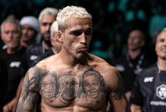
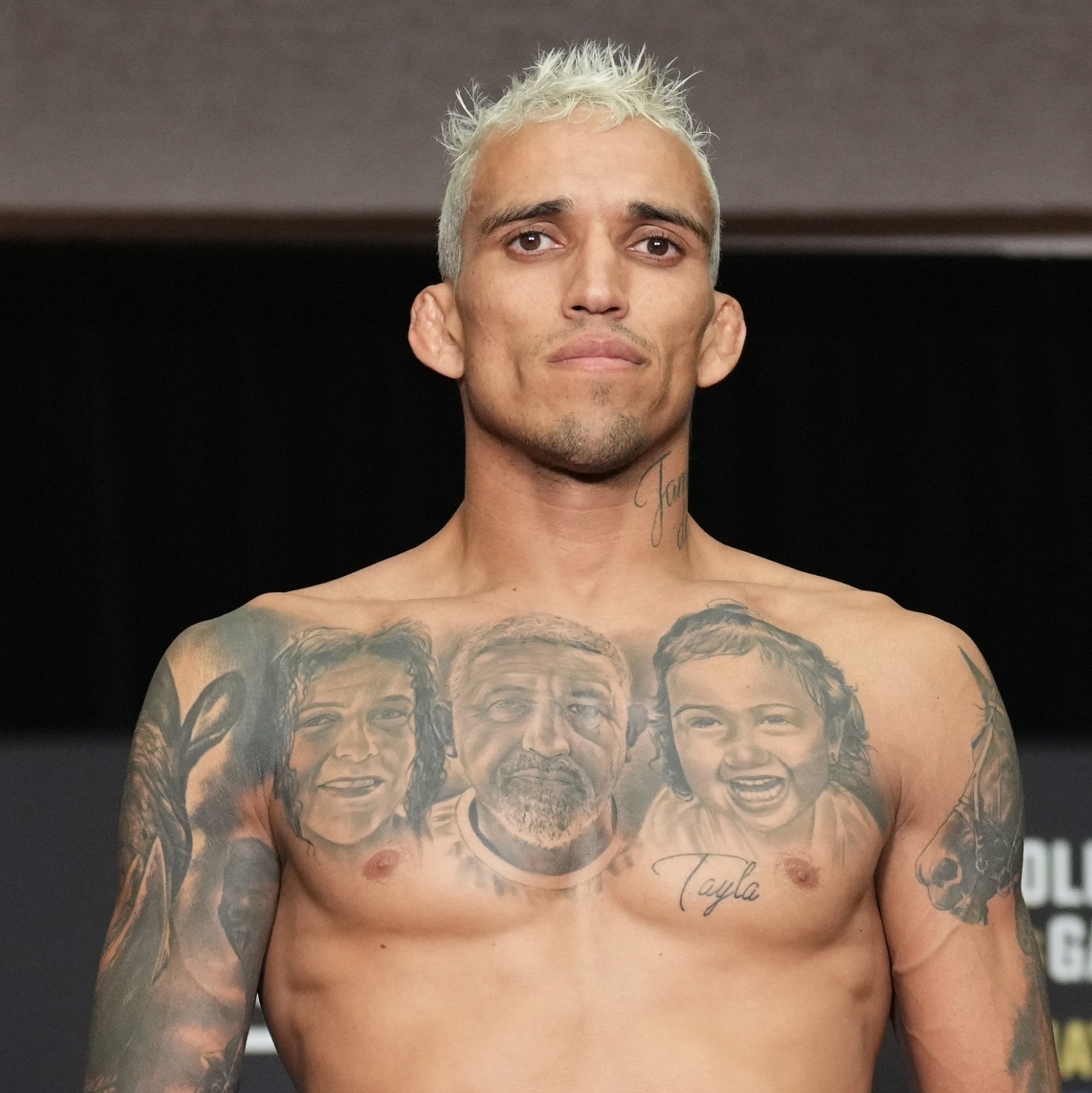
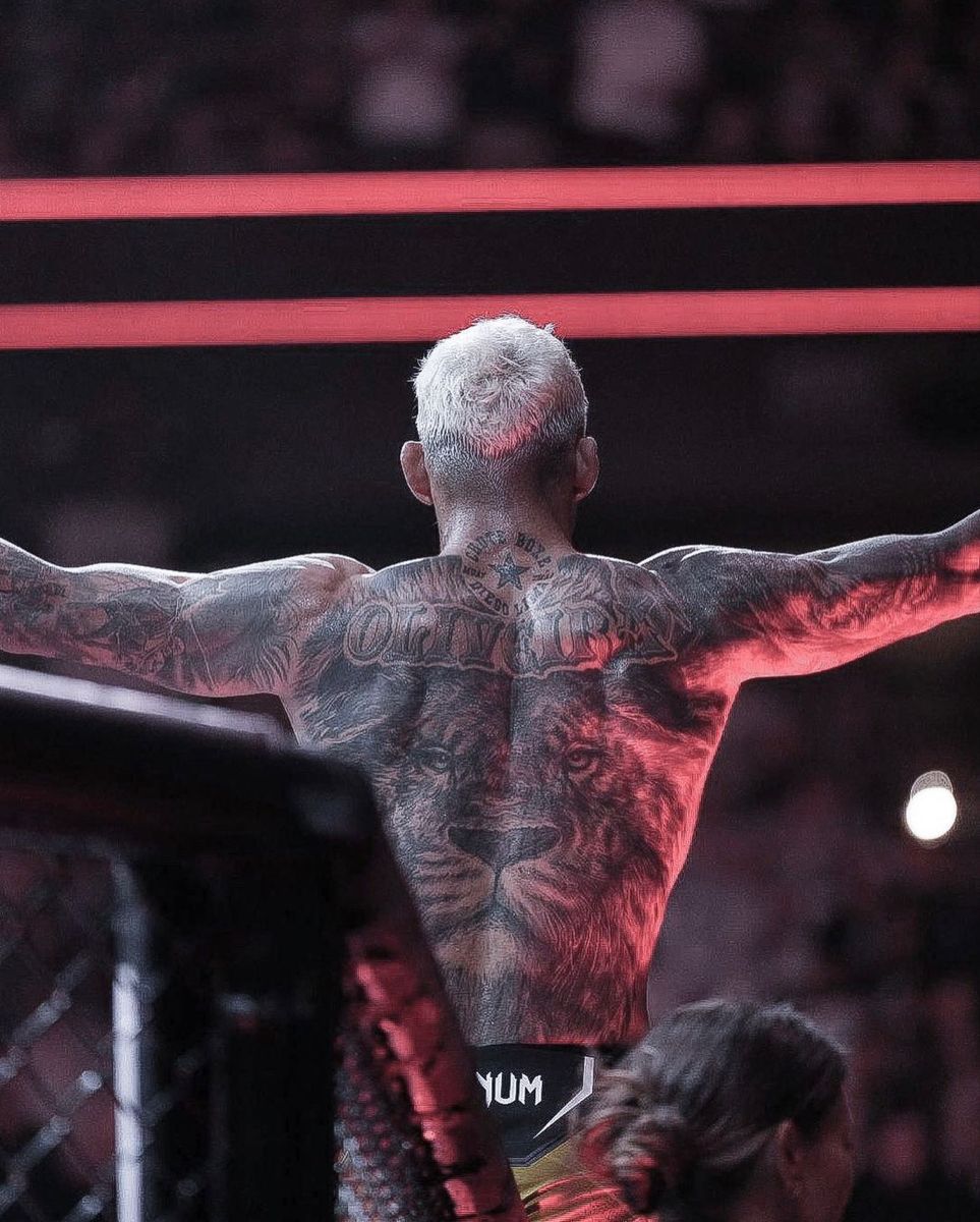
Charles Oliveira’s tattoos mix family portraits with larger images and lettering tied to his public identity. The former UFC lightweight champion has portraits across his chest, a lion on his back, dark work on both arms, and lettering at his neck. Smaller designs fill some of the space between.

His mother, father, and daughter appear in the chest portraits. The back lion adds a larger symbol, while realism, dark shading, and script give the collection a common look. It feels built over time, with different pieces marking different parts of his life.

Oliveira is known as Do Bronx, and that name appears in his tattoos and public image. This guide looks at the designs that stand out in photos and how their placement works for someone planning personal black-and-grey ink.

The chest portraits make family the centre of the collection

Charles Oliveira tattoos: family portraits and chest lettering

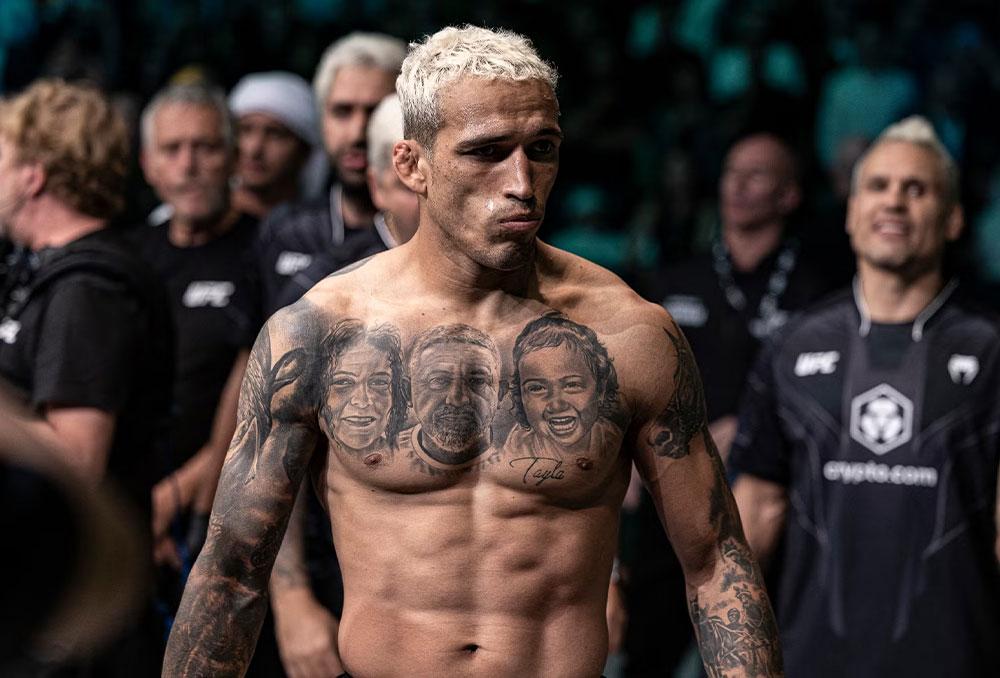
Three large faces sit across Oliveira’s upper chest: his mother, father, and daughter. The realistic portraits use soft shading around the eyes, hair, and cheekbones. They sit close enough to read as one family tribute rather than three unrelated pieces.

The chest gives each face space, while shared grey tones connect them. Script near the lower chest adds another personal detail without drawing attention away from the portraits. When Oliveira faces the camera, the design reads like a family photo brought onto the skin.

Portrait tattoos leave little room for error. Small changes around the eyes or mouth affect the expression, and the body moves under the image. Oliveira’s portraits use darker shading around the hair, brows, and clothes, while the faces stay lighter so their features remain clear from a normal distance.

If you’re considering a family portrait, bring a sharp reference photo with the expression you want. A blurry phone image may not show enough detail. Decide whether the faces should look forward or toward each other. The best portrait tattoos feel like real people, not generic faces with names added later.

Chest portraits can be covered by a shirt, giving the wearer control over when the most personal part of the collection is visible. The wide area also lets an artist balance the design across both pectorals instead of squeezing one face into a narrow arm panel.

The lion back piece gives his tattoos a bold focal point

Charles Oliveira tattoos: large lion back tattoo with Oliveira lettering

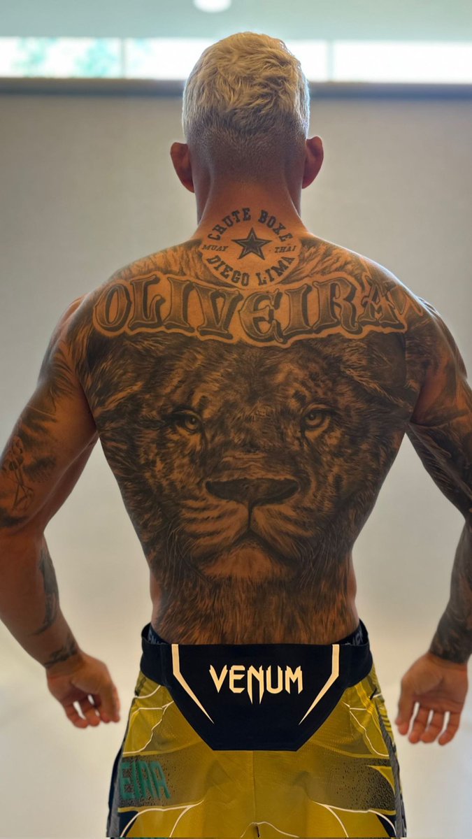
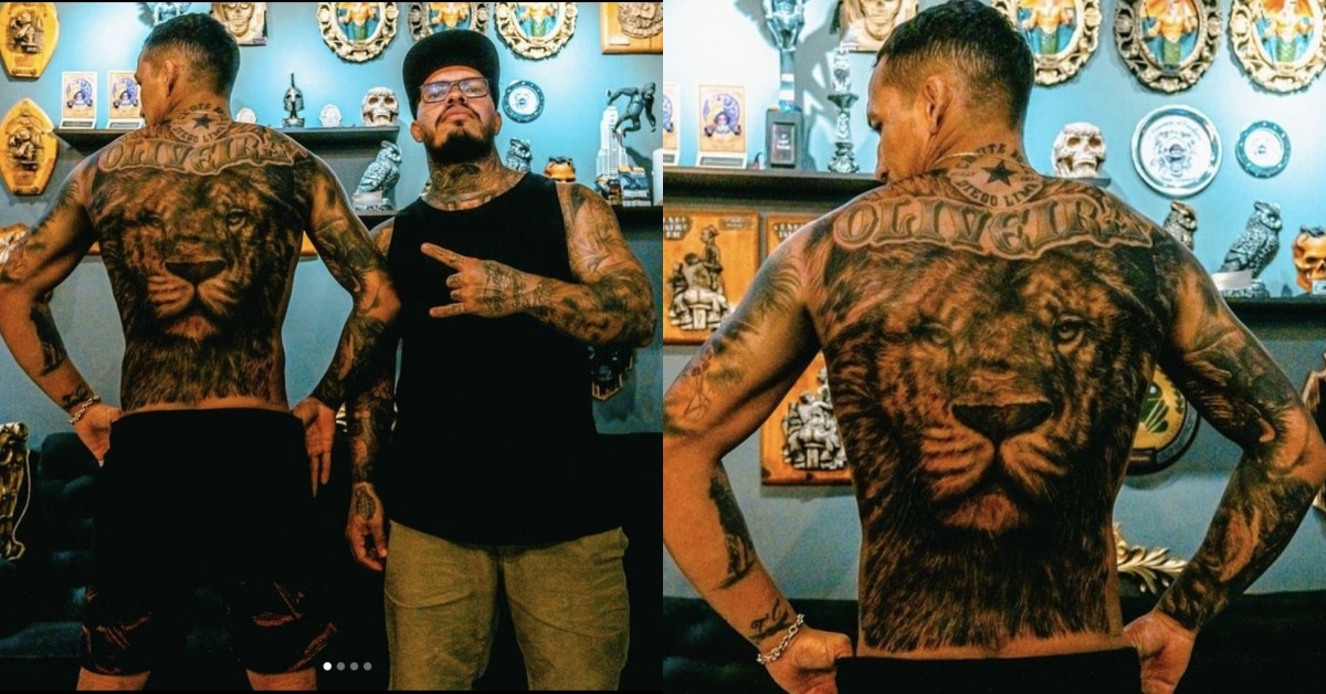
A large lion fills Oliveira’s back. Its face sits at the centre, and the mane reaches toward his shoulders. From a distance, the outline is easy to recognise; up close, you can see the fur, eyes, and shading around the shoulder blades.

The lion adds a different scale and mood to the collection. The chest portraits are personal; the back piece is broader and more symbolic. Its watchful expression gives the design a strong presence from behind.

The lion’s eyes are the main focal point, with the mane providing texture and movement. A strong back piece needs contrast that still works when the tattoo is photographed from across a room. Keep the central expression clear, then use details around it to support the image.

The back offers room for an animal, mask, or large religious image that might lose impact on an arm. Fur can fade into the surrounding skin, and darker shading can sit around the edges without turning the whole design into a solid patch.

Consider how the tattoo will follow the body. A stencil should account for the spine and shoulder blades, and still look centred when the shoulders are relaxed. It shouldn’t only work in a straight-on pose.

His arms use dark realism and heavy framing

Charles Oliveira tattoos: dark arm realism and portrait chest work

Oliveira’s arms are darker and more densely tattooed than his chest. Shaded areas cover the shoulders and upper arms, with portraits, animals, lettering, and ornamental details within the larger shapes. Strong outlines keep the ink from reading as one patch of black.

The designs have to work with a moving arm: the biceps flex, the elbow bends, and the forearm rotates. Oliveira’s larger images sit where they’re still visible through those changes; smaller text and texture wrap around the limb.

Black-and-grey realism gives different images a shared base, even when the subjects don’t match. Family portraits, animals, and religious or symbolic designs can sit together because the shading helps connect them.

If you’re building an arm over time, place the main images before filling gaps. Leave the elbow and inner-arm transitions to an artist who can plan the whole flow, even if the sessions happen months apart. A design added just because space is easy to reach can crowd a larger idea later.

The darker work near the shoulders also helps the sleeves connect to the chest. You don’t need to copy Oliveira’s subjects to get the same effect. Repeating a shadow level, border, or background texture can link tattoos from different sessions.

Neck lettering adds a visible Do Bronx signature

Charles Oliveira tattoos: lion back, neck lettering and gym tribute

Lettering beneath Oliveira’s jaw follows the curve of his neck. It’s a smaller piece than the chest or back work, but you can see it when the rest of his body is covered. The name gives his look a quick signature without replacing the more personal story across the chest.

Neck skin turns from the front to the side and moves whenever the head turns. Oliveira’s script stays fairly simple, so it can still be read when he speaks or looks to the side.

A neck tattoo changes how the face is seen and makes a collection feel more visible. If you like the placement but want a quieter option, a small word behind the ear or along the side of the neck can show in profile without covering as much. One clear word can carry more impact than a whole row of tiny marks.

Check the stencil with your head turned both ways. Lettering should follow the neck’s movement without becoming so curved that the word loses its natural shape. A short phrase is usually easier to keep legible here than a long sentence.

The neck lettering works as a direct accent, while the chest and back hold the more detailed images. That balance keeps it from competing with the larger tattoos.

Family names, small symbols and newer pieces keep the story moving

Charles Oliveira tattoos: full back and surrounding smaller tattoos

The collection includes smaller lettering, symbols, and designs among the portraits and lion. Some details stand out in photos; others only show when Oliveira turns or raises an arm.

Smaller pieces can mark a person, place, or period in a career without becoming a full back tattoo. The larger realism gives the body its structure, while smaller designs make it feel like more than one session’s work.
Leaving some skin open also allows room for later ideas. An artist can connect pieces with shading or background texture when it makes sense. Open space is not a failure to finish; it gives a tattoo collection somewhere to go next.

Not every tattoo has to come with a public explanation. The chest portraits are recognisable; the lion can stand as a symbol; the lettering is direct. Together, the designs feel personal and still read clearly in fight-week photos.

If you’re planning your own collection, choose the image that matters most and give it the best placement. Pick a style that can support other ideas later. Black-and-grey realism, lettering, and controlled shading can connect different subjects. Add colour when it helps a design, not just to fill a gap. Good planning makes a collection feel personal, not pieced together by accident.

Oliveira’s tattoos balance family portraits, the back lion, darker arm work, and neck lettering tied to Do Bronx. If you like that approach, think about what you want closest to you, give a large design room, and leave space for future changes.

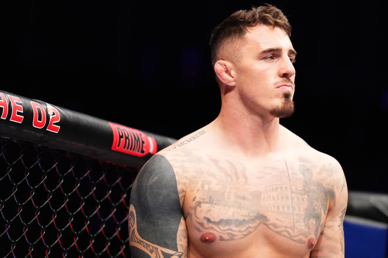
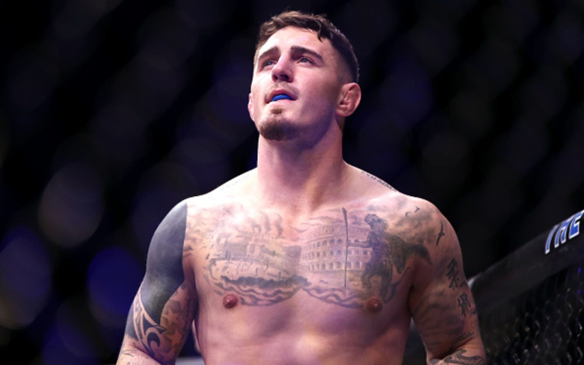
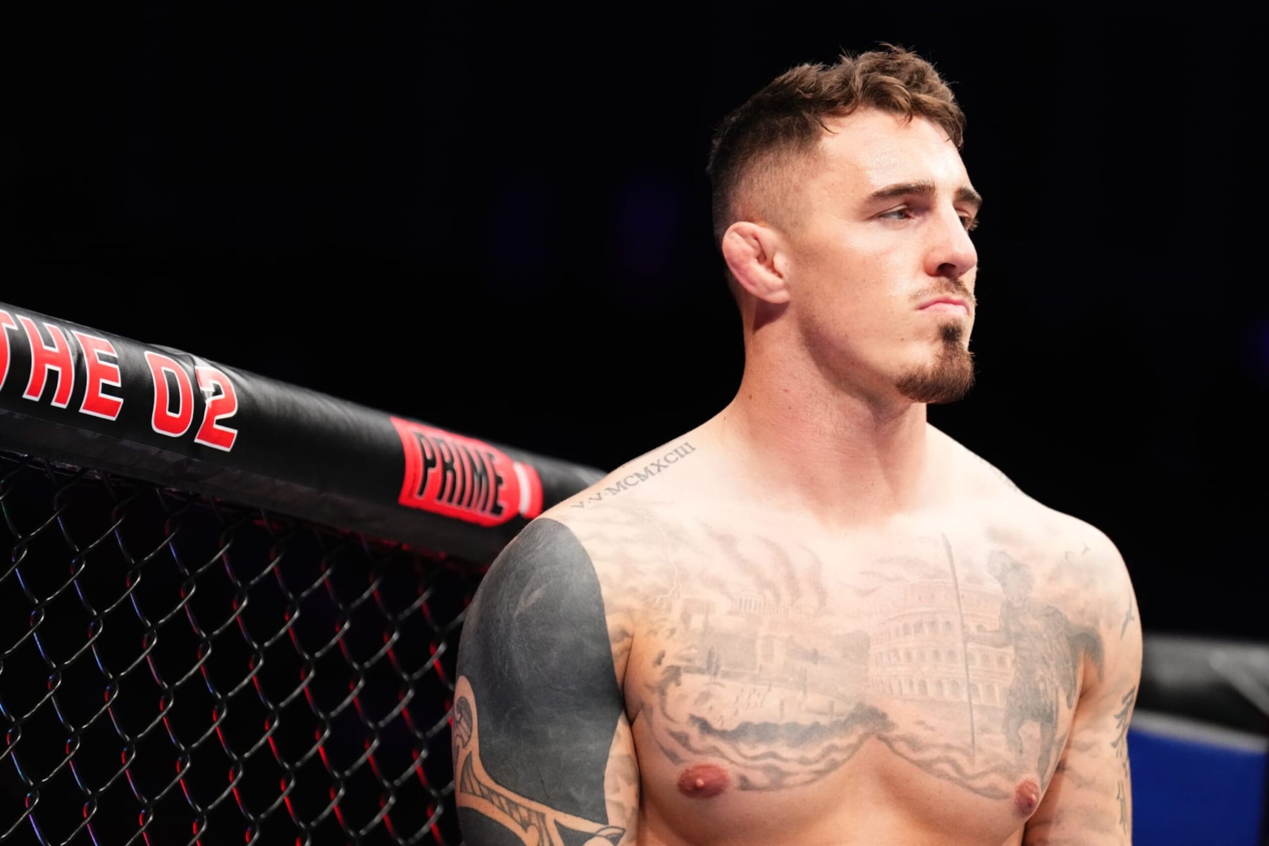
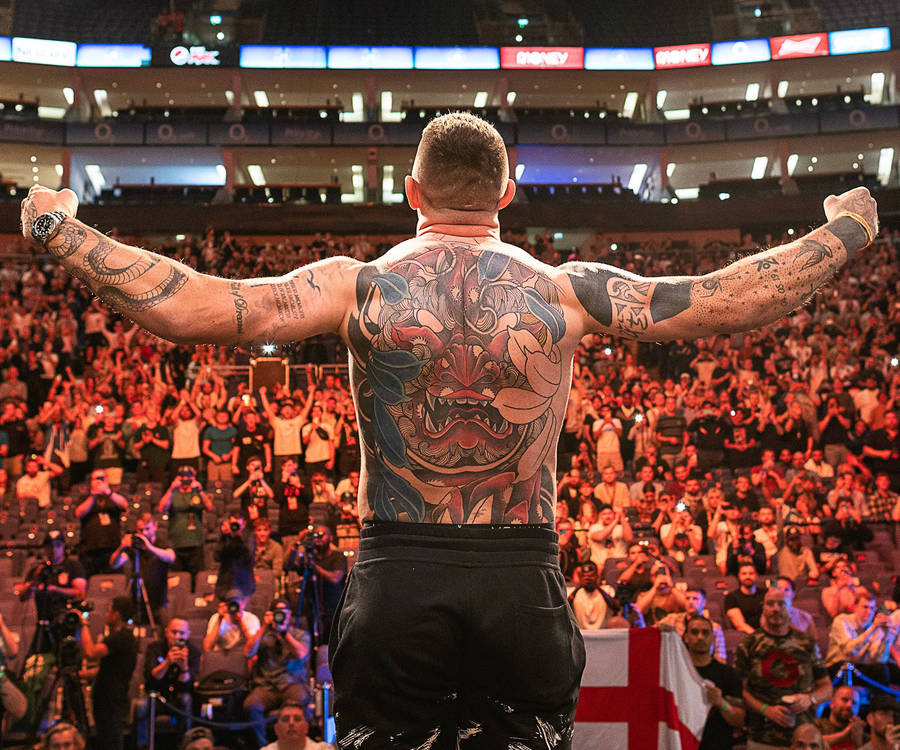
Tom Aspinall Tattoos: Colorful Back Piece, Roman Numerals and UFC Ink

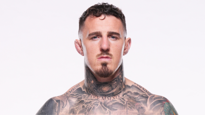
Tom Aspinall’s tattoos cover much of his upper body. A large colour piece sits on his back, with work across his chest and shoulders, visible ink on his neck, and smaller marks among the larger designs. The collection seems to have grown with his career rather than being planned as one matching set.

The back is colourful and large; the front has architectural details, lettering, black shading, and smaller symbols. That contrast gives each area a different feel while keeping the whole collection connected.

Aspinall has talked about the time and thought behind his tattoos. The back piece took more than one quick appointment, and the front designs have their own placements and stories. This guide looks at the main pieces and what their layout can teach someone planning a tattoo.

The back piece brings colour, movement and a clear focal point together

Tom Aspinall tattoos: large colourful demon-style back piece

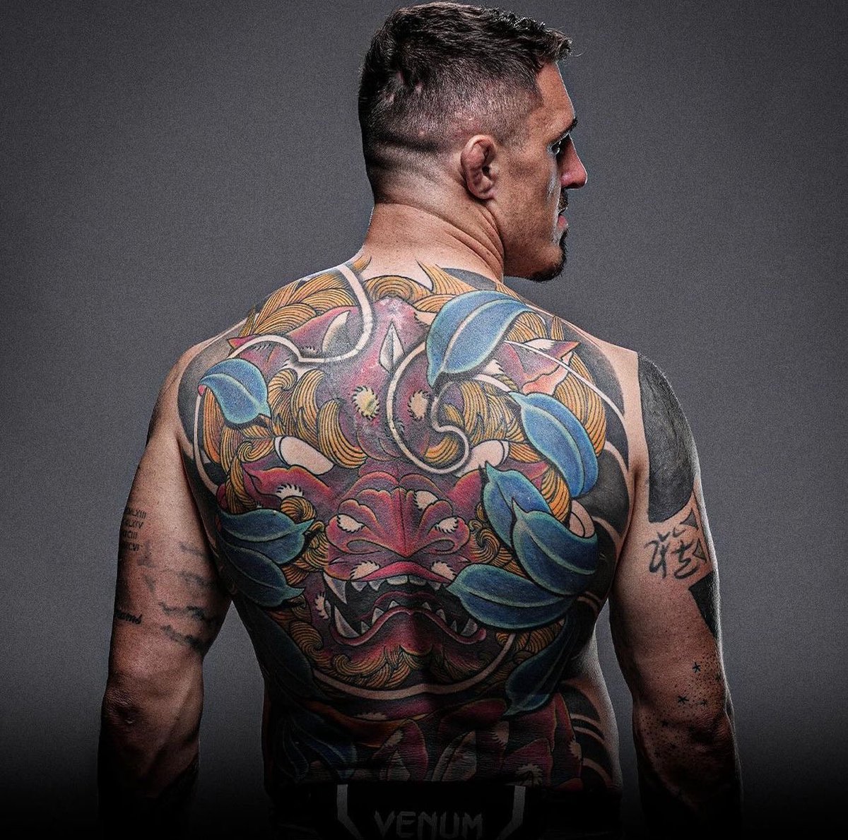
The back piece changes Aspinall’s silhouette. A stylised face sits near the centre, with blue and green shapes around it and dark outlines giving the design a graphic edge. The face catches your eye first; leaves and smaller forms carry the colour out toward the shoulders.

A large tattoo needs one shape that reads from across a room. Here, the central mask-like face does that. Colour adds movement, while the black lines help the image hold up in arena photographs.

The back gives the artist room to build around the spine and shoulder blades. The composition doesn’t need to be perfectly symmetrical; slight differences from side to side can keep it from looking like a sticker placed in the middle of the body.

Colour works best when it has a strong black structure underneath it. Blue and green can draw attention, while outlines and darker shadows help preserve the image’s shape over time. That matters when much of the piece will be seen from a distance.

If you’re planning a back tattoo, start with the shape of the main subject. Then ask the artist to build around the body’s lines instead of dropping a finished rectangle onto the skin. The design should work with the muscles and movement.

The scale gives the back a different mood from Aspinall’s front. It is colourful and expressive; the chest is more structured and broken up. That contrast gives the collection room to breathe.

The chest combines Roman numerals, architecture and atmosphere

Tom Aspinall tattoos: Roman numerals and architectural chest tattoo

Roman numerals and architectural shapes sit across Aspinall’s chest. The shading gives the design a stone-like, historical feel. It’s less colourful than the back, so it adds a quieter focal point when his whole upper body is visible.

Roman numerals can mark a date without looking like a plain string of digits. Here, they sit within a larger composition; the architecture gives them context and darker areas keep the lettering readable when photographed from an angle.

Straight lines can be hard to place on a curved chest. A doorway or column that looks level on paper may bend across the pectoral or toward the shoulder. Place the strongest vertical lines where the body gives them support, then let the smaller forms follow its curve. Good chest lettering should be checked while the wearer is standing normally, not only while the skin is stretched flat.

Stonework and numerals can suggest memory or milestones without spelling everything out. If you like meaningful tattoos but don’t want a portrait or quote, an architectural design can leave some of the story open.

Leave a little skin around the chest piece so its forms remain clear and later work has room to connect. A darker, structured design on the front can sit beside a more colourful back piece without copying its palette. Placement and contrast do much of the linking.

The black shoulder sleeve shows how cover-ups can evolve

Tom Aspinall tattoos: heavy black shoulder and upper-arm cover-up work

Aspinall’s shoulder and upper arm carry heavy black shading that frames the chest. In some views, it looks like cover-up work or a later stage in an evolving sleeve. Either way, the darker sections give the collection stronger structure.

Large black areas need careful edges. A clean curve around the shoulder can make the chest look wider; an awkward border can make two tattoos seem to compete. The edge matters as much as the filled area.

If an older tattoo sits underneath, a cover-up needs enough weight to hide it while still forming a clear design. The artist may adjust the angle, deepen a shadow, or use open skin to build a new focal point. A successful cover-up is not only about hiding the past; it should give the new tattoo a reason to exist on its own.

The rounded shoulder is a natural place for a dark frame linking the chest and upper arm. Not every sleeve needs solid black, but a repeated shadow or controlled border can help tattoos from different sessions feel related.

Think about the balance of dark and open skin. A little negative space keeps the arm from feeling heavy all the way around and gives the main shapes somewhere to stand out. A collection can change over time. Sometimes the smartest tattoo plan is the one that leaves enough flexibility for the next chapter.

The neck tattoo changes the whole face-up look

Tom Aspinall tattoos: front view showing neck, chest and surrounding arm tattoos

Aspinall’s neck ink covers less skin than the back piece, but it changes his look in a shirt. A visible mark near the neck frames the face and shows up in interviews and walkout photos.

The neck turns from front to side and moves whenever someone speaks or looks over a shoulder. A busy image can lose its shape there. Aspinall’s design has enough contrast to remain legible in changing light and ordinary movement.

Check a neck stencil from several angles. Turn your head and relax your shoulders. The design should sit well against the collar and jaw. Visibility is part of the tattoo design, not an accidental side effect.

Neck ink is hard to cover, so it becomes part of everyday first impressions. If that’s what you want, a visible tattoo can be a deliberate choice. If you’d like a quieter option, the side of the neck or behind the ear can still show in profile.

A small, clear shape often works better there than a tiny detailed picture that may blur with time. Aspinall’s neck piece also balances the larger back and shoulder tattoos: it brings the eye toward the face without competing with the main designs.

His arms and smaller marks keep the collection personal

Tom Aspinall tattoos: additional arm marks and the evolving back collection

The smaller marks on Aspinall’s arms keep the collection from feeling like one large back piece plus a few unrelated tattoos. They appear from different angles as he moves, and give the work the uneven feel of a collection built over time.

A body can look planned without every piece matching. A few large designs, medium-sized tattoos, and smaller marks added when the idea mattered can all sit together. The artist’s job is to manage the space between them.

The arms offer different panels: an outer bicep for a larger symbol or portrait, a forearm for lettering, and an inner arm for something more private. The elbow and wrist fold and take more wear, so those areas often suit simpler designs.

If you’re adding tattoos over time, photograph the whole arm before each appointment. It’s easy to focus on one empty patch and miss how the new piece will look from across the room. The overall layout should guide the next choice.

Step back often, because a tattoo is part of a moving body and not a collection of isolated flash cards. One important image needs enough room, and smaller tattoos should support it rather than fill every opening immediately. Open skin leaves choices for later.

Aspinall’s collection has a colourful back piece, architectural chest work, a dark shoulder cover-up, visible neck ink, and smaller arm details. If you like the style, choose the main piece first, place it for the body you have, and leave space for the person you’ll become.

Stephen Curry Tattoos: Hebrew Wrist Ink, WOE and More

Stephen Curry’s tattoos are easy to miss when he’s moving down the court. There’s no full sleeve or large chest piece; most of the visible ink sits around his wrists and arms, flashing into view when he shoots, points or raises his hands after a play.

That makes Stephen Curry tattoos a useful reference if you like smaller designs with a clear reason behind them. His collection leans on short lettering, compact symbols and faith-related marks. The pieces have space around them and don’t get in the way of how he uses his arms.

The ideas are personal without being loud. Hebrew script carries words he has chosen to keep close; matching ink links him to Ayesha; and other marks bring in work, family, basketball and pop culture. None of those needs a large image to register.

Game photos show the tattoos in motion. A wrist turns toward the camera, the forearm flexes as he raises the ball, and an inner-arm mark can appear for only a second. Those changing views tell you more about placement than a flat reference shot.

There’s a practical point here, too. Small lettering can stay meaningful when it’s clear and placed around real habits. Curry’s tattoos show during basketball, but still feel personal rather than made just for photographs.

Stephen Curry’s Hebrew wrist tattoos keep faith close

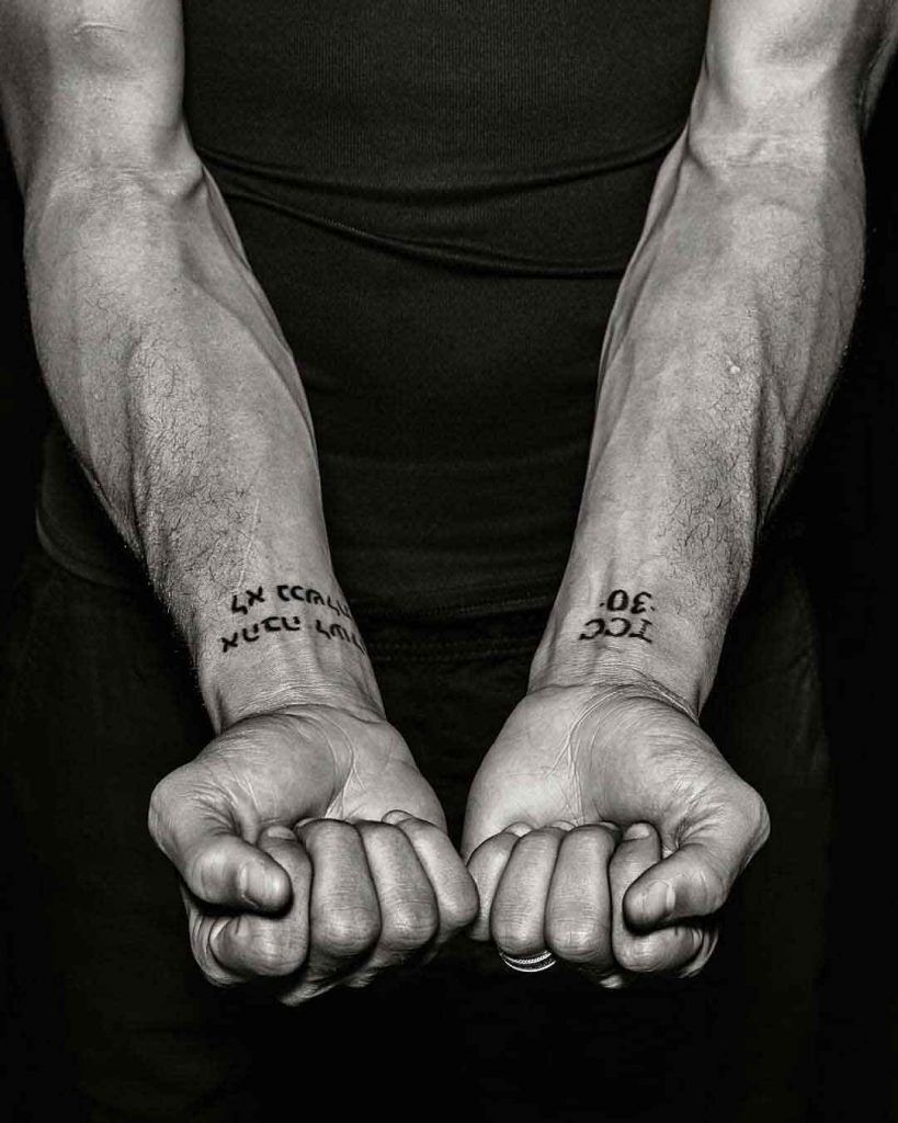
Stephen Curry tattoos: close-up of the TCC 30 and Trust wrist lettering

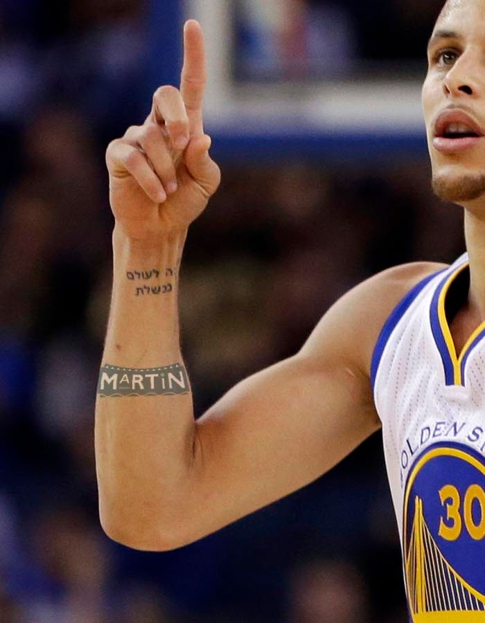
The Hebrew lettering on Curry’s wrist is the design people recognize first. It refers to “Love Never Fails,” from First Corinthians 13:8. The compact line sits where it shows when he lifts his hands, without turning the wrist into a large statement.

Wrist lettering is naturally visible in Curry’s shooting motion. The inside of his arm can face the camera on a follow-through, and the words appear briefly as he moves. It’s also a place he can see himself, which suits a phrase used as a reminder.

There isn’t much flat space on the wrist, so the letters have to follow its curve and remain legible when the hand bends. Here, the spacing keeps the Hebrew from looking crowded and helps it read in a game photo.

If you’re considering a wrist phrase, settle the scale before choosing the wording. Ask to see it at the size your wrist can handle, with enough room between letters. Check it with your hand open and closed; even a short line can carry plenty of meaning.

The matching Curry and Ayesha ink makes the story personal

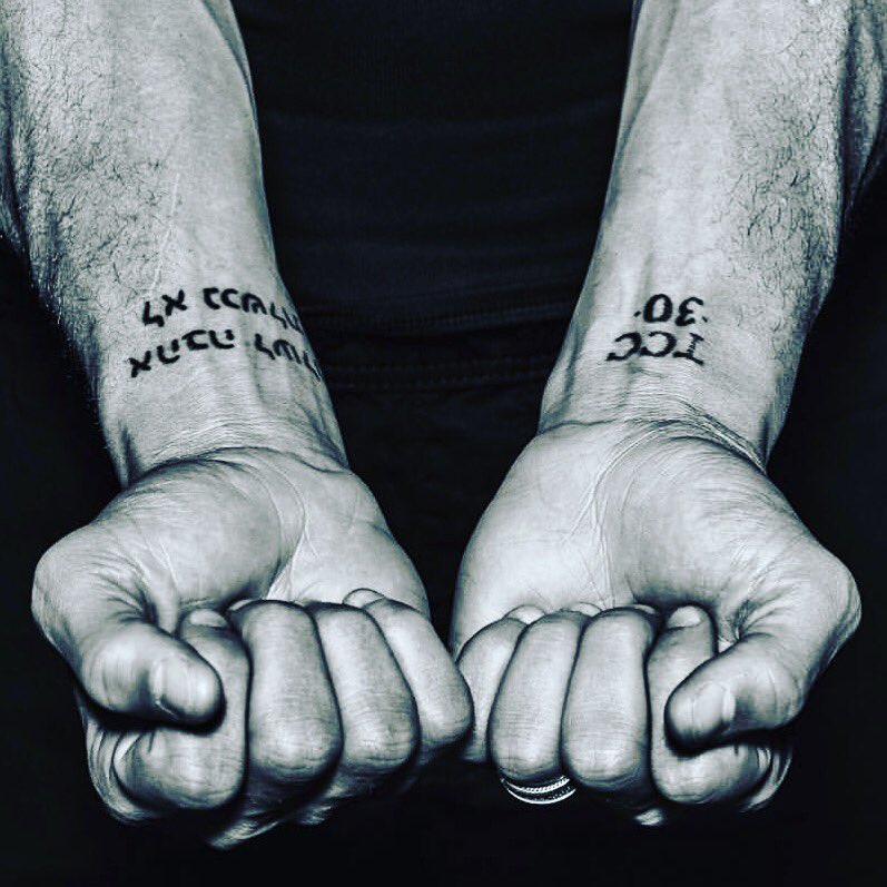
Stephen Curry tattoos: TCC 30 and Hebrew wrist lettering close-up

Curry and Ayesha have matching tattoos, a small shared element in an otherwise restrained collection. The design connects to their relationship without using a portrait or a long name. A simple mark can stay personal and still sit cleanly on the skin.

Matching tattoos work best when each person can wear the idea in a way that suits them. They don’t have to be identical photographs; the point is the link between them. Curry’s wrist ink stays close to the body but appears naturally in daily movement.

A close-up of both hands shows open skin around the lettering. That space lets the two tattoos read as a pair without merging into a dark patch. The design feels deliberate without being overworked.

A matching tattoo should still make sense when you’re on your own. Choose a mark that belongs to both people, then place it where each of you will be comfortable wearing it. A small symbol, short word or shared date can be easier to live with than a large image that only works side by side.

WOE and the small arm tattoos turn reminders into routine

Stephen Curry tattoos: clean wrist and forearm close-up showing the Hebrew lettering

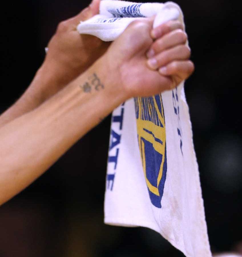
The WOE tattoo on Curry’s arm is commonly described as “Working on Excellence.” It’s a short phrase tied to how he approaches basketball. Three letters are enough to serve as a cue through training, games and daily life.

Block lettering holds its shape at a distance, and the brief word follows the curve of the arm without taking over. It also leaves open skin for the other tattoos around it, rather than turning the whole area into one panel.

Court photos show how the inner-arm tattoo changes as Curry bends his elbow. With the arm relaxed, the word sits in a clear patch of skin; as the muscle tightens, it becomes part of the movement. It’s a reminder to check an arm tattoo in motion as well as at rest.

A short phrase works best when it connects to something you actually do. Start with the words you return to, then see if a few letters can bring the thought back. Keep the final wording short enough to fit cleanly and easy to read at a glance.

TCC, Martin and the basketball tattoos add another layer

Stephen Curry tattoos: Martin and Hebrew wrist tattoos

The smaller tattoos add variety without changing the collection’s clean look. TCC is often read as “Trust, Commitment, Care,” while another photo shows Martin written across Curry’s forearm. One points to values; the other brings in a pop-culture reference.

The Martin tattoo shows that a collection can include a lighter choice alongside faith-based lettering. A reference to a show doesn’t need to match every other tattoo; it can simply record something Curry enjoys alongside the more serious faith-based lettering.

Basketball photos show how the same word changes with the pose. The forearm lettering looks casual when his arm is down, then becomes part of a gesture when he points or signals. The tattoo is small, but movement gives it more presence.

Let serious and playful ideas differ in scale rather than crowding them together. Give the main phrase some open skin, then place a smaller reference or initials nearby. The mix can record different interests without crowding the arm.

Why Stephen Curry tattoos stay simple and easy to read

Stephen Curry tattoos: wrist symbol close-up

Curry’s tattoos stay easy to read because they use clear marks and considered placements. The wrist carries the phrases people notice first, the inner arm holds short reminders, and the forearm leaves room for a name or reference. Each spot has a purpose; none needs to compete with the others.

That restraint also makes the collection easy to wear with a uniform, a suit or casual clothes. The ink appears when his hands move, which gives it a lived-in feel rather than making it look like it was added for close-ups.

If you want a similar approach, start with the piece that matters most to you: perhaps a line of faith-based lettering, a family symbol or a short reminder. Put it somewhere you’ll actually see it, then add smaller designs only when they earn a place.

Leave room for the collection to change. A wrist or forearm doesn’t need to be filled in at the first session. Open skin keeps the letters clear and leaves space for later ideas; it also lets each tattoo hold its own meaning as life changes.

Curry’s tattoos show in quick moments during games but don’t dominate his appearance. That fits designs he carries through basketball, work and family life.

His collection is a compact mix of faith, family, work and personality. The Hebrew wrist phrase carries the clearest message, matching tattoos with Ayesha add a shared story, and the arm lettering turns short reminders into part of his routine. TCC and Martin keep the mix from feeling too serious.

If you’re taking inspiration from Curry, study the placement as closely as the words. Notice how the wrist lettering follows the arm, how a small mark appears in a shot, and how open skin keeps each design distinct. The spacing, as much as the words, keeps the collection from looking crowded.

Here’s a short video looking at Curry’s tattoos and the meanings people associate with them:

Andre Gray Tattoos: Black History Back Piece and More

Andre Gray’s tattoos cover his chest, shoulders, arms, hands and back. The Watford striker’s designs move between family, faith, lettering and portraits. There isn’t one theme repeated over every inch, but each area has a reason for being there.

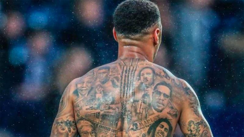
The back piece is the one people recognize first: a black-and-gray tribute to figures from Black history, with portraits, headlines, scenes and short phrases in one large composition. On the front, roses share the chest with a Roman war scene; his arms carry names, quotes, religious imagery, faces, birds and smaller symbols.

That makes Andre Gray tattoos worth a closer look if you like work that can grow over time. Some parts are meant to read from a distance; others reveal more detail up close. Here’s what stands out across the collection, and what the placement can teach you when planning your own.

His full back is a Black history tribute, not just a large mural

Andre Gray tattoos: Black history back piece

Gray’s back tattoo is the collection’s centrepiece. It brings together Nelson Mandela, Martin Luther King Jr., Malcolm X, Rosa Parks, Muhammad Ali, Marcus Garvey and Bob Marley, alongside Black Panther imagery and newspaper-style lettering. There’s a lot in the design, but the shared subject—people and movements that changed how Black history is remembered—keeps it from feeling random.

Portraits fill the shoulders and upper back, while smaller scenes and text sit lower down. That creates a clear order: the faces catch your eye first, then the headlines and background details come into focus. Several portraits need that kind of hierarchy, or a back piece can become a wall of gray shading.

Gray has said the project took months. The scale makes that believable: an artist has to match lighting and proportions across portraits, then make them sit together as the back bends and moves. With a large tribute, it helps to plan the full composition before settling on each small detail.

If you’re planning a tribute back piece, start with the people who matter most and keep the first draft to a manageable group. More space around each portrait makes the whole image easier to read. Gray’s tattoo uses a personal history to organize a full back without relying on one oversized symbol.

The chest combines roses with a Roman war scene

Andre Gray tattoos: Roman war scene and roses

Roses sit near Gray’s shoulders, while a Roman war scene covers the right pec. The scene includes a masked general, armed troops and the Roman numeral MCMXCI, or 1991. Its mood differs from the historical tribute on his back, but the black-and-gray shading helps the two pieces belong to one collection.

The war scene follows the curve of the pec rather than sitting in a flat rectangle. Darker details gather near its center, while the roses soften the shoulder edges and leave the upper body some open skin.

The scene needs room for faces, armor and background lines. Compressing the same idea into a small tattoo would cost it expression and movement. When several figures carry the story, make the placement large enough for the smallest important detail to stay clear.

Roses are familiar, but their position changes their role. Here they frame the chest instead of taking it over. A rose in the center would be the subject; Gray’s shoulder roses support the larger historical image.

His arms are layered with names, quotes, portraits and faith imagery

Andre Gray tattoos: side profile chest and arm ink

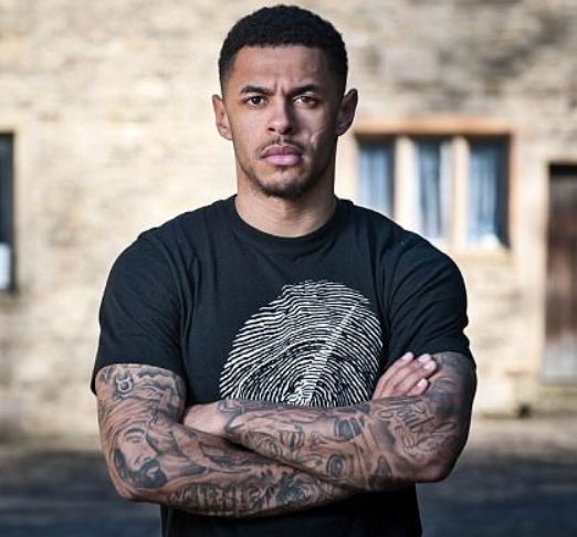
Gray’s arms hold some of the collection’s most personal and varied work. One upper arm has his name inside a crown; other areas include a quote, a Bible verse, a rose, religious figures and portraits. The opposite arm shows a fly, feather, woman’s face, crowned princess, butterfly, tribal face and the words “No Good Without God.”
Because the tattoos arrived at different times, the arms don’t read as perfectly matched sleeves. That’s part of their character. Lettering gives the eye a pause between portraits, and smaller birds or symbols fill spaces without competing with the faces. It feels closer to a visual diary than a set of matching designs.

The crown around his name gives simple lettering a defined edge. A name alone can look unfinished; the frame gives it a shape. The bicep quote works in a similar way, following the length of the muscle.

Planning matters when several tattoos share an arm. Portraits need clean space around eyes and mouths; text needs enough room between letters. Filler doesn’t have to mean another large picture—a bird, feather or small geometric mark can join two pieces without crowding the sleeve.

If you’re adding to an arm gradually, choose the largest portrait or symbol first and leave the connecting areas open. Photograph the tattoo after it has healed before planning the next piece. Fresh ink can look darker and tighter than it will after settling, so the spacing you need may only become clear later.

The shoulder and upper chest carry some of his most recognisable detail

Andre Gray tattoos: upper-back portrait detail

Gray’s upper-body tattoos meet across the chest, shoulder and upper arm. The Roman scene runs into nearby shading; small stars, lettering and portraits bridge the change in direction. That transition can make a collection feel connected instead of divided into separate panels.

Realistic tattoos rely on contrast. Dark shadows separate the figures from the skin, while lighter gray keeps the scene from turning into a heavy patch. On a moving body, that difference helps the image read when Gray turns his shoulder or lifts an arm.

When a design crosses a joint, check the stencil in more than one position. A layout that looks balanced with the arm down can stretch when the shoulder rolls forward. Gray’s tattoos follow the body’s curve, so the portraits remain anchored as the pose changes.

Not every area needs the same darkness. Lighter passages around faces and lettering add depth and give the eye a place to rest. If the background is equally dark everywhere, the details that matter can disappear.

Small hand and forearm details keep the collection visible every day

Andre Gray tattoos: arm and forearm details

Gray’s lower arms and hands carry ink that’s hard to hide. Roses, compact lettering and small symbols sit near the wrist and forearm, adding to the sleeve without repeating one large image. They show when he’s holding a ball, pointing or celebrating.

Hands and wrists move constantly and get plenty of sun and friction. Clear outlines matter more than tiny decoration, and a design has to read quickly. Gray’s smaller pieces use strong shapes and short details rather than trying to fit a full scene onto the smallest areas.

These marks also break up the scale of the collection. If every tattoo were a portrait, the whole body could feel heavy. A rose or short word gives the eye a pause. Varying the size of the designs is one way to make a heavily tattooed body feel organized.

Before getting hand or wrist ink, think about how it will sit beside a watch, sleeve cuff or jewelry. Photograph the area in a normal daily position, not only with your hand spread flat; you’ll see where the design bends and what might be hidden when the wrist turns.

Gray’s collection carries a story without forcing every piece into one style. The back honors people and movements, the chest combines historical imagery with roses, and the arms gather names, faith, words and portraits. The best starting point is deciding what deserves space on your skin, then choosing a placement where it can be seen clearly.

Marcelo Tattoos: Sleeves, Family Tributes and Football Ink

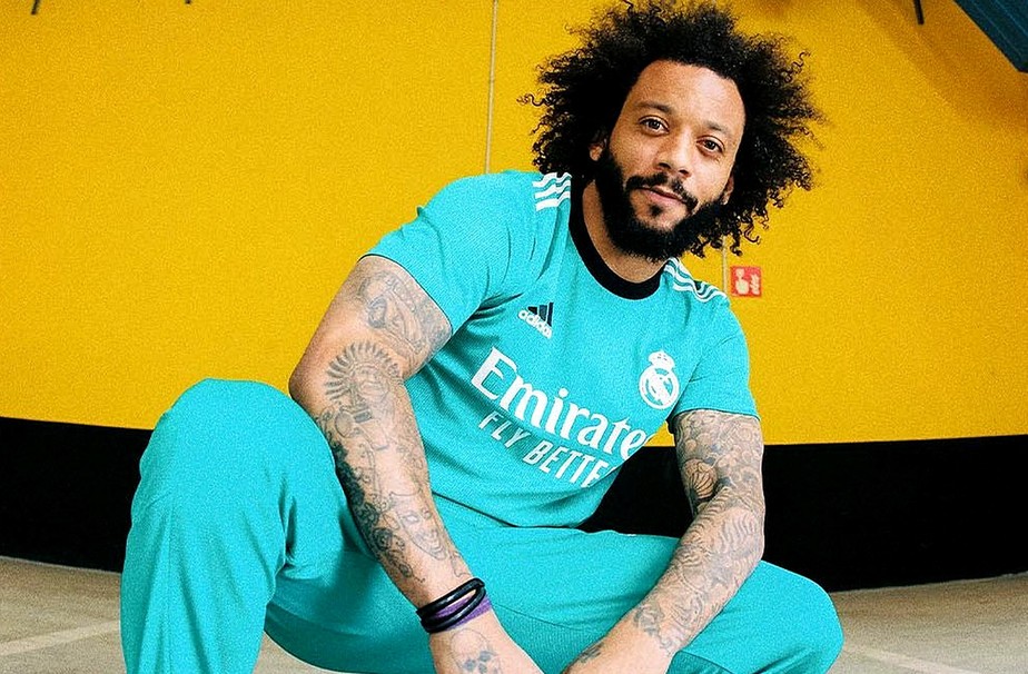
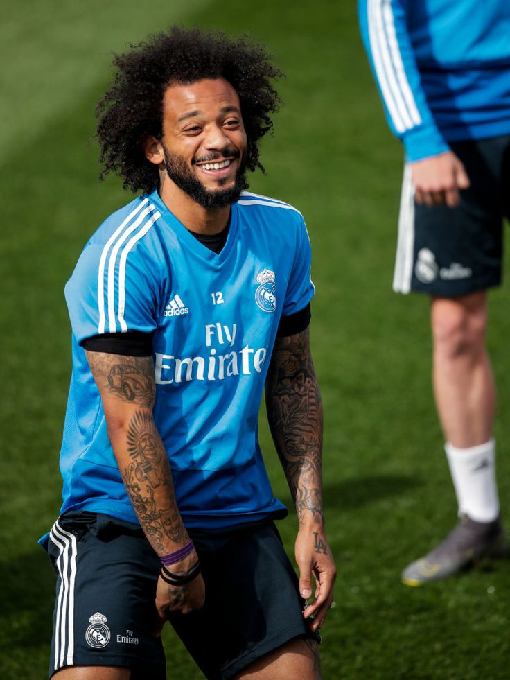
Marcelo Vieira’s tattoos look different each time he rolls up a sleeve. The former Real Madrid and Brazil left-back has ink on both arms, his hands and fingers, his legs and parts of his torso. Some pieces mark family, some football; others add to the black-and-gray style he’s built over the years.

The collection is busy, but the images aren’t random. His grandfather’s name, his children, shirt number, birth year and trophies appear in different places. A whistle, Celtic cross, contrasting faces, vintage car and large Jesus portrait bring different moods into the same look.

That makes Marcelo tattoos worth studying if you like sleeves that feel personal without sticking to one subject. Here’s a closer look at the main areas, the stories behind some of the best-known pieces, and how their placement works on a moving body.

Marcelo’s arms are the main feature of his tattoo collection

Marcelo tattoos: full sleeve tattoos

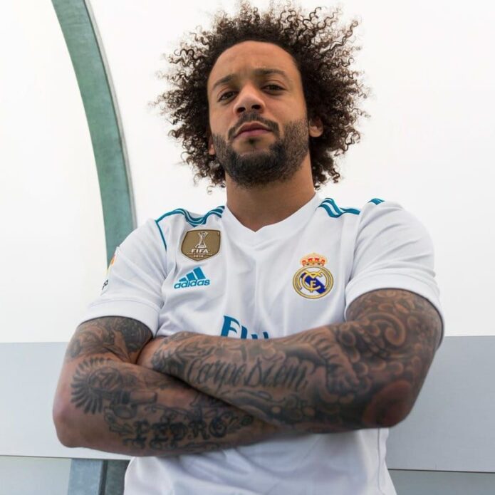
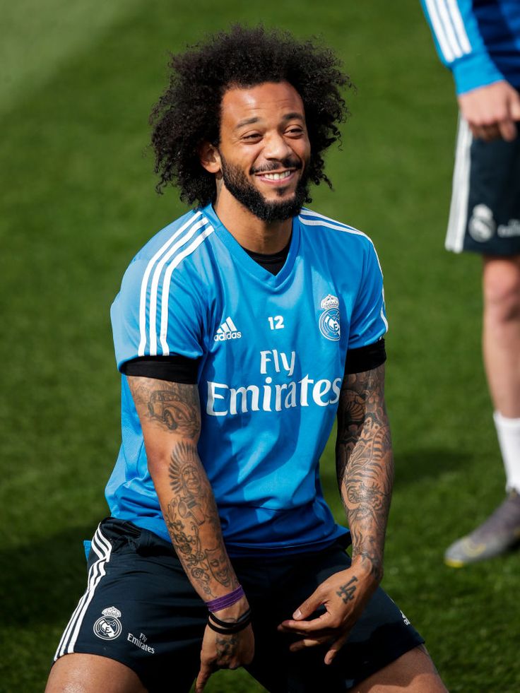
Marcelo’s sleeves are the first thing most people notice. Both arms carry dense black-and-gray work from shoulder toward wrist, mixing portraits, script, symbols and shading. The repeat use of dark outlines and soft gray keeps them from reading as a pile of unrelated stickers.

The arms don’t mirror each other. One has large “Carpe Diem” lettering and broad tribal-style work; the other shows the family name Pedro, a whistle, a cross, a vintage car, a Celtic cross and religious images. The difference gives each arm its own identity and makes the collection change as he turns.

Even a sleeve that looks spontaneous needs room for the main pieces. Faces and lettering need the clearest skin; smaller symbols can fill the spaces around them. Marcelo’s work has natural breaks between larger tattoos instead of shading every gap at once, leaving room for the collection to grow.

If you’re starting a sleeve, decide whether you want one continuous story or a series of memories. Marcelo’s leans toward the latter. The tone, scale and placement connect the images without making every tattoo about the same subject. A shared visual style can link different ideas without matching them exactly.

The Pedro tattoo keeps his grandfather close to his football story

Marcelo tattoos: arm tattoos and family ink

One of Marcelo’s most personal tattoos is the name Pedro on his right arm. Pedro was his grandfather, who supported him during the difficult start of his football career and the journey from Fluminense to Europe. The lettering points back to where that story began; it isn’t just another name in a sleeve.

The placement gives the tribute weight. It sits among larger designs, part of the arm’s overall rhythm but still easy to pick out. A name can stay visible without turning the whole tattoo into a literal portrait.

Marcelo has also shown a vintage Volkswagen Beetle connected to his grandfather. The car took him to early football sessions, giving the image a direct link to the name on his arm. It may seem like an unusual tattoo subject until you know the story; then it becomes a piece of family history.

A memorial often feels more personal when it includes a detail like that. A name says who the tattoo is for; an object, date or place can show why they mattered. One specific memory can say more than a generic tribute image. Marcelo’s arm pairs lettering with an object without crowding them into one design.

His football tattoos include a whistle, number 12 and the years that matter

Marcelo tattoos: football symbols and hand ink

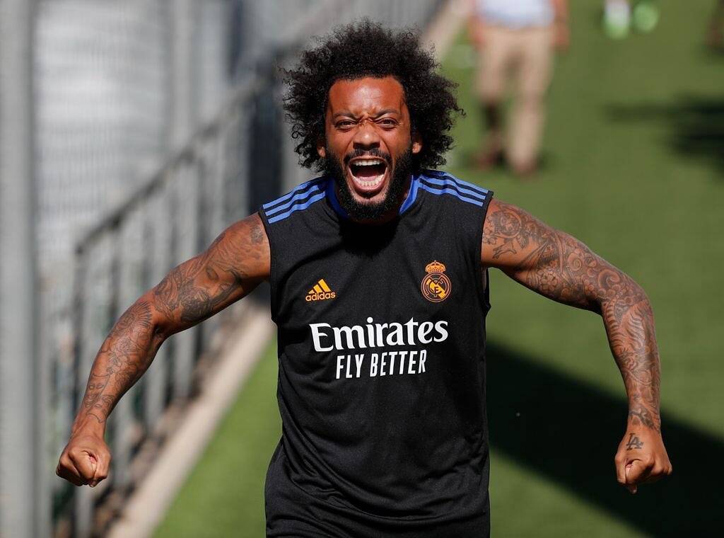
Football appears in several parts of Marcelo’s tattoos. A whistle sits on the front of his right arm; number 12, his shirt number, is on the left; and 1988, his birth year, runs across his knuckles.

These are smaller than a full sleeve, but they make the collection specific to him. A ball, trophy or club badge would be an obvious choice; a whistle and shirt number point more directly to the routines of playing. They’re details from inside the sport rather than generic symbols placed on top of it.

Number 12 is on the hand and fingers, which show in photos, celebrations and everyday gestures. Hand tattoos are hard to hide, so a simple number can be easier to live with than tiny, crowded detail. The same is true of wrist lettering: clear shapes tend to hold up better on skin that moves and gets exposed.

Marcelo has also added Champions League years and trophy imagery to his leg. They turn achievements into a timeline, with room for later seasons. A career tattoo can leave space for the next chapter.

The religious portraits and contrasting faces give the sleeves more depth

Marcelo tattoos: religious portraits and sleeve detail

Football isn’t the only subject across Marcelo’s arms. His right arm includes a large Jesus portrait, a halo skull, an angel and a Celtic cross; another forearm has two contrasting faces that represent different emotions. The religious images bring a darker tone and give the sleeve several strong focal points.

A large portrait needs open space. The Jesus image sits high on the arm, where the bicep gives it a natural center. Clouds and shading connect it to the rest of the sleeve, while contrast keeps the face from disappearing into the background.

The paired faces work differently. They’re smaller and more graphic, so the contrast between them carries the idea instead of one realistic portrait. That change of scale gives the sleeve a new rhythm. Not every tattoo has to be large or detailed to catch the eye.

If you’re combining religious imagery with lettering or family tattoos, choose one focal piece for the area. A face, cross or angel can lead while smaller words and symbols support it. Several equally prominent images can compete, even when each one is well done. Marcelo’s largest portraits have room around them, which keeps the sleeve readable.

His legs carry trophy ink and another side of the collection

Marcelo tattoos: face-visible arm portrait

Marcelo’s legs give his tattoos more room than his hands and forearms. His thigh carries Champions League trophy imagery and the years linked to European wins. Other leg pieces include a dragon clown, a sign and number, and portraits of his dogs. The placement lets each design sit apart from the crowded sleeves.

The thigh works well for taller designs. A trophy can keep its shape, while a portrait or animal can follow the long line from hip to knee. It’s also easier to cover than a hand or forearm, which gives the wearer more choice if the tattoo is personal or visible ink is inconvenient for work or travel.

The trophy tattoo reads like a record of progress. The dates give it a career-scrapbook feel; the cup gives those years a clear center. A medal, ticket, jersey number or place could mark the same kind of milestone without copying a trophy.

Leg tattoos also keep Marcelo’s collection from being concentrated on his arms. If one area is already heavily covered, extending the work to the legs can balance the overall look. Use larger areas for designs that need space, and keep the most visible placements for marks you’ll want to see every day.

Marcelo’s tattoos return to family, faith, football, memory and the people who helped him grow. The designs don’t need to match because those stories connect them. If you like his style, start with a detail from your own life, then choose a placement and scale that keep it clear. The collection’s strength is how it records a life that kept moving.

Roberto Firmino Tattoos: Faith, Family and Football Ink

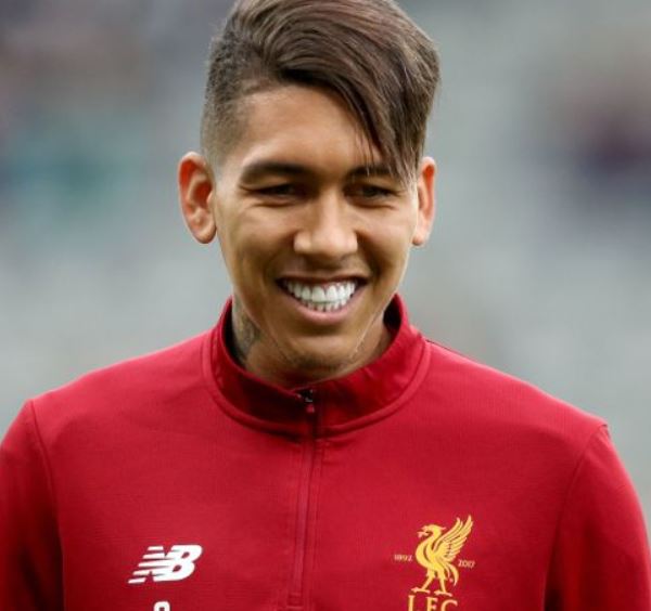
Roberto Firmino’s tattoos show clearly on the pitch: they cover his arms, hands, neck, chest and back. Family tributes sit alongside faith, football memories and designs chosen for their look. The collection feels lived-in rather than built around one theme.

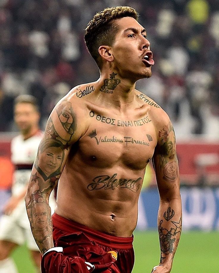
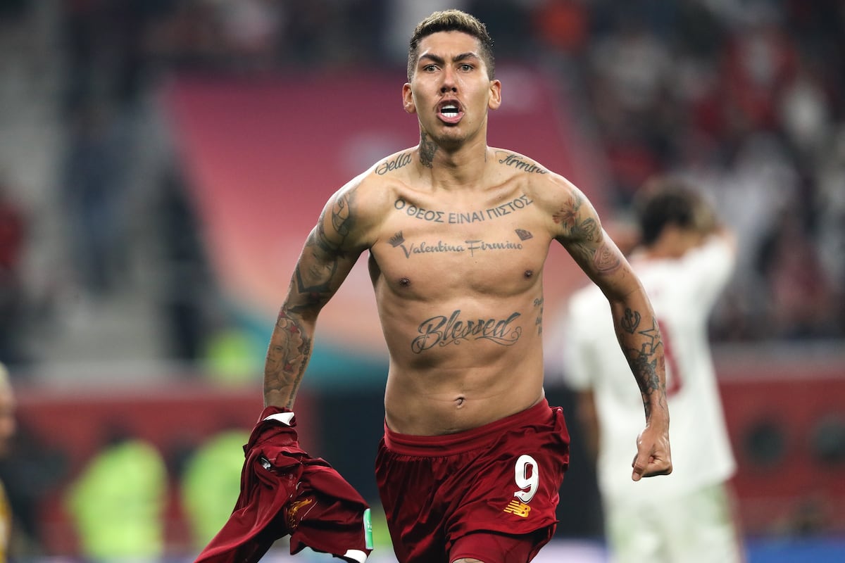
The Greek phrase across his chest, the name Valentina Firmino and the large Blessed lettering are among his best-known pieces. Portraits run through his arms; the back carries a large scene tied to his roots, family and the Champions League. Together, they tell more than a quick shirtless celebration photo can.

Here’s a closer look at the main placements and the ideas behind some of the best-known Roberto Firmino tattoos, with details that may help if you’re considering bold personal ink.

His sleeves and hands carry the busiest tattoo work

Roberto Firmino tattoos: arm and hand tattoos

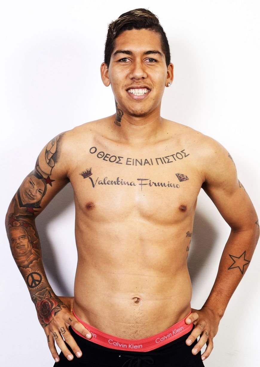
Firmino’s arms are densely tattooed, but the sleeves don’t read as one solid block. Portraits, roses, stars, lettering and symbols sit at different angles. Dark outlines and soft gray shading hold their shape in photos, even when he’s moving.

The hand and wrist work adds to that coverage. A rose crosses the hand; the forearm carries a peace symbol, an anchor and smaller details. These placements are always visible, so the designs need to stay legible at a small size. Firmino’s mix of solid forms and open skin keeps them clearer than a sleeve made entirely of tiny lines.

The larger portraits and symbols have room to register; stars and lettering connect them. When a sleeve has several subjects, repeated shading and a consistent black-and-gray tone can link them without a single theme.

If you’re planning this much arm coverage, choose the important pieces first and add filler later. Firmino’s sleeves show how a little open space around a face or name can make the whole arm easier to read.

The Greek chest phrase is his clearest statement of faith

Roberto Firmino tattoos: Greek chest phrase and Valentina lettering

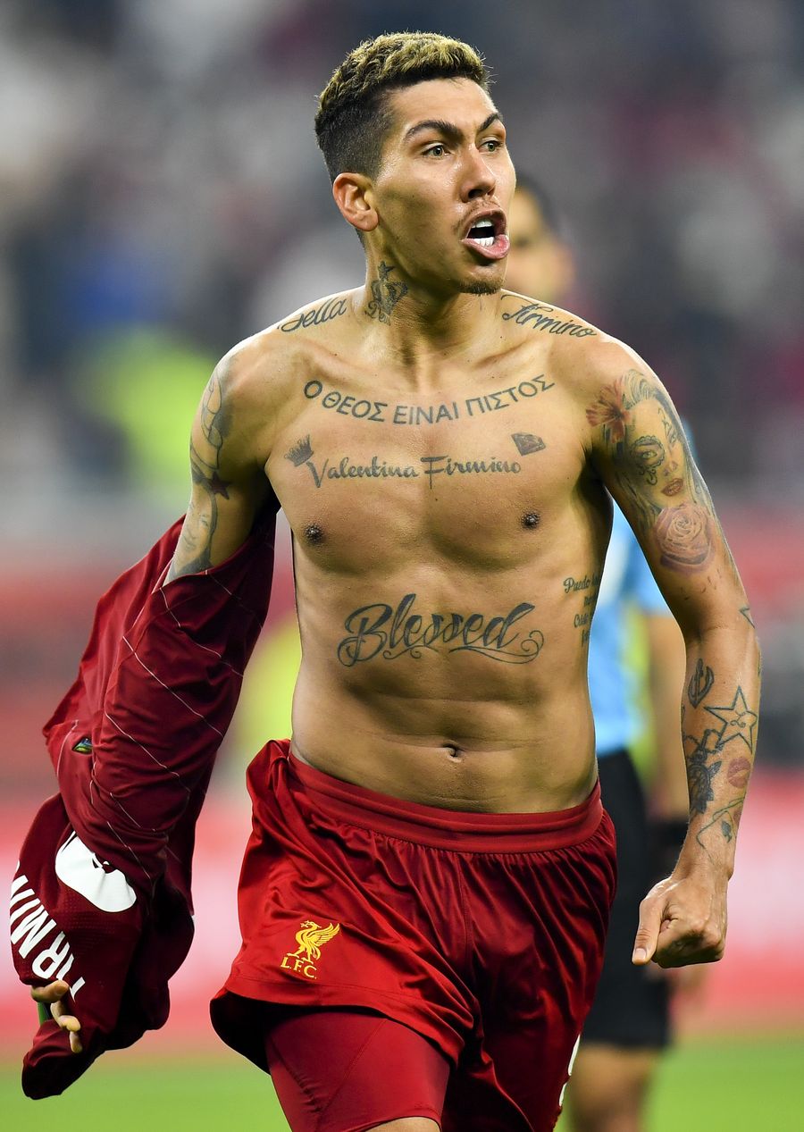
The largest chest lettering reads “Ο ΘΕΟΣ ΕΙΝΑΙ ΠΙΣΤΟΣ,” meaning “God is faithful.” The Greek characters stretch across the upper chest and are among the first details visible when Firmino takes off his shirt. The phrase is direct, with the chest giving it room to read.

Below it, Valentina Firmino is written in flowing script. The two styles sit on separate lines: the Greek phrase is firm and structured; the name is softer and more personal. Small marks around the script keep it from looking like plain text on bare skin.

Chest lettering has to follow the body. Firmino’s upper phrase crosses the chest without getting too tall, and the lower script leaves space between the words and ribs. The lines stay clear when he stands straight and move with his shoulders as he turns.

A short phrase can carry more weight than a crowded chest collage when the lettering is clear and has room. If you choose a language that matters to you, check the spelling carefully and pick a style that will still read after the ink settles.

Family is written into the chest, neck and arm portraits

Roberto Firmino tattoos: Blessed lettering and family chest ink

Firmino’s family tattoos go beyond names. His arms include portraits, while the chest carries names of people close to him. Bella appears near the shoulder; Valentina is written across the chest. The portraits make those connections visible as images as well as words.

The faces sit among flowers and symbols rather than in one blank panel. That gives the sleeves a natural flow, but the shading around each portrait needs control. Too much dark filler can swallow the features; leaving skin breaks helps keep them visible.

For a tribute, a name gives context, while a portrait or small object can make the memory more specific. You don’t have to copy Firmino’s arrangement. A family member’s handwriting, a familiar flower or a meaningful date could carry the same personal link in a layout of your own.

Script, realistic faces and simple symbols can share an arm without matching exactly. They need enough shared contrast, spacing and line weight to read as parts of one collection.

The back piece brings together Maceió, family and football

Roberto Firmino tattoos: full back tattoo with Maceio and football themes

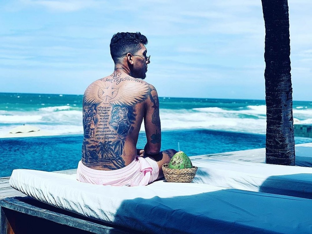
Firmino’s back is one of the largest pieces in his collection. A beach photo shows it covering much of his back: wings stretch across the shoulders, with a central scene, text and palm trees lower down. The layout has a top, middle and bottom, rather than reading as one mass of shading.

The imagery connects Maceió, his family and the Champions League trophy tied to his Liverpool career. The subject is personal before it’s decorative. Tropical details bring his home into the piece, while the football reference marks a turning point in his career.

A back tattoo works for a story that needs room. Several images can sit together without being compressed into a small area, and the wearer can cover the piece when they want it private. That can matter when it includes family or a long personal message.

The wings catch the eye first; the lower scene gives it somewhere to go. If you’re planning a large back piece, think about that path before the first session. It should read from a distance and reward a closer look.

Smaller symbols give the collection its football and everyday details

Roberto Firmino tattoos: neck, wrist and smaller symbol tattoos

Firmino’s smaller tattoos add details from different moments of his life. Stars, a peace sign, an anchor, a rose and marks on his hands sit between the larger pieces. Neck tattoos add another visible area; his wrists and fingers show in celebrations and photographs.

These designs keep the collection from being made up only of major statements. A symbol can mark a belief without needing a long explanation. A rose might connect to family or simply add color beside darker work. An anchor and peace sign have familiar associations, but their placement gives them a place in Firmino’s look. Small tattoos can be the details that make a sleeve feel like one person’s collection.
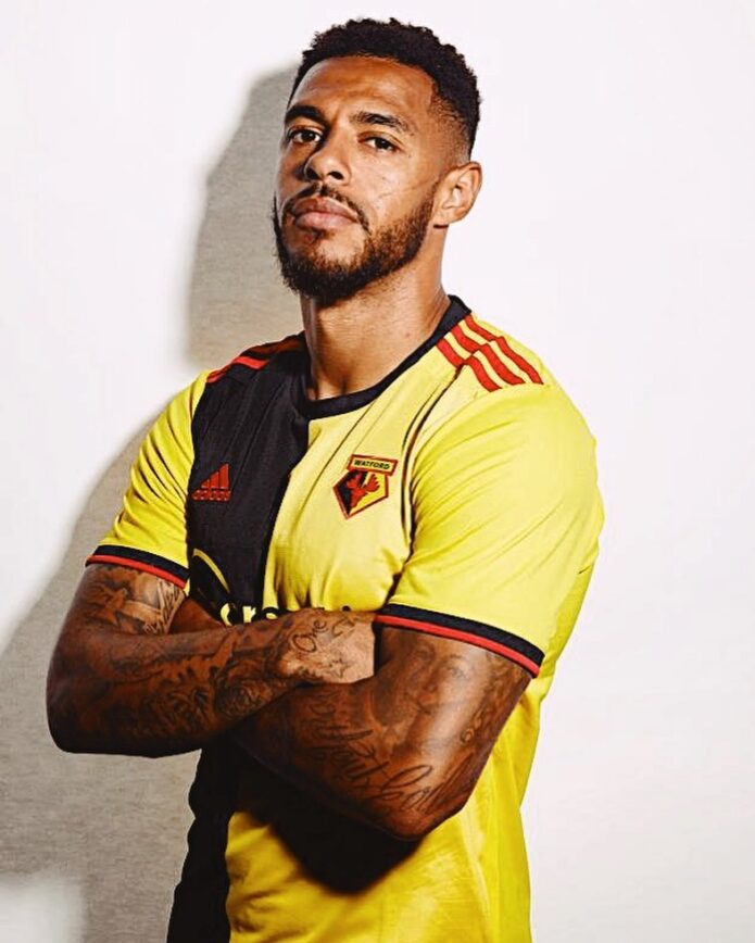
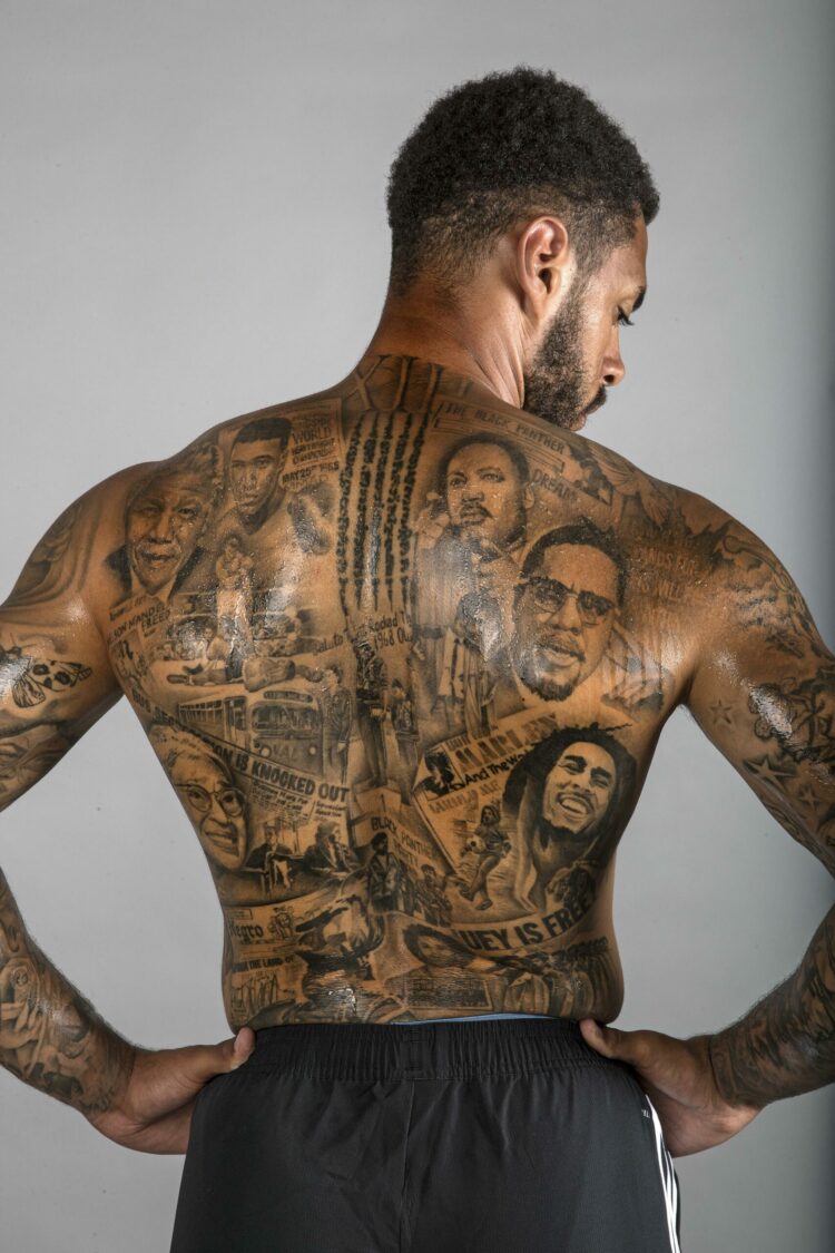
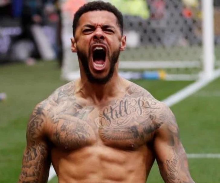
Hand and finger tattoos need simple shapes. The skin moves, sees sun and gets washed often, and there isn’t much room. Firmino’s visible hand work uses clear outlines and compact designs rather than trying to fit a full portrait on a knuckle.

A football tattoo doesn’t have to be a ball or badge. Firmino’s back links a trophy to a personal memory; the other pieces bring in faith, family and the places that shaped him. The strongest sports tattoos often say something about the person away from the match, too.

Firmino’s collection gives each area a different role. The chest carries the clearest words, the sleeves hold portraits and symbols, the hands add everyday details, and the back gives the largest story room. If you like his style, start with ideas that belong to your life, then give each one a placement and scale that keep it clear. An artist can help decide which memories deserve a large canvas and which suit compact marks near the wrist, collarbone or fingers. That planning matters when several tattoos will share the same area.