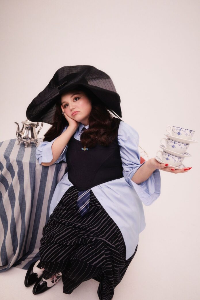
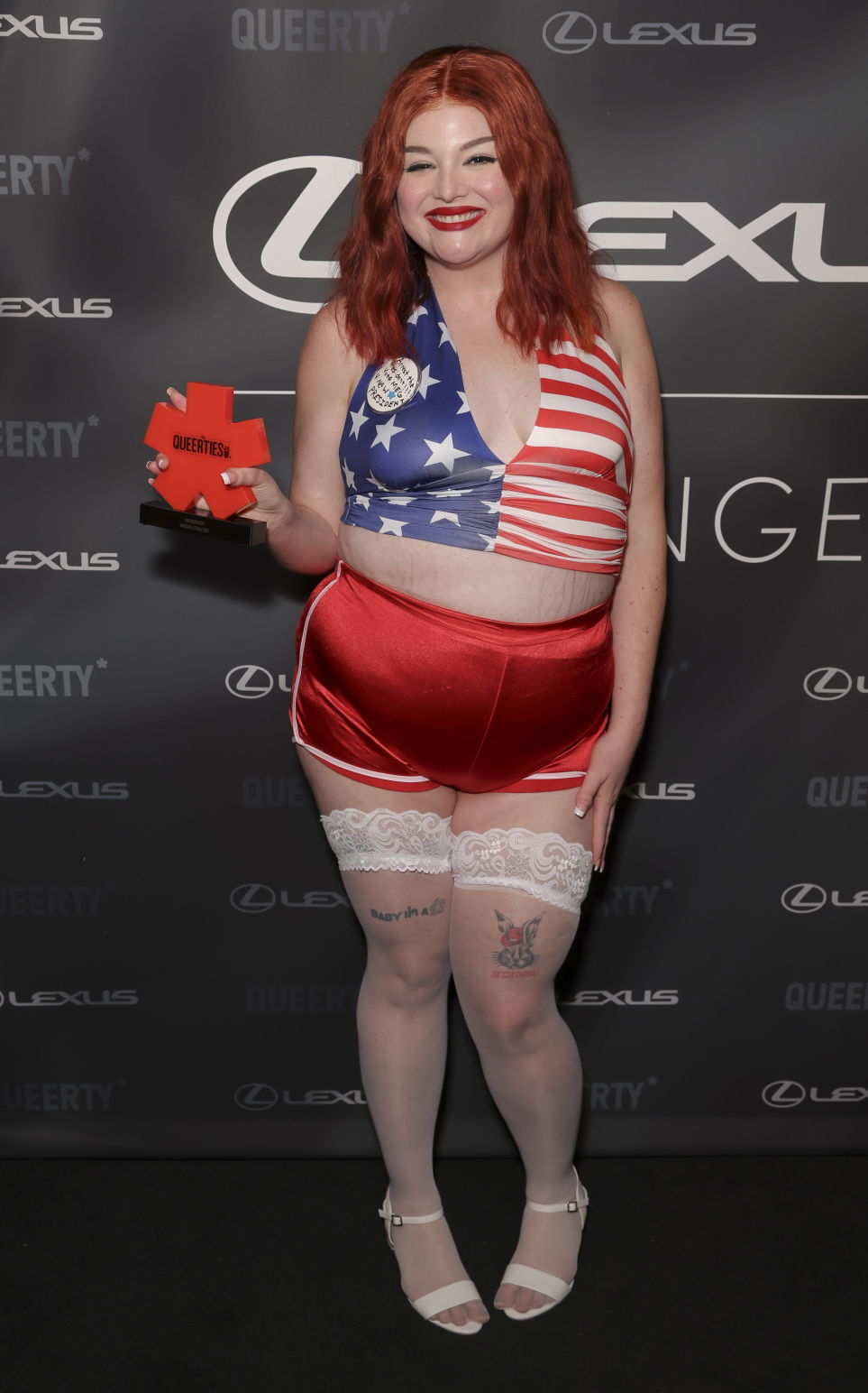
Published photos show two tattoos high on Megan Stalter’s thighs: the words “Baby, I’m a star” and a cartoon rabbit. Stalter has talked about the phrase’s link to performing, and a later interview also gives the rabbit a backstory.
Megan Stalter’s visible thigh tattoos
A Harper’s Bazaar shoot shows Stalter lifting the hem of a red gown, while a full-length Queerties Awards photo gives a clearer look at the thigh pieces. The script and rabbit are separate designs on opposite legs; the lettering has a small star beside it, and the rabbit has red writing beneath it.
The Washington Post reports that Stalter’s father and brother tattooed the star phrase at her father’s Voodoo Monkey shop in Cleveland. She told the paper that the words aren’t a reference to Prince’s song; they reflect her lifelong love of performing. A 2026 New Yorker interview adds that her brother did the star design and her father tattooed the rabbit. Stalter said she had always wanted a rabbit tattoo and thought it would be funnier with a hat.
The photos make the broad shapes easy to distinguish: a short line of script on one thigh, a small cartoon on the other. The rabbit’s tiny red lettering is harder to make out, so there’s no point guessing at the words from these images.
Coverage of the 2026 Queerties Awards also noted lower-back lettering that read “Prettiest girl in America.” That was part of Stalter’s red-carpet look. The reports call it a tattoo but don’t say whether it was permanent, so it’s safest to keep that event image separate from the thigh designs shown here.
For a design that mixes script and an illustration, give each part room to read. Check the lettering at its actual size, and ask to see how the drawing’s smaller lines will hold up on skin. Try the stencil standing naturally, then sit and move around; a thigh design shifts with posture and clothing.
What can be confirmed? Photos show the “Baby, I’m a star” script and rabbit on opposite thighs. Stalter has explained the phrase and the rabbit choice in interviews; the images themselves don’t show every small detail clearly.
Her style changes with the setting
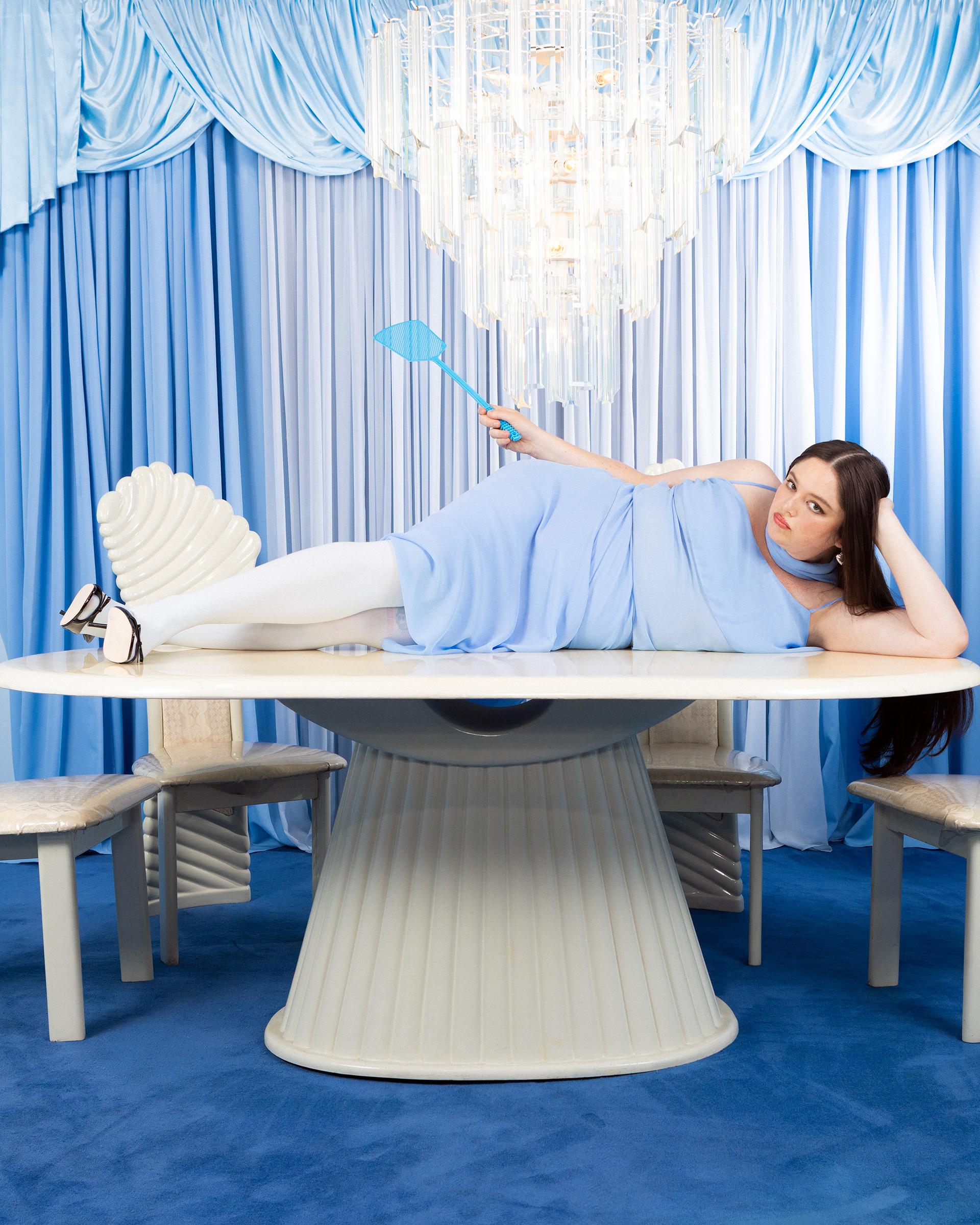
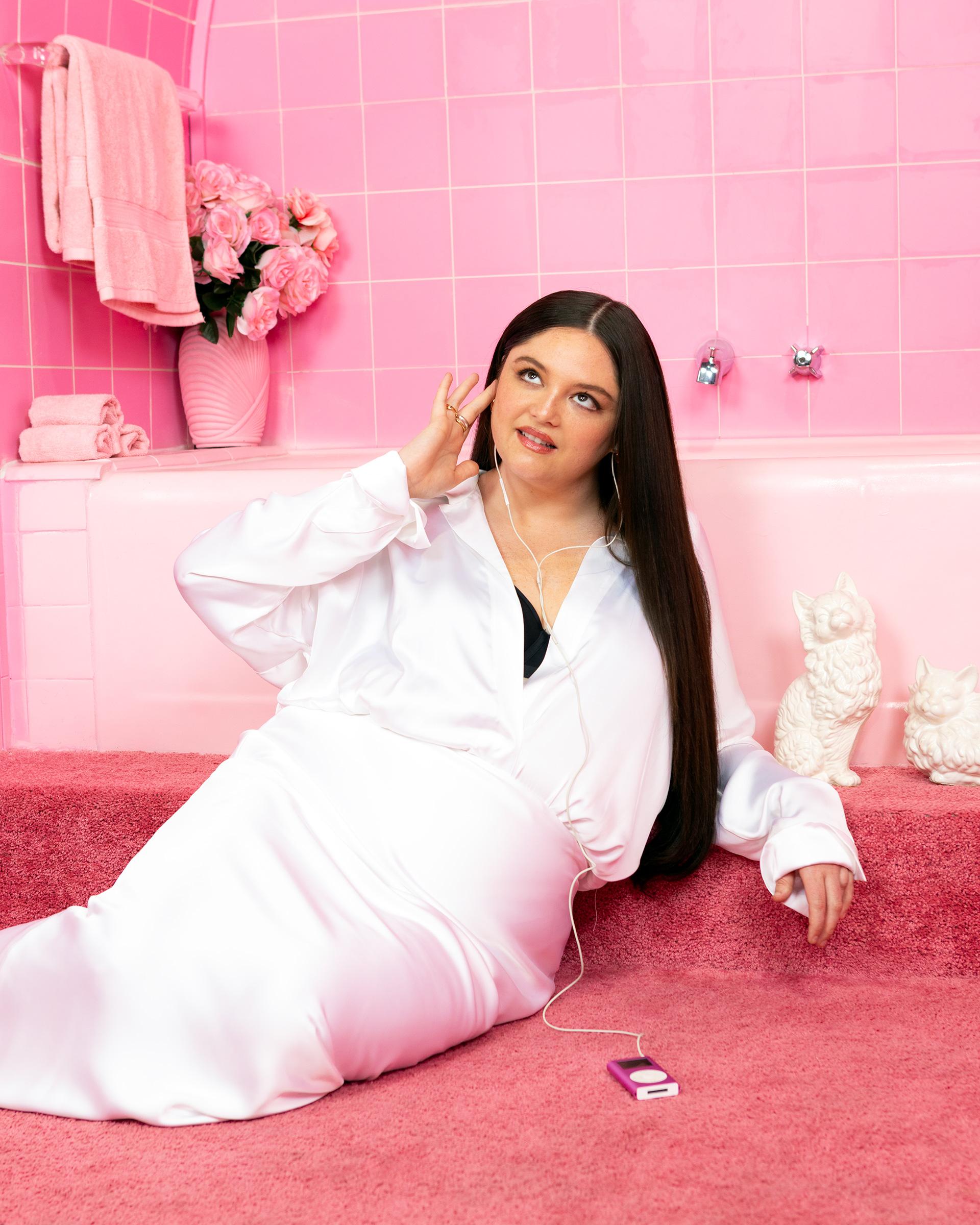
Stalter’s editorial looks often lean into costume and a strong pose. In these two TIME portraits, one puts her beneath a chandelier in a pale-blue room; the other moves to a pink bathroom and a softer pose. They show different photo setups, not additional tattoo evidence.
Photos catch a moment, not a whole person
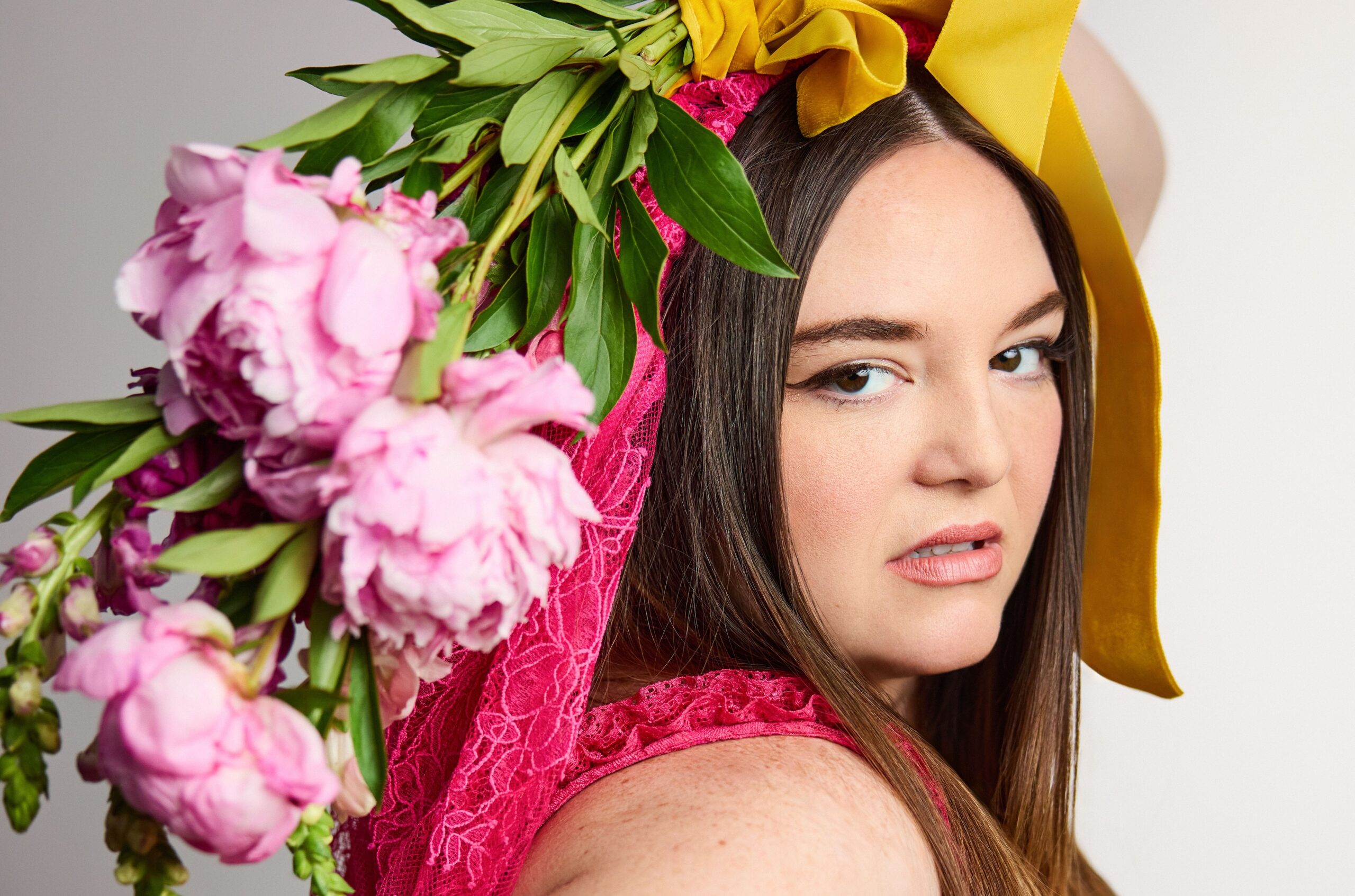
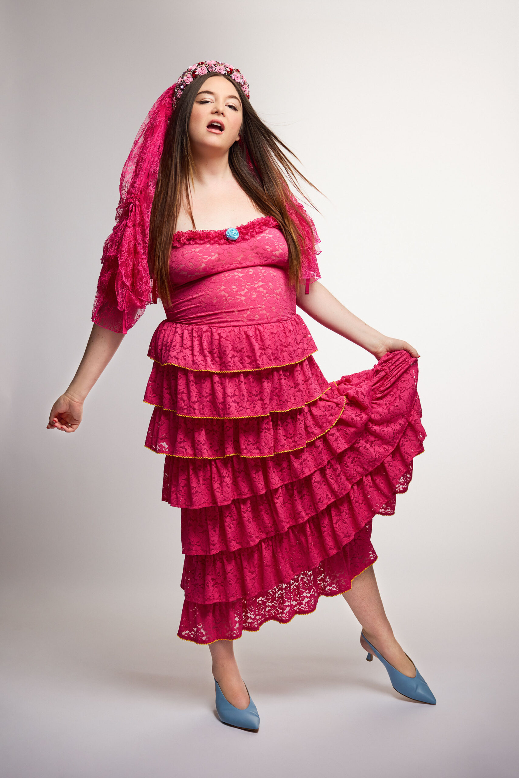
The Washington Post profile photographed Stalter among pink flowers and a yellow ribbon, then in a separate portrait wearing pink lace with a veil-like headpiece. Both images are carefully staged career portraits. They show how much the clothes, props and framing can change the mood of a photo; neither adds information about her tattoos.
What does Megan Stalter’s thigh tattoo say? It reads “Baby, I’m a star.” Stalter said it’s about her love of performing, not Prince’s song.
What is the other visible thigh tattoo? It’s a cartoon rabbit. Stalter said she had always wanted one and thought a hat would make it funnier.
What was the “Prettiest girl in America” back tattoo? It was lower-back lettering shown at the 2026 Queerties Awards. Coverage called it a tattoo, but doesn’t establish whether it was permanent.
Has Stalter explained the other designs? She has described the rabbit and the star phrase. The New Yorker also reported a separate bee body with a wolf head, which Stalter said her sister has too.
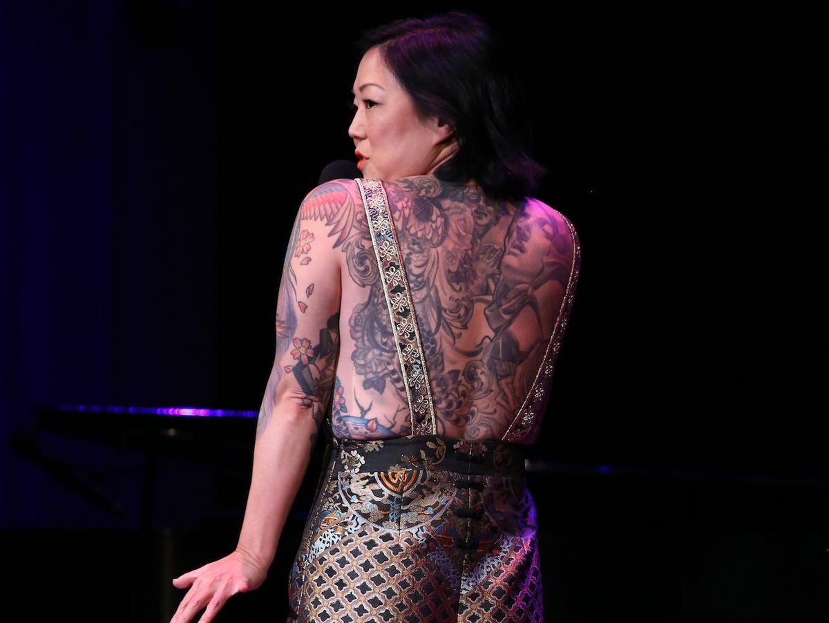
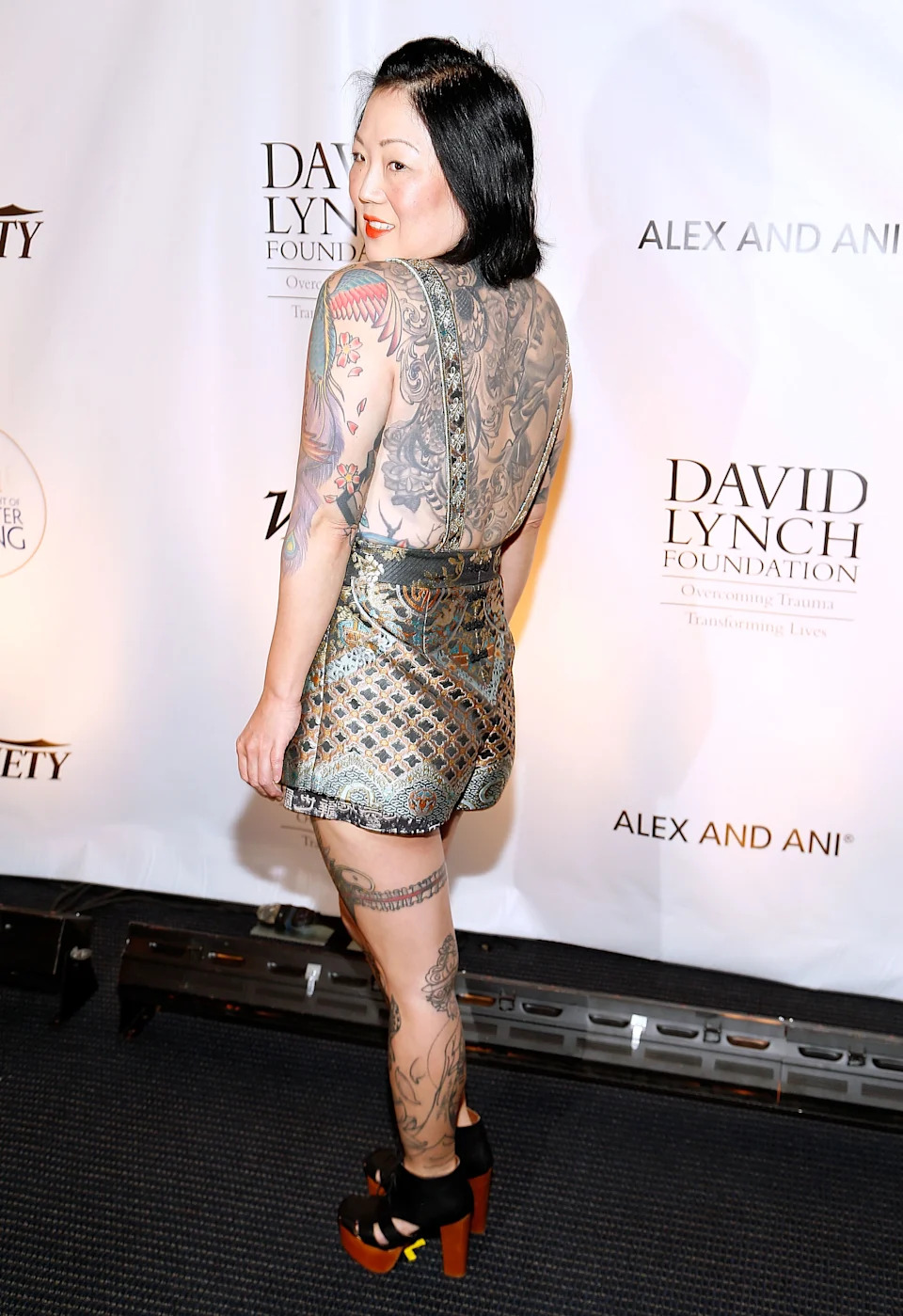
Margaret Cho has tattoos across her back, arms, stomach and legs, including colorful flowers, a crane and portrait designs. She has described building a large collection over time.
She began getting larger pieces in her thirties, found community in tattoo shops and has said she’d like a full bodysuit. Cho has called herself a tattoo collector, and she doesn’t give every design one fixed meaning.
Margaret Cho’s back tattoos are the biggest part of the collection
The scale of Cho’s back work is clear in stage photos. Flowers, ornamental shapes and darker shading spread across her shoulders and back, with different parts appearing to have been added over time.
Cho has spoken about getting a large amount of her body tattooed and wanting a full bodysuit. The back piece is part of that larger project, rather than a stand-alone design.
The colorful arm work includes flowers, a phoenix and a bird
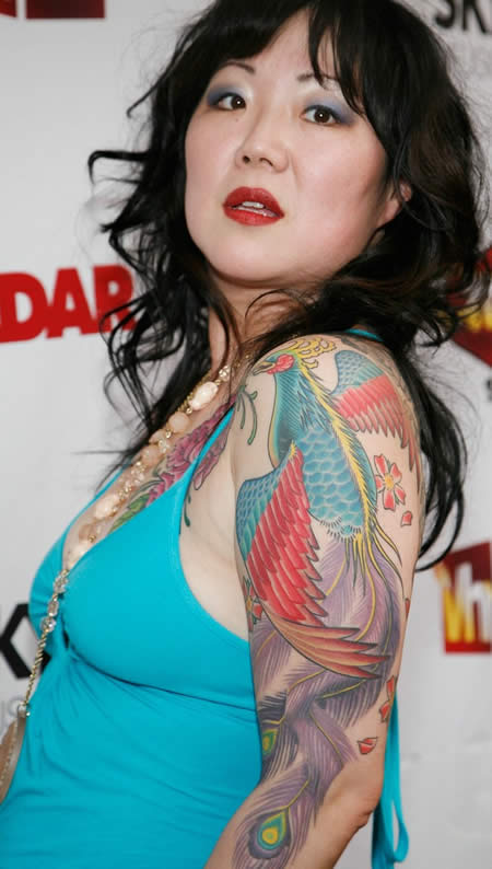
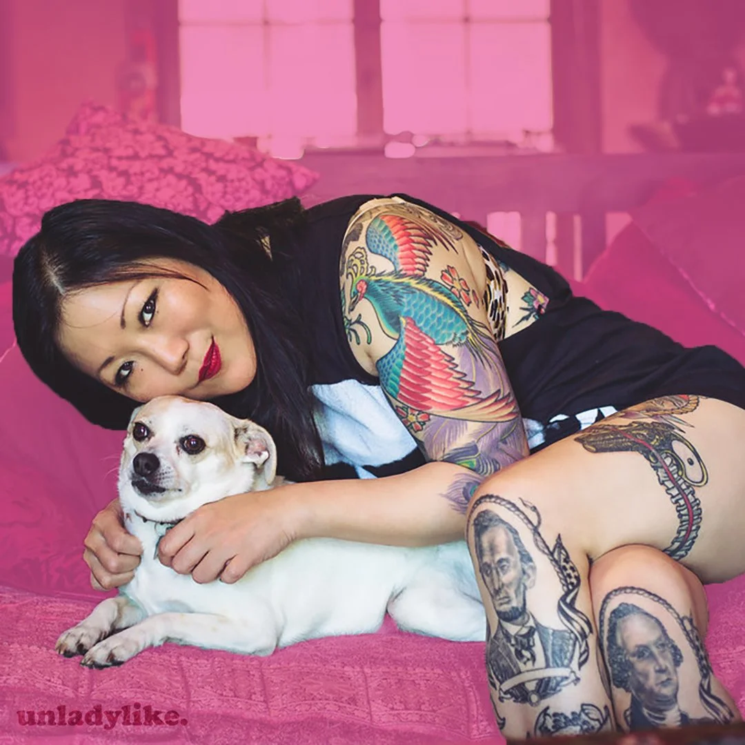
Cho’s arms show pink peonies, leaves, a colorful bird and a phoenix-like design. The colors are bright, with fine lines that keep the pieces distinct.
One peony has been linked to artist Andrew Moore; other coverage connects parts of the sleeve to Nathan Kostechko. Cho has also mentioned getting several peonies, so the flowers are better treated as a group than given one shared meaning.
Her crane tattoo came from a Chris O’Donnell session
On her own site in 2007, Cho shared photos from a tattoo session with Chris O’Donnell. She joked about the pain and her expression in the pictures. The finished design is a crane, lighter in feel than some of her darker work.
The session photos show the tattoo being made, rather than just a small detail in a red-carpet shot. Cho’s post is casual and funny, in keeping with the way she has talked about the process.
Cho has tattoos across her stomach, legs and thighs too
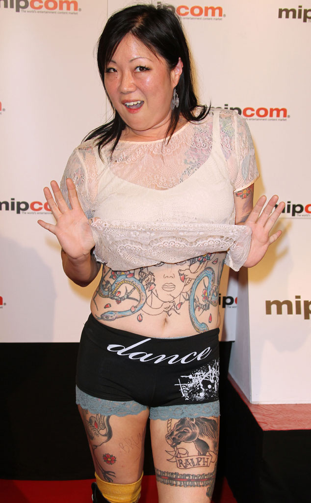
Photos show tattoos across Cho’s stomach and legs, including portrait-style work on her knees and designs on her thighs.
One talked-about piece is a garter around her left thigh with a derringer pistol. Other portraits have been associated with Abraham Lincoln and George Washington. The collection mixes flowers, old-school flash, portraits and personal jokes.
Her tattoos are tied to family, community and self-expression
Cho has talked about growing up around tattooed people in San Francisco. Her father’s employee David Forbes, who was heavily tattooed, became an important figure in her life. She has also said that Ed Hardy did her first large tattoo, across her stomach and back.
Cho has described tattooing as a way to express herself and work with artists she admires. A design can honor someone, mark a period in her life or simply appeal to her visually.
Not every Margaret Cho tattoo has a confirmed meaning
Cho has shared plenty of photos, but not every design has a public explanation. Some online captions assign meanings she hasn’t stated herself.
The peonies, crane, phoenix and portraits are visible; the stories behind all the smaller details aren’t. Several pieces also appear to have been added at different times, giving the collection a more personal feel than a matching sleeve.
Why Margaret Cho’s ink stands out
Cho’s collection spans bright colors, traditional shapes, portraits and work from different artists. The photos show a busy collection that has grown with her, rather than one design built around a single trend.
She has also shared tattoo sessions and talked about the process with humor. For more comedian tattoos, visit the site’s comedian tattoo section.
Watch Margaret Cho talk about tattoos
In the short Tattoo Stories interview below, Cho talks about her collection in her own words.
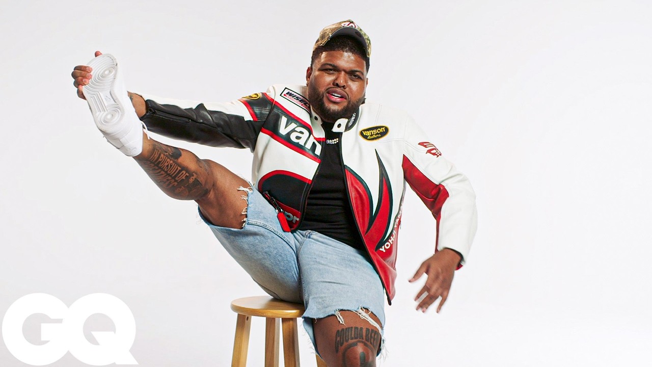
Druski’s tattoo tour opens with the piece he would rather leave in the past. In GQ’s Tattoo Tour, he laughs about his first tattoo, then walks viewers through the ink on his legs. He doesn’t pretend every design comes with a deep backstory: some are personal, some belong to a particular chapter of his life, and some simply mark the route from Atlanta comedy sketches to sold-out shows.
There still isn’t much reliable detail about the full collection. GQ offers the clearest tattoo-specific account, while photos from public events help show where the ink sits. A few designs are easy to make out; others are obscured by clothing, shadows or distance. The guide sticks to what Druski has said and what the pictures actually show.
That mix of self-mockery and selective detail feels right for him. He is willing to talk about early choices without turning every tattoo into a grand statement. The ink sits between private history and public persona, a familiar place for a comedian’s ink.
The first tattoo is the one Druski is least proud of
Druski starts his tour by poking fun at his younger self. The official GQ description quotes him saying, “I’m not proud of my first tattoo!” It sounds like an early decision he made with less confidence than he has now, and he is happy to laugh about it.
He also draws a line around anything from before the money, saying he will not show those pieces. That does not tell us exactly what is hidden, but it gives the collection a little context: some of his earlier years remain private, while the GQ video focuses on the tattoos he is comfortable showing today.
The first tattoo still has a place in the story, even though public sources do not clearly identify its design. It is an awkward beginning and an easy setup for a joke. Druski’s willingness to laugh at that choice tells us more than a made-up explanation ever could.
His legs are the main canvas viewers can actually follow
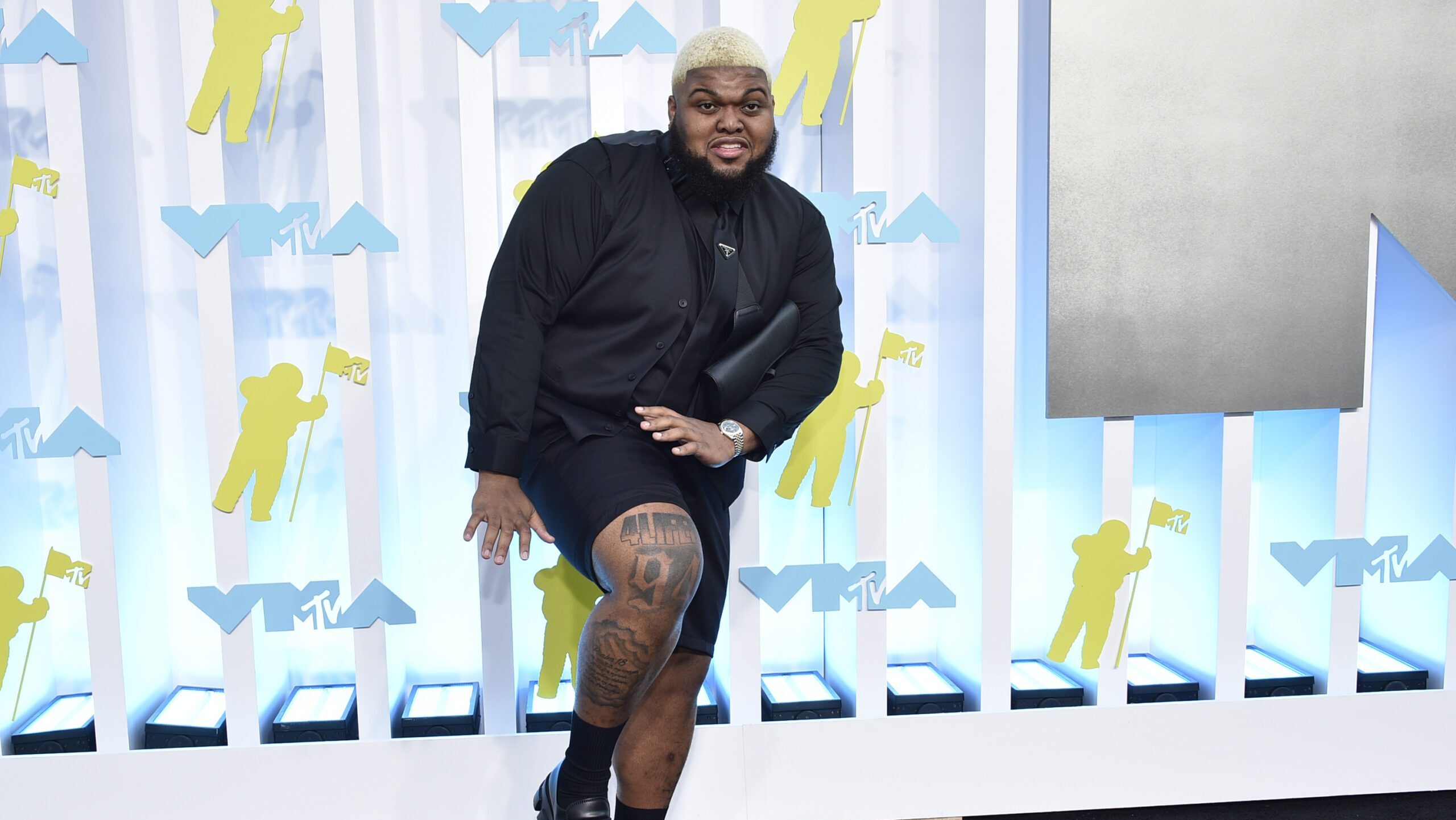
The most consistent feature in the available coverage is Druski’s leg ink. GQ says he spends time discussing the tattoos on his legs, and photos from events often show the work when he wears shorts. It is the clearest centre of the collection that viewers can follow.
Stage and red-carpet photos reveal several pieces across his lower body, but lighting and distance make it hard to identify every design. A dark patch in a picture is not enough to name a tattoo. What the images do support is a growing collection of leg pieces, seen from different angles and at different points in time.
The placement also lets Druski change how much of the collection he shows. Trousers keep the ink covered for a polished appearance; shorts bring it into view at a performance or photo call. The tattoos move easily between the formal celebrity setting and his more playful comedy persona.
“If you ain’t first, you’re last” connects the ink to his ambition
One of the few tattoos with a clearly reported meaning is the line “If you ain’t first, you’re last.” Druski told XXL that he had the quote from Ricky Bobby tattooed on his body. It is a joke from a movie, but it also matches the competitive energy he brings to his career.
This is not a quiet tribute or an abstract symbol. It is an over-the-top motto borrowed from a fictional driver and made permanent. That combination feels very Druski: a motivational line delivered with a wink, while still reflecting how much he wants to keep moving forward.
The sources used here do not consistently identify where the quote sits, so its placement is best left open. The phrase and its connection to the film are clear; attaching it to a particular body part would go beyond what has been documented. Tattoos can carry meaning without sounding solemn.
The red-carpet photos show how the collection looks in motion
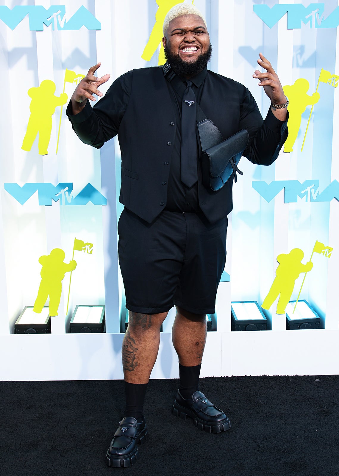
Photos from public appearances catch Druski’s tattoos as part of an outfit, rather than as isolated close-ups. Shorts and loafers reveal the leg work while he stands, sits or turns for photographers. The ink becomes part of his silhouette.
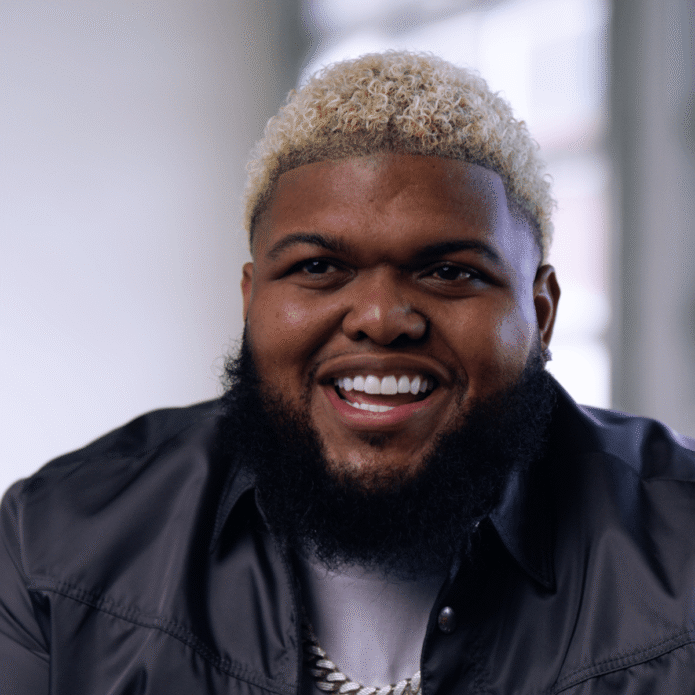
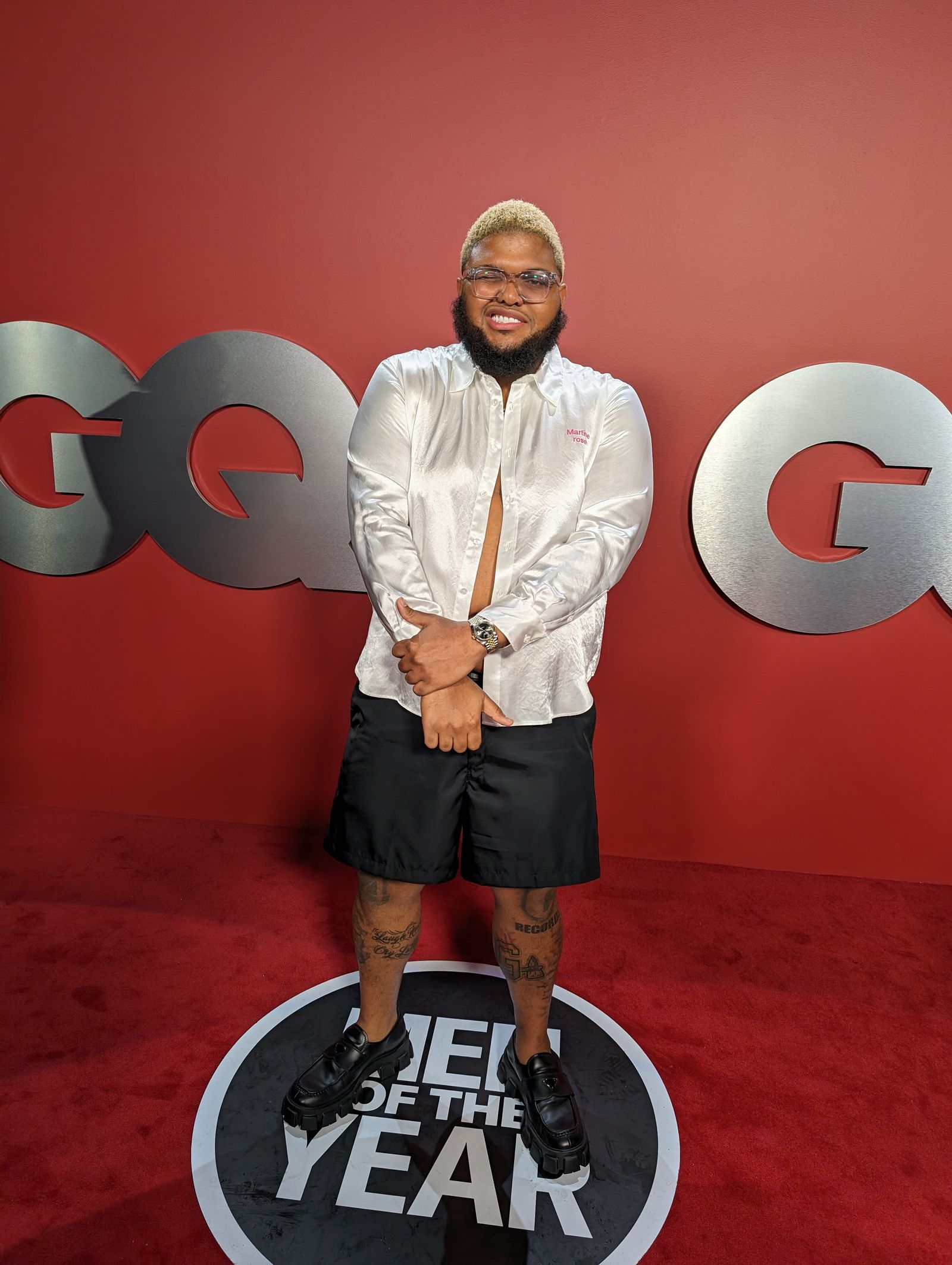
The GQ event pictures are a good example. His clothes are sharp, but the exposed legs keep the look relaxed. Bleached hair, glasses and his comic expressions already make him easy to recognise; the tattoos add another detail without taking over the frame.
The images also show why a careful inventory matters. A photo can confirm ink on a calf or thigh without revealing the design itself. Shadows, fabric and resolution hide details, so the pictures help document where the tattoos appear without giving us license to guess what they are.
Some tattooed looks belong to characters, not the real collection
Druski’s sketches often involve costumes and different characters, which can make tattoo research tricky. A character may have extra ink on the arms or chest, but that does not mean Druski has those designs permanently.
It helps to keep documented personal ink separate from character styling. The GQ tour is useful because Druski speaks as himself and shows his own collection. Repeat appearances in event photos can also confirm that an area of ink is part of his real look. Sketches, makeup and temporary tattoos need to be identified as such before they belong in an inventory.
That distinction explains why his tattoos can look very different from one image to another. A character may have a separate pattern, while a photograph of Druski himself may show only a small section of his legs. The shifts are part of the comedy, but they should not be mistaken for changes to his permanent collection.
What the tattoos say about Druski’s public image
Druski’s tattoos fit the playful, ambitious image he has built. He can joke about an early mistake and still be open about the rest of the collection. He can dress formally with leg ink on show, or turn a movie gag into a permanent motto without treating it like a solemn declaration.
The contrast between the private early pieces and the tattoos he discusses now hints at how his life has changed. He says the pieces from before the money will stay hidden; today, he is a comedian who has built Coulda Been Records, headlined tours and stepped into bigger entertainment spaces. The ink offers a small glimpse of that timeline.
It is not a full biography. A visible calf cannot explain a whole life, and a movie quote cannot stand in for everything about the person who wears it. The public evidence gives us a more modest picture: a growing collection most visible on his legs, one quote with a clear story behind it, and a comedian who can laugh at his earlier choices.
Druski’s tattoo timeline is still being written
The collection is still changing, which may be the most honest place to leave the story. GQ frames the tour as a look at a lifetime of tattoos, but its description leaves room for the phrase “almost.” Druski’s career is still moving, and his ink can keep growing with it.
For now, the public record includes an early tattoo he jokes about and does not want to celebrate, visible work across his legs, and the “If you ain’t first, you’re last” quote tied to his competitive, movie-loving humour. Other designs may show up in photos, but unclear images and unconfirmed details should stay undescribed.
That restraint leaves room for the known details to stand on their own. This is not a finished display; it is a story with jokes, awkward beginnings, new confidence and a few choices Druski would rather leave behind. It is a fitting way for him to approach a tattoo tour.
Anyone looking for every design should remember that a tattoo tour is only a snapshot. New pieces can appear, old ones can be covered, and Druski may choose to keep his least polished work private. This guide counts the tattoos and placements that the available reporting and images can support, and leaves uncertain details open.
That approach keeps the collection in perspective. Druski is not building a serious mythology around his ink. He is cracking jokes, admitting that some early decisions were questionable and showing enough for viewers to follow the story. His tattoos add to that story without having to explain all of it.
Russell Brand’s tattoos have always been part of his public look: spiritual, theatrical, sometimes a little untidy, and tied to different stages of his life. The collection includes Sanskrit lettering, a long prayer on his forearm, religious imagery and smaller marks that can disappear behind his hair, jewellery or clothes.
That mix is what makes his ink interesting. It is not one tidy sleeve built around a single style. Some pieces have a clear explanation; others are easy to identify but harder to interpret, and a few show up only in older photos. It is best to look at each tattoo on its own and keep the visible design separate from larger claims about what Brand believes.
The Sanskrit “go with the flow” tattoo is Brand’s clearest piece
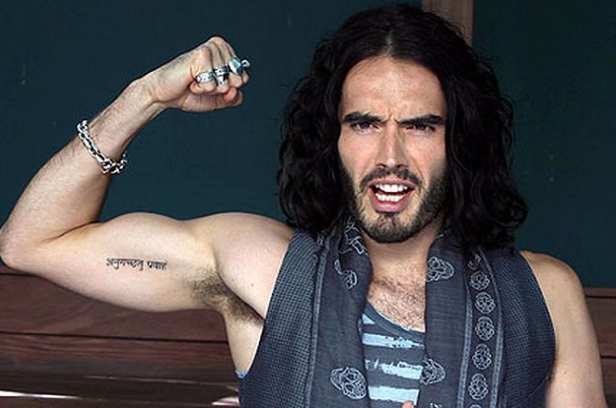
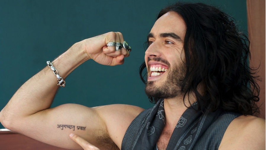
The Devanagari script on Brand’s upper arm is probably the tattoo people recognise first. It is commonly translated as “go with the flow” and runs along the inside of the bicep. In a sleeveless photo it looks like a clean strip of dark ink; up close, the individual characters and their spacing give it more shape.
The wording fits Brand’s long-running interest in Indian religion, yoga and meditation, but it does not need a grand theory to work. It is short, memorable and visually strong. The script follows the arm rather than sitting like a small badge, so it becomes part of the bicep’s shape when he raises or bends it.
A wider old photo helps show where the lettering sits on his arm.
There is also a relationship story attached to the design. Brand and Katy Perry were reported to have matching Sanskrit tattoos during their marriage. That belongs to that period of their lives, not a current statement about the relationship. The ink stayed visible after they separated, which is why the design keeps turning up in celebrity tattoo coverage.
Photos can make the characters look slightly different from one year to another. Lighting, skin tone, arm position and the quality of the original image all affect what shows up. The clearest description sticks to the commonly reported translation and visible placement instead of claiming that a soft photo proves every spelling detail.
Other designs sit around the script, but the Sanskrit line has its own character. It is narrower and more regular than the larger religious imagery elsewhere on his arm. That contrast gives the area some balance: a compact line of text beside looser, more illustrative work.
The matching tattoo story belongs to an earlier chapter
A wider view shows the phrase on the bicep rather than floating in a close crop. The arm’s position makes the lettering curve slightly with the muscle. The frame also catches the bracelet, vest and jewellery that appear in many older photos, which helps when comparing them.
The matching design carries two kinds of context. Visually, it is a line of Sanskrit; historically, it became connected to Brand’s marriage to Perry. Those facts are related, but they are not the same thing. The design can be described without turning it into a full account of their relationship.
It is also useful to separate the original choice from later interpretations. “Go with the flow” may sound like a perfect summary of Brand’s later spiritual interests, but that does not prove every idea people attach to it. Photos show dark script on his inner arm; reporting adds the translation and the matching-tattoo history.
The wider image makes the scale easier to judge. This is not a tiny wrist mark that vanishes in a crowd shot; it takes up enough of the bicep to anchor the arm, while leaving space for other designs. That is why using several genuinely different photographs works better than repeating one close-up with slightly different crops.
The forearm prayer is long, readable and tied to recovery
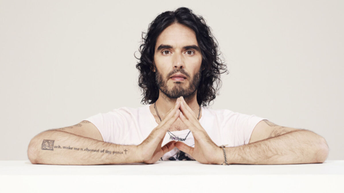
Brand’s forearm carries a much longer piece of text: a version of the prayer usually written as “Lord, make me a channel of thy peace.” Some reports use “God” rather than “Lord,” but the photos show a sentence-length inscription running along the arm, with a small cross at the end.
A clear photo of the arm matters because a distant portrait turns the lettering into a blur. In the seated image, his forearms rest in front of him and the words can be read as part of the composition. The long, narrow forearm gives the sentence room rather than squeezing it into a small patch of skin.
The wording is often discussed alongside Brand’s recovery from drug and alcohol addiction and his interest in twelve-step work. That context is supported in coverage, but it should not be stretched into a claim that the tattoo is a private diary. The inscription is a spiritual sentence; the recovery story helps explain why it matters without replacing the words themselves.
The cross can disappear in a low-quality image, even though it changes how the line ends. Without it, the tattoo reads like a quotation. With it, the inscription has a more prayer-like finish. It is a small detail, but one a close photo can settle.
Brand’s styling can make the forearm look busier than it is. Beads, bracelets and patterned clothes often sit close to the ink, and bright sunlight can flatten the letters. A wide, sharp image shows the placement; a close crop makes the wording readable.
The prayer’s wording is clearer in a close-up
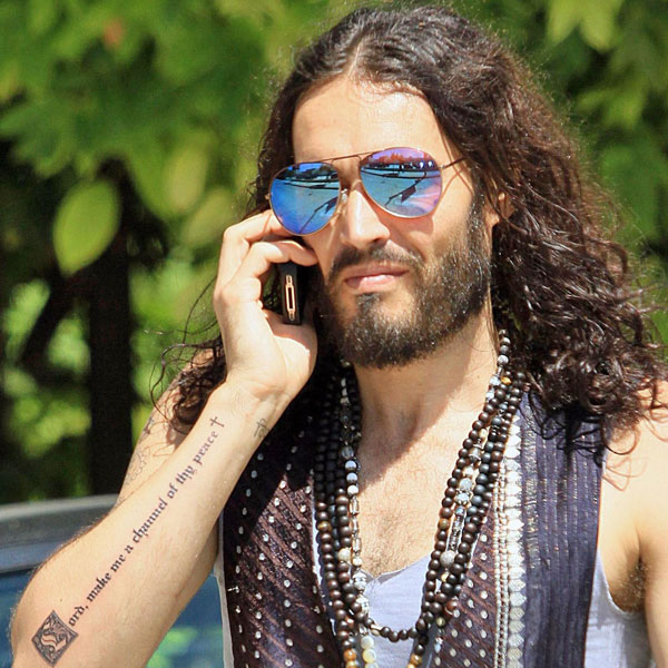
A second photo shows the same inscription from another angle. It is not a second prayer tattoo; it is another useful view of the one on his forearm. The words run along the arm, the cross sits at the end, and the line remains readable with his hand turned toward the camera.
The prayer is commonly connected with the Prayer of St. Francis and with recovery culture. Brand has spoken publicly about addiction, sobriety and the twelve steps, so the connection is understandable. The careful wording is that the tattoo uses prayer language that fits themes he has discussed. More personal claims need a direct statement from him.
The lettering feels different from the Sanskrit. That mark is compact and graphic; the prayer reads like a sentence, almost a line from a notebook. The contrast is part of the collection’s appeal. Brand’s tattoos do not all try to look or sound alike.
The eye and Krishna imagery give the arm a more graphic side
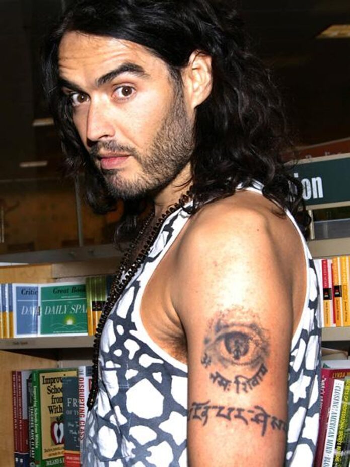
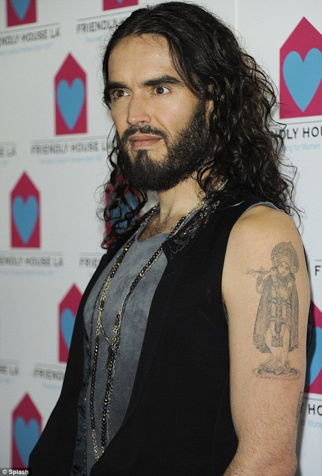
Brand has also been photographed with larger religious imagery on his upper arm, including a Krishna figure and Sanskrit lettering. This is more illustrative than the short bicep phrase: a figure, shading and surrounding text turn the arm into a small panel of artwork.
Older photos and reports also describe an eye tattoo with Sanskrit underneath. The eye has more immediate visual impact than the prayer text; it reads as a graphic symbol before the viewer considers its meaning. If hair or clothing hides the edges, it can be hard to tell where one design ends and another begins, so the placement description should stay careful.
Brand’s interest in Hare Krishna and Hindu thought is well known, giving the religious imagery a public context. That still does not establish a hidden meaning for every line or figure. A Krishna image, an eye and a Sanskrit phrase can sit together because he likes the ideas and the look, without forming a secret code.
Scale changes how a tattoo reads. The figure can hold attention from across a room, while the lettering invites a closer look. That combination of instant recognition and small detail appears elsewhere in Brand’s collection too.
Not every mark attributed to Brand is equally easy to verify. Older lists mention smaller symbols, a “33” wrist tattoo and a word reported as “Ecstasy,” while other photographs focus almost entirely on the arm pieces. Those details can be identified as reported, but they should not carry the same certainty as the Sanskrit phrase or forearm prayer without a clear photo.
Dates matter. Brand’s hair, jewellery and clothes can hide the wrist or hip, and a picture from one stage of his life will not necessarily show every tattoo. Lighting can also soften or change a mark’s appearance. If something is absent from one photo, that does not prove it was removed.
The arm pieces are the clearest place to start because they recur in interviews and event photos. The smaller tattoos take more care: a close-up may show a mark but say nothing about its meaning, while an interview may explain a phrase without giving readers a good view.
That split between visual evidence and personal explanation is useful. A photograph establishes shape, colour and placement; Brand’s own words can explain a phrase or spiritual reference. Anything else should be labelled as interpretation instead of being slipped in as fact.
Together, the tattoos move between text and image, private memory and public style. The Sanskrit line carries the “go with the flow” translation and the relationship history; the forearm prayer connects with recovery and service; and the Krishna and eye imagery gives the collection a more graphic spiritual edge. Smaller reported marks add glimpses from other stages of his life.
This guide needs more than one generic portrait. One photo should make the Sanskrit readable, another should show its scale on the bicep, two should help with the long forearm prayer, and the upper-arm image should show how the religious artwork sits on the body. That keeps the writing relaxed and specific instead of filling space with vague claims about transformation.
Brand’s ink is personal, but it is also very visible. The lettering invites people to ask what it says, and the larger religious images give his arms a recognisable look. There is no need to force every piece into one polished story. The interest is in the mix: clear phrases, open-ended symbols and tattoos gathered across different chapters of his life.
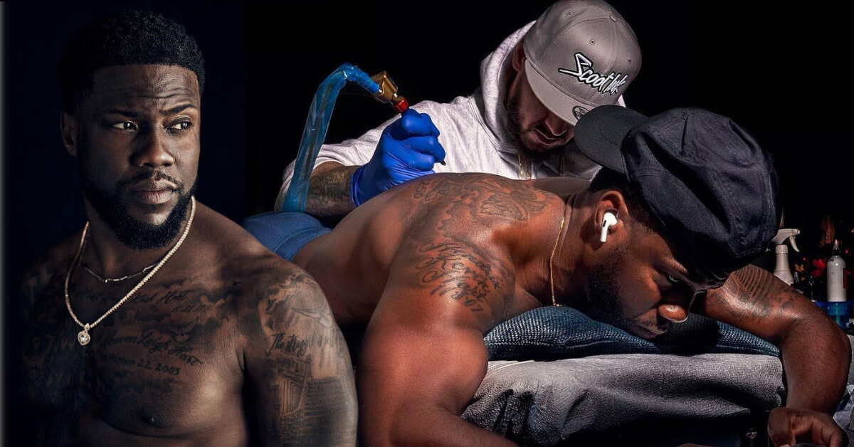
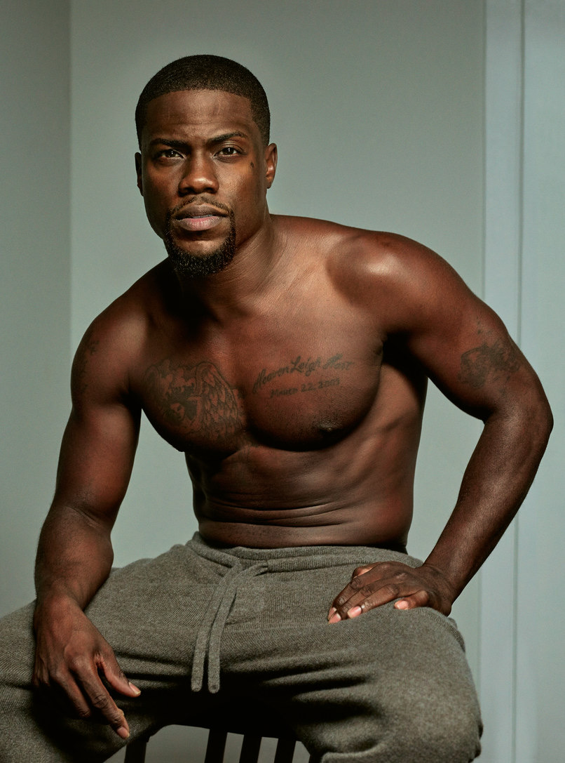
Kevin Hart has more tattoos than his usual red-carpet outfits show. His chest, shoulders, arms and back all carry ink, including family names, an angel, theatre masks and smaller symbols. The back piece is the biggest, but the mix of large work and small details gives the collection its character.
The photos here focus on different parts of the body. A headshot cannot show a back tattoo, and one shirtless image may not make the lettering easy to read. Several views, with a little context from coverage, give a clearer picture of Hart’s tattoos.
Kevin Hart’s chest tattoos include family names and a large angel
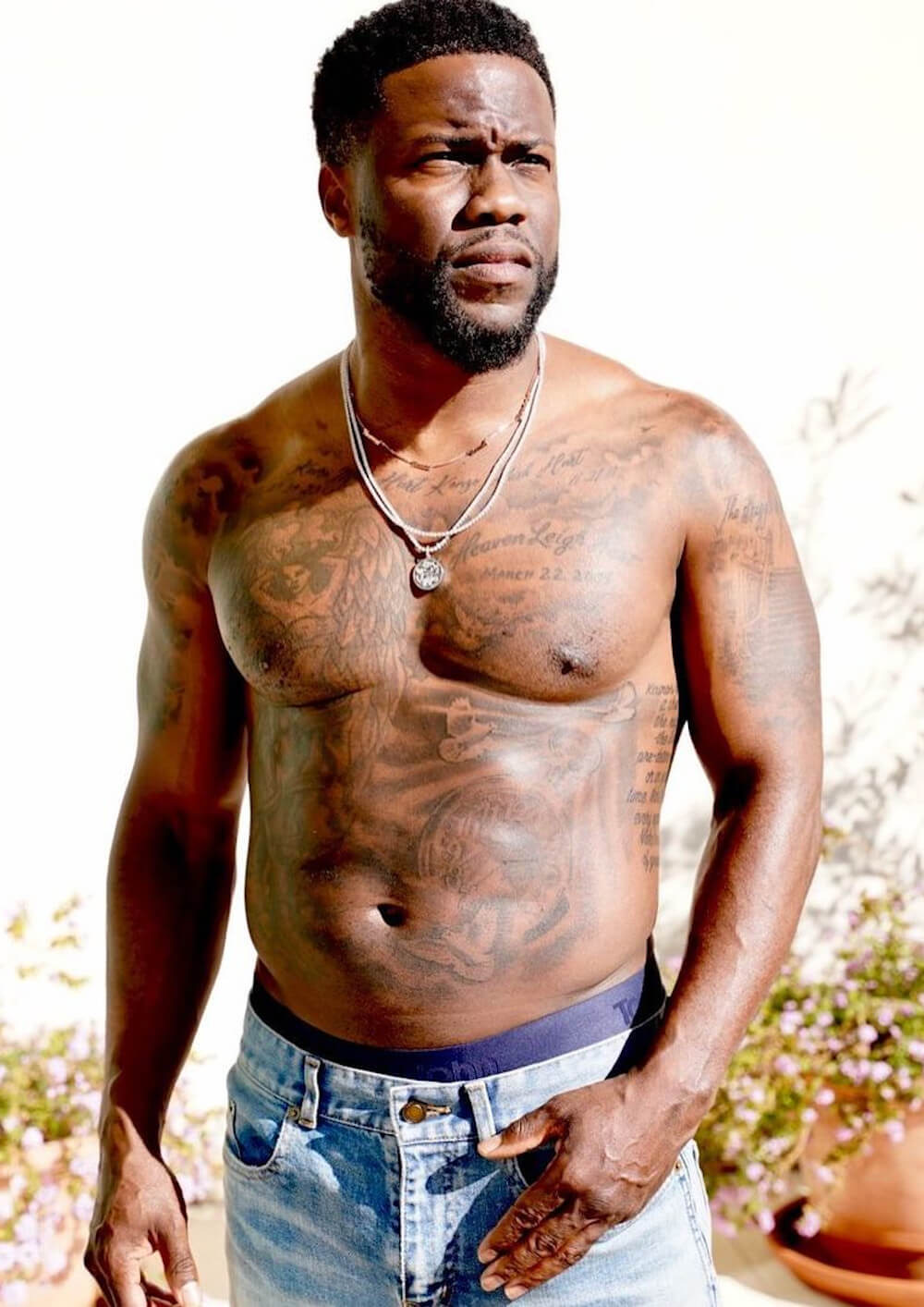
Hart’s chest is one of the easiest places to see the collection. It includes an angel and lettering connected to his family, including his children’s names. That personal detail does not need an elaborate explanation. A clear shirtless image shows how the words sit across his chest instead of letting them blur together.
The angel is the larger visual feature in the centre. Its shape anchors the chest, while the smaller lettering sits nearby. These are separate designs with different roles, and the photo also shows how chains, lighting and muscle definition can affect their appearance.
Hart has been photographed at the gym, on the beach and during tattoo sessions. Those images make the ink visible, but some are more useful than others. A wide shot shows how much of the chest is covered; a close-up helps readers make out the names and the angel’s edges. The family names need that sharper view.
The family connection is clearer than the meaning of many smaller symbols. Hart has publicly linked parts of the work to his children and relatives. Other marks can be described by their shape and location until he gives them a direct explanation. That keeps the article detailed without inventing a story for every line.
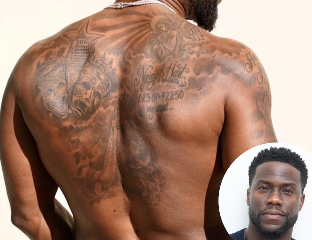
The comedy and tragedy masks cover most of Kevin Hart’s upper back
Hart’s largest single tattoo is on his back: comedy and tragedy masks spread across the upper back. It is a fitting design for a comedian whose career centres on performance. The masks use black-and-grey shading and stretch across both shoulders, reading as one strong composition when he turns away from the camera.
Their contrasting expressions give the piece its focus. One face feels lighter and more playful; the other has a darker theatrical mood. The difference creates a clear centre without needing colour. A full back photo lets the masks read properly instead of reducing them to a small crop on an otherwise empty page.
Hart revealed the tattoo during a workout-style photo session, and later pictures show how it sits beside smaller shoulder pieces. Coverage has also shown an artist working on his back, helping establish the timeline. The finished design developed over time rather than appearing all at once.
A generic portrait would not work for this section. The featured image can show Hart’s face, but only a separate back photo reveals the tattoo, its shading and its placement.
Hart’s arm tattoos sit beside the chest work and smaller symbols
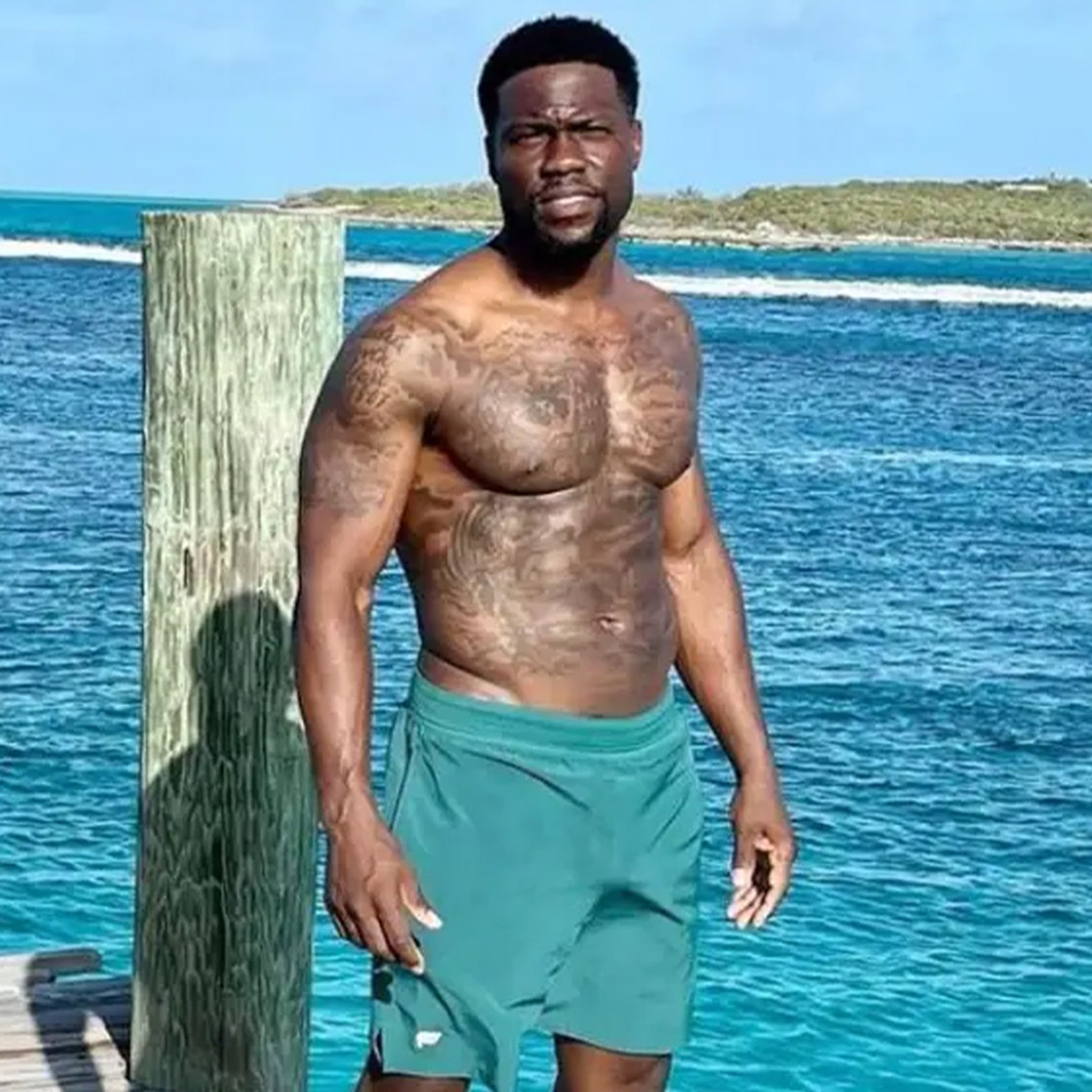
Small tattoos on Hart’s arms can disappear under a T-shirt. There is lettering, darker imagery and work that visually connects with his chest. A beach photo helps because his arms are uncovered and the strong light makes it easier to distinguish the individual marks.
The arms do not form one precisely planned sleeve. Some tattoos stand alone, while others sit close enough to look connected in a wide image. That is natural for a collection built over years. It is more accurate to identify what is visible and leave uncertain edges alone than to claim the whole arm follows one theme.
Hart has also been photographed during tattoo sessions, showing the work as it develops. One image may catch an artist working on his back with older tattoos still visible around the shoulders. That adds timeline context, but it does not prove that every surrounding mark came from the same appointment.
The arm lettering is another reason to use a large image. Compressed photos can make small words unreadable. A clear body shot shows where the text sits, while the article adds only the context supported by the available sources.
The shoulder and side tattoos fill in the gaps around the main pieces
Smaller tattoos around Hart’s shoulders and sides fill out the upper body. Some sit near the collarbone; others are beside the angel or extend toward his ribs. They may not be as famous as the back masks, but they explain why a shirtless photo shows more ink than a short list of headline designs suggests.
Posture changes how the shoulder work appears. When Hart raises his arms, the skin stretches and the lines seem farther apart. When he turns or relaxes, the designs bunch closer to his chest. More than one angle is useful because a single pose can hide the placement.
Coverage and tattoo galleries identify the angel, family lettering and other shoulder designs, but not every small symbol has a confirmed meaning. It is enough to describe what is visible: an outline, a short word, a mark near the shoulder or a design running toward the side. That is more helpful than guessing.
The shoulder details also show why photos need different framing. Larger tattoos benefit from a wide view, while small lettering needs a close one. Both belong in the article and deserve a clear image instead of getting buried in one long paragraph.
Kevin Hart’s tattoo collection changes with each workout and studio photograph
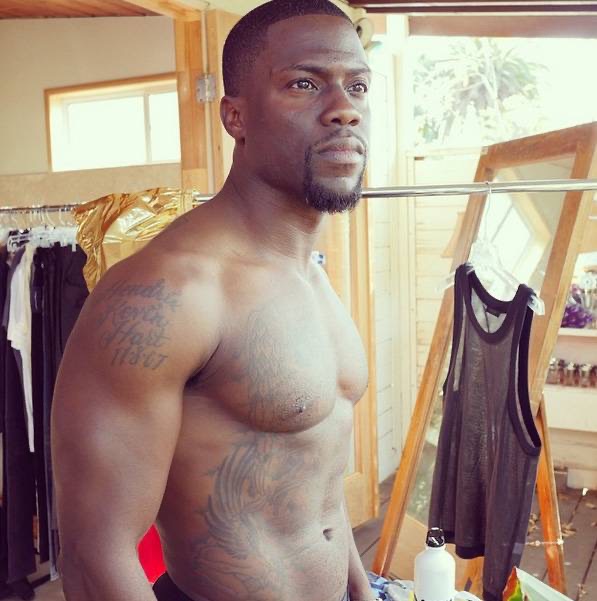
Fitness photos often capture Hart’s arms, chest and torso all at once. That makes the tattoos easy to spot, but the details can flatten out. Sweat, hard light and shadow may make a design look darker than it does in a calmer portrait.
This workout image is separate from the beach and gallery photos. It shows the tattoos while Hart is moving and posing naturally, which helps explain why the layout can look different from a straight-on studio view. His chest may appear broader, an arm can obscure a shoulder and the back is usually out of sight.
Those changes do not necessarily mean Hart has added or removed anything. Clothing, posture and camera distance all affect the view. Where possible, a reliable account dates the photo and avoids calling every difference a cover-up. The overall layout becomes clearer when several distinct images are compared.
Hart’s tattoos have an easy, personal feel: family names, an angel, performance masks and smaller marks around his arms and shoulders. It is not one rigid sleeve built around a single idea. The collection appears to have grown as his family, career and interests changed, making the photos as useful as the design list.
The tattoos are easier to read as a timeline than as one finished mural
Hart’s tattoos did not all become visible at once. The back masks drew particular attention in later fitness photos, while the chest and arm pieces had appeared in public earlier. The timeline explains why older portraits can look less crowded than newer ones.
The family lettering belongs to the personal side of the collection, while the masks connect with comedy and performance. The angel brings in another mood, and the smaller shoulder marks bridge the spaces between. The designs can have different reasons; they do not need to add up to one polished statement.
The clearest visual inventory includes the comedy and tragedy masks, the angel, his children’s names and the arm, shoulder and side tattoos shown in close photos. Less distinct marks should remain uncertain. That tells readers where the evidence is clear and where the image does not show enough.
Hart has enough documented work to merit several body photos instead of one generic headshot. The featured portrait is separate, and the six tattoo images appear beside the sections they support. Together, they show his chest, back, arms, shoulders and the changing layout of his collection.
Framing matters. A full back piece needs enough space for the masks to remain recognisable, while a child’s name or a small shoulder symbol needs a closer view. Reusing one low-quality photo would make the collection look smaller than it is. The images here show distinct scenes rather than one file cropped in several ways.
Hart’s tattoos are easier to follow when the body is broken into areas: family and angel designs on the chest, theatre masks on the back, and smaller work around the arms and shoulders. The strongest meanings are the ones Hart or a reliable source gives directly. The designs themselves fill in the rest.
For readers looking up Kevin Hart’s tattoos, the simple takeaway is that there is plenty to see, and the designs do not all come from one session. The collection has grown along with his public life, family and training routine. It reads best when each group gets a clear photograph instead of being rushed through a short list.
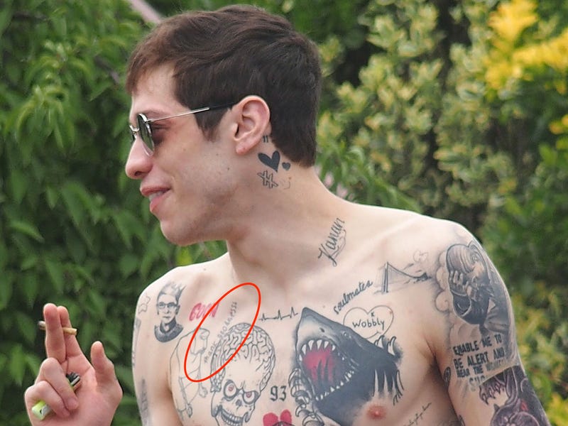
Pete Davidson’s tattoos were never a neat, coordinated collection. They mixed jokes, pop culture, lettering and relationship references, with some pieces added quickly enough that the circumstances became part of their story. For years, photos showed a dense patchwork across his chest, arms, hands and neck. More recently, laser removal has changed the picture, so dates matter as much as design names.
Davidson has explained some choices himself. On Fresh Air, he told the story of getting a Game of Thrones tattoo while watching the show. Later interviews and reports covered why he began removing much of the ink. A careful inventory keeps his own explanations separate from what a photograph only seems to show.
The shark became the most recognisable piece on his chest
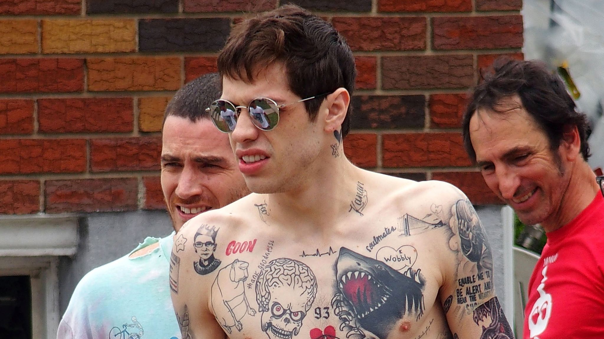
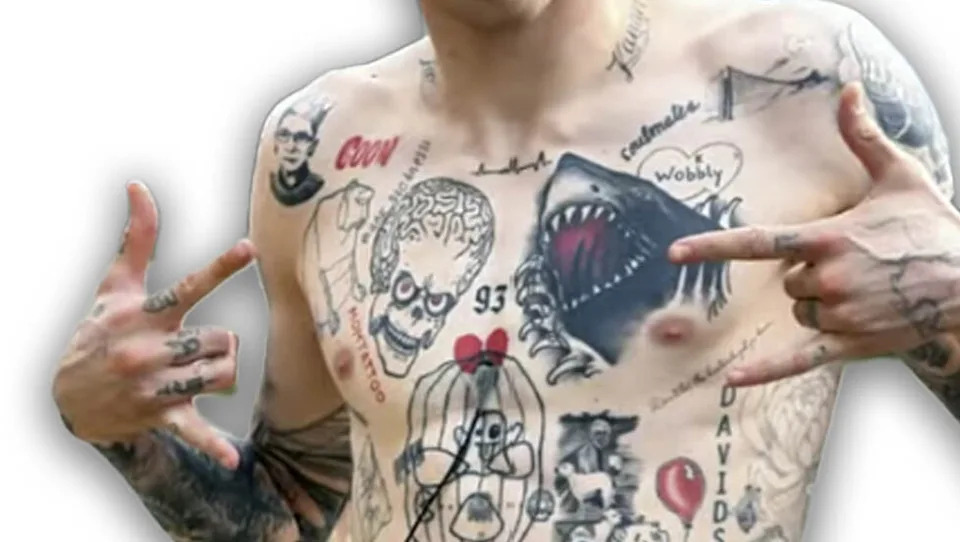
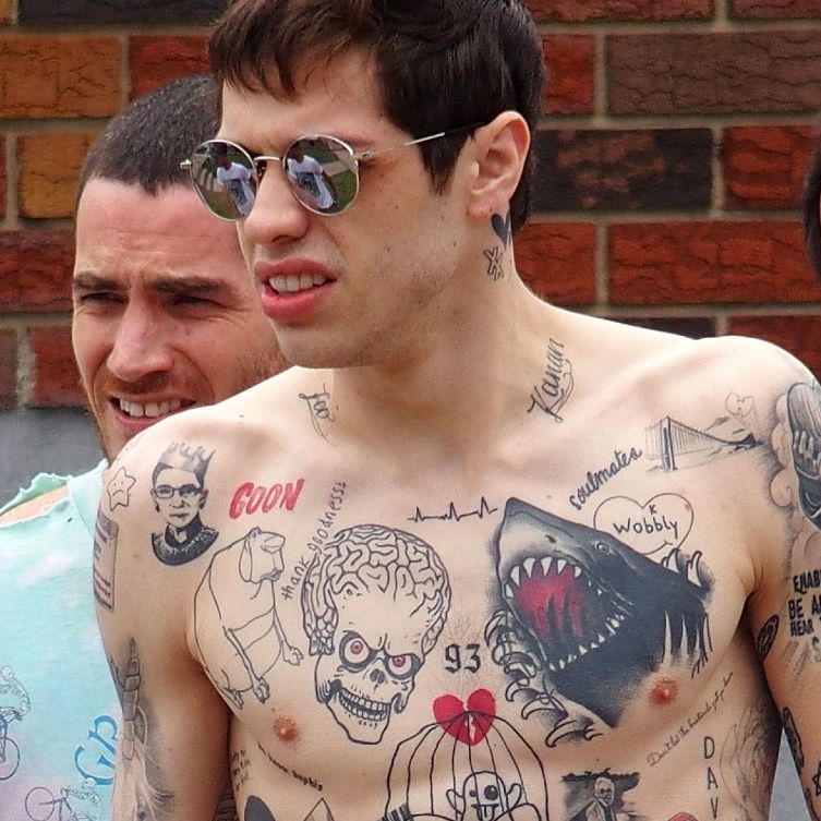
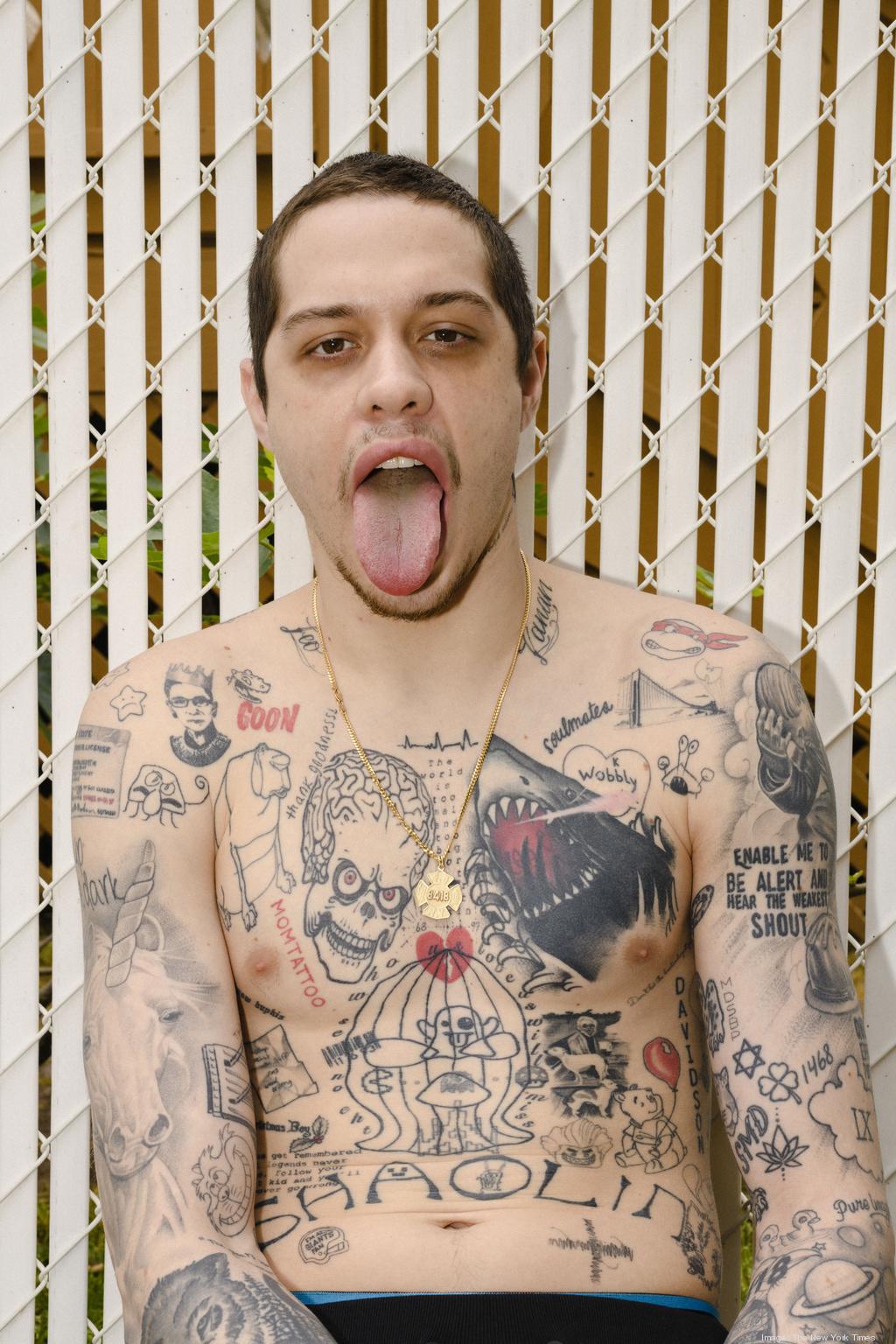
The shark works both as an image and as a cover-up. Its open mouth and heavy outline take over the chest and change how the older ink underneath appears. In photos, the red mouth draws the eye first, while the black-and-grey work around it makes the whole area feel crowded. The shark is a headline image, even though it is only one piece in a much larger collection.
Its position tells readers something practical about Davidson’s tattoo history. A large chest design can cover an earlier phrase without removing that decision from the record. The shark is what is visible now; the old tattoo helps explain why the area looks so dense. Those facts should not be blurred into a claim that both designs carried the same meaning.
A large shark is one of the clearest anchors in photos from Davidson’s tattooed years. It spans the chest and appears beside smaller illustrations, words and symbols. Reports have also connected it to a cover-up, which gives the design a history beyond that of a random animal in the middle of a crowded torso.
The shark’s blunt outline suits Davidson’s earlier approach to tattoos. Its mouth gives it energy, and its size keeps it visible even in a wide shot. That matters because smaller marks can disappear when a photograph is cropped for a news story or television appearance.
Still, the shark should not stand in for all of Davidson’s ink. It is one design among many, and the surrounding tattoos arrived at different times. They do not automatically share its story. A useful guide can give the shark its own space, then move on to the lettering and pop-culture pieces.
SHAOLIN and GOON show how much lettering filled the map
SHAOLIN sits lower on Davidson’s torso, while the shorter GOON lettering is higher on his chest. SHAOLIN runs across a wider area; GOON reads more like a compact label. From straight on, the words can look like one band of text, but they are separate tattoos in different positions. Naming both makes the tattoo inventory more useful than calling the area general chest lettering.
Numbers, script and small drawings nearby add texture, but do not all have a documented explanation. Some have been linked to family, friends or entertainment, yet a soft photo cannot settle every attribution. The grounded description is the visible wording and placement, with Davidson’s own comments supplying context when available.
Photos of his torso show the bold words SHAOLIN and GOON. The lettering is not just filler around the shark; it is part of a visual mix that places plain words beside cartoons, skulls and small personal symbols.
Lettering can be identified without a specialist interpretation. A guide can name each word, describe where it sits and show the photograph without claiming that every phrase is a lifelong motto. Some designs began as jokes or impulses; others were later covered or removed.
That changing record matters when comparing old and new photos. A 2020 image may show a word clearly, while a later appearance shows fading, cover-up work or bare skin. Both tell us what the collection looked like at different times. A dated photo is not a current inventory.
Pop-culture tattoos came from the way Davidson watched and joked
Davidson’s pop-culture tattoos are easiest to describe when their subject is clear. A character, film reference or comedy image can be named without turning it into a grand statement about his personality. Often, the joke is the point. That tone sits beside larger memorial and relationship designs.
The photos show these designs competing for space. A cartoon or emblem may sit beside lettering, a skull or a line drawing, making the torso look more like a sketchbook than one coordinated sleeve. The useful detail is the individual motif, where it appears on the body and whether it can be seen in the photograph being used.
On Fresh Air, Davidson said he got a Game of Thrones tattoo while watching the series. His story makes it sound like a decision made in the moment, rather than the result of a formal design process. It belongs with the pop-culture side of his tattoo history, which also included film and television references.
That anecdote does not tell us which other tattoos were done during a particular episode or night. It supports one specific story. The rest need to come from clear photos or reporting that names the design. With a collection this large, it is easy to attach an unverified origin to a mark.
The variety is part of the look. A TV reference can sit beside a skull, a word or a rough cartoon without matching one style. The body reads like an archive of things Davidson found funny, memorable or worth carrying for a while.
Relationship tribute tattoos changed as the relationships changed
Relationship tattoos need their own section because several widely reported pieces were later covered, altered or removed. A matching design can be placed in a particular relationship period without suggesting it remains unchanged today. That distinction preserves the timeline and explains why older photographs show more lettering than later ones.
The later changes are part of the visual record. Cover-ups can make old designs harder to identify, while fading and laser work may leave partial outlines that look like new ink. When a photo is unclear, the article can name a reported tribute and describe what is currently visible instead of guessing at what lies beneath it.
Reports about Davidson’s relationships have also documented tattoos and marks connected with partners. Some appeared as initials, phrases or designs tied to a shared joke. Coverage of his relationship with Kim Kardashian discussed Jasmine, the phrase My girl is a lawyer and a branding mark described differently from an ordinary tattoo.
That distinction matters. A branded mark is not the same as a tattoo, even if it appears on skin. And a tattoo made during a relationship does not prove its wearer meant to make a permanent promise. Davidson’s later removal process shows how the emotional context of an image can change.
It is best to name a design only when a source does and avoid treating the relationship as the tattoo’s entire meaning. A photograph can show placement and wording; an interview can add context. Neither turns a public romance into a private psychological diagnosis.
Removal is now part of the tattoo story
Removal changes how a photograph should be read without making the image useless. A chest photo from the heavily tattooed period documents designs that may no longer look the same, while a later one records the effort to clear space. Davidson has described the pain, cost and length of the laser process, so the timeline belongs beside the tattoo inventory instead of a separate celebrity-news aside.
For anyone comparing pictures, lighting and distance matter. Faded black ink may disappear in one frame and show up in another, while a cover-up can look like a solid shape from across a room. A careful guide ties the shark, lettering, pop-culture marks and relationship designs to dated images, and labels what comes from reporting rather than a clear photograph.
Davidson began removing many tattoos in 2020. Later reports described the process as lengthy, expensive and physically unpleasant. El País reported his explanation that the ink had become a reminder of an earlier part of his life. Other coverage described the number of sessions involved and how some designs would take longer to fade than others.
That means a current guide cannot simply reuse a famous old tattoo list. The shark may be clear in one appearance while lettering has faded in another. Hands, neck and arms may show the process differently from the torso. Readers need to know whether an image comes from the dense-ink period or documents removal.
Davidson’s tattoo history is a record of choices, jokes, attachments and revisions, not a fixed catalogue. The most useful details are the designs that can be named, the stories he has told and the changes visible across dated photos. Anything else should remain uncertain rather than be presented as fact.
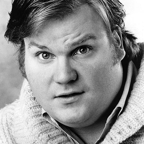
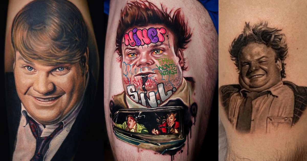
Chris Farley died in 1997, but fans still get tattoos of his portraits, characters and familiar lines. The designs celebrate his work; they aren’t tattoos Farley was known to wear himself. Many draw on the physical comedy and warmth that made even a short scene memorable.
Examples in tattoo galleries and memorial features tend to fall into three groups. Some fans choose realistic portraits of Farley in black and grey or colour. Others choose characters such as Tommy Callahan from Tommy Boy or Todd O’Connor from Saturday Night Live. Still others use comic lettering, props or a scene that points to a film without spelling out Farley’s name. The styles vary, but each points back to the same performer.
Realistic portraits keep Chris Farley’s face at the centre
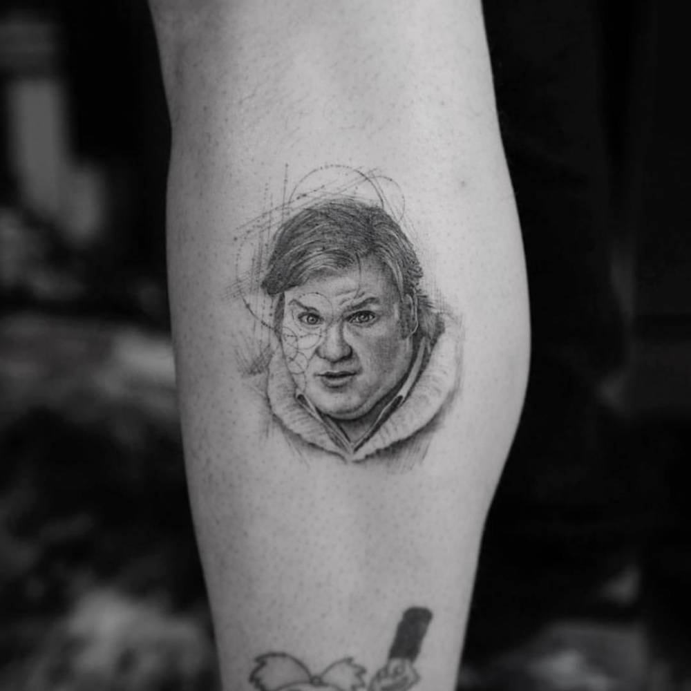
Portrait tattoos of Chris Farley are the most direct tributes in these examples. Tattoo Filter features a fine black-and-grey micro-realism portrait credited to Dr. Woo; the Mike DeVries gallery shows another realistic fan portrait. The likeness rests on the details: his eyes, cheeks and open grin. If those don’t read clearly, the tattoo could be a generic face.
Size makes a difference. A calf or forearm gives the artist room to shape the jaw, hair and expression; a small design has to simplify them. The Tattoo Filter portrait keeps the face in focus without much competing detail around it. Fans who know Farley’s screen presence may recognise him from the expression alone.
The source pages identify Farley and sometimes the artist or gallery, but rarely say why a particular person chose the portrait. The tattoo shows admiration for Farley and his performances. Without more from the wearer, there’s no reason to tie every portrait to grief, a particular film or a private event.
Tommy Boy turns a favourite character into a calf tattoo
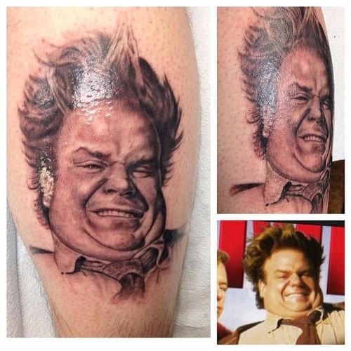
Tommy Callahan gives fans another way to remember Farley. Tattoodo’s gallery includes a black-and-grey tattoo of him as the central character in Tommy Boy, credited to Jay Cunliffe. It points to a role rather than a generic celebrity portrait; the film’s scenes, wardrobe and comic personality make the reference clear.
A character piece asks for more than a likeness. Clothing, posture and props help identify the role, while the expression carries Tommy’s frantic optimism. A calf gives a vertical figure room; on a wrist, the same design might have to lose detail to stay readable.
Tommy Callahan has a recognizable stance and a particular kind of panic. A fan might choose him as shorthand for the whole film, or for a scene where Farley loses control and wins the audience back.
Tattoodo identifies this as a Tommy Boy tribute by Jay Cunliffe. It doesn’t give the fan’s reason for choosing it, so that part is best left open.
Comic lettering and scenes preserve Farley’s loudest jokes
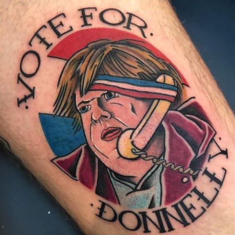
Some fans tattoo the joke instead of Farley’s likeness. Ultimate Tattoo Supply’s memorial feature shows colourful designs and familiar comic references, including a Vote for Donnelly parody tied to his political sketches. Inked Magazine’s roundup includes several more, with Farley alongside fellow performers, graffiti-style lettering and scenes built around a line or character.
A line of dialogue can bring back a sketch’s rhythm; a costume or prop can point straight to a film. Colour can keep the tattoo as playful as the performance. These are still memorials: they remember the comedy that made people laugh.
The sources name some words and subjects, but the photos don’t always reveal which scene the wearer had in mind. They show the tattoo itself, not necessarily the reason the fan chose it.
Some designs combine several references: Farley’s face with SNL lettering, a character beside a prop or a film line under a portrait. When one image holds the focus, the extra details can read as a memory board instead of clutter.
SNL characters make the tribute about performance as well as identity
Some fans choose Farley as Todd O’Connor from the Bill Swerski’s Superfans sketches on Saturday Night Live. Tattoodo tags the tattoo with Farley and the Da Bears reference, tying it to one of his SNL characters.
A portrait depends on getting Farley’s face right; this piece also relies on the pose and costume that identify Todd O’Connor. The sketch’s exaggerated sports-fan world supplies the rest of the context.
The choice can reflect when a fan first got to know Farley. Someone who remembers the Superfans sketches may choose Todd; another might pick Tommy Boy, Billy Madison or Beverly Hills Ninja. Each design marks a different way into his work.
The public image shows the costume and pose; Tattoodo’s page confirms the Todd O’Connor reference. That makes it possible to describe the tattoo clearly without attaching a private meaning the fan hasn’t shared.
What Chris Farley fan tattoos have in common
The tributes share a recognizable detail—a smile, a character or a joke—that leads back to Farley’s work. A Tommy Boy or SNL tattoo can name the role; a phrase or prop can bring back a particular scene.
The galleries identify subjects, artists and characters, but rarely explain why someone commissioned a design. The fan tattoos are tributes to performances and jokes viewers want to remember, not a record of Farley’s own ink.
If you’re planning a tribute, choose the memory before the style. Use a clear reference photo for a portrait, a pose that reads as the character, or enough space for a quote and its scene. The result should point to a specific performance, line or expression that matters to you.