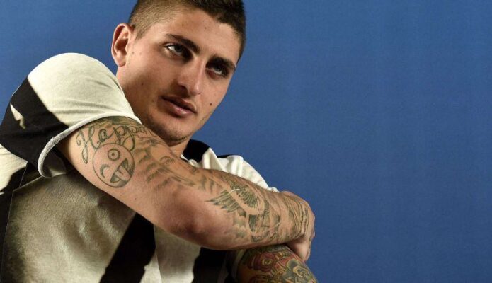
Marco Verratti’s tattoos are easiest to read as a changing body map rather than one fixed catalogue. The photographs in this guide move from PSG match action to an Italy training ground, a beach, a training-venue portrait and an early-career media frame. Each original gives a different view of the ink, and together they show how his arms became the most recognisable part of his visual identity.
The written record adds the personal layer. Goal describes a Virgin Mary on the left arm, the name of his daughter Mya, an emoji on the right triceps and other characters and patterns. Italian reporting has also tied one arm tattoo to the lips of his partner and a Spanish line about living each day as if it were the last. Those meanings belong to the sources; the photographs are used here to establish placement, density and visible form.
This distinction matters. A sports photograph can show a coloured sleeve, a wrist inscription or a dense shoulder area without proving the private story behind every mark. The article therefore maps what the inspected frames actually show and reserves confirmed meaning for the interviews and reporting that name it.
The match-day forearms and raised hand
The RTL match photograph is the most energetic view in the set. Verratti is captured in a PSG shirt with one arm raised, so the forearm runs diagonally through the frame and the wrist turns toward the camera. Small lettering sits close to the hand, while denser designs continue toward the elbow and lower arm. The image reads as a working tattoo surface rather than a posed diagram.
Action changes the way the ink is seen. The forearm stretches as the arm rises, and the skin around the elbow compresses. Some designs look smaller because of the angle, while the darker areas remain readable as blocks of shading. That is useful for a design study: a tattoo must hold its identity while the arm bends, reaches and rotates in ordinary movement.
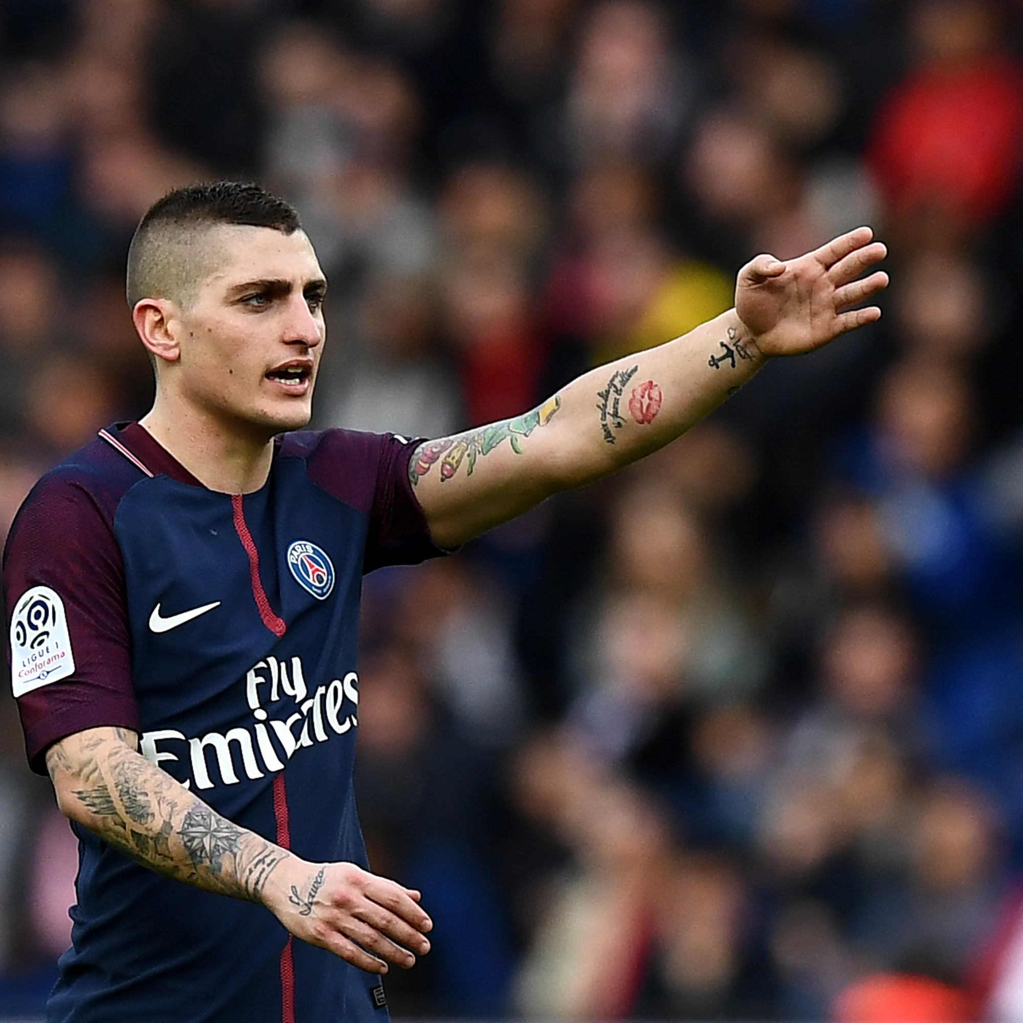
The frame also makes the separation between documented and observed information clear. The sources establish that Verratti has multiple tattoos and identify several family-linked designs, but this particular match image does not label every shape. It is accurate to describe the visible lettering, the dense forearm work and the placement near the wrist. It would be speculative to assign a name to every blurred motif.
For a custom concept, the photograph suggests a practical balance between small personal marks and larger illustrative pieces. The wrist lettering creates a close focal point, while heavier work farther up the arm supplies visual weight. Open skin between those areas keeps the collection from becoming one unreadable dark band.
The Italy training portrait
The Independent training portrait offers the clearest comparison between Verratti’s two arms. He wears Italy’s blue training gear and holds a phone to his ear, leaving both sleeves exposed. The arm on the viewer’s left carries mostly black-and-grey work, while the opposite arm shows a more colourful grouping with red, green and yellow accents. The contrast makes the collection feel assembled over time rather than designed as a single matching sleeve.
The larger coloured arm contains several overlapping forms, but the photograph does not justify naming each one. What can be seen confidently is the difference in palette, density and scale. The left arm has fine dark lines and shaded areas; the right side carries stronger colour and a fuller visual mass. This is the kind of comparison that remains useful even when individual tattoo meanings are private.

The pose also reveals how clothing can frame tattoo placement. The short sleeves stop above the main upper-arm work, and the blue shirt becomes a clean background for the skin. On a person considering a similar composition, sleeve length and daily wardrobe would affect how often the design is visible. A good tattoo plan considers both the skin and the clothing that will surround it.
Goal’s account supplies the strongest factual context here: the Virgin Mary on the left arm, the family name and the playful triceps emoji. The inspected photograph supports a broad reading of religious, family and humorous elements in the collection, but it does not prove which visible coloured area corresponds to which reported design. The safe approach is to keep those layers separate.
The beach photograph and chest placement
The Purepeople beach photograph changes the body map by removing the shirt. Verratti’s shoulders, upper chest and both arms are visible, giving the reader a wider view than the match and training images. The dense arm pieces continue toward the shoulder, while smaller marks and dark shapes appear closer to the chest. The result is a fuller portrait of how his ink sits across the upper body.
This frame is especially useful for scale. A close crop can make one forearm design seem like the whole collection, but the beach image shows how multiple pieces relate to the torso. The arms create the strongest visual anchors, and the chest work fills the space between them without producing one continuous block. The design reads as a collection of separate motifs that share line weight and density.
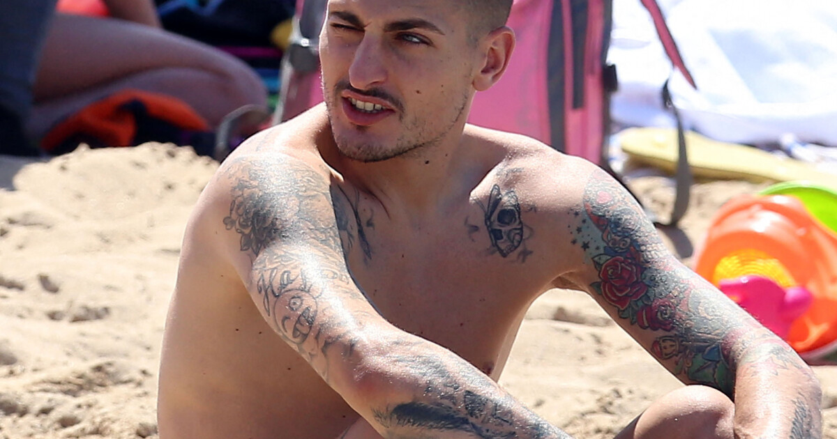
Sunlight and skin highlights make the tattoo edges less even than in the studio-like portraits. Some black areas appear softer because of glare, while coloured details remain visible as separate patches. That is not evidence that the ink has changed; it is a reminder that lighting alters the apparent weight of tattoo work. Comparing several originals prevents one lighting condition from becoming the whole story.
The published record also warns against overclaiming. A Polish sports report mentioned a tattoo above the knees, but that placement is not visible in this selected upper-body frame. It belongs in the research dossier as a documented extension of the collection, not as an invented detail inside the beach photograph’s section.
The folded-arms PSG portrait
The IBTimes portrait returns to a controlled setting. Verratti stands against blue stadium seating with his arms folded, bringing the forearms and hands into the centre of the composition. The crossed pose shows script lettering across one forearm and a more illustrative, shaded collection on the other. Because the face and arms are both clear, the frame works well for identity and tattoo comparison at the same time.
Crossing the arms creates a useful overlap. The lower forearm partly covers the opposite side, yet the visible skin still shows how the designs wrap around the limb instead of sitting on a flat front-facing panel. The hand lettering is a particularly strong detail because it changes the scale of the collection: not every tattoo is large, and small marks can become important anchors when the arms are close together.
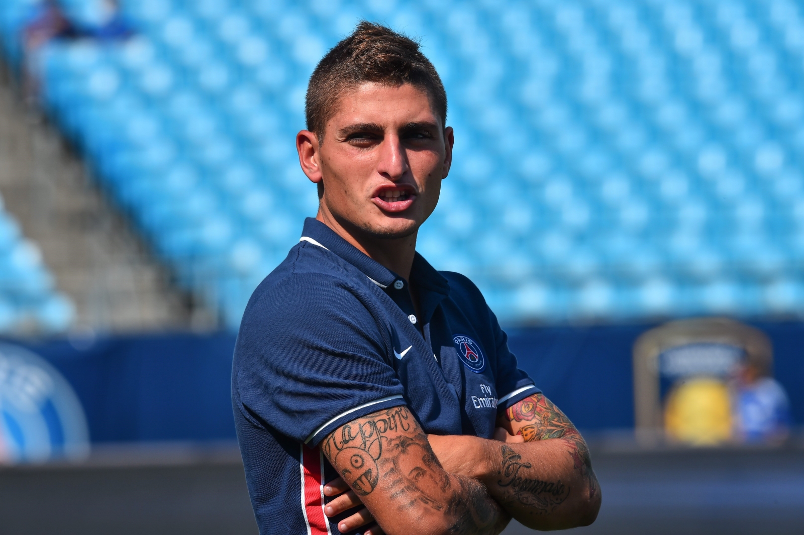
This image should be read beside the RTL action frame rather than repeated as a substitute. Both photographs show Verratti in football settings, but the poses expose different planes of the arms. One reaches outward; the other folds inward. The same collection therefore appears to expand and contract with movement, which is a more honest visual lesson than claiming that one photograph provides complete coverage.
The portrait also supports the article’s design focus. A multi-piece arm can combine script, illustrative figures and denser shaded areas while retaining a readable rhythm. The key is not to copy one visible mark but to study the spacing between them, the way the wrist stays lighter and the way larger motifs occupy the upper forearm and biceps.
The early PSG media portrait
The early PSG media portrait provides a timeline contrast. Verratti appears in a clean studio-style setting with his arms crossed and a younger face, while only a smaller wrist-area tattoo is clearly visible beneath the sleeve. The image is less useful for inventory than the later beach and match photographs, but it is valuable because it shows that the visible collection expanded and became denser across different periods.
A historical image should not be treated as proof that a tattoo was absent from every hidden area. It simply records what this particular frame exposes. The sleeve covers most of the upper arms, and the pose hides the forearms. That limitation is part of the evidence. A careful guide can say that a smaller wrist mark is visible and that the image predates the more extensive public views without inventing a complete early tattoo map.
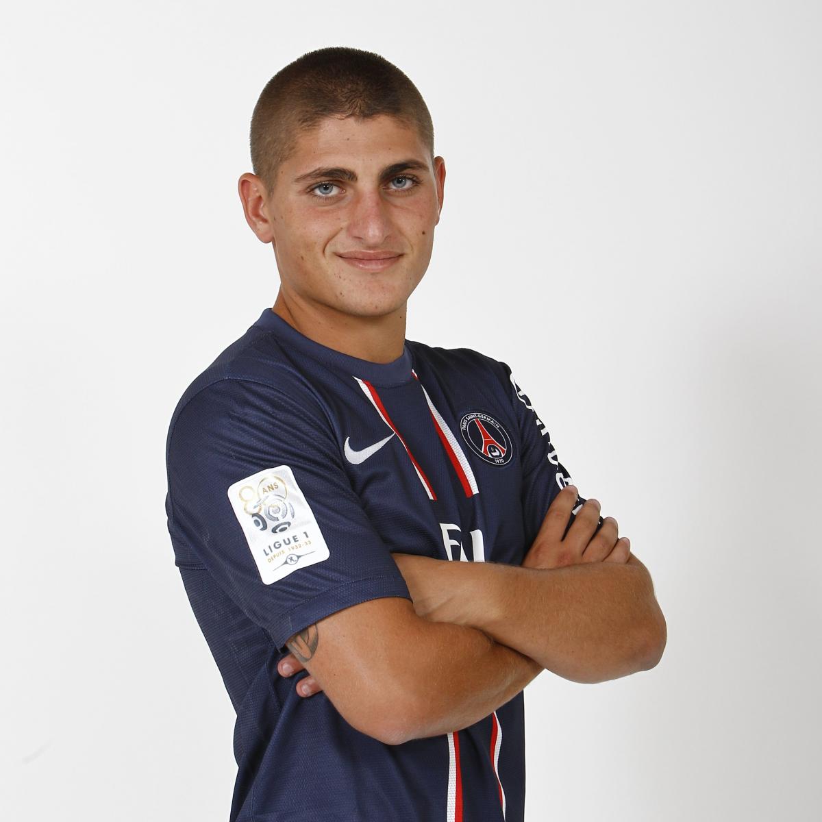
Placed last in the inline sequence, the portrait lets the reader work backward through the collection. The later photographs show coloured sleeves, chest work and dense forearm designs; the early frame shows a quieter visible surface. The contrast suggests change without assigning a precise date to every tattoo or claiming that all later pieces were added in one session.
The separate featured image has a different role. It is a face-visible editorial portrait from Cadena SER and sits outside the tattoo sequence. It helps establish identity at the top of the article, but it is not mapped to a tattoo section and is not used as evidence for any specific design. The five inline originals carry that burden instead.
What the documented sources add
The interviews make Verratti’s tattoo collection more personal than a gallery of football photographs would suggest. The Icon interview connects a left-arm design to his partner and quotes the Spanish line “Vivi ogni giorno come se fosse l’ultimo.” Le Parisien records his answer that he did not know the total number of tattoos and names the presence of family-related ink. Those comments show a collection shaped by relationships, memory and impulse rather than one single visual theme.
Goal’s account supplies additional anchors: the Virgin Mary on the left arm, the name of his daughter Mya, the characters and patterns on the right arm and the emoji placed on the right triceps to amuse his son. A 2017 CulturePSG report also documented a fresh tattoo session and linked it to a black-and-white image shared by Verratti and the artist. These sources support the article’s description of an evolving collection, but they do not create a complete diagram that can be overlaid on every photograph.
The distinction between source and image is especially important for names and lettering. A word may be readable in one frame but softened in another, and a script design may be mistaken for a different phrase when the arm turns. The guide therefore describes the visible lettering as lettering unless a source has identified it. Meaning is reported only where the interview or article supports it.
How the photographs fit together
The inline set is intentionally varied. The RTL match image shows movement and wrist lettering. The Independent frame compares the two arms and their different palettes. Purepeople exposes the shoulders and upper chest. IBTimes brings script and illustrative work into a folded-arms portrait, while VAVEL supplies an earlier, cleaner view with a smaller wrist mark. None of these photographs is repeated, and none is a generic portrait standing in for tattoo evidence.
That variety also improves accessibility. Each image has alt text that names the person, the setting and the tattoo-bearing area visible in that original. Readers who cannot inspect the photographs still receive a meaningful account of the forearm, shoulder, chest, wrist and hand details. The page is structured as a visual guide rather than a stack of unrelated celebrity pictures.
For anyone drawing inspiration from Verratti’s collection, the best lesson is to begin with a body map. Decide whether the main emphasis belongs on the wrist, forearm, upper arm, shoulder or chest, then test the idea while the body is relaxed, bent and rotated. A photograph is a reference point, not the only position that matters when a design is placed on moving skin.
What remains uncertain
The published sources do not identify every tattoo or publish a complete chronology. The selected photographs come from different years, countries and settings, and some body areas are covered by shirts, crossed arms or the crop of a sports image. A new session may also have changed the collection after an older article was published. For that reason, the guide separates clearly seen forms from unverified details.
The same caution applies to colour. The beach image makes red and other warm tones easy to notice, while the match and training photographs flatten some of the shading under stadium light. Those differences do not prove that the ink changed. They show why multiple originals are necessary when a reader wants to understand scale, saturation and line weight.
A tattoo inspired by the photographs should still be personal. Family names, religious imagery, humour and memories are meaningful because they belong to Verratti’s life. Copying an outline without a connection to the wearer would reproduce the surface and lose the reason the design has staying power. A consultation with a qualified artist can turn a visual reference into a proportionate, original concept.
Ideas to borrow without copying
Verratti’s photographed collection demonstrates how different tattoo languages can coexist on one body. Script sits beside illustrative shading, coloured work sits beside black-and-grey pieces, and small wrist or hand marks remain legible among larger forearm designs. The collection feels coherent because the placements follow the body and the photographs show repeated visual anchors rather than one forced theme.
The most useful design lesson is restraint. Open skin gives the larger motifs room to breathe, while smaller personal symbols create a rhythm between them. A good custom concept can borrow that balance without borrowing a celebrity’s exact subject matter. The result should be sized for the wearer’s anatomy, checked in more than one position and built around a meaning that will remain personal after the trend has passed.
Seen together, the five originals support a clear conclusion: Marco Verratti’s tattoos are not a single emblem but an evolving set of family references, religious imagery, playful details and visual experimentation. The source-led reading is stronger than a speculative inventory because it tells the reader exactly what the photographs show, what the interviews confirm and what the published sources leave private.