
Nico O’Reilly’s tattoos are easy to spot when he pulls on a Manchester City shirt, but they make more sense when you slow down and look at the details. His arms carry a mix of local pride, family language, football memories and phrases that sound like rules he actually tries to live by. The designs aren’t presented as one perfectly planned sleeve. They feel collected over time, with bold blocks of lettering sitting beside shaded images, smaller script and pieces that only become clear when he changes position.
There is also a useful limit to what can be said with confidence. Some designs have been discussed in interviews, while others are only readable in photographs. That means the strongest guide sticks to the visible placement and the words O’Reilly has actually shared. It doesn’t turn every dark patch into a mystery symbol or invent a backstory for work that hasn’t been explained.
Nico O’Reilly’s 0161 Tattoo Starts With Manchester
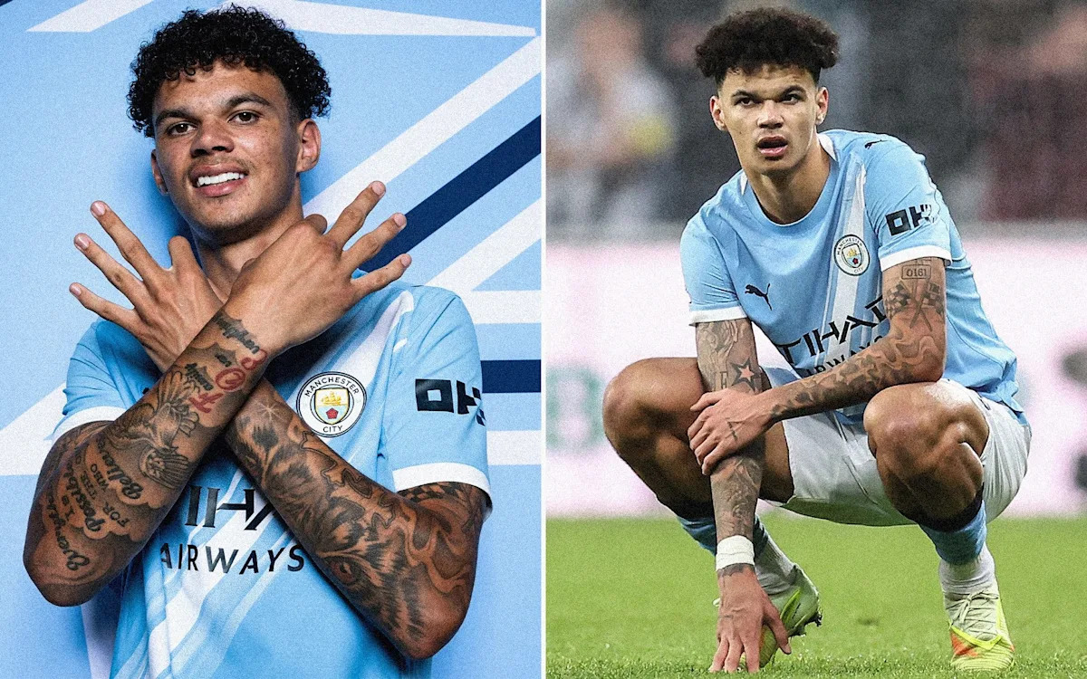
The best-known piece in Nico O’Reilly’s collection is the boxed 0161 tattoo on his left arm. The number is Manchester’s telephone area code, so the reference is wonderfully direct. It doesn’t need a cryptic explanation. The design ties him to the place where he came through Manchester City’s academy and built his football career.
In the wider photographs, the code sits among a lot of other work, which can make it disappear into the sleeve at first glance. In the close portrait, though, the placement is much easier to read. The block shape gives it the feel of a sign or label, and the straight edges stand out against the darker shading around it. That contrast is part of why the design photographs so well.
The Manchester reference is the anchor. O’Reilly has plenty of lettering, but 0161 is the one that immediately explains where his story is rooted. It is a small piece of local identity carried in a very visible place.
The No Ball Games Tattoo Adds Another Local Detail

Beside the 0161 design, O’Reilly has a sign-style tattoo reading NO BALL GAMES. It sits on the left bicep and is photographed clearly in the close-up where he lifts the sleeve of his white shirt. The lettering is framed like a warning notice, which gives the piece a slightly playful edge next to the more straightforward area code.
That phrase has a familiar British feel. Anyone who grew up seeing old signs around estates, schoolyards or quiet streets will recognise the tone immediately. It sounds official, but it also lands as a joke when it appears on the arm of a professional footballer. O’Reilly’s career is literally built around ball games, so the contrast is hard to miss.
The photograph matters here because it shows the design rather than merely placing it on a list. The sign is not a vague rectangle and it isn’t a guess based on a blurry sleeve. The border, spacing and all three words are visible. That kind of clear evidence is what separates a documented piece from a tattoo rumour.
STAY HUMBLE HUSTLE HARD Sits on His Right Bicep
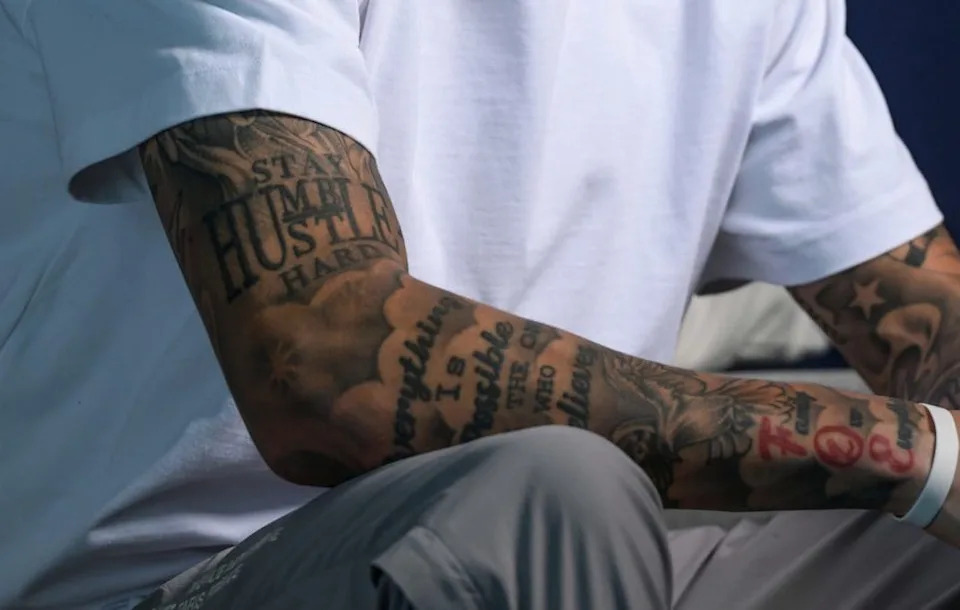
On the right bicep, O’Reilly has the phrase STAY HUMBLE HUSTLE HARD. It is stacked in large capital letters, with the words spread across the upper arm in a way that makes the piece read like a poster or locker-room reminder. The wording is common enough to be instantly understood, but the placement gives it more force than a phrase printed on a shirt.
The close tattoo photograph shows how much the phrase dominates the bicep. Smaller script and shaded designs surround it, yet the block lettering stays readable because the lines are heavy and the layout is simple. It gives the right arm a strong focal point while the other pieces create a busier frame around it.
There is no need to attach a grand explanation to the sentence. The words already describe the attitude: keep your feet on the ground, keep working and let the work do the talking. It feels especially natural for a young player moving into senior football. The design is motivational without looking overly polished, which fits the rest of O’Reilly’s collection.
Love Yourz Hand Tattoo Keeps Family Close
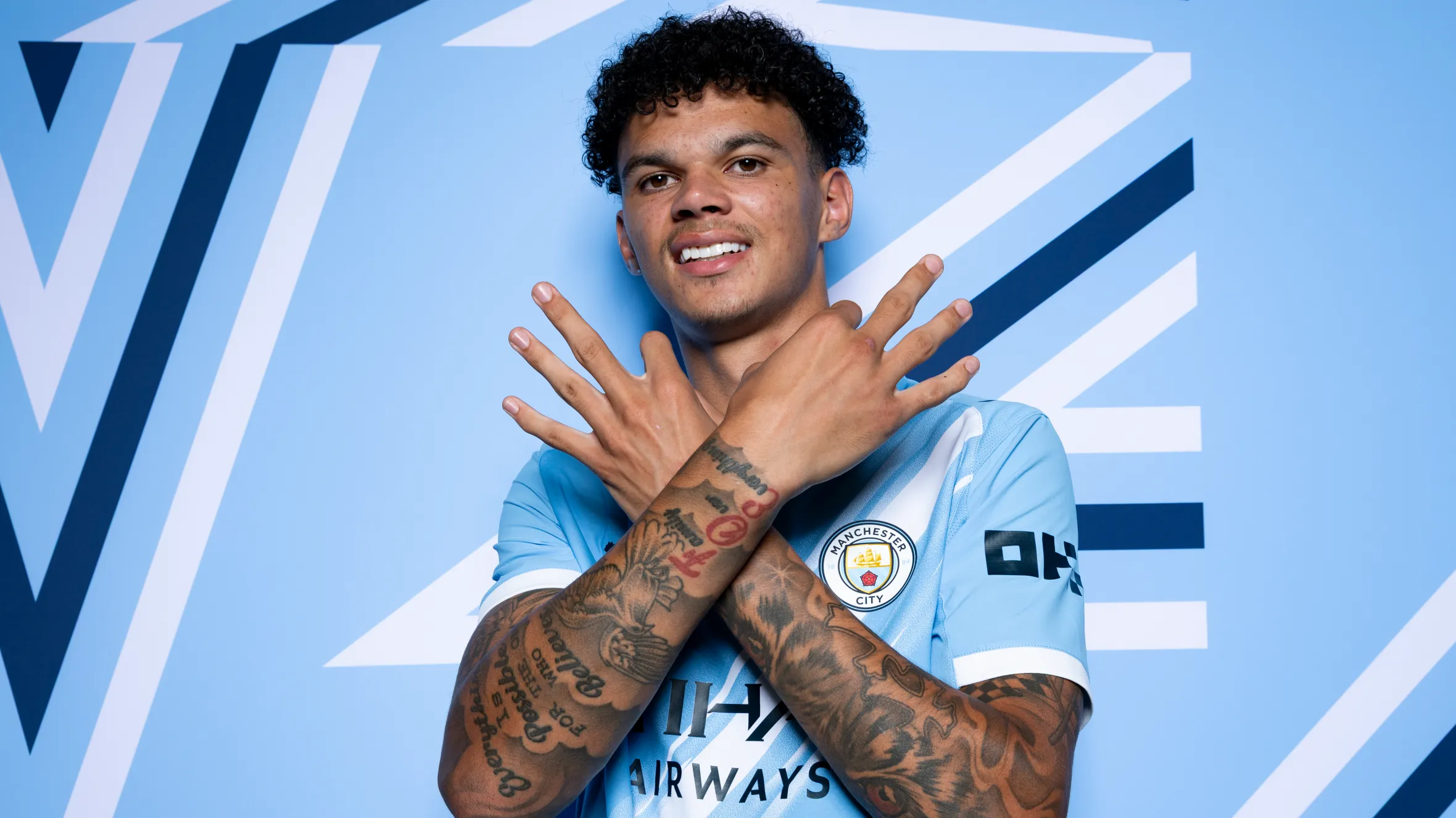
Another readable phrase is Love Yourz, placed on the front of O’Reilly’s left hand. It is smaller than the bicep signs and easier to miss in a match photograph, but it becomes clear when his hands and forearms are held across his chest. Because the piece sits on the hand, it travels with every gesture and isn’t hidden by a short sleeve in the same way as the upper-arm designs.
The phrase is associated with valuing your own life instead of measuring it against somebody else’s. O’Reilly has not needed to turn the tattoo into a long public explanation for the wording to feel personal. It sits among other lettering and imagery, but its position gives it a quiet importance. The hand is one of the first places people look when they greet you, celebrate a goal or pose for a photograph.
In the close portraits, the red detail near his wrist also stands out against the black and grey work. That colour is one reason the collection doesn’t read as a flat wall of dark ink. There are small changes in tone, script direction and scale across the arm. The result feels lived-in rather than designed for one single reveal.
Comparing the Photographs
Looking at the photographs side by side is useful because no single pose shows everything. The arms-crossed studio portrait gives the widest sense of how the pieces sit together. The close interview image reveals the sign designs on the left bicep. The separate crop of the right upper arm makes the motivational phrase readable. The official UEFA portrait adds another clean view with both forearms raised.
Those are different views of the same person, not proof of a completely different set of tattoos each time. Clothing, lighting and the angle of an arm change what appears to be visible. A piece can look larger in a close crop, while a wider portrait shows how it fits into the surrounding work. That is why the 0161 code may seem to shift position between photographs even though the placement remains on the left arm.
The collection includes a lot of script, lettering and shaded imagery, but the photographs don’t justify naming every smaller design. Some words are partially covered by clothing or hands. Some shapes are clear enough to recognise as part of the sleeve without giving a reliable name. Leaving those details open is more honest than turning a blurred shape into a confident claim.
A Clean Full-Body Tattoo View of Nico O’Reilly
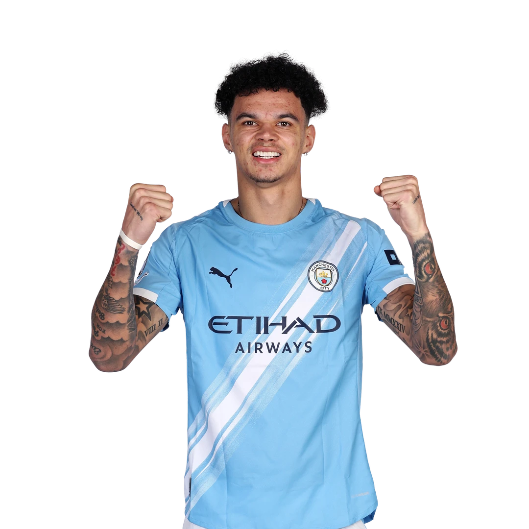
The official UEFA portrait is helpful for a different reason. It shows O’Reilly from the waist up with both arms lifted, so the overall balance is easy to see. His left and right arms are not mirror images. One carries the most obvious Manchester references and the sign-style lettering, while the other brings the large motivational phrase into view.
The image is not the best source for reading tiny script, and it shouldn’t be treated as one. It works as a comparison photograph: a clean, official view that confirms how much of the ink is visible when he is wearing a short-sleeved football shirt. The background is removed, his face is clear and the arms aren’t hidden behind a teammate or a crowd.
That wider view also explains why O’Reilly’s tattoos stand out during matches. The designs run below the sleeves and continue toward the hands, so they remain visible when he is moving, celebrating or raising his arms. The collection is part of his public football image, even though the meanings behind individual pieces remain personal.
Why the Collection Feels Personal
The most convincing thread is the mix of place and principle. 0161 points to Manchester. Love Yourz reads as a reminder to value what is close. STAY HUMBLE HUSTLE HARD sounds like a working rule. The reported phrase no risk, no story adds another line in the same general direction, although its exact placement is not clear in the photographs reviewed here.
O’Reilly has also spoken about adding a maxim on the left side of his chest after the Carabao Cup final. That newer piece should be treated separately because it was reported before a clear photograph was available. It is tempting to fill in the missing detail, but there is no reason to guess what the design looks like or how it sits under his shirt.
That balance between visible work and reported work makes the collection more interesting, not less. The photos show the scale and style. The interviews give a little context. What they don’t provide can stay private.
Reading the Collection Without Overdoing It
If you are using O’Reilly’s collection for tattoo inspiration, the useful ideas are practical ones. A local area code can be turned into a clean boxed design. A familiar phrase can become a sign with a strong border. Large lettering can give an upper arm a clear focal point while smaller script fills the space around it. None of those choices require copying the exact tattoos.
The photographs also show why placement matters. The bicep leaves enough room for stacked lettering. The hand makes a short phrase more visible in everyday movement. The forearm gives longer script a natural vertical path. A tattoo artist can adapt those ideas to your own story, body and preferred level of visibility.
Most importantly, the collection doesn’t need a made-up explanation to be memorable. The strongest pieces are the ones that connect to a real place, a real habit or a line that still feels useful years later. O’Reilly’s tattoos are readable because the designs are bold, but they feel personal because the words point back to how he sees himself.
The Story Is Still Growing
Nico O’Reilly’s tattoos are not a finished catalogue. His collection already covers both arms and one hand, and the reported chest piece shows that more work may appear over time. New photographs could make the smaller designs easier to identify, while a future interview might explain phrases that currently have to be read from the ink alone.
For now, the clearest picture is enough: Manchester in the 0161 code, the sign-style NO BALL GAMES piece beside it, STAY HUMBLE HUSTLE HARD on the right bicep, Love Yourz on the left hand and a wider collection of script and shaded work across both arms. The photos show genuine variation in angle and distance without pretending every view is a new tattoo.
That is what makes the collection worth looking at. It has strong visual impact, but the details are grounded in things O’Reilly has actually shown or discussed. The result is a set of tattoos that feels connected to Manchester, football and personal discipline without needing a dramatic story pasted over the top.