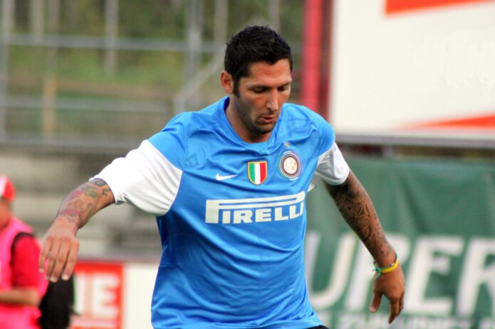
Marco Materazzi’s tattoos are easy to spot in football photos: color on his forearms, script along his arms and legs, and a large pair of wings across his back. The collection looks like it grew over time rather than following one theme.
He has spoken about tattoos connected to people close to him, including “Marco” and “Davide,” and said he wanted a Japanese geisha drawn by his friend John Richmond. Photos show other designs, but they don’t explain why he chose each one.
Marco Materazzi’s tattoo collection in one look
The forearms carry much of the color. One training photo shows an orange flower near the elbow, smaller motifs below it and script alongside. The other arm has darker lettering and outlines; the sleeves are full but not mirror images.
The word “LION” is visible on the inner arm in a well-known football photo. Nearby, a row of diamond shapes with small rays adds a sharper, more geometric pattern beside the flowers and script.
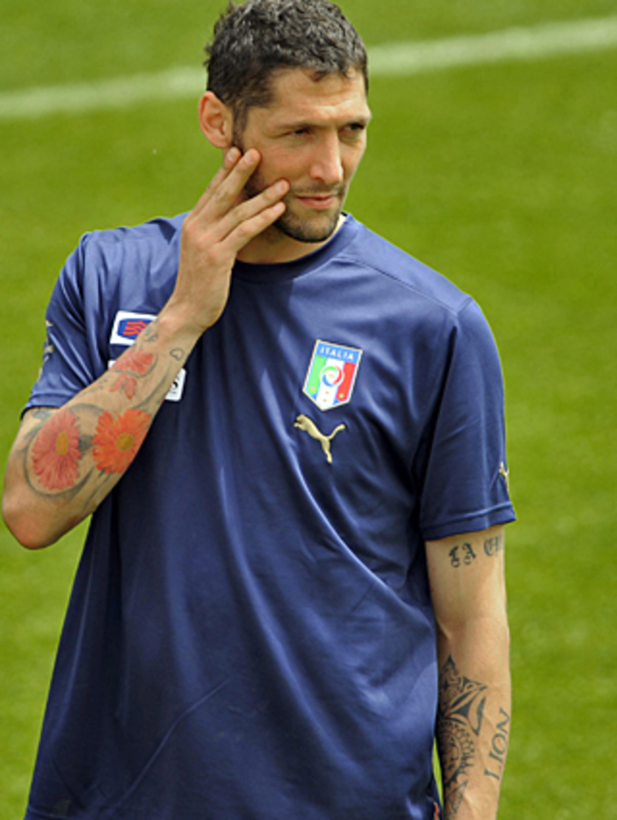
This photograph is a genuine tattoo view of Materazzi during an Italy training session. The colorful flowers and dense arm work are clear, while the face and national-team shirt keep the image in football context.
The forearms carry the loudest visual weight
The photographs show the difference between the two arms. One leans toward colored symbols and script, while the other has heavier shading and larger lettering. Both have enough detail to read up close.
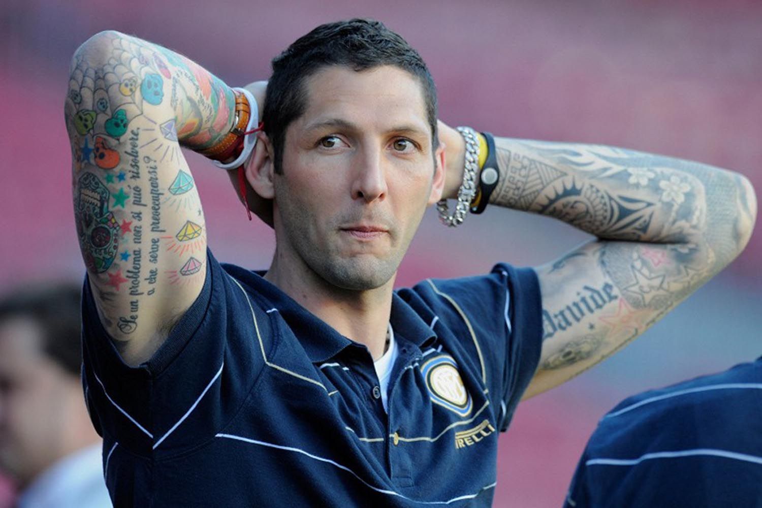
Here the camera catches both forearms at once. The image is useful because it shows the balance of the collection: one side leans into colorful symbols and script, while the other has heavier shading and larger lettering.
The personal side of the collection
Materazzi has named some of the references himself. Reports place “Marco” above his right knee and “Davide” on his right calf. In a FourFourTwo interview, he also mentioned tattoos connected to friends, music, Valentino Rossi, José Mourinho and Michael Jordan, as well as the geisha he wanted John Richmond to draw.
Those details come from his comments and published reports. The rest can be described by what appears in a photo: a name, flower, diamond or line of script, without assigning it a private story.
The back piece changes the scale completely
The wings across Materazzi’s upper back create a much larger image than the arm work. In a shirtless photograph, they spread over the shoulder blades, with other tattoos continuing down the sides.
The back piece changes how the collection reads: from behind, the wings become the focal point; in match photos, the forearms tend to draw the eye first.
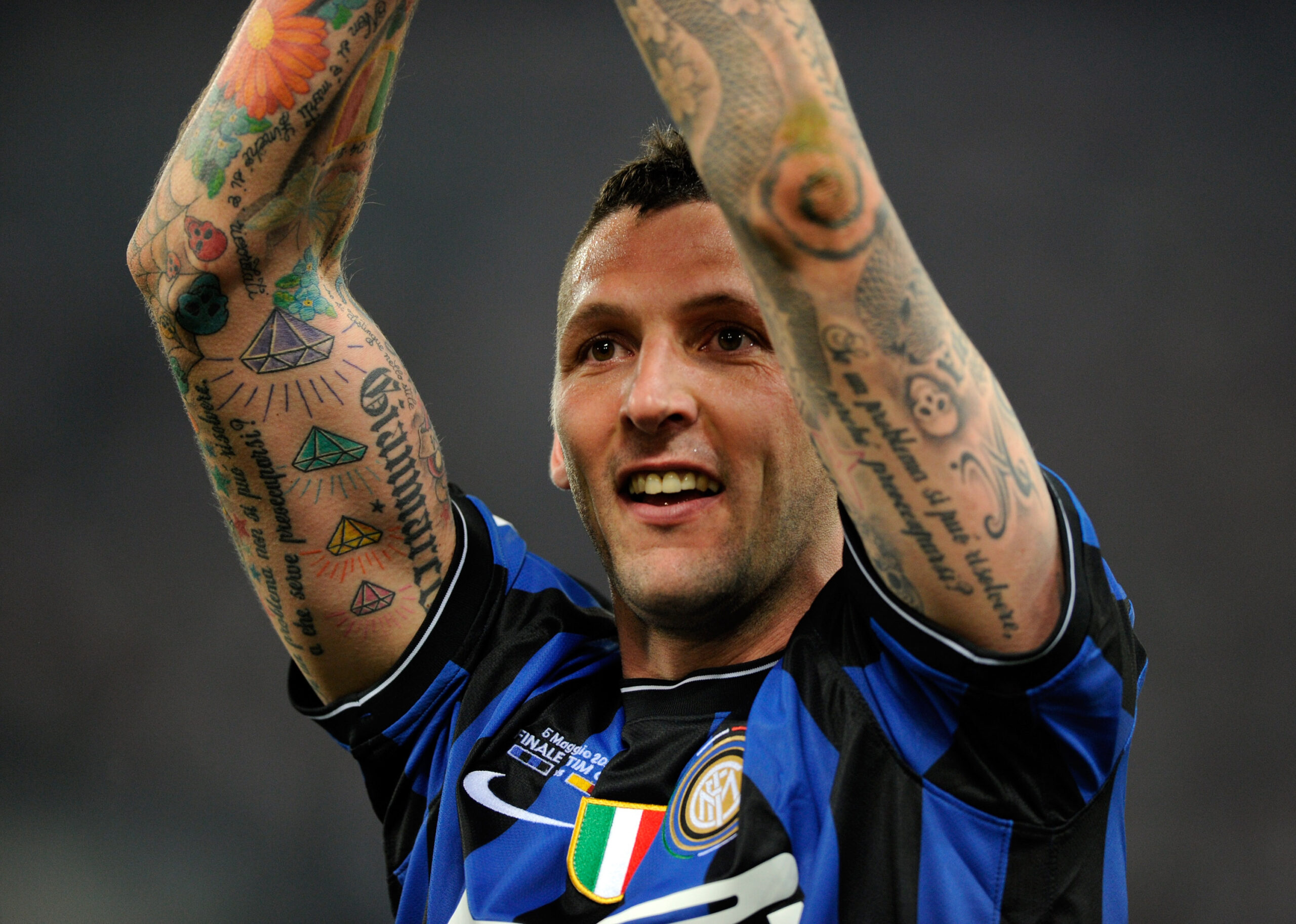
This close celebration photograph shows the tattooed arms in motion. It isn’t a studio tattoo shot, but the raised-arm angle gives a clear view of the forearm lettering, diamond motifs and the way the sleeve bends at the elbow.
A close portrait makes the forearms look larger because they fill the frame. A full-body shot gives a different sense of scale, and a rear view shows the wings. Shirts, shorts, socks, lighting and movement can hide pieces or change how strongly the colors appear.
Why different photographs show different tattoos
This wider match photo gives context for the visible arm coverage, but it isn’t as useful for reading small designs. Close views show detail; broader frames show how the tattoos sit with Materazzi’s football kit and movement.
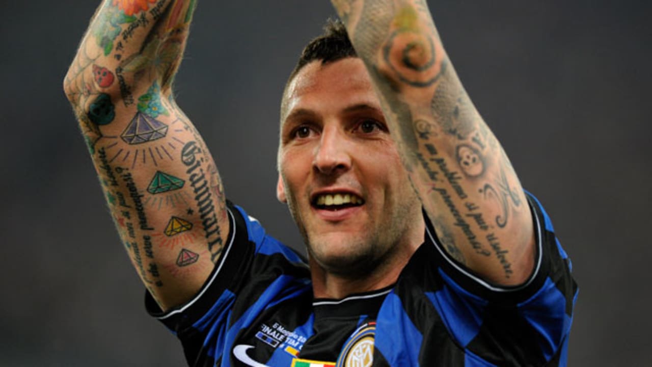
This wider match photograph is contextual rather than a close-up tattoo study. It still provides genuine visual evidence of Materazzi’s identity and the visible arm coverage, while the wider frame shows how the tattoos sit against the Inter shirt and stadium setting.
The collection mixes flowers, geometric diamonds, script and darker outlines. Each type reads differently: color draws the eye, lettering creates a line across the arm, and larger images carry weight through their size. That variety keeps the sleeves from becoming one dark surface.
If you’re planning a larger piece, consider how the design will look as the arm turns and bends. Leave room around lettering and larger images so the separate parts remain readable from more than one angle.
The collection mixes color, script and heavy outlines
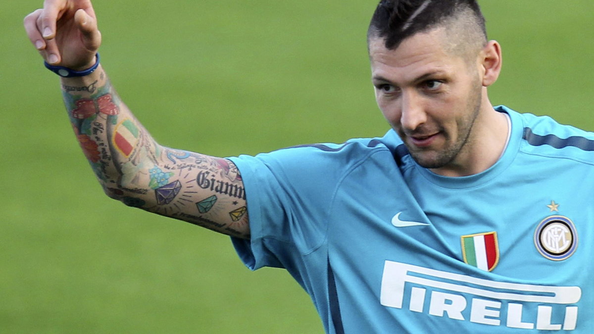
The side-on view shows how the arm coverage wraps around the limb. Details disappear toward the back of the arm, then return as the player turns. That changing view is part of the tattoo, not a flaw in the photograph.
The lower-body tattoos are easier to miss in football photos. Reports identify “Marco” above the right knee and “Davide” on the right calf; older images also show larger designs around the calves and thighs. The names are simpler than the colorful forearm work, and the leg gives each a longer vertical space.
Socks and shorts can cover much of the legs, so training photos may reveal work that match images don’t. That change in view doesn’t mean the tattoo is new.
The lower-body work is easy to miss
Materazzi’s collection includes several kinds of reference: people close to him, football figures, music and designs chosen for their appearance. A single theme isn’t needed to make the pieces feel connected.
Contrast helps the eye move through a sleeve. Plan for how it looks from the front and side, and think about how new work will sit beside older pieces. Personal names and larger designs can share space without matching in subject or size.
The photos show the colorful arm work, readable names and winged back piece. Where Materazzi hasn’t explained a design, its appearance is enough; the reason can remain his.