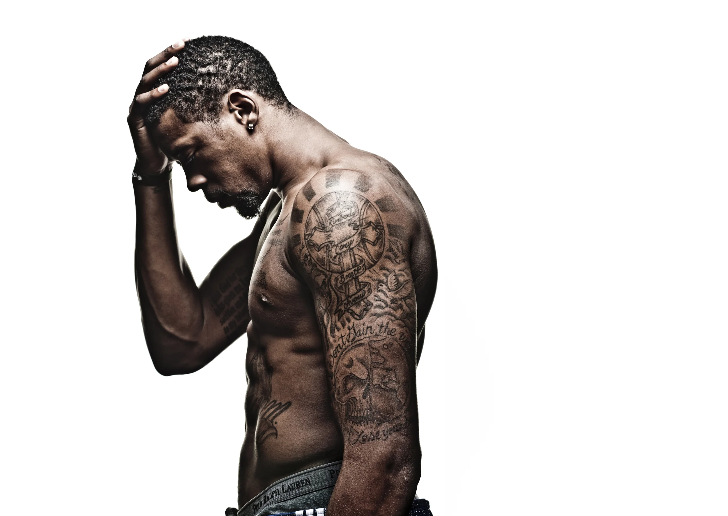
Athletes

Richarlison Tattoos: Cartoon Ink, Brazil Heart and Football Tributes

Richarlison’s tattoos are as recognizable as his celebrations. The Brazilian forward has a heart with the national flag on his chest, cartoon characters along one arm, lettering on his neck and a medal on his thigh. His back piece puts his own face beside Neymar and Ronaldo, players who shaped his view of Brazilian football.

The collection has plenty of personality. Some tattoos are serious and sentimental; others look like they came from a cartoon collection. That contrast is part of what makes the mix stand out. He hasn’t tried to make every area match.

Here’s a closer look at the main designs, where they sit and how Brazil, family, football and childhood characters come together.

The collection has grown without forcing each new tattoo into the same style. A realistic heart can sit beside cartoon figures, while a medal and a back tribute carry different memories. Planning is often about giving each idea enough room.

The Brazilian heart tattoo sits at the centre of his chest
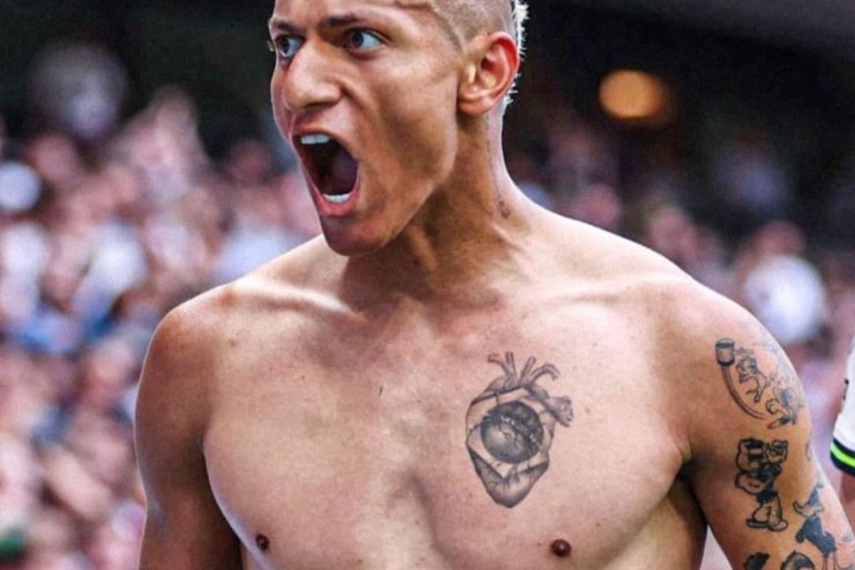
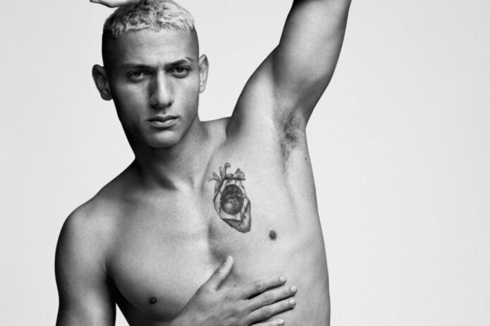
Richarlison tattoos: Brazilian heart chest tattoo

The heart on Richarlison’s left chest is the most direct tattoo in the collection. It’s an anatomical heart, with the Brazilian flag set into the middle. The detailed lines make it look like an illustration; the flag makes the meaning clear. It speaks to his love of Brazil rather than serving as a generic heart design.

Its position adds to that feeling. The left side of the chest already carries an emotional association, and the design is large enough to keep its shape when he runs or turns. His body is moving in most football photos, so the tattoo has to read from more than one pose.

Richarlison has shown it in posed photographs and match celebrations. In clearer shots, dark outlines separate the flag from the shading. The result is bold without needing to cover the whole chest.

A national tattoo says more when it has a detail specific to the wearer. A flag alone can feel generic; pairing it with an anatomical heart makes it a statement about identity. If you’re considering a country tattoo, think about a symbol from your own story rather than copying a flag onto bare skin.

His left arm is a cartoon sleeve with a lot of movement
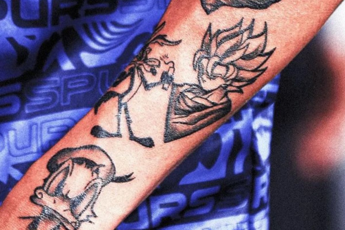
Richarlison tattoos: cartoon forearm sleeve

The playful side of Richarlison’s tattoos is clearest on his left arm. Donald Duck, Taz, Wile E. Coyote, Goku, Chaves, Popeye and other familiar characters sit close together, making the arm a lively collage rather than one traditional sleeve.

The linework is more graphic than the back portraits or chest heart. Cartoon characters depend on recognizable outlines, gestures and color, so they can still read at a smaller size. Their different angles also keep the arm from looking like a repeated sticker sheet.

The characters bring a childhood memory into the collection. Richarlison doesn’t seem to want every tattoo to be solemn; the cartoons give it a funny, relaxed side beside the more serious portraits and national symbols.

Cartoon sleeves need a clear plan. Tiny details can blur when several characters share one arm. Strong outlines, space between faces and a few controlled color accents help keep the style readable as it ages. The sleeve shows how to make it personal without relying on names or dates.

The Olympic medal tattoo turns a career moment into a keepsake
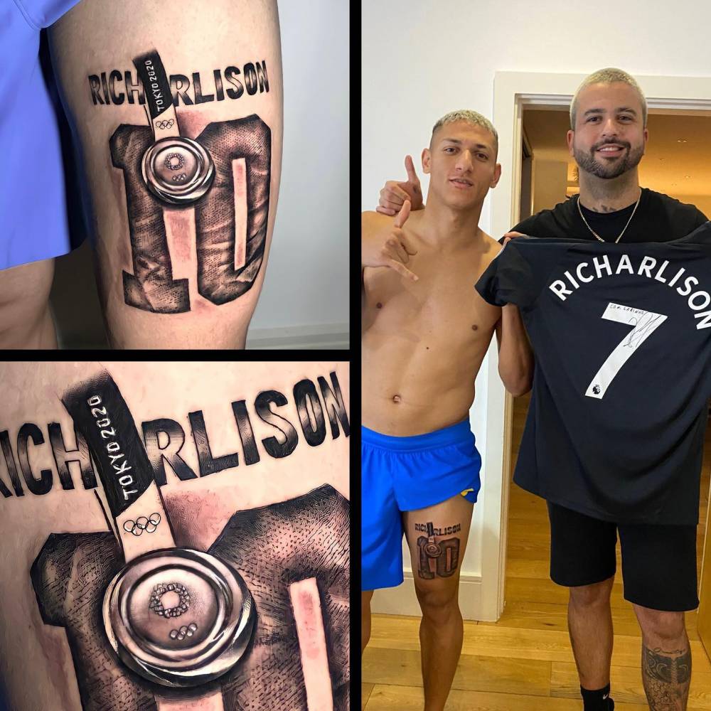
Richarlison tattoos: Olympic medal thigh tattoo

Richarlison has a tattoo of Brazil’s Tokyo Olympic gold medal on his thigh, with his name and the number 10. He played a major role in the team’s win. Unlike the cartoon designs, this one records a career milestone and a specific moment.

The thigh gives the medal room for its shape and lettering. It’s broad and relatively flat, and easy to cover when needed. It can show in training, on holiday or in a celebration photo without being on display every day.

A shirt number or trophy can look anonymous on its own, even when it means a lot to the wearer. The medal works here because it sits with Richarlison’s name and the number tied to that chapter. The context is built into the tattoo.

If you’re marking a milestone, add a detail that belongs to your memory. A medal, ticket, venue or date can all work, but one personal reference makes a familiar sports symbol more individual. The strongest achievement tattoos connect the event to the person.

The football tribute back piece gives the collection its biggest scale
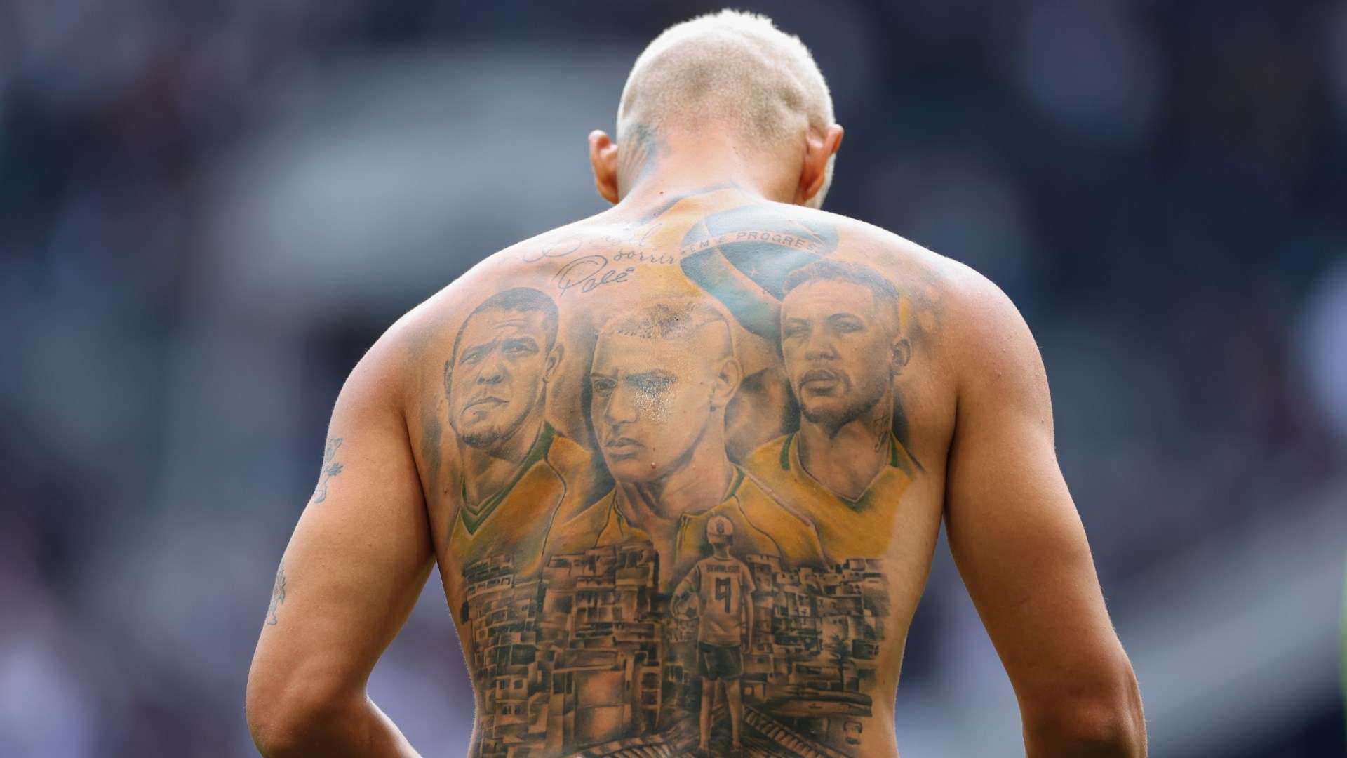
Richarlison tattoos: football tribute back piece

The largest Richarlison tattoo covers his back. He placed his own face beside Neymar and Ronaldo; a Brazilian flag, the national motto and a small figure wearing his number 9 jersey fill out the lower part. Together they make a football story rather than a row of separate portraits.

The faces form a horizontal focal point across the shoulders. A city scene and child figure carry the eye down the spine, giving the mural more structure than three heads floating on their own.

Ronaldo was one of Richarlison’s heroes; Neymar represents his generation. The design ties those influences to his own rise, adding national pride without relying on a simple flag alone. Large portraits need a clear order: faces first, message next, background details last.

If you’re planning a large back tattoo, think about the complete composition before choosing individual references. The portraits matter, but lettering, scenery and open skin help the piece sit naturally across the body.

A close back view shows how much detail fills the tribute
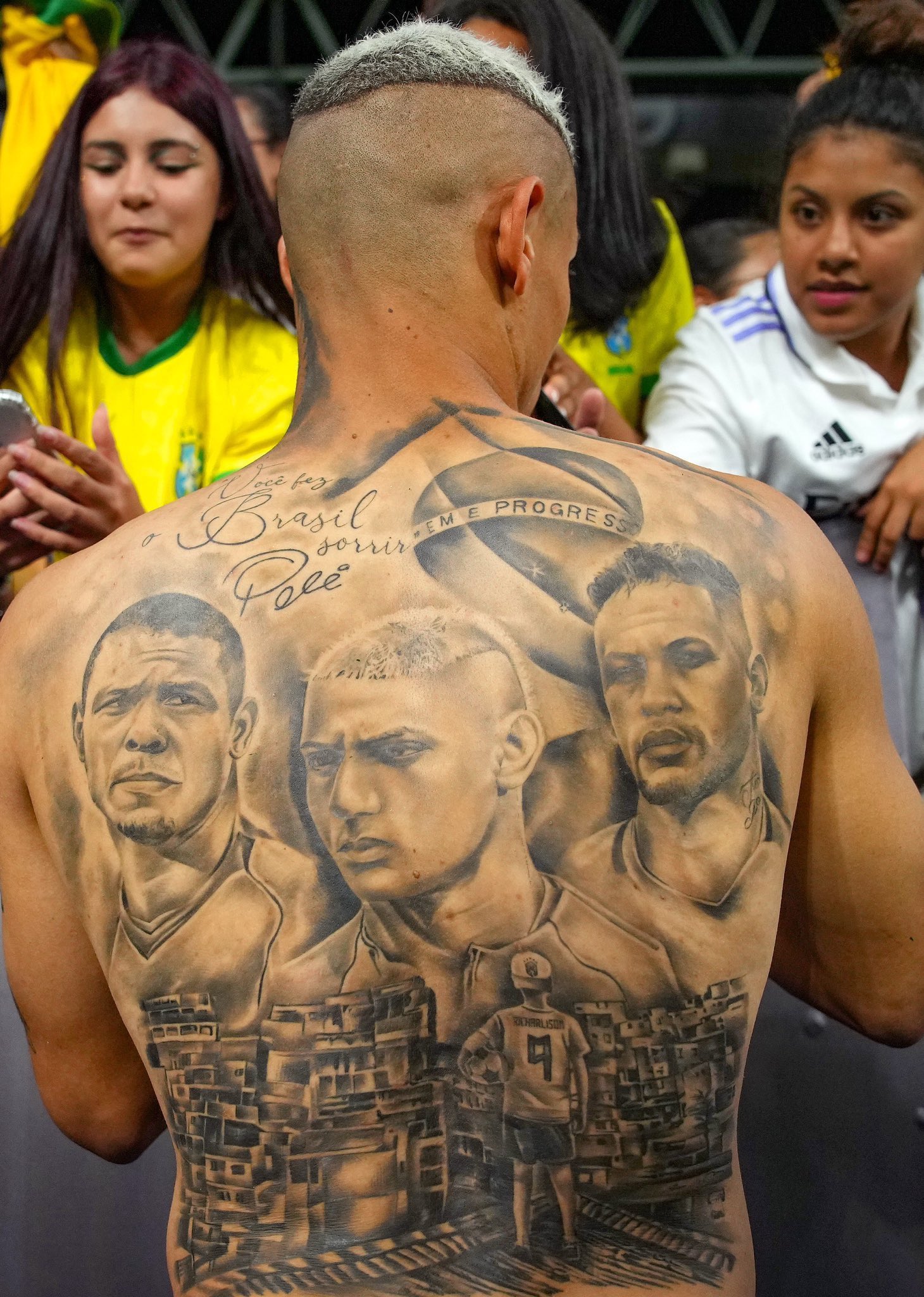
Richarlison tattoos: portrait detail in the back piece

A second view makes the portrait work easier to read. Lettering carries the emotional message above three faces with different expressions and shading. Richarlison is in the center, framed by the players he admired and the Brazilian imagery connecting them. The close-up also shows why faces, lettering and background texture need strong contrast.

Below them, a small figure in a number 9 shirt stands above a dense cityscape. That detail gives the tattoo a sense of place; it suggests where the story began, not only who appears in it.

The back is the main chapter, but it doesn’t erase the neck lettering, cartoon arm or Olympic medal. Those other tattoos bring in humor, pride and milestones that came before it. That range makes the collection feel more like a personal scrapbook than one matching set.

If you want a tribute tattoo with several people, start with the shared story. Then decide which face will anchor the design and which details belong in the background. Clear priorities help a large piece stay readable over time.

Richarlison’s tattoos let different moods sit together: funny, patriotic, sentimental and ambitious. If you like the mix, choose symbols that belong to your own life and give each one enough space to read clearly.

Each major design has a place, from the chest and arm to the thigh and back. That spacing keeps the tattoos visible in photos, on the pitch and in everyday life.
DeAndre Jordan Tattoos: Chest, Arms, Script and Faith Ink

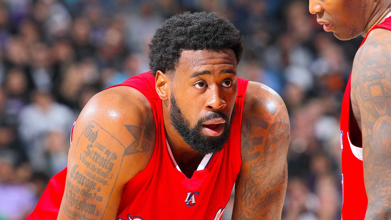
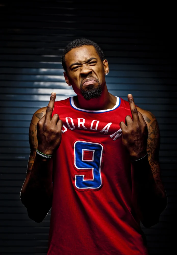
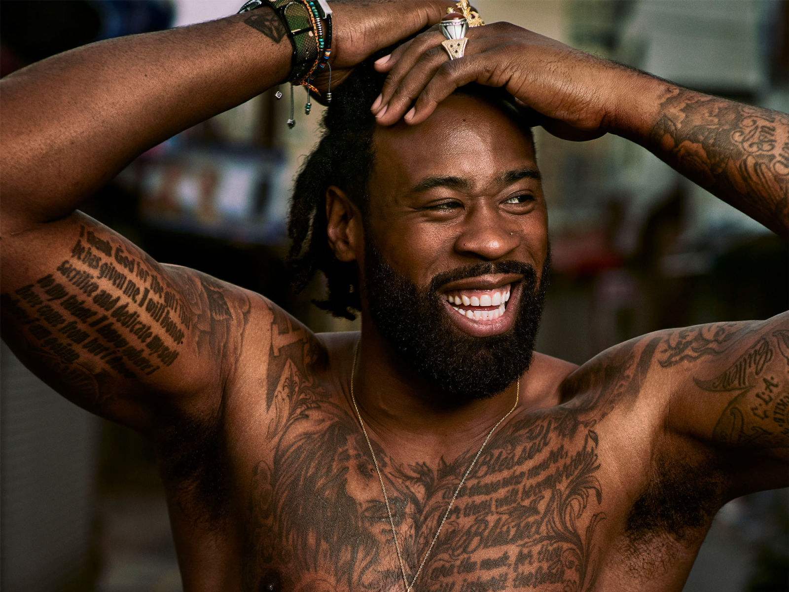
When DeAndre Jordan takes his shirt off, the tattoos cover both arms, his chest, shoulders, back and legs. Long lines of writing sit beside portraits, crosses and basketball references. The pieces don’t look like one perfectly matched sleeve. Together they feel like a map that grew with him.

DeAndre Jordan tattoos mix large black-and-grey shapes with long script and smaller details. The shoulders hold some of the widest images, the chest carries prominent messages, and the arms give you more to follow. The placements keep the collection from becoming a wall of unrelated ink.

Jordan has talked about tattoos tied to family, his Houston roots and his faith. Those subjects give the collection a personal centre. You don’t need to copy a cross, quote or hometown reference; start with the people, places or beliefs you want to carry, then find the right space for them.

DeAndre Jordan’s chest tattoos make the collection feel personal

DeAndre Jordan tattoos: chest and arm tattoo coverage

Jordan’s chest gives his collection a centre. Long writing stretches across a broad surface, while portraits and symbols add darker areas around it. In shirtless photos, you can see these sections together, and the mix reads as a story rather than a stack of separate flash designs.

The chest lets words and images sit side by side. A long quote can turn into a block if the lines are squeezed together; Jordan’s has room to read, with nearby artwork breaking up the text. That keeps the area visually full without flattening it.

Before planning a chest piece, decide if the main idea belongs in the centre, over one pectoral or across the whole front. A central image can work like an emblem, while a quote needs width toward the ribs and shoulders. The design should follow the shape of the body, not treat the skin like a blank sheet.

Step back from the reference photo too. Fine details can look sharp on a phone and disappear at normal distance. Clear outlines, spacing and a few darker areas help a chest tattoo keep its shape in everyday light.

His shoulder tattoos use large images and curved placement

DeAndre Jordan tattoos: shoulder and upper-arm tattoo placement

Jordan’s shoulder work is easy to study because the large images follow the curve of the arm. One shoulder carries a circular skull-and-banner design, with script and decorative shapes continuing down the upper arm. The round cap frames the main image; the lettering below it follows the arm rather than forcing a straight line.

Wrapping a design around a muscle can make it harder to read from every angle. Here, the central image has a clear focal point, and the smaller writing supports it. The arm turns, but the main shape still holds together.

If you want a shoulder tattoo with this scale, give the central image the space it needs first. A skull, portrait, animal or religious symbol may fit the roundest part of the shoulder, where it shows from the front and side. Then plan the lettering below it. Don’t force words into every open gap; a little bare skin can give the image room.

Ask your artist to test the design on a curved template. Lines that look straight on paper may bend oddly over the deltoid. The main face or symbol should point the right way, and the layout needs to allow the arm to move.

The arm tattoos carry Jordan’s faith and family references

DeAndre Jordan tattoos: arm tattoos and visible game-day placement

Jordan’s arms carry some of the collection’s most visible pieces. Long writing runs along an upper arm; the other includes images and symbols tied to faith, family and personal history. Because his arms show in basketball photos, the tattoos are part of how fans recognise him away from the court.

The subjects vary. One area may centre on a quote, another on a cross or portrait, while smaller marks connect them. They don’t all need to match; a shared line weight and black-and-grey tone can make different designs feel related.

A tattoo collection can come together over time instead of being planned as one complete sleeve. Jordan’s public photos show pieces with different sizes and spacing. The overlaps and gaps give the arm a lived-in quality, while the larger images still have room to read.

Before adding another piece, photograph the arm from the front, side and back. Ask whether the new design improves the flow or only fills an empty patch. A gap isn’t automatically a problem. It can give the eye a rest and help the more important tattoos stand out.

The Serenity Prayer tattoo works because the lettering has room

DeAndre Jordan tattoos: Serenity Prayer lettering and readable arm placement

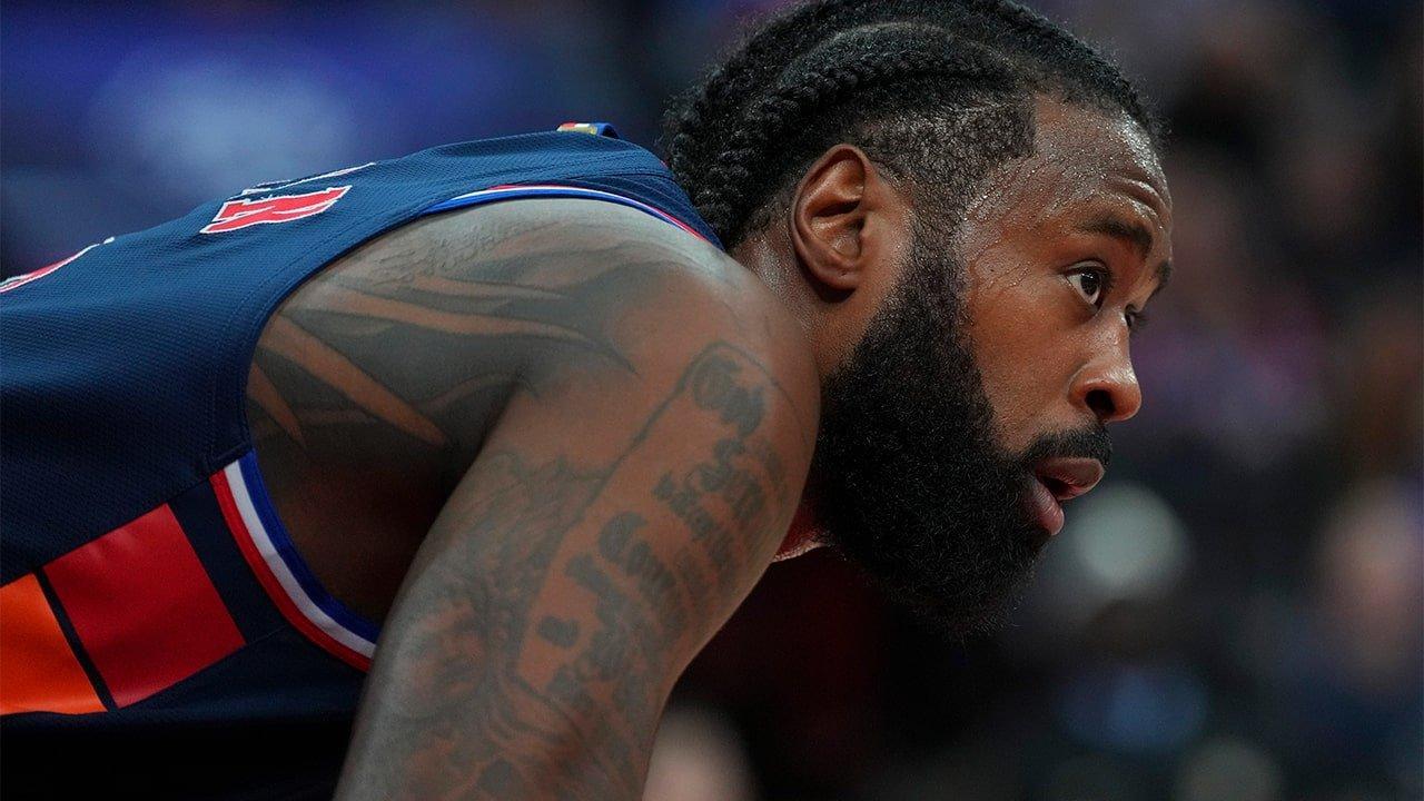
The Serenity Prayer is one of Jordan’s most visible arm tattoos. The lettering runs over a long stretch of skin, giving the words room. A quote this length needs careful spacing; if the lines sit too close, the tattoo may blur together as it ages.

A game photo shows the writing while his body is moving. Jordan bends and twists, but the text still reads as a vertical panel along the arm. That placement follows the arm’s length rather than fighting the folds in the skin.

A long quote brings a few practical choices. Pick lettering that will stay readable at the size you can use, and check the spaces between words before settling on the style. The artist can tune the letter shapes and rhythm, but the phrase still needs enough room.

The words already carry the meaning; the nearby tattoos add context. If your idea is a prayer, song lyric or family saying, let the text remain the main feature. Add flourishes only when they help the layout, and make sure the words can stand on their own.

His on-court tattoos show how the collection moves

DeAndre Jordan tattoos: tattoo movement during basketball

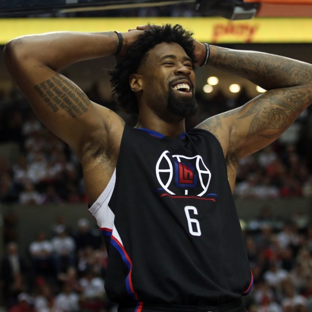
Game photos show Jordan’s tattoos in motion and ordinary light. A jersey covers much of the chest, but the arm work remains visible. When he puts his hands on his head, the shoulders and upper arms enter the frame too. The ink changes with each pose.

Another court image shows a different mood from the shirtless portraits. The tattoos aren’t being posed for the camera, yet the larger shapes and script still read clearly. The arm ink has enough contrast to show at a distance, while finer marks reward a closer look.

Think about your everyday clothes when you choose a placement. A shoulder tattoo may disappear under a sleeve, while a forearm piece can stay visible all day. The best spot is one that suits how you live and how much of the design you want to show.

Most of the visible tattoos use black and grey, so the shapes and lettering carry the look. Colour can work just as well; repeating one or two tones across different pieces can help them feel related. Line weight, subject and placement can create that connection too.

How to plan a collection with the same personal feel

Start with the meaning, not a random picture. Think about the people, places or beliefs you want a tattoo to represent. Jordan’s collection includes family names, faith imagery, hometown references and longer phrases because those subjects matter in his life. Your list should come from your own experience.
Next, choose a placement with enough room. A small symbol may suit the wrist or upper arm; a quote needs a longer stretch, such as the outer arm, ribs or chest. A portrait needs enough space for the face to remain distinct. Let the detail set the scale.

Jordan’s larger pieces also show the value of building in stages. Place the most important design first, then let supporting work develop around it. Your artist can repeat shapes, shading or line weight without making every tattoo identical, leaving you room to change direction as the collection grows.

Check the layout in positions you actually use: raise your arms, sit, turn and put on a shirt. Look in soft and bright light. If the main image still reads and the letters have breathing room, you’re close. DeAndre Jordan tattoos show how much meaning gains when placement gives it room.

Jordan’s tattoos feel personal because they connect faith, family, home and the shape of his body. You can use the same approach without copying his designs: choose the stories that matter, make room for the main pieces, and let the collection grow with you.

The video below looks at the tattoo artist behind several NBA players, including DeAndre Jordan.

Anthony Davis Tattoos: Chicago Script, Stars and Arm Ink

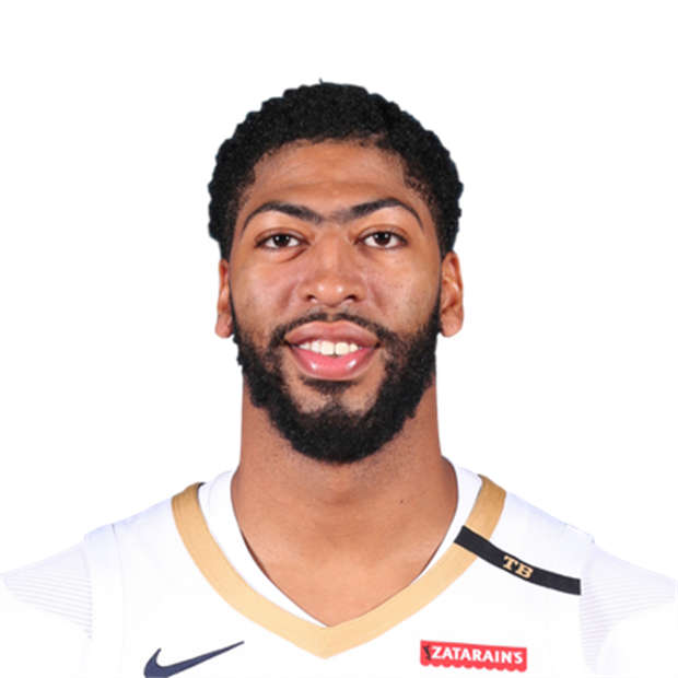
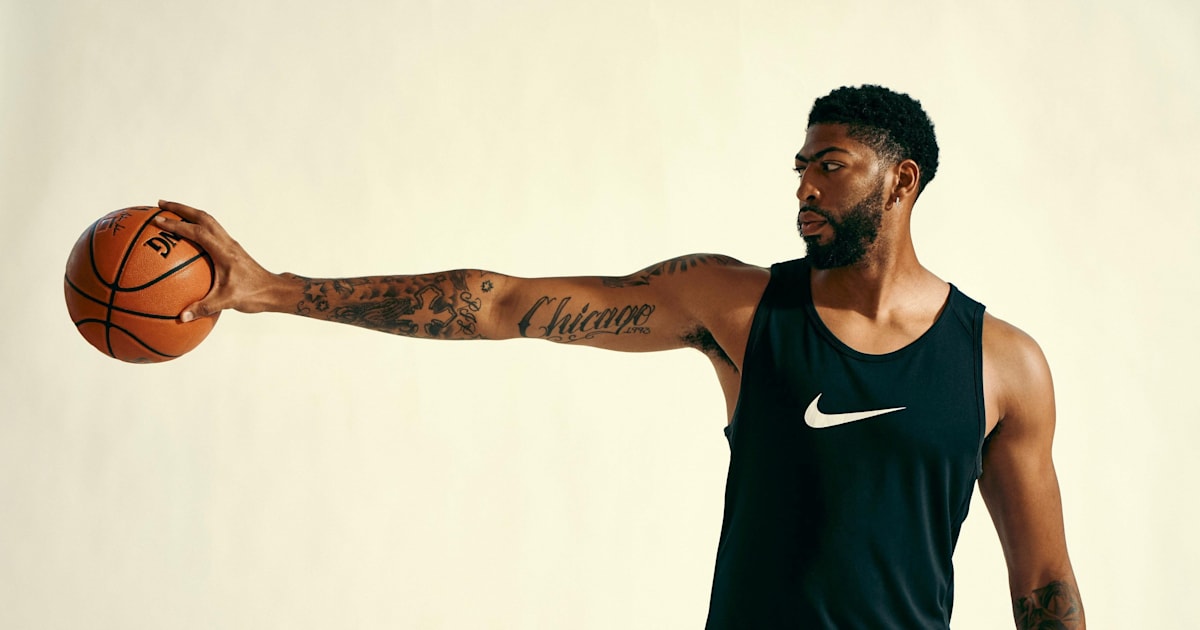
Anthony Davis’s tattoos can be hard to see under a compression shirt, but they stand out when his arms are bare. Script, portraits, stars, symbols and dates run across both arms. The collection feels less like decoration than a record of people, places and moments he wants to keep close.

Anthony Davis tattoos offer ideas for meaningful sports ink without copying a whole sleeve. Large lettering gives the arm a focal point, while smaller symbols and shaded images fill in around it. The designs have stories behind them, but still work as shapes on the body.

The placement helps carry that meaning. Chicago references sit on the arm he raises during a shot; portrait work has room to show its detail. The tattoos connect to his life and take the body’s shape and movement into account.

Chicago lettering gives Anthony Davis’s arm a clear centre

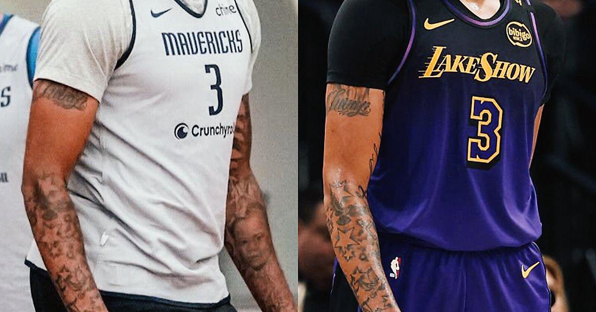
Anthony Davis tattoos: arm tattoo coverage in different jerseys

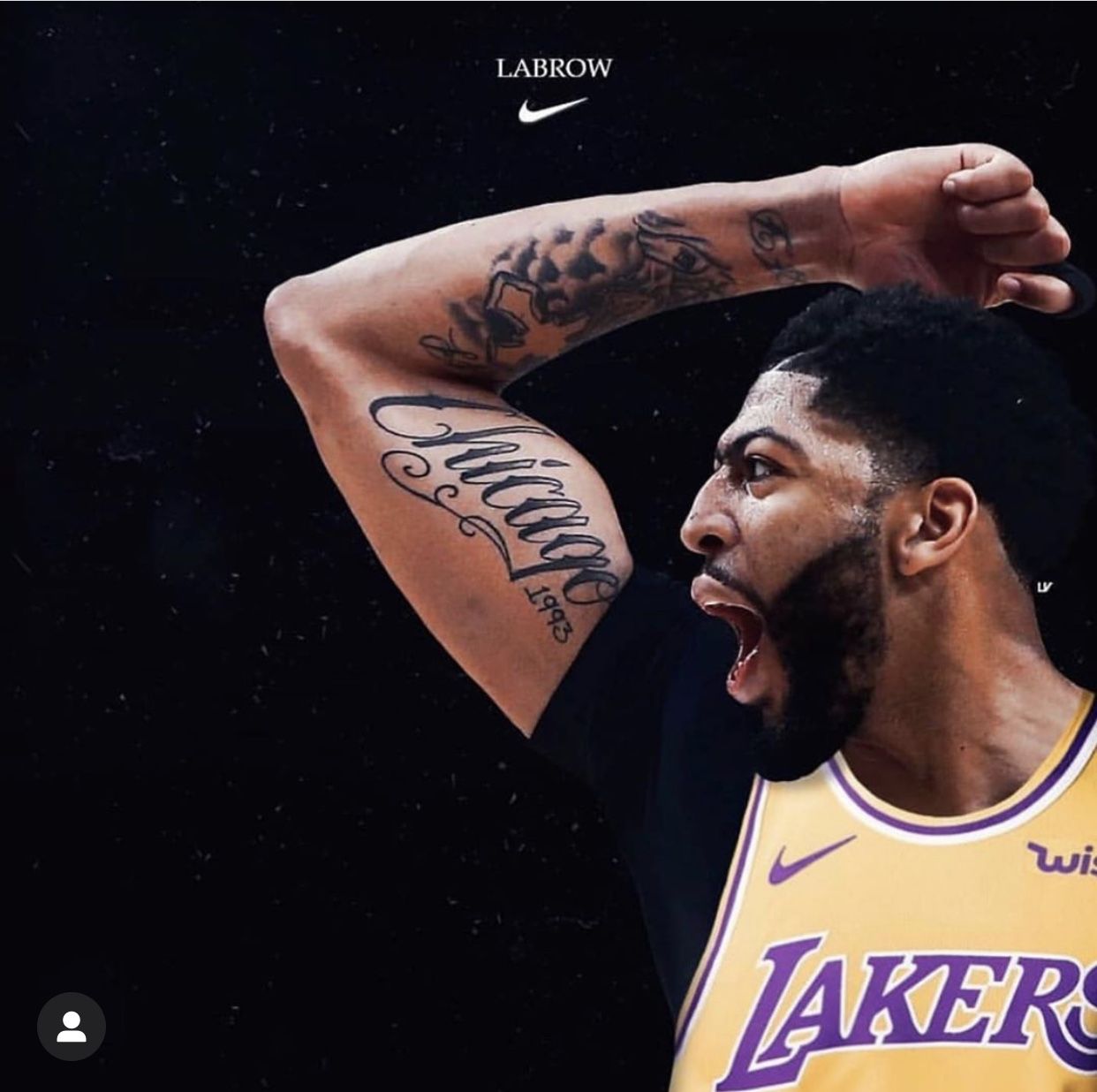
“Chicago” is one of the first details people notice in Davis’s arm tattoos. The script runs across his bicep, with the year 1993 worked into the design. It’s a hometown reference that combines a place with a date instead of leaving the numbers on their own.

The upper arm gives the word a long path to follow. It isn’t squeezed near the elbow or hidden right under the shoulder. The lettering runs with the arm, so it remains visible when he lowers it, lifts it or reaches toward the basket.

For a hometown tattoo, decide what feeling you want the piece to hold before choosing its extras. A city name can sit beside a year or a small symbol. Ask to see the lettering on the arm from a few angles. Good script follows the body instead of fighting it.

His forearm tattoos mix script with smaller symbols

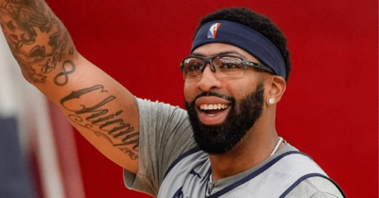
Anthony Davis tattoos: script and symbol placement

A practice photo shows the forearm tattoos beside the larger lettering on Davis’s bicep. Flowing script, smaller shapes and darker details become easier to see when he lifts his arm. The variety keeps the area from relying on one repeated pattern.

A mixed arm needs some planning. Letters need open space to stay legible, while small symbols can help bridge larger designs. Davis’s collection uses darker marks as anchors and lighter areas to stop the arm feeling crowded.

Choose the piece you want people to notice first when they see the outside of your arm. That design can guide what comes next. Smaller stars, dates or symbols can connect it to the inside, as long as there’s enough space around the lettering for it to stay clear.

Script can also make use of direction. A city name might follow the arm’s length; a shorter date can sit below it as a quieter detail. Try several layouts on paper, then check how they sit against your skin. The version that looks good on a screen may not fit your arm as naturally.

Stars and Olympic rings add a different rhythm

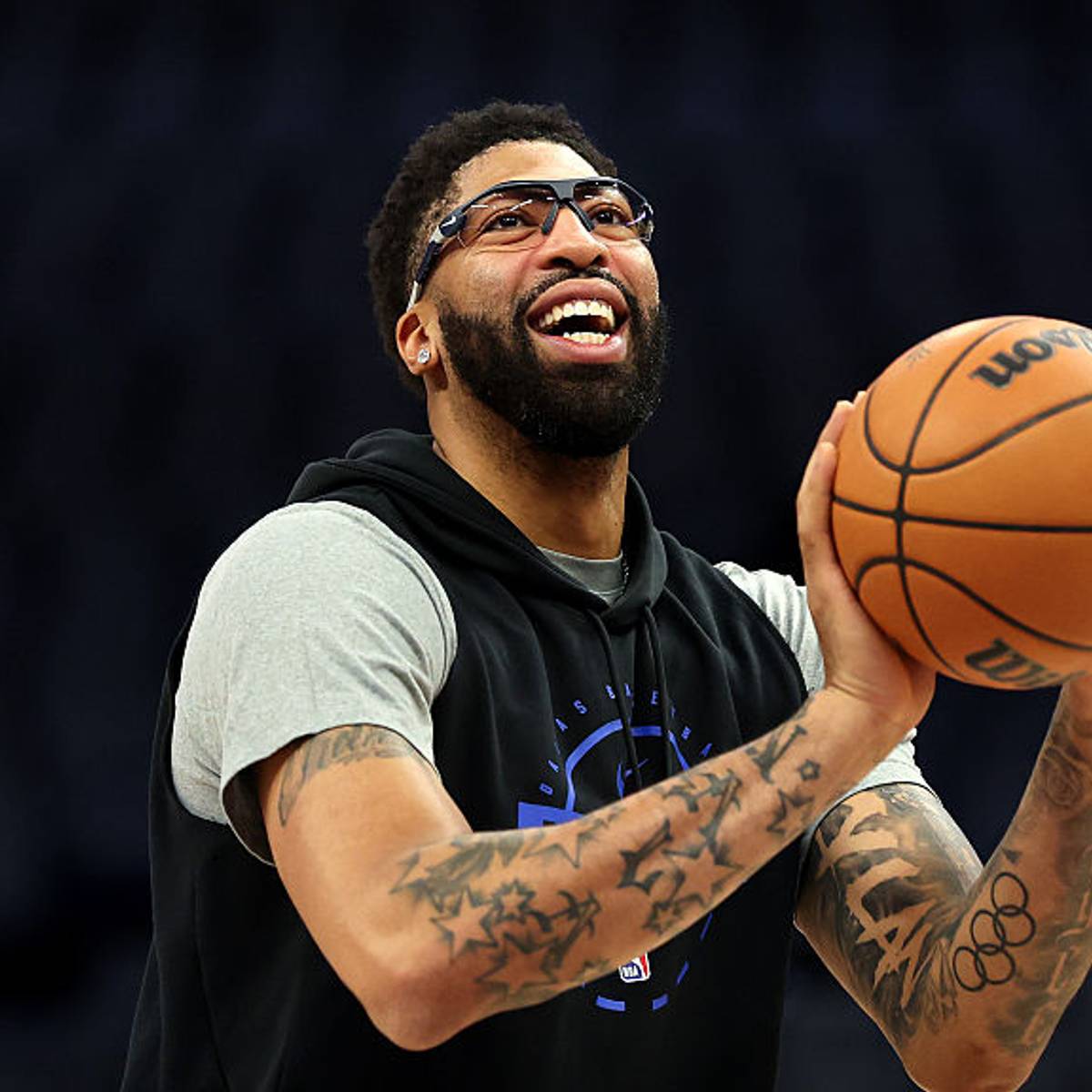
Anthony Davis tattoos: stars and Olympic rings

Stars and Olympic rings add a more graphic element to Davis’s arm. The stars repeat across the space, while the rings give the lower section a clean symbol with open circles. Both bring a different texture from the larger script.

Repeating a shape can tie tattoos together even when they were added at different times. Stars can fill a sleeve or work as small accents around a portrait. The rings create open centres that give the eye a break from the darker ink nearby.

When you combine symbols, consider line weight before colour. Outlines of similar strength tend to sit well together, even if their subjects differ. A repeated shape can make a collection feel planned without making every tattoo match.

The open rings also show how a simple outline can bring balance to a busy arm. A compass, number or another personal emblem can serve the same role. Not every tattoo needs heavy shading to hold its place.

The Chicago 1970 tattoo uses a wider canvas

Anthony Davis tattoos: Chicago 1970 lettering

A Red Bull portrait shows another Chicago reference on Davis’s forearm. The script spans the arm with enough room for the letters to stay bold; nearby tattoos add texture above and below. His extended arm shows how the design reads when the wrist and elbow are straight.

Forearm writing changes as the wrist turns. A word may look balanced from the front but compressed from the side. Check the stencil with your arm relaxed, bent and extended, so you can see how the lettering follows the movement.

Large script can stay readable without filling the whole arm. Give the word a clear direction and clean edges; smaller surrounding designs can add detail without crowding it.

Before choosing a long phrase, check how many letters fit comfortably across the arm. A font that looks elegant in a sketch may need more space or a simpler shape once it wraps around the body. Your artist can help the text age legibly while fitting the rest of the tattoos.

The arm collection carries identity without hiding the skin

Anthony Davis tattoos: portrait and script placement

A Lakers portrait shows some of the smaller tattoos around Davis’s larger pieces. Script, a portrait and compact symbols share the arm, but patches of skin between them keep each design distinct. That breathing room helps the collection feel considered.

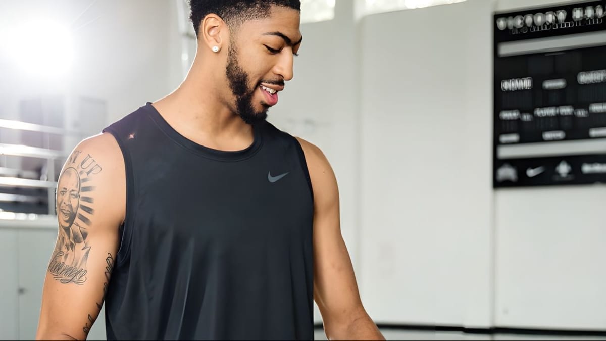
The portrait sits on the upper arm, where there’s room for a larger image. Nearby writing follows the limb’s length. The face can show when he wears a sleeveless jersey without needing to cover the whole shoulder.

If you’re planning a portrait, choose an area with enough space for the eyes, mouth and shadows to stay clear. Keep nearby lettering simple, and agree on a size that can hold the detail. A portrait needs visual space around it, even when it’s part of a sleeve.

A useful reference photo has clear light and shadow, which helps the artist shape the face. Choose an image that feels true to the person rather than one that’s famous or widely used. That choice can make the finished design feel more like a memory than a copied picture.

How to plan an Anthony Davis inspired tattoo sleeve

Anthony Davis tattoos: upper-arm portrait and sleeve planning

A practice photo shows Davis’s upper-arm portrait and script with a training top. The shoulder remains open around the larger image, letting it stand apart. The sleeve is made from different ideas rather than a row of matching designs from wrist to shoulder.

Begin with the tattoo that matters most. It might be a family portrait, a hometown date or a symbol connected to your own work. Give it space, then use script and smaller marks to build a link to the rest. Davis’s arm shows how words and dates can connect a larger image to the collection.

Think about work and clothing as well. A forearm tattoo will show most days, while an upper-arm piece is easier to cover. If you play sports, lift or spend time outdoors, ask how movement and sun might affect the placement. Practical choices can help the tattoo fit your life.
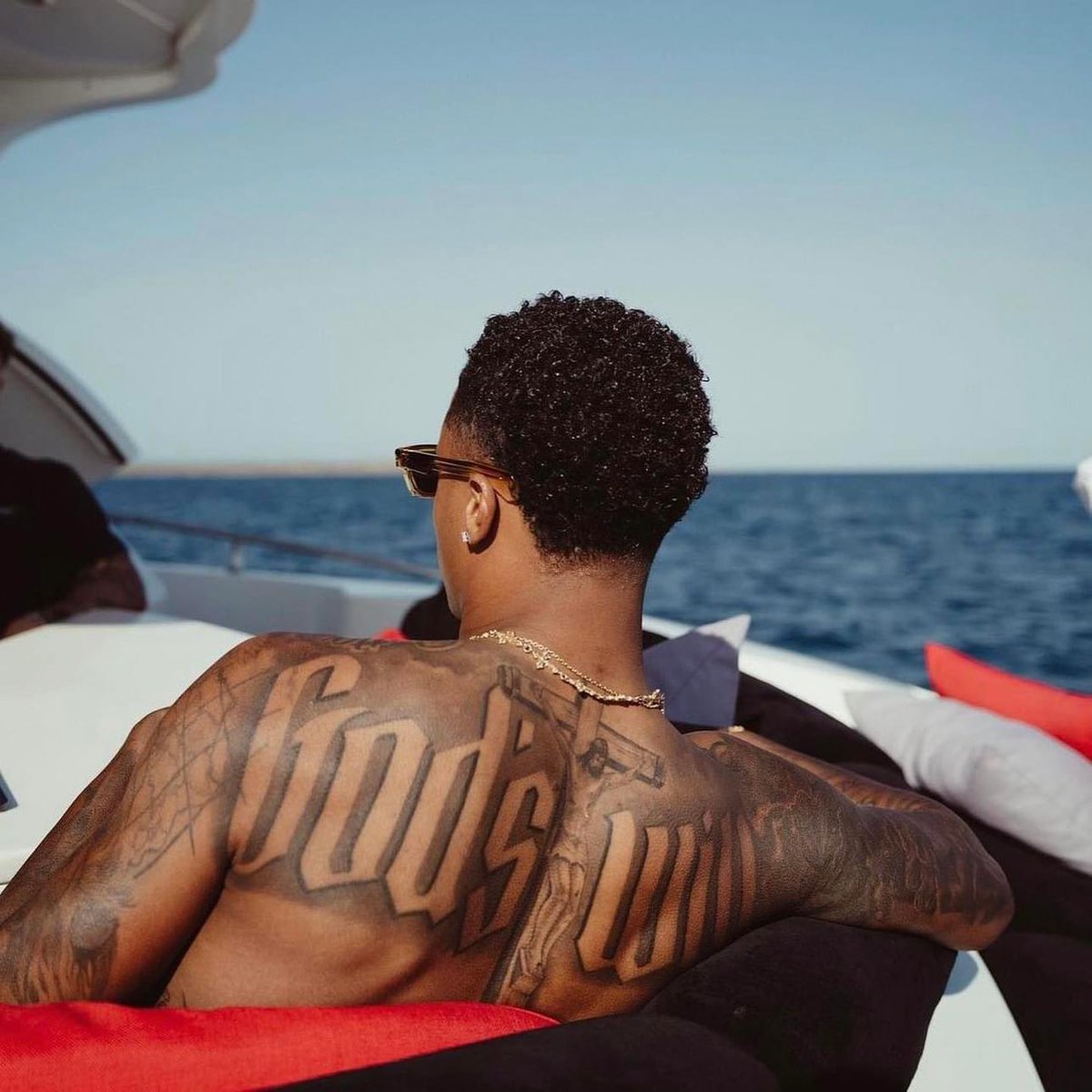
Davis’s tattoos each play a role: Chicago lettering anchors the arm, stars and rings add a pattern, and portrait work carries a more personal subject. The collection doesn’t need every patch of skin filled. Start with a story, then give the tattoo space to tell it.

Anthony Davis’s tattoos connect his city, personal symbols and portrait work without filling every part of the arm. Chicago script gives the collection a focal point; stars and rings add a different rhythm, and the larger images carry their own weight.

Anthony Davis explains one tattoo and talks about his career in the interview below.

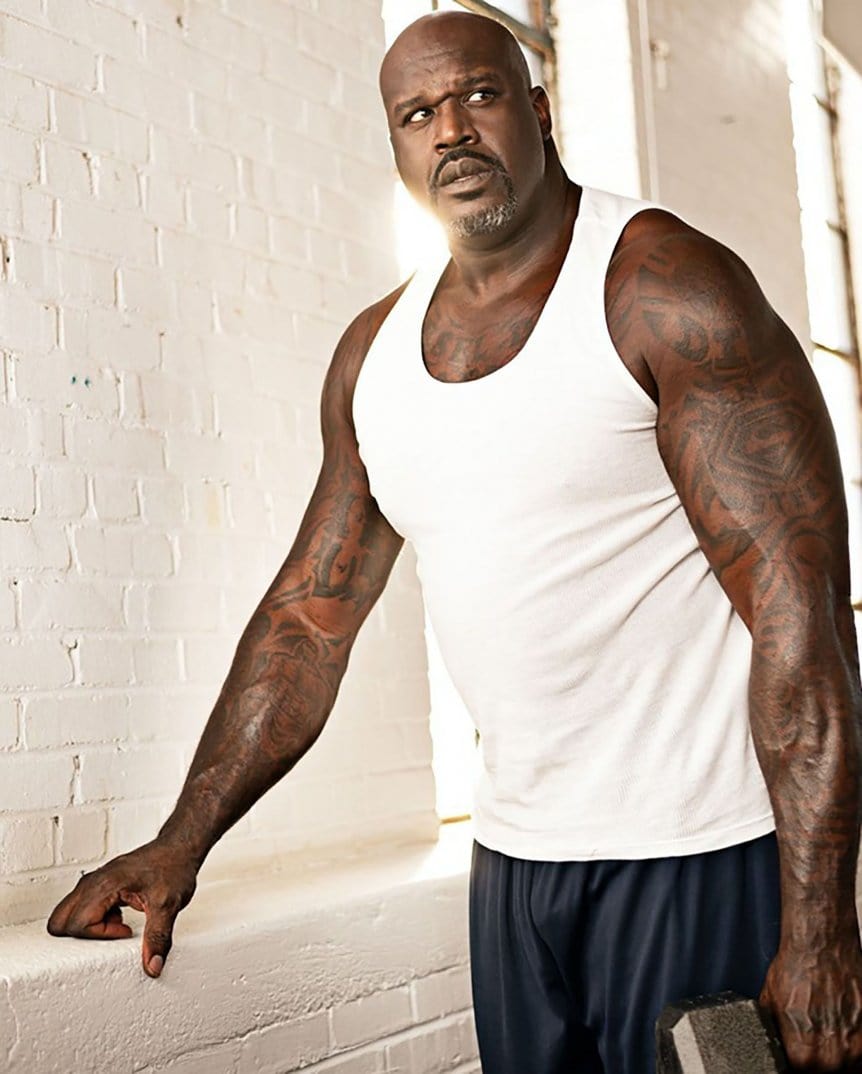
Shaquille O’Neal Tattoos: Diesel, Superman and Arm Ink

Shaquille O’Neal’s tattoos match his presence: they’re big, easy to spot and full of personality. His collection brings together bold lettering, Superman references, shaded figures, chest work and smaller symbols. It isn’t one coordinated sleeve; the designs grew around his nicknames, basketball career and life beyond the court.

Shaquille O’Neal tattoos are useful inspiration if you want bold sports ink with a personal story. Many of the designs read from a distance: a nickname, a tribute, a character or a symbol in a place that gives it room. The collection shows how personal tattoos can be large and direct.

Meaning and movement both matter in the placement. Shaq’s arms carry work visible in jerseys, suits and training clothes. His chest offers a wider surface, while the forearms show lettering and smaller images as he moves or raises a hand. Start with where a tattoo sits, then look at the design.

The Diesel lettering makes the upper arm impossible to miss

Shaquille O'Neal tattoos: Diesel lettering and upper-arm scale

“Diesel” is one of the clearest words in Shaq’s collection. It runs across his upper arm in heavy lettering, using the nickname associated with his basketball and music years. The word has a strong outline, so it’s easy to recognise when the arm moves or a jersey covers part of it.

Big letters need enough width to keep their shapes open. If a word is squeezed into a narrow strip, small spaces inside the letters can close as the ink settles. Shaq’s broad upper-arm placement lets the lettering follow the curve of the muscle, rather than sitting like a label on top.

If you’re thinking about a nickname tattoo, test the word at different sizes. A short name can carry a heavier font; a longer phrase may need finer strokes or more room between letters. Let the body set the scale. A larger version isn’t stronger if the word becomes hard to read.

Superman imagery connects the ink to Shaq’s public identity

Shaquille O'Neal tattoos: Superman imagery and symbol placement

Shaq is closely associated with Superman, and the shield is one of the arm symbols people recognise. It draws on the image fans and teammates had of him on the court: a huge, powerful player who could change a game.

A symbol like the shield can read without much explanation. Its outline stands out from a distance, and nearby work gives it context. You can use the same idea without copying the exact emblem: an original crest, family mark or simple shape can represent a role that matters to you.

Strong graphics need to follow the body. A curved bicep can distort straight lines, so check the stencil while the arm is relaxed and again when the muscle flexes. Good placement helps a symbol stay recognisable as the body moves, especially when the design relies on a clean outline and open space.

The forearm tattoos mix personal words with compact images

Shaquille O'Neal tattoos: forearm lettering and compact images

Older basketball photos show smaller tattoos clustered across Shaq’s forearms: words, shaded figures and symbols in more than one style. The mix feels like it was collected over time instead of planned as one matching set.

That approach can work if you’re adding to an existing tattoo. Rather than filling every gap, ask what the current piece needs beside it. A dense black image might sit well next to lighter script; a long word could be balanced by a round symbol or small portrait on the other side.

Keep the clear parts clear. Fine writing and small facial details need space around them. A little open skin between tattoos can keep unrelated images from running together. Shaq’s arms show how a busy collection can still have focal points when the larger shapes stand apart.

The chest tattoo gives the collection a wider canvas

Shaquille O'Neal tattoos: chest tattoo scale and placement

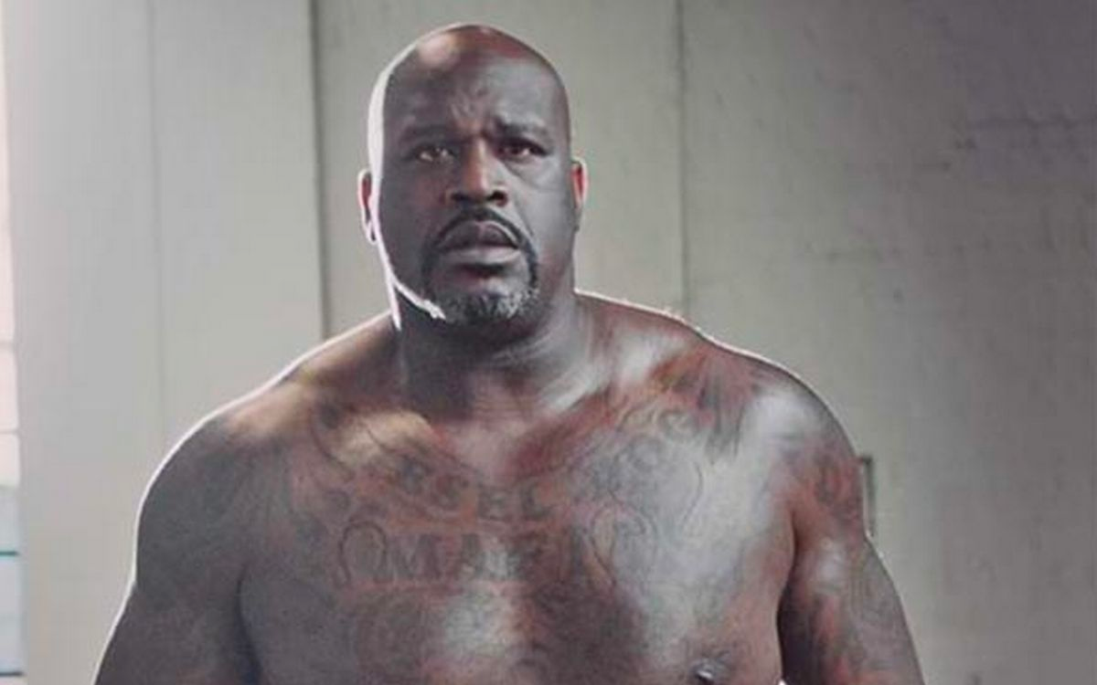
When Shaq wears a tank top, the chest ink adds another layer. Lettering and shading spread across a wide surface, making the tattoo feel like a statement across the upper body rather than a small emblem. A chest piece can be seen as a whole without wrapping around a narrow limb.

The chest moves with each breath, and the collarbones create two planes across the top. A layout that looks even on paper may sit too high or low once it follows the body. Ask to see the stencil while standing naturally, with shoulders relaxed.

A wide tattoo doesn’t have to cover every part of the chest. Strong lettering can carry the design, with shading and smaller details around it. Decide whether your main idea belongs in the centre, across both sides or along the shape of the pectorals; that choice changes how it looks under a shirt, vest or bare.

Training photos show how the arm sleeve moves

Shaquille O'Neal tattoos: arm sleeve movement and contrast

Gym portraits show Shaq’s tattoos while his arms are relaxed, bent or reaching. The ink runs from upper arm toward the forearm, and different designs appear as he changes position. That movement makes the collection read as part of him rather than a flat picture.

Before starting a sleeve, check the stencil from the front, side and back. A design positioned for one camera angle can disappear when the wrist turns. Keep the largest shapes visible from at least one common position; smaller pieces can follow the arm’s movement.

Shaq’s dark tattoos have strong contrast in photos, but a sleeve doesn’t need to be solid black to stand out. Open skin, grey shading and lighter lines can create pauses. Contrast gives a busy arm rhythm and helps the tattoos that matter most stay in focus.

The shirtless views reveal how the pieces connect

Shirtless photos make it easier to see how Shaq’s chest, shoulders and arms sit together. The designs don’t all match, but their size and weight make them feel related. Shoulder pieces frame the chest, and smaller arm tattoos carry details down toward the elbows and wrists.

If you’re planning a large project, think about the sleeve and chest as connected areas. They’ll meet at the shoulder and upper arm, so their edges need to work together. Repeating a line weight, lettering style or shading can link different designs without repeating the same image.

Some skin stays open between Shaq’s tattoos, which helps each piece remain distinct. If you like the amount of ink but don’t want a packed sleeve, use the photos as a reminder that a few large pieces can feel bold without filling every gap.

How to plan a Shaquille O’Neal inspired tattoo

Shaquille O'Neal tattoos: chest, shoulder and arm connection

Start with a story you want to carry. Shaq’s recognisable tattoos point to names, identities, characters and different parts of his life. Yours might be a family name, hometown reference, career symbol or a design for a change you’ve lived through. Choose that anchor before gathering unrelated ideas.
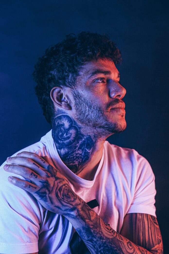
Then find a placement that gives the design room. A short nickname can fit the bicep; a portrait needs a calmer area with less stretching. A small symbol can sit on the forearm, but leave enough distance from the wrist so it doesn’t disappear into the joint when your hand moves.

Plan the surrounding pieces over time. Don’t add filler just because a gap looks empty today. Shaq’s collection feels confident because its main ideas have room, the words remain legible and the designs point back to his life rather than a single trend.

Shaquille O’Neal’s tattoos are direct and easy to recognise. Diesel lettering, Superman imagery, chest work and layered arm pieces all reflect the person wearing them. If you like that approach, start with an idea that matters to you, give it space, and check how it looks when your body is relaxed as well as flexed.

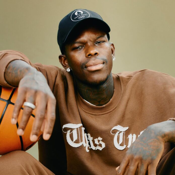
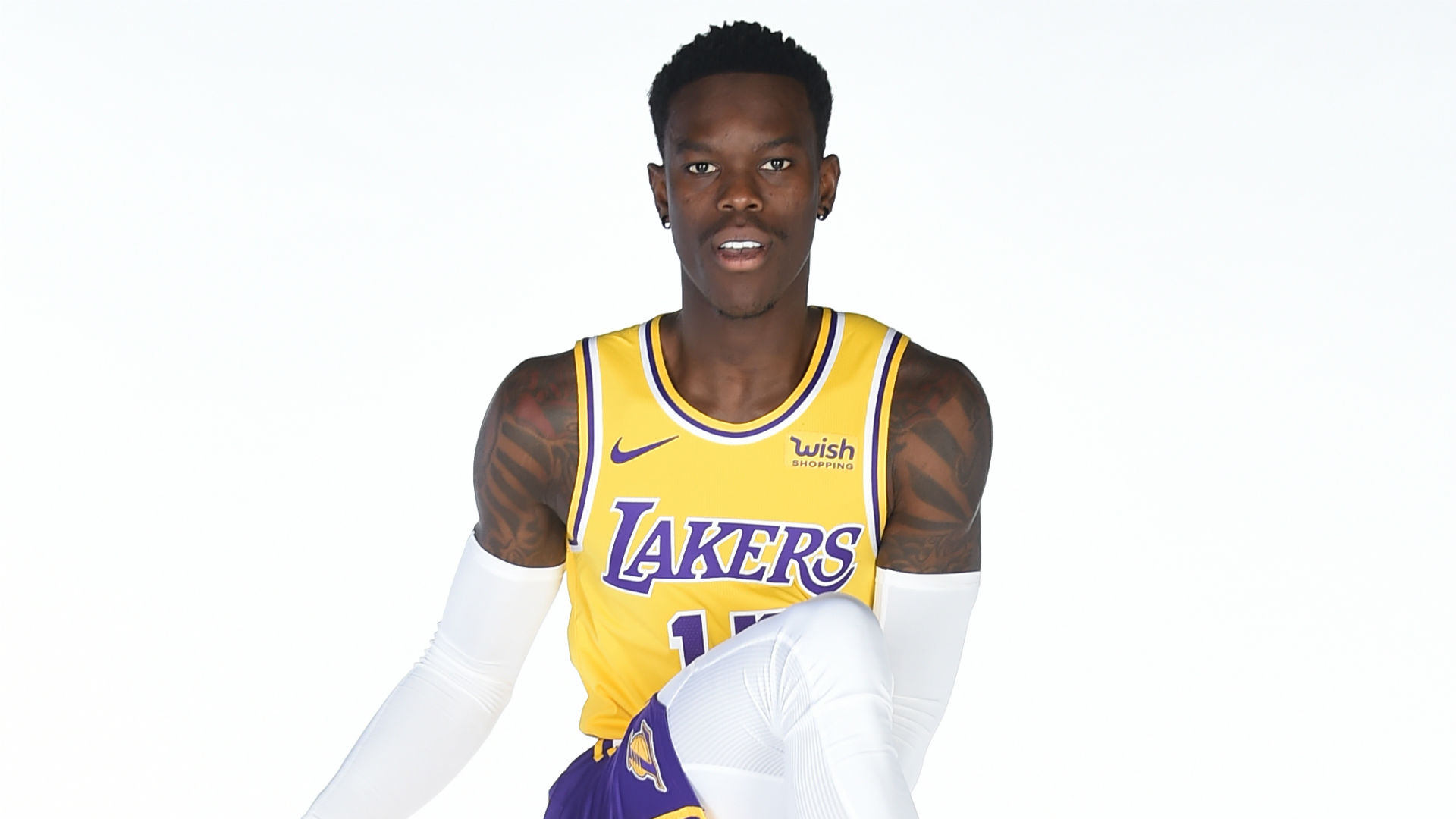
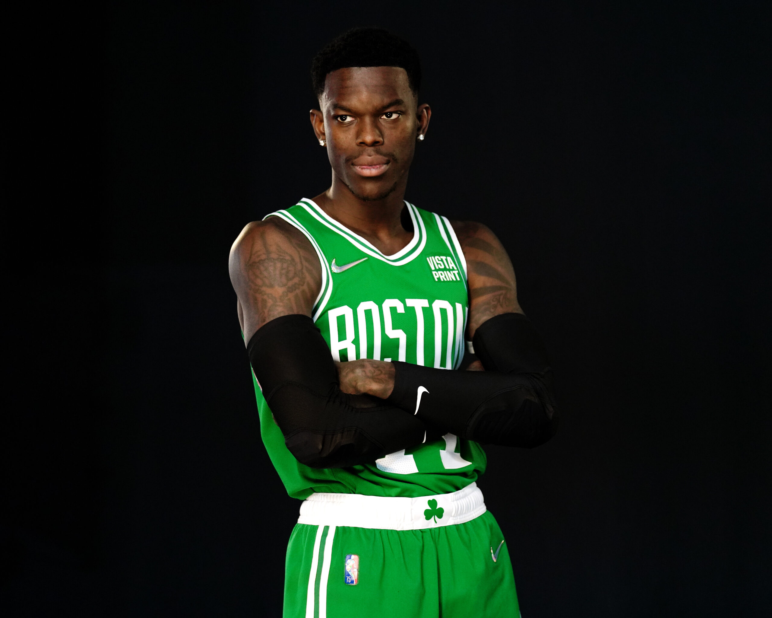
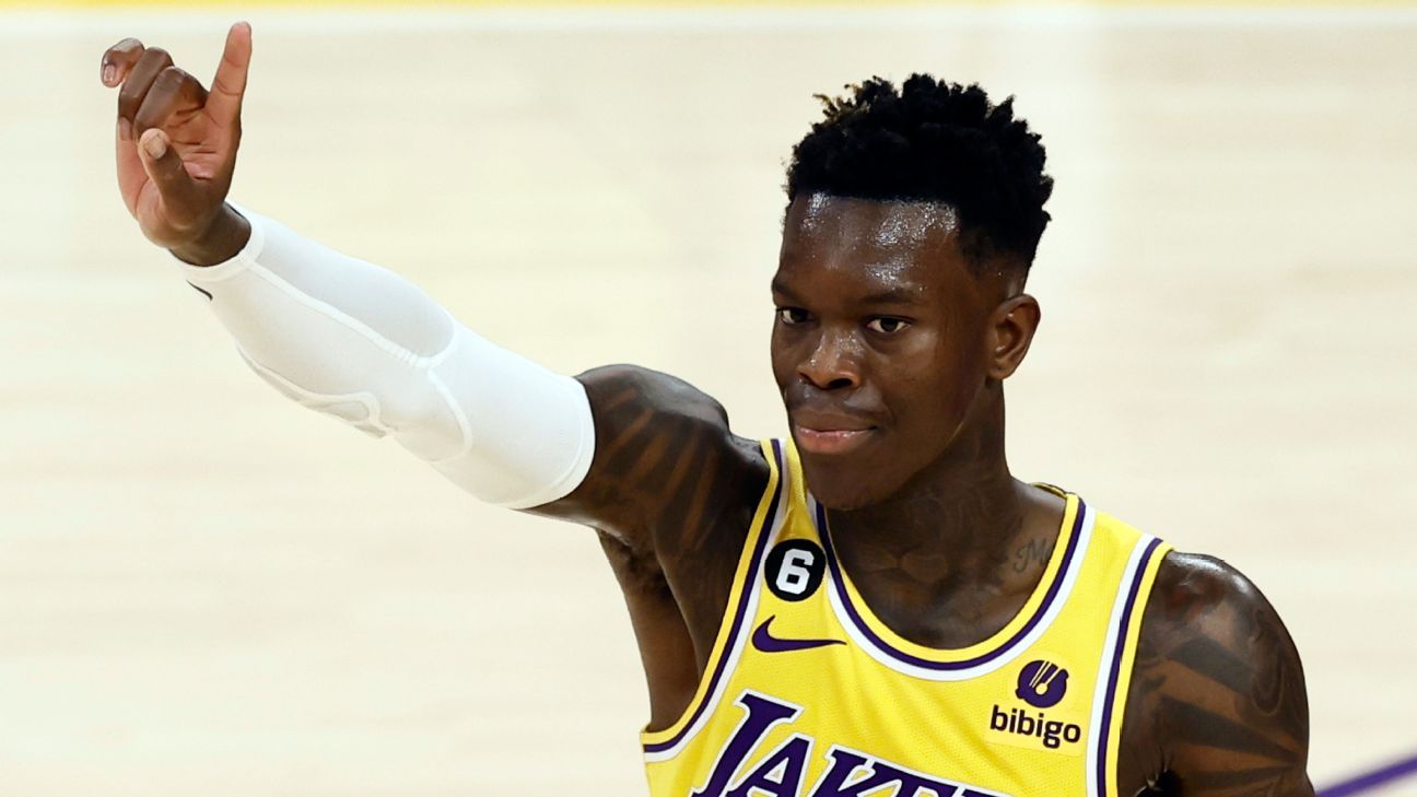
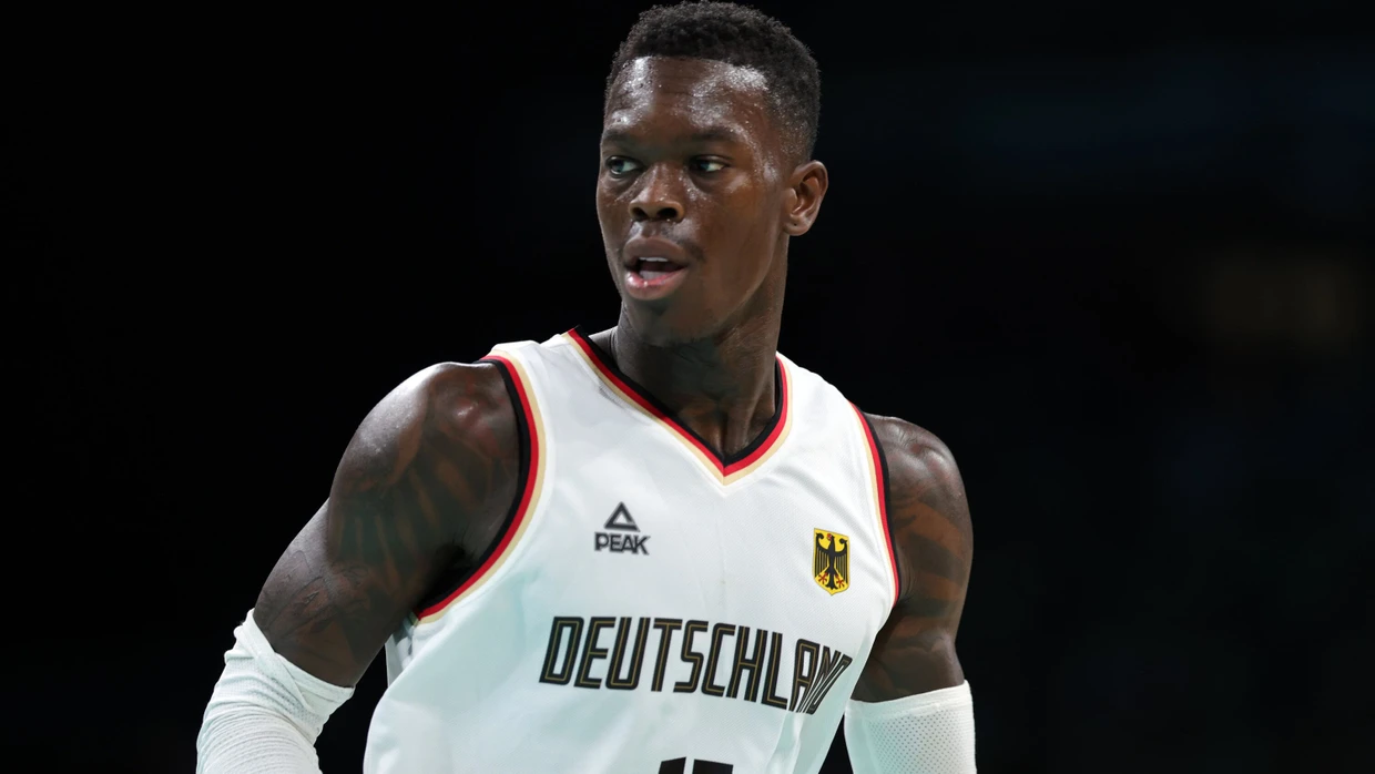
Dennis Schroder Tattoos: Family, Faith and Basketball Ink

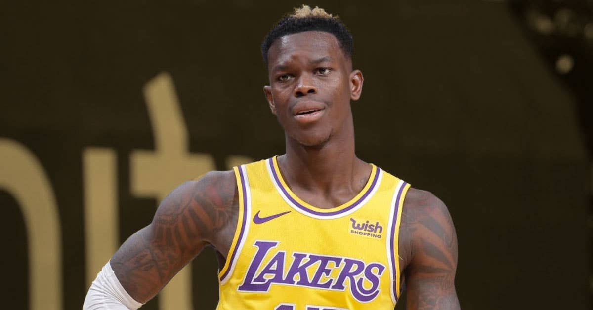
Dennis Schröder’s tattoos extend well beyond his arms. The German point guard has ink across his chest, shoulders, neck, hands, legs and stomach. Each area holds a different kind of design: some show with a basketball jersey, others only in shorts or a vest.

Dennis Schröder tattoos read like a timeline more than a single planned sleeve. Family tributes, religious words, portraits, card symbols, roses and basketball references sit beside one another. The styles vary, but many pieces point back to people, places and turning points in his life.
Schröder has talked about ink as part of his story. His first tattoo was connected to his father, and later designs returned to family, faith and the sport that took him from Braunschweig to the NBA. The strongest thread is his life, not one matching visual style.
His arm tattoos use heavy shading and clear lettering

Dennis Schröder tattoos: arm sleeve coverage

In game photos, the upper-arm coverage is hard to miss. Dark bands, lettering and shaded shapes run from the shoulders toward the elbows. Even when a jersey hides some details, the arm keeps a strong outline. The blackwork is bold, but it isn’t just blank filler.
Open skin between denser areas gives the words and symbols room. That also helps the designs stay distinct as the arm moves. A sleeve can hold many details and still read clearly when each major piece has its own space.

For an upper-arm project, decide which design should lead. A name, portrait or symbol can anchor the sleeve; shading can build around it later. Choose the focal point before the filler. That leaves room to add more without losing the idea you started with.

Card and dice tattoos add a personal street-style detail

Dennis Schröder tattoos: arm symbols and lettering

Card and dice tattoos bring a different note to Schröder’s arm. Cards can suggest luck or risk; dice make chance part of the design. The symbols sit among his other tattoos without taking over the whole collection.

Game imagery can be drawn in several ways: an ace in sharp lettering, traditional flash or heavier blackwork; dice can be simple or more shaded. The style matters, but first decide what the card or number means to you. A personal reason gives a small symbol more weight than surface detail alone.

Placement changes the feel too. A small mark on the bicep reads differently from the same symbol on the hand or forearm. Keep it large enough for the lines to remain clear, and give nearby pieces room. Meaning can make a small tattoo matter; clean spacing helps it stay sharp.

Family portraits bring the emotional weight

Dennis Schröder tattoos: family portrait and hand tattoo context

Family portraits are among the more personal pieces in Schröder’s collection. Images connected to his children and family don’t need a team logo or a slogan to explain their place. A face, name or date can carry a lot when the reference is chosen with care.

Portraits need enough space for the features to stay recognisable. The eyes, nose and mouth can lose their character when squeezed into a small area, so placement comes before final size. An upper arm or leg may offer a smoother surface than a wrist; the chest and back can take a larger composition.

If you’re planning a family portrait, bring several photos to your consultation. Your artist can compare the lighting, expression and angle to find one that will translate to skin. A portrait needs a strong reference as well as a personal connection. Good contrast and clear facial structure still matter.

His leg tattoos show that the collection does not stop at the sleeves

Dennis Schröder tattoos: shoulder, neck and leg placement

Leg tattoos are easy to miss in game photos, but they add another part to Schröder’s collection. The longer area can hold portraits and larger shapes without competing with the arm pieces. It also offers room for a design that would crowd a forearm.

A leg changes shape as you sit, walk or bend your knee. A portrait centred while standing may shift when the muscle folds, so check the stencil in different positions. The knee can interrupt a design and affect how its lines age.

The leg can be a useful place for a larger project if your arms already carry visible work. It can tell a separate story instead of forcing everything into one sleeve. Schröder’s placements show how a collection can spread across the body while each area keeps its own character.

Words such as Blessed and Mashallah make the ink feel direct

Dennis Schröder tattoos: faith lettering and upper-body balance

Lettering gives Schröder’s tattoos a direct voice. Words such as “Blessed” and “Mashallah” sit alongside heavier shaded designs. In a photo, a short word reads quickly; for the person wearing it, it can hold a quieter meaning.

Short script can be harder to place than it looks. Leave enough room for every letter, and choose a style that suits the body area. Flowing script may fit an arm; a blockier font can hold better on a chest or shoulder. Check how it reads from a few feet away, not only up close.

Religious words deserve care beyond their appearance. Check the spelling, language and intended meaning, then review the final stencil at its actual size. Make the text readable before choosing a decorative font, especially when it carries spiritual or personal weight.

The upper-body tattoos balance chest, neck and shoulders

Dennis Schröder tattoos: chest, neck and shoulder connection

Photos from Schröder’s playing career show the shoulders and neck meeting the arm ink. Dark shapes remain visible under arena lights and frame the jersey neckline. Chest and neck designs also show when a sleeve covers the lower arm.

This layout takes more planning than one tattoo. The neck is visible and turns constantly; shoulders stretch when the arms lift. A piece can look balanced with arms down, then pull in another direction during a shot. Check the stencil at rest and while making familiar movements.

The upper body can vary its weight. A broad shoulder design can sit beside fine script, while a small mark on the neck gives the eye a pause between chest and arm work. Contrast helps a full collection feel organised without making every tattoo look alike.

How to plan a Dennis Schröder inspired tattoo collection

Dennis Schröder tattoos: overall tattoo collection planning

Start with the parts of your life you want to remember. Schröder’s tattoos point to family, faith, basketball and the trip from Germany to the NBA. Your own collection might centre on a hometown, a parent, a child, a belief or a milestone. Begin with that story before choosing a style or colour palette.

Plan by body area next. Keep the most visible pieces readable, and save larger or more private ideas for the chest, back or legs. Consider work, sport, sun and how often you want each tattoo to show. A collection can be bold without putting every important idea on the forearm.

Give the collection time to develop. Schröder’s tattoos feel personal because they carry different chapters rather than one rushed design. Leave space for additions, find an artist who can work with what’s already there, and don’t fill every gap just to finish an area.

Dennis Schröder’s tattoos stand out because they tell a story from head to toe. The lettering is direct, the portraits carry family meaning, and the basketball pieces sit beside faith and personal history. Choose what matters first, give each tattoo room, and let the larger collection take shape over time.

Paul George Tattoos: Lions, Faith and Hometown Ink

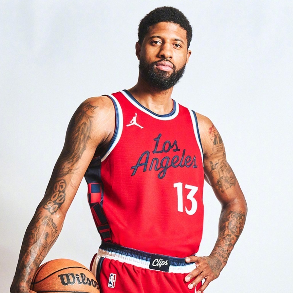
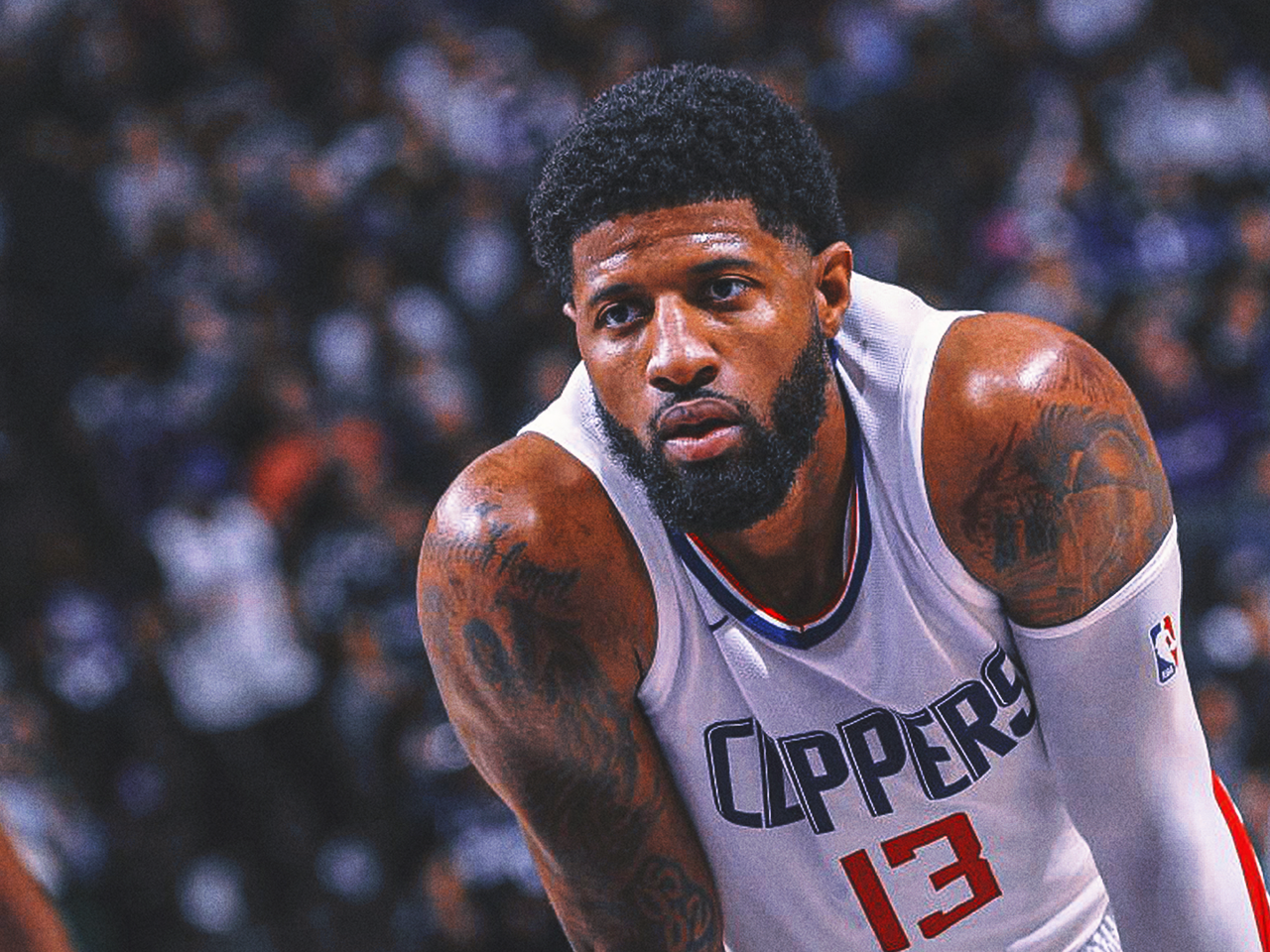
Paul George’s tattoos are easy to spot in a game, but a few quick photos only show part of the collection. His arms carry animals, dates, hometown references, chess pieces, faith lettering and family tributes. Some designs read from the stands; others sit between the larger pieces.

Paul George tattoos mix his identity off court with the competitive player he wants to be. The lion and tiger on his hands connect to his court persona, while forearm lettering points to faith, Los Angeles and family. The work doesn’t form one matched sleeve. It has grown in chapters as his life and career moved from Palmdale to the NBA.

George has said that some of his best-known tattoos carry personal meaning. That matters when you’re planning a larger piece: the visual style counts, but a person, place or idea you still care about can give the design its staying power.

Game photos can hide smaller tattoos behind wristbands, jerseys or the angle of his arm. Looking at each area on its own makes the details easier to see; stepping back afterward shows how they sit together. It also keeps the guide grounded in tattoos that are actually visible.

Paul George’s hand tattoos use a lion and a tiger

Paul George tattoos: lion and tiger hand tattoos

The lion and tiger on George’s hands are among the most noticeable pieces in his collection. One animal sits on each hand, drawn with sharp expressions and heavy shading. Their placement makes them hard to cover, so they’re part of his everyday look, whether he’s in a jersey or a vest.

George has called the animals two of his favourites and linked them to his personality on the court. Their alert faces and dark outlines hold up in action photos. They don’t sit quietly in a corner of the design.

Hand tattoos get a lot of movement, sunlight, washing and friction. If you like the idea, keep the main shapes bold and leave room around the details. A hand tattoo has to work at a glance. A clear animal face or simple symbol is easier to read over time than a crowded miniature scene.

The guardian angel tattoo covers his shoulder

Paul George tattoos: guardian angel shoulder tattoo

George’s right shoulder carries a large guardian angel, one of the clearest pieces on his upper arm. Its wings and figure sit above smaller forearm lettering and numbers, giving that side of his body a long shape that remains visible from the side.

The words tied to the design are My Guardian Angel. George hasn’t explained every part of the surrounding image, so it’s best to stick to what’s visible: the angel is clear, while the story behind every nearby shape is his to tell.

For a shoulder piece, plan the main silhouette before adding background texture. Wings can follow the curve of the shoulder, but check the stencil with the arm both relaxed and raised. The best large shoulder tattoos follow the body instead of fighting its movement. Look from behind and rotate your arm to make sure the design stays balanced.

Crown Me and chess tattoos bring a competitive edge

Paul George tattoos: Crown Me and chess lettering

On George’s left forearm, the words Crown Me sit among chess pieces. The king is the main image, and the mix gives the tattoo a competitive feel without using a basketball logo. Chess brings in ideas of planning and control as well as winning.

The phrase catches your eye first; the chess pieces add detail when you look closer. That balance keeps the design readable from a distance while giving the arm more to take in up close.

When you pair lettering with an image, decide which one should lead. If the surrounding icons are just as large and dark as the words, the phrase can get lost. Let the king, a date or a short line take focus, then keep the supporting details smaller. Hierarchy keeps a busy arm from turning into visual noise, especially if you plan to add more tattoos later.

Faith lettering gives the arm tattoos a quieter side

Paul George tattoos: Walk by Faith lettering

George’s collection also has quieter designs. Walk by Faith runs along his inner forearm, where the script is easy to miss when a sleeve or wristband covers it. It shows more clearly when he turns his arm toward the camera.

With faith lettering, choose words that matter to you rather than copying a font just because it looks good in a photo. Test the phrase at full size. Thin script can be hard to read once healed, while a little more weight and space between letters can help it hold up.

The inner forearm gives the words a natural reading line, though the skin bends and catches sun. Have your artist check the stencil with your wrist straight, relaxed and turned outward. It can keep a private phrase close while still letting you show it when you want. Good lettering should feel natural on the arm before it ever reaches the skin.

Dates, city and Mama tattoos connect the ink to home

Paul George tattoos: Mama, City of Dreams and route references

Some of George’s smaller tattoos refer to home. The numbers 05, 02 and 90 are widely read as his birth date, May 2, 1990. Other forearm designs include route and street-sign references, along with the words City of Dreams. Ordinary dates and places become personal markers in this part of the collection.

The word Mama, a basketball and a lock-and-keyhole design also appear on his forearm. These details draw less attention than the animals on his hands, but small symbols can carry a lot of meaning without taking over the whole arm.

If you want a number tattoo, settle on what it means before deciding where it goes. A birthday, road, area code or family date can all work, but knowing the reason keeps the design from feeling random. Leave enough room around a family name or symbol so it stays clear as you add more ink.

His back tattoos add scale beyond the sleeves

Paul George tattoos: large back tattoo layout

Photos away from the court show larger tattoos across George’s back, beyond the forearm pieces. Shaded artwork and lettering spread over the shoulders and toward the middle of his back, where there’s room for shapes that would be cramped on a wrist or hand.

Posture changes how a back piece looks. The shoulders widen when relaxed and shift when the arms move forward, so check a stencil from several angles. The artist also has to account for the shoulder blades, the curve beside the spine and folds in the skin when you sit.

The back can hold a large design without making it visible in every outfit. George’s arm tattoos are easy to see; the bigger back pieces give the collection a different scale. Use the back for the idea that needs room, and let nearby work support it instead of filling every space at once.

George’s collection links his playing identity to home and family: the animals on his hands, the guardian angel and faith lettering, and the dates and hometown references. If you’re borrowing an idea from his work, start with a person, place or belief you want to carry with you. Then choose a style and placement that suit it.

Ederson Tattoos: Lion, Eagle and Football Ink

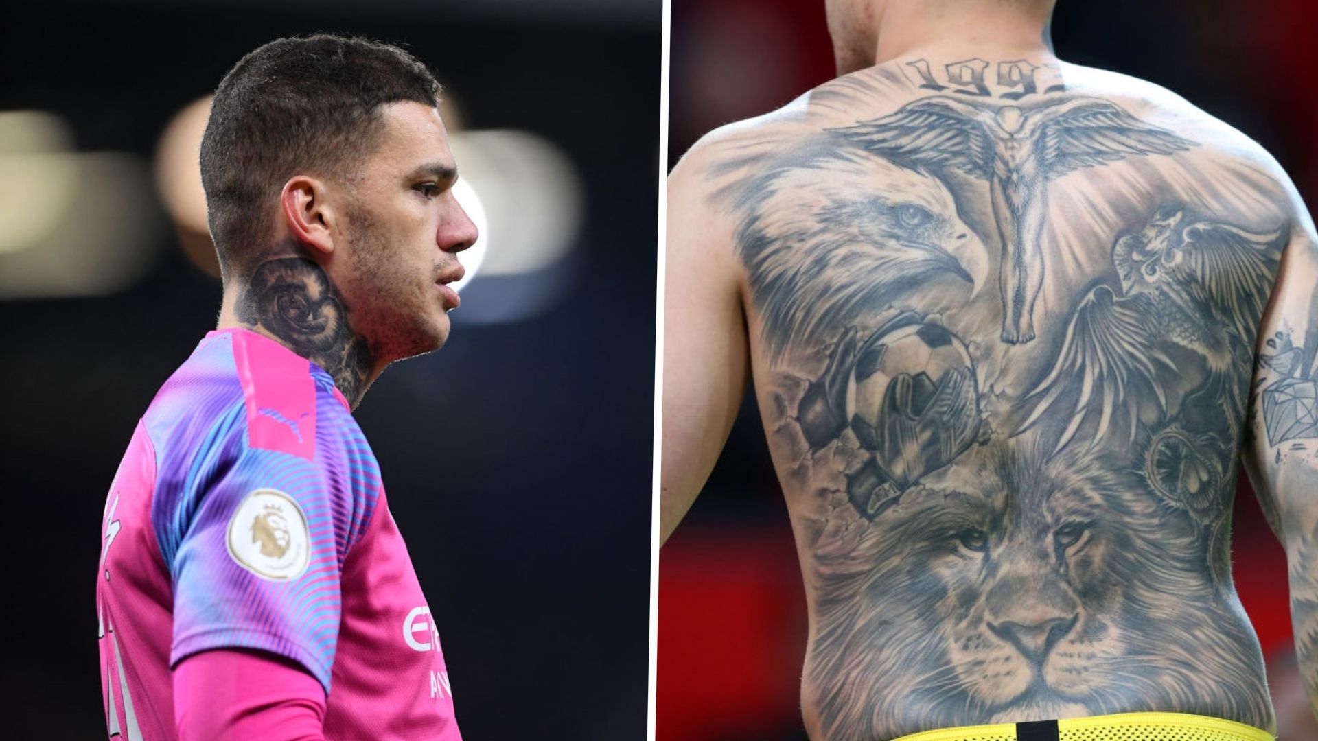
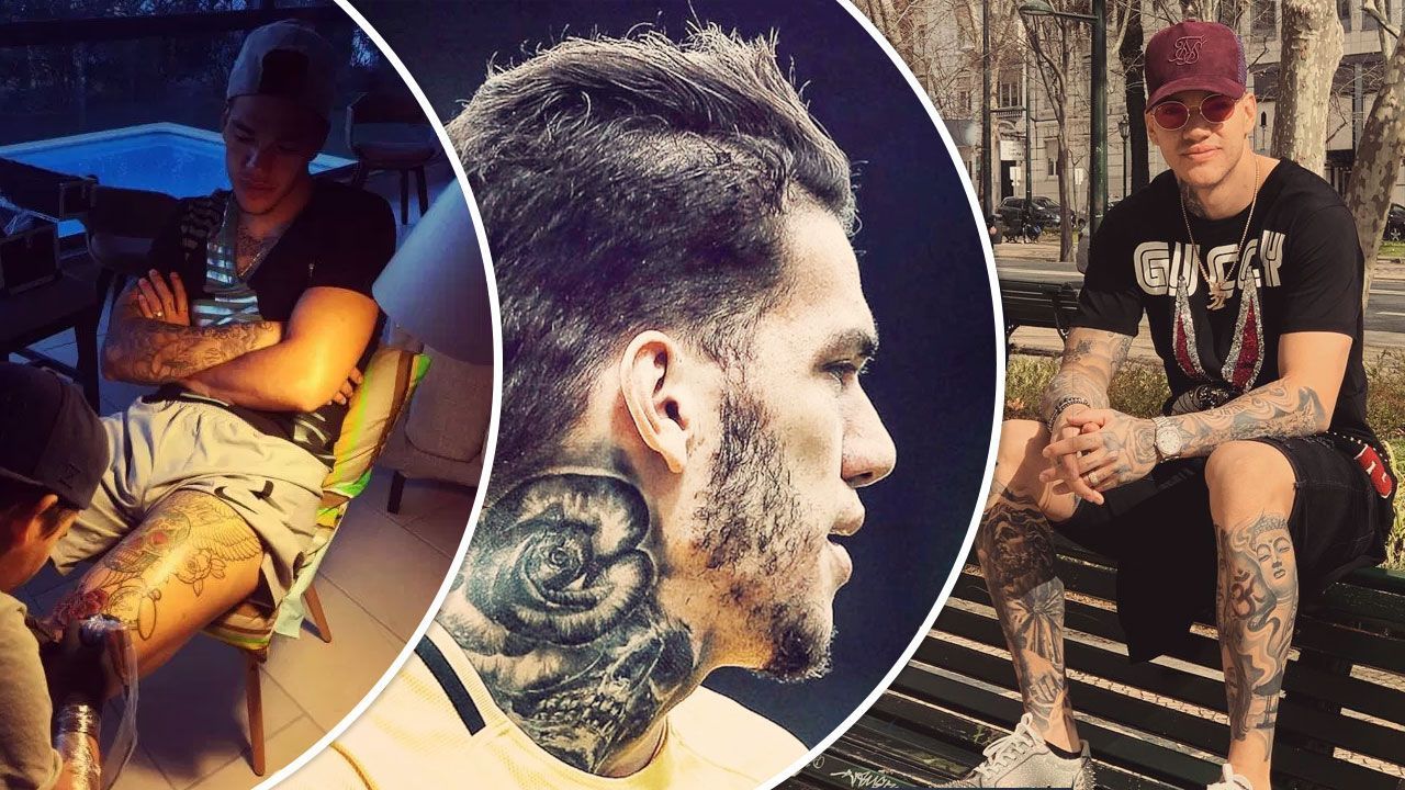
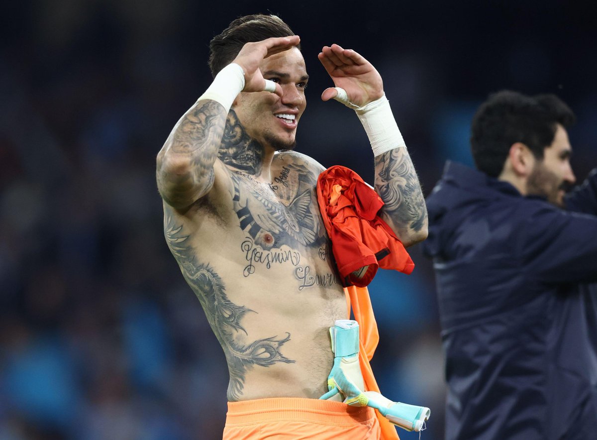
With his goalkeeper shirt off, Ederson’s tattoos cover his back, chest, neck, arms and legs. The Manchester City and Brazil goalkeeper has built a large black-and-grey collection that brings together faith, football, family names and animal imagery.

Ederson tattoos are tied closely to his life. The back combines a lion, eagle, Christ imagery, a football and goalkeeper gloves. Family lettering and a dove appear on his chest; the neck piece has a darker feel, while his leg tattoos include reminders of trophies and his time in Portugal.

Ederson has said he enjoys tattoos and wants more. In a Manchester City interview, he spoke about the smiley behind his ear. That interest shows in a collection that has grown across several parts of his body, with each area carrying a different subject.

Here are the main designs and a few practical points to consider if you’re drawn to the scale and detail of his work.

Ederson’s back tattoo brings together a lion, eagle and football

Ederson tattoos

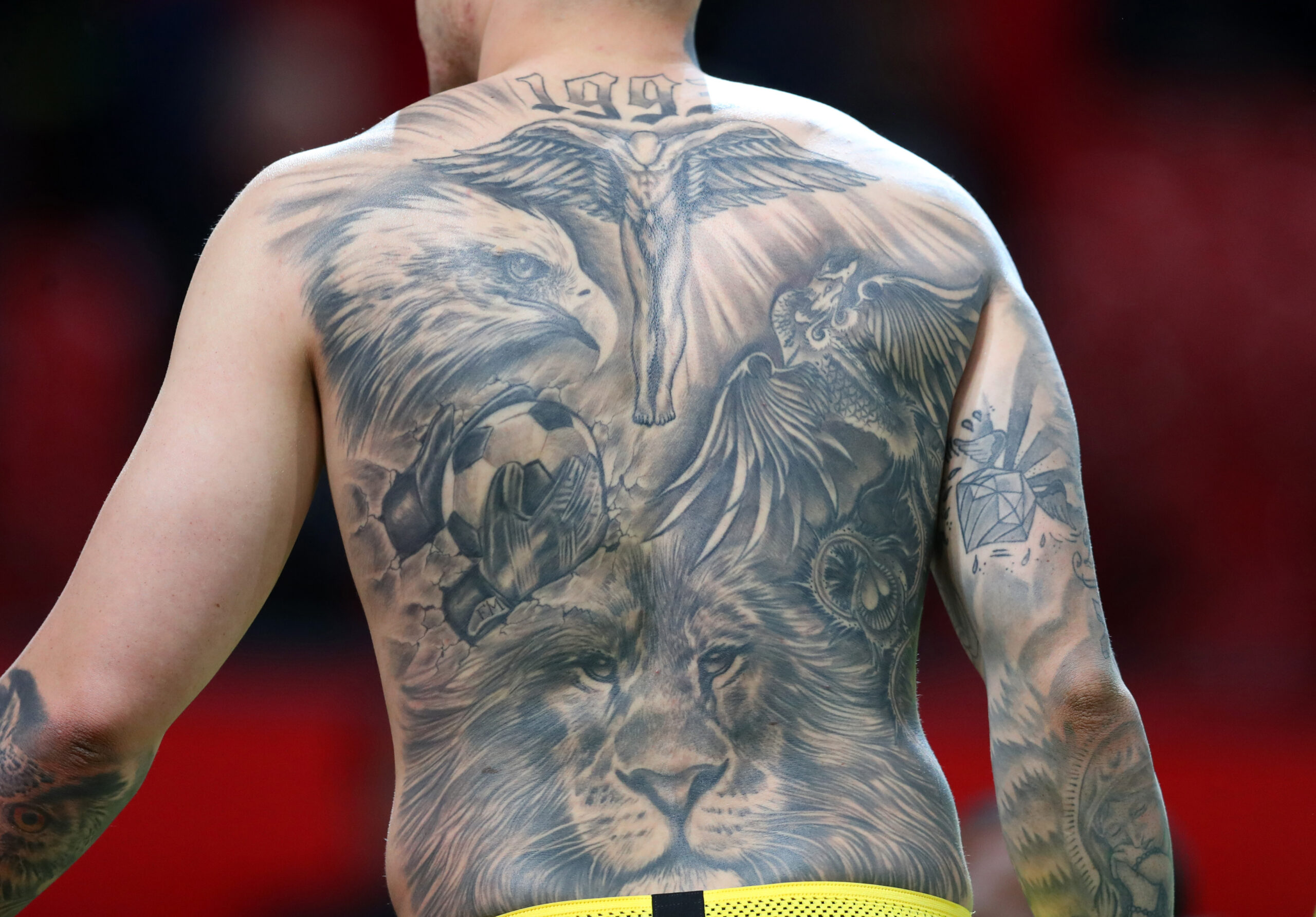
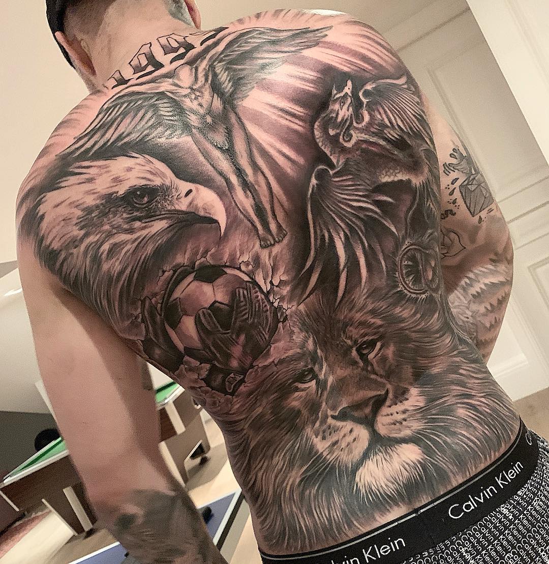
Ederson’s back is the largest single piece in his collection. A lion fills the lower section, while an eagle spreads across the upper back. Between them, gloved hands hold a football, and a religious figure with outstretched wings sits above. The images are arranged as one mural, rather than separate small tattoos.

The lion carries much of the visual weight. Ederson has said it represents focus and determination, qualities he connects with goalkeeping. The ball and gloves bring the rest of the design back to his position.

A back piece this large needs one image to lead. If you’re planning something similar, choose that first, then use wings, smoke, clouds or lettering to guide the eye around it. The best full-back tattoos have a clear focal point, with enough open space that the details don’t run together.

The newer back work adds close-up detail to the main piece

Ederson tattoos

The close-up views show the layers of shading in Ederson’s back tattoo. Dark and light strokes give the lion’s mane its texture; sharper feather lines carry the eagle across his shoulders. The football appears to push forward from the skin, giving the composition a sense of movement.

The upper section also shows the year 1993 and a religious figure. From a distance, the lion and eagle draw the eye first. Closer in, the numbers, hands, ball and smaller symbols become easier to pick out.

That scale works well for realistic back tattoos: keep the main shapes large enough to read across a room, then leave some finer detail for a closer look. Realistic work needs breathing space; too many tight lines can blur as the tattoo heals.

His chest tattoos focus on faith and family

Ederson tattoos

The chest has a more personal feel than the back. I belong to Jesus is written across the upper chest, above a dove and other shaded imagery. Family names, including his children’s, are also visible across the front. The words make the subject clear before you take in the rest of the artwork.

The contrast gives the two areas different jobs. The back brings together large figures and football imagery; the chest uses words and symbols tied to faith and family. The dove may suggest peace or faith, while the lettering spells out what matters to him.

Chest lettering needs to sit well as the body moves. Check the words while standing naturally, breathing, bending and lifting your arms, not just lying flat for the stencil. Choose lettering thick enough to stay clear and leave room between names so the design sits evenly across the body.

The rose and skull neck tattoo gives Ederson a darker edge

Ederson tattoos

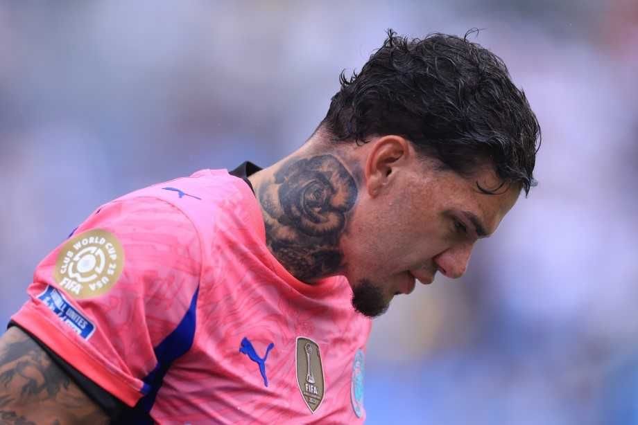
The rose and skull on Ederson’s neck is one of his more recognisable smaller pieces. Dark, portrait-style shading wraps around the side of the neck and continues toward the back. It’s far smaller than the back mural, but its placement catches the eye when he turns his head.

A neck tattoo has to work across a curved, moving surface. Ederson’s uses heavy shading and a clear outline, so its main shapes remain readable as the angle changes.

If you’re considering a neck piece, find an artist who plans for how the image wraps around the throat. A rose that looks right from the front may sit awkwardly from the side if its leaves aren’t placed carefully. Ask for the stencil from every angle, especially if the design includes a face, skull or lettering.

His arms and hands carry the smaller pieces

Ederson tattoos

Smaller designs cover Ederson’s arms and hands, filling in around the larger chest and back tattoos. There are shaded figures, script, symbols and geometric details on his arms; the compact hand pieces show when he holds the ball or raises his gloves. The mix makes the collection feel added over time instead of planned as one matching sleeve.

The subjects and styles vary. Some tattoos are realistic, others more graphic, and a few read quickly from a distance. Similar shading and considered placement can help varied pieces sit together; every tattoo doesn’t need the same subject.

Hands and fingers take more wear than the forearm. Keep small lettering simple, use clear outlines and plan for possible touch-ups. The forearm has room for finer work; on the hand, a clean symbol usually lasts better than a crowded illustration.

Leg tattoos connect football, trophies and time in Portugal

Ederson tattoos

Ederson has spoken about a Portuguese League trophy tattoo and the number 35 on the back of his leg, a reference to his Benfica years. Photos also show shaded work across his thigh and lower leg, including faces and football images that use the black-and-grey style seen on his torso.

The leg gives a career tribute room to grow vertically. A trophy, date or club reference can sit beside a portrait without competing with the chest work. The placement also keeps the tattoo covered by many everyday clothes.

For a football tattoo that feels personal, start with a memory rather than a badge. A trophy, shirt number, stadium or date can sit inside a larger scene. Specific memories make sports tattoos feel less disposable, even after a career moves on or the kit changes.

Large collections take time. Leaving skin around a trophy or portrait gives each piece space and makes later additions easier to place. If you’re combining several football memories, repeat a visual element across them so the leg reads as one area, not a row of separate stickers.

Check a lower-leg stencil while walking, sitting and flexing your calf. The skin shifts, and a straight line can bend around the muscle. Photos from the front, side and back can show how the design will look in different positions.

Ederson’s tattoos bring together the back mural, the chest lettering and family names, and smaller work on his neck, hands and legs. If you like the scale of his collection, choose the memory or person you’d give the most space to, then add other pieces gradually so each one stays legible.

Ricardo Quaresma Tattoos: Wings, Eagles and Family Ink

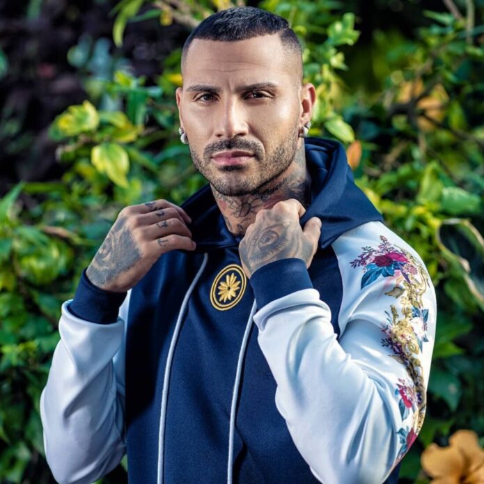
Quaresma’s tattoos are hard to miss. The Portugal winger has ink across his face, neck, chest, arms, hands and legs, with family, faith and football recurring throughout. The collection is as visible and varied as his style on the pitch.

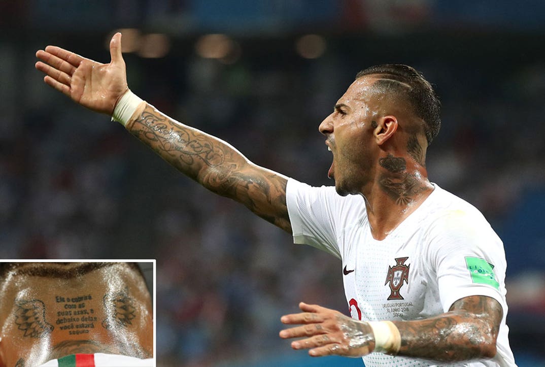
The wings and Portuguese lettering at the back of his neck, small face symbols, broad chest eagle and arm tattoos are among its clearest features. Quaresma has also spoken about older designs linked to his family, faith and people who helped him get started.

Ricardo Quaresma tattoos move between public statements and quieter memories. The neck ink changes the look of a portrait; a name or family image on his arm can matter without needing an explanation.

Here is a closer look at the main areas of his collection and how the designs fit together.

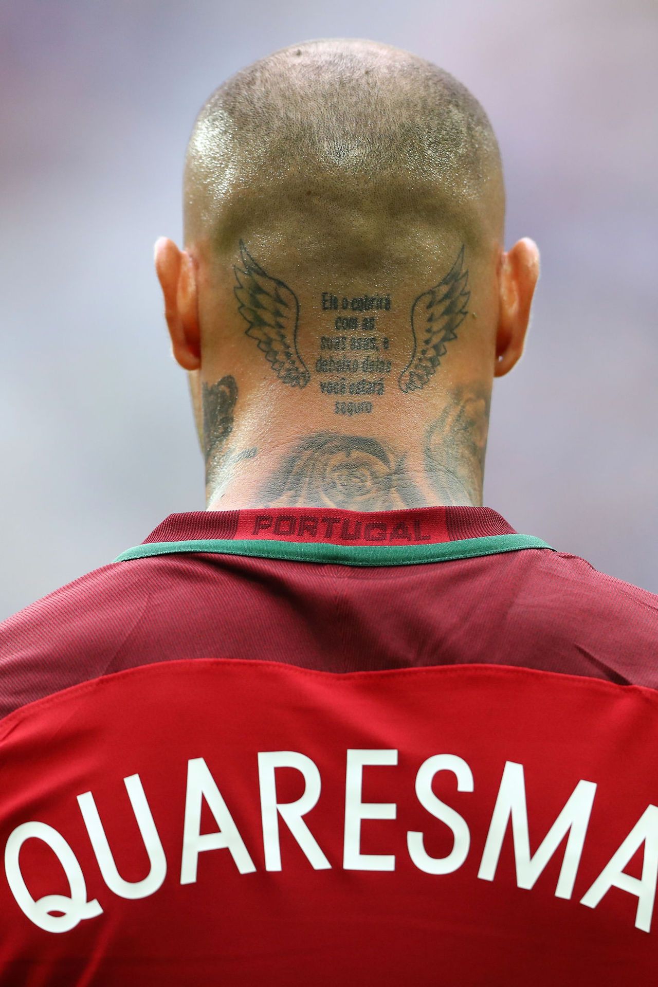
The wings and lettering on Quaresma’s neck are his signature tattoo

Ricardo Quaresma showing his winged neck lettering tattoo

Two wings frame a Portuguese sentence across the back of Quaresma’s neck. It roughly promises shelter and safety beneath them. The tattoo sits high enough to show above a football shirt, which has made it a familiar part of his look.

The lettering is dense, but the wings give it a clear outline from a distance. That helps with a long quote on a curved surface: the image remains easy to read even when a collar covers some of the words.

If you’re considering a neck quote, keep the layout simple and check it from the side as well as straight on. A tattoo that looks balanced from one angle can feel crowded once the head turns. Quaresma’s central lettering and wings follow the same vertical line.

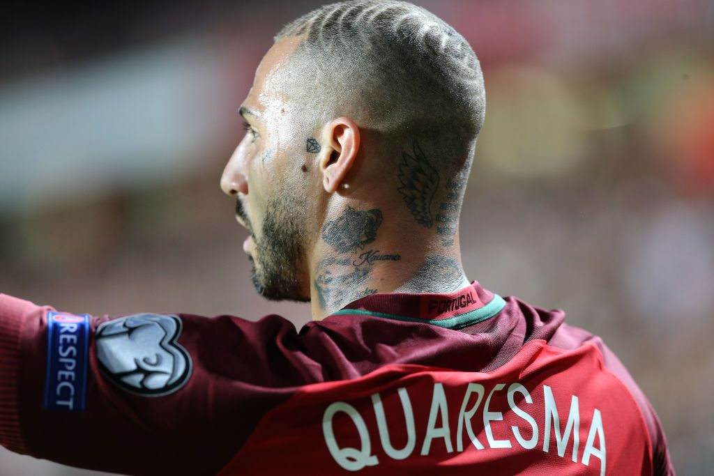
His side-neck ink connects names, symbols and family

Ricardo Quaresma showing his side-neck family tattoos

His side neck is crowded with names, a small diamond, a crown and other dark symbols around the jawline and upper neck. Together, they look like memories added over time, rather than one planned mural.

Family comes up often in Quaresma’s tattoos. Names linked to his children and relatives sit near his face, with a small cross and diamond among the more private details. They don’t have to match in size or style; the neck gives them a shared frame.

Small designs can work here if their shapes stay clear. Fine lines can disappear on skin that moves, especially near the jaw. Strong outlines and enough space help a small symbol remain readable.

The neck ink also becomes part of his overall silhouette. Quaresma often wears open collars and short hair, so the tattoos are visible without covering his face. The back and side of the neck make a statement while leaving his expressions unobstructed.

Keep the most important word or symbol easy to find when a design wraps around the neck. If the stencil is crowded, a name can disappear into the jawline; if it’s too sparse, a small piece may look out of place. Give the design one clear focal point and let the other marks support it.

The eagle across his chest gives the collection its biggest front-facing image

Ricardo Quaresma showing his eagle chest tattoo

The large eagle across Quaresma’s chest sets the scale at the front of the collection. Its wings reach toward his shoulders, with stars and smaller marks around it. The bird anchors the design, tying the other chest details together.

The eagle remains readable in match photos, even when he’s moving or wearing an open shirt. Dark shading gives it a solid outline, while the feathers reward a closer look.

A chest-wide stencil needs to follow the body. Check the wings while standing naturally and with both arms raised. The best chest pieces move with the ribcage instead of fighting it.

Too much shading can make a large chest image feel heavy. Leaving some skin around the eagle keeps its shape clear and gives future work room. It also lets the design read as the chest and shoulders move.

Before choosing an animal for the centre of a chest piece, consider its pose as well as what it represents. Wide wings make a broad shape; a folded bird creates a narrower one. Quaresma’s eagle fits the width of his chest and draws the eye toward the shoulders.

His arm tattoos mix faith, portraits and football memories

Ricardo Quaresma displaying his arm tattoos at the World Cup

Quaresma’s arms bring together religious images, portraits, names and football references in black and grey. Rather than one perfectly matched sleeve, the tattoos read like a diary that grew along with his life.

Some early designs are tied to family. Quaresma has talked about tattoos connected to his mother and brother; other images came from photographs or memories that mattered to him at the time. Those personal starting points give the arms more meaning than a set of unrelated motifs.

If you’re building an arm over time, leave space around the larger pieces. That makes each one easier to see and gives you options for connecting them later with shading or smaller fillers. Different subjects can sit together when the contrast and line weight feel consistent.

A portrait can mark a person, a religious image a belief, and a football design a moment in a career. The tattoos don’t need to spell out their stories for the collection to feel connected; they belong to the same person.

Write down why each piece matters before you book an appointment. That can help your artist choose its pose, crop and placement. Personal details usually make a tattoo stronger than a trend copied without a reason, even when the design itself is simple.

The hands and smaller arm pieces make the ink impossible to hide

Ricardo Quaresma showing his hand and arm tattoos

The smaller tattoos on Quaresma’s hands and wrists become clearer after the larger pieces. Letters, compact symbols and dark marks sit around his fingers and lower arms, visible when he points, celebrates or holds the ball.

Hand tattoos are always on show and take more wear than pieces higher on the arm. A small design doesn’t have to be complicated: a simple mark with a strong outline can stay clearer than a tiny realistic image.

The large wings and eagle give the collection its broad shapes; names and lettering carry personal meaning, and marks on the hands and face bring the ink close. If you like Quaresma’s look, start with an idea from your own life and let the rest grow around it.

That slower approach helps with tattoos people see every day. Hand, face and neck pieces affect how the rest of the collection looks. Live with the larger arm or chest work first, then decide whether a gap needs a small design or looks better left open.

Quaresma’s tattoos combine lettering, faith, family, football and small symbols without forcing them into one style. A good collection can be personal before it is perfectly uniform. Give each piece enough space to read and a reason to be there.

Lonzo Ball Tattoos: Sleeves, Chest Ink and Meaningful Tributes

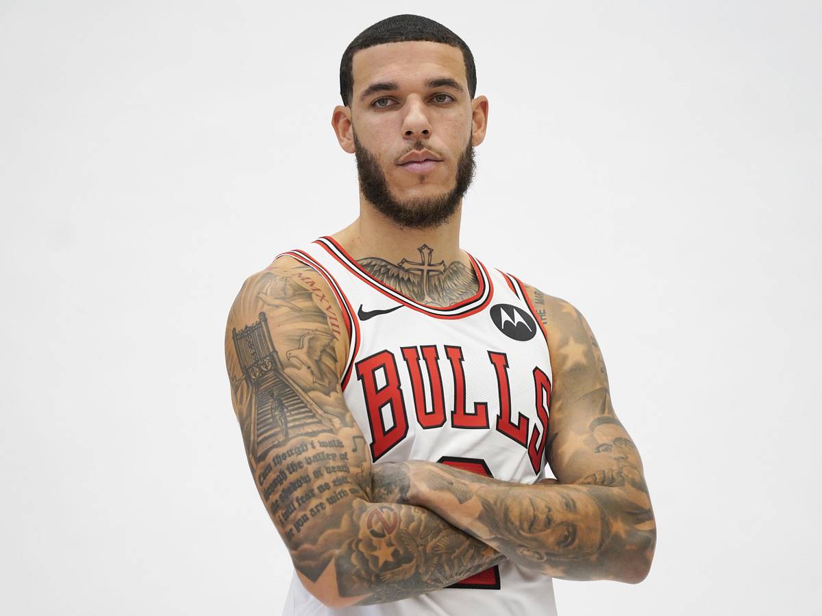
Photos from different years show Lonzo Ball’s tattoos growing from small wrist designs into full sleeves, scripture, portraits of Black leaders, and a cover-up tied to his career. Faith, family, and basketball recur throughout the collection.

Lonzo Ball’s tattoos mix personal references with careful placement. Lettering follows the arm, portraits have space around them, and shading links the designs without making every section identical.

Ball has said he first got tattooed partly because he didn’t want his brother LiAngelo to be the only one in the family with a lot of ink. Later pieces became more personal and more extensive.

Lonzo Ball’s arm sleeve tattoos are built around portraits and scripture

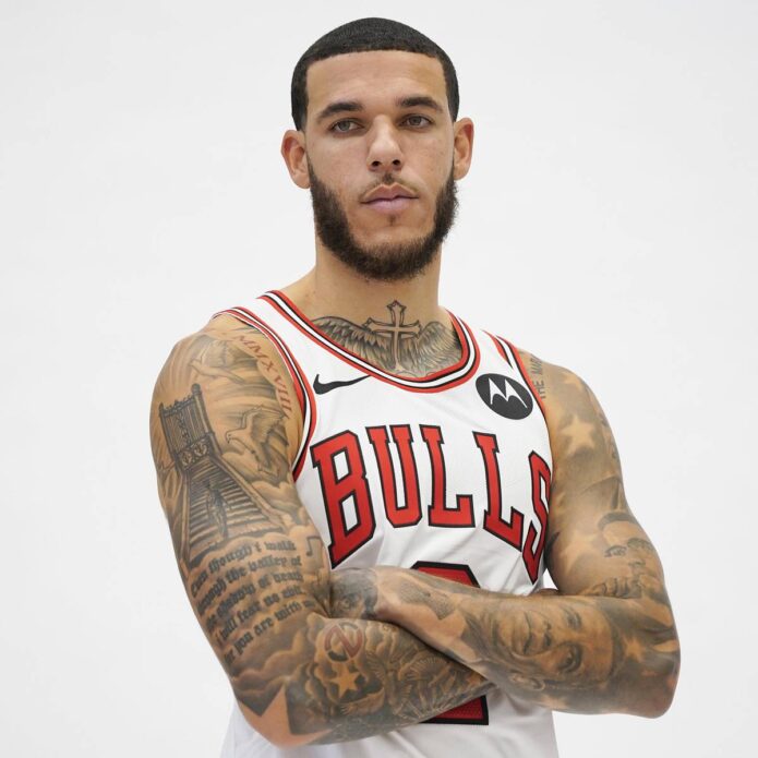
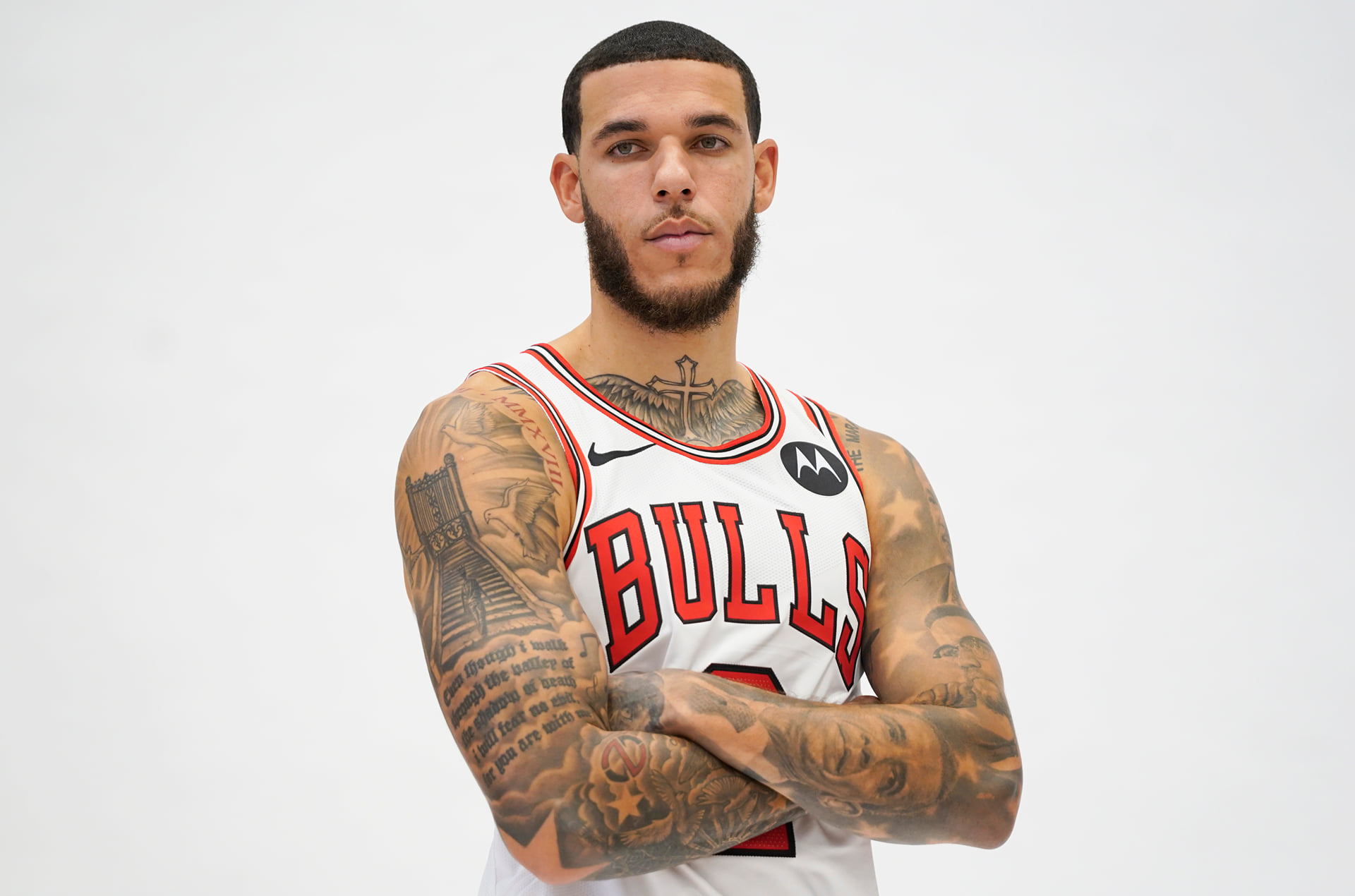
Lonzo Ball tattoos: full Bulls media-day view of his arm sleeve and chest ink

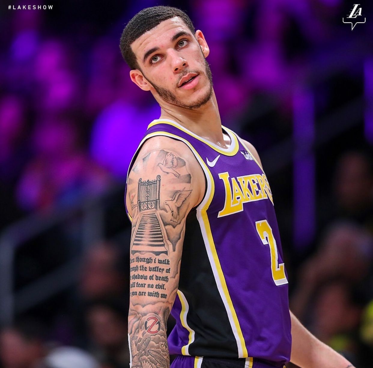
One sleeve combines portraits, a staircase, birds, and long sections of lettering. In Lakers photos, the staircase and gate stand out first, with doves around them.

The lettering below the image comes from Psalm 23. Ball used a long passage in dark, compact gothic letters that run down the arm.

The staircase draws the eye upward, the birds soften the design, and the lettering anchors the lower arm. Each part has a different role, which keeps the sleeve readable.

Long scripture takes planning. The words need to fit the bicep and forearm as they curve and turn, with room around the elbow.

If you’re considering a verse tattoo, choose the passage first, then test it at the intended size and placement. A shorter excerpt needs less space; a larger area gives the lettering room.

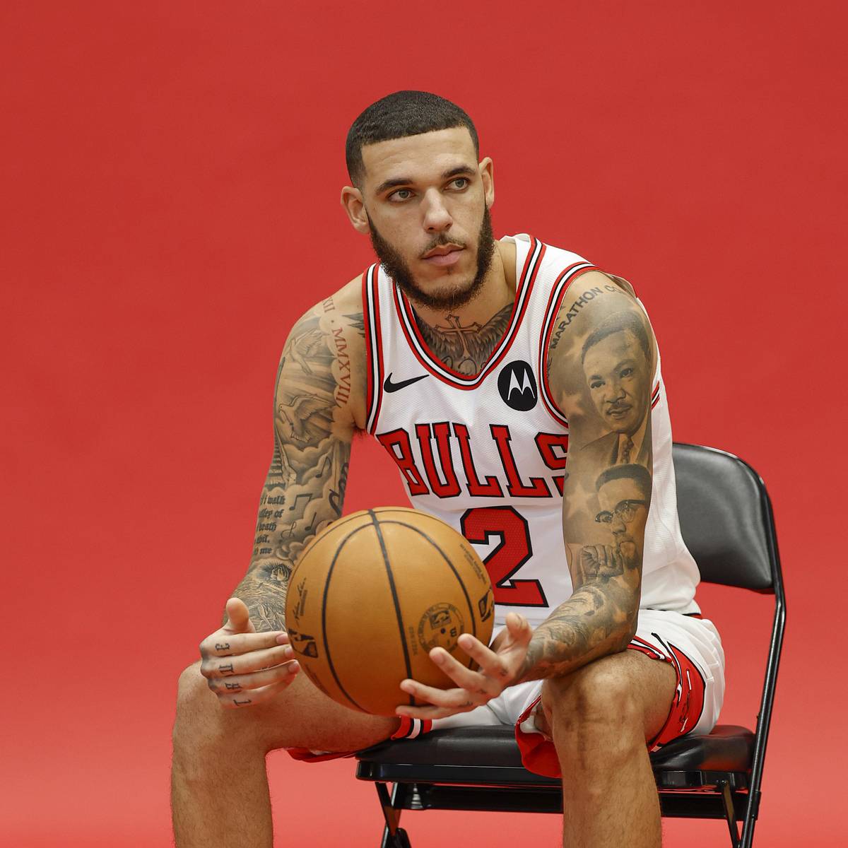
His chest and neck tattoos frame the Bulls-era look

Lonzo Ball tattoos: seated Bulls portrait showing the cross, chest and neck tattoos

Bulls media-day photos show a cross at the center of Ball’s upper chest, surrounded by feathered or wing-like shading. It sits above the jersey line and remains visible in uniform.

Script runs along the shoulders and upper arms, with smaller marks around the larger designs. Some areas have lighter shading; others are darker. The difference keeps the chest from reading as one solid patch.

The neck and upper chest sit between the chest work and sleeves, helping the areas read together. The tattoos don’t have to connect physically to share a visual line.

A jersey covers the lower chest and back but leaves the cross, shoulders, and neck visible. Placement affects what a tattoo shows with everyday clothes.

For a similar chest layout, choose one central image first, then decide how much shading or lettering should surround it. Leave enough space for the main shape to stay clear as the body moves.

The Psalm 23 tattoo turns a long verse into a full arm piece

Lonzo Ball tattoos: Lakers action portrait showing the Psalm 23 sleeve and stairway design

Psalm 23 appears alongside the staircase and gate. In Lakers photos, the stairs climb across the upper arm while the passage runs down the forearm, linking text and image.

The passage includes the lines about walking through the valley and not fearing evil. The text is a large part of the image, not a short caption.

For a long script tattoo, line breaks and spacing affect the whole design. Readable lettering needs room; cramped text can blur together over time.

The doves and gate break up the text with lighter areas. A simple image around a verse can keep a long passage from reading as one dark block.

Choose words you expect to care about beyond their appearance in a particular font. Scripture, poetry, and lyrics all need room and a reason to stay on the skin.

Portrait tattoos of Black leaders add a tribute layer

Lonzo Ball tattoos: Bulls portrait showing the civil-rights portrait work and full arms

One sleeve features Black leaders and cultural figures: Martin Luther King Jr., Malcolm X, Rosa Parks, Jackie Robinson, Harriet Tubman, and Barack Obama. It’s often called his Black excellence sleeve. The Marathon Continues runs across the top.

The portraits vary in expression, angle, and shading. Those differences keep the sleeve from looking like a row of identical faces.

Ball has said he looks at the portraits when he needs perspective. He sees them as reminders of people who faced challenges greater than his own.

Portrait sleeves depend on likeness and layout. The faces need to remain recognizable and fit beside one another; shading and small gaps help separate them.

For a tribute sleeve, choose the people and the link between them before planning the layout. A shared family story, movement, or set of values can give the portraits a common thread.

The Big Baller Brand cover-up shows how tattoo plans can change

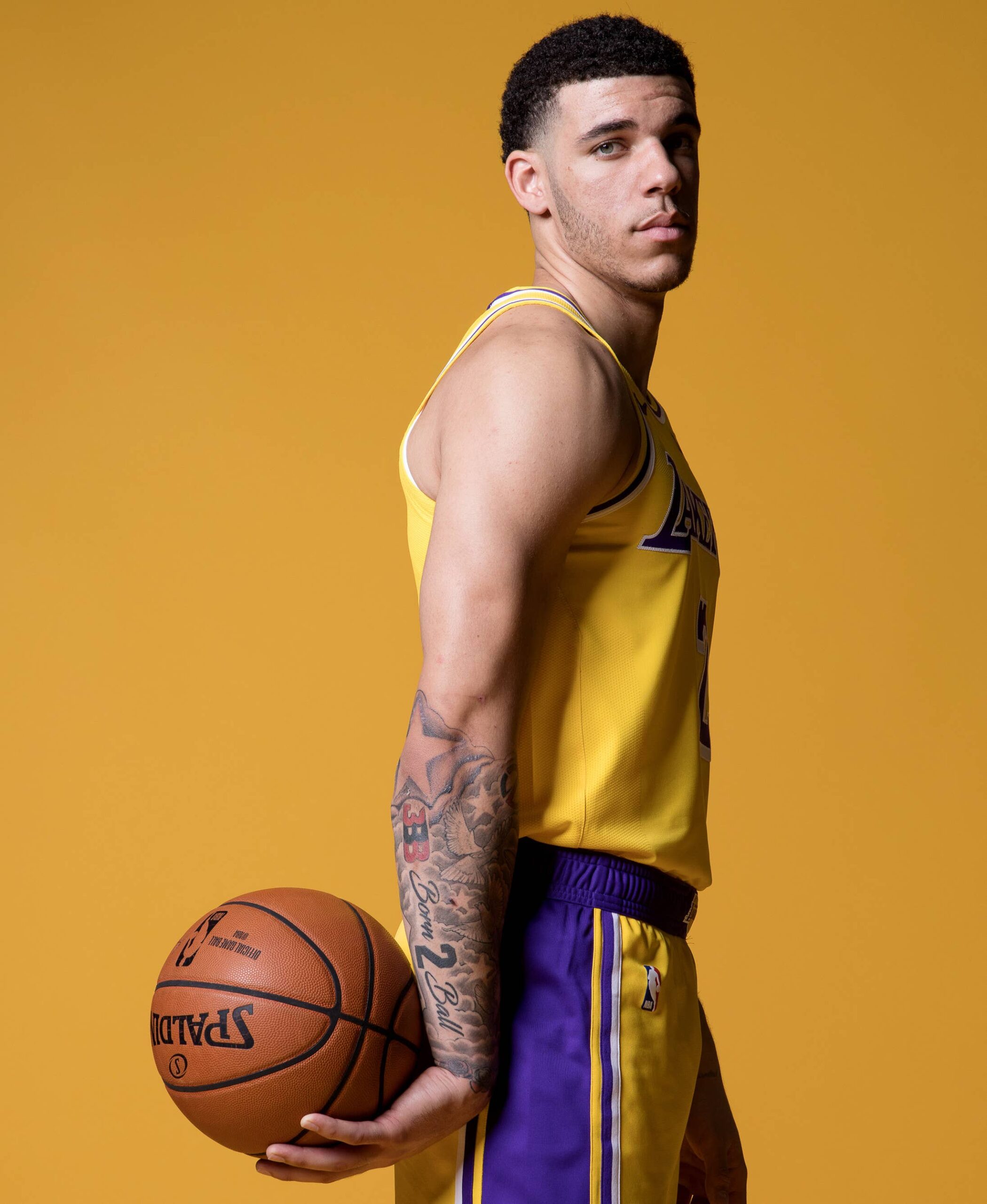
Lonzo Ball tattoos: Lakers portrait showing the forearm cover-up and Born 2 Ball lettering

Before the portrait sleeve, Ball had a Big Baller Brand logo on his forearm. The NBA objected to visible commercial branding, so he covered it during games. The logo became part of the tattoo’s history for practical reasons.

The logo was later covered with dice showing one, two, and three for Lonzo, LiAngelo, and LaMelo. Nearby, Born 2 Ball keeps the family and basketball references together.

A side-view Lakers photo shows the dice with the surrounding sleeve. The cover-up replaces the logo with a family reference rather than a solid patch.

If you’re considering a brand or name tattoo, remember that the design may stay after a company or relationship changes. A number or symbol can leave more room to reinterpret it later.

Ball’s early wrist tattoos include words about being motivated by Jesus and dedicated to the game, and a “Born to Ball” phrase with his birthday. The collection returns to faith, family, and basketball.

The scripture sleeve, portraits, dice, chest cross, and wrist lettering point to faith, history, and family. If you’re planning a sleeve, choose the story first and build the images around it.

The text follows the arm, portraits have room, and lighter shading separates darker areas. You can use the same planning approach with designs of your own.

In the video below, Ball talks about the family and basketball ideas behind his tattoos.


171 container
172 container wp-word-count
173 text Word count: 1911
174 text Last edited by admin on October 8, 2026 at 8:42 am
175 container side-sortables
176 container Description: Publish, ID: submitdiv
177 heading Publish, Value: 2, ID: submitdiv-title
178 text Publish
179 container

Ja Morant Tattoos: Kobe Tributes, Memphis Ink and the Story Behind His Body Art

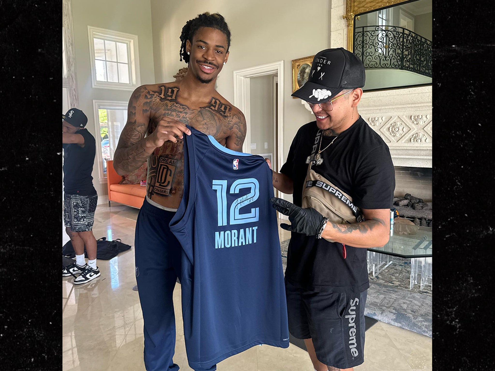
Ja Morant’s tattoos are easy to spot during a game: ink runs down both arms and reaches onto his hands. Shirtless photos show a larger back piece and dense chest work. Across the collection, the visible subjects include basketball, Kobe Bryant tributes, Memphis references and family details.

The Ja Morant tattoos have grown alongside his career. Some point clearly to basketball; other designs are personal and don’t have public explanations. The overall look is built from large dark shapes, lettering and shaded images.

This guide sticks to tattoos visible in photos and to reported details. Where a design’s meaning hasn’t been explained, the image can show what it looks like without telling us why he chose it.

Ja Morant’s tattoo style at a glance

Morant’s collection relies on large pieces. Photos show lettering, portraits, sports references, clouds, religious phrases and family details across his chest and back. The designs sit together in layers rather than following one obvious theme.

Most of the linework is dark. Gothic lettering sits near cursive script, shaded figures and small symbols. Some areas read as basketball tributes; the meaning of others is personal to Morant and his family.

The back tattoos are built around basketball and memory

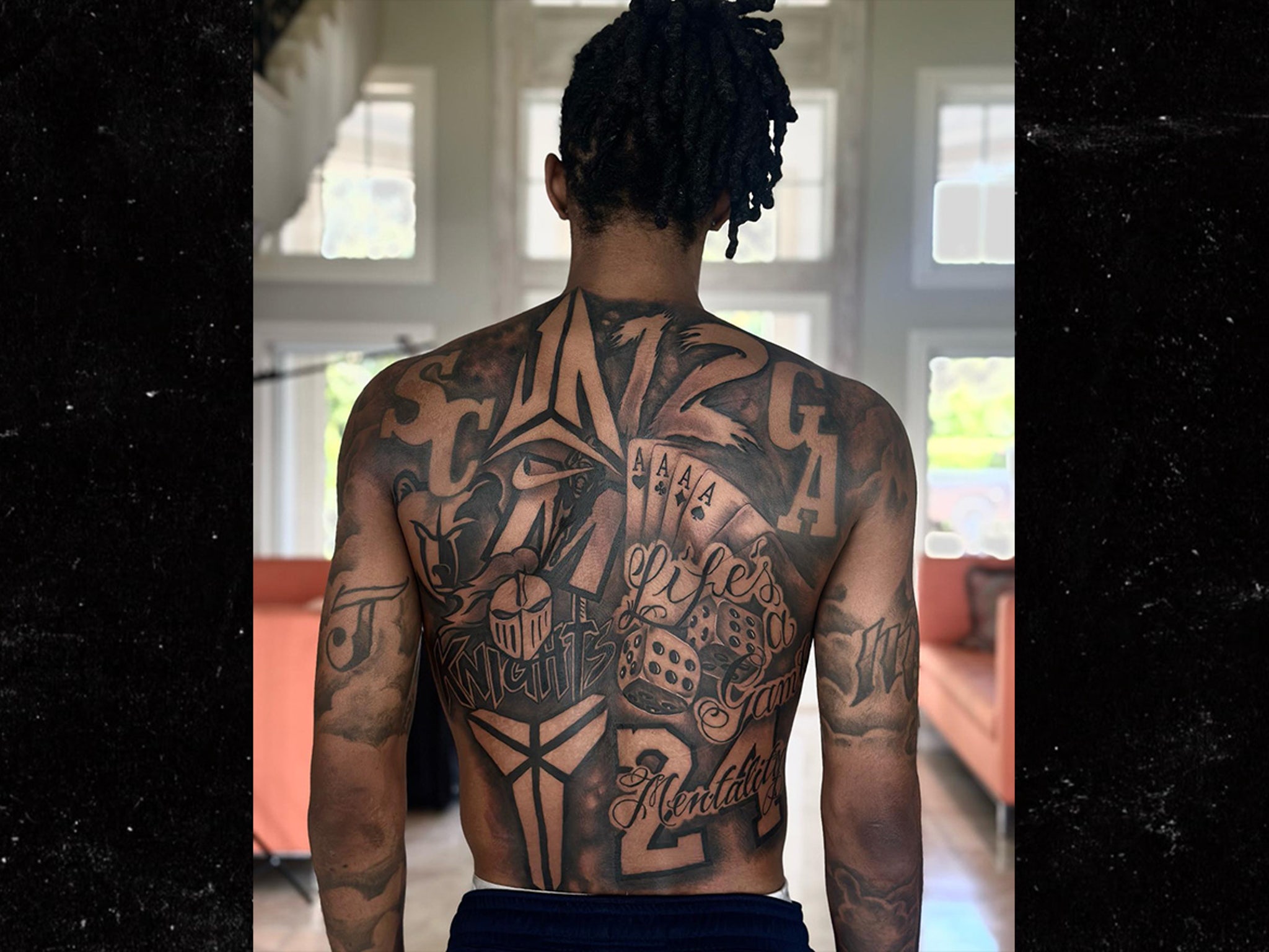
Ja Morant back tattoo tribute to Kobe Bryant
Morant’s large back tattoo brings basketball imagery together with a tribute to Kobe Bryant.

The back piece covers much of Morant’s upper and middle back. Clear photos show basketball imagery and elements connected to Kobe Bryant. It’s a large composition, not a small name tucked below the shoulder.

Shading fills the spaces between the main images and lettering. The larger shapes and dark contrast remain visible even when the photo is taken from farther away.

The Kobe tribute places the tattoo within basketball history, but the visible image doesn’t tell us everything Morant associates with it. What can be seen is a large back design with a clear basketball focus.

Kobe Bryant tributes take up more than one spot

Ja Morant tattooed torso and back ink
This view shows the back work extending toward Morant’s chest and shoulders.

The back tattoo is part of a larger layout. In some photos, the work reaches toward the shoulders and upper torso; from the front, parts of the shading and lettering appear to continue around his body.

Seeing the ink from different angles gives a fuller view than a close-up alone. The tattoos connect across his chest, shoulders and back, though the collection was built over time.

Clouds, script and filler shading sit between the larger images. They fill the spaces around the main pieces and help them read as one composition.

The chest piece mixes script, symbols and family energy

Ja Morant full back tattoo close-up
A close view shows the heavy shading and large lettering across Morant’s torso.

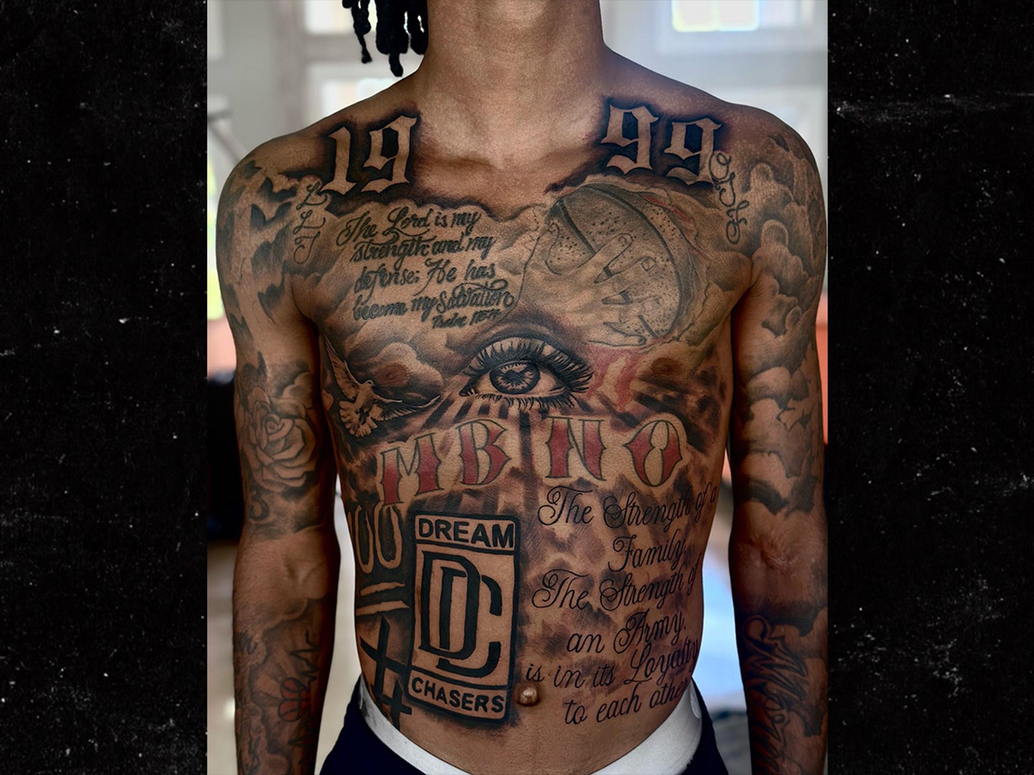
Morant’s chest is densely tattooed. Photos show large letters near his collarbones, script across his chest and smaller symbols between the main designs. The work uses black and grey shading, but it doesn’t follow just one traditional style.

There are family references around the chest and shoulders, including small letters and other details. Not every initial has a public explanation, so it’s better to leave those identities open than guess who each one represents.

The script breaks up the heavier lettering, while the shaded clouds fill out the composition. Different styles share the space without flattening into one large block.

The famous eye and chest lettering

Ja Morant chest and back tattoo detail
The chest detail shows lettering beside shaded imagery.

Another close photo shows the eye motif, red lettering and surrounding script. The chest is busy, but the eye and words stand out because they are larger than the details around them.

Morant hasn’t given a full public explanation for every part of the design. The photo shows an eye set into a chest piece, surrounded by script and shaded shapes; beyond that, its meaning is open.

Small touches of colour distinguish this section from the mostly black and grey work. They draw attention to the lettering and central image without taking over the whole piece.

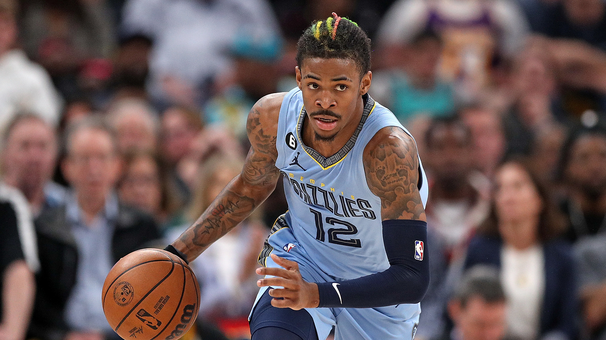
His arm tattoos are easier to see during games

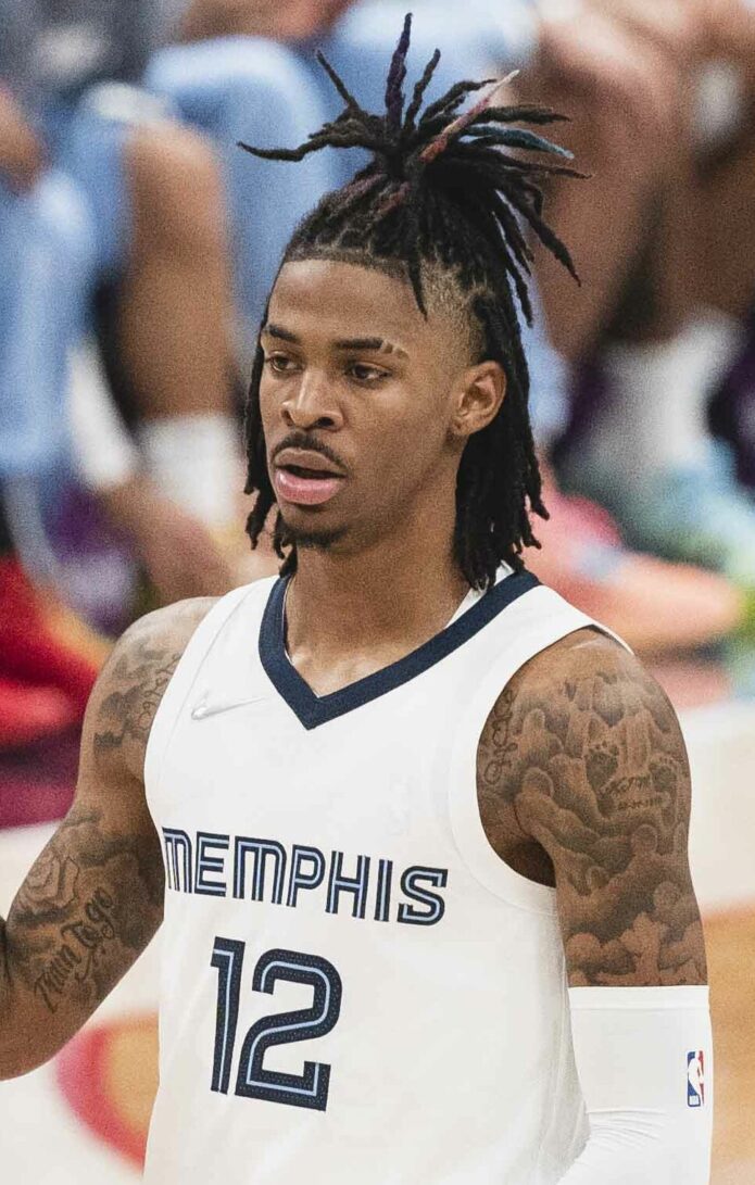
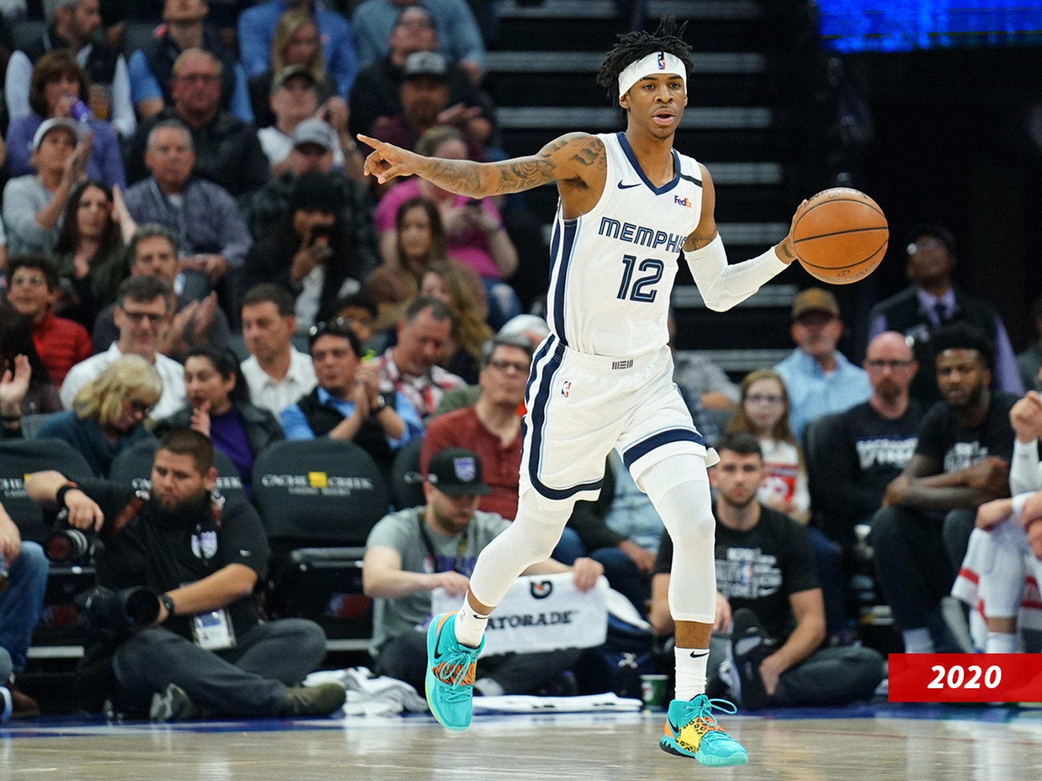
Ja Morant arm tattoos in game action
Morant’s arm tattoos remain visible in his Memphis uniform.

During games, Morant’s arms are the tattoos most fans can see. Script and shaded pieces run down both arms. Some show above his uniform; others appear when he raises the ball or gestures on court.

Game photos have limits: jerseys cover the chest, motion can blur small designs, and lighting changes from one shot to another. Even so, the pictures show that the arm work extends beyond the larger back piece, with its own mix of lettering, figures and shading.

Because his arms and hands are often in frame, the tattoos appear regularly in game photos. A celebration, pass or warm-up can reveal a different section.

What is known about the hand tattoo

One of the more discussed hand tattoos is the word HIM. It’s short and easy to read, unlike the more layered chest and back pieces. A hand tattoo is also hard to cover, so the word appears in everyday and game photos.

The word fits Morant’s competitive public image, but it doesn’t sum up his personality or explain the rest of his tattoos. It’s one direct message within a much larger collection.

Memphis pride runs through the collection

Morant’s Memphis connection appears in the basketball and team references in his tattoos. The city and the Grizzlies are part of his public story as an NBA player, and some of the ink links him to both.

These references are easy to spot beside the larger back piece. They also turn up in photos, interviews and game coverage, making it possible to see how the collection changes over time.

Comments about his loyalty to the Grizzlies have drawn attention to the back logo. The tattoo gives a visible sign of that connection, though it can’t tell us the whole story behind it.

Why Ja Morant’s tattoos stand out

The collection stands out for its scale and how the designs move across different parts of Morant’s body. Chest and back photos show the smaller details, while the large dark shapes remain readable from farther away.

Basketball is a recurring subject, alongside family, faith and self-belief. Not every piece has a public explanation, but together they make up a collection that has changed as Morant’s career has developed.

If you’re planning a tattoo inspired by this look, think about how a large piece will flow across the body. Give script room to stay legible, and use shading or a strong symbol to connect separate designs.

Final take on Ja Morant’s ink

Morant’s tattoos combine basketball tributes with personal details that are harder to read from the outside. The Kobe Bryant work and Memphis references are the clearest public connections; the initials, script and smaller symbols leave more unanswered.

Photos show a large back composition and arm tattoos visible during games. They show where the ink sits and what it looks like, but don’t explain every design or what Morant privately associates with it.

For another NBA player’s tattoos, see our guides to Kevin Durant’s tattoos, Kyrie Irving’s tattoos and Randy Orton’s tattoos. Each collection has its own subjects and style.

Watch a closer look

The related video below discusses Morant’s tattoos and their place in his public image.