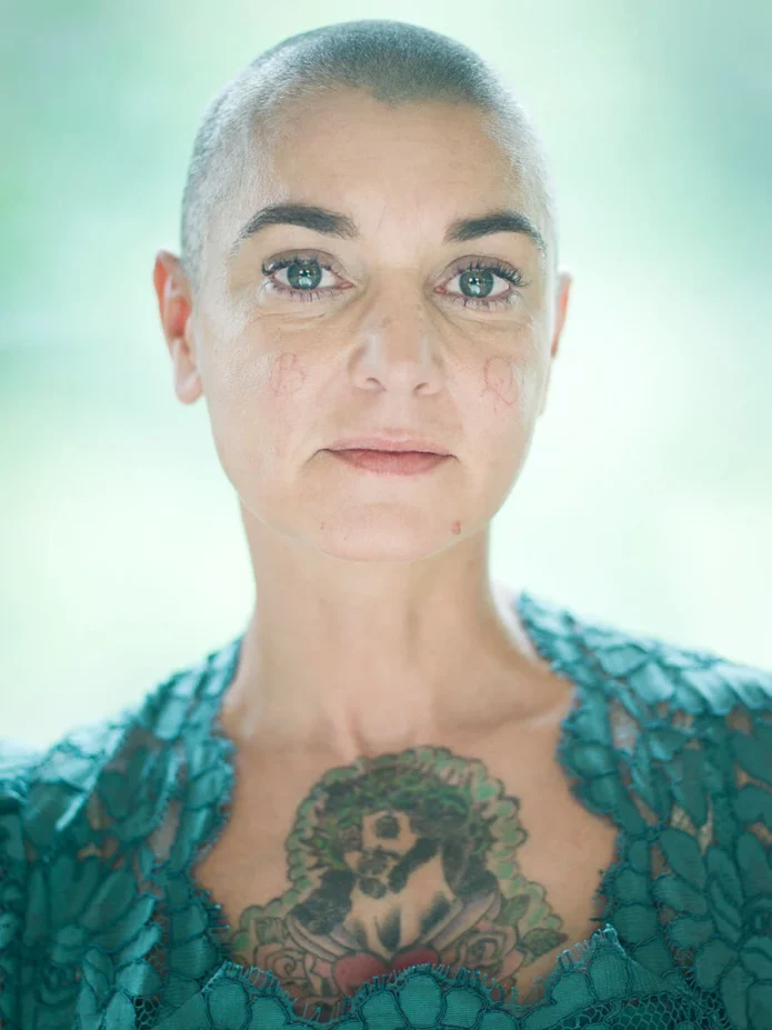
Sinéad O’Connor’s tattoos have the same directness as her music. They do not feel like decoration added at random. The neck lettering, chest medallion, arm script and hand ink all make a strong impression because they sit in places that stay visible as she moves, performs and speaks. Her collection is a good reminder that a tattoo can be quiet in size but loud in meaning, or large and unmistakable without needing a complicated colour palette.
There is also a useful difference between seeing one tattoo in a close portrait and seeing the same collection across several photographs. A collar can hide part of a neck piece. Stage light can flatten a chest design. A hand can disappear around a microphone. Looking at more than one angle makes the layout easier to understand and helps separate a clear tattoo detail from a shadow, fold of clothing or camera effect.
This is a relaxed look at the areas that stand out most. It covers the lettering on her neck, the hand and forearm work, the chest medallion, the long script on her arm and the way these choices shaped her recognisable performance style. The point is not to copy an exact photograph. It is to notice how placement, scale, contrast and commitment work together when the body is the canvas.
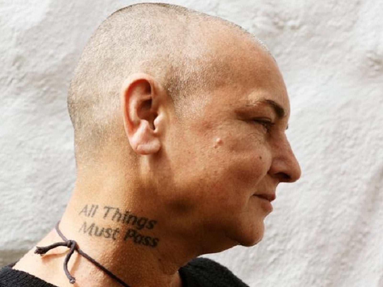
Sinéad O’Connor’s neck lettering tattoo
The neck piece is one of Sinéad’s clearest tattoos because it sits above a collar and below the face. The lettering reads “All Things Must Pass,” a phrase that has enough width to follow the curve of the neck while still working as a compact line. In a side-profile photograph, the words become part of the outline of her head and shoulders. That is why the tattoo can look especially bold even when the lettering itself is not oversized.
Neck lettering asks a lot from both the design and the person wearing it. The placement is visible from the side, from behind and in plenty of ordinary conversations. A short phrase may look balanced in a stencil but feel too tight once it wraps around the curve. Font choice matters too. Heavy letters make a statement quickly, while a finer script can feel softer but may need more breathing room to stay readable over time.
Sinéad’s example shows the value of letting the body set the line. The phrase follows the natural band of the neck instead of being forced into a perfectly straight strip. If you like that idea, ask an artist to show the stencil while your head is relaxed, turned left and turned right. A good neck tattoo should read naturally in motion, not only when you stand still for a photograph.
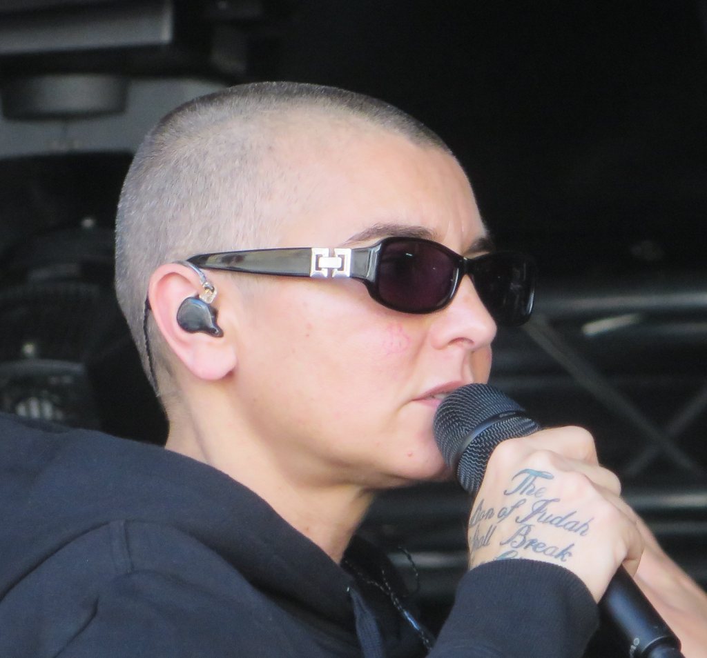
Sinéad O’Connor’s face and hand tattoos
The hand photograph brings out a different kind of visibility. Small lettering and marks near the fingers or back of the hand are easy to notice because the hands are always involved in the moment. When Sinéad holds a microphone, gestures or rests her fingers near her face, the ink becomes part of the performance rather than a detail kept in the background. It has an intimate quality that large chest work does not quite have.
Hand tattoos also have practical limits. The skin moves constantly, gets washed often and sees plenty of daylight. Fine lettering can soften, and a design squeezed into a narrow space can lose its shape. A simple word or symbol usually has a better chance of staying clear than a tiny detailed picture. Ask to see healed work from the artist, not only fresh photographs taken immediately after an appointment.
Placement can change the feeling of the same idea. The back of the hand is more public than the inside of the wrist, while a finger tattoo will be seen from almost every angle. Test the design with a temporary marker and look at it while making the gestures you use every day. Visibility is part of the meaning, but it is also part of the commitment.
Sinéad O’Connor’s chest medallion tattoo
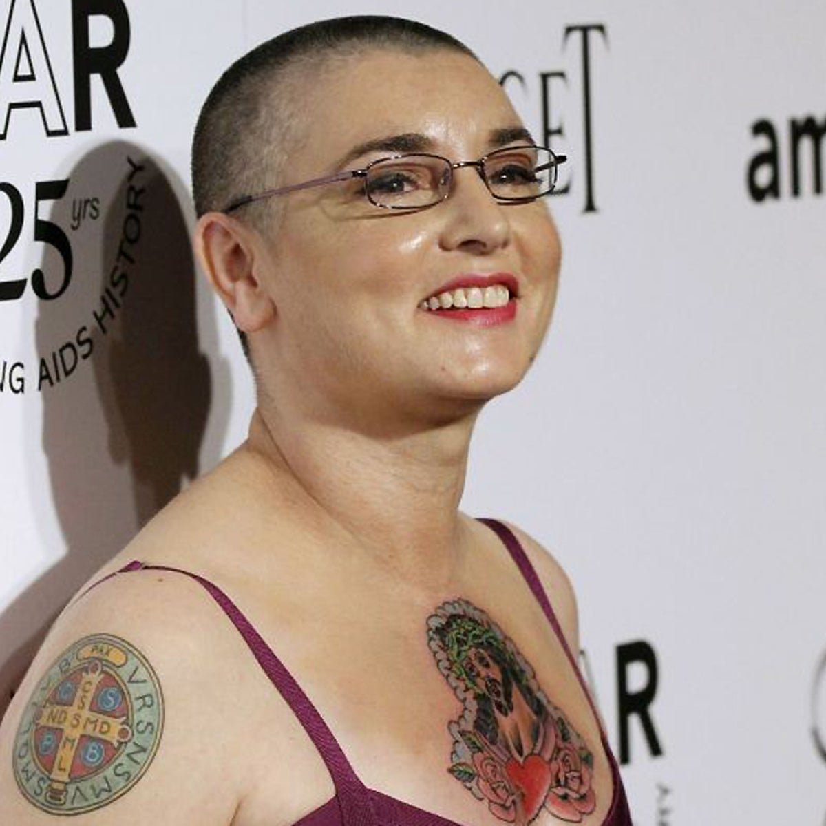
The chest tattoo has a different rhythm from the neck lettering. In photographs from the amfAR period, a central medallion or figure sits against the chest, with surrounding lines and shapes that give it a strong focal point. It reads as an image before it reads as a collection of small marks. The placement gives the design a broad surface, so the main subject has room to breathe instead of being compressed into a strip.
Chest tattoos can shift a lot with posture. Standing tall, sitting down, raising the arms and taking a deep breath all change the way the skin stretches. A stencil should be checked in more than one position so the centre of the design stays where you expect it to stay. The same idea applies to a sternum piece, where symmetry can feel different when the body turns slightly.
Sinéad’s chest work is also a lesson in contrast. The central shape is easy to find because the surrounding detail supports it rather than competing with it. If you are planning a large chest tattoo, decide what the eye should notice first. One clear focal point usually makes a busy design feel more intentional than a page full of equally loud details.
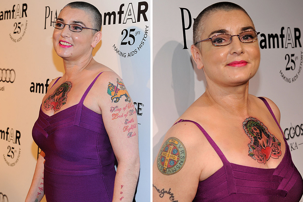
Sinéad O’Connor’s arm script and figures
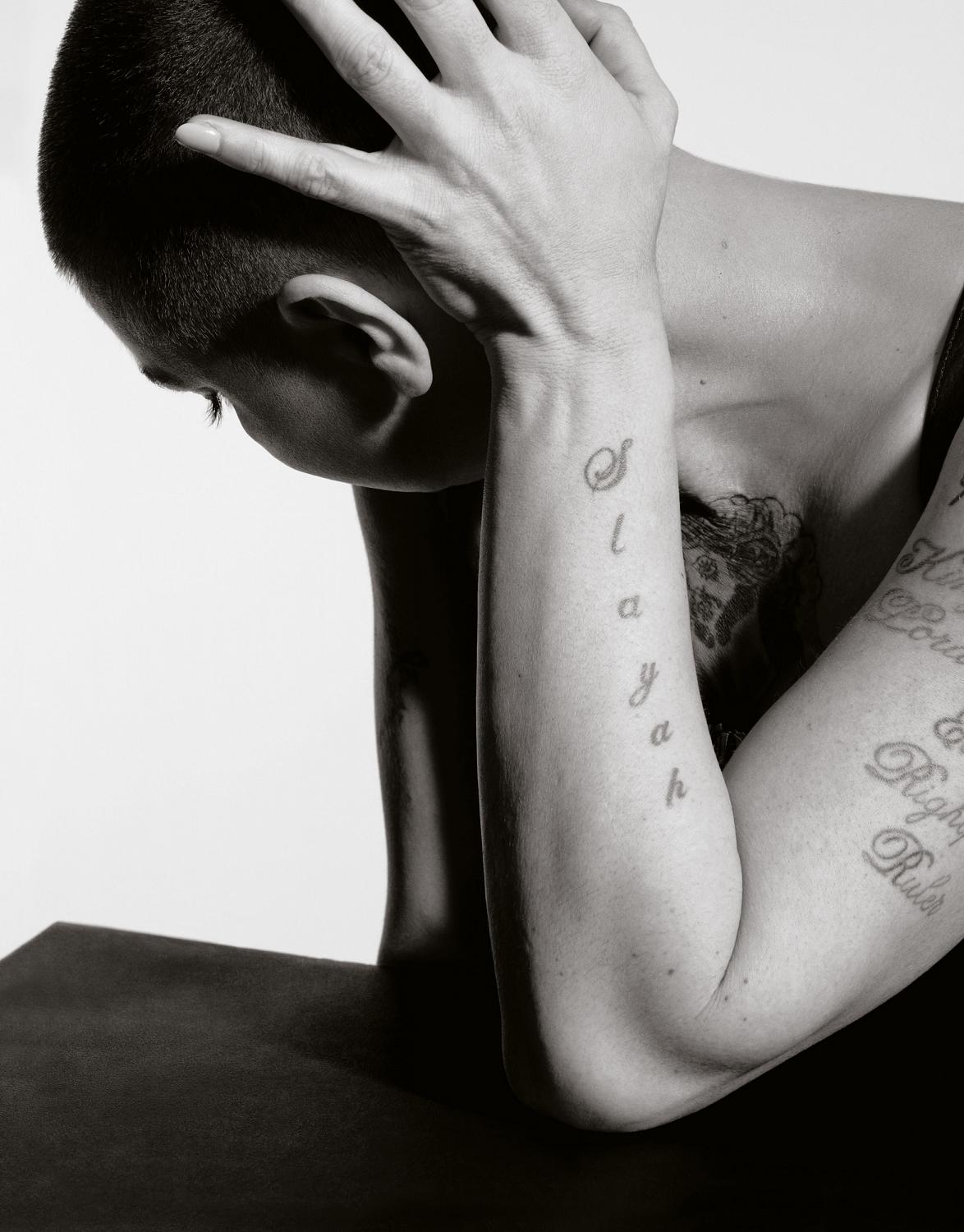
The upper-arm photographs show some of the most substantial lettering in her collection. The long script running along the arm has the feel of a statement rather than a small label. Words such as “King of Kings Lord of Lords Earth’s Rightful Ruler” take up real space, and that length is part of the design. The text follows the limb, so the eye travels down the arm instead of stopping at one small emblem.
Long lettering needs planning at the level of a poster or sign. The artist has to think about line breaks, spacing, the direction of the arm and how the words will look when the elbow bends. A sentence that looks balanced in a straight reference image can bunch up when the arm is relaxed. It is worth checking the stencil with the arm hanging naturally, bent at the elbow and held above the head.
Her arm work also shows why script tattoos should be chosen for readability rather than trend value alone. A dramatic font can look great in a screenshot but become tiring if every word is squeezed together. Leave enough open space between lines and let the artist simplify flourishes that do not help the letters. Clear words age more gracefully than decorative noise.
Sinéad O’Connor’s tattooed performance style
Sinéad’s tattoos are part of a public image, but the photographs do not show one fixed arrangement. Hair changes, clothing covers different areas and the angle of a stage or portrait can make a tattoo feel more or less prominent. The neck remains a quick visual anchor, while the hands and arms appear and disappear with gestures. That movement is a big part of why the collection feels connected to her presence rather than simply attached to her skin.
The black-and-white portrait makes this especially clear. Without bright colour competing for attention, the eye follows the shape of the forearm lettering and the placement of the visible marks. A monochrome image can reveal line weight, spacing and how a tattoo sits beside a fold in the arm. It is a useful way to study a design, even if your own tattoo will be colourful.
If you are building a collection, think about how the pieces will meet in ordinary life. A shoulder tattoo might touch the edge of a sleeve. A wrist design may sit beside a watch. A neck piece can become the first thing people see. None of these choices is automatically right or wrong, but each one creates a different daily relationship with the ink. Plan for the version of your body that moves through real clothes, work, weather and conversations.
What her collection teaches about commitment
Sinéad O’Connor’s tattoos are memorable because they combine clear placement with a willingness to be seen. The lesson is useful even if you want one small piece rather than a public collection. Start by separating what you like about a reference. Maybe it is the directness of a phrase, the old-school weight of a medallion, the way script follows an arm or the confidence of a tattoo that cannot be hidden easily. Tell the artist those qualities instead of handing over a photograph and asking for a copy.
Words deserve extra care. Check spelling, punctuation and the exact version of a quote before anything is stencilled. Read it in a mirror and ask someone else to read it too. Think about whether you want the phrase to feel formal, handwritten, heavy or understated. Lettering is not just a font decision. It is a voice decision.
Give the placement the same attention. Face, neck and hand tattoos become part of nearly every outfit and photograph. Chest and upper-arm pieces offer more control over when they are visible. A tattoo that feels exciting in a studio can feel different at work, at an airport or in a family picture. That is not a reason to avoid visible ink. It is a reason to choose it with open eyes.
Leave room for healing and for future decisions. Fresh black ink can look very dark, and swelling can make a design seem larger than it will after it settles. Follow the artist’s aftercare instructions, protect healed work from strong sun and judge the result when the skin is calm. Waiting before adding a neighbouring piece can reveal whether the first tattoo needs company or looks better with open skin around it.
Finally, remember that the strongest collections are personal records. Sinéad’s work feels convincing because it belongs to her voice, her history and the way she chose to be seen. You can borrow the confidence without borrowing the exact words or layout. The best tattoo is not the one that looks most like a celebrity’s. It is the one that still feels like yours when the reference image is long gone.