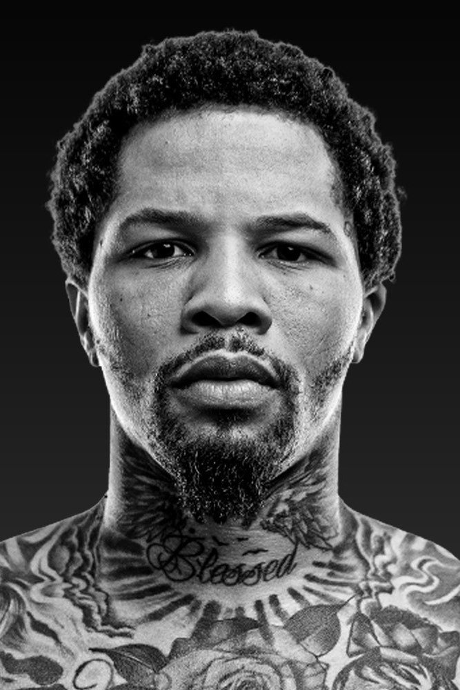
Gervonta Davis does not treat tattoos like background decoration. His ink is easy to spot whenever he steps onto a scale, into a ring, or in front of a camera. The collection runs from a huge Baltimore back piece to a red rose, family portraits, movie characters, animals, lettering, and a neck tattoo that reads Blessed. It feels personal, but it also has the bold, high-contrast look you would expect from a champion boxer.
What makes Gervonta Davis tattoos interesting is the mix of subjects. There is hometown pride, family, faith, pop culture, and the fighter identity he has built around the nickname Tank. Some pieces are packed into large scenes. Others are small details that only show when the camera gets close. Here is a clear look at the designs that stand out most and the tattoo ideas they offer.
Gervonta Davis’s Baltimore back tattoo is his biggest statement
The back piece is the tattoo that gives the whole collection its centre. Large block lettering spells out Baltimore across the upper back, making the hometown message readable before you even take in the rest of the design. Under the lettering is a black-and-grey scene with an archangel, a samurai, wings, clouds, and heavy shaded figures. It is a lot of artwork, but the layout still has a clear top-to-bottom flow.
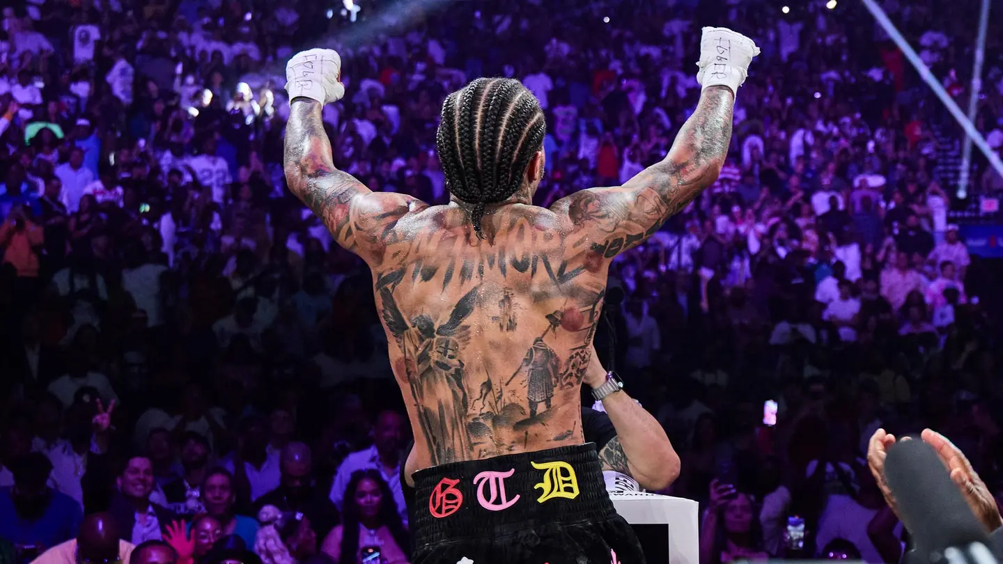
The Baltimore lettering works because it acts like a headline. The images below it can be detailed and dark without losing the main idea. That is a useful approach for anyone planning a large back tattoo: start with one strong word, place it where it can be seen at a distance, then build the story underneath. Davis’s version is dramatic, but the same structure could work with a city, a family name, or a place that shaped you.
The archangel and samurai also push the piece toward a warrior theme. They are not tiny icons scattered around the skin. They are part of a single scene, with wings and shadows tying the figures together. The result looks closer to a mural than a collection of separate flash tattoos. That is why the back piece still reads clearly even when photographed from across a room.
Gervonta Davis’s movie leg sleeve packs several portraits together
His leg sleeve takes a completely different route. Instead of one hometown scene, it brings several pop-culture faces into the same long composition. The clearest reported elements include Tony Montana from Scarface, Joaquin Phoenix’s Joker, Tupac Shakur, and a wolf. The work was completed over multiple sessions, and the images are arranged so the leg can be read in sections rather than as one flat picture.
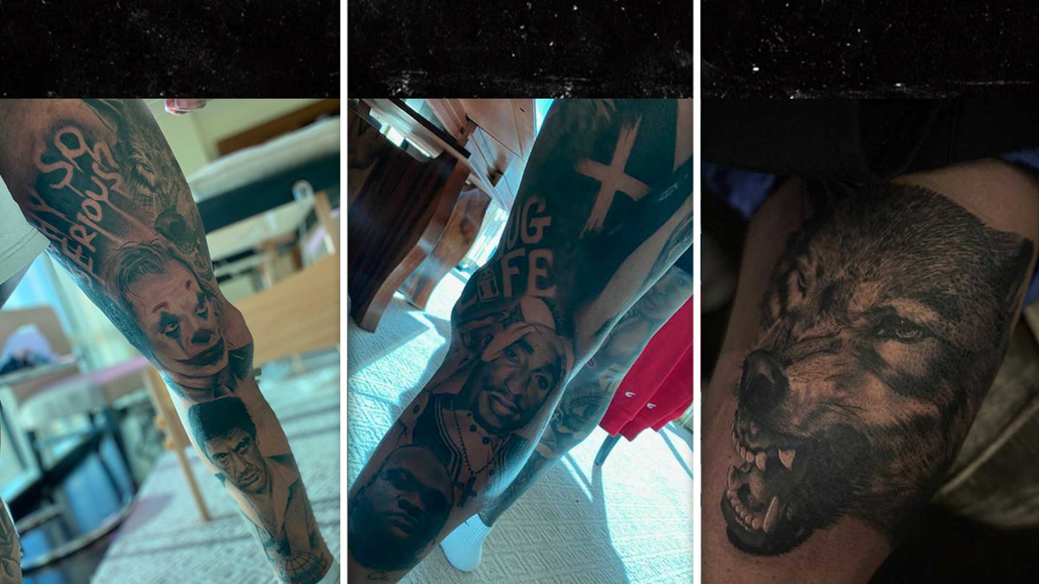
The close views show why realistic portrait work needs room. Faces use contrast, soft shading, and carefully placed dark areas so they do not disappear when the leg bends or moves. The quoted film lines add another layer, but the portraits are what make the sleeve instantly recognisable. It is a good example of using one body area for a theme while still giving each section its own focal point.
For a sleeve inspired by this approach, the smartest move is choosing a short list of subjects before drawing anything. Too many unrelated portraits can turn a leg into visual noise. Davis’s sleeve has a shared mood: crime-film drama, music history, horror, and the tough energy of a fighter. The subjects are different, but they belong to the same world.
The red rose and family portraits make the chest tattoos personal
The front of Gervonta Davis’s torso is warmer than the back piece or the movie sleeve. A red rose sits near the centre of the chest, with a child’s portrait close by. Around them are darker animal and figure tattoos, including the large lion-like work that spreads across his upper torso. The colour in the rose gives the chest an immediate focal point while the black-and-grey shading keeps everything connected.
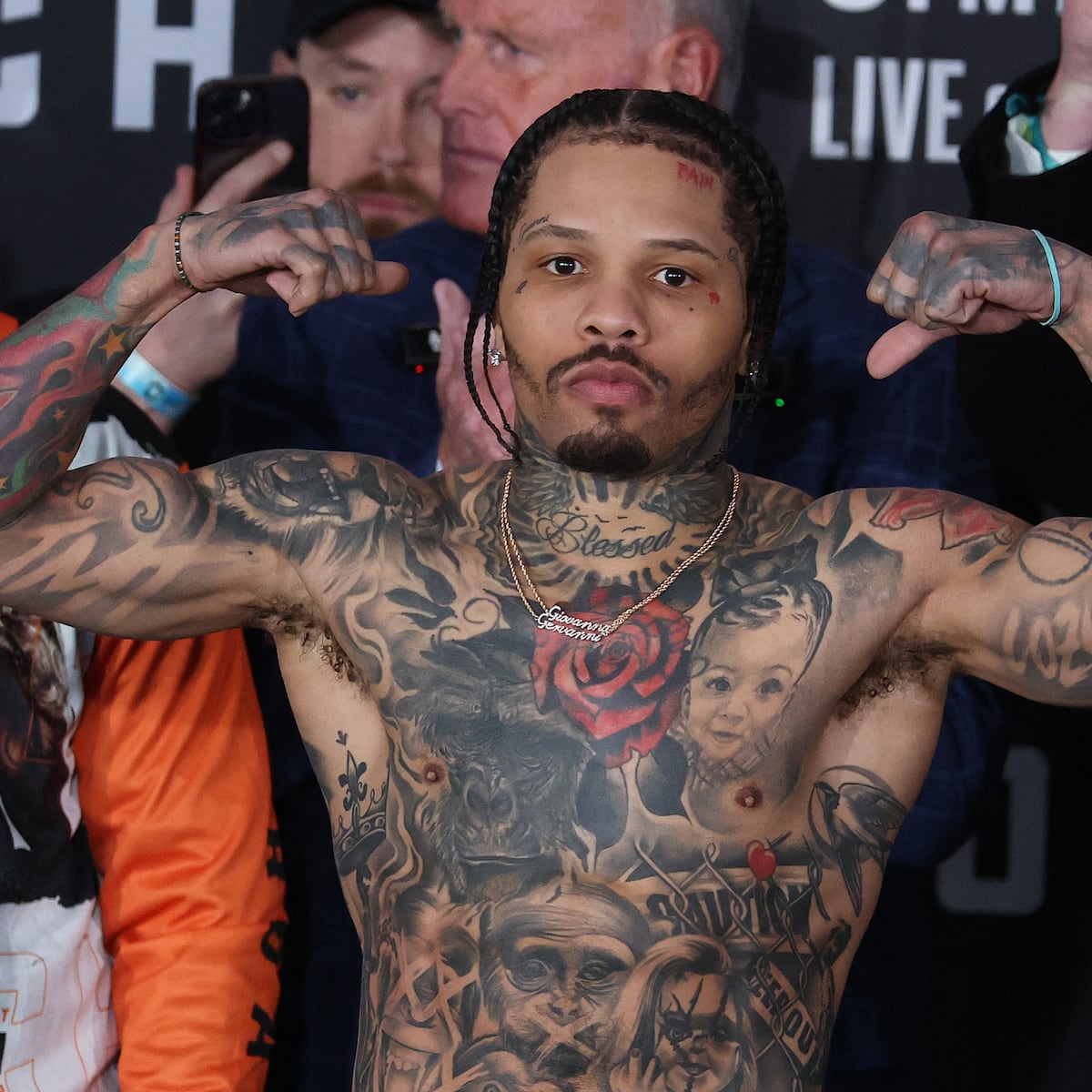
Family portraits are hard tattoos to get right because a face carries so much emotion. Davis’s chest pieces are placed where the eye naturally lands, and the surrounding leaves, wings, and shadow give the portraits breathing room. That balance matters. A portrait squeezed between unrelated designs can lose its expression, while a portrait framed by supporting work can feel intentional.
The rose is also a useful example of controlled colour. It is not a full colour sleeve. Most of the chest stays monochrome, so the red reads as a deliberate accent rather than a competing palette. Anyone considering a similar tattoo could use one colour for a flower, a date, or a small symbol and let black-and-grey work do the rest.
Gervonta Davis’s Blessed neck tattoo ties the upper body together
The word Blessed is written across the front of Davis’s neck, surrounded by radiating lines and darker ornamental shapes. It is visible in nearly every close portrait, which makes it one of his most recognisable tattoos. The lettering is not hidden inside a sleeve or placed on the ribs. It sits in a high-visibility spot and works almost like a signature.
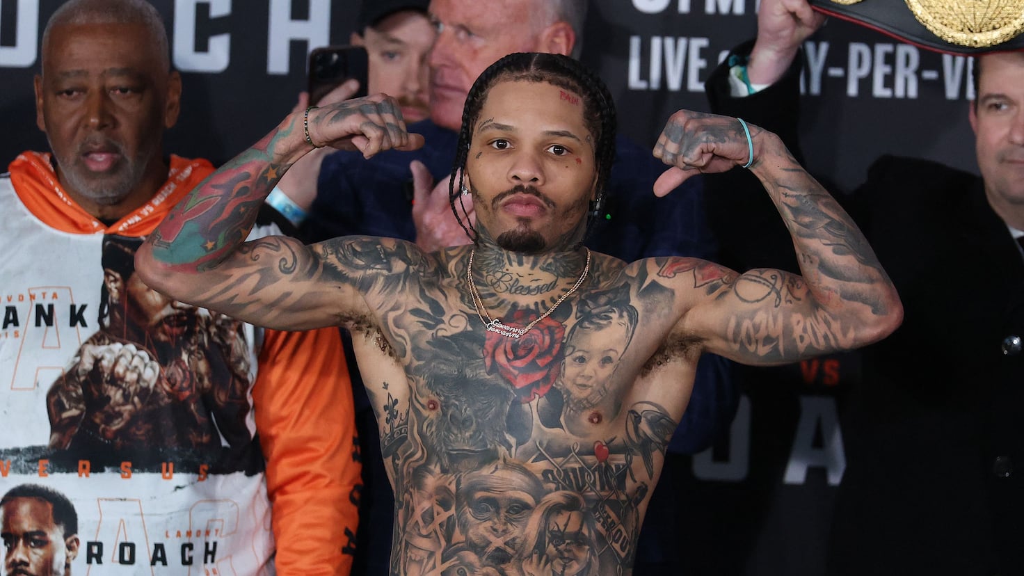
Neck lettering has to be short enough to read and strong enough to hold its shape. Davis’s design uses a single word with a loose script style, then gives it extra weight with the rays behind it. The surrounding lines help the tattoo fill the curve under the chin instead of floating on the skin. It is a simple lesson in placement: a small word can look complete when the framing is designed with the body.
The word also gives the heavier chest work a clear top edge. Without it, the rose, faces, and animal shading could run together. With it, the eye has a stopping point before moving down into the rest of the torso. The neck piece is not the largest design, but it is the detail that makes the upper body feel more finished.
His arms mix fighter symbols, animals, names and smaller details
When Davis flexes, the arms reveal how much of the collection is built from smaller pieces. There are script tattoos, stars, numbers, animal imagery, dark shading, and symbols that sit around the larger chest composition. Some photos show the hand and forearm work more clearly than the torso shots, while others show how the tattoos wrap around the biceps and shoulders.
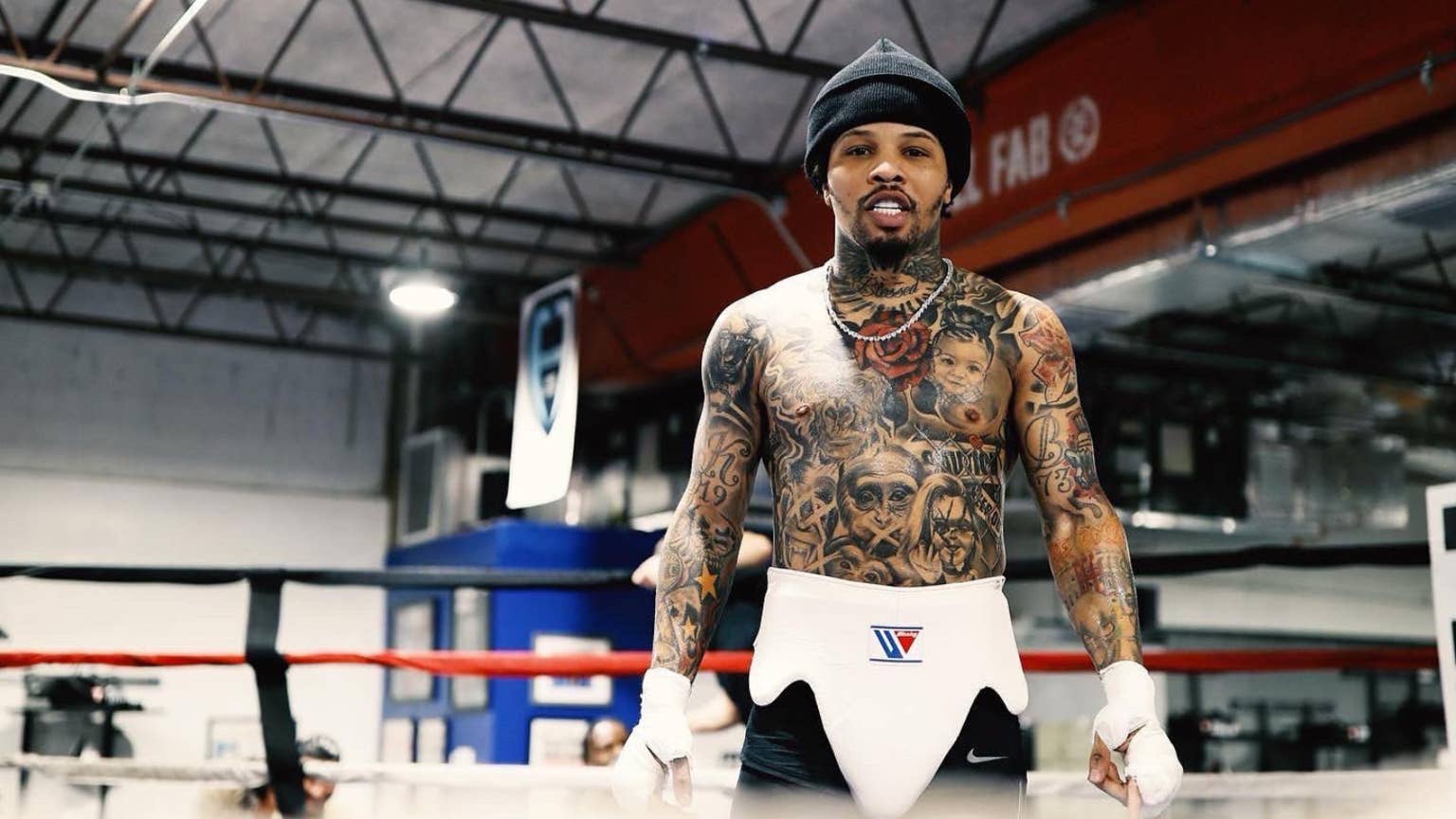
The arm work has the loose, lived-in quality of a collection that grew over time. It does not look like one sleeve was planned from a blank arm in a single sitting. Instead, larger pieces have been fitted around existing marks, with black shading used to close gaps and keep the different designs from feeling too scattered.
That is a practical way to build a sleeve if you are not ready to commit to a full plan. Start with one meaningful subject, leave room around it, and let later tattoos decide whether the final direction should be bright, black-and-grey, realistic, or illustrative. The key is keeping the line quality and shading consistent enough that the pieces can live together.
His torso also includes portraits and symbols that are easier to see in training or weigh-in photographs than in a polished headshot. Those candid views show an important part of tattoo design: the piece has to work while the body is moving. A design that looks strong in a straight-on studio pose should still have readable shapes when the arm turns or the chest flexes.
The close-up view shows how small details finish Gervonta Davis tattoos
Beyond the headline pieces, close photos reveal the smaller marks that stop the collection from feeling unfinished. A hand tattoo, a short script line, a star, or a number can work as a visual bridge between bigger areas. These details are easy to miss in a wide shot, but they give the arms and upper chest a more lived-in rhythm.
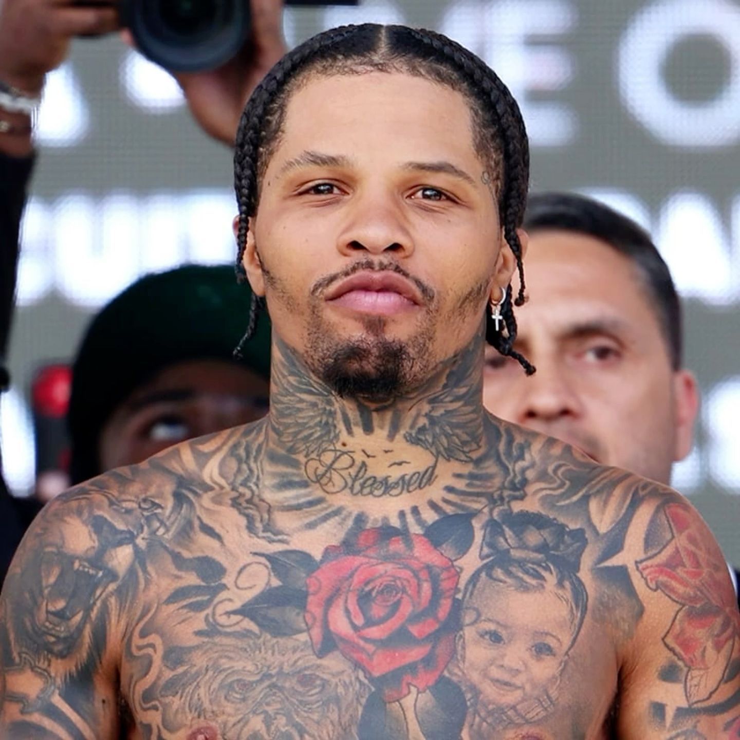
That layered effect is useful if you prefer a collection that grows naturally. Small tattoos do not have to compete with the main portrait or animal. They can fill a narrow space, follow the curve of a muscle, or repeat a shape that appears elsewhere. On Davis, the smaller marks help the eye travel from the chest into the arms without a hard stop.
Why Gervonta Davis’s collection feels cohesive
There is no single style label that covers every piece. The back is a black-and-grey narrative scene. The leg leans into realistic pop-culture portraits. The chest combines a bright rose with family imagery and animals. The neck is script lettering. The arms bring in symbols and smaller designs. That range is part of the appeal.
The collection also shows how placement can create order. A big back piece can carry the hometown story. A chest portrait can hold the personal message. A short neck word can become the recognisable signature. A leg sleeve can keep the movie references together. When every idea gets its own area, a large number of tattoos can still feel organised.
If you like the look but want something easier to wear, borrow the structure instead of copying the exact artwork. Try one meaningful word, one portrait or animal, and one small symbol. Keep the palette tight, decide which piece should be the focal point, and give the tattooer enough open skin to make the main subject readable. The strongest Gervonta Davis tattoos are not strong because they are crowded. They are strong because each section has a job.
Watch the related video below for another look at the boxer and his ink.