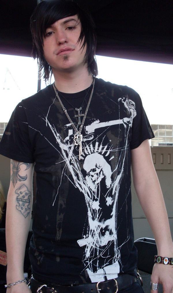
Craig Mabbitt’s tattoos are easy to spot in Escape the Fate stage photos. Dense black and color work covers his arms, with smaller pieces on his hands, neck and chest that show when his clothes shift. The collection looks as if it grew over time, giving it a lived-in feel.
Photos show full sleeves, lettering, shaded faces, patches of color and smaller marks. Some shapes are clear; others blur under red lights or movement. This look at the collection sticks to what the photos show and to the way scale, contrast and placement work together.
The tattoos share a heavy visual feel even when the designs differ. The arms do most of that work, while the hand and neck pieces carry the ink into more visible spots. If you’re drawn to Mabbitt’s style, pay attention to the balance rather than copying an exact design.
His upper arms use large color blocks and strong contrast

Large shapes and dark shading dominate the clear upper-arm photos. Color appears in selected areas instead of covering the whole arm evenly, so the outline still reads from a distance. The sleeve is busy, but darker and brighter patches give it a rhythm.
On Mabbitt’s left arm, the visible work runs from shoulder toward elbow in overlapping sections. Rounded forms, lettering and dark outlines sit together, and the arm reads as one field during a show rather than a single image surrounded by blank skin.
If you like a sleeve made of separate pieces, decide which one should catch the eye first. An artist can connect the rest with shading, similar line weight or a few shared colors. The connection can be quiet; the designs don’t need matching frames or logos.
Stage photos show how that scale holds up while Mabbitt moves, grips the microphone and leans toward the crowd. The main shapes remain visible from changing angles. Fine details alone would be harder to follow under stage lights.
Dense forearm coverage keeps the collection connected

The forearm is packed with images and shading, making it look darker than the upper arm in some photos. A close performance shot shows the designs continuing around the limb instead of stopping at a flat panel.
That wraparound shape matters because forearms are seen from several directions. Mabbitt’s tattoos turn with his arm as he reaches for the microphone, bends his wrist or faces the camera from another angle.
Red and other warm colors appear within the darker work, with small areas of bare skin separating the pieces. If every patch used the same saturation, the sleeve could read as one block. Those breaks help the motifs stay distinct.
Leave some open skin before filling every gap. It gives the strongest shapes room, helps around joints and cuffs, and leaves space for future additions. A dense sleeve still needs places for the eye to rest.
Hand and wrist tattoos bring the details closer to view

The marks on Mabbitt’s hands and wrists are smaller than the sleeve pieces, but they show up in his gestures. A microphone, cable or raised hand can put the ink at the center of a photograph.
Hands are washed, exposed to sunlight and constantly moving, so fine detail can soften sooner than it might on a covered area. The bold shapes and lettering visible in his stage photos stay recognizable even when the hand is angled or partly hidden.
A wrist tattoo can join the hand to the forearm sleeve without creating a hard edge. One compact mark near the thumb or inside the wrist may be enough; there’s no need to fill every finger. The design just needs to fit the weight of the ink above it.
Try a hand design with the fingers open, curled and relaxed. Skin shifts in each position, so a word that looks level in a fist may slope when the hand opens. Plan for the movement as well as the photograph.
Chest and neck pieces frame the face and microphone

The chest and neck pieces are less dominant than the sleeves, but they frame Mabbitt’s face in performance photos. They sit near the collar, ear jewelry and microphone, and show more clearly when he wears a vest or sleeveless shirt.
A chest tattoo doesn’t have to be one enormous image. Several medium-sized pieces can carry the same visual weight if they’re spaced well. In the photos, the ink works with the neckline rather than crowding it. That can be useful if you want a design you can cover with a shirt.
The neck is hard to hide, so clear shapes matter. Fine detail can disappear under hair, shadow or stage lighting. If you’re considering that placement, check how the design reads from the front, side and three-quarter view.
The same subject can feel different in a different place. A skull or line of script on the upper arm may read casually; near the throat, it can feel more confrontational. Mabbitt’s mix keeps the upper body direct without making every piece oversized.
Stage photos show how the sleeve moves with him

A posed portrait can make a sleeve look flat. Stage photos show Mabbitt reaching, leaning, gripping the microphone and turning his shoulders while he sings. The designs shift across those movements, so the ink feels part of the performance.
Different angles bring out different pieces. One photo may show a broad patch of color; another catches a wrist detail or the back of a hand. Several images give a better sense of the layout than one close-up.
Stage lighting changes how colors appear. Red light can blend warm ink into the background, while a cool spotlight can sharpen the black outlines. Compare references in daylight and indoor light before deciding how you want color to look against your skin and clothes.
The collection’s consistent features are heavy outlines, dark shading, compact symbols and visible placement. The designs are not identical, but they sit in the same visual world. That direction can be built gradually: choose an anchor piece, decide how much color or dark coverage you want, then let later tattoos work with it.
There’s no need to guess the story behind every mark. Some are easy to see; other details remain private or unclear in photos. It’s enough to describe what is visible and leave the rest to the person wearing the tattoos.
Think about scale before your first appointment. A large upper-arm piece needs room, and a dense forearm design has to wrap cleanly. Smaller wrist and hand tattoos can bridge the areas instead of looking like add-ons. Planning the layout early leaves more options later.
If you like the rough alternative feel, bring references that show what you respond to—red color, heavy black shading, old-school forms, portraits, lettering or a particular stage look. Talk with the artist about your skin, work and how visible you want the tattoos to be. The design should fit your life as well as the reference.
Mabbitt’s sleeves show that a full collection can grow over time and still feel considered. Strong placement, recurring contrast and room between some shapes keep the pieces readable. Start with a design you’d still want years from now, then build around it patiently.
Borrow the energy, not the exact artwork. An artist can adjust the scale for your arm and make a new composition that fits your skin. That’s how a reference becomes your tattoo instead of a duplicate.