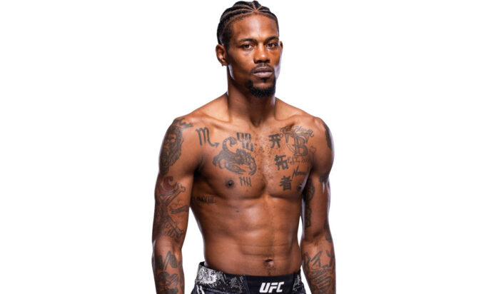
Kevin Holland’s tattoos fit his personality: loud enough to spot from the cheap seats, but personal enough to reward a closer look. The UFC welterweight carries a busy mix of chest lettering, dark symbols, script, numbers, and arm work. None of it feels like a single matching sleeve. It looks collected over time, with each new piece adding another layer to the fighter people know as “Trailblazer.”
This guide breaks down the ink that shows up most clearly in fight photos and weigh-in pictures. Some designs are easy to read, while others blur into the larger chest and arm work. I’ll stick to what the images actually show and keep the meaning talk sensible. A tattoo can have a story without the owner spelling out every detail in public.
Kevin Holland’s chest scorpion and bold lettering tattoos
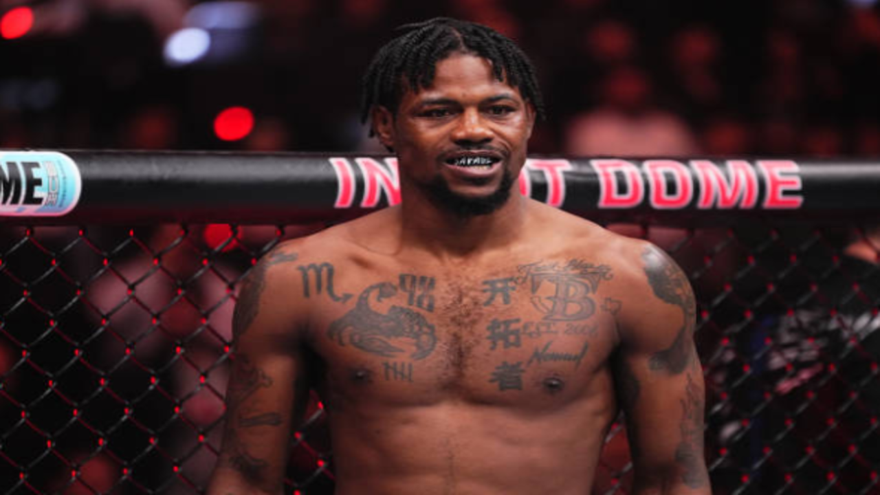
The center of Kevin Holland’s tattoo collection is his chest. The strongest image of it shows a dark scorpion-like design across the left side, surrounded by heavy marks and compact lettering. The shape has enough movement to keep the piece from looking flat, while the thick black sections give it the kind of contrast that still reads under bright arena lights.
Across the upper chest, the lettering is arranged almost like a patchwork of statements. There are blocky characters, a large outlined mark, and smaller script tucked between the bigger shapes. The spacing is tight, so the chest reads as one dense panel instead of a row of isolated flash designs. That is a useful detail if you like the look but want something easier to wear: the visual weight comes from the layout as much as from the individual symbols.
The scorpion also gives the front of the collection a clear focal point. Scorpions are often linked with toughness, self-protection, patience, and a willingness to strike back, but there is no need to pretend we know Holland’s private explanation. What we can say is that the design adds a sharp animal shape to a chest built mostly from lettering and symbols. The best takeaway is the contrast between the curved body of the scorpion and the straight, boxed-in marks around it.
Shoulder and upper-arm tattoos that frame the chest
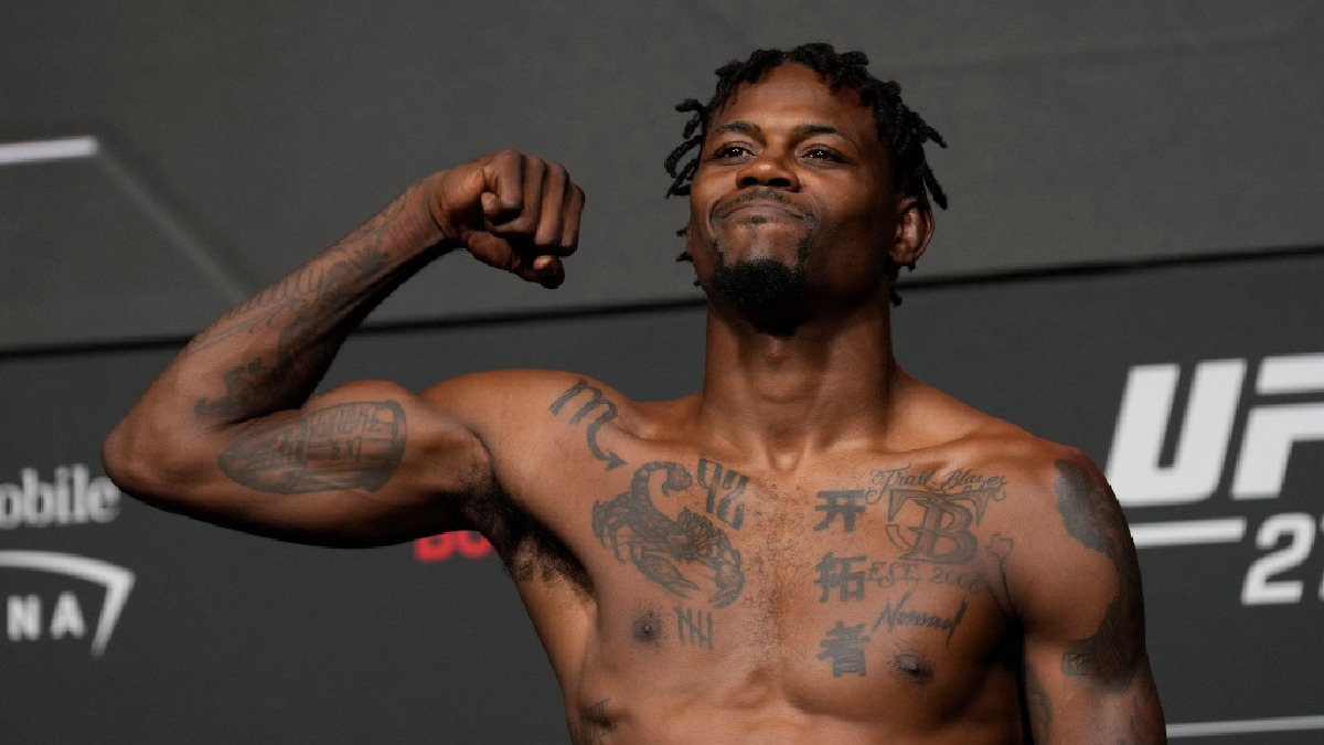
Holland’s shoulders and upper arms give the chest work a broader outline. In close fight photos, the left shoulder appears covered in a dark rounded design, while both upper arms carry older-looking shading and lettering. The edges are not perfectly uniform, which makes the collection feel lived-in rather than drawn from one catalogue page.
That framing matters. When a tattoo sits only in the middle of the chest, the eye stops at the collarbone. Holland’s shoulder ink pushes the visual line outward and makes his upper body look connected from one side to the other. The designs are not identical, and that is part of the appeal. One side can carry a denser black shape while the opposite side leaves more skin showing.
If you are thinking about a similar placement, shoulder work is a good place to plan for movement. The design has to make sense with the arm hanging naturally, flexed, or lifted. A good tattooer will check how the lines sit around the deltoid instead of treating the shoulder like a flat sheet of paper. Holland’s photos show why that extra planning matters: the ink changes shape as his stance changes.
Back tattoos and the ink that appears during fights
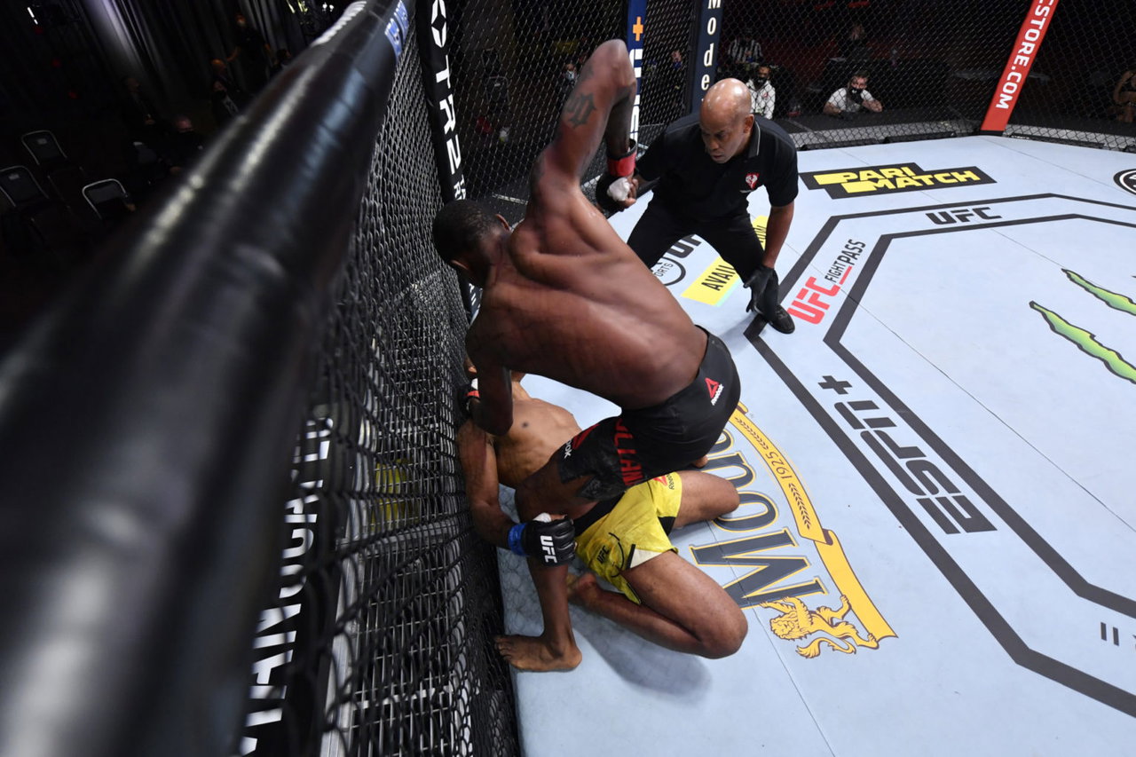
The back is easier to miss because most portrait shots face Holland toward the camera. Fight photography catches it more clearly. In a cage-side action frame, the upper back shows a dark central design while his shoulders and arms carry additional marks. The angle is not a perfect tattoo reveal, but it proves that the collection continues around the body instead of stopping at the chest.
Back tattoos often work best when they have room to breathe. A central image can sit between the shoulder blades, then grow outward later if the wearer wants a larger piece. Holland’s back view has that unfinished, expandable feeling. The darker shape reads first, while the surrounding skin leaves space for the eye to separate the design from the movement of a fight.
There is also a practical side to this placement. A back piece is easy to keep private under everyday clothes, but it becomes a statement when a fighter removes his shirt for a weigh-in or a bout. That shift between hidden and visible ink is one reason back tattoos keep showing up in athlete collections. They can be personal without being on display all day.
Forearm script, numbers and smaller arm details

Holland’s forearms bring smaller details into the mix. The weigh-in photos show script and block lettering along the arms, plus compact marks that sit between the larger shoulder pieces and the wrist. These are the tattoos that can disappear in a wide shot, then become obvious when he raises a fist or flexes for the cameras.
Forearm placement is naturally good for words and numbers because the shape gives the design a long, readable path. Holland uses that space for a mix of directions rather than one clean band. Some lines run with the arm, while other marks sit across it. That uneven rhythm keeps the arms from looking like identical sleeves.
The smaller pieces also make the collection feel more personal. Big chest images give a strong first impression, but little script can carry a date, a name, a phrase, or a private reminder. We should not label every mark without a direct explanation from Holland. Still, the pattern is clear: the arms hold the quick details, while the chest supplies the main visual hit.
Recent right-arm and shin tattoo details

Recent coverage of Holland’s tattoos has pointed to newer work on the right arm and shin. Those pieces do not always appear in the same clean portrait as the chest designs, but they fit the way his collection has grown: one area gets a fresh mark, then later photos place it inside a much larger mix of older ink.
The right-arm additions are especially useful to notice if you like tattoos that build gradually. You do not have to plan a full sleeve on day one. A small symbol, a line of script, or a compact black shape can become the anchor for future work. The trick is to leave enough breathing room and to choose an artist who can match the weight of the existing tattoos.
A shin tattoo has a different challenge. The skin is narrow, the bone changes the surface, and the design needs to read from more than one angle. A bold shape or short piece of lettering usually holds up better there than a tiny, crowded illustration. Holland’s broader approach suggests a useful rule: let the placement decide the scale, then let the overall collection stay a little imperfect.
What makes Kevin Holland’s collection stand out
Holland’s ink is not built around one color palette or one strict theme. It works because the collection has a consistent attitude. The designs are dark, visible, and confident. Lettering sits beside symbols. A central animal shape sits beside marks that look more private. The result feels like a fighter’s body art rather than a showroom set.
There is also a useful balance between filled and open skin. The chest carries the most visual noise, while the torso below it stays relatively clear in the photos. That gap lets the upper-body pieces feel heavier without turning the whole front into a single block. His arms then carry the design outward, giving the eye a route from the shoulders to the forearms.
For anyone collecting ideas, the strongest lesson is to plan the relationship between tattoos instead of copying a single picture. Pick one anchor design, decide where the next piece should sit, and keep the line weight in mind. Placement, spacing, and contrast will do more for a cohesive collection than forcing every tattoo into the same style.
Ideas inspired by Kevin Holland’s style
You can borrow the broad ideas without copying Holland’s exact marks. A scorpion or another animal can act as a focal point. Short lettering can fill a forearm. A shoulder piece can bridge the gap between chest and sleeve work. If you like the look of symbols, ask your tattooer to build an original design around your own references rather than lifting a fighter’s exact character or layout.
Think about visibility, too. Chest and shoulder tattoos are easy to show off in photos, while back and shin work can stay quieter. A collection feels more natural when every piece has a reason to live where it does. Take your time with the stencil, check the design while you move, and make sure the smallest details are large enough to age well.
Kevin Holland’s tattoos stand out because they feel active and personal. They do not look frozen in one moment. New pieces can sit beside old ones, and the overall picture still makes sense. That is a relaxed way to approach body art: start with what matters now, leave room for what comes next, and let the collection tell its own story.
Here is a Kevin Holland UFC interview if you want to see the tattoos in motion during a post-fight conversation.