
Julia Gnuse’s tattoos are hard to take in with one quick glance. Known as The Illustrated Lady, she covered about 95 percent of her body with colourful work, including her face, neck, arms, hands, torso and legs. The result is not one matching sleeve or one tidy theme. It is a huge personal collection made from cartoons, underwater characters, portraits and bright scenes that follow the shape of her body.
Her story also gives the collection some important context. Gnuse began getting tattooed after porphyria caused painful blistering and scarring. An early attempt to match the colour of the scars did not work as planned, so she moved toward colourful designs instead. Over time, the practical idea grew into a full-body project and a look that became instantly recognisable. The interesting part is how a personal solution turned into a visual language of its own.
These photographs are useful for more than shock value. They show how scale, colour, spacing and subject matter can work across a body, even when the pieces are not all from one artist or one period. Here is a relaxed look at the areas that stand out, plus a few design lessons that still make sense if your own goal is a much smaller collection.
Julia Gnuse’s face and neck work
Face and neck tattoos are the first details most people notice because they become part of a person’s expression. In Julia Gnuse’s portraits, the ink around her eyes, cheeks and neck changes with the light and with the angle of the photograph. The designs do not sit apart from her features. They frame them, which is why even a small close-up can feel as busy as a full-body picture.
This kind of placement needs an especially honest decision-making process. A face tattoo will appear in nearly every introduction, work photo and family picture. Hair, makeup and collars can change the balance, but they will not make the ink disappear. If you like the idea, test the shape with temporary ink and look at it in ordinary daylight. Check it while your face is relaxed, smiling and turned slightly to each side.
For a less permanent commitment, the same visual idea can be moved to the upper arm, thigh or shoulder. You can still use a design to frame a feature or create a strong focal point without making it part of every expression. Visibility is a design choice as much as a style choice.
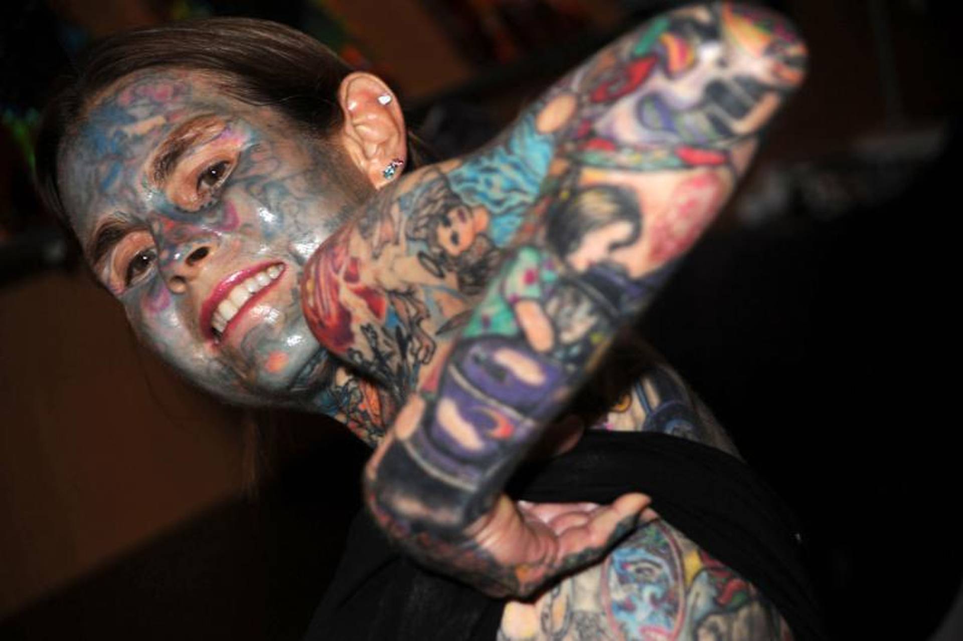
Julia Gnuse’s hands and forearms
The close hand and forearm views show how quickly small details add up. Fingers, the backs of the hands and the skin near the wrists carry tiny shapes, while the forearms give larger images more room. Because those areas sit next to each other, the eye moves from small marks to bigger scenes without needing a single continuous sleeve.
Hands are a demanding canvas in everyday life. They are washed, exposed to sunlight and constantly moving, so delicate lines can soften faster than they would on an upper arm. A simple design with enough open skin will often stay clearer than a detailed picture squeezed into a narrow space. Ask an artist to show healed examples, not only fresh photographs from the day of the appointment.
The forearm is more forgiving, but it still changes shape when the wrist turns. Check a stencil with the arm relaxed, palm up and palm down. A word or central face can look straight in one position and angled in another. The best placement works with movement instead of pretending the body is flat.
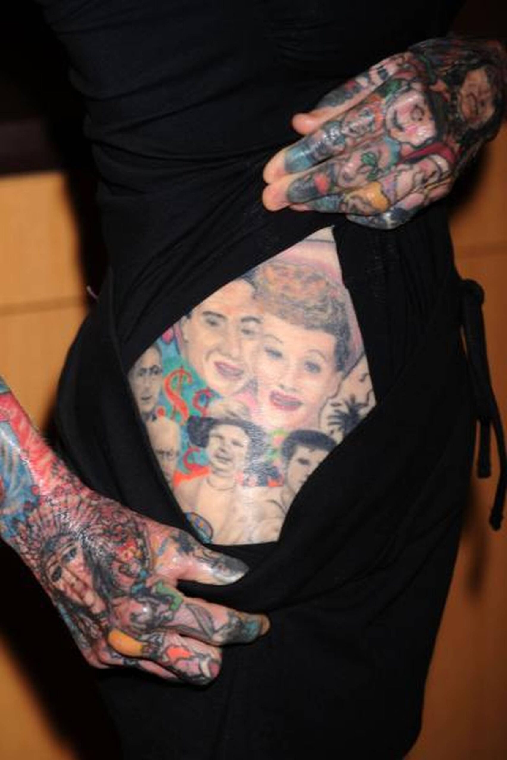
Julia Gnuse’s chest and upper-body scenes
The upper-body photographs reveal the collection’s mix of scale and subject. Large colourful pieces sit near smaller faces, symbols and lettering, while the chest and shoulders provide a broad area for scenes to develop. The designs feel connected because colour and line weight repeat, even when the individual images are very different.
Chest and stomach tattoos can look dramatic in a photograph, but they are also living surfaces that move with breathing, sitting and changes in the body. A good stencil check should include standing, sitting and raising the arms. Watch whether the main subject stays centred and whether a curved edge follows the ribs or waist naturally.
Gnuse’s collection also shows the value of choosing subjects that genuinely interest you. Cartoons, underwater creatures and portraits can sound unrelated on paper, yet they make sense together when they reflect a person’s memories and taste. You do not need a single symbol repeated everywhere. A shared mood, palette or level of detail can be enough to give separate ideas a family resemblance.

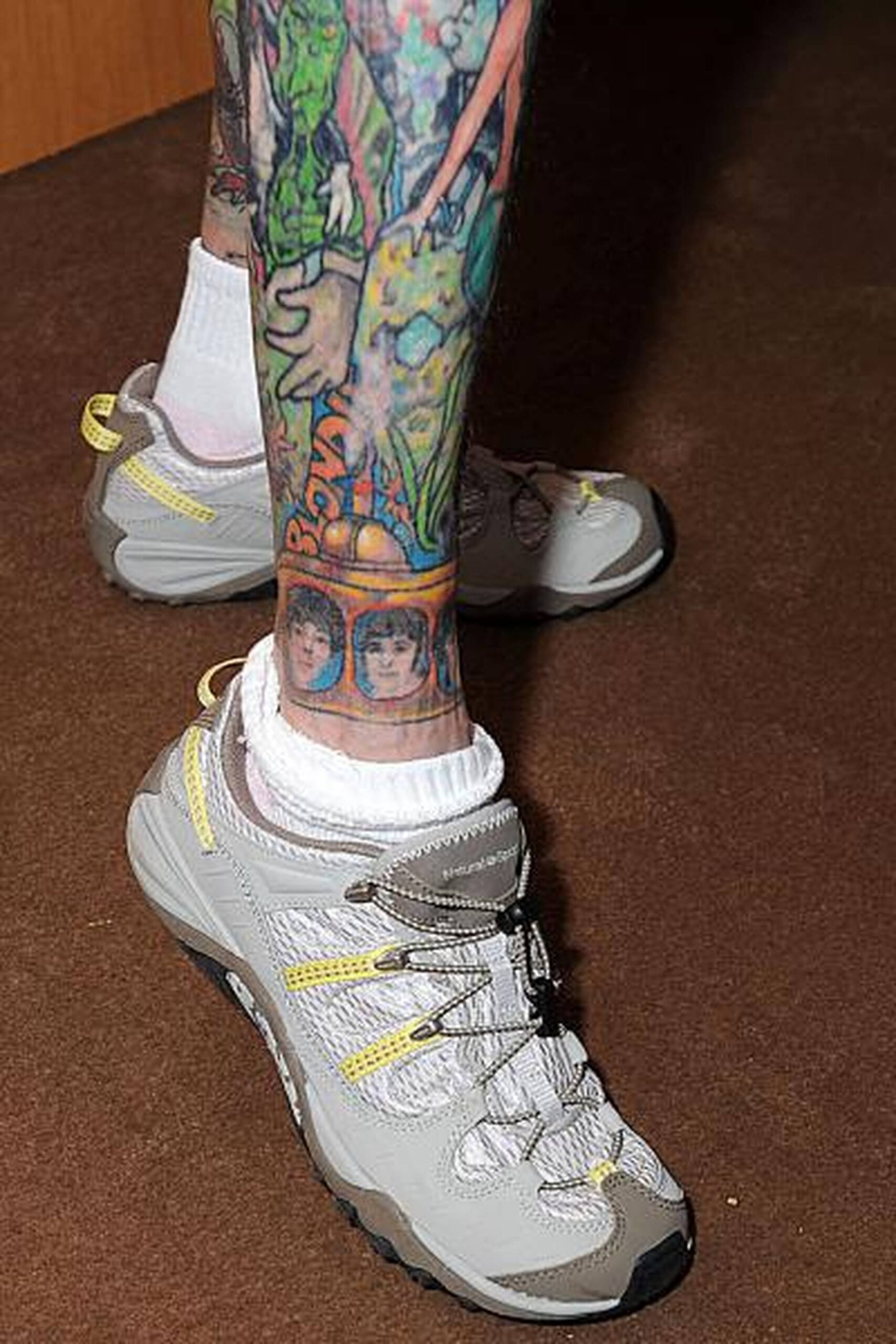
Julia Gnuse’s leg tattoos and colorful character pieces
The lower-leg photograph brings out some of the most playful parts of Julia’s collection. The legs have room for bright character faces and compact scenes, and the long shape lets the images stack without losing their identity. Colour makes these pieces read quickly, but the outlines and spacing keep them from becoming one indistinct block.
Legs are useful when you want a larger tattoo that can still be covered. The thigh gives room for a portrait or broad composition, while the calf and ankle suit designs that follow the length of the limb. Before choosing the exact spot, try the stencil while standing and walking. A piece that looks balanced on a chair may sit differently when the muscle tightens.
Bright colour is not only about choosing the loudest pigments. It is also about contrast, skin breaks and the way neighbouring tones interact. Leave enough room around a face or central character so the colours do not blur together as the tattoo ages. Open skin is part of the palette.
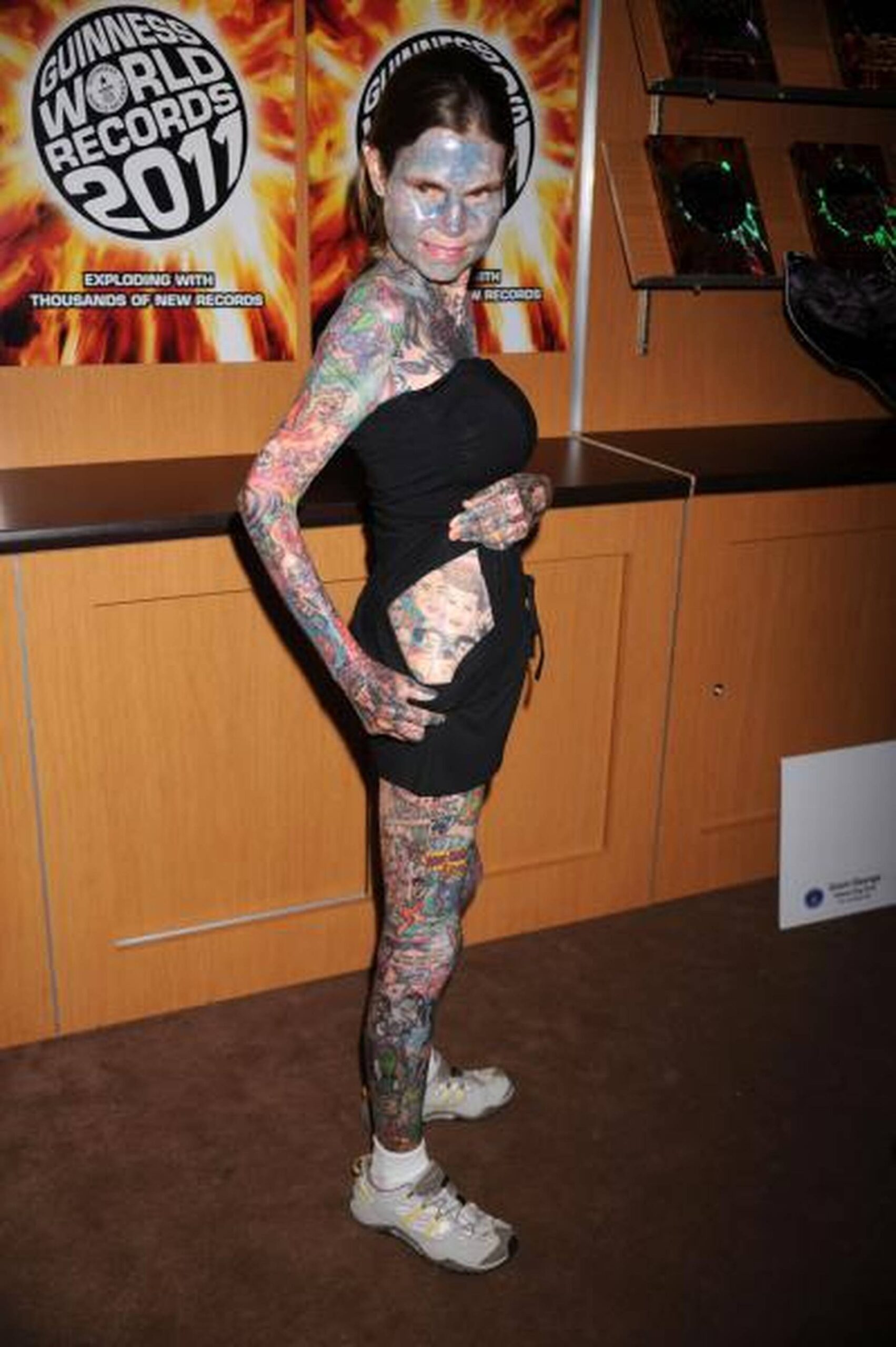
Julia Gnuse’s full-body tattoo layout
The full-length side view makes the larger lesson clear: a heavily tattooed body still needs structure. The pieces do not all point in the same direction, and they are not one giant mural, but the collection has a rhythm. Small marks sit beside large images, bright sections alternate with darker ones, and the body gives every design a different frame.
If you are building a collection, there is no reason to plan every inch at once. Start with the areas you care about most and live with them before adding more. Photograph the front, sides and back, because gaps that are invisible in a mirror can become obvious when you turn or lift an arm. Clothing matters too. A layout may look different in a T-shirt, swimwear or a winter coat.
Scale should follow the subject. A face, animal or scene usually needs more room than a simple symbol. A tall design may suit the leg, while a wide shape can follow the shoulder or chest. Let the body decide how large the idea needs to be, rather than shrinking an important design until it barely reads.
What her collection teaches about commitment
Julia Gnuse’s tattoos are an extreme example, but the useful design lessons are surprisingly practical. Her collection shows that a body can hold different subjects without looking accidental, provided the owner makes deliberate choices about placement, scale, colour and repetition. Those same choices apply to a first tattoo or a small group of pieces.
Begin with the stories or images you would still want after the excitement of a new appointment has faded. Then separate the parts you like about a reference. Maybe it is the bright palette, the cartoon feeling, the portrait shading or the way a design wraps around a joint. Explaining those qualities to an artist is more useful than asking for a direct copy of someone else’s photograph.
Choose the artist for the job. Realism, colour, lettering, blackwork and large body layouts each need different experience. Look at healed examples and ask what will happen when the design moves, sees sunlight or sits beside a future tattoo. If an artist suggests making a small piece larger or simplifying a crowded idea, that advice is usually about keeping it readable for the long term.
Visibility deserves the same attention as style. Face, neck and hand work can become part of every outfit and every photograph. Legs, chest and stomach pieces give you more control over when they are seen. Neither choice is automatically more serious. They simply create different everyday trade-offs, so the right answer is the one that fits your work, relationships and comfort level.
Leave gaps on purpose. Open skin gives a colourful piece room to breathe and keeps a detailed portrait from turning into a dark patch. It also gives you time to notice what the collection actually needs. Waiting between appointments is part of the design process. You may discover that a gap looks good as it is, or that a future piece needs to be larger than you first imagined.
Think about healing before you think about the next reference image. Follow the artist’s aftercare instructions, keep fresh work protected from strong sun and do not pick at peeling skin. Judge the tattoo when it is healed, not only when the colours are bright and the surface is new. Healthy skin gives every style a better chance to stay clear.
Finally, let the collection remain personal. Gnuse’s tattoos became memorable because they reflected her own interests and circumstances, not because they followed a simple trend. You can borrow the confidence, colour and sense of play without copying the exact subjects. A strong tattoo collection should feel like a record of your life, with every new piece earning its place.