codex

Yeat Tattoos: His Arm Symbols, Lettering and Blackwork

Yeat’s tattoos are easiest to spot on his arms and hands, even when a mask, dark glasses, or stage clothes hide much of his face. Black lettering, symbols, portraits, and loose figures sit at different points along both arms. The mix has a futuristic edge, though the pieces also look like they were added over time.

Oversized clothes, gloves, and masks can cover the ink in ordinary photos. In sharper portraits and stage shots, the arms are more exposed and individual designs are easier to see.

Yeat’s arm tattoos are the centre of his look
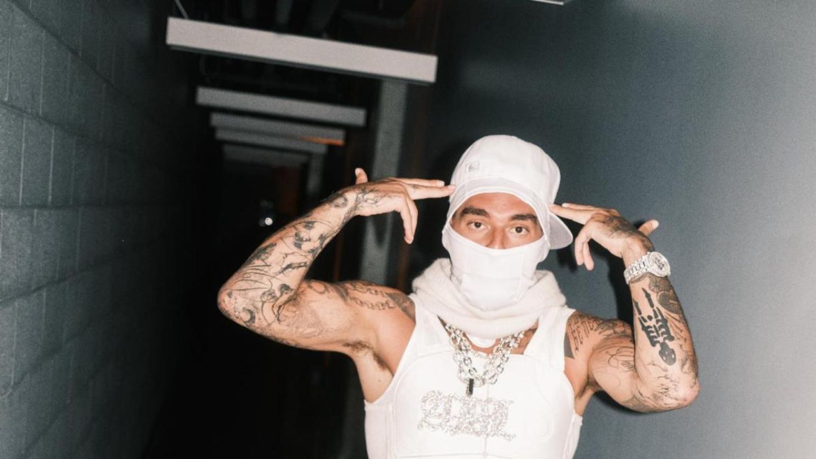
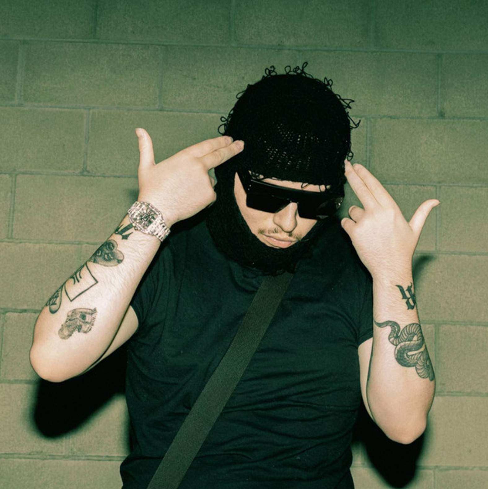
Yeat tattoos: both arms lifted with visible tattoos

The hallway portrait shows tattoos at different heights along both arms. Some areas are dense, while open skin remains between other pieces. The two sides aren’t mirror images: one has tall dark marks and lettering; the other shows smaller pictures, curved outlines, and shapes that continue toward the wrist.

The ink is mostly black, with bold outlines and patches of shading. Some designs are filled heavily, while others stay lighter. Their shared roughness ties them together without making them look like parts of one uniform sleeve.

A full-arm view also makes the spacing clear. The designs have room around them, so even a busy collection doesn’t become one flat patch. Later additions can fit into the open areas without crowding every existing tattoo.

The forearms mix symbols, numbers, and personal marks
Yeat tattoos: forearm symbols and wrist ink

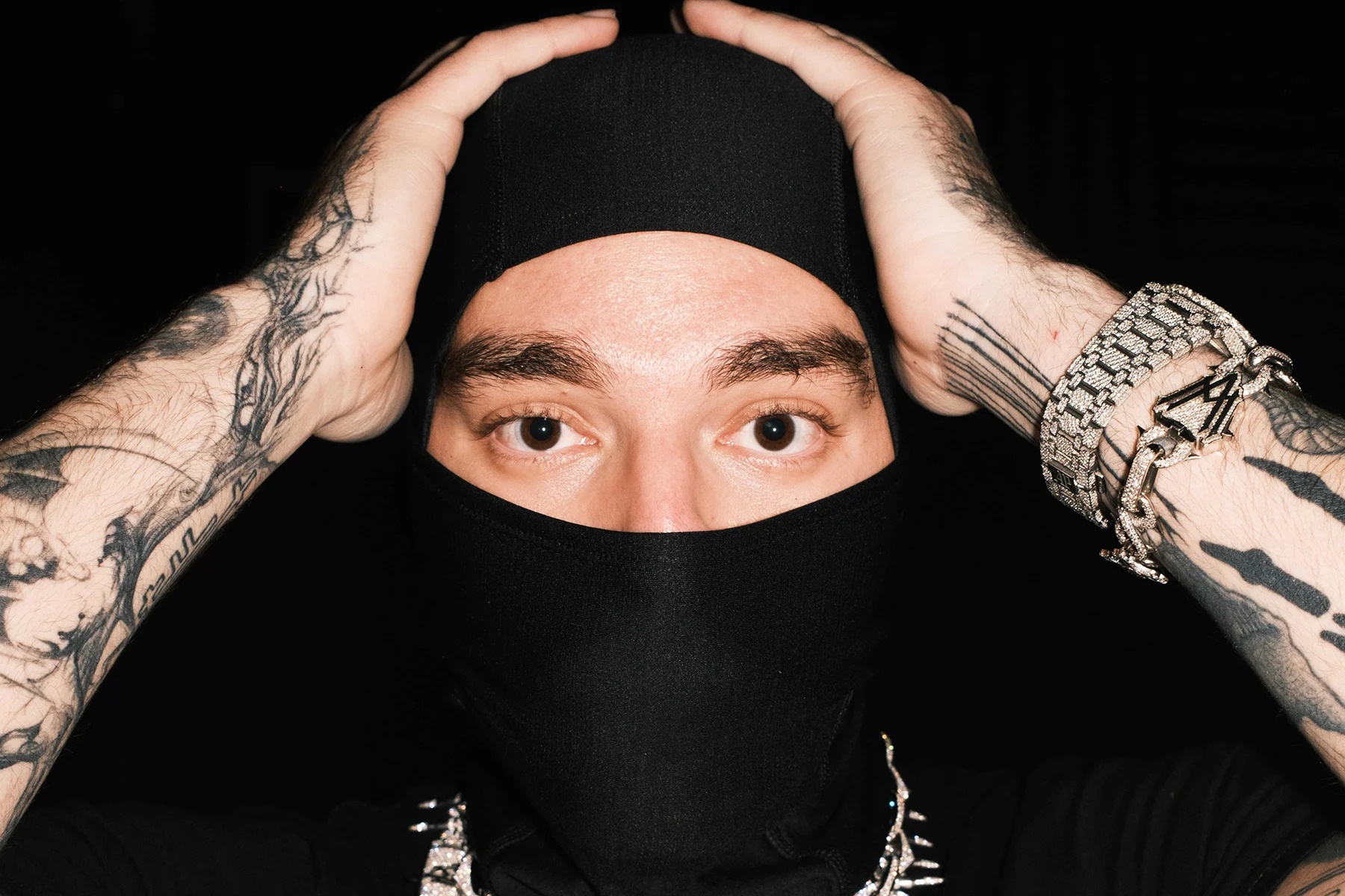
Close photos of Yeat’s forearms show geometric shapes, repeated lines, small pictures, and marks that resemble a private alphabet. Some are easy to recognize; others are abstract. A photograph shows their form more clearly than their meaning.

Yeat has talked about communicating through numbers and symbols, which fits the way some of the marks read. They don’t always form conventional sentences; a blocky character beside a curved shape can look like a code or personal sign. The exact meaning may be known only to him.

Some public references connect particular tattoos to his music or people close to him. Fans have identified one portrait as his grandfather, though Yeat hasn’t explained that interpretation in detail. Other symbols have been linked by fans to different album eras. Those readings are best treated as speculation unless he confirms them.

The designs are visible, but their meanings aren’t all public. The symbols, numbers, and personal marks can stay private even when they’re part of a public image.

His lettering and block shapes make the ink feel futuristic
Yeat tattoos: close forearm lettering and symbols

Yeat’s lettering is often tall, squared, or stretched along the arm. Rather than traditional script, some of the marks resemble signs or logos, which fits the futuristic clothing and metallic jewelry he wears.

The larger blocks remain visible in wider shots, while smaller details show up close. In the Rolling Stone photo, he raises his forearms beside his face, making the tattoos part of the pose rather than something sitting off to the side.

Arms bend and turn, so lettering can shift with the skin. Bold shapes stay legible from more angles than very fine lines. The open skin around them also helps the dark marks keep a clear edge. The gaps between the tattoos are part of the layout.

The newest Yeat tattoos push into heavy blackwork
Yeat tattoos: upper arm blackwork and purple figure

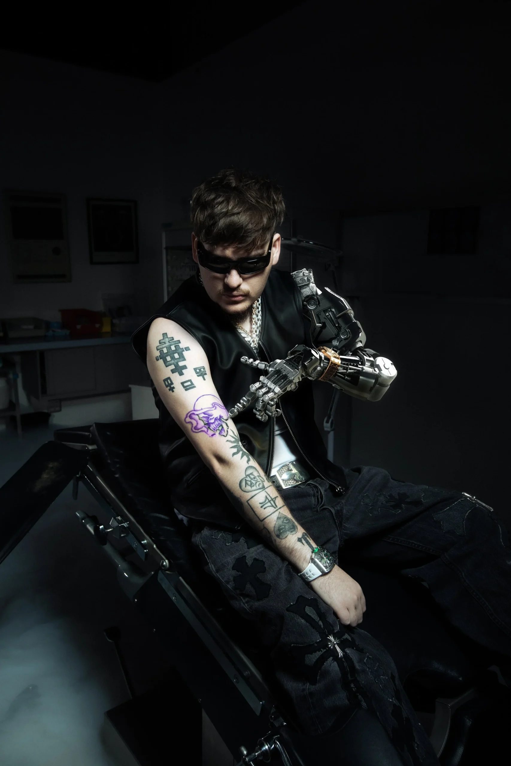
An Inked Magazine photo shows larger black symbols, a purple figure, curved lines, and darker patches reaching toward Yeat’s shoulder. These sections look heavier than the more isolated marks in the earlier close-ups, like part of a sleeve taking shape.

A large filled-in area can draw the eye quickly, so the outlines and lighter figures around it help keep the arm from reading as one solid mass. Here, the darker work sits alongside outlined shapes and lighter sections.

The sharp lines, symbols, and unusual figures sit comfortably beside Yeat’s masks and machine-like styling. The tattoos don’t need to share one subject; recurring outlines and contrast give them a similar visual feel.

Yeat tattoos change with motion on stage
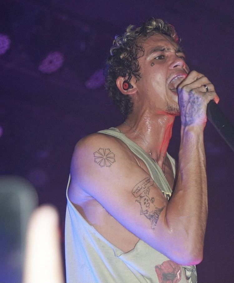
Yeat tattoos: tattooed arms during a live performance

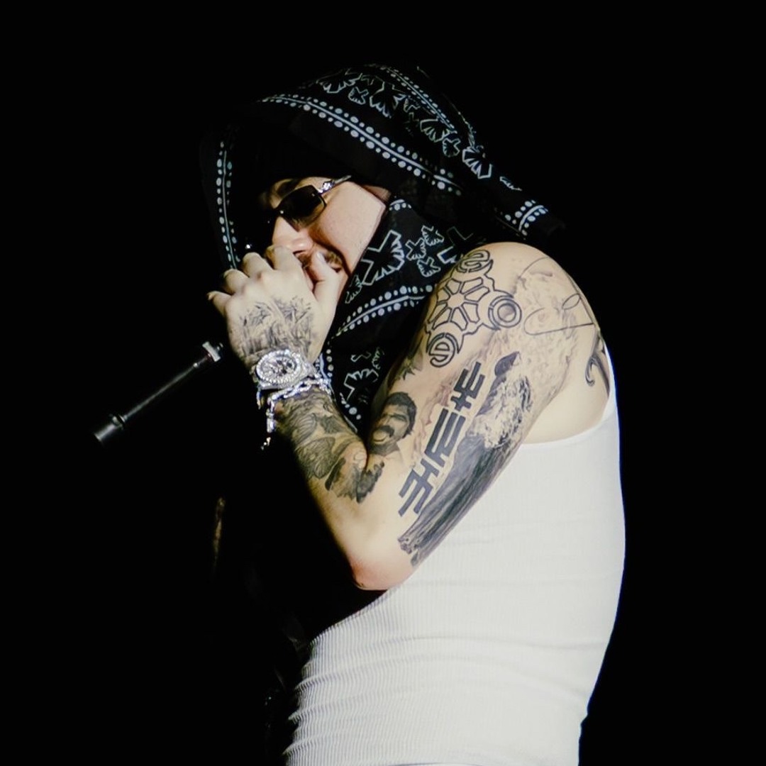
In a live photo, Yeat’s arms move through a darker stage light. A tattoo can disappear when the elbow bends and show again as he reaches toward the crowd. The shifting view makes it easier to see how the ink sits on a moving arm.

His hands, bracelets, microphone, and tattoos share the frame, but the larger shapes remain recognizable when smaller lines blur in the lighting. The bold linework reads quickly, even from a distance.

The tattoos are part of the visual look he brings to a performance: raised arms, covered hands, a masked face, and heavy ink. Photos can exaggerate shading or catch old work before it was changed, so it’s safer to describe the overall pattern than assign a meaning to every mark. The clearest through-line is the arm coverage, with lettering, symbols, and figures layered over time.
More musician tattoo guides

Landon Barker Tattoos: Chest Wings, Floral Arms and Face Ink

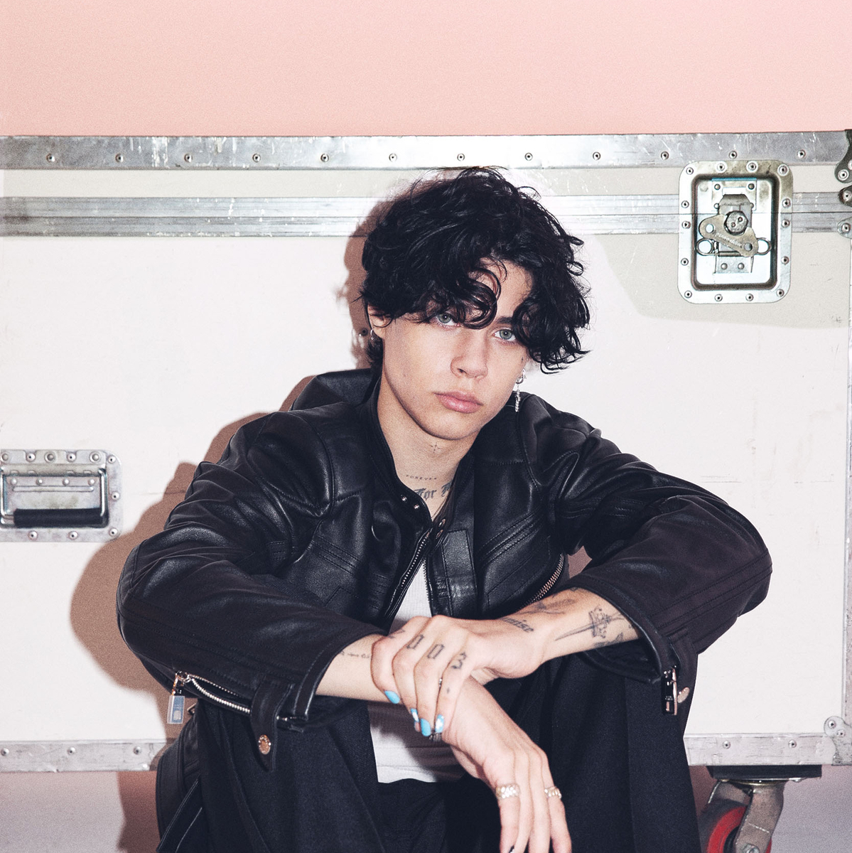
Landon Barker’s tattoos are part of the look he brings onstage and in portraits. Some are easy to spot through a tank top or open jacket: wing shapes and lettering across his chest, flowers on his arms, and smaller marks near his face. The collection mixes fine lines with darker sections, so it changes depending on the photo and pose.

Coverage has linked some designs to family, faith, and relationships, though the meaning of every tattoo has not been explained publicly. The photos are clearer about placement than private intent, so the visible details are the best place to start.

Landon Barker’s chest tattoos mix wings, lettering, and roses

Landon Barker tattoos

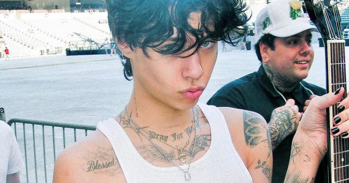
A Highsnobiety portrait shows fine lettering across the upper chest, wing-like shapes spreading toward the shoulders, and floral lines around them. Most of the work is black and grey. The softer shading gives it a worn-in look instead of the bright, hard-edged feel of traditional flash.

The pieces follow the shape of the chest. The lettering sits low, while the wings reach outward and the lines near the collarbone move with the body. The open skin keeps the flowers and script distinct; the darker outlines tie them together. The wings connect the centre of the chest to the floral work on the arms.

Some tattoo coverage describes the chest lettering as a personal phrase, but the photos alone don’t establish what every word means. What they do show is a narrow script, balanced placement, and imagery that reaches toward the shoulders. If you’re planning a similar piece, the body’s shape is a useful starting point before filling in smaller details.

His arm tattoos use floral linework and strong black outlines

Landon Barker tattoos

An E! portrait catches Landon with his forearms crossed, showing the small marks on his hands and larger designs near his wrists. The pieces don’t form a uniform sleeve. Flowers, fine shapes, and heavier outlines sit at different points along the arms and become clearer as he turns toward the camera.

The open skin gives each floral design room. The hand tattoos are smaller and harder to make out from a distance, but they add to the layered look of the arms. A bent elbow also changes what the photo reveals: some forearm ink falls into shadow while the hands come forward.

That is why a sharp close-up can tell you more than an event photo. Blur can turn a fine flower into a dark patch; a clearer portrait shows the lines and gaps around it. With fine-line tattoos, a clean image matters as much as the size of the design.

The useful idea here is the balance between fine floral lines and stronger outlines. It leaves space for additional pieces and gives an artist options for connecting them without making every tattoo look the same.

The face and neck marks keep the look recognisable

Landon Barker tattoos

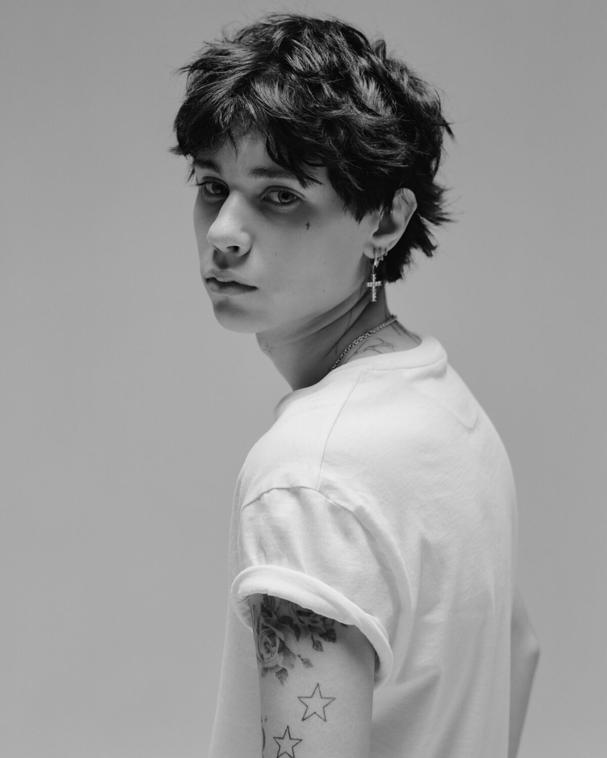
In a black-and-white IMG Models portrait, a small cross sits near Landon’s eye and light lettering runs along his neck beneath the jaw. The marks are small, but their position makes them easy to notice when his hair or jacket covers other tattoos.

There is little room for error with a face tattoo, and even a tiny symbol becomes part of someone’s everyday appearance. The cross stays close to the eye without taking over the portrait. The neck lettering sits lower and can disappear beneath a raised collar.

The restrained scale leaves his features visible while adding a punk edge. A small mark can change the frame of a face more than a much larger design elsewhere.

Some coverage identifies the neck words as a phrase connected with prayer, but the exact story behind each mark isn’t always public. Visually, the lettering is short and close to the jaw; the small cross acts as a distinct detail near the eye.

The shoulder and upper arm tattoos bring in hearts and stars

Landon Barker tattoos

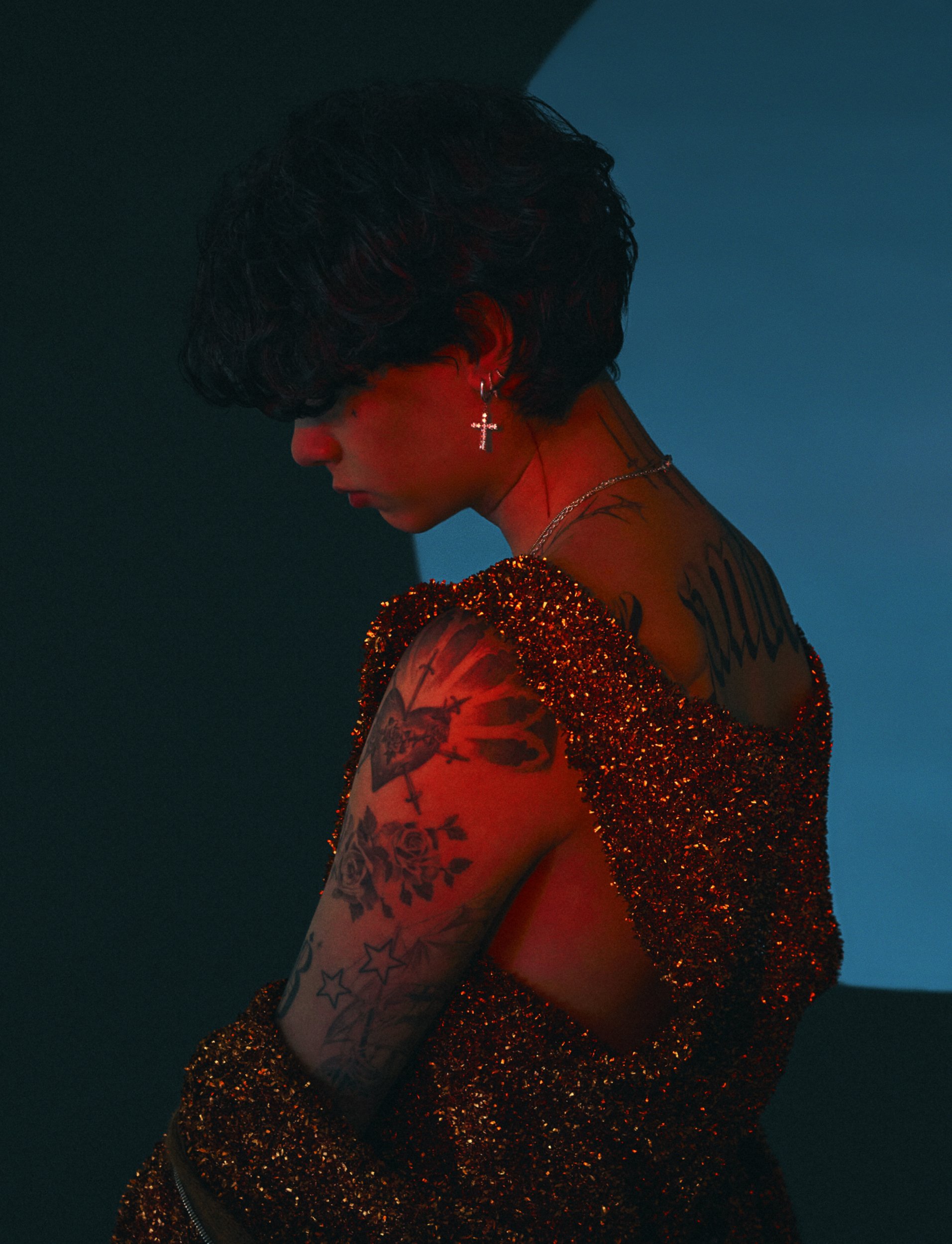
A Flaunt portrait, lit in red and blue, shows a heart-like image near the shoulder, roses on the upper arm, and outlined stars farther down. Dark lettering follows the curve at the back of the shoulder. The lighting makes exact ink colours hard to judge, but the shapes and placement remain visible.

The rounded petals sit beside open star outlines, with the shoulder design adding a denser patch of ink. The stars leave some room around the larger work, so the arm doesn’t read as one solid piece. It looks like separate designs added in layers.

This mix can work when you want several tattoos to feel related without matching exactly. A larger piece can anchor the shoulder while simpler outlines fill space below it. Leaving skin open keeps the designs distinct and leaves room for later additions.

The back and arm work show how the collection grows

Landon Barker tattoos

A Distractify portrait gives a quieter view of Landon’s upper body. It shows the chest lettering, shoulder designs, and floral work on his arms without the bright lighting and styling of the Flaunt photo, making it easier to see how the pieces sit together.

The flowers sit high on the arms, with stars continuing toward the elbows. More detail gathers near the shoulder, then the design opens up lower down. Across the photos, larger images sit near the chest and shoulders while smaller marks appear on the hands and face. Some meanings have been reported; others are visible designs whose stories Landon has kept private.

The collection is easier to read as a set of pieces placed around the body than as one matching sheet of designs. If you like its pop-punk feel, black-and-grey lines, open stars, floral shading, and short lettering offer a direction to explore. The exact placement and symbols can be your own.

More musician tattoo guides

Dominic Fike Tattoos: Face Marks, Chest Ink and Sketchy Arm Designs

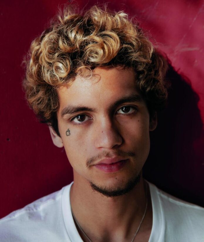
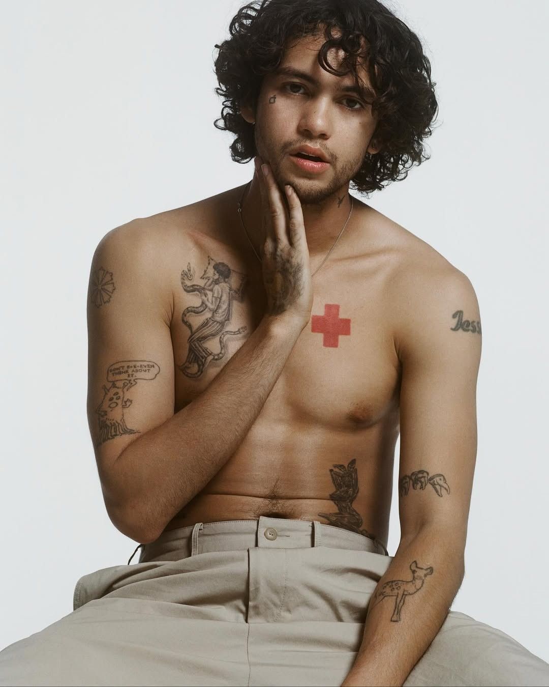
Dominic Fike’s tattoos range from small face marks to a red chest cross, loose arm drawings, hand ink, and larger pieces across his torso. In some photos the collection looks playful; in others, the heavier black work gives it a more serious feel.

The designs don’t follow one style. A fine-line figure sits near the cross, while a small apple and forehead lettering show up in close-ups. His arm tattoos include a speech bubble and cartoon-like figures. The pieces look collected over time, not planned as one matching sleeve.

The clearest portraits show where the tattoos sit and how their lines and spacing work together. Some meanings have been publicly reported, but many are best described by what the photos show.

Dominic Fike’s chest tattoos balance a red cross and fine-line figures

Dominic Fike tattoos: red cross, chest figure, shoulder lettering, and arm artwork

A clear portrait shows a bright red cross high on the right side of Fike’s chest and a detailed black figure on the other side. The contrast is immediate: the cross is a solid, graphic shape, while the figure uses lighter lines that curve and overlap.

The cross gives the chest one strong focal point. Nearby lettering and open skin add detail without crowding it. The larger figure has the feel of a small drawing, which makes an interesting counterpoint to the simple shape of the cross. The contrast between the two is the point.

If you’re considering a similar layout, it helps to plan the pieces together without making them one large design. One image can anchor the chest; finer work can add movement around it. Spacing keeps each tattoo readable.

His shoulder and upper-arm tattoos have a sketchbook feel

Dominic Fike tattoos: fine-line chest figure, shoulder outline, and visible hand ink

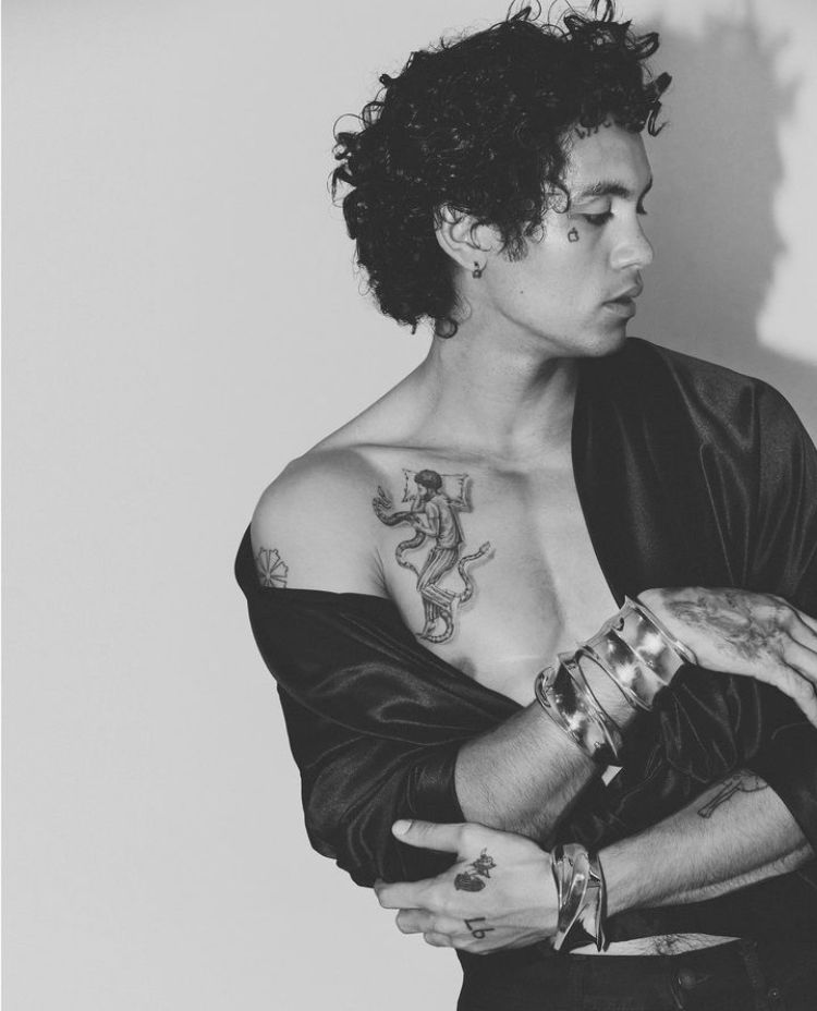
A black-and-white portrait shows the fine-line figure continuing from the upper chest toward the shoulder, with a small flower-like outline near the top of the arm. The loose drawing style gives the work a sketchbook feel.

The chest figure has more detail than the simple shoulder outline. That shift in scale keeps the area from looking flat, and the open space between them lets each one read on its own. A jacket or a turned shoulder can hide part of the work, so the same tattoos look different from one photo to another.

The pieces don’t need to match to sit together. A detailed figure, a simple outline, and space around each can feel more relaxed than a set of designs in one uniform style.

The face tattoos are tiny but instantly recognisable

Dominic Fike tattoos: apple tattoo, forehead lettering, and small eye-area marks

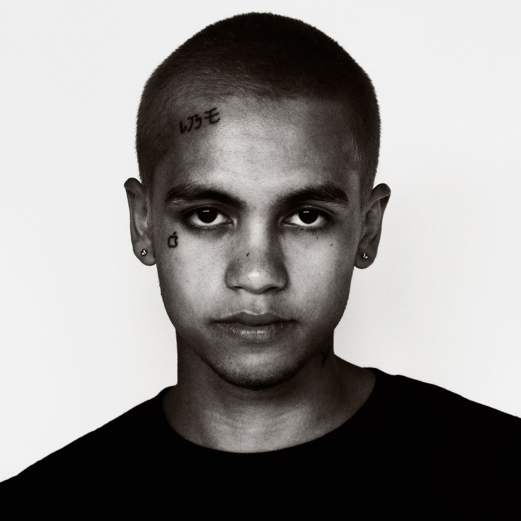
Close-up portraits show a small apple beneath one eye, short characters high on the forehead, and, in some photos, a mark near the other eye. Each tattoo takes up little space, but its position makes it noticeable.

The apple has a compact outline; the forehead lettering runs across the hairline area. Together, the different placements frame the face without filling it. The open space around the marks keeps his features clear.

Face tattoos are harder to conceal than arm or chest work, so a small design still changes someone’s everyday appearance. Fike’s marks are relatively light, leaving his eyes and other features easy to see. Small symbols can have plenty of presence when they’re placed where people look.

If you’re collecting ideas, pay attention to spacing as much as the symbols themselves. A small shape needs to stay readable and sit comfortably beside the eye or brow.

His arm and hand tattoos mix cartoon lines with loose lettering

Dominic Fike tattoos: flower-like shoulder design, speech bubble, figures, and forearm ink

In performance photos, sleeveless tops show a flower-like shoulder design, a speech bubble on the upper arm, small figures, and ink extending toward the forearm. The tattoos sit at different angles with skin between them instead of forming one continuous sleeve.

The speech bubble has a hand-drawn outline and block lettering. It looks closer to a doodle than formal type, in keeping with the casual lines of the other small designs.

Movement changes what a photo reveals. A bent elbow can hide part of the forearm while bringing the hand closer to the camera. Stage lights soften some fine lines, but the larger shapes still show. The open gaps give the smaller pieces room to read.

For a similar arrangement, one or two larger designs can sit among smaller marks. Lettering needs enough space around it to stay distinct from nearby ink.

The full torso layout shows how the tattoos build over time

Dominic Fike tattoos: chest cross, torso figure, forearms, hands, and asymmetrical placement

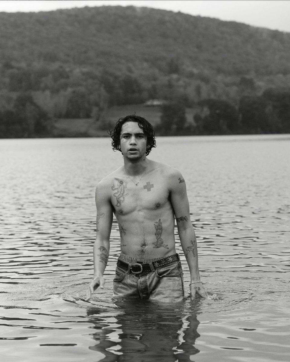
A black-and-white lake portrait shows the red cross, chest figure, shoulder outlines, forearm designs, lower-torso work, and smaller marks near the hands in one view. It makes the relationship between the tattoos easier to see than a close crop of any single design.

The strongest contrast sits across the chest, with darker illustrative work lower on the torso and smaller marks on the arms. The sides aren’t mirrored; each has a different amount of ink. That uneven layout makes the collection feel as if it grew piece by piece.

Some areas hold larger images while others carry smaller tattoos. You don’t need to fill both sides equally for a body layout to feel balanced; the size and position of each design can do that work. The lines also vary from one tattoo to another, but the open, hand-drawn look gives them something in common.

Fike’s collection puts the smallest marks on the face, clusters of casual drawings on the arms, and the clearest statement pieces on the chest. The designs aren’t perfectly coordinated, yet the different areas each have their own role. That loose approach leaves room for new work without forcing every tattoo into the same style.

More musician tattoo guides

Nessa Barrett Tattoos: Fine-Line Scripts, Butterflies and Arm Ink

Nessa Barrett’s tattoos are mostly fine-line designs: short scripts near the collarbone, butterflies and flowers on the arms, small hand symbols, and a skeletal hand on the forearm. In a close portrait the details look delicate; under concert lights, the marks read as a larger pattern when she moves.

The pieces leave plenty of skin open, so they don’t form one solid sleeve. Some meanings may be personal, but the photos show placement more clearly than intent. The descriptions below focus on what can be seen in portraits and performance shots.

Nessa Barrett’s collarbone tattoos use tiny script and open skin

Nessa Barrett tattoos: collarbone lettering, shoulder flower, and fine-line chest marks

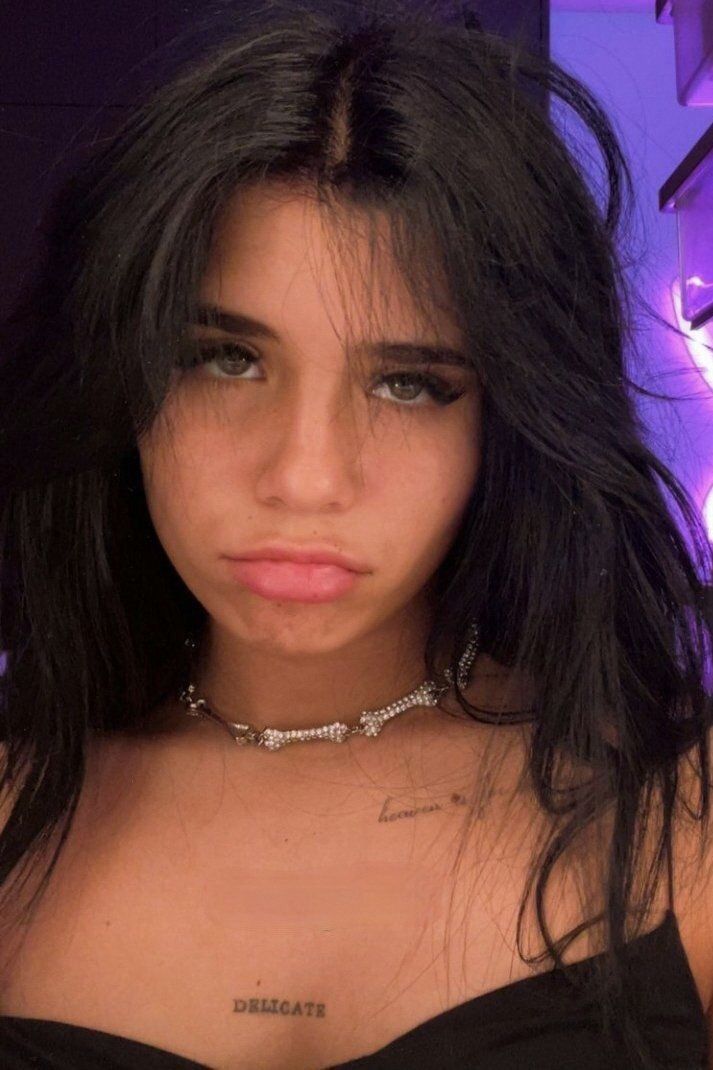
A close selfie shows thin lettering just below Nessa’s collarbone and another short script mark near the shoulder. A small flower-like design sits nearby. The tattoos follow the line of the upper chest instead of filling it with a dark block.

The words can be easy to miss beneath a neckline or necklace, but stand out when the chest is uncovered. The open skin keeps the separate marks clear. That matters with fine script, since tiny letters can soften over time.

For a similar placement, follow the collarbone’s curve and keep the phrase short. A little flower or symbol can sit beside it without crowding the area.

Her shoulder tattoos mix butterflies with small floral details

Nessa Barrett tattoos: butterflies, floral outlines, and shoulder symbols

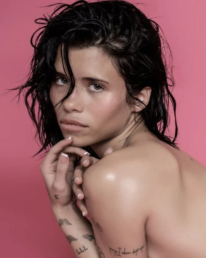
A performance portrait shows small butterflies, a flower outline, and other light symbols across Nessa’s upper arm. Each design is modest in size, but together they form a pattern when she raises the microphone or brings a hand toward her chest.

Butterfly wings give a fine-line tattoo a shape that’s easy to recognise. The nearby flowers and symbols add detail without taking attention from the butterflies. Concert lighting can soften the lines, while close photos bring out their outlines.

The designs shift as her shoulder moves. A few separated pieces can cover the area without becoming a dense patch of ink.

Her forearm tattoos include a skeletal hand, teeth, and tiny symbols

Nessa Barrett tattoos: skeletal hand, tooth, birds, and small forearm symbols

A monochrome selfie shows a skeletal hand among small birds, a tooth-like shape, and other simple marks on Nessa’s forearm. They sit at different heights rather than in neat rows, giving the arm a collected look.

The skeletal hand is the clearest piece, with a stronger outline than the smaller symbols around it. That gives the eye a place to land; the lighter marks add detail above and below. One distinct design can hold a group of smaller tattoos together.

The forearm offers a long strip for arranging pieces, but they don’t have to line up or match the other arm. Leaving gaps also makes it easier to add tattoos later without crowding the existing work.

The hand tattoos keep the collection personal and easy to spot

Nessa Barrett tattoos: arm lettering, butterflies, hand symbols, and wrist ink

Concert photos show thin marks across Nessa’s fingers and the back of her hand, with more ink near the wrist. The small designs aren’t always sharp enough to identify from a distance, but their placement is visible when she lifts the microphone or reaches toward the audience.

Hand tattoos move with the fingers. A mark across a knuckle shifts when the hand closes, and a butterfly can look different when the fingers curl. Nessa’s light designs don’t form a solid band of ink.

Some lines continue toward the wrist, while other pieces stop before the joint. Those small breaks keep the hand and forearm from blending into one busy area.

Fine details on hands can be hard to read in motion and may blur over time. Simple shapes and clear spacing are easier to make out than crowded lettering.

Her full arm and leg layout shows how fine-line ink grows over time

Nessa Barrett tattoos: fine-line arm collection, script, butterflies, and leg tattoos

A tour photo shows the broader layout: script, butterflies, small objects, and larger patches run from Nessa’s shoulders toward her wrists. The same image shows tattoos on her legs, extending the collection beyond her arms.

Some areas of each arm are more crowded than others. Those clusters sit beside open sections that give the eye a break. The leg pieces use larger, darker shapes, so they look different from the fine-line work above.

The collection isn’t symmetrical. One arm can carry more small symbols while the other stays quieter; script and butterflies don’t need to mirror each other to fit together. Each part of the body has its own mix of designs.

Across the photos, the recurring choices are fine lines, compact shapes, and room between pieces. The tattoos look different beneath a stage outfit or in a close selfie, and concert lighting can obscure details that a sharp portrait shows. Together, the different views give a more useful sense of their placement.

More musician tattoo guides

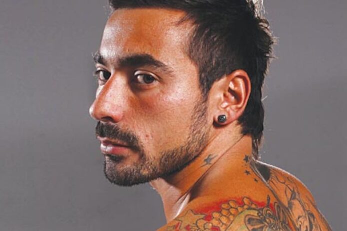
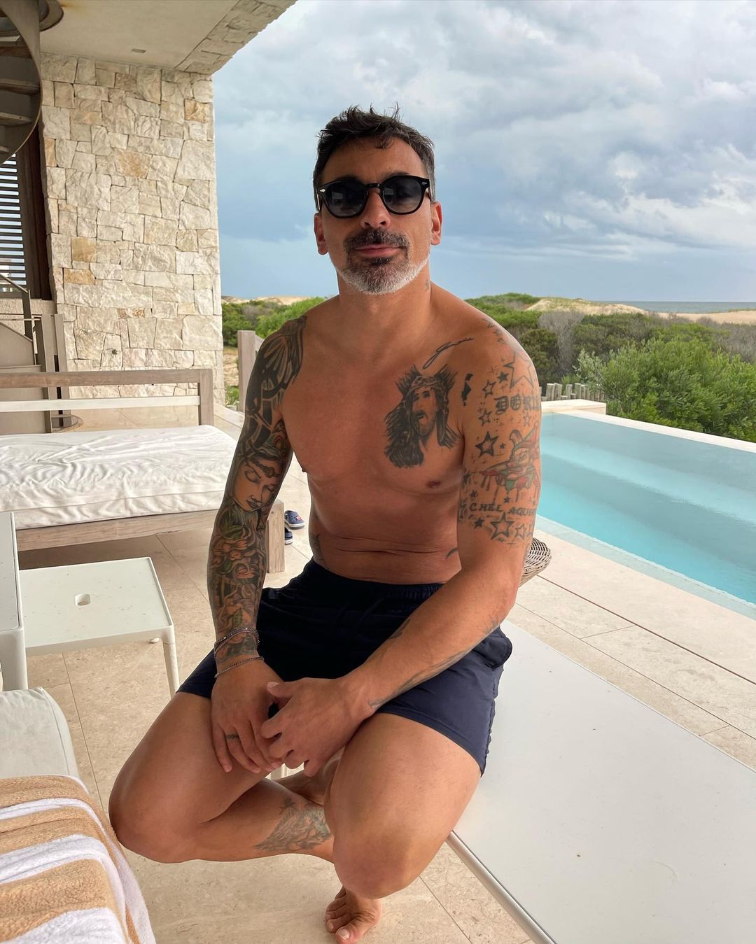
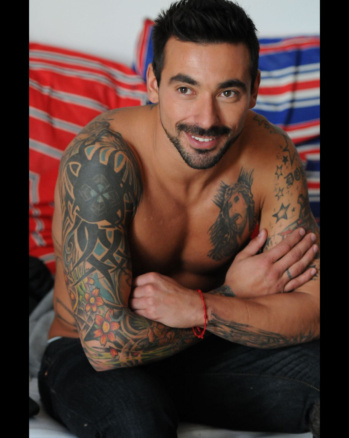
Ezequiel Lavezzi Tattoos: Jesus Chest Ink and Colorful Sleeves

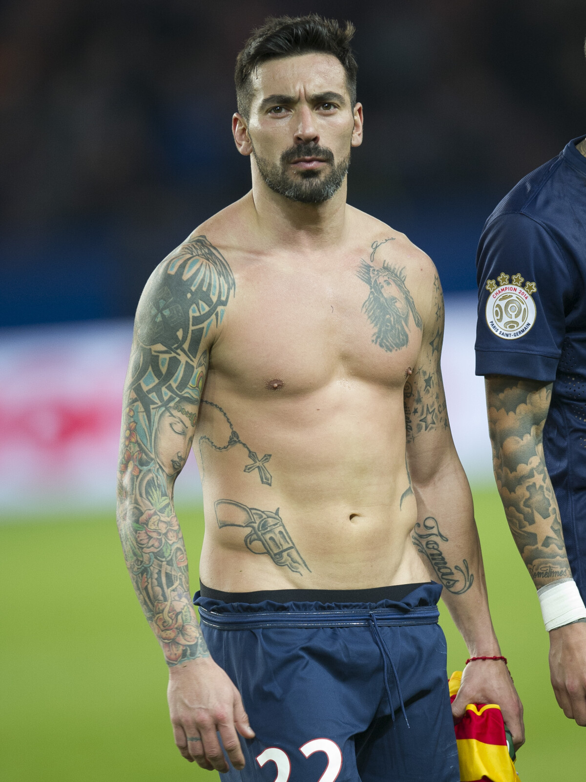
Ezequiel Lavezzi’s tattoos include a large religious portrait on his chest, colorful work along his arms, and smaller stars and lettering. Match-day, training, and off-duty photos show different parts of the collection, so its layout is easier to see across several images than in one posed shot.

A Jesus portrait anchors the chest, while color and shading carry down the sleeves. Stars, words, and smaller symbols fill some of the spaces between. The sections have their own look, but together they form a loose arrangement across his upper body.

Ezequiel Lavezzi Jesus chest tattoo

Ezequiel Lavezzi tattoos: large match-day portrait showing the Jesus chest portrait and torso layout

The Jesus portrait sits high on Lavezzi’s chest and is the first detail that stands out. Soft shading surrounds the face, while stronger areas of ink cover the shoulders and upper arms. The portrait has a clear outline, so it remains visible in a wider match photo.

A face tattoo depends on its overall shape as well as small details. Here, the face, hair, and shading make a recognizable form that fades toward the surrounding work. The portrait has room to stand out without the nearby tattoos competing with it.

The chest gives the image space, and the design can reach toward the shoulders without turning the front of the body into one solid block. The way a portrait looks will change as the chest and arms move, so placement needs to account for more than a still pose.

Religious tattoos can be small symbols or larger portraits. Lavezzi’s piece is at the larger, realistic end of that range. Smaller crosses, stars, or lettering can sit around a main image, but the portrait is the clear center here.

Ezequiel Lavezzi colorful sleeve tattoos

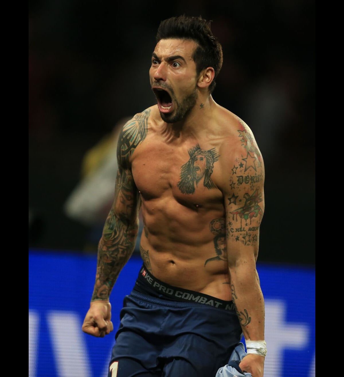
Ezequiel Lavezzi tattoos: high-resolution celebration photo showing colorful sleeves, chest and shoulder ink

The sleeves bring most of the color. Flowers, leaves, faces, geometric shapes, and darker sections overlap along the arms. Reds and greens sit beside warm tones and dark outlines, giving the work a traditional tattoo feel even as the subjects change.

The color appears in groups rather than scattered evenly. Blackwork and grey shading give those brighter patches definition. Repeating a few colors can help separate designs feel related without forcing them all into the same subject. Color can connect a sleeve even when its images differ.

The placement changes as Lavezzi raises or bends his arm. A flower or portrait may be partly hidden when the arm is down, then become more prominent in another pose. The sleeve has to read around the front, side, and back of the arm, not just as a flat image.

Some skin remains visible between the flowers, outlines, and shaded areas. Those gaps help the separate designs stay clear. A sleeve can feel full without every part of the arm carrying the same density of ink.

Ezequiel Lavezzi stars and lettering tattoos

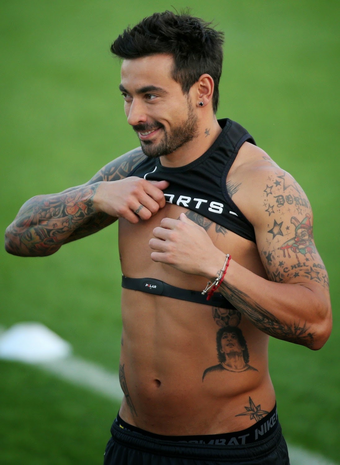
Ezequiel Lavezzi tattoos: full-resolution training image showing stars, lettering, symbols and arm coverage

Stars and lettering sit around Lavezzi’s larger arm designs, including near the shoulder and wrist. Some marks are bold; others are words or names. They add smaller points of detail between the more elaborate images.

Stars can fit into narrow gaps or sit beside a portrait as a larger mark. In these photos, they work as part of the sleeve’s texture rather than taking over the composition.

Lettering adds a readable element. It may be a name, date, or short phrase, but the exact words should be checked in a clear image before assigning meaning. Small script needs enough space to remain legible. A line that looks delicate in a fresh photo can be difficult to read if the letters are crowded.

Placement matters as much as font. Some of Lavezzi’s visible words follow the arm rather than running in a stiff straight line. A phrase should be tested at its actual size and position, since it can look different once it curves around the body.

Ezequiel Lavezzi torso and side tattoos

Ezequiel Lavezzi tattoos: natural-light pool portrait showing chest, shoulder and side tattoo placement

Wider torso photos show ink extending from the chest toward the ribs and stomach. Smaller images and lettering fill the sides below the main portrait. A cross, a lower-torso symbol, and shaded figures lead the eye down toward the waist.

The body changes shape when a person sits, twists, or breathes, so the placement looks different in each pose. In these photos, larger images sit on the broader areas, while smaller designs continue around the sides. The lines follow the torso rather than forming a straight grid.

The transitions between chest and shoulder work also matter. A few symbols, vines, or shading can soften where a portrait meets a sleeve, though some open skin keeps the larger designs readable.

Natural light can reveal shading that stadium or indoor lighting obscures. Looking at photos in different settings gives a better sense of which details belong to the tattoo and which are effects of the light.

Ezequiel Lavezzi neck and shoulder tattoo flow

Ezequiel Lavezzi tattoos: separate high-resolution portrait showing neck star, shoulder and sleeve transition

A small star near the neck, the shading on the shoulder, and the top of the sleeve link the chest and arms in a three-quarter view. These marks are smaller than the Jesus portrait, but they help the separate areas sit together.

The shoulder design follows its rounded edge before continuing down into the sleeve. That transition keeps the arm from looking divided into front and back. Neck tattoos are more exposed: a single star or short mark can be distinct, while too many small designs may crowd the area. The small marks work best when they have room around them.

Older photos show that the collection has changed over time. Lighting, angle, and the stage of the tattoos can make the same area look different. These images capture a collection that has grown, rather than one finished design.
A relaxed way to build a collection

Lavezzi’s tattoos have a loose structure: the chest portrait draws the eye, color and shading fill the sleeves, and stars and lettering sit among the larger pieces. The torso and shoulders connect those areas without making every tattoo look alike.

His collection can offer placement ideas, but it isn’t a template to copy. A main image can guide the rest of the layout; color, open skin, and smaller marks can be considered as the work grows. Large portraits and sleeves take time to plan, and healed examples show how the ink looks beyond a fresh photo.

The official PSG interview below offers more football context. The photos show how the tattoos look in different lighting and poses, which is useful when comparing placement and contrast.

More athlete tattoo guides

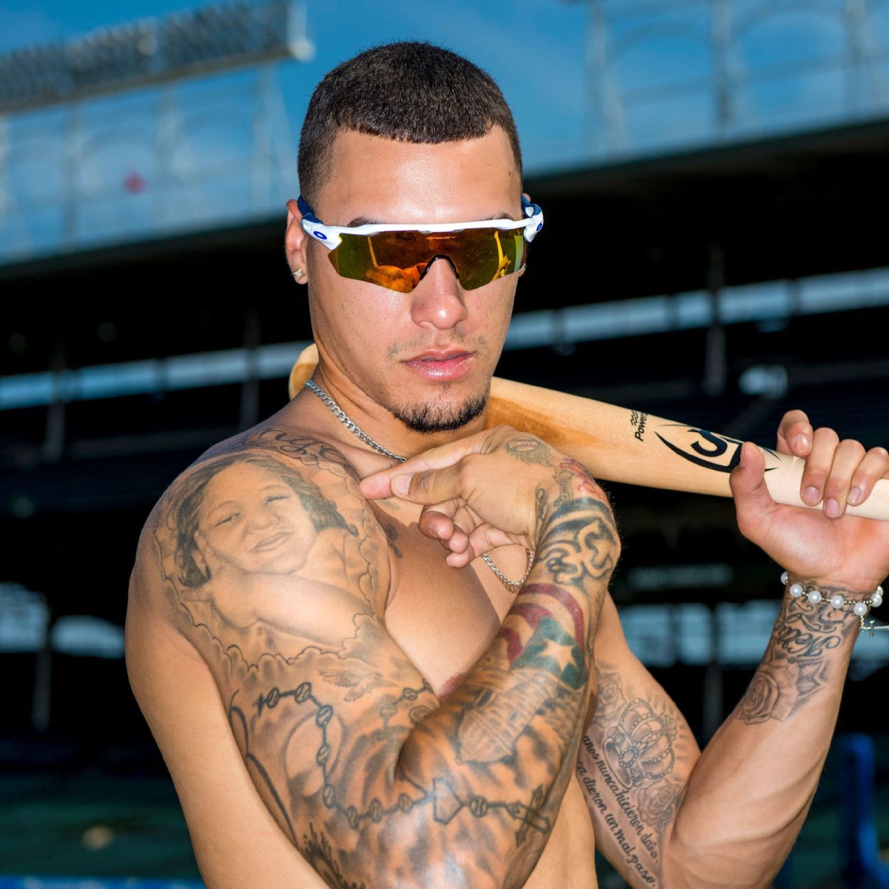
Javier Baez Tattoos: Family Portraits, Puerto Rico and Baseball Ink

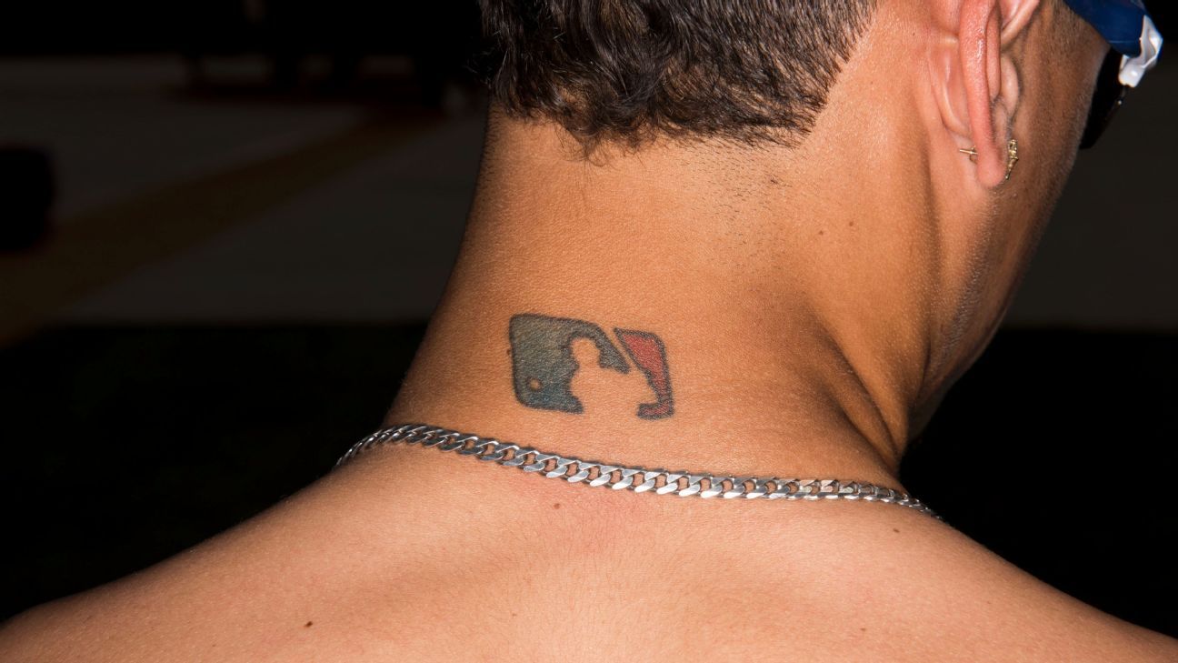
Javier Báez’s tattoos bring together family, Puerto Rico, baseball, and playful details. Most of the collection is on his arms, though a small MLB logo at the back of his neck connects it to the sport he shares with his brothers and cousins. Portraits, hometown symbols, lettering, and career memories sit alongside one another without all using the same style.

Some pieces are black and grey, while others use red or blue. The collection is busy, but the designs still have room to read on their own. That mix of personal subjects and varied styles is the clearest thread through Báez’s tattoos.

Javier Baez family and shoulder tattoos

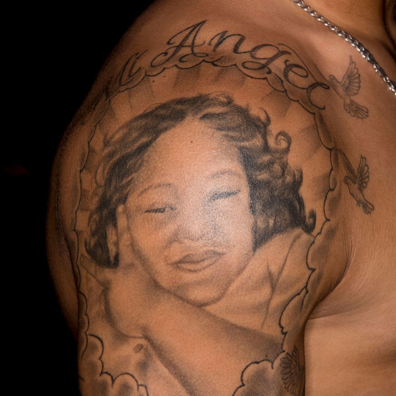
The shoulders and upper arms hold some of the collection’s most personal work. One shoulder carries a portrait of Báez’s late sister Noely; other pieces connect to his parents, siblings, and people close to him. The placement gives a larger portrait room, with space to carry shading down the upper arm.

A portrait needs clear facial features, so squeezing it among too many other designs can make the eyes and mouth harder to read. Báez’s nearby script and small symbols leave the face as the focus while adding detail around it. Family portraits can sit beside other tattoos when the surrounding lines and shading frame the image instead of covering it.

Javier Baez tattoos: Javier Baez family and shoulder tattoos

Javier Baez Puerto Rico arm tattoos

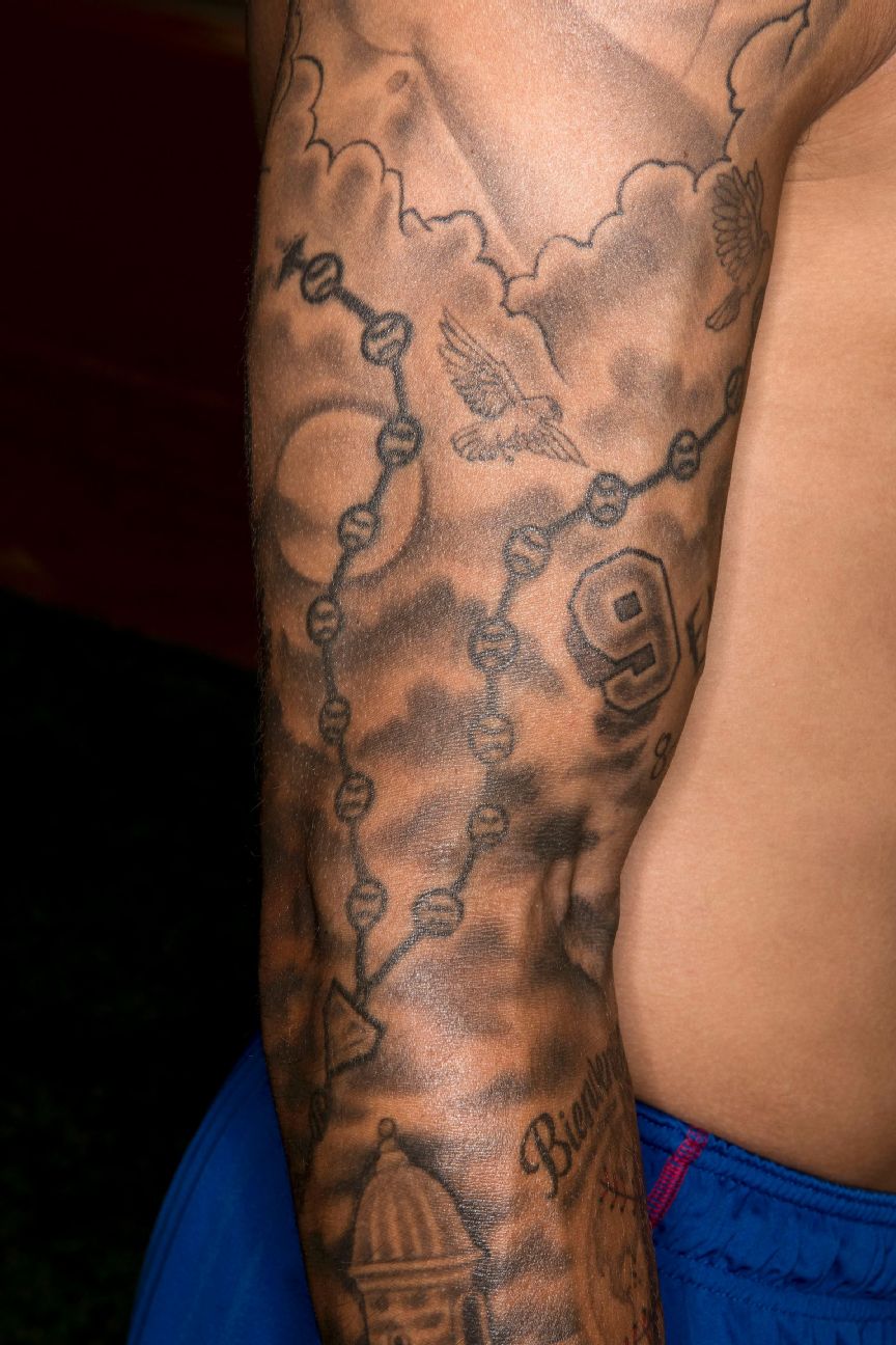
Báez’s arm work includes Puerto Rican references such as a garita, the sentry box found at old Spanish forts, along with nature and hometown symbols. Those details give the sleeve a connection to a specific place rather than a set of unrelated images.

The objects are recognizable and sit beside lettering and other designs. Choosing a local building, flower, bird, or landscape can give a sleeve a similar sense of place; the style can be realistic, traditional, or fine-line.

Javier Baez tattoos: Javier Baez Puerto Rico arm symbols

Javier Baez MLB neck tattoo

The MLB logo at the back of Báez’s neck was his first tattoo. He has said that his brothers and cousins got the same mark because baseball has long been part of their lives. It is small, but its position keeps it visible in photos, on the field, and in everyday life.

The clean emblem stands apart from the denser arm work. The MLB logo marks a shared memory without taking up much space. Its simple shape also suits the curve of the neck.

Javier Baez tattoos: Javier Baez MLB neck tattoo

Javier Baez sister portrait tattoo

The portrait of Noely is one of the collection’s clearest tributes. The border gives her face a defined edge, while the soft shading keeps it from looking pasted onto the shoulder among the sports-related designs.

A portrait depends on a clear reference and enough open space around the face. Báez’s portrait shows why the eyes and other features should stay clear of dense filler. The sister portrait remains the focus, with the surrounding work kept secondary.

Javier Baez tattoos: Javier Baez sister portrait tattoo

Javier Baez roses, crown and Spanish quote tattoos

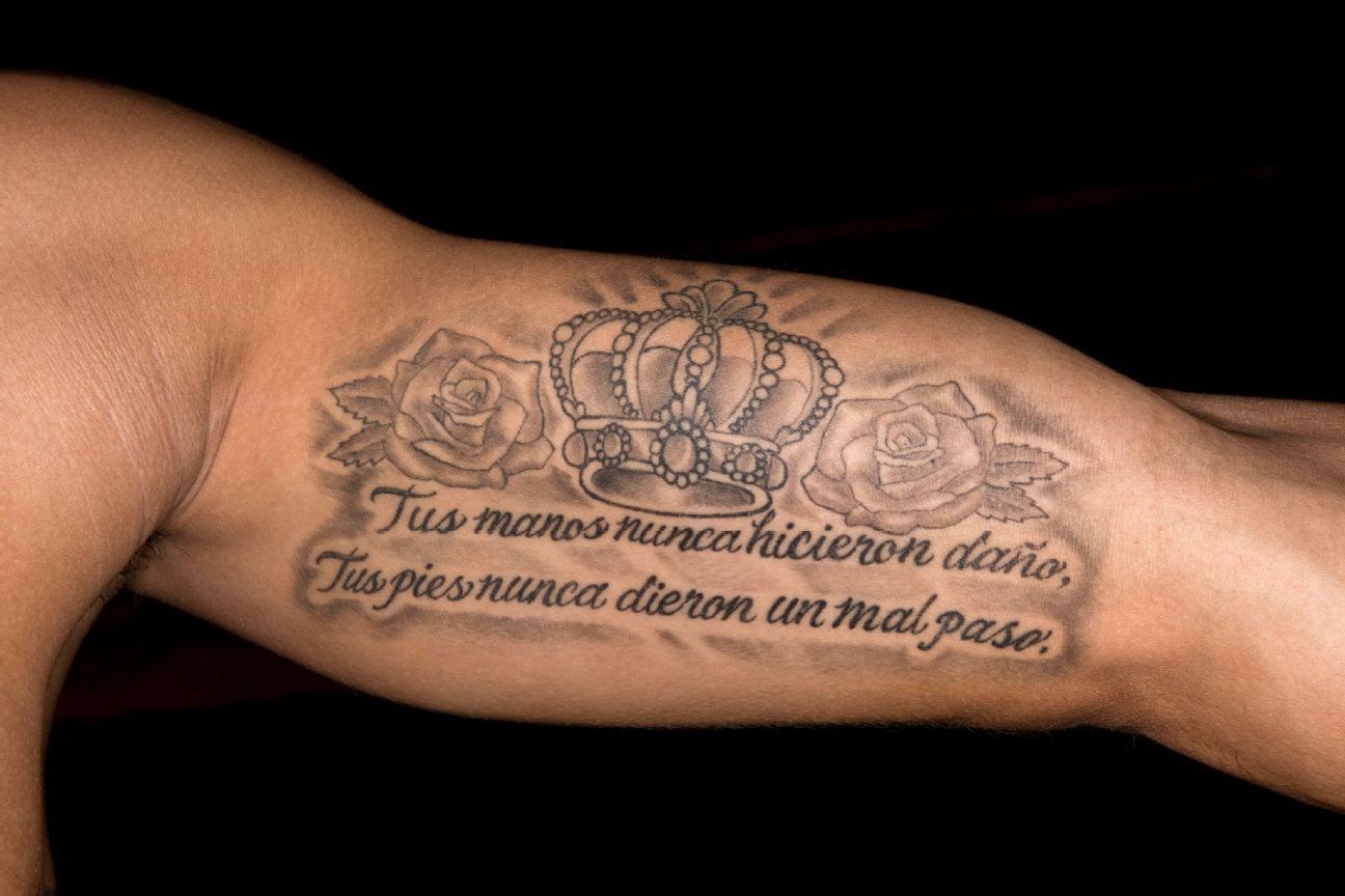
A close-up shows a crown framed by roses above a Spanish quote on Báez’s upper arm. The lettering forms a horizontal block, while the flowers soften its edges. The script needs room between lines to remain readable.

The crown and roses decorate the quote without overwhelming it. If you’re planning a similar piece, decide whether the words or flowers should lead. A short phrase such as “Mi mundo” can give the composition a clear shape to build around.

Javier Baez tattoos: Javier Baez roses crown and Spanish quote tattoos

Planning the pieces together

Báez’s collection puts family portraits beside Puerto Rican references and baseball marks. A mostly black-and-grey base, a few color accents, or repeated framing can help different tattoos sit together. Start with one important piece and let the rest build around it rather than copying his exact images.

Placement changes how the work reads. A shoulder portrait follows the rounded cap of the arm; a forearm quote needs enough length to remain legible. Small marks near the wrist or elbow can connect larger designs. Looking at the arm from several angles helps catch crowding that isn’t obvious in a front-facing photo.

Some tattoos, like the neck logo, are always visible; others can stay covered by clothing. That lets a collection hold both public and private memories. For lettering, check the spelling and test the font at the intended size on the body. A phrase that looks elegant on a screen can become too thin or crowded on skin.

Color can be a small accent in an otherwise black-and-grey sleeve. A red or blue detail may be enough to lift the composition, especially if the color is repeated carefully. Leave some open skin for clarity and for future work instead of filling every gap at the first appointment.

For portraits or fine script, look at healed work by the artist, not only fresh photos. Bring references that explain the idea, then let the design be adjusted to fit your body. Báez’s tattoos show how family, hometown, and baseball can share space when each image has room and the layout works from more than one angle.

More athlete tattoo guides

Ryan Garcia Tattoos: Lions, Crowns, Script and Boxing Ink

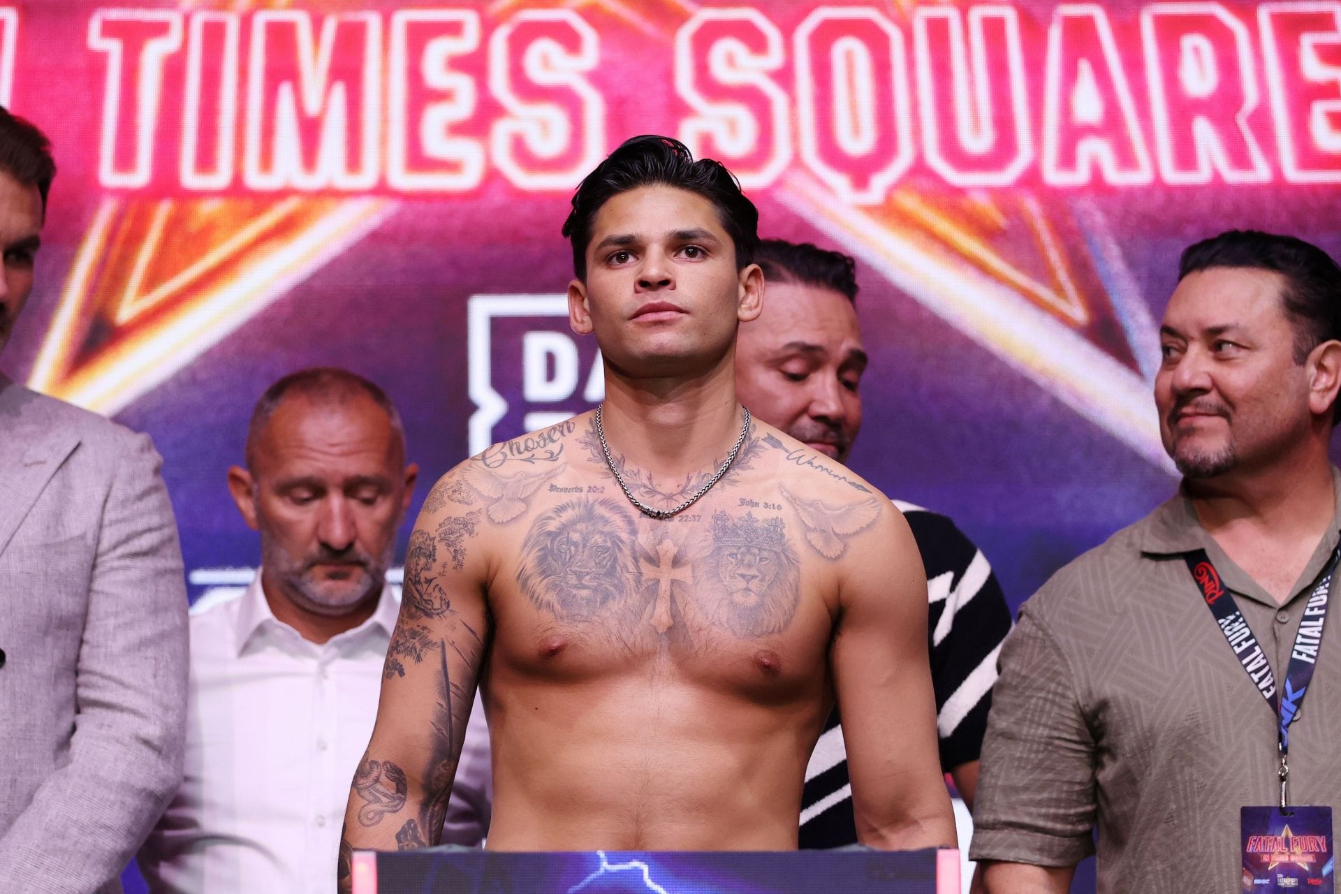
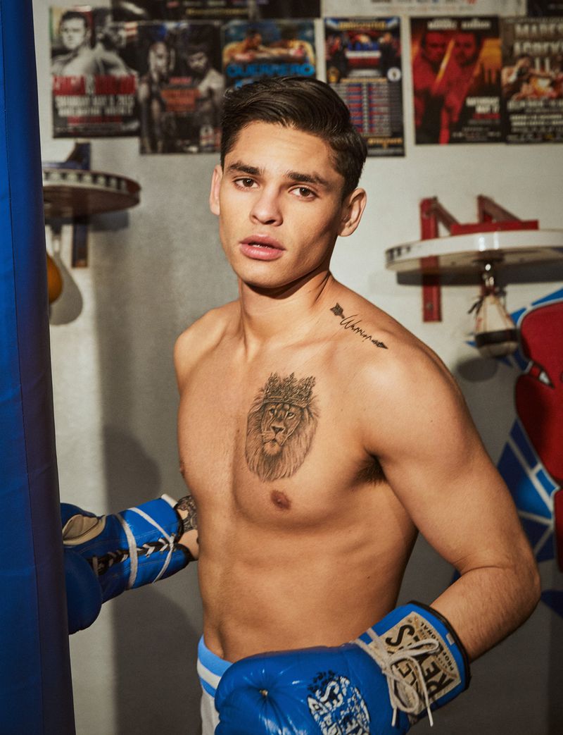
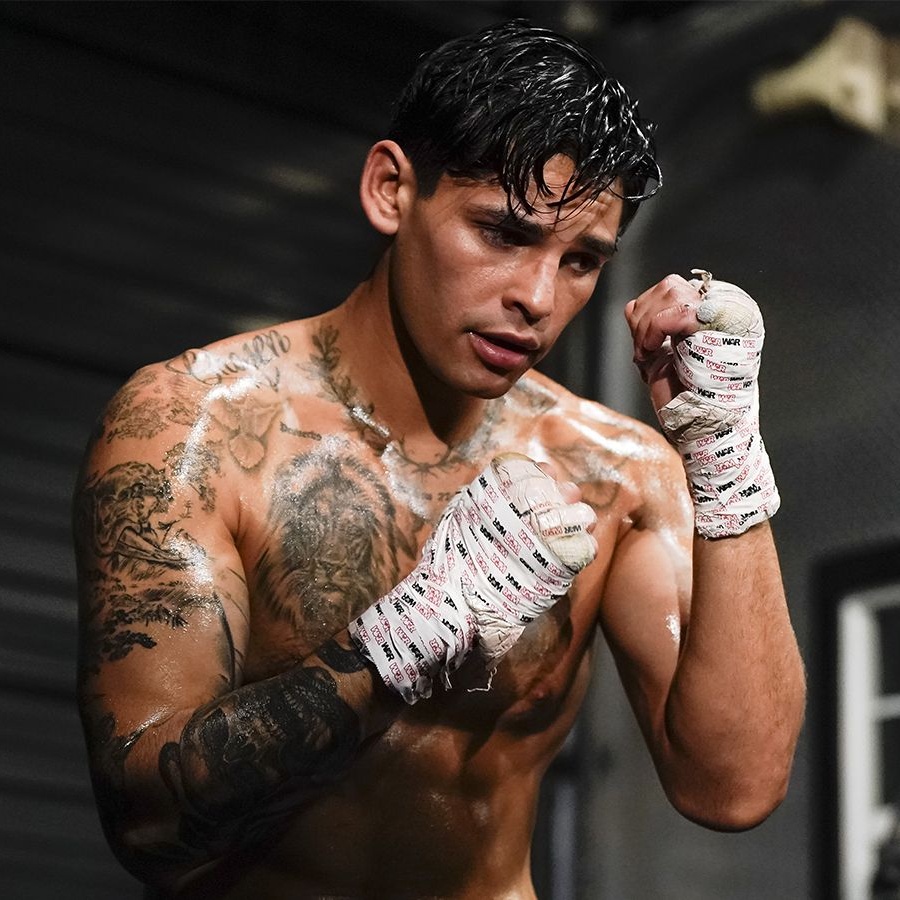
Ryan Garcia’s tattoos include twin lions across the chest, script near the shoulders, and a large back piece built around a sword and crowns. The collection also has smaller references to faith and boxing. His chest and back hold the largest designs, while the shoulders and upper arms carry lettering and other details.

The tattoos have grown over time. Earlier pieces were more separate; later work filled the chest, shoulders, arms, and back. Across the photos, the larger images remain easiest to identify, while the smaller marks add detail around them.
Placement is a big part of how the collection reads. A chest design has to work across the pectorals, and a back piece follows the spine and shoulder blades. The images below show different parts of the layout.

Ryan Garcia lion chest tattoos

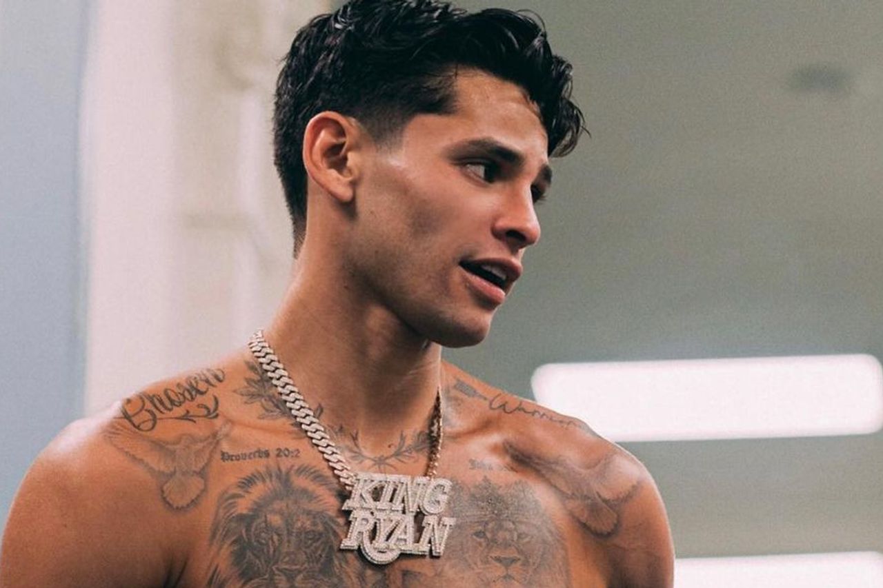
The twin lion portraits sit across the chest, one on each side, with a cross and short scripture references between them. The faces are large enough to read from a distance, while their shading is clearer in close photos.

The two lions can be read as one chest composition, with the cross connecting them. The central symbol and script sit between the faces without taking over the design. The portraits need room around their features so the shading and outlines remain clear.

Ryan Garcia tattoos: twin lions, scripture and arm work

Ryan Garcia shoulder script and collarbone ink

Script runs along Garcia’s upper shoulder, with leaves, dates, and short Bible references near the top edge of the chest design. These smaller details frame the lions rather than compete with them.

Short lettering can fit along the curve of the collarbone without turning into a solid band of text. The phrase needs to be sized for the space and remain readable when the shoulder is relaxed. The body’s curve is part of the placement.

A line of script can also connect work done at different times. The letter style and spacing can relate to an existing chest piece while still giving the shoulder its own detail.

Ryan Garcia tattoos: lion chest tattoo and shoulder script

Ryan Garcia chest and shoulder layout

From the front, the collection includes more than the lion portraits. Script and ornamental details sit on the shoulders, darker ink covers the upper arms, and religious imagery and shading fill the space between the larger chest designs.

The mix of large faces and smaller marks keeps the chest from reading as one uninterrupted block. When tattoos are added over time, matching every line isn’t necessary; a shared black-and-grey finish or related lettering can help them sit together. Open skin around the collarbones and upper arms helps separate the designs.

Photos taken with the arms relaxed, raised, or turned show how the shapes shift across the chest and shoulders. A layout should look balanced in ordinary posture as well as in a flexed pose.

Ryan Garcia tattoos: upper arm sleeve and wet-fight chest view

Ryan Garcia script and faith references

Short phrases and Bible references appear around Garcia’s chest and shoulders. They add a personal element beside the larger portraits, though the photos alone can’t explain what each line means to him.

For lettering, the wording should still matter to you years later. A short phrase, date, or reference can fit more easily than a long quote. Shorter text also gives the artist more room to adjust the size and placement.

Think about whether the words should be immediately readable to other people or mainly serve as a private reminder. That choice affects how large they need to be and where they sit.

Ryan Garcia tattoos: lion chest and collarbone script

Ryan Garcia crowns and sword back tattoo

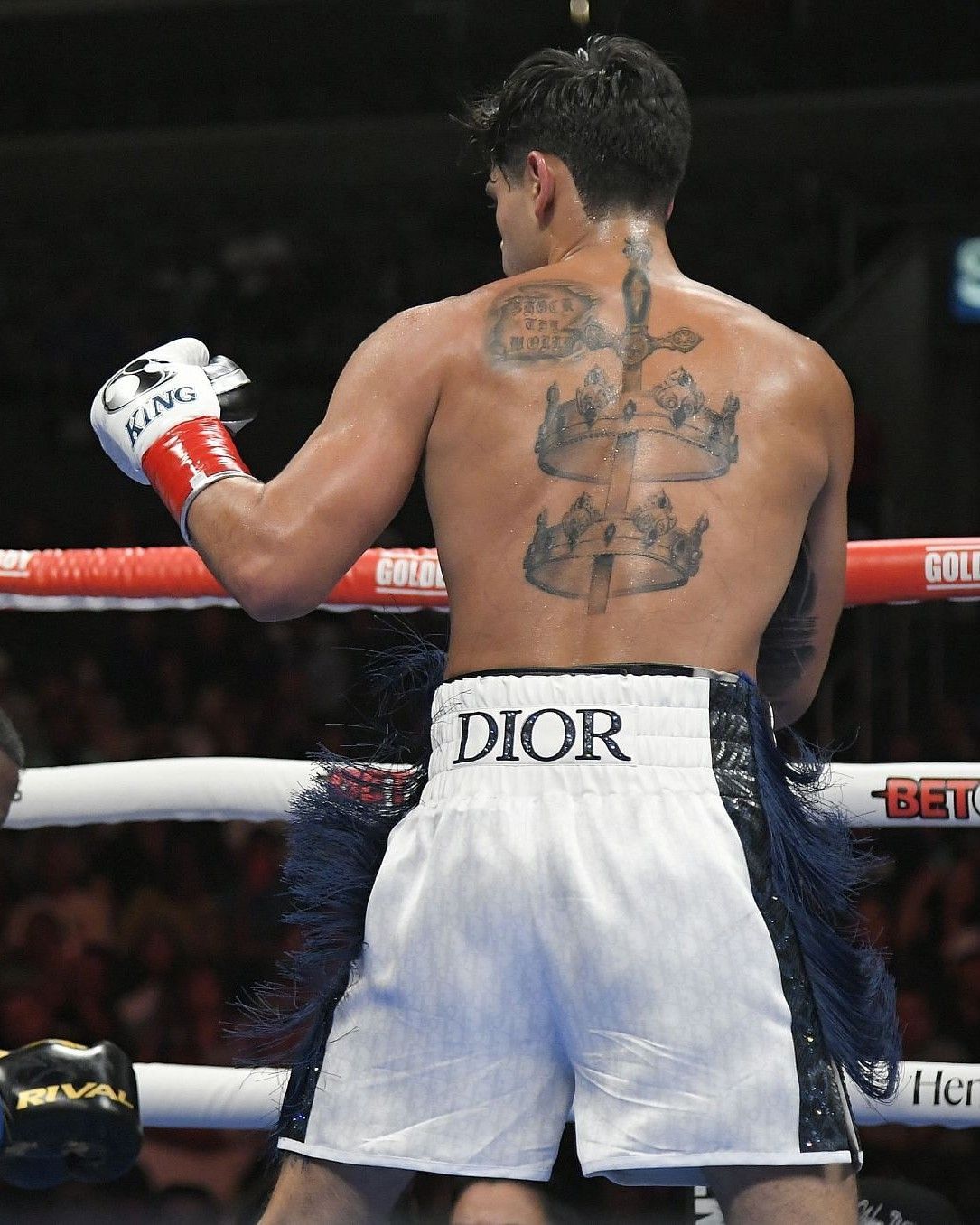
Garcia’s back piece is built around a sword running down the centre, with crowns across the upper and middle back. Above them, the words “SHOCK THE WORLD” sit near the shoulders. From a distance the design reads as one tall shape; closer photos show more of the lettering and crown details.

The sword gives the layout a central line, while the crowns spread it across the shoulder blades. A large back piece needs a clear outline and careful spacing so its main shape stays visible as the body moves.

Back work can take several sessions. Looking at an artist’s healed pieces and settling the main silhouette before adding small details can help keep the design coherent if shoulder or rib work is added later.

Ryan Garcia tattoos: crowns and sword back piece

Making the layout your own

Garcia’s chest portraits, shoulder script, and back piece have different roles, but the bold black-and-grey shading gives them a shared look. The front holds the lions and lettering; the back carries a vertical design across the shoulder blades.

You can take the same approach to planning without copying the images. Start with a subject that matters to you, then add supporting symbols that fit alongside it. A family portrait, a hometown reference, or a short phrase can take the place of a lion, crown, or scripture line.

Bring clear references and consider which pieces you want visible in everyday clothes. Ask the artist to map the placement and explain how the lines may age. Leave room for future work if you want to add to the collection later.

More athlete tattoo guides

Megan Anderson Tattoos: Sleeves, Florals, Skulls and Fighter Ink

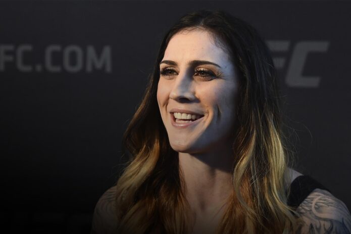
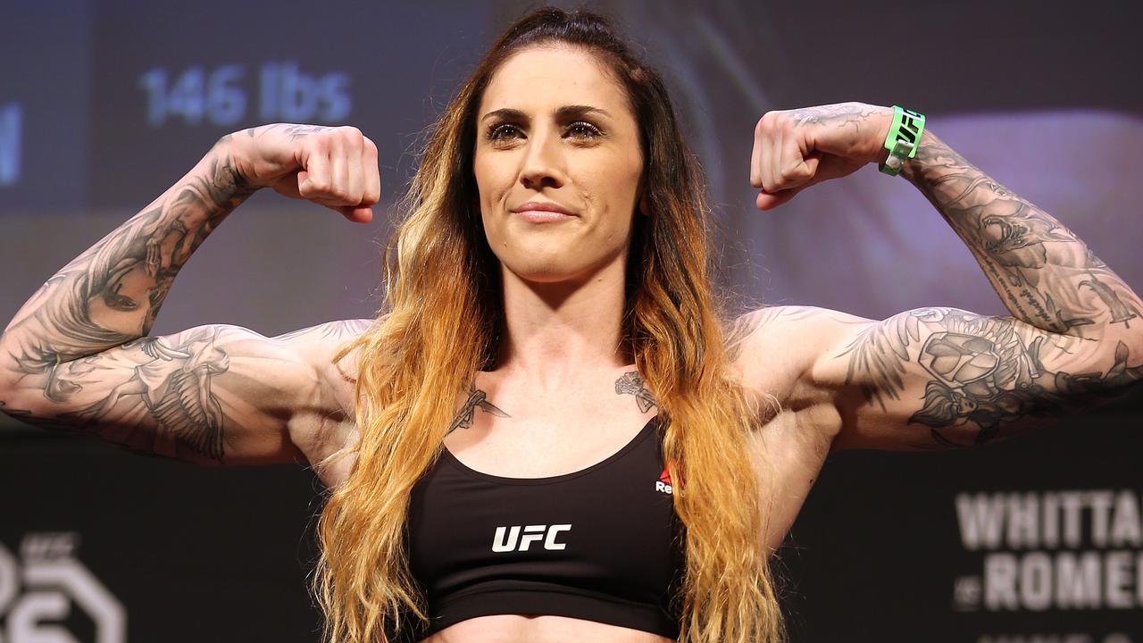
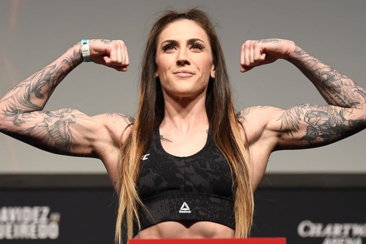
Megan Anderson’s tattoos include floral work, skulls, animal and fantasy-style designs, with smaller pieces on her chest, neck, and lower body. Most of the collection is on her arms. The photos show flowers, faces, leaves, and darker shapes layered together, rather than one repeated motif.

The sleeves set the overall look; tattoos on her chest and shoulders connect the two arms. Some designs use color, while others rely on black outlines and shading. Different photos show how the placement changes as she moves and turns.

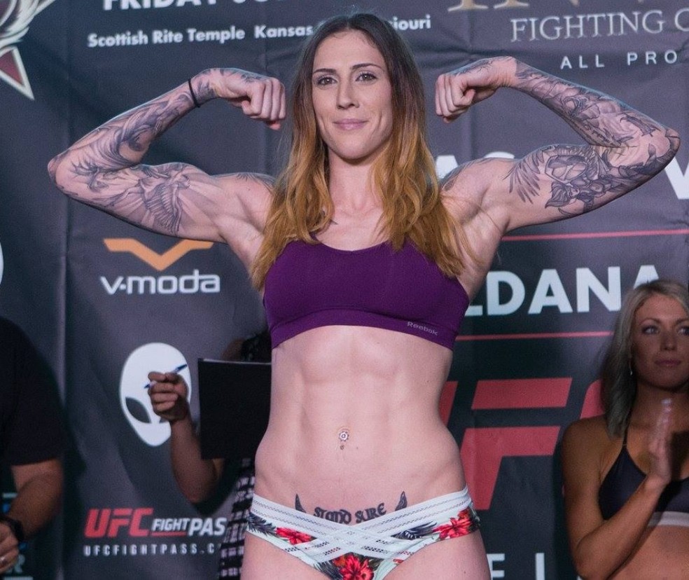
A weigh-in photo shows the front and shoulder placement; personal portraits offer a closer view of the separate designs. What can look like one dark patch from a distance resolves into smaller images and lines up close.

Megan Anderson full arm sleeve tattoos

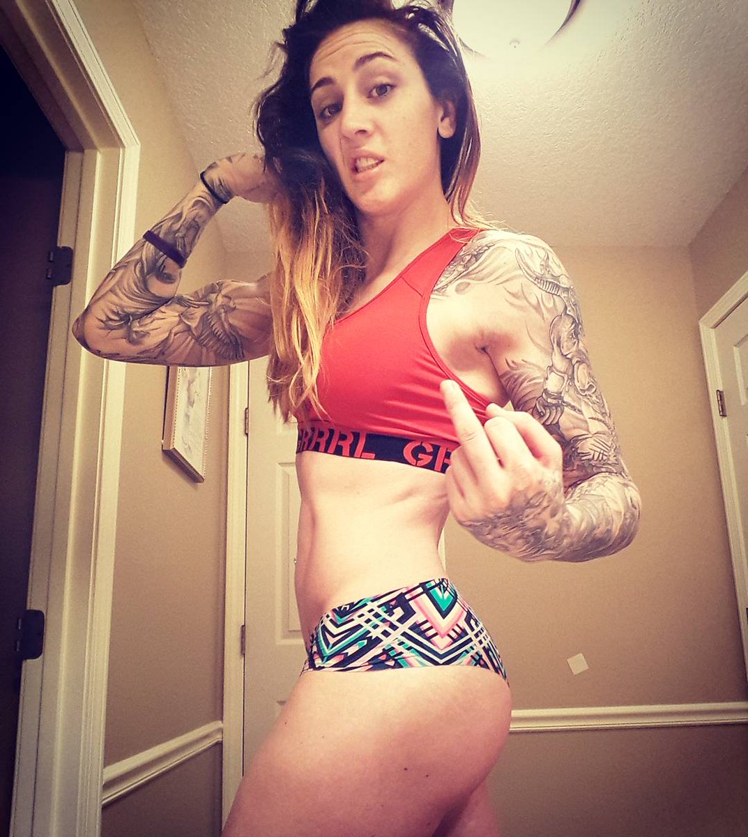
Anderson’s sleeves are the largest part of the collection. Designs run from the upper arms toward the wrists, with larger forms near the shoulders and smaller details lower down. Photos show floral work, shaded figures, animal-like shapes, and heavier black sections.

The pieces vary in size and detail, so the main shapes need room to read. In photos, the arm position also changes how the designs fit together: a bent elbow can compress the image, while an arm at rest shows a different outline.

Megan Anderson tattoos: front weigh-in view showing both tattooed arms and upper-chest ink

Megan Anderson floral arm and abdomen tattoos

Flowers and leaves sit beside darker shapes on Anderson’s upper arms. The floral lines break up the heavier areas, and a small tattoo near her lower abdomen adds another detail away from the sleeves.

Flowers can follow the curves of the shoulder or bicep. In Anderson’s photos, petals, leaves, and stems sit alongside the darker outlines instead of forming one uniform patch. The lines move with the body rather than sitting as a flat shape.

Some of the work uses color, while darker outlines keep the forms distinct. Color can settle differently as a tattoo heals, so healed examples in a similar palette are useful when discussing a design with an artist.

Megan Anderson tattoos: purple weigh-in view with floral arm work, side ink and lower-abdomen tattoo

Megan Anderson colorful floral and leopard tattoos

One photo shows floral shapes beside leopard-style spots and smaller decorative marks. The subjects differ, but the color and outlines help them sit together. Bright petals stand out against darker areas of shading.

The mix of light and dark keeps the arm from reading as one even surface. Color will also change with healing, skin, and sun exposure. Healed photos in the palette you want can give you a clearer reference than fresh work.

Megan Anderson tattoos: colorful weigh-in view showing the floral, leopard and chest pieces clearly

Megan Anderson shoulder and upper-arm tattoo layout

The shoulder joins Anderson’s sleeve to the chest. Smaller marks near the collarbones lead into the larger upper-arm designs, so the transition is visible when she raises her arms.

A tattoo can wrap over the shoulder, continue toward the chest, or stop at a defined edge. The choice affects how much appears beneath a shirt sleeve or neckline. Check the placement in the clothes you wear day to day.

Small chest symbols can sit between larger pieces, but they need space around them to remain clear. The shoulder and collarbone area can look crowded if every gap is filled.

Megan Anderson tattoos: black sports-bra weigh-in view showing the upper-arm and shoulder layout

Megan Anderson detailed sleeve and shoulder tattoos

Personal photos show how the sleeves are made up of separate pieces: faces or figures, shaded bands, and smaller leaves, bones, wings, and marks. The designs overlap in the overall view, but each started as its own choice.

That kind of collection can grow over multiple appointments. A new tattoo might add color, bring a darker area into balance, or fill a specific gap. Open skin is part of the layout, not a space that has to be filled.

Showing an artist both close references and a full view of the arm helps them see how a new piece needs to fit. The drawing may need a different scale or angle to sit well on the body.

Megan Anderson tattoos: personal portrait showing the left and right sleeves, shoulder details and chest symbols

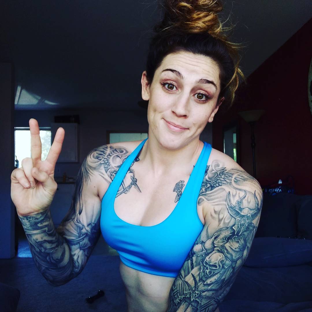
Megan Anderson chest and full sleeve tattoo close-up

The close chest photo shows smaller marks near the collarbones linking the two sleeves. The arms are densely tattooed, while the upper chest remains more open; there is no single large design across the sternum.

A small bird, symbol, phrase, or ornamental detail can connect sleeves across the chest. Leaving space near the collarbones keeps the existing designs clear and allows for later additions.

Chest tattoos shift with breathing and shoulder movement. A stencil should be checked in a relaxed pose as well as with the arms raised, so the lines sit naturally in more than one position.

Megan Anderson tattoos: close personal view of the chest, shoulders and both full sleeves

How to build a bold fighter-inspired collection

Anderson’s arms carry the strongest concentration of ink, with chest and shoulder pieces linking the sleeves. The smaller tattoos add detail without repeating the same subject. The arrangement can be a reference even if your own subject has nothing to do with MMA.

Choose the design you want to give the most space, then decide what smaller pieces should sit beside it. Think about visibility, color, and how the layout looks from several angles. A sleeve doesn’t need every area filled at once.

Bring clear references and talk through color, placement, healing, and any touch-ups with the artist. Use the overall arrangement as inspiration, then make the images and their meaning your own.

More athlete tattoo guides

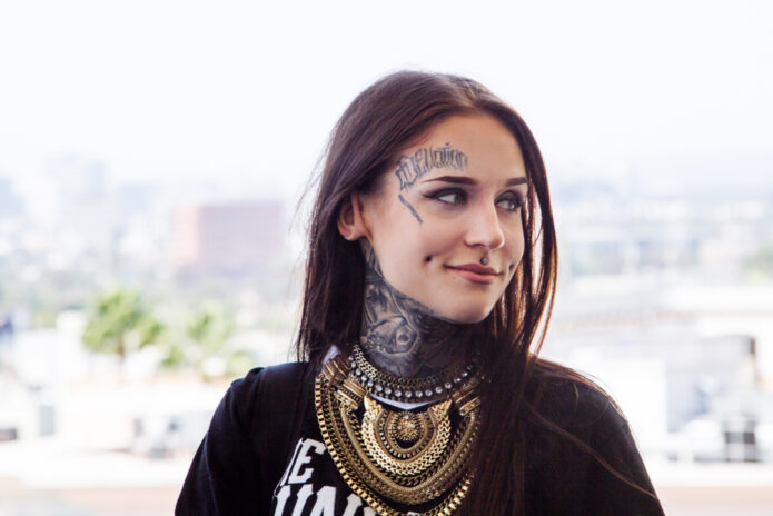
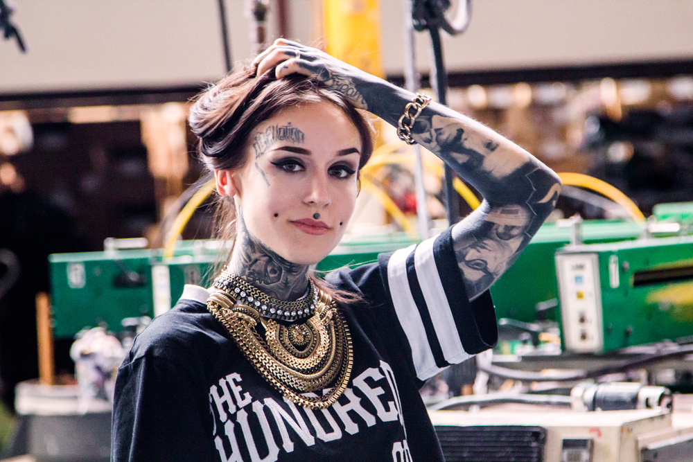
Monami Frost Tattoos: Blackwork, Face Ink and Full-Body Style

Monami Frost’s tattoos use heavy blackwork, realism, lettering, and a blackout section on one arm. The ink reaches across her face, neck, arms, hands, torso, and legs, so the collection reads as a body-wide mix of designs rather than a single sleeve.

The contrast between dark coverage and open skin keeps the pieces distinct. Fine lettering and lighter details sit beside large black areas, giving each part of the collection a different weight. The photos below show how those choices work across different parts of the body.

Monami Frost full-body tattoo layout

A full-body photo shows the amount of coverage across Frost’s arms, torso, and legs. The dark areas repeat across the body, while lettering and portraits add smaller details. The layout is easier to understand from the front, side, and back than from one close-up.

A collection can grow in stages. Taking photos of the existing work before adding more makes it easier to see where another piece would fit. A design that looks balanced straight on may leave a gap when the shoulder turns or an arm lifts.

Clothing also changes which tattoos are visible. A sleeveless top, crop top, or shorts reveal different parts of the layout, so it helps to plan around what you usually wear.

Monami Frost tattoos: Monami Frost full-body tattoo layout photograph, selected because the named tattoo area is clearly visible at full resolution

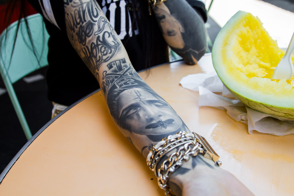
Monami Frost black arm and hand tattoos

The blackout section is one of Frost’s most recognizable tattoos. It forms a solid dark shape, while the other arm and the hands show faces, symbols, and lettering. The large block reads from a distance; smaller marks become clearer up close.

Blackout work takes planning. Previous tattoos, healing, touch-ups, skin, and the time needed for sessions all affect the result. An artist can explain what can be covered and show examples of healed work.

Hand tattoos have their own considerations: hands move often, get washed, and are exposed to the sun. Small lines can soften, so the design needs to be simple enough to remain readable. Clear shapes and realistic sizing work better than squeezing a detailed scene into a small area.

Monami Frost tattoos: Monami Frost black arm and hand tattoos photograph, selected because the named tattoo area is clearly visible at full resolution

Monami Frost leg and thigh tattoos

The leg photo shows portrait work and ornamental shapes on the thigh. The broad area gives a portrait room for detail, while the knee and lower leg create natural breaks in the layout.

Leg tattoos can be covered more easily than ink on the face, hands, or neck. Before settling on a portrait, check the stencil while sitting, standing, and bending the leg. Muscle movement can change how the features line up.

A reference photo can show the expression or lighting you want, but the artist may need to redraw it for the curve of the thigh. A reference is a starting point, not a template to trace exactly.

Monami Frost tattoos: Monami Frost leg and thigh tattoos photograph, selected because the named tattoo area is clearly visible at full resolution

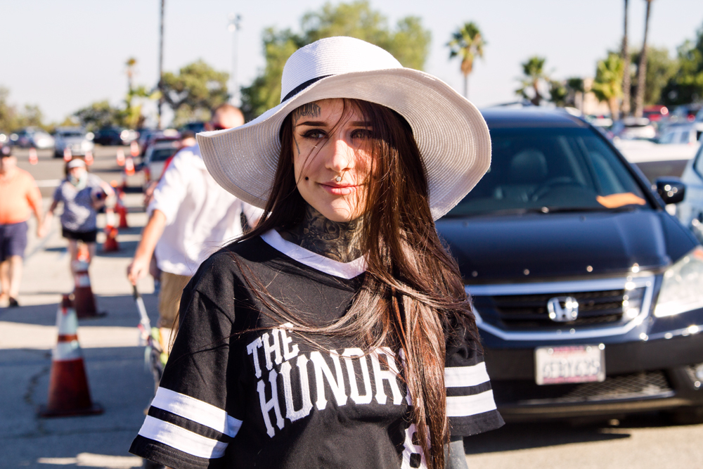
Monami Frost face and neck tattoo details

Frost’s forehead lettering, cheek mark, and dark neck work frame her eyes and jaw. From a distance the tattoos make a strong outline; close up, the lines and smaller details become easier to see.

Face and neck placement changes with expression, hair, collars, and light. A stencil can be checked in daylight as well as in a studio mirror, with the head turned and the face relaxed.

These tattoos are visible in nearly every setting, which can matter at work, with family, or while traveling. A small mark still becomes part of how the face is seen, so it helps to choose a design you are comfortable carrying into everyday life.

Monami Frost tattoos: Monami Frost face and neck tattoo details photograph, selected because the named tattoo area is clearly visible at full resolution

Monami Frost white ink forehead tattoo

A close-up shows a pale forehead design that is subtle from some angles and easier to see when the light catches it or the hair moves away. A lighter detail can break up a dense area of blackwork.

White ink still needs careful placement and realistic expectations. Its appearance can change as it heals and with sun exposure or skin tone. An artist with healed examples can show how it looks in natural light.

A pale mark, a highlight, or an open shape can draw the eye across a darker section. Contrast can make a design clearer without making every part bolder.

Monami Frost tattoos: Monami Frost white ink forehead tattoo photograph, selected because the named tattoo area is clearly visible at full resolution

How to build a collection with strong contrast

Frost’s collection pairs very dark work with lighter details and open skin. A blackout arm can sit beside fine face lettering; a portrait can share space with smaller marks. The contrast, placement, and scale connect the pieces without making them all alike.

Start with the subjects you expect to care about for a long time, then decide which areas of the body suit each one. Take photos of the existing tattoos from several angles before planning another piece. A clear space may help a portrait or line of text remain readable, and it can leave room for future work.

Choose an artist whose healed work matches the style you want. Portraits, blackout, lettering, and large body layouts each call for different skills. Ask how the design will move with the body and how it may look as it heals. A small change in scale can make fine lines easier to read.

Visibility is another part of placement. Face, neck, and hand tattoos show in most photos and introductions; tattoos on the torso or legs are easier to cover. Think about how that fits your life before deciding where a piece belongs.

Collections often develop over time. You don’t need to fill every open patch at once; living with the existing layout can make the next choice clearer. Follow the artist’s aftercare instructions and judge the result by the healed tattoo, not just the fresh photo.
The dark work is only one part of Frost’s look. The open spaces, fine lettering, and lighter forehead design affect how the heavier sections read. Use those choices as inspiration, then make the subjects and placement your own.

More celebrity tattoo guides

Neymar Jr Tattoos: Sleeves, Script, Portraits and Football Ink

Neymar Jr’s tattoos include portraits, roses, script, and small symbols across his arms, chest, ribs, and neck. Some pieces are large enough to read from a distance; others show more clearly in close-up. The collection combines family and faith references with football-related designs.

The photos show different parts of the layout, from the arm sleeve to the script on his chest and ribs. Taken together, they make it easier to see how the tattoos sit as he moves.

Neymar Jr right arm sleeve tattoos

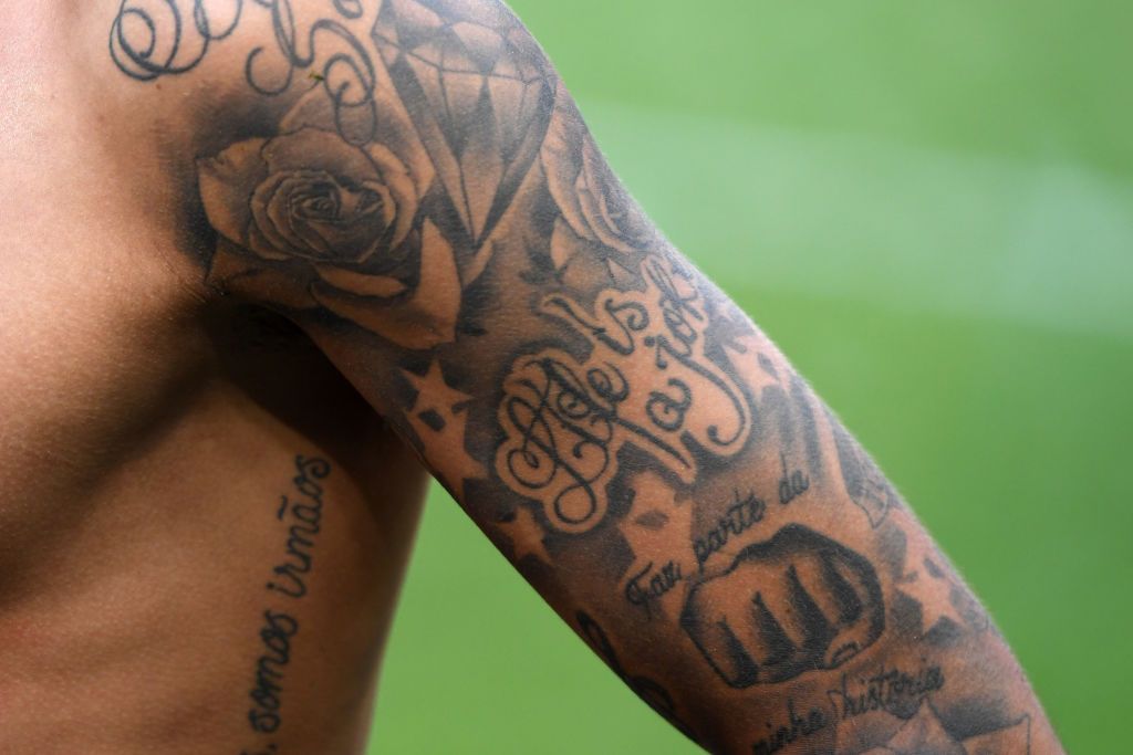
Roses, stars, script, and shaded shapes cover Neymar’s right arm. The rose is one of the clearest images, with smaller marks filling spaces around it. The lettering follows the arm, so it reads as part of the sleeve rather than a separate patch.

The rose gives the sleeve a focal point. Stars and script add detail without competing with it. Starting with one main image can help a sleeve feel organized as more pieces are added.

The arm changes shape as the wrist turns and elbow bends. Checking a stencil with the arm in different positions can show whether the design still fits when the hand faces another way.

Neymar Jr tattoos: close view of the right arm sleeve with roses, stars, diamond and Portuguese script

Neymar Jr chest script tattoos

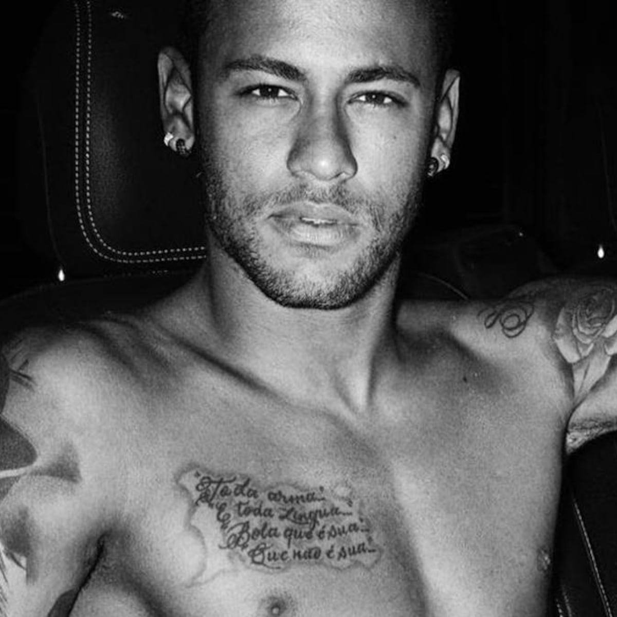
A handwritten-style phrase crosses Neymar’s chest, with roses on the shoulders and arm work around it. The open space around the words helps them stand apart from the rest of the ink.

Long script has to follow the curve of the chest and move with the shoulders. A shorter phrase may be easier to keep readable than a line packed with tiny words.

The chest lettering sits among other tattoos, so leaving some space around it helps the words remain distinct. If more work is planned, the first piece doesn’t need to fill every available area.

Neymar Jr tattoos: shirtless black-and-white view showing the large chest script and shoulder roses

Neymar Jr portrait and underarm tattoos

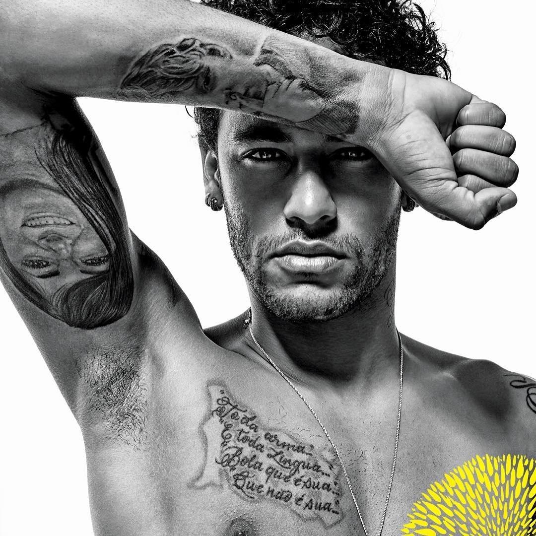
The portrait beneath Neymar’s arm differs from the broad chest script. Its face depends on careful shading and a clear outline so it remains recognizable whether the arm is raised or at rest.

The skin stretches as the arm moves, which can change how the face looks. A stencil viewed from the front and side can help show whether the angle works in a relaxed stance.
Lettering around the portrait frames it without enclosing it. A date or small line of script can connect the image to nearby work while leaving room around the face.
Neymar Jr tattoos: monochrome portrait showing the underarm portrait tattoo and chest lettering

Neymar Jr full sleeve and rib tattoos

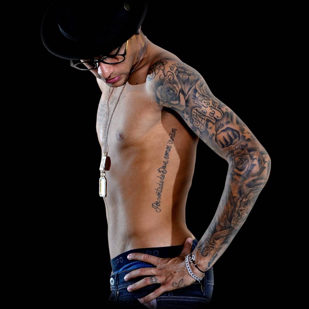
A side view shows the sleeve continuing alongside long lettering on the ribs. From this angle, the arm and torso pieces sit close together but have different directions: the sleeve covers the arm while the words run down the side.

Rib lettering shifts with breathing and bending. The text can follow the curve of the ribs or run more vertically; those choices give it different movement. The open skin between the sleeve and the rib piece helps each area stay distinct.

A gap can be left open until you know whether the designs should connect. Filling every space at once may make it harder to see the individual pieces.

Neymar Jr tattoos: side view showing the full sleeve, roses, script and long rib lettering

Neymar Jr neck lettering tattoos

The neck lettering is small compared with the sleeve, but its placement makes it visible in portraits and everyday clothing. It follows the side of the neck and adds detail without another large image.

Neck ink is harder to cover than an arm tattoo. The placement and size should suit how visible you want the words to be, and the lettering needs enough space to remain clear.

As part of a larger collection, a short mark can balance heavier work lower down. Neymar’s neck lettering is a small detail alongside the larger arm and chest pieces.

Neymar Jr tattoos: separate clean head-and-shoulders portrait with the neck tattoo clearly visible

Neymar Jr Batman and Spider-Man back tattoos

The back piece brings Batman and Spider-Man across Neymar’s shoulder blades, with “Blessed” above them. The figures form a broad composition in dark black and grey, with details that show more clearly up close.

A back design has room for larger figures, and the upper-back lettering sits above them like a title. Planning the whole back shape first helps keep separate characters from feeling cramped together.

For comic-inspired work, a reference can show the character and pose, while an artist redraws the proportions and shading to fit the back. A custom design can keep the same feel without copying every detail from a picture.

Neymar Jr tattoos: rear view showing the large Batman and Spider-Man back tattoo with Blessed lettering

How to build a personal collection inspired by Neymar

Neymar’s layout can be a reference for planning, but the images and meanings should be your own. Start with a subject that matters to you, then decide how script, realism, or floral work might fit around it.

Before adding more ink, look at the area in a relaxed position and consider how the new design will sit beside existing tattoos. The clearest parts of the collection have room around their main images; not every open patch needs to be filled.

Lettering, portraits, and color each need their own care as they heal. Follow the artist’s aftercare instructions and use sun protection on healed tattoos. The collection holds together through personal subjects and careful placement, not just the number of pieces.