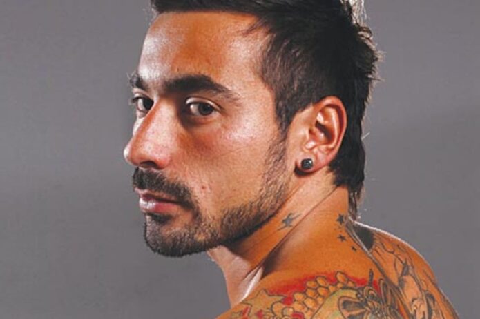
Ezequiel Lavezzi’s tattoos include a large religious portrait on his chest, colorful work along his arms, and smaller stars and lettering. Match-day, training, and off-duty photos show different parts of the collection, so its layout is easier to see across several images than in one posed shot.
A Jesus portrait anchors the chest, while color and shading carry down the sleeves. Stars, words, and smaller symbols fill some of the spaces between. The sections have their own look, but together they form a loose arrangement across his upper body.
Ezequiel Lavezzi Jesus chest tattoo
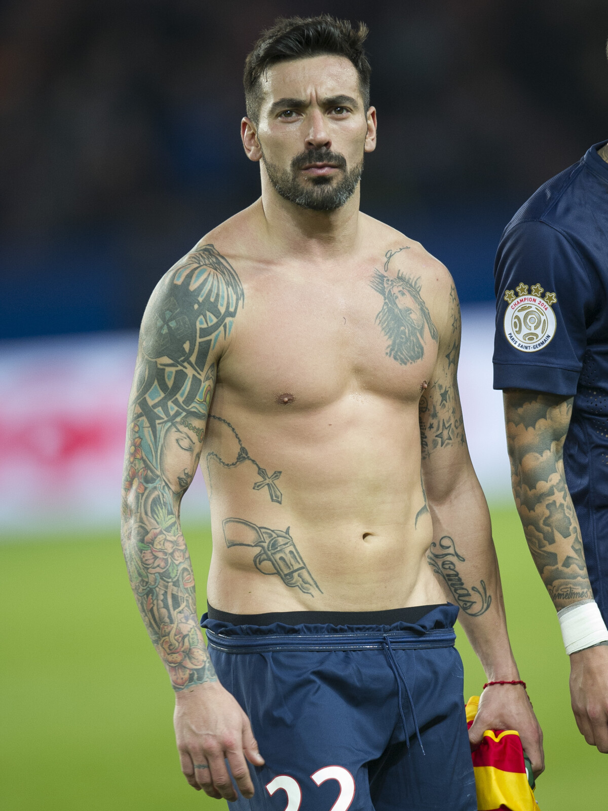
The Jesus portrait sits high on Lavezzi’s chest and is the first detail that stands out. Soft shading surrounds the face, while stronger areas of ink cover the shoulders and upper arms. The portrait has a clear outline, so it remains visible in a wider match photo.
A face tattoo depends on its overall shape as well as small details. Here, the face, hair, and shading make a recognizable form that fades toward the surrounding work. The portrait has room to stand out without the nearby tattoos competing with it.
The chest gives the image space, and the design can reach toward the shoulders without turning the front of the body into one solid block. The way a portrait looks will change as the chest and arms move, so placement needs to account for more than a still pose.
Religious tattoos can be small symbols or larger portraits. Lavezzi’s piece is at the larger, realistic end of that range. Smaller crosses, stars, or lettering can sit around a main image, but the portrait is the clear center here.
Ezequiel Lavezzi colorful sleeve tattoos
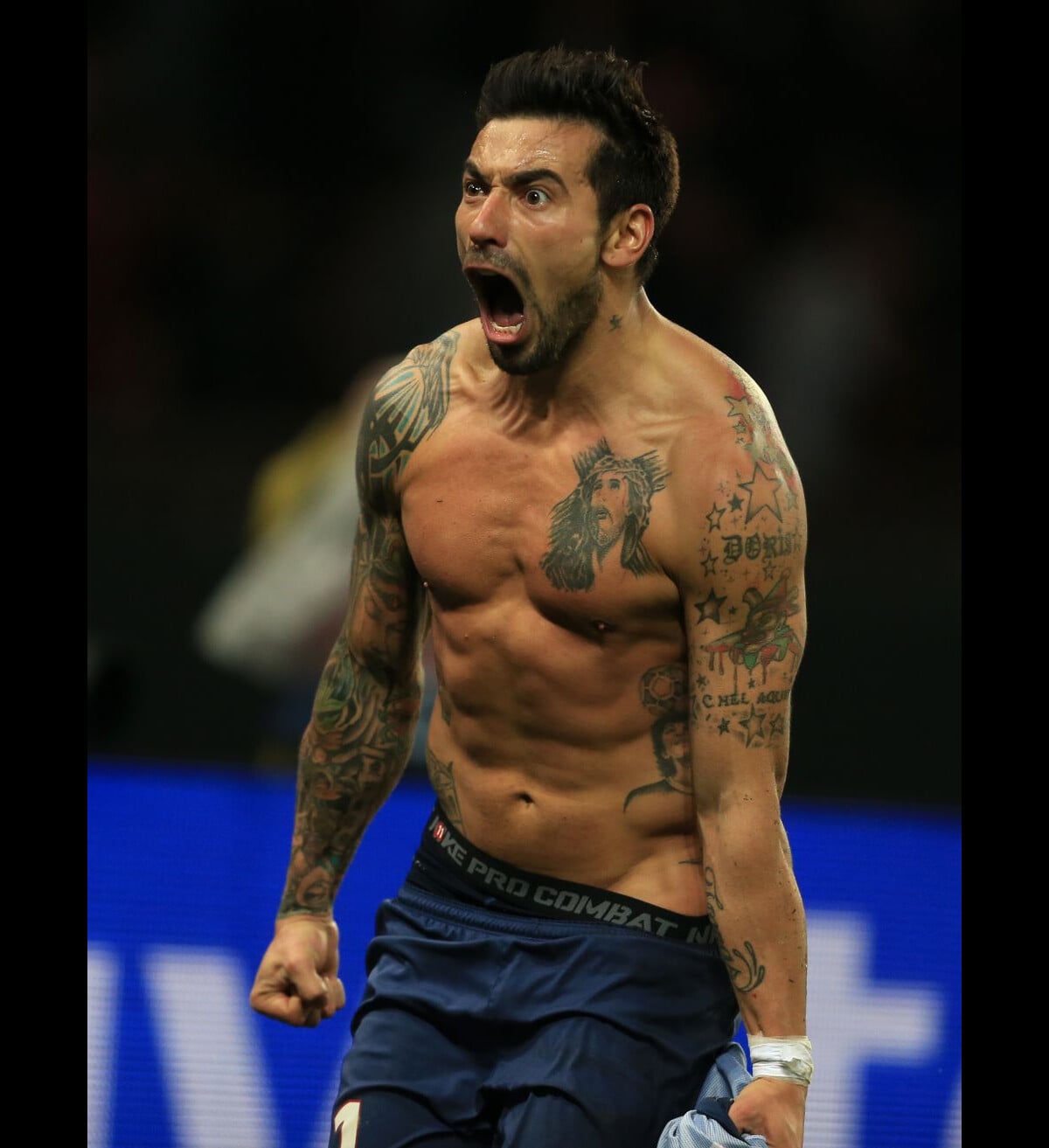
The sleeves bring most of the color. Flowers, leaves, faces, geometric shapes, and darker sections overlap along the arms. Reds and greens sit beside warm tones and dark outlines, giving the work a traditional tattoo feel even as the subjects change.
The color appears in groups rather than scattered evenly. Blackwork and grey shading give those brighter patches definition. Repeating a few colors can help separate designs feel related without forcing them all into the same subject. Color can connect a sleeve even when its images differ.
The placement changes as Lavezzi raises or bends his arm. A flower or portrait may be partly hidden when the arm is down, then become more prominent in another pose. The sleeve has to read around the front, side, and back of the arm, not just as a flat image.
Some skin remains visible between the flowers, outlines, and shaded areas. Those gaps help the separate designs stay clear. A sleeve can feel full without every part of the arm carrying the same density of ink.
Ezequiel Lavezzi stars and lettering tattoos
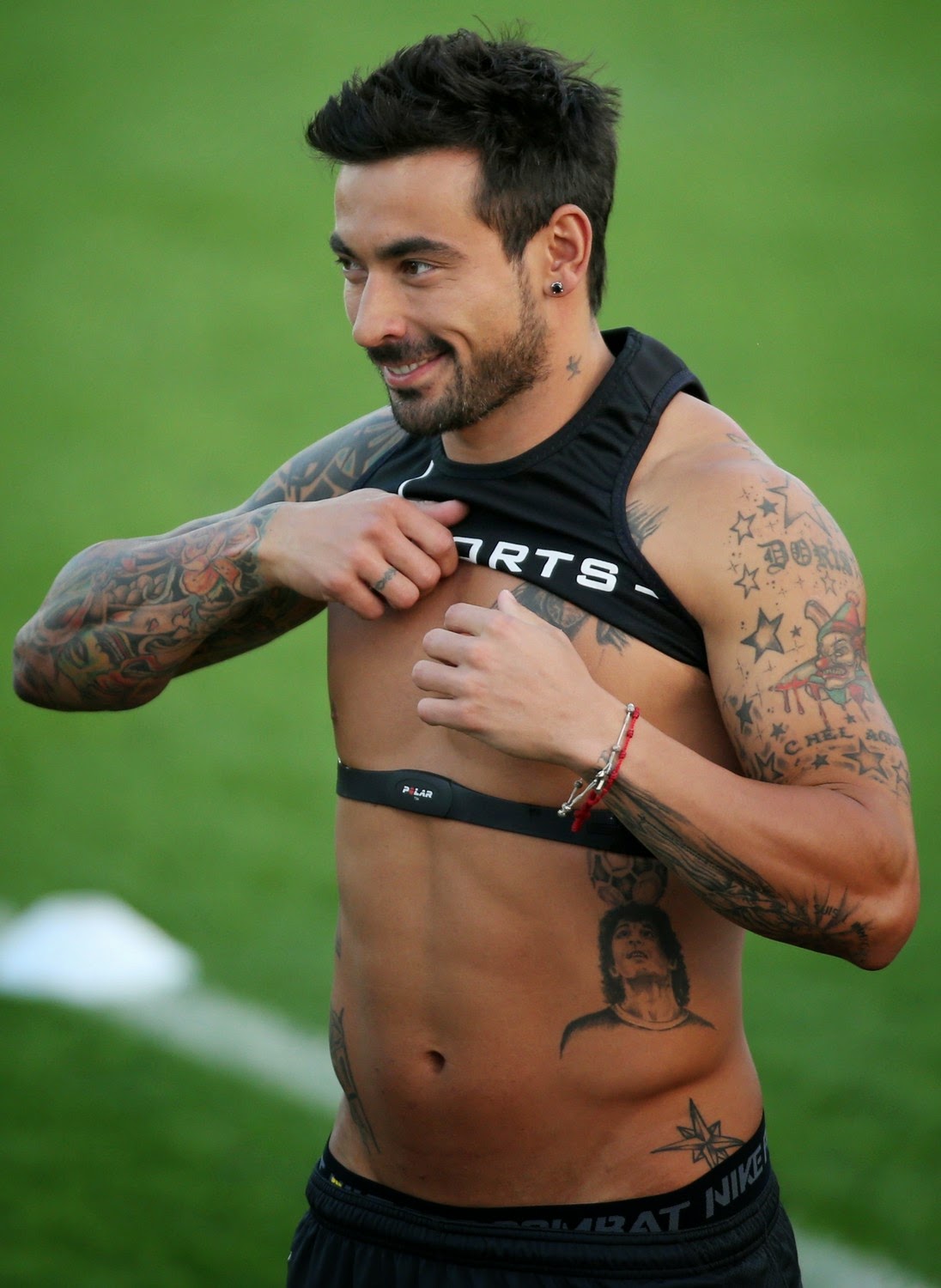
Stars and lettering sit around Lavezzi’s larger arm designs, including near the shoulder and wrist. Some marks are bold; others are words or names. They add smaller points of detail between the more elaborate images.
Stars can fit into narrow gaps or sit beside a portrait as a larger mark. In these photos, they work as part of the sleeve’s texture rather than taking over the composition.
Lettering adds a readable element. It may be a name, date, or short phrase, but the exact words should be checked in a clear image before assigning meaning. Small script needs enough space to remain legible. A line that looks delicate in a fresh photo can be difficult to read if the letters are crowded.
Placement matters as much as font. Some of Lavezzi’s visible words follow the arm rather than running in a stiff straight line. A phrase should be tested at its actual size and position, since it can look different once it curves around the body.
Ezequiel Lavezzi torso and side tattoos
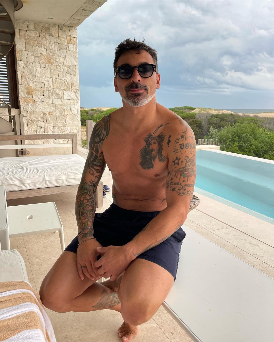
Wider torso photos show ink extending from the chest toward the ribs and stomach. Smaller images and lettering fill the sides below the main portrait. A cross, a lower-torso symbol, and shaded figures lead the eye down toward the waist.
The body changes shape when a person sits, twists, or breathes, so the placement looks different in each pose. In these photos, larger images sit on the broader areas, while smaller designs continue around the sides. The lines follow the torso rather than forming a straight grid.
The transitions between chest and shoulder work also matter. A few symbols, vines, or shading can soften where a portrait meets a sleeve, though some open skin keeps the larger designs readable.
Natural light can reveal shading that stadium or indoor lighting obscures. Looking at photos in different settings gives a better sense of which details belong to the tattoo and which are effects of the light.
Ezequiel Lavezzi neck and shoulder tattoo flow
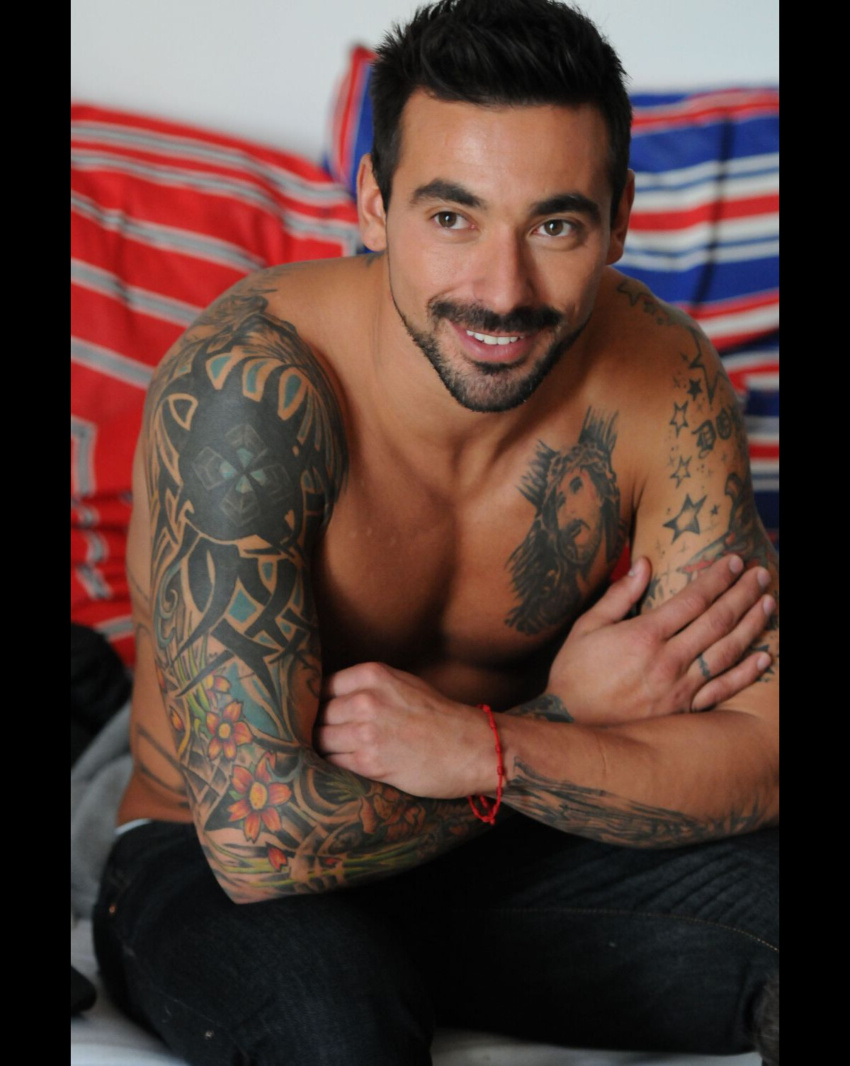
A small star near the neck, the shading on the shoulder, and the top of the sleeve link the chest and arms in a three-quarter view. These marks are smaller than the Jesus portrait, but they help the separate areas sit together.
The shoulder design follows its rounded edge before continuing down into the sleeve. That transition keeps the arm from looking divided into front and back. Neck tattoos are more exposed: a single star or short mark can be distinct, while too many small designs may crowd the area. The small marks work best when they have room around them.
Older photos show that the collection has changed over time. Lighting, angle, and the stage of the tattoos can make the same area look different. These images capture a collection that has grown, rather than one finished design.
A relaxed way to build a collection
Lavezzi’s tattoos have a loose structure: the chest portrait draws the eye, color and shading fill the sleeves, and stars and lettering sit among the larger pieces. The torso and shoulders connect those areas without making every tattoo look alike.
His collection can offer placement ideas, but it isn’t a template to copy. A main image can guide the rest of the layout; color, open skin, and smaller marks can be considered as the work grows. Large portraits and sleeves take time to plan, and healed examples show how the ink looks beyond a fresh photo.
The official PSG interview below offers more football context. The photos show how the tattoos look in different lighting and poses, which is useful when comparing placement and contrast.