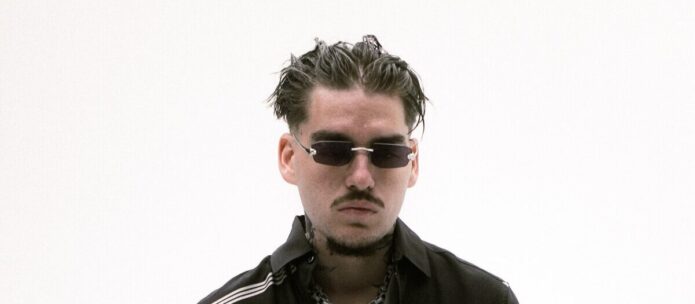
Yeat tattoos are a big part of the rapper’s look. Even when he is covered by a balaclava, dark glasses, or a stage outfit, his arms and hands usually give him away. The ink runs across both forearms, climbs toward the elbows, and mixes block lettering with symbols, portraits, figures, and loose blackwork. It feels futuristic in places, but it also has the messy energy of a collection that has grown through different eras.
There is a reason Yeat’s tattoos can be easy to miss in ordinary photos. He often wears oversized clothes, gloves, or the masks that became part of his public image. When he raises his hands on stage or poses with his arms uncovered, the details come into focus. A sharp image can show several different designs on one arm, from a dark outlined symbol near the wrist to a larger character higher up.
Yeat’s arm tattoos are the centre of his look

The clearest thing about Yeat tattoos is the amount of work on his arms. The tattoos do not sit in one tidy band. They appear at different heights, with open skin between some pieces and denser sections around the forearms. That uneven spacing gives the collection movement. It also means that each pose reveals something slightly different.
In the hallway photograph, both arms are lifted beside his head, so the placement is easy to study. The left and right sides are not mirror images. One arm carries tall black marks and lettering, while the other shows smaller pictures, curved outlines, and shapes that run toward the wrist. The contrast keeps the eye moving instead of making the two arms look like matching sleeves.
The style is mostly black ink with strong outlines and patches of shading. Some pieces are filled heavily, while others are left lighter so the lines can breathe. That mixture gives the arms a rough, hand-drawn quality. The tattoos feel connected by their attitude rather than by one strict theme, which suits an artist whose music and visuals keep changing.
For anyone planning a similar sleeve, the useful lesson is to think about the whole arm before filling every inch. The strongest designs need room around them. Leaving a little skin between symbols can make the shapes easier to read and gives future work somewhere to go. Yeat’s arms look busy, but the spacing stops them from becoming one flat block.
The forearms mix symbols, numbers, and personal marks
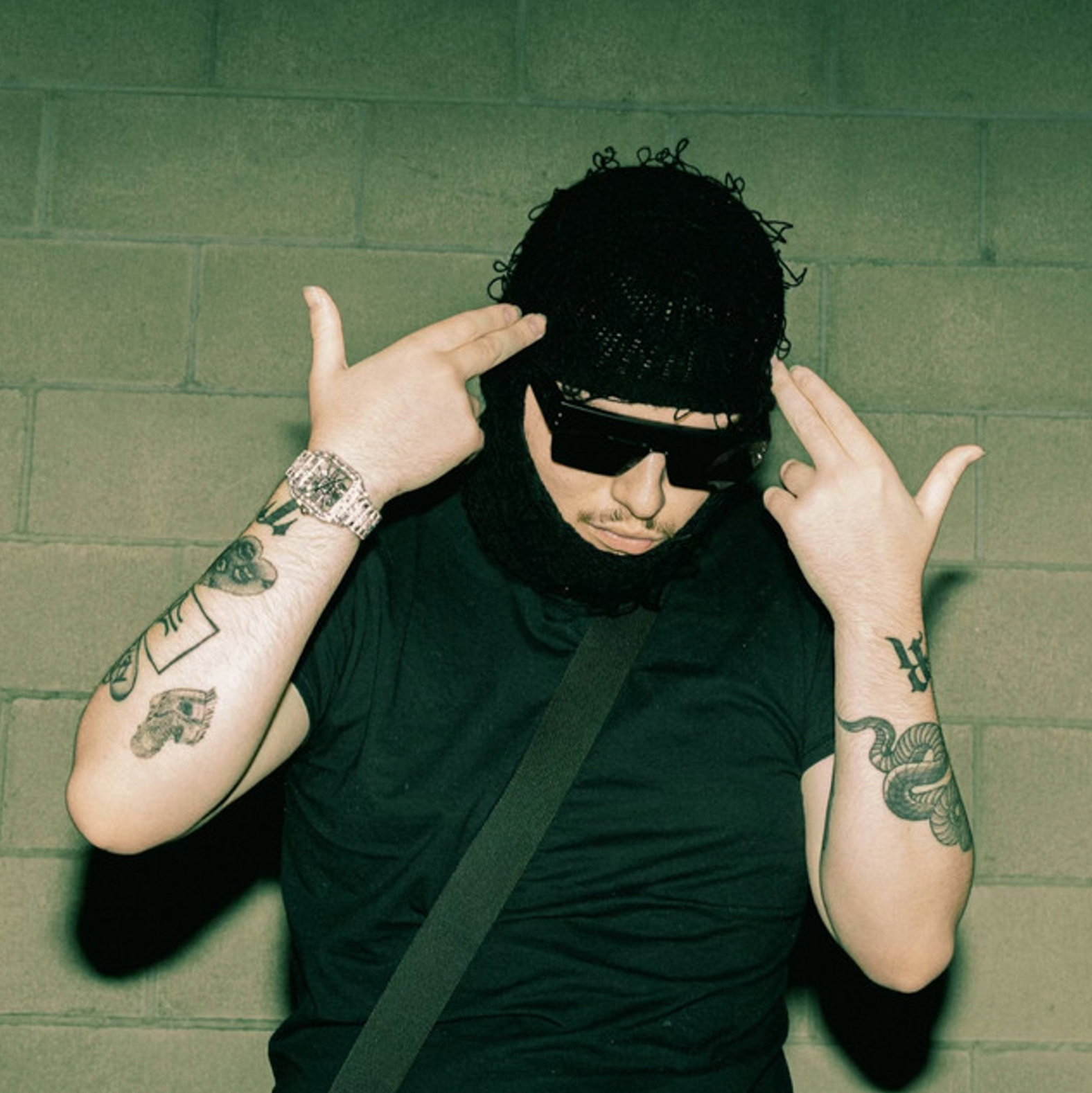
A closer view of Yeat’s forearms shows why the collection has so much visual texture. There are geometric symbols, repeated lines, small pictures, and marks that look almost like a private alphabet. Some designs are easy to identify, while others are more abstract. That uncertainty is part of the appeal. The tattoos invite a second look without needing to announce one simple meaning.
Yeat has talked about communicating through numbers and symbols, and that idea fits the way the ink is arranged. The marks do not always read like conventional sentences. Instead, they work as signs inside a larger visual language. A blocky character beside a curved shape can feel like a logo, a code, or a reminder known mainly to the person wearing it.
Public tattoo references also connect some of the visible pieces with his music and the people who matter to him. A portrait has been identified by fans as his grandfather, although it is better to describe that as a reported reading than a fact Yeat has explained in detail. The same caution applies to symbols that fans connect with album eras. A design may look obvious from a photograph while its real meaning stays private.
That privacy keeps the collection from feeling like a press release. The arm tattoos are visible, but they are not all explained. The result is more interesting than a list of fixed definitions. Symbols, numbers, and personal marks can carry a private history without needing a caption every time they appear in a photo.
His lettering and block shapes make the ink feel futuristic
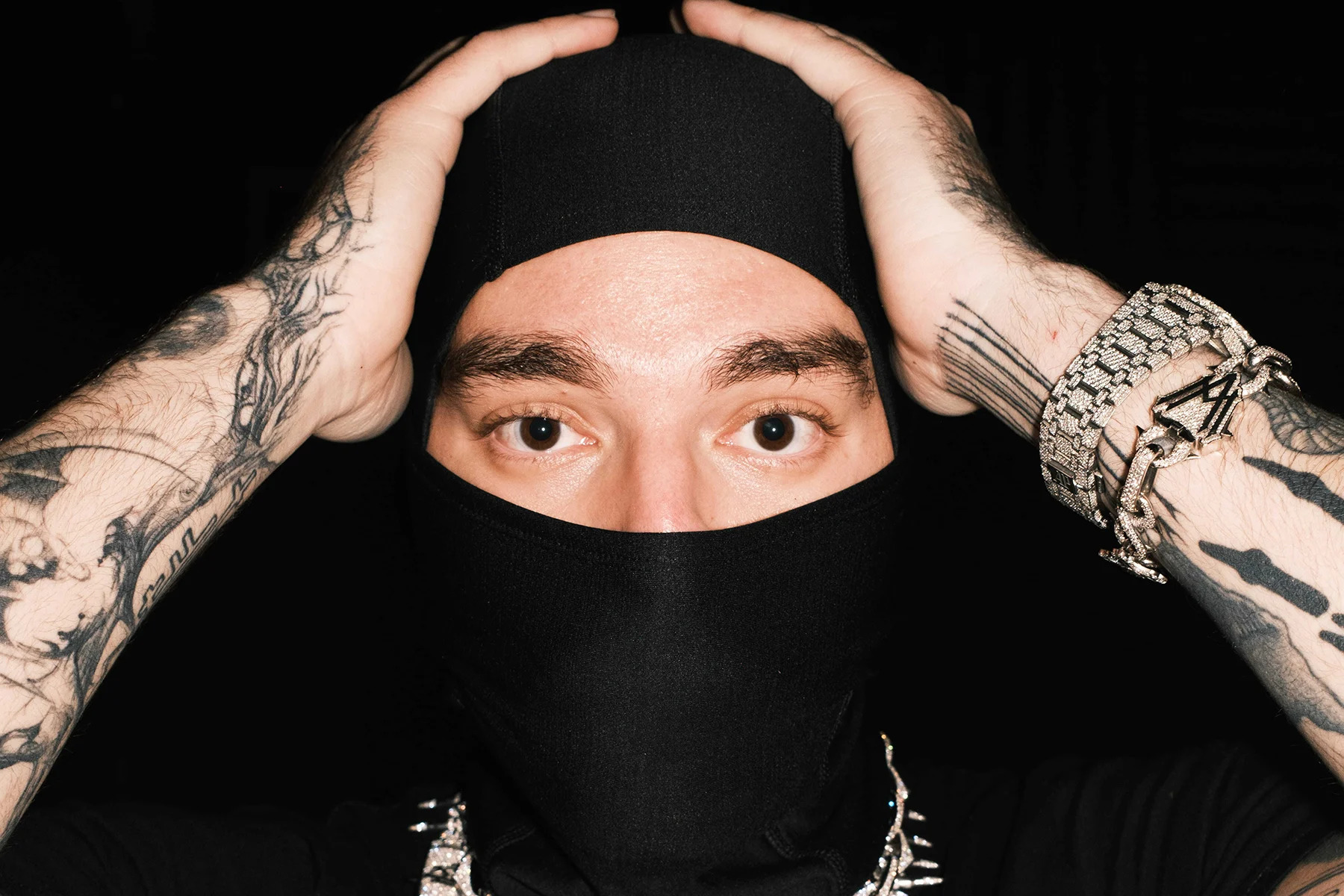
Yeat’s lettering has a distinctive shape. It is often tall, squared, or stretched so that it follows the length of the arm. Instead of looking like traditional script, the marks can resemble a sign from a game, a piece of industrial design, or a logo from a science-fiction world. This helps explain why the tattoos work so well with his futuristic clothes and metallic jewellery.
The large block forms are also practical. They stay visible when a photo is taken from a distance, while smaller details fill in around them when the camera gets close. In the Rolling Stone image, the forearms frame his eyes and make the tattoos part of the pose. The arms are not just resting beside the body. They are lifted into the composition, so the ink becomes part of the gesture.
Lettering can be difficult to place because the arm bends and turns. A word that looks straight with the wrist relaxed can twist when the elbow moves. Yeat’s pieces show one way around that problem. The marks are bold enough that they still work when the skin changes angle. They do not depend on a delicate line being perfectly flat to the camera.
There is also a nice difference between the dark marks and the pale gaps around them. Strong black shapes give the tattoos weight, but the open skin keeps the image from becoming too heavy. The space between the pieces is part of the design. It lets the arm breathe and gives the bolder symbols a cleaner outline.
The newest Yeat tattoos push into heavy blackwork
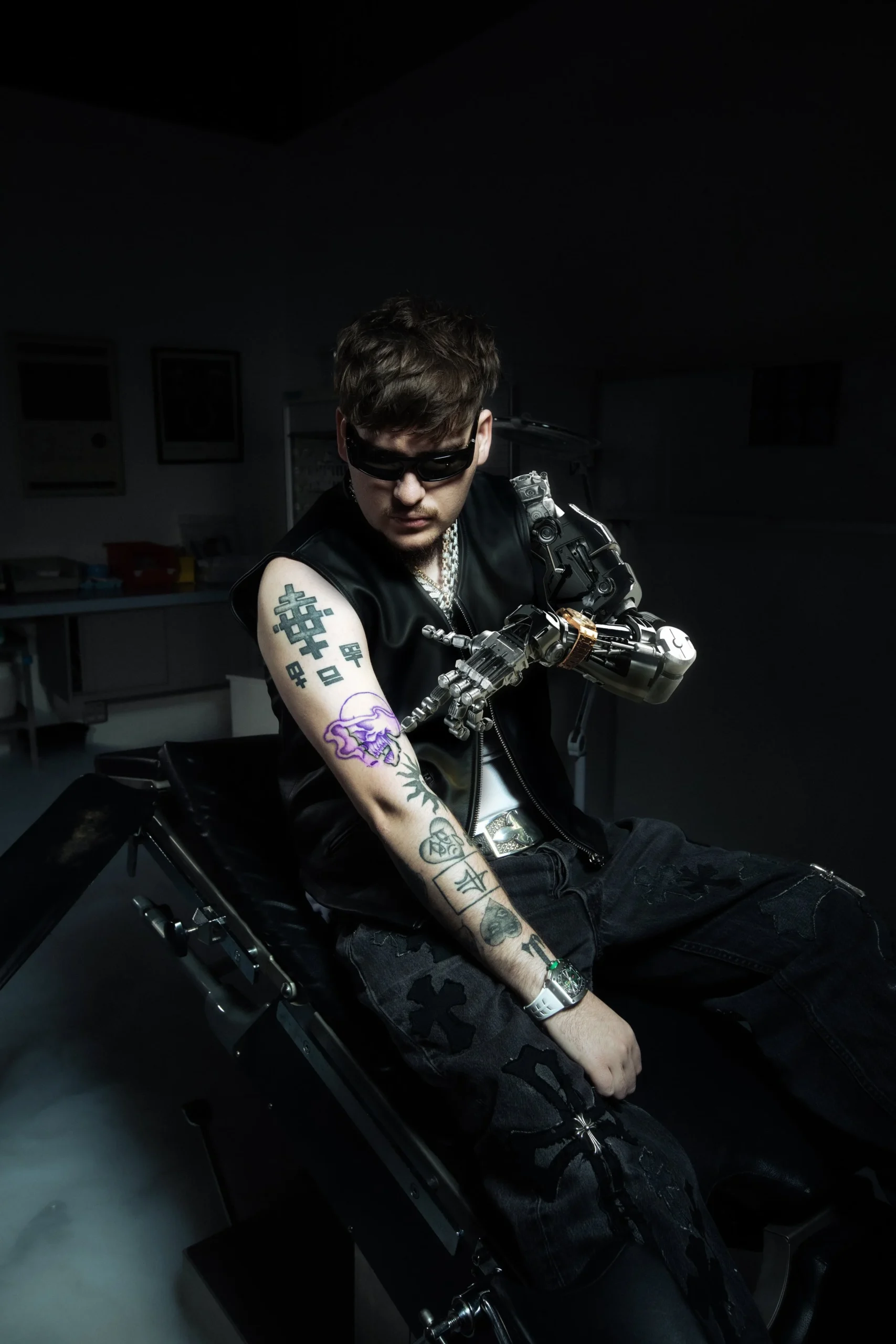
More recent photos show the collection becoming heavier in places. The Inked Magazine image catches an arm with large black symbols, a purple character, curved linework, and darker patches that reach toward the shoulder. It is a different feeling from the earlier close-up images. The work looks less like a few isolated marks and more like a sleeve being built around a strong visual identity.
Heavy blackwork can change the balance of an arm quickly. One filled shape attracts the eye, so the surrounding pieces need to hold their own without competing. In Yeat’s case, the darker areas are mixed with outlined figures and lighter sections. That creates contrast even when the overall arm is heavily tattooed.
The newer work also seems connected to the artist’s interest in machines, masks, and altered silhouettes. The tattoos do not copy the robotic styling of a costume, but they live comfortably beside it. The symbols, sharp lines, and strange little characters make the skin feel like another part of the world Yeat builds through music and clothing.
For tattoo inspiration, this is a good example of committing to a graphic language. You do not need every piece to be identical, but repeating the same line weight, shape, or level of contrast can make a collection feel intentional. Yeat’s tattoos move between figures and symbols, yet the overall mood stays recognisable because the black outlines keep returning.
Yeat tattoos change with motion on stage
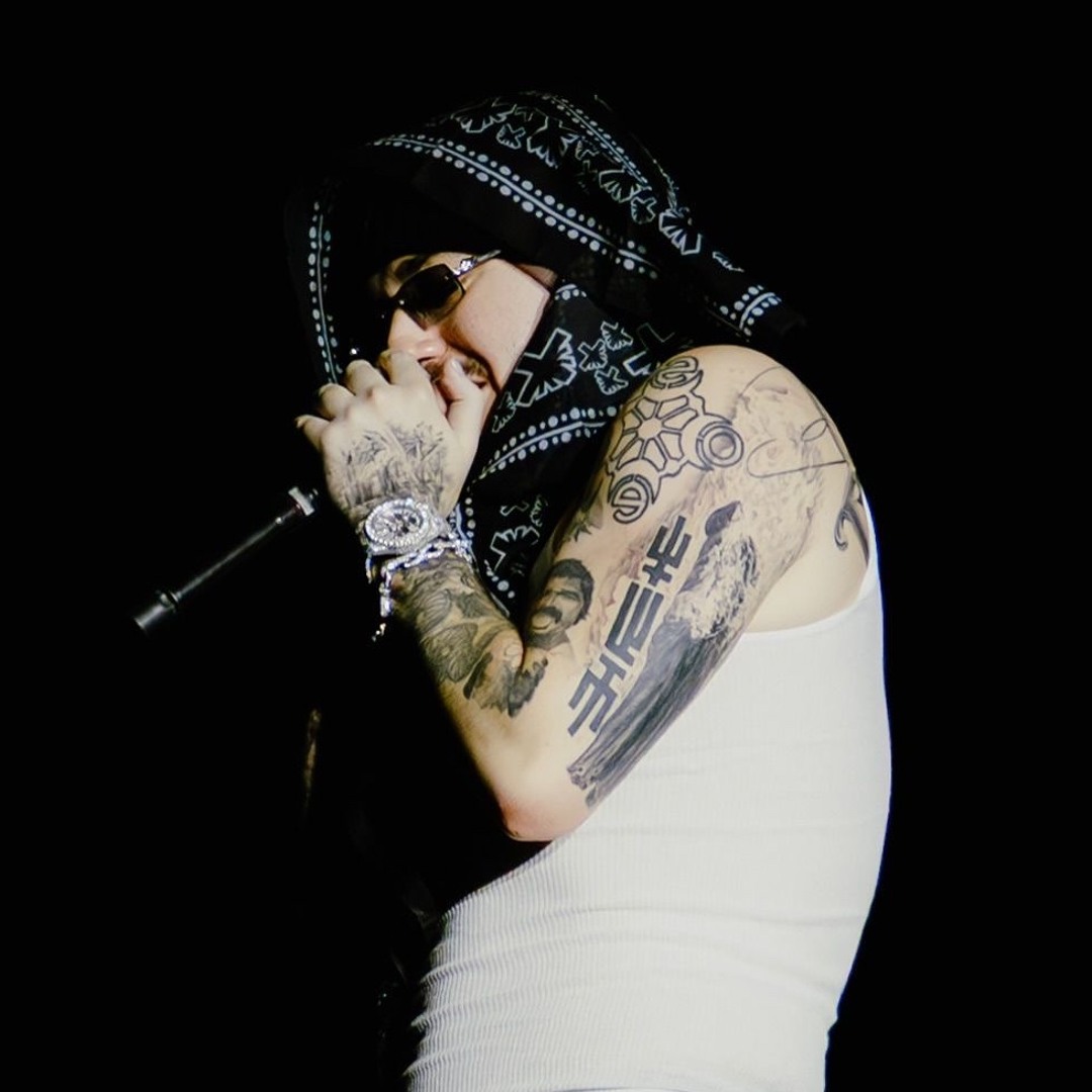
A live photograph gives Yeat tattoos a different kind of clarity. The lighting is darker and the pose is active, but the movement of the arms makes the placement easier to understand. A tattoo can disappear when the elbow is bent and then appear again when the arm reaches toward the crowd. That changing view is part of what makes a sleeve feel like it belongs on a moving body.
On stage, Yeat’s hands, bracelets, microphone, and tattoos all compete for attention. The ink still works because the largest marks have clear silhouettes. You can pick out the long symbols and broad shapes even when the smaller details blur into the lighting. This is one reason bold linework remains useful for performers. It reads quickly, whether the viewer is close to the stage or watching a video on a phone.
The concert images also show that the tattoos are not just an accessory added to an outfit. They are part of the performance language. His raised arms, covered hands, and masked face create a recognisable outline, and the ink strengthens that outline. The result is a look that feels consistent across a music video, a photo shoot, and a live set.
Still, it is worth leaving room for uncertainty. Photos can make a symbol look darker or more detailed than it is, and some images catch older work before it was changed or covered. What is clear is the broad visual pattern: Yeat has a heavily tattooed collection centred on both arms, with symbols and figures layered over time. The arm coverage is the consistent thread.
The best way to read Yeat tattoos is to focus on that visual pattern rather than inventing meanings for every mark. The arms carry the main story, the lettering gives the collection its futuristic edge, and the newer blackwork adds weight. The tattoos feel personal because they are not presented as a neat catalogue. They show up in fragments, just like memories, lyrics, and images from different parts of an artist’s life.
If you want a similar direction, start by choosing a small group of shapes that really belong to you. Then let the collection grow around them. Keep the strongest symbols clear, leave enough space for the skin to move, and use bold lines when you want the design to read from a distance. Yeat’s biggest tattoo lesson is to make the visual language your own.