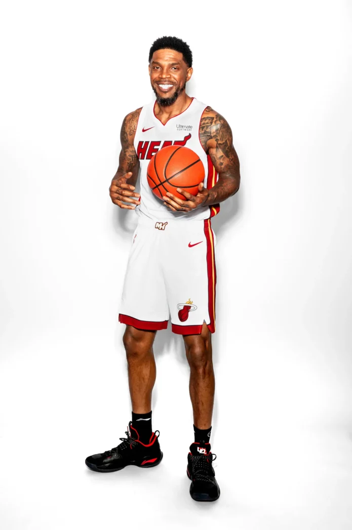
Udonis Haslem’s tattoos don’t look like filler. They suit the way he played: tough, personal, and tied to home. A large Florida design covers his back; script runs across his chest; darker work covers his shoulders and arms; names and short phrases add smaller details. The collection feels lived in rather than staged.
Some tattoos are easiest to see in shirtless portraits, others only in game photos or interview clips. Across those different views, the same ideas recur: Florida, family, faith, Miami, and memory. Bold black shading gives the designs a shared feel.
Here’s a look at the pieces people notice first, what their placement does, and ideas you can adapt without copying an athlete’s tattoo map.
Udonis Haslem’s Florida back tattoo is the centrepiece
The Florida tattoo across Haslem’s back is the collection’s largest statement. The outline gives it an immediate connection to home. Haslem was born in Miami and spent his entire NBA career with the Heat, so the state is part of both his personal life and public identity.
The design works as a full-back composition. The state’s outline sets the shape, with lettering and darker details giving it enough weight to fill the broad area. It needs room: on a forearm, the outline and words would lose much of their effect.
As Haslem turns or leans forward, the state shape moves with his back. An artist planning a piece like this would need to consider the shoulder blades, spine, and lower back together before tattooing.
Design takeaway: a meaningful place can carry a large tattoo when its outline is clear and the details are planned as one design. The connection behind the shape matters as much as the image itself.
Chest script and the rosary create a layered front panel

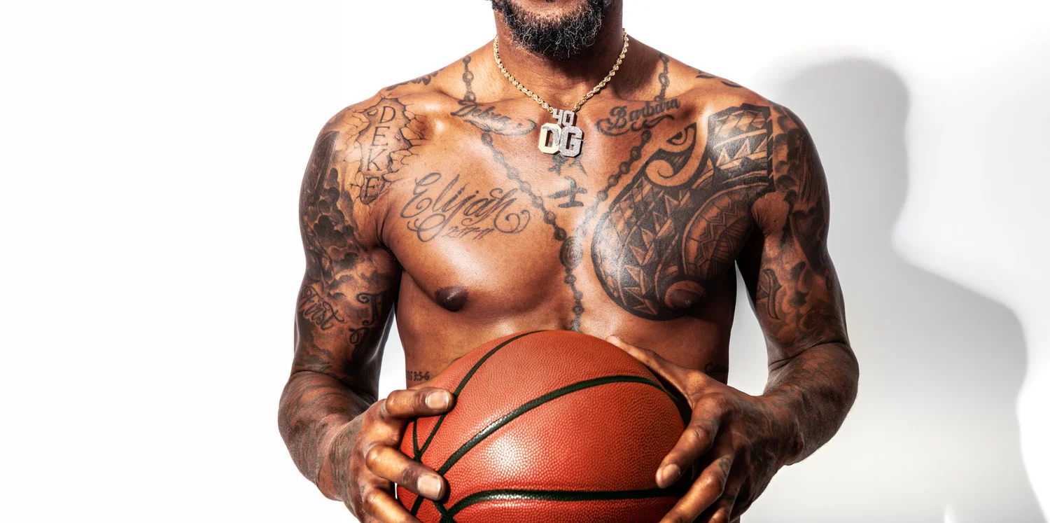
Haslem’s chest has a different feel from the back piece. Script, religious imagery, and lines that follow the width of his chest sit across the front. A rosary-style chain and cross add a vertical line, while the lettering spreads sideways.
The separate pieces share a visual rhythm. The script has room around it, and the rosary gives the eye a path from the neck toward the center of the body. Even when the words are hard to make out in a moving photo, the layout remains clear.
The beads and cross bring a quieter note to a collection with a lot of dark shading. The cross is recognizable without needing much detail and breaks up the lettering.
A phrase such as “Family First” fits the chest because it keeps the message close. For a smaller design, one short line of script beside a fine-line cross might be enough; there’s no need to reproduce the whole panel.
Design takeaway: chest lettering can sit with a chain, cross, or small symbol. Leave open skin around the words so the message stays easy to read.
His shoulders and arms carry the boldest blackwork
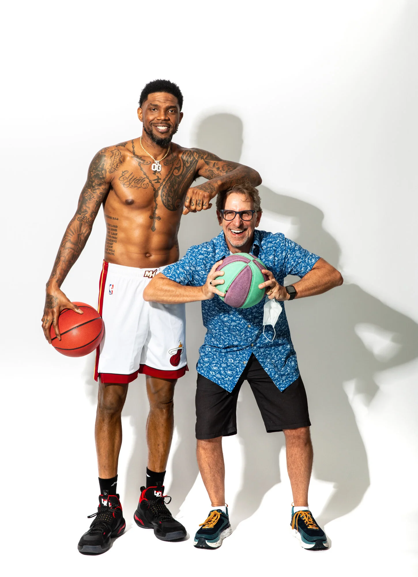
The shoulder and arm tattoos give Haslem’s collection its toughest look. In shirtless portraits, the ink runs from the upper arms over the shoulders and down the biceps. Patterns, shading, and smaller marks fill the available space, creating connected blackwork without one obvious centerpiece.
Shoulder tattoos have to work from the front, side, and back because the muscle turns through all three views. Haslem’s designs use that curve: darker shapes sit where the shoulder rounds, while smaller details continue down the arm without making the tattoo look like a rectangle.
The open chest script contrasts with the denser shoulder work. That keeps the whole collection from reading as one dark block. Your eye can move from the lettering to the shoulder, then toward the forearm and hand.
If you’re planning a similar piece, start with the shoulder or upper-arm tattoo you care about most. Let it heal before deciding what should connect to it. That gives you more room to adjust than planning a whole sleeve before the first design has settled.
Design takeaway: balance dark areas with lighter gaps, and let the pattern follow the round shape of the shoulder. A sleeve can feel full without covering every inch in the same weight of black.
Family names and hand lettering keep the story personal

Not every meaningful tattoo in Haslem’s collection is a large image. Names, brief phrases, and hand lettering tie the designs to people and relationships. The writing on his hands and forearms is smaller than the Florida piece, but it can feel more intimate because it’s always visible.
Hand tattoos are direct and exposed. The skin moves constantly and there isn’t much space, so even a short word has to carry its weight. A name or family phrase can be a reminder the wearer sees throughout the day.
Memorial tattoos can also work with simple lettering. A name or date may be enough; a small cross, star, or line of script can sit beside it without taking over.
Hands and fingers fade faster than areas protected by clothing, and fine letters can soften over time. Choose a font with enough weight, don’t crowd too many words into a small area, and plan for the possibility of a touch-up.
Design takeaway: a clear phrase can hold more meaning than a complicated picture. Choose a placement that keeps the words close without squeezing them in.
Neck, forearm and bicep tattoos fill the gaps
The smaller tattoos on Haslem’s neck, forearms, and biceps link the larger pieces. A phrase near the neck can lead into the chest design; a bicep tattoo can continue the shoulder work. The collection looks as if it grew over time, not as if every piece came from one flash sheet.
Names, faith references, and short statements fit narrow spaces because their size can be adjusted to the body part. Forearm letters can follow the length of the arm; a bicep design can wrap around the muscle.
Neck ink is easy to spot in interviews and photos, so it becomes part of a public image. If you want a similar vertical line with more flexibility, the upper chest or back of the arm may be easier to cover.
Small tattoos should still have a reason to be there. They can balance an open patch, repeat a familiar shape, or mark a memory. Repeated lettering, symbols, or shading help related pieces feel connected; random additions can make a collection feel crowded.
Design takeaway: use smaller placements to link the main tattoos or add a personal detail. A repeated lettering style, symbol, or shading choice can make a collection feel deliberate.
Heat-era additions and changing visibility
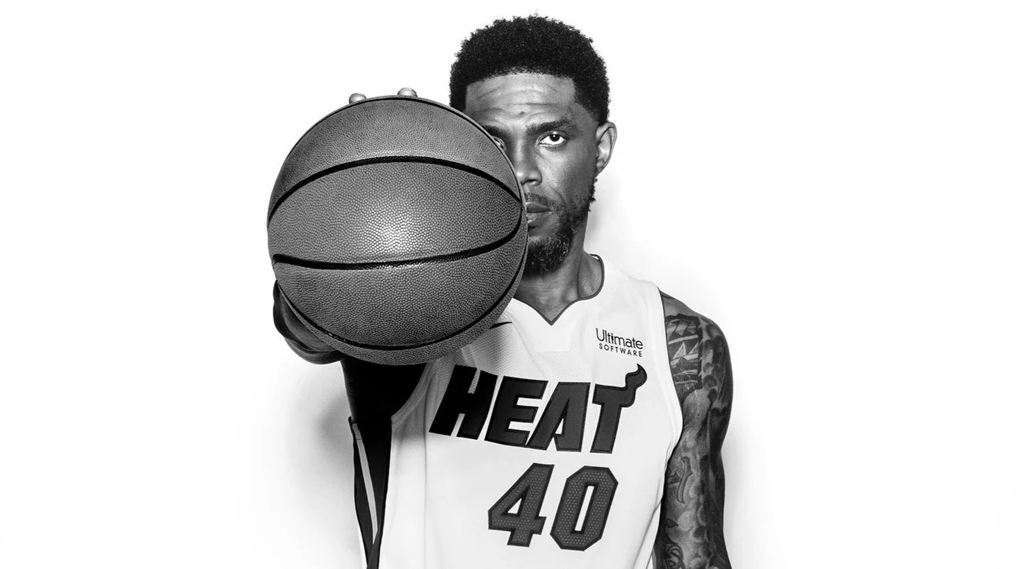
Haslem’s tattoos became part of his image during his Miami Heat career, but the collection changed over time. Different photos show more or less of the ink depending on his clothes, the lighting, and the camera angle. A jersey hides much of the chest and back; training and beach portraits reveal more.
One photograph rarely shows every tattoo. A design can seem new simply because it was hidden in earlier images. Taken together, Haslem’s tattoos read like a timeline of home, family, belief, and career.
If you like the overall look, take the ideas rather than the exact artwork. Choose a place that matters to you, use a phrase you’ll still stand by later, and let each new tattoo connect to a real part of your life. The personal logic is what holds the collection together.
Frequently asked questions
What is Udonis Haslem’s most famous tattoo? The large Florida design across his back is most closely tied to his Miami identity and is usually the first tattoo people mention.
Does Udonis Haslem have chest tattoos? Yes. His chest has prominent script and a rosary-style religious design, along with other ink visible in shirtless portraits.
What style are Udonis Haslem’s arm tattoos? His arms combine bold blackwork, shading, lettering, and smaller personal details rather than following one strict traditional style.
What should I copy from his tattoo style? Borrow the planning: connect placement, meaning, and scale. A hometown outline, family phrase, or faith symbol will mean more when it belongs to your own story.
One thought on “Udonis Haslem Tattoos: Florida Back Piece, Chest Script and Heat Ink”