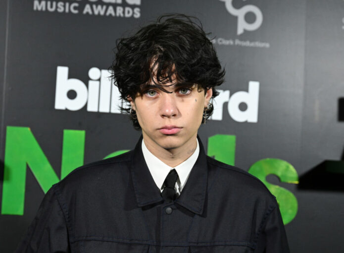
Landon Barker tattoos have become part of the young musician’s whole look. His ink is easy to spot in a tank top, a leather jacket, or a backstage portrait, but the collection is more than one dramatic chest piece. He has lettering across the upper body, floral work on his arms, small marks near his face, and larger designs that appear when he turns or rolls up a sleeve.
What makes the collection interesting is the mix of delicate linework and heavier images. One photo may show a soft flower or star, while another catches a dense black section near the shoulder. Public articles have also connected a few tattoos with family, faith, and relationships. Those reports are useful context, but the visible design should always come first. A photograph can show placement clearly even when the private meaning has never been explained in full.
Landon Barker’s chest tattoos mix wings, lettering, and roses
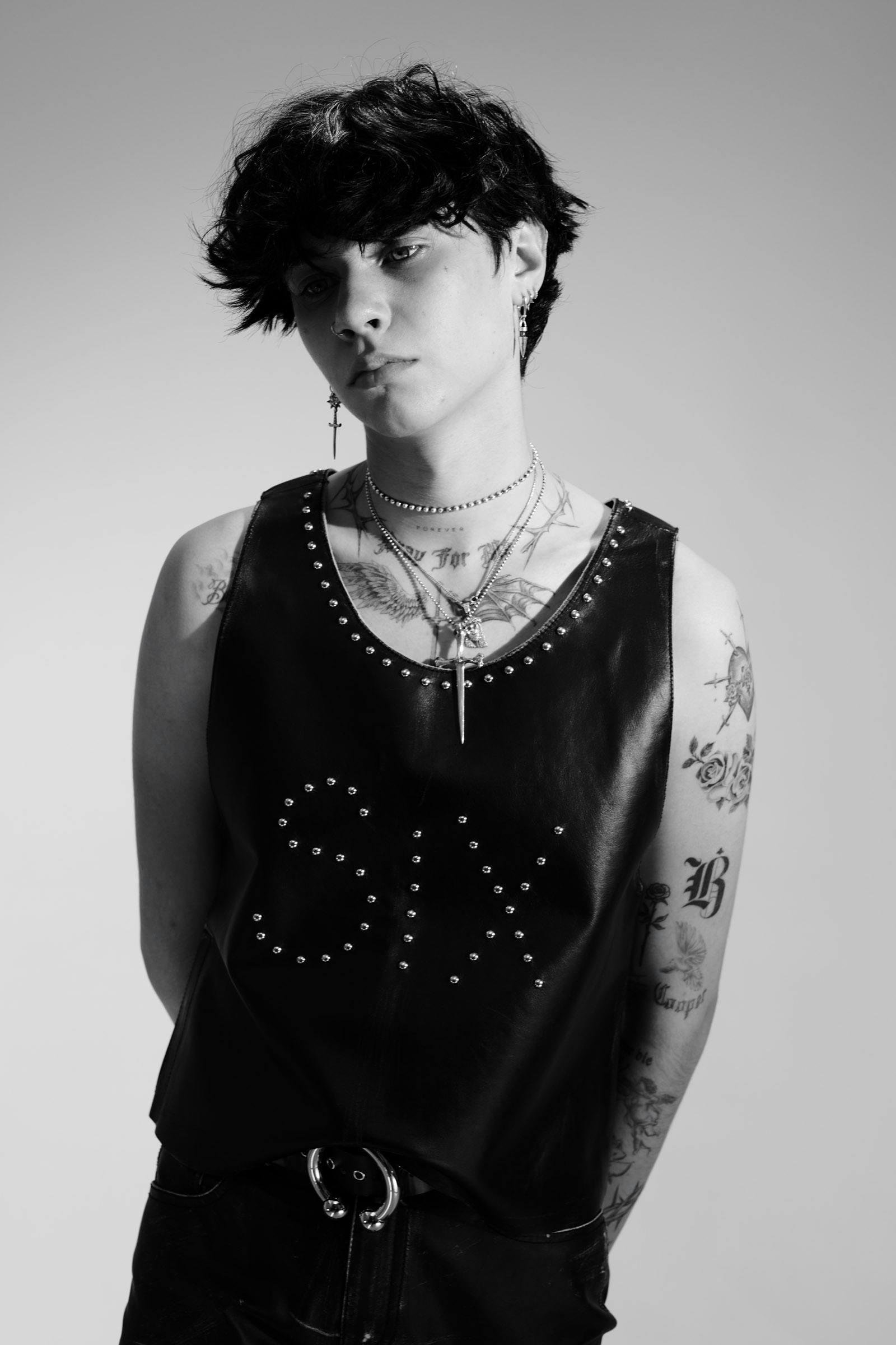
The chest is one of the clearest parts of Landon Barker tattoos. In the Highsnobiety portrait, the open neckline shows fine lettering running across the upper chest, a pair of wing-like shapes, and floral lines that continue toward the shoulders. The work is mostly black and grey, so the tattoos keep a soft, slightly worn-in feeling instead of looking like bright traditional flash.
The placement makes the designs feel connected. The lettering sits low across the chest while the wings spread outward, giving the upper body a broad shape. Lines near the collarbone follow the body instead of cutting straight across it. That matters with chest tattoos because the skin moves whenever the shoulders lift or the wearer turns. A design that follows those changes will usually look more natural than a rigid image dropped into the middle.
There is also a contrast between the open skin and the shaded areas on the arms. The chest does not read as one solid block. Small gaps let the flowers and letters stay separate, while the darker outlines keep the overall design from disappearing under clothing. The wings create the visual bridge between the centre of the chest and the floral arm work.
Public tattoo write-ups often describe the chest lettering as a personal phrase, but it is better to avoid inventing a fixed meaning for every word. What is visible is enough to understand the style: thin script, symmetrical placement, and imagery that spreads toward the shoulders. If you want a similar effect, start with the shape of the chest and decide how the design should move before choosing every small detail.
His arm tattoos use floral linework and strong black outlines
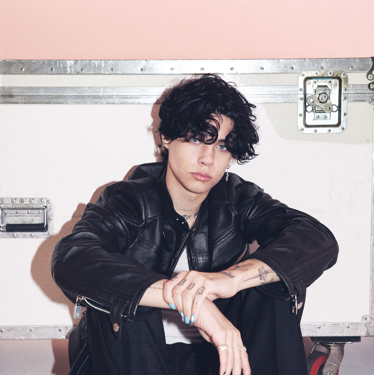
Landon’s arm tattoos add most of the collection’s texture. The E! portrait catches him with his forearms crossed, making the small hand marks and the larger designs near the wrists easy to see. The ink is not arranged like a perfectly finished sleeve. Instead, different pieces sit at different heights, with flowers, thin shapes, and darker outlines appearing as the arms turn toward the camera.
That scattered layout gives the collection a casual feel. The floral work is recognisable without becoming too heavy, and the open skin around it keeps the shapes from running together. His hands have smaller tattoos that read almost like little symbols. They are harder to identify from a distance, but they help the arm work feel lived-in rather than staged for one photo.
The arms also show how much a pose changes tattoo visibility. With the elbows bent, some of the forearm designs sit in shadow while the hands come forward. In a full-length portrait, the same marks would be much smaller. That is why a close, sharp photograph matters when looking at celebrity tattoos. A blurry event picture can make a flower look like a dark patch, while a clean editorial portrait shows the outline and spacing. Clarity matters as much as scale when a tattoo has fine lines.
For design inspiration, the useful idea is not copying a single rose. It is the balance between fine floral lines and stronger black contours. That combination leaves room for future work and keeps the arm from feeling like one flat wall of ink. It also gives a tattoo artist several ways to connect new pieces without making every design identical.
The face and neck marks keep the look recognisable
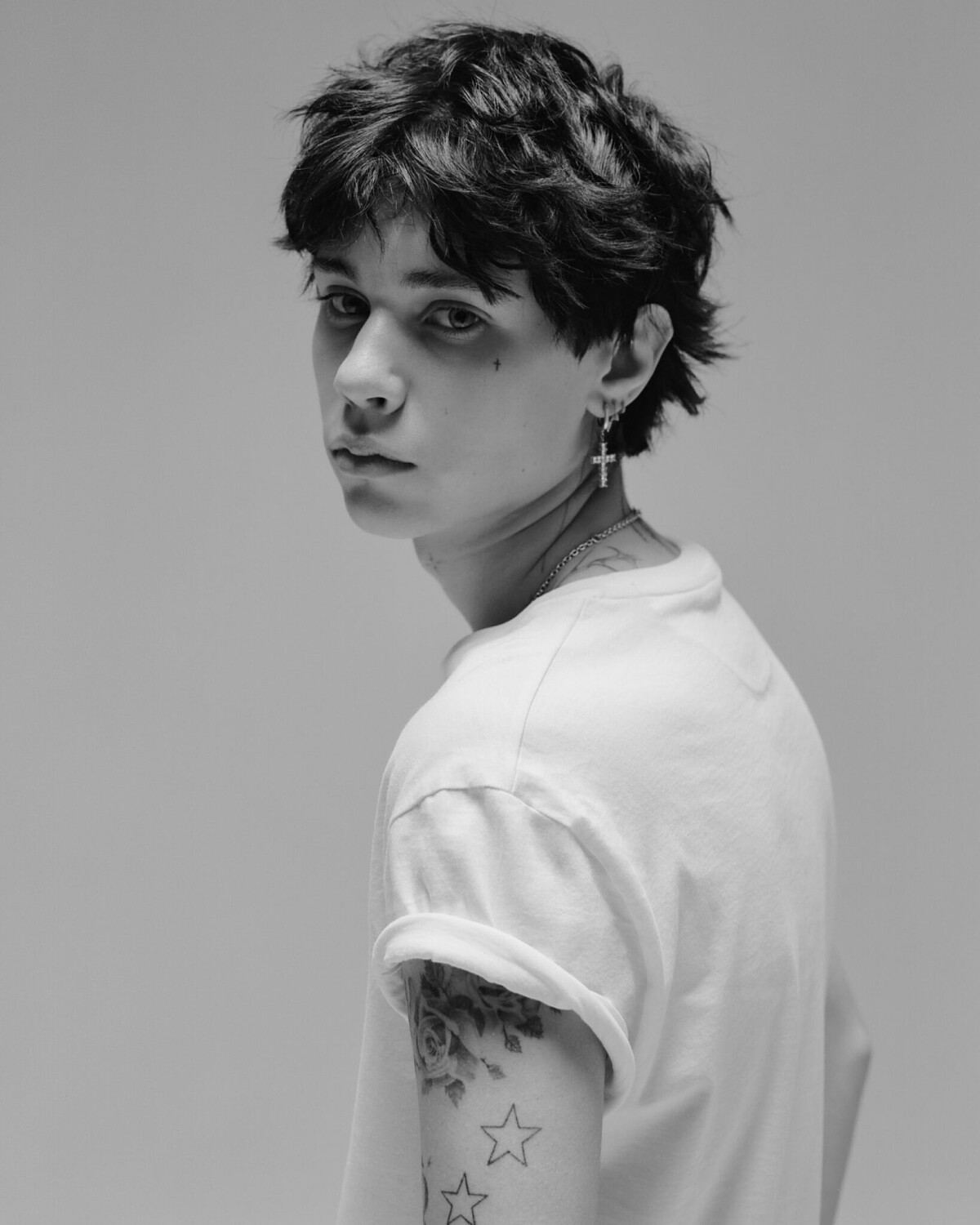
Some Landon Barker tattoos are small, but their placement makes them stand out. The black-and-white IMG Models portrait shows a tiny cross near the eye and light neck lettering beneath the jawline. These are not large designs, yet they change the way the whole face reads. The marks stay visible even when his hair, jacket, or jewellery covers most of the other ink.
Face tattoos need a different kind of planning from an arm or chest piece. There is little room for error, and even a tiny symbol becomes part of someone’s everyday expression. Landon’s small cross is placed close enough to the eye to be noticed without taking over the portrait. The neck lettering sits lower, so it works as a detail when the head is turned and almost disappears when the collar rises.
The style is restrained compared with the larger work on his arms. There is no oversized portrait or solid black panel across the face. The small marks leave his features visible while still adding an alternative, slightly punk edge. Small placement can have a bigger effect than a large design when it changes the frame around the face.
It is worth separating what can be seen from what is only reported. Some coverage identifies the neck words as a phrase connected with prayer, but the exact story behind every mark is not always public. The useful visual takeaway is clearer: short lettering can sit close to the jaw and remain readable, while a tiny symbol near the eye acts like a signature.
The shoulder and upper arm tattoos bring in hearts and stars
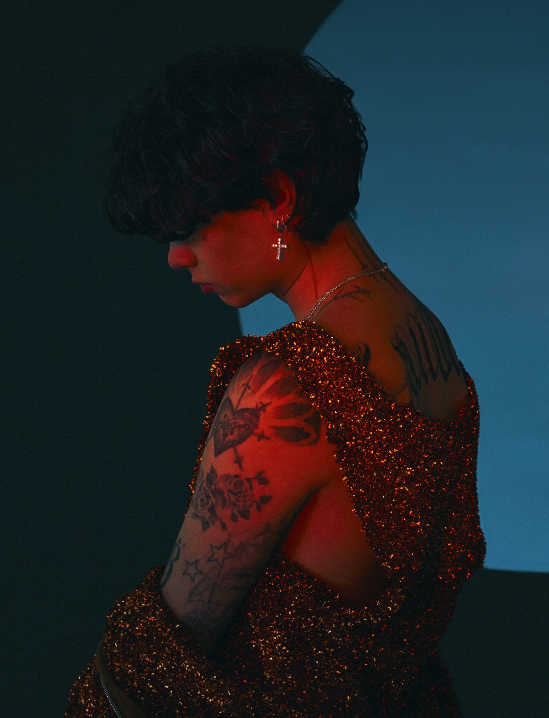
A Flaunt editorial portrait gives a different view of Landon Barker tattoos. The red and blue lighting makes the image dramatic, but the shoulder and upper arm designs are still clear. A heart-like image sits near the shoulder, roses fill the upper arm, and star outlines continue lower down. On the back of the shoulder, larger dark lettering follows the curve of the body.
This photograph shows how the same collection can feel soft and sharp at once. The roses have rounded petals and shaded centres, while the star outlines are simple and open. The shoulder piece adds more weight, but the smaller stars create breathing room below it. Together, the different shapes make the arm look like it was built in layers over time.
The lighting changes the apparent colour and contrast, so the safest description is based on the visible structure rather than guessing at exact ink tones. The main details are the floral forms, the heart-shaped centre, the star outlines, and the lettering near the upper back. They are linked by placement and mood, not by one strict style.
That mix is useful if you want a collection that feels personal without being too coordinated. One large piece can be the anchor, while small stars or simple outlines fill the space around it. Leaving some skin open also keeps the shoulder from becoming a single dark mass and makes later additions easier to plan.
The back and arm work show how the collection grows
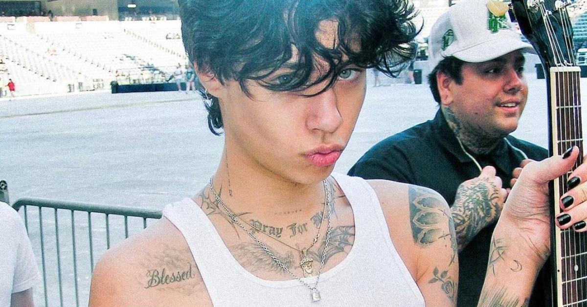
The Distractify portrait focuses on the front of Landon’s upper body and shows the chest phrase, shoulder work, and floral details on the arms. The photo is quieter than the Flaunt image, which makes it easier to study how the lettering and arm designs sit together without bright colour or heavy styling competing for attention.
The flowers sit high enough to work with a short sleeve, while the stars continue toward the elbow. That gives the arm a natural vertical rhythm. The upper section is denser and more detailed, then the lower section opens up. This kind of arrangement can make a tattoo collection look finished even when it is still changing.
Across the photos, the same pattern keeps returning: larger images near the chest or shoulder, smaller marks on the hands and face, and floral details that soften the darker outlines. The result does not look like one flash sheet. It looks like a personal archive built through different moments. Some meanings have been reported, while other designs are simply visible pieces that Landon has chosen to keep private.
The best lesson from Landon Barker tattoos is to build around a mood and a body map, not around a random list of pictures. Decide which areas should carry the strongest work. Leave space around pieces that need to stay readable. Use small symbols to connect larger tattoos, and remember that a design will look different when the arm bends or the shoulder turns.
If you like the pop-punk edge of the collection, black and grey linework, open stars, floral shading, and short lettering can create a similar direction without copying someone else’s exact ink. Start with the ideas that matter to you, then let the placement guide the artwork. The collection works because the pieces feel related while still showing different sides of the person wearing them.