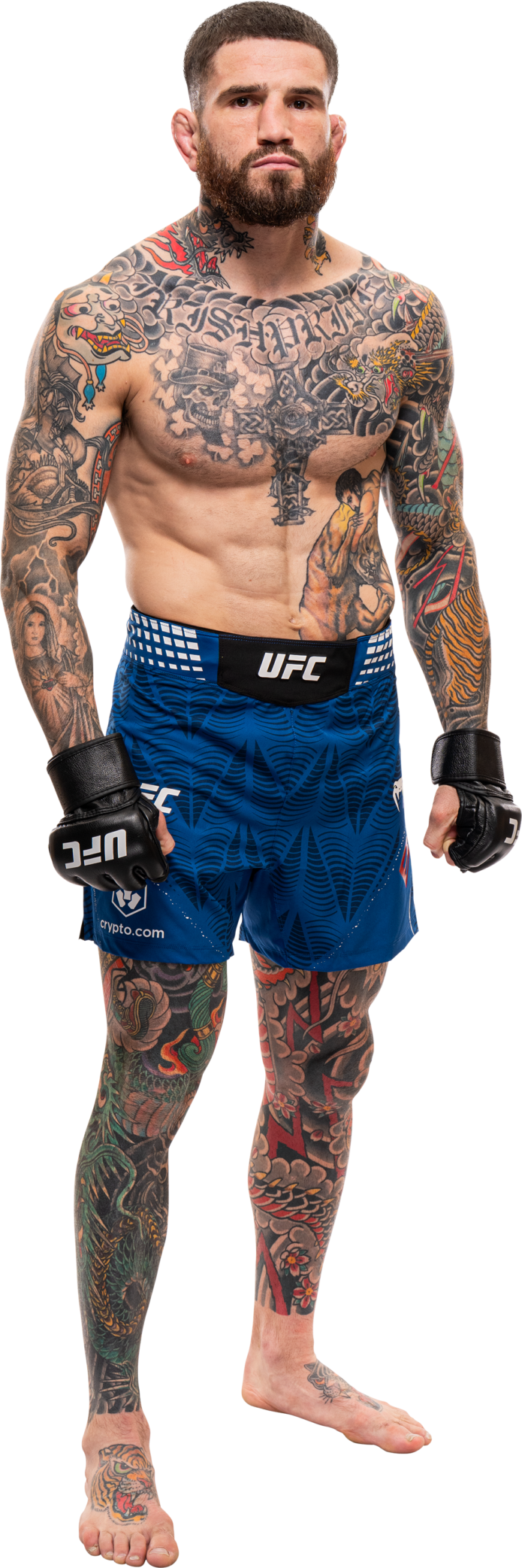
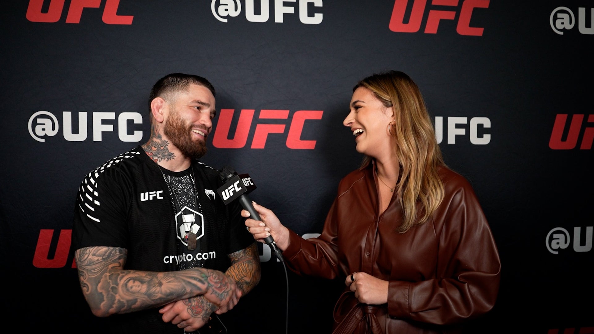
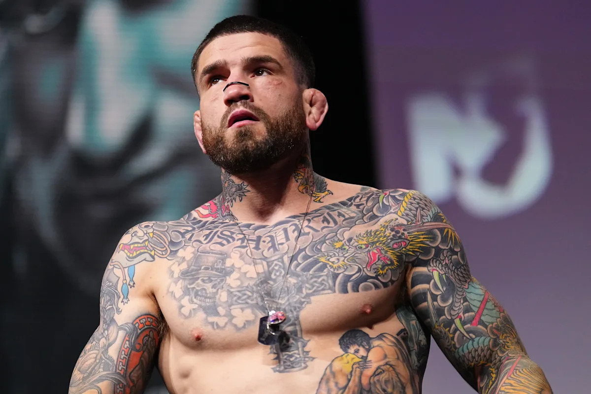
Sean Brady’s tattoos are a big part of his look. The UFC welterweight has a full chest, Japanese-inspired work across both arms, dragons on his neck, and a large back piece. New designs have been added over the years, and some older ink has been covered or reworked.
The collection mixes Japanese dragons, waves, clouds, skulls, script, and religious symbols. Colour shows up in places, while the chest uses softer greys around its lettering and central figures. Brady’s tattoos feel like a working collection rather than a single planned suit.
This guide looks at the main designs and what their placement shows about planning bold tattoos.
The chest piece brings lettering, skulls and Japanese movement together
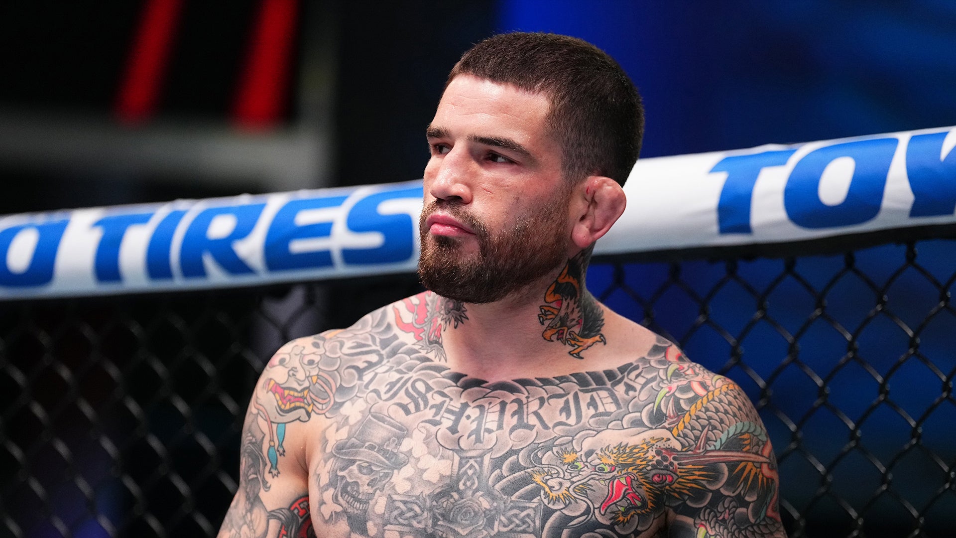
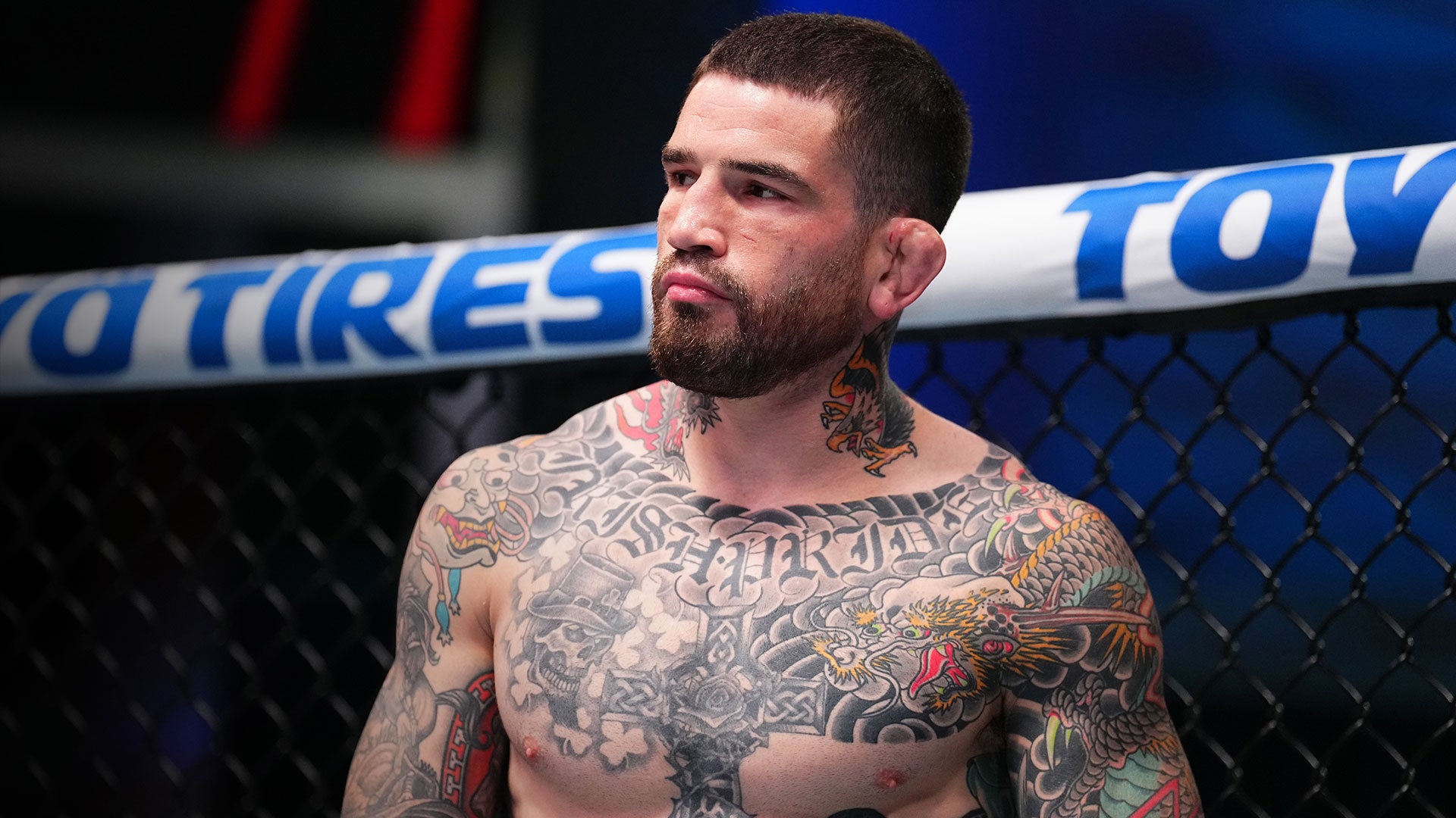
Brady’s chest is the first area many people notice in shirtless photos. Old English lettering runs across the upper chest; skulls, clouds, and darker shading fill the space below. The top forms a strong horizontal line, while the lower design moves toward the stomach and arms.
The Japanese-inspired imagery around the letters helps the chest read as one piece. Dragons and waves curve around the sharper letter shapes, leading the eye from the words to the animals and down the torso. That keeps the lettering from looking like a name with unrelated filler around it.
Chest tattoos shift as the shoulders roll and pectoral muscles change shape. Brady’s larger forms remain clear when his body moves; the smaller details sit inside darker areas instead of being spread thinly across the whole chest.
If you’re planning chest lettering, start with where the line will sit. Ask your artist to show the stencil from the front and both three-quarter angles. A phrase that looks level on paper may need a small adjustment around the collarbone. Good chest lettering should feel attached to the body, not pasted across it.
Brady uses brighter colour in the dragons and arms, while much of the central chest stays grey and black. That makes the colour work like an accent. A limited palette can also leave room for other pieces to connect later.
The Japanese dragons give his arms a strong sense of motion
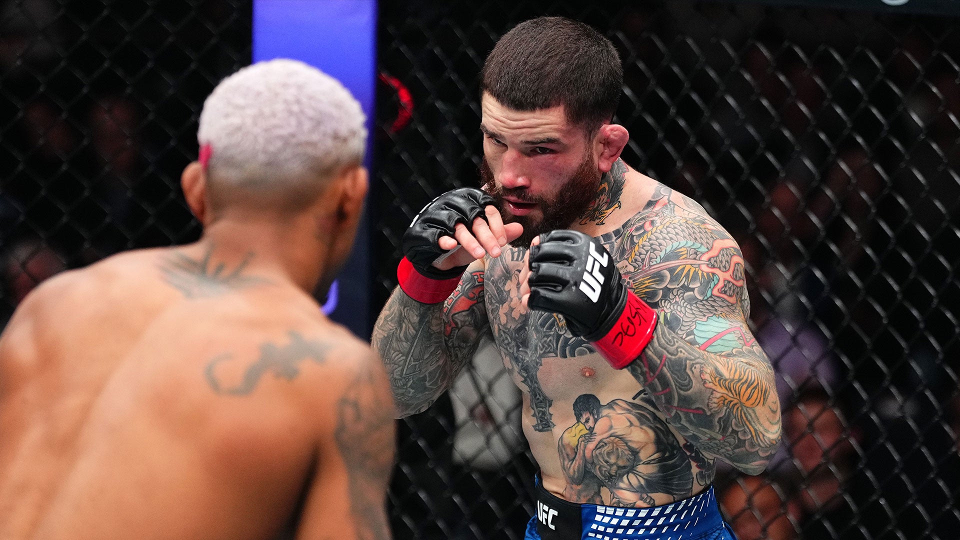
Brady’s dragons wrap around the arms. Their bodies curve over the shoulders and down the upper arms; scales and whiskers fill the larger outlines with detail. The lines travel in different directions, so the sleeves look active even when his arms are relaxed.
The curved forms follow the shoulder and elbow. Waves and clouds soften the joins between images, while darker outlines keep the dragons readable from farther away.
The sleeve has a shared look without making every design identical. Dragons, flowers, and background elements use related line weights and colour. That visual link helps the work feel planned as new sections are added.
A crowded sleeve can happen when every image is treated as equally important. In Brady’s stronger views, the dragon faces and main curves have the clearest contrast, with softer filler behind them. Pick two or three hero shapes for a sleeve, then let the background support them.
Check a sleeve from more than one angle. A dragon that reads well from the front may disappear when the arm turns inward. A mirror, phone photos, and a stencil check with your elbow bent can show whether the design still works across the shoulder and triceps.
The neck tattoos connect the chest to the face and shoulders
Brady’s neck work takes up less skin than the chest or arms, but it’s visible above a shirt. Dragon heads and dark ornamental shapes rise from the chest toward his jaw, linking the torso and head.
The neck is narrow and always moving. A design that looks good on a flat page can lose its shape where it crosses the throat or curves under the ear. Brady’s tattoos use recognisable outlines and bright colour accents that remain legible when he turns or speaks.
Neck ink changes the feel of the whole collection. Chest and arm tattoos can be covered; neck pieces show right away. If you want a less visible version, a small mark behind the ear or at the side of the neck can give a similar effect with less coverage. Think about how often you want it seen before choosing a front-of-neck design. Visibility is part of the meaning, even when the image itself is purely decorative.
The neck also bridges the chest and shoulders. A few connected shapes can keep a heavily tattooed shoulder from looking cut off at the top. Leave enough skin around the throat so the work doesn’t turn into one dark collar.
The back tattoo is a Japanese mask with a story behind it
Brady’s large Japanese mask fills the upper back. Its bold shapes are visible even in a cage photo, and it has become one of his most recognisable pieces. He has spoken about his interest in Japanese tattoo culture and getting new work after fights. The piece is also linked to a sponsor relationship that helped make it possible.
A back tattoo needs a clear outline before the small details come into view. The mask gives Brady’s design that shape: heavy eyes, mouth, and surrounding lines spread across the shoulders, while lower areas hold extra shading and texture.
The back gives a large subject room to express itself. A mask, dragon, or religious scene can lose impact when squeezed onto an arm. On the back, the artist has room to shape a face and carry waves, clouds, or colour toward the shoulder blades.
A back piece can be personal without being on display all the time. Brady’s chest and neck are visible in many photos; the mask can be covered when he wants. Consider whether you want a tattoo seen often or kept more private.
If you’re planning a large back design, work from a full-body photo and consider the space between the shoulders, ribs, and waist. The best large tattoos are composed for the whole back, not enlarged from a tiny flash image.
Smaller symbols and cover-ups keep the collection changing
Alongside the dragons and mask, Brady has religious images, skulls, script, fighter references, and parts of older tattoos that have been covered or darkened. Those details make the collection feel like it has grown over time, as his preferences changed.
A cover-up can mean someone wants a new style or a larger design. Brady’s darker, Japanese-inspired arm work gives the area a new direction while absorbing some of the older lines. The new subject needs enough contrast and structure to stand out, even if every trace of the previous tattoo doesn’t disappear.
The religious imagery adds another note beside the dragons and skulls. Crosses and sacred figures carry a different tone, and the collection lets those designs sit together without forcing them to say the same thing.
Smaller tattoos on hands, wrists, and inner arms see more friction, sunlight, and movement. Simple symbols and stronger outlines tend to be easier to read there than a tiny realistic scene. Brady’s larger pieces carry the detail; the smaller marks act as punctuation.
Open skin is not unfinished work; it is space for the next chapter. Leaving gaps gives you somewhere to put a later idea, which can matter when your life and career change.
Sean Brady’s collection combines Japanese-inspired dragons, a chest scene, neck tattoos, and a large back mask with smaller symbols and cover-ups. The pieces differ, but shared shading and placement help them sit together. If you like the style, borrow the pacing and give the main design room. His tattoos look built through the years, not made for one camera angle.