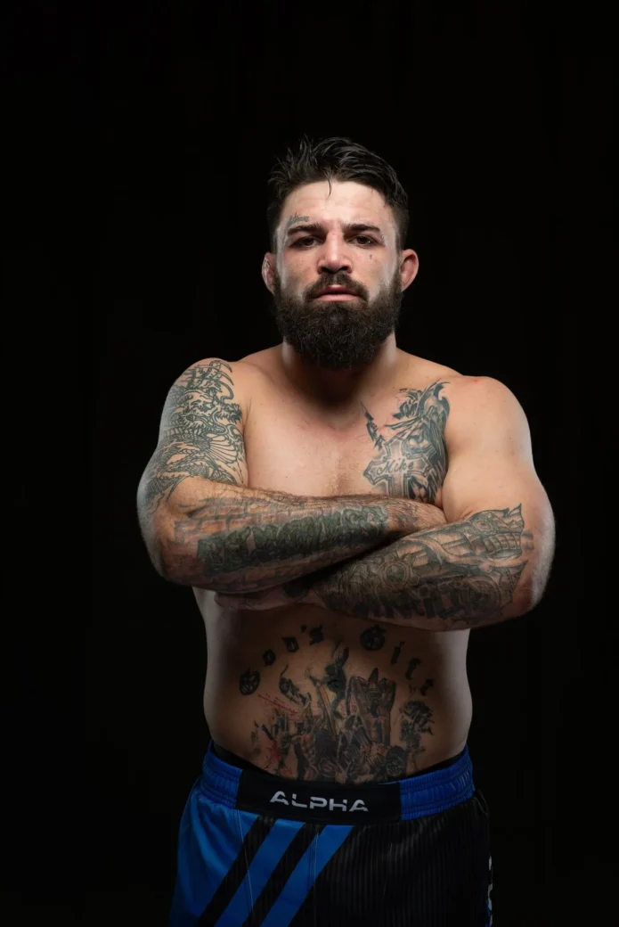
Mike Perry’s tattoos spread well beyond one sleeve. Face and neck ink sits above designs on his arms, chest, abdomen and hands, mixing big lettering, religious imagery and fight-related shapes. The collection is bold and meant to be seen.
The word Platinum above his eyebrow is the easiest detail to spot, but there’s more to the layout: a dragon around one arm, a cross and Knight of Swords on the chest, and smaller words between the larger pieces.
Perry has discussed the face tattoo in interviews. He said it followed a cut above his forehead during training before his UFC debut, and that he wanted the tattoo for more than one reason. It’s part of his public image as a fighter, not just decoration.
Mike Perry’s dragon arm is the main event
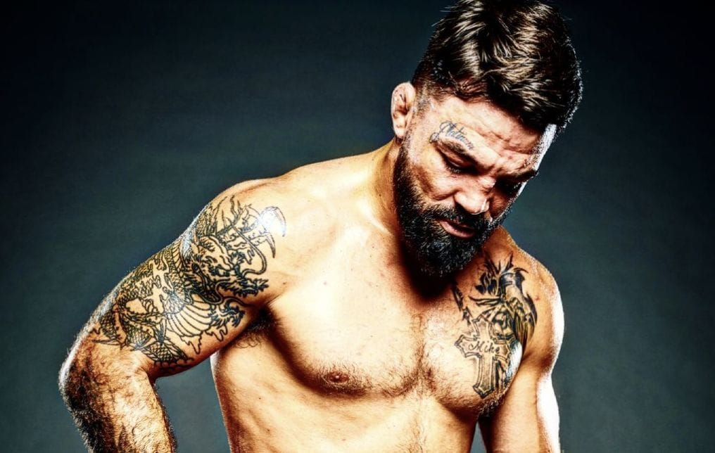
The dragon on Perry’s arm is the largest visual anchor. It starts around the shoulder and upper arm, then winds through darker sections as it continues down. In a shirtless photo, it gives that side of the body a clear shape instead of a string of unrelated images.
Dense linework and shading surround the dragon, making it read as a sleeve. The darker panels define the outline; lighter gaps leave places for the eye to move. On a muscular arm, that balance lets the design follow the body without losing the main subject.
The shoulder looks especially strong from the front. Turn slightly and the full wrap becomes easier to see. The tattoo moves around the arm, so its lines shift when Perry flexes, reaches or raises his hands for a face-off.
The standout detail is the sense of motion. A dragon already curves naturally, and Perry’s placement carries that shape along the muscle. Dark background shading helps the figure hold its contrast in bright arena light or a crowded fight-night photo.
If you’re planning a sleeve, decide where the main head or face should sit before filling in the rest. A large subject needs a path around the arm. Here, the central figure carries the design, while smaller shapes help join the elbow and forearm.
The chest cross and Knight of Swords carry the center
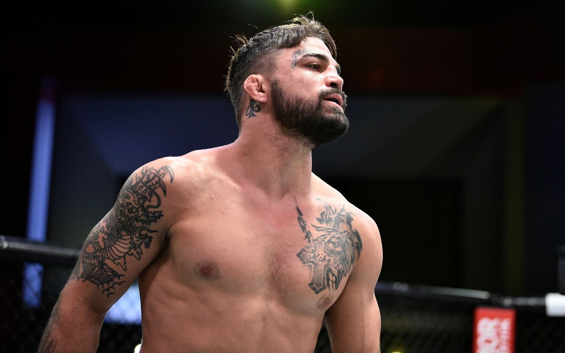
The chest pieces give the arm tattoos a place to meet. Perry has a religious cross across his upper chest, along with a Knight of Swords design mentioned in coverage of his ink. The symbols add a strong center without turning the whole chest into one dark panel.
The cross shows clearly when he faces the camera. It sits among other tattoos and connects visually to the shoulders. The Knight of Swords adds sharper lines, leading the eye from the torso back toward the arms.
Those shapes contrast with the dragon. The dragon bends and flows; the cross and sword have straighter edges. That mix keeps the upper body from feeling too soft or too heavy, while giving the tattoos a fight-ready feel without relying on a slogan.
The chest is where the separate pieces begin to read as a composition. They stay distinct, but their size and placement let them work together. Bare skin between them keeps the details open, and the shoulder and arm shading frame the center.
When planning chest ink, consider how the edges meet before choosing the central symbol. A cross or sword can look separate if shoulder tattoos stop abruptly. Curved lines, open skin and repeated black-and-gray shading can make the transition feel more deliberate.
Relentless lettering gives the forearm a sharp edge
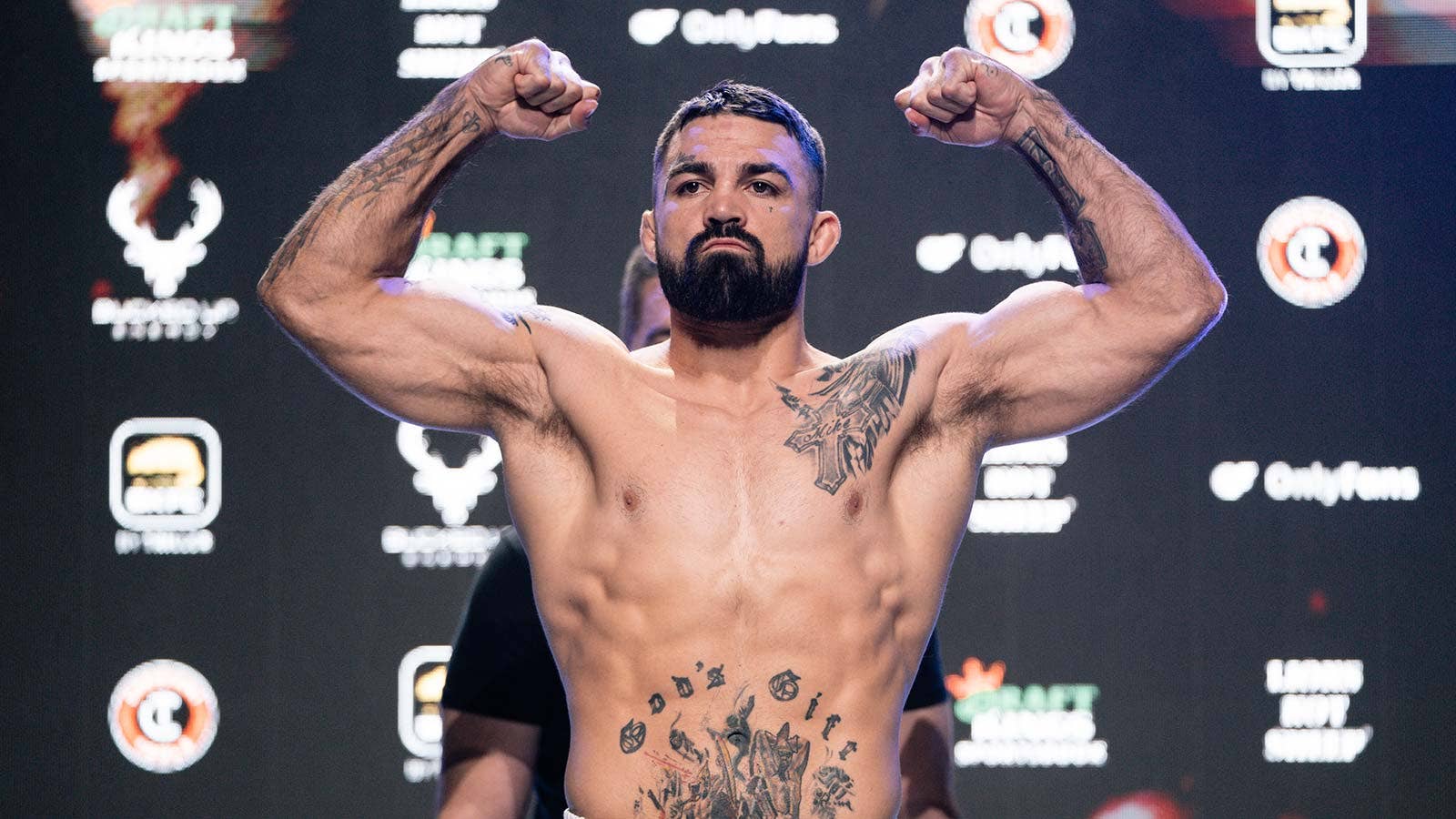
Perry’s right forearm has the word Relentless in compact script. It’s smaller than the dragon, but easy to read in a weigh-in or training pose because the forearm often faces the camera.
A picture can invite several interpretations; a word gives the viewer a direct message. Relentless fits Perry’s public image around pressure and toughness. Its placement makes that idea visible without filling the whole lower arm.
Darker tattoos above and below the lettering give it a frame. The changes in line weight help the letters stay distinct. That matters with forearm script, where movement and small type can make words blur together in a photo.
Give lettering room to breathe. A short word can be hard to read if it’s squeezed between larger images. Perry’s forearm leaves a clear lane for the text, letting the other tattoos support it rather than compete for the same space.
Choose a reading direction early and check the design with your arm relaxed. A phrase that looks right in one pose can turn sideways as the wrist rotates. The forearm is visible, so simple letterforms, spacing and a readable size matter.
The abdomen and hand tattoos add smaller fighting symbols
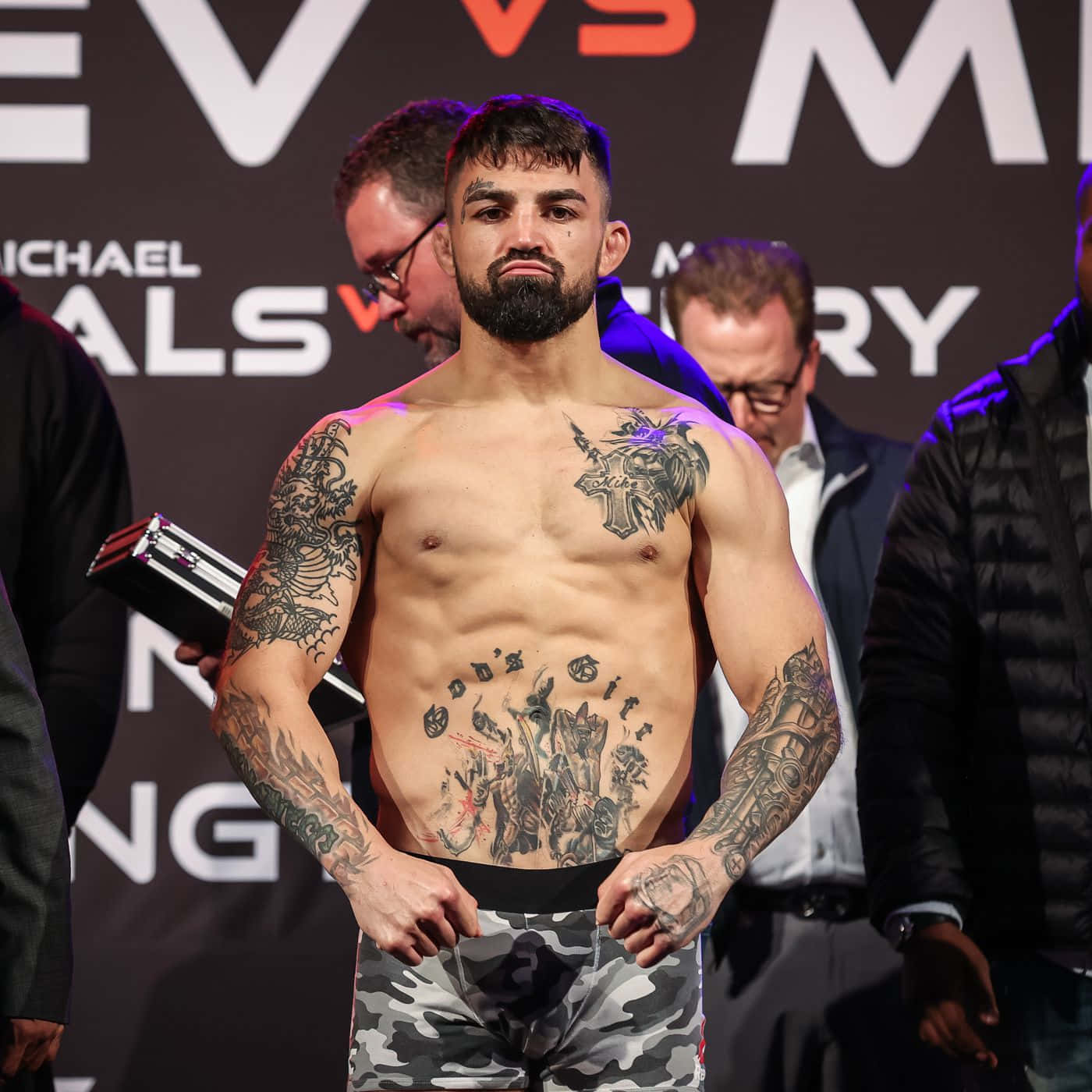
The larger arm and chest tattoos get the first look, but smaller pieces add character. God’s Gift runs across Perry’s abdomen, and a design shaped like a dog’s mouth has been noted on his left hand. They change the way the body reads when the camera pulls back.
The abdomen lettering sits below the chest symbols, adding another horizontal line without filling the stomach with a full scene. It is direct and easy to read, in keeping with Perry’s other visible ink.
The hand tattoo is different: it’s small, exposed and hard to ignore as he gestures. Its mouth-like shape gives the hand a rough edge and makes an ordinary pose part of the display. It also adds an unexpected detail next to the larger arm pieces.
Different scales give the eye a break. The dragon and chest cross provide large shapes, Relentless handles the forearm lettering, and the hand and abdomen marks fill quieter areas.
Smaller tattoos can connect two larger designs without turning the body into a crowded mural. A hand mark, short phrase or compact symbol works best when it has a clear place in the layout, rather than being added just because an area is open.
Face and neck ink changed the way every portrait reads
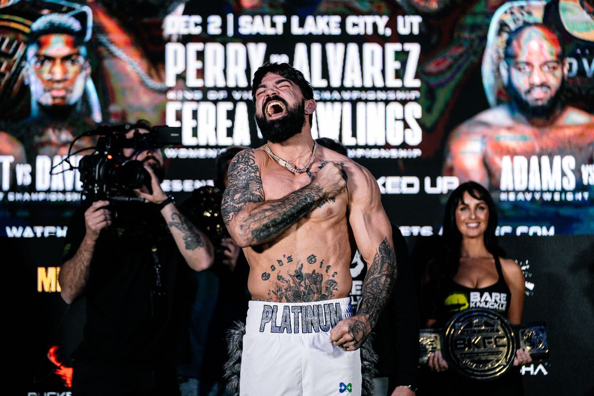
The face tattoo is what made Perry’s look instantly recognizable. Platinum sits above his eyebrow; the surrounding face and neck ink changes how every photo reads. Even when a fight is the subject, the face becomes part of the visual story before the viewer gets to the arms.
Perry has linked the tattoo to a cut he got in training before his UFC debut. He also said he wanted face ink and chose that moment to get it. That explanation gives the word context; visually, the lettering makes his expression look harder and more deliberate.
The neck tattoos connect the face to the shoulders, especially in a three-quarter portrait. The transition isn’t perfectly symmetrical, which adds to the collected-over-time look rather than making it feel like one planned costume.
Face ink changes the balance of a portrait. A word above one eye draws more attention than a small mark on an arm because viewers look at faces first. That’s why the Platinum lettering can be modest in size and still dominate the photo. The body tattoos support the impression, but the face sets the tone.
Anyone considering face or neck tattoos should think beyond the first photo. Hair, expression, lighting and age all affect how the design reads. Perry’s collection shows how placement can become part of a public identity, not just another detail in a sleeve.
Together, Perry’s tattoos mix large images with blunt words and smaller symbols. The dragon gives the arm movement; the chest cross and Knight of Swords create a center; Relentless draws attention to the forearm; and the abdomen and hand designs add more detail. Platinum ties the look back to his face.
The collection feels connected because the attitude repeats. The different subjects point toward fighting, toughness, faith or self-definition. A shared mood can link tattoos even when their artwork, size and placement vary.
Perry’s ink commits to a point of view. The lettering is visible, the large arm work has contrast, and the designs move with his body. It has rough edges, and that’s part of what makes the look his.