Celebrities

Rita Wilson’s new back tattoo opens a very different chapter

Rita Wilson’s tattoo story changed overnight. For most of her career, the singer, actor and producer was not known for showing a large amount of body art. Then, in a September 2026 Instagram carousel promoting her song “Stranger with Age,” she shared a photograph that put a substantial design across her back in full view. The image shows an ornate cross running from the upper back toward the lower back, with rounded, bud-like details inside the design.

The reveal is striking, but the most interesting part is the way Wilson has talked about tattoos in recent months. In an interview with The Cut, she described growing up with the idea that tattoos belonged to “a thug” or “a bad guy” who went to jail. After speaking with a tattoo artist, her understanding shifted. The artist told her that people often choose tattoos to show who they are. That change in perspective gives the new ink a little more context without pretending Wilson has explained every symbol.

The back cross is the clearest documented tattoo

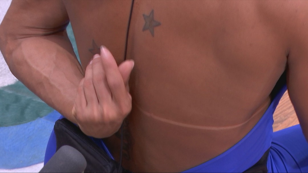
Rita Wilson back cross tattoo

The back piece is the one design the current reporting clearly documents. The Daily Beast described it as a massive budded cross, while other coverage has called it a large Celtic cross. Visually, the tattoo stretches vertically along the center of Wilson’s back, beginning near the neck and continuing toward the lower back. Its scale makes it the dominant feature of the photograph.

It is worth keeping the description precise. The reporting supports a cross with ornate, rounded details and a long central placement. It does not include a direct statement from Wilson explaining whether the cross is religious, familial, symbolic or simply an image she liked. Calling it a Celtic cross is a reasonable visual description used by multiple outlets, but the exact intended meaning remains unconfirmed. The design is documented; its private explanation is not.

The upper-arm tattoo adds a second visible design

Rita Wilson portrait with Chet Hanks matching cross tattoo

The same Instagram carousel also showed ink on Wilson’s upper arm or bicep. Close coverage described a sun-like motif with an infinity symbol above text that could not be read clearly from the pose. That makes the arm piece important, but it should not be over-inventoried. The image shows an arrangement, not a confirmed inscription.

At this point, the safest inventory names three visual elements: a sun-like illustration, an infinity symbol and lettering that remains unreadable. No reliable source has supplied the exact words, an artist credit or a date for the arm tattoo. That gap matters because tiny script is easy to misread, especially in a social-media photograph. Unclear lettering is still unclear lettering. It should not be turned into a quote for the sake of a cleaner list.

The published reveal keeps the family link visible

Rita Wilson upper arm sun and infinity tattoo

Wilson’s post was not staged like a formal tattoo tour. She used the carousel to promote “Stranger with Age,” joked about getting older and shared several photographs of herself making funny faces and surfing. The tattoo appears inside a larger, playful post rather than as a solemn announcement. That tone is part of the story. She was showing a new side of herself, but she was also having fun with the attention.

Her caption asked, “STRANGER WITH AGE? Who? Me? I’m lovin’ it!” That line makes the reveal feel connected to the song’s larger idea of becoming more comfortable with change. It would be too much to claim the tattoo was designed specifically for the single, because the reporting does not establish that. Still, the timing makes the cross part of a public moment about aging, self-acceptance and trying something unexpected.

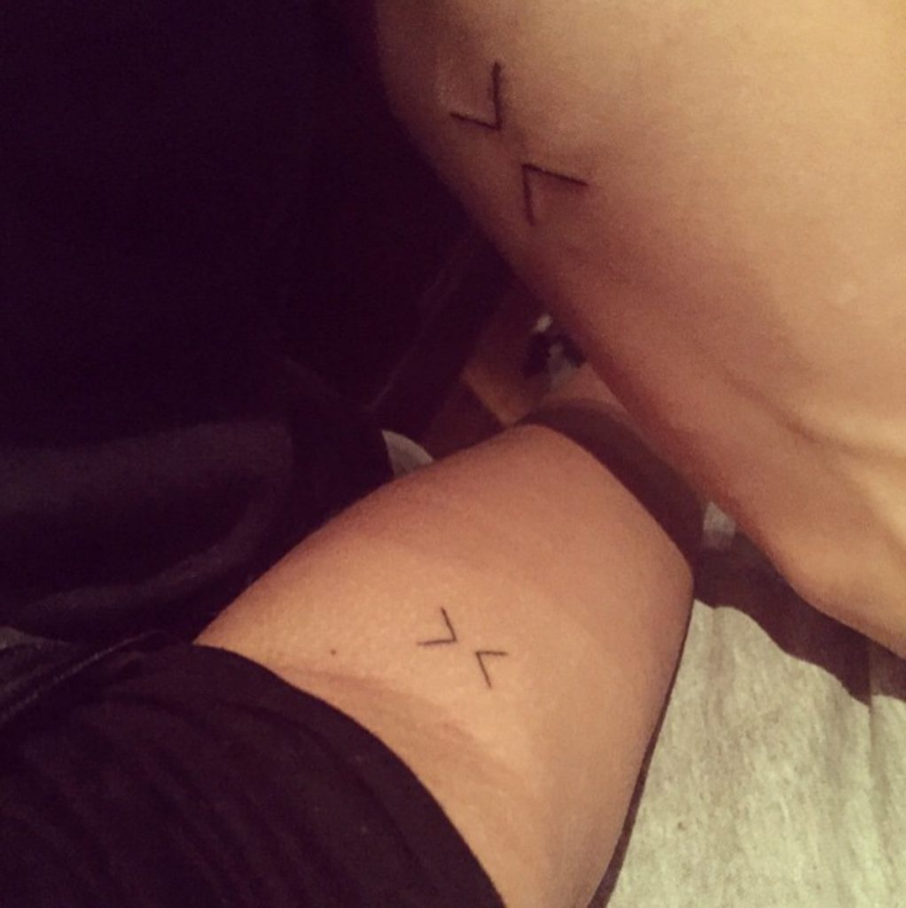
How Rita Wilson’s cross matches Chet Hanks’s

Rita Wilson and Chet Hanks matching cross tattoos

Several reports noted that Wilson’s back tattoo resembles, or matches, a cross tattoo worn by her son Chester “Chet” Hanks. Coverage from The Independent and other outlets connected the two designs, and a May 2026 Instagram video has been cited as showing Chet with similar back ink. The family connection is therefore part of the current public conversation, but the exact process behind the matching designs has not been fully explained by Wilson.

There are a few careful distinctions here. A visual resemblance is not proof that two tattoos were done in the same session or by the same artist. It also does not prove whether the idea began with Wilson, Chet or a shared family conversation. The useful fact is that the cross has been reported as matching or closely resembling her son’s, which gives the design a possible family dimension without closing the case.

What the family story adds to the tattoos

In The Cut interview, Wilson explained that her childhood view of tattoos was shaped by a stereotype: people with tattoos were seen as dangerous or disreputable. Meeting a tattoo artist changed that view. The artist’s explanation was simple: people choose designs that show who they are, so a tattoo can help another person understand them.

That quote does not decode the cross or the arm design, but it does tell us how Wilson now looks at body art. She approaches tattoos as personal language rather than a warning sign. The shift also explains why the reveal landed as a new chapter at 69. The story is not that she suddenly became someone else. It is that she felt freer to let a different part of herself be visible. The change in attitude is documented; the tattoo’s exact symbolism is still hers to define.

What the current evidence confirms:

A granular inventory of Wilson’s newly public ink can be kept short and accurate. On the back: a large vertical cross with ornate, budded or Celtic-style detailing, extending from the neck area toward the lower back. On the upper arm: a sun-like illustration, an infinity symbol and text that is not legible in the available photograph. The cross has been reported as matching or resembling Chet Hanks’s own back tattoo.

That is enough to describe the reveal without padding it with guesses. The public record does not confirm the tattoo artist, the exact date of the session, whether the designs are permanent or temporary, or the meaning Wilson assigns to each image. The Daily Beast specifically noted that Wilson did not clarify whether the tattoos were permanent. A careful article should keep that uncertainty visible, especially because the photograph appeared in a promotional social post rather than a tattoo publication.

The design is bold because the placement does the work:

Even without a confirmed explanation, the placement tells us why the back cross attracted so much attention. A vertical design from the neck down the spine changes the silhouette when the wearer turns around. It can stay covered in everyday clothing, then become dramatic in a single photograph. That contrast makes the tattoo feel private and public at the same time.

The arm design works differently. A bicep tattoo is easier to reveal casually and may appear in sleeveless clothing, beach photographs or movement. Together, the two placements create a small but noticeable collection: one large piece that controls the back, and one smaller arrangement that adds detail to the arm. The photographs show that Wilson was not simply adding a tiny token somewhere hidden. She chose ink that could become part of the visual conversation.

Why the reveal landed with fans:

Fans reacted because the image challenged a long-established expectation. Wilson has spent decades in public, but the tattoo was not part of the standard red-carpet picture most people associate with her. Her marriage to Tom Hanks, her film work and her music career are all familiar. A large back tattoo created a fresh visual detail that audiences had not been invited to see before.

The response also fits the message Wilson shared about becoming less judgmental toward tattoos. Commenters described the reveal as freeing, cool and authentic. Wilson replied to one commenter who suggested that getting older could mean taking off the mask and letting the authentic self show. Her response was “All of the above.” That is not a direct tattoo explanation, but it is meaningful context for the moment in which she chose to show the design.

What remains unconfirmed:

The cross may be religious, cultural, familial or simply aesthetic. The sun and infinity elements may carry a private message. The lettering may spell a name, phrase or date. None of those possibilities should be stated as fact until Wilson or a reliable source identifies them. The available photographs are strong enough to document the shape and placement, but not the full story.

That restraint makes the tattoo story better, not thinner. Wilson has only recently made the designs public, and she may explain them later. For now, readers can see a large back cross, an arm arrangement, a possible family connection to Chet Hanks and a clear change in her own attitude toward body art. The mystery is part of the first reveal.

Rita Wilson’s tattoo chapter is still unfolding:

Rita Wilson’s new ink reads like a visible sign of a personal shift. The back cross is bold, the arm tattoo adds another layer, and the resemblance to Chet Hanks’s tattoo gives the story a family thread. Her own comments about tattoos make the timing feel even more natural: she has moved from seeing ink as a stereotype to seeing it as a way people tell the world who they are.

There is no need to force a final meaning onto the designs. The most honest reading is that Wilson felt ready to show a side of herself that had been private, playful and perhaps still evolving. The tattoo may eventually come with a fuller explanation. Until then, the evidence is enough: a large cross, a sun and infinity motif, unreadable text, and a new willingness to be seen differently.

Watch the latest coverage of Rita Wilson’s tattoo reveal:

Mads Mikkelsen’s Tattoos: H.J. Initials and Pusher Ink

Mads Mikkelsen’s tattoo story is easy to muddle because his most famous ink belongs to a character. The actor has been linked to a small real tattoo of the initials H.J., associated with his wife Hanne Jacobsen, but the boldest images online come from Pusher II. Those photographs show Tonny, the damaged Copenhagen criminal Mikkelsen played, with a shaved scalp, a huge back design and ink running down his arms.

That distinction matters. A film tattoo can be perfectly real inside a scene without being permanent ink on the actor. In Mikkelsen’s case, the word RESPECT, the “Blood & Honour” lettering and the winged central design are part of Tonny’s look. They were created to tell the audience something about a fictional man who wants status, approval and control. They should not be listed as Mikkelsen’s everyday tattoo collection.

The small H.J. design has a completely different feeling. It is personal, quiet and easy to miss. Public reports describe it as a wrist tattoo and connect it with Hanne, while tattoo-focused posts have credited a Danish artist and described it as Mikkelsen’s first tattoo. The documentation is not as extensive as the film stills, so it is best treated as a reported personal tattoo rather than an invitation to invent a larger sleeve that the photographs do not prove.

What can be shown clearly is Tonny’s screen ink. The images below are arranged by the tattoo details they actually show. That means the gallery is about Mikkelsen’s tattooed character work, with the real H.J. initials kept separate. It is a more accurate way to look at the actor’s tattoos than mixing a private wrist mark with makeup and costume design.

The RESPECT tattoo on Tonny’s scalp

Mads Mikkelsen as Tonny showing the RESPECT tattoo across the back of his shaved scalp

The first thing most viewers remember is the word RESPECT across the back of Tonny’s shaved head. It is large, angular and impossible to hide once the camera moves behind him. The placement is part of the joke. Someone who genuinely commands respect would not need to announce it in block letters, and Tonny is constantly chasing recognition from people who do not give it to him.

Mikkelsen later described the idea as ironic and connected to Tonny’s need for approval. That gives the tattoo more depth than a simple gangster image. It is a visual admission that the character feels overlooked. The head placement also changes the way the word works. It is visible to everyone behind him, but Tonny cannot see it himself. He has to rely on other people to read the message.

“Blood & Honour” across the upper back

Mads Mikkelsen as Tonny with RESPECT, Blood and Honour lettering and a winged back tattoo

Below the scalp lettering, the upper-back design adds another layer of coded identity. The phrase “Blood & Honour” curves over the shoulders, while a dark winged figure and long central blade sit between the shoulder blades. In the wider promotional still, the ink reads as one connected piece rather than a set of isolated tattoos.

That scale is important to the character. The design gives Tonny a body that speaks before he does. It makes him look as if he belongs to a violent world, even when his behaviour shows insecurity and confusion. The tattoo is not subtle because Tonny is not subtle. He wants to look dangerous, but the film keeps showing the fear and need underneath the performance.

The forearm tattoos in the dockside scene

Mads Mikkelsen as Tonny extending his tattooed forearm during a Pusher II scene

One of the most useful stills shows Tonny extending his forearm toward his father at the waterfront. The image does not turn the arm into a clean catalogue plate, but it proves that the character’s ink continues beyond his scalp and back. The forearm tattoos sit inside a tense family exchange, which makes the placement feel more loaded than a random close-up.

Tonny is trying to prove something in this moment. His body is part of the argument, and the tattoos help frame him as someone shaped by the street. At the same time, the scene exposes how little power he actually has with his father. The ink makes him look hardened, while his posture and the conversation reveal a son still asking to be taken seriously.

A close view of the RESPECT lettering

Close view of Mads Mikkelsen as Tonny with the RESPECT tattoo visible on his shaved head

The close-up over the table shows how rough the lettering is meant to look. The lines are uneven and slightly jagged, which suits the film’s low-level criminal world. This is not polished luxury tattooing. It looks like a mark made for speed, attitude and immediate recognition.

That roughness also supports the character reading. Tonny is not a calm professional who has carefully designed a public image. He is impulsive, bruised and desperate to be noticed. The tattoo turns that desperation into a word. The camera can focus on it for a second, then return to the table, the drugs and the choices that keep making his life worse.

The arm ink in the blue-lit room

Mads Mikkelsen as Tonny seated in blue light with visible shoulder and arm tattoos

A separate still from the film’s darker interior scenes shows Tonny seated in a blue-lit room with tattoos visible across his shoulders and forearms. The mood is very different from the red back shot. There is no theatrical pose and no broad display of the lettering. Instead, the ink appears as part of the character’s everyday silhouette, visible because his vest leaves the arms uncovered.

This is why the tattoo work in Pusher II remains memorable. The designs are not only there for one reveal. They keep returning as part of Tonny’s physical presence. The red room makes the back piece feel confrontational, while the blue room makes the arm ink feel lived-in. Both images belong to the same fictional collection, but they communicate different sides of him.

How the film tattoos differ from Mads Mikkelsen’s real ink

Mads Mikkelsen as Tonny in a close portrait with visible shoulder and arm tattoos

The safest summary is simple: the RESPECT lettering, the Blood & Honour phrase, the winged back design and the arm tattoos shown here belong to Tonny. They are character tattoos created for the Pusher films. Mikkelsen’s own reported H.J. initials are a separate, much quieter story, and the public evidence does not support turning them into a full list of dramatic permanent tattoos.

That difference is worth keeping in the headline details, the captions and the article layout. Generic Cannes portraits cannot prove a tattoo, and a still from a film cannot prove that an actor wears the same design off camera. Good tattoo research follows the image instead of forcing the image to match a rumour. In this case, the pictures are strongest when they are labelled honestly: Mads Mikkelsen playing Tonny, with the character’s ink doing a lot of the storytelling.

Bottom line: Mikkelsen’s real tattoo record appears compact, with the H.J. wrist initials as the clearest reported personal detail. His most visible tattoo legacy comes from Tonny, whose scalp, back and arms were marked to show insecurity disguised as toughness. That is why searches for “Mads Mikkelsen tattoos” produce such striking images even though many of them are really images of a role.

Watch a relevant Mads Mikkelsen interview: The video below is included as a companion to the actor’s public persona and his work in intense character roles.

Nick Cannon’s tattoos have lived through a lot of chapters

Nick Cannon’s tattoos have changed as his life has changed. What started with a famous name across his back later became a large cover-up, while newer work on his chest and neck turned into something closer to an autobiography. He has described his body as covered from the neck down, and the collection backs that up: there is visible ink on his chest, shoulders, back, arms, hands and neck.

That makes Cannon’s collection interesting for a simple reason. It isn’t frozen in one era. The tattoos show relationships, family, faith, ambition and the passage of time. Some of the older pieces are bold and easy to spot. Others are tucked into a bigger composition, especially the work he had done at Inked NYC over two days with artists Maria Garza and Sherri Austria-Portela.

Here’s what can be identified from Cannon’s tattoo interviews and the clearest available photographs, with the focus kept on documented designs rather than guesses about every small mark.

The compass sits at the centre of his chest

Nick Cannon shirtless portrait showing the compass tattoo on his chest and neck ink

The easiest piece to pick out is the compass tattoo on Cannon’s chest. It sits high on the torso and acts as the centre point for a much larger arrangement of ink. The design has a round face with directional points, making it look like an old navigation instrument rather than a tiny minimalist compass.

Cannon has explained that the compass connects to his personal sense of direction. The idea isn’t hard to understand in the context of his career. He has moved between music, television, comedy, film, radio and business, so the image works as a reminder to keep moving with purpose even when the route changes.

The placement matters too. A compass over the chest is more intimate than one on the forearm. It sits close to the heart and becomes the visual anchor for the tattoos around it. In the close-up photographs, the compass is surrounded by heavy black-and-grey work on the upper body, so it reads as part of a map rather than a stand-alone travel symbol.

It is the kind of tattoo that makes more sense as a centrepiece than as decoration.

The neck and chest piece became an autobiography

Nick Cannon portrait showing the compass chest tattoo and surrounding neck designs

The compass was part of a larger session at Inked NYC, where Cannon spent two days getting his neck and chest worked on. The artists, Maria Garza and Sherri Austria-Portela, built a piece that was described as spanning several chapters of his life. It is not just one symbol placed in isolation. It is a composition that joins the throat, neck, upper chest and surrounding shoulders.

Cannon has described the new tattoo as autobiographical. That explains why the design feels dense in photographs. There are layered shapes, lettering and symbolic details around the central compass, with the neck acting as an important transition between his face and torso. The work gives the upper body a more finished look than the earlier scattered pieces.

Large chest tattoos can be difficult to read from a single image because chains, clothing and posture get in the way. The close Inked portrait helps because it shows how the compass sits beneath the neck work and how the side pieces stretch toward the shoulders. The full meaning belongs to Cannon, but the public explanation is clear enough: this was meant to tell a story about his life.

The old Mariah tattoo became a major cover-up

Nick Cannon portrait showing extensive arm and back tattoo coverage

One of the biggest changes in Cannon’s collection happened on his back. His first major relationship tattoo was Mariah Carey’s name, written across the upper back during their marriage. After the relationship ended, he covered that lettering with a much larger religious design rather than leaving the old name visible.

The replacement is generally described as a crucifix with wings. Photographs show the design spreading across the shoulders and upper back, giving the cover-up a much heavier presence than the original lettering. A piece that once pointed directly to one person became a statement about faith and a different stage of Cannon’s life.

Cover-ups are technically demanding because the new design has to work with the old lines underneath it. The dark areas and strong shapes in the crucifix design make sense for that job. It is also why the back piece looks so large in photographs: it has to cover a wide name tattoo and still read as a complete image from a distance.

The change is more than a celebrity breakup detail. It shows how tattoo meaning can move over time. The skin stays permanent, but the story attached to it can change completely.

His arms are packed with layered sleeve work

Nick Cannon shirtless portrait showing clock and lion tattoos across the shoulder and arm

Cannon’s arms carry some of the most visible work in the collection. The sleeves mix large shaded images with lettering, geometric shapes and smaller symbols. One photograph clearly shows a clock and lion design across the shoulder and upper arm, while other images show the tattooing continuing down toward the forearms and hands.

The arm work does not look like a single session. Different sections have different densities and textures, which is common with a collection built over many years. Some areas are packed with darker shading, while other pieces leave skin showing between the lines. That spacing helps individual images remain readable even though there is a lot of ink overall.

There are also script and block-letter elements on the upper arms. Because the photographs are from different periods, the exact wording is not always legible, so it would be a mistake to turn every blurred letter into a confident claim. The reliable point is that Cannon combines text with illustrative pieces and uses the arms as a long running canvas.

The sleeve work also gives context to the later chest tattoo. The new compass piece is darker and more unified, but it still sits naturally beside the older arm designs. The result is a body covered in chapters rather than one perfectly matching visual style.

The neck lettering makes the face-to-body transition obvious

Nick Cannon Urban Ink cover portrait showing his tattooed arms and back

Neck ink is one of the first things people notice in a portrait, and Cannon has several designs running across that area. The newer upper-body work includes ornamental shapes around the throat, while another visible mark reads “LOST” along the side of his neck. The lettering is clear in close portraits, especially when he wears a tank top or leaves the collar open.

The word can be read in more than one way, but Cannon has not given a single definitive public explanation that covers every small detail. The safest description is the visual one: it is a bold block-letter neck tattoo that sits beside the larger chest and shoulder work. The placement makes it hard to ignore, and it connects the more private chest composition to his public image.

His neck also shows why tattoo photography needs more than one pose. A straight-on portrait can hide the sides of the throat, while a turned head reveals how the lettering and ornamental designs wrap around the neck. The best views of Cannon’s collection come from a mix of chest close-ups, side portraits and wider images that show where the neck work meets the shoulders.

The collection is tied together by faith, family and direction

Nick Cannon’s tattoos are not a neat catalogue of matching designs. They are a record of different moments: a relationship, a cover-up, a compass, a religious image, years of arm work and a new chest piece built around personal history. The collection is large enough that no single photograph can show everything clearly.

There are documented facts that stand out. Cannon’s tattoos also show the difference between a design chosen for a relationship and a design chosen to carry that relationship into a new chapter. The old lettering was direct and personal, while the cover-up is broader and more symbolic. The compass then adds another layer, pointing toward the person he is still becoming rather than only the person he was.

The compass is the chest centrepiece. The Mariah Carey name was replaced with a winged crucifix. The arms carry layered sleeve work including clock and lion imagery. “LOST” is visible on the neck, and the newer chest-and-neck composition was made by Maria Garza and Sherri Austria-Portela at Inked NYC.

Just as important, some small marks are not explained publicly. It is better to leave those pieces unidentified than to invent meanings from a blurry photograph. Cannon’s tattoos already have a strong story without forcing every line into a caption.

His ink looks like a life that kept adding chapters instead of starting over from a blank page.

The overall shape is what makes Cannon’s collection worth studying. The back, chest, neck and arms do different jobs, but they are not disconnected. The same heavy line work and religious imagery keep reappearing, while the compass gives the upper body a clear centre. In a way, the collection reflects his career: several different lanes, all running at once, with a few symbols helping him keep his bearings.

Watch Nick Cannon explain his most meaningful tattoo