Gracyanne Barbosa’s tattoos make more sense when you look at them through the life she actually lives. She’s a Brazilian fitness model, dancer, television personality, and long-time Carnival figure, so the ink isn’t just there for decoration in a posed photo. Some of it is tied directly to the costumes, heat, movement, and skin irritation that come with performing. In a 2025 conversation reported by Gshow, Gracyanne said all of her tattoos have something to do with Carnival. She even explained that some designs cover marks left by costumes rubbing against her skin.
There’s also a more intimate piece that has been photographed and reported for years: the name Belo across the lower back, near the top of the buttocks. A separate small tattoo sits higher on her torso, while star shapes are visible across the upper chest and shoulder area in a Gshow still. The public photos don’t give us a complete tattoo catalogue, and they don’t explain the meaning of every mark. That’s fine. There’s still plenty to learn from the placements, the scale, and the way the tattoos sit on a body that’s constantly moving.
Photo note: this repaired draft uses only the two verified tattoo photographs available from the reporting: the upper-chest stars and the lower-back lettering. No generic event portraits are being used as tattoo evidence.
What Gracyanne Barbosa has actually said about her Carnival life
The strongest piece of reporting comes from Gshow, where Gracyanne talked with Daniele Hypolito about a mark on one of her tattoos. She explained that Carnival costumes can leave dark patches, scars, or small burns because the material rubs against sweaty skin. Her answer was direct: she put tattoos over some of those marks. She also said the tattoo on her calf is connected to Carnival, just like the rest of her collection.
That detail changes the way you read the photographs. It’s easy to assume every celebrity tattoo starts with a carefully planned symbol and a deep explanation. Gracyanne’s own account is more practical. Some of her ink came from the reality of performing, from wanting to cover skin damage and turn an annoying reminder into something intentional. The result can still look glamorous, but the reason behind it is grounded in work.
It’s important not to turn that comment into a claim that every visible tattoo has one specific meaning. She said the tattoos relate to Carnival, not that she has publicly named every design or every artist. The safest reading is that Carnival is the common thread. The exact story of each piece remains hers to tell.
The stars across her upper chest
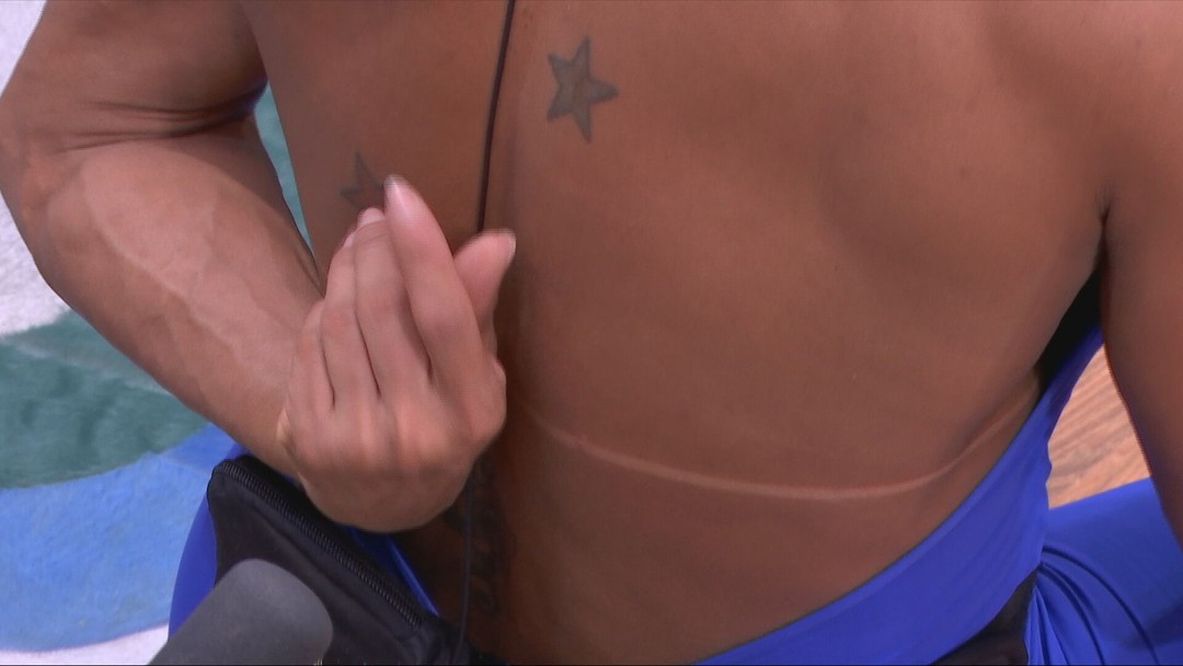
A Gshow still gives us the clearest look at two star tattoos on Gracyanne’s upper chest and shoulder area. They’re dark, compact stars with a soft, slightly shaded look rather than crisp geometric outlines. The image is a close crop, so it doesn’t show her face or the whole tattoo collection, but it does show how the stars sit against the curve of the upper torso. The placement is the point: the designs sit where costume lines can reveal or hide them.
Stars are common tattoo ideas, but placement keeps them from feeling generic. These aren’t tiny wrist stars tucked into a bracelet stack. They’re positioned where a bikini top, stage costume, or open neckline can reveal them. That makes them part of the visual rhythm of her performance wardrobe. They can disappear under clothing, then reappear when the costume changes.
The shapes also have enough weight to hold up against a muscular frame. Fine-line stars might have looked delicate in the same spot, while these darker marks keep their silhouette from getting lost. If you’re taking inspiration from them, the useful idea isn’t copying the exact stars. It’s thinking about contrast. A design needs enough line weight for the placement, the distance people will see it from, and the amount of movement around it.
The lower-back Belo tattoo
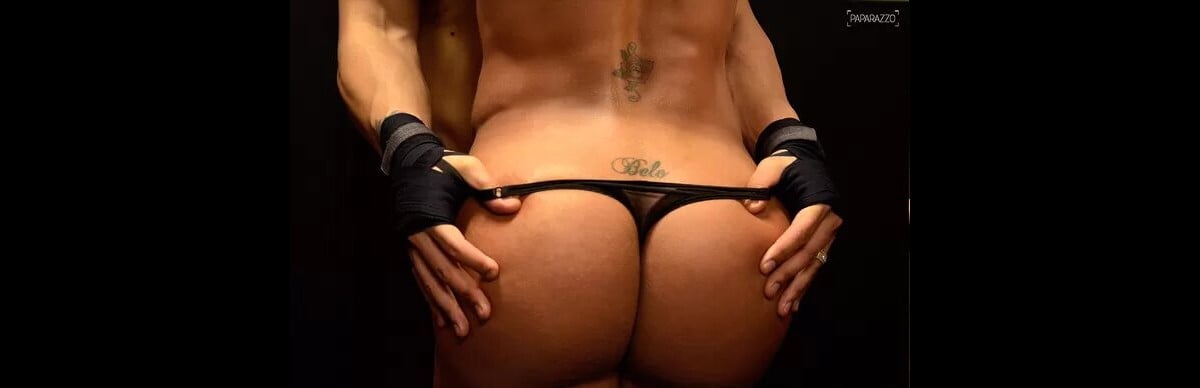
The most talked-about tattoo in Gracyanne’s collection is the name Belo written across her lower back. Published photographs show the lettering just above the bikini line, in a spot that can be covered easily or displayed deliberately. The piece was made as a tribute to her former husband, the singer Belo, and reports have described it as an older tattoo that stayed part of her public image for many years.
This is a good example of how placement can carry as much attitude as the lettering itself. A name tattoo on the forearm is visible in almost every outfit. A name tattoo on the lower back is more private, but it becomes very noticeable in swimwear, Carnival costumes, and photos taken from behind. The design is simple enough to read quickly, which is exactly what makes it so bold.
There’s no need to romanticise the decision. Relationship tattoos can feel meaningful when they’re made, and they can become complicated when life changes. Gracyanne’s tattoo has been photographed and discussed because it’s visible, not because the public is entitled to a full explanation of what she feels about it now. The practical lesson is clear: names are permanent, and a hidden placement is still a public placement when the right outfit or camera angle comes along.
A smaller detail sits above the lettering
The same close photograph shows another small design higher on the centre of Gracyanne’s torso. It appears darker and more detailed than the simple script below it, though the crop and lighting make it hard to identify every line. That’s where a little restraint matters. We can describe the position and overall shape, but we shouldn’t invent a symbol or a meaning that the image doesn’t establish.
Spacing the smaller pieces
Small tattoos in the centre of the body can be surprisingly tricky to place. The skin moves with breathing, posture, muscle definition, and weight changes. A design that looks centred while standing may shift visually when someone bends or twists. Gracyanne’s photos are a reminder that an artist needs to work with the body in motion, not just draw a flat sticker for a reference board.
If you like the stacked look of a small central tattoo above a word or name, leave enough space between the two designs. The gap gives each piece room to breathe. Cramming separate tattoos together can make them blur into one dark patch over time. The simpler the shapes, the more important clean spacing becomes.
The wider performance context
Gracyanne has spent years in a world where the body is part of the performance. Carnival costumes are built to move, sparkle, and reveal skin, but they also sit tightly against the body for long periods. Sweat, straps, metal details, and rough fabric can create a lot of friction. Her explanation about covering marks with tattoos gives the collection a practical angle that most celebrity tattoo roundups miss.
Her tattoos aren’t simply a set of designs chosen for a studio portrait. They’re seen during rehearsals, parades, fitness appearances, and photos where the pose changes every few seconds. A tattoo on the calf can look different while walking than it does while standing still. A star on the chest can be partly hidden by a costume in one picture and completely clear in the next. That movement is part of the look.
It also explains why her ink can feel connected even when the designs don’t look like one matching sleeve. The shared idea is the setting: Carnival, performance, skin, and the marks left behind by working in costumes. That’s a more useful way to think about a collection than forcing every piece into a single visual style.
Formal event styling changes the read
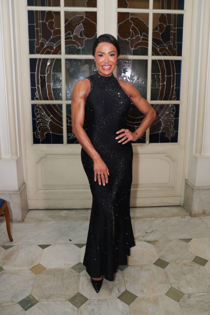
Formal event photos give a different view of Gracyanne than the close tattoo shots. In a black evening dress, the visible skin is framed by fabric, jewellery, and a polished red-carpet setting. The ink becomes quieter. You may notice a small mark on the torso or the edge of a design on the arm, but the tattoos don’t control the whole photograph.
That shift is useful if you’re planning visible work. The same tattoo can feel loud in swimwear, balanced in a stage costume, and almost hidden under formal clothing. None of those readings is more correct than the others. They’re just different contexts. Good placement gives you options, especially when your everyday wardrobe changes a lot.
Gracyanne’s photographs also show why tattoo descriptions should stay honest about what’s visible. A full-length image can confirm the overall placement of ink, but it usually can’t confirm a tiny symbol. A close crop can show the design clearly, but it can’t tell us how that tattoo fits the rest of the body. Using both types of image is more useful than pretending one picture answers every question.
Practical notes for moving skin
Gracyanne specifically mentioned the tattoo on her calf while explaining her Carnival-related ink. The published report doesn’t give us a clean, detailed photograph of that design, so the responsible thing is to stick to what she said: the tattoo is connected to Carnival, and her broader collection helped cover marks caused by costume friction. It would be wrong to fill in the design from guesswork.
The calf is a practical place for a tattoo linked to performance. It’s visible in many costumes, it has a long surface for flowing shapes, and the muscle gives an artist a strong natural line to work with. At the same time, the area moves constantly when someone walks, dances, or climbs stairs. A design that follows the curve of the calf will usually feel more natural than one placed as if the skin were perfectly flat.
There’s a wider point here about cover-up tattoos. Covering a scar or burn isn’t always as simple as placing dark ink over it. Scar tissue can have a different texture and may take pigment differently. Anyone considering that route should speak with an experienced tattooer who understands scarred skin and can be honest about what is realistic. “Todas as minhas tatuagens têm alguma coisa de Carnaval.” Gracyanne’s story makes the emotional idea easy to understand, but the technical side still needs care.
A balanced visual rhythm
Gracyanne’s visible tattoos range from a readable name in a private-but-displayable spot to smaller marks on the torso and stars across the upper chest. That mix keeps the collection from feeling flat. One design carries words and history. Another brings a graphic shape. The smaller marks give the eye somewhere else to land.
Scale matters because the body is already doing a lot of visual work. Muscle definition, costume texture, stage lighting, and movement all compete for attention. A tattoo doesn’t need to be huge to survive that environment. It needs clear edges, enough breathing room, and a placement that supports the way the person moves.
For anyone building a collection, the takeaway is to plan the rhythm rather than every single piece. You might want one larger tattoo that anchors an area, then two or three smaller designs around it. Or you may prefer separate pieces with plenty of open skin. Gracyanne’s photographs show that both approaches can feel intentional when the placement works with the body.
Making the idea your own
If you like Gracyanne Barbosa’s ink, start with the parts that actually appeal to you. Is it the stars? The confidence of a lower-back name? The idea of turning a scar into something decorative? Write that down in your own words. Don’t just send a screenshot and ask an artist to trace the same tattoo.
For a star tattoo, decide whether you want a soft shaded shape, a clean outline, or something more graphic. For body placement, test the idea in a mirror while standing, sitting, and moving your arm. For a name or phrase, check how the lettering reads from a distance. Script that looks beautiful in a phone photo can become hard to read when the letters are too thin or packed too tightly.
Most importantly, think about what you’ll still be comfortable showing years from now. A tattoo inspired by Carnival can be colourful, energetic, and tied to performance. A relationship name can feel right in one chapter of your life. The design should still be yours, with a size and location you can live with even when the reference celebrity’s story changes.
The final read on Gracyanne Barbosa’s style
Gracyanne Barbosa’s tattoo collection has a clear thread: Carnival, performance, and the physical reality of wearing costumes on a working body. The stars across her upper chest are easy to see in a Gshow still. The lower-back lettering dedicated to Belo is one of her most documented pieces. Her own comments add the most useful context, especially the explanation that tattoos helped cover marks caused by costume friction.
There’s no need to claim more than the photographs and reporting support. We don’t have a public explanation for every design, and we don’t have a clean image of every tattoo she has mentioned. That doesn’t make the collection less interesting. It makes the useful details clearer: the placement, the contrast, the movement, and the decision to turn the marks of performance into something she chose to keep.
If you take inspiration from her style, take the attitude rather than the exact artwork. Think about the body area, the way the design will move, and whether the tattoo belongs to your own life. That’s how a celebrity reference becomes a tattoo idea instead of a copy.