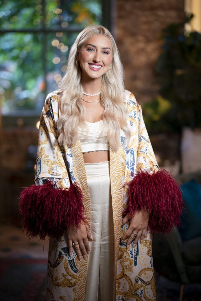
Samantha Moitzi’s most recognisable tattoo is pretty hard to mistake once you’ve seen it: delicate, written in bold black lettering across her upper stomach. It’s an interesting choice because the treatment doesn’t look especially delicate. The letters have weight, sharp details and enough size to hold their own across her torso. That contrast is what makes it work.
If you remember Samantha as a bride on Married at First Sight Australia, you might remember the clothes before the tattoos. A wedding dress and a cropped going-out top give you very different glimpses of the same person. Her ink fits into that everyday change of outfit rather than looking like something arranged for a television reveal. And her explanation of that big stomach piece is a lot more personal than a tough-looking font might suggest.
The delicate stomach tattoo
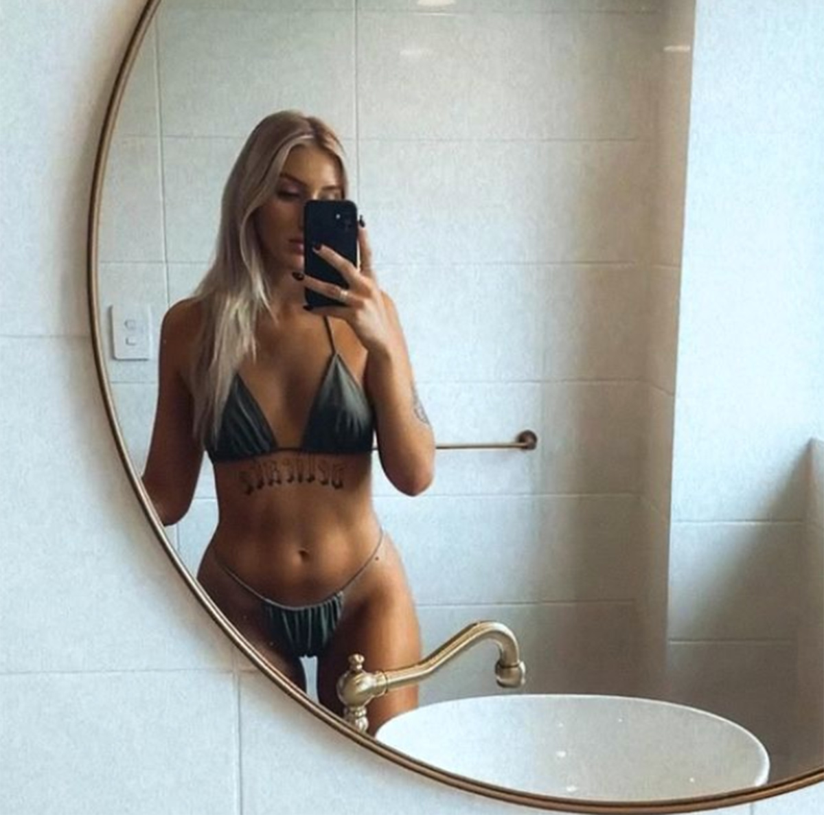
The word sits beneath Samantha’s bust and above her navel, running across the upper abdomen. In her mirror photograph, the black lettering follows a broad horizontal line with decorative points and curves. It has a blackletter feel rather than the loose, handwritten look you get with fine cursive. The reflection reverses the lettering, which is easy to forget when you’re trying to read a selfie.
This is a statement-size text piece. It doesn’t need a background of roses, shading or a separate illustration to fill the space. The shape of the letters does most of the visual work. There’s also breathing room around the word, so it reads as one deliberate element rather than a small sentence tucked between other designs.
That placement matters to the overall effect. It can disappear beneath a full-length top, then become the centre of an outfit with an open midriff. In the photograph, the word occupies the gap below her bikini top without extending down to her waistband. It’s substantial, but it still has a clear boundary.
There’s no reason to guess an exact font, needle configuration or session length from a photograph. Those details haven’t been established here. What you can see is the combination that gives this piece its character: dark decorative lettering, a single emotionally loaded word and a confident amount of space.
What she meant by feeling sensitive
Samantha explained that people can read her confidence very differently from how she feels inside. Speaking to 9Entertainment, she described coming across as confident and outgoing, then added: “But inside I can be quite insecure and really sensitive.” That’s the useful explanation to keep in mind when looking at the piece. The word points to a side of her that isn’t necessarily obvious on first meeting.
It also stops the design becoming a guessing game. You don’t have to assign it to a breakup, a particular episode or a private event she hasn’t identified. A personal inscription can express something about someone without acting as a neatly dated diary entry. Samantha’s own explanation gives it enough meaning already.
The visual contrast is my favourite part. A softer-looking treatment could have made the word feel like a decorative label. Here, the heavy lettering makes you pause. Being sensitive and looking confident can sit together perfectly well, and the appearance of the piece plays with that idea without needing a long explanation underneath it.
That doesn’t mean every large black text piece has to hide a vulnerable message. It means the person wearing it gets to decide what their chosen word says about them. In Samantha’s case, the meaning is clearer when you listen to her than when you try to read her personality off the style alone.
Her style away from television
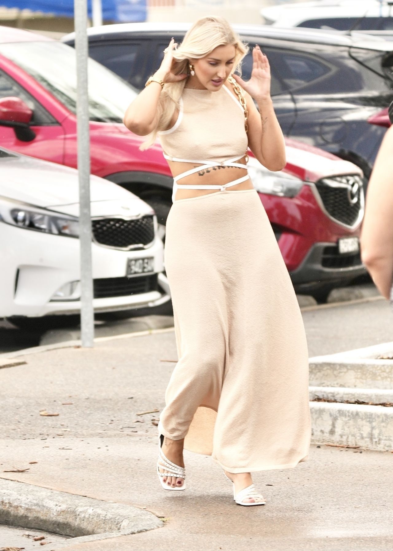
Photographs of Samantha out at Burleigh in February 2022 offer a much more ordinary setting than a television wedding. In one, she’s walking in a pale outfit with an open midriff and crossing straps. It’s a useful look at her personal style: light colours, a long silhouette and a fairly simple set of accessories. The clothes leave some of her existing ink visible without making the whole outfit revolve around it.
The difference between that look and the black lettering is striking. You don’t need an all-black wardrobe to wear bold black work. Pale fabric and bare space can give a dark piece plenty of contrast, too. That’s a styling observation, rather than a claim about why Samantha chose her outfit.
Her fashion background also makes sense of the attention paid to what she wore on the show. In April 2022, So Dramatic! reported on her plans for the label Silk Leppard and identified her feather-trimmed reunion outfit as one of her own designs. That’s a specific moment in her career, rather than a reason to assume the label’s current availability or business status.
For anyone who likes the overall look, the practical appeal is the balance. There’s room for a noticeable personal detail without adding an elaborate print or a pile of jewellery around it. Sometimes a quiet outfit gives one strong feature more presence than several competing ones would.
Time out with her castmates
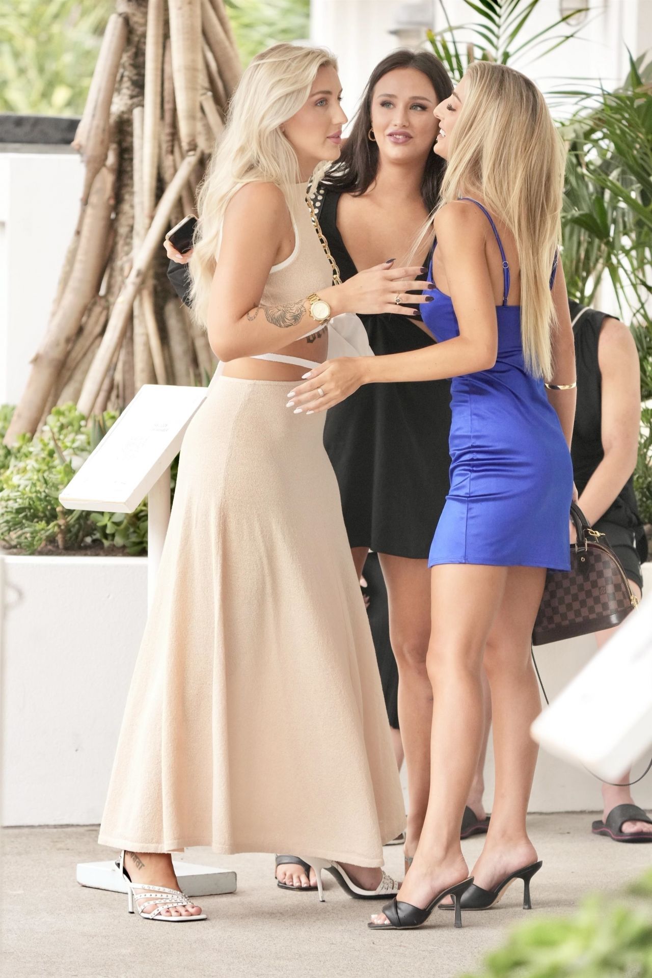
Another photograph from the Burleigh outing catches Samantha talking with Tamara Djordjevic and Jessica Seracino. It’s a separate exposure, with a different setting and pose, rather than another crop of the walking photograph. Samantha is the blonde woman in the pale outfit on the left. The scene is simply a moment with her fellow cast members, away from the ceremony and dinner-party format.
These off-duty photographs are a good reminder that a celebrity’s public image is made up of very different kinds of moments. A carefully lit reunion picture, a casual selfie and a conversation outside a restaurant all depict the same person, but they don’t give you the same information. Some depict an outfit clearly. Others tell you very little about the finer details of body art.
It’s easy to get carried away with the idea that every visible mark needs an explanation. Samantha has spoken about some of her pieces, but a candid photograph isn’t an invitation to invent a meaning for everything else. You can enjoy someone’s style without turning every small detail into a theory.
Samantha’s photographs show why the piece is so visually distinctive: the delicate lettering is broad enough to read across the upper abdomen, while its decorative treatment keeps the single word from looking like plain type. The surrounding styling changes from image to image, but the placement and scale remain the defining features of the tattoo.
A new setting in South Africa
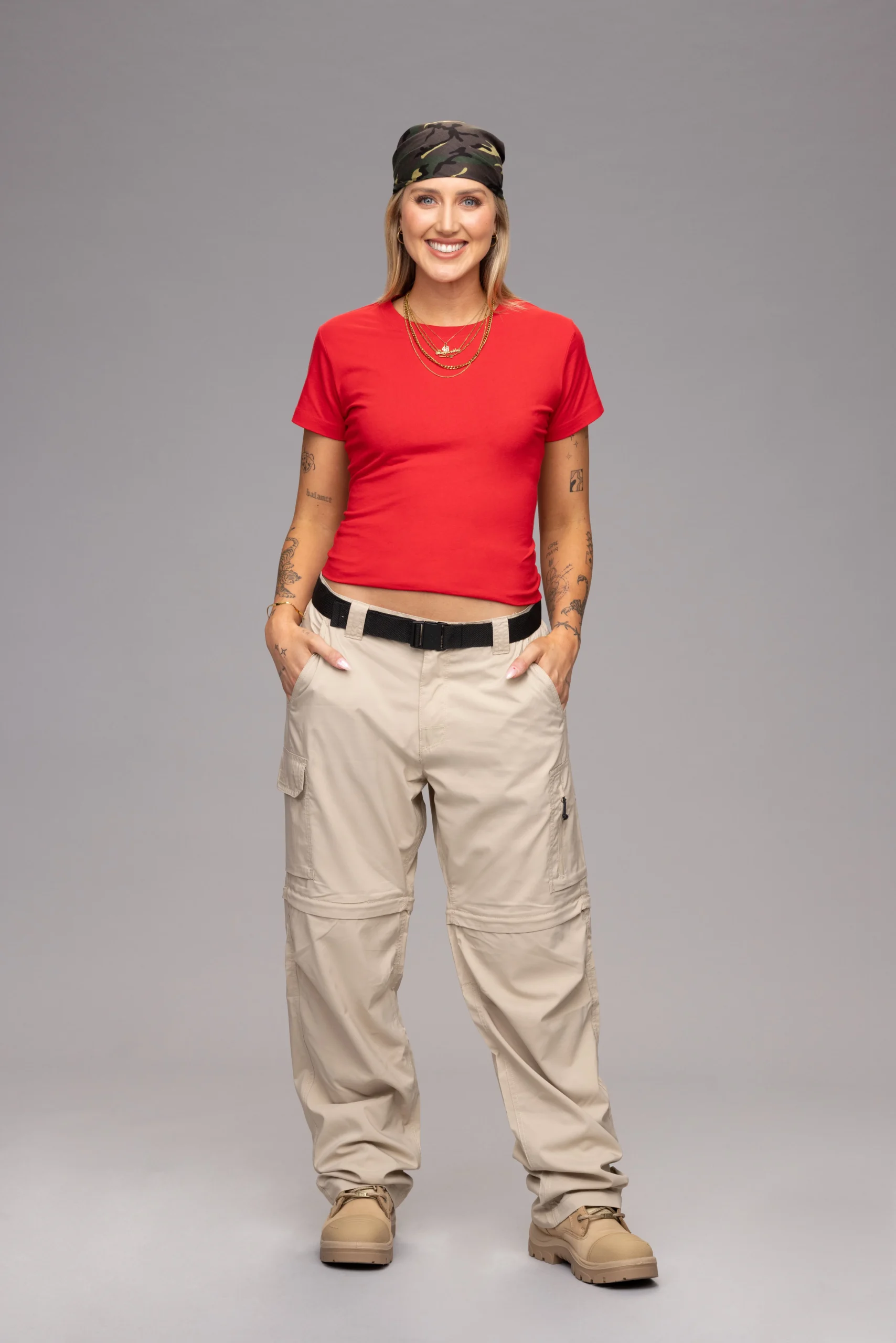
Samantha returned to Australian reality television for I’m a Celebrity… Get Me Out of Here! in 2025. The setting was quite a change: camp clothing and outdoor trials instead of bridalwear. Her publicity photograph for the series puts her in a red T-shirt, neutral cargo trousers and a patterned head covering against a plain studio background. It’s an especially clear example of how different the same person can look in another television format.
Paramount’s account of her time on the programme describes an entrance involving a leap off a dam wall and a trial with Nicky Buckley that involved searching through a dumpster for stars. Samantha was the first contestant eliminated that season. Those are details about her participation, not clues to the meanings of individual pieces of body art.
That distinction is helpful because later appearances can make an older photograph look incomplete. People change their hair, their clothes and sometimes their collection of tattoos. A photograph taken in 2022 gives you a view of that moment; it doesn’t automatically describe everything they were wearing years later.
For Samantha, the change of setting adds useful context without altering her earlier explanation of delicate. You can look at her television career as a series of different experiences while letting that personal explanation stand on its own.
A more open conversation about body image

During her time on I’m a Celebrity, Samantha supported the Butterfly Foundation. In Paramount’s published explanation of her chosen cause, she spoke about eating disorders and body image and about wanting people to feel able to discuss their experiences and find support. That was a wider conversation than the meaning of one piece of body art.
It would be a stretch to say the stomach inscription was created for that cause, or that it documents a particular stage of recovery. Samantha hasn’t made that connection in the material discussed here. Her earlier explanation and her later advocacy are separate statements, and both deserve to be understood on their own terms.
What they do have in common is a willingness to talk about feelings that might not match an outwardly confident appearance. That doesn’t require us to diagnose her, draw conclusions from her photographs or judge how her body looks. Her words are enough to understand the point she was making.
It’s also a good reason to approach celebrity photographs with perspective. Samantha’s image records her own choices rather than setting a standard for anyone else. The tattoo can be visually interesting while remaining specific to her body, styling and personal history.
Taking inspiration without copying
One word, deliberately enlarged. Samantha’s stomach tattoo turns a personal word into a prominent visual statement. Its scale gives the lettering presence, while the fine decorative lines preserve the softness suggested by the word itself.
The lettering also has a strong relationship with clothing and movement. It can disappear beneath a fitted top, then become immediately legible when the fabric lifts or the styling exposes the upper torso. That changing visibility is part of the tattoo’s documented visual character.
Samantha’s explanation connects the word to her own feelings, but the photographs reveal the design’s other layer: a simple inscription treated almost like an ornament. The tattoo’s meaning and its graphic presentation work together without requiring a larger collection of symbols around it.
A chat with Samantha
For a different side of Samantha, her interview with The Project after leaving the jungle is a nice companion to the photographs. It’s a television chat about her experience on I’m a Celebrity, rather than a tour of her body art. Hearing her speak is a better way to get a feel for her than trying to work everything out from a still image.