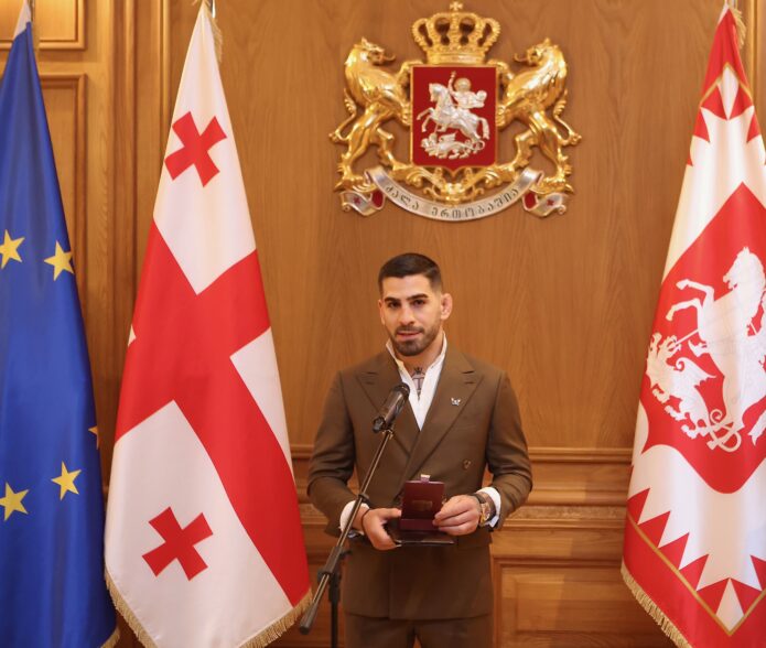
Ilia Topuria’s tattoos tell several stories. His chest combines a crowned T, animal faces, and a split portrait. A winged cross sits on his back above a long central design, while his arm has darker cover-up work and lettering. Together, the tattoos touch on faith, family, identity, and confidence.
Each area has a different role. The chest has a clear centre and room around the animals; the back is taller and more vertical; the sleeve is denser, with script and details that show up at close range. There is no single template to copy here. The useful idea is how the designs are fitted to each area.
This guide looks at the best-known pieces and the design choices visible in photos.
The winged cross makes the upper back the first big statement
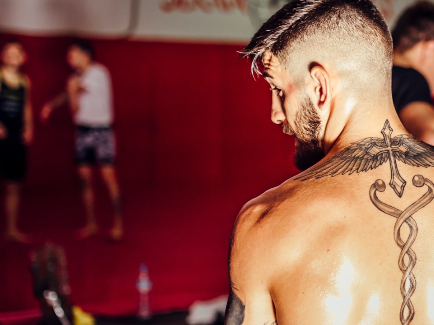
From behind, the upper-back tattoo gives Topuria’s collection its strongest outline. Wings spread over his shoulders, with a cross near the neck and a long, twisting design running down the spine. The wings make a horizontal shape; the centre gives the eye a line to follow downward.
The back is wide, so a piece can end up looking like several unrelated images without a clear focal point. Here, the cross ties the shoulders together, and the lower design carries the composition toward the middle of the back instead of stopping between the shoulder blades.
The black-and-grey work leaves small breaks of skin between the feathers and central line. The wing tips are fine, while the centre has stronger edges. Those changes in line weight give the tattoo depth without colour.
A meaningful symbol does not need to be huge to feel important, but it does need clean placement. The cross is easy to see, with smaller details around it rather than crowded inside it.
If you’re planning wings across your back, consider how the shoulder blades and spine move before settling on the drawing. A tattooist can design with those lines, so the piece still sits well when you stand, bend, or turn—not only when you’re posing.
The spine design adds a long, clean line through the back
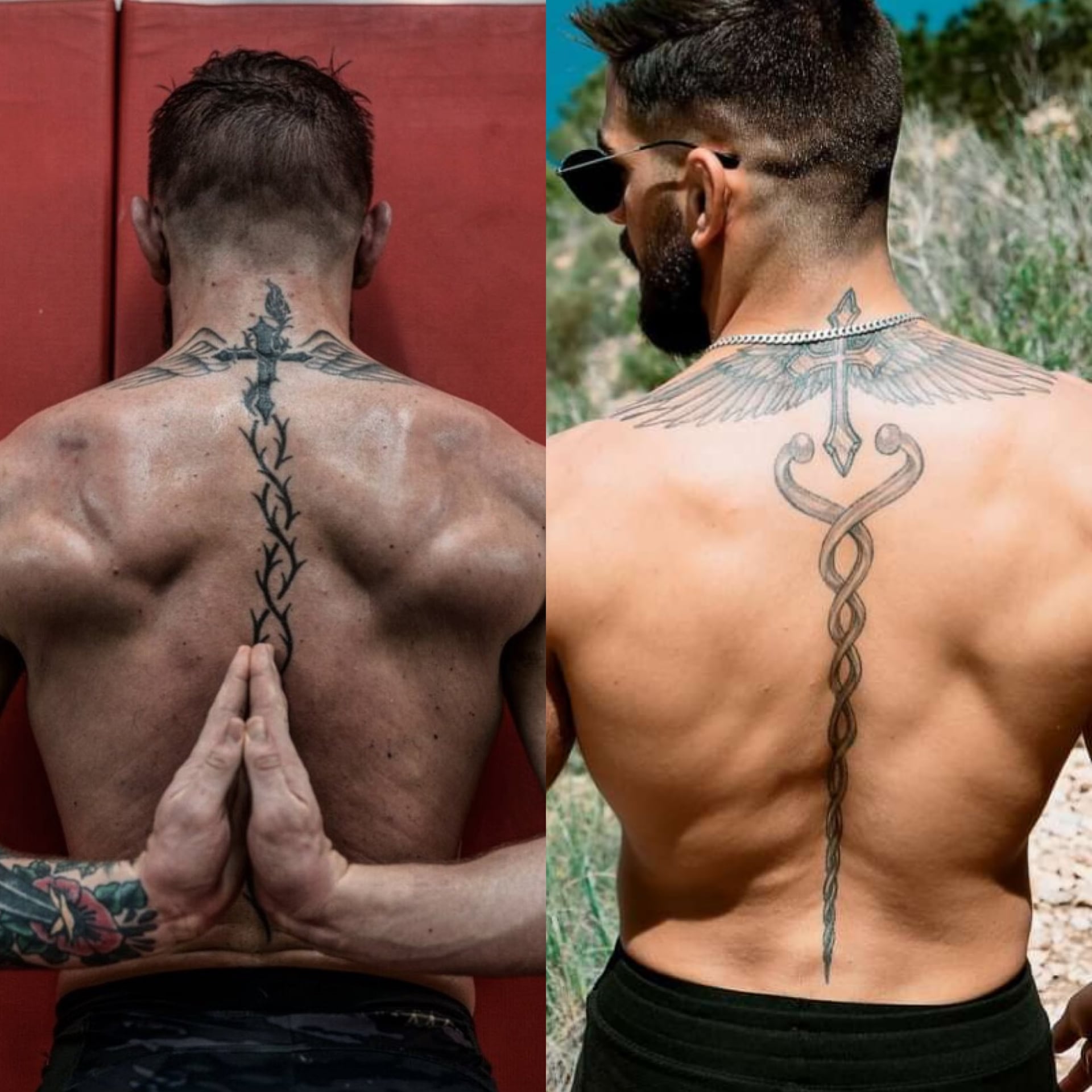
Below the cross, a long design runs down the centre of Topuria’s back. Its narrow middle and curved sections that open then return toward the spine make the whole piece feel longer than a single symbol between the shoulders.
Spine tattoos show even small shifts in a line. Topuria’s design follows one central route, with decorative sections to either side. The lower part has room to finish rather than being squeezed into the waist.
The ornamental lines match the cross above them through thin black outlines, light grey shading, and a vertical direction. If separate tattoos are being added in stages, repeating one or two of those choices can help them relate.
The centre line gives the tattoo scale while leaving skin open around it. Negative space is doing real work in this design. Too much shading could bury the clean shape that makes it read.
Decide whether a spine piece is the main image or a connector between larger tattoos. If it’s the main subject, keep nearby details quiet; if it’s a connector, make sure its ends lead into the other designs. That planning helps it feel intentional, not like a strip between separate pictures.
The crowned T gives the chest a clear centre
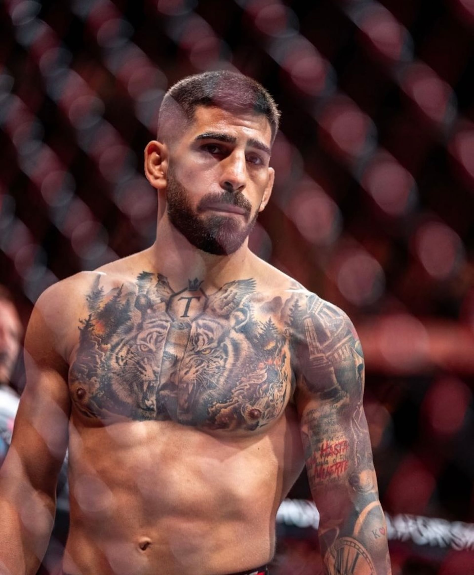
Near Topuria’s collarbone, a crowned T sits inside an octagon-like outline. The letter is tied to his surname and public identity, and it also anchors the larger chest composition.
Trees, animal faces, and shaded forms surround the emblem and lead toward the shoulders. The small crown lifts the design; the simple letter remains readable when the chest is photographed at an angle. A complicated logo can be hard to make out on a moving part of the body.
The chest’s centre line gives the composition a starting point, but the rest doesn’t have to be symmetrical. Different details on each side keep Topuria’s tattoo from looking like a mirror image. The repeated eyes and dark forest shapes bring rhythm to the two halves.
Chest lettering and logos need to be checked on the body. Muscles move, skin stretches, and the collarbone changes direction. Photograph the stencil from straight on before the needle starts. A design that looks centred on paper can shift when it wraps around the chest.
The crowned T shows how an initial or family mark can work as body art. You could use a circle, shield, open frame, or negative space around your own letter. The important parts are why it’s there and enough room for it to stay clear.
The tiger and wolf imagery turns the chest into a full scene
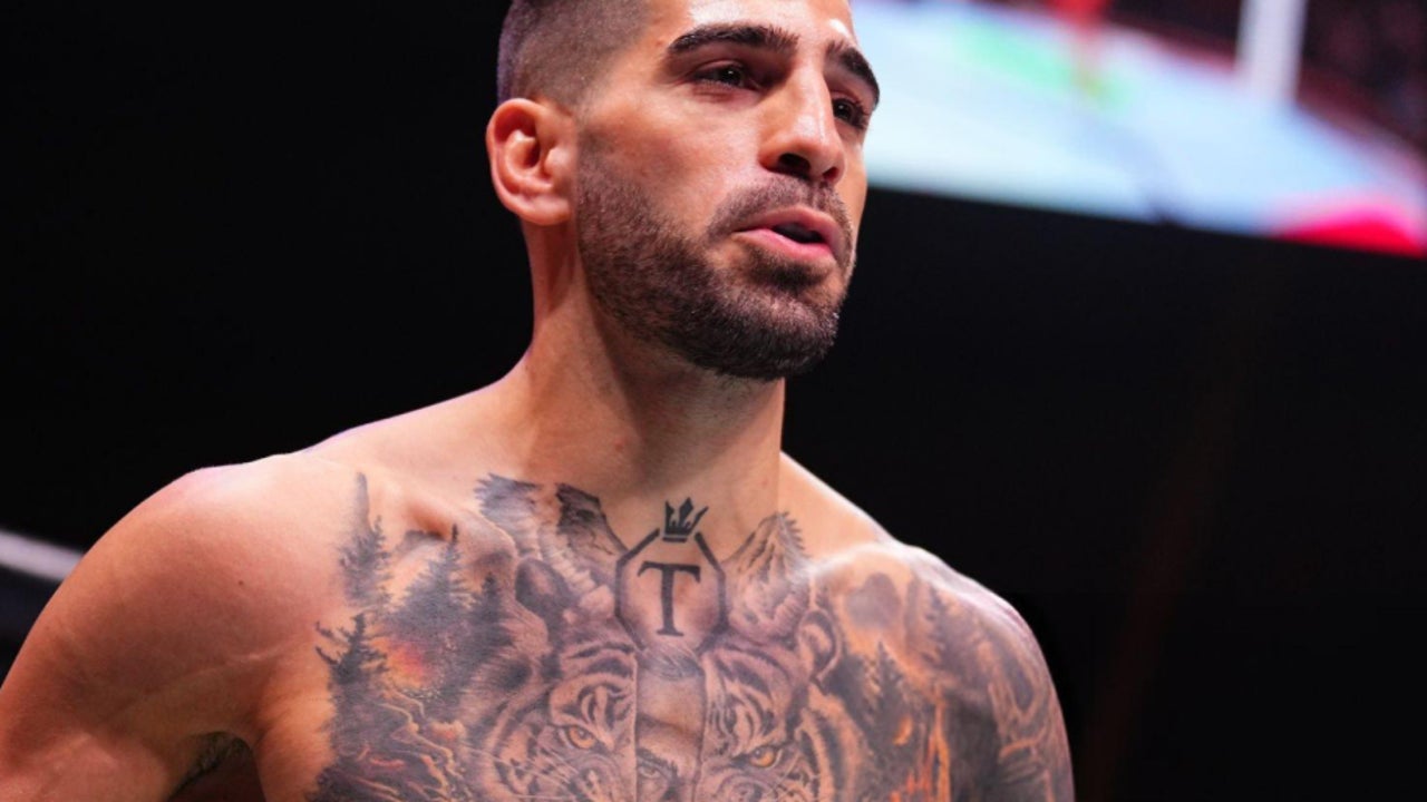
Around the crowned T, Topuria’s chest carries black-and-grey wildlife imagery. Tigers and wolf-like faces sit among trees, shadows, and textured fur. The animals add force to the scene and give the artist shapes to work around the centre emblem.
The eyes catch your attention first. They need to stay sharp while fur and forest recede into softer shading. Darker areas near the ribs and shoulders help the eyes and letter stand out without turning the chest into one flat patch of black.
A split-face detail gives the scene another layer: one side reads as an animal, while another suggests a bearded human face. Whether you take it as a portrait or a blended symbol, it makes the chest feel more individual than a stock wildlife design.
If you’re planning a large chest piece, decide which part should lead. Keep contrast around the eyes if they’re central; don’t bury a letter in shading if that’s the main image. Good realism is often about deciding what not to sharpen.
The animals have room for their faces, whiskers, and fur. On a smaller chest, the same number of subjects could feel crowded. One animal, one symbol, and a few open lines may read better than several faces packed close together.
Tigers, wolves, and trees can suggest power and instinct, but the central emblem and lettering give this tattoo a personal frame. That combination of familiar imagery and individual details is what keeps a bold tattoo from looking like a costume.
The arm sleeve is darker, busier and more personal
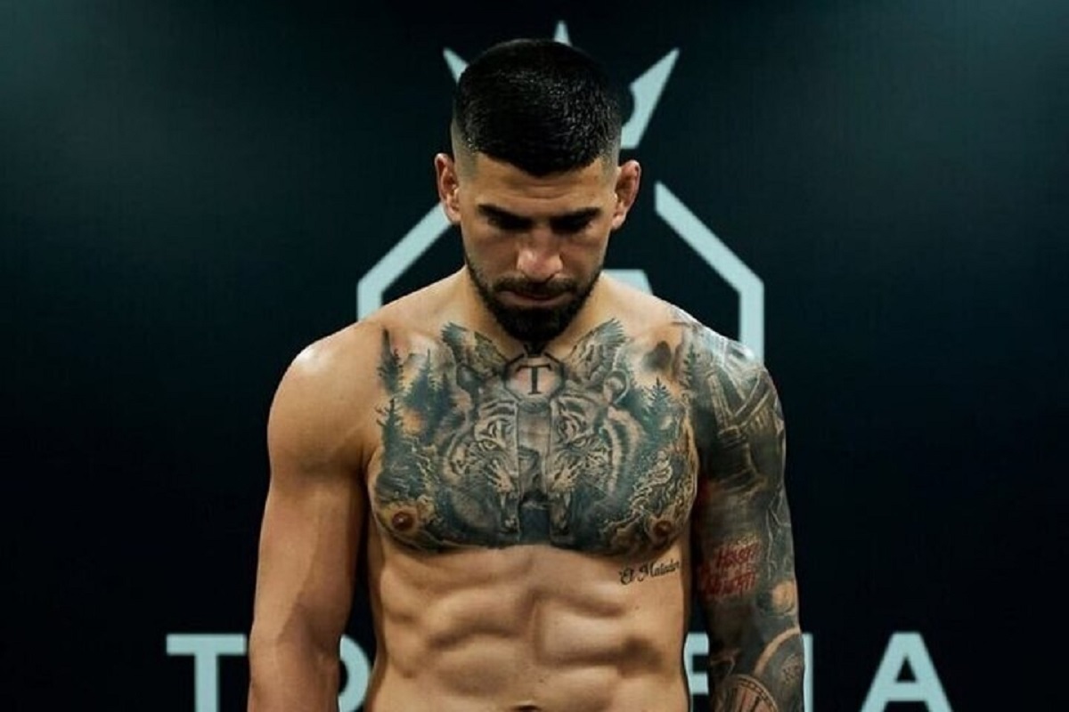
Topuria’s arm has a denser look than his chest. Darker cover-up sections, script, and layered images fill the sleeve. At close range, you can see smaller shapes and parts of older ink that have been worked over.
Cover-ups start with existing marks on the skin. Spartan-inspired sections give the arm a new direction, while lettering and small symbols add detail. Not every old line has to disappear; the newer work needs a clear value range and shapes that hold together as a composition.
The slogan “Real hasta la muerte” brings language into the sleeve. Text has a direct feel, but the lettering needs room. Tiny script may look crisp in a fresh close-up and become harder to read over time. Contrast and spacing matter along with the words themselves.
The sleeve mixes realism, symbols, and lettering without forcing them into one style. Shared black-and-grey shading links the pieces; darker outlines hold the composition while lighter skin breaks keep it readable.
If you’re planning a sleeve, don’t fill every gap first. Choose the images that matter most, place them, and let smaller details grow around them. A sleeve usually looks better when it has a few calm areas instead of the same level of detail from shoulder to wrist. Those spaces give the eye somewhere to rest.
Check the stencil with your arm straight, relaxed, and bent. A design can look balanced in one position and change shape at the elbow. That matters for tattoos you’ll see while training and moving through an ordinary day.
Topuria’s collection works as a body map: faith and a vertical design across the back, a crowned emblem and animals on the chest, and a denser sleeve with script and cover-up work. Each area has its own focus, but the black-and-grey shading helps them sit together. Borrow the placement choices if they appeal to you, and make the images your own.