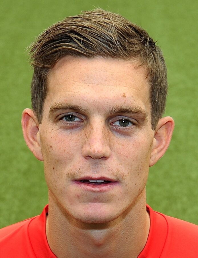
Daniel Agger’s tattoos are impossible to miss. During his Liverpool years, the Danish defender played with his sleeves rolled up, his knuckles on display, and enough ink across his torso to make every close-up feel like a tattoo tour. His work is not a random pile of flash. It mixes Danish history, family, football loyalty, and a slightly gothic love of skulls, graves, and old legends.
What makes Agger’s collection so interesting is the way the pieces talk to each other. His back is a huge story about Denmark and mortality. His arms carry color, movement, and smaller symbols. His hands turn a football anthem into a daily statement. Even the chest design that looks like a necklace has a personal reason behind it. If you like tattoos with a strong sense of place, Agger’s body art is a great one to study.
Here is a closer look at the designs that stand out most, along with the little details that make Daniel Agger’s tattoos feel personal instead of purely decorative.
Daniel Agger’s full-back Viking tattoo is the centerpiece
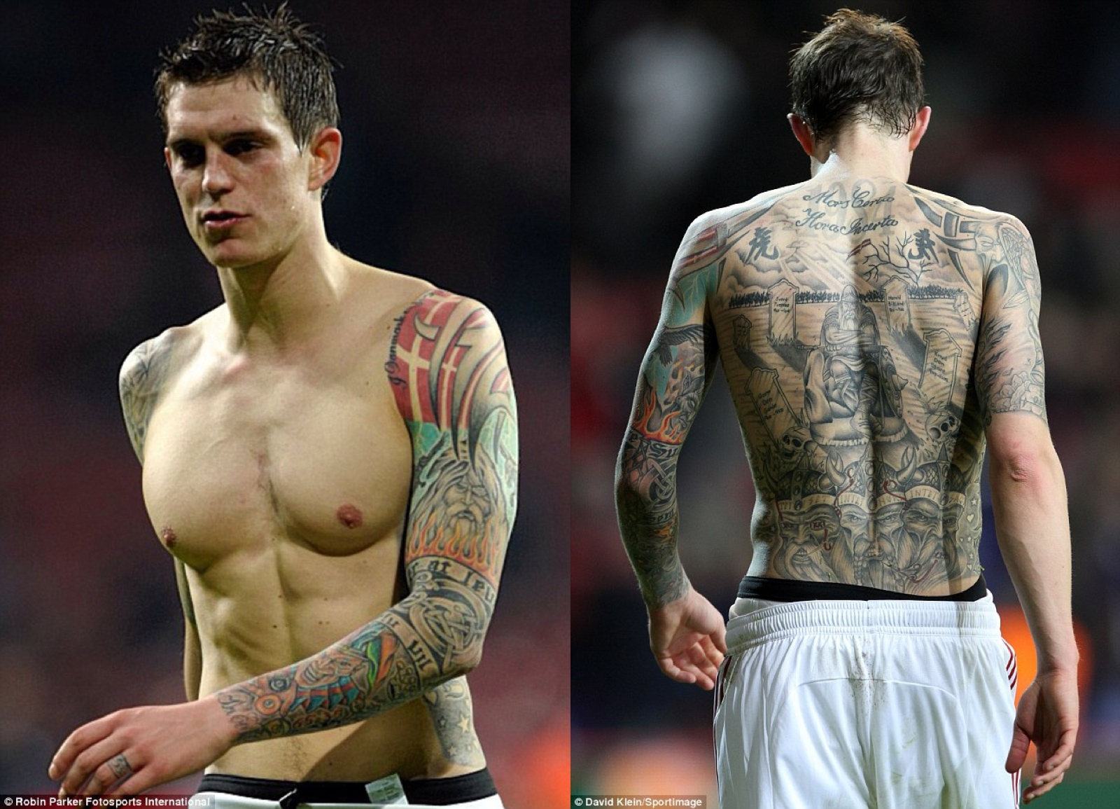
The first thing most people notice is the large back piece. It stretches from Agger’s shoulders down toward his waist and reads almost like an illustrated history book. At the top sits the Latin phrase Mors Certa, Hora Incerta, usually translated as death is certain, its hour is uncertain. Below it, the scene moves into gravestones, trees, skulls, and a central Viking figure. The scale gives the tattoo the feel of a mural rather than a single isolated design.
There is a lot going on in the composition, but it still has a clear path for the eye. The lettering sets the mood first. Then the graveyard and seated figure pull you toward the middle of the back. Lower down, the crowned faces and other historical references make the piece feel tied to Danish heritage. It is dark without being flat, because the shading, pale skin breaks, and small flashes of color give the design some depth.
For anyone looking at Daniel Agger’s tattoos as inspiration, this is a good example of planning a large tattoo around a central subject. The main figure gives the back a focal point, while the surrounding script and scenery fill the space naturally. It does not look like five unrelated tattoos squeezed together. It looks like one world built over time.
The Viking theme also suits Agger’s public identity. He is Danish, proud of where he comes from, and known for a direct, hard-working style on the pitch. A piece like this does more than decorate the back. It carries history and attitude in the same frame. That is why it remains the design people remember first when they talk about his ink.
His colorful sleeve and arm tattoos make the collection feel alive
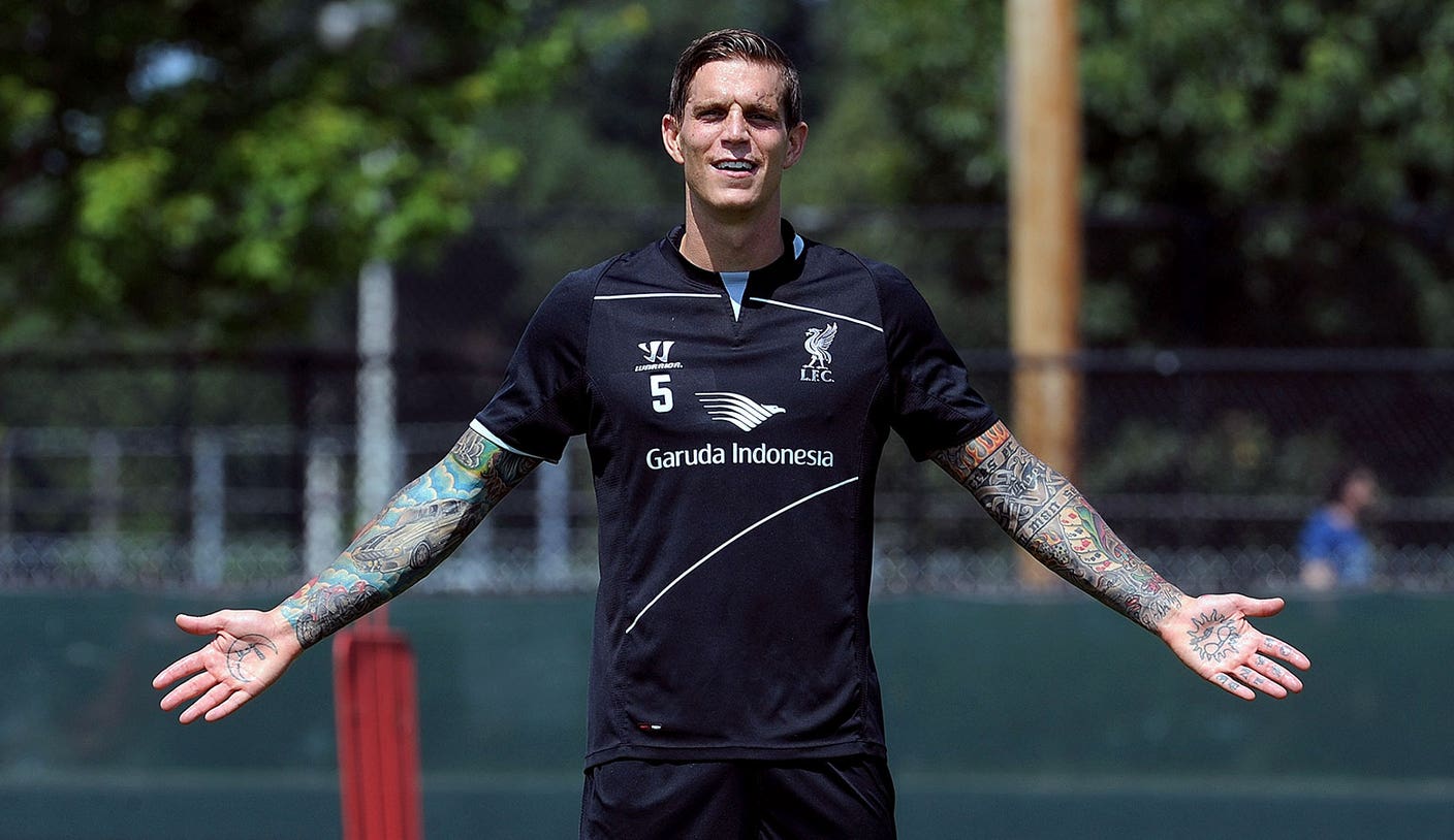
The back piece gets the headlines, but Agger’s arms stop the whole collection from becoming a wall of gray. His sleeves use strong color, bold outlines, and a mix of traditional and illustrative shapes. In photographs from his playing days, you can see reds, greens, blues, and warm orange tones moving across the skin. The result feels energetic, especially beside the more muted Viking scene on his back.
His right arm includes a Viking reference of its own, while other sections bring in patterns, small symbols, and pieces that look more like classic tattoo flash. That variety is part of the charm. The designs do not all use the same visual language, yet the heavy outlines help them sit together. The sleeves feel collected rather than overly matched.
A close look also shows how much the placement matters. Agger did not keep everything on the upper arm. Ink travels across the shoulder, down the biceps and forearms, and toward the hands. That creates movement whenever he raises an arm or reaches for the ball. It also means the tattoos still read clearly when he is wearing a short-sleeved shirt.
Strong color can be a smart choice for a large tattoo collection, but it needs room to breathe. Agger’s sleeves work because the designs have solid areas, open skin, and darker sections to balance the brighter ink. If you are building a sleeve of your own, that balance is worth noticing. A tattoo does not need every inch filled with the same level of detail to look complete.
There is also a relaxed confidence to these arm pieces. They are bold, but they do not feel like they are trying to outshout the back. The arms give the collection personality and motion, while the main back tattoo supplies the big story.
The chest chain tattoo ties family and football together
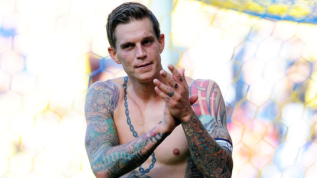
Across Agger’s chest sits a design that looks, at first glance, like a heavy chain or necklace. It runs down the center of the torso and connects to lettering and family references. The piece is one of the clearest examples of how he uses the body as a layout. The chest gives the design a natural vertical line, and the chain effect helps guide the eye from the neck toward the stomach.
The personal part matters here. Reports about Daniel Agger’s tattoos describe names and birth years connected with his sons, along with heart-shaped tattoos for his parents on his calves. Those details turn the chest from a purely tough-looking design into something much warmer. The chain is not just an accessory drawn on the skin. It becomes a way to keep family close, even inside a very masculine tattoo style.
The front of the torso also shows how Agger combines different scales. Some elements are large enough to read from a distance, while smaller lettering rewards anyone who gets closer. That mix is useful when planning chest work because it keeps a big area from looking like one blank block of ink.
Agger’s football life sits beside those family details rather than replacing them. His tattoos include national symbols, Liverpool references, and personal phrases, but the collection never feels like a single club advertisement. The chest design brings the emotional side forward. It is a reminder that meaningful tattoos do not have to be tiny or hidden. A large piece can still be intimate when the subject is personal.
For tattoo ideas, the chain motif is especially easy to adapt. Someone could use it to frame names, dates, flowers, or a small portrait. The important lesson is the structure. Use the natural line of the chest, keep the central element readable, and let the details branch out without losing the main idea.
Daniel Agger’s YNWA knuckles put Liverpool right on his hands
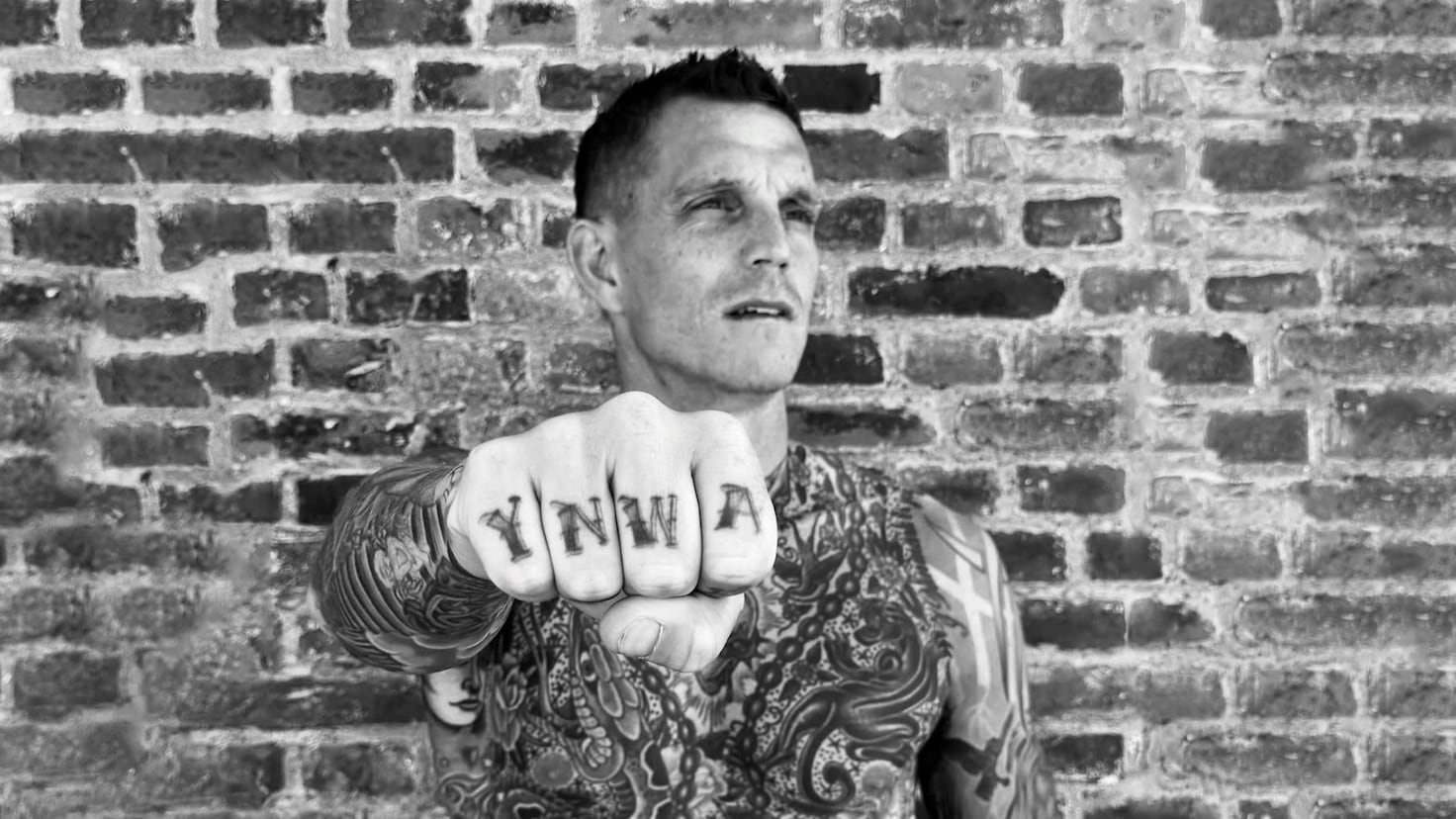
Agger’s hand tattoos are the most direct part of his collection. The letters YNWA sit across his knuckles, standing for You’ll Never Walk Alone, the Liverpool anthem. He got the lettering during a period when people were talking about his future, so the message landed as more than football decoration. It was a permanent way of saying where his loyalty sat.
Knuckle lettering is small, exposed, and hard to hide. That makes the choice feel deliberate. Every time Agger opens his hand, the phrase appears. The lettering is also instantly readable in photographs, which is one reason these may be the most recognizable Daniel Agger tattoos after the back piece.
Later, he added Liver Birds to the same hand. The birds are closely linked with Liverpool and the city crest, so the new ink built on the meaning of the older letters instead of starting a separate story. This is a nice example of adding to a tattoo without weakening the original idea. The hand became a layered tribute to the club and the city.
Agger has spoken about his connection to Liverpool in a way that makes the hand work feel genuine. The tattoo is not just a slogan picked because it looks good. It represents the people, the stadium, and the years he spent there. The best lettering tattoos usually have a reason to be repeated every day, and this one clearly does.
There is a practical point too. Finger and knuckle tattoos fade faster than ink placed on calmer skin, and the hands take plenty of wear. Agger’s block letters and strong placement help the design stay legible, but anyone considering a similar tattoo should expect touch-ups. The meaning may be permanent, but the crispness needs a little maintenance.
The Latin motto and Viking imagery give Daniel Agger’s back ink its mood
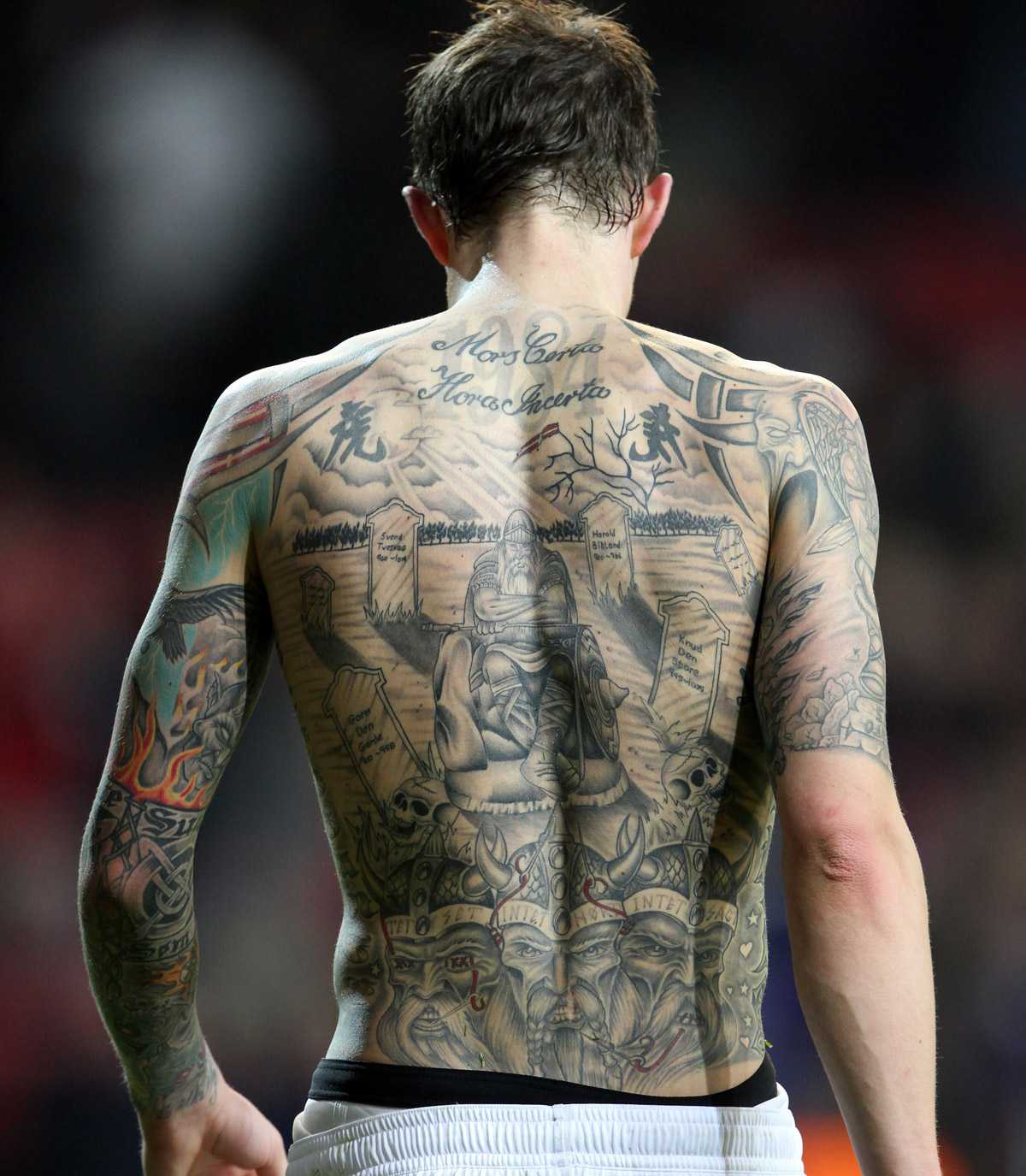
The close-up view of Agger’s back shows why the tattoo still rewards a second look. The Latin motto is easy to spot, but the surrounding imagery carries just as much weight. Gravestones, skulls, trees, and figures create a memento mori feeling without turning the whole design into shock value. The message is about time, memory, and the fact that life moves quickly.
The Viking references add a clear connection to Denmark. Agger’s back includes historical faces and symbols associated with Danish kings, along with the central Holger Danske figure from Danish folklore. That gives the tattoo a sense of home. Instead of borrowing a generic warrior image, he built a scene around stories and people tied to his own culture.
This kind of tattoo asks a lot from the artist. A large back piece needs a strong plan, especially when it includes script, faces, scenery, and repeated symbols. The lettering has to stay readable. The main figures need enough contrast to hold their shape. The smaller details should support the story instead of turning into visual noise.
Agger’s design shows one way to make a dark tattoo feel spacious. There are areas of open skin and softer gray shading between the heavier outlines. That keeps the graveyard from becoming a solid black wall. It also helps the older work age in a more natural way, because the eye can still separate the main parts of the composition.
Put together, the motto and Viking scene explain why Daniel Agger’s tattoos have such a strong identity. The ink is tough, but it is not empty. It connects family, country, football, and a personal awareness of mortality. That combination gives the collection a story you can follow, even when you only see one photograph.
Daniel Agger’s tattoos are a reminder that a large collection can still feel focused. The back piece supplies the history, the sleeves bring color, the chest carries family, and the hands show loyalty in plain letters. Each section has its own job, but the full picture feels connected.
If you are collecting ideas for your own work, the useful takeaway is not to copy a particular Viking, bird, or motto. Start with the things that actually matter to you, then give each idea the placement and scale it needs. Agger’s ink works because the designs come from real parts of his life. That is what turns a tattoo collection into a personal map.
Watch a short video about Agger’s Liverpool tattoo story below.