codex

Christian Nodal Tattoos: Forearm Sleeve, Neck Script and More

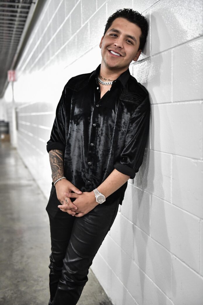
Christian Nodal’s tattoos are part of his overall look, but the designs don’t all do the same thing. His forearm carries the largest area of ink; smaller marks on his hands, neck, and chest add personal details. Blackwork, script, symbols, and shading make the collection look different from one angle to another.

A stage photo shows the bigger shapes. In a close-up, you can pick out lettering on his neck, a symbol on his hand, or the way one tattoo sits beside another. The collection has changed over time, and not every private meaning has been confirmed, so this guide sticks to the visible designs and their placement.

Here’s a closer look at the main areas where his tattoos stand out and how bold pieces can sit beside smaller ones without becoming a solid mass of ink.

The forearm sleeve carries the biggest visual weight
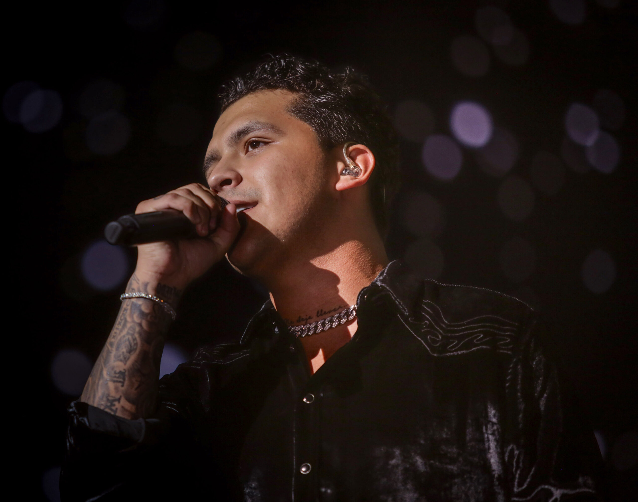
Christian Nodal tattoos: forearm sleeve and layered arm tattoos

Nodal’s forearm is the first area many people notice. It holds several ideas, and the darker shading gives the arm a strong shape from a distance. In performance photos, the sleeve reads as one design before you make out its separate elements.

Up close, you can see the layers: dark shading, open skin, and lines that wrap around the arm instead of sitting in a rectangle. That matters on a forearm, which turns as someone sings, reaches for a microphone, or gestures. A design that only works from the front would lose its flow as soon as the wrist moved.

Design for movement. If you like this sort of sleeve, decide where the main image should sit with your arm relaxed. Then check it with your elbow bent and your hand turned. Nodal’s arm feels full without looking as if every gap had to be filled at once.

The dark palette helps the designs feel connected. They don’t need the same subject to share a sleeve. Similar line weight, shading, or contrast can create flow while leaving each image with its own space.

The forearm blackwork tattoo becomes clearer in a close view
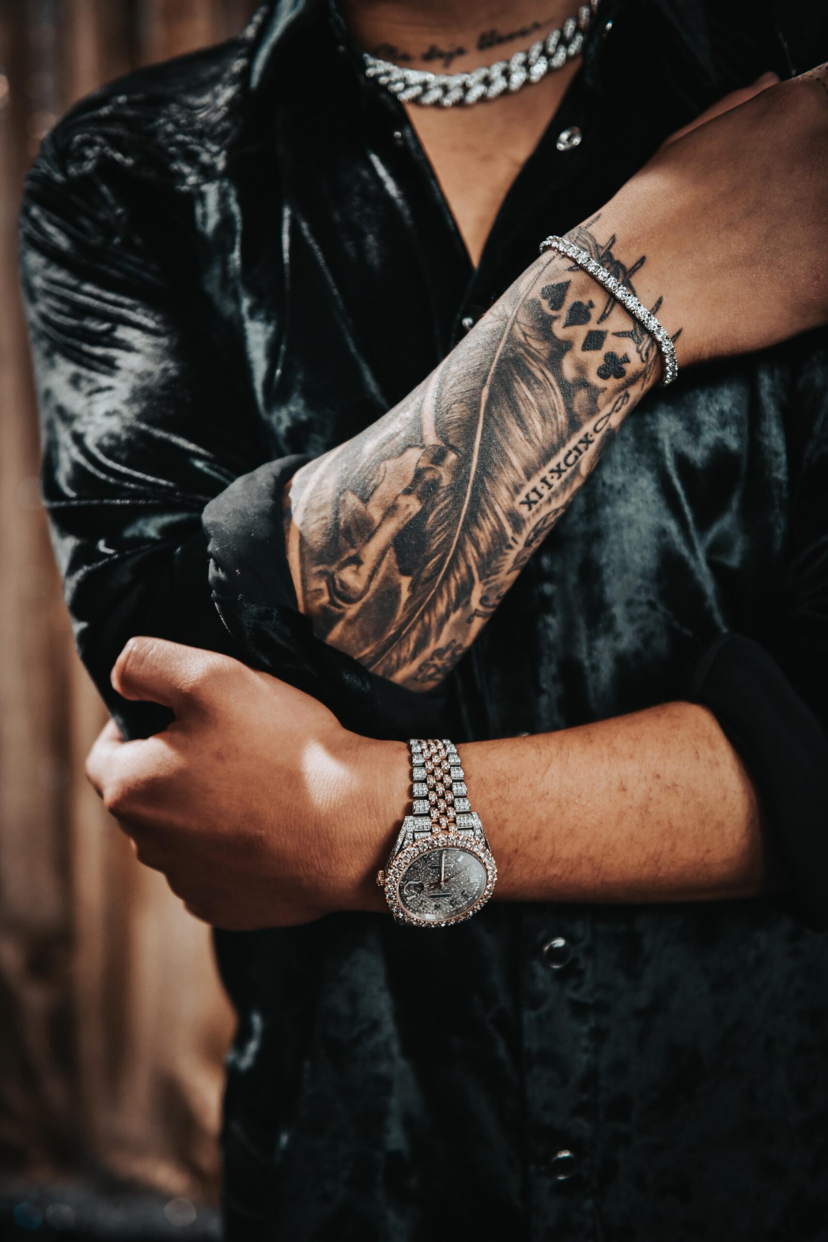
Christian Nodal tattoos: close forearm blackwork and line detail

A wide shot shows how much ink Nodal has on his arm; a close-up shows how it’s put together. The forearm detail reveals changes in texture, patches of shading, and smaller marks set within the larger sleeve. Concert lighting can hide those details, so a clear close-up helps you see the linework.

The shading isn’t only there to make the arm darker. Some high-contrast areas draw the eye, while softer sections keep the sleeve from feeling noisy. That balance helps when several images share the same space.

There’s a loose quality to the lines. They don’t look like logos arranged at equal distances; that slight irregularity makes the tattoos feel lived in. Expressive lines can feel relaxed and still be finished when the overall composition is clear.

If you’re using these photos for reference, show your artist texture and movement, not just a celebrity portrait. Ask which shapes need to read from a distance and which details can be seen only up close. That will help you decide what to keep bold.

The hand and finger tattoos add a smaller scale
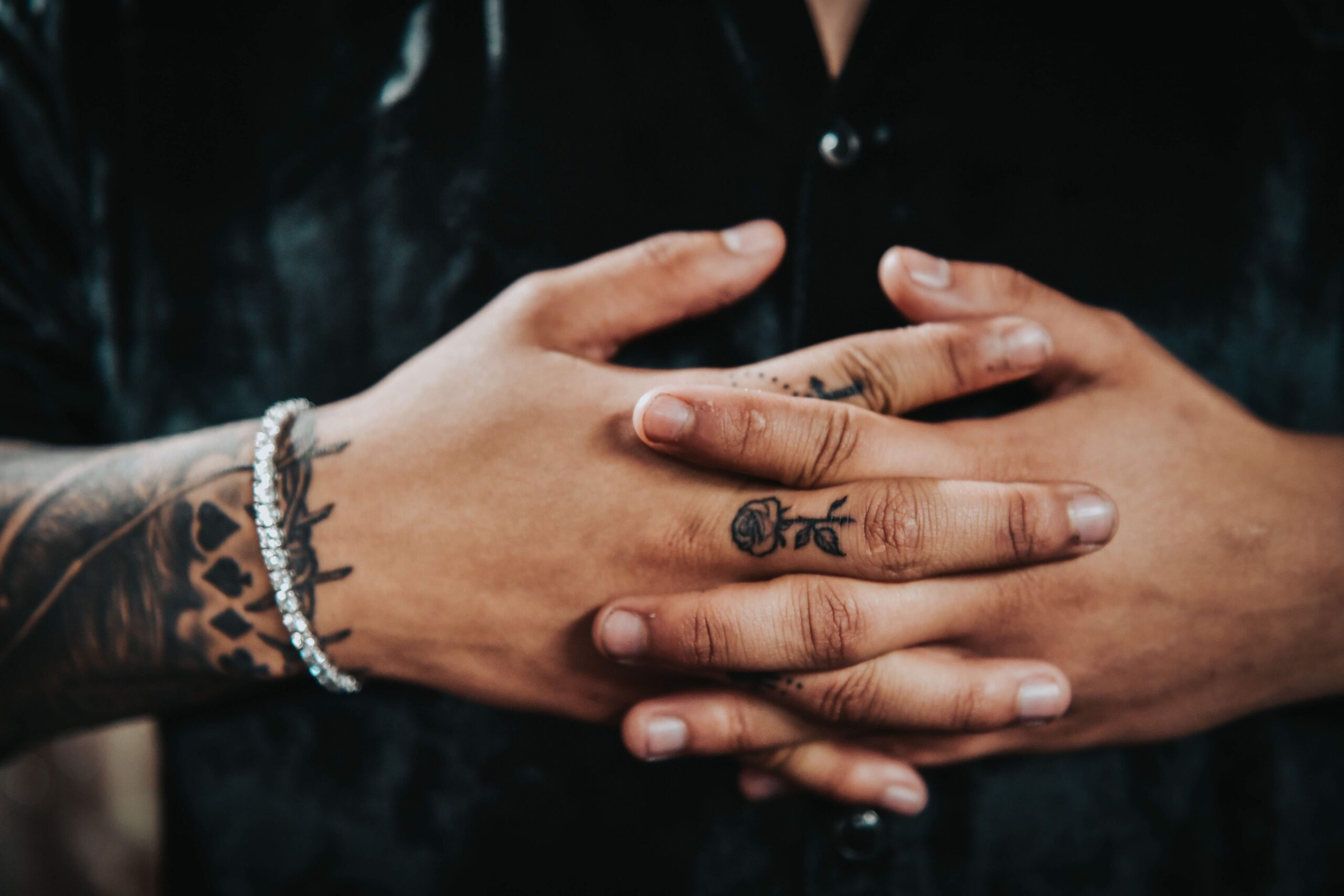
Christian Nodal tattoos: hand and finger tattoo details

The hand and finger tattoos change the pace of the collection. After the larger forearm work, the smaller marks feel quick and direct. They come into view when Nodal moves his hands, then disappear when he curls his fingers, which makes them feel more private than the arm sleeve.

Finger tattoos have their own limits. The skin is always moving, gets washed and rubbed often, and small details can soften faster than on the upper arm. Nodal’s hand photos show why simple shapes and clear lines suit the area. The symbols don’t need much shading to register.

Small marks often give a collection its personality. A symbol, letter, or brief reminder can stand on its own without an explanation. Hand ink can also be added after a sleeve; the different scale keeps it from competing with the larger design.

Still, a hand tattoo is a visible choice, and fading can be obvious. Think about how it will look at work, in photos, and during everyday tasks. Look for healed examples, not only a fresh tattoo.

The neck script works like a personal headline
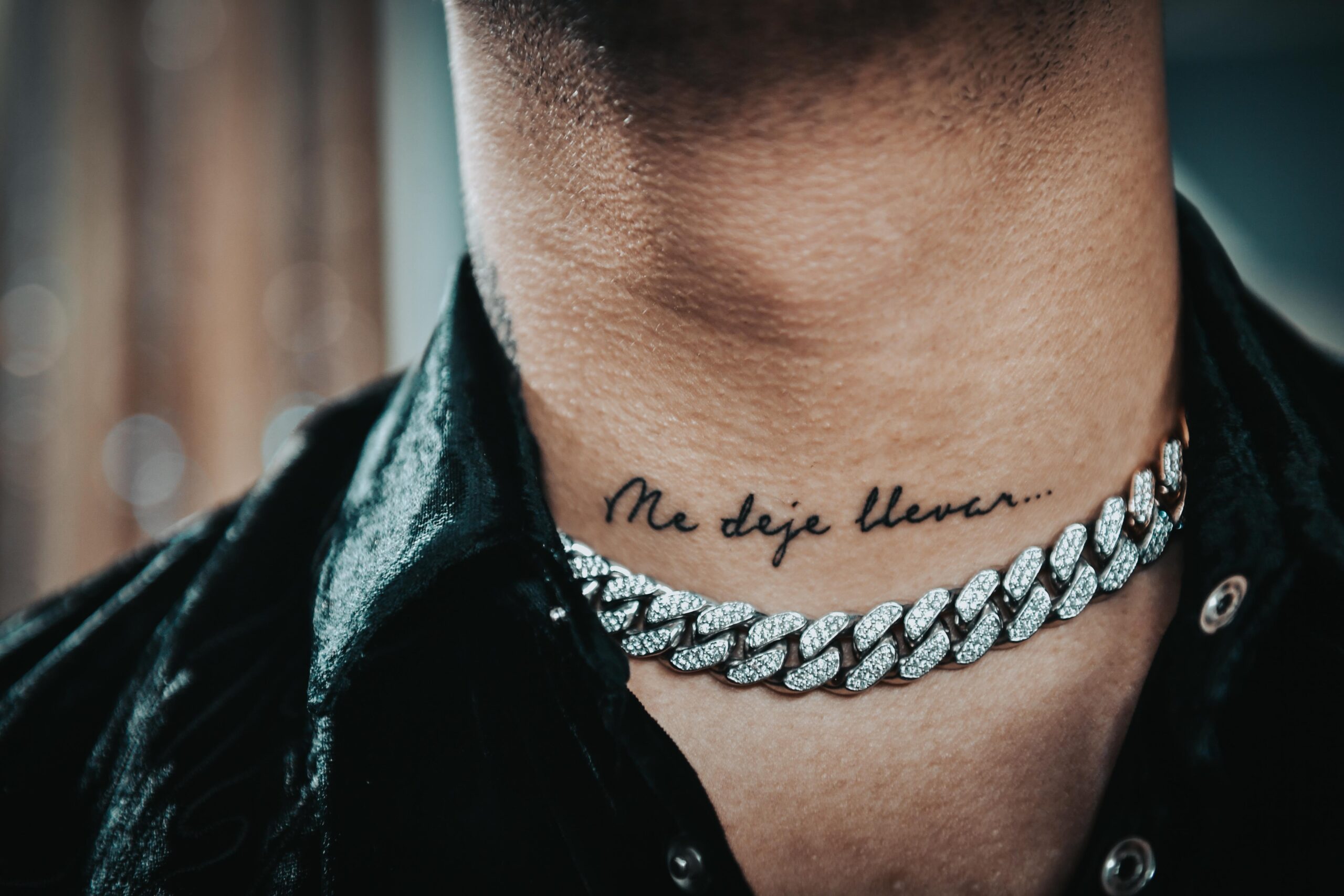
Christian Nodal tattoos: neck script tattoo reading Me deje llevar

The script on Nodal’s neck is easy to see because of where it sits. The phrase “Me dejé llevar” follows the curve of his neck, almost like a title for the collection. It’s visible without becoming a large image beside his face.

Neck script depends on spacing. The letters need room to stay readable as the skin turns, and a tight line that looks elegant from the front can be harder to read from the side. A short phrase is often a better fit for a narrow area than a long paragraph.

Lettering works best when the words and placement suit each other. Test the phrase against the actual shape of the body part. Think about the most common viewing angle, how the lines might age, and whether the handwriting fits the words. The lettering should feel chosen for the person wearing it.

The neck design also links the chest and arm. A single short line can help the eye move between different tattooed areas without needing a matching border.

The chest work changes the balance of the collection
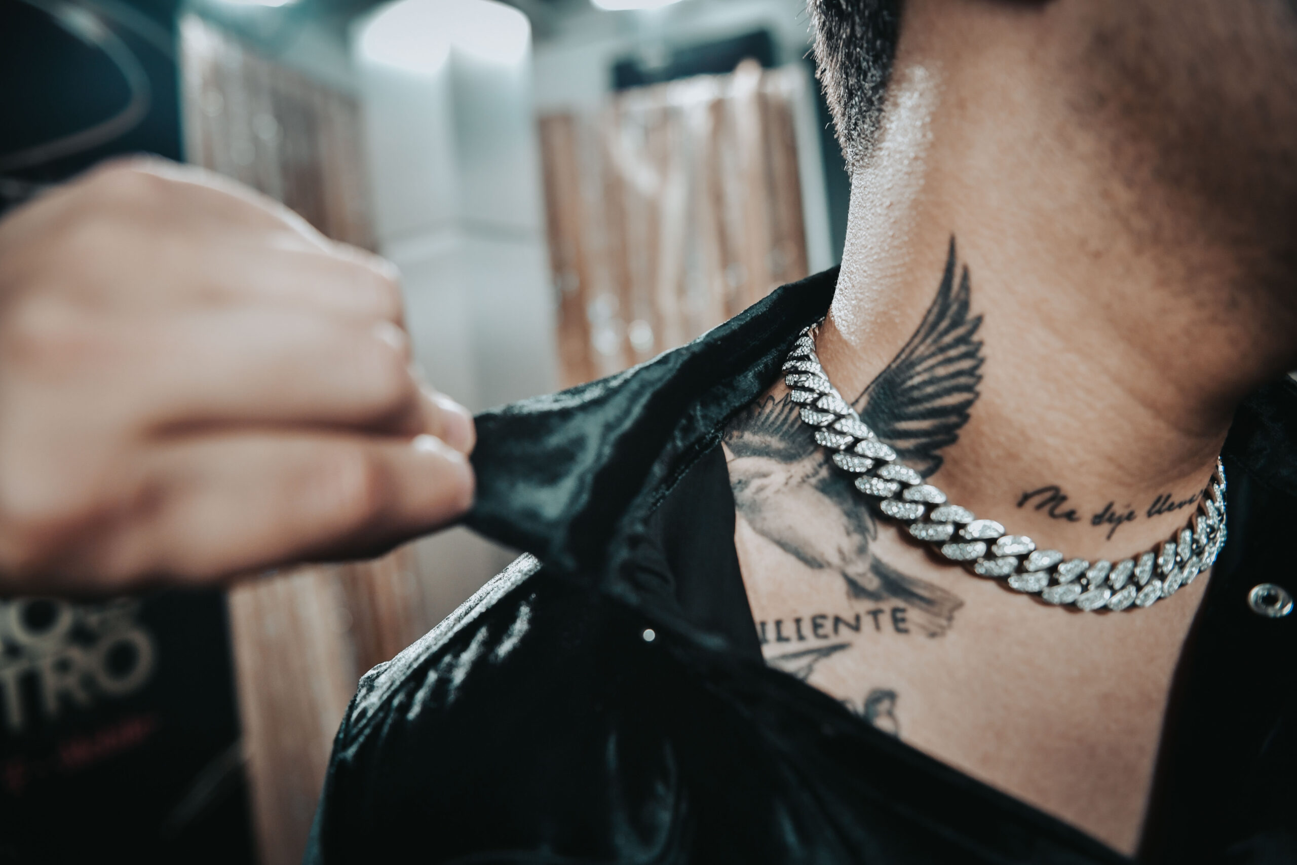
Christian Nodal tattoos: chest tattoo and upper body placement

The chest work adds weight near the center of Nodal’s upper body. Arm tattoos appear from different angles as he moves; chest pieces sit closer to the middle of the frame, especially when a shirt opens or a performance outfit leaves more skin visible.

The chest shapes have more visual mass than the narrow line of script on his neck. That change in scale keeps the upper body from feeling repetitive. If every tattoo has the same size and density, there’s nowhere for the eye to rest.

Open skin around the tattoos helps keep their edges clear and leaves room for future additions. Breathing room can make a heavily tattooed body look more considered than filling every gap as soon as possible.

Chest designs also move with the body. The chest expands and the shoulders roll, and the ink may sit under clothing much of the time. Use references on a real body, not just a flat drawing, and check how the lines look standing, sitting, and moving.

Nodal’s tattoos have a clear style but leave room for different kinds of designs. The forearm makes the strongest statement, the hand adds smaller details, the neck brings in readable script, and the chest gives the upper body another focal area. The designs don’t need to match to belong together.

If you want a similar feel, think about how the tattoos will relate, not how closely you can copy them. Start with the piece that sets the mood, then consider the size, direction, and contrast of the next one. A little planning can make a mixed collection feel connected without looking manufactured.

Let the tattoos grow with your life. Keep the designs personal, give each placement enough room, and work with an artist who can adapt your references to your body. Nodal’s ink feels like a record of different chapters, rather than one look planned all at once.

For a closer look at Nodal discussing his tattoos, watch the interview below.
More musician tattoo guides

Presley Gerber Tattoos: Face Ink, Neck Script and More

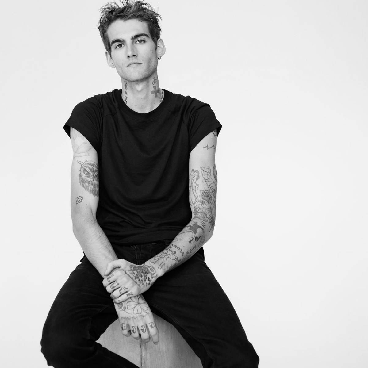
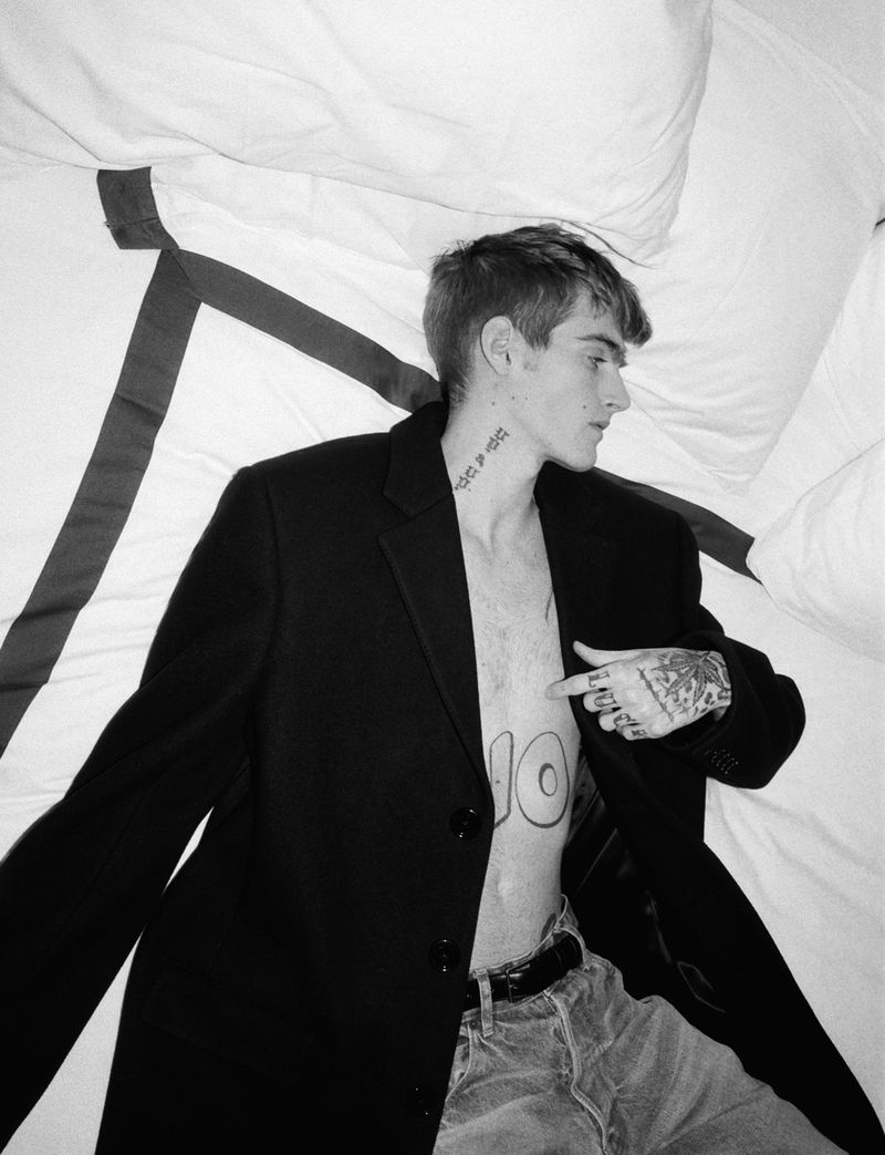
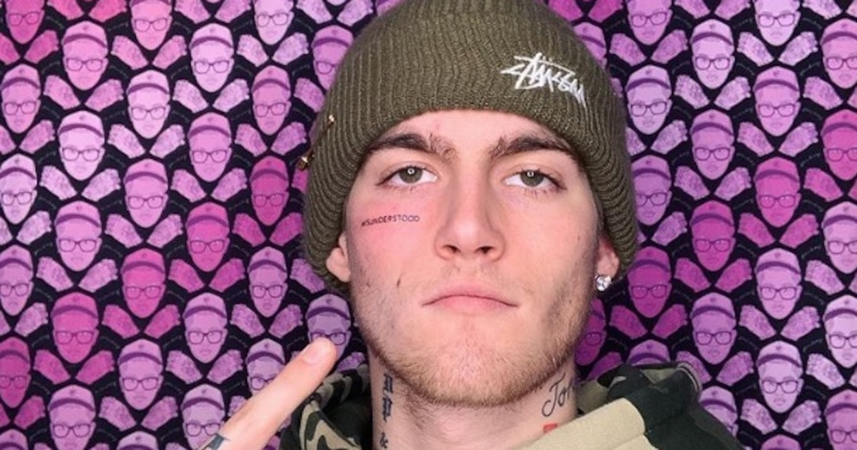
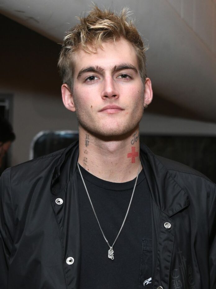
Presley Gerber’s tattoos have long been part of his fashion image, but the photos show more than one look. There’s small lettering on his face, script and a cross on his neck, loose linework on his arms, and smaller marks on his hands. Some images are polished editorial shots; others are casual.

The collection doesn’t follow one theme or one perfect sleeve. Lettering, symbols, cartoon-like art, and sketchy blackwork vary in size and mood, with black ink giving them a loose connection. Meanings are discussed here only when they’ve been publicly explained; the focus is on visible placement and design.

The misunderstood face tattoo and hand lettering set the tone

Presley Gerber tattoos: face-visible portrait with neck, arm, and hand tattoos

The small “misunderstood” tattoo beneath Gerber’s eye became the design most people associate with him. It’s plain lettering, but the placement makes it conspicuous. A short word near the eye can catch attention before a larger tattoo on the arm simply because people look at the face first.

The letters are compact and clean, without a frame or heavy shading. That restraint suits a face tattoo; extra flourishes could crowd the area quickly. At this size, the word reads as a statement without taking over his cheek.

The hand tattoos are visible in a different way. Fingers and hands move through ordinary gestures, so even simple marks seem animated. They sit beside rings, sleeves, and the things people handle every day; the ink becomes part of those gestures, not just a detail in a photo. Small hand tattoos can carry a lot of character when the lines stay clear.

Face and hand tattoos stay visible. Before choosing either placement, think about how permanent visibility fits your life. Check the lettering at its actual size and look at it from a normal speaking distance; a large phone mock-up can give a misleading impression.

The neck script sits beside loose torso and hand designs

Presley Gerber tattoos: neck script, torso symbols, and hand tattoos

The neck is where Gerber’s tattoos start to layer together. Script runs along its side, with a cross and smaller marks nearby. They sit close enough to make one area, but the shapes aren’t identical, so they don’t blend into one patch.

Neck lettering needs room because the skin turns with the head. A word that looks balanced from the front may bunch up from the side. Here, the script follows the length of the neck and leaves space around the cross, keeping the shapes separate.

The torso marks add detail without competing with the face. They’re lighter and more open than the stronger neck work. Negative space matters when small tattoos sit close together. Leaving some skin visible helps each mark stay clear.

A collection can grow one tattoo at a time. A neck design doesn’t need to predict every later piece. You can add a small symbol, then decide whether it needs a partner on the chest or shoulder. A loose plan helps the tattoos relate; open areas keep you from locking in every detail at once.

The shoulder and forearm tattoos make the collection feel lived in

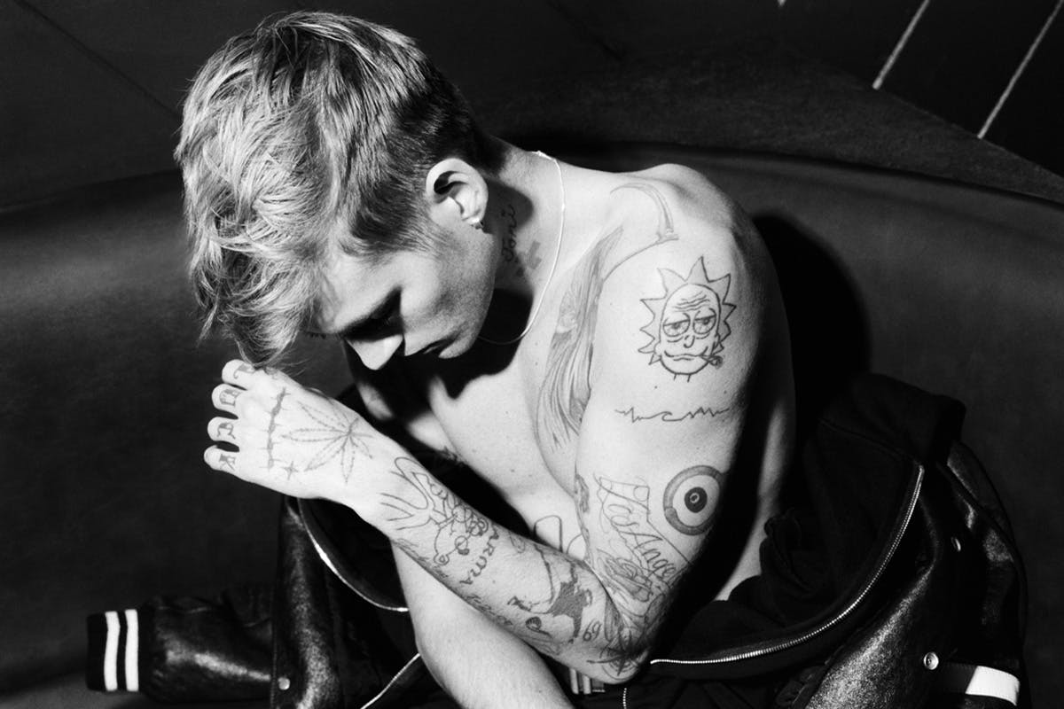
Presley Gerber tattoos: shoulder cartoon, arm lines, and forearm tattoos

Gerber’s shoulder and forearm photos show some of the more expressive designs. A cartoon-style tattoo sits on the shoulder beside looser lines, while sketches and shading run along the forearm. They look less like a matching set than pieces gathered at different times.

The shoulder can hold a bold image without forcing it into a narrow strip, and it connects naturally with the upper arm. The forearm extends the composition downward. As the arm bends, the shapes change with it.

Some outlines are graphic and confident; others have a sketchbook feel, with lighter strokes and open skin. Different levels of finish can sit together when the placements give each tattoo room. They don’t all need to be equally polished.

When sharing references with your artist, show both the close-up details and the whole limb. A cropped shoulder tattoo might look fine by itself but awkward next to the chest or upper arm. Check it from several angles before settling on the design.

The neck cross and arm details change the balance of the look

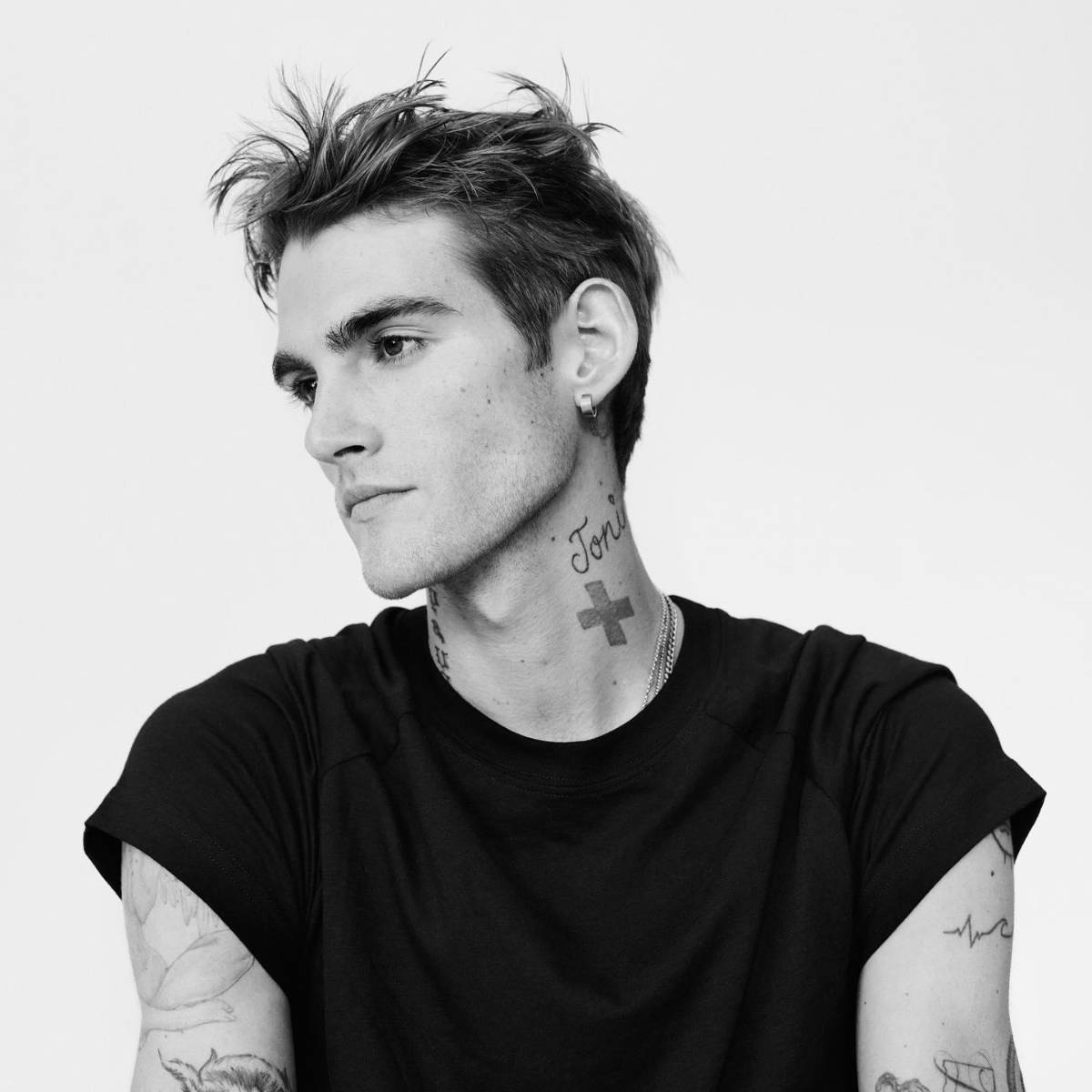
Presley Gerber tattoos: neck cross, script, and arm tattoo details

The cross on Gerber’s neck is one of the clearest shapes in these photos. Its simple outline stays visible when the rest of the image is busy. Script and smaller arm tattoos make the area denser, but the cross gives the eye a place to land.

A small symbol still takes care to place. A cross, star, or icon has to sit well on a body that moves; on the neck, even a slight change in angle can affect the balance. Nearby script helps the cross feel part of the collection rather than isolated.

The arm tattoos add texture without demanding the same attention. Smaller pieces can make an area feel complete without forcing every design into one theme. Repeated black ink and consistent spacing can connect different ideas without making them identical.

It helps to choose one focal point for each area: a cross at the neck, a flower on the shoulder, or a word on the forearm. Smaller tattoos can support it while leaving space around it. That order keeps a busy area legible.

The face lettering is small, direct, and impossible to miss

Presley Gerber tattoos: face lettering with neck and hand tattoos

The close-up shows how the face lettering works. The word is small, but its position makes it part of Gerber’s expression. Text of the same size would have a very different effect on an arm or rib.

In the full portrait, the eye moves from the lettering to the script and cross on the neck, then to the hand tattoos. Those placements create a vertical line. The marks have different sizes but share a dark palette.

That sequence is useful if you want a bold look without relying on one huge black shape. Placement can matter as much as size. A small tattoo near the eye can be more noticeable than a larger design under a sleeve. Neck script can link face and chest; hand tattoos show when the arms move.

Gerber’s collection doesn’t need to look perfectly matched. Give each tattoo a reason to be where it is, then check how it sits beside the next one. Keep the choices personal, leave useful space, and have the artist adapt the design to your body rather than tracing a photo.

The video below adds context to the first tattoo story and the response it drew.

More celebrity tattoo guides

Anthony Kim Tattoos: Full Sleeve, Arm Details and More

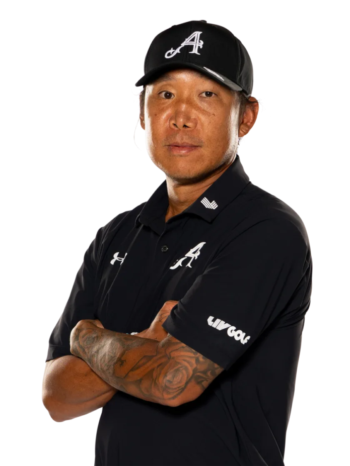
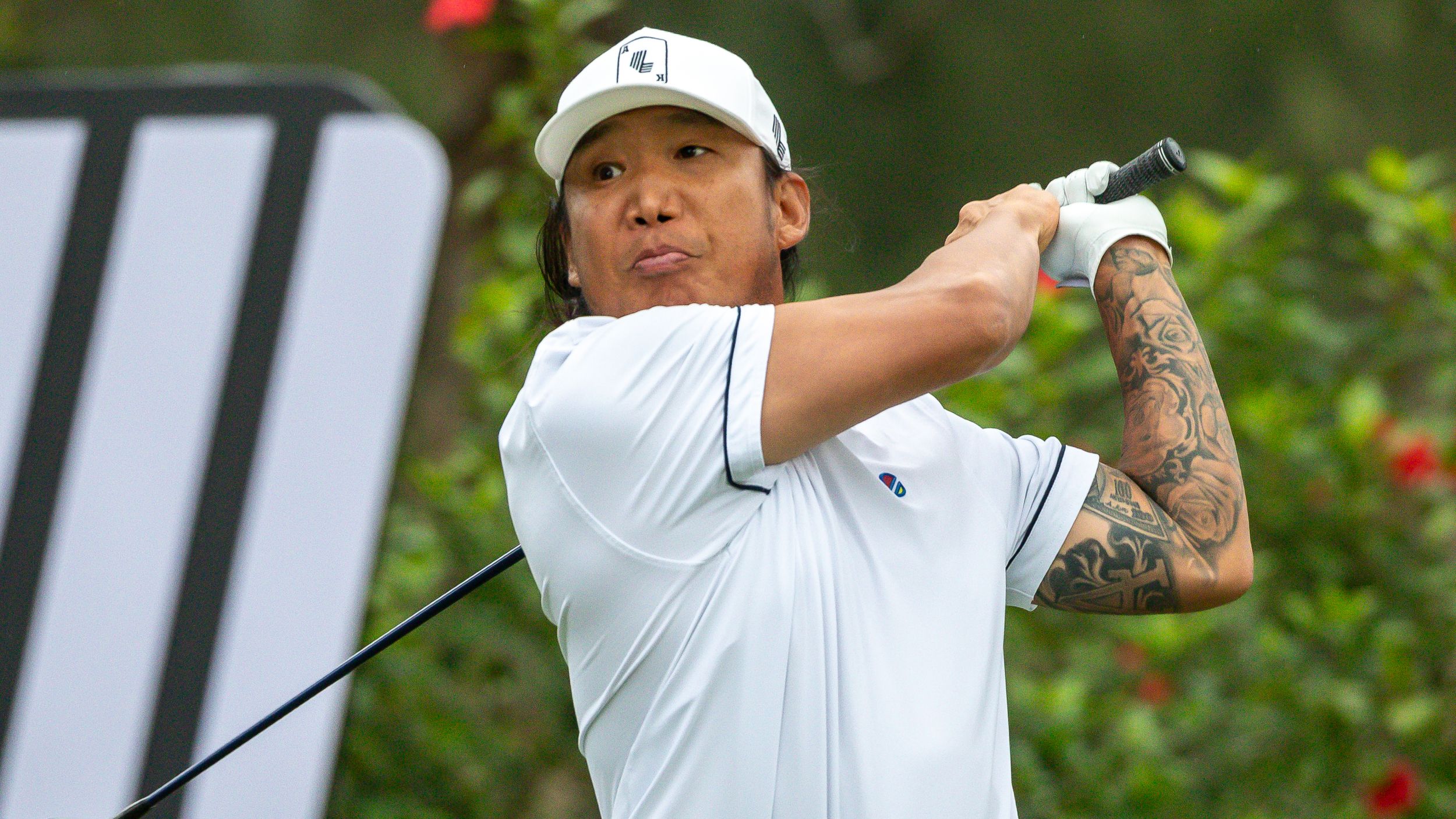
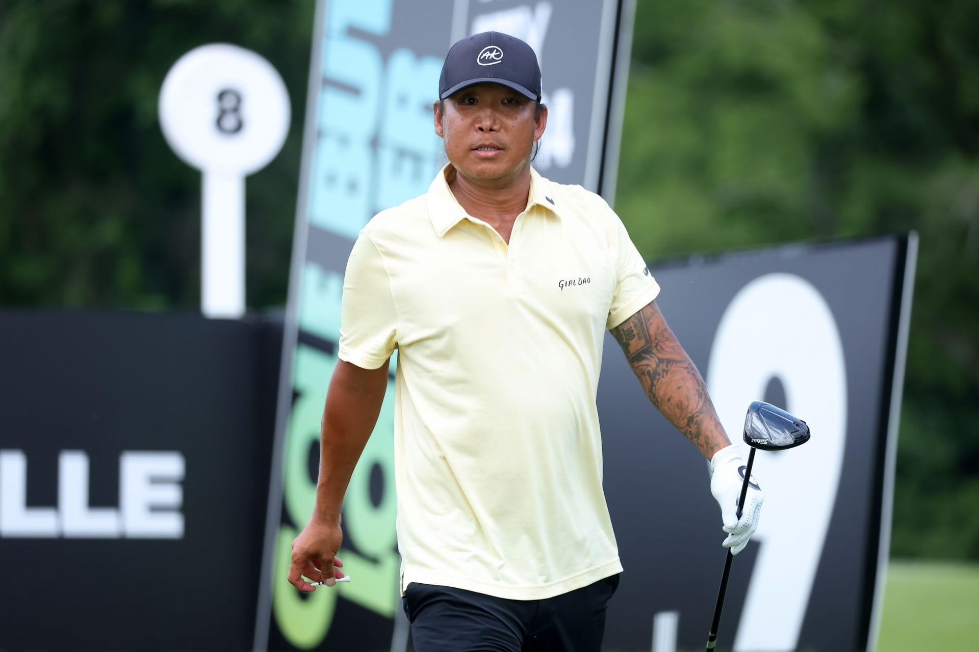
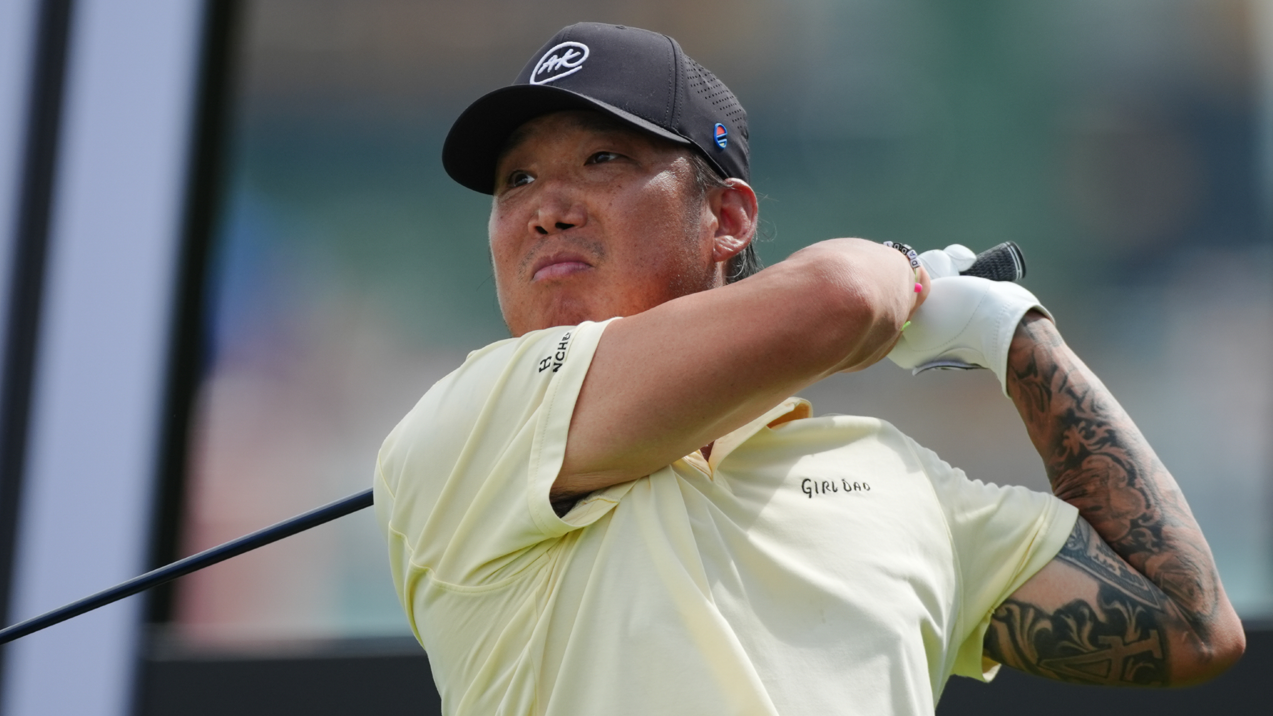
Anthony Kim’s tattoos stand out when he steps onto a golf course. A large black-and-gray sleeve covers his right arm, and it looks different as he swings, walks, or folds his arms. One photo shows the shapes along the outer arm; another brings the forearm into view. Together, the images make clear that this is a sleeve, not a single small tattoo.

The arm is dark enough to read from a distance, but smaller marks add texture up close. Open skin and denser areas alternate, letting the design keep its shape as he moves.

This guide sticks to what’s visible in the photos: the right-arm coverage, the black-and-gray shading, how the sleeve wraps, and how it sits with everyday clothes. Where Kim hasn’t explained a meaning publicly, I won’t guess. The design choices are clear enough to discuss on their own.

Anthony Kim’s sleeve is the first thing you notice

Anthony Kim tattoos: full right-arm sleeve visible during a golf swing

The first thing you notice is how much of the arm is covered. The tattoo starts high and runs toward the wrist, so it reads as a sleeve rather than a single image. A golf shirt covers part of the upper section, but the forearm remains visible and gives the look an anchor. The tattoo stands out without a large chest or neck piece.

In the swing photo, Kim’s arm is stretched and turned, showing how the design follows the body. Lines that look separate when the arm is straight overlap as the elbow bends. That movement matters: a sleeve should hold together when someone reaches, lifts, or relaxes, not only in a straight-on photo.

Deep black, gray shading, and open skin carry the composition. Contrast makes the shapes legible. Dark areas establish the main forms; lighter gaps keep the arm from looking like one solid block. If you’re considering a similar sleeve, ask to see the design from the front, side, and back before the first session.

The tattoo also works beside an ordinary sports uniform. If you play a sport, wear a uniform, or often wear fitted shirts, think about where the sleeve ends and how much ink you want visible day to day.

The full arm sleeve keeps its shape while he moves

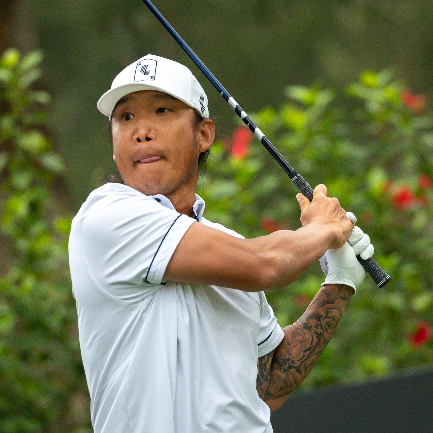
Anthony Kim tattoos: black and grey sleeve visible on the fairway

The fairway photo shows the sleeve under movement. Kim’s arm is bent and turned toward the camera, but the main shapes still hold together. Strong lines follow the length of the arm, so the tattoo feels like one composition rather than a stack of separate images.

Elbows are difficult places to tattoo because the skin folds and stretches. A design that works above the elbow can lose its rhythm across the joint. The black-and-gray shading here allows the sleeve to move without making every line depend on one angle. Flow matters more than a perfect flat outline when a design crosses a joint.

The shot also shows that the lower arm carries the design when a shirt hides the upper section. If you want a sleeve that is sometimes covered, consider placing a strong part where it will still show in a short-sleeve shirt, then build the rest over time.

Bring both close-up details and full-arm photos to your artist. The close views help with texture and shading; the full views show proportion. A beautiful crop may still fail to connect with the tattoos above or below it.

Close views show the sleeve’s black and grey rhythm

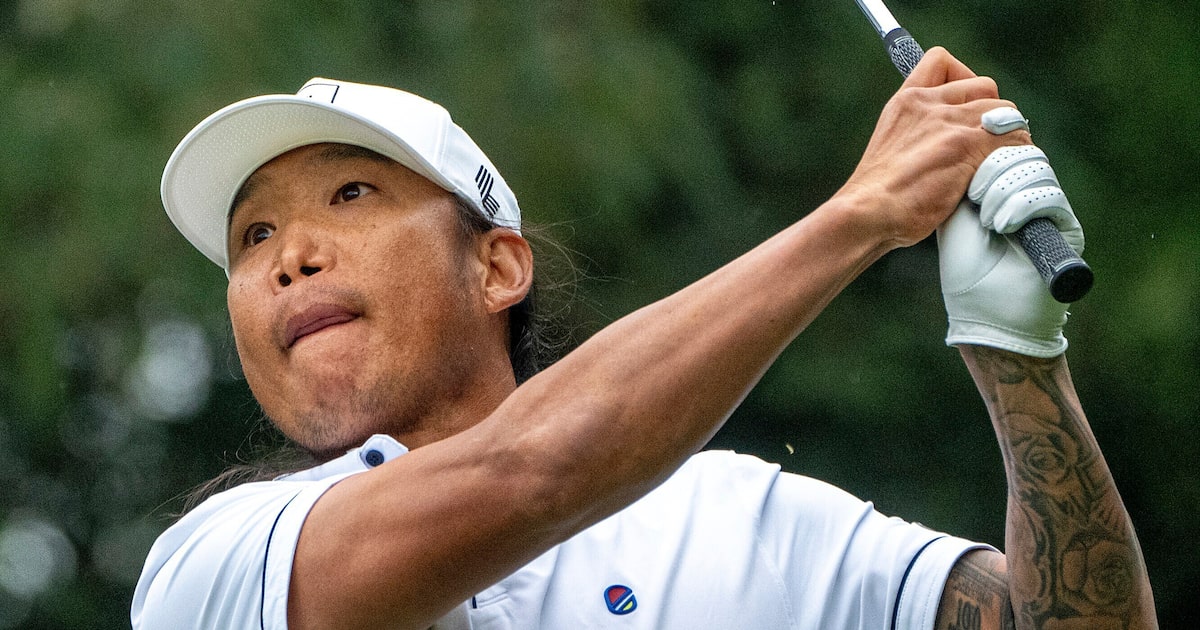
Anthony Kim tattoos: close view of the black and grey sleeve

The closer photo shows how the sleeve is put together. Some areas read almost as solid black from a distance, then open into softer shading and lighter lines when you look again. That shift makes the tattoo legible at a glance and gives you more detail nearby.

Black-and-gray work can get depth from a few values: solid black to anchor the darkest area, gray to soften its edge, and bare skin to leave a pause. Those changes can layer a large tattoo without adding tiny detail everywhere.

The designs also vary in size. Larger forms set the structure; smaller marks fill gaps and help the sleeve wrap around the forearm. That mix tends to work better than making every tattoo equally prominent.

If you like the look but aren’t ready for a full sleeve, start with one design that has a clear direction. Leave space for future work and ask how the next section could connect. Open skin gives a later tattoo somewhere to sit and helps the arm remain readable.

The lower arm carries the denser details

Anthony Kim tattoos: square action photo showing denser lower-arm details

The square action photo brings the lower arm closer. Here, changes in line weight are easier to see. The forearm feels denser than the more open area above, but the shading still leaves enough separation for the main shapes to read.

Forearm tattoos are visible in ordinary positions: holding a phone, carrying a bag, or reaching across a table. The shoulder may be covered by a sleeve, while the forearm stays on view. That makes it a natural place for the part of a collection you want others to see without making the tattoo the only thing they notice.

Kim’s lower-arm design also shows why the artist has to plan the wrist as an ending. The sleeve shouldn’t look abruptly cut off, though it doesn’t need to end as a perfect bracelet. A softer fade, lighter edge, or small gap can make the finish feel considered. Plan the edge as carefully as the center of the sleeve.

If your arm is becoming a sleeve over several sessions, don’t rush to fill every gap. Let the larger pieces settle first, then use the direction of the design to decide where smaller details would help.

A close sleeve crop makes the smaller marks easier to read

Anthony Kim tattoos: close portrait with the sleeve clearly visible

The close portrait shows how the sleeve changes the balance of Kim’s look. His face and clothes are relatively simple, leaving the arm as the main area of texture. When one part of the body carries most of the ink, the rest of the outfit doesn’t need to compete with it.

His arm is tucked close to his body here rather than fully extended. The tattoo compresses into a smaller area, so some lines overlap and the darkest patches stand out more. A sleeve has to work in this position as well as during a swing. People see it at rest and in motion.

You can borrow the idea of a connected arm composition without copying a motif. Use flowers, words, animals, geometric forms, or symbols that matter to you. The structure is often a more useful reference than the specific image.

Kim’s sleeve has a clear place on his body. It’s bold without needing face or neck tattoos to explain it. The arm gives the designs room for contrast, movement, and detail. If you’re planning similar work, think about the message of the main area, how visible you want it, and where to leave open skin.

For more context on Kim’s return to competitive golf, see the interview below.
More athlete tattoo guides

Alesso Tattoos: Eagle, Sleeves, Cross and More

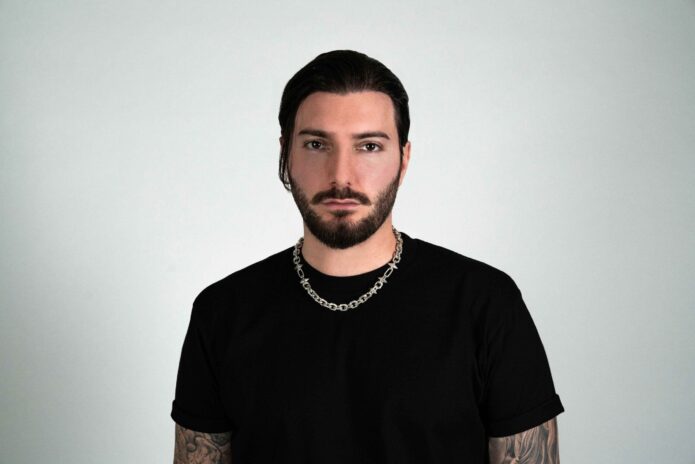
Alesso’s tattoos are part of the visual language he brings to a stage. The Swedish DJ and producer is often photographed in black T-shirts or sleeveless tops, and that makes the ink on his arms easy to read. The collection moves from an eagle and cross to denser blackwork across the sleeves, with open skin and lighter shading keeping the arms from looking like one solid block.

That mix makes Alesso tattoos interesting for anyone who likes music-inspired body art without wanting a loud logo on every inch of skin. The photos show a collection that grew over time. Some pieces have a clear subject. Others work more as texture, filling the arm and helping separate one tattoo from the next.

Alesso has spoken about at least one piece in a very relaxed way. In a Young Hollywood interview, he described the eagle as a spontaneous tattoo and said he liked the bird. That detail matters because it pushes back against the idea that every tattoo needs a grand explanation. Sometimes the design simply looks right, and the placement gives it a life of its own.

This guide sticks to the visible work in close portraits and live photos. It looks at the eagle, the cross, the sleeve balance, and the way the designs work with his clothes and movement. The useful ideas are in the placement, contrast, and flow, not in trying to copy a celebrity’s exact ink.

Alesso’s tattoo sleeve sets the whole look

Alesso tattoos: full tattoo sleeves visible in a studio portrait

The first thing the studio portrait shows is how much of Alesso’s arms are covered. The tattoos run from the upper arm down toward the forearm, giving the collection the feel of connected sleeves even when a single photo only shows part of the work. The lines and shading are detailed, but the skin breaks keep the arm from reading as a flat wall of black.

That balance is useful if you are planning a large arm project. A sleeve has to work as a whole shape before anyone gets close enough to study the details. The outer silhouette is just as important as the tiny lines inside it. When the arm is relaxed, the darker areas create a strong outline. When it bends, the separate images start to overlap and the piece feels more alive.

Alesso’s clothes also help explain why the tattoos stand out. A plain black shirt gives the arms a clean background. There are no bright prints competing with the designs, so the eye goes straight to the skin. You do not need to dress exactly the same way, but a simple outfit can make a busy collection feel more intentional.

If you like the look of a full sleeve, start with the way you want it to read from a few steps away. Choose the largest value areas first, then work out where lighter textures and smaller marks should sit. Your artist can use open skin to separate the motifs and guide the eye around the arm. That kind of planning makes later additions easier.

The eagle tattoo is small but impossible to miss

Alesso tattoos: forearm eagle and blackwork visible in side profile

The eagle is one of the clearest individual tattoos associated with Alesso. In the side-profile image, the bird sits on the forearm and reads as a compact blackwork design. It does not need a huge scale to be recognizable. The wings, body, and direction of the shape give it enough movement to stand out against the rest of the arm.

What makes the placement work is the curve of the forearm. A bird already has a natural direction, so it can follow the long line of the arm without looking boxed in. The design feels like it is moving along the skin instead of sitting inside a square. Choosing a subject with its own built-in motion can make a small tattoo feel more dynamic.

Alesso has described the tattoo as spontaneous and said he simply liked the eagle. That is a useful reminder for anyone who gets stuck trying to explain every idea in a paragraph. A personal tattoo can start with a shape, animal, or object that you enjoy looking at. Meaning can come later, or it can stay simple.

For your own forearm, think about whether the design should face toward your hand, toward your elbow, or across the side plane of the arm. The answer changes how the tattoo looks when you move. Ask for a stencil in a few positions before you commit. A bird that looks perfect straight on can look cramped when the wrist turns.

Cross ink gives the forearm a clear focal point

Alesso tattoos: cross tattoo visible on the upper arm during a DJ set

The performance photo shows another recognizable part of Alesso’s visible ink: a cross on the upper arm. It has a strong shape, so it catches the eye even in darker stage lighting. The piece gives the arm a clear focal point while the surrounding work supplies texture.

Simple religious symbols are deceptively difficult to place. A cross has a straight center line and a strong horizontal bar, so small changes in angle are easy to see. On a rounded upper arm, the design has to be set so it still feels balanced when the muscle turns. A clean symbol needs a clean placement.

The cross also works as a visual pause inside a larger collection. Dense sleeves can become hard to read if every section has the same level of detail. A simple symbol creates a moment of clarity, then lets the eye move back into the more shaded pieces nearby.

If you want a similar effect, choose one straightforward tattoo to act as an anchor. It might be a cross, star, letter, number, or small portrait. Put that piece where it can be seen, then use softer shading or smaller designs around it. The anchor does not have to explain the whole arm. It just needs to give the composition a place to settle.

The paired sleeves create balance on stage

Alesso tattoos: both tattooed arms visible beneath a black shirt

The sleeveless portrait makes the overall balance easier to see. Both arms carry tattoo work, but the coverage is not necessarily identical from one side to the other. That slight difference gives the look some movement. Perfect symmetry can feel stiff. Related density and a similar black and grey mood are often enough to make two arms feel connected.

Stage photos are useful because they show how the tattoos behave when the arms are open. Alesso’s forearms become long visual lines leading out from his torso, which suits the wide gestures of a DJ set. The tattoos do not stay in one neat pose. They stretch, twist, and break into different shapes as he reaches for equipment or addresses the crowd.

Your body is not a flat poster, so the design should not depend on one frozen angle. When planning matching or related arm work, take photos with your arms down, bent, crossed, and raised. Check what the audience or a friend sees in each position. The best flow usually comes from designing around movement rather than correcting for it later.

Clothing matters here too. A sleeveless shirt reveals more of the upper arm, while a short sleeve may only show the forearm. If you want your collection to have different levels of visibility, decide which pieces should stay private and which ones should appear in everyday outfits. That helps you choose the order of your sessions.

Alesso’s travel and music tattoos feel personal

Alesso tattoos: both forearm sleeves shown while Alesso performs live

The live stage image brings the tattoos into the setting where most people know Alesso best. Under blue light, the arms read as two dark bands of texture around a simple black shirt. Individual designs are harder to identify at that distance, but the overall shape still works. That is a sign that the collection has a strong visual rhythm.

Some of Alesso’s tattoos have been connected with travel, music, and the people around him. A long-running tattoo story about his early work describes a friend and a spontaneous approach to choosing designs. Other references point to personal names and travel ideas in the collection. The exact meaning of every piece is not always public, so it is better to focus on what the photographs show clearly.

That visible mix gives the arms a lived-in feeling. They do not look like one marketing graphic built around a single concept. They look like a musician’s collection, added at different moments and shaped by different moods. That kind of uneven growth can make a sleeve feel more personal.

If you are building a music-related tattoo collection, consider using one design that points to your work and another that belongs only to you. A waveform, instrument, lyric, or stage symbol can sit beside a family mark, travel memory, or image you simply love. The contrast often makes the whole arm stronger than a row of matching logos.

Alesso’s tattoos are a good example of how a large collection can stay readable. The eagle gives the forearm motion. The cross adds a simple focal point. The darker sleeve work creates depth, while the open skin keeps the arms from becoming too heavy. If you want similar energy, plan the flow first, leave room for lighter areas, and let the designs grow in a way that still feels like you.

For a little more context on the spontaneous eagle tattoo and Alesso’s style, the interview below is a useful watch alongside the photos.

More musician tattoo guides

Andy Ruiz Jr. Tattoos: Praying Hands, Back Ink and More

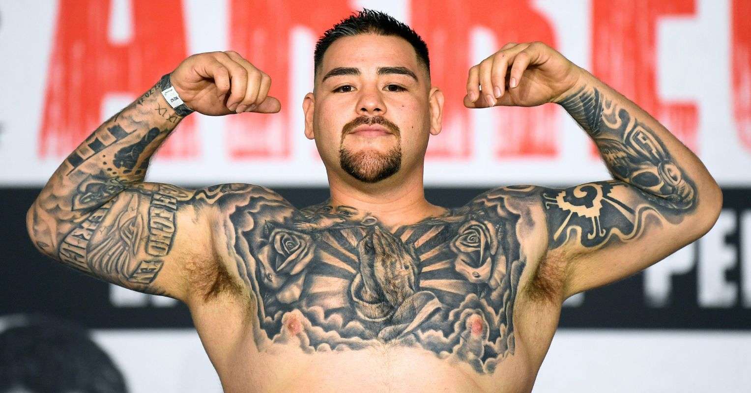
Andy Ruiz Jr.’s tattoos cover most of his upper body. The former heavyweight champion has ink across his chest, shoulders, arms, neck, and back. From the front, black-and-gray work frames his torso. The back piece is larger still, running from his neck down across his back.

If you like religious imagery, roses, lettering, portraits, or tattoos that follow the body’s shape, Ruiz’s collection offers a few clear placement ideas. The pieces have different roles: some read in a quick weigh-in photo, while others need a closer look or a full view of his back.

The collection has grown over time. His chest and sleeve work came first; the later back tattoo adds a much larger centerpiece. The designs vary, but similar shading, line weight, and religious imagery help them sit together.

This guide looks at the parts visible in public photos: the central chest design, praying hands, roses, arm lettering and sleeve work, and the back piece with an angel and the word “Victorious.” The point isn’t to copy Ruiz’s tattoos. It’s to look at how the placement works and how you might adapt the ideas to your own body.

Andy Ruiz Jr.’s chest tattoo sets the whole look

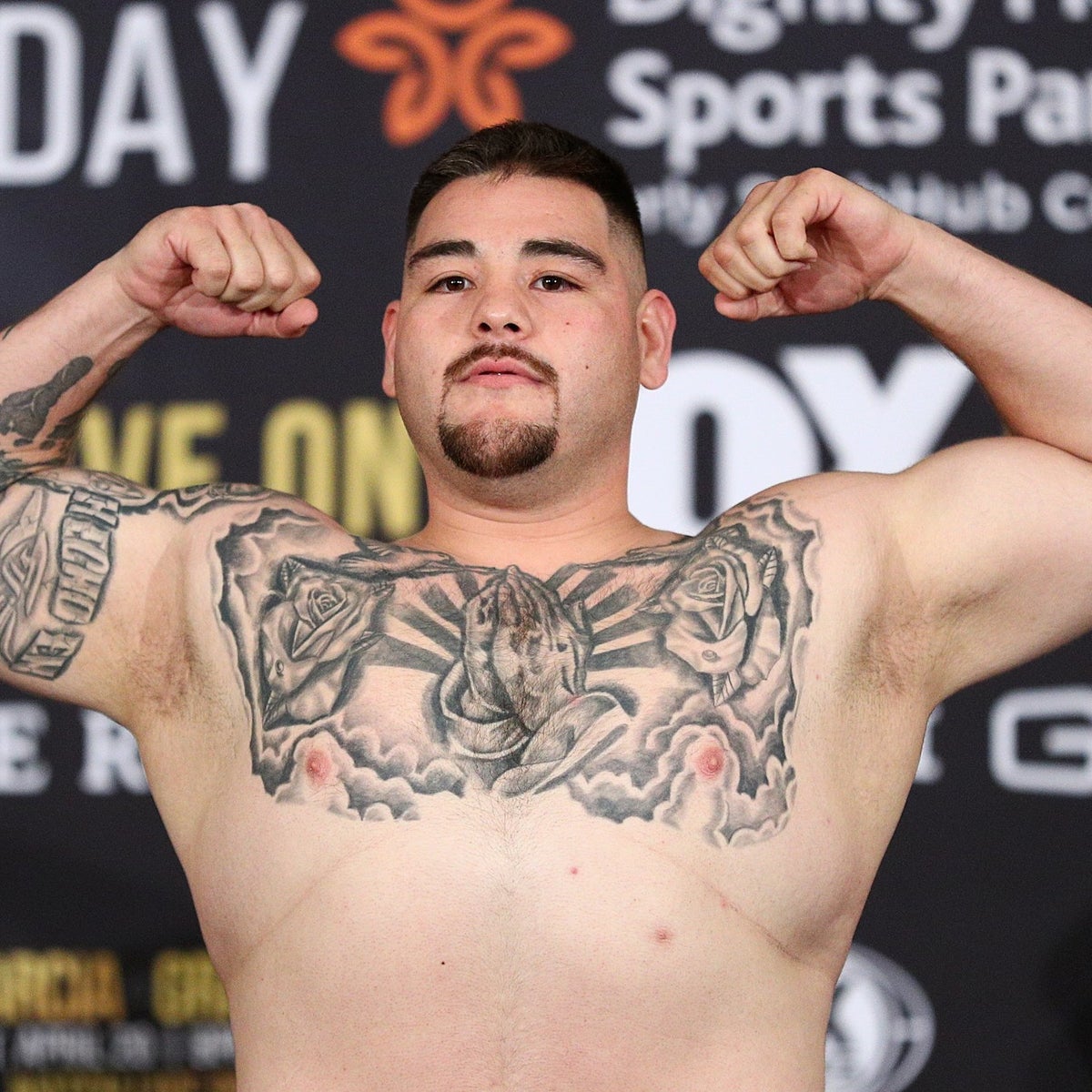
Andy Ruiz Jr. tattoos: close weigh-in portrait showing the central chest piece, roses, praying hands, and arm work

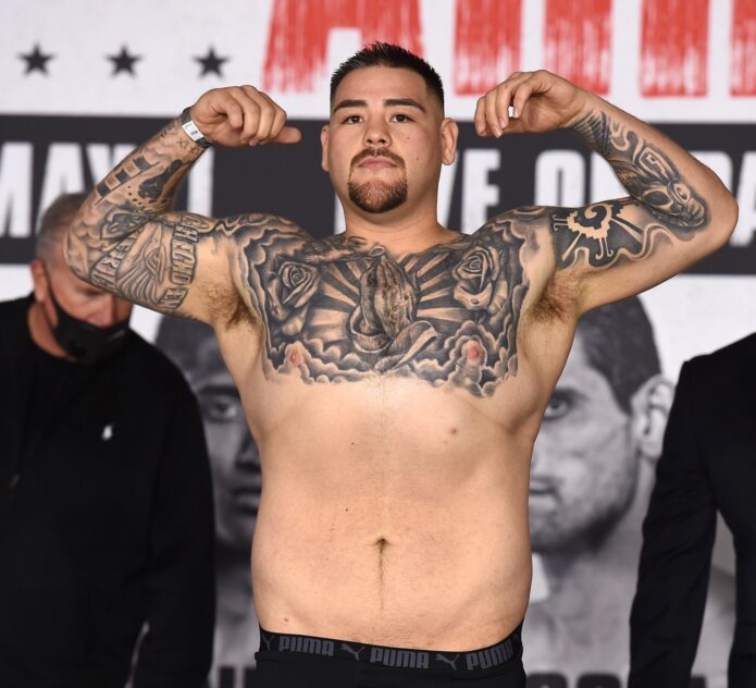
In a clear weigh-in portrait, the chest design stretches from one shoulder to the other and down toward the upper stomach. Praying hands sit at the center, with light, cloud-like shading around them. Roses on either side fill the width of the chest and keep the hands from looking like a symbol placed on its own.

The artist had to make the design work with the body’s movement as well as its shape. The pectorals read like two connected panels. Darker lines near the shoulders draw the eye toward the middle, while lighter shading leaves some space along the lower edge.

A chest tattoo feels more finished when the outer edges have a plan. It doesn’t need perfect symmetry, but the artist should know where the piece ends, where to leave skin open, and how later work could connect. The roses soften the border around Ruiz’s central image and help the chest read as one design.

If you’re planning a similar piece, begin with your own proportions instead of a flash sheet. Check the width from armpit to armpit and decide how far the design should wrap around your ribs. The subject can be religious, floral, or something personal. Give it room, and let the surrounding shading support it.

The praying hands tattoo anchors his chest

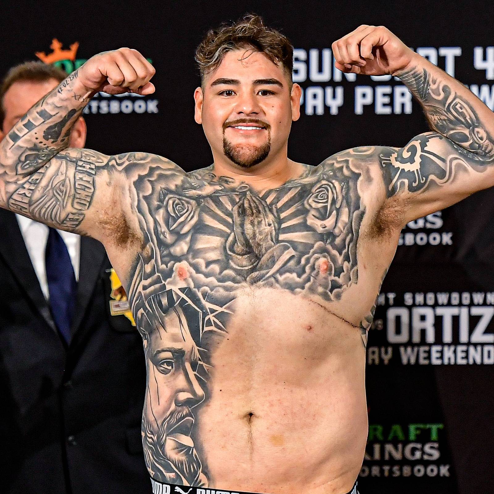
Andy Ruiz Jr. tattoos: full front view showing the chest, both sleeves, side portrait, and large black-and-gray coverage

The praying hands are the first thing many people notice in Ruiz’s front-facing photos. They sit in the middle of the chest, then the eye moves out to the roses and darker sleeve work. That clear focal point helps a large tattoo avoid feeling like one solid patch of detail.

Religious imagery can carry personal meaning, but its shape matters too. The hands form a vertical line: the fingers point upward and the wrists meet below. Rays or clouds spread out around them, giving the center room against the wider background.
The shading keeps the hands distinct. Darker areas behind them add contrast, and lighter gaps keep the whole chest from becoming one heavy block. That contrast helps a detailed image stay readable as the tattoo ages.

Think about how you want the design to sit on your torso. A straight-on image can feel formal; a slight curve may follow the chest more naturally or connect with shoulder and rib work. Ask to see the stencil while you’re standing normally, not only with your chest pushed out.

Scale matters here. Small praying hands can work on an upper chest or inner arm, but Ruiz’s composition needs space for the fingers, rays, and flowers. If you want that level of detail, give the design enough skin to hold it. Shrinking a complex image can make it harder to read.

The arm lettering and sleeve work add a clear identity

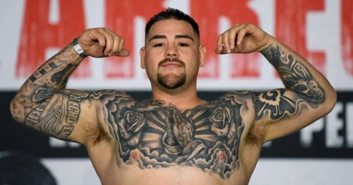
Andy Ruiz Jr. tattoos: post-fight portrait showing how the chest and arm tattoos read from a little farther away

Ruiz’s arms combine lettering, dark ornamental shapes, and portrait-style work. In photos, the designs wrap around the biceps and forearms instead of sitting like separate stickers. Some parts are dense; small gaps of skin give the words and symbols room to show.

One reported phrase in his collection is “Hecho en México,” a reference to his Mexican identity. The arm gives the words a natural line to follow along the muscle, with black-and-gray work around them. It’s a personal detail without needing a large flag or bright color.

Lettering needs room to age. Fine lines can soften over time, especially on a busy forearm. Ruiz’s heavier style is one way to keep words legible: use a firm outline, space the letters, and keep the surrounding work quieter where the text needs attention.

Related shading can also help tattoos from different sessions fit together. You don’t have to plan a whole sleeve at once, but it helps to tell your artist how dark and dense you want the finished arm to be.

If you’re adding words to a sleeve, consider how the skin moves. The outside forearm is easy to show, but it shifts when you turn your wrist. Check the stencil from a few angles so the lettering sits well in ordinary positions.

The Victorious back tattoo changes the scale

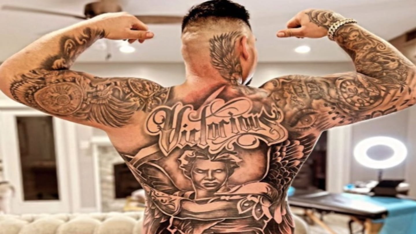
Andy Ruiz Jr. tattoos: back view showing the huge angel, Victorious lettering, neck ink, and the way the piece fills his back

The back tattoo is a much bigger project. Ruiz has a design that starts at the neck and runs down across the back toward the lower body. It includes an angel or winged warrior, the word “Victorious,” and decorative shading around the main figure. The piece is meant to read as a whole, not as a small mark between the shoulder blades.

The lettering across the shoulders catches the eye first. Below it, the figure gives the tattoo a vertical center. Ruiz already has ink across his arms and shoulders, so the black-and-gray treatment also helps the back piece sit alongside that older work.

Victorious works as part of the composition, not just a caption underneath it. The word is large enough to read as an image from a distance, before someone can make out every detail.

A full back tattoo should be designed for a body that moves. The spine, shoulder blades, waist, and lower back shift as you bend or twist. A central figure can follow the spine while wings or ornamental lines spread over the shoulder blades. Good placement makes the design follow the body.

A piece this large may take several sessions, and healing can affect training, clothes, and sleep. Talk through the order of the work before starting. Beginning with the main figure and adding the background later can help keep the focal point clear.

Newer ink makes the collection feel lived in

Andy Ruiz Jr. tattoos: shirtless press portrait with the tattooed chest, roses, central religious imagery, and both arms visible

The newer tattoos add to Ruiz’s older work. In press portraits, you can see designs across his chest, arms, and side. A portrait or large shaded area can sit beside roses and lettering without every piece matching exactly.

That kind of collection builds as people go. Some tattoos are large and central; others fill a space or mark a different time. Ruiz’s black-and-gray shading, religious references, and large placements give the work a shared feel, even when individual pieces differ.

Clothes change which tattoos stand out. A bare chest shows the full composition; a T-shirt brings the arms forward; a boxing robe can cover nearly everything except the hands and neck. If you’re choosing a spot for a new tattoo, consider when you want it visible and when you don’t.

The best celebrity tattoo inspiration is usually a placement idea, not a direct copy. You might like Ruiz’s central chest image but choose a family portrait, flowers, or a symbol of your own. You can borrow the scale of his back piece without using the same angel or lettering. Keep the structure that appeals to you and choose a subject with personal meaning.

The praying hands and roses make Ruiz’s chest easy to recognize. His sleeves carry the black-and-gray work down his arms, and the “Victorious” back tattoo gives the collection a second focal point. Together, the pieces follow the shape of his body.

If you’re planning a larger project, start with the area you want to define and choose one focal image. Decide how much open skin to leave around it, and consider where future work could go. An artist can help connect separate tattoos without forcing them into one theme. Ruiz’s collection shows how placement can follow the body as the work grows.

The video below offers another view of Ruiz’s chest, arms, and back beyond a single press photo.

More athlete tattoo guides

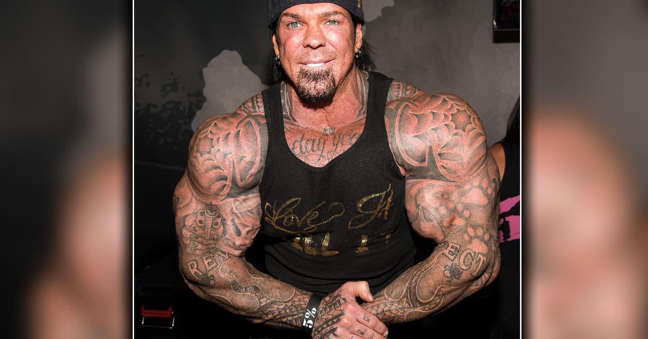
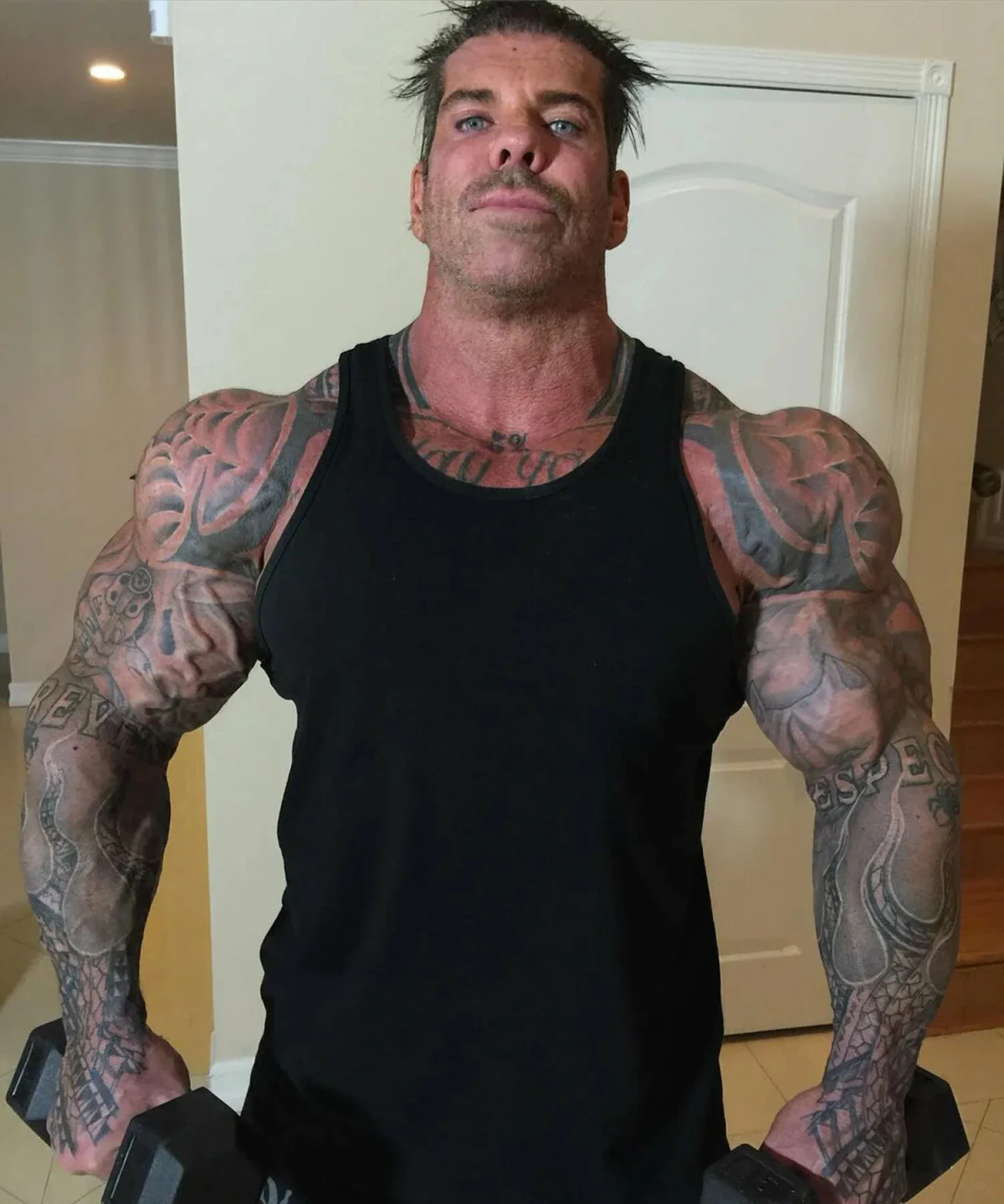
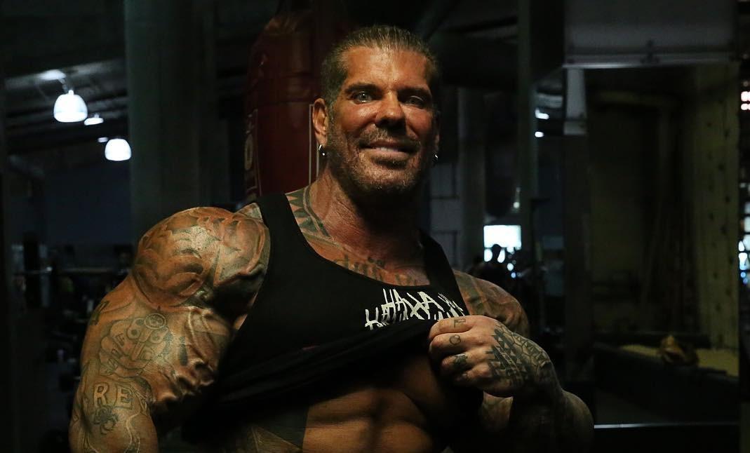
Rich Piana Tattoos: Full Sleeves, Chest Script and Bold Bodybuilding Ink

Rich Piana’s tattoos matched the scale of his bodybuilding image. They cover large areas, use dark shapes, and connect his shoulders, chest, arms, and hands. The designs are hard to miss, and they follow the same bold style as the rest of his public look. Rich Piana tattoos are worth looking at for how the placements work with his size, not just as separate pictures.

In photos, you can make out heavy lettering, black-and-grey shading, a revolver motif, chest script, and patterns across his upper body. Some pictures show individual details; others show how the ink frames his physique. Looking at the placements one by one makes the collection easier to read.

This guide sticks to what is visible rather than guessing at private meanings. A photo can’t explain what a tattoo means to its owner, but it can show the design choices: large scale, clear contrast, heavy coverage, and placements that follow the muscles. Those are useful ideas if you like bodybuilding-inspired tattoos but want your own designs.

Rich Piana’s shoulder and upper-arm work creates a full sleeve effect

Rich Piana tattoos: clear face-visible front view showing Rich Piana's dense shoulder and upper-arm tattoos following the muscle shape

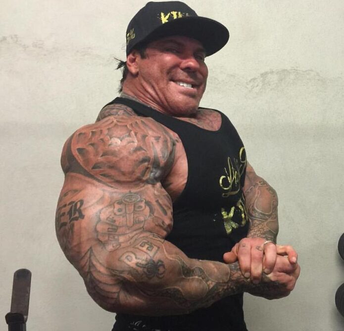
Piana’s upper-arm tattoos take up a lot of space. The shoulder, biceps, and upper forearm read as connected areas: dark shapes and breaks of bare skin lead down toward the elbow. Together, they give the arm a sleeve-like look even though the patterns don’t all match. That connection matters on a large frame.

The shoulder follows the curve of the muscle. As the arm turns, the design moves with it, instead of sitting like a flat panel. An artist can use that same approach with script, flames, a portrait, or abstract blackwork. The drawing should be planned against the body, not only on paper.

The dark and light areas also show up well in gym photos. Harsh lighting can wash out fine details, while larger black shapes hold their form. Smaller lines add texture around them. The result is bold without needing every inch to become solid black.

For a similar upper-arm layout, decide where you want the main piece to sit: shoulder, outer biceps, or forearm. Build the nearby designs around it. A sleeve added over time can still look connected if the line weight and spacing relate. Some open skin can help the main shapes stand out.

The revolver and bold lettering make his forearms easy to read

Rich Piana tattoos: high-resolution torso and arm view where the revolver motif, lettering, and forearm coverage are easy to inspect

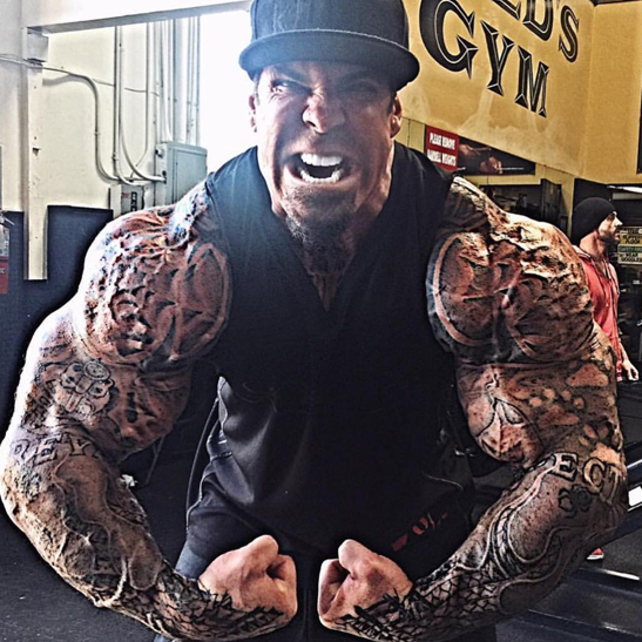
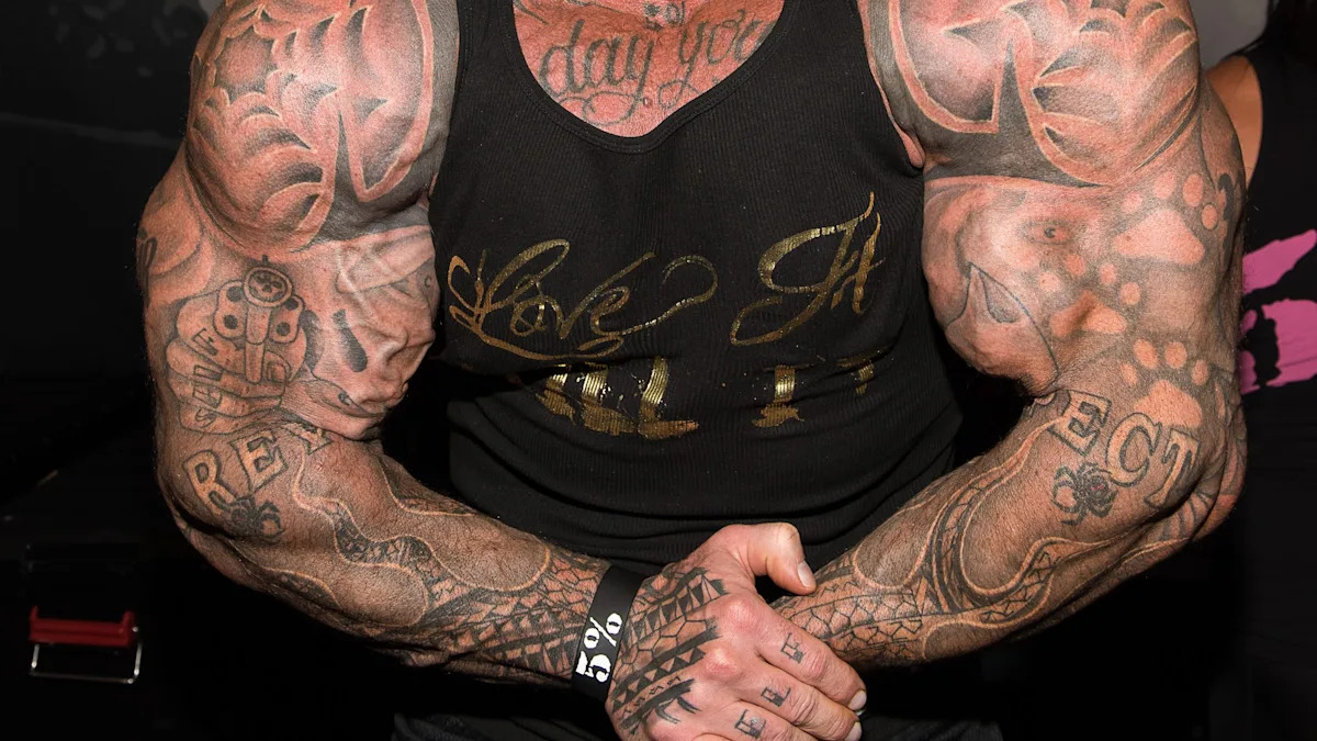
The revolver on Piana’s forearm gives the surrounding ink a clear focal point. Its outline is easy to recognize even in a photo taken from farther away. Lettering and darker marks add weight around it without hiding the central shape. It suits a visible part of the body that moves with the hands.

Forearm tattoos turn up in everyday moments: lifting, driving, greeting someone, or holding a phone. A design there has to read quickly. The revolver doesn’t rely on fine shading to make sense; its outline does most of the work, with texture around it for depth.

The lettering gives the arm a different direction. Words move across or along it, while the revolver makes a stronger central shape. That change in scale keeps the whole forearm from repeating one pattern.

A bold object can also be easier to keep legible over time than a tiny, highly detailed scene. An artist can simplify its shape for the skin and use shading where the arm bends. Clarity is the real flex here. The main image should still read from a few feet away and in changing light.

Chest script and shoulder shading keep the upper body connected

Rich Piana tattoos: face-visible gym photograph showing chest script connected to darker shoulder and upper-body work

When Piana faces the camera, the chest script and shoulder ink read as one broad design. The writing runs across the chest; darker tattoos at the shoulders carry the line outward. It doesn’t sit like a small emblem by itself. The surrounding work frames it across his upper arms and deltoids.

Chest lettering has to work with a body that changes shape. The pectoral muscles expand and contract with posture, so a phrase that looks even while relaxed can stretch when the chest is flexed. Placement around the body’s centre line matters, as does how the words sit on either side of it.

The shading connects the front and sides of the torso. Without it, the chest and arms might look like separate projects. Here, the tattoos trace the width of the body. On a large build, that connection can work better than a series of small designs with no relationship to each other.

If you’re planning chest lettering, keep the phrase short enough to read and give it room. Ask to see how it sits at a normal distance, then decide whether the surrounding ink should stay light or build into a heavier black-and-grey frame.

His hand and wrist ink add small details to the bigger collection

Rich Piana tattoos: face-visible gym portrait showing the smaller hand and wrist marks beside the larger arm collection

The hands and wrists bring the scale down. They have smaller marks than the shoulders and chest, but people often notice hand ink first because hands are always moving. These details add to Piana’s look without competing with the larger work on his arms.

The wrist gives a small symbol, word, or band a natural edge. Hand tattoos are harder to place: the skin gets rubbed and washed often, and finger shapes can make a straight line look curved. Simple designs with room around them tend to stay clearer than crowded detail.

Small tattoos can change the feel of a larger collection. They’re visible in ordinary gestures, not just posed photos. Piana’s hand and wrist ink connects the dramatic torso work with the way he holds or moves his hands.

If you’re drawn to this part of the collection, you don’t have to fill every finger. Pick a spot you can live with every day. A small tattoo still needs a clear reason to be there, even if that reason is simply that you like the design. Give the lines enough space to remain readable as the skin changes.

The dense black-and-grey tattoo coverage shows how he used scale

Rich Piana tattoos: clear face-visible wider gym photograph showing the overall black-and-grey balance across the arms and chest

In wider gym photos, you notice the amount of coverage before the smaller details. Dark work frames Piana’s arms and chest, while lighter patches break it up. The silhouette catches the eye first; then the separate designs become easier to pick out.

Black-and-grey shading suits this approach. Black holds the outer shapes, and grey wash softens the change between areas like the shoulder, chest, and forearm. That range gives the tattoos depth and lets separate pieces sit together without a hard outline around every one.

Gym lighting brings out the muscles’ shadows, but the placements work with the body’s shape in other settings too. A shoulder catches light as it turns; the forearm shifts with the wrist; the chest changes with posture. The body adds movement to the design.

For a large project, plan the work in stages. Start with a piece that can anchor the area and leave room for later additions. Think about how much black you want before filling every gap. Big does not have to mean crowded. Spacing and a few readable shapes can carry the design.

Why Rich Piana’s collection feels so recognisable

Piana’s ink takes up space in the same way his public image did. It covers the shoulders, arms, chest, hands, and wrists, with larger pieces connected by smaller details. No single tattoo has to carry the whole collection.

Not every design is large. The wrist and hand marks provide a pause between the dark shoulder and chest work. Those shifts in scale help the eye move through a heavily tattooed area.

You don’t need to copy the revolver or lettering to take something from the collection. Think about what scale fits your body, work, and comfort level. If you train often, you may like a design that follows the muscle. If you want to cover it easily, an upper-arm piece can be a smaller commitment than a full torso. The placement should make sense in your life.

It can help to choose one main design first, then use smaller pieces to connect the area. Leave some skin open and let your artist adjust the drawing to your anatomy. Filling every blank space at once can make the result harder to read.

Rich Piana’s tattoos stand out for their size and the way they follow the body. They show how a bold placement can become part of someone’s look without every piece matching. If you like that approach, take the confidence and attention to scale, then choose imagery that feels like yours.

Watch Rich Piana talk about training and his life

His training videos and interviews give context for the larger-than-life style that sits alongside the tattoos.

More athlete tattoo guides

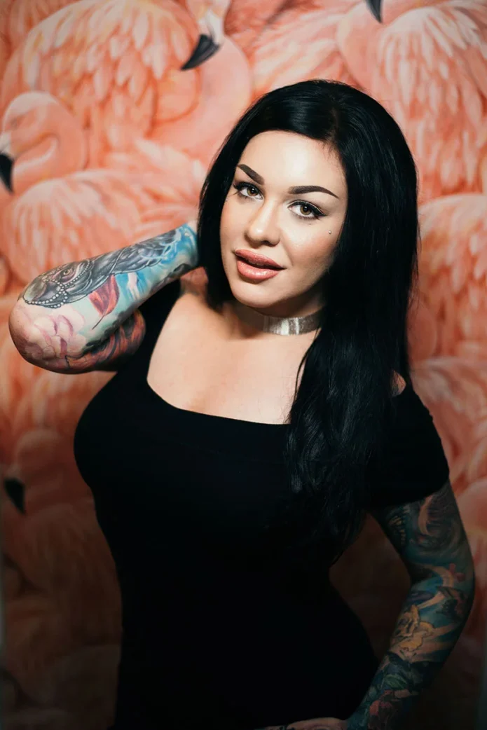
Nikki Simpson Tattoos: Colourful Sleeves, Neck Ink and Hand Details

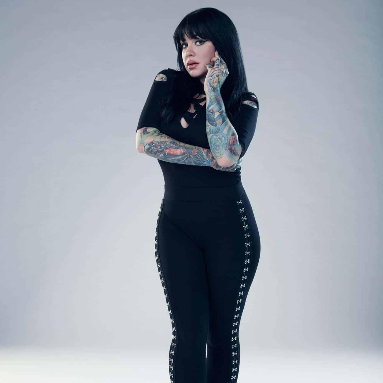
Nikki Simpson’s tattoos are hard to miss. Her arms are covered in bright colour and bold outlines, with illustrated scenes that reveal more detail up close. The ink runs from her fingers and hands through both sleeves, then reaches her neck and chest. Nikki Simpson tattoos make a useful reference if you like colour and want a collection with a clear point of view.

The designs include flowers, faces, ornamental lines, dark framing, and smaller details within the sleeves. Simpson often wears clothes that show much of the work, and she is a tattoo artist herself. The photographs give a sense of how the pieces fit together across her body.

This guide focuses on what can be seen in the photos: colour, placement, line weight, and how the tattoos flow. Their personal meanings aren’t always clear from an image, so there’s no need to guess. You can build a bold collection without making every tattoo look identical. A shared palette and thoughtful placement can connect different subjects.
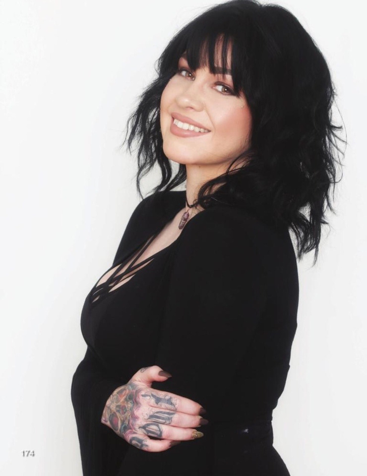
Nikki Simpson’s colourful sleeves work as full-body compositions

Nikki Simpson tattoos: full-resolution face-visible portrait showing both colourful sleeves from shoulders through the hands

Simpson’s sleeves cover a lot of skin, but they’re not solid blocks of colour. Lighter patches, black outlines, softer washes, and small accents break up the designs. That gives the eye places to rest and keeps individual shapes visible.

The two arms have different colour palettes. One leans on deep reds and greens with darker framing; the other uses cooler blues and brighter highlights. The contrast lets each sleeve have its own feel instead of making them mirror images.

The designs follow the shape of her muscles. A face turns around the biceps, a flower opens across the forearm, and leaves and shading carry the eye toward the wrist. The ink moves with her arms in both portraits and everyday photos.

If you want a full sleeve, choose an anchor design first: perhaps a portrait, flower, animal, or ornamental shape. Let later pieces work around it. A sleeve looks calmer when the empty skin and the dark areas are planned together, instead of filling every gap just because it’s there.

Her forearm work mixes portrait details with strong colour

Nikki Simpson tattoos: face-visible portrait showing Nikki's forearm colour, sleeve flow, and hand coverage clearly

The forearm photos make Simpson’s illustrative style easy to see. Faces, flowers, and layered shapes sit close together, but their outlines keep them distinct. From a little farther away, the contrast holds; up close, there are details in the eyes, petals, and decorative edges.

A portrait needs enough space for its features to read. Simpson’s forearm designs use the length of the arm, rather than squeezing a face into a small patch. That gives the colours room and keeps the features clear.

Some of the ink continues over the wrist onto the back of the hand, so the sleeve doesn’t stop at a hard line. That transition takes planning: the artist has to consider how the design looks with the palm open, the wrist bent, and the fingers moving.

For a forearm portrait, decide which expression or feature should lead. Let the surrounding shapes add texture. Readable contrast will usually do more for a tattoo than extra tiny texture. Colour can make the image feel full without trying to reproduce every detail of a photograph.

The hand and finger tattoos make the sleeves feel personal

Nikki Simpson tattoos: face-visible portrait with both hands and colourful sleeve details visible against a clean background

The hands change the feel of the collection. The sleeves are the larger statements, but hand tattoos show up in everyday gestures: when Simpson holds a tattoo machine, rests a hand on her hip, or touches her hair. They move with her instead of appearing only in a posed photo.

Hands are hard on tattoos. Washing, friction, sunlight, and bending can soften fine lines. Simpson’s visible handwork uses graphic shapes that suit the smaller area; the fingers add accents without trying to hold an entire scene.

The details also link the colourful forearm to the hand. A repeated colour or curved line can carry through without making the designs identical. Sometimes one small echo is enough.

If you’re considering hand ink, check the placement with your hand relaxed, not only held flat. Leave space between the marks and choose an artist who understands how the skin moves. Small tattoos need room just as much as big ones do, especially beside an existing sleeve.

Her neck and chest tattoos soften the heavy arm coverage

Nikki Simpson tattoos: face-visible close portrait where Nikki's neck tattoos, chest area, and upper-arm ink are easy to inspect

The neck and chest give the eye a break from the colourful sleeves. The ink near Simpson’s face looks lighter and more open in the photos. That change keeps the upper body from turning into one dense field of colour and leaves room for her face to stand out.

Neck placement has to work around the jaw, collarbones, and hair. A design that looks balanced in a straight-on portrait can shift when the head turns. Simpson’s visible neck work follows the lines of the area and sits naturally beside her other ink.

The chest gives an artist more room, but spacing still matters. Fine lines can sit against open skin; darker areas can echo the sleeves’ black outlines. The pieces don’t need to match exactly to feel related.

A collection can include full sleeves and still leave some areas quieter. Sometimes the smartest way to make colour pop is to give it a calmer neighbour.

The black linework designs give everything structure

Nikki Simpson tattoos: face-visible portrait showing the contrast between Nikki's black outlines, colour fields, and sleeve details

In wider portraits, the black linework does more than outline the colour. It separates flowers, faces, and other shapes so the sleeves don’t blur into one wash. The colour catches your eye first; the darker lines keep the designs organised.

Repeated line weight and similar shading can also connect different subjects. A flower, a portrait, and an ornamental design may not seem related on their own, but they can sit together when they share those visual choices. Simpson’s sleeves show that kind of connection.

The chest and shoulders use the same idea. Darker marks carry the eye from the upper arm toward the collarbone, while open skin keeps lighter details visible. The design moves with the body instead of following a strict geometric grid.

Before starting a colourful collection, ask your artist how the lines may age, how much open skin to leave, and where a new piece would sit beside older work. A strong outline is not just decoration. It is the framework that lets the colour stay readable.

Why Nikki Simpson’s collection feels so connected

Simpson’s tattoos share a style more than a single subject. They’re colourful, illustrative, and comfortable taking up space. The faces, flowers, symbols, and textures vary, but the overall collection still feels connected.

If you’re adding tattoos over time, you don’t have to repeat the same subject. Think about the feeling you want the collection to have: bright and playful, dark and ornamental, or realistic faces with bold colour around them. A shared mood can bring different designs together.

Placement helps too. Simpson’s arms carry most of the visual weight; the hands, neck, and chest add smaller details. That gives the collection a clear rhythm. If every area had the same amount of detail, it would be harder to know where to look.

Ask your artist to adapt the drawing to your body. A sleeve has to work around the elbow, wrist, shoulder, and hand, not just look good on a flat page. Those joints and curves can help the design feel natural.

Nikki Simpson’s tattoos look personal without being precious about matching every piece. They’re bright and built to move with her. If you like that approach, choose an image you care about, give it room, and let the rest of the collection grow around it.

Nikki Simpson and the Angels

Her Ink Master Angels interviews offer a look at Simpson as an artist and at the illustrative style seen in her tattoos.

More celebrity tattoo guides

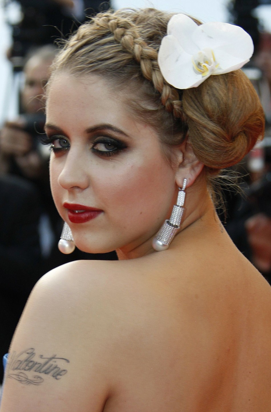
Peaches Geldof Tattoos: Daisy Chain, Lyric Back Piece and Script

Peaches Geldof’s tattoos were part of her everyday style. The bluebirds, script, hearts, and long daisy chain showed up in photos alongside her clothes and movement. Her collection looked gathered over time, with different designs sharing the same body rather than following one plan.

That is what makes Peaches Geldof tattoos worth a closer look: they combine fine colour, flowing script, small symbols, and larger pieces that move across the body. Some photos isolate one tattoo; others show how several sit together. There isn’t a single theme tying every piece to the next.

This guide sticks to visible details and documented designs. A tattoo’s meaning belongs to the person wearing it, so the focus here is on placement, linework, and how different ideas share the skin. If you like a collection that grows over time, Geldof’s offers a few useful ideas.

Peaches Geldof’s daisy chain turns one tattoo into a moving line

Peaches Geldof tattoos: high-resolution close view of the daisy chain flowers, vine, and hand placement across the leg

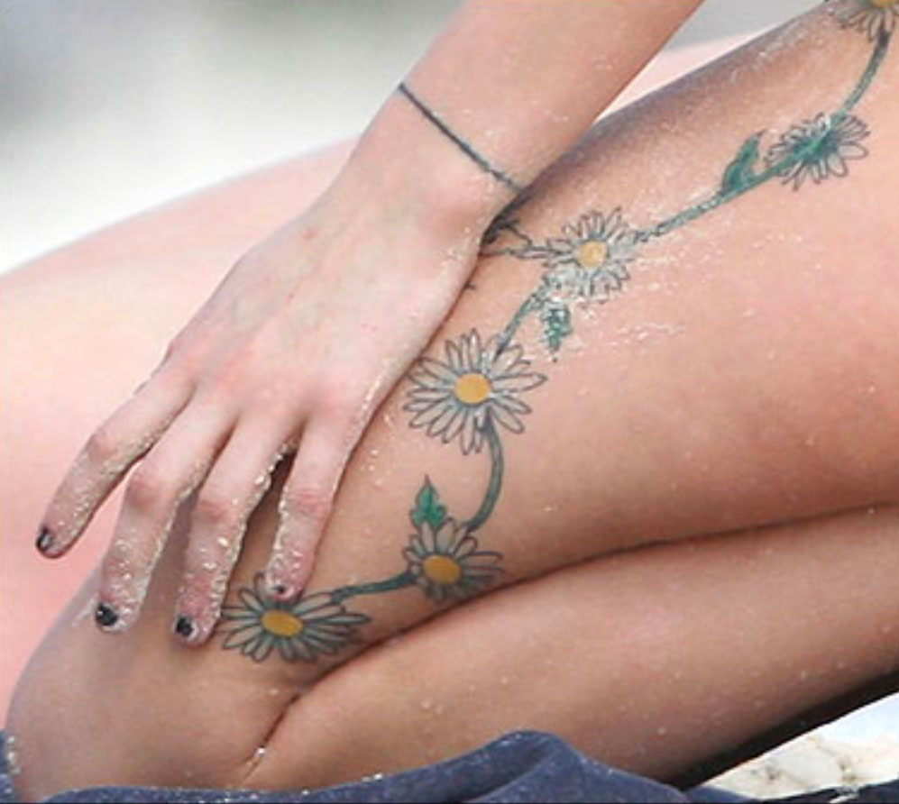
The daisy chain gives this part of the collection its shape. In close photos, the flowers curve along Geldof’s thigh and continue up the side of her body. The vine links them, and the yellow centres and pale petals stand out against the skin.

A chain like this can follow the body’s curves. The thigh, hip, and ribs don’t form a flat surface; the vine bends as the body moves. The open skin around it is part of the design too.

The flowers change in size. Some are clear at a glance, while the fine stem and small leaves show up when you look closer. A repeating motif does not need to be perfectly identical to feel connected. Slight differences give a hand-drawn piece a looser feel.

For a floral chain, decide where you want the eye to land. A larger bloom can anchor the thigh or hip, with smaller flowers tapering toward the knee or ribs. Leave room for the skin to move; packing the whole area can make the line harder to follow.
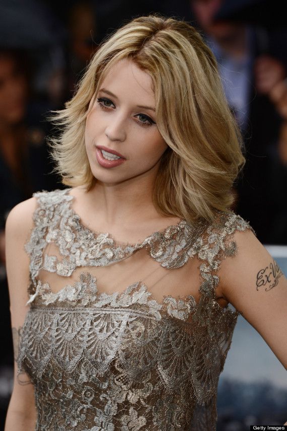
Her red-carpet portraits show arm ink in context

Peaches Geldof tattoos: high-resolution face-visible portrait showing multiple arm tattoos and small symbols in context

Event portraits show how Geldof’s arm tattoos sat with her clothes and posture. Script appears against bare skin, with smaller marks lower down near the wrist. In photos where she’s standing, turning, or holding a bag, the ink looks like part of her everyday style rather than a display arranged for the camera.

The arm combines clean lettering with lighter decorative lines. That leaves space around the words. A short phrase can hold attention while a heart or bird nearby adds another detail without filling the whole arm.

Placement changes what a tattoo feels like. Clothing can cover an upper-arm piece, while wrist and forearm ink shows during ordinary gestures. Geldof’s photos include both: some designs are immediately visible, others take a closer look.

If you’re planning script on your arm, check how it looks from different angles and with your arm hanging naturally. Think about how sleeves, straps, and movement will frame it. Good placement lets a small tattoo feel intentional without asking it to fill the whole limb.

The arm script makes personal names part of the everyday look

Peaches Geldof tattoos: high-resolution close portrait showing the upper-arm script tattoo and additional visible ink

Geldof had several script tattoos on her arms, visible in event photographs. They show up when she raises a hand, reaches for a bag, or turns toward a camera. Arm lettering is hard to keep private; it becomes part of the way a person presents themselves.

The letters are modest in scale, with flourishes that extend beyond the words. Those curves add movement, but the lettering still needs to be easy to read. Near a shoulder, elbow, or wrist, a few details can finish the design; too many can crowd it.

The script sits between the mood of the floral chain and the larger back piece: direct enough to read, with a decorative style that fits beside symbols and flowers.

If you’re considering a name tattoo, check it when your arm is relaxed, bent, and turned away. Placement can make a simple word feel private or prominent. Placement can make a simple word feel either intimate or loud.

Small hearts and symbols give the collection its lighter notes

Peaches Geldof tattoos: high-resolution event portrait showing the heart, arm script, and placement around the shoulders

The small hearts and symbols are easy to miss in a full portrait, but they give the collection a lighter touch. A heart on the arm, a bird near the script, or a mark at the wrist works like a small pause between the larger designs.

Small tattoos depend on clean lines and placement more than a large silhouette. Geldof’s visible marks are simple enough to read quickly: a heart looks like a heart, a bird like a bird. They don’t need close-up detail to make sense.

They also break up the longer designs. The lyric piece across her back asks for a longer look, and the daisy chain draws the eye along her body. A small symbol gives the eye somewhere else to land.

A small tattoo can mark a moment without becoming a major project. Keep the design clear, give it enough room, and choose a spot that won’t be constantly rubbed. Little tattoos can carry a lot of personality when they are allowed to stay little.

Peaches’ floral and script tattoos work because the contrast is honest

Peaches Geldof tattoos: high-resolution face-visible portrait showing the delicate shoulder script and surrounding styling

In full-body photos, the pieces differ in style: the daisy chain is light and colourful, the script is dark and flowing, and the smaller symbols read quickly. They don’t have to look alike. Their differences make the collection feel like it grew with her interests.

Placement gives each piece its own space. Flowers follow the thigh; words sit across the back; arm tattoos show up with movement; a small heart can be more private. The design choices create a sense of order without needing one master plan.

If you’re building a collection over time, you can repeat a style without repeating a subject. Maybe the connection is fine linework, soft colour, or hand-drawn lettering. The tattoos can still mark different parts of your life. A personal collection does not need a logo. It needs a point of view.
Clothing changes how tattoos read. A design under a strap may look delicate, then feel bolder against bare skin. The same piece can be private in one outfit and more visible in another. That’s part of how tattoos become part of someone’s everyday style.
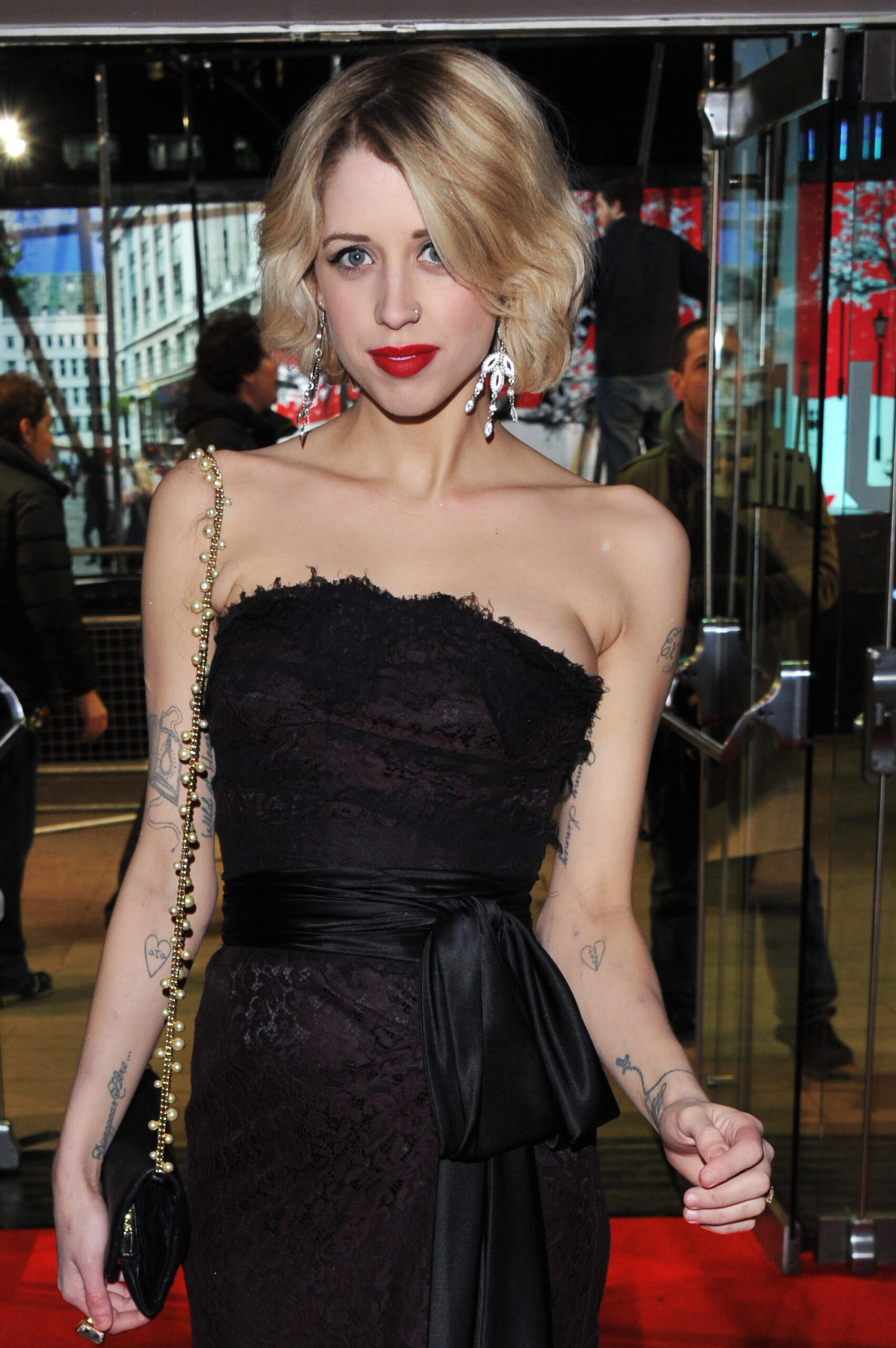
Why Peaches Geldof’s collection still feels personal

Geldof’s tattoos don’t look like a matching set. They include names, lyrics, flowers, birds, hearts, and smaller marks that suggest different chapters. The mix is what gives the collection its character.

The point isn’t to copy a daisy or a line of script. Choose designs that matter to you, think about how their placement will work together, and don’t rule out a small piece because it won’t dominate a photograph. A quieter detail may be the one you notice most.

Not every tattoo needs a grand explanation. It can be meaningful, decorative, impulsive, or some mix of the three. Geldof’s collection shows how one body can hold different stories at once.

Peaches Geldof in conversation

This interview offers a glimpse of Geldof’s voice and public style during her lifetime.

More celebrity tattoo guides

Chelsea Wolfe Tattoos: Snakes, Symbols and Dark Hand Ink

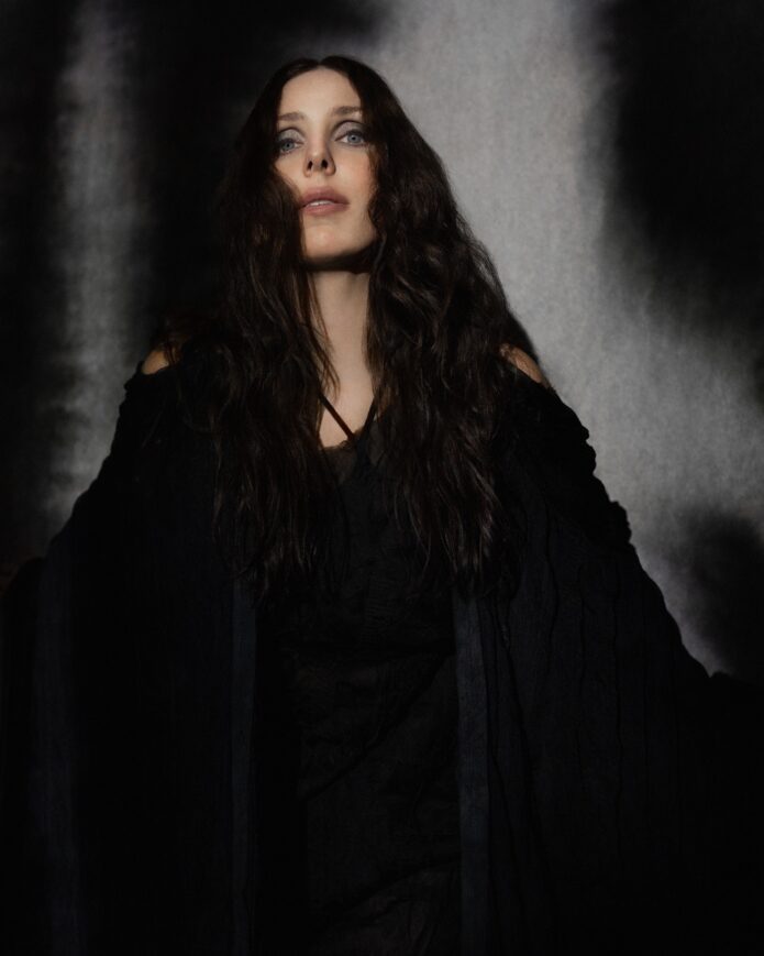
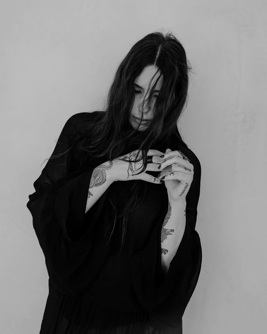
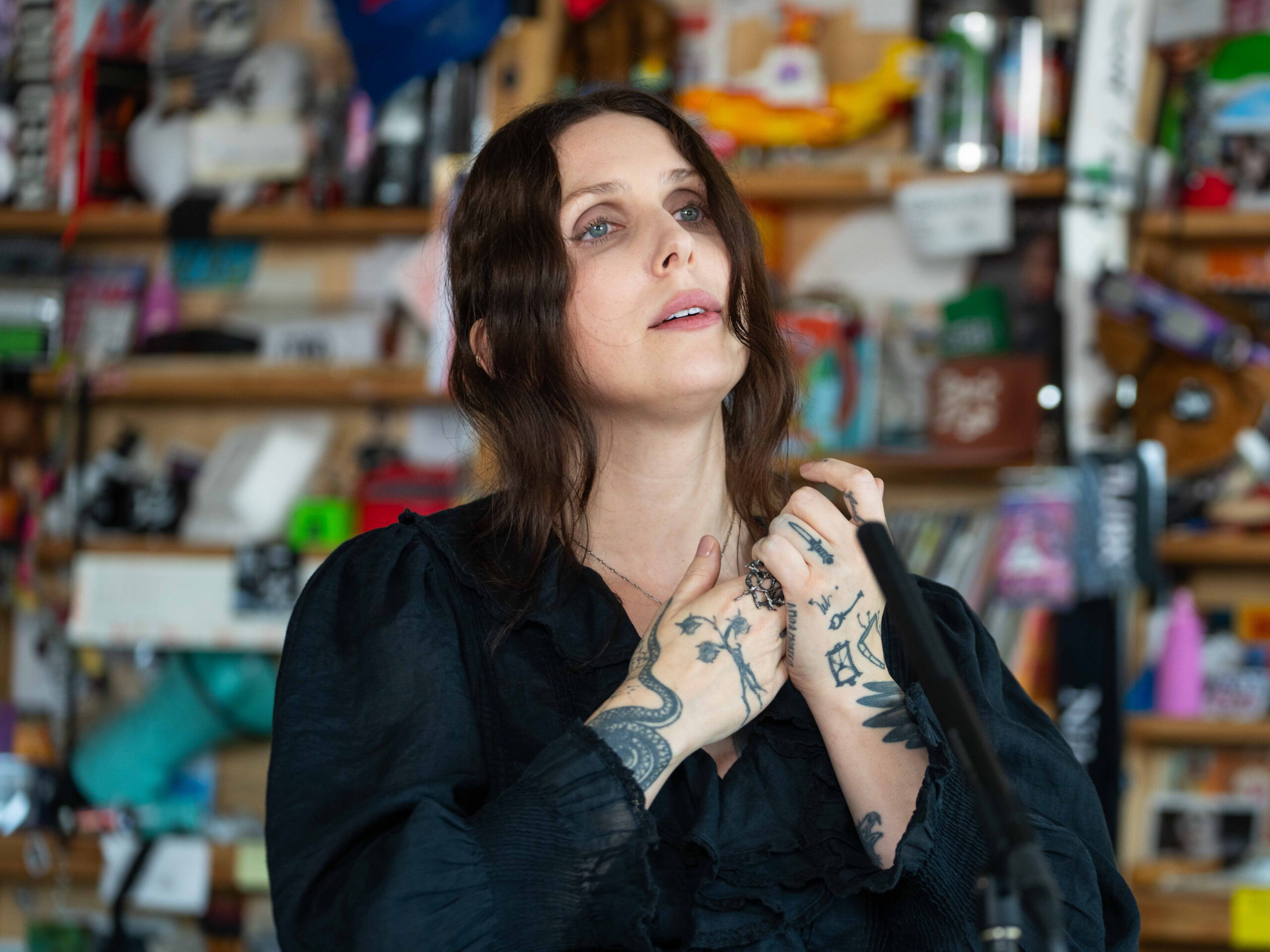
Chelsea Wolfe’s tattoos fit the mood of her music without looking like stage props. Some pieces are dark and spare, with shapes that leave room for interpretation. A long snake winds along one forearm; smaller marks sit around her hands and fingers. Geometric lines and fan-like forms become visible when she folds her arms or brings her hands near her face.

Chelsea Wolfe tattoos are worth looking at as a collection, not a checklist. The larger images sit on her forearms; smaller marks appear on her hands and fingers. They show up differently when she’s singing, holding a microphone, or resting her hands against her chest.

Wolfe has spoken about images including a dagger, trident, moon, raven, and Scorpio constellation. A coiled snake is another clear motif on her forearm. Those symbols sit beside her interest in tarot, seasonal cycles, dreams, and the darker edges of folk and metal. The layout feels personal, though the visible designs also offer ideas about placement.

The photos show how the pieces share space: a portrait centres the snake and forearm work; another shows her arms crossed; close views make the finger ink easier to see. The point isn’t to copy a photo as a stencil. Look at the spacing, how the blackwork travels across the skin, and how small tattoos balance the larger ones.

The coiled snake gives Chelsea Wolfe’s forearm a clear focal point

Chelsea Wolfe tattoos: a close hand and finger view with a snake line and smaller symbols

The coiled snake is a natural starting point. In a straight portrait, it sits along Wolfe’s forearm and has the look of an old woodcut. Its outline reads from a little distance; the tighter lines show up when you look closer. That balance gives the tattoo detail without relying on lots of tiny marks.

A snake also gives a forearm design some movement. It can follow the length of the arm, bend around the muscle, or curl toward the wrist. Wolfe’s piece looks integrated with the nearby dots and geometric details rather than pasted on top. The surrounding marks give the snake room without having to fill every inch.

A snake can mean different things to different people: change, instinct, protection, danger, healing, or simply an animal they like. The pose makes a difference too. A tight coil feels contained; a long S-curve opens up the design; a head turned toward the wrist can make it seem watchful.

Let the curve follow the arm instead of fighting it. Ask your artist to draw the design with your arm relaxed and bent. A shape that looks right on paper can twist once the elbow moves. The forearm is a long canvas, but its front, side, and underside all change with a gesture.

Wolfe’s snake also shows what open skin can do around a main image. The space keeps its outline clear. Dots and smaller symbols can come later, but they don’t need to crowd the snake from the start. One animal with a few quiet marks around it can carry the same dark folk feel.

Geometric marks and fan shapes make the crossed-arm layout feel deliberate

Chelsea Wolfe tattoos: crossed arms with geometric marks, dots, and fan-like shapes

When Wolfe crosses her arms, the tattoos read like a collection of panels. Lines on one arm meet shapes on the other, and the pose lets you see several kinds of blackwork together: curves, dots, dark fills, and bare skin. That mix keeps the arms from reading as one solid block.

The fan-like forearm shape is a good example of a simple outline with texture inside it. It could be adapted into feathers, leaves, rays, shells, or abstract blades. Whatever the subject, the outer shape needs to read before the smaller details are added.

Geometric designs can look exact on a sketch, but skin isn’t a flat sheet. The wrist narrows, the forearm turns, and the elbow interrupts a line. In Wolfe’s photos, some marks stay crisp and centred while others soften around the side of the arm. That slight irregularity lets the design follow the body.

Use one repeated shape to connect separate tattoos. It might be a dotted line, a thin border, a pointed end, or a shared shade of black and grey. You don’t need to repeat the same motif everywhere. One visual link can help pieces added over several sessions feel related.

Where a geometric shape sits changes where the eye goes next. Near the wrist, it can lead toward the hand; higher on the forearm, it can point toward the elbow. Check the stencil from the front, side, and back, and see how it looks when your hand is doing something ordinary.

Her hand tattoos bring the collection right up to the face

Chelsea Wolfe tattoos: a face-visible portrait with small hand, finger, and shoulder tattoos

The smaller tattoos are easy to notice in close portraits. Wolfe has marks on her fingers beside rings and nails. They don’t compete with the snake farther up the arm; they draw your eye closer. In a photo, you may see the hand first, then pick out the larger pieces.

Finger tattoos are always moving and changing shape, and they can be partly hidden. A mark can look sharp with the hand open and break up when the fingers curl. That movement is part of their appeal, but it also means the design needs to stay simple enough for everyday wear.

Wolfe’s hand ink fits the larger work through direct shapes rather than dense decoration. A small dagger, star, rune-like mark, or short line of script can stand on its own. You don’t need matching symbols on every finger; one or two can make the same impression and leave the hand easier to read.

Test your hand tattoo in the gesture you actually use. Hold a microphone or phone, rest your chin on your knuckles, or put your hands together. Watch how the stencil shifts as the skin folds. A design centred on a flat hand may move to the side when the fingers bend; an artist can adjust its angle before tattooing.

Hands are washed often and exposed to sun, friction, and weather, so fine lines may soften sooner than on the upper arm. A clean outline, enough space, and a design that doesn’t depend on microscopic detail can help the tattoo hold up. Keep the small marks deliberate rather than crowded.

A darker full-arm look changes the balance from one photo to the next

Chelsea Wolfe tattoos: a high-resolution portrait showing the darker arm and hand work together

In a full-arm photo, the tattoos look different from how they do up close. First you see the darker outline and a few strong shapes; then the symbols, lines, and shading separate out. That lets the designs work in close portraits and performance shots alike.

The arm doesn’t have to be covered edge to edge to feel finished. Wolfe’s tattoos use darker areas as anchors, with bare skin around them. From a distance, those shapes hold the composition; up close, the smaller details come through.

Think about how dark tattoos will sit beside your clothes and other ink. A black piece against a black shirt may disappear in a wide photo, while the same design stands out against bare skin or a light top. You don’t have to dress around the tattoo, but contrast affects how visible it looks.

Plan the outline first and the filler later. A clear outside shape gives the artist a way to organise the arm. Dots, leaves, rays, and small symbols can be added after the main pieces heal. Leaving some gaps for now lets you see whether the open skin is doing useful work.

Wolfe’s blackwork doesn’t read as harsh. Curves, soft edges, and shapes like a woodcut give it a quieter feel. If that’s the style you want, bring references that show line weight and texture as well as the subject. The way an artist handles space can make a black graphic feel quite different from a woodcut.

How to borrow the mood without copying Chelsea Wolfe’s tattoos

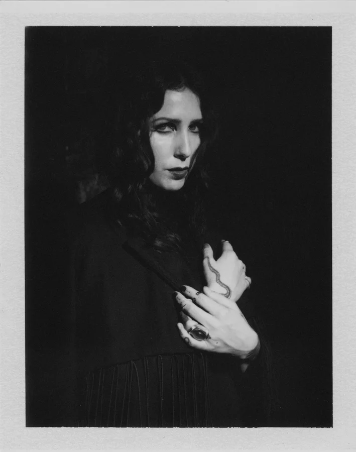
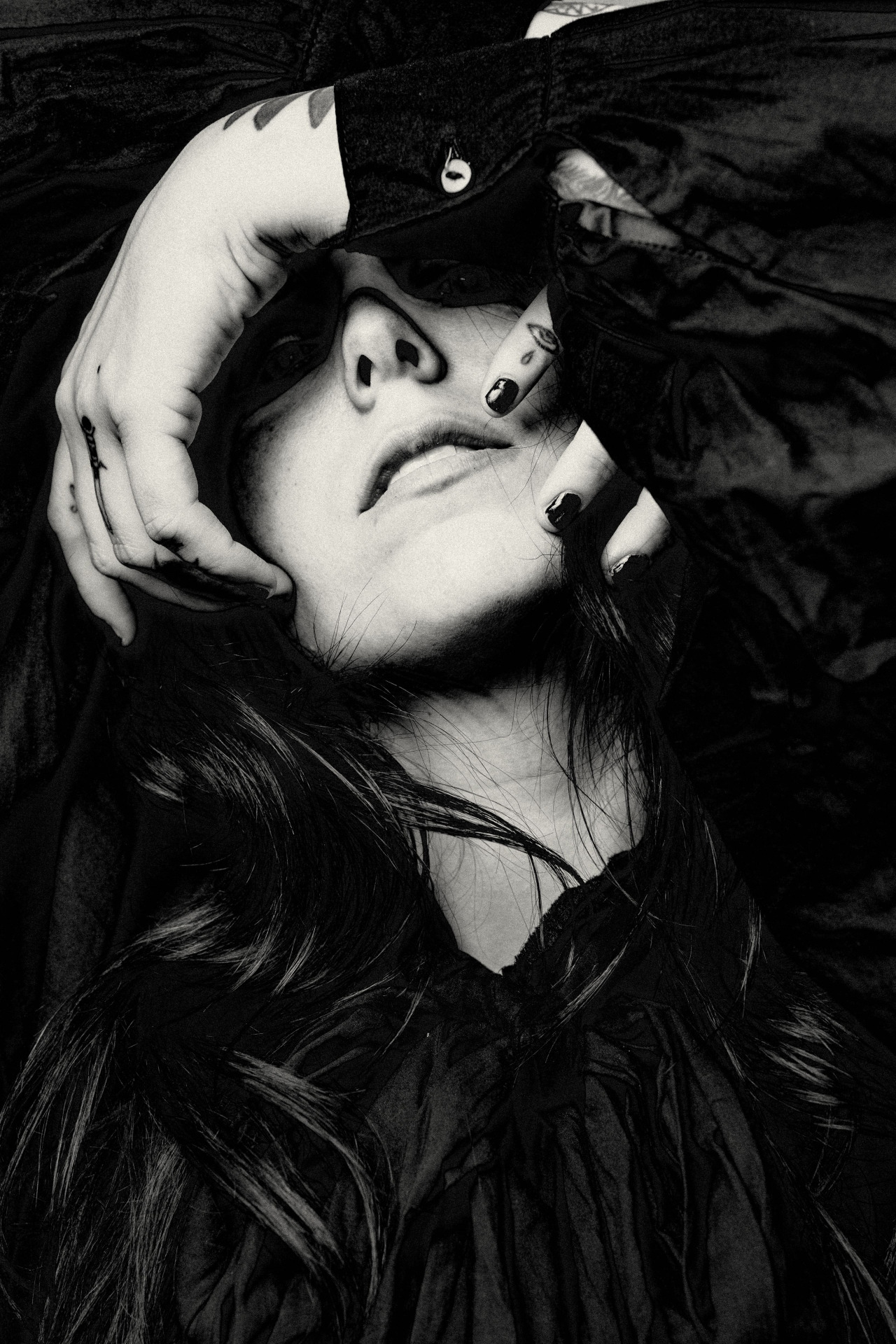
Chelsea Wolfe tattoos: a tight black-and-white portrait where finger tattoos frame the face

Use Wolfe’s tattoos as a reference for the design choices, not as drawings to copy. Start with what catches your eye: the old-world snake, the small hand marks, the spare geometry, or the dark shapes. A similar mood doesn’t require someone else’s personal symbols.

Think about scale as well as subject. Wolfe’s forearm pieces have room around them, while the hand tattoos stay small. The same balance can work with other imagery: a large bird on the forearm and a tiny star on a finger, or a geometric panel leading toward a small moon at the wrist. Each design has a job, and their sizes help connect them.

Decide how visible you want the tattoos to be. Hand and finger ink shows up often; forearm pieces can hide under long sleeves and show with short sleeves; upper-arm or shoulder work is easier to cover. Think about how the placement will fit your ordinary day, not just a portrait.

Leave space for the tattoo to become yours. Bring references to your artist and explain what you like about them. The curve that works on Wolfe’s arm may need a different angle on yours, and her hand marks may carry meanings of her own. Adjust the shape and subject to your body and your reasons for getting it.

Choose an artist who is comfortable with the style and placement. Geometric work, blackwork shading, finger tattoos, and long forearm designs each call for a different kind of control. Look at healed examples when available, discuss how much detail and coverage will work for you, and check the stencil from every side.

The snake gives Wolfe’s forearm a clear centre. Geometric and fan-like shapes add texture around it, while the smaller hand and finger tattoos bring the collection up toward her face. The scale changes from one area to the next, but the dark palette holds the look together. Chelsea Wolfe tattoos stand out for that mix of a steady mood and varied placement.

If you’re looking for ideas, focus on the layout: choose one main image, leave it room, and use smaller marks to guide the eye around it. That can make a collection feel dark and personal without covering every patch of skin.

Here’s a Chelsea Wolfe performance with the same intimate, stripped-back feel:

More musician tattoo guides

Rachel Daly Tattoos: Leeds Tribute, Euro Trophy and Lioness Ink

A look at Rachel Daly tattoos shows a collection built from family memories, football milestones, a Leeds tribute, and smaller pieces that don’t all share one style. Her arm ink is easy to spot in match photos, while close views show its mix of dark shading, fine script, small symbols, and open skin.

The best-known piece quotes Leeds United’s “Marching On Together”, a tribute to her late father Martyn. Daly has also spoken about a Euro 2022 trophy and lioness design she created with her tattoo artist, and a teddy bear for her nephew. She and Millie Bright share matching “1/2” tattoos on their hands, a small design tied to their friendship.

This guide sticks to what the photographs show and what Daly has said about the tattoos. It may help if you’re looking at an arm collection, meaningful script, a sports tribute, or several small pieces that don’t need to match. The placement can connect tattoos added at different times.

Rachel Daly’s Leeds tribute script sits inside a busy forearm collection

Rachel Daly tattoos: the Leeds tribute script and layered forearm ink

The Leeds tribute is one of Daly’s clearest tattoos. The words “at least until the world stops going round” run along her forearm in large script. Daly has explained that the line comes from the Leeds anthem and became especially meaningful after her father’s death. Its place in the collection comes from that connection, not only from how the lettering looks.

A forearm gives a long line of script room to travel. The lettering follows the arm’s length, and the nearby pieces frame it without taking over. Smaller marks sit around it, but the words remain the first thing you notice. That clear hierarchy is what keeps a busy arm from turning into visual noise.

If you’re thinking about a quote, start with its shape. A short line might sit across the wrist or inside the arm; a longer one could run vertically or wrap around the forearm. Decide whether it should be easy to read or more private. Daly’s is visible, but still placed like a personal reminder.

Other tattoos can be added around script later, as long as they leave the main line room. A soft shadow, small symbol, or open gap can help separate the lettering from nearby work. Meaning gives the tattoo its reason, while spacing gives it its shape.

Rachel Daly’s forearm tattoo stays readable while she is in motion

Rachel Daly tattoos: the forearm tattoo visible as she moves in an England shirt

Action photos show how Daly’s tattoos look while she’s running, pointing, or challenging for the ball. Her forearm is often bent or turned toward the camera, but the larger shapes remain visible as the skin moves. The design doesn’t depend on a single posed angle.

The arm balances dense black and grey areas with lighter spaces, so smaller details don’t get lost. A good arm tattoo does not have to fill every inch to feel complete. Breaks between pieces give the darker areas more definition, even in stadium light or a quick photograph.

Anyone who plays sport, works out, or uses their hands throughout the day knows that skin moves. Wrists turn and elbows fold. Ask your artist to check a stencil with the arm relaxed and moving, especially if a line of script or long floral shape needs to follow the limb.

Daly’s pieces also show how an arm collection can build over time. They don’t all look as if they came from one flash sheet; their placement and visual weight help them sit together. Plan the broader route first: choose where the boldest piece will go, then give later additions room around it.

An Aston Villa action photo shows how the arm tattoos sit with a short sleeve

Rachel Daly tattoos: the arm tattoos shown clearly during an Aston Villa match

In a short-sleeved football kit, Daly’s forearm is the most visible part of her collection. Her shirt covers some of the upper arm while the lower tattoos remain on show as she walks, warms up, or talks with teammates. The ink is part of her everyday look; it doesn’t rely on a face or neck tattoo to stand out.

The photo also shows why the inner and outer arm can be planned together. One side can hold a larger image while the other has script, smaller marks, or lighter shading. As the arm turns, the view changes. That change of view is one of the best ways to make a sleeve feel lived-in rather than flat.

Athletes also have to consider kit sleeves and wrist tape. Daly’s tattoos continue below the shirt line without looking as if they were placed only for a photograph. If you wear a uniform or fitted work clothes, decide how much ink you want visible on an ordinary day. Planning those edges early can help a tattoo feel comfortable in a professional setting.

Smaller pieces soften the transition between the forearm work and the shirt sleeve. If you like several subjects, use size and spacing to make them neighbours. They don’t need to share a theme; a repeated line weight, shade, or deliberate gap can tie them together.

The longer forearm piece gives Rachel Daly’s collection its strongest visual weight

Rachel Daly tattoos: the long forearm design and smaller wrist details in a match portrait

A longer view of Daly’s arm shows how the lines guide the eye from elbow toward wrist. That direction follows the arm’s natural length. Individual designs remain easy to pick out instead of looking like a row of separate stickers.

Daly has described the teddy bear as a favourite piece and connected it to her nephew. It brings a softer note beside the football and family tributes. Not every tattoo needs to look tough, dark, or serious to belong beside stronger work.

Changes in scale help balance an arm with several tattoos. A large line of script may sit better beside a quieter image; a dark section can have open skin around it. The bear adds a different mood before the eye moves to the heavier shading. Daly’s collection doesn’t force every idea into one polished theme.

If you’re building a sleeve, think about the memories you want close. Start with the story that matters most and leave room for pieces about other people, places, and moments. Your artist can help with the visual links, but each tattoo should have a reason for being there. The strongest sleeve is often a timeline, not a matching set.

A close view makes the script and small marks easier to study

Rachel Daly tattoos: the script, small symbols, and wrist details in a close view

The close photo shows details that are easy to miss in a full-body match shot: the large script beside smaller symbols and lettering near the wrist. Some pieces look crisp and dark; others are softer and more faded. Together, they have the look of a collection added over time.

Daly and Millie Bright’s matching half tattoo is another approach. The small hand design marks a friendship, not a career milestone. A small tattoo can carry a huge meaning when the placement and story are clear. Its simple shape also leaves room beside the larger arm work.

The Euro trophy and lioness design marks a team achievement, but Daly and her artist shaped the tattoo themselves. For a sports tribute, you don’t have to copy a club logo. A trophy, date, animal, or small symbol can keep the memory while leaving room for your own style.

Daly’s arm holds sentimental script, family references, a bear, football milestones, and smaller details. The placement gives those different ideas room to sit together. Choose one main area, keep the strongest piece easy to see, and let later tattoos come when their stories matter to you.

The video below features Rachel Daly and Millie Bright in a lighter team setting, alongside the tattoo details.

More athlete tattoo guides