
Nikki Simpson’s tattoos are hard to miss. Her arms are covered in bright colour and bold outlines, with illustrated scenes that reveal more detail up close. The ink runs from her fingers and hands through both sleeves, then reaches her neck and chest. Nikki Simpson tattoos make a useful reference if you like colour and want a collection with a clear point of view.
The designs include flowers, faces, ornamental lines, dark framing, and smaller details within the sleeves. Simpson often wears clothes that show much of the work, and she is a tattoo artist herself. The photographs give a sense of how the pieces fit together across her body.
This guide focuses on what can be seen in the photos: colour, placement, line weight, and how the tattoos flow. Their personal meanings aren’t always clear from an image, so there’s no need to guess. You can build a bold collection without making every tattoo look identical. A shared palette and thoughtful placement can connect different subjects.
Nikki Simpson’s colourful sleeves work as full-body compositions
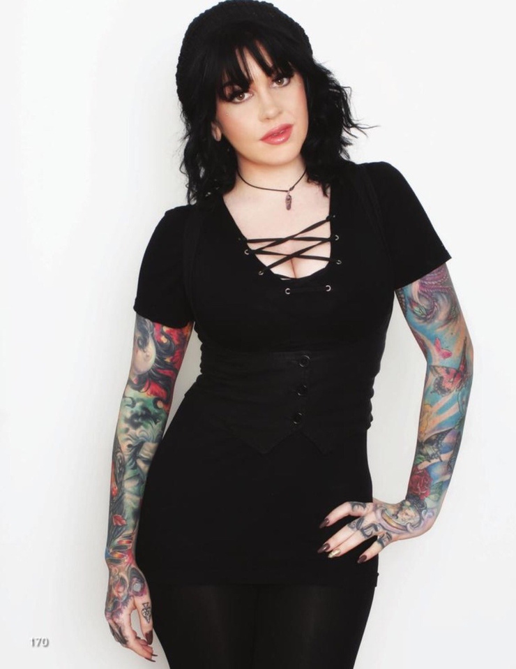
Simpson’s sleeves cover a lot of skin, but they’re not solid blocks of colour. Lighter patches, black outlines, softer washes, and small accents break up the designs. That gives the eye places to rest and keeps individual shapes visible.
The two arms have different colour palettes. One leans on deep reds and greens with darker framing; the other uses cooler blues and brighter highlights. The contrast lets each sleeve have its own feel instead of making them mirror images.
The designs follow the shape of her muscles. A face turns around the biceps, a flower opens across the forearm, and leaves and shading carry the eye toward the wrist. The ink moves with her arms in both portraits and everyday photos.
If you want a full sleeve, choose an anchor design first: perhaps a portrait, flower, animal, or ornamental shape. Let later pieces work around it. A sleeve looks calmer when the empty skin and the dark areas are planned together, instead of filling every gap just because it’s there.
Her forearm work mixes portrait details with strong colour
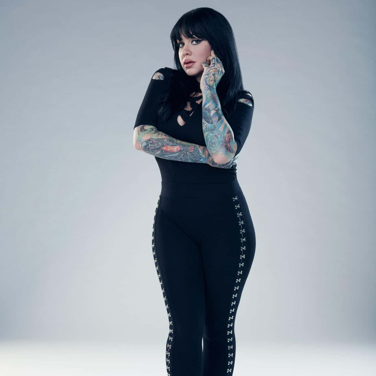
The forearm photos make Simpson’s illustrative style easy to see. Faces, flowers, and layered shapes sit close together, but their outlines keep them distinct. From a little farther away, the contrast holds; up close, there are details in the eyes, petals, and decorative edges.
A portrait needs enough space for its features to read. Simpson’s forearm designs use the length of the arm, rather than squeezing a face into a small patch. That gives the colours room and keeps the features clear.
Some of the ink continues over the wrist onto the back of the hand, so the sleeve doesn’t stop at a hard line. That transition takes planning: the artist has to consider how the design looks with the palm open, the wrist bent, and the fingers moving.
For a forearm portrait, decide which expression or feature should lead. Let the surrounding shapes add texture. Readable contrast will usually do more for a tattoo than extra tiny texture. Colour can make the image feel full without trying to reproduce every detail of a photograph.
The hand and finger tattoos make the sleeves feel personal
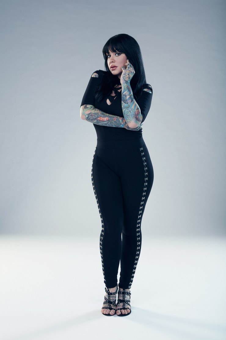
The hands change the feel of the collection. The sleeves are the larger statements, but hand tattoos show up in everyday gestures: when Simpson holds a tattoo machine, rests a hand on her hip, or touches her hair. They move with her instead of appearing only in a posed photo.
Hands are hard on tattoos. Washing, friction, sunlight, and bending can soften fine lines. Simpson’s visible handwork uses graphic shapes that suit the smaller area; the fingers add accents without trying to hold an entire scene.
The details also link the colourful forearm to the hand. A repeated colour or curved line can carry through without making the designs identical. Sometimes one small echo is enough.
If you’re considering hand ink, check the placement with your hand relaxed, not only held flat. Leave space between the marks and choose an artist who understands how the skin moves. Small tattoos need room just as much as big ones do, especially beside an existing sleeve.
Her neck and chest tattoos soften the heavy arm coverage

The neck and chest give the eye a break from the colourful sleeves. The ink near Simpson’s face looks lighter and more open in the photos. That change keeps the upper body from turning into one dense field of colour and leaves room for her face to stand out.
Neck placement has to work around the jaw, collarbones, and hair. A design that looks balanced in a straight-on portrait can shift when the head turns. Simpson’s visible neck work follows the lines of the area and sits naturally beside her other ink.
The chest gives an artist more room, but spacing still matters. Fine lines can sit against open skin; darker areas can echo the sleeves’ black outlines. The pieces don’t need to match exactly to feel related.
A collection can include full sleeves and still leave some areas quieter. Sometimes the smartest way to make colour pop is to give it a calmer neighbour.
The black linework designs give everything structure

In wider portraits, the black linework does more than outline the colour. It separates flowers, faces, and other shapes so the sleeves don’t blur into one wash. The colour catches your eye first; the darker lines keep the designs organised.
Repeated line weight and similar shading can also connect different subjects. A flower, a portrait, and an ornamental design may not seem related on their own, but they can sit together when they share those visual choices. Simpson’s sleeves show that kind of connection.
The chest and shoulders use the same idea. Darker marks carry the eye from the upper arm toward the collarbone, while open skin keeps lighter details visible. The design moves with the body instead of following a strict geometric grid.
Before starting a colourful collection, ask your artist how the lines may age, how much open skin to leave, and where a new piece would sit beside older work. A strong outline is not just decoration. It is the framework that lets the colour stay readable.
Why Nikki Simpson’s collection feels so connected
Simpson’s tattoos share a style more than a single subject. They’re colourful, illustrative, and comfortable taking up space. The faces, flowers, symbols, and textures vary, but the overall collection still feels connected.
If you’re adding tattoos over time, you don’t have to repeat the same subject. Think about the feeling you want the collection to have: bright and playful, dark and ornamental, or realistic faces with bold colour around them. A shared mood can bring different designs together.
Placement helps too. Simpson’s arms carry most of the visual weight; the hands, neck, and chest add smaller details. That gives the collection a clear rhythm. If every area had the same amount of detail, it would be harder to know where to look.
Ask your artist to adapt the drawing to your body. A sleeve has to work around the elbow, wrist, shoulder, and hand, not just look good on a flat page. Those joints and curves can help the design feel natural.
Nikki Simpson’s tattoos look personal without being precious about matching every piece. They’re bright and built to move with her. If you like that approach, choose an image you care about, give it room, and let the rest of the collection grow around it.
Nikki Simpson and the Angels
Her Ink Master Angels interviews offer a look at Simpson as an artist and at the illustrative style seen in her tattoos.