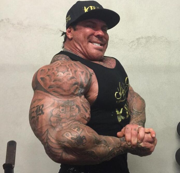
Rich Piana’s tattoos matched the scale of his bodybuilding image. They cover large areas, use dark shapes, and connect his shoulders, chest, arms, and hands. The designs are hard to miss, and they follow the same bold style as the rest of his public look. Rich Piana tattoos are worth looking at for how the placements work with his size, not just as separate pictures.
In photos, you can make out heavy lettering, black-and-grey shading, a revolver motif, chest script, and patterns across his upper body. Some pictures show individual details; others show how the ink frames his physique. Looking at the placements one by one makes the collection easier to read.
This guide sticks to what is visible rather than guessing at private meanings. A photo can’t explain what a tattoo means to its owner, but it can show the design choices: large scale, clear contrast, heavy coverage, and placements that follow the muscles. Those are useful ideas if you like bodybuilding-inspired tattoos but want your own designs.
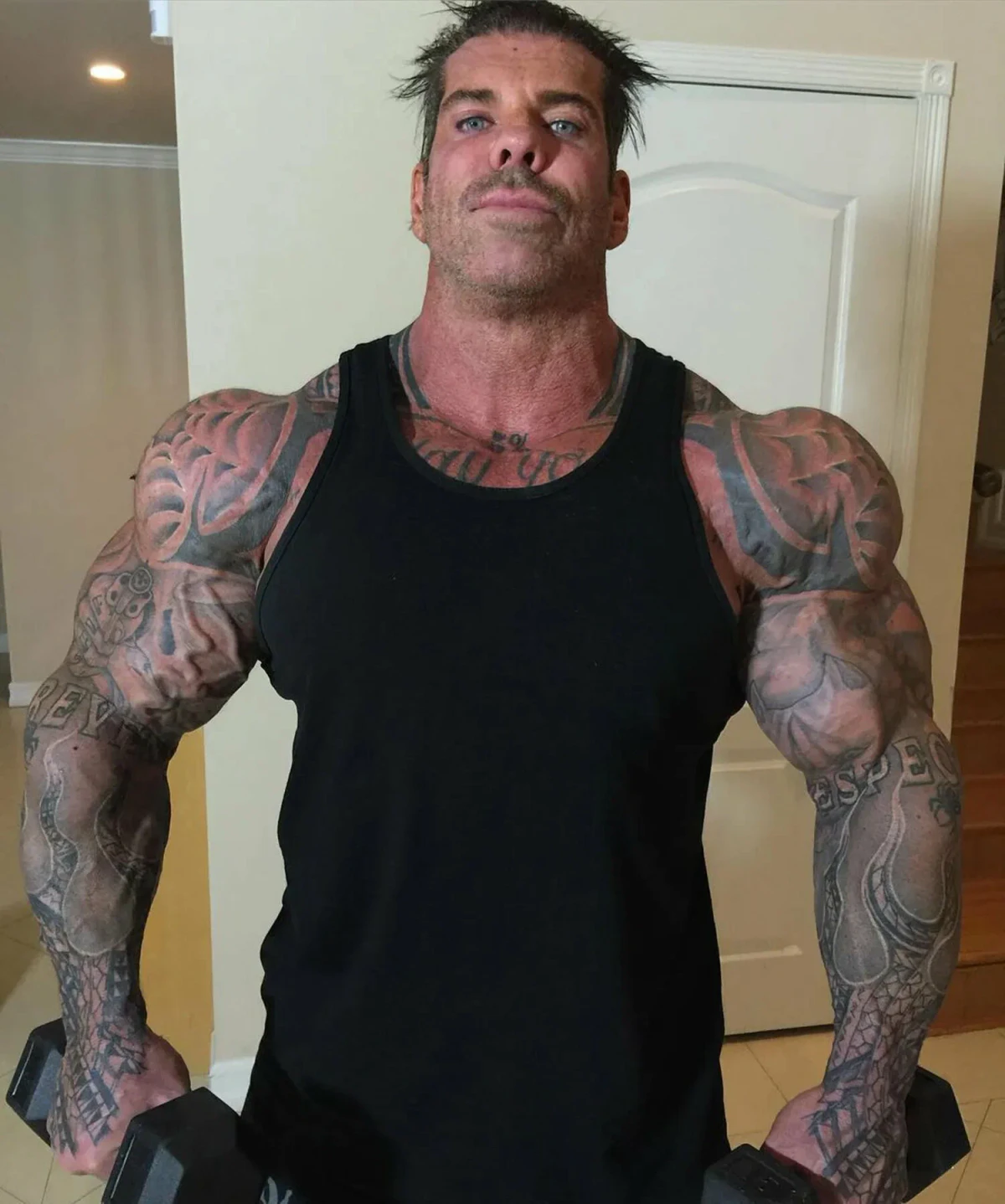
Rich Piana’s shoulder and upper-arm work creates a full sleeve effect
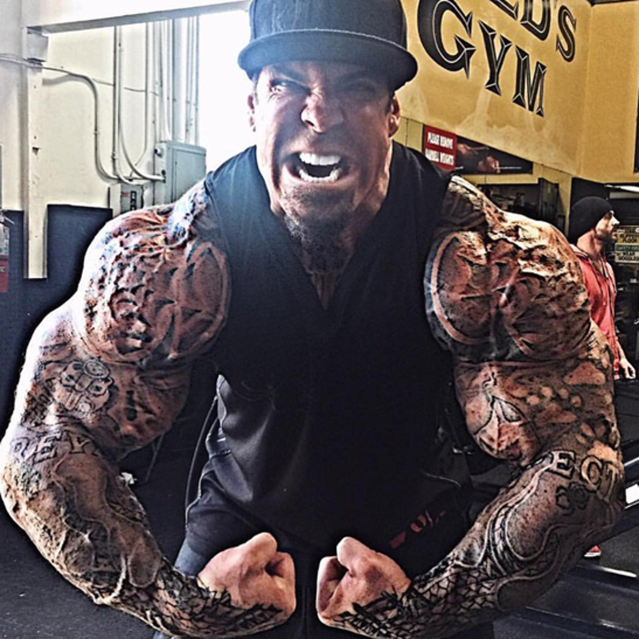
Piana’s upper-arm tattoos take up a lot of space. The shoulder, biceps, and upper forearm read as connected areas: dark shapes and breaks of bare skin lead down toward the elbow. Together, they give the arm a sleeve-like look even though the patterns don’t all match. That connection matters on a large frame.
The shoulder follows the curve of the muscle. As the arm turns, the design moves with it, instead of sitting like a flat panel. An artist can use that same approach with script, flames, a portrait, or abstract blackwork. The drawing should be planned against the body, not only on paper.
The dark and light areas also show up well in gym photos. Harsh lighting can wash out fine details, while larger black shapes hold their form. Smaller lines add texture around them. The result is bold without needing every inch to become solid black.
For a similar upper-arm layout, decide where you want the main piece to sit: shoulder, outer biceps, or forearm. Build the nearby designs around it. A sleeve added over time can still look connected if the line weight and spacing relate. Some open skin can help the main shapes stand out.
The revolver and bold lettering make his forearms easy to read
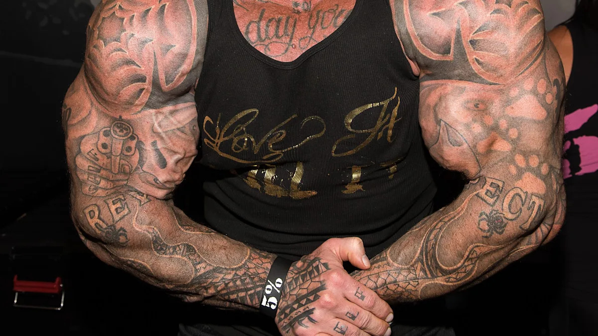
The revolver on Piana’s forearm gives the surrounding ink a clear focal point. Its outline is easy to recognize even in a photo taken from farther away. Lettering and darker marks add weight around it without hiding the central shape. It suits a visible part of the body that moves with the hands.
Forearm tattoos turn up in everyday moments: lifting, driving, greeting someone, or holding a phone. A design there has to read quickly. The revolver doesn’t rely on fine shading to make sense; its outline does most of the work, with texture around it for depth.
The lettering gives the arm a different direction. Words move across or along it, while the revolver makes a stronger central shape. That change in scale keeps the whole forearm from repeating one pattern.
A bold object can also be easier to keep legible over time than a tiny, highly detailed scene. An artist can simplify its shape for the skin and use shading where the arm bends. Clarity is the real flex here. The main image should still read from a few feet away and in changing light.
Chest script and shoulder shading keep the upper body connected
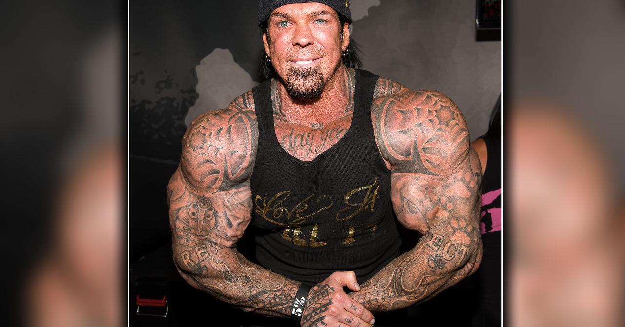
When Piana faces the camera, the chest script and shoulder ink read as one broad design. The writing runs across the chest; darker tattoos at the shoulders carry the line outward. It doesn’t sit like a small emblem by itself. The surrounding work frames it across his upper arms and deltoids.
Chest lettering has to work with a body that changes shape. The pectoral muscles expand and contract with posture, so a phrase that looks even while relaxed can stretch when the chest is flexed. Placement around the body’s centre line matters, as does how the words sit on either side of it.
The shading connects the front and sides of the torso. Without it, the chest and arms might look like separate projects. Here, the tattoos trace the width of the body. On a large build, that connection can work better than a series of small designs with no relationship to each other.
If you’re planning chest lettering, keep the phrase short enough to read and give it room. Ask to see how it sits at a normal distance, then decide whether the surrounding ink should stay light or build into a heavier black-and-grey frame.
His hand and wrist ink add small details to the bigger collection
The hands and wrists bring the scale down. They have smaller marks than the shoulders and chest, but people often notice hand ink first because hands are always moving. These details add to Piana’s look without competing with the larger work on his arms.
The wrist gives a small symbol, word, or band a natural edge. Hand tattoos are harder to place: the skin gets rubbed and washed often, and finger shapes can make a straight line look curved. Simple designs with room around them tend to stay clearer than crowded detail.
Small tattoos can change the feel of a larger collection. They’re visible in ordinary gestures, not just posed photos. Piana’s hand and wrist ink connects the dramatic torso work with the way he holds or moves his hands.
If you’re drawn to this part of the collection, you don’t have to fill every finger. Pick a spot you can live with every day. A small tattoo still needs a clear reason to be there, even if that reason is simply that you like the design. Give the lines enough space to remain readable as the skin changes.
The dense black-and-grey tattoo coverage shows how he used scale
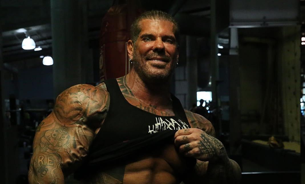
In wider gym photos, you notice the amount of coverage before the smaller details. Dark work frames Piana’s arms and chest, while lighter patches break it up. The silhouette catches the eye first; then the separate designs become easier to pick out.
Black-and-grey shading suits this approach. Black holds the outer shapes, and grey wash softens the change between areas like the shoulder, chest, and forearm. That range gives the tattoos depth and lets separate pieces sit together without a hard outline around every one.
Gym lighting brings out the muscles’ shadows, but the placements work with the body’s shape in other settings too. A shoulder catches light as it turns; the forearm shifts with the wrist; the chest changes with posture. The body adds movement to the design.
For a large project, plan the work in stages. Start with a piece that can anchor the area and leave room for later additions. Think about how much black you want before filling every gap. Big does not have to mean crowded. Spacing and a few readable shapes can carry the design.
Why Rich Piana’s collection feels so recognisable
Piana’s ink takes up space in the same way his public image did. It covers the shoulders, arms, chest, hands, and wrists, with larger pieces connected by smaller details. No single tattoo has to carry the whole collection.
Not every design is large. The wrist and hand marks provide a pause between the dark shoulder and chest work. Those shifts in scale help the eye move through a heavily tattooed area.
You don’t need to copy the revolver or lettering to take something from the collection. Think about what scale fits your body, work, and comfort level. If you train often, you may like a design that follows the muscle. If you want to cover it easily, an upper-arm piece can be a smaller commitment than a full torso. The placement should make sense in your life.
It can help to choose one main design first, then use smaller pieces to connect the area. Leave some skin open and let your artist adjust the drawing to your anatomy. Filling every blank space at once can make the result harder to read.
Rich Piana’s tattoos stand out for their size and the way they follow the body. They show how a bold placement can become part of someone’s look without every piece matching. If you like that approach, take the confidence and attention to scale, then choose imagery that feels like yours.
Watch Rich Piana talk about training and his life
His training videos and interviews give context for the larger-than-life style that sits alongside the tattoos.