codex

David Raum Tattoos: Living the Dream, 86 Hand Ink and More

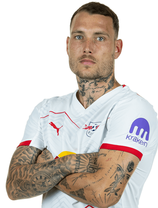
David Raum’s tattoos come into view in goal celebrations and close-up photos. The German footballer’s collection includes handwritten phrases, bold numbers, religious images, small marks near his face, and dense black-and-grey work on his arms. The pieces seem to have accumulated over time rather than being planned all at once.

The chest lettering is the most obvious place to start, but his 86 hand tattoo and layered neck work stand out too. He has smaller details near his face and throat, along with larger pieces across both arms. Raum has explained some of the designs publicly; for others, it’s better to stick to what the photos show.

The Living the dream chest tattoo marks David Raum’s rise
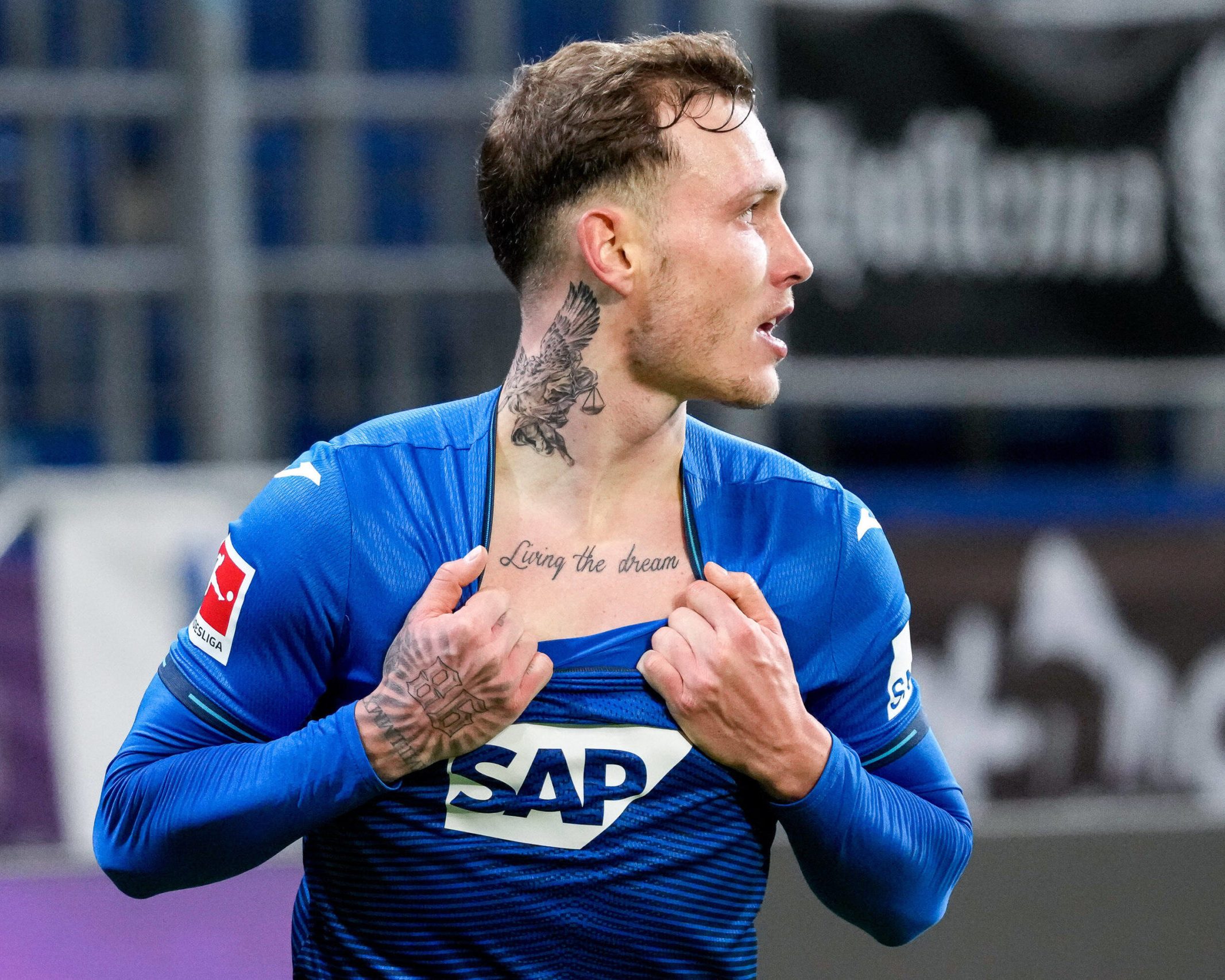
David Raum tattoos: Living the dream chest script during a goal celebration

The words Living the dream sit across Raum’s upper chest in loose handwriting. They’re easy to see when his jersey collar drops, but the script still feels personal rather than billboard-sized. In the photo above, he has his shirt open after scoring, with the words in the middle of the celebration. That’s the tattoo many people associate with him.

Raum has connected the phrase with playing at the highest level and pursuing Champions League nights. It’s a direct statement, without a long quote or symbol to decode. The lowercase script looks handwritten, which suits a career that took him from youth football in Nuremberg to the Bundesliga and Germany’s senior team.

The scale is useful if you’re considering chest lettering. A short phrase can get lost if the letters are too small or crowded. Raum’s words have space between them and follow a clean line, while the slight variation in the script keeps it from looking like a typeface. The design also leaves room by the collarbones and can sit under a shirt.

The chest script is the most readable piece in the collection, but it isn’t the darkest. The neck and arm work give it a stronger frame, and the contrast between plain lettering and detailed blackwork keeps the chest from looking flat. A simple phrase can work well when its placement and lettering have been thought through.

The 86 hand tattoo makes the collection impossible to miss
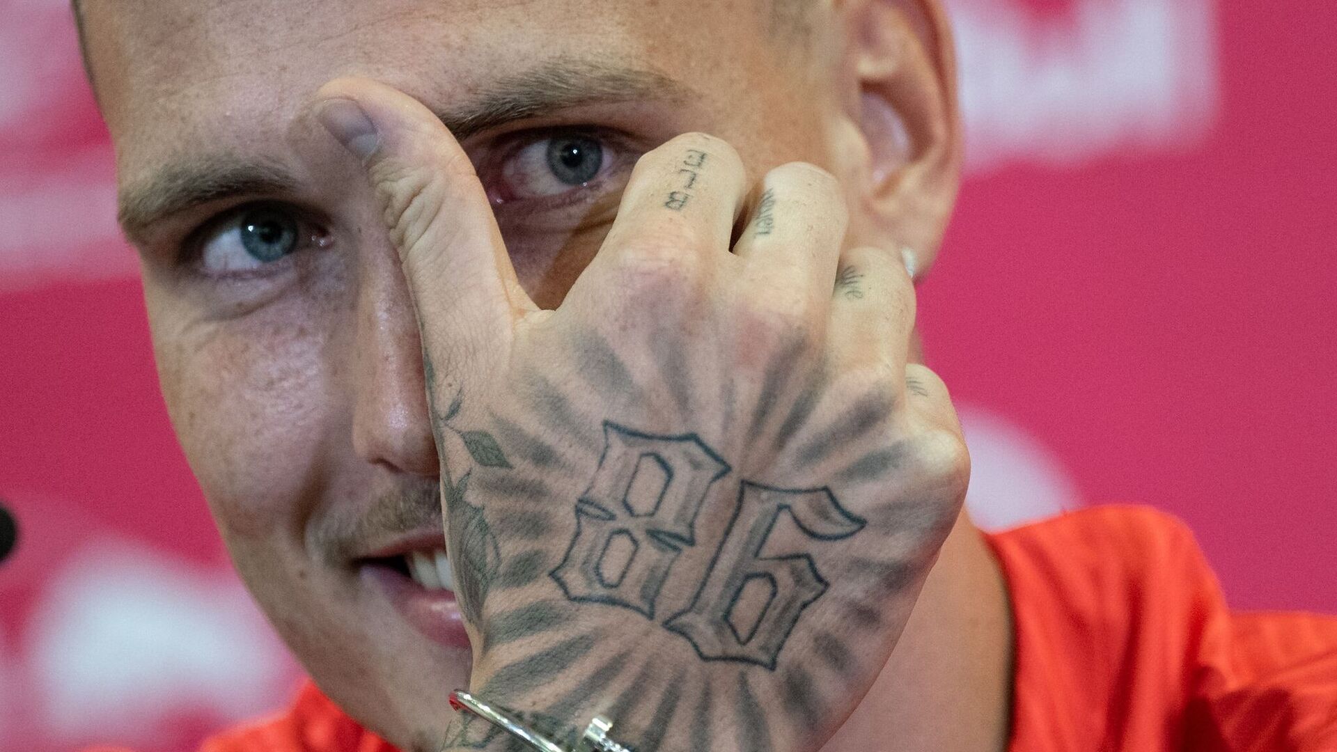
David Raum tattoos: Bold 86 hand tattoo with smaller finger lettering

The number 86 is inked across the back of Raum’s right hand in large outlined figures. In close-up, the digits look angular, with radiating black lines around them. The design works like a small badge and gives his hand a focal point in match photos.

Public explanations have linked the number to Raum’s old phone area code and hometown. That connects the tattoo to where he came from rather than to a shirt number or a lucky number. The meaning is personal, but the design doesn’t hide from view.

Hand tattoos get washed, moved, and exposed to sunlight, so their lines are easy to see change over time. Raum’s 86 has a bold outline, and open spaces inside the digits help them stay distinct. The 86 hand tattoo doesn’t depend on small shading details to read.

There is smaller lettering on his fingers too, though it can be hard to make out in action photos. The 86 does the heavy lifting; the finer marks make the hand feel like part of a collection built over time rather than one flash design.

The tattoo also changes with his hand. Relaxed, you can see the full outline; clenched, the numbers break into sharp sections. That movement gives the same design a different look in different football photos.

The neck bird and archangel set the tone
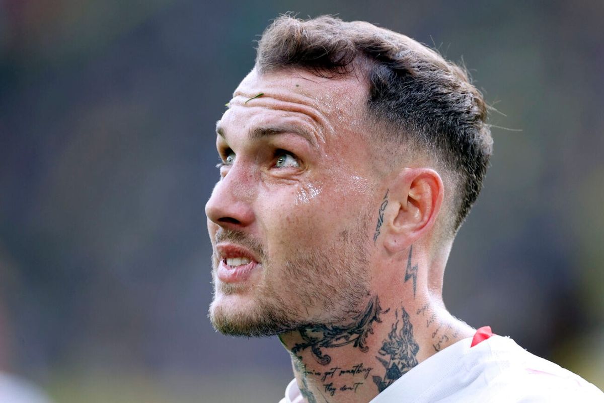
David Raum tattoos: Neck bird, archangel and script details in a match close-up

Raum’s neck has religious and ornamental designs, including a winged figure, a bird, scales, and script beneath his jaw. A tattoo artist who has worked with him has described an archangel as one of the earlier pieces. In close-up, the surrounding black-and-grey work looks layered around the images rather than built around one isolated symbol.

The bird and wing shapes follow the line from his ear toward the collar. Dark shading near the jaw gives the work a strong edge, while lighter lines keep it from reading as a single block of black. The placement is designed to move when Raum turns his head.

Religious imagery means different things to different people. The archangel has a protective, old-school look, but Raum hasn’t publicly explained every detail. In the photos, the whole arrangement feels serious and watchful without relying on a single symbol to tell the story.

The neck work changes the way every other tattoo reads. It is visible above a shirt or football kit, and a small turn of the head brings another part of the design into view. Anyone considering a neck piece should think about the whole side of the neck, rather than adding one small symbol and hoping it connects later.

Small face and throat tattoos change the look of the portrait
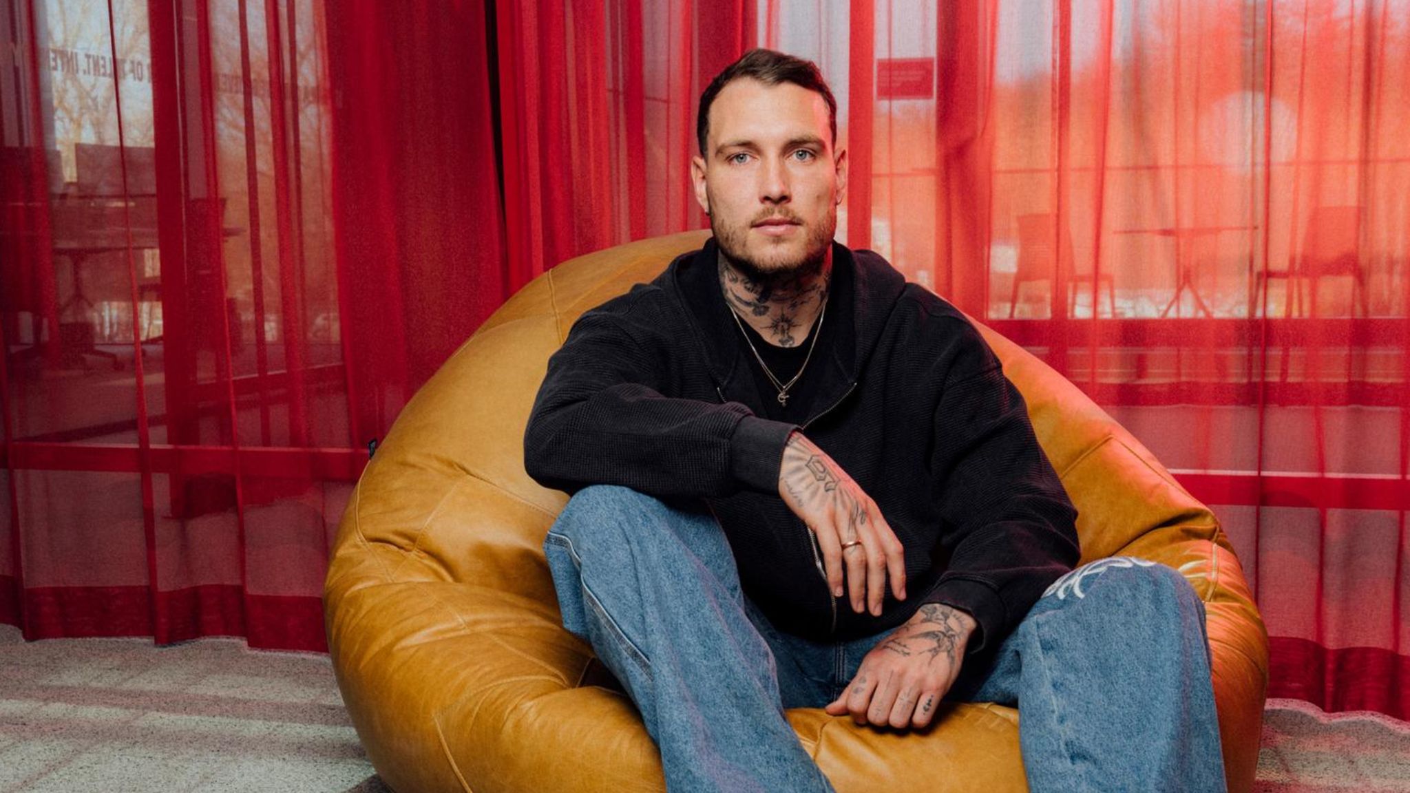
David Raum tattoos: Face-visible portrait showing neck and forearm tattoo coverage

In side photos, smaller marks near Raum’s face become easier to see. The close-up shows a slim design beside his ear, a lightning-shaped mark lower on the neck, and more script around his throat. None covers his face, but together they make the profile distinctive.

Face tattoos need restraint. The lines have to fit around the ear, cheek, and jaw without crowding them. Raum’s side detail follows the angle of the ear; the lightning shape below leads toward the larger neck piece. The spacing helps keep the profile clear.

The throat script sits between heavier images, almost like a note in the gaps. Public tattoo coverage has also mentioned a candle below his throat, though it’s not clear in every photograph. A single photo doesn’t always show every part of a tattoo.

Small details can carry the mood of a portrait even when they aren’t the first thing you see. Raum’s marks sharpen his profile without taking over the face; they act as small points around the larger neck design.

If you like the look but don’t want a full face tattoo, a small design near the ear, behind the jaw, or at the side of the neck can show in profile without becoming the only thing people notice. Leave space around it and consider how its linework will sit beside existing tattoos.

His arms and legs turn career moments into a growing collection
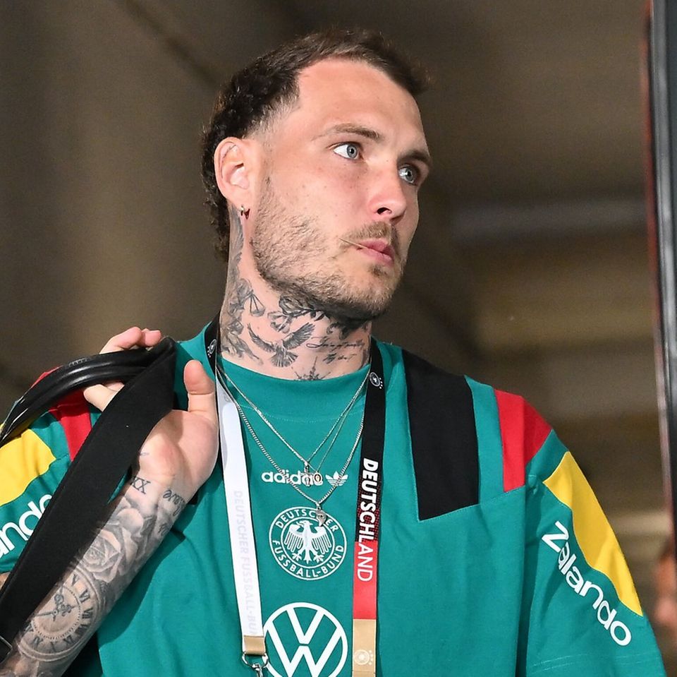
David Raum tattoos: Germany portrait showing layered forearm and neck tattoos

Raum’s arms carry the densest coverage. In the portrait above, both forearms show black-and-grey designs, including faces, clocks, lettering, geometric marks, and smaller symbols. The pieces come close together, though the arm doesn’t read as one uniform sleeve from every angle.

The 86 on his right hand connects with the surrounding arm work. On the other forearm, larger shaded images sit beside narrow script that shows when he rolls up a sleeve. There are strong focal pieces, then smaller details for a closer look.

Some tattoos have been linked publicly to career or personal moments; others sit under sleeves or turn away from the camera. It would be guesswork to assign a story to every mark. The visible collection isn’t limited to one theme: it includes a hometown number, a chest phrase, religious imagery, and black-and-grey designs.

The arm tattoos make the collection feel unfinished in a good way. There are open patches, different levels of shading, and room for later additions. A sleeve can take shape over several sessions, with each piece tied to a move, season, or personal decision.

The plain chest script sits against more detailed neck and arm work, while the hand adds a graphic number. Together, those choices give Raum’s tattoos a visual language without making them look matched.

If you’re collecting ideas, pay attention to placement and pacing. Give a short phrase room, use a clear outline where the tattoo will be busy, and plan the open skin between pieces. Each area here has its own focal point, but none feels entirely separate from the others.

Raum’s collection may change as his career continues. In public photos, the chest phrase, 86 hand tattoo, neck imagery, face details, and layered arms define the look. They’re useful references if you like football-related tattoos, personal lettering, bold numbers, and darker illustrative work.
More athlete tattoo guides

Wanderlei Silva Tattoos: Faith, Forearm Script and Fight-Team Ink

Wanderlei Silva’s tattoos are easy to spot in old fight photos. They cover his shoulders, forearms, wrists, and hands. Portuguese faith phrases run down his arms, and shoulder symbols connect him to the Wand Fight Team and to the identity he built during his Pride and UFC years.

That mix makes Wanderlei Silva tattoos a useful reference if you like meaningful lettering. The collection includes short phrases, compact symbols, and longer lines that follow the arm. The pieces weren’t all done at once. Some still look crisp; others have softened over years of training, bright arena lights, and everyday wear.

This guide looks at the designs Silva has explained and the details visible in photos. Where a meaning isn’t well documented, it stays with placement, lettering, and how the pieces work together.

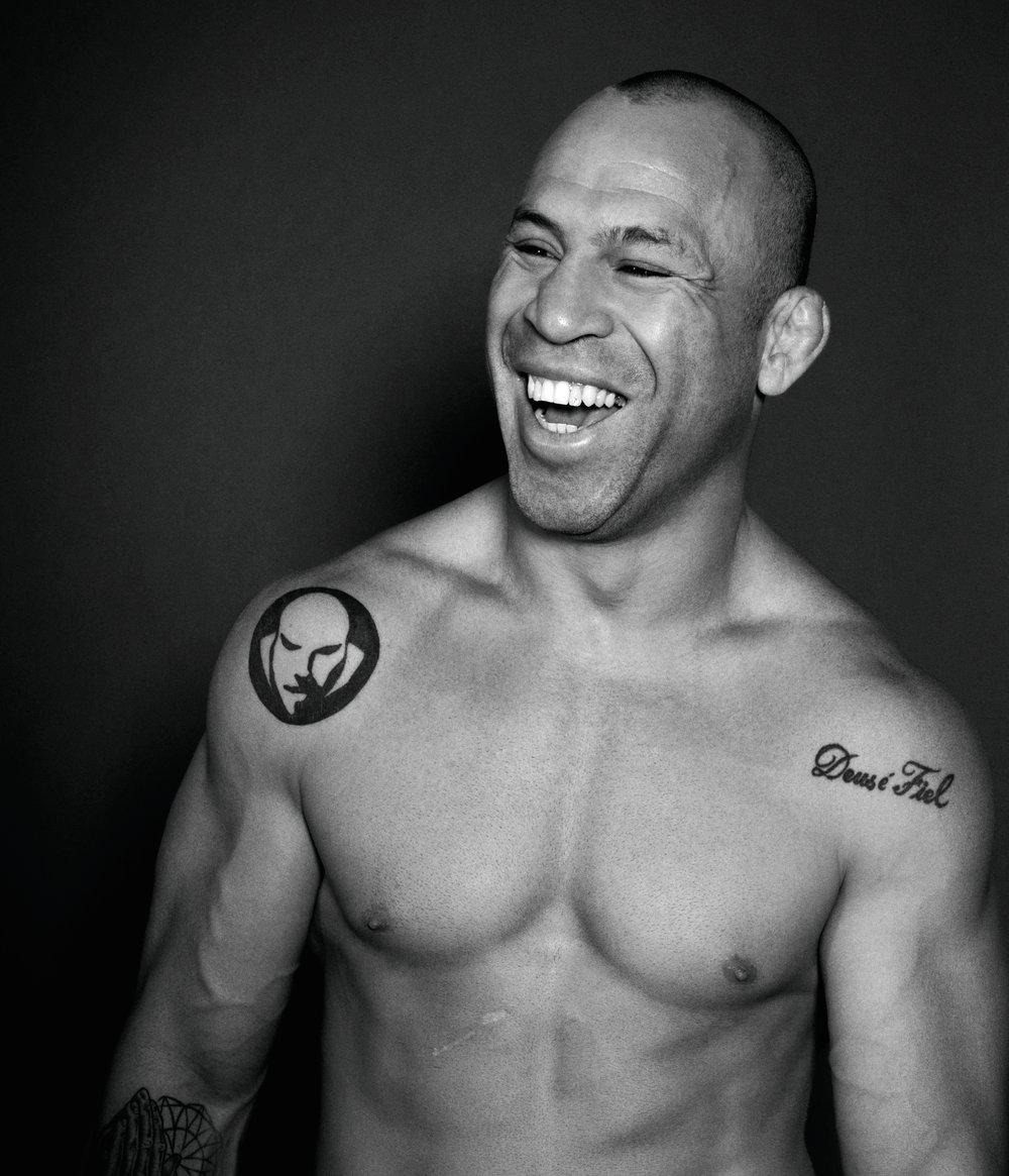
Deus é Fiel on the shoulder: Wanderlei’s faith tattoo

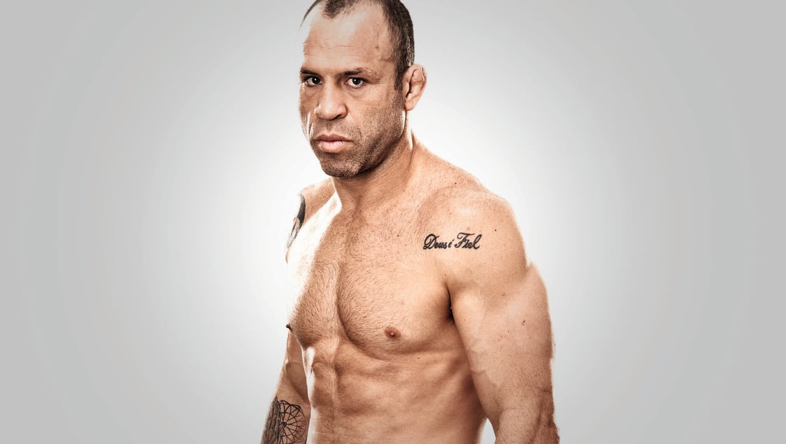
Wanderlei Silva tattoos: Deus é Fiel shoulder tattoo in a clean shirtless portrait

The phrase Deus é Fiel—“God is faithful”—sits across Silva’s shoulder in rounded black script. It follows the curve of the shoulder instead of running straight down the arm, so it stays readable when he turns or raises his hands. The tattoo is easy to see in photos of him without a shirt.

The lettering is simple. There is no banner or frame around it, and the open skin gives the words space. If you’re considering a faith tattoo, a short phrase doesn’t need heavy decoration. A clear line, a comfortable size, and placement that follows the body can be enough.

Script needs room to breathe. The letters aren’t squeezed into a narrow strip, and the dark outline shows in older photos as well as newer ones. That spacing gives the curves a better chance of staying distinct as the tattoo ages.

Silva is known for the “Axe Murderer” nickname and an aggressive fighting style, but this phrase brings a calmer note to the collection. It points to faith and gratitude. It feels like a personal tattoo rather than something chosen to match an image for the camera.

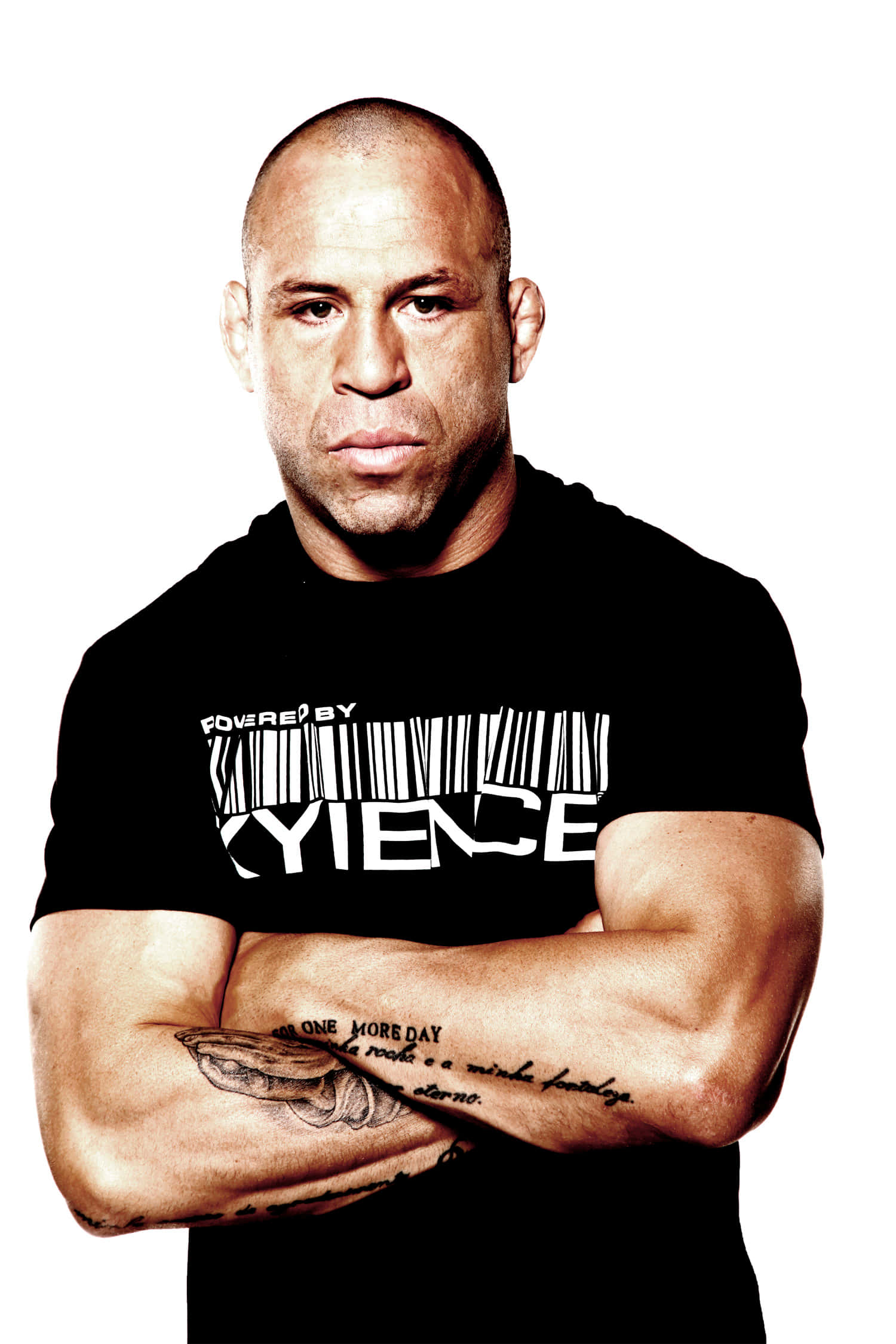
One More Day: the forearm script that reads like a daily promise

Wanderlei Silva tattoos: One More Day forearm script shown clearly across folded arms

Silva’s forearm carries a long script passage built around “One More Day.” The phrase sits among longer lines, so the tattoo reads more like a short passage than a slogan built around One More Day. When his arms are folded, it faces the camera; when he raises his fists, the writing wraps around the arm.

This uses the length of the forearm without turning the whole area into a block of black ink. The handwriting follows the arm rather than sitting inside a rigid rectangle. For long script, decide where the words should begin and how they’ll read when the arm is bent.

“One More Day” suits the daily demands of fighting: another training camp, another round, another hard day. It comes across as a reminder to keep going, without promising that things will be easy.

If you’re drawn to long script, take the placement and scale as a starting point and choose words that matter in your own life. Long quotes often need editing. An artist can help with line breaks and spacing so the words stay legible after healing. Silva’s passage works because the phrasing has a reason to be there.

Portuguese prayer lettering across both arms

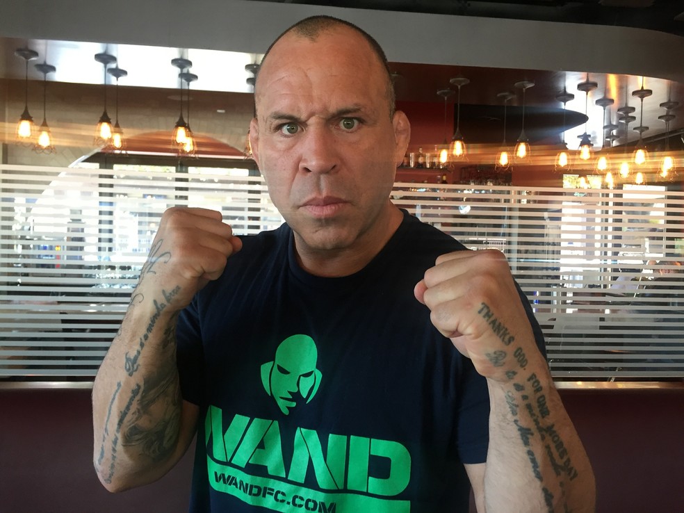
Wanderlei Silva tattoos: Portuguese prayer lettering visible on both forearms in a fighting pose

Silva’s forearms carry several Portuguese phrases about prayer, gratitude, and strength. One is commonly described as “Pai, és a minha rocha e a minha fortaleza”, followed by words about eternal love. Another reads like a prayer asking to be taught God’s commandments. Together, the lines form long paths down and across the arms.

The writing takes up space without making the forearms look solid. It follows their length and changes as Silva turns his hands. A phrase that appears straight on a stencil can shift with the arm, so the layout needs to account for movement.

Portuguese connects the tattoos to Silva’s Brazilian background, family, and faith. Translating the phrases might make them easier for more people to read, but the original language carries its own voice and history. If you want a tattoo in another language, check every word, accent, and translation with a fluent speaker.

The lettering styles aren’t identical, but they share a devotional mood. Family, faith, or resilience can connect tattoos with different shapes and sizes more naturally than making every piece match.

Wand Fight Team symbols and the shoulder identity mark

Wanderlei Silva tattoos: Wand Fight Team shoulder symbol beside the Deus é Fiel script

Silva’s shoulder tattoos also include symbols linked to the Wand Fight Team, the gym and training identity he developed after becoming a well-known MMA veteran. A circular, face-like mark appears beside the script in photos. It gives the upper body a focal point among the lines of writing on his arms.

A team tattoo can mean more than the logo. For Silva, the gym represented a place, a circle of coaches, and part of his life outside the cage. If you’re considering a team design, think about what will still matter if the name changes. A symbol for shared work or a place may outlast a logo from one season.

The shoulder is visible in a tank top and easy to cover with a shirt. Its rounded surface suits a bold shape, and open skin can keep the image clear. Beside the script, it creates a contrast between words and graphic forms.

Not every tattoo needs the same style. A round symbol can break up a run of lettering; a small dark mark can give a larger phrase somewhere to rest. The collection feels more balanced when the designs take turns catching the eye.

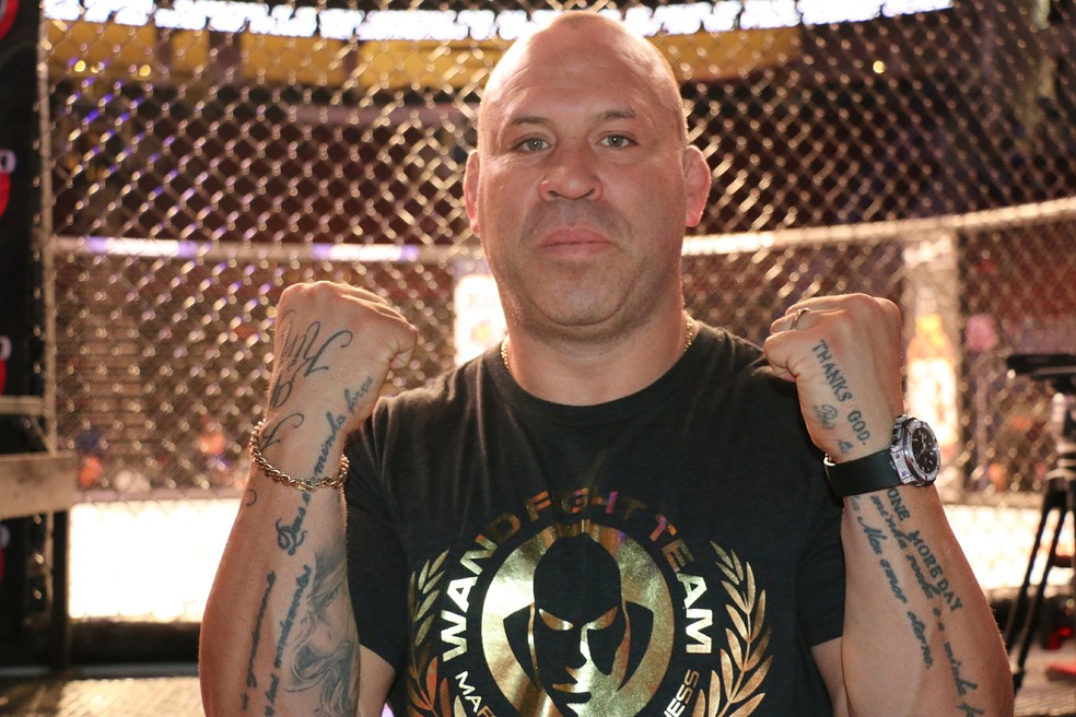
Layered arm artwork: symbols, script, and the lived-in finish

Wanderlei Silva tattoos: Layered arm lettering and symbols shown clearly at a fight event

The wider photos show how Silva’s arms have filled in over time. There are lines of text, small symbols, and larger images higher up. The collection doesn’t look like one planned sleeve. It reads like different moments: a phrase tied to faith, a team mark, and words about the mindset of fighting.

You don’t have to fill an arm all at once. Start with the piece that matters most, then add around it when a new idea earns a place. Tattoos can feel connected through their stories even if the line weight or style varies.

The age of the ink is part of what you see in these photos. Some edges have softened, while the strongest words remain clear. Sun, sweat, training, and time change tattoos. Placement and a skilled artist can help them age well, but a fresh studio image isn’t the whole story.

Silva’s collection doesn’t need a complicated explanation to feel meaningful. The words are direct, and the symbols are simple. The reason he chose them, and when they entered his life, gives them context.

His tattoos bring together faith, language, family, team pride, and a fighter’s persistence. If you want something in that vein, choose words that will still matter to you later, give the script room, and let the placement support the design. Avoid copying the exact phrase or symbol; adapt the idea to your own life.

Take your time with lettering. Ask your artist to show healed work, check foreign-language text with a fluent speaker, and look at the stencil with your arm relaxed and bent. Silva’s collection looks like it belongs to him. Your tattoo should feel that way too.

More athlete tattoo guides

Ilia Topuria Tattoos: Winged Cross, Crowned T and Tiger Chest Ink

Ilia Topuria’s tattoos tell several stories. His chest combines a crowned T, animal faces, and a split portrait. A winged cross sits on his back above a long central design, while his arm has darker cover-up work and lettering. Together, the tattoos touch on faith, family, identity, and confidence.

Each area has a different role. The chest has a clear centre and room around the animals; the back is taller and more vertical; the sleeve is denser, with script and details that show up at close range. There is no single template to copy here. The useful idea is how the designs are fitted to each area.

This guide looks at the best-known pieces and the design choices visible in photos.

The winged cross makes the upper back the first big statement

Ilia Topuria tattoos: winged cross and back tattoo

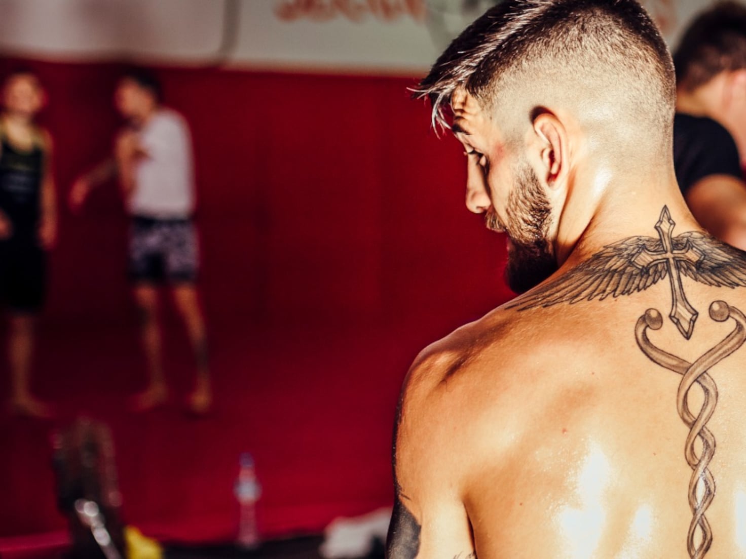
From behind, the upper-back tattoo gives Topuria’s collection its strongest outline. Wings spread over his shoulders, with a cross near the neck and a long, twisting design running down the spine. The wings make a horizontal shape; the centre gives the eye a line to follow downward.

The back is wide, so a piece can end up looking like several unrelated images without a clear focal point. Here, the cross ties the shoulders together, and the lower design carries the composition toward the middle of the back instead of stopping between the shoulder blades.

The black-and-grey work leaves small breaks of skin between the feathers and central line. The wing tips are fine, while the centre has stronger edges. Those changes in line weight give the tattoo depth without colour.

A meaningful symbol does not need to be huge to feel important, but it does need clean placement. The cross is easy to see, with smaller details around it rather than crowded inside it.

If you’re planning wings across your back, consider how the shoulder blades and spine move before settling on the drawing. A tattooist can design with those lines, so the piece still sits well when you stand, bend, or turn—not only when you’re posing.

The spine design adds a long, clean line through the back

Ilia Topuria tattoos: spine tattoo design

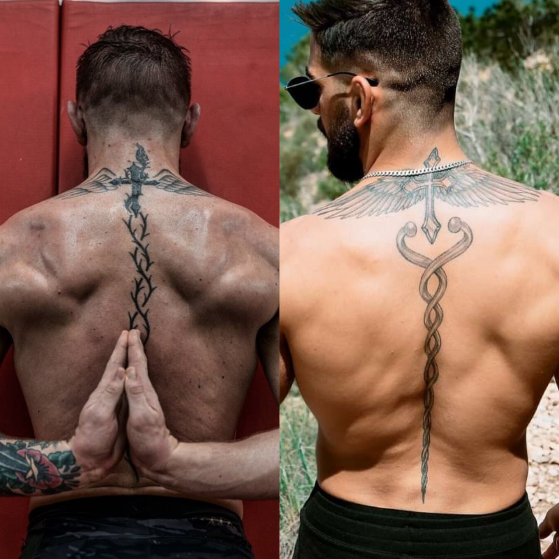
Below the cross, a long design runs down the centre of Topuria’s back. Its narrow middle and curved sections that open then return toward the spine make the whole piece feel longer than a single symbol between the shoulders.

Spine tattoos show even small shifts in a line. Topuria’s design follows one central route, with decorative sections to either side. The lower part has room to finish rather than being squeezed into the waist.

The ornamental lines match the cross above them through thin black outlines, light grey shading, and a vertical direction. If separate tattoos are being added in stages, repeating one or two of those choices can help them relate.

The centre line gives the tattoo scale while leaving skin open around it. Negative space is doing real work in this design. Too much shading could bury the clean shape that makes it read.

Decide whether a spine piece is the main image or a connector between larger tattoos. If it’s the main subject, keep nearby details quiet; if it’s a connector, make sure its ends lead into the other designs. That planning helps it feel intentional, not like a strip between separate pictures.

The crowned T gives the chest a clear centre

Ilia Topuria tattoos: crowned T chest emblem

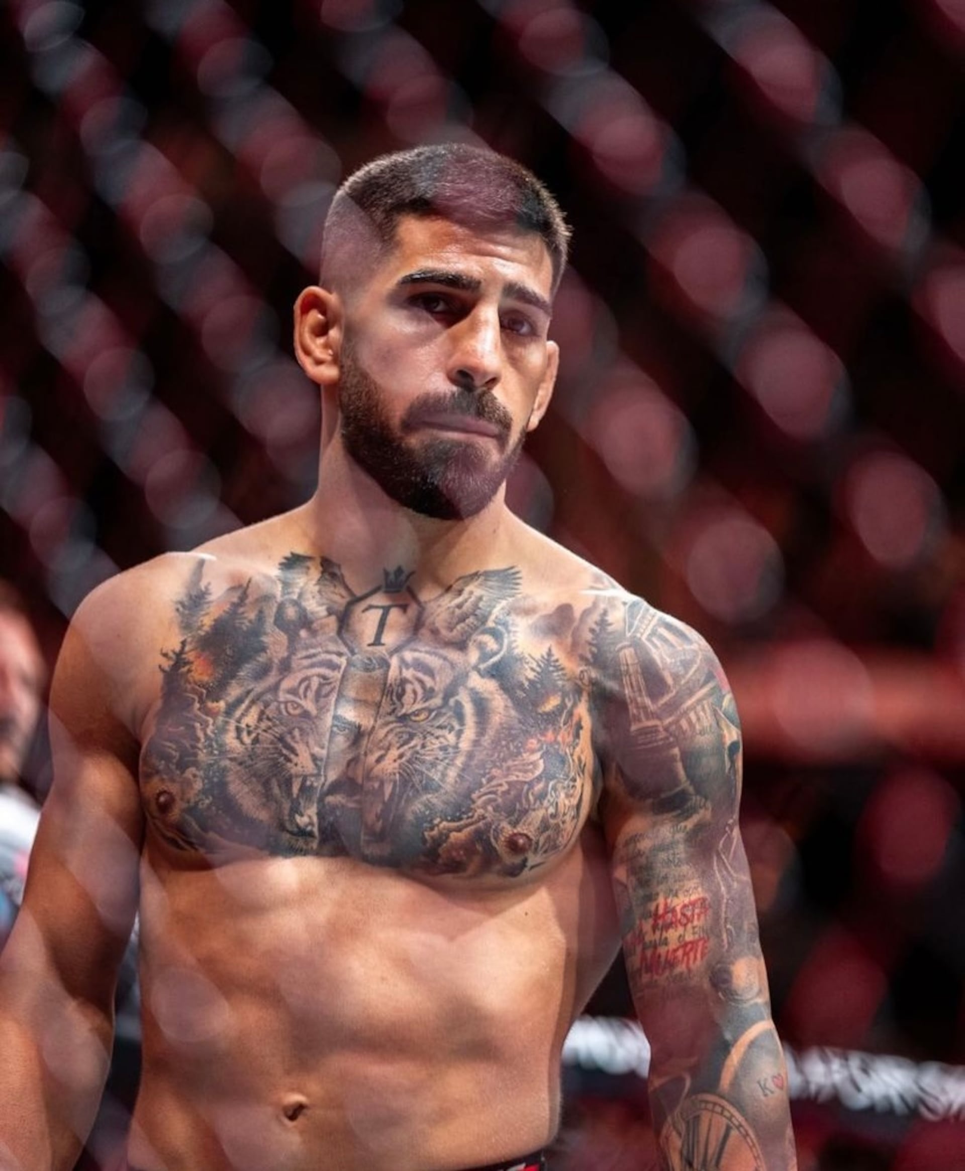
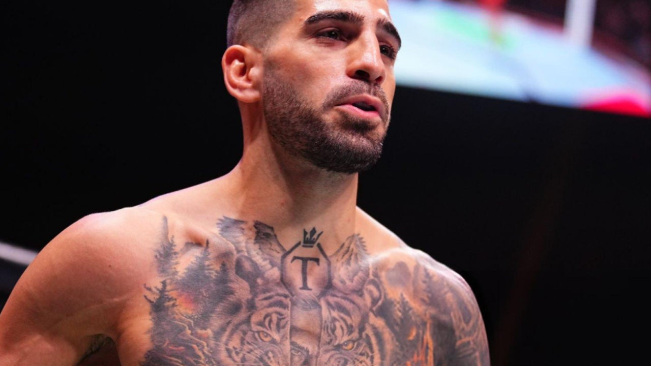
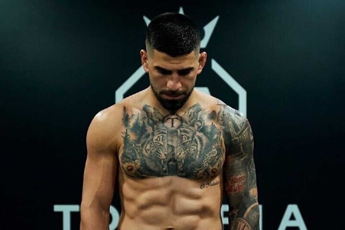
Near Topuria’s collarbone, a crowned T sits inside an octagon-like outline. The letter is tied to his surname and public identity, and it also anchors the larger chest composition.

Trees, animal faces, and shaded forms surround the emblem and lead toward the shoulders. The small crown lifts the design; the simple letter remains readable when the chest is photographed at an angle. A complicated logo can be hard to make out on a moving part of the body.

The chest’s centre line gives the composition a starting point, but the rest doesn’t have to be symmetrical. Different details on each side keep Topuria’s tattoo from looking like a mirror image. The repeated eyes and dark forest shapes bring rhythm to the two halves.

Chest lettering and logos need to be checked on the body. Muscles move, skin stretches, and the collarbone changes direction. Photograph the stencil from straight on before the needle starts. A design that looks centred on paper can shift when it wraps around the chest.

The crowned T shows how an initial or family mark can work as body art. You could use a circle, shield, open frame, or negative space around your own letter. The important parts are why it’s there and enough room for it to stay clear.

The tiger and wolf imagery turns the chest into a full scene

Ilia Topuria tattoos: tiger and wolf chest tattoo

Around the crowned T, Topuria’s chest carries black-and-grey wildlife imagery. Tigers and wolf-like faces sit among trees, shadows, and textured fur. The animals add force to the scene and give the artist shapes to work around the centre emblem.

The eyes catch your attention first. They need to stay sharp while fur and forest recede into softer shading. Darker areas near the ribs and shoulders help the eyes and letter stand out without turning the chest into one flat patch of black.

A split-face detail gives the scene another layer: one side reads as an animal, while another suggests a bearded human face. Whether you take it as a portrait or a blended symbol, it makes the chest feel more individual than a stock wildlife design.

If you’re planning a large chest piece, decide which part should lead. Keep contrast around the eyes if they’re central; don’t bury a letter in shading if that’s the main image. Good realism is often about deciding what not to sharpen.

The animals have room for their faces, whiskers, and fur. On a smaller chest, the same number of subjects could feel crowded. One animal, one symbol, and a few open lines may read better than several faces packed close together.

Tigers, wolves, and trees can suggest power and instinct, but the central emblem and lettering give this tattoo a personal frame. That combination of familiar imagery and individual details is what keeps a bold tattoo from looking like a costume.

The arm sleeve is darker, busier and more personal

Ilia Topuria tattoos: arm sleeve and cover-up tattoos

Topuria’s arm has a denser look than his chest. Darker cover-up sections, script, and layered images fill the sleeve. At close range, you can see smaller shapes and parts of older ink that have been worked over.

Cover-ups start with existing marks on the skin. Spartan-inspired sections give the arm a new direction, while lettering and small symbols add detail. Not every old line has to disappear; the newer work needs a clear value range and shapes that hold together as a composition.

The slogan “Real hasta la muerte” brings language into the sleeve. Text has a direct feel, but the lettering needs room. Tiny script may look crisp in a fresh close-up and become harder to read over time. Contrast and spacing matter along with the words themselves.

The sleeve mixes realism, symbols, and lettering without forcing them into one style. Shared black-and-grey shading links the pieces; darker outlines hold the composition while lighter skin breaks keep it readable.

If you’re planning a sleeve, don’t fill every gap first. Choose the images that matter most, place them, and let smaller details grow around them. A sleeve usually looks better when it has a few calm areas instead of the same level of detail from shoulder to wrist. Those spaces give the eye somewhere to rest.

Check the stencil with your arm straight, relaxed, and bent. A design can look balanced in one position and change shape at the elbow. That matters for tattoos you’ll see while training and moving through an ordinary day.

Topuria’s collection works as a body map: faith and a vertical design across the back, a crowned emblem and animals on the chest, and a denser sleeve with script and cover-up work. Each area has its own focus, but the black-and-grey shading helps them sit together. Borrow the placement choices if they appeal to you, and make the images your own.

More athlete tattoo guides

Sean Brady Tattoos: Japanese Dragons, Chest Ink and Fight Stories

Sean Brady’s tattoos are a big part of his look. The UFC welterweight has a full chest, Japanese-inspired work across both arms, dragons on his neck, and a large back piece. New designs have been added over the years, and some older ink has been covered or reworked.

The collection mixes Japanese dragons, waves, clouds, skulls, script, and religious symbols. Colour shows up in places, while the chest uses softer greys around its lettering and central figures. Brady’s tattoos feel like a working collection rather than a single planned suit.

This guide looks at the main designs and what their placement shows about planning bold tattoos.

The chest piece brings lettering, skulls and Japanese movement together

Sean Brady tattoos: chest lettering and dragon tattoos

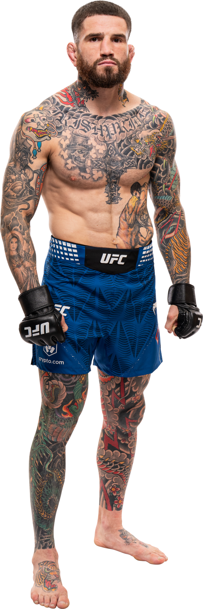
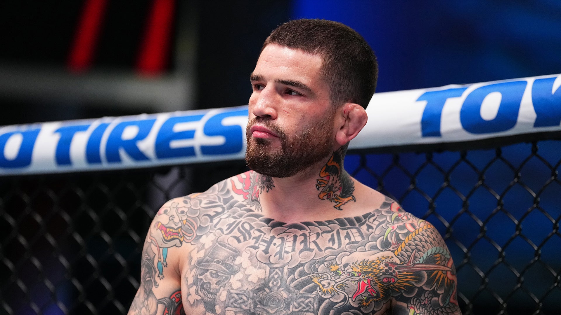
Brady’s chest is the first area many people notice in shirtless photos. Old English lettering runs across the upper chest; skulls, clouds, and darker shading fill the space below. The top forms a strong horizontal line, while the lower design moves toward the stomach and arms.

The Japanese-inspired imagery around the letters helps the chest read as one piece. Dragons and waves curve around the sharper letter shapes, leading the eye from the words to the animals and down the torso. That keeps the lettering from looking like a name with unrelated filler around it.

Chest tattoos shift as the shoulders roll and pectoral muscles change shape. Brady’s larger forms remain clear when his body moves; the smaller details sit inside darker areas instead of being spread thinly across the whole chest.

If you’re planning chest lettering, start with where the line will sit. Ask your artist to show the stencil from the front and both three-quarter angles. A phrase that looks level on paper may need a small adjustment around the collarbone. Good chest lettering should feel attached to the body, not pasted across it.

Brady uses brighter colour in the dragons and arms, while much of the central chest stays grey and black. That makes the colour work like an accent. A limited palette can also leave room for other pieces to connect later.

The Japanese dragons give his arms a strong sense of motion

Sean Brady tattoos: chest lettering and neck tattoos

Brady’s dragons wrap around the arms. Their bodies curve over the shoulders and down the upper arms; scales and whiskers fill the larger outlines with detail. The lines travel in different directions, so the sleeves look active even when his arms are relaxed.

The curved forms follow the shoulder and elbow. Waves and clouds soften the joins between images, while darker outlines keep the dragons readable from farther away.

The sleeve has a shared look without making every design identical. Dragons, flowers, and background elements use related line weights and colour. That visual link helps the work feel planned as new sections are added.

A crowded sleeve can happen when every image is treated as equally important. In Brady’s stronger views, the dragon faces and main curves have the clearest contrast, with softer filler behind them. Pick two or three hero shapes for a sleeve, then let the background support them.

Check a sleeve from more than one angle. A dragon that reads well from the front may disappear when the arm turns inward. A mirror, phone photos, and a stencil check with your elbow bent can show whether the design still works across the shoulder and triceps.

The neck tattoos connect the chest to the face and shoulders

Sean Brady tattoos: arm sleeve and neck tattoos

Brady’s neck work takes up less skin than the chest or arms, but it’s visible above a shirt. Dragon heads and dark ornamental shapes rise from the chest toward his jaw, linking the torso and head.

The neck is narrow and always moving. A design that looks good on a flat page can lose its shape where it crosses the throat or curves under the ear. Brady’s tattoos use recognisable outlines and bright colour accents that remain legible when he turns or speaks.

Neck ink changes the feel of the whole collection. Chest and arm tattoos can be covered; neck pieces show right away. If you want a less visible version, a small mark behind the ear or at the side of the neck can give a similar effect with less coverage. Think about how often you want it seen before choosing a front-of-neck design. Visibility is part of the meaning, even when the image itself is purely decorative.

The neck also bridges the chest and shoulders. A few connected shapes can keep a heavily tattooed shoulder from looking cut off at the top. Leave enough skin around the throat so the work doesn’t turn into one dark collar.

The back tattoo is a Japanese mask with a story behind it

Sean Brady tattoos: full torso tattoo collection

Brady’s large Japanese mask fills the upper back. Its bold shapes are visible even in a cage photo, and it has become one of his most recognisable pieces. He has spoken about his interest in Japanese tattoo culture and getting new work after fights. The piece is also linked to a sponsor relationship that helped make it possible.

A back tattoo needs a clear outline before the small details come into view. The mask gives Brady’s design that shape: heavy eyes, mouth, and surrounding lines spread across the shoulders, while lower areas hold extra shading and texture.

The back gives a large subject room to express itself. A mask, dragon, or religious scene can lose impact when squeezed onto an arm. On the back, the artist has room to shape a face and carry waves, clouds, or colour toward the shoulder blades.

A back piece can be personal without being on display all the time. Brady’s chest and neck are visible in many photos; the mask can be covered when he wants. Consider whether you want a tattoo seen often or kept more private.

If you’re planning a large back design, work from a full-body photo and consider the space between the shoulders, ribs, and waist. The best large tattoos are composed for the whole back, not enlarged from a tiny flash image.

Smaller symbols and cover-ups keep the collection changing

Sean Brady tattoos: tiger arm and smaller tattoos

Alongside the dragons and mask, Brady has religious images, skulls, script, fighter references, and parts of older tattoos that have been covered or darkened. Those details make the collection feel like it has grown over time, as his preferences changed.

A cover-up can mean someone wants a new style or a larger design. Brady’s darker, Japanese-inspired arm work gives the area a new direction while absorbing some of the older lines. The new subject needs enough contrast and structure to stand out, even if every trace of the previous tattoo doesn’t disappear.

The religious imagery adds another note beside the dragons and skulls. Crosses and sacred figures carry a different tone, and the collection lets those designs sit together without forcing them to say the same thing.

Smaller tattoos on hands, wrists, and inner arms see more friction, sunlight, and movement. Simple symbols and stronger outlines tend to be easier to read there than a tiny realistic scene. Brady’s larger pieces carry the detail; the smaller marks act as punctuation.

Open skin is not unfinished work; it is space for the next chapter. Leaving gaps gives you somewhere to put a later idea, which can matter when your life and career change.

Sean Brady’s collection combines Japanese-inspired dragons, a chest scene, neck tattoos, and a large back mask with smaller symbols and cover-ups. The pieces differ, but shared shading and placement help them sit together. If you like the style, borrow the pacing and give the main design room. His tattoos look built through the years, not made for one camera angle.

More athlete tattoo guides

Charles Oliveira Tattoos: Lion Back Piece, Family Portraits and Do Bronx Ink

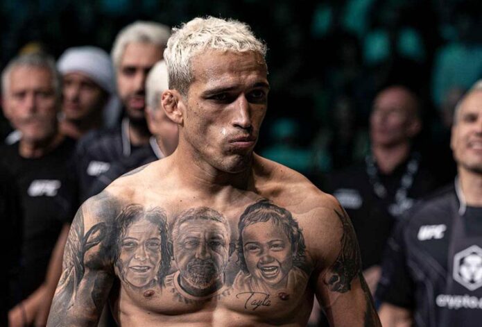
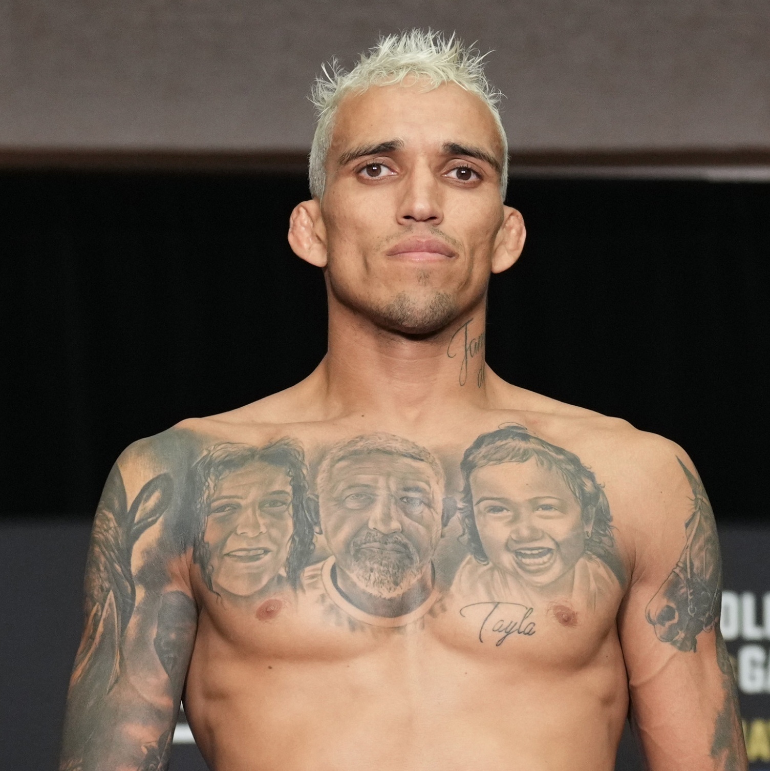
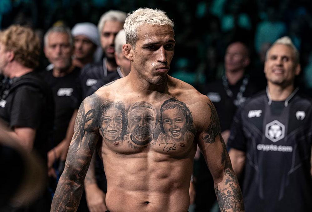
Charles Oliveira’s tattoos mix family portraits with larger images and lettering tied to his public identity. The former UFC lightweight champion has portraits across his chest, a lion on his back, dark work on both arms, and lettering at his neck. Smaller designs fill some of the space between.

His mother, father, and daughter appear in the chest portraits. The back lion adds a larger symbol, while realism, dark shading, and script give the collection a common look. It feels built over time, with different pieces marking different parts of his life.

Oliveira is known as Do Bronx, and that name appears in his tattoos and public image. This guide looks at the designs that stand out in photos and how their placement works for someone planning personal black-and-grey ink.

The chest portraits make family the centre of the collection

Charles Oliveira tattoos: family portraits and chest lettering

Three large faces sit across Oliveira’s upper chest: his mother, father, and daughter. The realistic portraits use soft shading around the eyes, hair, and cheekbones. They sit close enough to read as one family tribute rather than three unrelated pieces.

The chest gives each face space, while shared grey tones connect them. Script near the lower chest adds another personal detail without drawing attention away from the portraits. When Oliveira faces the camera, the design reads like a family photo brought onto the skin.

Portrait tattoos leave little room for error. Small changes around the eyes or mouth affect the expression, and the body moves under the image. Oliveira’s portraits use darker shading around the hair, brows, and clothes, while the faces stay lighter so their features remain clear from a normal distance.

If you’re considering a family portrait, bring a sharp reference photo with the expression you want. A blurry phone image may not show enough detail. Decide whether the faces should look forward or toward each other. The best portrait tattoos feel like real people, not generic faces with names added later.

Chest portraits can be covered by a shirt, giving the wearer control over when the most personal part of the collection is visible. The wide area also lets an artist balance the design across both pectorals instead of squeezing one face into a narrow arm panel.

The lion back piece gives his tattoos a bold focal point

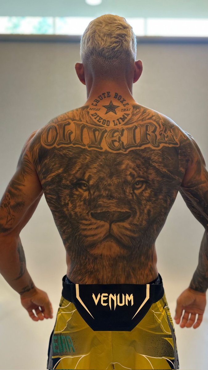
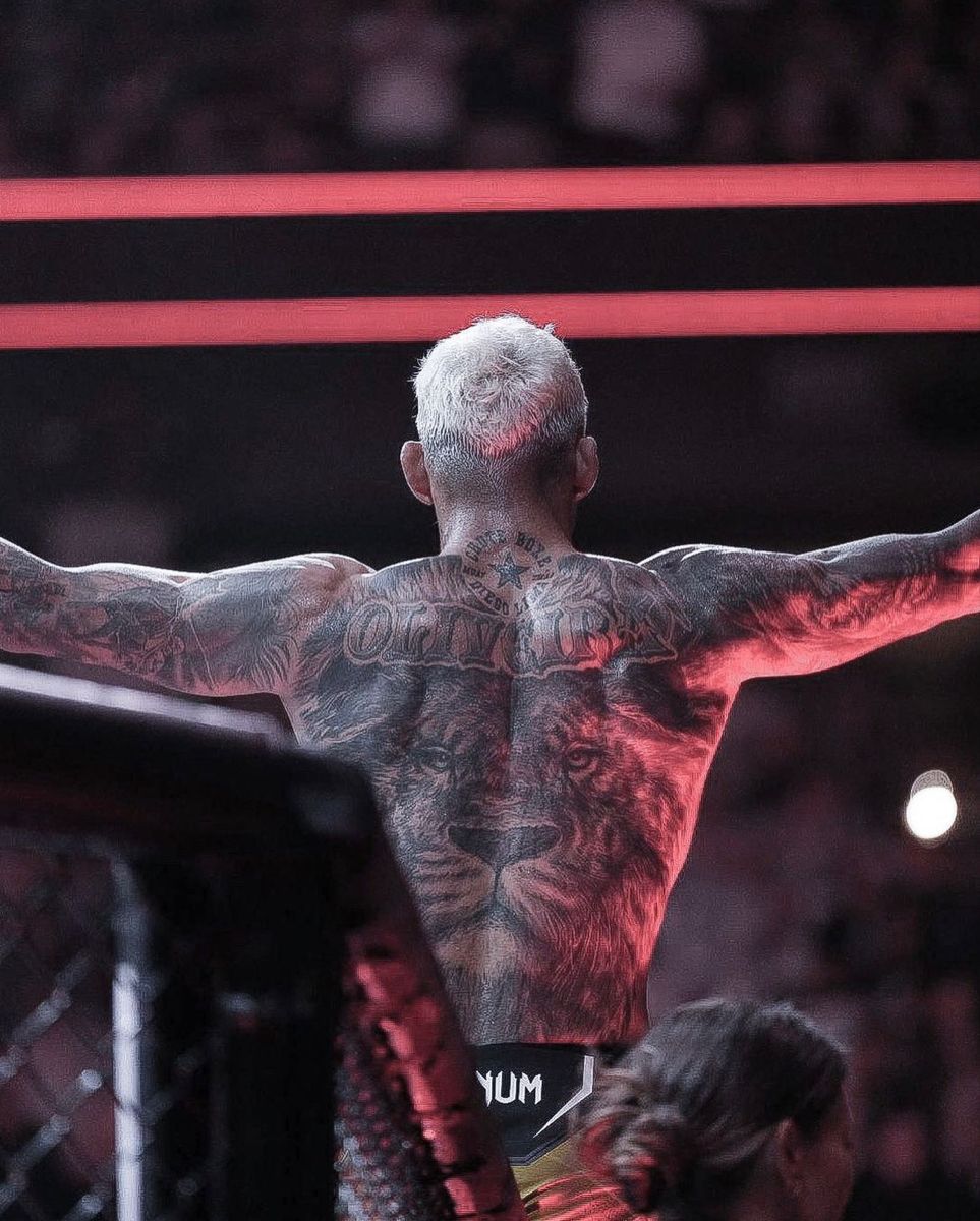
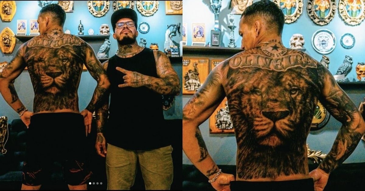
Charles Oliveira tattoos: large lion back tattoo with Oliveira lettering

A large lion fills Oliveira’s back. Its face sits at the centre, and the mane reaches toward his shoulders. From a distance, the outline is easy to recognise; up close, you can see the fur, eyes, and shading around the shoulder blades.

The lion adds a different scale and mood to the collection. The chest portraits are personal; the back piece is broader and more symbolic. Its watchful expression gives the design a strong presence from behind.

The lion’s eyes are the main focal point, with the mane providing texture and movement. A strong back piece needs contrast that still works when the tattoo is photographed from across a room. Keep the central expression clear, then use details around it to support the image.

The back offers room for an animal, mask, or large religious image that might lose impact on an arm. Fur can fade into the surrounding skin, and darker shading can sit around the edges without turning the whole design into a solid patch.

Consider how the tattoo will follow the body. A stencil should account for the spine and shoulder blades, and still look centred when the shoulders are relaxed. It shouldn’t only work in a straight-on pose.

His arms use dark realism and heavy framing

Charles Oliveira tattoos: dark arm realism and portrait chest work

Oliveira’s arms are darker and more densely tattooed than his chest. Shaded areas cover the shoulders and upper arms, with portraits, animals, lettering, and ornamental details within the larger shapes. Strong outlines keep the ink from reading as one patch of black.

The designs have to work with a moving arm: the biceps flex, the elbow bends, and the forearm rotates. Oliveira’s larger images sit where they’re still visible through those changes; smaller text and texture wrap around the limb.

Black-and-grey realism gives different images a shared base, even when the subjects don’t match. Family portraits, animals, and religious or symbolic designs can sit together because the shading helps connect them.

If you’re building an arm over time, place the main images before filling gaps. Leave the elbow and inner-arm transitions to an artist who can plan the whole flow, even if the sessions happen months apart. A design added just because space is easy to reach can crowd a larger idea later.

The darker work near the shoulders also helps the sleeves connect to the chest. You don’t need to copy Oliveira’s subjects to get the same effect. Repeating a shadow level, border, or background texture can link tattoos from different sessions.

Neck lettering adds a visible Do Bronx signature

Charles Oliveira tattoos: lion back, neck lettering and gym tribute

Lettering beneath Oliveira’s jaw follows the curve of his neck. It’s a smaller piece than the chest or back work, but you can see it when the rest of his body is covered. The name gives his look a quick signature without replacing the more personal story across the chest.

Neck skin turns from the front to the side and moves whenever the head turns. Oliveira’s script stays fairly simple, so it can still be read when he speaks or looks to the side.

A neck tattoo changes how the face is seen and makes a collection feel more visible. If you like the placement but want a quieter option, a small word behind the ear or along the side of the neck can show in profile without covering as much. One clear word can carry more impact than a whole row of tiny marks.

Check the stencil with your head turned both ways. Lettering should follow the neck’s movement without becoming so curved that the word loses its natural shape. A short phrase is usually easier to keep legible here than a long sentence.

The neck lettering works as a direct accent, while the chest and back hold the more detailed images. That balance keeps it from competing with the larger tattoos.

Family names, small symbols and newer pieces keep the story moving

Charles Oliveira tattoos: full back and surrounding smaller tattoos

The collection includes smaller lettering, symbols, and designs among the portraits and lion. Some details stand out in photos; others only show when Oliveira turns or raises an arm.

Smaller pieces can mark a person, place, or period in a career without becoming a full back tattoo. The larger realism gives the body its structure, while smaller designs make it feel like more than one session’s work.

Leaving some skin open also allows room for later ideas. An artist can connect pieces with shading or background texture when it makes sense. Open space is not a failure to finish; it gives a tattoo collection somewhere to go next.

Not every tattoo has to come with a public explanation. The chest portraits are recognisable; the lion can stand as a symbol; the lettering is direct. Together, the designs feel personal and still read clearly in fight-week photos.

If you’re planning your own collection, choose the image that matters most and give it the best placement. Pick a style that can support other ideas later. Black-and-grey realism, lettering, and controlled shading can connect different subjects. Add colour when it helps a design, not just to fill a gap. Good planning makes a collection feel personal, not pieced together by accident.

Oliveira’s tattoos balance family portraits, the back lion, darker arm work, and neck lettering tied to Do Bronx. If you like that approach, think about what you want closest to you, give a large design room, and leave space for future changes.

More athlete tattoo guides

Tom Aspinall Tattoos: Colorful Back Piece, Roman Numerals and UFC Ink

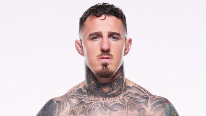
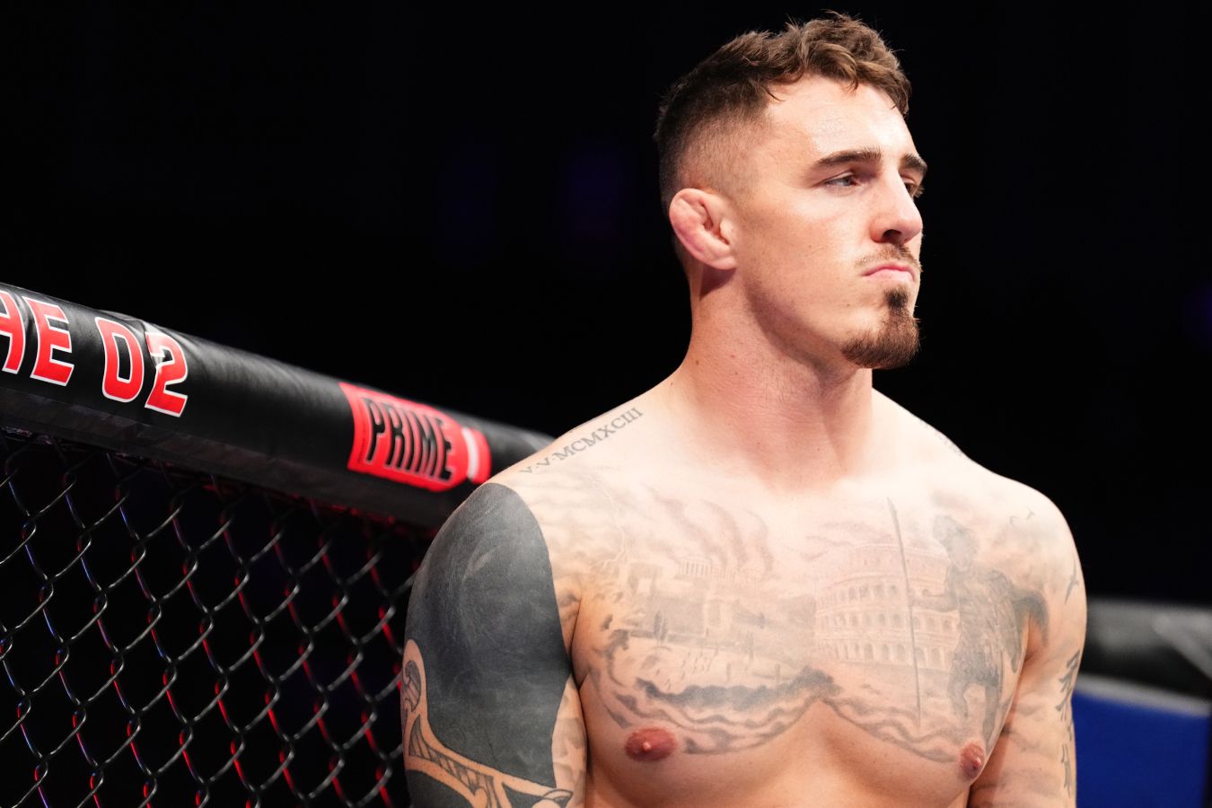
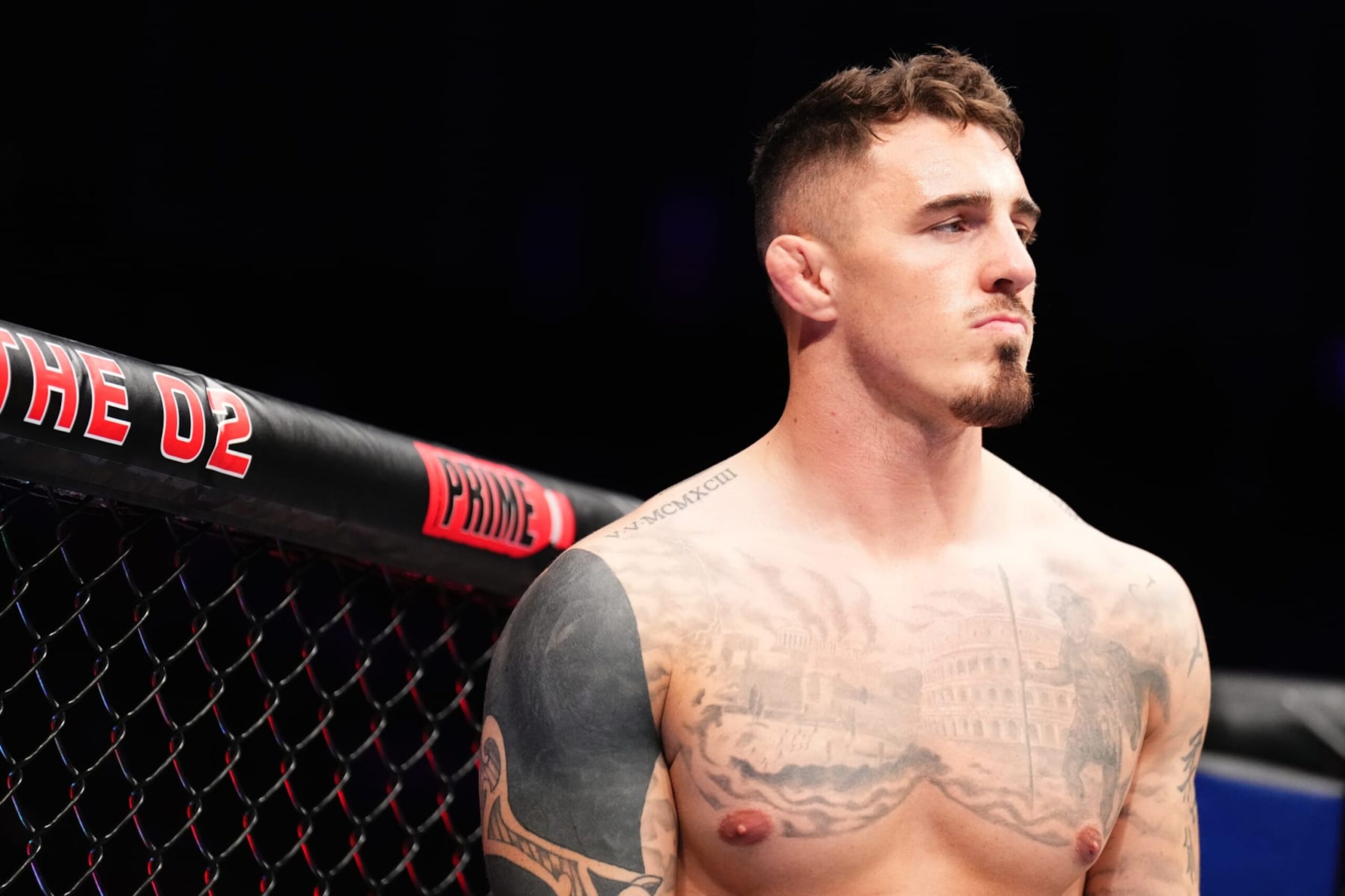
Tom Aspinall’s tattoos cover much of his upper body. A large colour piece sits on his back, with work across his chest and shoulders, visible ink on his neck, and smaller marks among the larger designs. The collection seems to have grown with his career rather than being planned as one matching set.

The back is colourful and large; the front has architectural details, lettering, black shading, and smaller symbols. That contrast gives each area a different feel while keeping the whole collection connected.

Aspinall has talked about the time and thought behind his tattoos. The back piece took more than one quick appointment, and the front designs have their own placements and stories. This guide looks at the main pieces and what their layout can teach someone planning a tattoo.

The back piece brings colour, movement and a clear focal point together

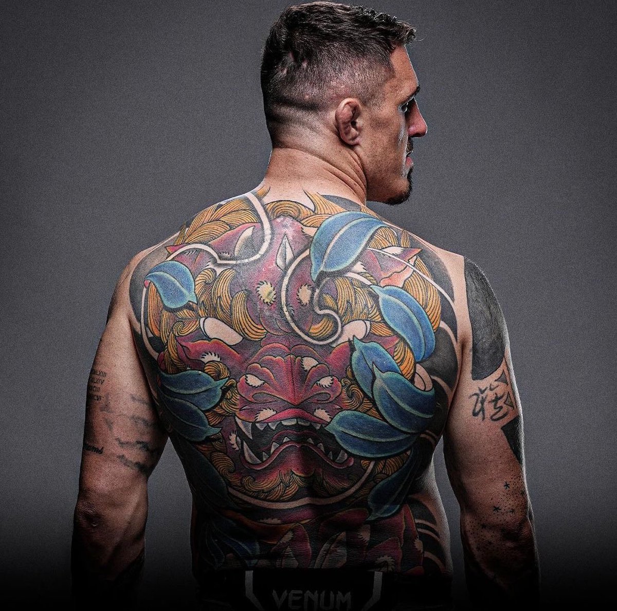
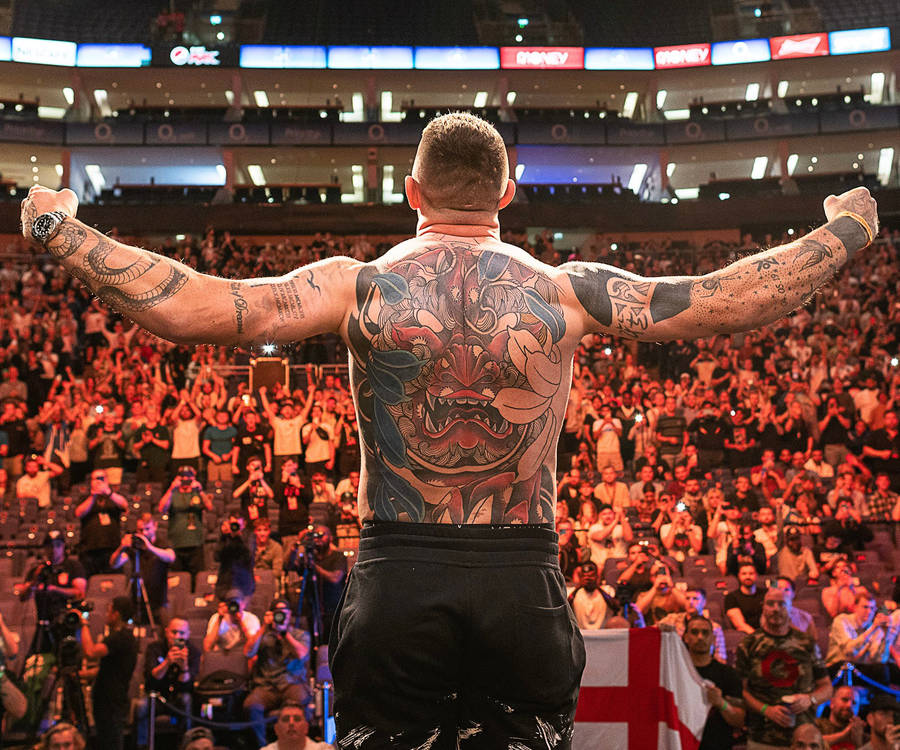
Tom Aspinall tattoos: large colourful demon-style back piece

The back piece changes Aspinall’s silhouette. A stylised face sits near the centre, with blue and green shapes around it and dark outlines giving the design a graphic edge. The face catches your eye first; leaves and smaller forms carry the colour out toward the shoulders.

A large tattoo needs one shape that reads from across a room. Here, the central mask-like face does that. Colour adds movement, while the black lines help the image hold up in arena photographs.

The back gives the artist room to build around the spine and shoulder blades. The composition doesn’t need to be perfectly symmetrical; slight differences from side to side can keep it from looking like a sticker placed in the middle of the body.

Colour works best when it has a strong black structure underneath it. Blue and green can draw attention, while outlines and darker shadows help preserve the image’s shape over time. That matters when much of the piece will be seen from a distance.

If you’re planning a back tattoo, start with the shape of the main subject. Then ask the artist to build around the body’s lines instead of dropping a finished rectangle onto the skin. The design should work with the muscles and movement.

The scale gives the back a different mood from Aspinall’s front. It is colourful and expressive; the chest is more structured and broken up. That contrast gives the collection room to breathe.

The chest combines Roman numerals, architecture and atmosphere

Tom Aspinall tattoos: Roman numerals and architectural chest tattoo

Roman numerals and architectural shapes sit across Aspinall’s chest. The shading gives the design a stone-like, historical feel. It’s less colourful than the back, so it adds a quieter focal point when his whole upper body is visible.

Roman numerals can mark a date without looking like a plain string of digits. Here, they sit within a larger composition; the architecture gives them context and darker areas keep the lettering readable when photographed from an angle.

Straight lines can be hard to place on a curved chest. A doorway or column that looks level on paper may bend across the pectoral or toward the shoulder. Place the strongest vertical lines where the body gives them support, then let the smaller forms follow its curve. Good chest lettering should be checked while the wearer is standing normally, not only while the skin is stretched flat.

Stonework and numerals can suggest memory or milestones without spelling everything out. If you like meaningful tattoos but don’t want a portrait or quote, an architectural design can leave some of the story open.

Leave a little skin around the chest piece so its forms remain clear and later work has room to connect. A darker, structured design on the front can sit beside a more colourful back piece without copying its palette. Placement and contrast do much of the linking.

The black shoulder sleeve shows how cover-ups can evolve

Tom Aspinall tattoos: heavy black shoulder and upper-arm cover-up work

Aspinall’s shoulder and upper arm carry heavy black shading that frames the chest. In some views, it looks like cover-up work or a later stage in an evolving sleeve. Either way, the darker sections give the collection stronger structure.

Large black areas need careful edges. A clean curve around the shoulder can make the chest look wider; an awkward border can make two tattoos seem to compete. The edge matters as much as the filled area.

If an older tattoo sits underneath, a cover-up needs enough weight to hide it while still forming a clear design. The artist may adjust the angle, deepen a shadow, or use open skin to build a new focal point. A successful cover-up is not only about hiding the past; it should give the new tattoo a reason to exist on its own.

The rounded shoulder is a natural place for a dark frame linking the chest and upper arm. Not every sleeve needs solid black, but a repeated shadow or controlled border can help tattoos from different sessions feel related.

Think about the balance of dark and open skin. A little negative space keeps the arm from feeling heavy all the way around and gives the main shapes somewhere to stand out. A collection can change over time. Sometimes the smartest tattoo plan is the one that leaves enough flexibility for the next chapter.

The neck tattoo changes the whole face-up look

Tom Aspinall tattoos: front view showing neck, chest and surrounding arm tattoos

Aspinall’s neck ink covers less skin than the back piece, but it changes his look in a shirt. A visible mark near the neck frames the face and shows up in interviews and walkout photos.

The neck turns from front to side and moves whenever someone speaks or looks over a shoulder. A busy image can lose its shape there. Aspinall’s design has enough contrast to remain legible in changing light and ordinary movement.

Check a neck stencil from several angles. Turn your head and relax your shoulders. The design should sit well against the collar and jaw. Visibility is part of the tattoo design, not an accidental side effect.

Neck ink is hard to cover, so it becomes part of everyday first impressions. If that’s what you want, a visible tattoo can be a deliberate choice. If you’d like a quieter option, the side of the neck or behind the ear can still show in profile.

A small, clear shape often works better there than a tiny detailed picture that may blur with time. Aspinall’s neck piece also balances the larger back and shoulder tattoos: it brings the eye toward the face without competing with the main designs.

His arms and smaller marks keep the collection personal

Tom Aspinall tattoos: additional arm marks and the evolving back collection

The smaller marks on Aspinall’s arms keep the collection from feeling like one large back piece plus a few unrelated tattoos. They appear from different angles as he moves, and give the work the uneven feel of a collection built over time.

A body can look planned without every piece matching. A few large designs, medium-sized tattoos, and smaller marks added when the idea mattered can all sit together. The artist’s job is to manage the space between them.

The arms offer different panels: an outer bicep for a larger symbol or portrait, a forearm for lettering, and an inner arm for something more private. The elbow and wrist fold and take more wear, so those areas often suit simpler designs.

If you’re adding tattoos over time, photograph the whole arm before each appointment. It’s easy to focus on one empty patch and miss how the new piece will look from across the room. The overall layout should guide the next choice.

Step back often, because a tattoo is part of a moving body and not a collection of isolated flash cards. One important image needs enough room, and smaller tattoos should support it rather than fill every opening immediately. Open skin leaves choices for later.

Aspinall’s collection has a colourful back piece, architectural chest work, a dark shoulder cover-up, visible neck ink, and smaller arm details. If you like the style, choose the main piece first, place it for the body you have, and leave space for the person you’ll become.

More athlete tattoo guides

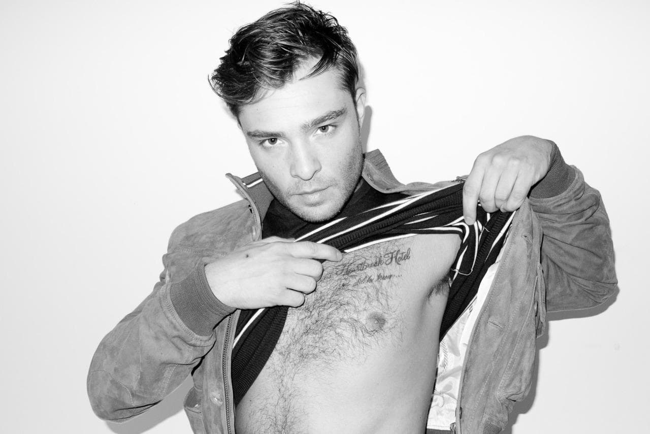
Ed Westwick Tattoos: Heartbreak Hotel, Arm Ink and 21 Grams

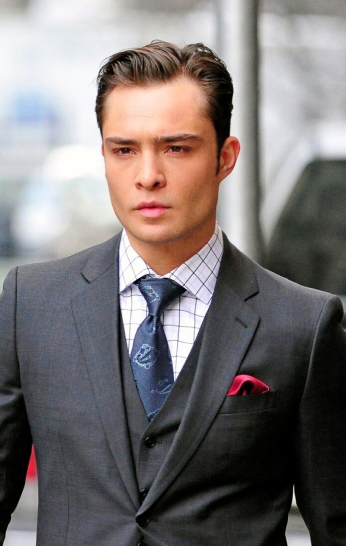
Ed Westwick’s tattoos read like snapshots from different parts of his life. The actor, known for playing Chuck Bass, has song titles, short phrases, a feather, a pin-up, and smaller lettering across his chest, shoulders, and arms. His collection feels like a stack of memories rather than one planned costume.

The tattoos don’t all match, and Westwick hasn’t tried to make them look like one sleeve. A lyric, a symbol, or a phrase that makes him laugh can sit beside the next idea as the collection grows.

Westwick has talked in interviews about the Elvis reference on his chest and the Doors lyric on his shoulder. Close-up photos show the lettering; wider shirtless views show how the pieces sit together. Here’s a look at the main tattoos and the details behind them.

Heartbreak Hotel gives the chest a clear musical anchor

Ed Westwick tattoos: Heartbreak Hotel chest lettering

Westwick’s scripted “Heartbreak Hotel” sits across his chest. He has said it’s a nod to Elvis Presley. The words sit high enough to show when his shirt is open, making the tattoo part of his everyday look.

The script is loose and slightly rough, but easy to read. Chest skin curves and hair can soften the edges, so fine or tightly packed letters might disappear in a photo. Westwick’s lettering leaves room around each word.

A song title can give a chest tattoo its own mood without explaining a whole story. “Heartbreak Hotel” sounds dramatic, but it doesn’t spell out one specific breakup. If you want a lyric or title, choose a phrase that keeps a feeling, period, or artist close to you.

Chest lettering can be covered by a regular shirt and shown when the collar is open. That mix of visibility and control is one reason chest lettering stays popular. It can be part of your style without being visible in every setting.

The chest phrase gives Westwick’s collection a centre. From there, the smaller arm pieces draw the eye outward. The later tattoos don’t need to follow the same subject or line weight for the collection to feel personal.

21 Grams turns a small shoulder phrase into a talking point

Ed Westwick tattoos: shoulder lettering and upper-arm tattoos

“21 Grams” sits below one of Westwick’s shoulders. The phrase refers to the old idea that the human soul weighs twenty-one grams. Whether you take it literally or like its mystery, the words are short and easy to recognise.

A shoulder gives a brief phrase enough room to sit by itself. Westwick’s placement separates it from the chest lettering, so the two pieces don’t blur together in a shirtless photo.

The tattoo doesn’t need an illustration around it. The spare lettering leaves the meaning open, and the shoulder keeps it away from the busier upper-arm work. Sometimes a small tattoo feels stronger because it refuses to over-explain itself.

Letter size matters. Tiny lettering can look sharp on the day it’s done and become harder to read as it ages. Ask your artist what size will hold up on your skin, then check the stencil with your arm hanging naturally. It may sit differently when you relax than when you pull your shoulder back.

The phrase adds a reflective note beside Westwick’s music references. Not every tattoo in a collection has to point to the same theme.

Love Me Two Times brings a Doors reference onto the shoulder

Ed Westwick tattoos: music-inspired chest and shoulder script

“Love Me Two Times” is a reference to a song by The Doors. The phrase sits across Westwick’s shoulder, working as music memorabilia and as a playful line of text. It’s longer than “21 Grams,” but the shoulder gives it room to follow the body.

A music tattoo could use an album image, band symbol, handwritten lyric, or a title that fans recognise. Westwick chose the words themselves. The design stays simple, but it gives people who know the song something to ask about.

The shoulder offers a natural path from the upper arm toward the back. Script placed across the muscle can look uneven from the side, so the stencil should be checked with the arm down and raised.

There’s restraint in keeping the title on its own. When the words are already doing the emotional work, a clean placement can be enough. That also leaves open skin for other tattoos later.

The Elvis and Doors references make Westwick’s collection feel like a record shelf: different artists and songs represented in different places. Choose references you expect to care about beyond the current trend.

I Heart Romance shows the value of a slightly odd idea

Ed Westwick tattoos: forearm script and visible arm ink

“I Heart Romance” is on Westwick’s forearm. He has said he saw the words written in a Brooklyn bathroom stall and thought they were cool, so he got them tattooed. It’s a more casual story than the Elvis tribute, which is part of why the tattoo sticks in people’s minds.

Some tattoos come from a phrase that makes you laugh or catches you at the right moment. Westwick put this one on his forearm, where other people can see it. It feels more like a conversation starter than a private message.

The inner forearm is a popular place for lettering because it’s relatively flat and the wearer can read it easily. It’s also visible in short sleeves and gets sun, so aftercare and sunscreen matter if you want the contrast to last.

If you find a phrase in an unexpected place, write it down and live with it for a while. Ask yourself whether you like the words themselves or only the story of where you saw them. A tattoo can start as a joke and still deserve a little planning before it becomes permanent.

“I Heart Romance” adds some humour beside the more deliberate music references. One tattoo can be researched; another can come from an impulse that stayed with you.

The feather and arm pieces make the collection feel lived in

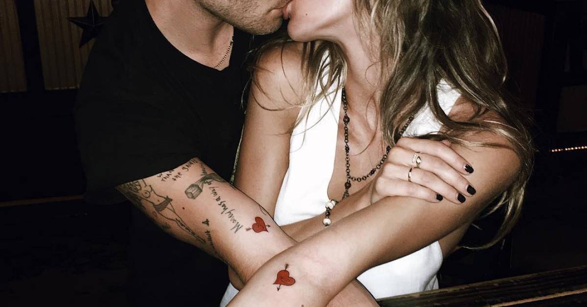
Ed Westwick tattoos: distinct heart and arrow forearm tattoo

Westwick’s arm tattoos include a large feather on the back of his left arm and a pin-up on his upper right arm. Wider photos also show smaller lettering, much of it hidden when he wears a jacket. These pieces make the collection look like something built over years rather than a short list of famous tattoos.

The feather has a clear outline from a distance, while its barbs give the artist detail to work with up close. With different outlines and shading, feather tattoos can look delicate or bold. Westwick’s has enough weight to sit beside the larger upper-arm piece.

The pin-up has a more traditional, mischievous feel. Westwick has spoken about the tattoo and about his mother disliking it. You don’t need the same image to take the idea: a tattoo can record a family joke, a rebellious phase, or a sense of humour.

Smaller phrases sit around the arm work like notes from different years. If you’re adding a tattoo, consider the gaps as well as the image itself. You don’t have to fill a sleeve in one appointment; open skin can keep each piece readable and leave room for another idea.

Take a step back before choosing the next spot. Look at your arm with the elbow bent, straight, and resting at your side. The best next piece is the one that improves the whole arm, not just the empty patch you noticed first. Westwick’s collection gives the eye several different shapes and sizes to move between.

His tattoos don’t have one mood: Elvis, The Doors, a thought about the soul, a phrase from a bathroom wall, a feather, and a pin-up. Some were carefully chosen; others feel like snapshots of a particular age. If you like that approach, start with one idea you’ll still enjoy explaining years from now, give it room, and let the rest of the collection grow at its own pace.

More actor tattoo guides

Brendon Urie Tattoos: Sinatra, Freddie Mercury and Piano Keys

Brendon Urie’s tattoos are a pretty good match for his music: theatrical, personal and a little bit all over the place in the best way. The former Panic! at the Disco frontman has built a colorful sleeve around the things he loves, from old-school singers to family memories and the records that shaped him. It isn’t one flat block of black ink. You can spot piano keys, tropical flowers, portraits, tour symbols and small pieces that only make sense when you know the story behind them.

The collection also shows how a sleeve can grow without losing its personality. Urie’s arm has a clear visual rhythm, but it still feels like a scrapbook instead of a matching wallpaper pattern. That is useful inspiration if you want a colorful arm that can keep changing over time. Start with one subject that really matters, give it room, then let the next idea answer it rather than forcing every tattoo into the same style.

Several of the best-known pieces have a music connection. He has a large Frank Sinatra portrait, a newer Freddie Mercury portrait, piano keys, flowers tied to his mother’s Hawaiian heritage and designs connected to Panic! tours. He has also talked about his love of classic singers and the albums that made him want to perform. Here’s a relaxed look at the main Brendon Urie tattoos and what makes each part of the sleeve work.

The piano keys and flowers give the sleeve its musical base

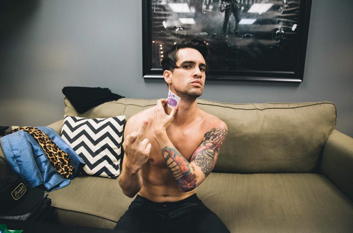
Brendon Urie tattoos: colorful piano keys and flower sleeve on the forearm

The piano keys are one of the easiest Brendon Urie tattoos to recognise. They run across his forearm as a strong black-and-gray band, with the keys broken up by the colorful flowers and other pieces around them. The design is simple enough to read from across a room, but it has enough shape to keep the arm from looking like a plain strip of text.

Urie has connected the piano to his early relationship with music. It is not just a random instrument picked because it looks good in a flash book. The keys make the sleeve feel like it belongs to a singer and songwriter, and they work as a visual bridge between the portraits above and the smaller symbols below. If you want a music tattoo without copying a band logo, an instrument can say a lot while staying open to your own story.

The flowers around the keys matter just as much. Hibiscus and plumeria have been described as a nod to his mother’s Hawaiian heritage, so the color is doing emotional work as well as decorative work. The blooms soften the hard geometry of the keyboard. That contrast between straight lines and loose petals is what keeps the forearm lively. A sleeve built entirely from portraits can feel heavy, while a few bright flowers give the eye somewhere to rest.
Placement is worth stealing here, even if the exact design is not. Piano keys follow the length of the forearm naturally, and the horizontal bars give the artist a clean measurement to work from. The floral pieces can then wrap around the edges instead of fighting the arm’s shape. Ask to see the stencil with your arm relaxed and bent before you approve it. A design that looks perfect while the skin is stretched may shift once you lower your wrist.

For a similar idea, keep the musical reference clear but leave space for the supporting images. You might use guitar strings, a drum rim, a microphone or a short line of handwritten lyrics. The main lesson from Urie’s piano tattoo is balance. The central image is recognizable, and the flowers make it feel like part of a living collection rather than a logo placed on top of the skin.

Frank Sinatra turns an idol into a serious forearm portrait

Brendon Urie tattoos: black-and-gray piano linework and forearm detail

Frank Sinatra is probably the most talked-about of the Brendon Urie tattoos. The portrait sits on his left forearm and reflects the singer’s long-running admiration for Sinatra’s voice, stage presence and old-school sense of showmanship. Urie has explained that his appreciation for Sinatra grew as he got older, especially after spending more time with the classic live records.

A portrait like this needs a little more planning than a small symbol. Faces depend on proportion, light and expression, so the artist has to build the image with enough contrast to survive the movement of the arm. Urie’s portrait is placed where it can be seen when he performs or lifts a microphone. That makes it feel like an active part of his identity rather than a private image hidden under a sleeve.

The design also gives the rest of the arm a focal point. Look at the sleeve as a whole and the eye goes to the face first, then travels into the piano keys and flowers. One strong portrait can organise a busy arm without making every other piece compete with it. If you are planning a portrait tattoo, think about what you want people to notice first. A clear focal point will make later additions easier to place.

There is a useful emotional detail in the choice of subject. This is not a portrait picked because Sinatra is a safe vintage reference. It connects to the kind of vocalist Urie wanted to become and to the way he talks about performance. That makes it a good reminder that a portrait should represent a relationship, not just a face you happen to like. The reason will still matter after the celebrity trend has moved on.

Forearm portraits can be very visible, especially when you wear short sleeves or perform with your hands in front of you. Give the piece enough breathing room and avoid squeezing it between tiny text tattoos. A portrait needs a clean edge, a readable expression and room for the shading to settle as it ages. Urie’s surrounding color also shows how a serious black-and-gray face can sit comfortably beside brighter traditional flowers.

Freddie Mercury adds a newer tribute below the Sinatra portrait

Brendon Urie tattoos: shirtless view of the full floral and portrait sleeve

Urie added a Freddie Mercury portrait below the Sinatra tattoo in 2022. The piece shows Mercury in his familiar stage posture, holding a microphone and wearing a bright yellow jacket. The placement creates a small line-up of vocal heroes on the forearm, with two very different performers sharing the same visual territory.

The choice makes sense for a singer who likes big voices and dramatic live performance. Sinatra represents control, phrasing and a classic lounge-era presence. Mercury brings movement, theatrical risk and a rock frontman’s physical energy. Putting the two images near each other turns the arm into a quick map of Urie’s influences. You can borrow that idea with your own heroes, whether they are musicians, actors, athletes or people from your family.

Fresh tribute tattoos often look different from older work because artists change and the wearer’s taste changes too. The Freddie piece has a brighter, more graphic feel than the older portrait. That difference is not a problem. A collection can show the year it was made without pretending every tattoo came from one appointment. Matching styles are nice, but matching memories are not always necessary.

The spot below an existing portrait is also a smart use of space. It lets the two faces read as a pair while keeping the rest of the sleeve open for flowers, symbols and smaller designs. If you are adding a second portrait, look at the first one from different angles and decide whether the new image should echo the line weight or deliberately bring in a new mood.

Mercury’s bright jacket also demonstrates why one strong color detail can wake up a mostly neutral sleeve. You do not need every inch to be saturated. A yellow jacket, red rose or blue background can act like a visual high note. The surrounding skin becomes part of the design, giving the color somewhere to stand out instead of making the whole arm feel crowded.

The eye, roses and personal symbols keep the sleeve close to home

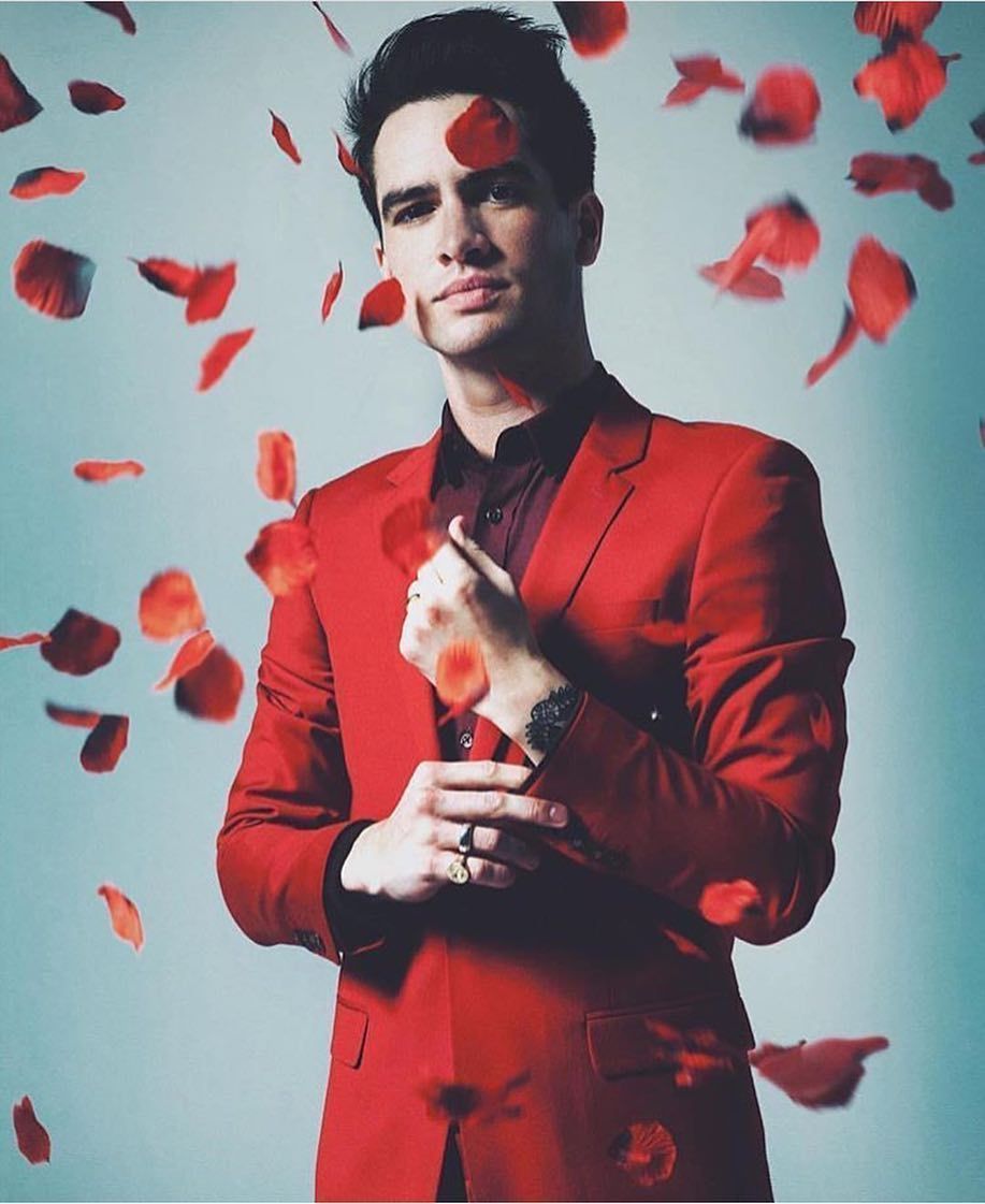
Brendon Urie tattoos: wrist tattoo and lighter personal arm details

Not every Brendon Urie tattoo is about a famous musician. One of the more personal designs is an eye connected with his wife, set inside or around a yellow rose. The image shifts the focus from public influence to private memory. It is also a good example of how a familiar tattoo symbol can become specific when the surrounding story is personal.

Eyes and roses are common starting points, but they do not have to feel generic. The artist can change the angle of the gaze, the petal shape, the amount of color or the way the image wraps around the arm. Urie’s version sits among the music references, so the sleeve feels like a portrait of a life rather than a fan wall devoted only to records.

Yellow is a useful choice here because it links the rose to the bright colors in the rest of the sleeve. It can also make the piece feel warmer than a heavy black-and-red rose. If you are working with a meaningful flower, pick the color for a reason. Maybe it was part of a wedding, a family garden or a place you remember. The explanation does not have to be obvious to everyone else to make the tattoo worthwhile.

The personal symbols also help the collection breathe. A sleeve becomes easier to live with when every image does not have to make a loud public statement. A small eye, a tour date or a simple mark can carry more weight for the wearer than a large illustration that photographs better. Leave a little quiet skin around those pieces so they can be read as separate memories.

Urie’s hand and wrist details add another layer too. Small lettering and linework can be hard to see in a full-body photo, but they change the way the arm looks when he plays piano or holds a microphone. Those spots are very visible, so they deserve the same thought as the large pieces. Test the size, check how the design looks when your hand is moving and remember that fine lines need room to age.

Panic! tour tattoos and band references finish the arm story

Brendon Urie tattoos: close view of the Freddie Mercury portrait tattoo process

Urie’s sleeve also carries designs tied to Panic! at the Disco, including symbols connected to different tours and the band’s visual language. These pieces are smaller than the portraits, but they give the arm a timeline. A tour mark can capture the period when an album was written, performed and shared with fans. It is a compact way to remember a whole chapter.

Band tattoos can be direct, like a logo or album title, or more private, like a symbol only the people in the group understand. Urie’s collection leans toward both. The larger music portraits show his influences, while the smaller tour designs point back to the work he made himself. That combination stops the sleeve from feeling like a collection of borrowed references.

There is a practical lesson in the way the small marks sit around the larger images. They fill gaps, but they do not try to erase every patch of skin. Leaving breathing room can make a sleeve look finished long before it is technically full. It also gives you the option to add another meaningful mark later instead of rushing into filler because one corner feels empty.

If you are thinking about a band tattoo, be honest about what you want to remember. A logo may be perfect if it has followed you for years. A tour date might be better if one particular show changed your life. You can also borrow the feeling without using the exact artwork: a stage light, a set-list line, a ticket stub or a tiny symbol from the album era can all work.

That is what makes the full Brendon Urie tattoos collection interesting. It brings together performance heroes, family, instruments, flowers, band history and small personal details without forcing one explanation over everything else. The best idea to take away is not a specific Sinatra portrait or piano design. It is the permission to build slowly, choose images that still matter and let the sleeve show the different parts of your life.

For a Brendon-inspired approach, start with one clear subject and one placement that suits it. Use color where it adds feeling, keep small details readable and let the next tattoo arrive when you actually have a reason for it. A good sleeve does not need to look planned from the first day. It just needs to keep making sense to the person wearing it.

More musician tattoo guides

Bert McCracken Tattoos: Neck Ink, LOVE Lettering and The Used’s Dark Sleeve

Bert McCracken’s tattoos are impossible to separate from the way he performs. The Used singer has the kind of ink that looks lived in, with bold neck work, packed arms, hand tattoos and strange little details that feel more like diary pages than a matching set. Some pieces are easy to spot from the stage. Others only show up when he lifts a hand to the mic or wears a sleeveless shirt.

That mix is what makes Bert’s collection useful for tattoo inspiration. It is not built around one polished trend. There are old-school shapes, lettering, rough color, personal symbols and tattoos that look as if they were added during different chapters of his life. The overall effect is messy in a deliberate way, with enough repeated black ink to hold the whole thing together.

Several designs have been discussed over the years, including the LOVE lettering on his neck and hand, musical notes, a bat on the lower abdomen and the phrase “I WISH I WERE A GHOST.” The exact story behind every mark is not public, so it is better to separate what can be clearly seen from what is only fan guesswork. Here’s a relaxed look at the main Bert McCracken tattoos and the design lessons they offer.

The LOVE lettering makes his neck tattoo the first thing you notice

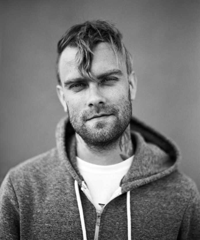
Bert McCracken tattoos: high-resolution view of neck, cheek and forearm tattoos

The neck is where Bert McCracken’s tattoo style announces itself. The bold LOVE lettering is one of the clearest pieces in his collection, and it reads quickly even in a stage photo. Neck lettering has to survive movement, sweat, changing light and the distance between a singer and the crowd, so the simple blocky approach makes sense.

LOVE is also a strong word for the placement. It is direct without needing a long quote or a complicated illustration. The word sits close to the face and voice, which gives it a little extra weight for a frontman whose songs spend a lot of time inside messy emotions. That does not mean every fan needs to copy the word. The useful part is the decision to choose a short phrase that still feels true when it is seen every day.

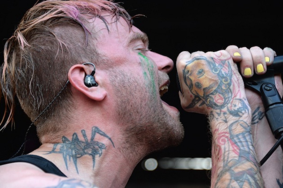
The spider-like neck image that appears in later photographs changes the mood. It gives the upper design a darker, more chaotic edge, while the lettering keeps the area readable. That contrast is a good reminder that a tattoo can be both rough and graphic at the same time. You do not have to choose between clean lettering and a more distressed surrounding image if the artist leaves enough separation.

Neck tattoos are high-commitment pieces, so placement should be tested from every angle before the needle starts. Ask your artist to show the stencil while your head is turned, tilted and held naturally. A word that looks straight in a front-facing mockup can bend around the throat when you move. Bert’s ink works because the designs follow the shape of the neck instead of treating it like a flat rectangle.

If you want a similar feeling without using LOVE, think about one short word that has survived several versions of your life. Keep the lettering large enough to age well, avoid stuffing the whole neck with tiny detail and decide whether the design should be easy to read from far away. Bert’s neck tattoos show how a simple word can become the anchor for a much bigger collection.

Hand and finger tattoos bring the collection into every performance

Bert McCracken tattoos: close-up of hand, wrist and neck tattoo details while performing

Bert’s hands are covered with the kind of expressive ink that becomes part of a performance. When he grips a microphone, the tattoos move into the foreground. The knuckles, fingers and backs of the hands carry color and linework that make an ordinary gesture look instantly recognisable. This is a big reason the tattoos feel connected to his stage identity rather than hidden personal decoration.

Hand tattoos also force a person to accept a little imperfection. The skin gets washed, rubbed and exposed constantly, and fingers bend every time you play an instrument, hold a phone or reach for a door handle. Lines soften. Small gaps appear. A design that looks slightly rough from the beginning can age more naturally than a hyper-fine drawing that depends on perfect edges.

In Bert’s case, the hand work helps bridge the neck and sleeve. The pieces do not look like a separate accessory added at the end. They continue the same mood of dark symbols, rough shading and compact marks. That visual handoff is a smart way to make scattered tattoos feel like one personality without forcing every design into the same style.

His hand tattoos also show why scale matters. The best designs are clear enough to read when the fingers are apart, but they still leave skin visible between shapes. If you are planning hand ink, ask for a version that works both close up and at normal speaking distance. Your artist should explain how the lines will settle and whether a touch-up is likely.

There is a practical point here too. Hand tattoos can affect work, family situations and how strangers read you, so the decision needs more than a cool reference photo. Bert’s career has always been public and physical, which makes the placement part of the story. For someone with a different job or a more private life, the same idea may work better on the wrist or forearm.

The spider, chest mark and dark symbols give the sleeve its edge

Bert McCracken tattoos: side profile showing the spider-like neck tattoo and central body mark

The darker symbols around Bert’s neck and upper body make the collection feel closer to punk and emo visual language than to a neat traditional sleeve. The spider image is especially effective because the legs create movement across the skin. It looks sharp from a distance, but the shape is simple enough to remain readable when the light is bad or the singer is moving.

His central chest marks add another kind of structure. Instead of filling every inch with one giant image, the designs sit as separate symbols that can be seen through an open shirt or a stretched tee. That spacing keeps the torso from becoming a single dark block. It also gives each tattoo a little room to keep its own identity.

A lot of people want a sleeve that looks intense but worry that blackwork will become visually heavy. Bert’s placement offers an answer: use strong dark shapes, then leave deliberate skin breaks around them. The eye needs somewhere to pause. Negative space is doing as much work as the ink in these photographs. Even a rough collection can look balanced when the artist pays attention to the empty areas.

The spider motif is also a good example of choosing an image for its outline. You can recognise it without needing a photorealistic finish. That makes it a useful starting point for anyone who likes gothic or creature tattoos but wants something that will still read after years of wear. Bold legs, a clear body and an intentional angle will usually age better than a crowded web of micro-detail.

If you like this part of Bert’s style, build around one strong silhouette first. A bat, moth, snake, crow or small demon can fill a tricky gap while still leaving room for future work. Keep the supporting marks smaller and decide whether you want the final mood to feel playful, threatening or mournful. The image can stay simple if the placement and line weight are right.
Face and temple marks make the look feel raw instead of polished

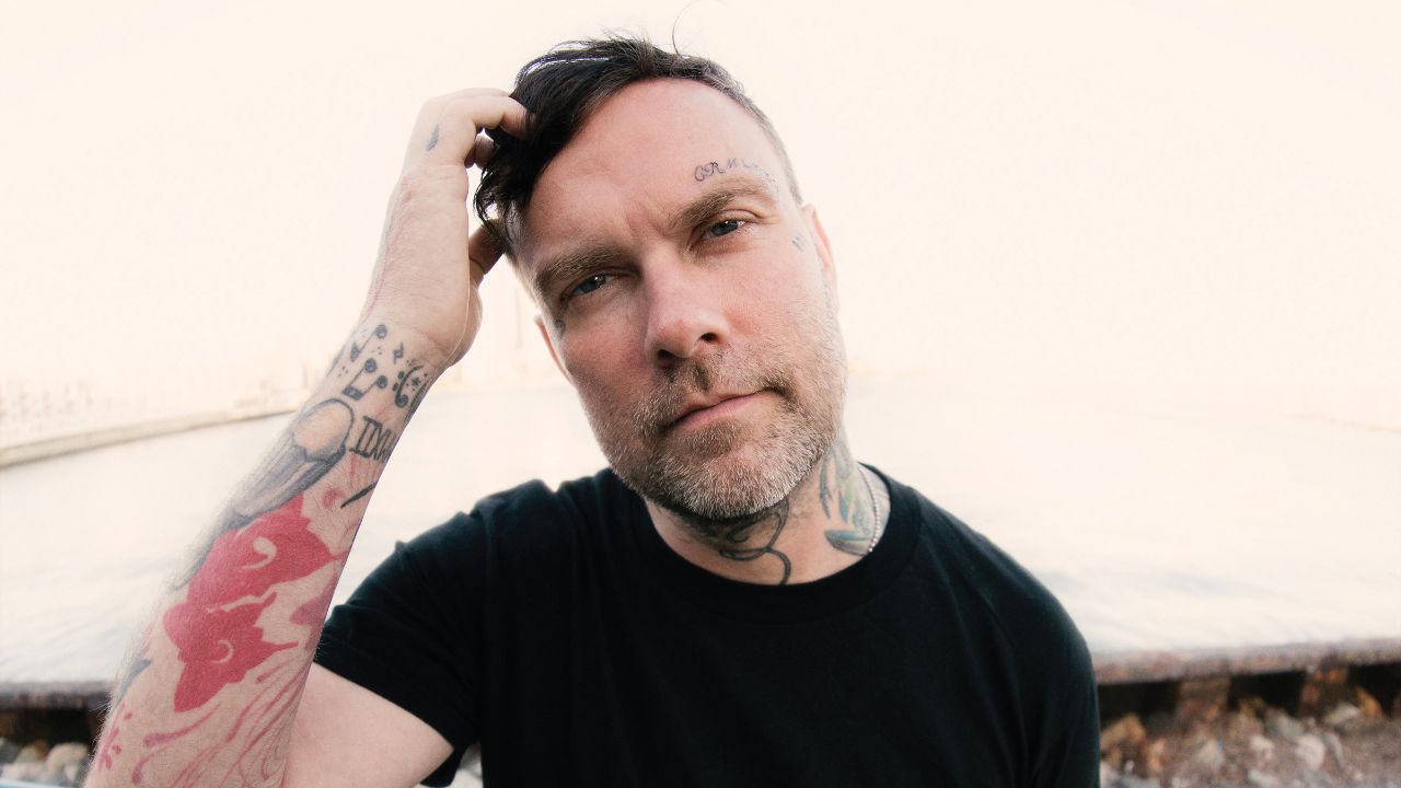
Bert McCracken tattoos: face-visible portrait with cheek and neck tattoo marks

Some of Bert’s later photos show small marks around the face and temples. They are not the largest designs on his body, but they change the whole impression of the collection. Face tattoos create an immediate sense of commitment because they stay visible in every interview, photograph and ordinary conversation. In a close-up, even a tiny mark can pull the eye away from the hairstyle and toward the expression.

The lighter facial details work because they do not try to become a full mask. They sit beside the features rather than covering them. That restraint matters. A small symbol near the temple can be personal and still leave the face recognisable. If you are considering a similar placement, start by living with the design in a temporary marker or a digital mockup. Look at it in daylight, on video calls and in photos taken from the side.

Face ink is also where style and timing become impossible to ignore. What feels right at twenty-five may feel different later, and there is no sleeve or collar that can hide the decision. Bert’s marks fit the rest of his visual history, but that does not make the placement casual. They read like a choice made with a clear understanding that the tattoo would become part of his public face.

For a lower-risk version of the same mood, try a small mark at the hairline, behind the ear or high on the neck. Those placements can still feel bold without putting the design directly in the centre of the face. Ask your artist about fading, sun exposure and how the lines may change. Face tattoos often need realistic expectations more than they need an elaborate concept.

The main design lesson is not to chase shock value. It is to make sure a visible tattoo belongs with the person wearing it. Bert’s face marks work in photographs because they are part of the same rough, emotional world as the neck and hand ink. A tiny shape with the right attitude can say more than a random collection of trendy symbols.

The bat, wrist lettering and full arms turn separate memories into a sleeve

Bert McCracken tattoos: large original-resolution stage photograph showing arm and sleeve tattoos

Bert’s arms show the collection at its busiest. The visible pieces include lettering, music-related marks, colored sections and heavier black shapes that run from the upper arm toward the wrist. His tattoo list also includes a bat on the lower abdomen and the phrase “I WISH I WERE A GHOST” around the wrist, designs that add a more vulnerable and strange side to the tougher stage image.

The phrase is especially interesting as a tattoo idea because it has room for more than one reading. It can suggest wanting to disappear, needing a break from attention or simply being drawn to ghost imagery. Unless Bert has explained a specific meaning, it is better not to turn the line into a firm biography. The lettering is still useful inspiration because it shows how a sentence can wrap around a small area and become part of the body’s movement.

The musical notes around the wrist make a quieter reference to his work. They are a good example of a small tattoo that does not need to compete with a full sleeve. A few notes can mark a song, a band or a memory without announcing the explanation to everyone else. They also suit the wrist because the curved line can follow the joint and remain visible when the hand turns.
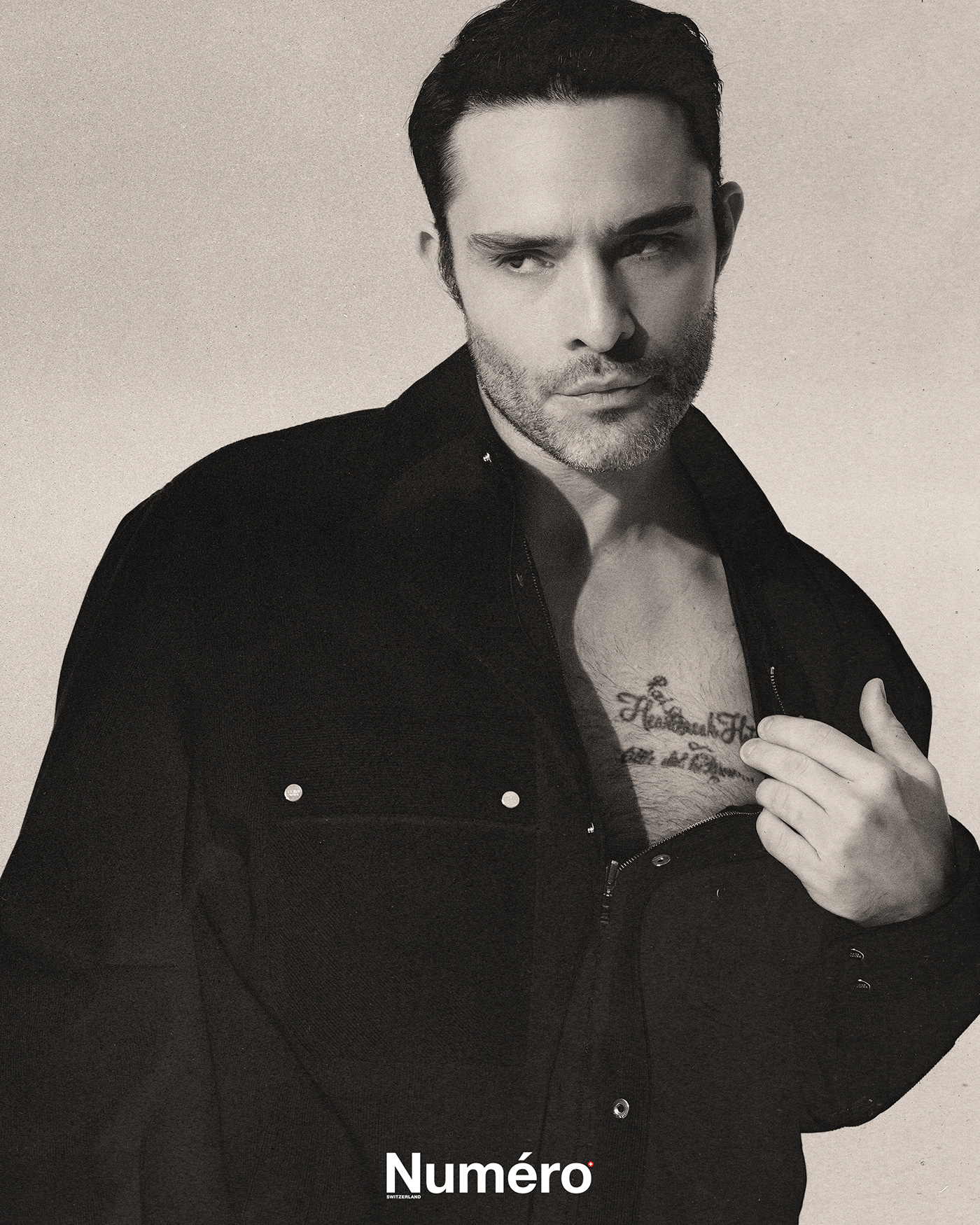
The bat on the lower abdomen brings in a different placement and a more playful gothic image. It is not sitting beside the face or on a microphone hand, so it feels more private. That split between public ink and hidden ink is worth thinking about when you plan a collection. Not every tattoo needs to be visible for it to shape the way the whole set feels.

Looking at Bert McCracken’s tattoos as a group, the biggest lesson is that a sleeve can grow through different moods and still feel honest. The dark neck work, rough hand tattoos, symbols, lettering and body pieces do not look like they came from one catalogue. They look like a record of a person who kept choosing images that matched the moment.

If you want to borrow that approach, start with one tattoo you would still explain proudly ten years from now. Give it room, choose an artist who understands the placement and let the next piece arrive naturally. A good collection does not need to be perfectly coordinated. It needs to feel like it belongs to you, which is exactly why Bert’s ink continues to stand out.

More musician tattoo guides

Megan Massacre Tattoos: Colorful Sleeves, Chest Ink and Creepy-Cute Details

Megan Massacre’s tattoos have always felt like part of the outfit, but they’re much more than decoration. The artist, model and TV personality wears a dense mix of color, black linework, portraits, animals and little symbols that all seem to come from the same slightly spooky, slightly playful world. Her ink is bold without looking stiff, and it has plenty of personality even when the details are small.

That’s what makes Megan Massacre tattoos so useful for inspiration. The collection isn’t built around one trend or one neat sleeve template. It looks like it grew over time, with different artists and ideas joining the party as her style changed. The common thread is attitude: bright color, strong outlines and images that feel a little weird in the best possible way.

Some designs are easy to identify from photographs, while the story behind individual pieces isn’t always public. So this guide sticks to the ink that can actually be seen and focuses on the practical design lessons: how to build a colorful sleeve, mix cute and creepy imagery, handle hand tattoos and keep a busy collection from turning into visual noise.

Her chest tattoos set the colorful, neo-traditional mood

Megan Massacre tattoos: high-resolution chest and arm view showing colorful illustrative tattoos

The chest is the first place to study if you like Megan’s style. Her upper-body work uses large, readable shapes rather than hiding every inch under tiny detail. Flowers, faces, leaves, dark outlines and bright fills sit beside each other, creating the feeling of a full illustration even when the designs were added at different times.

A chest piece like this needs a clear anchor. Megan’s work often has a strong central image or a dark line that gives the eye somewhere to land. Around it, smaller designs can move toward the shoulders and collarbones without making the whole area look like a sticker sheet. That’s a smart approach for anyone planning a first large tattoo because it leaves room for future additions.

The color choices matter just as much as the subject matter. Warm reds, greens, yellows and muted blues give the collection a vintage flash feel, while heavy black outlines stop the palette from becoming too soft. “Creepy but cute” is a useful shorthand for the balance, but the real trick is contrast. A sweet flower looks more interesting beside a skull, bat or strange little character than it does surrounded by more flowers.

If you’re planning chest work, start with the shape of your body instead of picking five unrelated flash drawings. Ask your artist where the sternum, collarbone and pectoral curve will pull the lines. Megan’s chest ink shows how separate motifs can still read as one composition when the scale and spacing are planned before the appointment.

The sleeves mix portraits, animals and bright illustrative linework

Megan Massacre tattoos: full-body view showing the colorful sleeves, legs and placement choices

Megan’s arms are where the collection gets busiest. The sleeves combine portrait-style faces, animals, florals and graphic shapes with enough open skin to keep the designs readable. From a distance, the arms look like a strong block of color. Up close, there are lots of small decisions in the line weight, background texture and way each figure turns around the arm.

Portraits are especially useful in a sleeve because they create a visual pause. A face has a natural focal point, so it can hold one section of the arm while smaller images fill the space above and below. The same idea works with a favorite animal, a doll or a character if realistic portrait work isn’t your thing.

One reason this style ages well is that the main silhouettes are clear. Even when color softens, you can still tell where the face, wing, flower or creature begins. Good sleeve planning is less about squeezing in more art and more about giving every major image a readable outline. The gaps are doing useful work too. They stop all the dark marks from merging into one muddy band.

For a Megan-inspired sleeve, pick one mood before you pick the exact images. Do you want old-school candy colors, darker horror references or a blend of both? Once that choice is made, your artist can repeat the same line weight and background treatment across pieces that are different in subject. That’s how a mixed sleeve starts to feel intentional.

Hand and finger tattoos bring the details right into the frame

Megan Massacre tattoos: close portrait showing hand, finger, neck and chest tattoos

Hand tattoos show up constantly in Megan’s photos because they’re impossible to hide when she’s working, posing or holding a tattoo machine. The fingers carry tiny lettering and symbols, while the backs of the hands connect into the heavier work on the wrists and forearms. It’s a high-visibility area, but the designs still feel playful rather than overly serious.

Small finger tattoos need a different kind of planning from a chest piece. There isn’t much room for detail, and the skin gets washed, bent and exposed every day. Megan’s hand work leans into simple shapes and compact marks that can still read when the fingers are moving. That’s a better reference than copying a delicate image that only looks good in a tightly cropped studio photo.

The hand designs also help the sleeves feel finished. When a tattoo stops suddenly at the wrist, it can look like an unfinished border. Small marks on the fingers and hand create a softer transition into the arm. That little bit of visual echo is enough to make a scattered collection feel connected.

There’s no need to rush into hand ink just because it looks cool on an artist whose career is built around tattoos. Think about work, sun exposure and how much you care about perfect lines. Finger tattoos often fade or need touching up. If you like the idea but want less commitment, try the same symbol on the wrist or the side of the forearm first.

Animal tattoos and darker motifs keep the collection from feeling too sweet

Megan Massacre tattoos: bright portrait showing the colorful chest and illustrative arm work

The darker side of Megan’s tattoos keeps the colorful pieces from becoming overly polished. Bats, skulls, spider imagery, snakes and other gothic shapes appear alongside flowers and cartoon-like details. The result is lively instead of gloomy because the color palette keeps the horror references from taking over.

Animal tattoos are a good way to build that kind of contrast. A raven, cat, bat or snake can act as a strong black shape, then smaller flowers or decorative marks can soften the edges. Megan’s collection shows that a dark image doesn’t need to be rendered in solid black to feel bold. Sometimes the attitude comes from the eyes, the pose or the way the shape cuts across the body.

The same idea works for a cover-up. A busy, illustrative subject gives an artist more options than a tiny fine-line flower. When an old tattoo needs to disappear, look for a design with movement, strong shadow and enough color to carry the new shape. Don’t force a cover-up to be smaller than the tattoo underneath it. The better design usually wins by being larger and more confident.

If you like the creepy-cute mix, make a short list of subjects you’d still enjoy after the novelty wears off. A smiling skull, a pretty moth or a cartoon animal can hold both moods at once. Keep the main silhouette simple, then let the color and small details do the personality work.
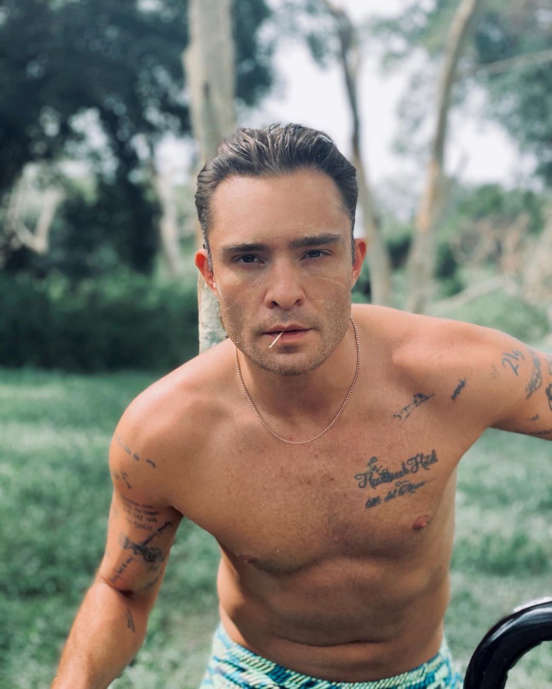
Full-body tattoos and placement make the collection feel like a living sketchbook

Megan Massacre tattoos: face-visible portrait showing hand tattoos and the dense sleeve texture

Megan’s tattoos don’t stop at the chest and arms. Photos show ink moving down the legs and across smaller areas of the body, which gives the collection a less formal, more sketchbook-like feel. A full-body set doesn’t need every section to match. It just needs repeated choices in color, outline and attitude.

This is where her collection offers a useful lesson for people who don’t want a traditional full suit. You can build a body map slowly. Start with the areas you most want to see every day, then use smaller pieces to connect the visual language later. A leg can carry a larger standalone image while the ankle or knee gets something compact and graphic.

Busy collections also benefit from a few quiet areas. Leaving skin open around a large tattoo makes the piece feel bigger and gives the eye a break. If every inch is filled at once, even beautiful work can lose its impact. Space isn’t empty when it helps the next tattoo stand out.
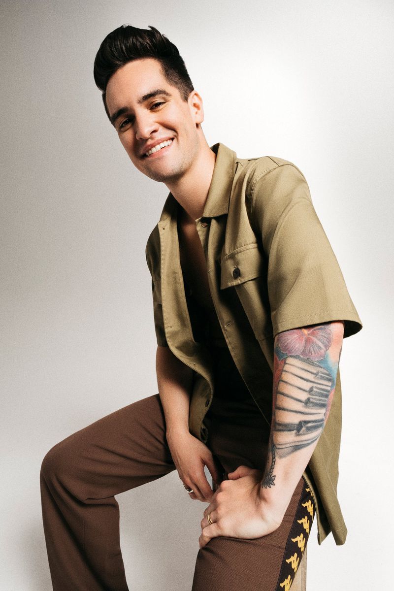
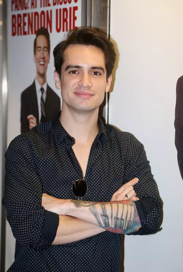
The best takeaway from Megan Massacre’s tattoos is that consistency doesn’t mean repetition. Her pieces can be cute, macabre, realistic, decorative or a little silly, yet they still belong together because the linework stays confident and the colors feel chosen. Build around your own strange mix instead of chasing someone else’s exact sleeve. Pick images that make you smile, give the important pieces enough room and let the collection grow at a pace you can actually live with.

Before you book a large project, bring your artist a few references and explain what you want the finished set to feel like. Talk about color, contrast, healing and how much empty skin you want to keep. Megan’s tattoos look spontaneous, but the strongest parts still have enough structure to age well. A little planning gives the weird ideas room to stay weird without losing their shape.

More celebrity tattoo guides