Jake Paul tattoos have grown from a few small personal pieces into a loud mix of blackwork, realism and large story-driven designs. His collection moves across his arms, chest, ribs, legs and feet, so there is no single style that explains everything. Some pieces are clean and graphic. Others are packed with shading and tiny details that are meant to be studied up close.
That variety is what makes Jake Paul’s ink worth looking at. He has a tiger on his foot, an angel running down his leg, skull and skeleton work, chest lettering, a Polynesian-inspired design and smaller marks that connect the bigger sections. The collection feels like it was built in chapters rather than planned as one perfect sleeve from day one.
A tattoo can look different in a mirror selfie, a fight photo or a close-up from a studio. Placement, body movement and lighting all change what stands out. This guide breaks down the visible pieces so you can see what makes them work and which ideas might translate into your own tattoo plan.
The tiger foot tattoo is the sharpest focal piece
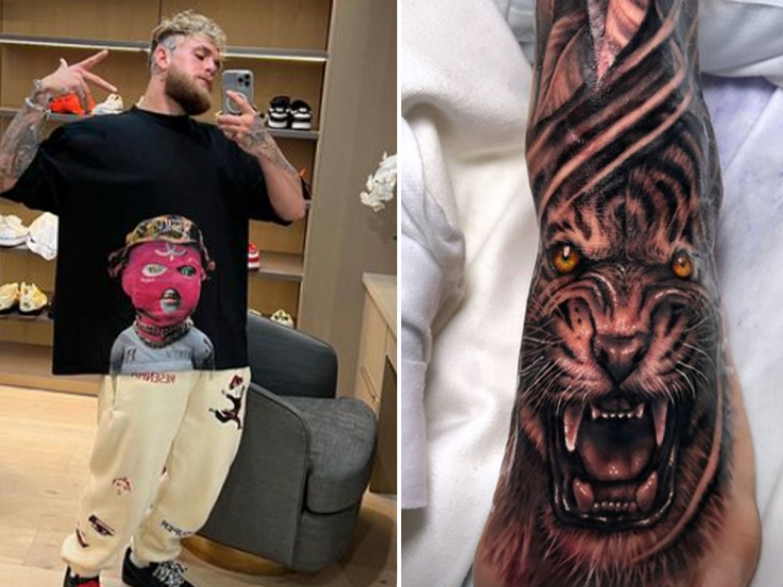
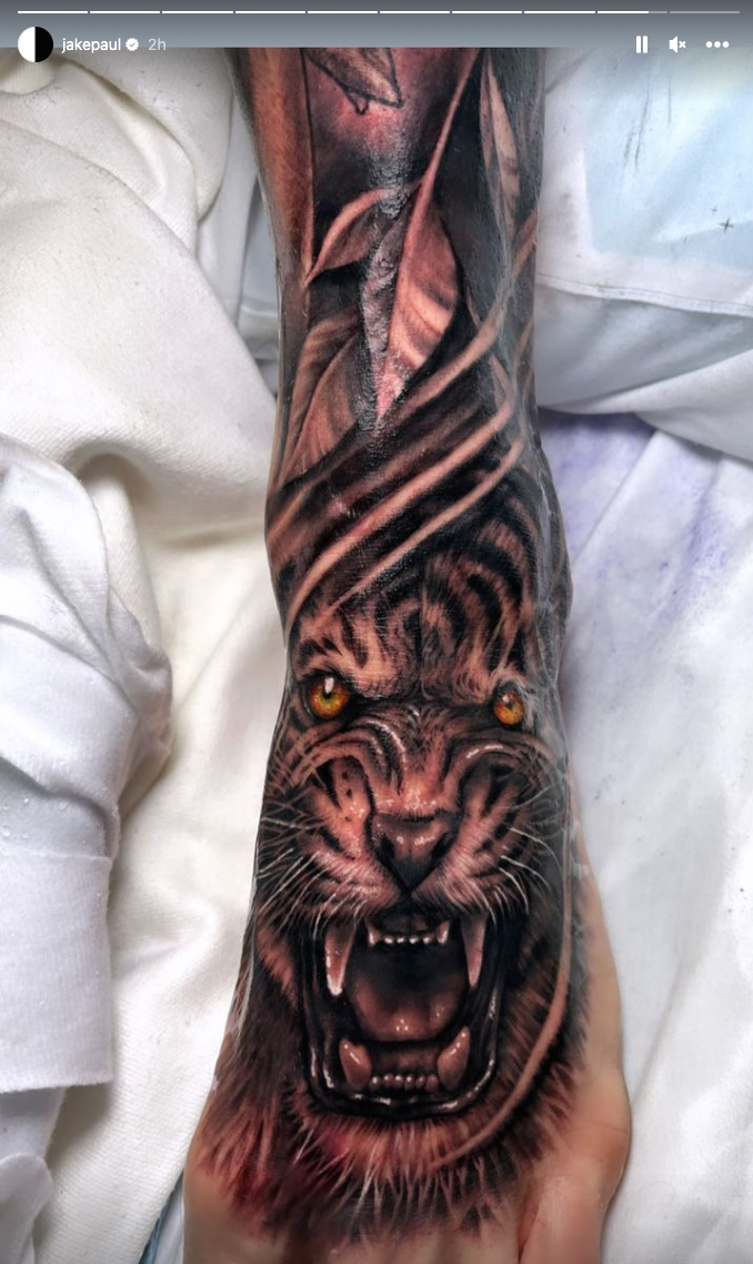
The tiger foot tattoo is one of the easiest Jake Paul pieces to recognise. The face sits low on the foot with the eyes, nose and open mouth doing most of the work. Warm colour in the eyes and fur gives it a fierce, almost alive feeling, while the darker stripes keep the design grounded. It reads immediately when he is wearing shorts or low shoes.
Foot tattoos are tricky because the skin moves, rubs against socks and takes daily wear. That makes a detailed animal portrait a serious commitment. The tiger works because the face is large enough to keep its main shapes clear. A smaller version could lose the eyes and mouth, so anyone borrowing the idea should be honest about the size needed for the detail to survive.
The long shape is useful too. Instead of placing a round tiger head in the middle of the foot, the tattoo stretches along the natural line of the leg. The stripes guide the eye upward, and the darker background makes the face feel connected to the rest of the body art. If you want an animal tattoo in a difficult spot, think about the body part first and choose an image that follows its shape.
Colour is another reason this piece stands out from the mostly black and grey work around it. The amber eyes become a small hit of contrast rather than a full bright palette. One controlled accent can make a large blackwork piece feel much more alive without changing the mood of the whole collection.
The angel sleeve turns the leg into a full scene
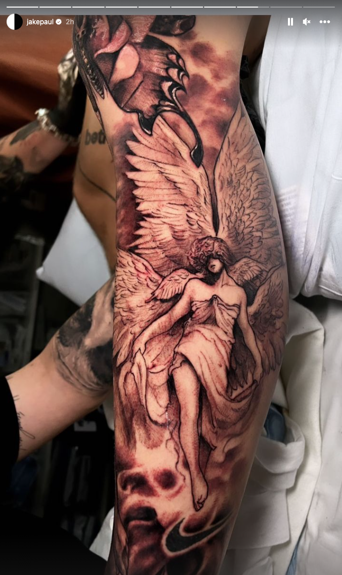
The angel and leg work create a very different mood. Instead of one isolated symbol, the tattoo uses a tall composition with wings, a figure and smoky shading that follows the length of the leg. It feels closer to an illustration or a book page than a simple flash tattoo, giving the viewer something to follow from the upper section toward the lower leg.
A long leg design needs a strong visual path. The wings and body provide that path, while the shadows act like transitions between separate sections. If every part has the same weight, the piece can look busy. Varying the dark and light areas gives the eye a place to rest and lets the main figure stay readable.
The figure also brings softness into a collection that includes tigers, skulls and heavy tribal shapes. That contrast helps the sleeve feel less one-note. You can use the same trick without copying the exact subject. Pair a hard-edged animal with a softer botanical section, or balance a dark mechanical piece with open skin and fine line work nearby.
Large leg tattoos need patience during planning. The reference should be checked from the front, side and back because the leg twists when you walk. An artist may change the size of the wings or turn the figure slightly so the main face stays clear. The best sleeve designs are made for the body, not pasted onto a flat template.
The torso tattoos mix lettering, skulls and movement
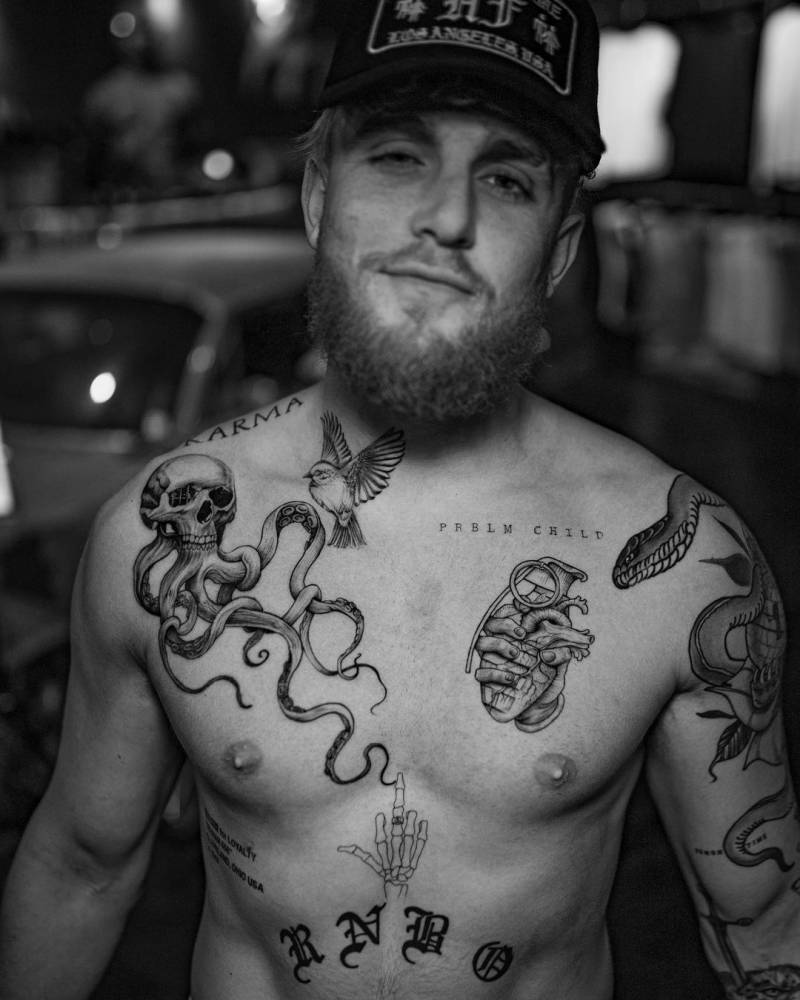
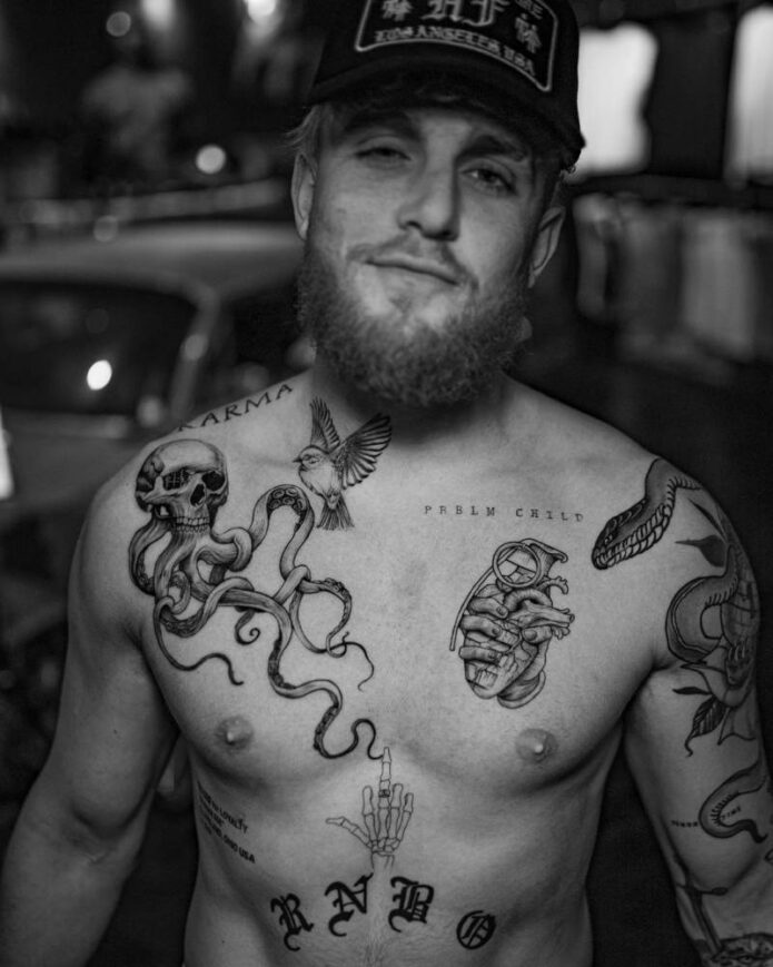
The torso is where Jake Paul’s collection feels most layered. The chest includes lettering near the collarbone, an octopus or tentacle form, a bird, a heart and other pieces that sit close together without becoming one solid block. The result is busy, but there is enough skin between the designs to let each image breathe.
The skull and tentacle work is strong because the shapes move across the chest instead of sitting like a sticker. Curved lines create direction, and the tentacles help join the upper and lower parts of the composition. This is a smart idea for anyone planning several chest tattoos. You do not need matching images if the lines and flow help them talk to one another.
The lettering is more restrained. Small words near the collarbone can be read at a glance, but they do not overpower the larger images. That balance matters on the chest, where too much text can make the area feel crowded. A short phrase is often easier to place well than a long sentence, especially if the body changes with muscle movement.
There is a useful mix of organic and symbolic shapes here. The octopus and bird bring natural movement, while the heart and lettering feel direct. That combination gives the torso a personal scrapbook feeling. It does not look like every piece came from the same catalogue, but the black linework and grey shading keep the overall look tied together.
The newer eleven-piece tattoo session added speed and variety
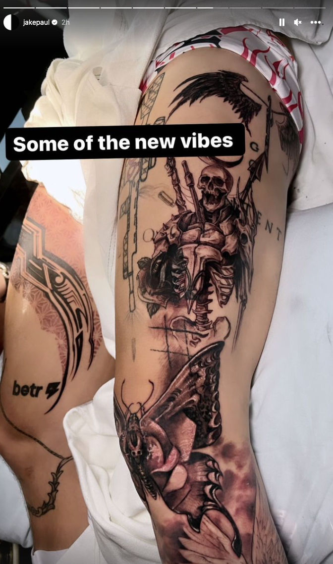
One of the biggest updates to Jake Paul’s collection came after an eight-hour session that added eleven pieces. The work included a shoulder, thigh, foot and much of the left leg, with several artists contributing during the same stretch. The images show a Polynesian-inspired design, a tiger, a skeleton, an angel and a butterfly among the additions.
That kind of session is unusual because most people build a collection slowly. Getting multiple pieces at once can make the body look dramatically different overnight, but it also creates a demanding healing period. Each tattoo needs room to settle, and several fresh pieces can make sleep, training and clothing much harder for a while.
The biggest design lesson is variety inside a clear visual mood. The subjects are different, but darker outlines and dramatic shading give them shared energy. That is a better way to plan a collection than forcing every tattoo to match exactly. Choose a common approach to line weight or contrast, then let the subjects reflect different parts of your life.
There is also a useful reminder about scale. A butterfly can sit beside a large skeleton without disappearing if the placement and contrast are handled well. The small piece becomes a pause between heavier images. When you plan a sleeve, leave breathing room so larger pieces do not turn into one wall of black.
The arm and rib work show his preference for personal symbols
Jake’s smaller tattoos add meaning that is not always obvious from a full-body image. He has spoken about a time-based tattoo connected with his late bodyguard Shadow, plus the Gotcha Hat piece tied to the incident around his brother Logan’s fight with Floyd Mayweather. He has also worn branding-related ink after making tattoo bets connected to business and boxing.
These pieces show why a celebrity tattoo collection cannot be judged only by visual style. A simple number or phrase can carry more weight than the biggest portrait. The design may look plain to someone else, but the story behind it changes how the wearer sees it every day. That is worth remembering before choosing a name, date or private reference.
The rib area is another example of how commitment affects the design. Paul has described a rib tattoo as taking around twenty-two hours, which says something about both the scale and the pain involved. Ribs give an artist a large canvas, but the skin moves with breathing and the area can be difficult to sit through for a long session.
If you like the idea of a meaningful symbol but do not want a huge piece, keep the central mark clear and let the surrounding decoration stay simple. A number can use clean type, a phrase can follow the ribs or collarbone, and a small object can be framed with just enough shading to make it feel finished.
How the full collection hangs together
At first glance, Jake Paul’s tattoos can look like a random pile of ideas. A closer look shows repeated choices: high contrast, bold outlines, dramatic figures, animals and placements that are easy to see during training or public appearances. Even the smaller tattoos tend to have a direct message or a story behind them.
His best-known pieces also use the body as part of the design. The tiger stretches along the foot. The angel follows the leg. The torso work moves across the chest rather than staying in one small square. Those choices make the tattoos feel more natural because the artist is responding to the shape of the body.
You can borrow that approach without copying any exact image. Start by choosing a placement and deciding how the tattoo should move when the body moves. Then choose a subject that supports the shape. A snake can wrap, wings can open across a shoulder, and lettering can follow the collarbone. Good placement often matters more than chasing the latest trend.
What to take from Jake Paul’s style
The first takeaway is to let the collection grow in chapters. You do not have to know what your entire body will look like before getting the first tattoo. Leave useful space, photograph healed work and see how the next design can connect to what is already there.
The second is to respect the difference between a portrait and a symbol. Realistic animals and figures need large enough placement, strong reference images and an artist who understands shading. A meaningful number or short phrase needs a different kind of care, especially around spacing and type. Matching the technique to the idea is what keeps the tattoo readable.
The third is to build contrast deliberately. Black and grey can still have variety when an artist changes line weight, texture and open skin. A small hit of colour, such as the tiger’s eyes, can work because it is surrounded by a mostly darker palette.
Finally, choose a story you can live with. Jake Paul’s ink includes jokes, business bets, memories, symbols and dramatic artwork. That mix is personal to him, which is why it feels more interesting than a perfectly coordinated set of random designs. The strongest inspiration is not copying the image. It is finding the part of the idea that actually belongs to you.
Jake Paul’s tattoos are a good reminder that a collection can be bold without being uniform. Use clear placement, give detailed images enough room, protect open skin and let meaningful pieces lead. Whether you want a tiger, a full leg scene or one small symbol with a private story, the useful part is the planning behind the ink.