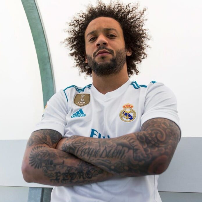
Marcelo Vieira’s tattoos look different each time he rolls up a sleeve. The former Real Madrid and Brazil left-back has ink on both arms, his hands and fingers, his legs and parts of his torso. Some pieces mark family, some football; others add to the black-and-gray style he’s built over the years.
The collection is busy, but the images aren’t random. His grandfather’s name, his children, shirt number, birth year and trophies appear in different places. A whistle, Celtic cross, contrasting faces, vintage car and large Jesus portrait bring different moods into the same look.
That makes Marcelo tattoos worth studying if you like sleeves that feel personal without sticking to one subject. Here’s a closer look at the main areas, the stories behind some of the best-known pieces, and how their placement works on a moving body.
Marcelo’s arms are the main feature of his tattoo collection
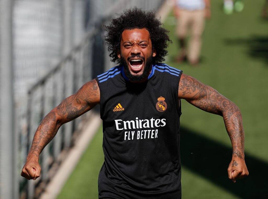
Marcelo’s sleeves are the first thing most people notice. Both arms carry dense black-and-gray work from shoulder toward wrist, mixing portraits, script, symbols and shading. The repeat use of dark outlines and soft gray keeps them from reading as a pile of unrelated stickers.
The arms don’t mirror each other. One has large “Carpe Diem” lettering and broad tribal-style work; the other shows the family name Pedro, a whistle, a cross, a vintage car, a Celtic cross and religious images. The difference gives each arm its own identity and makes the collection change as he turns.
Even a sleeve that looks spontaneous needs room for the main pieces. Faces and lettering need the clearest skin; smaller symbols can fill the spaces around them. Marcelo’s work has natural breaks between larger tattoos instead of shading every gap at once, leaving room for the collection to grow.
If you’re starting a sleeve, decide whether you want one continuous story or a series of memories. Marcelo’s leans toward the latter. The tone, scale and placement connect the images without making every tattoo about the same subject. A shared visual style can link different ideas without matching them exactly.
The Pedro tattoo keeps his grandfather close to his football story
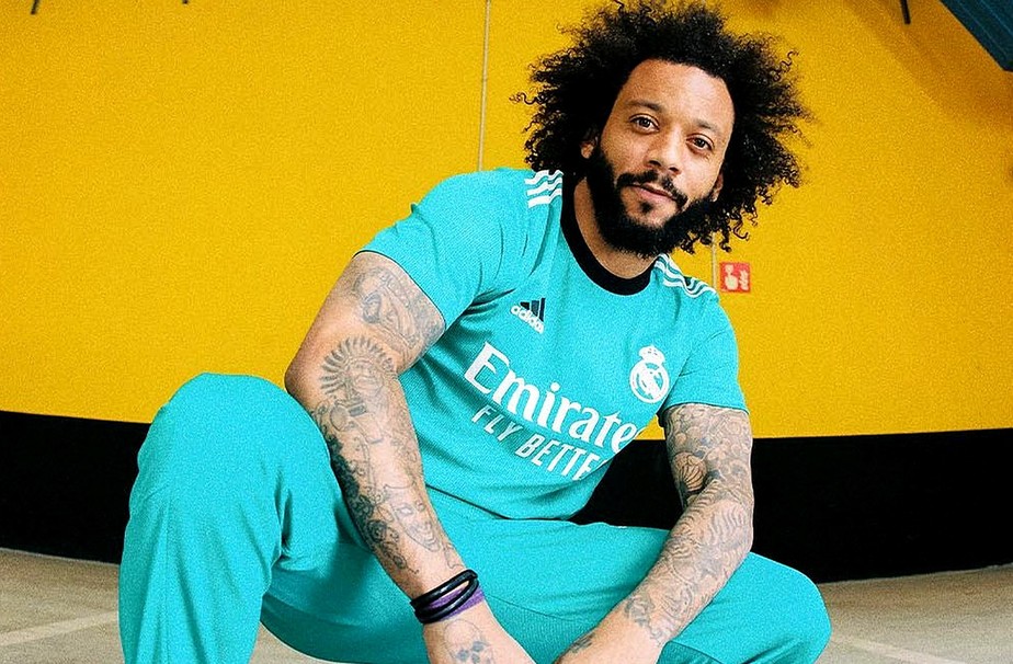
One of Marcelo’s most personal tattoos is the name Pedro on his right arm. Pedro was his grandfather, who supported him during the difficult start of his football career and the journey from Fluminense to Europe. The lettering points back to where that story began; it isn’t just another name in a sleeve.
The placement gives the tribute weight. It sits among larger designs, part of the arm’s overall rhythm but still easy to pick out. A name can stay visible without turning the whole tattoo into a literal portrait.
Marcelo has also shown a vintage Volkswagen Beetle connected to his grandfather. The car took him to early football sessions, giving the image a direct link to the name on his arm. It may seem like an unusual tattoo subject until you know the story; then it becomes a piece of family history.
A memorial often feels more personal when it includes a detail like that. A name says who the tattoo is for; an object, date or place can show why they mattered. One specific memory can say more than a generic tribute image. Marcelo’s arm pairs lettering with an object without crowding them into one design.
His football tattoos include a whistle, number 12 and the years that matter
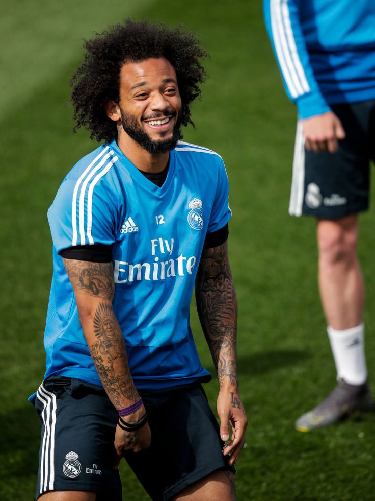
Football appears in several parts of Marcelo’s tattoos. A whistle sits on the front of his right arm; number 12, his shirt number, is on the left; and 1988, his birth year, runs across his knuckles.
These are smaller than a full sleeve, but they make the collection specific to him. A ball, trophy or club badge would be an obvious choice; a whistle and shirt number point more directly to the routines of playing. They’re details from inside the sport rather than generic symbols placed on top of it.
Number 12 is on the hand and fingers, which show in photos, celebrations and everyday gestures. Hand tattoos are hard to hide, so a simple number can be easier to live with than tiny, crowded detail. The same is true of wrist lettering: clear shapes tend to hold up better on skin that moves and gets exposed.
Marcelo has also added Champions League years and trophy imagery to his leg. They turn achievements into a timeline, with room for later seasons. A career tattoo can leave space for the next chapter.
The religious portraits and contrasting faces give the sleeves more depth
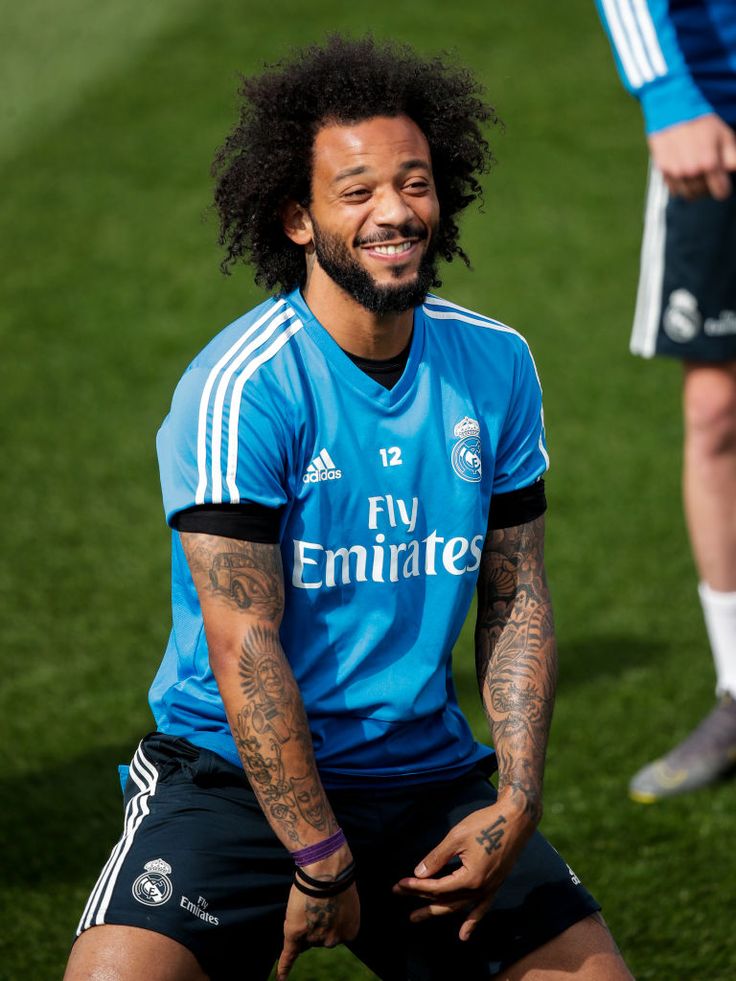
Football isn’t the only subject across Marcelo’s arms. His right arm includes a large Jesus portrait, a halo skull, an angel and a Celtic cross; another forearm has two contrasting faces that represent different emotions. The religious images bring a darker tone and give the sleeve several strong focal points.
A large portrait needs open space. The Jesus image sits high on the arm, where the bicep gives it a natural center. Clouds and shading connect it to the rest of the sleeve, while contrast keeps the face from disappearing into the background.
The paired faces work differently. They’re smaller and more graphic, so the contrast between them carries the idea instead of one realistic portrait. That change of scale gives the sleeve a new rhythm. Not every tattoo has to be large or detailed to catch the eye.
If you’re combining religious imagery with lettering or family tattoos, choose one focal piece for the area. A face, cross or angel can lead while smaller words and symbols support it. Several equally prominent images can compete, even when each one is well done. Marcelo’s largest portraits have room around them, which keeps the sleeve readable.
His legs carry trophy ink and another side of the collection
Marcelo’s legs give his tattoos more room than his hands and forearms. His thigh carries Champions League trophy imagery and the years linked to European wins. Other leg pieces include a dragon clown, a sign and number, and portraits of his dogs. The placement lets each design sit apart from the crowded sleeves.
The thigh works well for taller designs. A trophy can keep its shape, while a portrait or animal can follow the long line from hip to knee. It’s also easier to cover than a hand or forearm, which gives the wearer more choice if the tattoo is personal or visible ink is inconvenient for work or travel.
The trophy tattoo reads like a record of progress. The dates give it a career-scrapbook feel; the cup gives those years a clear center. A medal, ticket, jersey number or place could mark the same kind of milestone without copying a trophy.
Leg tattoos also keep Marcelo’s collection from being concentrated on his arms. If one area is already heavily covered, extending the work to the legs can balance the overall look. Use larger areas for designs that need space, and keep the most visible placements for marks you’ll want to see every day.
Marcelo’s tattoos return to family, faith, football, memory and the people who helped him grow. The designs don’t need to match because those stories connect them. If you like his style, start with a detail from your own life, then choose a placement and scale that keep it clear. The collection’s strength is how it records a life that kept moving.