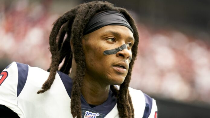
DeAndre Hopkins’s tattoos combine family history, peace symbols and different artistic traditions. The collection includes a tribute to his father across his back, a tiger over his chest and shoulder, the word “Metta” on his arm and a watercolor peace sign on his hand. In his GQ Tattoo Tour, Hopkins talks through the designs with the curiosity he brings to his football style. He likes moving between Japanese and American art rather than forcing everything into one matching sleeve.
The halo and wings tattoo remembers DeAndre Hopkins’s father
Hopkins says his favourite tattoo honours his father, who died when Hopkins was a child. The design includes a halo and angel wings across his back. He has explained that the wings represent his father’s legacy and the effect he had on his life.
The placement was practical as well as personal. Hopkins said he tried to keep the tattoo from his mother for as long as he could, and putting it on his back made that easier at home. It began as something he could cover, even though it later became one of the most recognisable parts of his collection.
Back tattoos are difficult to document in a front-facing interview. A shoulder edge or single feather does not show the full layout. A clear rear photo matters because it reveals how the wings spread across his back, rather than making one visible section look like a separate design.
Hopkins has also said he got his first tattoo at fourteen. It was a signature-style design done by a friend, and he has joked about the quality of the equipment. That early piece came before the more planned work that followed. Not every tattoo began with a professional studio or a detailed concept.
A tiger chest tattoo brings Japanese and American ideas together
The tiger was designed to fit the shoulder and chest.
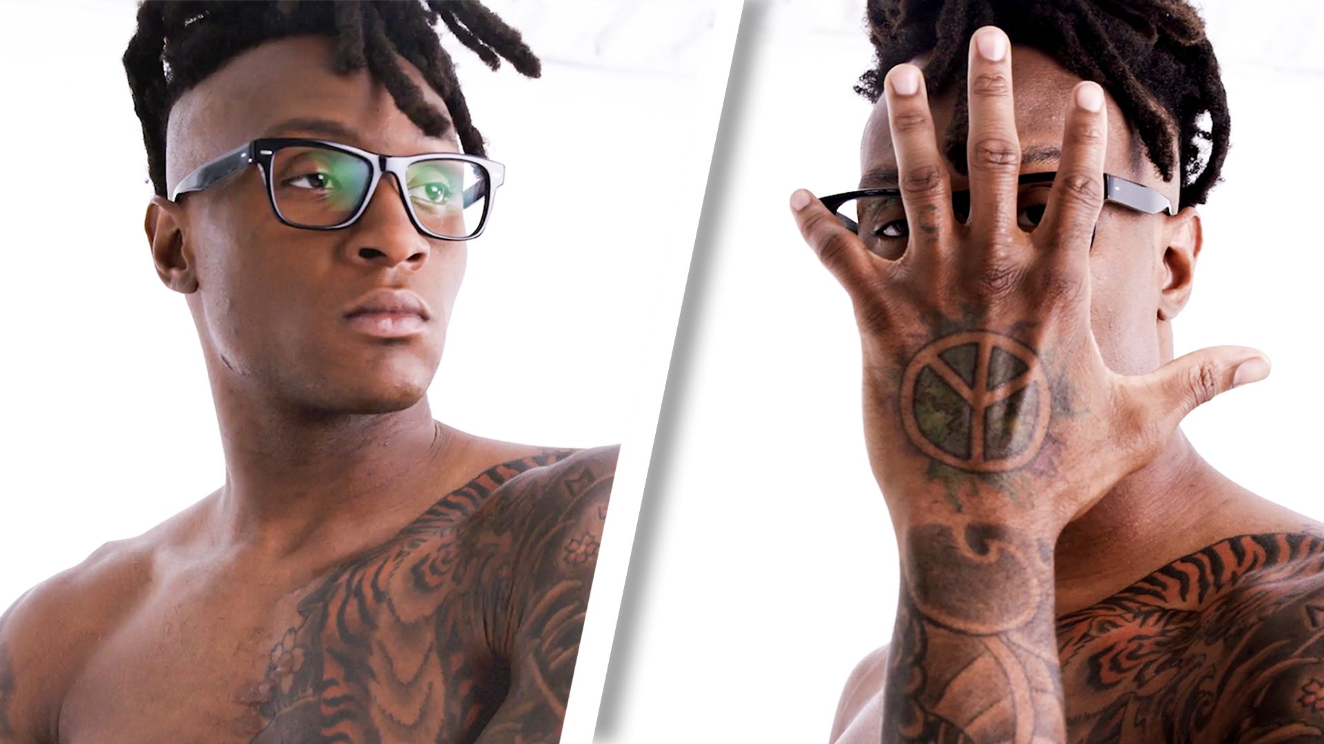
Hopkins says he came up with the tiger design and gave the Japanese tattoo artist a clear idea of the look he wanted. The result goes beyond a simple animal portrait. Stripes, flowers and surrounding shapes run from his chest onto the shoulder, so different photos show different parts of the piece.
He has said he enjoys switching between Japanese and American tattoo styles instead of making the whole collection uniform. The tiger is the clearest example: it draws on Japanese art, but sits within a broader mix of lettering, family details and newer colour work.

The tiger on Hopkins’s chest is among the boldest designs in his collection. He created the concept and worked with a Japanese artist experienced in tattooing tigers. Hopkins knew the style and overall look he wanted, while the artist brought their own experience to the finished piece.
The tiger reaches from the chest toward the shoulder, surrounded by flowers and patterns. In one photo the animal can seem like the whole tattoo, but the surrounding lines complete the design. A wide image shows the composition; the closer GQ frame makes the face and stripes easier to see.
Hopkins is open about bringing styles together. In the same conversation, he mentioned Japanese and American work, along with liking different eyes and viewpoints. That helps explain why the collection does not follow one visual language. The tiger can draw on Japanese art while sitting beside lettering and symbols from other parts of his life.
Sports photography can hide a lot of the chest. A jersey covers most of it, while a shirtless portrait reveals the tiger, flowers and work extending down the arm. The design has not necessarily changed when a game photo shows less of it; the clothing and angle have.
Metta and the watercolor peace sign hand tattoos show Hopkins’s interest in peace
“Metta” and the hand piece were meant to be seen.
The word “Metta” is on Hopkins’s arm, and he says it means world peace. The hand tattoo is separate: a watercolor peace sign that shifts from purple toward blue and green as the ink settles and the lighting changes. Hopkins wanted it on his hand so it would still show with a button-down shirt. The designs share a broad theme but deserve separate descriptions.
That distinction helps make the photos useful. The arm view shows the lettering, while a close hand photo gives the clearest look at the watercolor peace sign. A full-body portrait can show where both sit, but cannot replace a detail image of either one.
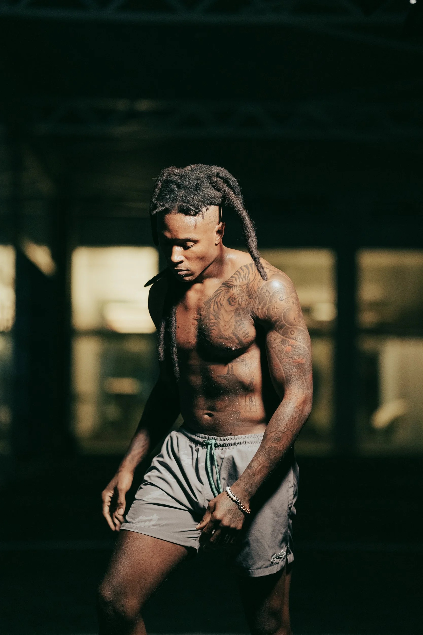
The word “Metta” sits on Hopkins’s arm. He says it means world peace, giving the lettering a clear purpose without needing a long theory. It is a small word, but its placement makes it visible among the other designs.
The watercolor peace sign stands out even more. Hopkins calls it one of his favourites and said it was his newest tattoo at the time of the GQ interview. He chose his hand because the design represents who he is and he wanted people to see it even when he wears a button-down.
He also notes that the colours shift in different light. The purple tones later appeared more blue-green. Colour tattoos do not look identical in every photo; lighting, healing and age can make the same ink seem warmer or cooler.
The peace sign is deliberately visible. The wings on his back began as something Hopkins wanted to hide from his mother, while the hand design sits where a sleeve or shirt cannot cover it completely. The two pieces show different sides of the collection: private remembrance and open self-expression.
Together, Hopkins’s tattoos are more than decoration on an athlete. The back holds his father’s memory, the tiger reflects his interest in art, and the peace designs express a value he wants people to see. The photos also have separate jobs: one shows the wings, the GQ close-up captures the tiger and hand work, and the full portrait shows how the areas connect.
Hopkins’s own comments keep the meanings grounded. He does not claim that every small mark has one grand explanation. He talks about styles, memories and the designs he wanted. That is enough: describe the placement, name the pieces he identifies and leave unclear details alone.
Smaller tattoos are easy to miss when Hopkins is in football gear. The peace sign may be partly hidden by a ball, glove or sleeve; lettering on his arm can disappear under pads and jersey fabric. A guide based only on game-day photos would make the collection look much smaller than it is.
Hopkins’s comments about drawing offer another clue to his approach. He says he enjoys creative expression and used to draw over tests and homework as a child, even when he had answered the questions correctly. The tattoos are not only designs taken from a catalogue. He talks about choosing a look, working with an artist and shaping the idea until it feels like his.
The Japanese influence is clearest in the tiger, but Hopkins says he likes different styles rather than treating one tradition as a rule for his whole body. The result combines clean lettering, a large animal, floral details, a peace symbol and the angel imagery on his back. Each area has its own look, and the tattoos share space on the same body.
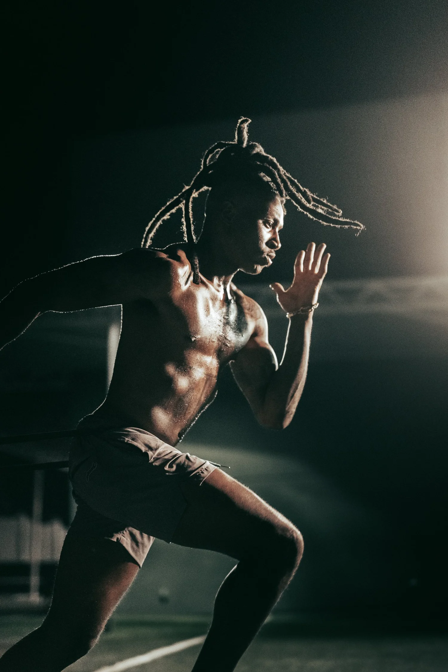
There is a timeline in the collection. Hopkins got his first tattoo at fourteen; the tribute to his father came from a more serious family memory. The tiger reflects a later interest in design and collaboration, while the watercolor peace sign was the newest piece during the GQ tour. A photo from one period should not be treated as a complete current inventory without checking its date.
The father tribute should stay distinct from the peace designs. Both matter to Hopkins, but in different ways. The wings honour someone he lost and the legacy his father left; the peace sign reflects how he wants to move through life and what he wants people to see. Calling them all inspirational tattoos would erase the details that make each one specific.
The colour also varies between photos. Hopkins says the watercolor sign moved from purple toward blue-green over time. Studio lighting can make the tiger warmer, while a dark rear shot can soften the wings. Those differences are normal and do not mean a tattoo was replaced or redone.
Hopkins’s collection works because it is personal without relying on one style. A family memorial sits beside an animal design, lettering about world peace and a hand symbol he wants people to notice. The clearest photos show one area at a time, and the strongest descriptions stay close to what Hopkins has said.
That balance is especially helpful for a heavily tattooed athlete. Some designs are easy to see from the sidelines, while others appear only when he chooses to show them. A careful inventory can identify the tiger, wings, Metta and peace sign, explain their stated context and leave the smaller uncertain marks open.
One thought on “DeAndre Hopkins’s Tattoos Put Family, Peace and Personal Style on Display”