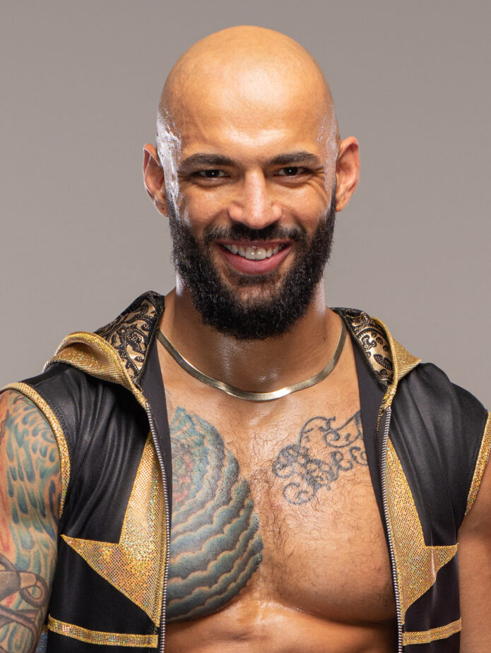
Ricochet tattoos are easy to spot because they match the way he moves. His left arm is packed with color and detail, while the chest pieces give the whole collection a clear center. Nothing feels hidden or overly delicate. The designs are built to read from a distance, which makes sense for a wrestler who spends most of his working life under bright lights and in motion.
His collection has a mix of traditional color, bold black outlines, script, and pieces that sit close together without looking completely planned as one giant sleeve. That slightly lived-in feeling is part of the appeal. You can see a dragon-like chest image, swirling shapes, lettering, and smaller details traveling down the arm. The result is recognizable even when he is moving across a ring or landing from a big spot.
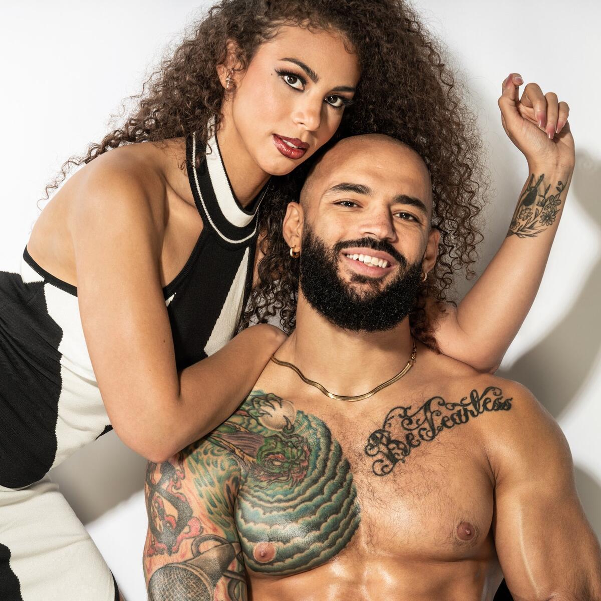
Ricochet has also shown his tattoos in very different settings. A staged portrait makes the colors and linework look crisp. A ringside photo shows how the sleeve changes when his shoulder flexes. A close crop lets you study the chest script and the way the ink sits against the curve of his body. Looking at those views together is more useful than relying on one generic portrait.
Here is a relaxed look at the main ideas in his tattoo style, plus some practical design lessons if you like colorful sleeves, visible lettering, and pieces that feel connected without being too neat.
The full left-arm tattoo sleeve does the heavy lifting
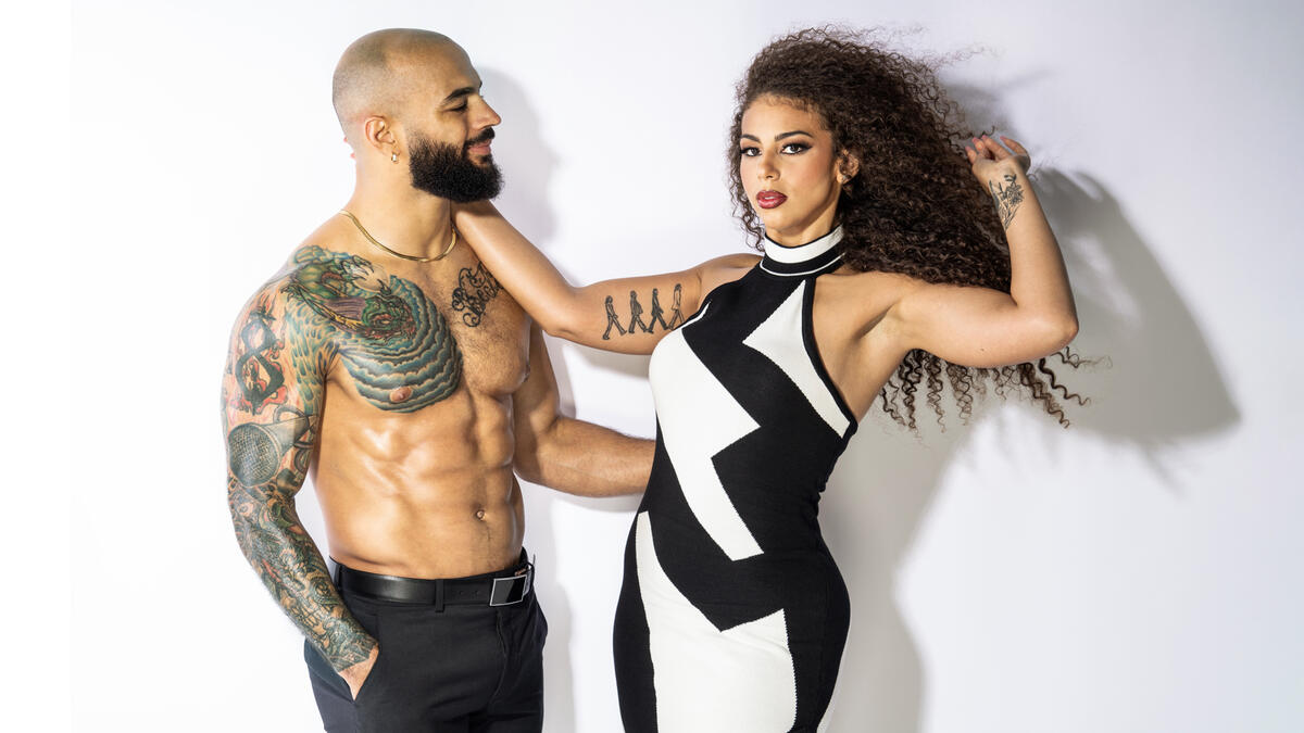
The first thing most people notice is Ricochet’s left arm. It is not a single flat block of blackwork. The sleeve has several zones, with color and shading doing a lot of the work between the larger outlines. There are warm red and orange notes, cooler green and blue areas, and plenty of darker shading to keep the arm from looking washed out under arena lighting.
That mix gives the sleeve a traditional feel, but the coverage is modern. Instead of leaving one tiny emblem to stand alone, the tattoos are allowed to build around the shape of the arm. The shoulder, upper arm, elbow area, and forearm all carry visual weight. From far away, the sleeve reads as one strong silhouette. Up close, it breaks into smaller scenes and textures.
The useful design lesson is flow. If you want a sleeve with this kind of energy, think about how one piece leads into the next. A tattoo does not have to share the exact same subject as its neighbor. Repeated line weight, a shared palette, or a similar background texture can do enough to make the collection feel related.
Ricochet’s arm also shows why negative space matters. Even with heavy coverage, the skin between shapes helps the main designs breathe. That keeps the sleeve from turning into one dark blur. When planning a colorful arm, leave room for the strongest shapes to stay readable instead of filling every gap just because the space is there.
The chest tattoo gives Ricochet’s look a clear focal point
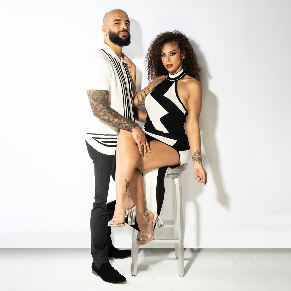
The chest is where his tattoo layout gets a strong anchor. The large colored piece sits high on the left side and spreads toward the shoulder, so it acts almost like a shoulder badge and chest panel at the same time. It is visible when he wrestles shirtless, but it also peeks out around open ring gear, which makes it part of his public look.
The shape works because it follows the body rather than fighting it. The curved lines move with the chest and upper arm, and the shading creates a sense of depth without needing a hard rectangular edge. That is a good reminder that big tattoos often look better when the artist designs for the body first and the flash sheet second.
There is also a nice contrast between the saturated color and the plain skin around it. The chest piece does not need a full background to be noticeable. Its outline, texture, and color changes already give it enough presence. For anyone considering a large chest tattoo, this is a useful approach: choose one main subject, give it a clear boundary, and let the surrounding skin help frame it.
His chest ink is also a good example of how placement changes the mood of a design. The same image on a forearm might feel more compact and private. Across the chest and shoulder, it feels bigger, louder, and more tied to performance.
The script across his chest adds a softer layer
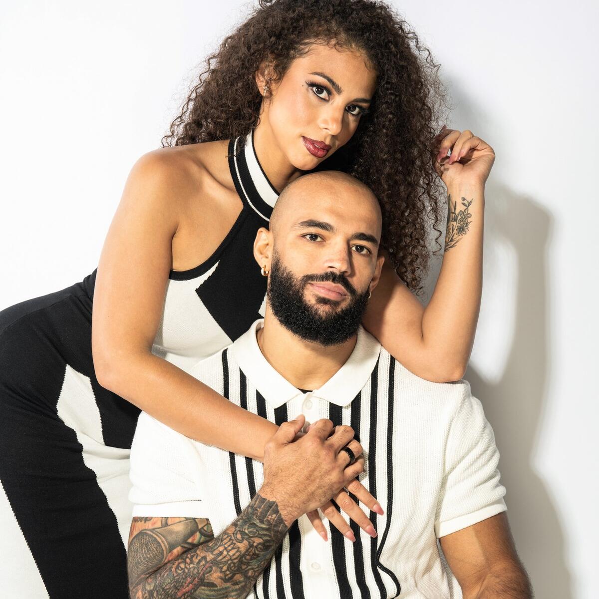
Near the larger chest design sits a sweeping script tattoo. The lettering has a softer rhythm than the heavier sleeve work, and that difference keeps the collection from feeling like one repeated texture. The script follows the chest line and gives the eye a place to slow down after taking in the color and dense shading on the arm.
Script tattoos can be tricky because the letters need to remain legible as the body changes shape. Ricochet’s placement works because the phrase is large enough to hold its own. It is not squeezed into a narrow wrist or hidden inside a busy sleeve. The open chest gives each letter a little room, and the curved baseline makes the piece feel intentional.
Good lettering needs breathing room. That is probably the biggest takeaway here. If you have a phrase that matters, do not shrink it just to fit a favorite placement. The right size lets the linework age more gracefully and keeps the words readable in photos years later. It also makes the tattoo feel like part of the person’s identity instead of a tiny detail people have to squint at.
The script also adds personality without taking over the whole look. It is a personal note inside a collection that is otherwise dominated by large images. That balance is worth copying if you like bold tattoos but still want one quiet, text-based element.
A full-body angle shows how the arm sleeve travels
A wider view makes the placement story much clearer. When Ricochet is standing in ring gear, you can see how the ink travels from the shoulder toward the elbow and forearm. The sleeve is not just something placed on a flat front-facing panel. It wraps around the side of the arm, which means the designs keep appearing as he turns or reaches.
That movement matters for a performer. A front-only tattoo can disappear when the arm rotates, while a wrapped layout gives the audience different details at different angles. Ricochet’s sleeve feels active because it changes with his stance. It supports the athletic look instead of sitting like a sticker on top of it.
For everyday tattoo planning, this is a useful way to test a design before booking. Stand in front of a mirror with your arm relaxed, raised, bent, and turned sideways. Ask where the main shape goes in each position. If the tattoo only looks right from one angle, it may need a little more wrap or a better focal point.
The wider photo also shows that the sleeve does not have to match the costume perfectly. It works with bright ring gear, dark street clothes, and simple shirtless portraits. Strong linework and a confident silhouette give it enough structure to survive changes in styling.
The older arm tattoos still read clearly in the ring
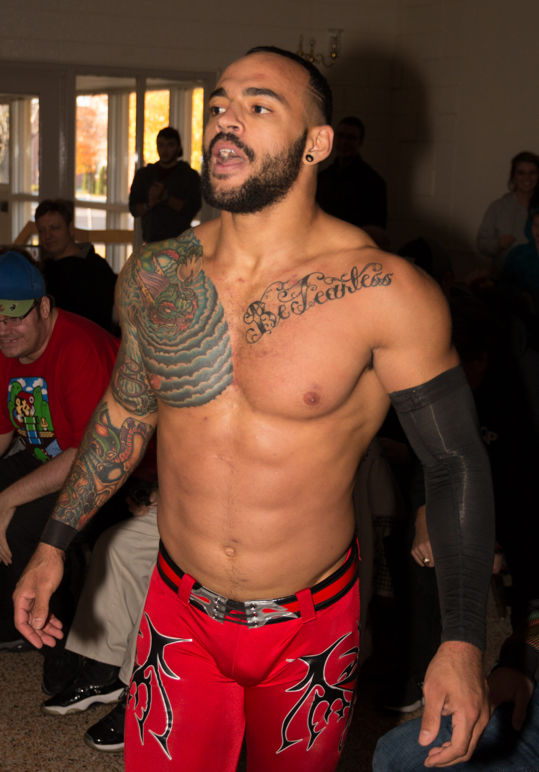
One reason Ricochet’s tattoos stand out is that they have been seen in motion for years. The arm work is not only made for close-up studio photography. It has to hold up while he is running, climbing, flipping, and landing. That gives the collection a practical quality. The shapes are clear enough to register quickly, even when the camera is not close.
Older tattoos can sometimes lose their edge when photographed in harsh light, but the larger pieces still have a readable structure. The main outlines remain easy to follow, and the color blocks keep the images from disappearing into the skin. That is a good argument for choosing contrast over tiny detail when a tattoo will be visible from a distance.
Readability is not the same as simplicity. A design can be detailed and still be easy to understand if its darkest lines, brightest areas, and main silhouette are placed well. Ricochet’s arm shows that you can have several ideas in one area without making every part compete for attention.
If you are building a sleeve slowly, this is also a reminder to leave yourself options. Start with the piece you care about most, then let future tattoos respond to it. A little planning around size and direction can make later additions look natural instead of forcing you into one rigid plan.
The color work keeps the sleeve from feeling flat
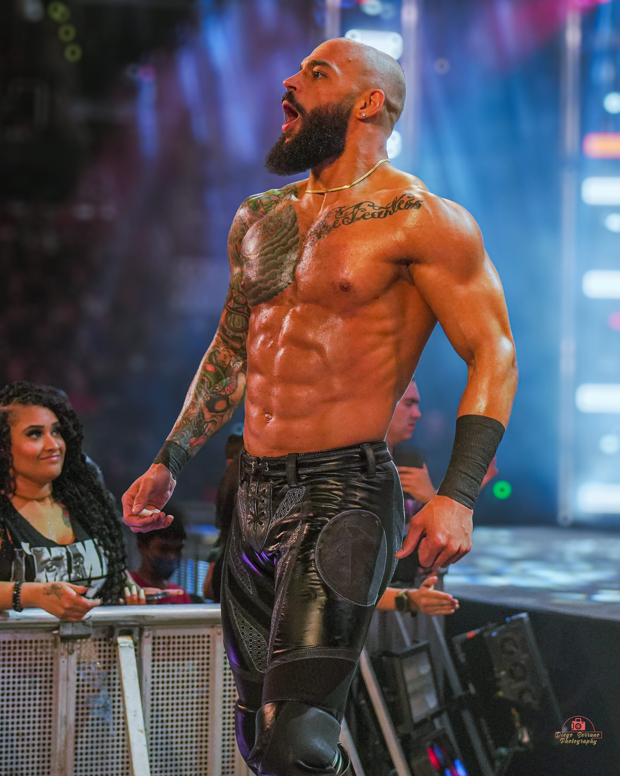
The color in Ricochet’s tattoos is not used as a soft wash. It helps separate the shapes. Greens, reds, and blue-gray shadows give the sleeve depth, while black outlines keep the edges firm. That contrast is especially helpful in a full-color arm because skin, lighting, and camera exposure can all change how the work looks.
Color also changes the mood of the chest. In a darker arena photo, the ink feels gritty and intense. In a clean portrait, the same work looks more illustrative. That range is a sign of a solid palette. The tattoos can look dramatic without relying on a filter or heavy editing.
If you like this approach, ask your artist how the colors will sit beside each other after healing. Fresh ink can look brighter than settled color. A thoughtful palette usually includes a few anchor shades, some skin breaks, and enough dark contrast to keep the design readable. You do not need every color in the tray to make a sleeve feel rich.
There is a practical side to the color choice too. Bright areas draw attention, so they can guide the eye toward a favorite part of the tattoo. Dark shading can then support the shape without stealing the spotlight. That kind of hierarchy is what makes a busy sleeve feel deliberate.
What Ricochet’s tattoo layout can teach about placement
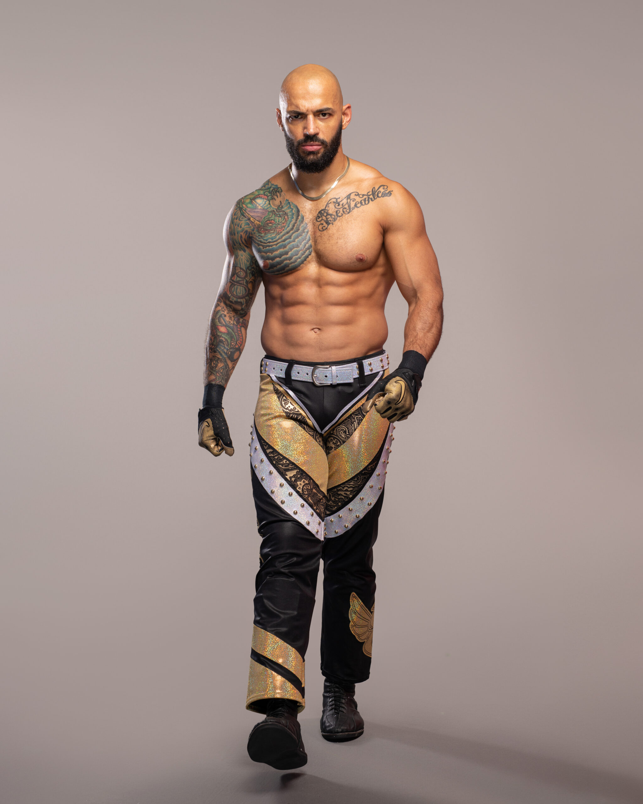
Ricochet’s collection is a useful study in placement because it combines three different scales. The arm sleeve is the largest visual group. The chest pieces create a second focal area. The script gives the eye a different texture and pace. Those layers work together without requiring every tattoo to follow the same theme.
The biggest lesson is to choose a clear starting point. If your favorite idea is a large upper-arm piece, let it set the direction for later work. If the script matters most, protect space around it so the words stay open. If you want an old-school sleeve, decide which colors and outline styles will repeat before adding small filler designs.
It is also worth thinking about visibility. Ricochet’s tattoos are easy to see during a match, which suits his career and image. That does not mean every tattoo needs to be public. You can borrow the same design logic on a shoulder, thigh, back, or rib placement if you want more control over when the work appears.
The strongest tattoo collections feel lived in. They show taste, history, and a little change over time. Ricochet’s tattoos have that quality. They are colorful, confident, and connected by the body they sit on, but they do not look like they came from one perfectly matching catalog page.
That is why his ink makes a good reference point. You can take the useful parts without copying the exact images: a bold main piece, a clear line of movement, a small amount of text with enough room, and a palette that still works when the lighting changes. Start with what means something to you, then let the rest of the design grow around it.