
Ed Westwick’s tattoos read like snapshots from different parts of his life. The actor, known for playing Chuck Bass, has song titles, short phrases, a feather, a pin-up, and smaller lettering across his chest, shoulders, and arms. His collection feels like a stack of memories rather than one planned costume.
The tattoos don’t all match, and Westwick hasn’t tried to make them look like one sleeve. A lyric, a symbol, or a phrase that makes him laugh can sit beside the next idea as the collection grows.
Westwick has talked in interviews about the Elvis reference on his chest and the Doors lyric on his shoulder. Close-up photos show the lettering; wider shirtless views show how the pieces sit together. Here’s a look at the main tattoos and the details behind them.
Heartbreak Hotel gives the chest a clear musical anchor
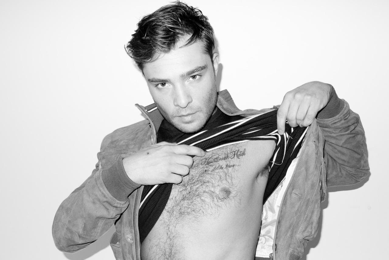
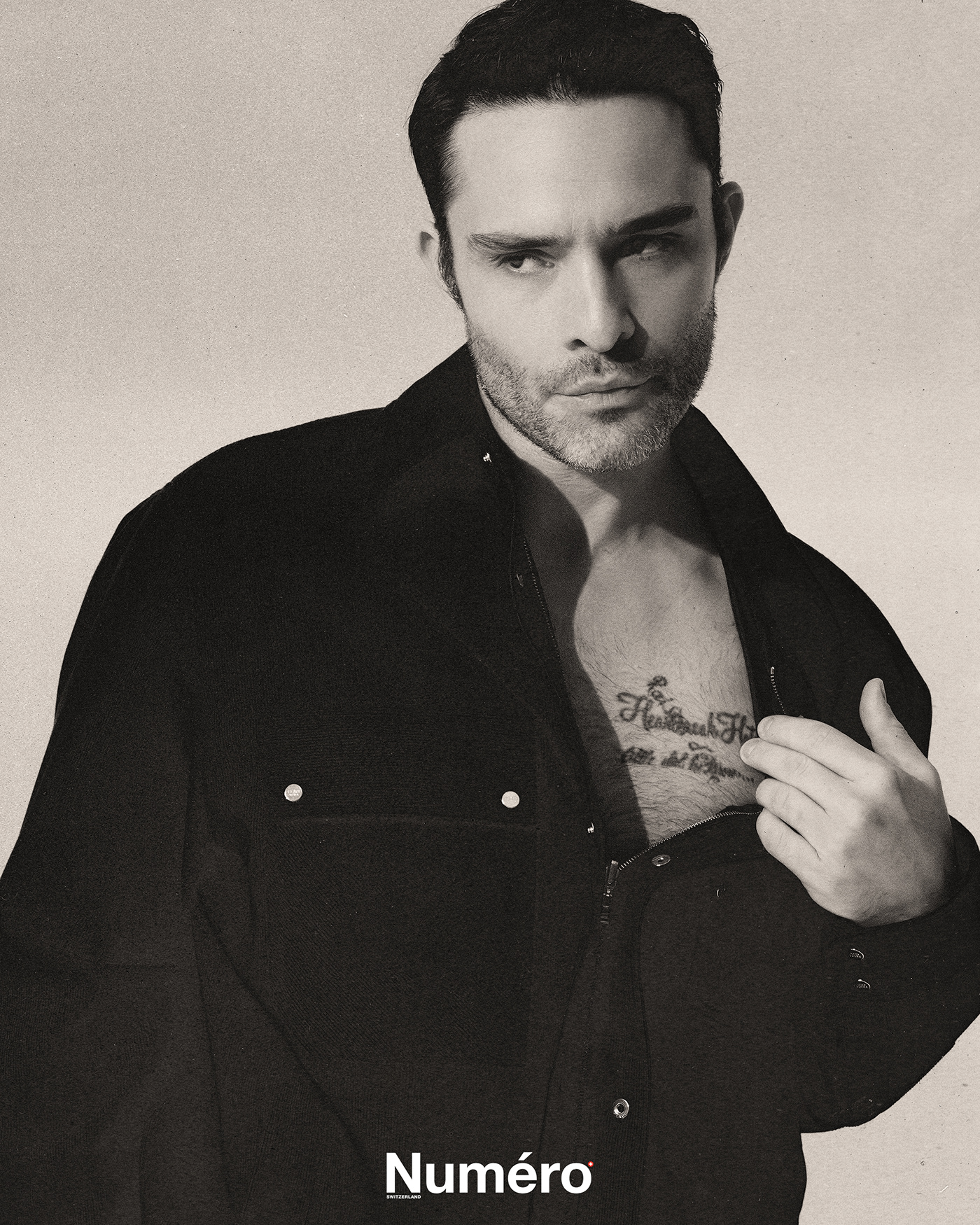
Westwick’s scripted “Heartbreak Hotel” sits across his chest. He has said it’s a nod to Elvis Presley. The words sit high enough to show when his shirt is open, making the tattoo part of his everyday look.
The script is loose and slightly rough, but easy to read. Chest skin curves and hair can soften the edges, so fine or tightly packed letters might disappear in a photo. Westwick’s lettering leaves room around each word.
A song title can give a chest tattoo its own mood without explaining a whole story. “Heartbreak Hotel” sounds dramatic, but it doesn’t spell out one specific breakup. If you want a lyric or title, choose a phrase that keeps a feeling, period, or artist close to you.
Chest lettering can be covered by a regular shirt and shown when the collar is open. That mix of visibility and control is one reason chest lettering stays popular. It can be part of your style without being visible in every setting.
The chest phrase gives Westwick’s collection a centre. From there, the smaller arm pieces draw the eye outward. The later tattoos don’t need to follow the same subject or line weight for the collection to feel personal.
21 Grams turns a small shoulder phrase into a talking point
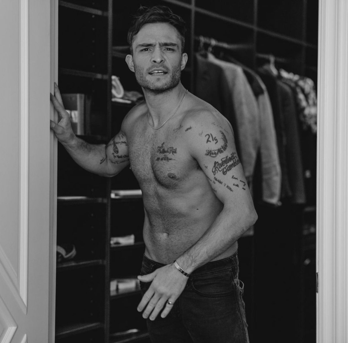
“21 Grams” sits below one of Westwick’s shoulders. The phrase refers to the old idea that the human soul weighs twenty-one grams. Whether you take it literally or like its mystery, the words are short and easy to recognise.
A shoulder gives a brief phrase enough room to sit by itself. Westwick’s placement separates it from the chest lettering, so the two pieces don’t blur together in a shirtless photo.
The tattoo doesn’t need an illustration around it. The spare lettering leaves the meaning open, and the shoulder keeps it away from the busier upper-arm work. Sometimes a small tattoo feels stronger because it refuses to over-explain itself.
Letter size matters. Tiny lettering can look sharp on the day it’s done and become harder to read as it ages. Ask your artist what size will hold up on your skin, then check the stencil with your arm hanging naturally. It may sit differently when you relax than when you pull your shoulder back.
The phrase adds a reflective note beside Westwick’s music references. Not every tattoo in a collection has to point to the same theme.
Love Me Two Times brings a Doors reference onto the shoulder
“Love Me Two Times” is a reference to a song by The Doors. The phrase sits across Westwick’s shoulder, working as music memorabilia and as a playful line of text. It’s longer than “21 Grams,” but the shoulder gives it room to follow the body.
A music tattoo could use an album image, band symbol, handwritten lyric, or a title that fans recognise. Westwick chose the words themselves. The design stays simple, but it gives people who know the song something to ask about.
The shoulder offers a natural path from the upper arm toward the back. Script placed across the muscle can look uneven from the side, so the stencil should be checked with the arm down and raised.
There’s restraint in keeping the title on its own. When the words are already doing the emotional work, a clean placement can be enough. That also leaves open skin for other tattoos later.
The Elvis and Doors references make Westwick’s collection feel like a record shelf: different artists and songs represented in different places. Choose references you expect to care about beyond the current trend.
I Heart Romance shows the value of a slightly odd idea

“I Heart Romance” is on Westwick’s forearm. He has said he saw the words written in a Brooklyn bathroom stall and thought they were cool, so he got them tattooed. It’s a more casual story than the Elvis tribute, which is part of why the tattoo sticks in people’s minds.
Some tattoos come from a phrase that makes you laugh or catches you at the right moment. Westwick put this one on his forearm, where other people can see it. It feels more like a conversation starter than a private message.
The inner forearm is a popular place for lettering because it’s relatively flat and the wearer can read it easily. It’s also visible in short sleeves and gets sun, so aftercare and sunscreen matter if you want the contrast to last.
If you find a phrase in an unexpected place, write it down and live with it for a while. Ask yourself whether you like the words themselves or only the story of where you saw them. A tattoo can start as a joke and still deserve a little planning before it becomes permanent.
“I Heart Romance” adds some humour beside the more deliberate music references. One tattoo can be researched; another can come from an impulse that stayed with you.
The feather and arm pieces make the collection feel lived in
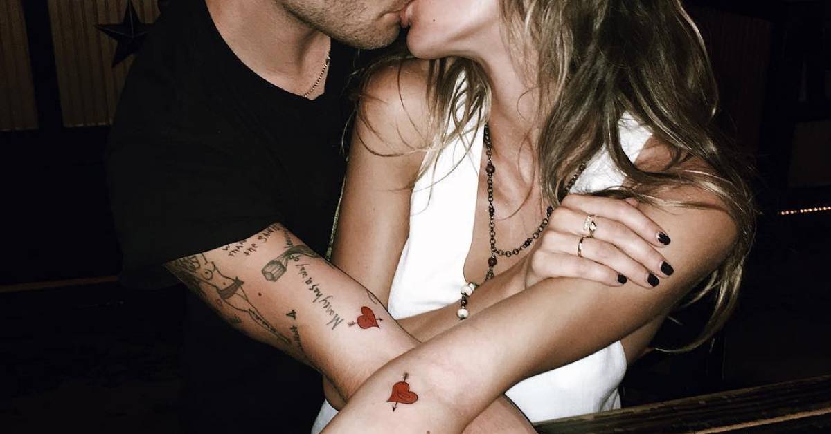
Westwick’s arm tattoos include a large feather on the back of his left arm and a pin-up on his upper right arm. Wider photos also show smaller lettering, much of it hidden when he wears a jacket. These pieces make the collection look like something built over years rather than a short list of famous tattoos.
The feather has a clear outline from a distance, while its barbs give the artist detail to work with up close. With different outlines and shading, feather tattoos can look delicate or bold. Westwick’s has enough weight to sit beside the larger upper-arm piece.
The pin-up has a more traditional, mischievous feel. Westwick has spoken about the tattoo and about his mother disliking it. You don’t need the same image to take the idea: a tattoo can record a family joke, a rebellious phase, or a sense of humour.
Smaller phrases sit around the arm work like notes from different years. If you’re adding a tattoo, consider the gaps as well as the image itself. You don’t have to fill a sleeve in one appointment; open skin can keep each piece readable and leave room for another idea.
Take a step back before choosing the next spot. Look at your arm with the elbow bent, straight, and resting at your side. The best next piece is the one that improves the whole arm, not just the empty patch you noticed first. Westwick’s collection gives the eye several different shapes and sizes to move between.
His tattoos don’t have one mood: Elvis, The Doors, a thought about the soul, a phrase from a bathroom wall, a feather, and a pin-up. Some were carefully chosen; others feel like snapshots of a particular age. If you like that approach, start with one idea you’ll still enjoy explaining years from now, give it room, and let the rest of the collection grow at its own pace.
One thought on “Ed Westwick Tattoos: Heartbreak Hotel, Arm Ink and 21 Grams”