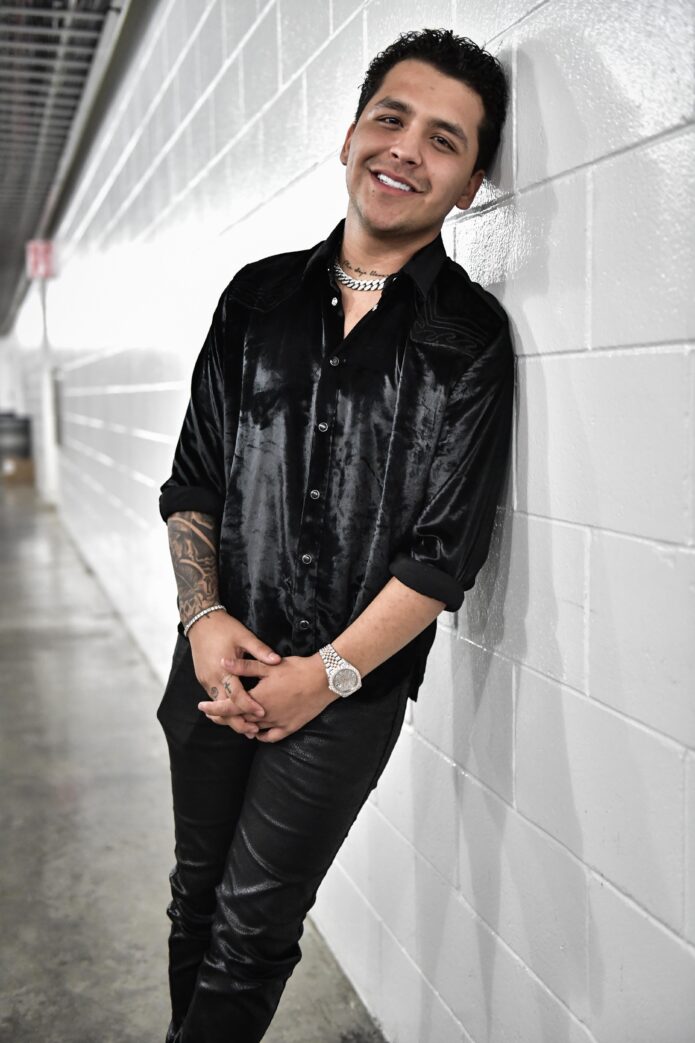
Christian Nodal’s tattoos are part of his overall look, but the designs don’t all do the same thing. His forearm carries the largest area of ink; smaller marks on his hands, neck, and chest add personal details. Blackwork, script, symbols, and shading make the collection look different from one angle to another.
A stage photo shows the bigger shapes. In a close-up, you can pick out lettering on his neck, a symbol on his hand, or the way one tattoo sits beside another. The collection has changed over time, and not every private meaning has been confirmed, so this guide sticks to the visible designs and their placement.
Here’s a closer look at the main areas where his tattoos stand out and how bold pieces can sit beside smaller ones without becoming a solid mass of ink.
The forearm sleeve carries the biggest visual weight
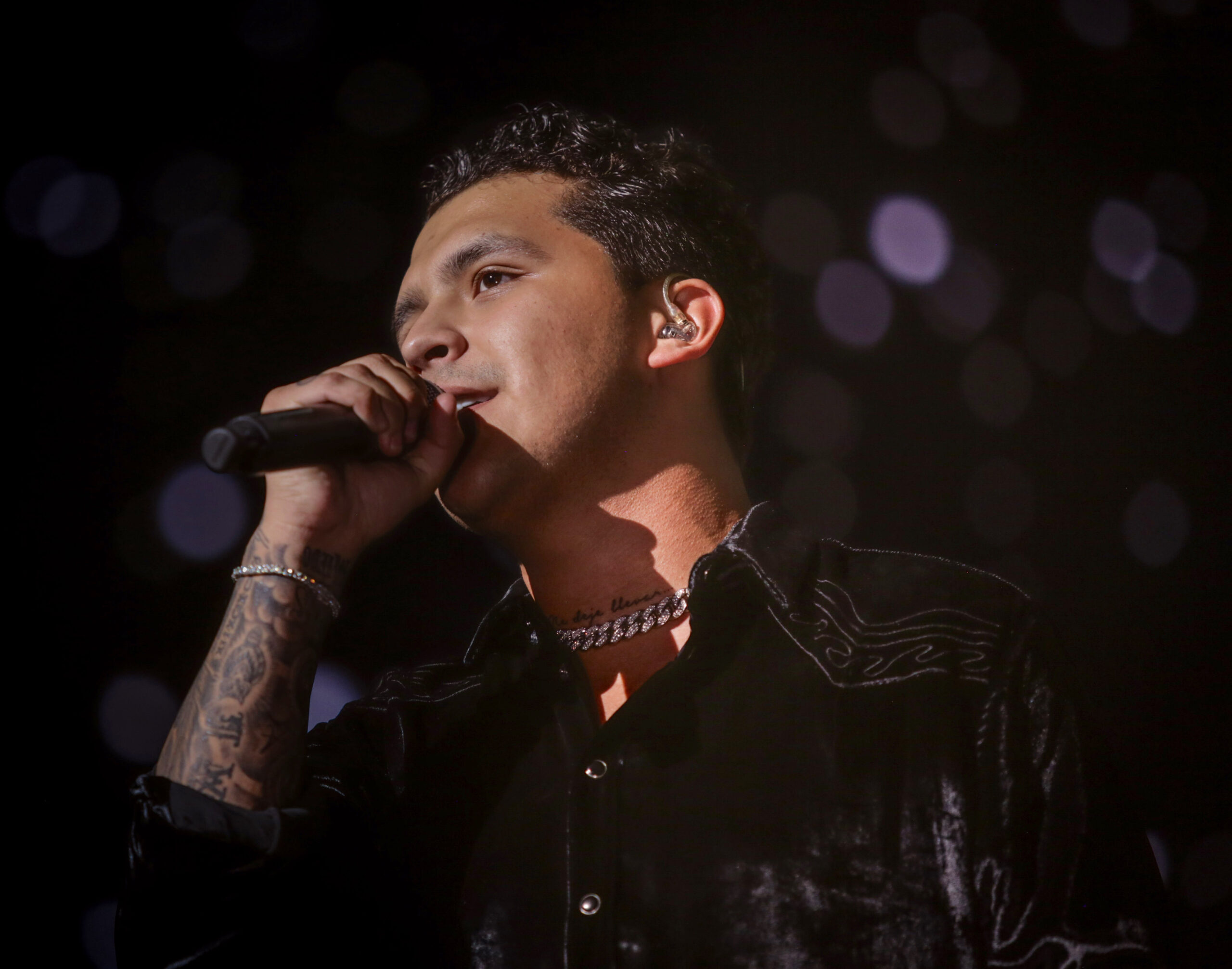
Nodal’s forearm is the first area many people notice. It holds several ideas, and the darker shading gives the arm a strong shape from a distance. In performance photos, the sleeve reads as one design before you make out its separate elements.
Up close, you can see the layers: dark shading, open skin, and lines that wrap around the arm instead of sitting in a rectangle. That matters on a forearm, which turns as someone sings, reaches for a microphone, or gestures. A design that only works from the front would lose its flow as soon as the wrist moved.
Design for movement. If you like this sort of sleeve, decide where the main image should sit with your arm relaxed. Then check it with your elbow bent and your hand turned. Nodal’s arm feels full without looking as if every gap had to be filled at once.
The dark palette helps the designs feel connected. They don’t need the same subject to share a sleeve. Similar line weight, shading, or contrast can create flow while leaving each image with its own space.
The forearm blackwork tattoo becomes clearer in a close view
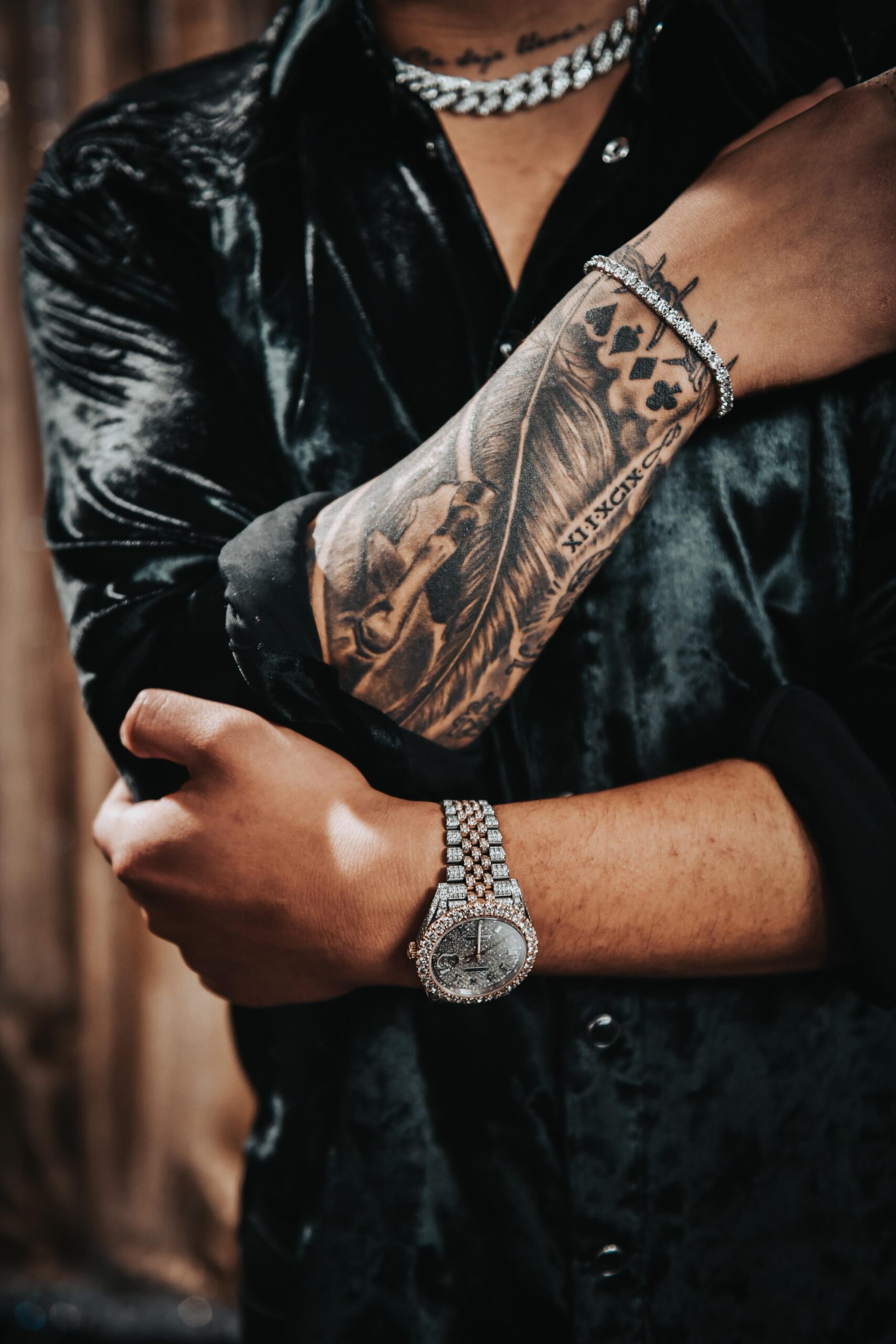
A wide shot shows how much ink Nodal has on his arm; a close-up shows how it’s put together. The forearm detail reveals changes in texture, patches of shading, and smaller marks set within the larger sleeve. Concert lighting can hide those details, so a clear close-up helps you see the linework.
The shading isn’t only there to make the arm darker. Some high-contrast areas draw the eye, while softer sections keep the sleeve from feeling noisy. That balance helps when several images share the same space.
There’s a loose quality to the lines. They don’t look like logos arranged at equal distances; that slight irregularity makes the tattoos feel lived in. Expressive lines can feel relaxed and still be finished when the overall composition is clear.
If you’re using these photos for reference, show your artist texture and movement, not just a celebrity portrait. Ask which shapes need to read from a distance and which details can be seen only up close. That will help you decide what to keep bold.
The hand and finger tattoos add a smaller scale
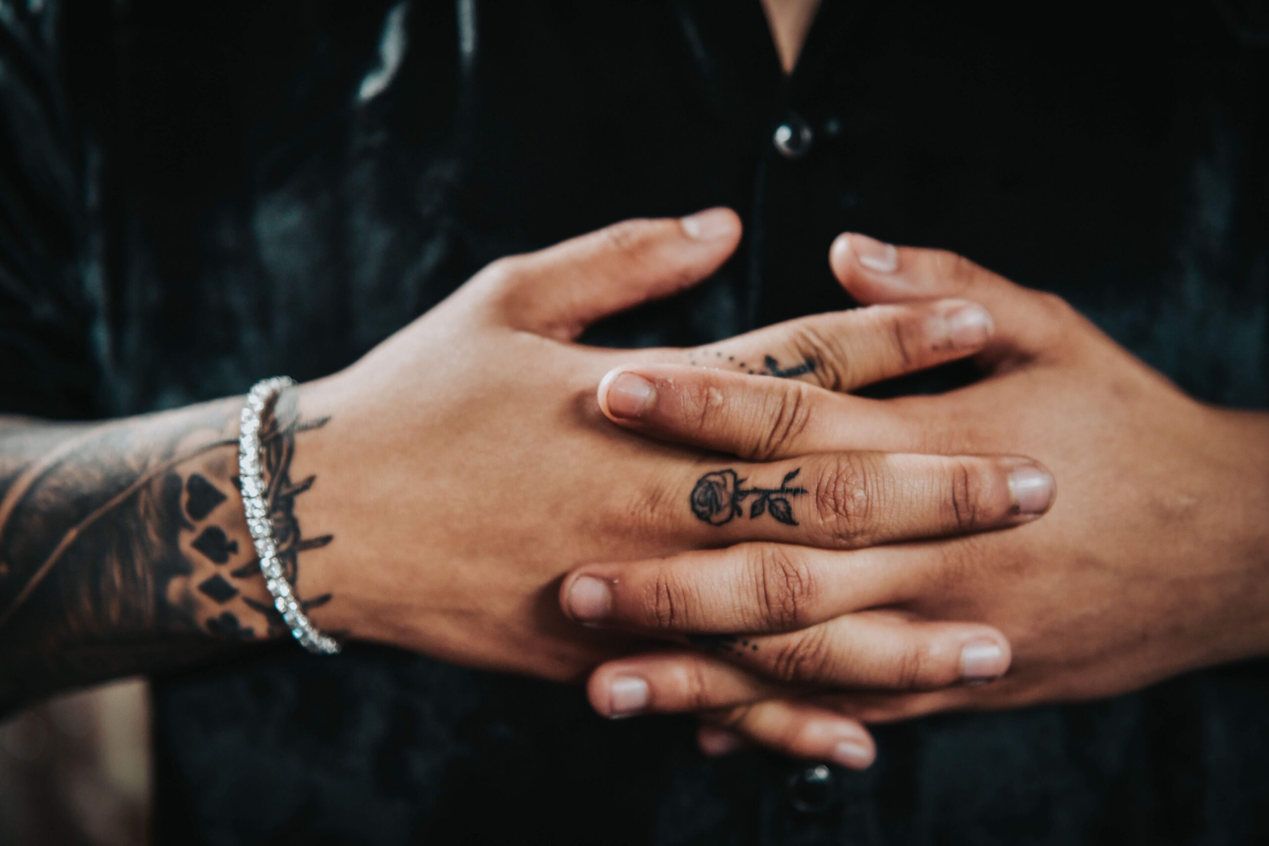
The hand and finger tattoos change the pace of the collection. After the larger forearm work, the smaller marks feel quick and direct. They come into view when Nodal moves his hands, then disappear when he curls his fingers, which makes them feel more private than the arm sleeve.
Finger tattoos have their own limits. The skin is always moving, gets washed and rubbed often, and small details can soften faster than on the upper arm. Nodal’s hand photos show why simple shapes and clear lines suit the area. The symbols don’t need much shading to register.
Small marks often give a collection its personality. A symbol, letter, or brief reminder can stand on its own without an explanation. Hand ink can also be added after a sleeve; the different scale keeps it from competing with the larger design.
Still, a hand tattoo is a visible choice, and fading can be obvious. Think about how it will look at work, in photos, and during everyday tasks. Look for healed examples, not only a fresh tattoo.
The neck script works like a personal headline
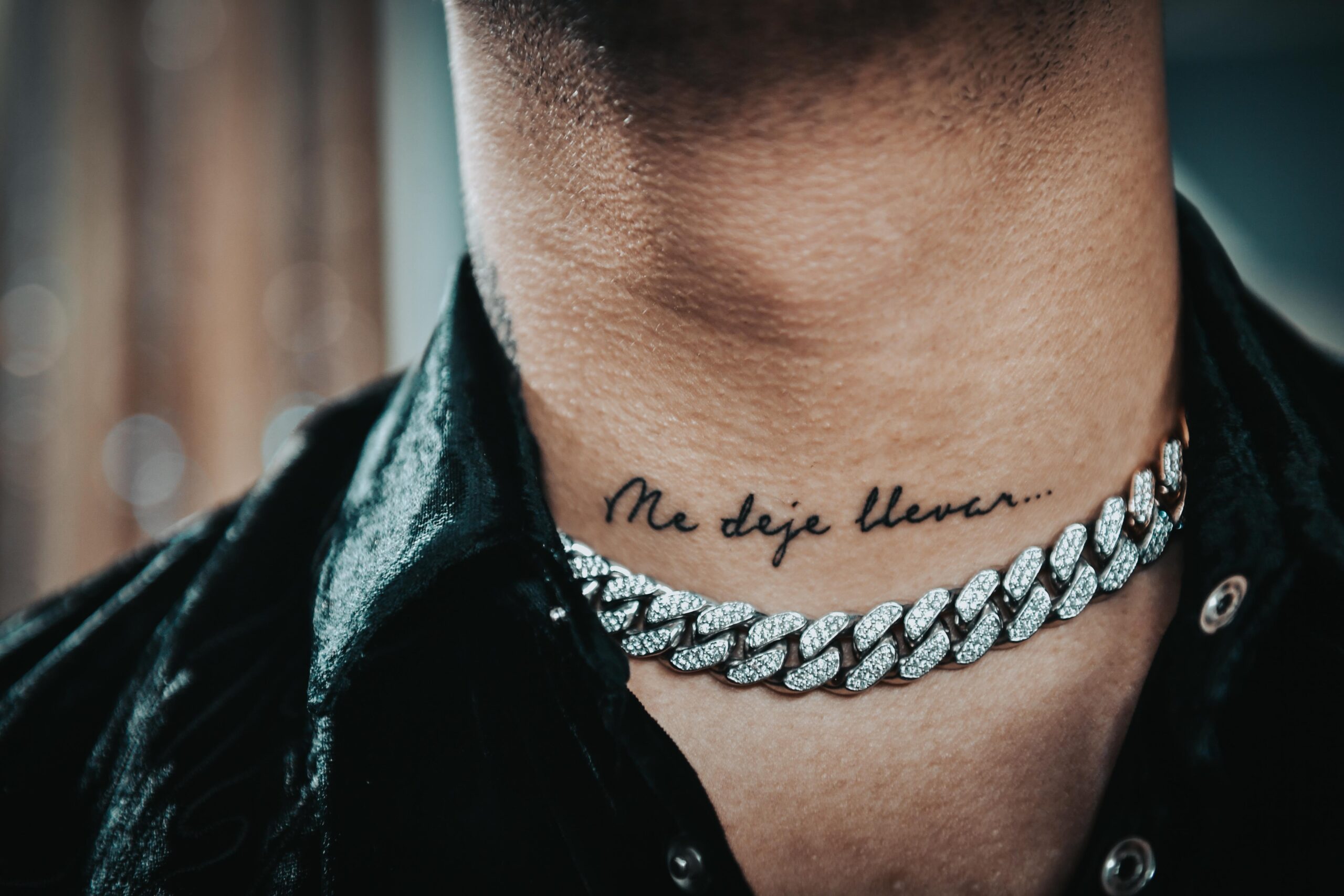
The script on Nodal’s neck is easy to see because of where it sits. The phrase “Me dejé llevar” follows the curve of his neck, almost like a title for the collection. It’s visible without becoming a large image beside his face.
Neck script depends on spacing. The letters need room to stay readable as the skin turns, and a tight line that looks elegant from the front can be harder to read from the side. A short phrase is often a better fit for a narrow area than a long paragraph.
Lettering works best when the words and placement suit each other. Test the phrase against the actual shape of the body part. Think about the most common viewing angle, how the lines might age, and whether the handwriting fits the words. The lettering should feel chosen for the person wearing it.
The neck design also links the chest and arm. A single short line can help the eye move between different tattooed areas without needing a matching border.
The chest work changes the balance of the collection
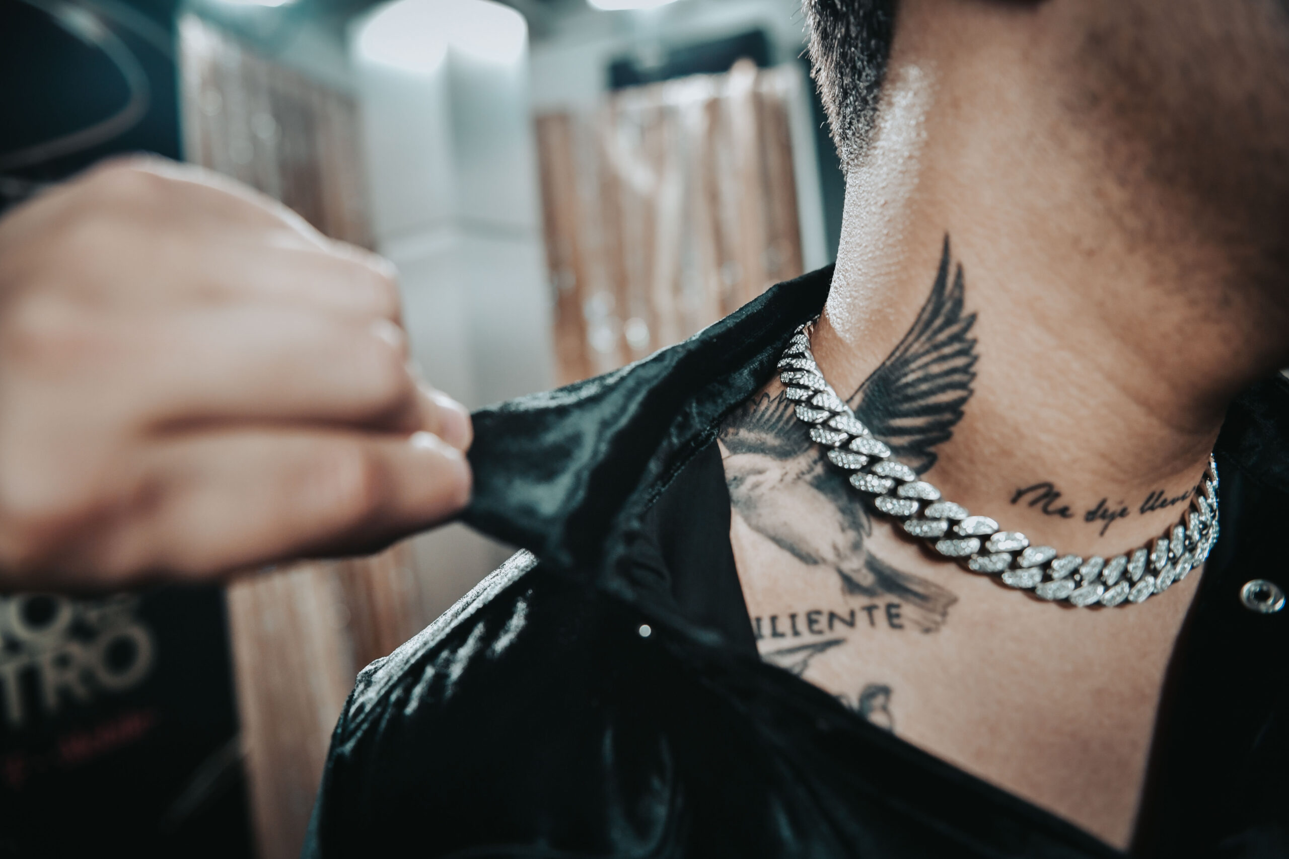
The chest work adds weight near the center of Nodal’s upper body. Arm tattoos appear from different angles as he moves; chest pieces sit closer to the middle of the frame, especially when a shirt opens or a performance outfit leaves more skin visible.
The chest shapes have more visual mass than the narrow line of script on his neck. That change in scale keeps the upper body from feeling repetitive. If every tattoo has the same size and density, there’s nowhere for the eye to rest.
Open skin around the tattoos helps keep their edges clear and leaves room for future additions. Breathing room can make a heavily tattooed body look more considered than filling every gap as soon as possible.
Chest designs also move with the body. The chest expands and the shoulders roll, and the ink may sit under clothing much of the time. Use references on a real body, not just a flat drawing, and check how the lines look standing, sitting, and moving.
Nodal’s tattoos have a clear style but leave room for different kinds of designs. The forearm makes the strongest statement, the hand adds smaller details, the neck brings in readable script, and the chest gives the upper body another focal area. The designs don’t need to match to belong together.
If you want a similar feel, think about how the tattoos will relate, not how closely you can copy them. Start with the piece that sets the mood, then consider the size, direction, and contrast of the next one. A little planning can make a mixed collection feel connected without looking manufactured.
Let the tattoos grow with your life. Keep the designs personal, give each placement enough room, and work with an artist who can adapt your references to your body. Nodal’s ink feels like a record of different chapters, rather than one look planned all at once.
For a closer look at Nodal discussing his tattoos, watch the interview below.