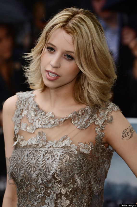
Peaches Geldof’s tattoos were part of her everyday style. The bluebirds, script, hearts, and long daisy chain showed up in photos alongside her clothes and movement. Her collection looked gathered over time, with different designs sharing the same body rather than following one plan.
That is what makes Peaches Geldof tattoos worth a closer look: they combine fine colour, flowing script, small symbols, and larger pieces that move across the body. Some photos isolate one tattoo; others show how several sit together. There isn’t a single theme tying every piece to the next.
This guide sticks to visible details and documented designs. A tattoo’s meaning belongs to the person wearing it, so the focus here is on placement, linework, and how different ideas share the skin. If you like a collection that grows over time, Geldof’s offers a few useful ideas.
Peaches Geldof’s daisy chain turns one tattoo into a moving line
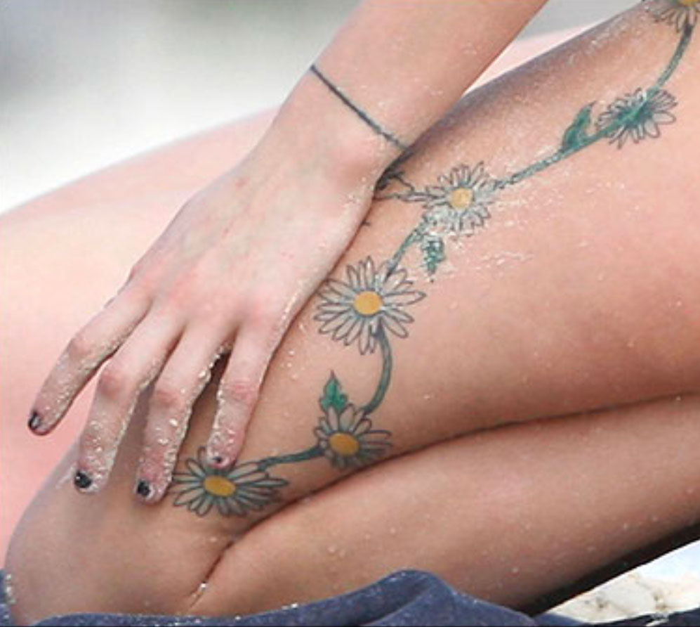
The daisy chain gives this part of the collection its shape. In close photos, the flowers curve along Geldof’s thigh and continue up the side of her body. The vine links them, and the yellow centres and pale petals stand out against the skin.
A chain like this can follow the body’s curves. The thigh, hip, and ribs don’t form a flat surface; the vine bends as the body moves. The open skin around it is part of the design too.
The flowers change in size. Some are clear at a glance, while the fine stem and small leaves show up when you look closer. A repeating motif does not need to be perfectly identical to feel connected. Slight differences give a hand-drawn piece a looser feel.
For a floral chain, decide where you want the eye to land. A larger bloom can anchor the thigh or hip, with smaller flowers tapering toward the knee or ribs. Leave room for the skin to move; packing the whole area can make the line harder to follow.
Her red-carpet portraits show arm ink in context
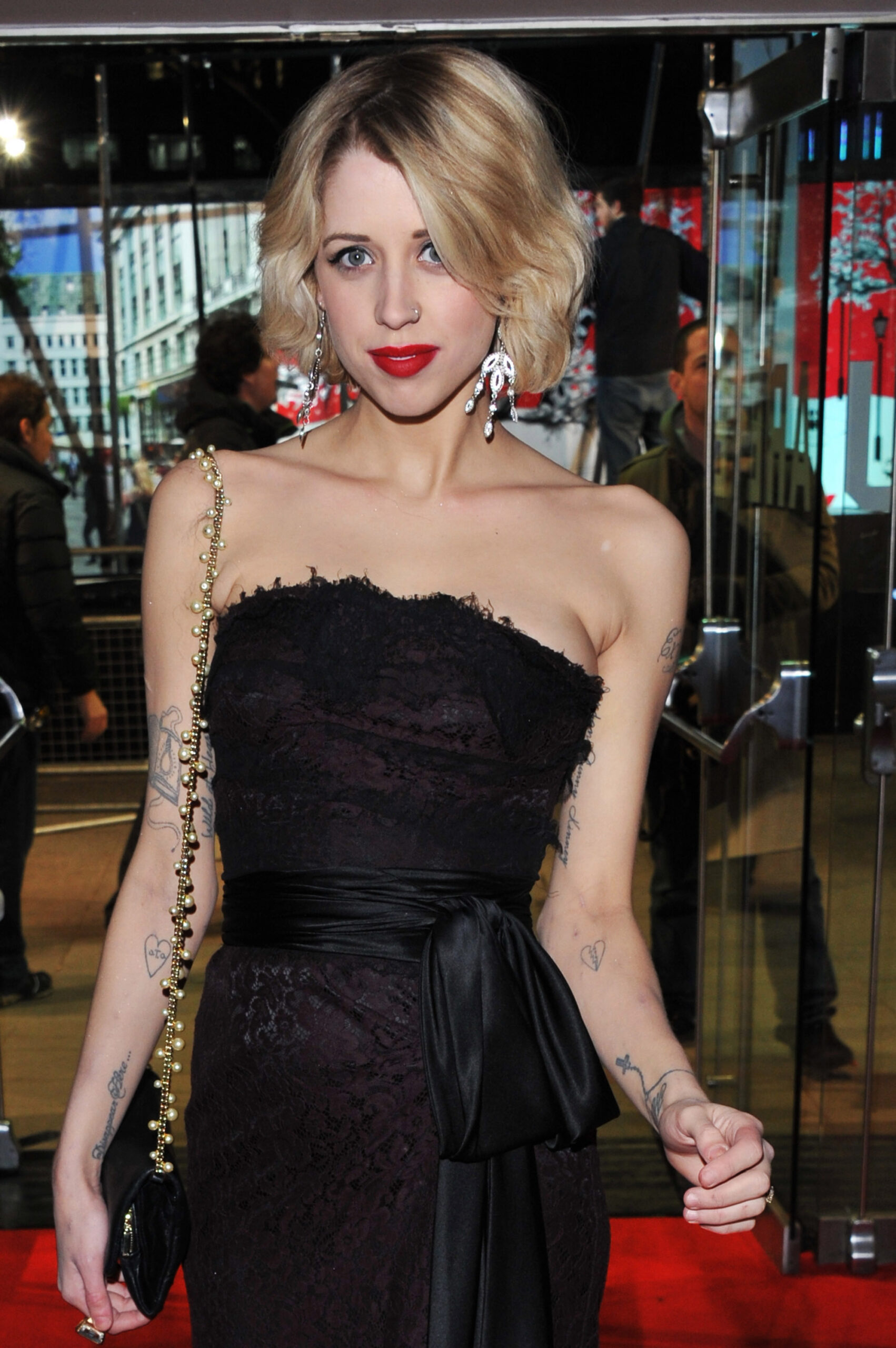
Event portraits show how Geldof’s arm tattoos sat with her clothes and posture. Script appears against bare skin, with smaller marks lower down near the wrist. In photos where she’s standing, turning, or holding a bag, the ink looks like part of her everyday style rather than a display arranged for the camera.
The arm combines clean lettering with lighter decorative lines. That leaves space around the words. A short phrase can hold attention while a heart or bird nearby adds another detail without filling the whole arm.
Placement changes what a tattoo feels like. Clothing can cover an upper-arm piece, while wrist and forearm ink shows during ordinary gestures. Geldof’s photos include both: some designs are immediately visible, others take a closer look.
If you’re planning script on your arm, check how it looks from different angles and with your arm hanging naturally. Think about how sleeves, straps, and movement will frame it. Good placement lets a small tattoo feel intentional without asking it to fill the whole limb.
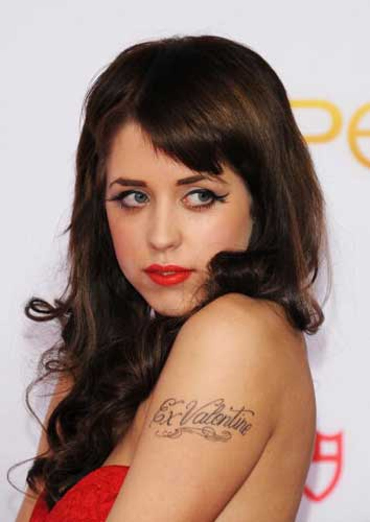
The arm script makes personal names part of the everyday look
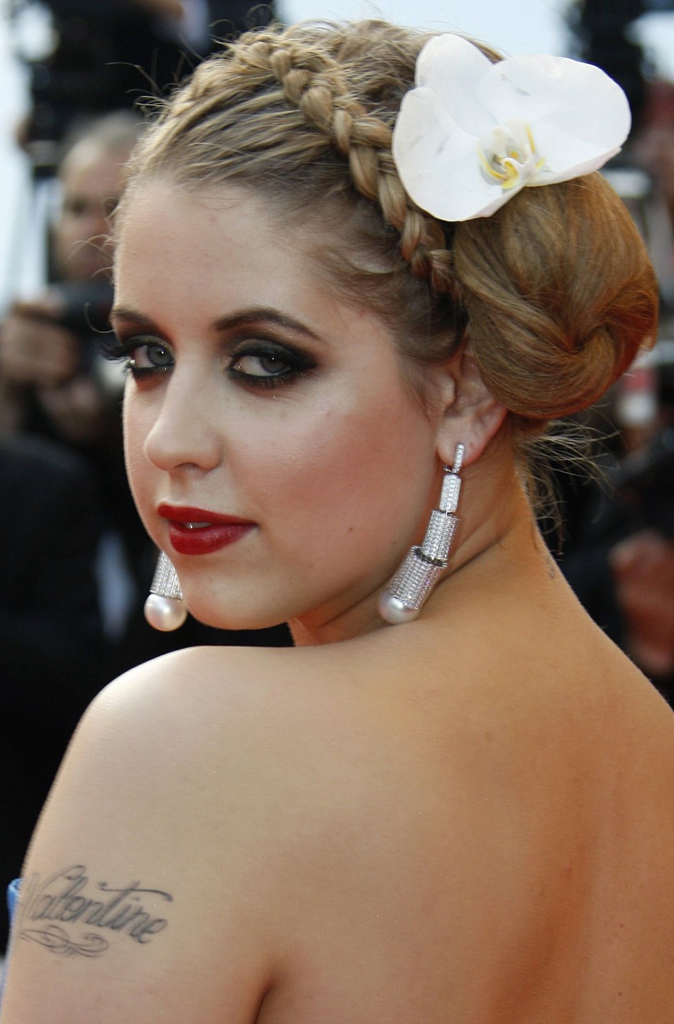
Geldof had several script tattoos on her arms, visible in event photographs. They show up when she raises a hand, reaches for a bag, or turns toward a camera. Arm lettering is hard to keep private; it becomes part of the way a person presents themselves.
The letters are modest in scale, with flourishes that extend beyond the words. Those curves add movement, but the lettering still needs to be easy to read. Near a shoulder, elbow, or wrist, a few details can finish the design; too many can crowd it.
The script sits between the mood of the floral chain and the larger back piece: direct enough to read, with a decorative style that fits beside symbols and flowers.
If you’re considering a name tattoo, check it when your arm is relaxed, bent, and turned away. Placement can make a simple word feel private or prominent. Placement can make a simple word feel either intimate or loud.
Small hearts and symbols give the collection its lighter notes
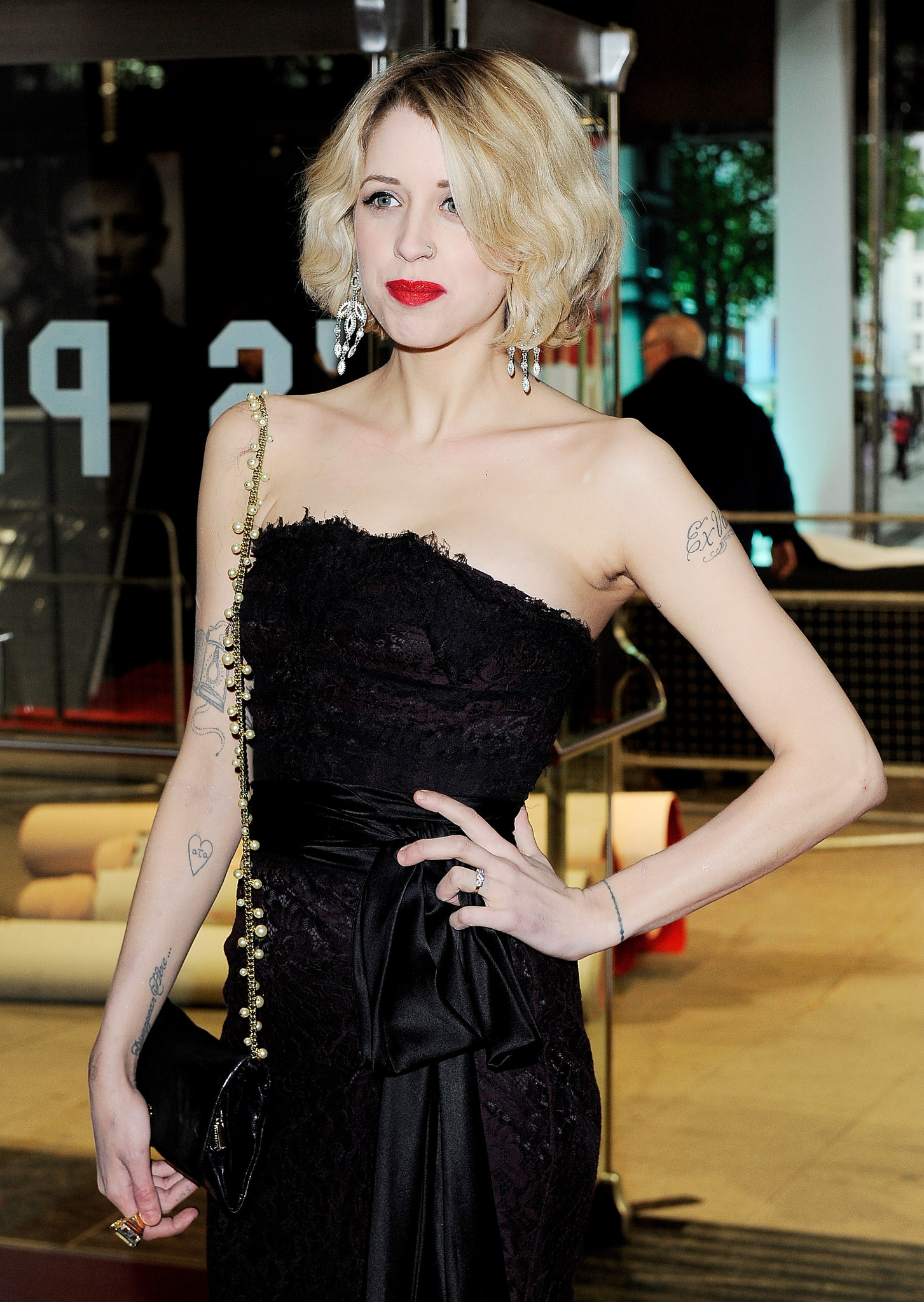
The small hearts and symbols are easy to miss in a full portrait, but they give the collection a lighter touch. A heart on the arm, a bird near the script, or a mark at the wrist works like a small pause between the larger designs.
Small tattoos depend on clean lines and placement more than a large silhouette. Geldof’s visible marks are simple enough to read quickly: a heart looks like a heart, a bird like a bird. They don’t need close-up detail to make sense.
They also break up the longer designs. The lyric piece across her back asks for a longer look, and the daisy chain draws the eye along her body. A small symbol gives the eye somewhere else to land.
A small tattoo can mark a moment without becoming a major project. Keep the design clear, give it enough room, and choose a spot that won’t be constantly rubbed. Little tattoos can carry a lot of personality when they are allowed to stay little.
Peaches’ floral and script tattoos work because the contrast is honest
In full-body photos, the pieces differ in style: the daisy chain is light and colourful, the script is dark and flowing, and the smaller symbols read quickly. They don’t have to look alike. Their differences make the collection feel like it grew with her interests.
Placement gives each piece its own space. Flowers follow the thigh; words sit across the back; arm tattoos show up with movement; a small heart can be more private. The design choices create a sense of order without needing one master plan.
If you’re building a collection over time, you can repeat a style without repeating a subject. Maybe the connection is fine linework, soft colour, or hand-drawn lettering. The tattoos can still mark different parts of your life. A personal collection does not need a logo. It needs a point of view.
Clothing changes how tattoos read. A design under a strap may look delicate, then feel bolder against bare skin. The same piece can be private in one outfit and more visible in another. That’s part of how tattoos become part of someone’s everyday style.
Why Peaches Geldof’s collection still feels personal
Geldof’s tattoos don’t look like a matching set. They include names, lyrics, flowers, birds, hearts, and smaller marks that suggest different chapters. The mix is what gives the collection its character.
The point isn’t to copy a daisy or a line of script. Choose designs that matter to you, think about how their placement will work together, and don’t rule out a small piece because it won’t dominate a photograph. A quieter detail may be the one you notice most.
Not every tattoo needs a grand explanation. It can be meaningful, decorative, impulsive, or some mix of the three. Geldof’s collection shows how one body can hold different stories at once.
Peaches Geldof in conversation
This interview offers a glimpse of Geldof’s voice and public style during her lifetime.