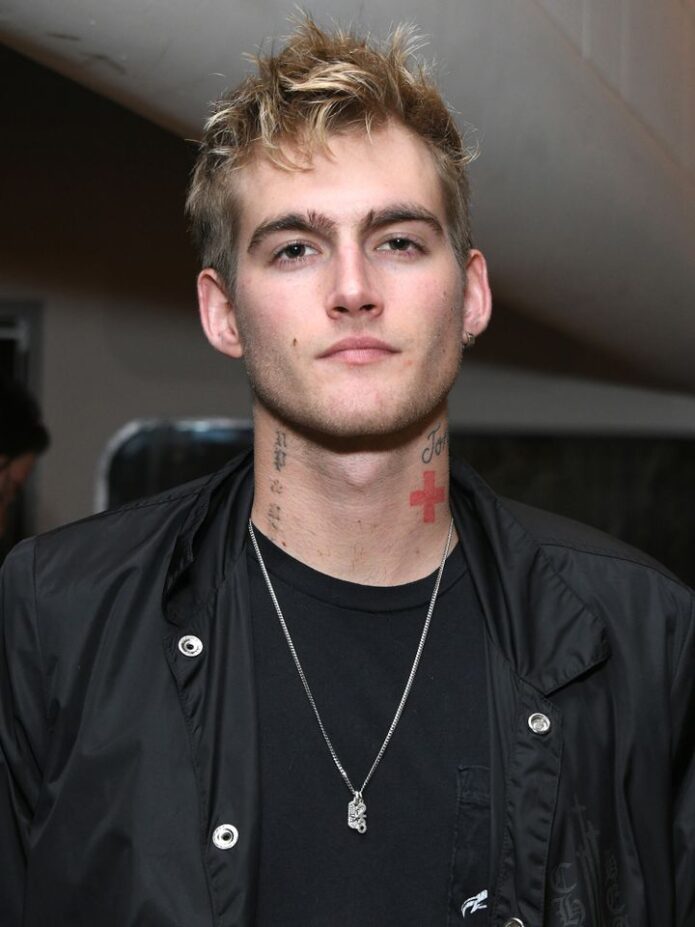
Presley Gerber’s tattoos have long been part of his fashion image, but the photos show more than one look. There’s small lettering on his face, script and a cross on his neck, loose linework on his arms, and smaller marks on his hands. Some images are polished editorial shots; others are casual.
The collection doesn’t follow one theme or one perfect sleeve. Lettering, symbols, cartoon-like art, and sketchy blackwork vary in size and mood, with black ink giving them a loose connection. Meanings are discussed here only when they’ve been publicly explained; the focus is on visible placement and design.
The misunderstood face tattoo and hand lettering set the tone

The small “misunderstood” tattoo beneath Gerber’s eye became the design most people associate with him. It’s plain lettering, but the placement makes it conspicuous. A short word near the eye can catch attention before a larger tattoo on the arm simply because people look at the face first.
The letters are compact and clean, without a frame or heavy shading. That restraint suits a face tattoo; extra flourishes could crowd the area quickly. At this size, the word reads as a statement without taking over his cheek.
The hand tattoos are visible in a different way. Fingers and hands move through ordinary gestures, so even simple marks seem animated. They sit beside rings, sleeves, and the things people handle every day; the ink becomes part of those gestures, not just a detail in a photo. Small hand tattoos can carry a lot of character when the lines stay clear.
Face and hand tattoos stay visible. Before choosing either placement, think about how permanent visibility fits your life. Check the lettering at its actual size and look at it from a normal speaking distance; a large phone mock-up can give a misleading impression.
The neck script sits beside loose torso and hand designs
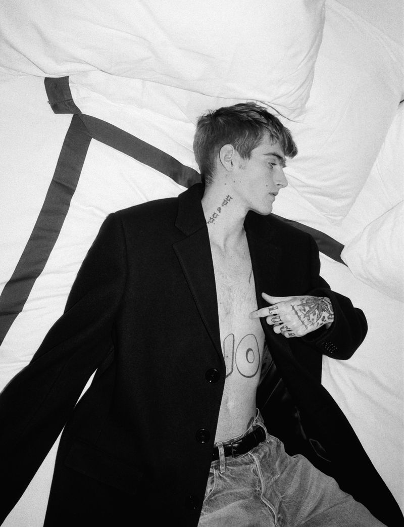
The neck is where Gerber’s tattoos start to layer together. Script runs along its side, with a cross and smaller marks nearby. They sit close enough to make one area, but the shapes aren’t identical, so they don’t blend into one patch.
Neck lettering needs room because the skin turns with the head. A word that looks balanced from the front may bunch up from the side. Here, the script follows the length of the neck and leaves space around the cross, keeping the shapes separate.
The torso marks add detail without competing with the face. They’re lighter and more open than the stronger neck work. Negative space matters when small tattoos sit close together. Leaving some skin visible helps each mark stay clear.
A collection can grow one tattoo at a time. A neck design doesn’t need to predict every later piece. You can add a small symbol, then decide whether it needs a partner on the chest or shoulder. A loose plan helps the tattoos relate; open areas keep you from locking in every detail at once.
The shoulder and forearm tattoos make the collection feel lived in

Gerber’s shoulder and forearm photos show some of the more expressive designs. A cartoon-style tattoo sits on the shoulder beside looser lines, while sketches and shading run along the forearm. They look less like a matching set than pieces gathered at different times.
The shoulder can hold a bold image without forcing it into a narrow strip, and it connects naturally with the upper arm. The forearm extends the composition downward. As the arm bends, the shapes change with it.
Some outlines are graphic and confident; others have a sketchbook feel, with lighter strokes and open skin. Different levels of finish can sit together when the placements give each tattoo room. They don’t all need to be equally polished.
When sharing references with your artist, show both the close-up details and the whole limb. A cropped shoulder tattoo might look fine by itself but awkward next to the chest or upper arm. Check it from several angles before settling on the design.
The neck cross and arm details change the balance of the look
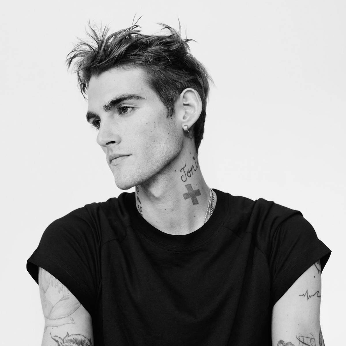
The cross on Gerber’s neck is one of the clearest shapes in these photos. Its simple outline stays visible when the rest of the image is busy. Script and smaller arm tattoos make the area denser, but the cross gives the eye a place to land.
A small symbol still takes care to place. A cross, star, or icon has to sit well on a body that moves; on the neck, even a slight change in angle can affect the balance. Nearby script helps the cross feel part of the collection rather than isolated.
The arm tattoos add texture without demanding the same attention. Smaller pieces can make an area feel complete without forcing every design into one theme. Repeated black ink and consistent spacing can connect different ideas without making them identical.
It helps to choose one focal point for each area: a cross at the neck, a flower on the shoulder, or a word on the forearm. Smaller tattoos can support it while leaving space around it. That order keeps a busy area legible.
The face lettering is small, direct, and impossible to miss
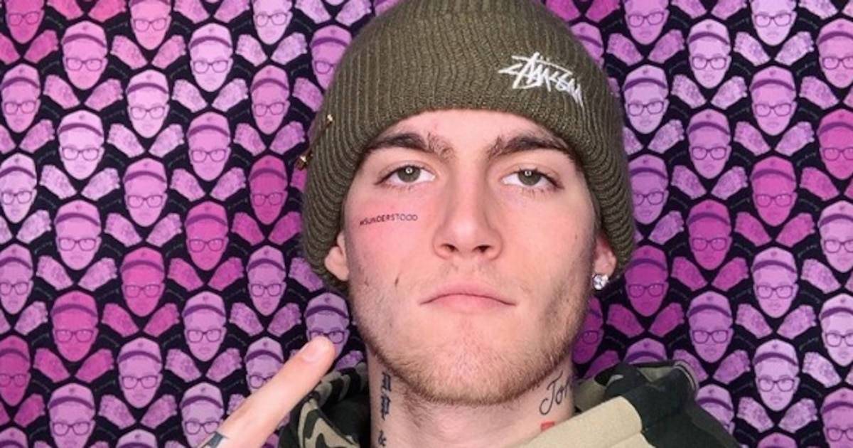
The close-up shows how the face lettering works. The word is small, but its position makes it part of Gerber’s expression. Text of the same size would have a very different effect on an arm or rib.
In the full portrait, the eye moves from the lettering to the script and cross on the neck, then to the hand tattoos. Those placements create a vertical line. The marks have different sizes but share a dark palette.
That sequence is useful if you want a bold look without relying on one huge black shape. Placement can matter as much as size. A small tattoo near the eye can be more noticeable than a larger design under a sleeve. Neck script can link face and chest; hand tattoos show when the arms move.
Gerber’s collection doesn’t need to look perfectly matched. Give each tattoo a reason to be where it is, then check how it sits beside the next one. Keep the choices personal, leave useful space, and have the artist adapt the design to your body rather than tracing a photo.
The video below adds context to the first tattoo story and the response it drew.
2 thoughts on “Presley Gerber Tattoos: Face Ink, Neck Script and More”