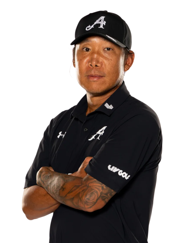
Anthony Kim’s tattoos stand out when he steps onto a golf course. A large black-and-gray sleeve covers his right arm, and it looks different as he swings, walks, or folds his arms. One photo shows the shapes along the outer arm; another brings the forearm into view. Together, the images make clear that this is a sleeve, not a single small tattoo.
The arm is dark enough to read from a distance, but smaller marks add texture up close. Open skin and denser areas alternate, letting the design keep its shape as he moves.
This guide sticks to what’s visible in the photos: the right-arm coverage, the black-and-gray shading, how the sleeve wraps, and how it sits with everyday clothes. Where Kim hasn’t explained a meaning publicly, I won’t guess. The design choices are clear enough to discuss on their own.
Anthony Kim’s sleeve is the first thing you notice
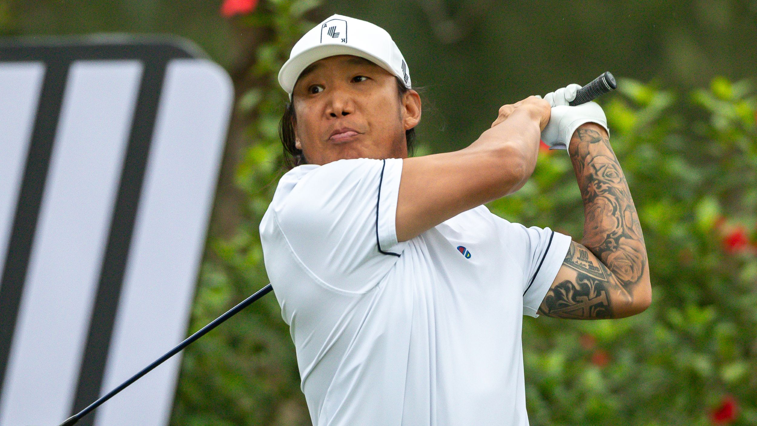
The first thing you notice is how much of the arm is covered. The tattoo starts high and runs toward the wrist, so it reads as a sleeve rather than a single image. A golf shirt covers part of the upper section, but the forearm remains visible and gives the look an anchor. The tattoo stands out without a large chest or neck piece.
In the swing photo, Kim’s arm is stretched and turned, showing how the design follows the body. Lines that look separate when the arm is straight overlap as the elbow bends. That movement matters: a sleeve should hold together when someone reaches, lifts, or relaxes, not only in a straight-on photo.
Deep black, gray shading, and open skin carry the composition. Contrast makes the shapes legible. Dark areas establish the main forms; lighter gaps keep the arm from looking like one solid block. If you’re considering a similar sleeve, ask to see the design from the front, side, and back before the first session.
The tattoo also works beside an ordinary sports uniform. If you play a sport, wear a uniform, or often wear fitted shirts, think about where the sleeve ends and how much ink you want visible day to day.
The full arm sleeve keeps its shape while he moves
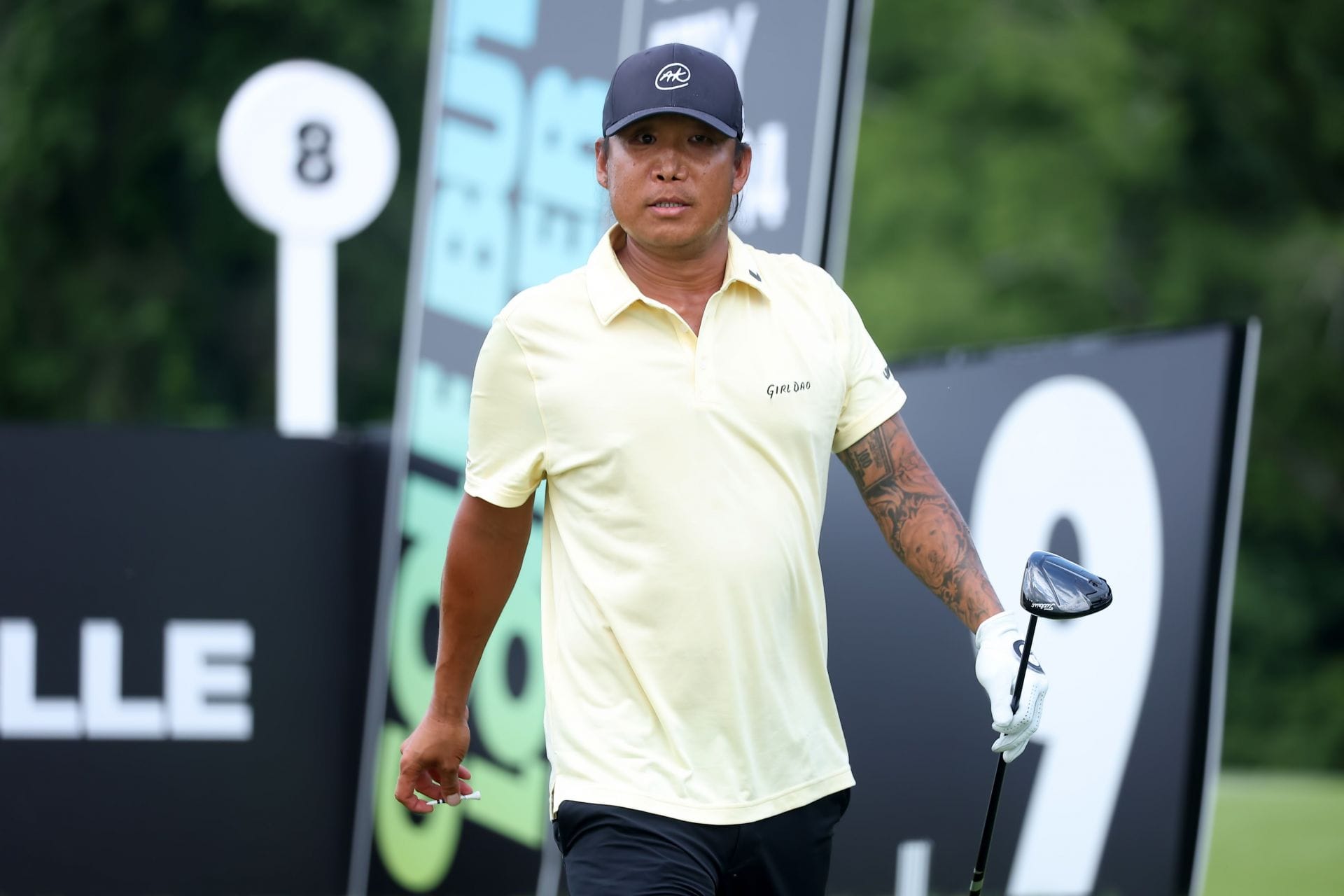
The fairway photo shows the sleeve under movement. Kim’s arm is bent and turned toward the camera, but the main shapes still hold together. Strong lines follow the length of the arm, so the tattoo feels like one composition rather than a stack of separate images.
Elbows are difficult places to tattoo because the skin folds and stretches. A design that works above the elbow can lose its rhythm across the joint. The black-and-gray shading here allows the sleeve to move without making every line depend on one angle. Flow matters more than a perfect flat outline when a design crosses a joint.
The shot also shows that the lower arm carries the design when a shirt hides the upper section. If you want a sleeve that is sometimes covered, consider placing a strong part where it will still show in a short-sleeve shirt, then build the rest over time.
Bring both close-up details and full-arm photos to your artist. The close views help with texture and shading; the full views show proportion. A beautiful crop may still fail to connect with the tattoos above or below it.
Close views show the sleeve’s black and grey rhythm
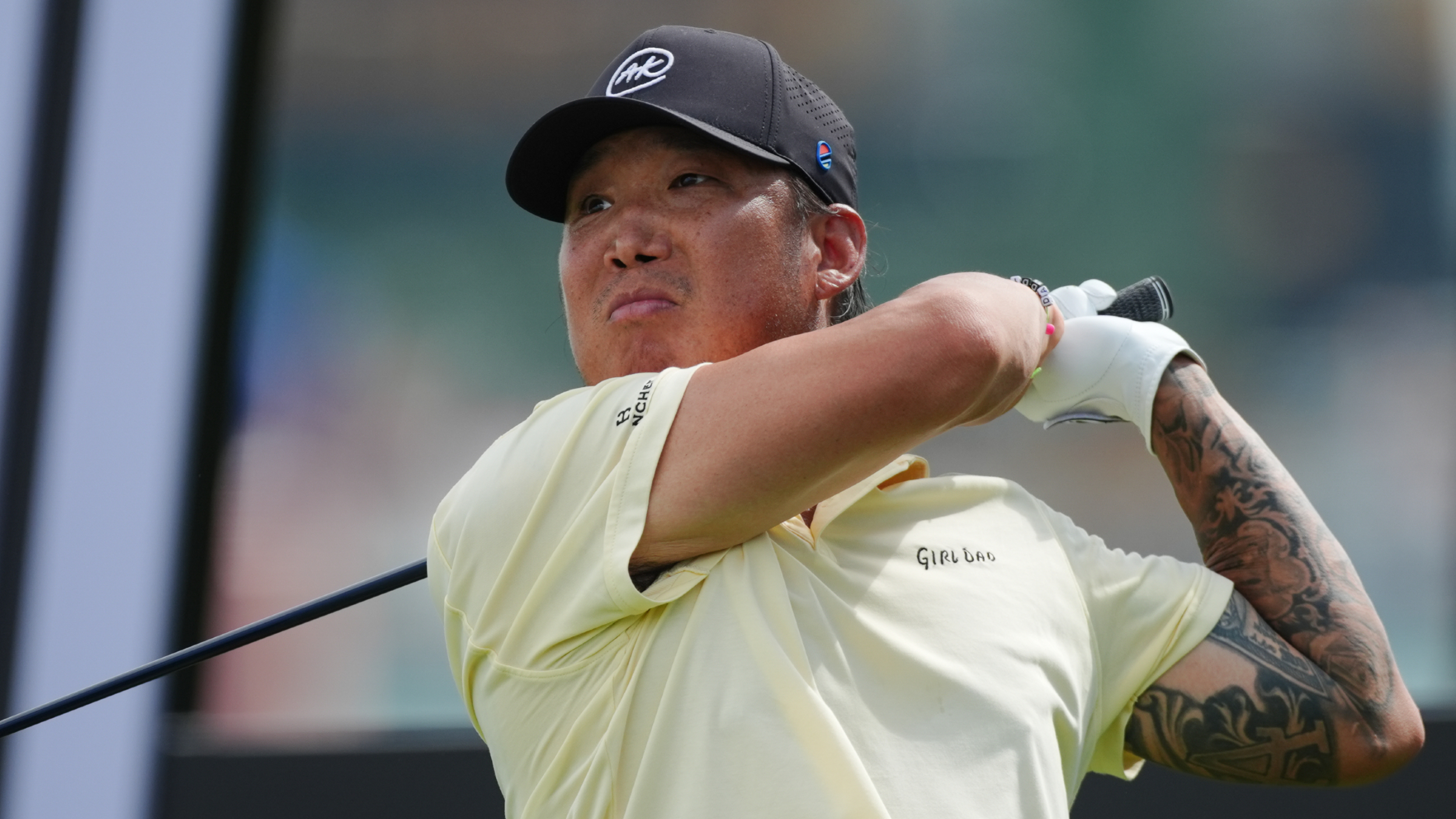
The closer photo shows how the sleeve is put together. Some areas read almost as solid black from a distance, then open into softer shading and lighter lines when you look again. That shift makes the tattoo legible at a glance and gives you more detail nearby.
Black-and-gray work can get depth from a few values: solid black to anchor the darkest area, gray to soften its edge, and bare skin to leave a pause. Those changes can layer a large tattoo without adding tiny detail everywhere.
The designs also vary in size. Larger forms set the structure; smaller marks fill gaps and help the sleeve wrap around the forearm. That mix tends to work better than making every tattoo equally prominent.
If you like the look but aren’t ready for a full sleeve, start with one design that has a clear direction. Leave space for future work and ask how the next section could connect. Open skin gives a later tattoo somewhere to sit and helps the arm remain readable.
The lower arm carries the denser details
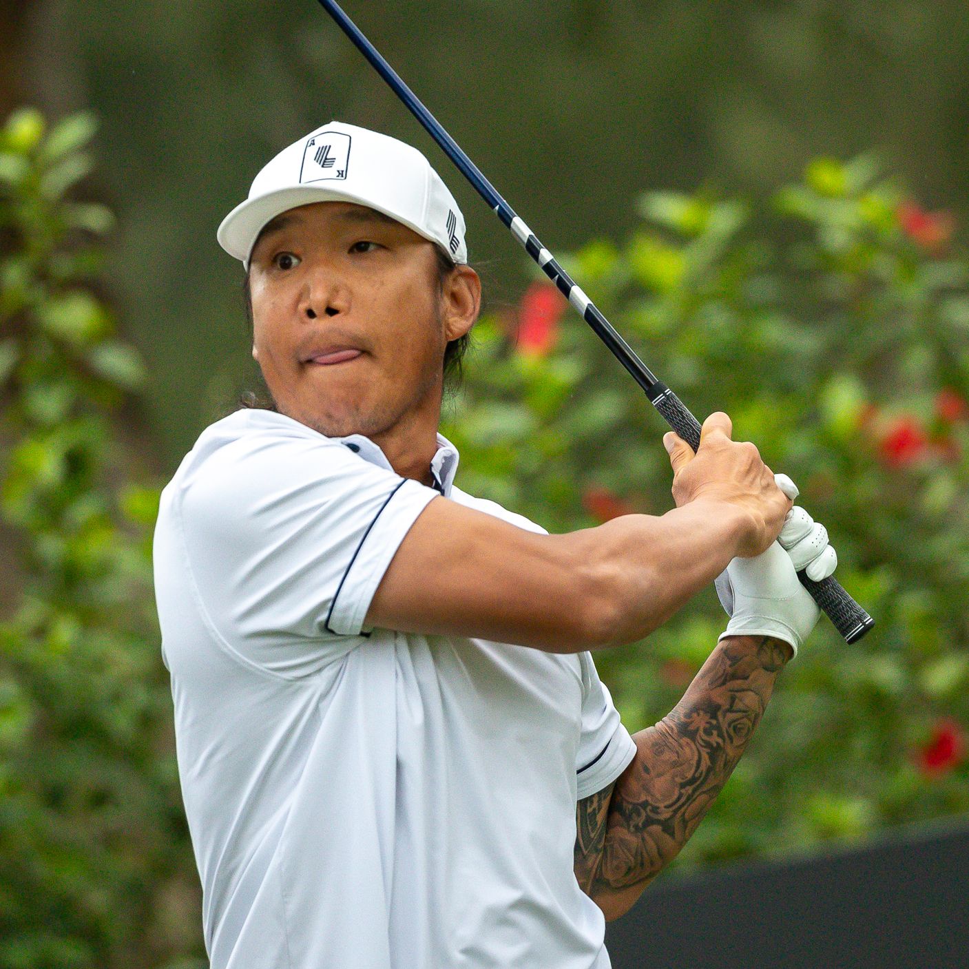
The square action photo brings the lower arm closer. Here, changes in line weight are easier to see. The forearm feels denser than the more open area above, but the shading still leaves enough separation for the main shapes to read.
Forearm tattoos are visible in ordinary positions: holding a phone, carrying a bag, or reaching across a table. The shoulder may be covered by a sleeve, while the forearm stays on view. That makes it a natural place for the part of a collection you want others to see without making the tattoo the only thing they notice.
Kim’s lower-arm design also shows why the artist has to plan the wrist as an ending. The sleeve shouldn’t look abruptly cut off, though it doesn’t need to end as a perfect bracelet. A softer fade, lighter edge, or small gap can make the finish feel considered. Plan the edge as carefully as the center of the sleeve.
If your arm is becoming a sleeve over several sessions, don’t rush to fill every gap. Let the larger pieces settle first, then use the direction of the design to decide where smaller details would help.
A close sleeve crop makes the smaller marks easier to read
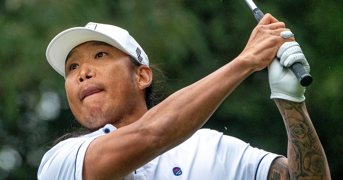
The close portrait shows how the sleeve changes the balance of Kim’s look. His face and clothes are relatively simple, leaving the arm as the main area of texture. When one part of the body carries most of the ink, the rest of the outfit doesn’t need to compete with it.
His arm is tucked close to his body here rather than fully extended. The tattoo compresses into a smaller area, so some lines overlap and the darkest patches stand out more. A sleeve has to work in this position as well as during a swing. People see it at rest and in motion.
You can borrow the idea of a connected arm composition without copying a motif. Use flowers, words, animals, geometric forms, or symbols that matter to you. The structure is often a more useful reference than the specific image.
Kim’s sleeve has a clear place on his body. It’s bold without needing face or neck tattoos to explain it. The arm gives the designs room for contrast, movement, and detail. If you’re planning similar work, think about the message of the main area, how visible you want it, and where to leave open skin.
For more context on Kim’s return to competitive golf, see the interview below.