codex

Karrueche Tran Tattoos: Colorful Hand Ink, Wrist Script and More

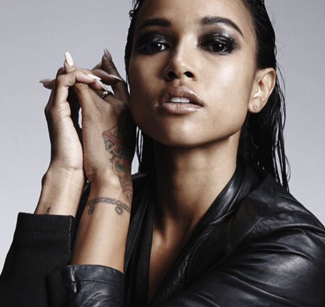
Karrueche Tran’s tattoos are best known for the colorful dragon across her left hand. The rest of the collection includes fine lettering, a bracelet-like mark at the wrist, and larger pieces visible in more open outfits. Some designs stand out immediately; others come into view from a different angle.

The mix gives her tattoos personality while leaving room for clothing and movement. A bold hand piece can sit beside fine script, and a slim wrist design can frame the arm without turning it into a sleeve. If you’re looking at her ink for ideas, notice how one strong image leads while the smaller pieces stay quieter.

This guide looks at the visible designs, how they read on the body, and what to consider if you’re planning something of your own.

Karrueche Tran colorful hand tattoo
Karrueche Tran tattoos: Colorful Chinese dragon hand tattoo close-up

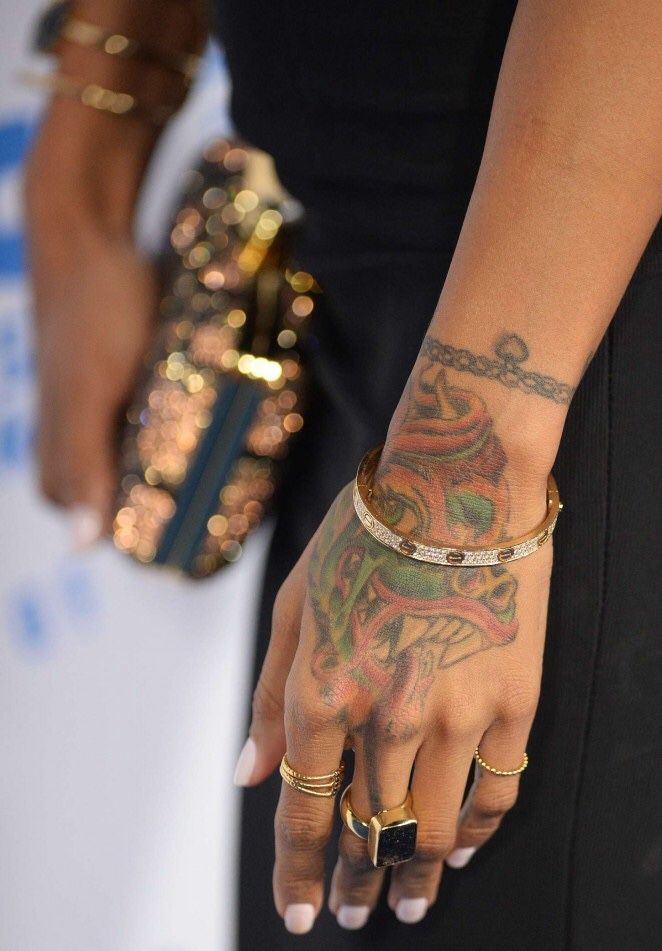
The colorful dragon on Tran’s hand is the piece most people associate with her. Bright tones and a lively outline spread across the back of her hand toward the wrist. There’s enough detail to feel illustrative, but the main shape remains easy to see as the hand moves. That’s especially useful on a placement where the fingers bend and the skin creases.

Tran has said the dragon connects to her Chinese and Vietnamese background and her Chinese zodiac sign. That gives the image a personal reason to be there as well as a strong shape. If you’re considering a statement tattoo on your hand, decide what the image means to you, then think about how much of the hand you want it to cover.

Color changes the mood. Black and gray might make a dragon feel darker and more traditional; saturated color makes this one feel almost like jewelry or nail art. Ask your artist how the palette will sit with your skin tone and how much detail will remain clear after healing. On a hand, strong shapes and contrast matter more than tiny scales.

Karrueche Tran wrist chain and bracelet tattoo
Karrueche Tran tattoos: Chain-like wrist bracelet tattoo and hand ink

At Tran’s wrist, a fine chain-like tattoo sits like a permanent bracelet. It’s noticeable without taking over the forearm. The repeated links give it a steady pattern, and from a distance it adds a finished edge to a simple outfit.

A bracelet tattoo can take many forms: linked circles, small leaves, beads, a charm, script, or a line that leaves patches of skin open. The design should follow the wrist instead of sitting like a stiff stripe. Show the artist the wrist from the front, side, and top so the pattern can wrap evenly. A paper or digital stencil can help catch a line that sits too high or twists near the thumb.

The chain also supports the larger hand tattoo without competing with it. If you already have one bold design, a quieter band can connect the collection. Keep the line weight distinct enough for both tattoos to stand on their own.

Karrueche Tran finger and knuckle tattoos
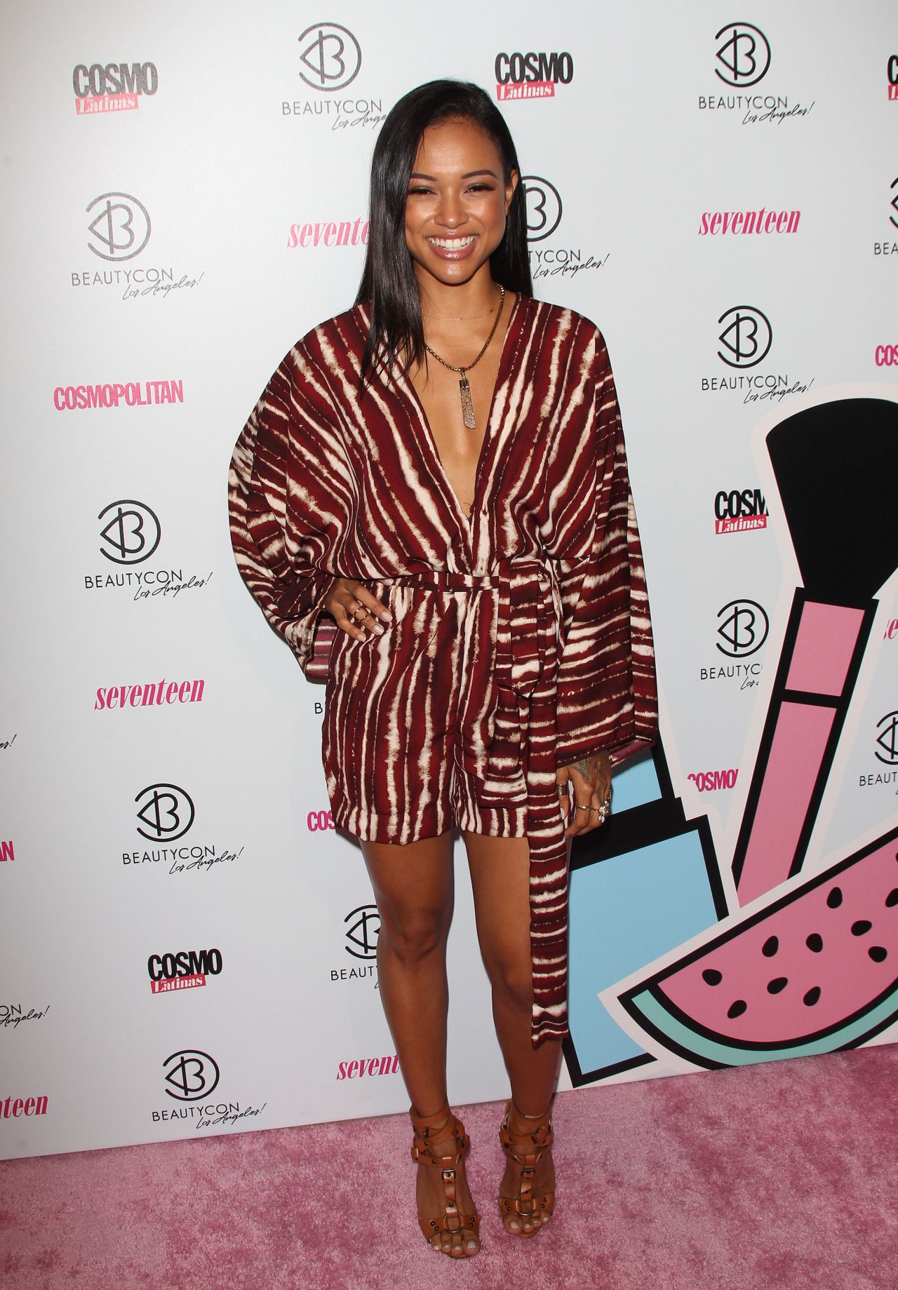
Karrueche Tran tattoos: Full portrait showing the hand tattoo in everyday styling

From farther back, the small marks around Tran’s fingers and knuckles become part of the overall look. The hand feels like an area that has developed over time, rather than one isolated tattoo. That’s a useful reference if you like patchwork ink: start with a larger design and add smaller pieces later, or let a few little symbols build into something over time.

Finger tattoos need realistic expectations. Hands see a lot of wear, and fine details may soften or need touching up. Choose a clear shape and look for an artist with healed examples. A star, cross, letter, or number is usually easier to read at that size than a detailed portrait. Check the stencil with your hand relaxed, curled, and hanging at your side.

Spacing matters more than quantity. Too many small marks around the knuckles can turn into visual noise. Tran’s colorful dragon remains the main feature, while the smaller designs add texture. Leave some skin open and let one image lead.

Karrueche Tran forearm script tattoo
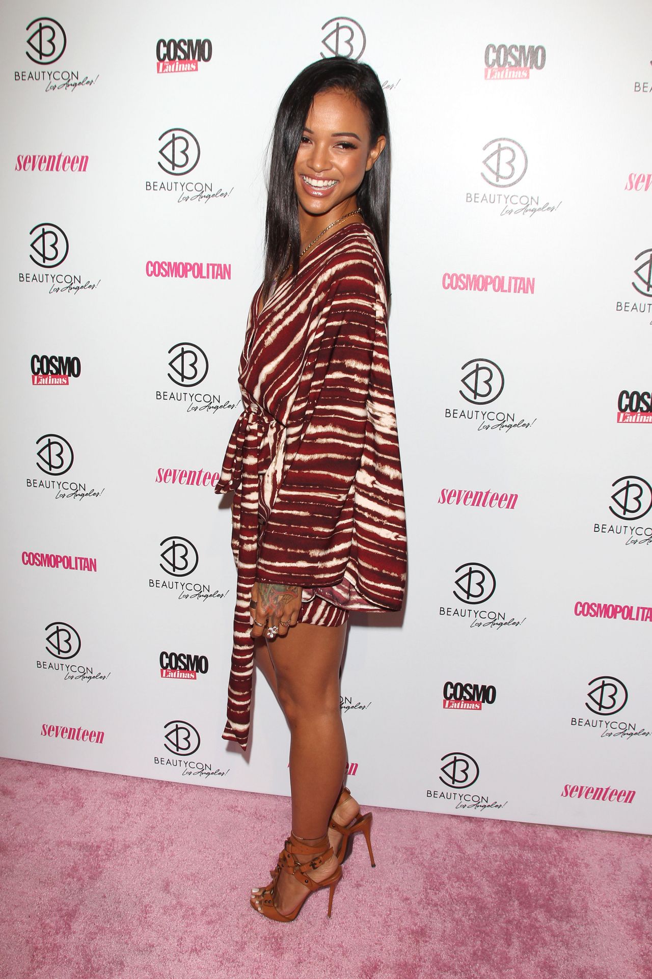
Karrueche Tran tattoos: Side pose showing the forearm and hand tattoo placement

The script in Tran’s collection softens the brighter hand tattoo. In interviews, she has discussed quote tattoos, including Arabic lettering down her spine and a Spanish proverb on her side. Other profiles have shown a phrase on her arm connected with the idea that the past is practice. These pieces give the collection a reflective note alongside its fashion and beauty imagery.

Lettering still needs careful planning. Check the spelling, translation, and accents with more than one trusted person before the stencil is applied. Then look at the words as a shape, not just as a sentence. A long phrase needs space; a shorter one can follow the forearm, while vertical lettering may feel more private and graphic. The right size depends on the text, the direction of the arm, and how far away you want it to read.

Fine script can sit beside a colorful tattoo because the styles do different things. The dragon brings color and movement; the words offer a pause. Different designs can feel at ease together when their scale and placement are considered.

Karrueche Tran tattoo styling and placement
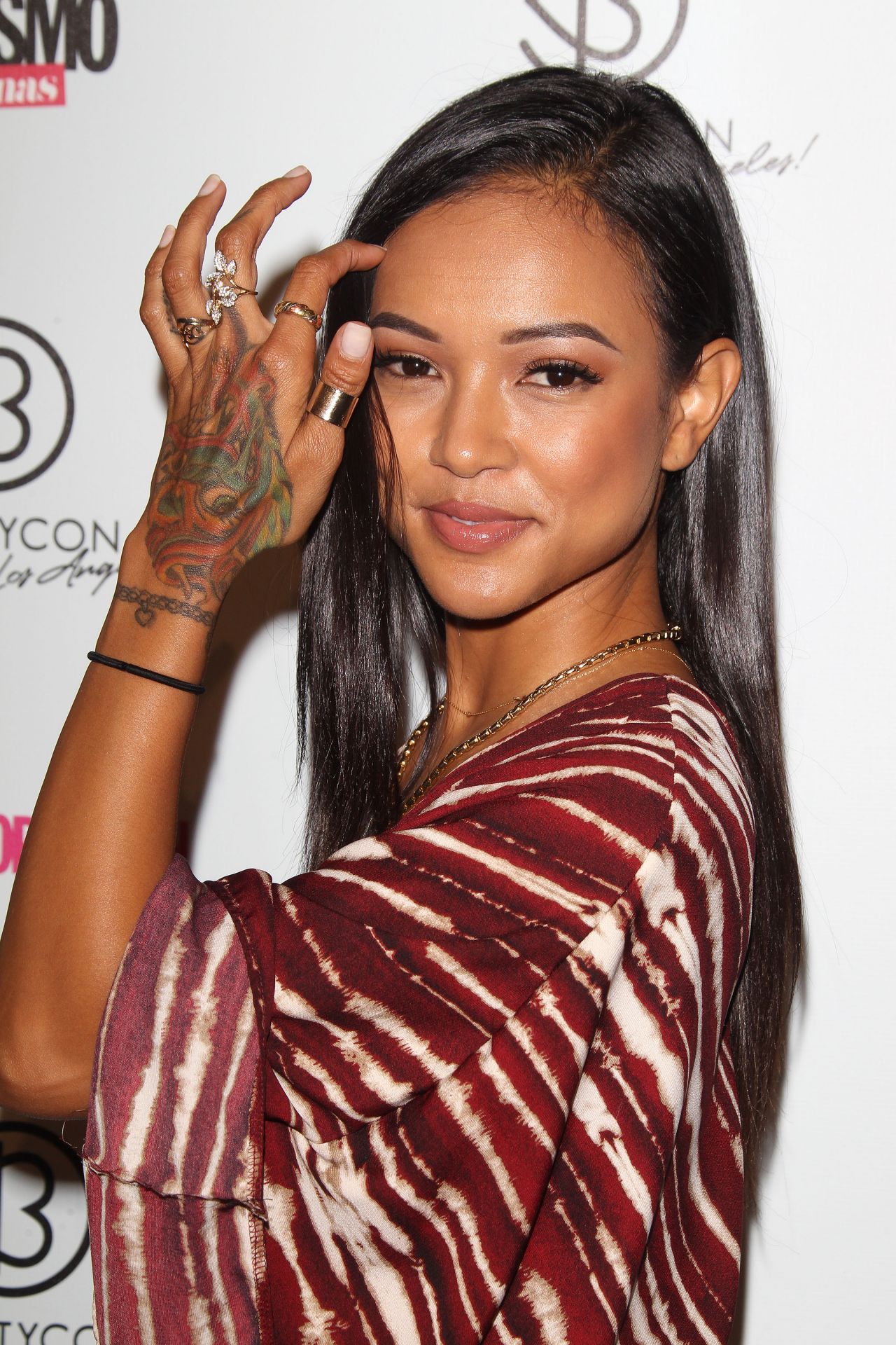
Karrueche Tran tattoos: Close-up of hand and forearm ink with face visible

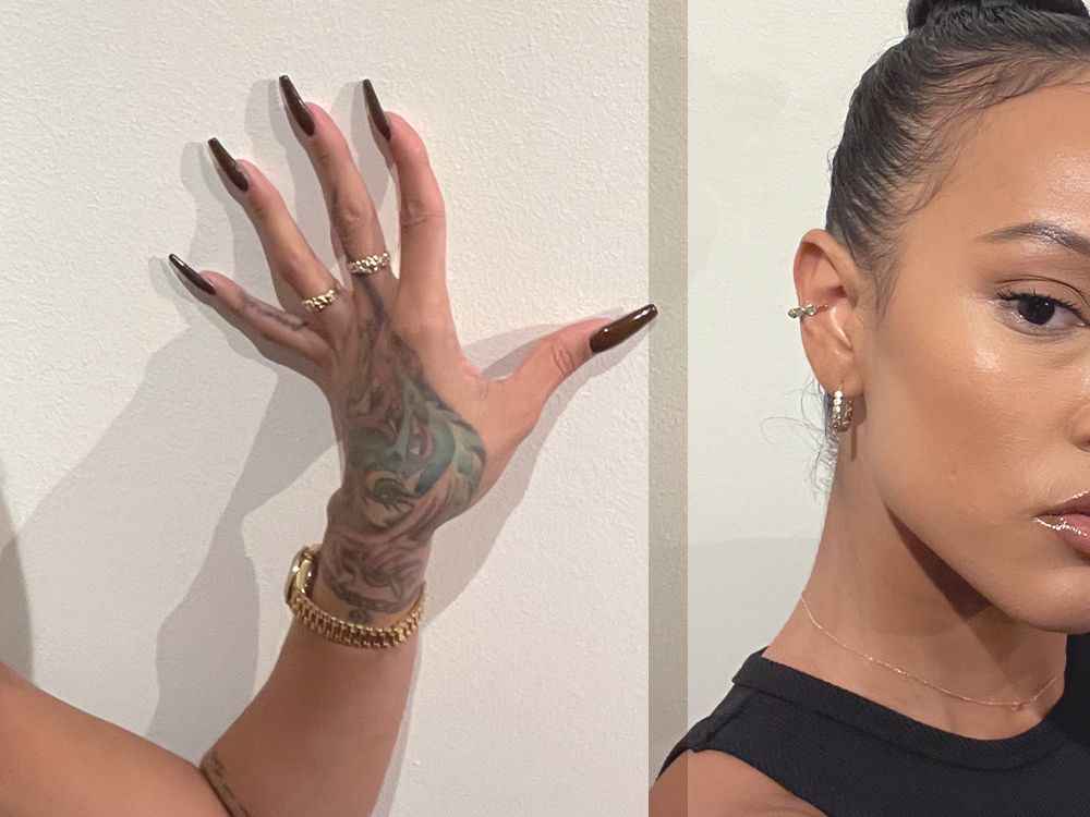
Tran’s tattoos sit naturally within her everyday styling. In a close-up, the hand tattoo reads like a bright accessory; against a clean sleeve, rings, or a simple manicure, it can feel sharper. The same design changes mood depending on what’s around it.

Think about your own clothes and routines when choosing a visible placement. Look at your hand while holding a phone, wearing a watch, carrying a bag, or resting on a table. Check your forearm with short and long sleeves. Those ordinary positions help you see whether a design fits daily life as well as a saved photo.

Tran’s collection pairs color with black linework, a bold hand with quieter script, and statement pieces with areas of bare skin. That space lets the tattoos breathe. If you want the same balance, don’t rush to fill every gap; add another piece when you know why you want it there.

The best idea to borrow from Tran is to let one tattoo lead. Start with the design you’d like to see every day, then consider how the rest could sit around it. A dragon, bracelet, phrase, or small symbol can all work if the placement suits your body and routine. Talk with your artist about healing, touch-ups, future additions, and jewelry or older tattoos nearby.

Take a few days to live with a visible design before booking, especially when it will stay in view every day.

Give hand and wrist tattoos time and thought. Look at healed work from the artist, confirm every word in a quote, and check that the placement works when you move. The goal isn’t to copy Tran’s tattoos; it’s to make one clear choice and give it room to sit alongside whatever comes next.

More celebrity tattoo guides

Levy Tran Tattoos: Floral Sleeves, Chest Heart and Zombie Ink

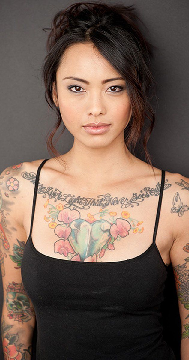
Levy Tran’s tattoos cover a range of styles. Her arms have bright flowers and traditional designs, her chest has a heart surrounded by flowers and script, and a darker illustrated piece runs along her side. She’s also talked about stars on her back, tattoos on both ribs and legs, and a zombie design she particularly likes. The collection looks large and well worn-in.

If you’re looking for ideas, there are different things to notice: color, how the designs move with the body, and the transition from one arm style to another. You don’t need a full bodysuit to use the same thinking. Even a floral sleeve or small chest design can feel considered when you think about what might sit nearby later.

The sections below look at visible tattoos, their placement, and details you can discuss with an artist without copying Tran’s exact designs.

Levy Tran floral arm sleeve tattoos

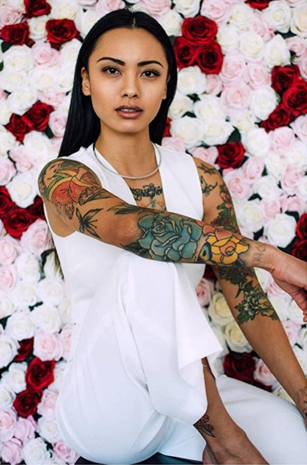
Levy Tran tattoos: Floral arm sleeve and shoulder tattoo details

Tran’s floral sleeves are a good place to start. Roses, leaves, and traditional shapes run along her arms in bold colors. Reds, blues, yellows, and greens make the designs lively; dark outlines keep the flowers distinct. Bright color still needs structure underneath it.

Tran has described her left upper arm as an Oriental Japanese-style sleeve and her right upper arm as an Americana-style design. The sleeves don’t have to mirror each other. One can use flowing flowers and curved leaves; the other can lean on bolder panels and traditional flash shapes. Their different styles still feel balanced because both are confident and colorful.

If you’re planning a floral sleeve, choose the main image and its placement first. Then build the surrounding flowers around it. Check how the design looks with your arm hanging, bent, and raised. It needs to move with you, not just look good in a straight-on photo.

Levy Tran heart chest tattoo and script

Levy Tran tattoos: Chest heart, script and arm tattoos in a portrait view

The heart on Tran’s chest gives the collection a clear center. Flowers surround the design beneath ornate lettering across her upper chest, making it read as a single composition rather than a small emblem. Leaves and petals give the heart more shape, while the overall piece keeps the bold feel of the rest of her ink.

The phrase above it is commonly reported as There Is A Light That Never Goes Out. Script across the collarbone needs to follow the body’s curve, and the phrase has to fit the chest rather than a straight line on paper. The artist can adjust the spacing, arc, and thickness so the words follow the body.

A chest tattoo can link two sleeves. Flowers at the shoulders can lead into the arms, while a central design gives the eye a place to pause. For a smaller version, a heart, lock, sun, or plant with a short word above it could work. Leave some skin around the main image so future additions don’t crowd it.

Levy Tran chest and arm tattoo contrast

Levy Tran tattoos: Chest heart and both arm tattoos in a close portrait

The chest and arms have different weights. The heart and flowers feel softer; the arm tattoos use heavier outlines, darker patches, and a broader mix of motifs. That contrast keeps the designs from repeating the same pattern.

Tran’s floral work has both decorative and tougher elements. Leaves soften the shapes, while the black outlines and darker sections keep them grounded. If you like that balance, try combining one gentle detail with a harder edge: roses beside a skull, fine script next to a heavy border, or bright flowers against dark shading.

Placement matters as much as the drawing. The upper arm has room for detail, while the more visible forearm benefits from a clear outline. Save the smaller marks for areas where they can be seen and let larger shapes spread across the body’s broader areas. Tran’s photos show how the tattoos change in a close portrait, a seated pose, and a full-body view.

Levy Tran arm wrist and leg tattoos

Levy Tran tattoos: Seated view of arm, wrist and lower leg tattoos

The tattoos continue beyond Tran’s shoulders. Wider portraits show ink on her arms and wrists, as well as around her knees and legs. Some areas are dense and colorful; others use smaller marks or leave more skin open. Those changes keep the collection from reading as one unbroken wall of ink.

Small symbols can work well beside larger pieces. Stars on the back, a little wrist design, or a compact knee tattoo can add a mark without carrying the same weight as a sleeve. It may simply fit the space or record a moment.

Legs give an artist different options for scale. A thigh can hold a large figure, animal, or flower, while the shin suits a longer vertical design. Tran has mentioned both legs as part of her collection, and later profiles note tattoos on the thigh, knee, and shin. For a leg piece, look at the area from the front, side, and back; the curves around a knee and calf can change the composition.

Levy Tran zombie side tattoo and body flow

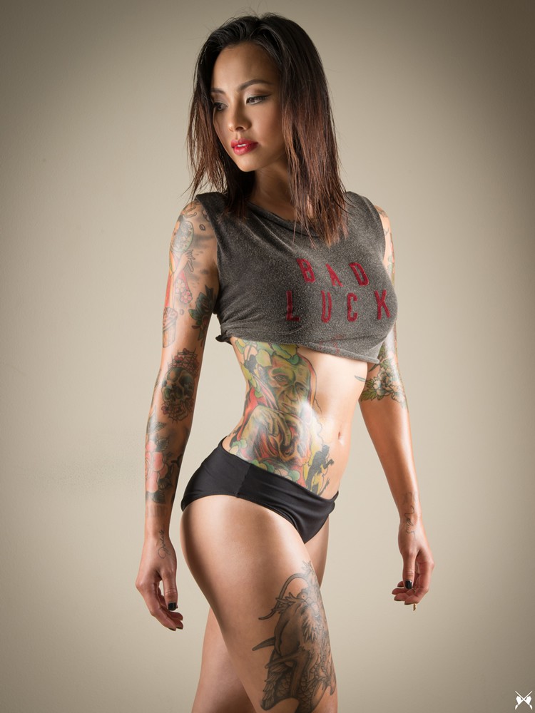
Levy Tran tattoos: Zombie side piece, torso ink and leg tattoos in full-body styling

The zombie on Tran’s right side is the collection’s darkest focal point. She has called it one of her favorite tattoos because of the artwork. It sits between her ribs, abdomen, and hip, giving the torso a strong illustrated shape. Its mood is a long way from the floral chest piece, but the color and confident outlines tie it to the rest of her ink.

The side is a good spot for a tall design with movement. A figure, snake, sword, or plant can follow the ribs and turn toward the hip. Because the area shifts when you breathe, sit, or twist, check the stencil while standing and relaxed. A design centered on a flat board may need to move once it is on the body.

The larger tattoos guide the eye around Tran’s body rather than stopping at one edge. A chest design can lead into an arm, a side piece can draw attention toward a leg, and a small wrist tattoo can finish a sleeve. Choose a few main pieces first, then let smaller tattoos support them.

Tran’s collection has room for different moods. Flowers, script, traditional designs, black shading, and darker illustration all sit together. If you want a similar range, choose one idea to repeat—perhaps bright color, bold outlines, or shapes that follow the body—without making each tattoo identical.

Start with one area you want to live with and find an artist whose healed work has the feel you’re after. Talk about size, touch-ups, future additions, and how the tattoo will look from different angles. A full celebrity collection can be exciting to browse; your own choices should fit your daily life.

Before committing to a large design, try the placement in ordinary clothes and take a few photos sitting and standing. Ask how the ink may soften over time, particularly on areas that move a lot, such as hands, knees, and ribs. A little planning helps the artwork feel right in more than one carefully posed photo.

More celebrity tattoo guides

DMX Tattoos: EXODUS Neck Ink, Boomer Back Piece and Dog-Themed Designs

DMX’s tattoos were part of his public image, but they never followed one tidy style. Lettering, dog imagery, religious symbols, names, and rough script covered his neck, back, chest, arms, and stomach. Some marks read like private reminders; others were visible onstage. Together they trace recurring subjects in Earl Simmons’ life and music.

The images also sit beside things DMX said about himself. He loved dogs and spoke about loyalty, toughness, and survival. He also talked openly about faith, pain, and his choices. The designs vary, but many return to those ideas.

This guide focuses on tattoos visible in portraits and those with a clear story attached: the EXODUS 1:7 neck tattoo, the ONE LOVE BOOMER back piece, his first grim reaper and pitbull tattoo, the writing across his stomach, and the arm work around them. Placement matters as much as the images.

DMX EXODUS 1:7 neck tattoo

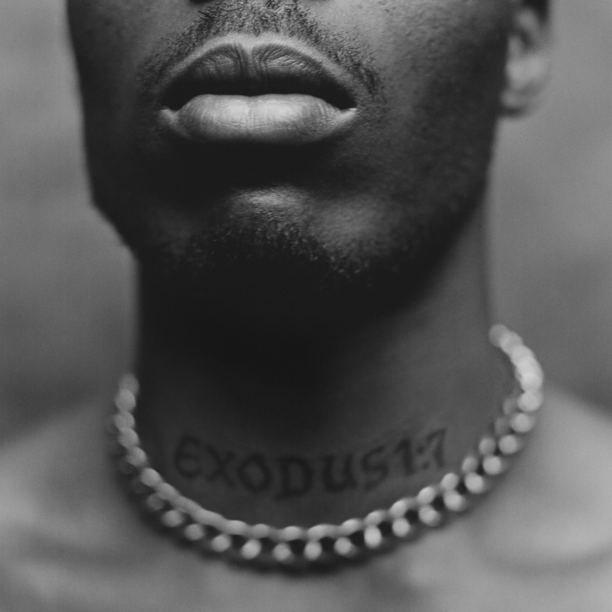
DMX tattoos: tight face and neck view showing the EXODUS 1:7 tattoo clearly

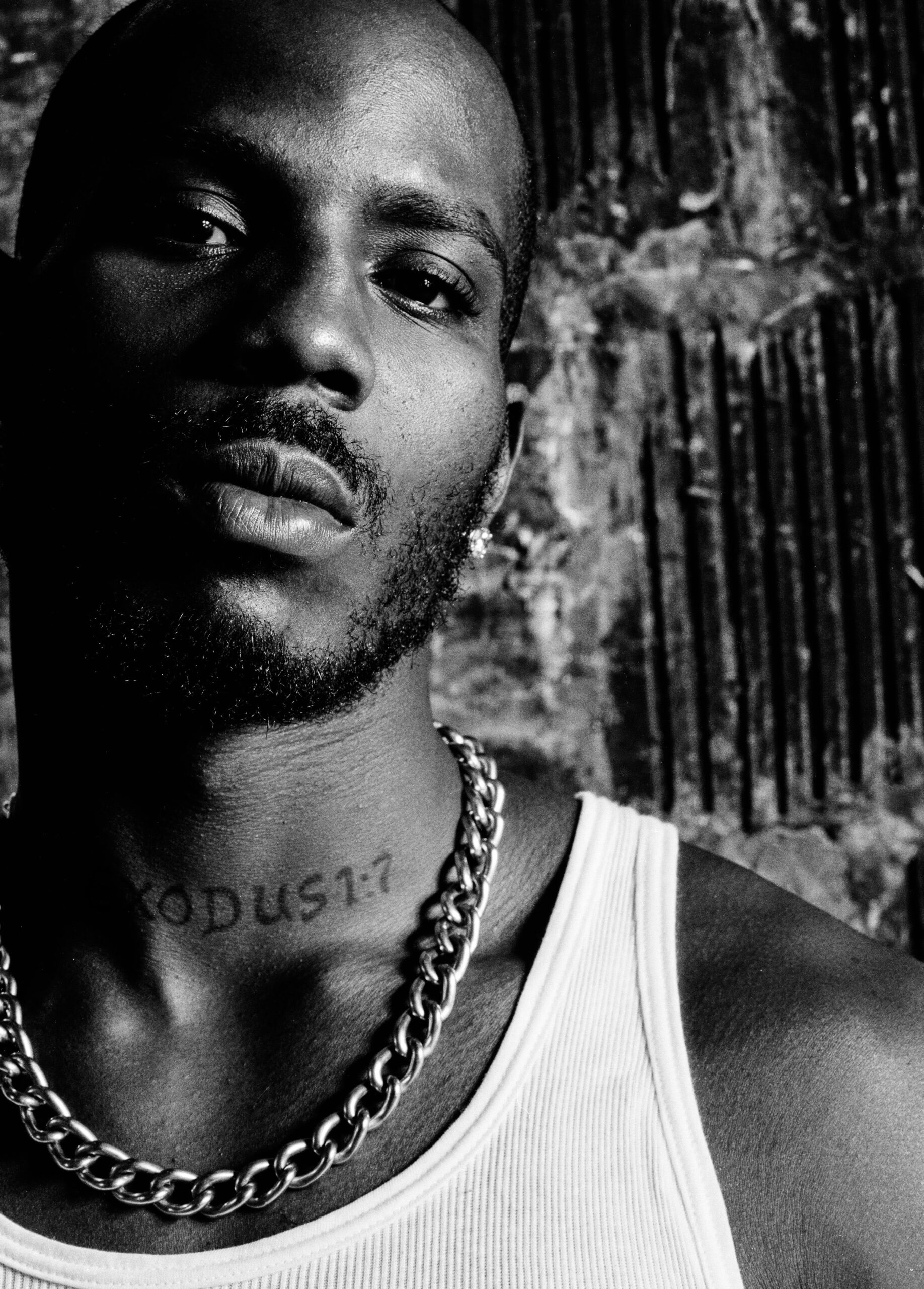
The EXODUS 1:7 tattoo is one of the first pieces people recognize in later photos. Dark block letters cross the front of DMX’s neck, just above the chain he often wore. The phrase refers to a biblical verse and to his son Exodus. On an episode of Black Ink Crew, DMX explained that he had just welcomed his fifteenth child and wanted his son’s name across his neck.

A neck tattoo isn’t background decoration. It shows when someone speaks, performs, or turns toward a camera. DMX chose a placement that made the family reference part of his public image. In the close-up, the letters are easy to read and follow the shape of the throat.

The word EXODUS also connects to the spiritual side of his writing, and the verse gives it another layer without a large illustration. If you like text tattoos, notice how a short word in a visible place can carry weight through placement alone.

The front lettering was added later than his older neck tattoos. As his collection grew, it became one element among several. Even a strong central word can become a chapter in a larger set of designs.

DMX ONE LOVE BOOMER back tattoo

DMX tattoos: shirtless back view showing ONE LOVE BOOMER lettering, dog image and arm ink

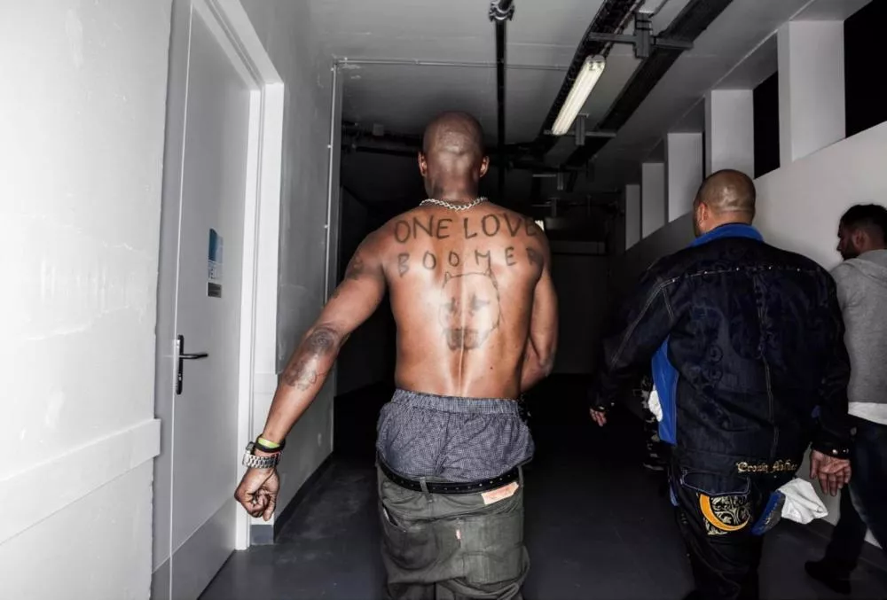
The back piece is one of the more personal designs in the collection. In the backstage photo, ONE LOVE BOOMER stretches across DMX’s upper back, with a dog image underneath. Boomer was a close companion, according to friends and later interviews, which gives the tattoo a more affectionate feel than the rough stage photos might suggest.

Dogs came up in DMX’s lyrics, interviews, and daily life. He often used them to talk about loyalty, respect, and the people around him. The tattoo makes that connection visible: the words sit high across the shoulders, with a dog portrait underneath.

The back gives a wide phrase room to sit along the shoulders. Large letters stay visible as the arms move, while the portrait below adds height without crowding the spine. Its rough, hand-drawn finish suits the memory behind it.

The lettering works like a banner, and the dog portrait gives it one clear focus. Together, they read as a tribute rather than a series of unrelated symbols.

DMX first tattoo: grim reaper and pitbull

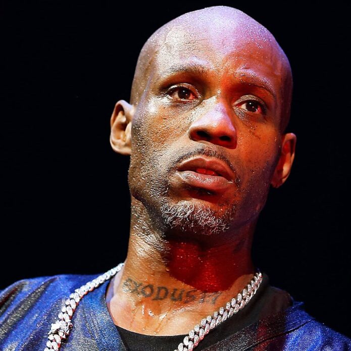
DMX tattoos: high-resolution stage portrait showing stomach writing and tattoos across both arms

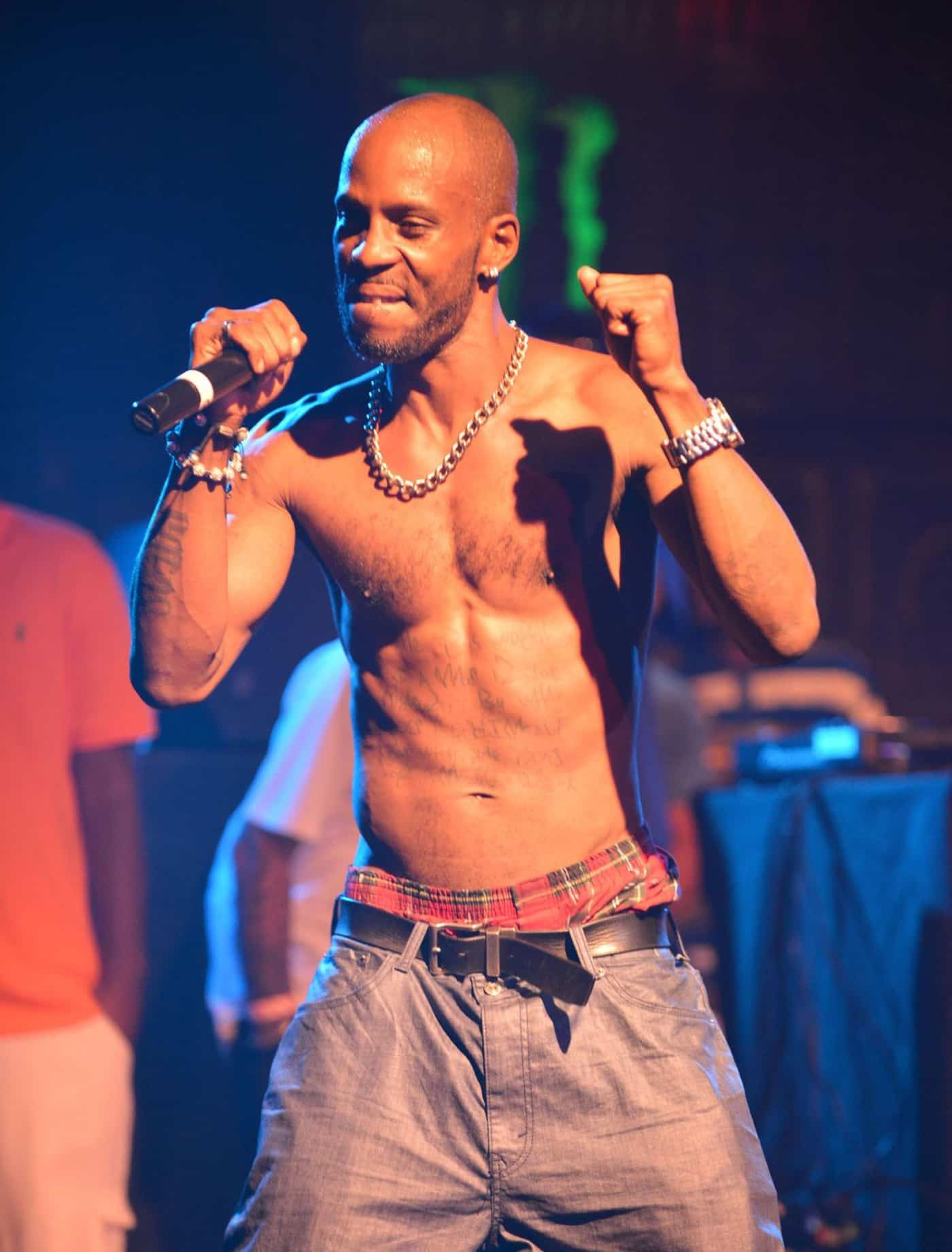
DMX told The Boombox that his first tattoo was a grim reaper walking a pitbull on his left tricep. Later, he questioned what it meant to carry such a dark image. He said, “when you put something on your body, you kinda bind yourself to it”. He felt the grim reaper brought a negative cloud with it, even though he had chosen the tattoo when he was young.

That was an unusually candid way to talk about old ink. DMX didn’t say the tattoo was poorly made; he talked about the meaning he’d attached to it and how that stayed with him. It’s a distinction worth keeping in mind when you’re choosing a first design.

The pitbull also links this early tattoo with the later Boomer piece. Dogs appear in both, but the emotional tone is different: the grim reaper design carries danger and fear, while the back tattoo is about love and remembrance. The same subject can carry different feelings depending on the image around it.

The tricep gives a vertical design room without making it the first thing everyone sees. When DMX performed shirtless, it appeared beside the arm lettering and torso writing. It became one of the early pieces in a collection that kept growing.

DMX stomach lyric and chest script tattoos

DMX tattoos: portrait view showing the large upper-arm piece, forearm script and hand placement

The writing across DMX’s stomach looks handwritten in the photos. Lines of script run over the torso, with more letters and symbols reaching toward the chest. It doesn’t read like a single polished panel so much as a page of notes written across the body.

One well-known stomach lyric begins with the idea that a person’s worth is measured by what they do for someone else. That sentiment fits how friends described DMX’s generosity and the prayerful side of his music. The words are visible in shirtless performance photos, yet still feel like a statement he wanted close to him.

Torso lettering has to move with breathing and posture. DMX’s script follows the available skin instead of forcing the lines into a rectangle. The result is rougher, but it also feels lived in, closer to handwriting than a logo.

If you’re planning a stomach tattoo, think about how the body bends before settling on a font. A phrase that looks straight on a screen may shift around the ribs or above the navel. DMX’s lettering works with the torso because the words are large and loose enough to follow its shape.

DMX arm, forearm and hand tattoo layout

DMX tattoos: close press portrait showing the EXODUS throat tattoo and upper chest placement

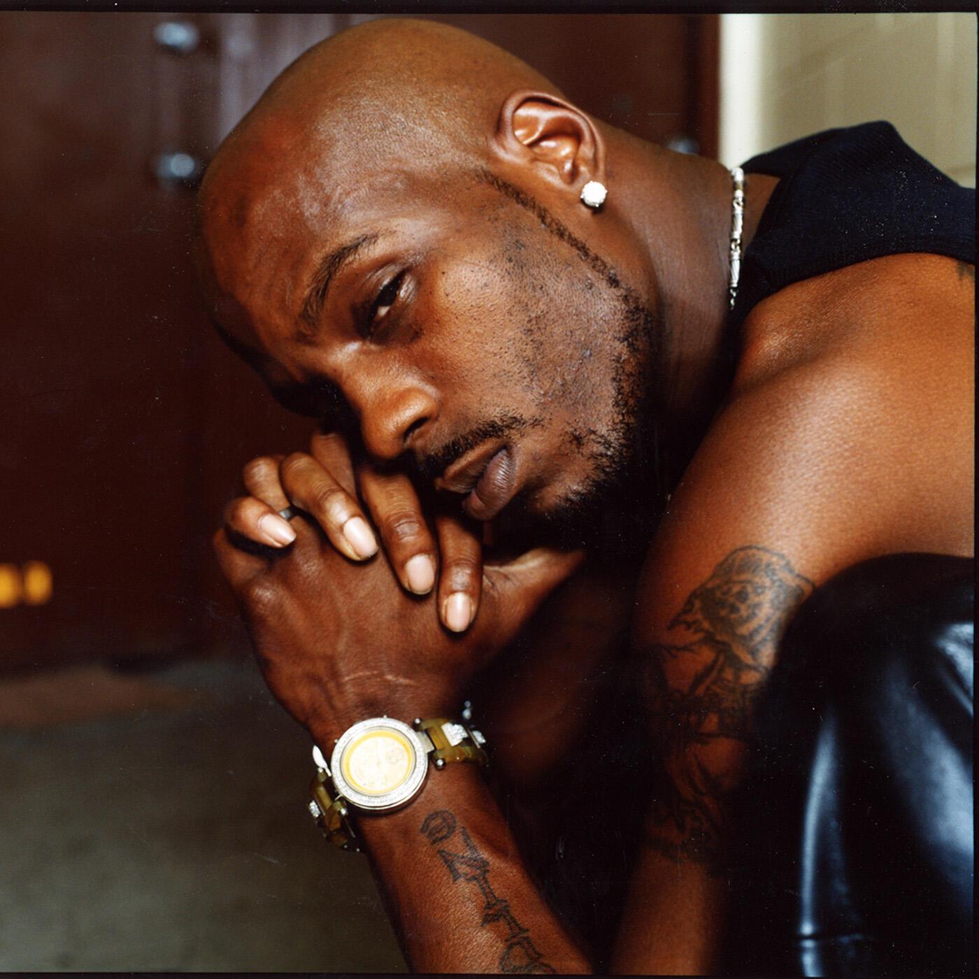
The arm tattoos tie the collection together. Close portraits show dark work on the upper arm, script on the forearm, and smaller marks reaching toward the hands. The subjects differ, but the designs share a similar weight: dark shapes alongside open skin, with lettering placed where it shows when he raises a microphone or folds his arms.

The upper arm has room for a larger image, such as the grim reaper and dog; the forearm gives shorter phrases a line to follow. Hand and wrist pieces add another visible layer. Onstage, the collection reads from a distance, while close portraits bring out more detail.

Crosses and religious imagery also appear in photos of his arms and torso. They sit alongside the prayer language in many interviews and songs, without making every tattoo part of one theme. A collection can hold faith, family, memory, and style at once; each piece needs to make sense where it sits.

The arm work grew over time, and the tattoos don’t have to connect perfectly to feel related. Repeated line weight, spacing, and recurring subjects can tie together designs from different years. Dog imagery, bold lettering, and dark shapes appear across DMX’s collection.

The tattoos show different sides of his public story. The ink looks tough, but many of the stories behind it involve family, faith, loyalty, and regret. EXODUS puts his son’s name across his neck; the Boomer piece remembers a dog he loved; and his account of the first tattoo shows how the meaning of old ink can change.

If you’re taking ideas from the collection, begin with the story, then think about placement. A name might belong somewhere you can see it each day; a tribute can spread across the back; a lyric may need room on the torso. Your design doesn’t need DMX’s lettering to carry the same honesty. It needs to say something you can live with.

More musician tattoo guides

Udonis Haslem Tattoos: Florida Back Piece, Chest Script and Heat Ink

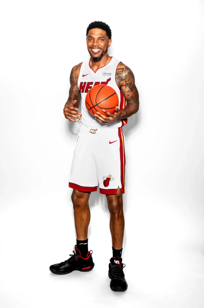
Udonis Haslem’s tattoos don’t look like filler. They suit the way he played: tough, personal, and tied to home. A large Florida design covers his back; script runs across his chest; darker work covers his shoulders and arms; names and short phrases add smaller details. The collection feels lived in rather than staged.

Some tattoos are easiest to see in shirtless portraits, others only in game photos or interview clips. Across those different views, the same ideas recur: Florida, family, faith, Miami, and memory. Bold black shading gives the designs a shared feel.

Here’s a look at the pieces people notice first, what their placement does, and ideas you can adapt without copying an athlete’s tattoo map.

Udonis Haslem’s Florida back tattoo is the centrepiece

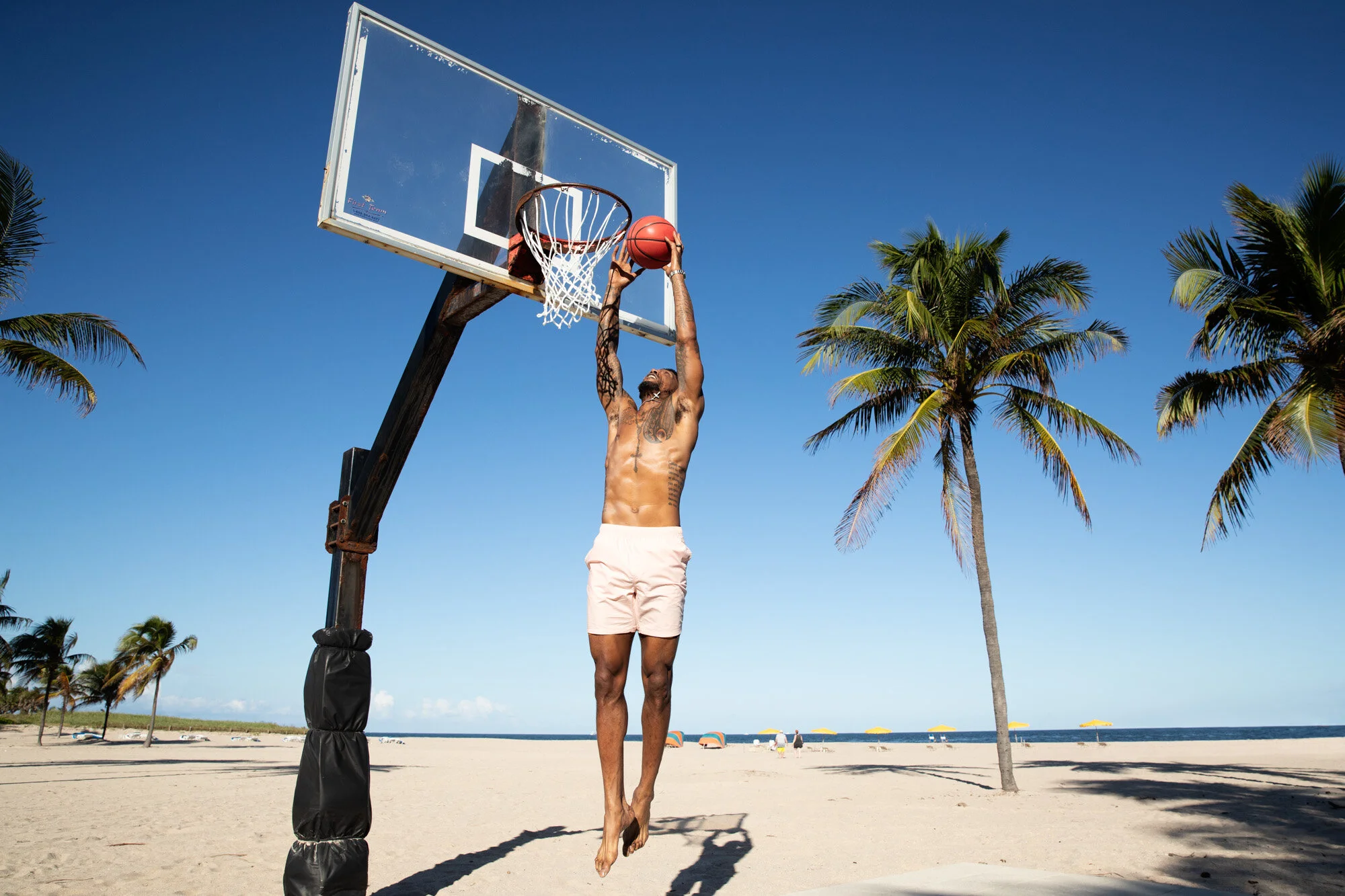
Udonis Haslem tattoos: close shirtless view showing chest script, rosary line, shoulder pattern and both arms

The Florida tattoo across Haslem’s back is the collection’s largest statement. The outline gives it an immediate connection to home. Haslem was born in Miami and spent his entire NBA career with the Heat, so the state is part of both his personal life and public identity.

The design works as a full-back composition. The state’s outline sets the shape, with lettering and darker details giving it enough weight to fill the broad area. It needs room: on a forearm, the outline and words would lose much of their effect.

As Haslem turns or leans forward, the state shape moves with his back. An artist planning a piece like this would need to consider the shoulder blades, spine, and lower back together before tattooing.

Design takeaway: a meaningful place can carry a large tattoo when its outline is clear and the details are planned as one design. The connection behind the shape matters as much as the image itself.

Chest script and the rosary create a layered front panel

Udonis Haslem tattoos: shirtless beach portrait showing the chest writing, shoulder coverage and forearm ink clearly

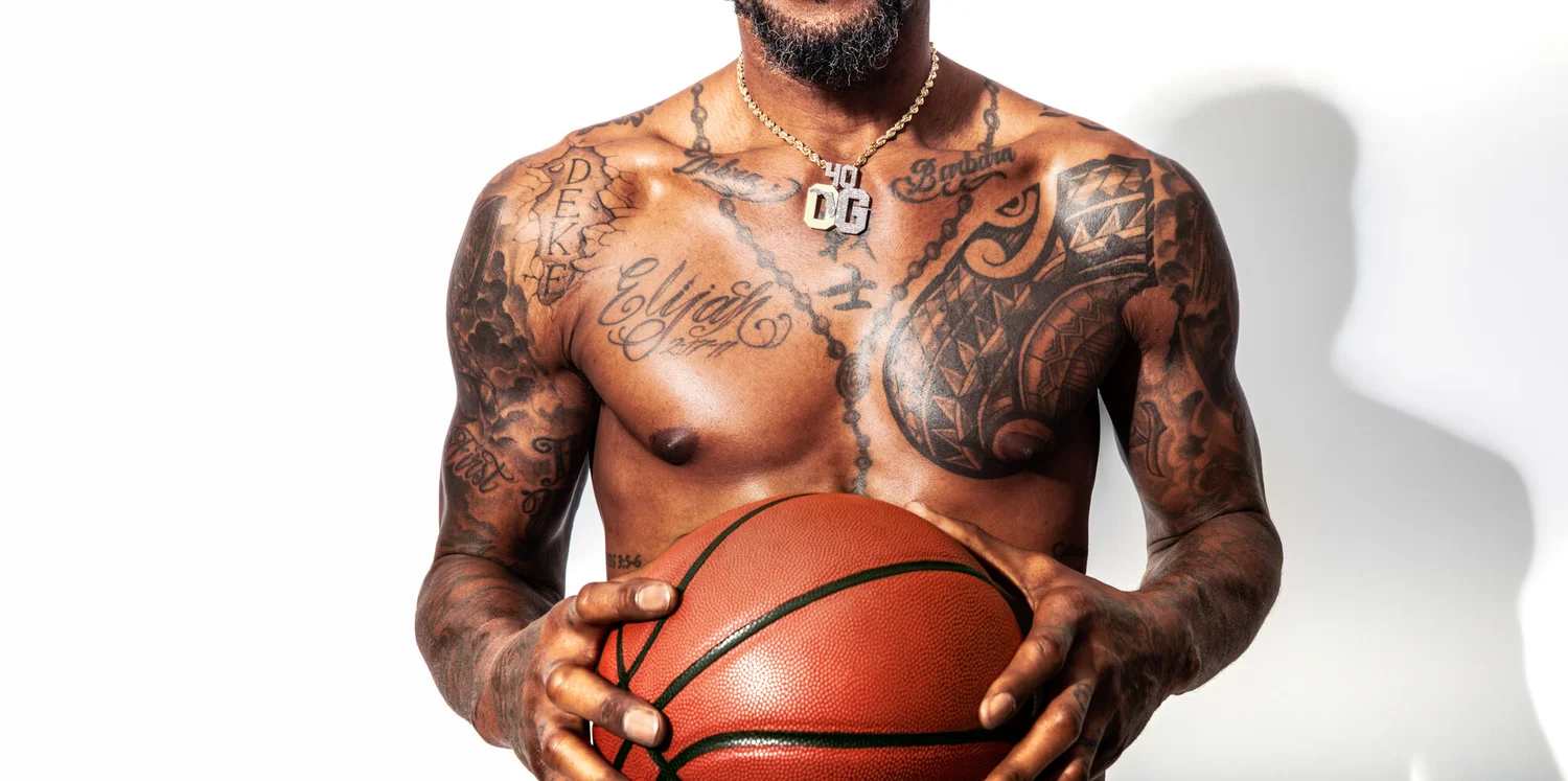
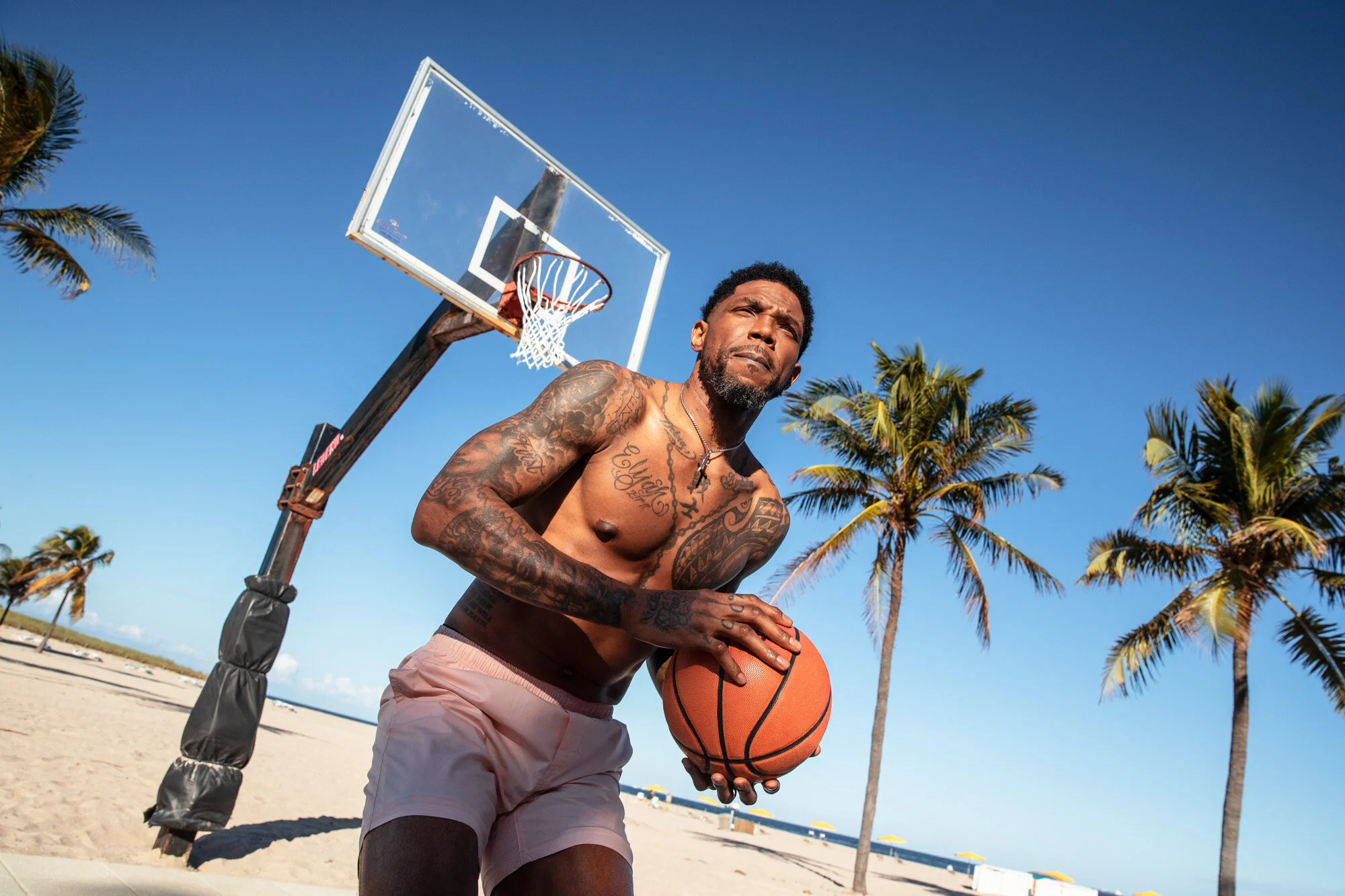
Haslem’s chest has a different feel from the back piece. Script, religious imagery, and lines that follow the width of his chest sit across the front. A rosary-style chain and cross add a vertical line, while the lettering spreads sideways.

The separate pieces share a visual rhythm. The script has room around it, and the rosary gives the eye a path from the neck toward the center of the body. Even when the words are hard to make out in a moving photo, the layout remains clear.

The beads and cross bring a quieter note to a collection with a lot of dark shading. The cross is recognizable without needing much detail and breaks up the lettering.

A phrase such as “Family First” fits the chest because it keeps the message close. For a smaller design, one short line of script beside a fine-line cross might be enough; there’s no need to reproduce the whole panel.

Design takeaway: chest lettering can sit with a chain, cross, or small symbol. Leave open skin around the words so the message stays easy to read.

His shoulders and arms carry the boldest blackwork

Udonis Haslem tattoos: shirtless portrait showing the full torso, shoulder patterns and script running down the body

The shoulder and arm tattoos give Haslem’s collection its toughest look. In shirtless portraits, the ink runs from the upper arms over the shoulders and down the biceps. Patterns, shading, and smaller marks fill the available space, creating connected blackwork without one obvious centerpiece.

Shoulder tattoos have to work from the front, side, and back because the muscle turns through all three views. Haslem’s designs use that curve: darker shapes sit where the shoulder rounds, while smaller details continue down the arm without making the tattoo look like a rectangle.

The open chest script contrasts with the denser shoulder work. That keeps the whole collection from reading as one dark block. Your eye can move from the lettering to the shoulder, then toward the forearm and hand.

If you’re planning a similar piece, start with the shoulder or upper-arm tattoo you care about most. Let it heal before deciding what should connect to it. That gives you more room to adjust than planning a whole sleeve before the first design has settled.

Design takeaway: balance dark areas with lighter gaps, and let the pattern follow the round shape of the shoulder. A sleeve can feel full without covering every inch in the same weight of black.

Family names and hand lettering keep the story personal

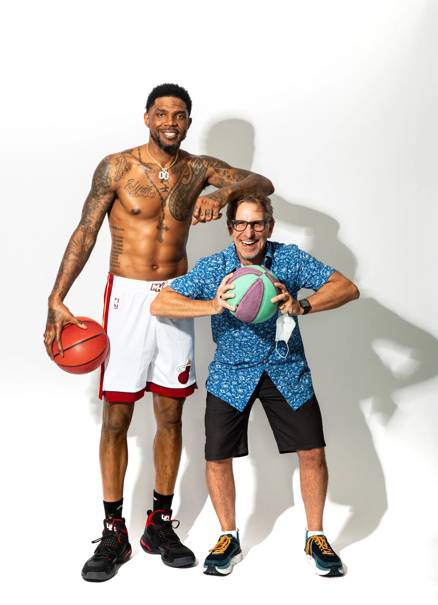
Udonis Haslem tattoos: standing shirtless view showing the chest lettering, abdominal script and arm coverage

Not every meaningful tattoo in Haslem’s collection is a large image. Names, brief phrases, and hand lettering tie the designs to people and relationships. The writing on his hands and forearms is smaller than the Florida piece, but it can feel more intimate because it’s always visible.

Hand tattoos are direct and exposed. The skin moves constantly and there isn’t much space, so even a short word has to carry its weight. A name or family phrase can be a reminder the wearer sees throughout the day.

Memorial tattoos can also work with simple lettering. A name or date may be enough; a small cross, star, or line of script can sit beside it without taking over.

Hands and fingers fade faster than areas protected by clothing, and fine letters can soften over time. Choose a font with enough weight, don’t crowd too many words into a small area, and plan for the possibility of a touch-up.

Design takeaway: a clear phrase can hold more meaning than a complicated picture. Choose a placement that keeps the words close without squeezing them in.

Neck, forearm and bicep tattoos fill the gaps

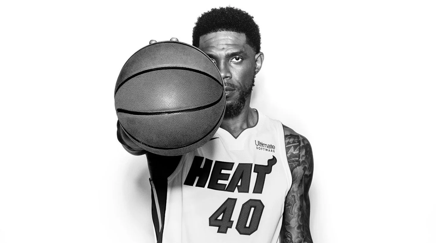
Udonis Haslem tattoos: black-and-white portrait showing the visible upper-arm, shoulder and hand tattoo layout

The smaller tattoos on Haslem’s neck, forearms, and biceps link the larger pieces. A phrase near the neck can lead into the chest design; a bicep tattoo can continue the shoulder work. The collection looks as if it grew over time, not as if every piece came from one flash sheet.

Names, faith references, and short statements fit narrow spaces because their size can be adjusted to the body part. Forearm letters can follow the length of the arm; a bicep design can wrap around the muscle.

Neck ink is easy to spot in interviews and photos, so it becomes part of a public image. If you want a similar vertical line with more flexibility, the upper chest or back of the arm may be easier to cover.

Small tattoos should still have a reason to be there. They can balance an open patch, repeat a familiar shape, or mark a memory. Repeated lettering, symbols, or shading help related pieces feel connected; random additions can make a collection feel crowded.

Design takeaway: use smaller placements to link the main tattoos or add a personal detail. A repeated lettering style, symbol, or shading choice can make a collection feel deliberate.

Heat-era additions and changing visibility

Haslem’s tattoos became part of his image during his Miami Heat career, but the collection changed over time. Different photos show more or less of the ink depending on his clothes, the lighting, and the camera angle. A jersey hides much of the chest and back; training and beach portraits reveal more.

One photograph rarely shows every tattoo. A design can seem new simply because it was hidden in earlier images. Taken together, Haslem’s tattoos read like a timeline of home, family, belief, and career.

If you like the overall look, take the ideas rather than the exact artwork. Choose a place that matters to you, use a phrase you’ll still stand by later, and let each new tattoo connect to a real part of your life. The personal logic is what holds the collection together.

Frequently asked questions

What is Udonis Haslem’s most famous tattoo? The large Florida design across his back is most closely tied to his Miami identity and is usually the first tattoo people mention.

Does Udonis Haslem have chest tattoos? Yes. His chest has prominent script and a rosary-style religious design, along with other ink visible in shirtless portraits.

What style are Udonis Haslem’s arm tattoos? His arms combine bold blackwork, shading, lettering, and smaller personal details rather than following one strict traditional style.

What should I copy from his tattoo style? Borrow the planning: connect placement, meaning, and scale. A hometown outline, family phrase, or faith symbol will mean more when it belongs to your own story.

More athlete tattoo guides

Rey Mysterio Tattoos: 619, Chest Wings, Family Names and Rosary Ink

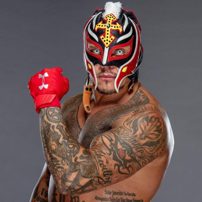
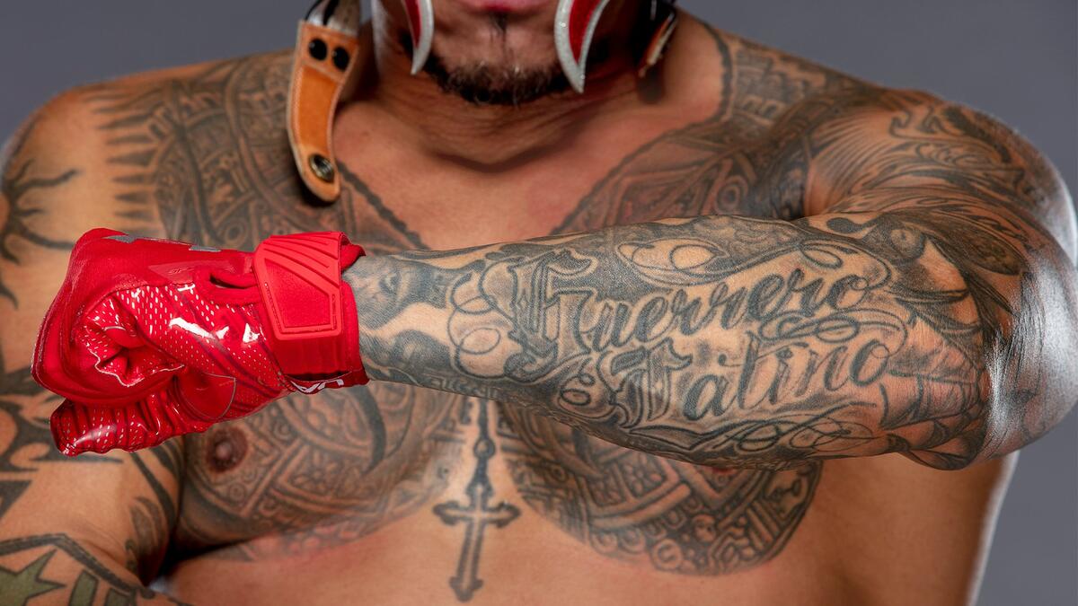
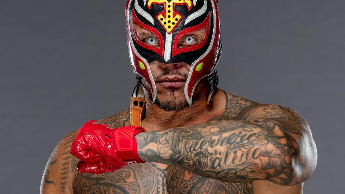
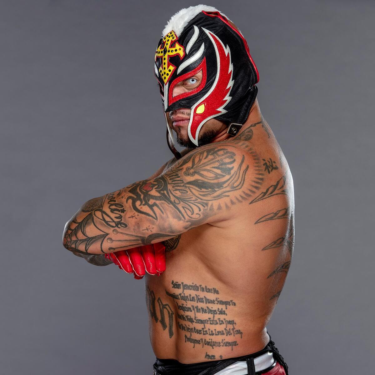
Rey Mysterio’s tattoos are nearly as recognizable as his mask. Lettering, symbols, and black-and-gray designs cover his arms, chest, shoulders, back, and neck. They point to the same parts of his life: family, faith, San Diego, and close friendships.

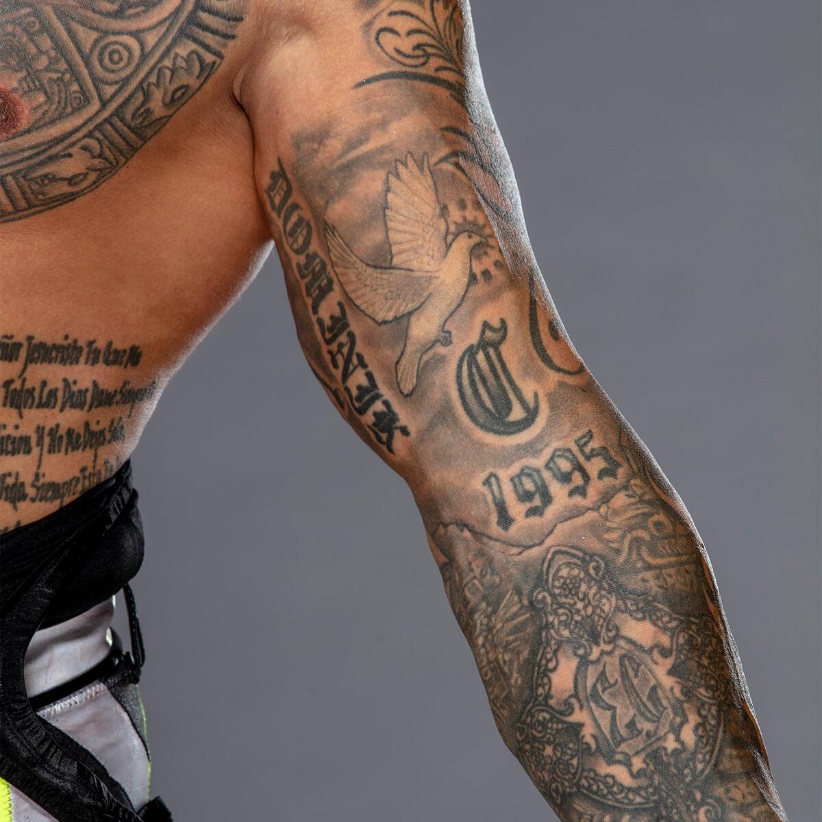
The number 619 connects to his hometown and signature move. His children’s names keep family close. Crosses and rosary details speak to his faith, while other pieces remember people important to him, especially Eddie Guerrero. The larger designs feel personal too, not just added to fill space.

Here’s a closer look at the main parts of Mysterio’s tattoo style and how they fit together.

Rey Mysterio’s chest wings and Aztec lines set the visual tone

Rey Mysterio tattoos: inline tattoo image
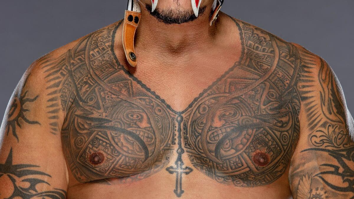
The scale of Mysterio’s collection is clear across his chest. Broad wings, curved black lines, and layered tribal shapes spread over his upper body and continue into the shoulders and arms. From a distance, they read as one bold piece; close up, repeated curves, outlines, and shading keep it from looking flat.

This is a strong design, built to show up when he’s moving around a ring or under arena lights. The wings draw the eye across his chest, and the darker areas add weight in the center. The whole piece follows the shape of his body rather than sitting like a flat panel.

The lines also recall the masks, armor, and warrior imagery associated with Mysterio. They aren’t a direct copy of one mask, but they share its movement. That helps the tattoo sit naturally beside his wrestling gear without looking like a costume piece.

The useful point here is that a large tattoo doesn’t have to cover every patch of skin. The open areas between the darker shapes leave the design room to breathe and keep it readable.

The 619 forearm tattoo turns a wrestling number into a signature

Rey Mysterio tattoos: inline tattoo image
The 619 is one of the tattoos most closely tied to Mysterio’s career. It refers to the San Diego area code and to the move that became his calling card. The number is part of his identity outside the ring as well as part of the show.

The lettering has an old-school look and enough weight to read from a distance. Nearby symbols and shading place it within the sleeve, so it feels connected to the rest of the arm rather than like a logo on bare skin. The surrounding designs also link the number to his hometown and career.

A number tattoo should still matter to you years from now. For Mysterio, the 619 connects home, wrestling history, and one of the best-known moves in the business. That gives it more staying power than a set of digits chosen only because they look good.

A signature number works best when it means something to you before other people recognize it. Fans know what the 619 means, but it belongs to Mysterio first.

Family name tattoos keep Dominik and Aalyah close

Rey Mysterio tattoos: inline tattoo image
Some of the most personal tattoos in Mysterio’s collection are also the simplest. His children’s names, Dominik and Aalyah, are lettered on his arms. The designs don’t compete with the larger chest and sleeve work; they sit within the collection as reminders of the people behind the public figure.

That difference in scale helps the names stand out. The large pieces use bold shapes and movement, while the lettering is direct. You don’t need a long explanation to understand why a parent might choose these tattoos.

The arms keep the names visible to Mysterio, and the surrounding designs give them a natural frame. They feel part of the same body art that has been with him through training, travel, and years of matches.

If you’re thinking about a family-name tattoo, keep the lettering clear. An uncluttered type style is easier to read than cramped or overly decorated text. Choose a placement that feels connected to your daily life.

The cross, rosary and neck work carry his faith

Rey Mysterio tattoos: inline tattoo image
Faith is another recurring subject in Mysterio’s tattoos. A cross, rosary details, and neck ink bring a different mood to the collection. The symbols are familiar, but their placement among his other designs makes them feel like part of his own story.

The rosary around his neck is easy to see because it follows a natural line around the body. At first it can resemble jewelry; as a permanent tattoo, it carries a different weight. The cross and related designs add a clear sign of belief beside the wrestling numbers, family names, and larger graphic work.

Neck tattoos affect the whole look because they’re visible from so many angles. Here, the neck helps connect the face, chest, and back instead of letting the designs stop abruptly at the collar or shoulder.

Religious symbols are common tattoos, so the wearer’s reason for choosing one matters. In Mysterio’s collection, faith sits alongside family and career rather than apart from them. The image matters, but so does what it means to you.

Love till Death and the Eddie Guerrero tribute add the personal tattoo weight

Rey Mysterio tattoos: inline tattoo image
Some of the most emotional tattoos in Mysterio’s collection are about love, loyalty, and remembering people. On his left calf, two skeletons form a heart around the words “Love till Death.” The figures turn the phrase into a small scene, giving it more warmth than a slogan on its own.

Mysterio also has tattoos connected to Eddie Guerrero, his friend and fellow wrestler. Their friendship became an important part of Mysterio’s life and career, in and out of the ring. The tribute keeps that relationship close; it’s for Mysterio as much as for fans who remember their story.

These pieces give the collection its emotional weight. The dark designs catch your eye, but the names, dates, phrases, and tributes tell you more about why the tattoos are there.

A memorial tattoo doesn’t have to be a portrait or a large realistic scene. A phrase, date, symbol, or pair of figures can carry a lot when the connection is clear. The details don’t need to be obvious to everyone; they need to feel true to the relationship they represent.

What makes the collection memorable

Each part of Mysterio’s collection has its own role. The chest and arm tattoos bring the visual impact; the 619 connects to San Diego and wrestling; the family names keep his children close; the cross and rosary reflect faith; and the “Love till Death” and Eddie Guerrero pieces hold on to personal memories.

There’s a sense of movement from one area to another. Chest lines lead toward the shoulders, lettering fits within larger shapes, and the neck tattoos help join the front and back. The designs come from different points in Mysterio’s life, but the collection has room to grow.

That’s the useful part to borrow. Start with the stories you want to carry, then think about size, placement, and how later tattoos might sit nearby. The designs can be bold while keeping their personal meaning at the center.

Questions readers ask

What does Rey Mysterio’s 619 tattoo mean? It refers to the San Diego area code and his famous wrestling move.

Does Rey Mysterio have his children’s names tattooed? Yes. Dominik and Aalyah’s names appear in lettering on his arms.

What does the “Love till Death” tattoo represent? Two skeletons and a heart on his calf express lasting love and loyalty.

Does Rey Mysterio have religious tattoos? Yes. Cross and rosary imagery, along with neck work, are part of his collection.

Which Rey Mysterio tattoo is most recognisable? The 619 lettering is probably quickest for fans to identify, while the chest wings and arm work are also central to his look.

Mysterio’s tattoos have grown alongside his life and career. Some show where he’s from, some honor the people he loves, and others hold memories that shaped him. The mask and the ink tell parts of the same story.

More wrestler tattoo guides

Kofi Kingston Tattoos: Spine Symbols, Wings and New Ink Explained

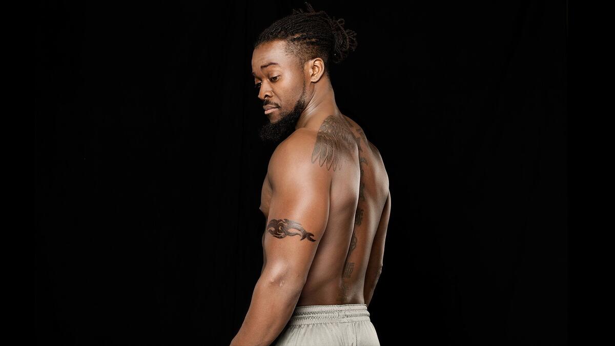
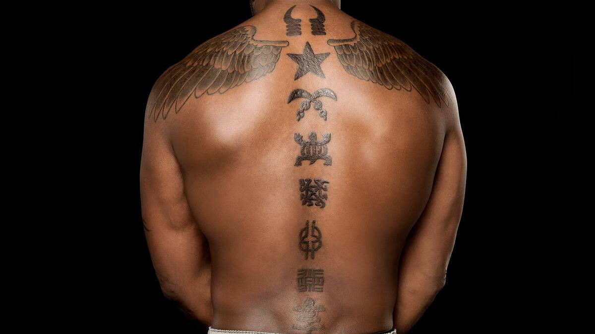
Kofi Kingston’s tattoos can be hard to catch during a match, but the close-up photos show how the designs fit together. There’s a pair of wings across his upper back, symbols down the spine, an armband, and newer ink on his lower leg. The pieces give his look a sense of motion without covering him in one unbroken mass of ink.

The back is broad and symmetrical; the spine marks draw the eye down the middle. The armband and leg tattoo break up those larger shapes. Kingston has also talked about the cultural meaning of the symbols on his back, so they aren’t there only to make a dramatic picture from a distance.

Here’s a closer look at the main designs, their placement, and the way they sit alongside one another.

Kofi Kingston’s winged back tattoo creates the main shape

Kofi Kingston tattoos: inline winged back tattoo image

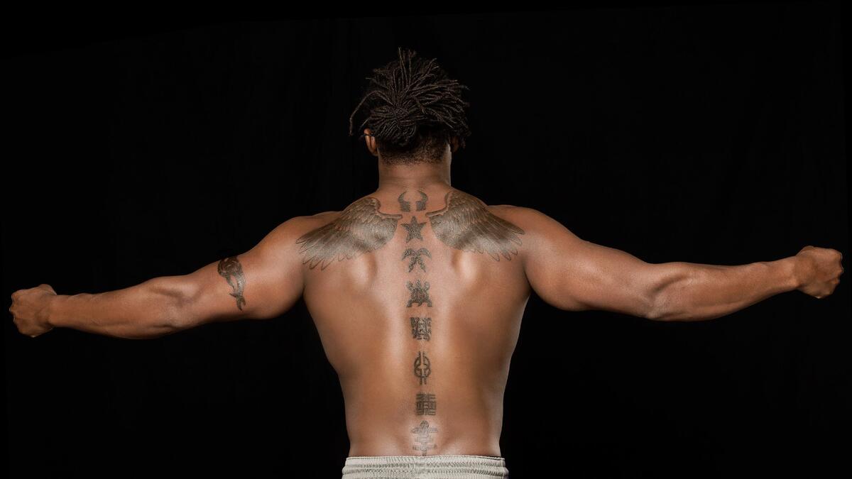
The pair of wings across Kingston’s upper back gives the collection its widest shape. Feathers spread from the center toward his shoulders, following the line of his frame. The design changes with the angle: from the side you see one wing’s edge; from behind, the symmetry comes into view.

The wings use shading instead of a single flat black fill. Feather lines and softer shifts between light and dark keep the image detailed, and the design moves with his back. When Kingston raises his arms or leaps, the wings seem to open with him.

Wings are a familiar tattoo subject, but the placement gives this piece its own shape. The spine symbols begin at the center, so the wings frame the top of a larger design instead of sitting apart from it.

Plan a large back tattoo around the body’s natural lines. The shoulders, spine, and shoulder blades already give the artist a structure to work with. A design can follow those landmarks rather than cover them up.

The spine symbols turn a back tattoo into a vertical story

Kofi Kingston tattoos: inline spine tattoo image

A row of symbols runs down the center of Kingston’s back, giving the area a different rhythm from the wings. Your eye starts near the neck, pauses on each mark, and continues toward the lower back.

The symbols also carry cultural meaning. During his Superstar Ink appearance, Kingston discussed their significance and said tattoos helped bring out his rebellious side when he was younger. That context makes them more than decorative shapes filling an open space.

Each mark has room around it, so the symbols remain distinct. If they were packed together, the line could become harder to read over time. Here, the spacing lets each one stand on its own while keeping the full row connected.

A vertical tattoo can feel connected without being one long image. A sequence of smaller symbols can create the same downward movement when the placement is consistent and the marks share a visual weight.

Kofi’s close-up back work shows the detail inside the ink

Kofi Kingston tattoos: inline back tattoo close-up

The closer view shows how the wings and spine designs meet. The feathers angle toward the symbols in the middle, so the two areas feel connected rather than like separate tattoos placed side by side.

Black-and-gray shading suits the design. Clear outlines keep the shapes legible, while softer gray areas stop the back from looking harsh. The overall effect is clean and athletic, with enough small detail to make the tattoo personal.

A close-up lets you see choices that disappear in a full-body photo: where feather tips overlap, how much dark shading is used, and which areas of skin are left open. Those details give the back piece its depth.

For a large symmetrical design, check it from both near and far. The outline should read across a room, and the smaller decisions should hold up when someone looks closer. Kingston’s back tattoo does both.

The arm band tattoo keeps the collection from feeling too symmetrical

Kofi Kingston tattoos: inline arm band tattoo image

The armband is smaller than the back piece, but it gives the collection another direction. It curves around the upper arm, adding a horizontal line against the vertical symbols down the spine.

That change in direction keeps the tattoos from feeling too rigid. The wings spread outward, the symbols run down, and the band wraps around. Each one uses the body’s shape differently.

An armband can stay clear without taking up much space. Strong outlines and a simple repeating pattern are usually easier to read than tiny details crowded into a narrow strip. It should look considered from each angle, not like a line that stops where a sleeve might cover it.

If you’re adding tattoos gradually, a band can stand on its own and still echo lines elsewhere in your collection. It doesn’t need to match every piece; a shared rhythm is enough.

The new leg tattoo adds a sharper, more personal accent

Kofi Kingston tattoos: inline new leg tattoo image

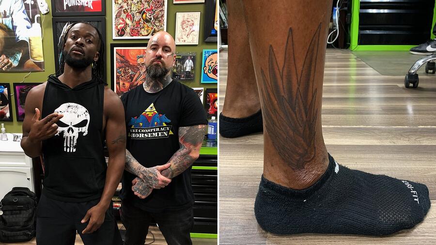
The newer tattoo on Kingston’s lower leg looks different from the older back work. It’s darker and more pointed, with long shapes that follow the ankle and calf. The design is more compact than the wings, but the lines still give it lift and direction.

The placement changes when the tattoo comes into view. A back piece is usually seen when the wearer turns around; a leg design shows during movement, especially with shorts, boots, or ring gear. That makes this piece part of his athletic look in a different way.

The session photo shows the design before it’s seen under stage lights or in motion. Its feather-like points and dark center are easy to make out, and the contrast helps it read from a distance.

New ink can fit a collection without repeating the older work. It can keep a related idea, such as movement or wings, while changing the scale and mood. Kingston’s leg tattoo feels like a new direction, not a copy of the back piece.

Why Kofi Kingston’s collection works

The tattoos have distinct shapes and placements. The wings spread across the back, the spine symbols run down the middle, the armband curves around the arm, and the leg tattoo creates another point of focus. Each occupies a different line of the body.

Personal meaning sits alongside the visual choices. Kingston has discussed the cultural significance of the back symbols, and the newer leg work shows that his style continues to change. The stories give the designs context; placement lets them sit together.

If you’re planning several tattoos, start with the story you want to keep, then think about the shape it could take. A larger piece can set the direction, while smaller tattoos can echo its lines or add a different one. The pieces don’t have to match perfectly; they should feel like they belong to you.

Questions readers ask

What tattoos does Kofi Kingston have on his back? He has winged designs across his upper back and a row of symbols down his spine.

What do Kofi Kingston’s spine tattoos mean? He has spoken about their cultural significance and about tattoos bringing out his rebellious side when he was younger.

Does Kofi Kingston have a new leg tattoo? Yes. A newer lower-leg design uses dark, pointed shapes and adds a different accent to the older back work.

Are Kofi Kingston’s tattoos all black and grey? The close-ups show mostly black-and-gray shading and linework.

What is the main idea behind Kofi Kingston’s tattoo style? The collection combines personal symbols with varied placements: wings, a vertical line of marks, and a band that wraps around the arm.

Kingston’s collection pairs a striking back piece with symbols that carry meaning, plus a newer leg tattoo that takes the design in another direction. The cultural context and the way the pieces follow his body are what make the set worth a closer look.

More wrestler tattoo guides

AJ Styles Tattoos: Rib Dates, AJ Lettering and Family Ink

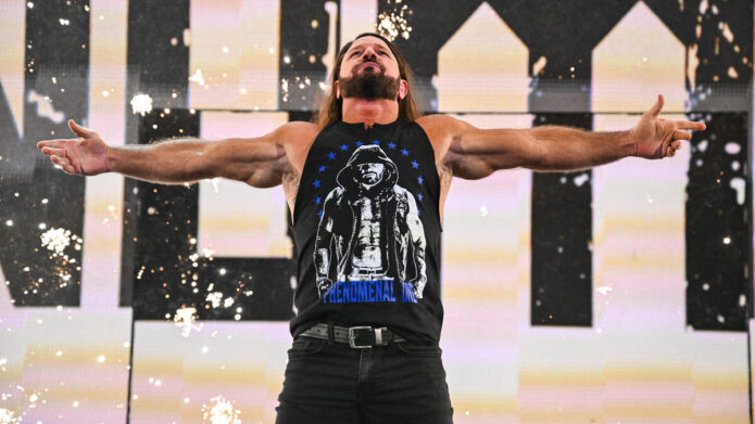
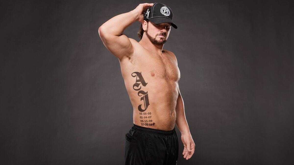
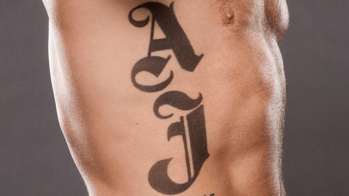
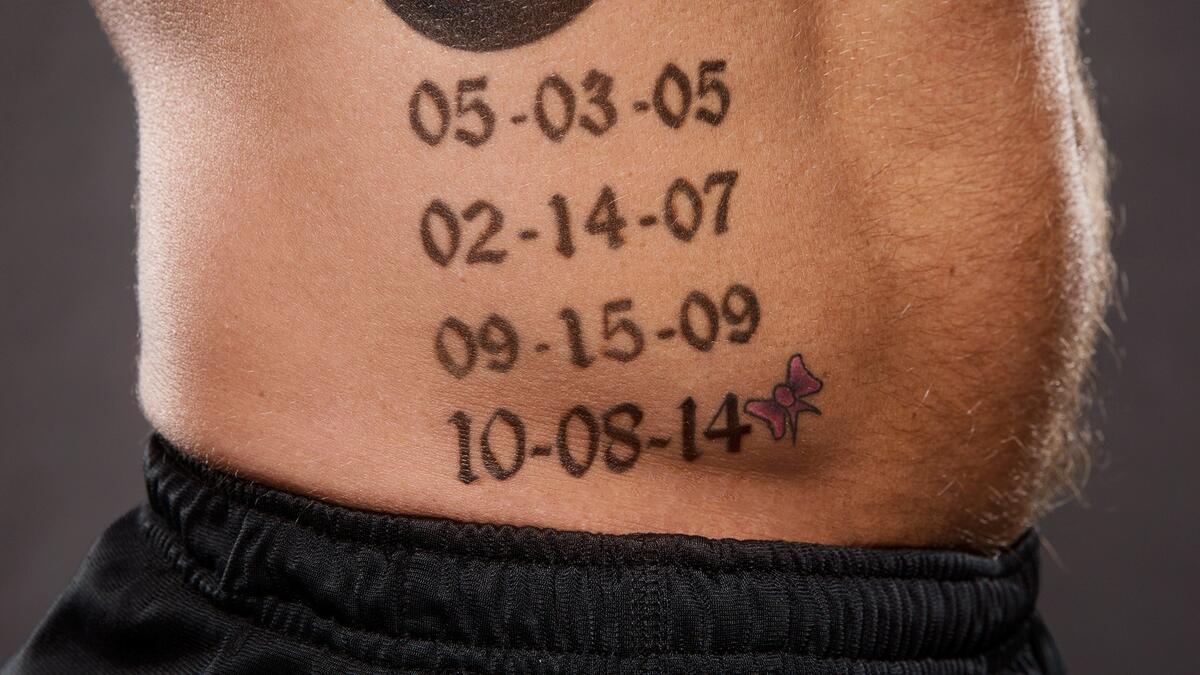
AJ Styles’ tattoos are easy to pick out once you know where to look. A large set of AJ letters covers the right side of his torso, followed by a neat row of dates. It’s a simple idea, but the oversized type and clear spacing make it stand out in WWE photos.

The design follows the curve of Styles’ ribs instead of competing with a sleeve or a full chest piece. The dates below the letters turn it into a family record, and a small pink ribbon beside the newest one adds a softer detail.

Here’s a closer look at the lettering, the dates, and the way the pieces fit together.

AJ’s oversized rib lettering sets the main shape

AJ Styles tattoos: inline wide view of AJ lettering and dates

The tall AJ letters on Styles’ right side are the first thing you notice. They’re large, dark, and shaped in an old-school style. The tattoo fills the space between his armpit and waist, so the letters still read in a wider photo.

Their placement gives the design a natural vertical line. The ribcage curves away from the front of the body, and the lettering follows it. From the front, it looks like a bold strip along his side; turn him a little, and the curve gives the letters more dimension.

AJ connects to Styles’ ring name and his initials, but it also points to his family. All of his children have names beginning with A, so the letters carry a shared meaning as well as a connection to his wrestling persona.

Scale is the main design choice here. On the ribs, larger lettering is more likely to stay readable as the body moves and from a distance. It also makes the tattoo a prominent part of the body’s overall look, which is clearly the effect Styles chose.

The four birth dates turn the piece into a family timeline

AJ Styles tattoos: inline view of the four family dates

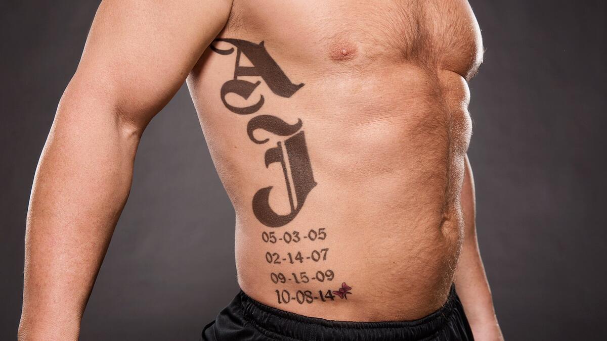
Below the letters, four dates form a column: 05-03-05, 02-14-07, 09-15-09, and 10-08-14. They mark the birthdays of Styles’ four children. The numbers are much smaller than the AJ above them, and that difference gives the design its structure: one large identifier, then the family details.

The first three dates were placed together; the fourth was added later for Styles’ daughter. The tattoo grew as his family did, with the new date extending the list at the bottom.

Dates need enough space to stay clear. Characters packed too tightly may blur together over time. Styles’ column leaves a gap between each line, and the plain, sturdy typeface makes the numbers easy to tell apart.

A family-date tattoo can carry meaning without much decoration. The dates are the point. The layout just needs to keep them legible and make them feel like part of the same design.

The newest date adds a small pink ribbon detail

AJ Styles tattoos: inline close view of newest date and pink ribbon

Beside the newest date, 10-08-14, is a small pink ribbon. It catches your eye because the rest of the lettering and numbers are black. That little touch adds color without changing the tone of the piece.

The ribbon accompanies the date for Styles’ daughter, setting it apart from the first three entries. Those dates stand alone; the newer one has its own visual marker, like a note added to the end of a list.

A small patch of color can direct attention without taking over a tattoo. Here it leads your eye past the large AJ letters and toward the way the design changed over time.

Each element has a different role. The lettering gives the design weight, the dates set a rhythm, and the ribbon provides a brief flash of color. That contrast keeps the piece from feeling flat.

Side angles show how the script follows the ribs

AJ Styles tattoos: inline side angle showing rib placement

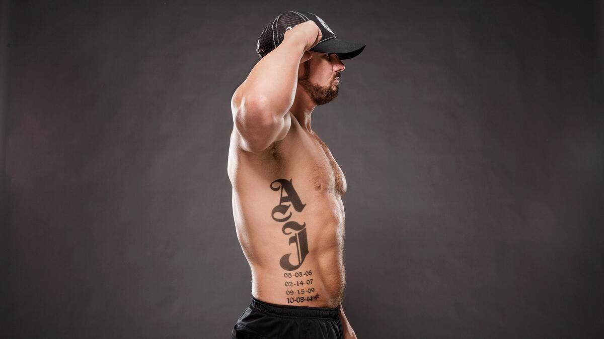
The side view makes the placement clear. The letters follow the outer torso, where the ribs taper toward the waist, instead of sitting on a flat panel. When Styles turns, that curve makes the design look longer and more pronounced.

The thick outlines and dark fills keep the letters clear at an angle. The dates are lighter and smaller, but they follow the same downward line.

Rib lettering moves with each breath, twist, and reach. A design that looks straight on paper can shift across the skin when the wearer changes position. Styles’ letters are tall enough to read together, and they don’t need to sit against a perfectly straight edge.

Notice how little extra decoration the tattoo needs. The letter shapes and the curve of the ribs give it direction; more flourishes could make the dates harder to read.

Close-up images reveal the tattoo’s clean lettering choices

AJ Styles tattoos: inline close-up of black lettering and date spacing

In the close-up, you can see the small choices behind the design. The AJ letters have heavy black sections, but open spaces inside the letterforms keep them from becoming one solid block.

The dates use a simpler style. Each number is separate, and the repeated format gives the lower half a steady rhythm. Here, repetition makes the four lines feel like one planned section.

The tattoo also holds both public and private meaning. People watching Styles wrestle can recognize the initials; the dates carry a family story for those who know what they mark. That gives the design a personal layer without making the message hard to follow.

It’s worth looking at a tattoo both close up and from a distance. Across a room, this reads as a bold AJ mark over a row of numbers. Up close, the ribbon, spacing, and way the letters follow the torso become easier to see.

Why AJ Styles’ family tattoo still works

The parts of Styles’ tattoo support one another. The large initials catch the eye, the four dates make it personal, and the ribbon marks the newest addition without making the design busy.

It also shows how a tattoo can grow and keep its original shape. The first three dates made a column; there was still room to add a fourth later. The layout could change without losing its sense of order.

If you’re planning a tattoo around family milestones, think about whether you may want to add to it later. A layout with room for another name, date, or symbol can grow with your life instead of looking unfinished.

Questions readers ask

What does AJ Styles’ rib tattoo say? It has large AJ letters followed by four dates: 05-03-05, 02-14-07, 09-15-09, and 10-08-14.

What do the dates in AJ Styles’ tattoo mean? They are the birthdays of his four children.

Why does AJ Styles have AJ tattooed on his side? The letters refer to his initials and to the shared A initials of his children.

What is the pink detail beside the last date? It’s a small pink ribbon beside the date added for his daughter.

Where is AJ Styles’ main tattoo? It runs down the right side of his torso, following the ribs toward the waist.

Styles’ tattoo shows how type, placement, and a personal set of dates can carry a design. The lettering catches your eye first; the family details give it meaning.

More wrestler tattoo guides

Rema Tattoos: Swords, Sacred Figures, Fire and the Meaning Behind His Ink

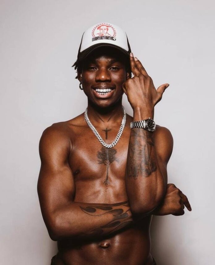
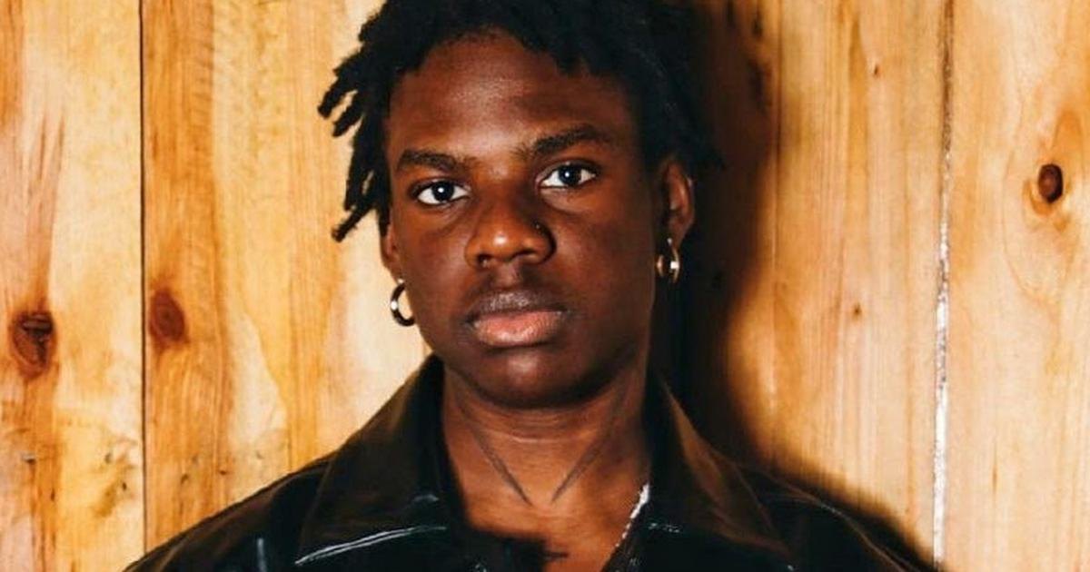
Rema’s tattoos move between religious images, fantasy, animals, fire, and lettering. The Nigerian singer and rapper has no single sleeve or theme holding everything together; the designs feel like parts of a visual world that continues to grow alongside his music.

Twin swords sit near his neck. A detailed scene covers an arm, and a simple word appears lower on his stomach. One image feels ancient, another fantastical, while other marks connect more directly to his identity. Together, they give the collection a character of its own.

Rema has spoken about faith and personal choice when discussing his tattoos. The images connect with ideas of belief, protection, and ambition, as well as the larger-than-life mood in his music. Here’s a closer look at the pieces that give his ink its movement.

The larger designs have room to read, while the smaller ones sit on their own instead of filling every gap. The collection works because the designs have room to breathe. That’s a useful detail to keep in mind if you’re planning several tattoos.

Rema’s sword tattoos frame the neck with a sharp spiritual idea

Rema tattoos: inline twin sword neck tattoo image

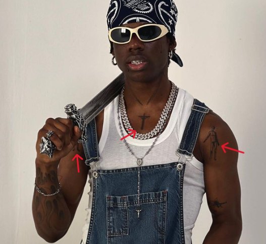
The twin swords on Rema’s neck are among the first pieces you notice. Their dark blades rise on either side, creating a balanced shape and a strong vertical line. They almost resemble a collar or guards, and their closeness to his face changes his outline when he turns his head.

Rema has linked the swords to a biblical idea about the power of the word. The reference is often associated with Hebrews 4:12, which describes the word as sharper than a two-edged sword. That gives the image a clear point without illustrating the passage literally: the blades suggest speech, conviction, and what a person carries within.

Two swords give the design balance. The symmetry makes the neck tattoo feel deliberate without crowding the space. The gap between them leaves the center of the throat open, which matters in a placement with little room to spare.

The arm scenes bring myth, motion and drama into the set

Rema tattoos: inline chariot horse and soldier arm tattoo image

The arm work is more detailed and cinematic than the neck pieces. One image shows a chariot, a horse, and a soldier, like a scene from an old legend. The horse gives it speed, the chariot points the way, and the figure draws your attention to the middle of the design.

A large illustrative tattoo needs to follow the arm’s shape. The shoulder gives the image a natural starting point, while the upper arm has space for the horse, wheels, and surrounding detail. It reads as one scene rather than a set of unrelated objects.

The dramatic scale suits the persona Rema brings to his music. His songs move through menace, romance, confidence, and fantasy, and this image has a similar range. A dramatic tattoo can leave some details for a closer look. It doesn’t need to explain the whole scene at a glance.

The angel and gun tattoo adds a darker edge to the biblical imagery

Rema tattoos: inline angel bat wings and gun bicep tattoo image

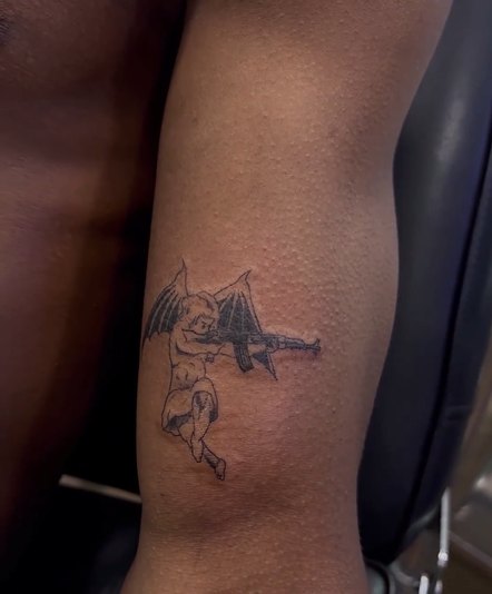
Another striking piece shows an angel with bat wings and a gun on Rema’s bicep. The angel suggests protection or heaven; the gun brings in a more dangerous, streetwise note. The wings keep the figure recognizable, while the darker details steer it away from a traditional religious image.

That tension gives the design its edge. Rema uses familiar symbols but changes their mood: an angel can suggest guidance, bat wings add a gothic feel, and the gun brings another idea of power and defense. The image carries those layers without needing a written explanation.

The bicep gives the wings space to spread. With a design made of several moving parts, the body should help the composition. An artist can use the curve of the arm to make the figure feel more dynamic when the wearer moves.

Rema’s Father, Son and Holy Spirit tattoo keeps faith close to the centre

Rema tattoos: inline Father Son and Holy Spirit tattoo image

The sword isn’t Rema’s only religious tattoo. Another piece depicts the Father, Son, and Holy Spirit, a direct Christian reference. The subject has a familiar structure, but its detail and shading make it feel like a personal statement rather than a stock design.

Faith comes up often in the way Rema talks about his life and career. He has described his mother as an important influence, and interviews have touched on the role of belief in his choices. This tattoo gives that part of his identity a place in the collection, alongside protective symbols and more dramatic scenes.

An image with this much detail needs enough space. Faces, hands, and other shapes should remain clear, with room around the tattoo to keep it from feeling crowded. It acts as a visual anchor among the more aggressive and fantastical pieces.

The Tree of Life tattoo gives the collection a calmer visual pause

Rema tattoos: inline Tree of Life tattoo image

The Tree of Life gives Rema’s collection a quieter image. Its trunk creates a vertical line, with roots below and branches spreading out. That natural shape gives the artist a structure to work with, while leaving room for leaves, texture, and shading.

Trees often stand for growth, family, grounding, or the link between past and future. Those ideas sit alongside the swords, with their associations of words and strength. The tree brings a more rooted feeling to a collection otherwise full of action and drama.

A tattoo doesn’t have to be loud to earn its place. Quiet imagery can make the louder images hit harder. The tree gives the eye a pause between more dramatic scenes.

Rema’s collection also includes fire imagery and the word “Raver” low on his abdomen. The lettering connects to his music and fans, while the fire adds heat and energy. These pieces are smaller than the chariot or religious scenes, but they tie his body art to his work.

The word points to the idea of raving that runs through his fan community. It’s short, easy to read, and personal to the world around his music. “Raver” feels like part of that world, not just a slogan.

Small words and symbols can tell you something the larger designs don’t. They show what a person calls their community and which parts of their public identity they want to carry with them. Here, those smaller marks keep the bigger images from feeling like a costume.

What makes Rema’s Afro-rave look work

Rema’s tattoos share a sense of movement even when the subjects change. Swords, angels, trees, fire, and chariots all suggest action. The religious imagery carries conviction; the fantasy scenes have a larger-than-life scale. The lettering brings the collection back to his life as a Nigerian artist with a distinct audience and sound.

Black and gray shading links the pieces. Strong contrast gives the figures depth, open skin keeps the details visible, and linework directs attention to faces, blades, and words. The designs feel related through their treatment, not because every tattoo looks the same.

Some meanings are visible to anyone who sees the tattoos; the reasons Rema chose a particular scene may be his alone. That’s one reason these images hold interest: the design catches the eye, while the personal story adds another layer.

If this style appeals to you, take the layout as inspiration rather than copying the images. Start with one large piece, then add smaller symbols that reflect your own interests. Leave space for future tattoos, and check any translation or religious reference with someone who understands it. The aim is to build a visual language that fits your own skin.

Rema’s tattoos carry the same contrasts as his music: religious imagery beside fantasy, dramatic scenes beside smaller words, and a tree among the more forceful designs. The twin swords frame his face, the arm pieces carry the action, and the lettering ties the collection to his music.

More musician tattoo guides

Cuco Tattoos: Scorpion, Dog, Snake and the Dreamy Ink Behind His Music

Cuco’s tattoos have the hazy, slightly offbeat feel of his music. The Los Angeles singer, songwriter, and producer has a scorpion, a smiling dog, a snake, a ship, a flower, a mime, and small bits of lettering. Some feel cute, others eerie; together they look more like characters from a sketchbook than a set of flash designs.

The collection moves between playful and serious. The dog feels friendly, while the skulls add a darker note. The ship suggests escape; flowers and a snake bring together beauty and danger. That mixture fits the contrast in Cuco’s bilingual psychedelic pop.

Cuco started making music as a teenager, developing his sound through self-recording, guitar, and experimentation. His tattoos have a similarly personal feel. They don’t look planned as one fixed brand, and many are small enough to feel like individual choices made over time.

The best idea to take from Cuco is the mood, not a particular image. Let different small designs have their own character, then give them a loose connection through linework, tone, or humor. A collection can feel lived in without making every tattoo match.

Cuco’s scorpion tattoo puts a sharp mark on the neck

Cuco tattoos: inline scorpion neck tattoo image

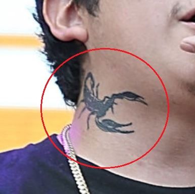
The scorpion on Cuco’s neck gives the collection an edge. It’s compact, but the curled tail, narrow legs, and distinct body make the shape easy to read. Because it’s on the neck, people see it when his collar opens or he turns toward the camera.

Scorpions are often associated with self-protection, control, and surviving difficult conditions. Here, the image sits alongside the softer side of Cuco’s music, with a bit of bite. It doesn’t need to be large to change the feel of his appearance; the silhouette does the work.

The neck moves constantly and gets a lot of sun, so line clarity and a steady hand matter. A simple animal can read better than a crowded miniature scene. The scorpion makes its point quickly and leaves the other designs room to add detail.

The smiling dog tattoo keeps the collection warm and personal

Cuco tattoos: inline smiling dog forearm tattoo image

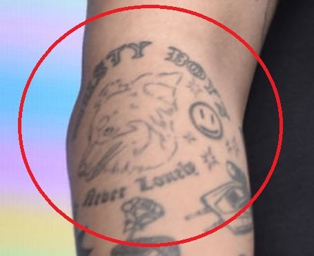
The dog tattoo brings a softer mood. It sits on Cuco’s forearm with a friendly expression, and a small smiley nearby makes the design feel a little cartoonish. The stars around it and the placement give it more character than a generic dog image.

A pet tattoo can be straightforward, but a cartoon style leaves room for personality. Instead of aiming for a formal portrait, the drawing turns affection into a symbol. It can suggest a memory or a companion, or simply keep a playful image close.

The forearm is a practical spot for a design like this. Cuco can see it while working, playing guitar, or reaching for a microphone, and other people can read the expression without knowing the backstory. The smile is clear before you know what inspired it.

Snake and flower imagery brings beauty with a little danger

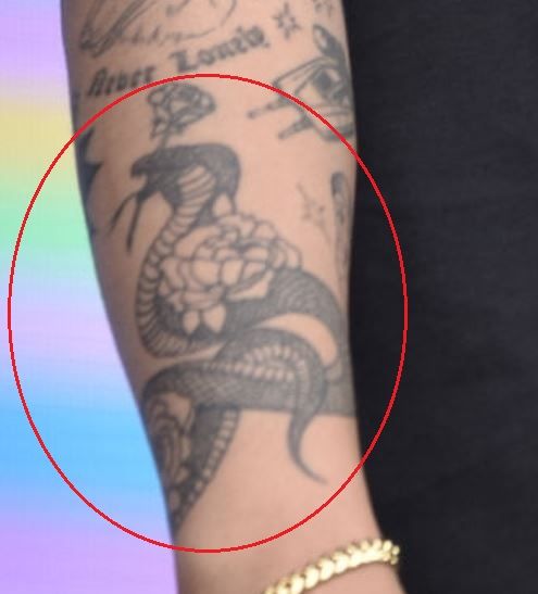
Cuco tattoos: inline snake and flower arm tattoo image

A snake winding through flowers is a familiar combination, but the two shapes change each other’s mood. The flowers soften the design; the snake adds movement and a hint of danger. Its presence keeps the tattoo from becoming too delicate.

That mix suits Cuco’s visual style. His songs can sound hazy and romantic, with an odd or unsettled detail beneath the surface. A snake and flowers carry both sides: attraction and growth alongside change, danger, and instinct.

The image needs a clear path across the arm. The snake should remain distinct from the petals, and the flowers need enough space to stay readable as the tattoo settles. Contrast keeps a pretty design from blurring together. Each organic shape has its own job.

The ship and diver tattoo turns the arm into a small escape story

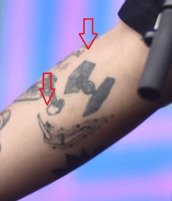
Cuco tattoos: inline ship and diver tattoo image

The ship and diver bring a sense of travel to the collection. A ship can suggest leaving, searching, or drifting into a private world. The diver makes the scene more active: instead of watching the water from above, someone goes beneath it.

That feeling of escape also runs through Cuco’s music, where nostalgia, romance, and daydreaming sit together. The tattoo gives that mood a shape without needing to refer to one specific event.

Illustrative tattoos need a clear focal point. The ship, diver, and water should have a visual order, so the details don’t compete. The curve of an arm can lead the eye from the boat to the figure below. The body becomes part of the scene.

The mime tattoo adds a theatrical face to the lineup

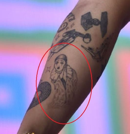
Cuco tattoos: inline mime tattoo image

The mime gives the collection a human character without looking like a standard portrait. Mime depends on performance, silence, and expression, so even a small face can carry a distinct mood. It also suits Cuco’s work as a performer: music conveys feeling through sound, while a mime does it through gesture and appearance.

There’s a tension between the mime’s quietness and the energy of a live show. The image can suggest a role, something held back, or a person saying plenty without words. A theatrical tattoo might be a private joke, a stage reference, or a reminder that identity has more than one side.

The mime sits naturally beside the other designs. The dog feels warm, the scorpion guarded, the snake restless, and the ship searching. The face gives the collection another mood. It adds a character to a group that’s already full of objects and scenes.

Skulls and hand lettering bring in a rougher edge. A skull can add mortality or dark humor; words on the fingers feel immediate beside the larger illustrations. Those smaller marks keep the flowers, stars, and dog from making the whole collection feel too cute.

Cuco’s finger tattoos spell “AMOR” and “BESO,” words tied to his Mexican heritage, romantic writing, and bilingual identity. They’re short and easy to recognize, and sit close to the hands he uses to make music. The placement gives them a bit of movement when he plays or gestures.

The mix of sweet and dark imagery gives the collection its range. Contrast is what keeps the tattoos from settling into one mood. The skulls and lettering add pauses, humor, and rough edges among the more finished scenes.

What makes Cuco’s style feel like a daydream

The tattoos feel as if they belong in the same imaginative neighborhood. Animals, flowers, boats, faces, and words could all come from a dream journal. They don’t need to match exactly; curiosity and the shifts between sweet and strange are enough to connect them.

The collection also gives each design the space it needs. The scorpion is quick and sharp, the dog reads easily on the forearm, and the ship gives the artist room for a scene. Small letters have their own place beside the larger images. Good spacing lets each tattoo keep its own voice.

If you’re building a collection over time, start with the images you keep coming back to and let later pieces respond to them. A flower can sit beside a skull; a cute animal can share space with a darker symbol. The tattoos don’t all have to be serious or use the same style.

If Cuco’s approach appeals to you, focus on the feeling behind it. Choose images that recall people, places, songs, or private jokes. Find an artist who can keep small faces and letters clear, and leave some room for whatever idea comes next. The result should feel like your own world.
Cuco’s tattoos echo the shifts in his music: soft at the edges, a little surreal, and full of turns in mood. The scorpion gives his neck some bite, the dog brings warmth, the snake and flowers mix their shapes, the ship opens a scene, and the mime adds a human face. That range is what makes the collection distinct.

More musician tattoo guides

Luka Doncic Tattoos: Tiger, Eagle, Eye of Providence and More

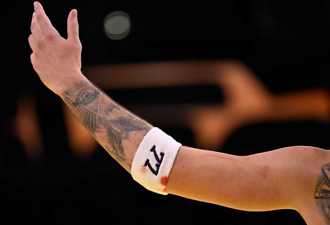
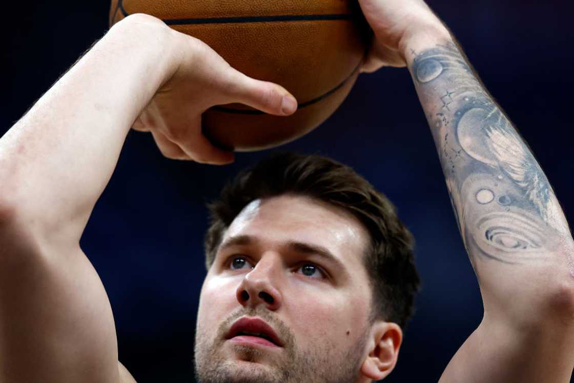
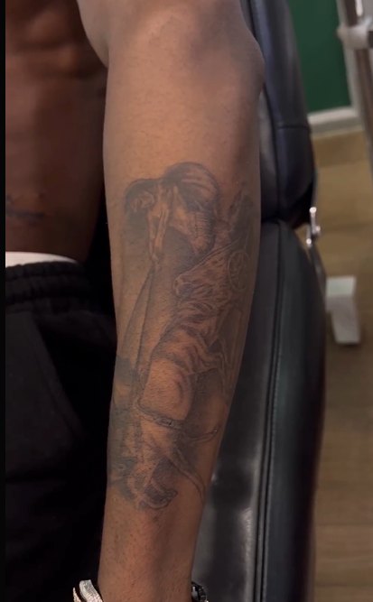
Luka Doncic’s tattoos are easy to recognize once you know where to look. His left arm carries the best-known piece: a black-and-gray half sleeve with a tiger, an eagle, an all-seeing eye, and small lettering. The design changes as he moves, which suits a player rarely seen standing still.

There’s more beyond the forearm. Luka has a EuroBasket tribute, a Latin phrase that reads like a personal reminder, and newer back work that fans catch when his jersey shifts. The collection stays focused, with enough detail to reward a closer look.

This guide looks at the visible tattoos without treating every possible meaning as confirmed. Some details have been reported or are apparent in the designs; others are interpretations, not explanations Luka has publicly given.

The tiger tattoo gives Luka’s half sleeve its focal point

Luka Doncic tattoos: tiger and Eye of Providence forearm tattoo

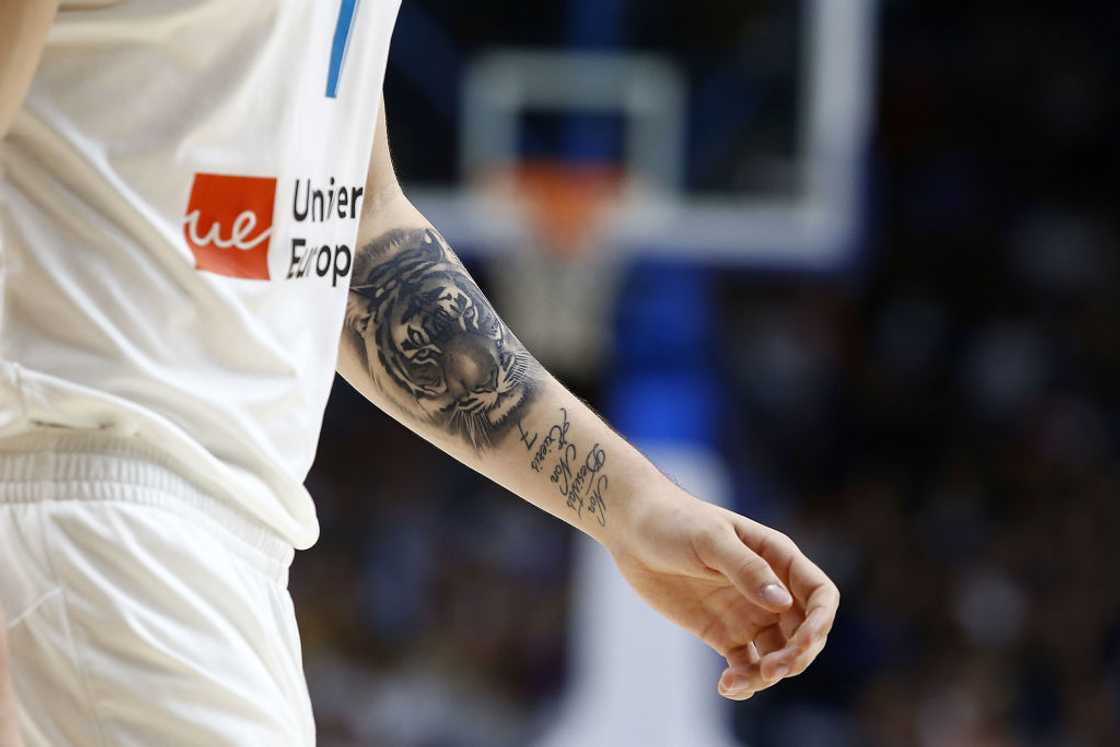
The tiger is the first design many people notice on Doncic’s forearm. Its face is realistic, with enough dark shading to stand apart from the nearby symbols. The eyes and stripes give it an intense look. A tiger can suggest power, focus, or patience; those ideas fit the way Luka controls a game, though that doesn’t confirm why he chose the image.

The tattoo follows the shape of his arm rather than floating on its own. The head sits within the half sleeve, and the black-and-gray shading links it with the eagle and surrounding lines. That connection matters with an animal portrait: without a plan for the space around it, a single face can look detached.

In the close-up, the nose, eyes, and stripe direction carry most of the expression. If those features are crowded or indistinct, the tattoo could lose its character over time. Luka’s design keeps the main shapes bold enough to read as his arm moves and the light changes.

A tiger doesn’t need to roar to look strong. A steady expression, clear outline, and placement that follows the muscle can do the job without extra background detail. Decide what mood you want—fierce, watchful, patient, or protective—then work with an artist to shape the face around it.

Luka’s forearm sleeve tattoos keep the details moving

Luka Doncic tattoos: layered forearm sleeve tattoo

From farther back, Luka’s forearm looks like a group of symbols that fit together, rather than one single image. The tiger, eagle, eye, and lettering overlap in separate areas, and curved lines carry the designs around the muscle. As his arm relaxes, rises, or wraps around the ball, the sleeve shifts with it.

Small areas of open skin give the darker designs room to read. Filling every gap can make a sleeve feel muddy. Here, the eye moves from a larger image to a smaller mark, then gets a moment of space before the next one.

If you’re planning a half sleeve, you don’t have to decide on every tattoo at the first appointment. Begin with the piece that matters most, then let the surrounding shapes respond to its size and direction. That can make the sleeve feel like it grew over time instead of being planned all at once.

Think about how the sleeve moves as well as what it depicts. Check the design with your wrist turned, your elbow bent, and your arm relaxed at your side. It has to work on a moving body, not just on a flat reference sheet.

The Latin phrase tattoo adds a quiet personal reminder

Luka Doncic tattoos: tiger and Latin phrase forearm tattoos

Alongside the larger images, Luka has a Latin phrase on his forearm. It’s commonly read as “never give up, never surrender,” a message that suits a competitor whose career has played out in public. The words are quieter than the tiger, but they give the sleeve a personal note.

Lettering changes the rhythm of the arm. The phrase makes a horizontal pause between images, and its script contrasts with the black-and-gray realism. It gives Luka words he can see himself, not just a design other people notice.

Latin is a popular choice for phrases that feel personal even when they’re visible. The translation is easy to share; the original wording keeps a little distance. The main thing is choosing a phrase you’ll still stand by when the moment that inspired it has passed.

If you’re considering lettering, double-check the spelling, accents, and line breaks before approving the stencil. Words that look elegant on a phone can become cramped around the curve of an arm. Even understated lettering needs enough space to stay readable.

The EuroBasket tattoo marks a breakthrough moment

Luka Doncic tattoos: EuroBasket 2017 trophy tribute tattoo

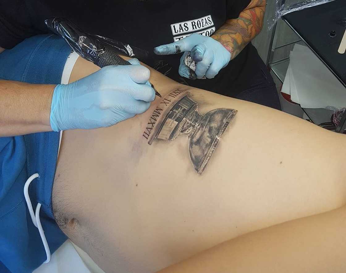
One of Luka’s most meaningful tattoos marks Slovenia’s EuroBasket win in 2017. It shows the trophy and the year, keeping the memory without needing a team logo or a long caption. The tournament was a turning point as his profile was rising quickly.

This is different from the animal imagery. A tiger or eagle can suggest an attitude; a trophy points to a specific event. That’s one way to approach a milestone tattoo: use a date, object, or simple outline that recalls the moment without trying to recreate the whole scene.

Commemorative designs usually benefit from restraint. The object needs to stay recognizable, and the date should be easy to read without competing with it. Luka’s tattoo keeps the attention on the achievement instead of crowding in every detail from the tournament.

A tattoo doesn’t have to wait until a career is over to mark something important. One breakthrough can deserve a place of its own, especially if it changes how someone sees what comes next.
The clock tattoo brings a newer mystery to his back

Luka Doncic tattoos: broken clock back tattoo

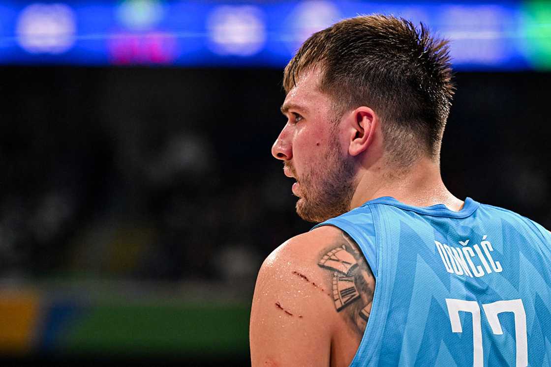
Luka’s back tattoos are harder to see than the sleeve. The newer piece appears to be a clock near his upper back and shoulder, with dark lines around a face that shows when his jersey shifts. It hasn’t been photographed as clearly as the forearm work, so its meaning isn’t established.

A clock might suggest time, patience, pressure, or a moment running out. It could also have a private meaning. Without Luka explaining it, those remain possibilities; the image is visible, but its story is his to tell.

The upper back gives a clock room to spread out. On a wrist or hand, Roman numerals and shading might feel crowded; here, the shape can follow the shoulder. The placement is also partly hidden, giving it a different relationship with the public than the arm sleeve.

A tattoo doesn’t need to be on show all the time. If you’re considering a hidden placement, think about how it will feel when you can’t see it easily in the mirror. Hidden ink can still be chosen for yourself.

Why Luka’s collection works without looking overdone

The collection has a clear visual thread: black-and-gray realism, sports memories, strong animals, and small pieces of text. The subjects differ, but the shading connects them. The half sleeve is the main feature; the EuroBasket and back tattoos add stories beyond it.
There’s also a mix of public and private pieces. Fans see the forearm tattoos during games and have had years to look closely at the tiger and eye. The back work is less visible, so it can remain personal even while Luka plays before a crowd. That combination makes the collection feel at home on him, rather than planned for one photo.
If you want to take something from his approach, start with a story instead of a trend. Choose an image connected to your life, then settle on a style and placement that let it stand on its own. Later pieces can share the same shading, scale, or mood without repeating the subject. A quiet thread between tattoos can be enough to connect them.

Luka Doncic’s tattoos bring together focus, milestones, and movement. The tiger anchors the forearm; the eagle and Eye of Providence add other symbols; the Latin phrase keeps a reminder close; and the EuroBasket piece marks a specific achievement. The newer clock on his back is less clear, which leaves a little mystery in the collection.

More athlete tattoo guides