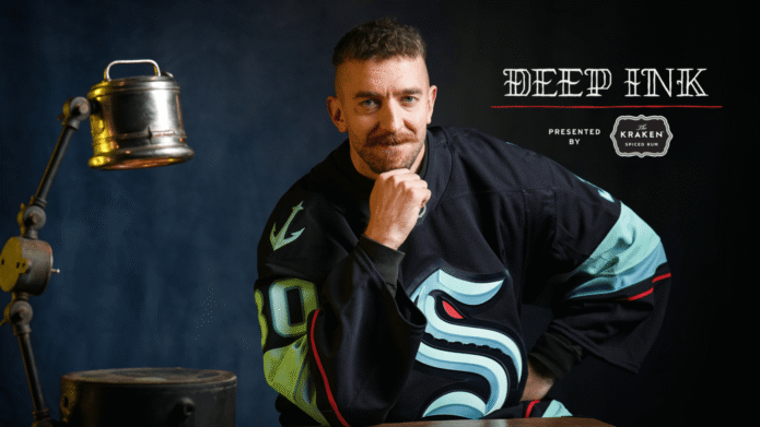
Athletes

Matt Murray keeps his biggest moments close in ink

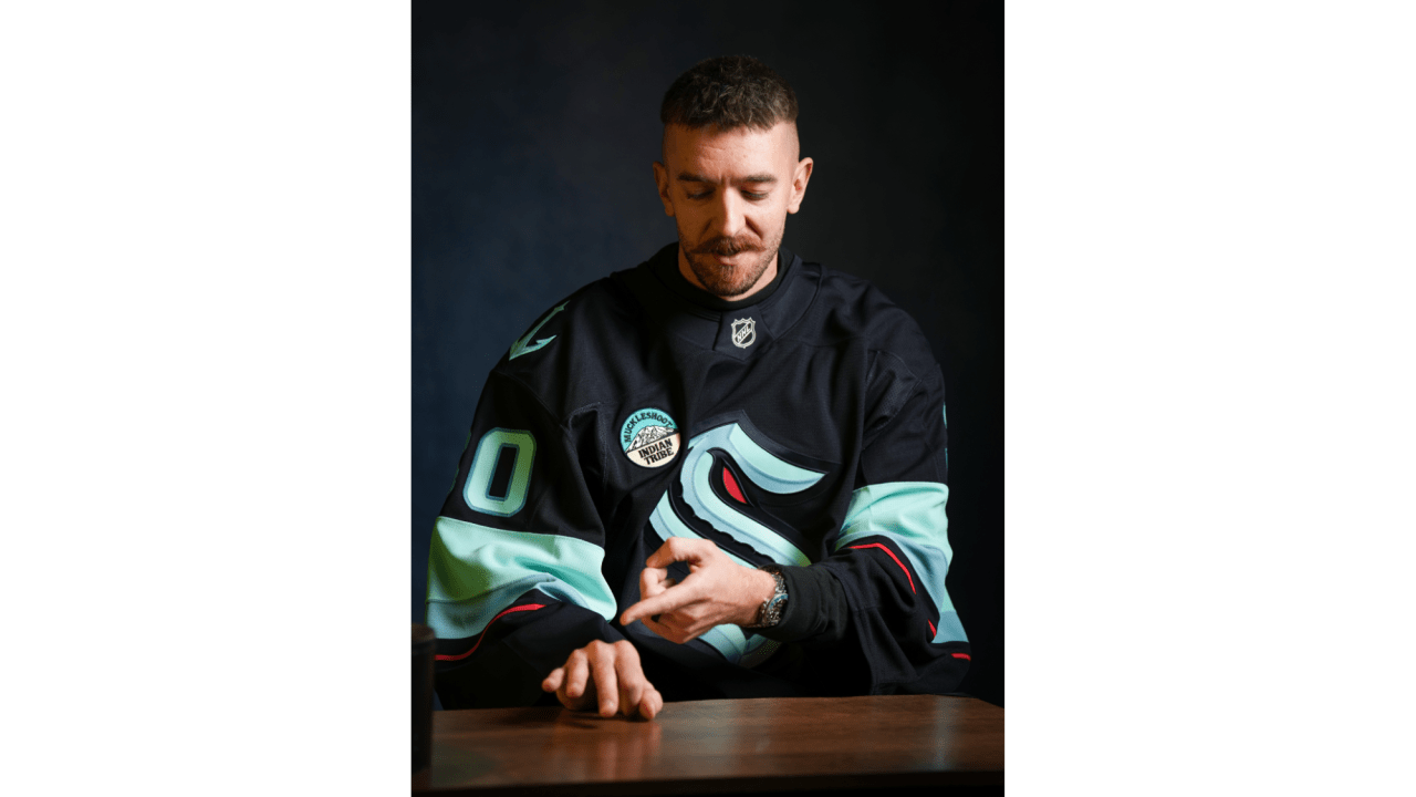
Matt Murray does not have a large collection, but each tattoo has a clear reason behind it. The Seattle Kraken goaltender has used ink to mark two Stanley Cup wins, keep his wife close and carry a reminder of how he wants to handle pressure.

There is no full sleeve here. The numbers on his fingers sit beside his championship rings, the tattoo for his wife rests under a watch, and “The Man in the Arena” sits on his left bicep, mostly out of sight during games.

Murray has spoken about what the tattoos mean without turning each one into a public statement. They are a few permanent reminders that fit into everyday life.

The 16 and 17 finger tattoos remember Pittsburgh’s Cup runs
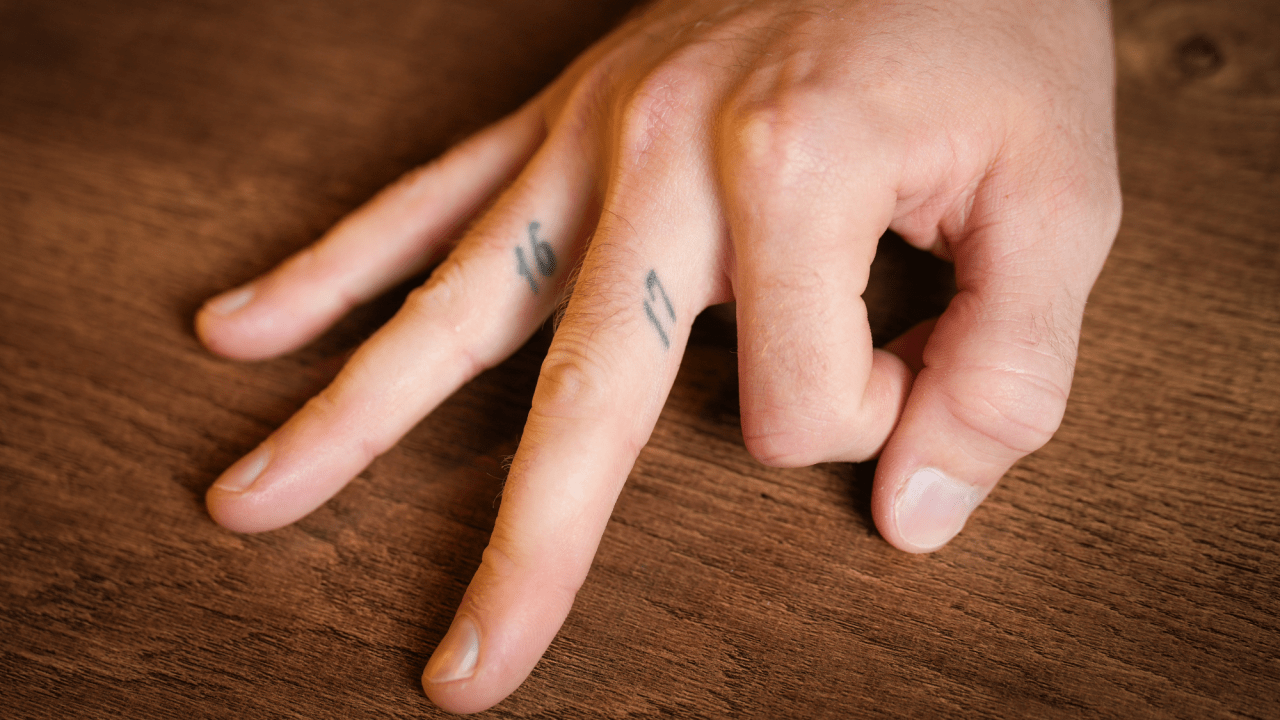
Matt Murray 16 and 17 championship finger tattoos in an official close-up
Matt Murray showing the 16 and 17 finger tattoos during the Deep Ink feature
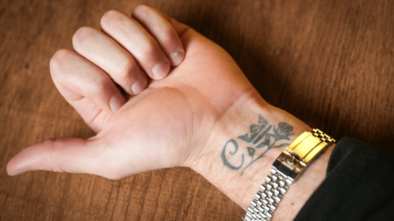
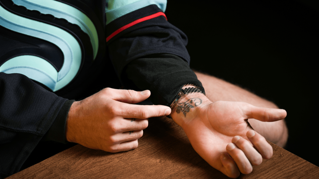
Matt Murray wrist and hand tattoos shown during the NHL Deep Ink feature

An official close-up shows how small the numbers on Murray’s fingers are. They sit beside the creases of his hand, so they can disappear in a game photo but line up with the rings he won in those seasons.

Murray’s first tattoo marked two of the biggest achievements early in his NHL career. He has a 17 on the inside of his right middle finger and a 16 on the inside of his right ring finger. They refer to the Pittsburgh Penguins’ back-to-back Stanley Cup wins in 2016 and 2017, when Murray helped the team reach the top.

The placement was deliberate. Murray said the tattoos sit on the same fingers where he wears his championship rings. They work as quiet reminders alongside the physical trophies; he even joked that the rings are different sizes, so he knows which number goes with which finger.

They feel less like a display and more like a private filing system. A fan might notice the numbers in a close-up, but they are easy to miss during a game. Murray can look down and remember those seasons without a date or trophy taking over his arm.

The timing matters too. Murray said he got his first tattoo in 2018, after he had already experienced the two Cup runs. He did not rush to mark the wins while everything was still unfolding. The design came later, once the achievements had settled into his life.

The numbers look simple enough to be mistaken for ordinary finger ink, which is part of why they work. They point to two seasons and let the memory do the rest. Some of the most personal sports tattoos look almost meaningless to everyone else.

They also sit in the hands that matter so much in hockey. A goaltender depends on repetition, small movements and focus. The tattoos share space with the rings and gloves, close to the hands that helped make those memories.

A C, rose and crown keep his wife close
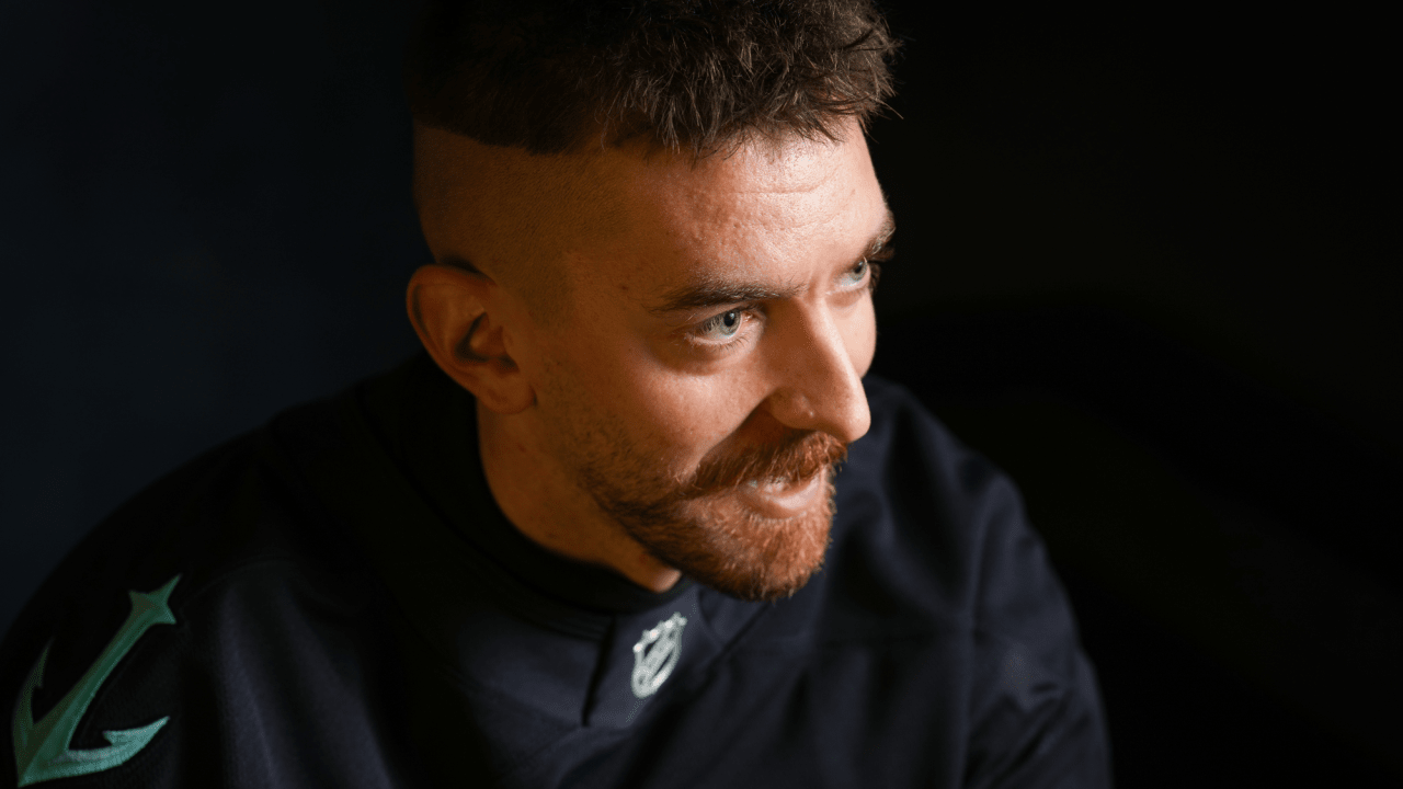
Matt Murray during the official Deep Ink tattoo feature
Matt Murray alternate close-up of the C, rose and crown wrist tattoo

After getting the championship numbers, Murray returned to the tattoo shop for a design dedicated to Christina, who was his girlfriend at the time and later became his wife. The tattoo includes a C for her name, a rose and a crown. Murray called it a tribute to her and said the crown represents her being the queen.

It sits on the inside of his left wrist. Murray has said he chose the spot because he wanted to glance down and see it when he was thinking about her, not because of a complicated placement rule. That direct reason gives the tattoo its charm.

The rose and crown make the design easy to recognise, but the C is what makes it personal. Anyone can read the flower as a love symbol; the initial points to one particular person.

Murray also said the tattoo fits neatly beside his watch. It was not placed for dramatic photographs; it works with something he already wears and stays close to his routine.

There is a quiet contrast between this wrist piece and the numbers on his other hand. The finger tattoos mark public achievements, while the rose and crown point toward home. One set remembers the seasons that shaped his career; the other keeps someone close while he is away playing.

The tattoo also came together with care. Murray went to an artist recommended by former Penguins teammate Kris Letang, then asked Christina what she might like. It was meant as a surprise and a tribute, but he wanted the final design to reflect her taste too.

The Man in the Arena sits on his left bicep

Murray’s most openly motivational tattoo is on his left bicep. It reads “The Man in the Arena,” a phrase from Theodore Roosevelt’s 1910 speech “Citizenship in a Republic.” Murray first noticed the phrase on LeBron James’s sneakers, then looked up the speech it came from.

The passage praises someone who steps into the arena, risks failure and keeps trying, rather than watching from a safe distance. For a professional goaltender, that idea fits. Every game brings pressure, mistakes and criticism, but Murray can only make a save by staying involved.

He has said the tattoo reminds him to dare greatly and not dwell on the people watching. A person in the arena may lose, but there is value in being the one who showed up and tried. That makes the piece more specific than a generic motivational phrase.

The left bicep is a practical place for those words. They can stay under a jersey, but Murray can still see them when he wants to. The tattoo is private first and public second; fans know about it because he chose to explain it, not because it is always visible on the ice.

It rounds out the other pieces. The 16 and 17 look back at what Murray achieved, the Christina tribute keeps someone close in the present, and “The Man in the Arena” sets a standard for what comes next.

Why Murray’s small collection still tells a full story

Murray has said that after getting his first tattoo, he understood why people often want more. Even so, the pieces he has discussed remain a controlled collection. He has talked about adding his children’s names and birthdays one day, perhaps alongside something based on the first family picture they draw. That would continue the family theme without changing the feel of the existing work.

Very little of the collection is there simply to be shown off. The finger numbers are subtle, the wrist tattoo was placed for a quick private glance, and the bicep quote stays covered during games. None needs to dominate a photograph to matter.

That does not make the tattoos dull. Each has a clear subject and a reason Murray has shared. They are not a catalogue of passing trends; they are reminders of people and moments he wants to keep close.

There is an easygoing quality to the way he talks about them. Murray has laughed about not remembering his first artist’s last name, said the pain was less than he expected and left room for future ideas. He enjoys tattoos without needing every piece to carry a dramatic life lesson.

In the end, the ink is about the things Murray wants nearby: two championships, his wife and a reminder to step into difficult moments. It is a small collection, but the reasons behind it are easy to see.
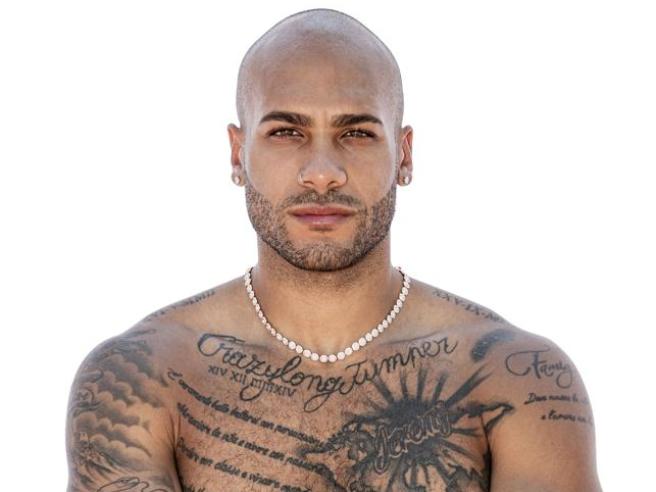
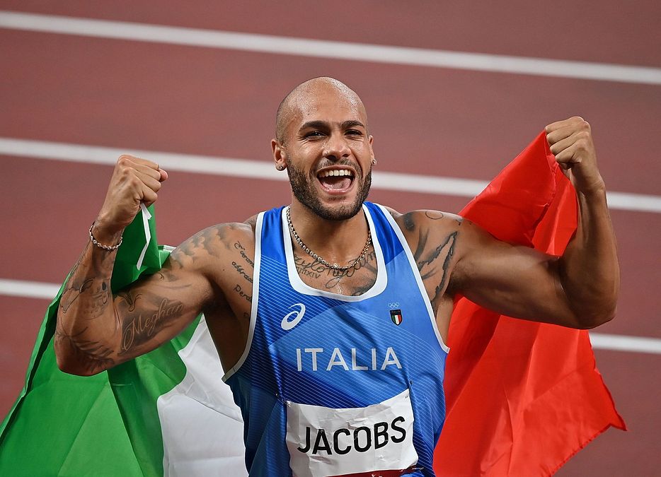
Marcell Jacobs keeps his fastest stories on his skin

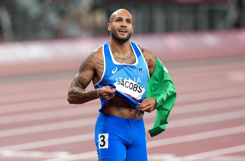
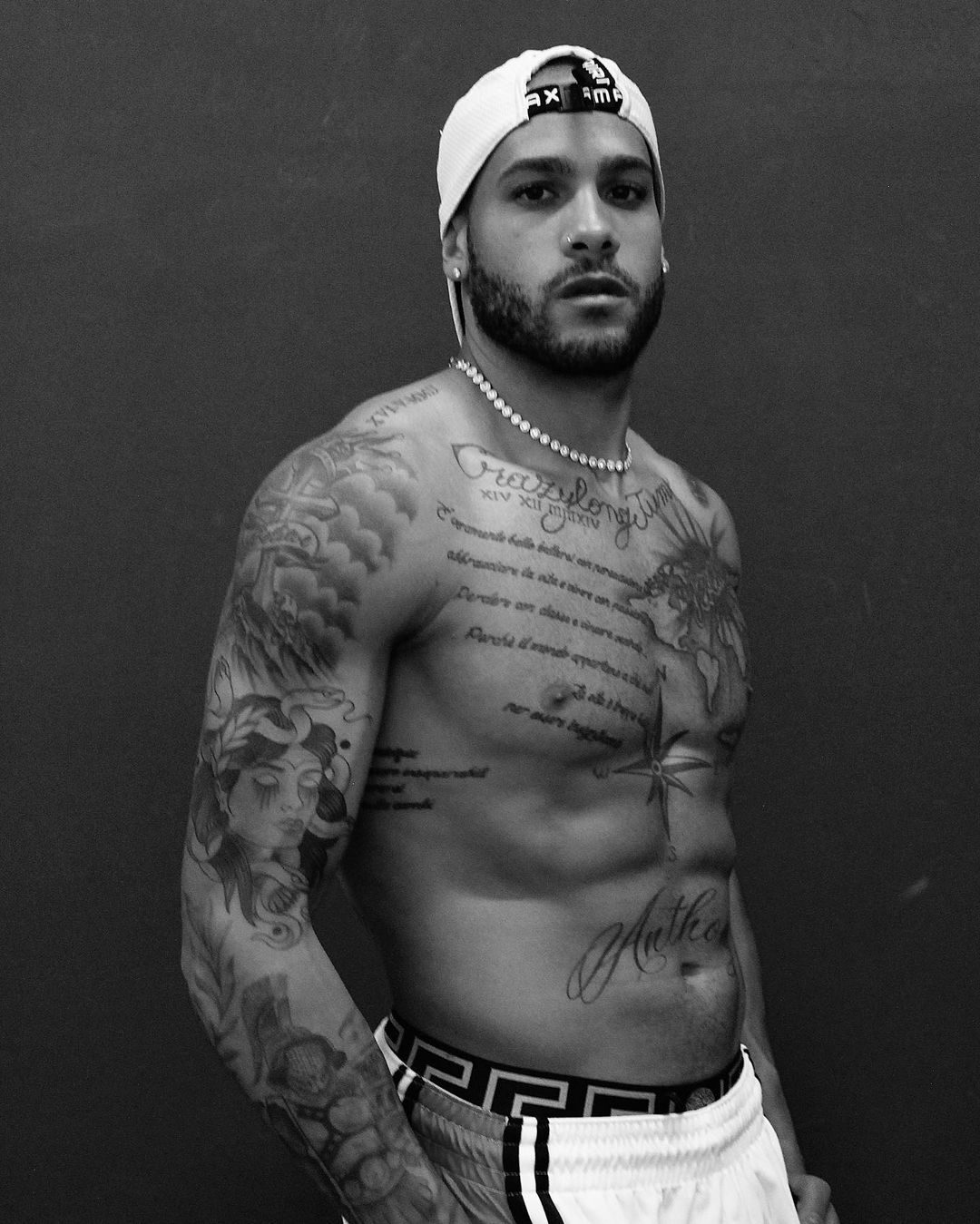
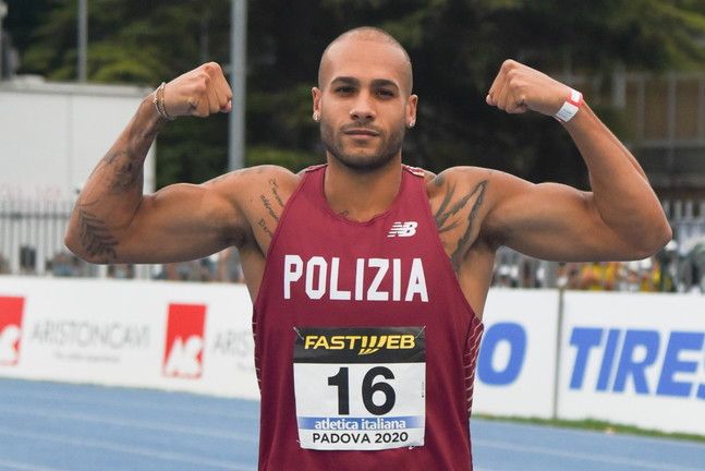
Marcell Jacobs wears his story openly. The Olympic sprinter has tattoos across his chest, shoulders, arms, stomach and back, and many connect to something real: his children, his former long-jump identity, his family, his faith in himself, and the people and ideas that kept him going.

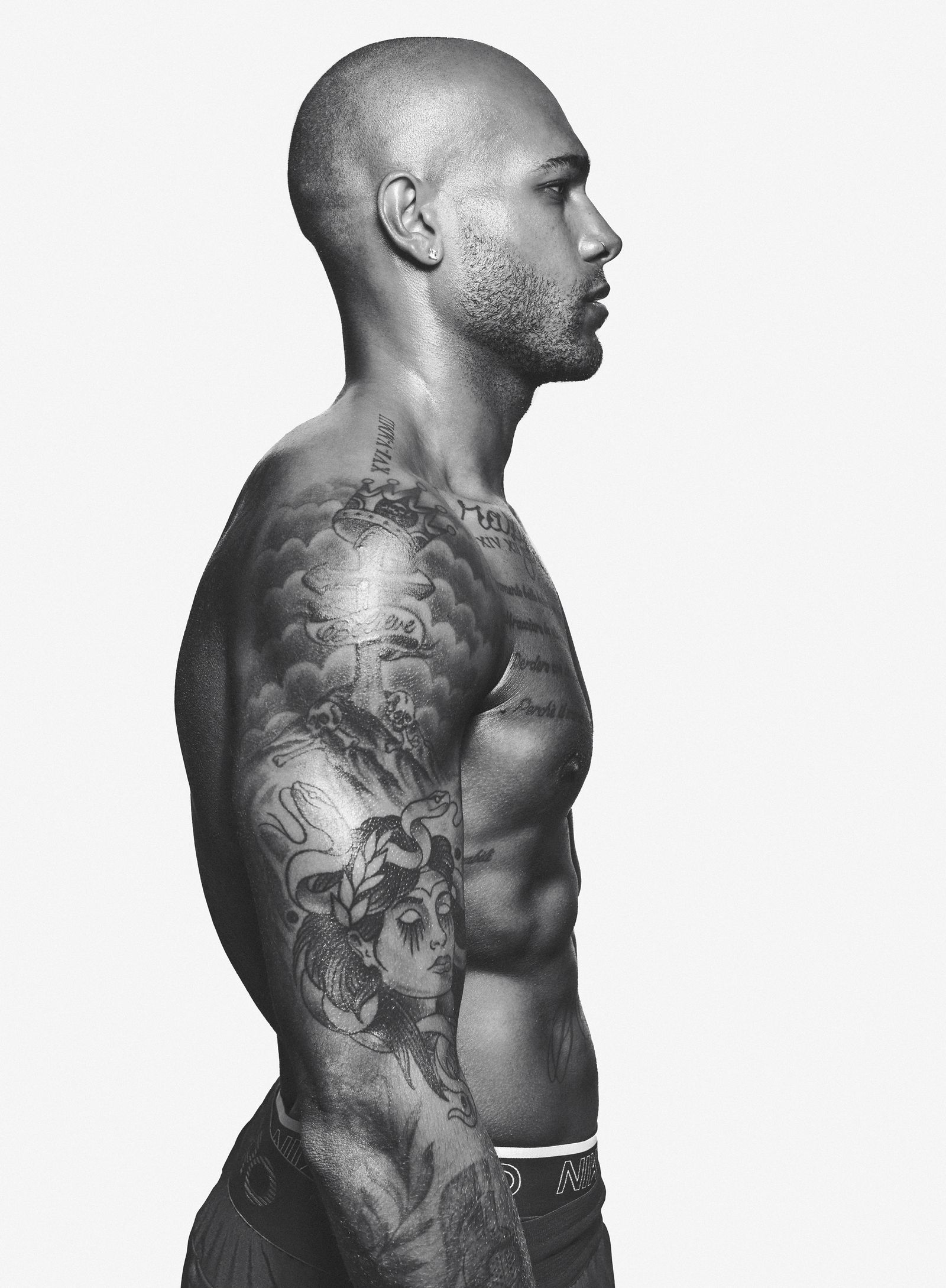
The collection is easy to follow even when the designs get busy. A compass over his stomach, Medusa near the top of his chest, a tiger on his back, his children’s names, long quotations and a cross marked “believe” all have their own place. It’s less a wall of black-and-grey ink than a personal scrapbook spread across a very fast athlete.
Jacobs has explained several of the pieces himself. The compass is about staying on course; the family words honour Nicole and the children; and “Crazylongjumper” points to the sport he loved before sprinting took over. Even the longer quotes reflect how he wants to live. Here’s a closer look at the best-documented tattoos.

The believe cross carries a message he grew into

Marcell Jacobs believe cross tattoo

On Jacobs’ right shoulder, a cross and crown sit above the word “believe.” The image already had meaning, but the timing gave it another layer after his Tokyo Olympic win. The tattoo was there before he became the Olympic 100-metre champion; after he beat the field, the message looked almost prophetic.

That doesn’t mean it predicted the race. Its meaning shifted with the result. Before Tokyo, “believe” was a private instruction. Afterwards, it looked like a line Jacobs had managed to live up to. The ink stayed the same while he moved into a new chapter.

The cross is in a spot that shows easily in training photos and interviews. Jacobs doesn’t need to explain it for people to notice. The word is clear at a glance, and the crown gives the lettering more weight than a plain script tattoo would have.

His old long-jumping identity is written across the upper chest

Marcell Jacobs family quote tattoo

Across his collarbone, Jacobs has “Crazylongjumper.” The phrase comes from his Instagram name and his earlier life in athletics, before he focused fully on sprinting. It keeps that earlier version of him in the picture. He’s now known worldwide for the 100 metres, but the long-jumping years are still part of his story.

The placement feels right: the words sit high across the chest, almost like a name on a kit. It’s personal, but it also works as a public label. Anyone who sees it can tell that his career began well before the Olympic final.

Longer inscriptions sit below and around the nickname. One of the best-known is a Charlie Chaplin quote translated into Italian. It speaks about embracing life, taking a loss with grace, staying passionate and daring to win. It’s a lot of words, but Jacobs has made room for them because the message fits his outlook. It feels less like decoration and more like a rule he wants nearby.

The compass keeps him pointed in the right direction

Marcell Jacobs compass tattoo

The compass rose above Jacobs’ navel is one of the collection’s clearest symbols. He has said it represents guidance and reminds him to stay on course. That fits an athlete whose career has changed direction more than once: he moved from long jump to sprinting, then from promising European competitor to Olympic champion.

Its position gives the compass a natural centre. The points spread across the upper stomach, making it a focal point in a front-facing photo and linking the chest lettering to the names and dates below.

There’s a practical side to the symbol. It isn’t only about travel or adventure; Jacobs uses it as a reminder to judge situations and keep his direction when life gets noisy. That’s a useful thought for someone whose public life changed overnight after Tokyo.

Family names and dates keep the collection grounded

Marcell Jacobs family tattoos

The most direct family tribute is made up of his children’s names: Jeremy, Anthony and Meghan, each given their own place across his body. They sit among larger images, but the idea is simple. His children aren’t tucked into one small symbol; each has a mark of their own.

Jacobs has their birth dates in Roman numerals too. The names show who matters to him; the dates make the tattoos a timeline. The words sit beside a compass, portraits, quotations and sports designs, much as family life sits alongside training and competition.

A phrase on his left shoulder translates as “Family, where life is born and love never ends.” It connects the individual names to the bigger idea behind them. Jacobs has spoken about how much Nicole and their children mean to him. The medals changed his public life, but these family pieces explain who the success is for.

Medusa gives the chest a mythic edge

Marcell Jacobs Medusa tattoo

Just below the collarbone lettering is a face framed by snakes, usually described as a Medusa tattoo. It brings a different mood to the upper chest: the compass is directional, the family names are warm, and Medusa adds mythology, danger and dramatic beauty.

Jacobs hasn’t given one definitive explanation for every detail, so there’s no need to invent one. The image itself is clear, as is the way it works with the surrounding tattoos. Medusa sits below the old long-jumper lettering, and the snakes carry movement toward the chest and shoulders.

The figure also fits the collection’s wider interest in recognisable symbols with a bit of history. Medusa can suggest strength, warning, protection or transformation, depending on the person wearing it. Here, it sits comfortably beside a cross, an anchor and a compass without forcing them into one theme.

The anchor, Carpe diem and tiger widen the story

Marcell Jacobs tiger back tattoo

Other pieces fill out the picture: an anchor on his left arm, “Carpe diem” on his left pectoral and a tiger across his back. The anchor echoes the compass’s navigation theme in a more traditional tattoo style. It suggests steadiness, something that can hold you in place while everything else moves.

“Carpe diem” means seize the day and sits naturally beside the longer Chaplin quote about living with passion. Jacobs returns to similar ideas throughout his collection: believe, stay on course, keep moving and make something of the day in front of you.

The tiger changes the mood. It’s associated with power and speed, which makes sense for a sprinter, but it also gives his back a bold image that can stand on its own. It may not show up in a standard red-carpet photo, yet it helps explain why the collection is bigger than the chest tattoos people tend to notice first.

The tattoo collection feels like a career map

Together, Jacobs’ tattoos form a loose map of his life. The family names and dates mark home; “Crazylongjumper” remembers the event that came before sprinting; the compass points ahead; and the cross carries the word “believe.” The tiger and Medusa bring strength and mythology, while the quotations give him words to return to.

No single style holds it all together, and that’s part of the appeal. Some designs are lettering, others portraits or traditional symbols, and some are large enough to need a full-body photo to make sense. The collection grew through different stages rather than appearing all at once.

It’s worth keeping the photos in mind, too. A crop can make a name look like decoration or hide the compass in a fold of skin. Wider, clearer images show how the pieces connect and make it obvious that the tattoos aren’t an afterthought. Jacobs has spent years building a record of the people, sports and ideas that keep him moving.

He’s not only carrying reminders of where he has been; he’s carrying instructions for where he wants to go next.

The tattoo interview

Jacobs has discussed the stories behind his ink in interviews and features about his Olympic career. The video below focuses on his tattoos and the meanings connected to the Italian sprinter’s designs.

Kelly Oubre Jr. wears his whole story in ink

Kelly Oubre Jr. never seemed likely to stop at one tattoo. He got his first in high school, liked the feeling of having something new on his skin, then kept finding more room. A few years later, much of his body was covered, and the collection had begun to read like a scrapbook of portraits, hometown symbols, faith, words and music.

Oubre has said the tattoos help tell his story. The collection can look chaotic at first: a huge chest piece, “SACRIFICE” across his stomach, musician portraits, New Orleans references, religious images, family details and a guitar on his hand. They’re not all trying to make the same point.

Some designs are about faith or people he admires; others connect to where he grew up or remind him who he wants to be. Here’s a closer look at the best-documented pieces in Kelly Oubre Jr.’s collection.

The first tattoo started with a basketball and a little faith

Kelly Oubre Jr chest owl tattoo

Oubre got his first tattoo as a sophomore at high school in Texas. He has said he left during a free period, went to a shop and came home with a basketball ringed by thorns. The design also carried the words “I do it for God because He is my savior.” That was a big step for a teenager, especially for a tattoo that wasn’t small or hidden under a sleeve.

The story sounds like Oubre. Inspired by another heavily tattooed basketball player, he went back to school with his shirt rolled up so everyone could see the new work. Later, he decided the tattoo looked lonely. Once there was one large piece, the blank skin around it started to feel unfinished, and he wanted to keep adding to the collection.

That first design helps explain why faith and basketball continue to show up together in his tattoos. The sport is part of how Oubre thinks about discipline, identity and the chance to make something out of a difficult start.

The owl and sacrifice design became the centrepiece

Kelly Oubre Jr sacrifice tattoo

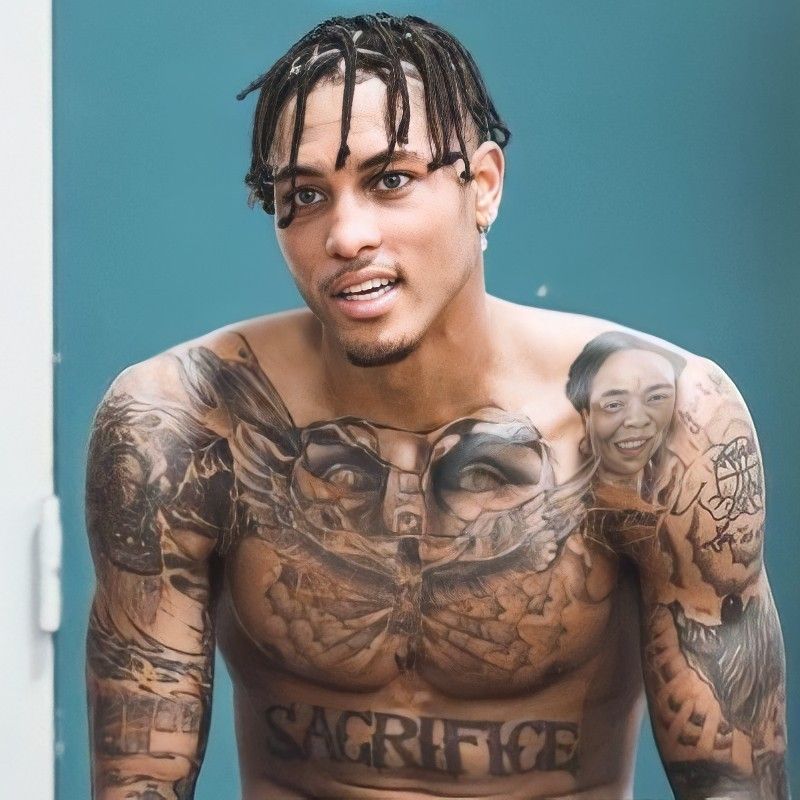
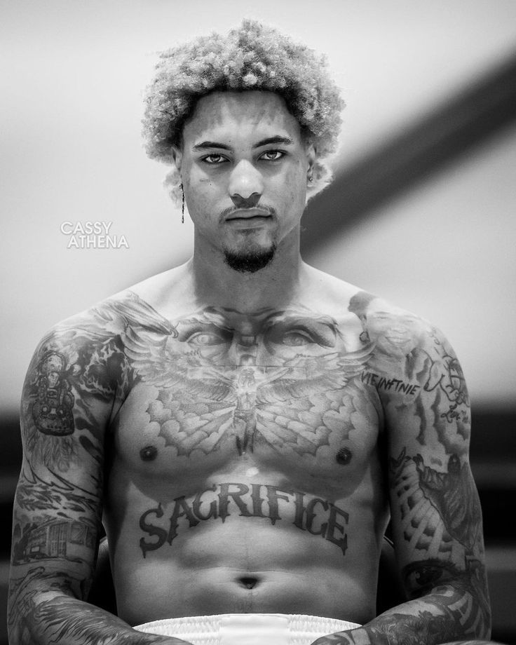
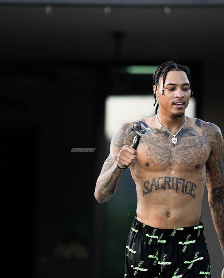
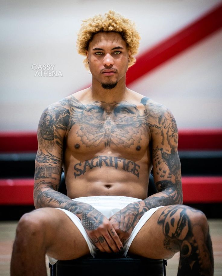
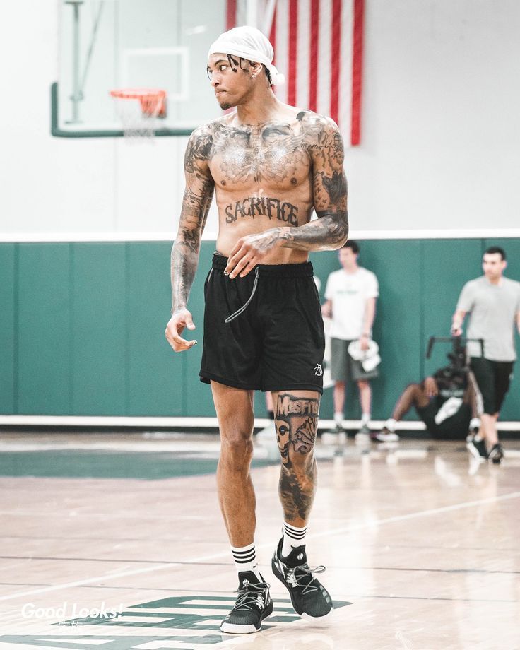
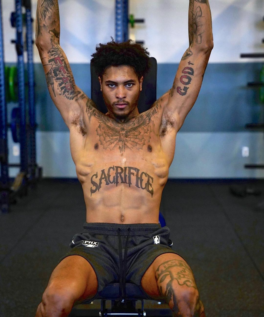
The biggest visual anchor is a large winged design across Oubre’s chest and stomach, with “SACRIFICE” written below. In some photos, the image reads as an owl; in others, its outstretched wings look more like a symbolic bird. Either way, it dominates his torso and gives the other tattoos a centre to build around.

Oubre has called the sacrifice piece his favourite tattoo. The word is simple, but it carries plenty of weight for an athlete. A basketball career is made of repetition, travel, injuries, competition and showing up again. The tattoo puts that idea right in the middle of his body.

Its appearance shifts with each photo. A straight-on portrait shows the wings and lettering as one design; a training shot breaks the piece into parts as Oubre moves, sometimes bringing the lower word into sharper view. Several clear angles help show how the tattoo works as a whole.

New Orleans is written into the smaller designs

Kelly Oubre Jr outdoor sacrifice tattoo

Oubre was born in New Orleans, and the city appears throughout his ink: fleur-de-lis symbols, a streetcar, the Superdome, St. Louis Cathedral, Mardi Gras beads, an alligator and a brown pelican. These details bring his hometown into the collection rather than treating the tattoos as a set of fashionable images.

He has spoken about leaving New Orleans after Hurricane Katrina and moving to Houston. That history gives the hometown designs extra meaning. They aren’t souvenirs from a visit; they keep him connected to a place that shaped his childhood after life took him somewhere else.

The New Orleans references are spread across the collection rather than gathered in one sleeve. That feels right for memories that don’t need a matching border. A fleur-de-lis can sit beside a portrait, a phrase or a religious image and still say where Oubre came from.

Music portraits bring Prince, Hendrix and Michael Jackson close

Kelly Oubre Jr court sleeve tattoos

Oubre’s left leg carries portraits of Jimi Hendrix, Michael Jackson and Prince, as well as Nipsey Hussle. These aren’t random celebrity faces. Oubre has described the musicians as inspirations, people whose work, style or attitude mattered to him.

The Prince tattoo includes the musician’s famous symbol. Oubre has talked about how Prince turned his name into an image, and that detail fits his own taste: he likes the picture, but he’s interested in the story behind it too. The symbol points to a whole creative identity, not just a portrait.

Putting these portraits on his leg gives them a little more privacy than the central chest piece. They still show in shorts and training gear, but they don’t take over every photo. The leg works like a gallery wall that people see a piece at a time as Oubre moves.

The hand guitar says the soul never dies

Kelly Oubre Jr Good Looks tattoos

One of Oubre’s most memorable small designs sits on his hand: a guitar with the words “the soul never dies.” It brings together two of the collection’s recurring ideas: music and the thought that what people create or leave behind can outlast the moment.

A hand tattoo is hard to hide. It shows when Oubre handles a basketball, adjusts his clothes or reaches for something, making the words an everyday reminder instead of a message he sees only on special occasions.

There’s also a separate “Love” tattoo among the writing on his hand and arm. Together, the words soften some of the tougher imagery nearby. A skull, religious portrait or fierce animal can sit close to a simple message about love or endurance.

Faith, family and the Papi identity fill the arms

Kelly Oubre Jr God bicep tattoo

Oubre’s arms hold many of the smaller pieces that make the collection feel busy. One shoulder carries a message about doing it for God; other areas show religious portraits of God and Jesus, an eye with a cross inside it, and words including “Infamous dope soul.”

On his left arm, “love,” “wins” and “Shylyn” are woven into the lettering. The name refers to his fiancée, and the phrase serves as a reminder that love can get through hard stretches. It’s a more intimate tattoo than the huge chest design, aimed at one person and their relationship.

“Papi” is another important part of Oubre’s identity. He has described it as a tribute to a version of himself that is confident, stylish and a little larger than life. It’s more than a nickname: it’s a persona he carries through basketball, fashion and public life.

There is still room for the strange and playful pieces

Not every tattoo is a solemn tribute. Oubre’s collection also includes a samurai, a tsunami wave, a unicorn, a phoenix, an alligator and a guitar. He has named Jet Li and Bruce Lee among the people he admires, so martial arts imagery sits naturally beside the music portraits and New Orleans symbols.

That variety keeps the collection from feeling overplanned. A tattoo can mean something and still look cool; it can honour family one day and come from a favourite film or artist the next. Oubre’s choices feel more like an ongoing conversation with himself than a formal design scheme.

Oubre has also talked about being judged for his tattoos. People can see a heavily inked player and decide they know him before he speaks. He isn’t the only inked athlete to deal with that kind of assumption. For Oubre, the collection pushes back on the snap judgment: it reflects taste, faith, loss, hometown pride, ambition and affection, far more than a stereotype can capture.

The ink doesn’t hide his story; it asks you to look at all of it.

Why the collection keeps growing

Oubre has described the feeling after his first tattoo as a kind of domino effect. Once the basketball design was there, the blank skin around it felt unfinished. That simple reaction helps explain how the collection came to cover so much of his body: each new piece changes the space around it.

The process lets him mark different chapters without starting over. A portrait remembers an artist he loves; a fleur-de-lis points back to New Orleans; “Sacrifice” stands for the work behind a career; and a word for his fiancée stays close to his hand. Each tattoo has its own purpose, but they all belong to the same scrapbook.

Kelly Oubre Jr.’s tattoos make the most sense when read that way. They aren’t one themed sleeve. They’re an open record of the places, people and ideas he continues to choose to carry.

The tattoo interview

Oubre has talked about his body art in basketball interviews, including his first teenage tattoo and the stories behind his most personal designs. The video below focuses on that journey.

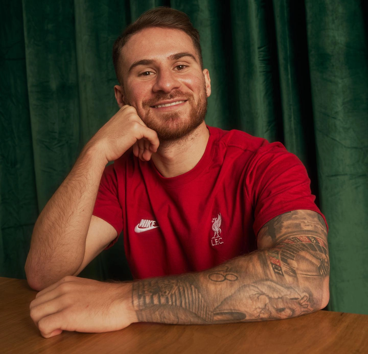
Alexis Mac Allister lets his sleeve tell the story

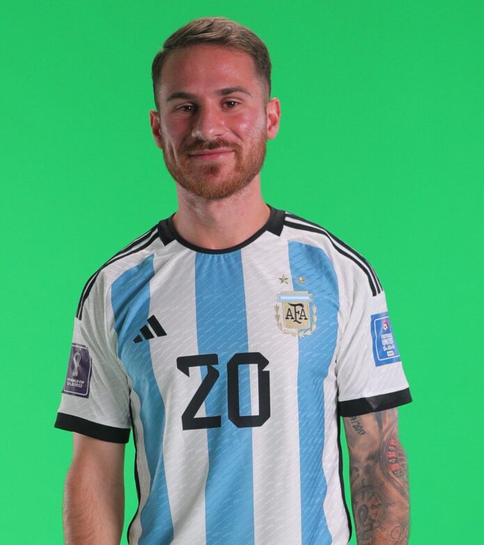
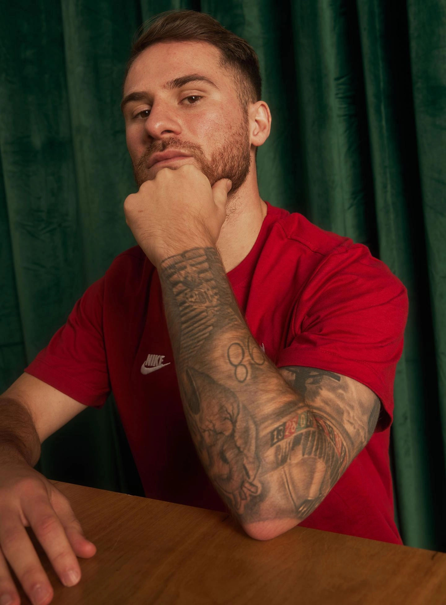
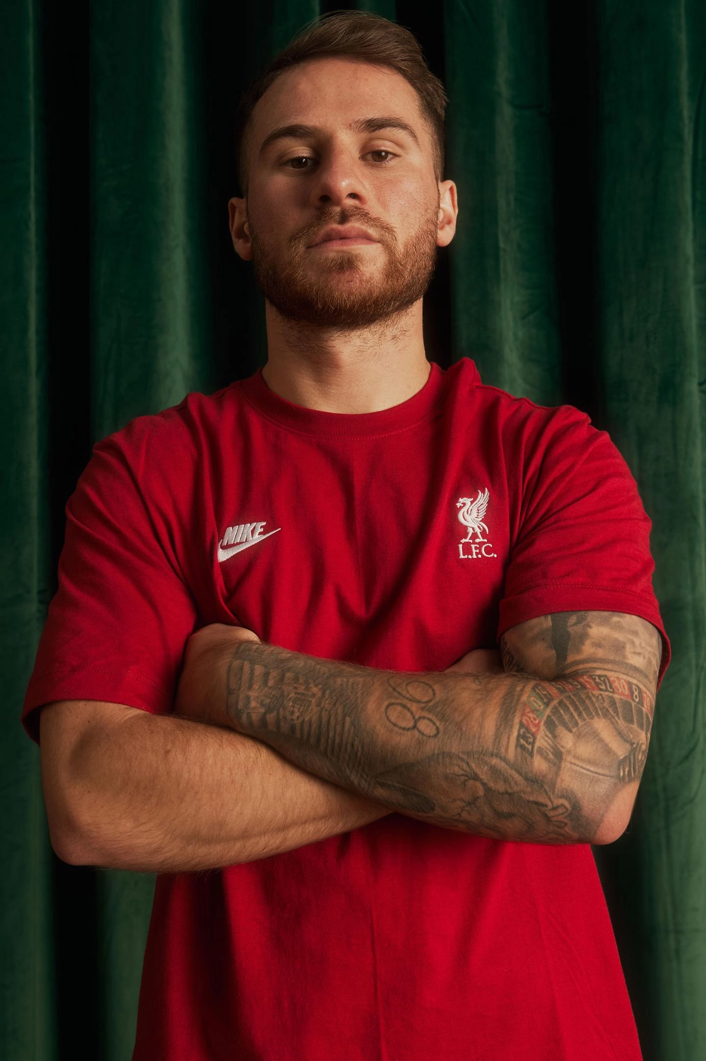
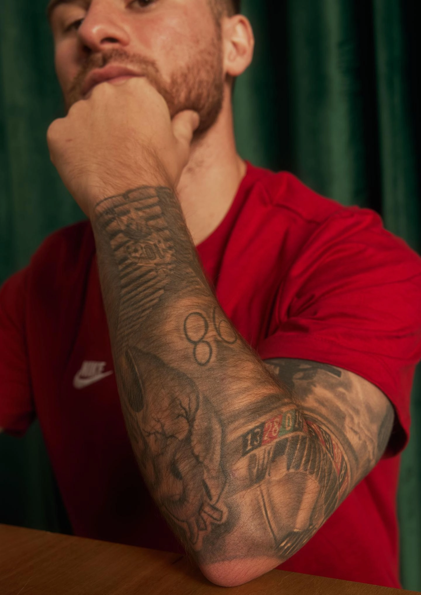
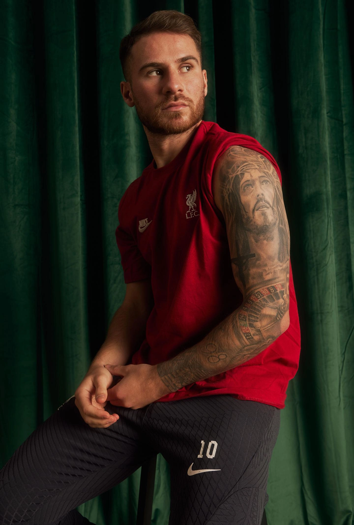
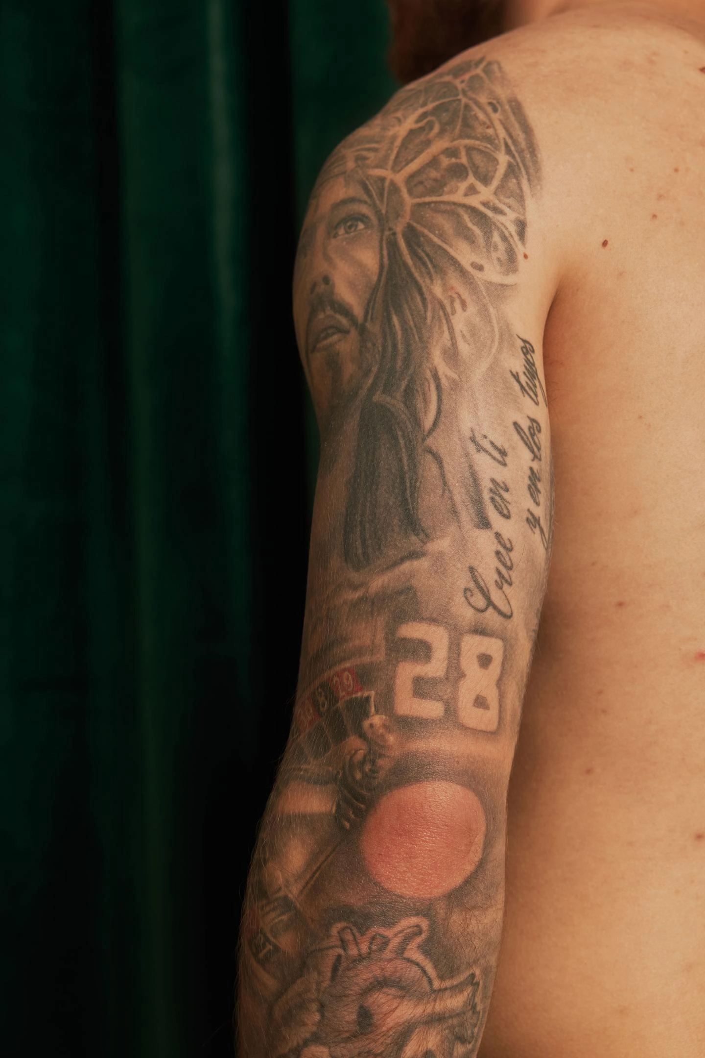
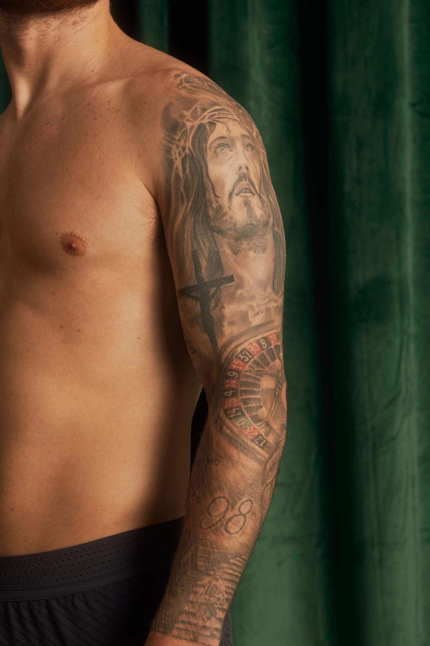
Alexis Mac Allister’s tattoos are easy to notice, but his sleeve has more to it than a wall of ink. His left arm brings together family names, football memories, religious imagery and small details that make more sense when he explains them. It has grown over time, piece by piece.

Mac Allister walked through the designs in Liverpool’s official Carlsberg Inked series, so there is a direct source for many of their stories. He discussed the number 98, a child carrying a football, his family’s names, Jesus imagery, early-career dates and a Spanish phrase about trusting yourself and your people. He also cleared up a roulette wheel tattoo that people often misread.

This guide sticks to the tattoos he described and what can be seen in the photographs from that interview. He said he hoped to add designs for the World Cup and Liverpool, so the collection may have changed since then. In the documented sleeve, the through-line is clear: Mac Allister keeps his family and football life close.

The full left-arm sleeve is built as one long story

Alexis Mac Allister full left arm tattoo sleeve

Mac Allister’s left arm is close to a full sleeve, though it does not look like one design planned in a single sitting. Script, portraits, blocks of numbers, religious images, a roulette wheel and smaller connecting details all sit together. Some parts are heavily shaded; in others, the open skin gives the lettering room to breathe.

He likes how tattoos look, but says each one needs a reason. That makes the sleeve less about matching styles and more about keeping important reminders in one place. New pieces can join the arm without erasing what was already there.

There is an easygoing side to the collection, too. Mac Allister explains the personal tattoos, laughs about the roulette wheel and talks about ideas he still has. He does not make every piece sound profound. Like any real sleeve, it feels unfinished in the best sense: it can keep growing.

The number 98 marks his birth year

Alexis Mac Allister number 98 tattoo on his arm

One of the clearest details is 98, the year Mac Allister was born. He explained that himself, so there is no need to read it as a shirt number, a gambling reference or a hidden score. It is simply a marker of where his story begins.

The block numerals also stand out against the softer portrait shading and the fine Spanish lettering nearby. That change in texture helps the sleeve stay legible instead of blending into one dark mass.

Birth years are a common tattoo choice, but here the number gives the rest of the timeline a starting point. Mac Allister has ink for later milestones, including his debut and a promotion with his first club. The 98 points back to the person he was before football became his profession.

A child with a football shows how much the game means to him

Alexis Mac Allister child with football tattoo

Mac Allister has a tattoo of a child carrying a ball beneath one arm and walking toward a heart. He said it represents how much he loves football. The image says what it needs to without a more elaborate theory: it links the boy he was to the career he built.

The heart makes it warmer than a standard football emblem. This is about affection for the game, not only competition or trophies. Football is also part of Mac Allister’s family life: his father, Carlos, played professionally, as do his brothers Francis and Kevin.

It is one of the sleeve’s most personal designs because it centres on feeling rather than achievement. A trophy can mark a win; a child with a ball suggests the love came first. That gives the other football tattoos a little more context.

His parents and brothers are written into the sleeve

Alexis Mac Allister family names tattooed on his arm

The names of Mac Allister’s parents and his two older brothers, Francis and Kevin, appear among the sleeve’s larger designs. He has described family as the people who stay beside you in good times and bad, which gives these names a meaning beyond a simple roll call.

In Liverpool’s interview, he said his sister’s name was still missing and that he wanted to add it. The family section was not finished just because the most obvious names were already there; he wanted everyone included.

His brothers are professional players too, so the sleeve carries family and football in the same frame. The names sit alongside the Mac Allister football story, without turning the family into a list of rivals or statistics.

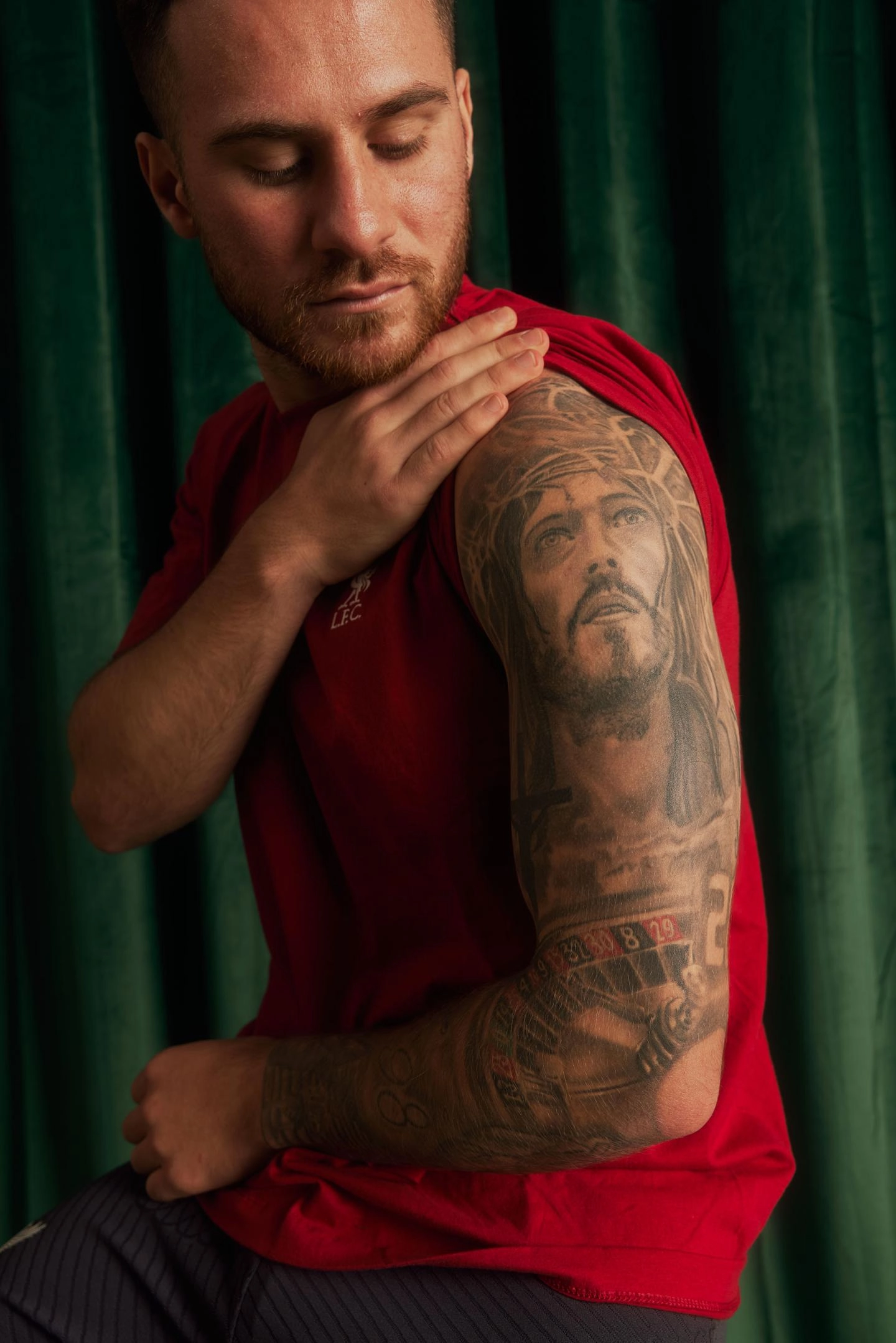
Jesus and the cross bring faith into the design

Alexis Mac Allister Jesus Christ tattoo on his upper arm

Religious imagery takes up a prominent part of Mac Allister’s collection. The official photos show a detailed Jesus Christ and crucifix design across his upper arm. It is larger and more dramatic than the number tattoos, but it fits the sleeve because it represents something he has said matters to him.

A photograph can show the figure, the cross and the shading, but the personal meaning belongs to the person wearing it. Mac Allister’s own comments let us say faith is part of the sleeve without guessing at every part of his beliefs.

The portrait gives the eye a place to land before it moves down through the lettering, dates and roulette wheel. Its detailed black-and-grey work also reflects the tattoo style he likes in this part of the arm: a realistic face rather than a small cartoon or simple outline.

The roulette wheel was meant to show shirt numbers, not gambling

Alexis Mac Allister roulette wheel tattoo around his elbow

The roulette wheel may be the most misunderstood design on Mac Allister’s sleeve. He said it represents the shirt numbers worn by him and his brothers, Francis and Kevin. The circular shape also helped him fill the awkward space around his elbow and connect the surrounding tattoos.

That is why people sometimes assume he is into gambling when they see it. Mac Allister has said that is not what the tattoo means, and joked that he may regret the choice a little because of how people interpret it. It is a lighter moment in an otherwise heartfelt interview.

The wheel still has a practical role in the sleeve. Elbows are tricky to cover, and a circular design can carry the eye around the joint. Here it both connects the family football numbers and helps the upper and lower parts of the arm flow together.

Career dates keep his early football years close

Alexis Mac Allister career date tattoos on his arm

Mac Allister’s sleeve includes dates tied to his early career: his professional debut with Argentinos Juniors and the club’s promotion to the top flight. They are not just milestones picked from a list. They mark the start of his path as a professional footballer.

Date tattoos can look plain beside a portrait, but they can mean more as the years pass. Clubs change, trophies come and go, and the player trying to break through may end up a World Cup winner. These dates keep the beginning in view.

They also point to the steps before global attention. Argentina’s 2022 World Cup win is now the achievement most people associate with Mac Allister, but this part of his sleeve reaches back to the debut and promotion that came first.

The Spanish phrase is about trust and loyalty

Alexis Mac Allister Spanish trust phrase tattoo

One of the smaller details is a Spanish phrase that Mac Allister translates as “trust yourself and your people.” It links neatly with the family names around it and the football symbols tied to the path he chose.

The words also give the sleeve an emotional centre. Mac Allister does not describe success as something achieved alone; he talks about loyalty and the way family stays close when life gets difficult. The phrase puts that belief in a place he can carry with him, whether he is playing for Argentina, Liverpool or an earlier club.

Quote tattoos can feel generic without their context. Here, they sit among names, dates and images that make the message specific to him. The line reads less like a motivational slogan and more like a personal rule he chose to keep in public view.

In a January 2024 interview with Liverpool FC, Mac Allister said he wanted a tattoo for winning the World Cup and another connected to Liverpool. Argentina had won the tournament in December 2022; he was also coming off Brighton’s first qualification for European football and had moved to Anfield.

That interview gives the photos a useful timestamp. The sleeve already held family, faith and early-career memories, but its next chapters were not yet visible. He floated the idea of a large World Cup design on his back and joked that a Liverpool trophy tattoo might go on his leg. A newer photo would be needed to confirm whether he has since done either.

Together, the tattoos make a timeline. The 98 marks his birth year; the child with a ball captures his love of football; his parents’ and brothers’ names keep family close; Jesus and the cross represent faith; the debut and promotion dates remember his early career. The roulette wheel ties the brothers’ shirt numbers together, even if it is the piece he jokes about most.

There is no single style running through the whole arm. Some pieces are realistic, some are lettering, others more symbolic. They do not need to match because the stories are what hold them together.

Mac Allister’s own rule sums up the sleeve: he likes tattoos, but each needs a reason. This is no random collection of passing trends. It records family, faith, early football memories and the milestones he may still add.

For Mac Allister, the ink is not finished. It is still keeping up with the story.

Arturo Vidal wears his whole story in ink

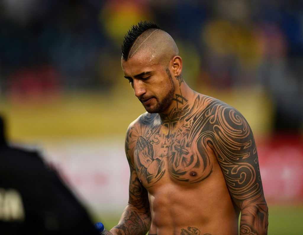
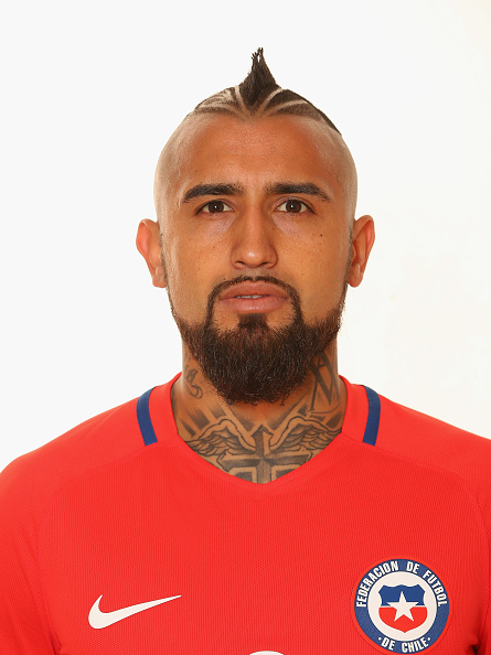
Arturo Vidal’s tattoos feel less like background decoration than a scrapbook carried across his chest, stomach, arms and neck. He has said his first piece, done when he was 20, was a portrait of his mother. Over time he added family names, religious images and designs tied to the life he was building in football.

One especially personal tattoo is an insulin pump linked to his son Alonso, who has type 1 diabetes. Vidal has said he has more than 30 tattoos and once admitted he has lost count. A complete inventory may be hard to pin down, but the main themes are clear: family names, faith, horses, football and personal mottos, held together by bold black-and-grey work.

Here is a closer look at the tattoos that can be identified in Vidal’s public photos and interviews.

His mother’s face was the first tattoo

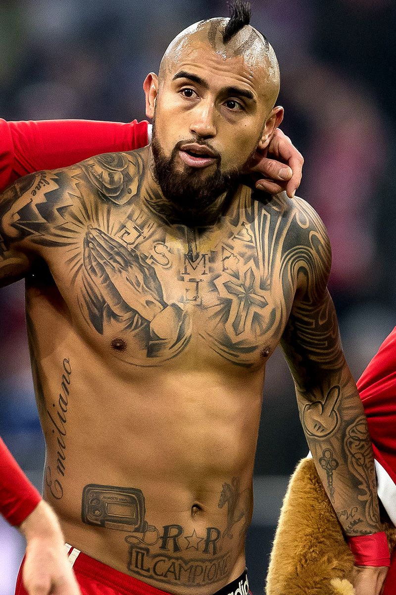
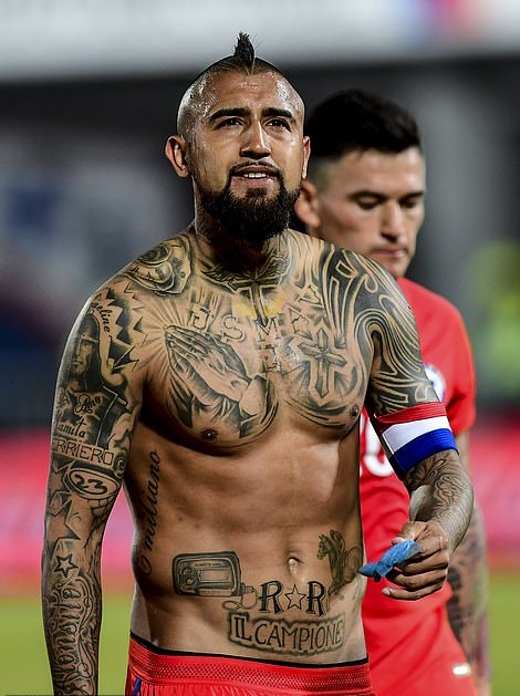
Arturo Vidal chest tattoos including Emiliano lettering

Vidal has said that his first tattoo was a portrait of his mother, which he got at 20. He has described her as the person who kept the family together while raising five children, so the choice was deeply personal from the start.

The portrait begins a family story that runs through the rest of his collection. Vidal speaks about his mother with the same pride he brings to football, and the tattoo gives that feeling a lasting place on his body. The designs grew at different points in his life, as people and moments became important to him.

In photos where his upper body is visible, the portrait sits among lettering, crosses and broad areas of shading. It can be easy to lose among the larger designs, but it remains one of the key pieces because it came first.

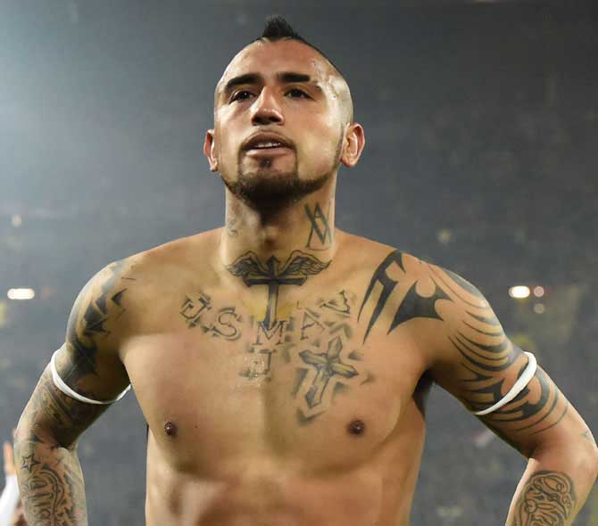
Praying hands and crosses fill the centre of his chest

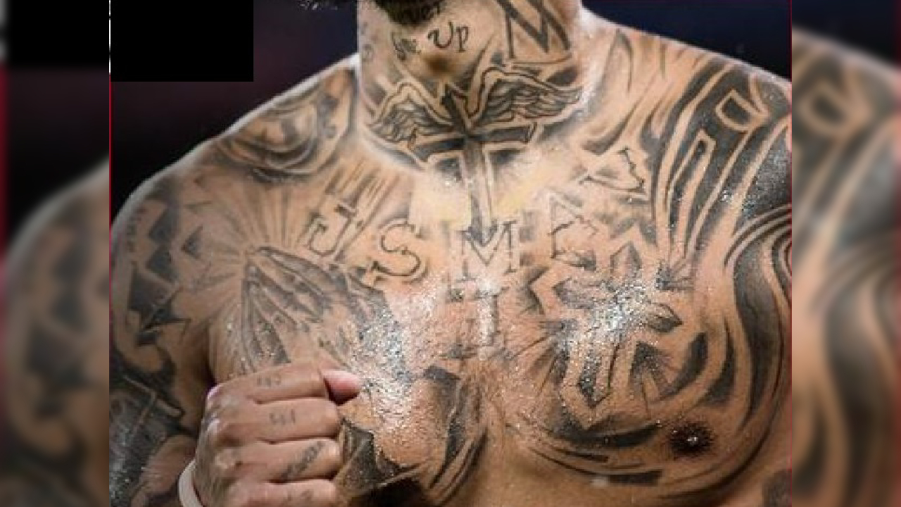
Arturo Vidal praying hands and cross chest tattoos

The praying hands at the centre of Vidal’s chest are among his most recognisable tattoos. Crosses and heavy shading frame them, with the design reaching toward his shoulders. It is broad enough to read from a distance, which suits his bold style.

The religious imagery is right out in the open: dark and central, almost an anchor for the rest of the chest. Lettering and smaller shapes around it add layers, and in some photos the cross at his neck seems to join visually with the chest work.

Public sources identify the hands and crosses, but Vidal has not explained every mark around them. The grounded description is that this is part of the spiritual side of his collection; the more specific meanings come from the family tattoos he has discussed himself.

The insulin pump tattoo is his clearest tribute to Alonso

Arturo Vidal insulin pump tattoo for his son

Near his lower stomach, Vidal has a tattoo based on the insulin pump his son Alonso uses. The small medical device is drawn with enough detail to make the reference clear. Vidal has talked about this piece more directly than most, and the story behind it is much more personal than its bold design might suggest.

He said Alonso wanted him to get the same pump on his own body. Vidal agreed because it gave him a way to carry a reminder of his son, especially when they were apart. The tattoo is less about looking tough than about sharing a small part of a child’s daily life.

The pump sits close to the larger lettering on Vidal’s abdomen, so it can disappear in wider photos and show up more clearly in close ones. Its meaning is one of the best documented in the collection: a sign of support for Alonso and a way to make his son’s experience part of his own story.

Emiliano and the family names are written into his side

Arturo Vidal family name and shoulder tattoos

The name Emiliano, one of Vidal’s children, runs vertically down his side. It is quieter than the chest piece, but carries the same family-first feeling. The lettering shows clearly in a three-quarter view of his torso.

Vidal has talked about tattooing the names of his brothers and children. The overlapping designs can make individual names hard to read in every photo, but the broader pattern is clear: much of this ink keeps loved ones close, alongside the trophies and the forceful football image.

A name on the side is also a more private reference than “Il Campione.” It can stay under a shirt, then break up the larger chest composition when Vidal is shirtless.

His shoulders and arms use bold tribal shapes

Arturo Vidal tribal arm and chest tattoos

Vidal’s arms carry sweeping tribal shapes, dark bands and sharp geometric sections in black and grey. The patterns wrap around his shoulders and upper arms, so they look different from each angle. Some photos show a broad dark curve; others reveal how the design connects back to his chest.

This is the collection at its most aggressive visually. The thick lines and strong contrast sit comfortably beside Vidal’s mohawk and all-action style of play. He has not provided a separate explanation for every pattern, so the clearest description is what can be seen: flowing shapes that frame the more personal names and symbols.

Small words and faces are worked into the arms as well, including family references and his mother’s portrait. The tribal work gives the collection its shape, while those smaller details give the sleeves a personal reason to keep growing.

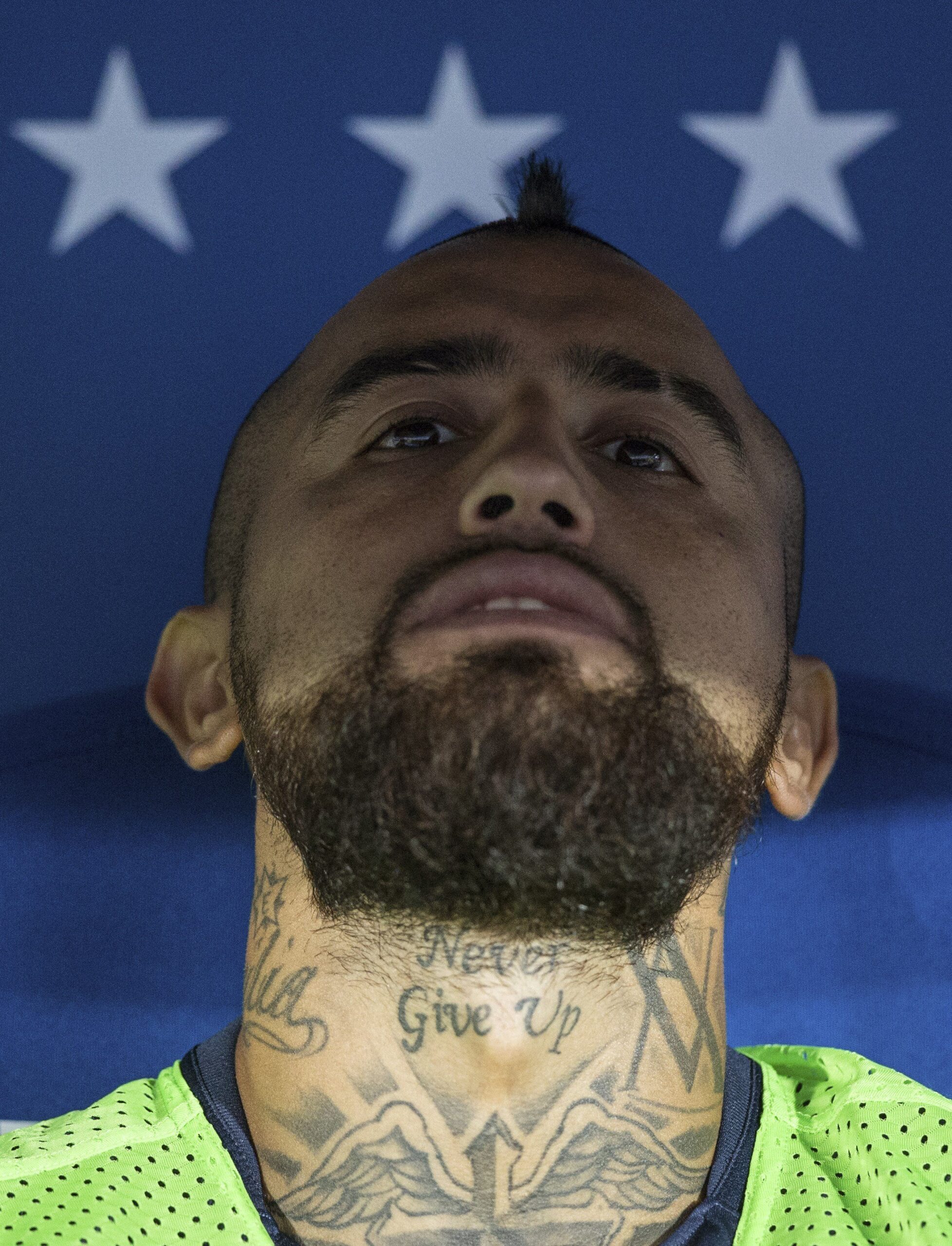
“Never Give Up” is written across his neck

Arturo Vidal Never Give Up neck tattoo

The words “Never Give Up” are written across Vidal’s neck, beneath his beard and above the chest design. The phrase is easy to read and often visible even when he is wearing a shirt. It is both a message and a public part of his look.

The words fit the way Vidal has spoken about his childhood and career. He has described growing up in a difficult neighbourhood and having a mother who worked hard to support the family. His game is built on pressure, recovery and persistence, so the phrase suits the image without needing a long explanation.

A neck tattoo is hard to keep private. Unlike ink on the ribs, this one follows Vidal into interviews, team photos and everyday life. Its placement feels deliberate, sitting close to the cross and winged imagery below.

The neck cross and winged design tie the upper body together

Arturo Vidal neck cross and upper-body tattoos

Below the “Never Give Up” lettering, a large cross is framed by wing-like shapes at the base of Vidal’s neck. In wider photos it looks connected to the crosses and praying hands on his chest, creating a line of religious imagery from his throat to his sternum.

The design is bold rather than delicate, with dark outlines and heavy shading that remain visible under stadium lights. That helps explain why his tattoos read so clearly in match photos: even when smaller lettering disappears, the cross, wings and chest hands still stand out.

There is a contrast between this public-facing work and the insulin pump near his stomach. The cross and wings contribute to the tough, almost warrior-like image many people associate with Vidal. The pump and names bring the focus back to the family story underneath it.

The upper-body composition ties the collection together

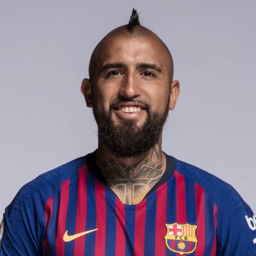
Arturo Vidal Chile portrait showing neck tattoos

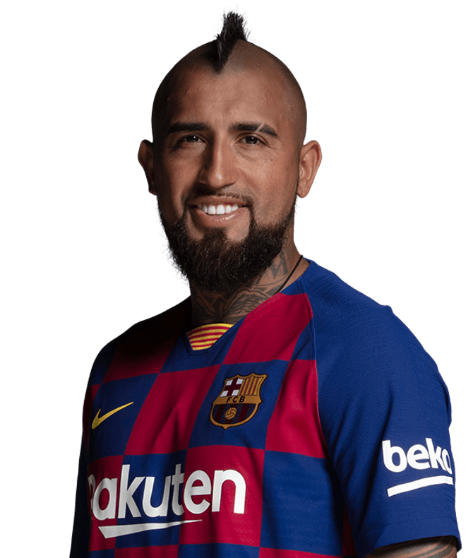
Vidal’s neck cross, wings and upper-chest lettering make the designs feel connected. His neck portrait shows how visible the work remains even when he is wearing a Barcelona shirt, and how the heavier outlines join the neck ink to the shoulder patterns.

Horses are an important part of Vidal’s life away from football. He has talked about growing up around them and once said he would have liked to be a jockey. That interest helps explain why horse imagery comes up in tattoo coverage, although the crowded photos do not make every small design easy to identify.

Vidal has not suggested his collection is complete. He has more than 30 tattoos, has said he cannot always count them and has mentioned leaving room for a Champions League design. That unfinished quality is part of the appeal.

From his mother’s face to Alonso’s insulin pump, his children’s names and “Never Give Up,” the clearest pieces point to people and goals. Football is part of the story, but it sits beside family rather than replacing it. His tattoos show Vidal’s competitive side and the reminders he wants to keep close.

The ink feels lived in. Some designs are loud, others hard to read, and a few only make sense once you know the story behind them. A collection built over many years does not need to look like a matching set; each new tattoo adds another page to the diary.

The official Barcelona interview below offers a closer look at Vidal talking about his life and tattoos, alongside the photos and explanations above.

Kyle Walker’s tattoos tell a football story

Kyle Walker’s tattoos are easy to spot, but their stories go beyond the quick glimpses in match photos. The England and Manchester City defender has built up a large collection across his arms, chest, stomach and legs. Some pieces honour family; others mark the clubs that shaped his career, while a few are designs he simply wanted at the time.

Walker has spoken openly about his ink. His first was his name, “K. Walker”, on his hand with a star beside it. He has also explained the eye on his forearm as a tribute to his late grandfather, who first brought him to football. More recently, he described the designs on his left leg as a visual record of his career.

There are plenty of smaller pieces among the larger work, so an exact count is difficult. The collection is easiest to follow by theme: family, remembrance, football clubs, dates and the dense sleeve work that brings it together.

His first tattoo was his own name and a star

Kyle Walker hand star, name and floral sleeve tattoos

Walker has said his first tattoo was “K. Walker” on his hand, with a star beside it. He later added another star after friends teased him for what they thought was a low rating. It is a simple start, tied directly to his own identity.

That first piece helps explain why the later tattoos feel so personal. Walker began with his own name, then added images as his life changed. The second star has a playful backstory: it was not part of a larger plan. He liked the idea, his friends joked about it, and he got another one.

In wider photos, the hand lettering can get lost beside the darker work on his forearms. Flowers, faces and shaded shapes have grown around it, turning that first tattoo into one small piece of a much bigger scrapbook.

The eye tattoo is a tribute to his grandfather

Kyle Walker arm tattoos including his grandfather eye tribute

One of Walker’s most meaningful tattoos is an eye on his forearm, dedicated to his late grandfather. Walker has said his grandfather took him to Sheffield United and helped introduce him to football. He sees the eye as a way of showing that his grandfather is still looking out for and guiding him.

That gives the design more weight than its size suggests. It is not just another detail in a packed sleeve; it connects Walker’s career to the person who helped him discover the sport. The eye is a quiet reminder of where his journey began.

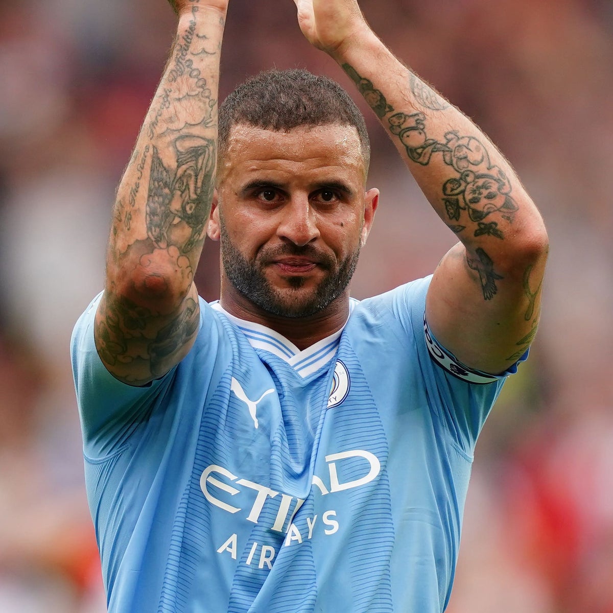
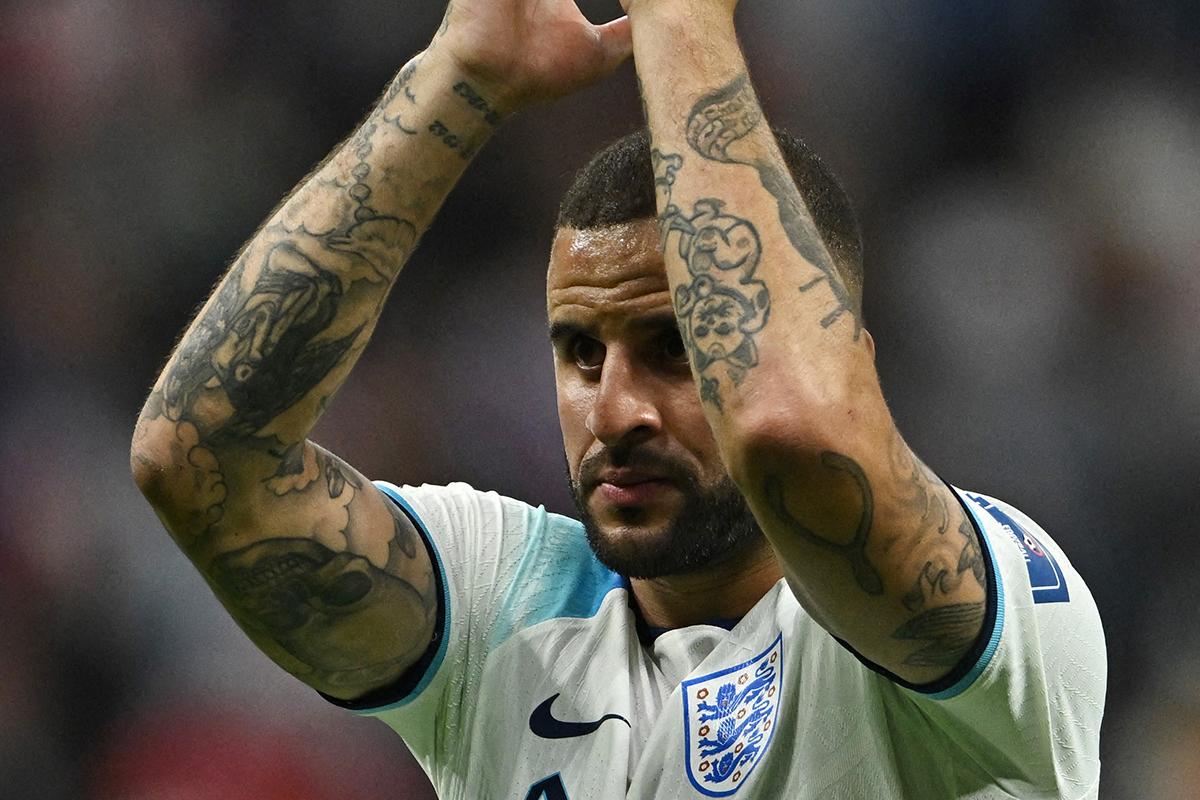
It sits among flowers and other arm tattoos, so it is usually seen as part of the sleeve rather than on its own. Walker often raises his arms to applaud supporters, which has made the forearm piece easy to spot in match photos.

Roman numerals across his torso mark family dates

Kyle Walker Roman numeral family date tattoo across his torso

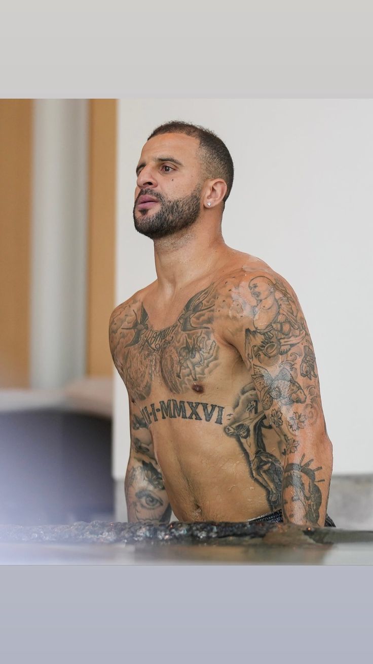
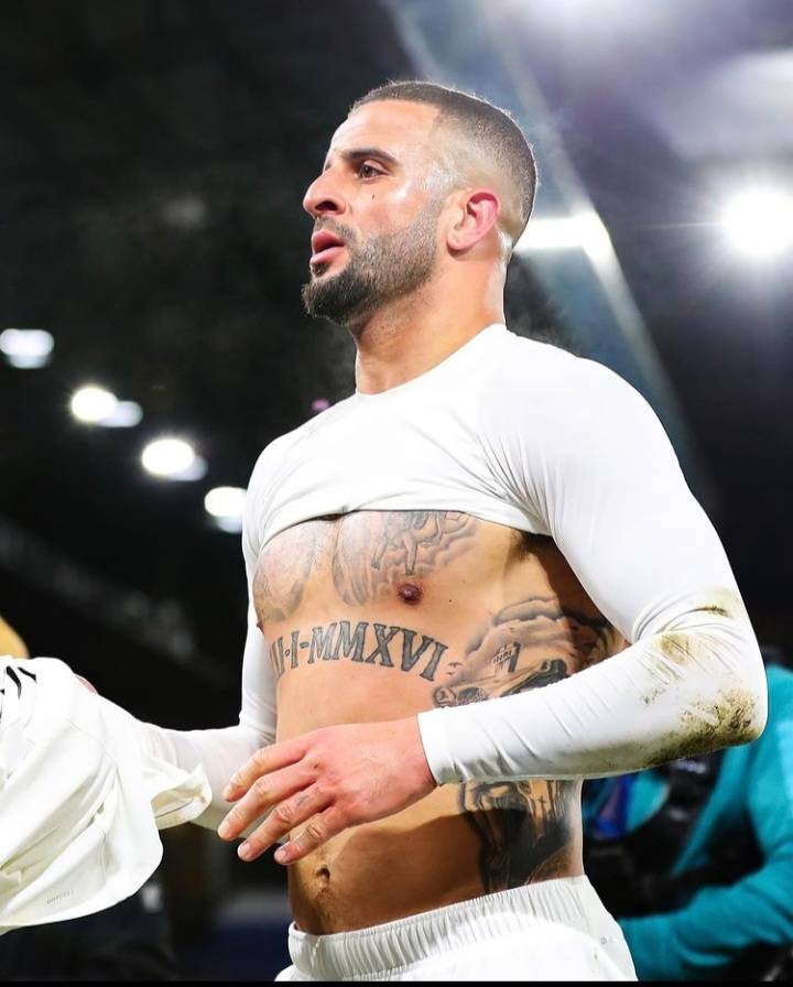
Large Roman numerals stretch across Walker’s stomach. Tattoo coverage identifies them as the birth date of his youngest son, giving the design a clear family meaning. It is one of his boldest pieces, spanning the centre of his torso like a banner.

The date is often visible when Walker lifts his shirt after a match, and it can be the first thing people notice. That placement makes it feel like a proud statement about his family rather than a private detail.

Walker uses dates as a kind of code: instead of writing out a name, the numerals mark something meaningful to those close to him. It fits a collection where moments appear through numbers, initials and images rather than one consistent style.

His chest mixes names, portraits and old-school imagery

Kyle Walker chest and arm tattoos on a boat

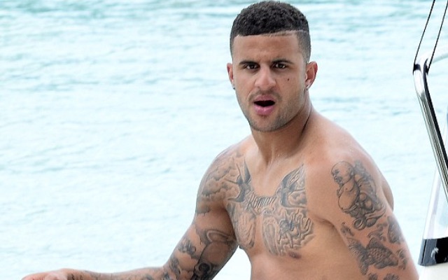
Shirtless photos show a busy chest of lettering, shaded portraits and traditional tattoo shapes. The designs overlap, so one photograph rarely captures every detail, but the overall picture is clear: this is a collection of separate pieces gathered over time, not one large image.

Faces and script sit across the upper body, with darker shapes linking the centre of the chest to his shoulders. The mix gives the tattoos a lived-in quality. Some players build a sleeve in one clean style; Walker’s ink reads more like a timeline, with newer work finding space beside older pieces.

Low-resolution match photos can be misleading. A shape that looks like one portrait from a distance may actually be several tattoos close together. Clearer photos reveal more around his chest and upper arms.

His arms carry flowers, faces and a lot of blackwork

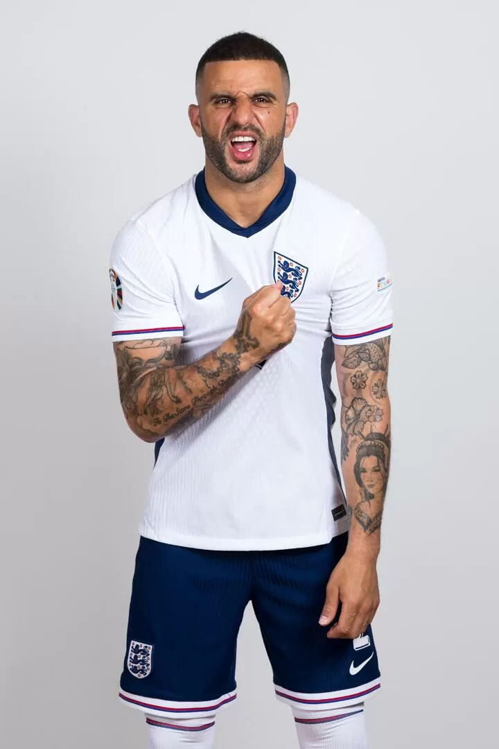
Kyle Walker forearm and sleeve tattoos for England

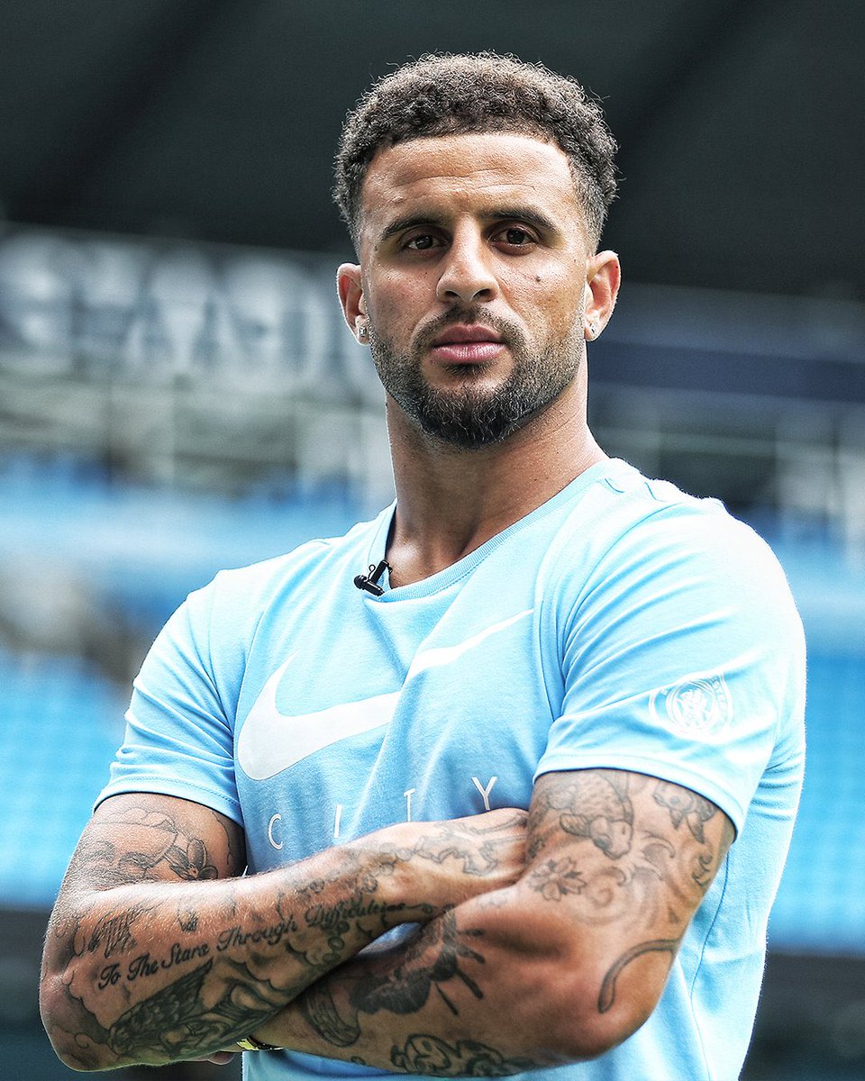
Walker’s sleeves are probably the most visible part of the collection. They combine flowers, faces, short bits of writing and heavy shading. The designs are dense but not uniform, giving each arm its own character.

Close-up photos show the eye tribute and smaller writing around it, while wider views reveal portraits and floral work higher on the arm. The ink reaches near his shoulders, so a short-sleeved England shirt often leaves plenty on show.

The sleeves also contrast with the clean Roman numerals across his stomach. The date is easy to read; the arms invite a closer look. In the same photo, you might spot a face, a flower or a line of script you missed before.

His Manchester City years sit inside the sleeve story

Kyle Walker Roman numeral tattoo visible after a match

Walker’s football tattoos are not tied to just one club. In a 2025 interview, he said the tattoos on his left leg represent the route his career has taken. He named Sheffield United, Tottenham and Manchester City, then joked that a move to AC Milan meant he would need to add another club.

That turns the tattoos into a kind of career map. Sheffield United marks the start, Tottenham the step into top-level English football, and City the long run of trophies and big nights. The map can keep changing when the next chapter begins.

His City years are visible in match photos, too. Walker is often pictured applauding with both arms raised, putting the sleeve work on display. The shirt changes from season to season, but the ink stays, following him through each stage of his career.

The designs do not look overly polished, and that suits the story. A club tattoo belongs to a moment; when a player moves, it becomes part of a longer timeline. Walker’s leg and arm pieces mark the roads he has already taken, not just the next photo.

Club names and dates can still be read years later, even if a smaller image fades or gets covered by newer work. They keep the memory of each stop in his career, while the family tattoos connect football to his life away from the pitch.

The newest photos show how the collection keeps growing

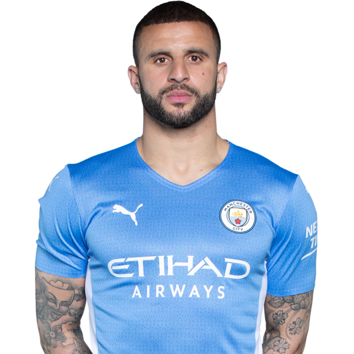
Kyle Walker detailed arm tattoos in Manchester City kit

Walker’s tattoos are still a work in progress. He has talked about new club references and extra details, while the older pieces remain in place: his name and star on his hand, the eye for his grandfather, and the family date across his stomach.

He has also said he does not regret the tattoos. His reasoning is simple: when he chose each one, he had a reason for it. That does not mean every piece carries the same weight. A name and star may have started as fun, while the eye holds a lifetime of memory. Both can belong on the same body.

That mix is what makes the collection worth a closer look. It is personal, a little chaotic and tied to Walker’s route through football, rather than polished into one theme. Family, remembrance, loyalty and the clubs that shaped his career all show up in the ink.

Sky Sports has a short video of Walker explaining the family meaning behind his tattoos. Hearing him talk through the ideas makes a useful companion to the photos.

Memphis Depay wears his whole story in ink

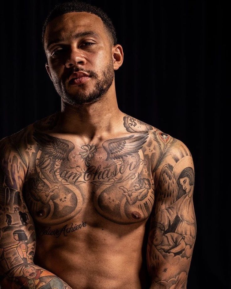
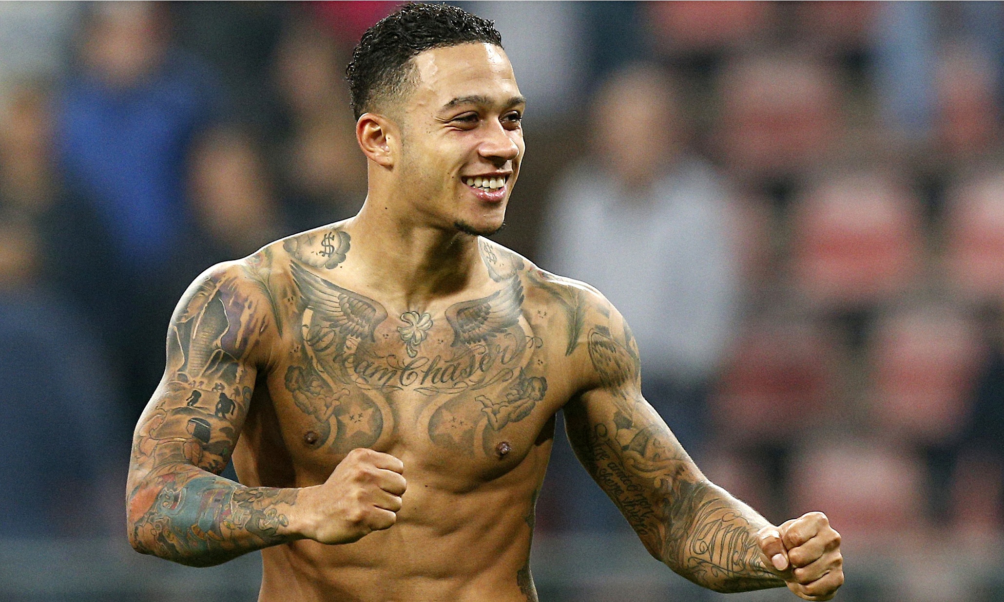
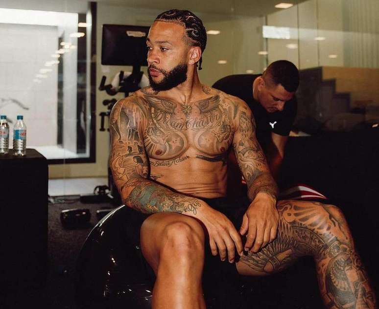
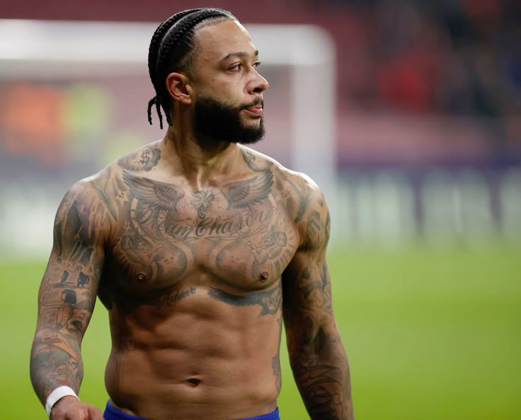
Memphis Depay’s tattoos feel less like decoration than a diary carried on his skin. Family, faith, ambition and private reminders appear across his chest, arms, back and legs, with even a small design inside his lower lip. Some are impossible to miss; others only show up in a close photo.

The collection ranges from the lion across his back, said to have taken about 26 hours, to phrases such as Dream Chaser, a memorial to his grandfather and the hidden word “succesvol.” The designs do not share one style because they mark different parts of his life.

Here is a closer look at the pieces documented in photos and tattoo coverage, along with the meanings that have been reported and the details that remain open to interpretation.

Dream Chaser and Believe Achieve sit across his chest

Memphis Depay Dream Believe Achieve chest tattoo

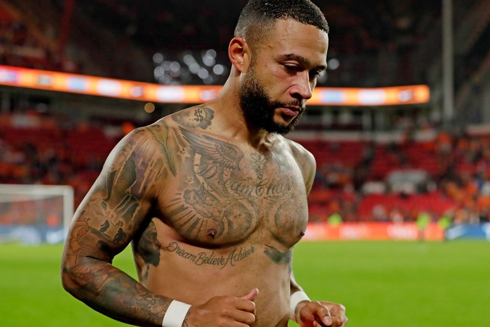
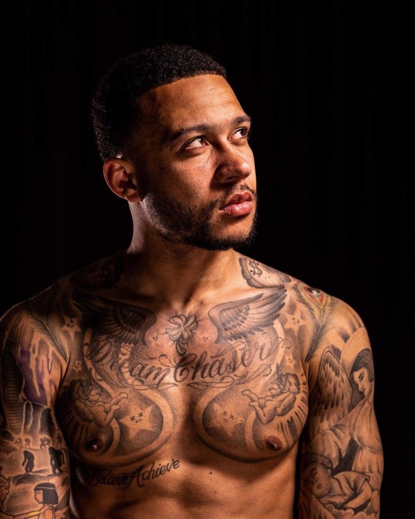
The words across Depay’s upper body are closely tied to the image he projects. “Dream Chaser” stretches across his upper chest, while “Believe Achieve” sits lower down. Together, they read like a short plan: keep pursuing what you want, then do the work to make it happen.

It is a familiar kind of football motto, but it feels connected to Depay’s own confidence and ambition. The phrases show when he plays, trains or takes his shirt off for a photo, making them both a public statement and a reminder he can carry with him.

The lettering sits among wings, script and smaller details, so his chest does not read like a blank canvas with one quote in the middle. These words are the headline in a much fuller story.

“Dream Chaser” is perhaps the clearest shorthand for the way Depay wants to be seen: ambitious, restless and still moving forward. “Believe Achieve” gives that drive a second step.

The lion on his back is the centerpiece

Memphis Depay lion tattoo across his back

Depay’s lion tattoo gets the most attention. It covers much of his back, and tattoo guides often associate it with strength, courage and self-belief. Those ideas fit the image, though it is safer to describe the lion as part of Depay’s public persona than to claim a single official meaning for every detail.

The scale is part of its story. Reports say the work took around 26 hours, a long session for all the shading and detail. This is no small emblem tucked under a collar; it stretches across his back and changes how the rest of the collection reads.

Lions often represent leadership, bravery or control in tattoo culture. Beside Depay’s “Dream Chaser” motto and other confidence-focused designs, the image feels less like a standalone animal portrait and more like a visual anchor for his public image.

Photos from the front tend to show his chest and arms more clearly than the back piece. It helps to separate what is documented from what one particular photo happens to reveal: the lion is on his back, even when the image in view shows another part of his collection.

His grandfather tribute includes a date and Christ the Redeemer

Memphis Depay Dream Believe Achieve tattoo across chest and stomach

Family is one of the strongest themes in Depay’s tattoos. Tattoo guides identify a tribute to his grandfather that includes the date 14-02-2009. It is described as a memorial marker, adding a personal note alongside the larger ambition quotes.

He also has an image of Christ the Redeemer on his left torso, alongside the date 18.06.14, which published summaries connect to his first goal for the Netherlands. The design carries a religious image and marks a football memory at the same time.

These details make the collection hard to reduce to one aesthetic. A memorial date is doing different work from a lion; Christ the Redeemer is more than a large picture. One tattoo remembers a person, another marks a career moment, while the words on his chest look toward what comes next.

The dates may not be as striking in a photograph as the bigger designs, but they help explain why the collection matters. They turn the ink into a timeline.

The angel, wings and faith imagery fill his arms

Memphis Depay winged chest and arm tattoos

Depay’s upper body also carries designs linked with faith and protection. There are wings across the chest, along with an angel scene that tattoo coverage has described as a guardian angel watching over a sleeping child. The imagery is gentler than the lion, though it still takes up plenty of space.

Wings can suggest freedom, faith or remembrance, while a guardian angel brings in the idea of care. Depay has not given a formal explanation for every symbol, so it is best to keep the reading measured: the imagery looks devotional and protective, while smaller personal details are harder to identify from photos alone.

His arms are heavily tattooed too, with script, small symbols and pieces that blend into the chest work. From a distance, the whole area can look like one continuous sleeve. Up close, the separate ideas become clearer.

That layered look suits a collection that has grown over time. Religious imagery sits alongside motivational phrases and football memories, without everything needing to match perfectly.

Egyptian figures cover the leg

Memphis Depay chest arm and leg tattoos during training

Another part of Depay’s collection draws on ancient Egypt. Tattoo guides have documented figures on his leg, including Isis, Nefertiti, Anubis and King Tut. Their look gives that area a different mood from the chest lettering and the lion on his back.

These figures come with familiar cultural associations: Isis with motherhood and protection, Nefertiti with beauty and royal power, Anubis with death and the afterlife, and King Tut with ancient royalty. Those are broad references, not necessarily Depay’s own explanation of each portrait, so they are useful context rather than a definitive statement about his intent.

The Egyptian theme is specific enough to stand as its own chapter in the collection. The figures share a visual language, while other parts of Depay’s body carry different ideas. He does not force everything into one style.

Training photos can make leg tattoos hard to read because of shadows, socks and movement. Still, the larger Egyptian portraits have appeared often enough in coverage to count among the main groups in his collection.

Stars, successful and the small circle keep the collection personal

Memphis Depay chest and arm tattoos after a match

Some of Depay’s most interesting tattoos nearly disappear in an ordinary photo. The best-known is “succesvol”, meaning “successful,” inked inside his lower lip. It is deliberately hidden, and the joke is simple: the word stays private until he decides to show it.

He also has small stars and a circle that tattoo explainers have linked to goals, direction and close relationships. One small forearm piece has been identified as “Memphis,” while other lettering can be hard to distinguish from nearby ink in low-quality images. A careful inventory separates the well-documented tattoos from guesses based on a blurry crop.

The stars sit nicely beside the larger statements. A lion or a full chest quote makes its message visible to everyone, while a tiny symbol may matter most to the person wearing it. The circle has been described as a reminder of Depay’s small circle of friends, though sources do not always explain its meaning in the same way.

These smaller marks keep the collection from feeling too grand. Depay has the dramatic back piece and the religious imagery, but also a word inside his lip and details that only appear up close. That range makes the collection feel personal rather than packaged.
What Memphis Depay’s tattoos say as a collection

Seen together, Depay’s tattoos sketch out ambition, memory and belief. The lion is the big visual statement; “Dream Chaser” and “Believe Achieve” put words to the drive behind it. The date for his grandfather and Christ the Redeemer keep the football story tied to family and faith, while the angel imagery adds a sense of protection.

The Egyptian figures bring another interest into the mix, while the stars, circle and lip tattoo keep things from getting too serious. There is space for symbolism, career memories and a little mischief in one collection. That is more fun to follow than a matching set planned all at once.

A photograph can never show the whole picture. A shirtless pitch photo might catch the chest and arms but miss the lion; a gym shot may show the leg work and hide a small line of script. Each angle reveals only part of the collection.

For Depay, the strongest thread is not a single style but the habit of attaching ink to a feeling or a moment. Some tattoos look ahead, others hold on to family, and some are private reminders. That mix of huge images and tiny hidden details is what makes his tattoo collection feel lived in.

Brandon Montour wears his family history on his sleeves

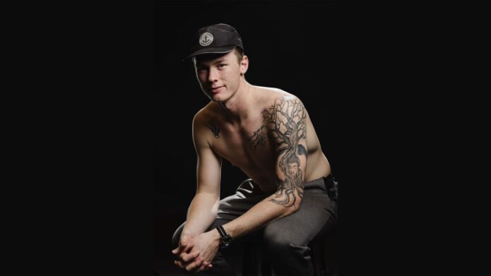
Brandon Montour’s tattoos read like a family album threaded through with hockey. The Seattle Kraken defenseman has ink for his parents, brothers, wife, children, dogs and grandfather, along with references to his Mohawk heritage and the career that took him from Ontario to the NHL. There is a lot there, but it does not feel random.

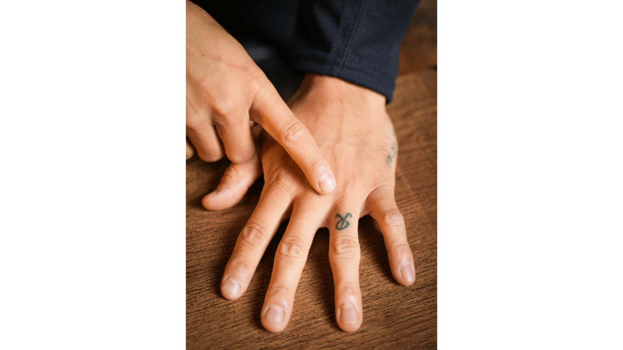
Montour has said his tattoos remind him of people and moments. “Mom” and “dad” sit on his wrist, where he can see them before and during games; an R on his ring finger stands for his wife, Ryian. After his grandfather died, the family turned one of the older man’s tattoos into a shared tribute. Palm trees and mountains mark places connected to his children.

The designs cover both arms, a thigh, his back and the area around his hip, and the collection is still growing. Montour has described his back as space for larger ideas, while the rest of his ink already reads like a loose timeline.

Frogs, owls and wolves fill the work in progress thigh

Brandon Montour frog owl and wolf thigh tattoos

Montour’s thigh is still a work in progress, but it already includes a frog, an owl and a wolf. The animals give his upper leg a different feel from the lettering and family dates on his arms, with space left for future pieces.

The story behind his first tattoo is just as personal. It brought hockey and lacrosse together, while the dreamcatcher puts family, community and heritage in the same frame.

Montour got that first design at about 16 or 17 and came up with it himself. He drew a silhouette of himself holding a hockey stick and a lacrosse stick, with a helmet beside him and a dreamcatcher behind. He said his parents accepted the idea once they saw it, though they asked him not to put it somewhere too wild.

That beginning set a pattern. Montour did not choose a generic symbol and find a meaning for it later; he started with an image that already felt like him. The collection has since grown in different directions, but the link to people, places and identity has stayed.

The family message sits among flowers, animals and a lion

Brandon Montour family and Anything is possible if you believe forearm tattoo

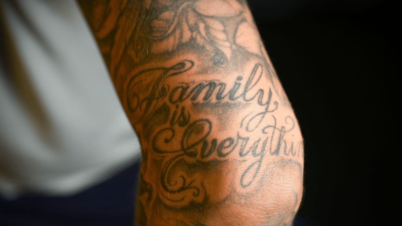
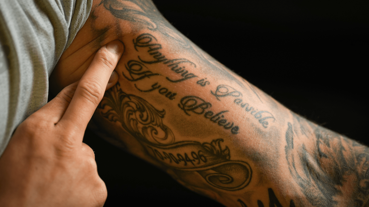
Much of Montour’s arm work circles back to family. One clear phrase reads “Anything is possible if you believe,” surrounded by flowers and animals. The words are motivational, but the names and dates nearby make the sleeve feel specific to him rather than like a generic slogan.

A lion fills part of the surrounding space, while palm trees connect with the start of Montour’s NHL career with the Anaheim Ducks. The sleeve moves between family, belief, travel and the places where his life changed direction.

Sports tattoos can easily become a wall of team logos, but Montour’s are more indirect. A palm tree can mark a city and a career chapter without spelling out the team. Flowers soften the lettering; animals fill the space while carrying their own associations.

The phrase offers a thought he can return to on a difficult day. Hockey demands that players recover after mistakes, and these words look forward rather than simply recording the past. It is the sort of sentence that can encourage him without needing to be explained each time someone sees it.

A Native American chief and an angel bring two sides of the collection together

Brandon Montour Indigenous chief and angel arm tattoos

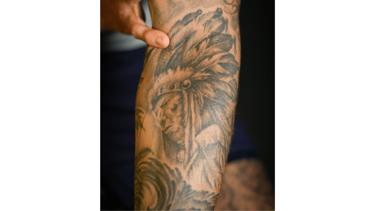
On his lower arm, Montour has a portrait of a Native American chief that he has connected with his Indigenous roots. Higher up, an angel represents “everyone,” according to the story behind the collection. One points to heritage and identity; the other has a broader, protective feeling.

Montour is of Mohawk descent and has described the chief as part of his own story. It is not simply a powerful-looking image. It sits alongside the family references and the dreamcatcher from his first tattoo.

The angel works differently. He has not described it as a portrait of one particular person; its reported meaning is wider, a dedication to the people around him. It can sit beside the specific “mom” and “dad” tattoo without competing with those names.

Together, the images make the sleeve feel like a set of connected ideas rather than one mural planned all at once. Some name the people closest to him; others speak to culture, belief or support. Their styles differ, but they do similar emotional work.

“Mom” and “dad” stay where he can see them during games

Brandon Montour mom and dad wrist tattoo

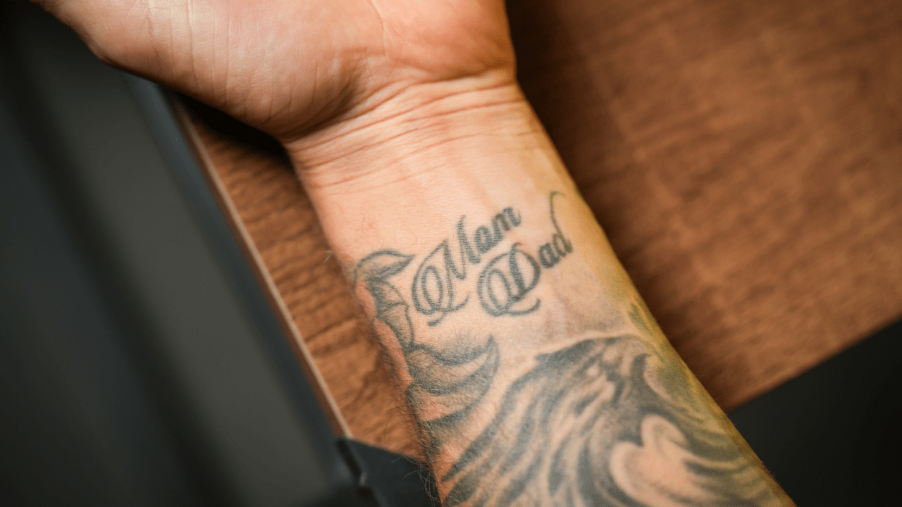
One of Montour’s most direct tattoos sits on his wrist: the words “mom” and “dad.” He chose the placement so he could look down at them before a game and even while playing. The dedication becomes part of his routine.

Athletes often have small rituals before competing. Montour’s reminder is always with him; he does not need a photograph or a lucky object nearby to think about the people who helped him get this far.

Other tattoos and shading surround the lettering, but its meaning is easy to read. There is no symbol to decode or translation to work out. That plainness helps it stand out among a collection full of scenes and imagery.

It also shows why Montour talks about tattoos as moments, not just pictures. An animal, a quote, a place or a family name matters because of what he sees in it when he looks down.

Family birth years turn the sleeve into a timeline

Brandon Montour family birth years and flowers arm tattoo

Below the wrist message are birth years for Montour’s parents and both of his brothers. They sit among flowers, animals and other decorative work, turning the sleeve into a family timeline rather than a single name tattoo.

The dates can be hard to make out from a distance, unlike a lion or portrait. Up close, they give the arm structure. It is not only a record of who his family are, but of the years connected with them.

Flowers soften the numbers and break up the lettering, while the animals add movement and nearby script helps the pieces hang together.

This is where the sleeve feels most like a family album. The dates are not there to impress a stranger seeing the tattoos for the first time. They let Montour carry the people and milestones with him while he travels for hockey.
The small LNG tattoo is for two dogs and a family joke

Montour’s tattoos are not only about his human relatives. He has an “LNG” tattoo for his dogs, Libby and Ginger. The letters keep both names close, and Libby has a playful backstory: it is short for LeBron.

A crown tied to the nickname adds another bit of fun. This is not a huge portrait or a dramatic memorial, just a small family reference that makes sense to people who know the dogs and the story behind the nickname.

That lighter side matters. Montour has serious tattoos for his Indigenous roots, his parents and his grandfather, but he leaves room for a dog joke too. A collection made only of solemn tributes could feel heavy; the LNG piece keeps it warm.

The tattoos do not all need to carry the same weight. Some hold grief or heritage; others make the wearer smile. His sleeve has room for both.

The “R” on his ring finger is for his wife Ryian

Brandon Montour R tattoo for wife Ryian on ring finger

After marrying Ryian in Nashville, Montour added a small “R” on the ring finger of his left hand. It is among the simplest tattoos in his collection, but the placement gives the letter extra meaning. The finger already carries the idea of marriage, and the initial makes the dedication personal.

Beside the arm sleeve, the R is minimal: no flowers, animals or long phrases, just one letter where a ring would sit. That restraint fits Montour’s approach. A large piece can tell a whole story, while a small one works as private shorthand.

It also marks a later chapter in his life. His first tattoo came as a teenager thinking about hockey and heritage; the family sleeve grew as he established his career; the ring-finger initial belongs to the life he is building with his wife.

His back and hip tattoos mark quotes, children and championships

Brandon Montour Kai and Maison children birth place tattoos

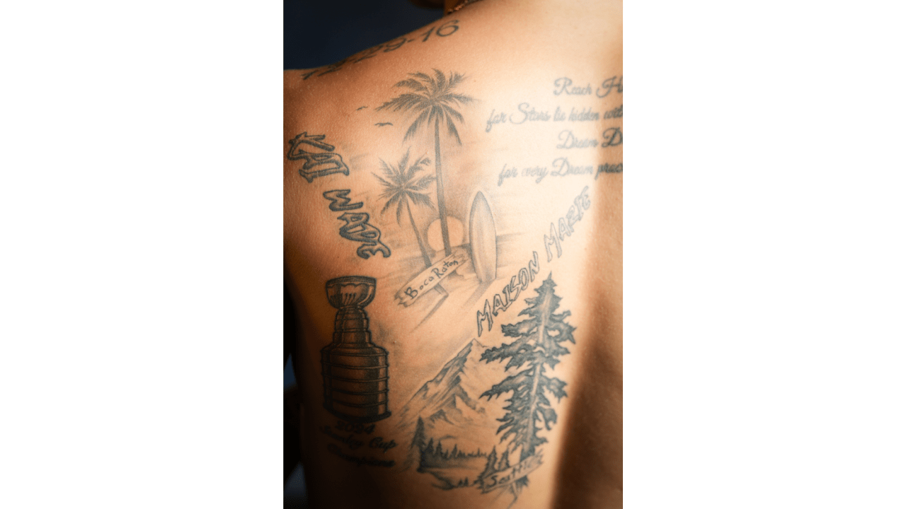
Montour has added larger work beyond the sleeve. A motivational quote covers his upper back, and a Stanley Cup above his left hip marks the 2023–24 championship he won with the Florida Panthers. Designs for his first two children sit around the Cup.

For his son Kai, Montour chose palm trees and a beach to represent Boca Raton, where Kai was born. For his daughter Maison, he added mountains and pine trees tied to the Pacific Northwest and her Seattle birthplace. They work as small landscapes rather than just names and dates.

The Cup marks a career milestone, while the surrounding scenery turns the same area into a story about home and family. Montour’s father has a slightly different version of the Cup design, adding another family connection to the championship.

Montour has joked that one of his favourite pranks is asking someone to scratch his back, knowing they will spot the Cup tattoo. It is a down-to-earth detail: even a major achievement can become part of a joke between friends.

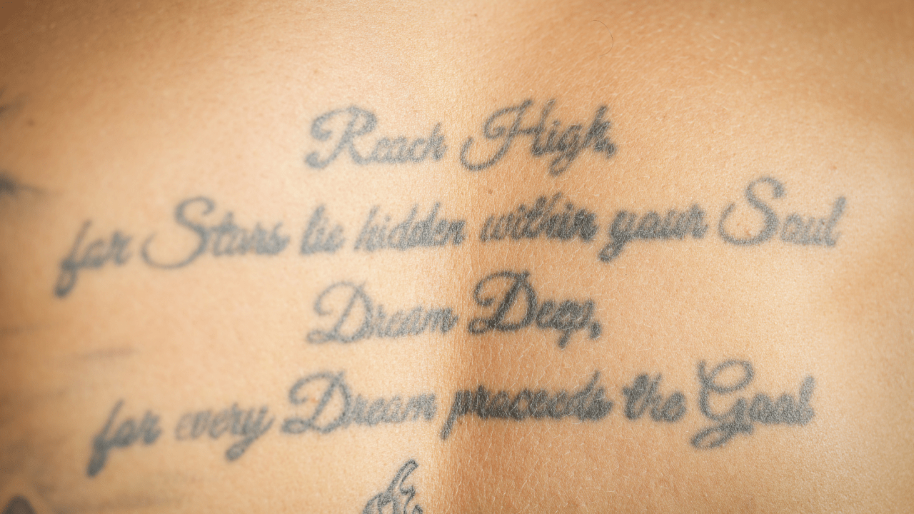
The quote higher on his back is easier to read in a close-up than in a game photo. It occupies space he has set aside for larger work, and his back does not appear to be finished.

The upper back carries a quote he found for himself

Brandon Montour motivational upper back quote tattoo

Montour’s upper-back tattoo is a longer motivational quote, better suited to a close-up than a quick view from the stands. It gives the back a different rhythm from the images across his arms and hip.

He has said the back is still a place for future ideas, so the quote is part of an unfinished area rather than a final centrepiece. That fits how he talks about tattoos generally: his collection is not a completed display, but something he can add to as life brings new moments.
Brandon Montour’s tattoos keep growing with his life

Montour has worked with several tattoo artists, though most of his ink was done by Steve Hill of 16 Aces in Ontario. He has described their process as sharing ideas and letting the artist help shape them. At a certain point, he says, a tattoo becomes the artist’s art too.

That collaboration shows in the collection. Some pieces are precise family markers; others are larger scenes that leave room for the artist to build. The designs do not look like they came from one catalogue because they were made at different points, around different stories.

Montour has said he does not expect to stop getting tattoos. That makes sense if the collection is a record of his life rather than a finished project. There is room for more family moments, career milestones and art.

The main theme is easy to spot. When Montour looks at one of these tattoos, he sees a person, a place or a moment that mattered. That is why the collection feels more like a living timeline than a set of disconnected designs.

Morgan Geekie’s tattoos keep the little things in view

Morgan Geekie’s tattoos make more sense once you know the stories behind them. There is script across his chest, a detailed sleeve on his left arm built around a Buddhist saying, and a small sparrow that marks the miles behind him. Even the simpler pieces have a reason for being there.

The Boston Bruins forward started getting tattooed as a teenager, when his dad still had to come along and sign the consent form. Since then, the collection has followed his hockey career from Manitoba to Charlotte, Carolina and Seattle. Geekie has said he likes tattoos that keep him grounded, remind him to do the small things and help him notice the road he is on.

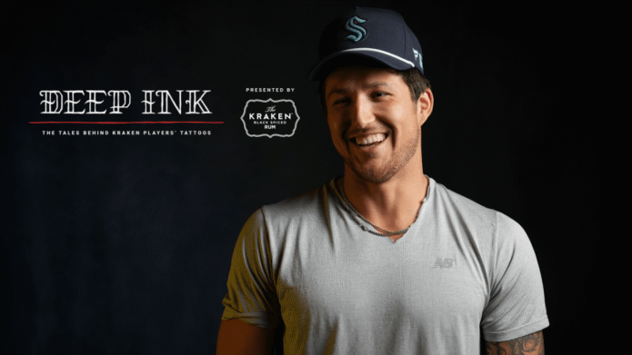
The clearest public record comes from the Seattle Kraken’s Deep Ink feature, with close-up photos and Geekie’s own explanations. Some of the imagery invites guesses, so his account is the best place to start when he has explained a design.

Think with your head, act with your heart

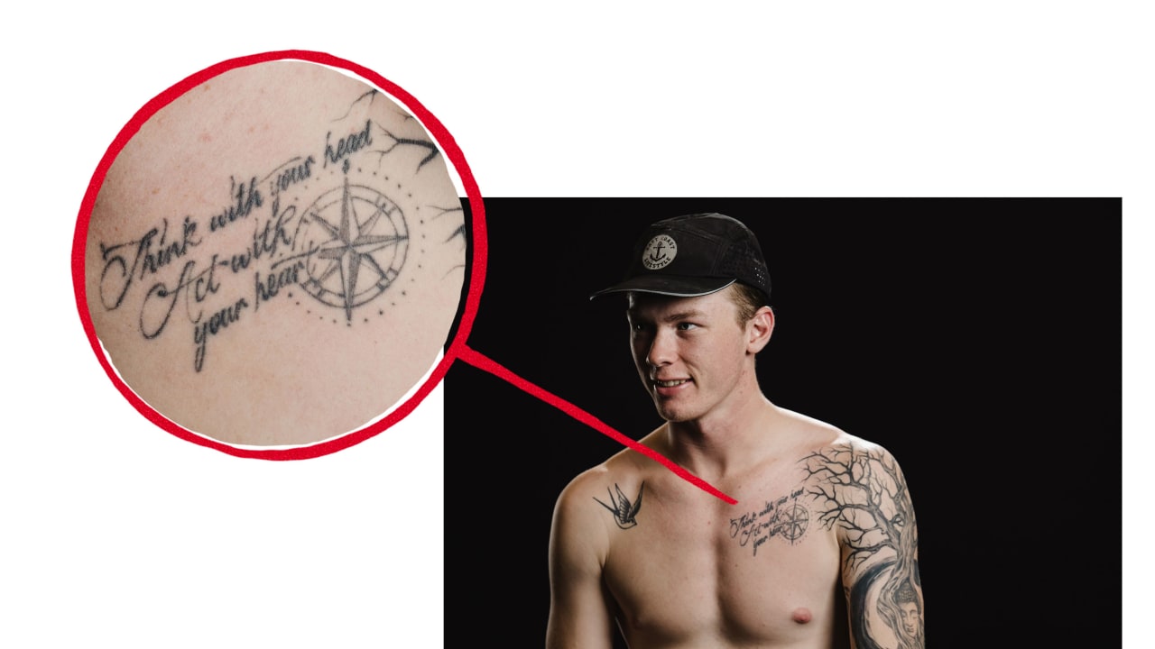
Morgan Geekie chest tattoo reading Think with your head act with your heart

Geekie’s first tattoo sits high on the left side of his chest. It is a script design with the words “Think with your head, act with your heart.” A compass-style image accompanies the line, giving the quote a little more shape than lettering alone.

He was about 16 or 17 when he got it. The session took around 45 minutes, and he remembered being surprised that it hurt less than he expected. Because he was still a teenager, his dad had to come along and sign the consent form.

The phrase was Geekie’s idea, not a famous quote he borrowed. He has said he does not know whether anyone else put the message together in quite the same way. Its meaning is straightforward: some choices need careful thought, but instinct matters too. His gut may tell him something before his brain has finished weighing it all.

That is why the compass fits beside the script. The words are about head and heart; the image suggests finding a direction. It feels like a quiet, practical reminder rather than a dramatic declaration.

The chest piece also set the tone for the rest of Geekie’s collection. He does not seem to get tattoos just to fill space. The designs tend to connect with a thought, a place or a period of his life.

Chop wood, carry water becomes a full sleeve

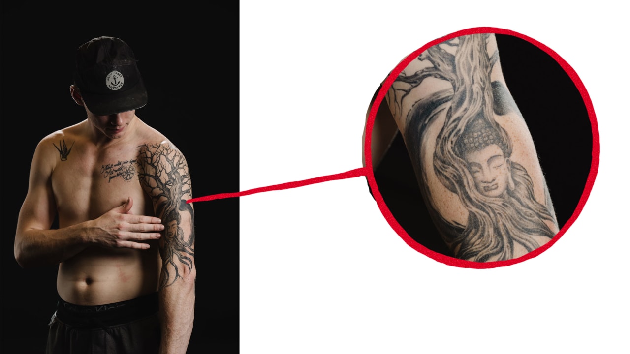
Morgan Geekie Buddha and enso left arm sleeve tattoo

The biggest project in Geekie’s collection is the full left-arm sleeve, inspired by the Buddhist saying, “Before enlightenment, chop wood, carry water. After enlightenment, chop wood, carry water.” The point is that reaching a goal does not end the everyday work that got you there. You still have to show up.

Geekie liked the idea because it felt useful, not abstract. He described the saying as a reminder to handle the small things, pay attention to details and remember where he came from. That fits professional hockey, where success depends on plenty of repetitive work that never makes a highlight reel.

The artist turned the saying into an Asian-inspired black-and-grey design. At its centre is a Buddha figure and an enso, the open circle used in Zen Buddhism that Geekie described as a symbol of enlightenment. Natural shapes and working tools build out the rest of the arm.

The first appointment lasted about eight hours. Geekie had the early part done before the season began in Charlotte, so he had to handle the practical side of fresh ink while playing hockey: plenty of plastic wrap and Vaseline. A second session took another five hours halfway through the year, and later visits added branches, the axe and water.

The long build gives the sleeve its movement. The Buddha anchors the arm, while the branches and water lead the eye around it. The larger spiritual idea sits beside images of ordinary work and nature, much like the saying itself.

Geekie first pictured an axe with more of a Celtic look, but his artist helped steer the design toward an Asian theme. He found the artist’s work online and went with his partner to a home studio, where another artist happened to be available. The chance meeting grew into a friendship and an ongoing project.

Buddha, enso, tree, axe and water fill the arm

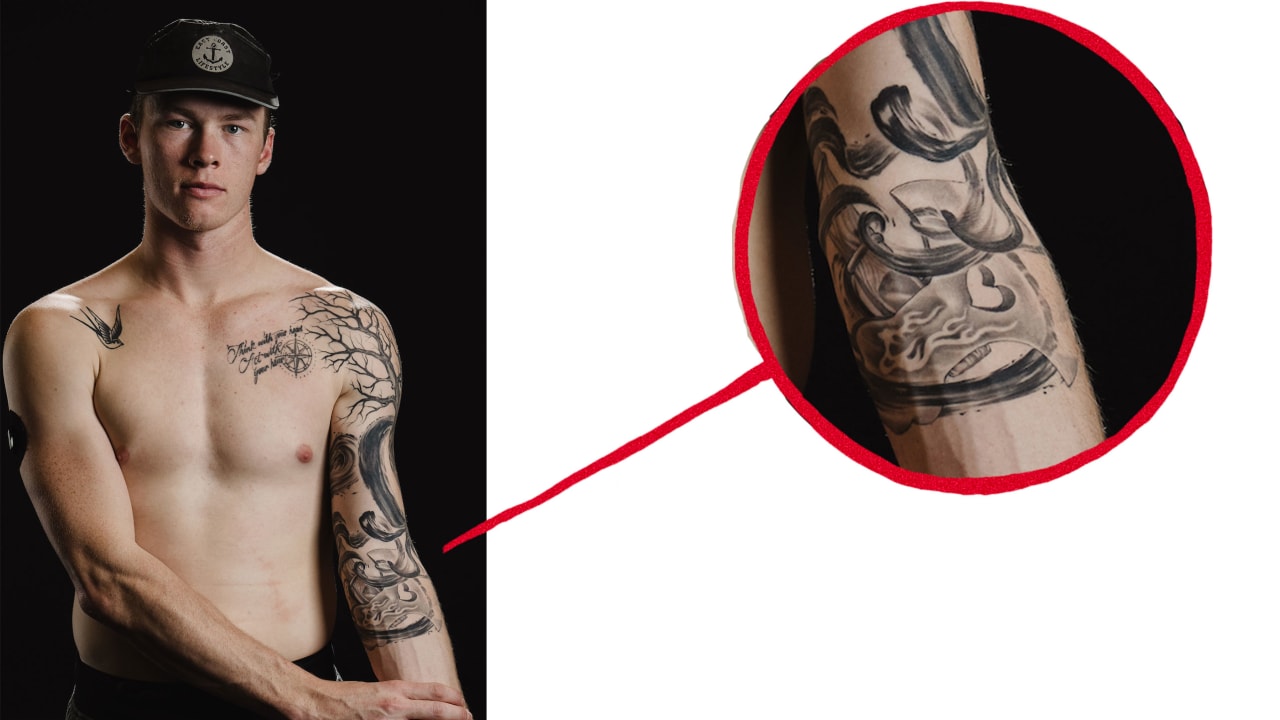
Morgan Geekie sleeve tattoo showing tree axe and water

An inside view reveals how many ideas sit in the sleeve. The tree represents the “chop wood” part of the saying, an axe gives that idea a direct, physical form, and flowing water stands for “carry water.” The tattoo is more than a Buddha or a landscape; each part belongs to the larger thought.

From a distance, it reads as one flowing arm piece. Up close, the Buddha, enso, tree branches, tool and water come into focus. Geekie’s explanation keeps the imagery from feeling like decoration piled on at random. The sleeve is busy, but one idea holds it together.

Geekie has also said the work was still in progress. Early sessions covered the tree, Buddha and enso; later appointments added the axe and water. He wanted to fill more space toward his hand, so the sleeve may not have been finished when the Kraken feature came out.

The process fits around hockey. He once booked an appointment on a whim, hoping it would work with a day off, then planned later sessions around the season and his artist’s schedule. The tattoo grew in the gaps between games, travel and training rather than as one tidy makeover.

Geekie has said his taste may change as he gets older. He still likes the sleeve’s central idea, but is more interested in patchwork tattoos and a traditional American look for future pieces. He does not expect to get another full sleeve; the left arm can remain one connected project while smaller designs find room elsewhere.

The sparrow marks a life spent moving

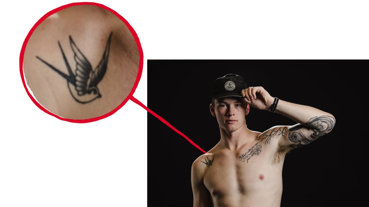
Morgan Geekie American traditional sparrow tattoo

The sparrow is the most obviously traditional design in the group. Geekie got it after arriving in Seattle, at Electric Cobra Tattoo Parlor. He liked its simple shape and its connection to old sailor tattoos.

Geekie explained that sailors traditionally get one sparrow for every 5,000 miles travelled, often as a pair. He chose one. There was already ink on the left side of his chest, so the bird went on the other side. That small placement choice keeps the collection from feeling too symmetrical or planned.

The travel is the main point. Geekie thought about the places hockey had taken him, from the Charlotte AHL team to the Carolina Hurricanes and Seattle, and about the miles between coasts. He did not calculate every trip. The sparrow is more a feeling than a spreadsheet: he has been moving, and this is a small mark for the road.

It brings a lighter mood to the collection. The chest quote is reflective, and the sleeve is a carefully built philosophy piece; the sparrow is simpler on its feet. Its clean traditional shape works without a long explanation.

Getting the bird in a new city also fits Geekie’s habit of looking up local artists when he arrives somewhere. He did that in Charlotte, where the sleeve began, and again in Seattle. The places matter as much as the final image.
What Morgan Geekie’s tattoo plans say about the collection

Geekie has said he wants to add more. At the time of the Kraken feature, he had ideas for the sleeve and wanted to fill some space toward his hand. He was also considering smaller patchwork pieces instead of starting another full-arm project. The traditional sparrow seemed to hint at that next stage.

He also talked about getting a tattoo for his daughter, Gabby, after she was born in 2023. The plan came up in a later interview, but the available photos do not confirm a settled design, so it should not be treated as part of the documented collection here.

That distinction is useful in any tattoo roundup. A clear photo can show that someone has ink, but it cannot always tell you what a small mark means. Geekie’s strongest details come from the official feature: the chest phrase, the Buddha and enso, the tree, axe and water, and the Seattle sparrow, all supported by his own comments and close-up photos.

Put together, the tattoos form a timeline. The chest piece is about balancing thought with instinct; the sleeve is about doing the everyday work before and after success; the sparrow marks travel and the places hockey has taken him. It is personal ink without trying too hard to look profound.

Geekie takes the designs seriously without treating them all like sacred objects. He can talk about enlightenment and still like a sparrow because it looks cool. He can spend long sessions on a sleeve and still leave room for his style to change.

For now, the left arm is the centrepiece, the chest saying is where it began, and the sparrow marks the miles. If he adds more, it will likely follow the same pattern: a clear image, a reason behind it and room for the next chapter.

Watch Morgan Geekie talk hockey and life in this verified Seattle Kraken interview:

Alexander Bublik’s tattoos carry the memories behind his wild tennis

Alexander Bublik does not play tennis like someone determined to stay within the lines. The Kazakh star serves hard, tries shots other players might not attempt and seems comfortable when a match gets strange. His tattoos have a similar feel: bold, visible and tied to different moments rather than one polished theme.

Bublik has spoken openly about his ink. He says much of it was done between the ages of 16 and 20, and that he is probably finished adding to the collection. The tattoos are more than decoration; they remind him of who he was, what he felt and what he was working through at the time.

Here is a closer look at the designs that show up most clearly in match photos, from the long forearm quote to the Roman numerals and the skeleton he links to the demands of professional tennis.

The long forearm quote is one of Bublik’s clearest tattoos

Alexander Bublik forearm quote tattoo

The tattoo that stands out in wide photos runs along Bublik’s right forearm. Several lines of writing include the phrase “You just make me stronger than I was,” visible in the clearest shots. It can be easier or harder to read depending on the light, angle and how far he extends his arm.

Bublik is rarely still on court. He is serving, raising his hands, celebrating or setting up one of his improvised shots. The lettering moves with him, so fans often catch part of the sentence rather than one flat block. The photo above shows the words clearly, while darker shading around them gives the forearm a fuller sleeve effect.

The quote fits the way Bublik talks about his career. He has had big wins, long losing runs, changes in ranking and plenty to say about how tiring the tour can be. The tattoo does not have to predict his results; it can be a private line that became public because he put it somewhere visible.

It also shows why the collection feels accumulated rather than planned as one project. The words are personal and readable, while the surrounding work is darker and more graphic.

Roman numerals cover the lower part of his forearm

Alexander Bublik Roman numeral tattoos

Rows of Roman numerals sit across the lower part of Bublik’s forearm near his wrist. They stand out when he raises his fist after a point. The lettering is clean and spaced out, giving this part of the sleeve a more structured feel than the softer script above it.

Several groupings are visible from different angles, including dates or date-like combinations. It is tempting to decode each line, but Bublik has not publicly explained them one by one. The safest description is that they belong to the personal side of the collection, rather than a sponsor or fashion choice.

The repeated marks give the forearm a strong visual rhythm. They contrast with the longer handwritten phrases beside them, so the sleeve remains readable despite all the different elements. The eye catches the numbers, then moves to the writing and shading around them.

Tennis keeps a player’s forearm in view during serves and fist pumps. Bublik’s numerals become part of those familiar gestures, almost like a signature that appears when he celebrates.

An Italian phrase runs through the sleeve

Alexander Bublik Roman numerals and script tattoos

Closer court photos show another line of writing curving through the sleeve. The Italian phrase is usually read as “A volte dove andrà con Dio.” It sits beside the Roman numerals and has a different look from the longer quote: compact, curved and fitted around the other pieces.

Bublik has mentioned having Italian ink, and this line helps the sleeve feel personal rather than generic. It is not a sports slogan or equipment-themed design, but a phrase associated with a particular stretch of his life.

Tattoo collections often turn into visual timelines: one idea added beside another until the body holds a history that would be hard to plan as a single design. That seems to be the case here.

The script shifts along his arm when he serves or points toward the crowd. It is not hidden ink; the line is part of how the sleeve looks in motion.

The sleeve mixes lettering with darker shaded work

Alexander Bublik sleeve tattoo

Bublik’s right arm is not all words and numbers. Dark shading, small figures and textured blackwork fill the spaces between the script. In action shots, some areas look like one dark panel; close-up photos reveal separate pieces sitting beside each other.

That patchwork quality suits a player known for changing direction at the last second. Solid black areas, fine lines and softer grey sections make the arm look different as the light changes.

The sleeve also shows how separate tattoos can build into a fuller look over time. Text, dates and images do not need to be added in one sitting, and the open spaces help keep the arm from becoming one solid wall of black.

Because Bublik plays in short sleeves, the work is visible without a special pose. It is part of his public image, even though each piece still feels like a private choice.

His forearm lettering feels more personal than decorative

Alexander Bublik forearm lettering tattoo

Some of the smaller words sit around the main quote. They are not always sharp enough to read in a broadcast photo, but the placement is clear: script runs along both the inner and outer forearm, with different lettering styles close together.

Bublik has said much of his ink came when he was a teenager or in his early twenties, while emotions ran high and life changed quickly. He described the tattoos as reminders of difficult and happy periods alike. He does not treat them as mistakes he needs to erase just because he might choose differently now.

That is a forgiving way to look at old tattoos. The pieces belong to the version of Bublik who chose them, and he respects that person even as he changes.

The small writing follows the same idea. It does not have to be famous or instantly legible; it can mark a feeling that mattered enough to keep.

The sleeve reflects a career built on ups and downs

Alexander Bublik arm tattoos

Bublik’s tennis career has not moved in a straight line. He has reached the top 20, slipped down the rankings, won major matches, lost early and kept showing up with the same unpredictable style. Tennis.com noted that many tattoos came from difficult or happy moments in his younger years, making the sleeve feel like a record of change.

The quote, dates and denser artwork all deal with time in different ways. The numerals mark something specific; the words hold on to a thought; the shading shows how the collection has grown around earlier decisions.

Bublik has said tennis does not determine his value as a person. Whether he is ranked high or low, he is still the same family member and friend. The tattoos belong to his life, but they are not a scoreboard. They hold memories without having to prove anything.

That is what makes the collection more interesting than a generic athlete tattoo gallery. The choices feel emotional, a little messy and completely his own.

The skeleton tattoo connects to what tennis demands

Alexander Bublik tattooed arm

One of the clearest meanings Bublik has attached to his tattoos is the skeleton, which he said represents what he has to endure in tennis. It gives the collection a darker edge and shows why he sees the ink as more than decoration.

Professional tennis means constant travel, playing through fatigue, managing rankings and enduring long stretches of uncertainty. Bublik often talks about the grind with a mix of candour and sarcasm. The skeleton works as a reminder of the pressure and the parts of the sport that wear a player down.

It fits the rest of the sleeve, too. The arm is not only cheerful messages or neat dates; there is room for the difficult parts. Bublik’s public personality can be funny and relaxed, while his career still asks for discipline.

One of the clearest meanings attached to Bublik’s tattoos is the skeleton, one of the designs he has explained. Other images can matter without a public explanation, but this is a piece where he has given fans a clear way into the story.
Why Bublik says he is probably done getting tattoos

In a 2025 Tennis.com interview, Bublik said he thought a chapter of his life had ended and that he was probably done getting tattoos. He tied the collection to his 16-to-20-year-old self: someone who went through hard and happy periods while making permanent choices as life changed.

That does not mean he dislikes the tattoos. He said he has to respect the person he was when he got them. He might make different choices now, but those pieces still belong to his history.

It is a thoughtful way to stop adding new ink. Rather than chasing a bigger sleeve or the next trend, Bublik seems content to let the existing work stand and age with him.

For fans, that shifts the focus to the tattoos already there and the moments they hold, rather than guessing about his next addition. The collection belongs to an unusual athlete who wears it in full view whenever he steps onto court.
Watch Bublik talk about his tattoos and the ranking rollercoaster in this interview:

Alexander Bublik’s tattoos are a lot like his tennis: emotional, unpredictable, and completely his own.