Athletes

Ederson Moraes’ tattoos tell the story of faith, family and football

Ederson Moraes is recognizable before he reaches the ball: the shaved head, the fearless passing and a lot of visible ink. The Manchester City and Brazil goalkeeper’s tattoos feel more like a personal scrapbook than a matching set. Some stand out immediately; others show only when he turns, lifts his shirt or celebrates with his gloves in the air.

More than 30 tattoos have been reported, and Ederson has said he started young and kept adding pieces as his career moved forward. Faith, family, football, animals and flashes of humour all turn up across his skin. The collection reads like a series of chapters rather than one planned theme.

Here is a closer look at the pieces that appear most clearly in photos and at the stories Ederson has shared. Some meanings are confirmed by his interviews; others are visual readings, and I’ll keep that distinction clear.

Ederson’s rose-and-skull neck tattoo sets the tone
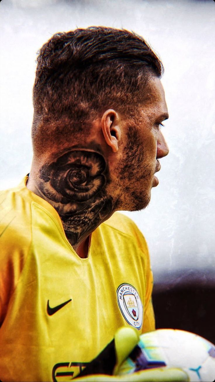
Ederson Moraes rose and skull neck tattoo

The rose and skull on Ederson’s neck are probably the first tattoos most people notice. They sit high enough to show above a football shirt, and the dark shading gives the design an old-school feel. The rose can suggest beauty or love; the skull adds a tougher edge. Together, they make a personal-looking piece without needing a caption.

The placement is a confident choice. A goalkeeper spends matches calling instructions and standing in front of a crowd, and a neck tattoo is hard to hide. It has become part of Ederson’s profile, as recognizable as his gloves or bright kits.

Photos from different angles can make the same neck work look like several tattoos. The rose sits above the skull, with the lower image worked into the darker section. It is one rose-and-skull piece, not a second version of it.

The yellow smiley face is a surprisingly simple piece
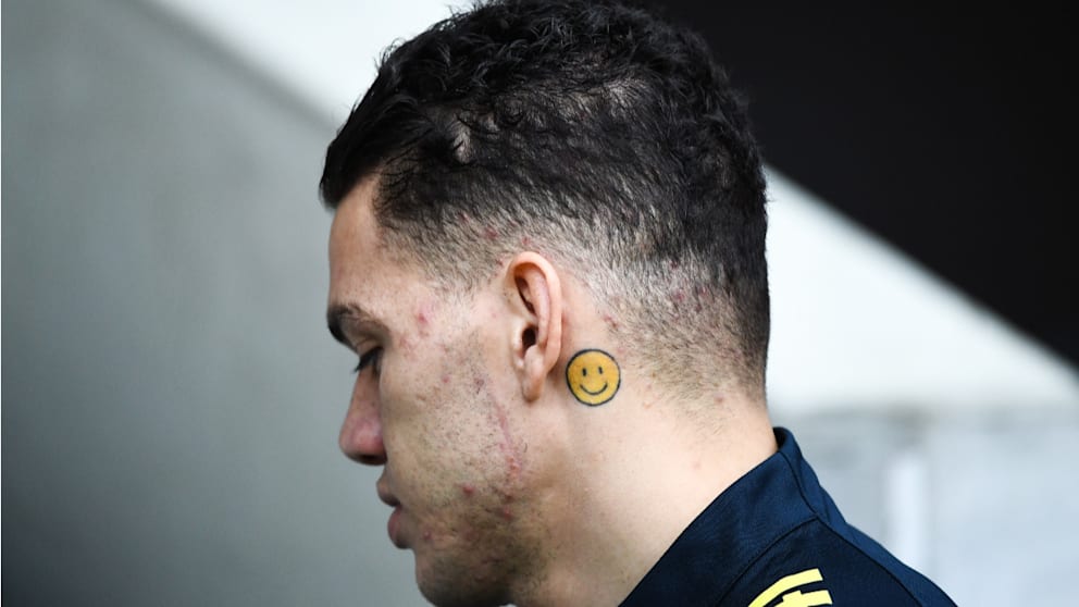
Ederson Moraes smiley face tattoo behind ear

Behind Ederson’s ear is a small yellow smiley face, a playful contrast to the darker work on his neck, arms, chest and back. Its simple cartoon shape and bright colour make it stand out when he turns his head.

Ederson has said the emoji is about happiness. There may not be more to it than that, and the simplicity is part of its charm. Many football tattoos focus on trophies, dates or fierce animals; this one is a reminder to enjoy the moment.

Manchester City’s interview is one of the clearest sources for the smiley’s meaning. The video below also touches on his family and faith tattoos. Hearing Ederson explain them helps separate his own account from guesses based on a cropped match photo.

His chest tattoos put faith and family front and centre
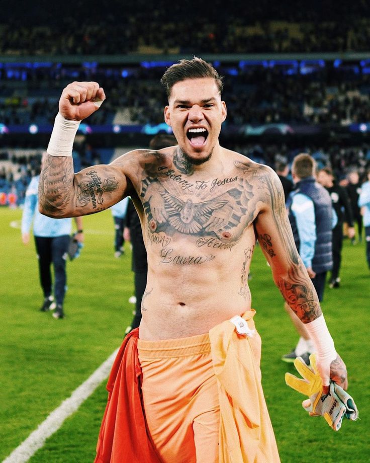
Ederson Moraes chest faith and family tattoos

Across Ederson’s chest, the words “I belong to Jesus” sit below a large dove. It is a direct statement of Christian faith. The dove softens the composition, while the lettering gives it a clear centre.

Names and script around his chest and shoulders bring family into the same area. Interviews and photo coverage have linked some of those marks to his children and family life, though not every small detail is easy to identify. The layout looks like it grew over time, with names and personal touches added around the central message.

The chest designs also connect to the work on his arms, as lines and shading extend out from the centre. Ederson has spoken about family support as his career took him from Brazil to Portugal and then to Manchester City. In that light, the chest ink feels less like a football graphic and more like a thank-you he carries with him.

The back piece turns football into a full tattoo scene
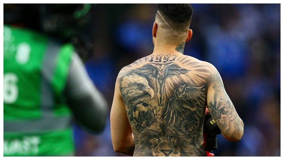
Ederson Moraes back tattoo with lion eagle and cross

Ederson’s back is the largest canvas in his collection. The scene brings together a central religious figure with wings, a crucifix, an eagle, a lion and football details. The number 1993 near the top marks his birth year. There is a lot to take in, but the composition gives the different images a clear order.

The cross and central figure continue the faith theme from his chest. The eagle adds movement; the lion gives the design a watchful, tougher feel. Football and goalkeeper gloves are the most direct references to his job. Instead of using a club badge, Ederson has folded the sport into a larger scene about belief, identity and ambition.

Back tattoos can be hard to judge in casual photos, where the angle hides part of the design. This image shows the full piece at once, from the shoulders down across the back. The details are busy, but the larger shapes keep them from becoming a blur.

That is why the collection looks so different in a match photo and a shirtless celebration. The back is usually covered; when it is visible, it changes the scale of the story. Ederson has more than a scattering of small designs—there is a full scene made to be seen as a whole.

The lion, ball and gloves design fits his goalkeeper style
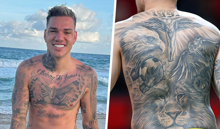
Ederson Moraes football gloves lion and back tattoos

One of the most football-specific combinations in Ederson’s ink is a lion, a ball and goalkeeper gloves. Interview coverage has described the lion as a symbol of focus and the instinct to chase the next challenge. The ball and gloves are more literal, but the pieces work together: they show both his position and the tools of his career.

That combination suits Ederson. He is not a goalkeeper who waits on his line; he comes out, takes risks and uses his feet like an outfield player. The lion and gloves capture those two sides—the aggressive mindset and the technical work.

This is a split view rather than a substitute for the full-back photo above. It offers another angle on the front and rear pieces together, and shows how football imagery fits into a collection that is also about faith, family and identity.

His arms and hands are packed with smaller details
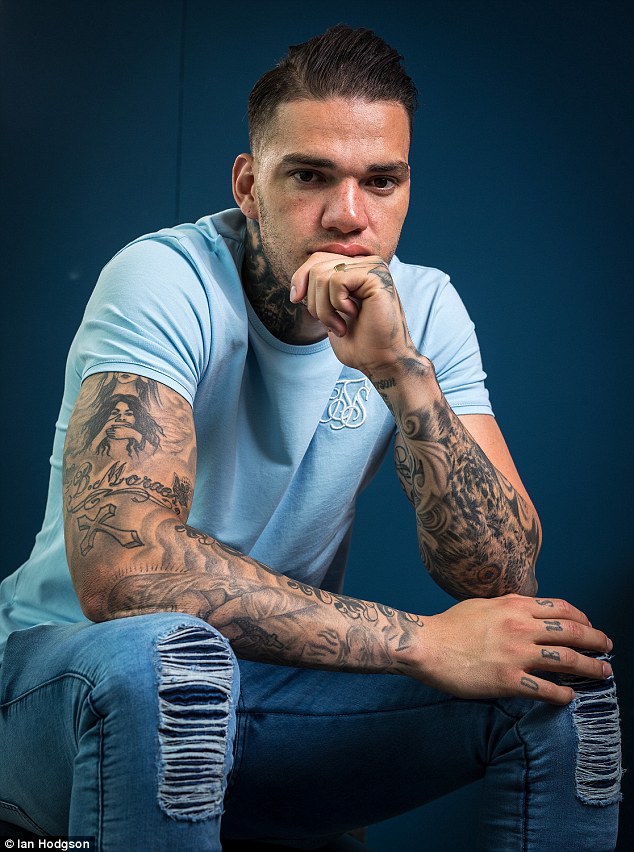
Ederson Moraes arm and hand tattoos

The arms and hands show just how much ink Ederson has. Portraits, lettering, symbols, dark shading and smaller marks run down toward his fingers. From a distance it can read as one sleeve; closer up, the styles vary and sit beside each other.

Some pieces are soft and realistic, others bold enough to read in a match. The hands remain visible even with gloves on, since the gloves cover only part of them, so those tattoos are part of his everyday look.

Counting every piece is difficult. One large area may hold several designs, while a small symbol can belong to a larger portrait or stretch of lettering. Saying Ederson has more than 30 tattoos gives a sense of scale, but not of how varied the collection is.

The leg work shows how his collection keeps growing
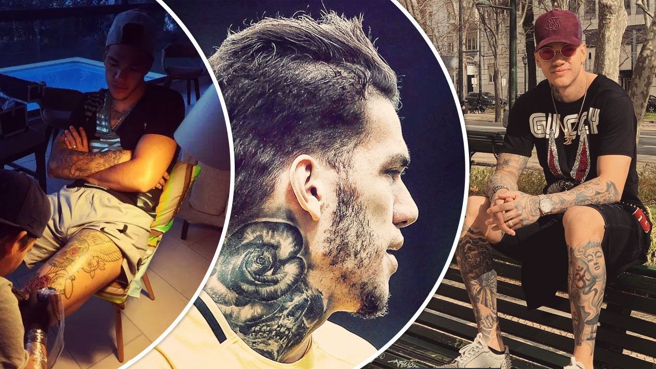
Ederson Moraes leg tattoo session

Ederson’s legs add another chapter. Session photos and older football features show larger designs across his thighs and lower legs, including floral shapes, skulls, religious details and portraits. These pieces are easy to miss in match photos, where his legs are usually covered.

A session photo shows the process still underway. Ederson continues to add work; this is not a collection completed years ago. The chair, artist and unfinished areas make that more obvious than a polished portrait. There is always another section that could be extended or filled in.

The range of styles makes sense in a collection built over years. A religious image can sit beside a family tribute, then a football reference or a design he simply liked. The common thread is not one look, but the people, beliefs, memories and sides of Ederson that the tattoos mark.

Why Ederson’s tattoos feel more like a timeline than a trend
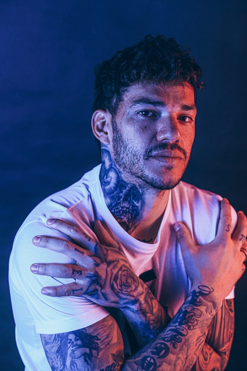
Ederson Moraes tattoo collection portrait

Ederson’s collection feels tied to his life rather than to one fashion moment. The smiley face is about happiness; the chest lettering brings faith and family together; the back piece joins religious imagery with football. The rose and skull give him a strong visual signature, while his arms and legs hold smaller details that are easier to miss.

That is why the tattoos look like they belong to him. Some are serious, some playful, some are simply details he has kept for years. Even the bold pieces leave room for something as uncomplicated as a yellow emoji.

Clear photos and Ederson’s own explanations give the fullest picture. The confirmed meanings matter, as does the pattern: faith, family, football and happiness return in different forms. Together, the tattoos make a visual biography of the goalkeeper.
Watch Ederson explain his tattoos

If you want to hear the stories in his own words, this short interview covers the bull, family and faith designs, as well as the smiley behind his ear.
Virat Kohli’s tattoos: the numbers, family ink and spiritual sleeve

Virat Kohli’s tattoos are not a random collection of decoration. Family names, spiritual symbols, cricket numbers and a few pieces chosen because they look good all sit across his arms and body. He has added to them over the years, so the ink reads more like a timeline than one sleeve planned all at once.

That is part of the appeal. One design points back to his parents, another marks his place in Indian cricket, and others reflect faith and ideas he keeps close. Some are easy to spot during a match; others only appear in training photos or when he sits for a new session.

Here is a closer look at the main designs, their reported meanings and how they have become part of Kohli’s off-field image as well.

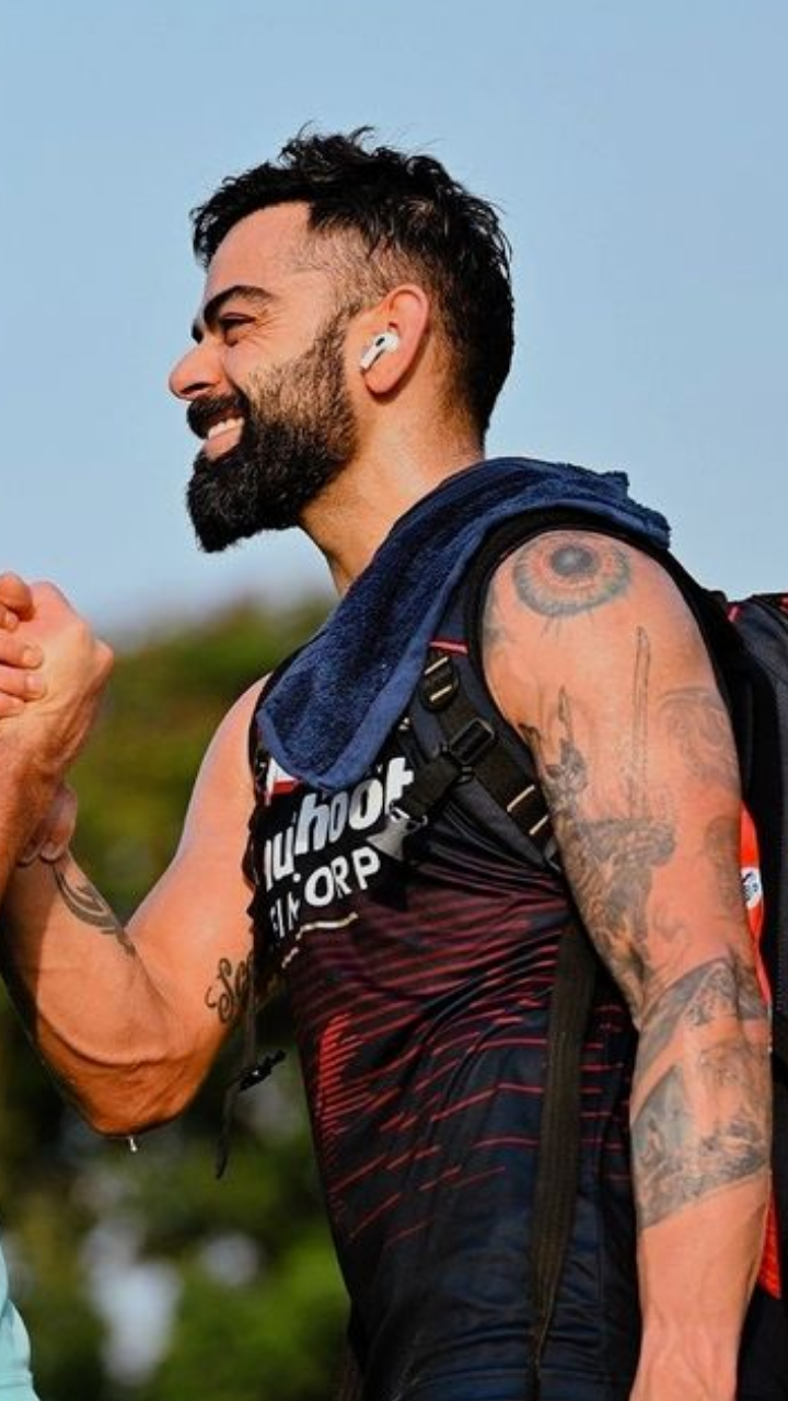
Virat Kohli’s God’s eye tattoo watches over his shoulder

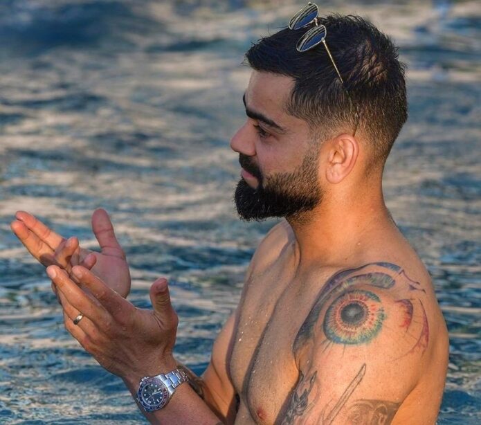
Virat Kohli God’s eye tattoo

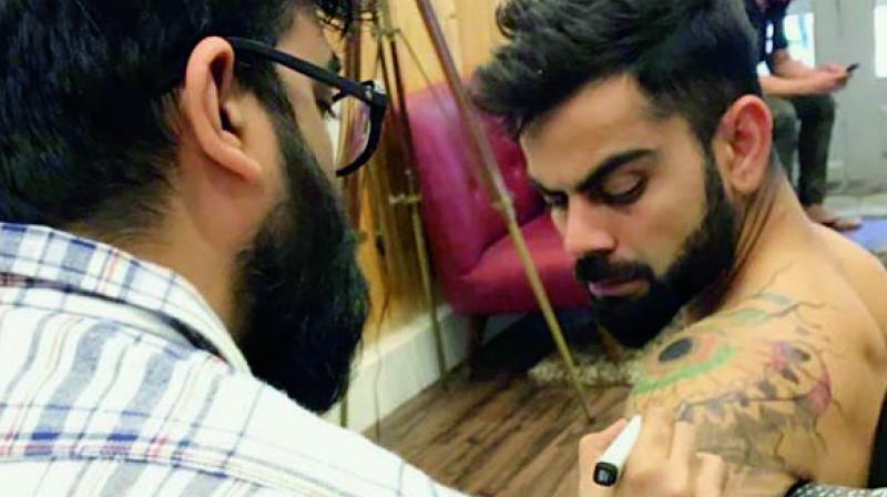
The large eye on Kohli’s left shoulder is one of his most noticeable tattoos. It sits inside a bright circular design, with lines radiating outward. In interviews, he has said it reminds him that everything in the universe is being watched and counted.

The placement gives the idea extra weight. A sleeveless training top can reveal the shoulder, while his cricket shirt covers it. The tattoo can travel with him onto the field and stay less visible when he prefers.

The 175 tattoo marks Virat Kohli’s ODI beginning

Virat Kohli 175 tattoo

Kohli’s number tattoos are simple, but they carry a lot of cricket history. The 175 refers to his One Day International cap number. He made his ODI debut for India in 2008, so the number marks the start of that part of his career.

It is a personal milestone rather than a general lucky number. When the tattoo appears in a close-up, it points back to the first step of a career that would grow far beyond that moment.

His 269 ink records his Test cricket cap number

Virat Kohli 269 tattoo

The other cricket number often noted in discussions of Kohli’s ink is 269, his Test cap number. It sits alongside 175, linking two major parts of his international career.

These tattoos show that not every meaningful piece needs to be large or elaborate. A small number can hold as much history as a detailed sleeve. For Kohli, both numbers connect the player he was when he entered international cricket to the one he became.

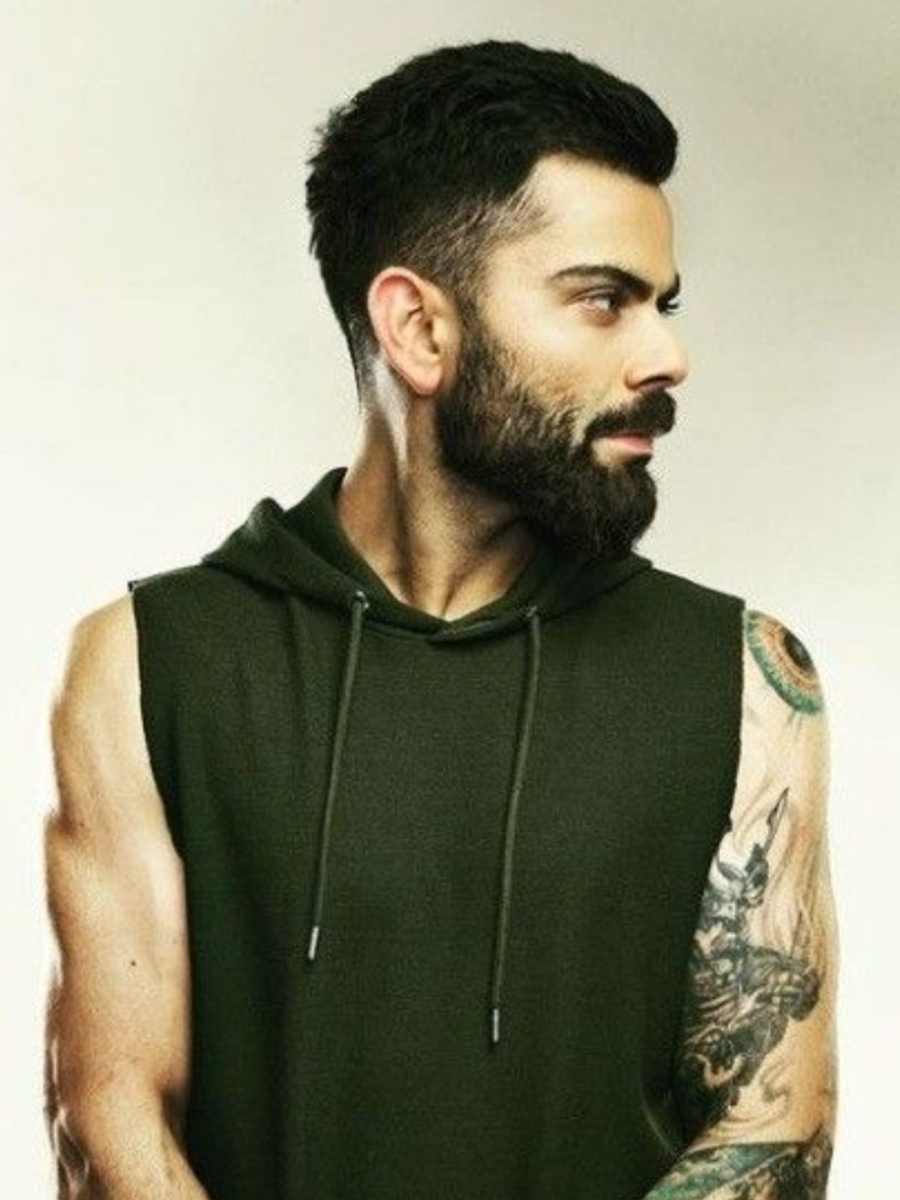
Virat’s samurai tattoo brings a tougher edge to the sleeve

Virat Kohli samurai sleeve tattoo

The samurai gives Kohli’s arm a different feel from the clean number tattoos. It is a detailed black-and-grey design, with the helmet, face and armour worked into a larger sleeve. In photos, it reads as a character rather than a small symbol.

Samurai imagery is often associated with discipline, courage and a personal code, and those themes fit Kohli’s public image as a competitor. Still, it is useful to separate common associations from a confirmed account: the design is clear, but he has not publicly explained every part of its personal meaning.

Shiva and the Om symbol show Virat’s spiritual side

Virat Kohli Shiva tattoo

Kohli’s arm also carries tattoos associated with Hindu belief, including Shiva and the Om symbol. At a distance, the pieces can blend into the denser sleeve around them.

Om is commonly associated with the sound and idea of ultimate reality in Hinduism, while Shiva has a distinct religious and cultural place. Kohli has spoken about faith and spirituality in his life, so these designs fit the personal side of the collection: reminders as much as visual flourishes.

The names of his parents are some of his most personal tattoos

Virat Kohli family name tattoos

Among the images and numbers, Kohli’s parents’ names are some of the most direct tattoos. His mother Saroj’s name is on his left triceps, while his late father Prem is represented on the other arm. There is not much to decode.

Kohli’s father died while he was still building his career. A parent’s name can be a quiet way to keep someone close, especially for a player who spends so much time travelling. These may not be the loudest designs, but they carry a strong personal pull.

Virat’s first tattoo story was much less serious than the later ink

Virat Kohli first tattoo story

Kohli has told a lighter story about his first tattoo: an F-shaped design. When people began asking what the letter meant, he later joked that it stood for faith. The real origin was more casual than that.

It makes the rest of his collection feel more human. Not every tattoo begins with a grand plan; some start as a spur-of-the-moment choice and become part of a person’s history. Later, Kohli became more deliberate, choosing designs connected to family, belief and his career.

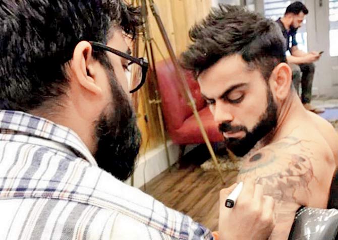
The new lotus tattoo adds another layer to his changing sleeve

Virat Kohli lotus tattoo

More recent coverage has focused on a lotus tattoo by Aliens Tattoo India. Lotuses are often associated with growth, calm and rising above difficult surroundings. On Kohli’s arm, the flower joins an existing group of religious and symbolic designs rather than standing on its own.

New ink can change the balance of an older collection: lines meet, empty spaces close and a sleeve begins to feel more connected. Kohli has treated his body art as an ongoing project, adding a piece when a symbol or idea feels right.

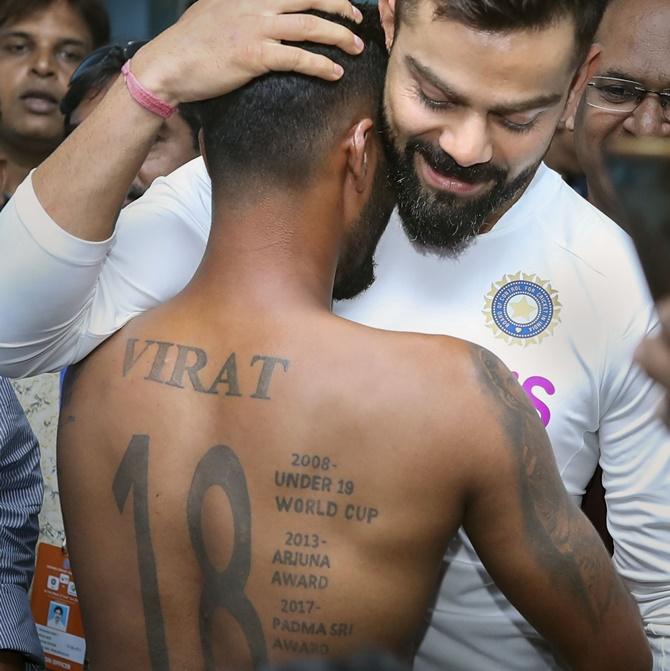
His back tattoos connect cricket milestones with memory

Virat Kohli back achievement tattoo

Kohli’s back tattoo is harder to see in ordinary cricket coverage, but it has a clear place in his story. Large lettering and milestone references include the Under-19 World Cup, the Arjuna Award and the Padma Shri: achievements that marked important shifts in how Indian cricket saw him.

A back piece gives a large design room while keeping it out of view day to day. When Kohli reveals it, the work reads like a personal record. His arm tattoos are more visible and decorative; the back feels closer to a page in a scrapbook.

Why Virat Kohli’s tattoos still feel personal

Virat Kohli inked arm portrait

It is easy to treat a famous athlete’s tattoos as a checklist: the eye, the numbers, family names, the samurai and religious symbols. But Kohli’s collection makes more sense as a record of different versions of him.

Some pieces belong to a young player just starting out; others mark milestones or hold on to family and faith, things that matter whatever the scoreboard says. That mix keeps the tattoos from looking too polished or too planned.

Separate pieces have accumulated side by side over time. A shoulder design becomes part of the sleeve, a number gets surrounded by shading, and a small family tribute can be overlooked beside a larger image. One clear training photo can show more than a dozen cropped match shots.

That change over time is part of the appeal. Kohli has kept moving, and older designs are no longer the whole story. They do not have to match perfectly; the collection carries its early choices, serious milestones and later additions together.

For anyone planning a meaningful sleeve, the idea is simple: start with memories you truly want to keep, then let the style grow around them. Numbers, names and symbols can share space when each has a reason to be there.

If you like tattoo stories tied to real milestones, you might also enjoy our guide to Brad Pitt’s tattoos. Kohli’s collection is louder and more athletic, but both show how personal ink can become part of a public image.
Watch Virat Kohli talk about his tattoos:

Rade Krunić’s tattoos: the family, faith and Bosnia stories on his sleeve

Rade Krunić’s tattoos are more personal than they might first appear. The Bosnia and Herzegovina midfielder has a full-looking right arm, but the pieces do not seem to be there just to fill space. Initials for his sisters, a prayer in Cyrillic, a church from his hometown, a warrior before a cross, family dates, a compass and a Joker all have a place.
That mix says a lot about what matters to him: family, faith, Bosnia and a few ideas he likes. Krunić has explained several designs in Milan TV’s Under My Skin feature, which offers more than the guesses people make from a single match photo.

As a kid, he admired tattooed footballers, especially David Beckham. His parents did not want him getting tattoos, so he waited until he had moved out. Once he started, he added pieces gradually instead of trying to complete the sleeve in one session.

Rade Krunić’s sisters’ initials were his first truly important tattoos

Rade Krunić warrior cross tattoo

Krunić has said he got his sisters’ initials, Aleksandra and Milica, when he was 20. He calls those tattoos especially important because his sisters are the most important people in his life. They give the sleeve a deeply personal starting point.

Initials can be easy to miss beside a large image, but they may carry more weight than a dramatic picture. For Krunić, they are a direct tribute to the people he grew up with and help explain why the sleeve is not just a collection of designs he thought looked good.

His parents did not have tattoos, and he has said his father worried he might go too far. That family connection still shapes the finished work. Even from a distance, the sleeve is built around people and memories rather than a passing style.
The Lord’s Prayer in Cyrillic is one of Krunić’s most painful pieces

Rade Krunić arm sleeve tattoo

One of the largest text designs on Krunić’s arm is the Lord’s Prayer, written in Cyrillic, his own language and script. He has said it was one of his most painful tattoos and took close to three hours. A long stretch of lettering on the arm sounds like a tough session.

The prayer is more than a visual centrepiece. Krunić has spoken about being an Orthodox Christian, which links the words to both faith and identity. Keeping the prayer in Cyrillic makes it personal to home; the script itself is part of the choice.

Text tattoos depend on spacing and clear lines, especially beside darker sleeve work. In photographs, the prayer breaks up the surrounding images and gives the arm a line for the eye to follow.

His warrior kneeling before a cross is about Bosnia and suffering

Rade Krunić forearm tattoo

Krunić has given one of the clearest explanations for the warrior design. He says it represents what happened to his country and the suffering people went through. The figure kneels in front of a cross, bringing strength and faith into the same image.

It would be easy to read a warrior tattoo as a simple sign of toughness, but Krunić’s explanation carries a heavier history. The figure is not only fighting; he has paused to pray and remember what came before.

The artwork can be hard to pick out among the other dark designs in match photos. Close-ups show the arm more clearly, and make the kneeling pose and cross—rather than just another patch of black and grey—easier to see.

The church tattoo is a link to Krunić’s hometown Foča

Rade Krunić family tattoo

Another meaningful piece is a church from Krunić’s hometown, Foča. His parents still live there, so the building is not just a general religious image. It connects the tattoo to home, family and the part of Bosnia where his story began.

That can be grounding for a player who has spent years moving between clubs and countries. Krunić has played in Bosnia, Italy and Serbia, while the church holds one particular place close. It works like a small landmark on his arm.

Seen with the warrior and prayer, the pieces form a connected story: hardship, faith and a return to his hometown. They do not need to be separated to make sense.

Dates, a compass and a clover fill out the family side of his sleeve

Rade Krunić calf tattoo

Krunić has also talked about family birth dates in Roman numerals. The dates belong to his parents and sisters, continuing the family theme begun by their initials. They are quieter designs, but add a private layer to the larger sleeve.

Nearby are a four-leaf clover and a compass. The clover is an obvious nod to luck, while the compass can suggest direction and steadiness. Krunić has connected this group more broadly to faith, football, family and friends.

He has said his family is his life and that they made sacrifices to help him reach professional football. That gives the dates extra weight: they are not numbers to fill space, but reminders of the people who helped him go from Foča to the biggest stages in Europe.

Krunić’s Joker tattoo is the playful part of the collection

Rade Krunić Milan tattoo

The Joker is the design Krunić says falls outside his usual style. He got it because he liked the character and the way the Joker thinks. His short version of the message is simple: you live once, so do not spend too much time worrying about what other people think.

It gives the sleeve a lighter moment. Many of the other pieces tie directly to family, faith, hardship or personal history; the Joker is more about attitude. It adds a little mischief to a collection that could otherwise feel very serious.

Krunić has compared getting tattoos to an addiction: the sessions hurt, but he enjoys seeing the finished work. The Joker seems to be a choice made for the pleasure of it, while still carrying an idea he relates to.
The word “Trust” comes with a warning about people

Another design Krunić has discussed pairs the word “Trust” with an image of two hands. One hand has a snake where a finger would normally be, turning what might look like a friendship slogan into a more cautious message.

He says you have to be careful with people and cannot be friends with everyone. It is practical advice from someone who has spent a career in competitive dressing rooms and changing football environments. The tattoo is not telling him to trust blindly; it is a reminder to think before letting someone close.

The hand and snake also add a different texture to the sleeve. The design is more symbolic than the church, less direct than the Roman numerals. Together, the tattoos make the arm feel like a personal notebook, with each image holding a different lesson.
Why Rade Krunić’s tattoos stand out

Krunić can explain the story behind much of his ink. His sisters’ initials honour family; the prayer and church connect faith with home; the warrior carries a memory of Bosnia; and the dates mark the people who supported him. The compass, clover and “Trust” design add smaller ideas, while the Joker keeps the collection from becoming too heavy.

There is no one style holding every tattoo together, and that is part of the appeal. The sleeve grew over about five years, one piece at a time. It feels like a record of things Krunić wanted close, not a design planned in one afternoon.

That gradual pace gives each new tattoo room to keep its own story.

If you like footballers whose tattoos have a clear story behind them, see our guide to Virat Kohli’s tattoos. Kohli’s collection leans into cricket, family and spirituality; Krunić’s is rooted in Bosnia, his sisters and the places that shaped him.
Watch Rade Krunić explain his tattoos:

Gabby Williams carries her stories on her skin

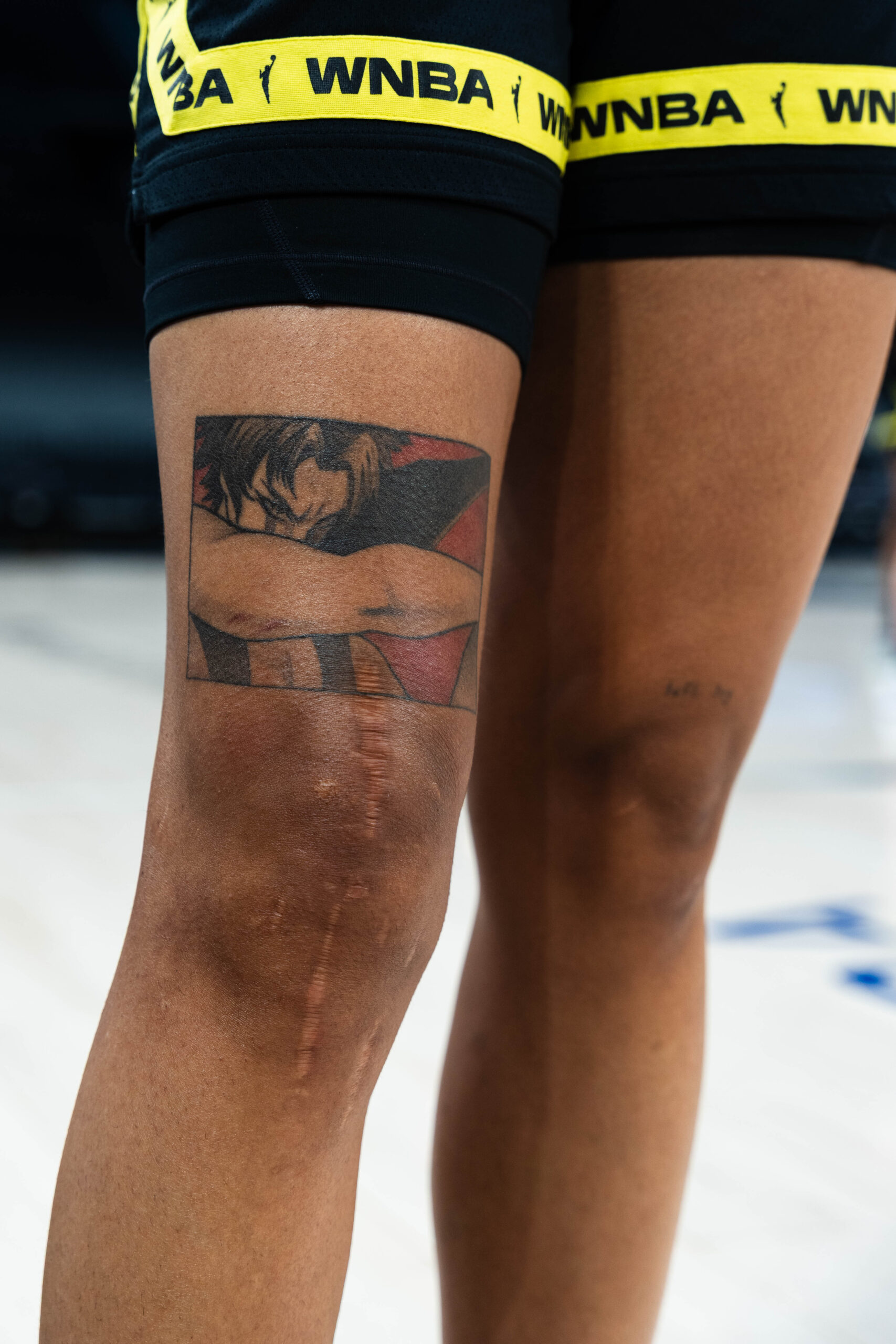
Gabby Williams’s tattoos feel more like a scrapbook than a costume. The Seattle Storm and French national-team star has designs linked to family, music, anime, basketball memories and people she has met. Some pieces are large and carefully built; others are tiny, funny or easy to miss until she turns her hand or lifts her shorts.

That variety fits Williams. She has said people can find it hard to put her in a box, and the tattoos make the same point without having to shout. A detailed black-and-grey sleeve sits beside an Olympic joke, rock music imagery and tattoos connected to friends and relatives. She has also been open about getting some designs young, sometimes in unplanned settings.

Here’s a closer look at the documented pieces and the stories she has shared, keeping the visible details separate so each tattoo has room to stand on its own.

Her black-and-gray arm sleeve is built like fine art

Gabby Williams black-and-gray arm sleeve tattoo

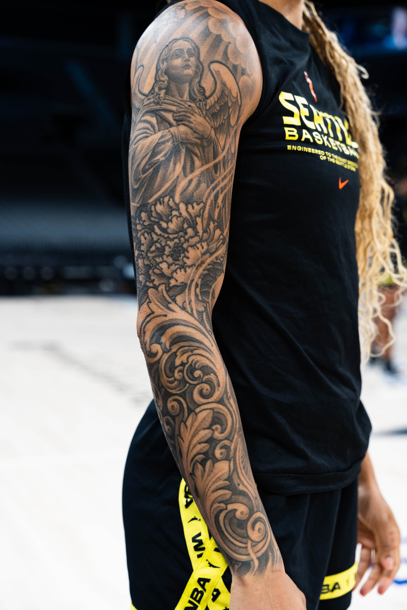
The biggest piece in Williams’s collection is the black-and-gray sleeve on her arm. It is not one symbol repeated across the skin. An angel, flowers, sculptural details and flowing shade come together in a composition with the feel of a classical illustration. Williams has credited French tattoo artist Lil’B and described it as a freestyled collaboration that took about six days.

Williams did not start with a rigid blueprint. She trusted the artist to shape a design around her arm, so it changes as you look from different angles. One view brings out the figure; another reveals more of the flowers and ornamental details. It feels like wearing a piece of art, not lining up separate stickers.

There is a calm confidence to the choice. Six days under the needle is a serious commitment, but the finished sleeve does not feel overly precious. It has movement, contrast and space to breathe. On court it is part of her look; off court it shows how much she enjoys the craft.

The Rolling Stones tongue connects her to the music she loves

Gabby Williams Rolling Stones tongue arm tattoo

One of the clearest pop-culture references is the Rolling Stones tongue logo on Williams’s arm. It is a small, instantly recognisable design, but it also says something about her taste. She has talked about rock music as an important part of her life, and the tattoo gives that interest a place beside the more decorative sleeve.

The design does not need a complicated explanation. The red tongue reads clearly from a distance, and its connection to the band gives it an obvious personal anchor. It also brings a little colour into a collection that otherwise leans heavily on black and grey.
It is useful to distinguish what Williams has said from what viewers might infer. The image is widely identified as the Rolling Stones logo, and her interest in music is part of the context. It is best understood as a direct tribute, not a hidden code. Sometimes a favourite band is reason enough.

No-Face gives her anime fandom a permanent shape

Gabby Williams Studio Ghibli No Face anime tattoo

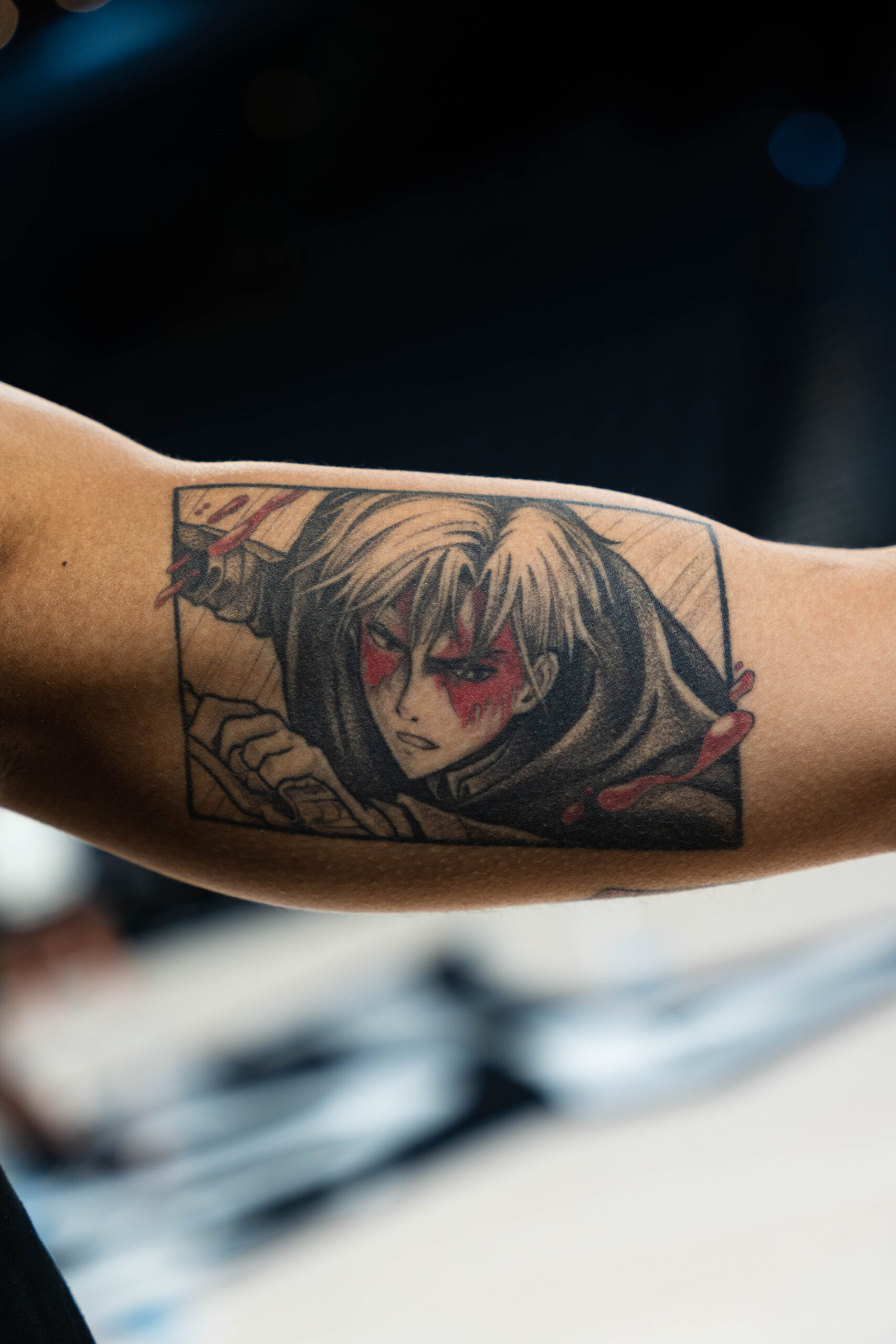
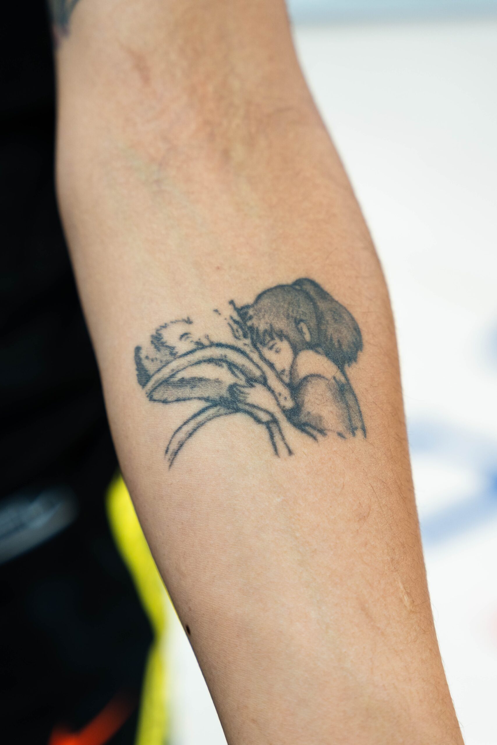
Williams’s Studio Ghibli No-Face tattoo is one she says gets a lot of compliments. The character is from Spirited Away, and the design brings a different mood from the portrait work and traditional symbols elsewhere on her body.

No-Face is quiet, strange and open to interpretation, which gives the tattoo a different feel from a team logo or a name. It hints at an imaginative side of Williams, who can enjoy a detailed animated world as much as a packed basketball arena.

Anime tattoos can look crowded when they compete with too many unrelated references. This one has a strong silhouette and an unmistakable face, so it stays readable. It is playful without feeling throwaway, and Williams has said it is a piece people often notice.

The Pac-Man tattoo remembers a medal and a bet

Gabby Williams Pac-Man tattoo on upper thigh

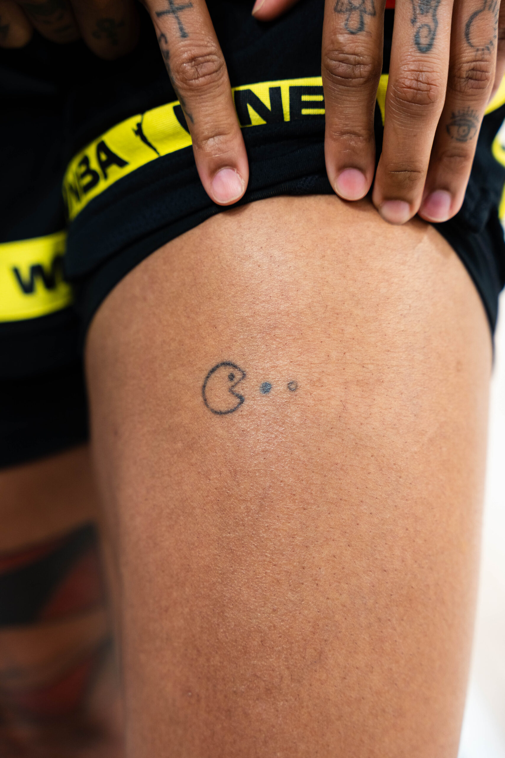
On her upper thigh, Williams has a small Pac-Man tattoo eating three dots in the French colors. The blue, white and red dots represent France. The tattoo also marks the French team’s bronze medal at the Tokyo Olympics, after Williams and teammate Marine Johannès made a bet about the result.

The design gets the tone just right. An Olympic tribute could have used rings, a date or a medal, but Williams chose an arcade character and let the national colors tell part of the story. It is a personal memory that still looks like something she picked because it made her laugh.

The upper-thigh placement gives it some privacy during games while leaving it easy to show when she wants to. It balances public identity with a private joke, marking a major sporting moment without turning it into a formal monument.

Her fingers carry smaller symbols and quick visual cues

Gabby Williams finger tattoos including Prince symbol and cross

Williams also has small finger tattoos, including a Prince symbol and a cross. They can disappear in a game-day photo and become clear in a close-up. Finger designs are more exposed than tattoos on a thigh or shoulder, so keeping certain symbols near her hands feels like a deliberate choice.

The Prince symbol brings a music reference into a smaller space than the Rolling Stones logo. The cross adds a separate spiritual note, though Williams has not described every detail as a grand statement. It is better to say what is visible and documented than to fit an entire biography onto a small mark.

The finger tattoos also break up the larger compositions. Her sleeve has room to spread, while these are compact and graphic. Together they make the collection feel lived in: she can have a six-day art project and a tiny hand symbol without pretending every piece came from one plan.

Family, friendship and the tattoos that started early

Gabby Williams family flower and triangle tattoo

Some of Williams’s most telling tattoo stories are about the way the ink began. When she was around twelve, her older sister Kayla had a Japanese character tattoo. Williams thought her sister was the coolest person in the world and wanted to copy her. Her own version was airbrushed, though, and eventually washed off. The joke still left a mark: tattoos became tied to family, imitation, style and a desire to step outside expectations.

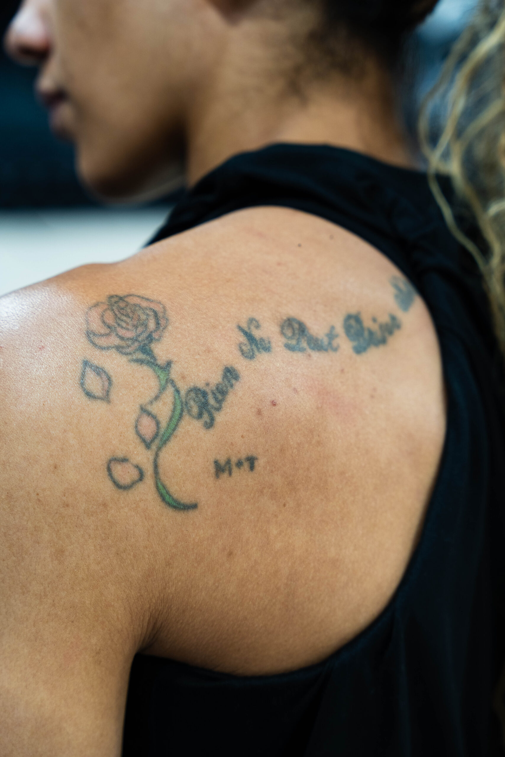
Williams has also said she got her first real tattoo at fourteen in a friend’s kitchen. While playing college basketball, she once hid a shoulder tattoo with tape because UConn had a policy about visible tattoos. It grounds the collection in everyday life. These were not all carefully staged celebrity choices; some came from friends, travel and youthful enthusiasm, then stayed part of her story.

Family connections appear elsewhere too, including a flower-and-triangle design linked to relatives. Not every detail is clearly visible in public photos, so it is best to leave the exact symbolism open rather than guess. What comes through is a recurring interest in people and experiences that make her feel connected.

Why the collection feels personal without being too serious

Together, Williams’s tattoos bring several visual languages into one collection. The sleeve is the most immersive piece. The Stones logo nods to music, No-Face brings in anime, and Pac-Man turns an Olympic memory into an inside joke. The finger designs keep a few small symbols close at hand.

The variety is the real theme. Williams does not seem interested in making every tattoo match. A classical-looking sleeve can sit beside an arcade character and a rock logo, just as a family story can sit beside a design she simply enjoys looking at. That is usually what makes a collection feel human: not perfect consistency, but a trail of different versions of the same person.

She has said she does not regret her tattoos, including the silly ones. That attitude comes through in the collection. Nothing has to be solemn all the time. A tattoo can honour a medal, celebrate a band, remember a friend, connect a family or make you smile when you see it in the mirror.

Watch Williams talk about the people and memories behind her ink

A fan-recorded basketball interview with Williams and her teammates includes a conversation about a tattoo she let Marine Johannès give her. It is a helpful companion to the stories above because it shows the easy, conversational side of how some of these pieces became part of her life.

Derrick Lewis’s Tattoos Carry Houston Pride and Hard Times

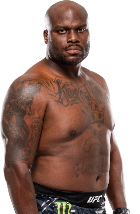
Derrick Lewis doesn’t dress up his tattoo stories. Some pieces came from prison, others are cover-ups, and one followed a drunken night in Las Vegas. The UFC heavyweight’s ink is connected to Houston, family, faith, fighting, and the difficult years he made it through before becoming a professional athlete.

In his GQ Tattoo Tour, Lewis jokes around but explains the designs plainly. Born in New Orleans and raised in Houston, he has gorillas inspired by his Silverback gym, a Houston Texans tattoo, religious lettering, a crown and boxing gloves, plus a few direct reminders of how he tries to live. Some older tattoos were covered as his life changed.

Here’s a closer look at Derrick Lewis’s Knockout King and chest tattoos, sticking to the designs he has explained rather than guessing at every mark in a weigh-in photo.

The Houston Texans piece marks the place he calls home

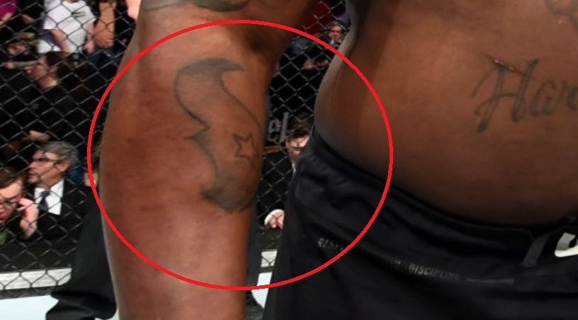
Derrick Lewis Texan arm tattoo

The most recent tattoo Lewis showed in the GQ interview was a Houston Texans design. He was born in New Orleans but has lived in Houston since 1998, and speaks warmly about the city. The tattoo is less about wearing a sports logo for its own sake than marking the place that became home after he moved there.

Houston also figures in stories beyond fighting. During Hurricane Harvey, Lewis drove his lifted truck through floodwater to help people. The Texans tattoo sits within that larger connection to the city. It says where he belongs, especially for a fighter whose public life is closely tied to Houston and its fans.

Two gorillas replaced the first tattoo he got for his mother

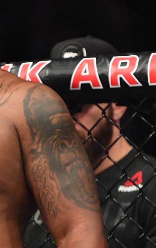
Derrick Lewis right arm gorilla tattoo
Derrick Lewis left arm gorilla tattoo

Lewis says his first tattoo was a cross for his mother. He later covered it with gorillas on both sides of his body. The choice had a few connections: he trains at Silverback, gorillas are among his favourite animals, and he has built a fighting persona around the way they move and strike.

He connects the gorilla imagery to pounding his chest and slamming the ground, too. That makes the designs feel tied to how he fights, not just like tough-looking animals from a flash book. The cover-up also marks a change: the cross belongs to a younger Lewis, while the gorillas reflect the fighter he became.

Lewis has said that most of his tattoos were done in prison, which helps explain the collection’s rougher, more personal look. He described making do with improvised equipment, including electricity from an exit sign and ink from a pen. It’s an unusual detail, but it’s part of the tattoos’ history.

Respect and loyalty are written into the collection

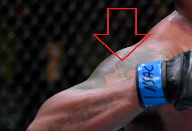
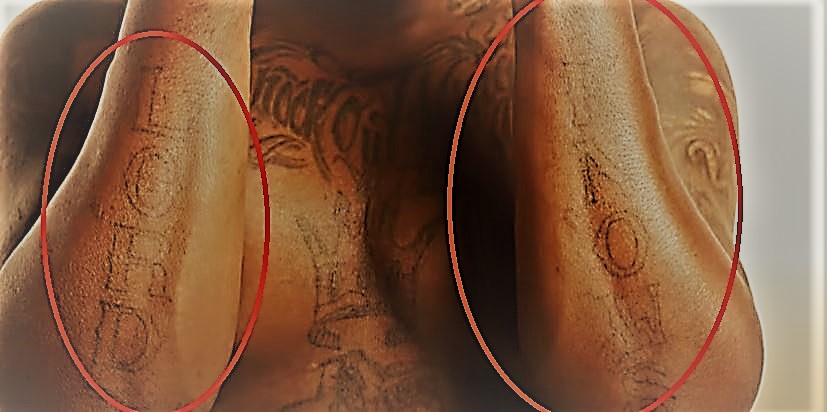
Derrick Lewis Lord Knows and loyalty tattoos

One tattoo reads respect and loyalty. Lewis says those are values he tries to live by: he expects respect from others and sees himself as loyal. The wording is direct, much like the way he explains his tattoos. He doesn’t build a mystery around every phrase; if it matters to him, he puts it on his skin.

That idea connects a few of the other designs. The gorillas relate to his gym and fighting identity, the Houston tattoo to home, and the lettering to how he wants to treat people. The pieces don’t all match, but their themes overlap naturally.

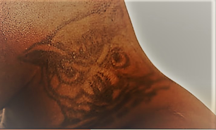
The owl is a cover-up of his old Black Beast tattoo

Derrick Lewis owl neck tattoo

Lewis once had “Black Beast,” his MMA nickname, tattooed on his neck. He later covered it with an owl, saying he considers himself wiser than he used to be. It’s a small change with a clear point: he replaced an old nickname with something that reflected a different stage of his life.

The owl also shows how a cover-up can become part of the story. The old lettering is hidden, but the reason for replacing it remains. Lewis doesn’t pretend he has always made the same choices. He has changed, and the ink records that in a very literal way.

Respect, loyalty and Lord Knows are the phrases he lives by

Another tattoo reads Lord knows. Lewis describes it as religious, then makes a joke about what he might do with his hands. That mix of sincere words and a grin feels like him. The phrase gives the collection a faith element without turning the whole thing solemn.

His hands are part of the practical side of the story, too. Lewis is a heavyweight known for his punching power, so hand tattoos naturally become part of how fans read his image. He doesn’t claim the ink makes him dangerous; the designs simply sit where his work happens.

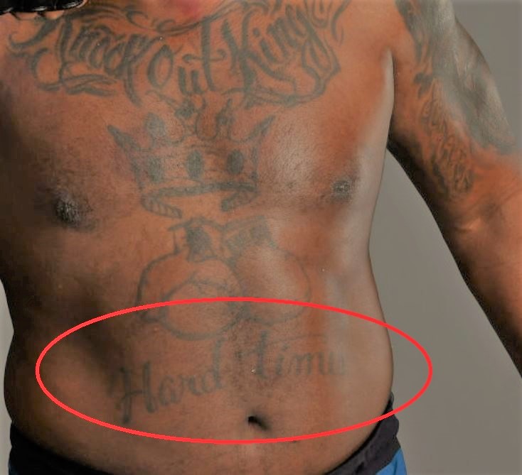
Knockout King, boxing gloves and hard times

Derrick Lewis hard times chest tattoo

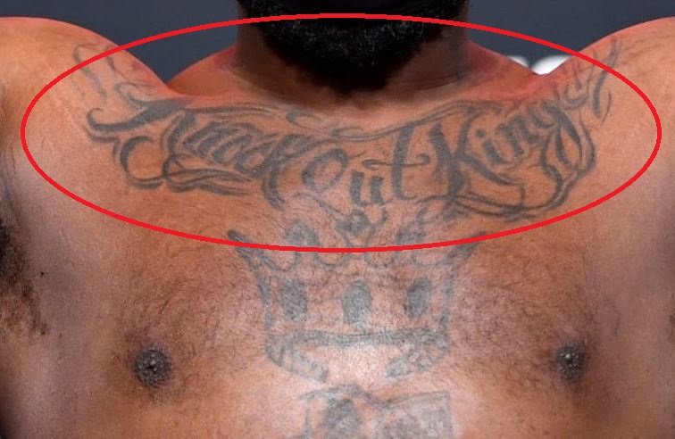
Lewis has a crown, boxing gloves, and the words Knockout King, alongside “hard times” as part of the same fighting-and-survival theme. The crown is confident, but the words add context. He sees the tattoo as a reminder of what he made it through before his UFC career brought a different life.

He started MMA training after leaving prison in 2008 and had his first amateur fight in 2009. That background matters: these aren’t just generic boxing designs. They come from a life that included street fighting, prison, training, and eventually professional competition. The crown and gloves are easy to read; the words make the story personal.

The small symbols fill in his family and faith references

Derrick Lewis Knockout King and chest tattoos

Photos show more lettering and small symbols across Lewis’s arms and torso, but he hasn’t publicly explained every mark. The documented designs include religious words, the Houston Texans tattoo, gorillas, the owl, the crown, gloves, “Knockout King,” and “hard times.” Those are enough to see the main themes without inventing meanings for blurred details in weigh-in photos.

He has also considered getting his wife’s name, though he hadn’t done it when the GQ video was filmed. They had been together for 11 years and married for two at the time. He joked about putting her name under his foot. The comment captures his attitude to future tattoos: he’s open to adding one, but isn’t racing to fill every patch of skin.

Why the tattoos fit Derrick Lewis better than a perfect sleeve would

Lewis’s tattoos bring together cover-ups, rough prison work, hometown pride, and symbols tied to family or his career. They don’t look like one artist planned the whole body at once, which is part of why they feel believable. The designs accumulated as he moved through different places and versions of himself.

The rough edges belong to the story. A tattoo made with improvised tools in prison carries a different history from a professional piece added after a UFC win. A gorilla beside a cover-up says something different from the Houston Texans design. Together, they form a timeline rather than a coordinated fashion statement.

There’s humour in how Lewis talks about the collection, too. He warns people against getting their first tattoo drunk in Las Vegas, jokes about his wife’s name, and seems happy to explain the pieces he kept. He doesn’t claim every decision was perfect; he says the tattoos are his, cover-ups and strange origin stories included.

For anyone interested in meaningful fighter tattoos, the strongest ideas aren’t always the biggest. Lewis’s designs point to home, family, faith, loyalty, work, and the difficult parts of reaching a goal.

He often connects the tattoos to something he does. The gorillas link to his gym and fighting style, the Houston mark to the city he chose as home, and the crown and gloves to the career he built after a hard earlier chapter. Even the owl is about changing and seeing himself differently. That’s a more useful way to read the ink than simply counting what shows in a photo.

His tattoos also leave room for change. Lewis has covered older work, left other pieces visible, and talked about what he might add next. The Houston design came after years in the city; the owl replaced a nickname he no longer wanted; the gorillas link his earlier prison tattoos to the gym and career that followed. His jokes help keep a complicated history from turning into a polished highlight reel.

Watch Derrick Lewis explain his ink

GQ’s Tattoo Tour is the clearest place to hear Lewis talk about the gorillas, the owl, the Houston tattoo, and the work he got in prison.

The Stories Behind Damian Lillard’s Oakland Ink

Damian Lillard’s tattoos read less like a collection of random ideas and more like a map of the people and places that shaped him. Oakland runs through the designs, alongside family, faith, his brother, and the basketball path from Weber State to the NBA.

Ink covers his chest, shoulders, wrists, and arms, but the stories are usually easy to follow. Many pieces point back home; smaller lettering honours relatives. And even when a tattoo session hurt, Lillard has been straightforward about it rather than inventing a mystery.

There’s no polished celebrity mythology here. Lillard says he got his first tattoo after high school, chose designs because they meant something, and learned that some spots hurt far more than others.

The Lillard Brothers logo was his first tattoo

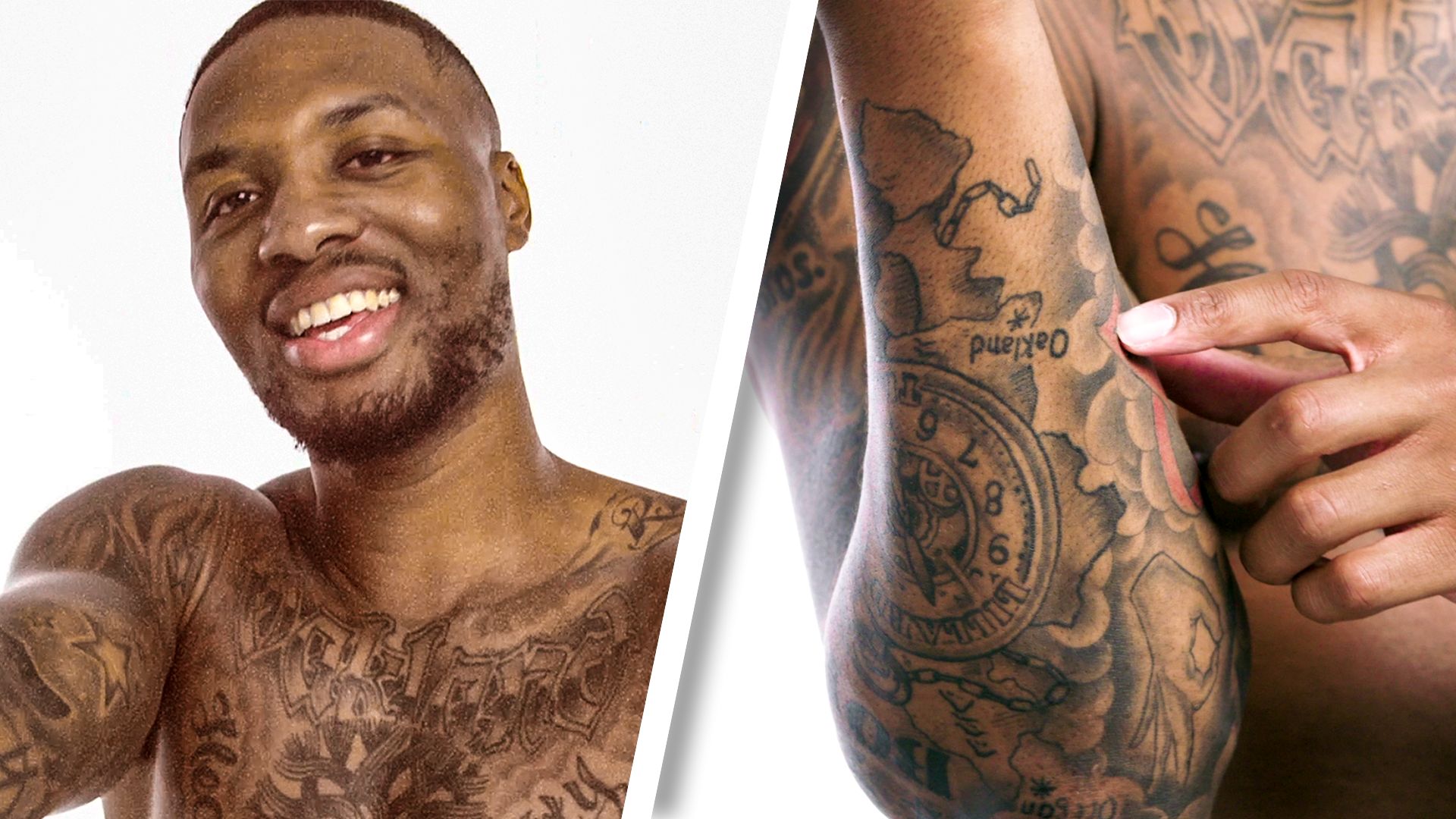
Damian Lillard tattoo tour showing chest and arms

Lillard got his first tattoo at 18. It borrows the Warner Bros. logo, changing the letters to “Lillard Brothers.” He and his brother Houston got matching versions, turning a familiar shape into something personal.

The timing mattered. Lillard has said his mother wouldn’t let him get tattooed as a kid. Her rule was simple: finish high school, then make his own choices. The first design came after he had done that.

It’s a good introduction to the rest of the collection. From a distance it looks clean and simple, but the meaning is about family and his bond with his brother. It’s the kind of tattoo that can age well because the idea is clear and the connection is real.

In later photos, the logo sits among other arm tattoos instead of on its own. That’s how Lillard’s collection grew: one meaningful piece, then another, until family lettering and larger chest work began to connect.

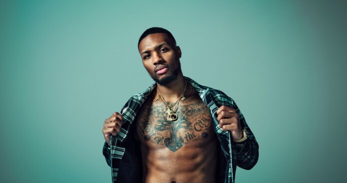
Oakland is the centre of the chest piece

Damian Lillard shirtless training chest and arm tattoos

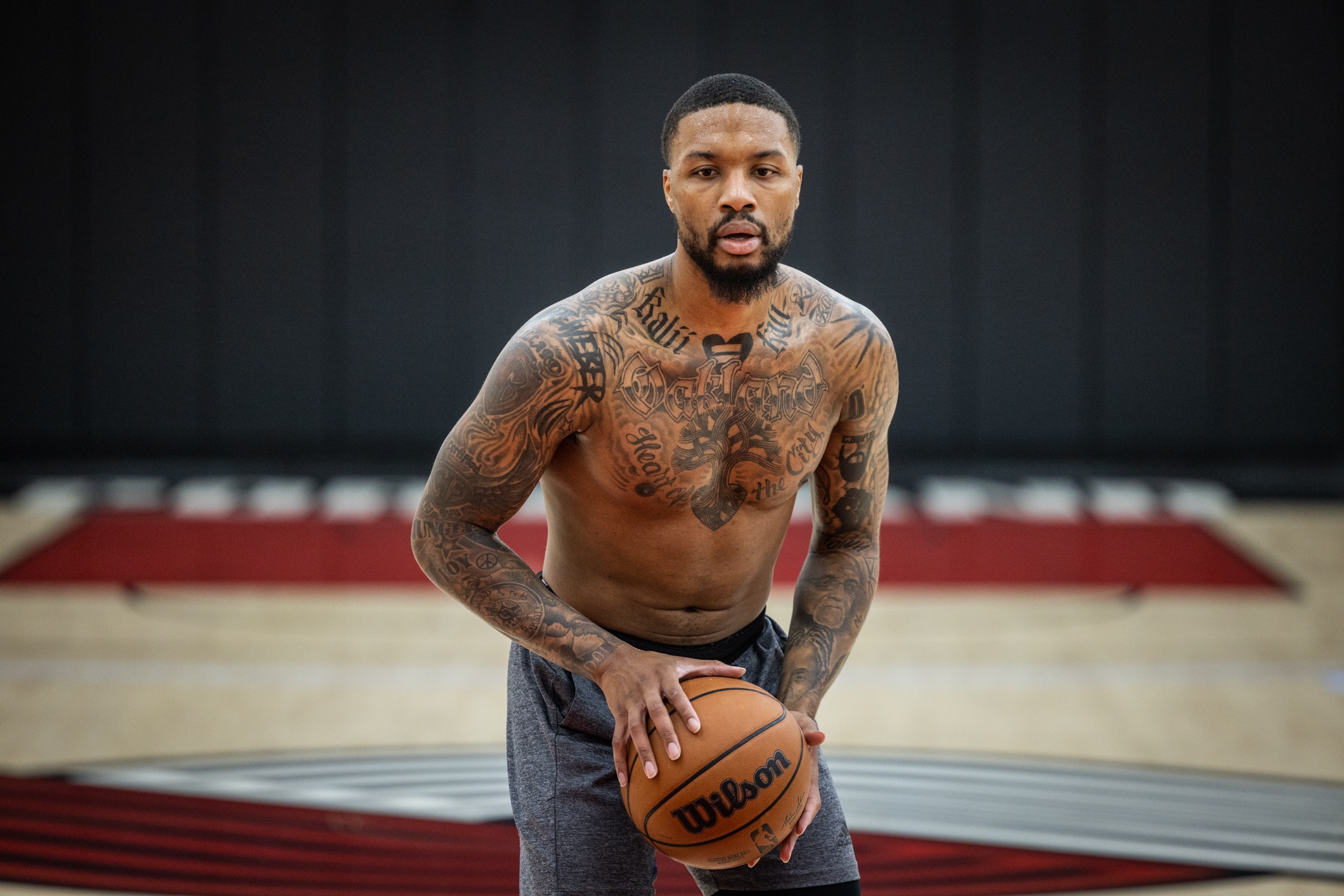
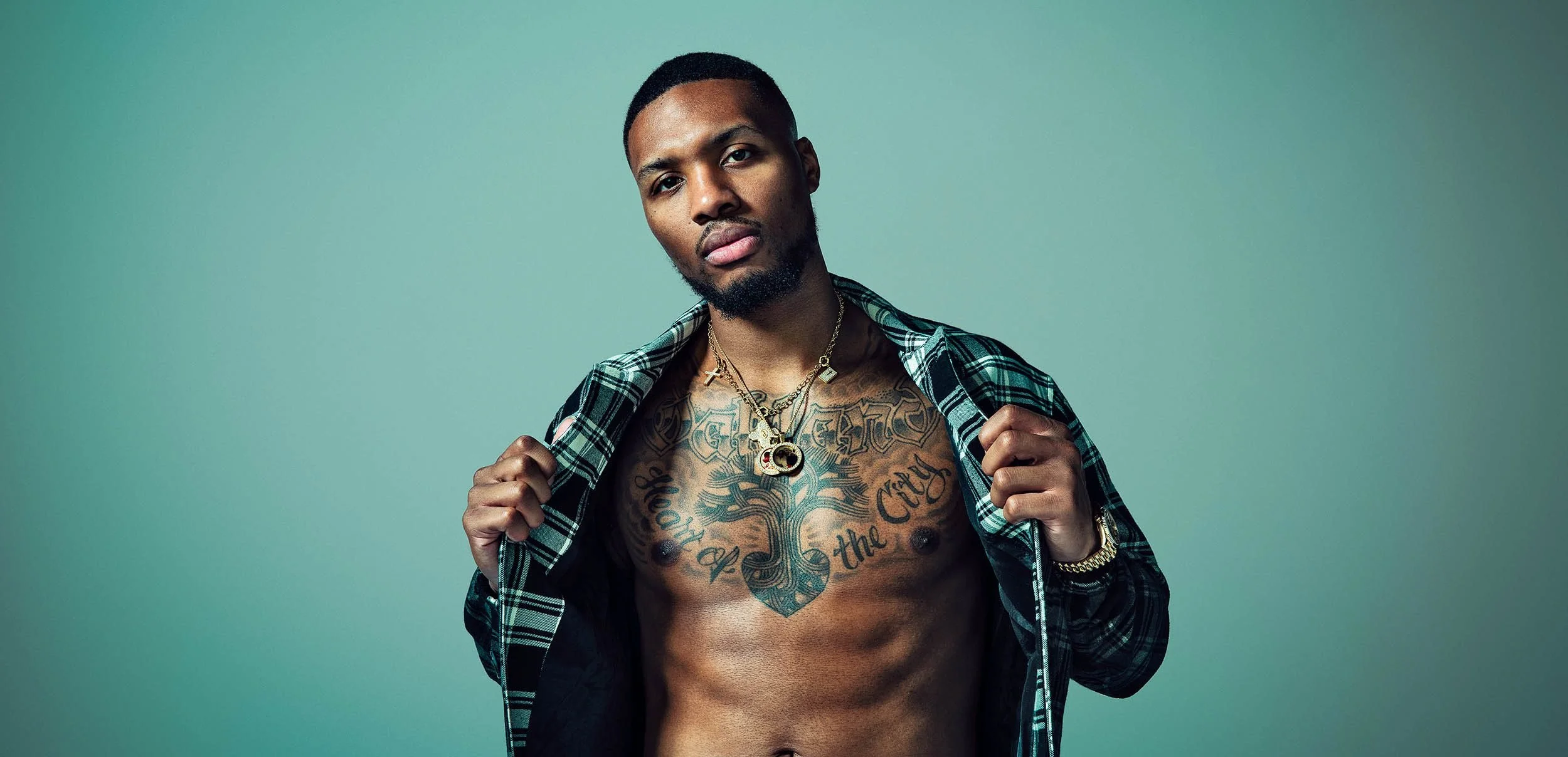
The most recognizable design across Lillard’s chest centres on a heart and tree, with “Heart of the City” tied to Oakland. Branches reach upward, making it more than a simple hometown name. The image represents where he feels he belongs.

Lillard has carried Oakland with him throughout his career. Basketball took him across the country, but the city remains central to his public identity. The chest tattoo makes that clear, visible when he’s training shirtless, posing for a shoot, or talking about life away from the court.

He has described this as one of his most painful pieces. The chest is a tough place to sit through a session, and Lillard said the pain got so bad his body went numb. He wouldn’t choose to do it again.

That makes the tattoo more than a proud hometown design or a painless accessory. It mattered enough to him that he finished it even when the session became miserable.

Names and family lettering fill the arms

Damian Lillard Heart of the City chest tattoo

Some of Lillard’s most personal tattoos are simple names. His arms include lettering for family members, including his mother and sister. The style is common among basketball players, but it still shows who he wants to keep close.

His mother’s part in the story goes back to his first tattoo. She made him wait until he finished school, and the collection he built afterward was his own choice. The family names keep that early moment in the background of the later work.

His arms also hold lines of text and smaller designs that can look different from one photo to another. A wide game-day shot may show dark shapes; a shirtless studio portrait gives the lettering more room. It helps to look at several views instead of treating one angle as the whole collection.

Lillard has said he likes tattoos that mean something to him. Not every design needs a public explanation, but the pattern is clear: the arms carry people, memories, and reminders rather than one single theme.

The Psalms verse gives the ink a quieter side

Damian Lillard wrist and arm tattoos

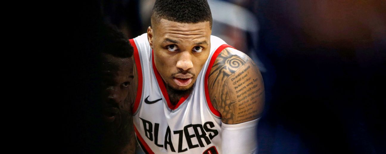
Lillard has a Bible verse from Psalms 37:1–3 on his left arm. It’s more understated than the chest piece and can disappear beneath a jersey. When it’s visible, it changes the mood of the collection.

The verse relates to faith and keeping steady when other people seem to be moving faster or doing better. That fits Lillard’s public outlook; he has often talked about patience, trust, and following his own path instead of chasing outside opinions.

The writing sits beside other arm tattoos rather than apart as a separate religious display. That mix keeps the collection from becoming one-note.

There are bold designs, softer details, text, portraits, and symbols. The verse doesn’t need to dominate the arm to matter. It works like a personal reminder, visible when his sleeve shifts during a game.

Wrist tattoos and the meaning behind Lillard Time

Damian Lillard shoulder tattoo game photo

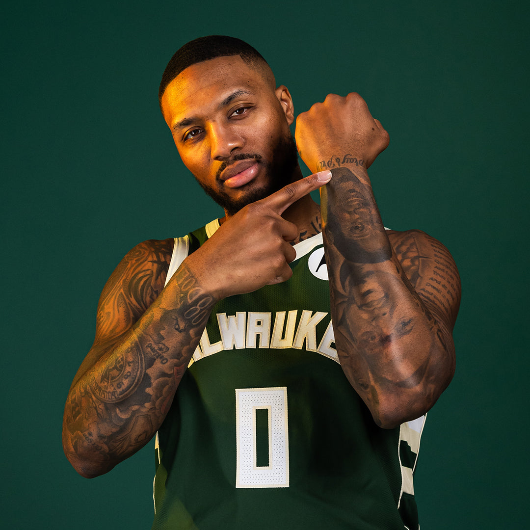
Lillard’s wrists and hands often come into view during his famous “Dame Time” celebration. When he points to his wrist after a big shot, the gesture draws attention to the tattoos around it. Some lettering is hard to make out in an action photo, but the placement has become part of how fans recognize him.

The wrist designs sit beside larger arm tattoos and can look like one continuous sleeve in some pictures. They’re actually separate pieces from different periods, a reminder that a sleeve doesn’t always begin as one big plan.

Game photos aren’t perfect references for reading tattoo details, but they show how the designs move with him. The letters and shapes are visible as he dribbles, points, or calls for the ball. A close portrait reveals more detail; an action shot shows how the tattoos have become part of his basketball image.

The smaller wrist pieces also complement the larger Oakland designs. The city provides the emotional centre, while the arms show everyday themes: family, faith, work, and the pressure of making decisions as the clock runs down.

What makes Damian Lillard’s collection stand out

Lillard’s tattoos aren’t tied to one fashionable style. Script, family names, a logo, religious writing, a large chest image, and hometown references all appear. The repeated themes help them work together.

Oakland anchors the collection; family gives it a personal core; faith adds a quieter layer; and basketball connects it to the career fans know. The first Lillard Brothers design still fits years later because it was never only a fashion choice.

Lillard is also candid about the uncomfortable parts. He wanted the chest piece because it meant something to him, but wouldn’t volunteer for that much pain again. That sounds more believable than pretending every tattoo session was easy.

For anyone looking for design ideas, the useful lesson isn’t to copy every piece. It’s to notice how the strongest tattoos connect to a real life. A hometown, a family name, a verse, or a shared logo can keep a large collection from feeling empty. Lillard’s ink works because the stories came before the artwork.

Some smaller tattoos get less attention than the Oakland chest piece. A wrist detail can disappear beneath a shooting sleeve, and arm lettering may show most clearly when he poses or points during a game. The big designs make the headlines, but the smaller pieces show how the collection grew.

It also helps to separate confirmed meaning from guesswork. Lillard has explained the brothers’ logo, the painful chest tattoo, family names, and faith-based writing. Other shapes are easier to see than to interpret, so it’s better to describe their placement and style than attach a story he hasn’t told. That balance keeps the guide honest while still giving readers plenty to look at.

Watch Damian explain the tattoos himself

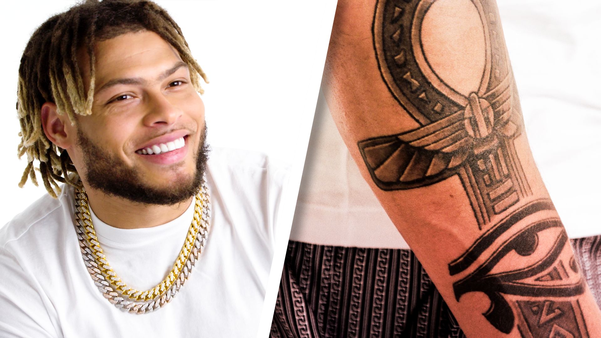
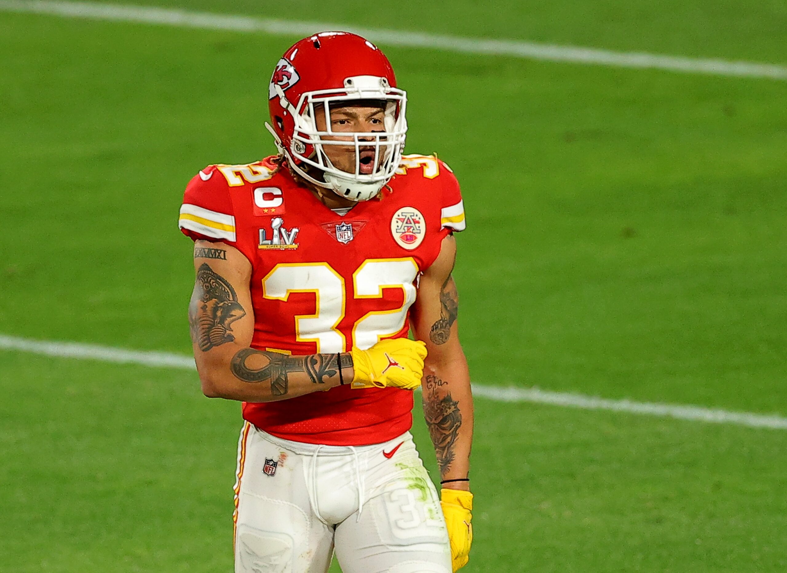
Tyrann Mathieu’s Ink Runs From Forever Young to a Leg Full of Icons

Tyrann Mathieu’s tattoos are more than decoration. They connect to New Orleans, family, football, faith, the people who shaped him, and parts of his past he doesn’t hide. Some designs are easy to see during a game; others need his own explanation to make sense.

He got his first tattoo as a teenager, while attending an all-boys school where he had to keep it covered. Since then, the collection has grown to include script, portraits, memorials, and symbols. Personal history is the thread running through it, even in the flashier pieces.

The first tattoo and the dark side he kept hidden

Tyrann Mathieu King forearm tattoo

Mathieu has said he was about 16 or 17 when he got his first tattoo. It was an impulsive choice made with friends after looking through a tattoo book. Since visible ink could have caused trouble at his private school, he spent senior year wearing a sweater nearly every day to hide it.

The early design he talks about most is a dark, mask-like image made of seven skulls. The number refers to New Orleans’ Seventh Ward, where he is from. Mathieu has described the tattoo as representing his darker side. It isn’t a tidy inspirational quote; it’s rough and a little unsettling, which fits a teenager trying to understand himself.

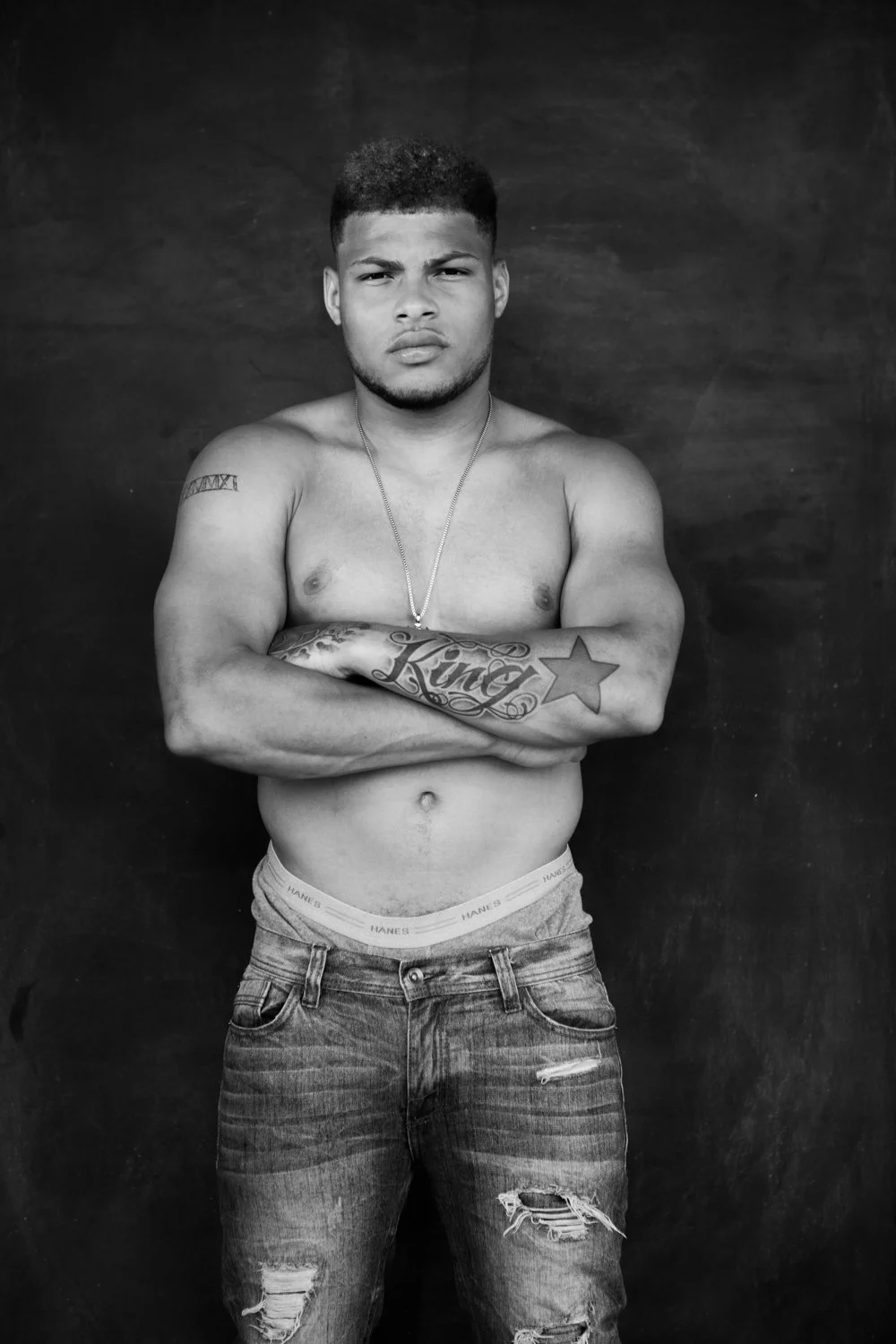
A black-and-white studio photo shows how that older piece sits beside later work. His forearm has large King lettering with a star, while smaller script and a band of Roman numerals sit higher on his arm. The mix looks like it grew over time, rather than being planned as one matching sleeve.

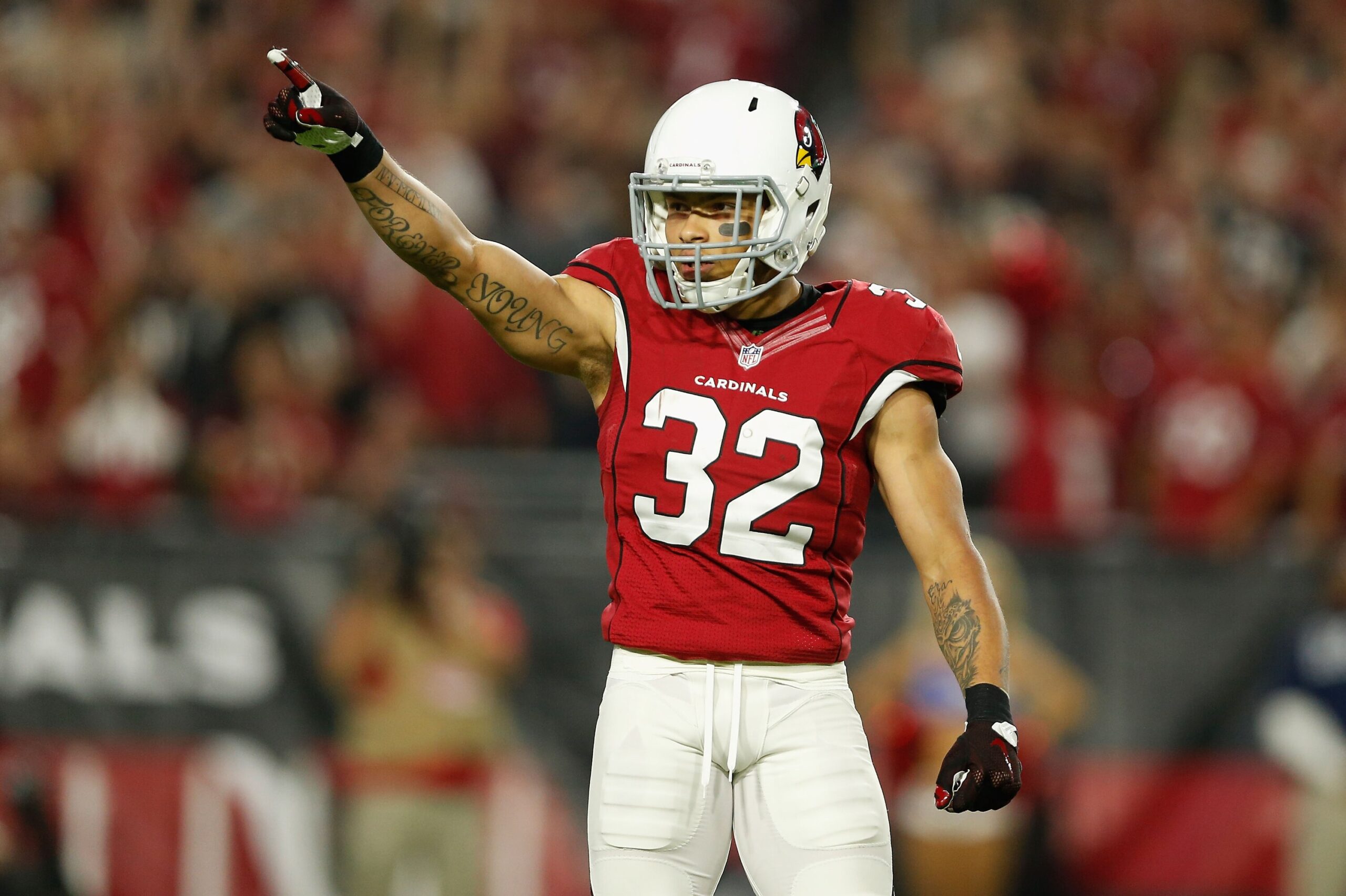
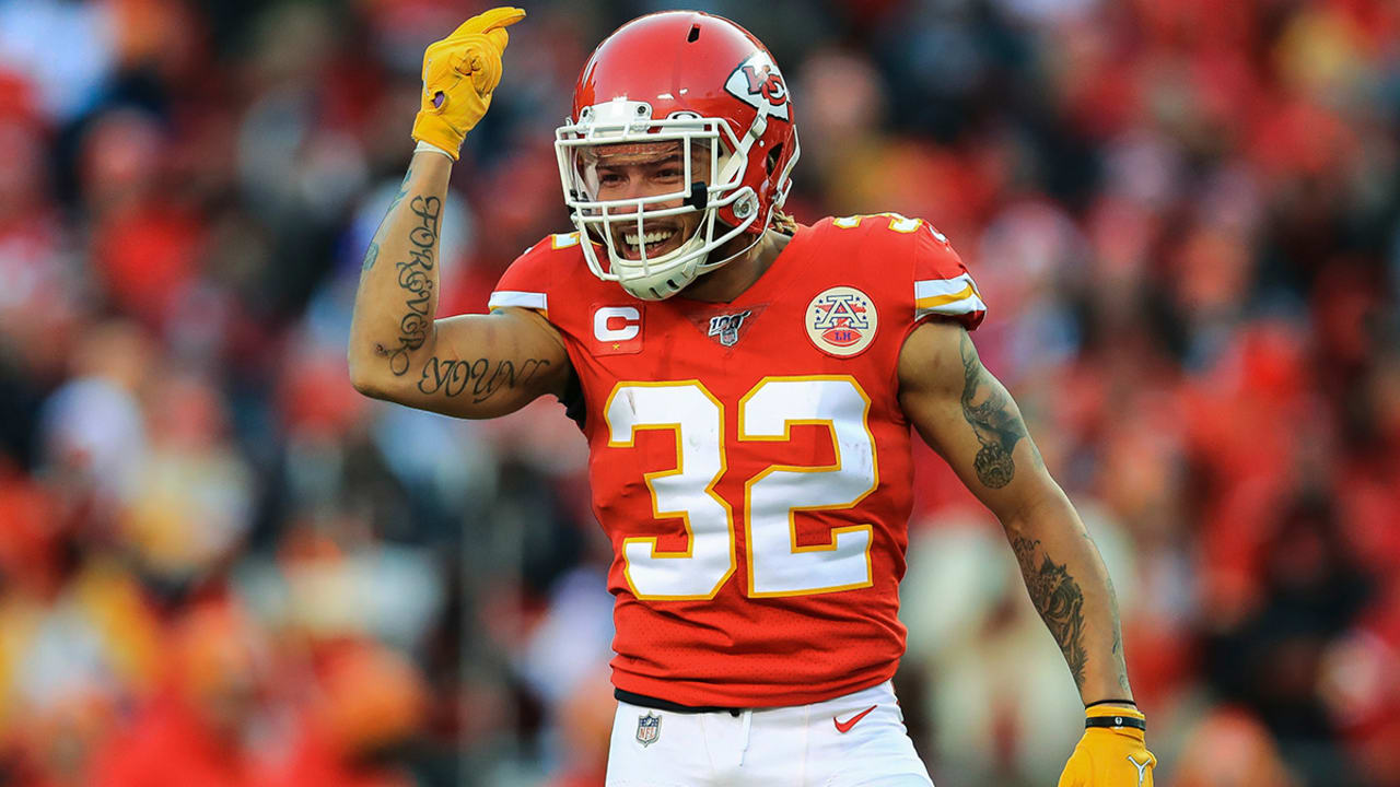
Forever Young is written across his arm

Tyrann Mathieu Forever Young forearm tattoo

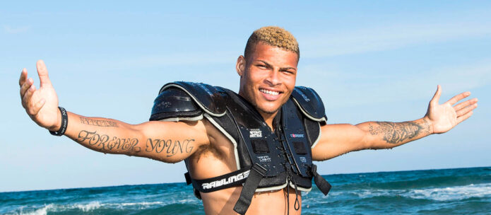
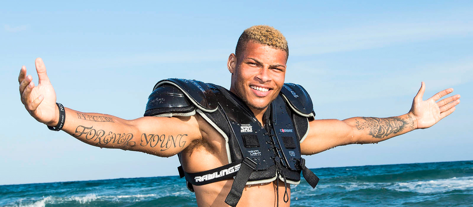
“Forever Young” flows across Mathieu’s forearm in large script, nearly the length of the arm. The phrase comes from Jay-Z’s song, and Mathieu connects it to keeping the curiosity and energy people can lose as they get older.

He has said adulthood can make people forget what made them happy as children. The tattoo reminds him to stay open, try new things, and avoid getting trapped in one version of himself. Its placement keeps that message in view whenever he raises his arms or celebrates a play.

The lettering sits beside other arm work, including “Above the top” near his thumb. That phrase is a direct reminder to keep working and stay hungry, even after reaching the NFL. Mathieu’s arm tattoos read like notes to himself that he chose to keep in public.

King, the crown and taking control of his own life

Tyrann Mathieu GQ tattoo tour arm tattoos

“King” is one of Mathieu’s most striking tattoos. The oversized script across his forearm appears with a star and crown or world imagery. In his GQ tattoo tour, he said the idea isn’t that he’s better than anyone else. It’s about taking responsibility for his own world and owning his choices.

That meaning connects to Mathieu’s uneven path. His mother left when he was young, and his biological father was sentenced to life in prison. He has spoken about the adoptive parents who gave him stability and helped him see a future in football. The “King” tattoo reflects that sense of taking ownership.

Another forearm tattoo reads “For the Family” and includes his adoptive father’s birthday, April 5, 1967. The numbers are small beside the large script but carry plenty of weight. This is where the collection becomes a family record, not just an image. It shows who Mathieu is grateful to and what he wants to live up to.

Protection, patience and the symbols on his arms.

Mathieu’s arm tattoos also include a Chinese foo dog, an elephant, and an ankh. Each has a personal role. He connects the foo dog with protection and keeping evil away, a fitting idea for someone who learned early to stay alert.

The elephant is one of his favourites. Mathieu calls it a spirit animal and associates it with patience and guidance. That’s a gentler idea than the skull mask or the portraits on his leg, adding balance to a collection where not every tattoo is meant to look tough.

The ankh brings another spiritual symbol into the mix. Mathieu has talked about reading people’s energy and sensing the feeling around them. He often connects the tattoos to instinct, identity, and finding his way through difficult situations without losing himself.

Other details, including hand lettering and the Roman numeral band on his upper arm, can be easy to miss in wide game photos. That’s why the closer studio view helps. For a tattoo site, the small work deserves as much attention as the large portraits.

The leg portraits are a personal hall of fame

Tyrann Mathieu portrait leg tattoo collection

Mathieu’s most ambitious tattoo work is on his leg: portraits of Zeus, Muhammad Ali, Bruce Lee, and Malcolm X. It’s a personal hall of fame, with each person representing a different kind of strength.

Zeus represents power. Mathieu has described him as a figure with enormous power, which makes sense of how the portrait anchors the group. Muhammad Ali stands for sporting greatness and the confidence to speak up for something bigger than himself. Bruce Lee connects to preparation and awareness; Mathieu admires how Lee understood his opponents, a quality that also fits the mental demands of playing safety.

Malcolm X represents speaking up when things are wrong. Mathieu has said Malcolm’s willingness to address uncomfortable subjects mattered to him. Together, the four portraits map out qualities he wants around him: power, courage, focus, and honesty.

Game photos don’t always show every portrait clearly, with shorts, socks, and movement in the way. Still, the different angles show how much of the leg is covered. It’s a group of portraits and symbols designed to read together, not one flat image.

Crosses, initials and the people he lost

Tyrann Mathieu memorial crosses and initials tattoos

Mathieu’s crosses are among the collection’s most emotional tattoos. They honour family members, friends, and others close to him who have died. Initials beside the crosses make each memorial specific rather than generic.

He has said the tattoos help him carry those people with him. The designs sit on his leg and move with him when he runs, cuts, and plants his feet. That placement fits an athlete, but the meaning goes beyond football: these are reminders of people who won’t be there to see the next game.

A quote on the inside of his leg reads, “When you’re a star, you put God first. Let your past guide and your future determine you.” Mathieu came up with the line himself. It brings faith, memory, and ambition together without pretending the past never happened. He isn’t trying to erase where he came from; he wants to keep it from deciding where he ends up.

Louisiana, the Seventh Ward and the number seven

Tyrann Mathieu Louisiana and Seventh Ward tattoos

New Orleans is a major part of Mathieu’s tattoo story. The Seventh Ward appears in the skull design, while the number seven also refers to the LSU jersey he wore. Another tattoo shows Louisiana with the 504 area code, keeping his home state close wherever his career takes him.

The hometown link returns in a tattoo on the back of his leg. Mathieu wore number seven at LSU and has described the design as a reminder that people in his community look to him. It carries pride, pressure, and responsibility at once.

When he talks about Louisiana, his tone shifts. He speaks about the affection and genuine support he feels when he returns. The state outline and area code are simple designs, but they carry the same message as the larger portraits: success hasn’t cut him off from home.

Why the whole collection works.

Mathieu has a lot of tattoos, but they feel connected when you hear the stories. His arms cover identity, protection, ambition, and family; his legs hold memorials, hometown references, and portraits of people he sees as guides. Even the dark early design refers to the Seventh Ward and a side of himself he once kept hidden.

That’s why the tattoos stand out in football photos. They aren’t just a visible sleeve beneath the pads; they make a running diary. Some are reminders, some are tributes, and others were simply pieces he liked when he was young. Together, they turn his background, relationships, and influences into something he can carry with him.

Watch Tyrann Mathieu explain the stories himself

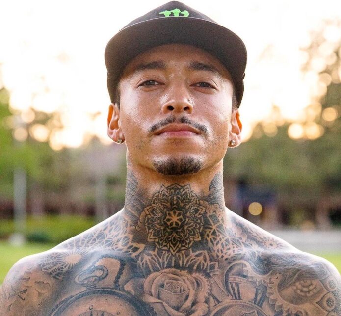
200 Tattoos and Counting for Nyjah Huston

Nyjah Huston’s tattoos don’t read like a collection with a tidy beginning and end. They’re closer to a sketchbook: some pieces are carefully planned black-and-grey work, some connect to skateboarding or family, and others are there because he liked the joke. That mix is what makes the collection interesting.

In his GQ tattoo tour, Huston estimated he had around 200 tattoos, covering roughly 90 percent of his body. It’s only an estimate, but the photos make it plausible. His neck, chest, arms, hands, legs, back, and even his backside have become part of the project. One photo only shows a small piece of a much bigger picture.

Here’s a closer look at the main designs Huston has discussed and how the smaller tattoos fit around them. He has said plenty of pieces are simply things he likes, so there’s no need to assign a confirmed meaning to every tiny mark. That candour makes the collection feel more human.

The first tattoo was a simple Skate and Destroy piece

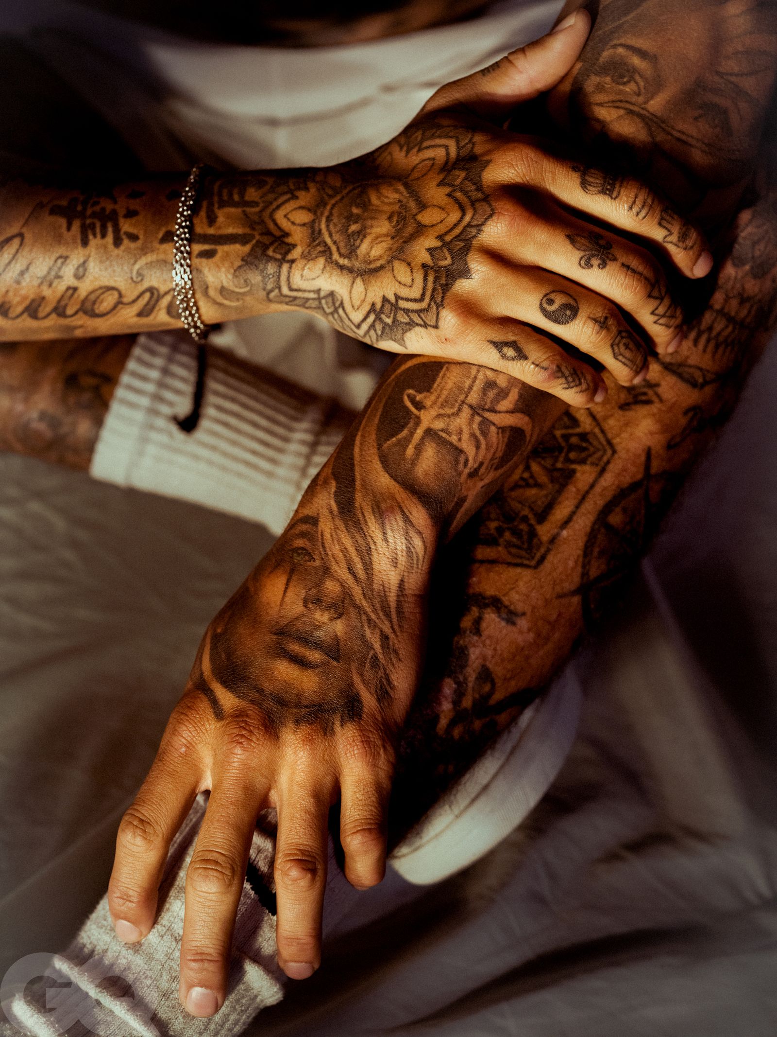
Nyjah Huston hand and forearm tattoos

Huston got his first tattoo on his arm at 18. He was at Tampa Pro, where tattoo artists were working behind the contest area, and his friend Chase kept urging him to get something. He chose the familiar Skate and Destroy phrase. It sounds like an obvious choice for a pro skater until you hear how spontaneous it was.

He has said he wasn’t even sure he wanted tattoos before that day. His friend was getting one, a design he liked was available, and Huston went for it. Then he returned to skate in the contest with fresh ink. It’s a very Nyjah beginning: impulsive, rooted in skating, and followed by many more tattoos.

Close-up shots of his hands and forearms show how much the collection grew after that first piece. Small symbols, letters, and shapes cover his fingers, while larger work blends into portraits and dark shading on his forearms. The tattoos aren’t one continuous sleeve; they look like separate decisions that gradually came together.

His chest is built around roses, clocks and compass details

Nyjah Huston chest and neck tattoos

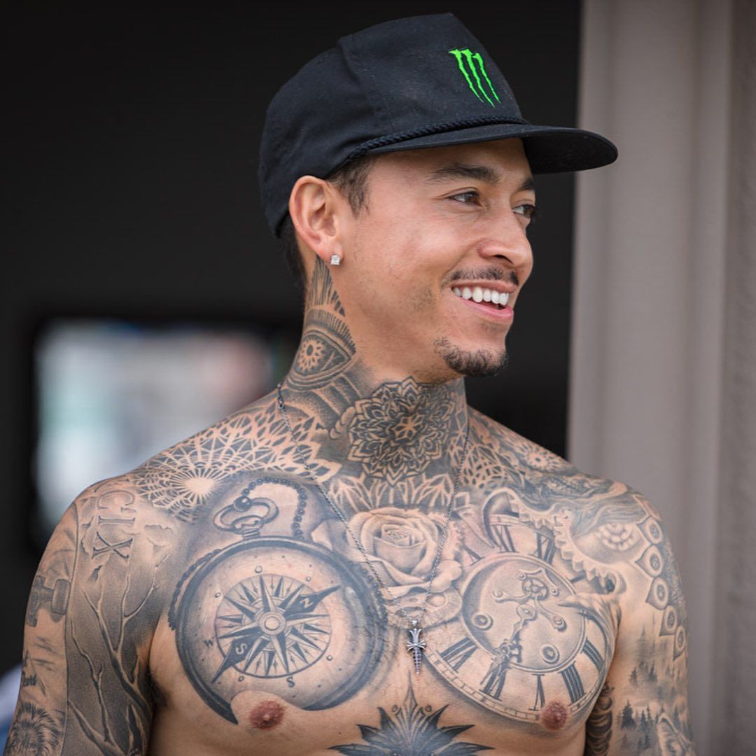
Huston’s chest looks more deliberately arranged. Photos show large black-and-grey work across both sides, with a central rose, compass imagery, clock details, and geometric patterning. These aren’t small filler designs; they give the whole torso weight.

A compass and clock sit near the rose, which softens some of the harder shapes. Smaller lines and symbols fill the spaces between the larger images. From a distance the chest can look like one large piece, but up close it’s a group of separate tattoos. The fine lines, numbers, and shading are easier to see in a close crop.

Huston has also talked about reworking the chest as his taste changed. He had an early portrait of his mother removed with laser treatment because the light-coloured tattoo didn’t sit well in that spot. He replaced it with darker work, including the clock. He was clear that his feelings for his mother hadn’t changed; he simply didn’t like the tattoo’s appearance.

The lion on his stomach carries the biggest personal story

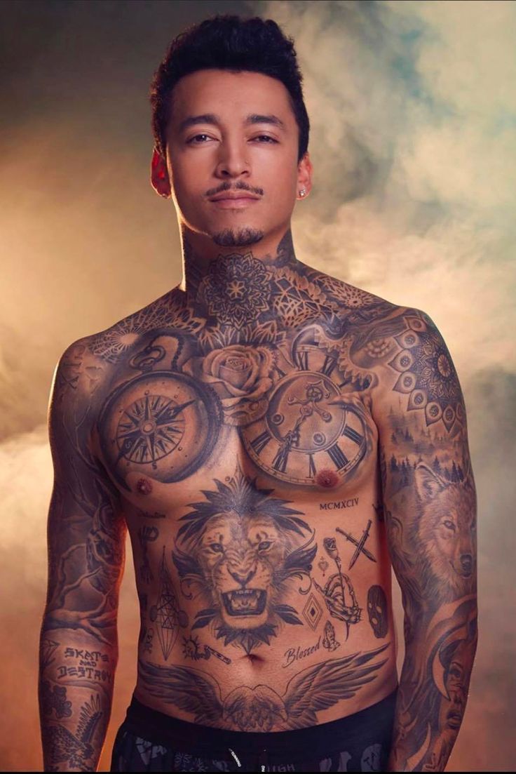
Nyjah Huston full torso lion and chest tattoos

Huston has explained the lion on his stomach in more detail than many of his tattoos. He says the animal has been his favourite since the years when he wore long dreadlocks and became known as a young skater. To him, the lion recalls the image people had of him then: a small, fearless kid with dreadlocks and a big personality.

In the full-torso view, the lion sits below the chest work. Its face, mane, and dark shading create a strong focal point. The expression is fierce, but the surrounding designs connect it to the rest of his torso. The clocks, rose, and compass draw the eye toward it.

There’s also a lion skull elsewhere in the collection. That helps explain why it’s difficult to reduce Huston’s tattoos to one simple list: a theme may return in different forms, while unrelated images sit beside it. He has said he chooses tattoos that fit his vibe, not that every design needs one grand explanation.

The same photo shows torso lettering, including Blessed and the Roman numerals MCMXCIV, his birth year, 1994. Those smaller marks help tie the lion into the rest of the collection.

His neck and throat work took serious time and pain

Nyjah Huston selfie showing neck and chest tattoos

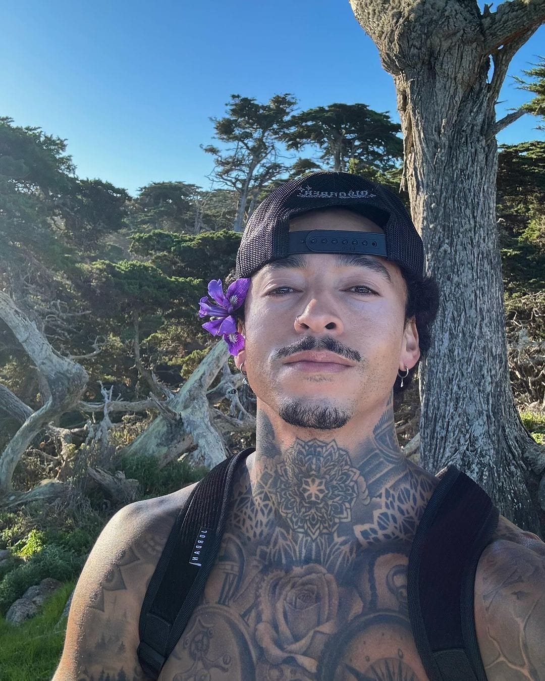
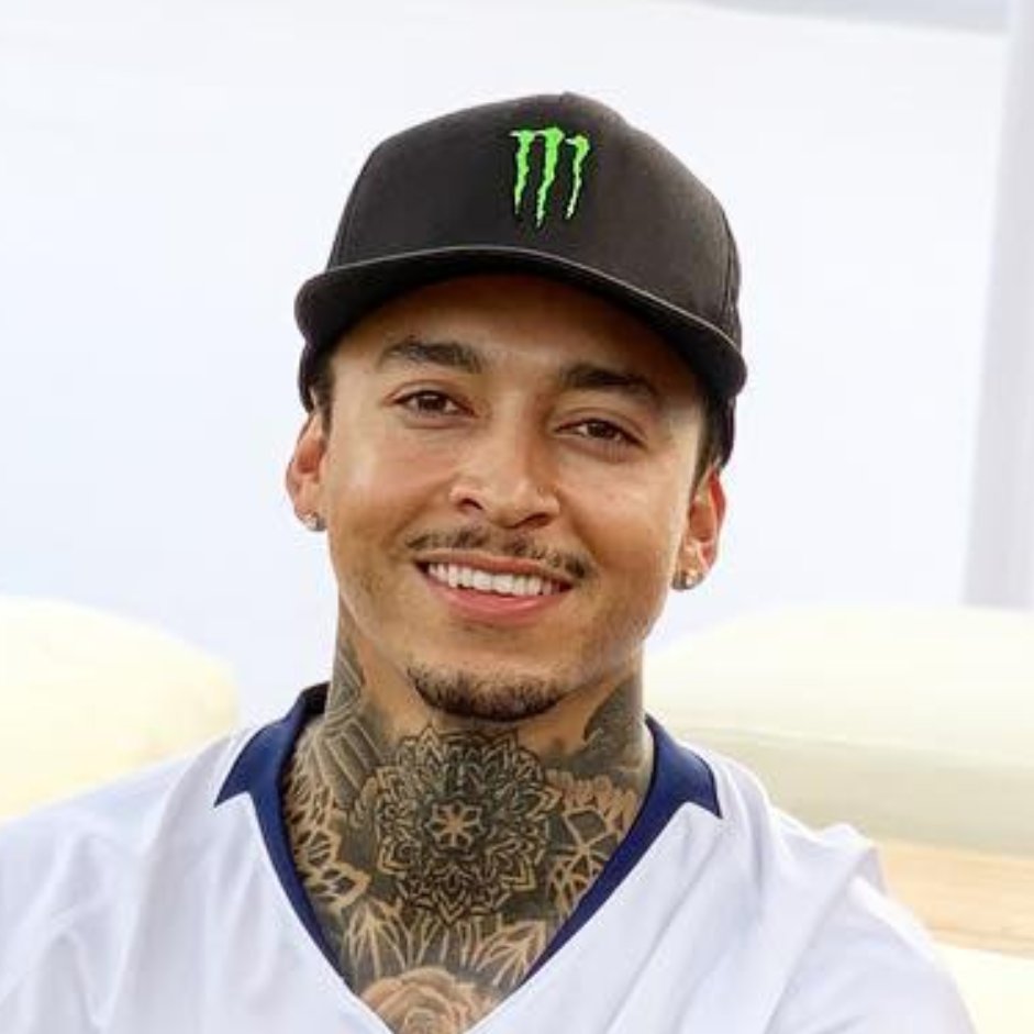
Huston’s neck is hard to miss. A large mandala-like design spreads across his throat, with patterns climbing the sides of his neck and continuing down toward his chest. The detailed lines can look like lace or carved metal in photos, giving his upper body a recognizable shape.

On the right side of his neck, he describes a triangle with an eye as having an Illuminati vibe. An eagle sits on the left. The surrounding geometry helps the separate images sit together. Open spaces, dots, and repeating lines keep the neck from reading as one solid black shape.

The sessions were intense. Huston said the work took about three days, with each session lasting five or six hours. He described the skin being stretched and his head and neck pulled into awkward positions, especially around the Adam’s apple. It was a major project and one of the most painful parts of his collection.

He has also said he might get a small face tattoo someday, but hadn’t done so when the GQ tour was filmed. For now, the neck is the closest his most visible facial area comes to a fully tattooed statement.

One leg is his home for random ideas

Nyjah Huston leg and arm tattoos at a skate session

If the chest is the more organized part of Huston’s collection, one leg is where he lets himself be silly. He calls it his random leg and points out a Jason mask, a pineapple, a grim reaper, a lion skull, and a waffle. The images don’t need to match; the fun is that they share the same space.

The waffle is exactly that: Huston likes waffles, so he got one. He’s joked that people might think it’s stupid, but he has no regrets. The ferret on a skateboard came from a similar impulse. A friend kept asking when Huston would get a ferret tattoo, and when his friend Cody was in town, he went ahead with it. He wasn’t in the mood to plan a serious design, so the ferret won.

That same leg has darker ideas too: butterflies, a tombstone marked See Ya Soon, a skeleton giving the middle finger, a mushroom, and other small drawings. On paper, the list sounds odd; in photos, it looks like a personal flash sheet that kept growing.

Skateboarding turns up among the jokes as well. Skateboards, small symbols, and lettering sit beside larger images. Huston says some tattoos come from things he notices and likes in the moment, while others take more thought. This leg shows both approaches living side by side.

The back and hips are a newer, more symmetrical project

Nyjah Huston neck mandala tattoo

Huston said he started working seriously on his back about a year before the GQ tour. His friend Kry, who works at Bang Bang in New York, did much of the tattooing. Unlike the random leg, the back has a more deliberate layout. Huston described it as symmetrical, with paired elements running down both sides and other images through the middle.

That symmetry gives the rest of his looser collection some structure without forcing all the tattoos to match. Geometric designs carry across the shoulder blades and hips, connecting with patterns already visible around his neck and shoulders.

He has also mentioned geometric tattoos on both sides of his backside that line up with the back work. They’re hard to see in a front-facing photo, another reason the collection needs several views. A chest portrait might show the rose and clocks while missing the newer back pieces entirely.

Other tattoos across his body include angels, wolf imagery, crosses, American flag details, small crowns, diamonds, praying hands, anchors, and tiny finger designs. Not all of them have a confirmed story. Some are simply images he liked, and the collection is more interesting when those can be left as they are.

The broad style is black and grey, dense, and still growing. Huston has said he prefers black-and-grey work because he thinks it suits his skin tone. Soft shading, dark outlines, geometric patterns, and realistic faces and animals recur throughout. Even the jokes sit within that wider visual style.

He has worked with a number of tattoo artists, including Thomas Hooper, Paul Timman, Sam Dusenberry, and Daniel Silva, as well as friends who have tattooed him over the years. Their styles differ, but Huston’s taste helps the tattoos feel connected.

There isn’t one message behind all 200 or so tattoos. Some relate to skating, family, or childhood; others are a waffle or ferret because he thought they’d look good. That may be the most honest way to read the collection: serious work and silly ideas share the same skin.

For anyone taking design inspiration from Huston, the lesson isn’t to copy the whole collection. Notice how a large chest piece sits beside tiny finger tattoos, or how a joke design can still become part of a personal style. Huston keeps finding room even when he says there’s hardly any left.

Watch Nyjah Huston explain the tattoos himself

Huston talks through his first tattoo, the ferret, the waffle, his neck work, the lion, and the random leg. The stories come from him rather than guesses based on a photo.

Inside Leandro Paredes’ Ink: La Bombonera, “VIVERE” and Argentina Memories

Leandro Paredes has the kind of tattoo collection that makes a football shirt seem to hide half the story. Without the shirt, a large chest scene comes into view alongside religious art, lettering, dates, family details, and black-and-grey work down both arms.

There isn’t one theme tying every piece together. Some tattoos are about Boca Juniors and Argentina; others are personal, and smaller marks show up most clearly in close match photos. Here’s what can be seen and what has actually been reported.

La Bombonera and the beach scene across Paredes’ chest

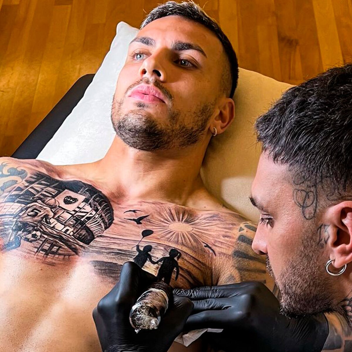
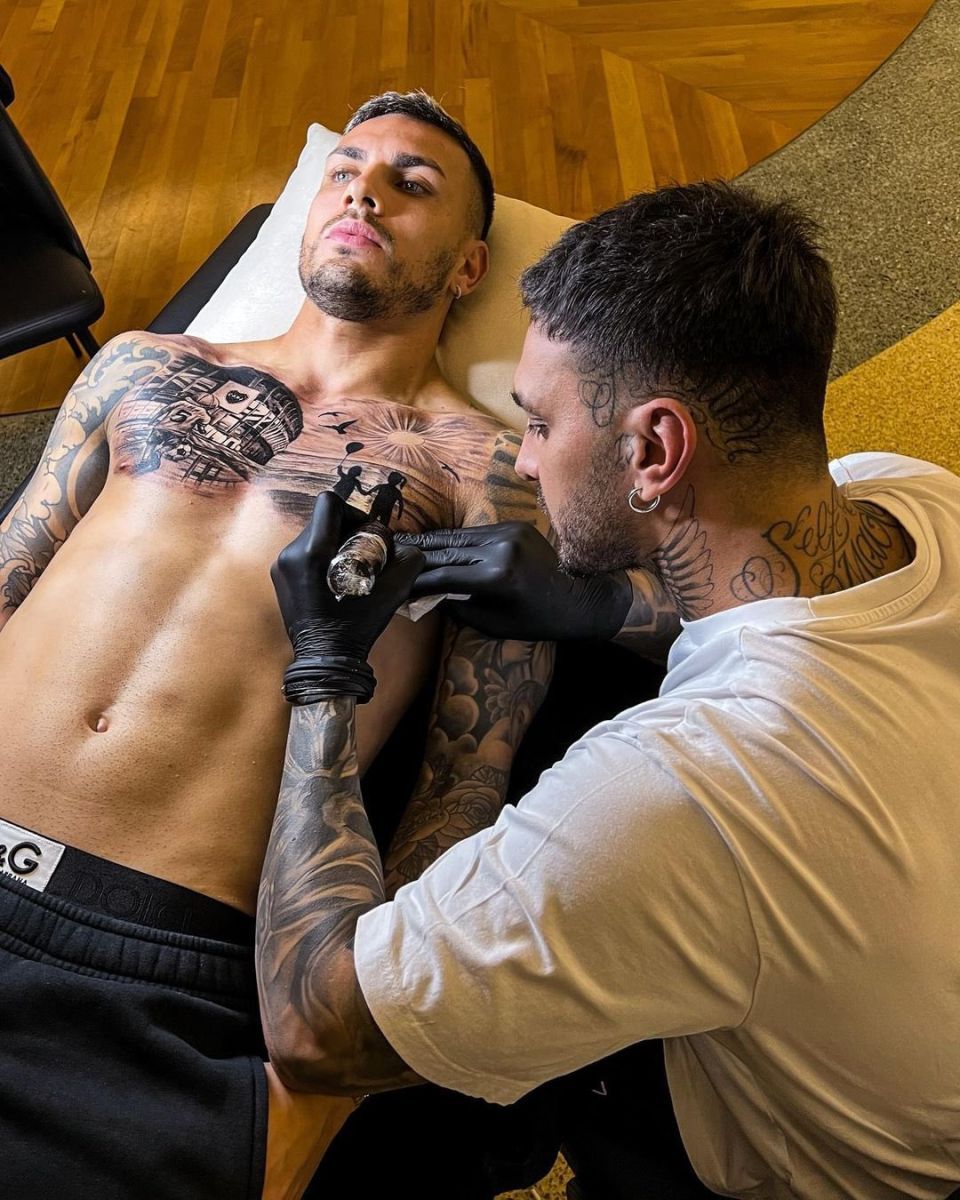
Leandro Paredes Bombonera chest tattoo session

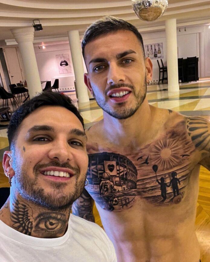
The main talking point is Paredes’ chest tribute to Boca Juniors. On the right side, La Bombonera appears in fine detail. It’s the stadium where his football story began, rendered as more than a simple club badge.

A small footballer wearing number five appears in the design. Five is Paredes’ shirt number, giving the scene a personal touch. The stadium, player, and ball turn the image into a small football memory, not just a building inked across his chest.

The other side shifts to a beach scene: two children holding hands, with a balloon, sun, and birds in the background. Reports connect the children to his family, though it’s safest to describe the design as family-centred without guessing at private details.

The contrast makes the chest piece work. One half feels busy and football-focused; the other is quieter and more nostalgic. Paredes gives his Boca history and personal life space side by side instead of folding them into one generic design.

The religious figures on his shoulder and upper arm

Leandro Paredes religious chest and arm tattoos

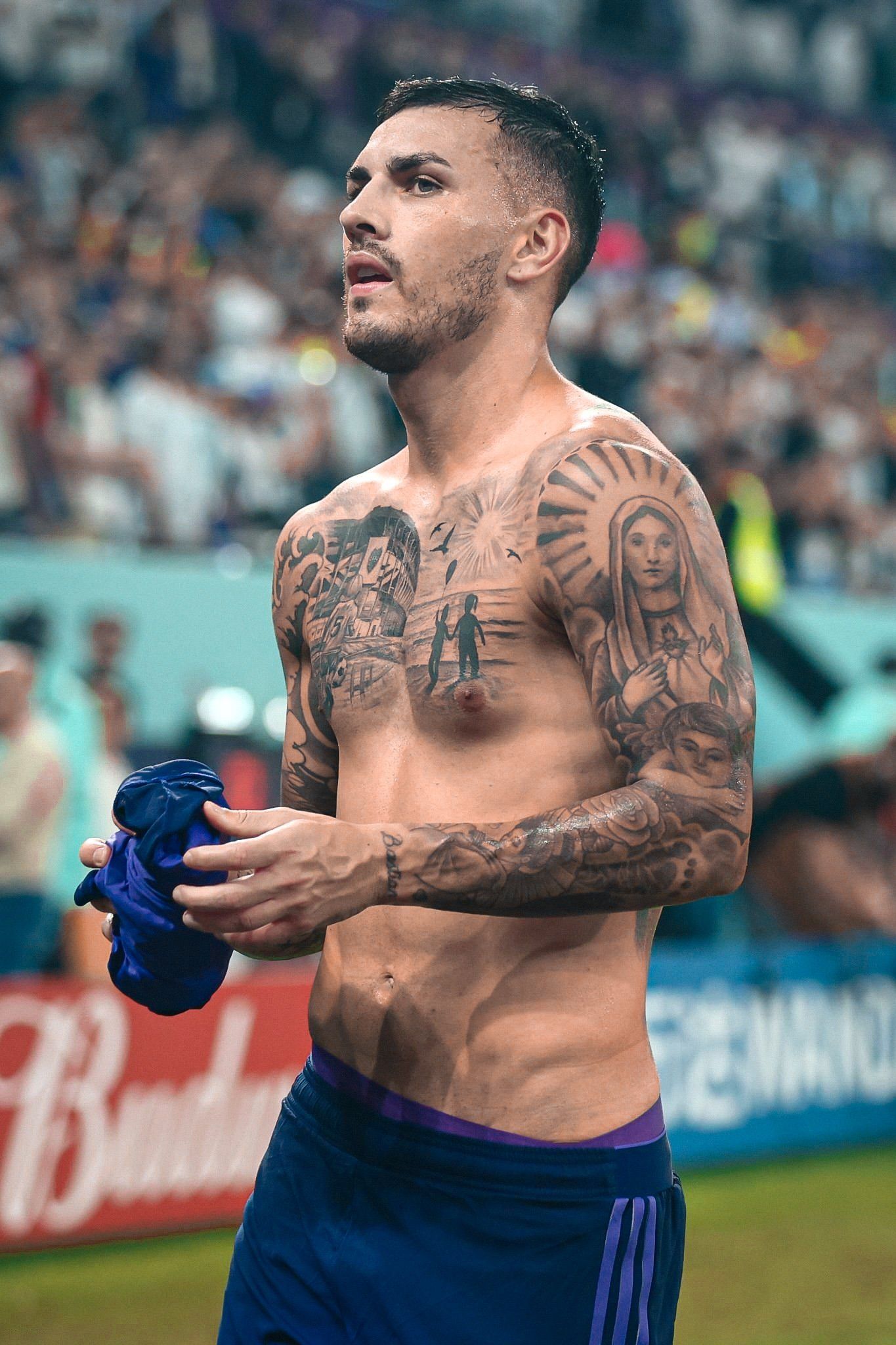
Some of the most recognizable images on Paredes’ right shoulder and upper arm are religious. A large black-and-grey portrait of the Virgin Mary is framed by lines that radiate outward, making the shoulder stand out even from a distance.

Below it, another religious figure takes up much of the upper arm. The shading gives it a heavier look than the chest’s cleaner lines. These aren’t small wrist symbols; they help explain why his arms look so covered when he plays in short sleeves.

The images are clear, but Paredes hasn’t explained the private meaning behind every part. Rather than invent a dramatic story, it’s fair to say that religious portraits and devotional imagery form a major part of his upper-body tattoos.

Classic black-and-grey work carries the design: faces, soft shading, and strong outlines. It also links the shoulder to the chest, rather than making it feel like a separate sticker. Seen from the front, the radiating lines and religious portrait frame the rest of the chest work.

“VIVERE” on the neck and the 1994 date on his stomach

Leandro Paredes VIVERE neck and 1994 abdomen tattoos

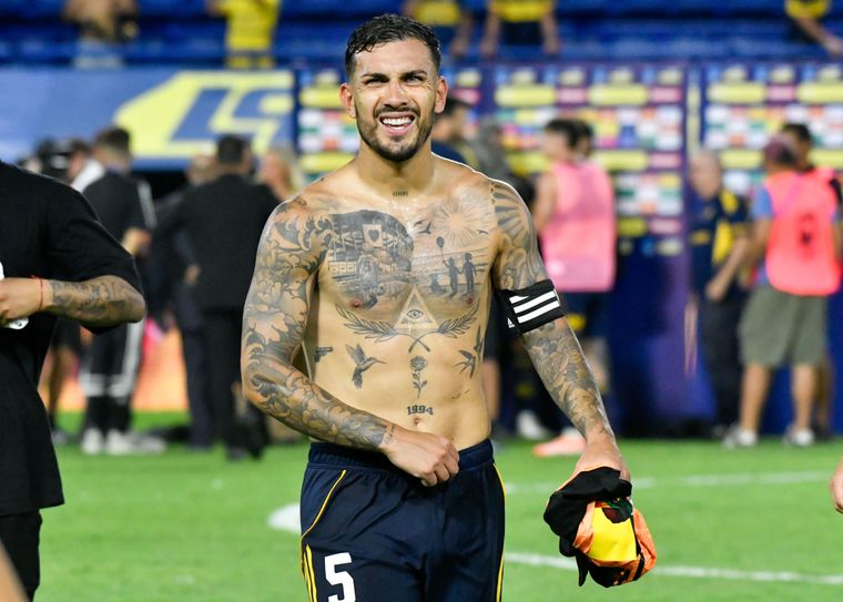
Two smaller details sit near the middle of Paredes’ body. The word “VIVERE” is low on his neck, and 1994 is tattooed on his abdomen. The date marks his birth year and gives the larger collection a simple personal anchor.

“Vivere” means “to live” in Italian. Paredes has played in Italy, France, Russia, and Argentina, and the short word sits just above the chest work without competing with it.

The date is much plainer: four clear numbers without a portrait or large scene around them. That simplicity breaks up the heavier shading and gives the eye somewhere quieter to rest.

Below the date, photos show a triangle with an eye, laurel-like branches, small birds, and a flower. Since those tiny marks don’t all have confirmed explanations, it’s better to describe what’s visible than make up a story for the whole area.

Black-and-grey arm work, birds and the smaller chest symbols

Leandro Paredes chest tattoo portrait

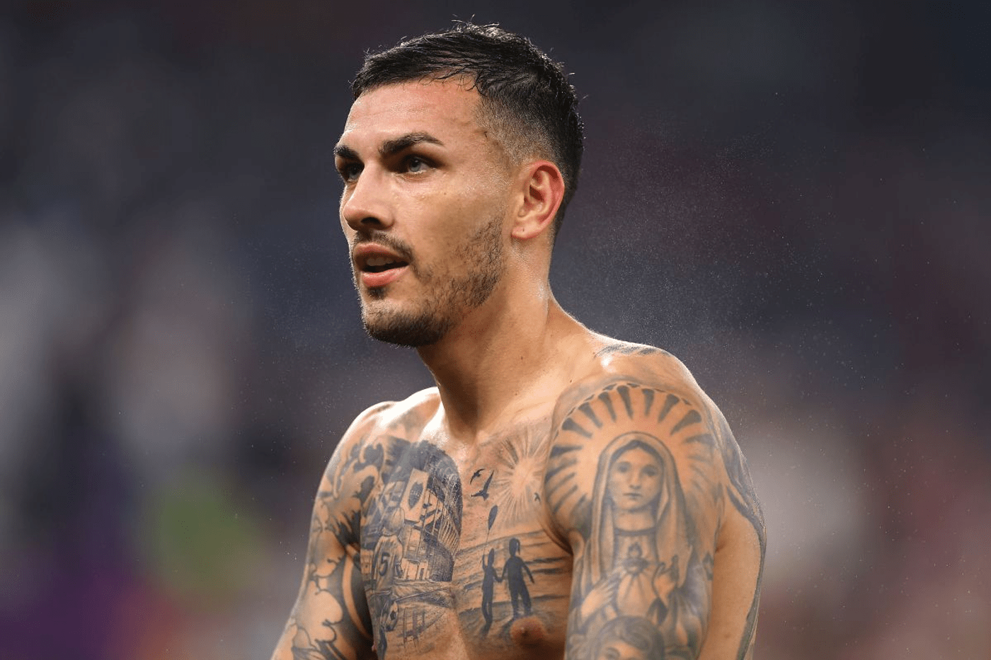
Paredes’ arms are filled with black-and-grey work, and they look different depending on whether he faces the camera or turns sideways. Clouds, dark shading, and smaller images run from his shoulders toward his wrists.

Small birds and dark shapes across his chest help connect the larger designs. They may not be the headline tattoos, but they keep the stadium, sun, and beach scene from floating on their own. Leaves, a flower, and little marks around the stomach serve a similar role.

The collection mixes realistic portraits with simple symbols. A detailed religious image can sit near a tiny bird or plain date without everything needing the same style. That gives the tattoos a lived-in look, as if they grew over time rather than being planned as one full bodysuit.

Reports also mention family names and lettering near his wrist and lower arm, including his son Giovanni’s name. Those details can be hard to read in wide match photos, but close-ups show how the small pieces matter alongside the chest work. They make the collection personal without turning every design into a public statement.

The chest piece was done by Valentino Russo

Leandro Paredes Bombonera tattoo session in progress

Italian tattoo artist Valentino Russo created the Bombonera piece. Photos from the session show the stadium and beach scene taking shape in layers of black and grey across Paredes’ chest.

Those images help explain the level of detail in the finished tattoo. The stadium front, number-five shirt, children, sun, and birds all need different shading. It was more involved than a small emblem that could be finished quickly.

Older photos of Paredes can look very different because the chest piece wasn’t always there. Newer images show a fuller front than earlier photos from his time in Europe. Tattoo collections change as people add work around existing designs.

Russo’s composition connects Paredes’ football past with his family life without forcing them into one portrait. La Bombonera represents the club that raised him; the children and beach scene point toward home and memory. That makes for a more personal tribute than placing a Boca crest alone in the centre.

The Copa América tattoo and the football memories on his legs

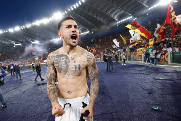
Leandro Paredes leg and torso tattoos after Roma match

Paredes also has football-related tattoos lower down. After Argentina won the 2021 Copa América, reports noted a trophy tattoo on his left leg. He had just won his first senior international title with Argentina, making it a natural memory to mark.

Leg tattoos can be easy to miss beneath a match kit, and warm-up photos may show only a small section. A clear image of his leg adds context that a stack of standard action shots can’t provide. It also separates the Copa América design from the chest piece instead of reducing the entire collection to one large tattoo.

His football memories go beyond a single trophy. The number five appears in different parts of the collection, while La Bombonera links the club of his childhood to the player he became.

Taken together, the tattoos move from Boca and family to Argentina, religious portraits, and small lettering. Some meanings are documented; other marks are simply visible details best left open. That balance keeps the guide accurate without pretending Paredes has published a complete catalogue.
What Leandro Paredes’ tattoos say as a whole

Paredes has a lot of ink, but the collection doesn’t feel random. Family, football, faith, and the places that shaped him keep returning. La Bombonera is central, but it shares the chest with softer images rather than replacing everything else.

The smaller details keep the larger designs from feeling too heavy. 1994, VIVERE, birds, flowers, names, and small symbols break up the portraits and stadium scene. They also show how the tattoos grew in stages rather than arriving as one fully planned design.

Photographs clearly show the religious portraits, Bombonera, beach scene, date, neck lettering, family references, and Copa América memory. Other marks are too small or covered to identify with confidence. That’s fine: a guide can say what’s visible without giving every shadow an invented backstory.

What stands out is how comfortably Paredes wears the mix. A large Boca tribute, an arm portrait, and a small stomach date all appear in the same frame. The result is busy, personal, and unmistakably tied to football, with enough quiet detail to keep drawing the eye.

Sergio Ramos’s Tattoos: Family Names, Football Numbers and a Fully Inked Back

Sergio Ramos’s tattoos read like a scrapbook of his life: family names, football numbers, religious images, match memories, portraits, and lettering across his chest, back, arms, hands, and legs.

He has dozens of designs, and counts vary as he adds new ones. It’s more useful to focus on the tattoos that have been clearly photographed or explained than to pretend every small mark has a confirmed story.

The style is large, busy, and personal. Some pieces form dense sleeves; others stand on their own, like “DAD” across a shoulder or the large 1986 on his stomach. The details range from a full back scene to small initials and dates.

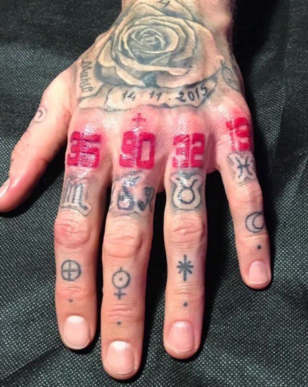
That contrast is part of the appeal. A portrait across the back needs room, while a birth date or initial can fit on a finger and still matter just as much. Ramos seems comfortable with both: a large new image one year, then small numbers that only make sense once someone asks.

Football photographs aren’t usually taken to show tattoos. Shirts, tape, armbands, sweat, and lighting can all hide or soften the work. Clear views tend to come from shirtless portraits, hand close-ups, and occasional post-match photos.

The family lettering is impossible to miss

Sergio Ramos family lettering chest and body tattoos

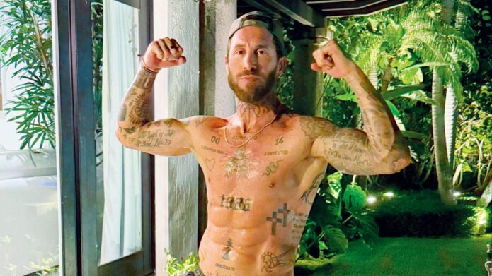
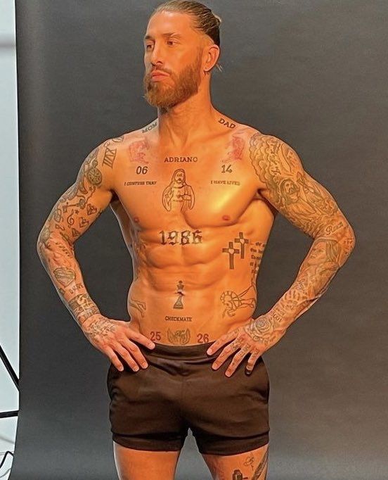
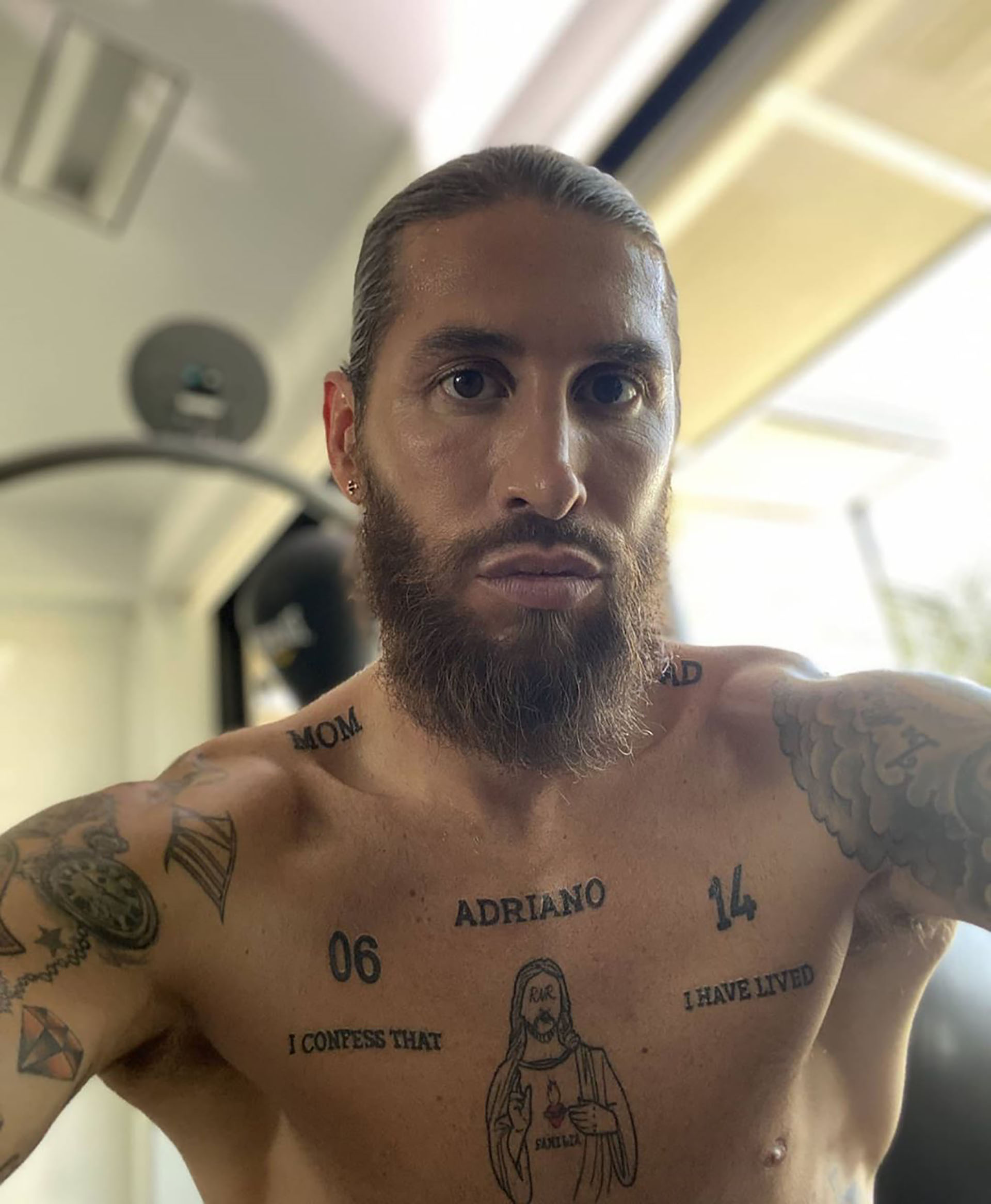
Ramos’s chest has some of the clearest personal lettering in the collection. “MOM” sits on one side, with “DAD” above the other shoulder. The words are simple and bold, giving a clear centre to his heavily tattooed body.

The name ADRIANO appears across his chest as a tribute to his son Máximo Adriano. Nearby numbers include 06 and 14, though explanations of every number vary. The family names are direct; the smaller numbers work more like private markers.

Beneath the central chest work, the phrase “I CONFESS THAT I HAVE LIVED” comes from Pablo Neruda’s memoir. It adds a reflective note to an area that already brings family, literature, and faith together.

His chest piece mixes Jesus, numbers and “1986”

Sergio Ramos Jesus chest tattoo and 1986 tattoo

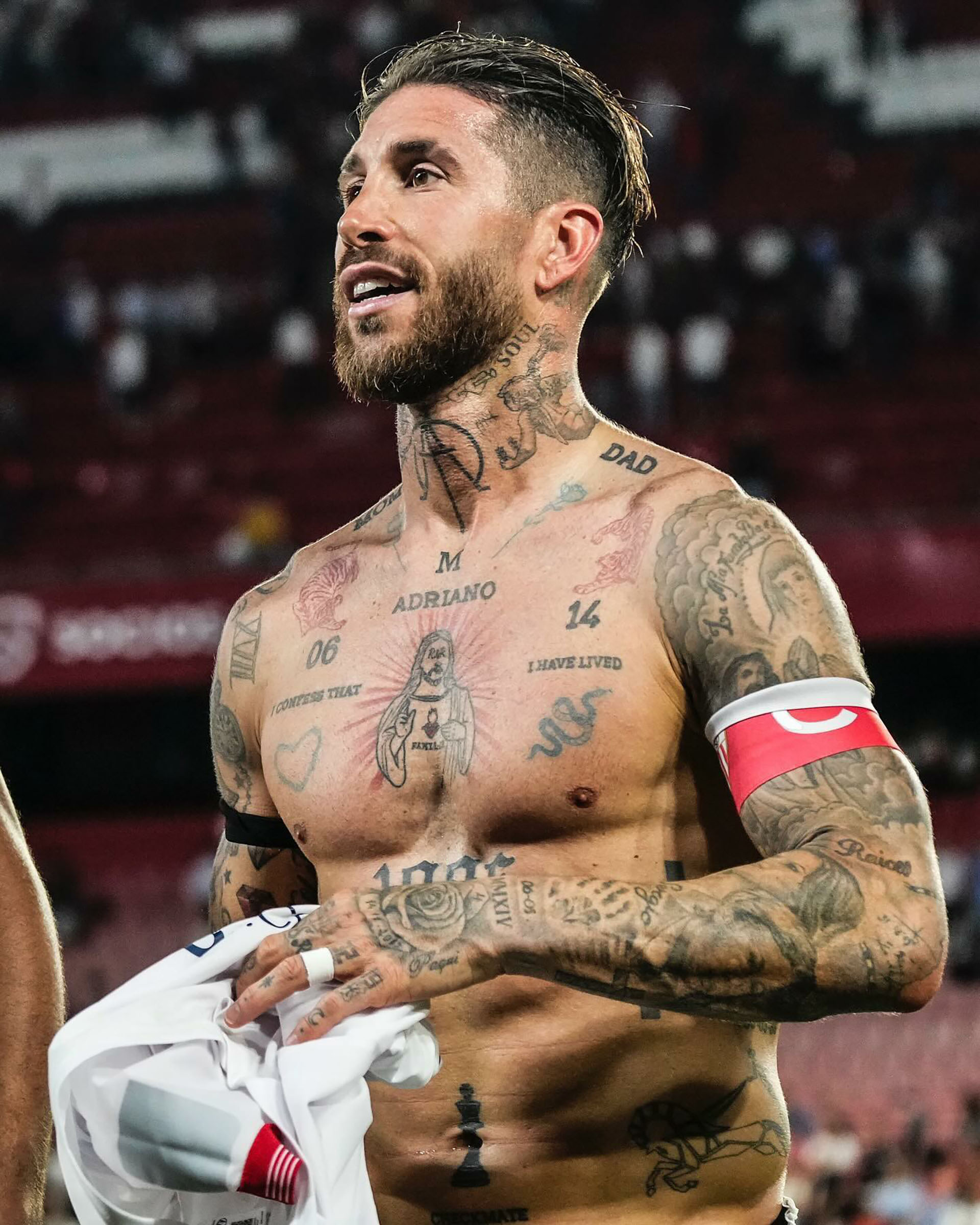
At the centre of Ramos’s chest is a figure of Jesus. The letters R and R appear around the design as a nod to Ramos and Pilar Rubio. It’s larger than the names and symbols nearby, making it the visual anchor of the torso.

Just below it is the large 1986, his birth year and one of the easiest details to spot in shirtless photos. Beneath and around the date are smaller images, including a chess design marked “CHECKMATE”.

The chess reference suits Ramos’s competitive, tactical, slightly theatrical way of talking about football. It doesn’t need a complicated private backstory to work. A pawn, a word, and a birth year make the stomach a small collection of personal markers.

The back is a full scene of lions, religious imagery and script

Sergio Ramos detailed back tattoo with lion and religious imagery

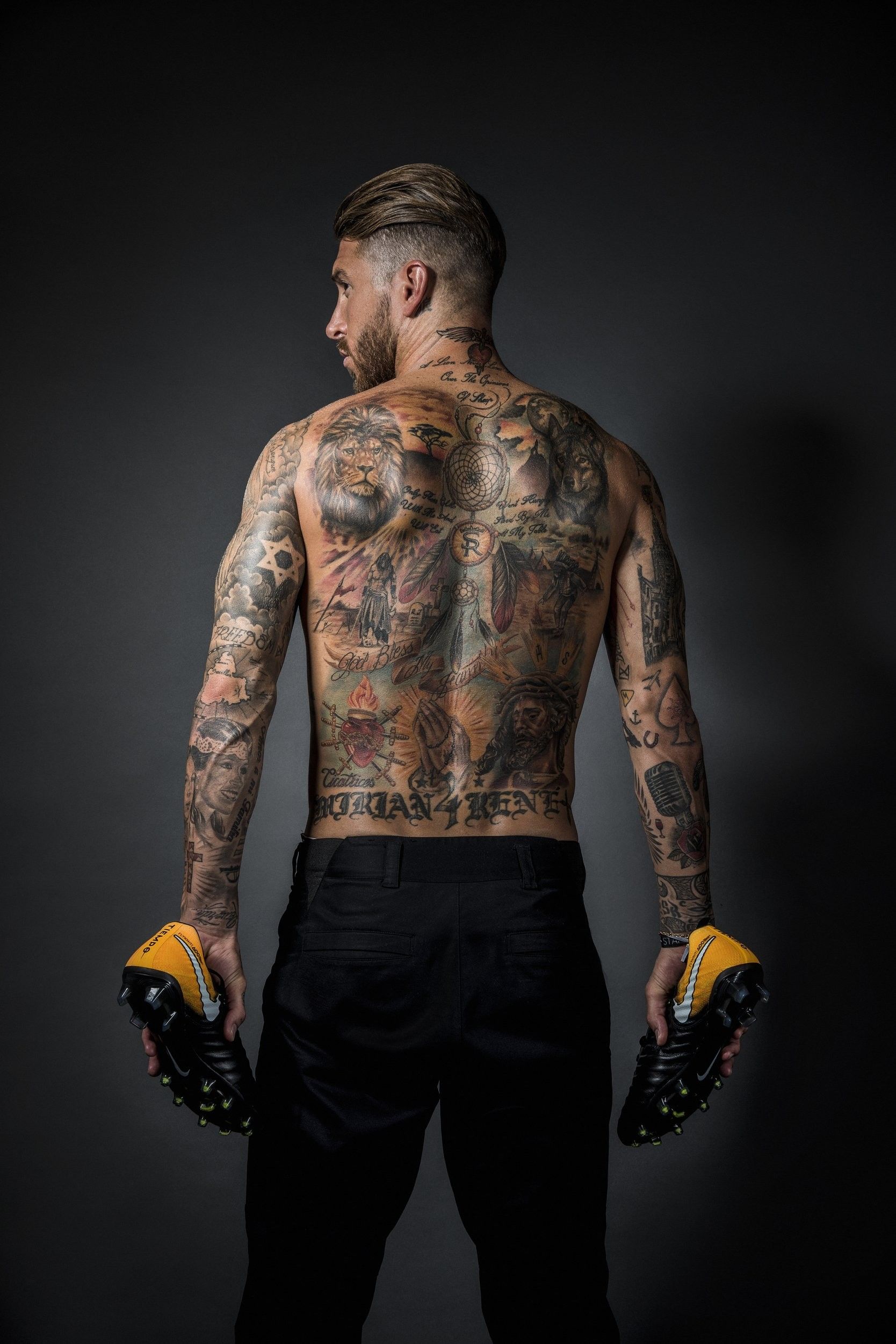
The scale grows on Ramos’s back. A large lion fills one side, with a dreamcatcher, religious images, figures, and long script around it. From a distance it reads as one composition, but there are many separate designs within it.

One photo shows “GOD BLESS MY FAMILY” across the lower back. It echoes the family words on his chest, while the back piece has a darker, more dramatic feel from the lion, clouds, and shaded figures.

A dreamcatcher and religious figures, including imagery connected with Jesus, appear elsewhere in the design. Ramos hasn’t publicly explained every part, so it’s better to describe the artwork clearly than invent meanings for each cloud or line.

Ramos uses numbers to record his football career

Sergio Ramos chest and neck tattoos after a football match

Football memories show up throughout Ramos’s tattoos. The best-known example is a set of hand numbers: 35, 90+, 32 and 19. They refer to different career moments, including early shirt numbers, his Spain debut, and the stoppage-time goal that became part of Champions League history.

His trophy tattoos follow the same idea. The World Cup, Champions League wins, and other major moments appear on his calves and legs, turning his body into a record of matches that matter to him. Rather than a generic ball or club crest, he often marks a specific number, date, or competition.

That’s why the tattoos feel so tied to his career. Ramos has played at the top level for long enough for the collection to grow with him. After a match, the designs show a player keeping track of the moments that shaped his path.

The hand tattoos carry dates, children’s details and career numbers

Sergio Ramos red knuckle number tattoos and rose hand tattoo

The hand work is smaller but just as full of detail. Red numbers across the knuckles stand out beside older black symbols, Roman numerals, and a rose. The date 14-11-2015 appears around the flower and has been connected with an important family moment.

Ramos has also used his hands for names, birth information, and symbols linked to his children. One account describes numbers recording details such as birth times and weights. It’s very much his approach: turn a personal fact into something permanent.

The rose softens the design, while the red numbers give it the feel of a small sports scoreboard. That contrast makes the hand tattoo stand out: sentimental, but still sharp and competitive.

The sleeves are packed with portraits, symbols and old-school pieces

Sergio Ramos tattooed arms and chest in shirtless portrait

Both arms carry portraits, lettering, religious designs, animals, and smaller symbols. From one angle the sleeves look traditional, with shaded faces and bold outlines. From another, the gaps and newer pieces make it clear the work was added over many years.

Ramos has tattoos connected to family, friends, and football figures, including a tribute to Antonio Puerta. Other designs refer to music and art, such as Michael Jackson and a Salvador Dalí-inspired elephant. Banksy-related images bring a more playful street-art note.

The sleeves aren’t one style. They shift from realistic portraits to text, symbols, and colour, making them look more like a personal collection than a matching set planned in one sitting.

Ramos also has visible tattoos on his neck, legs, and lower torso. The neck pieces show in shirtless photos, while the leg work includes trophies and other career memories. Some smaller designs only appear when he wears shorts or turns away from the camera.

One well-known lower-body tattoo is tied to the 2014 Champions League final in Lisbon. Another marks Spain’s 2010 World Cup win. These designs do the same job as the numbers on his hand: they keep important football memories close, long after a match is over.

There are more personal and unexpected designs lower down, including a Banksy-inspired figure and a toy associated with one of his children. That variety keeps the collection from becoming a list of trophies. Depending on where you look, the ink can be serious, religious, funny, or sentimental.

Taken as a whole, Ramos’s tattoos are detailed and full of references. Family names sit beside religious figures; career numbers share space with portraits, flowers, and old-school symbols. Some meanings are confirmed, others are widely reported, and a few can’t be known from a photograph.

That uncertainty is part of the appeal. Ramos clearly likes tattoos that preserve something: a child’s birth details, a World Cup, a late goal, or a person he wants to remember. He doesn’t need one neat theme to tie it all together.

One photo is never enough for a heavily tattooed footballer. A front view catches the family lettering and 1986; a back view shows the lion and dreamcatcher; close-ups reveal the red numbers on his hand. Together, the photos make the collection easier to follow.

Ramos’s body art is busy, but not random. It records years of football, family, and personal references in different styles. The pieces don’t all have the same mood, and that’s what makes the collection feel like his.