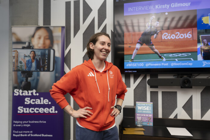
Kirsty Gilmour’s tattoos read like a compact scrapbook of a long badminton career. There are Olympic symbols, small marks for medals, a croissant, a Scottish landscape and a few pieces that are much more private. None of it feels like a random flash collection. The designs are tied to places, tournaments, memories and little reminders that make sense on her body even when they are not explained to everyone else.
What makes the collection especially interesting is that Gilmour has actually talked through the tattoos in a recent interview. That gives us a much firmer starting point than a blurry courtside photograph or a fan-made list. The photographs show the ink clearly, while her own comments explain what the pieces mean. Where she has not offered a full explanation, it is better to leave the gap alone than fill it with a guess.
What is actually documented
The strongest record comes from Gilmour’s 2026 Outlook India interview around the BWF World Championships. She rolled up her sleeve, pointed out pieces on her arms and discussed tattoos on her ribs and ankles. The interview identifies several designs: upside-down lettering that says make good choices, a north-coast Scottish landscape, Olympic rings, medal dots, Mount Fuji, a croissant, a small Commonwealth Games piece, a plant pot, an infinity sign and the words it’s gonna be okay.
That is already a lot of information, but the collection is still easy to read. Gilmour has not tried to turn every inch of skin into one continuous sleeve. Instead, the tattoos sit as separate notes. Some are easy to spot during a match, while others appear only when she points them out or wears shorter clothing. That mix of public and private placement is part of the appeal.
The upside-down make good choices tattoo
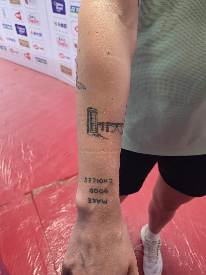
The lettering is probably the most personal piece in the group. Gilmour explained that it is the right way up for her, which means it appears upside down to anyone looking at it from the outside. The phrase is make good choices, and she connected it to the 2019 film version of Little Women, specifically Saoirse Ronan’s necktie and collar.
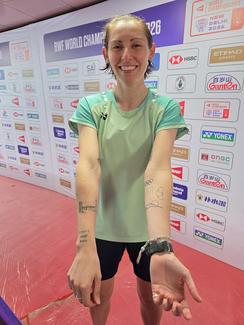
There is a smart idea behind the placement. The tattoo is not arranged like a message for strangers to read. It is oriented toward the wearer, so the reminder belongs to Gilmour first. That gives a familiar phrase a more private feeling. If you like text tattoos, this is a useful reminder that direction, spacing and audience matter just as much as the words themselves.
The Scottish landscape arm tattoo
Another arm tattoo shows a landscape from the north coast of Scotland near Lossiemouth. Gilmour described a phone box on the bridge that leads to the beach. It is a specific memory, and that specificity is what keeps the design from feeling like a generic landscape tattoo. The subject is not simply mountains or a coastline. It is one small route, one familiar view and the objects that make the place recognizable.
The visible photograph shows fine linework rather than a heavy illustrative scene. A phone box, bridge and horizon can be reduced to a handful of dark marks if the composition is planned carefully. It is the sort of tattoo that rewards a close look. From a distance it reads as a small linear landscape; up close, the personal details begin to appear.
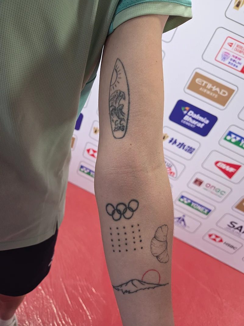
Olympic rings and medal-dot arm tattoos
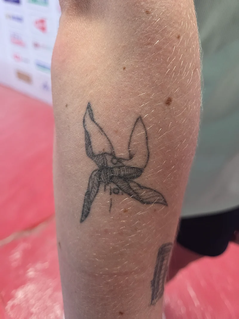
Gilmour’s Olympic rings mark her experience at Rio, but the nearby dots add another layer. She described them as records of major medals and titles. The idea is simple: a large career achievement does not need a huge trophy tattoo. A row of small dots can work as a private visual tally, especially when the person wearing it already knows exactly what each one represents.
This is one of the clearest examples of how her collection turns sport into a visual language. The rings identify a particular Olympic memory, while the dots keep accumulating as her career changes. The design can grow without needing to be redrawn from scratch. It is minimal, but not empty. Every mark has a job, and the spacing leaves room for future additions.
Mount Fuji for Tokyo 2020
Mount Fuji is another competition memory, this time linked to Tokyo 2020. In the close-up photograph, the mountain sits within a small travel-like scene with sun and wave shapes. It is not a literal tournament logo, and that is what gives it more character. The tattoo can point to Tokyo without looking like branded event merchandise.
A mountain is also a practical subject for a small tattoo. The outline stays recognizable when reduced, while a few interior lines can suggest distance, weather or landscape. Gilmour’s version appears deliberately light and open. If you are drawn to destination tattoos, the useful lesson is to choose one image that carries the place for you instead of squeezing an entire itinerary into a tiny patch of skin.
The croissant that marks Paris
The croissant is one of the collection’s most charming designs. Gilmour said it marks Paris 2024, which gives the small food illustration a clear place in her personal timeline. It is playful without being throwaway. Paris is represented through something ordinary and instantly recognizable rather than through a large landmark or a formal Olympic emblem.
That choice fits the rest of the collection. The best tattoo references do not always need to be grand. A croissant can hold a trip, a competition and a whole period of life if the object is tied to a real memory. It also gives the collection a change of rhythm. Among rings, dots, lettering and landscapes, the little pastry keeps the group from becoming too solemn.
The Gold Coast piece and career milestones
Gilmour also has a small tattoo connected to the bronze medal she won at the Gold Coast Commonwealth Games. The detail is less widely described than the Olympic pieces, but the purpose is clear: a medal can be remembered through a compact symbol instead of a literal date or result. That keeps the tattoo open to her own reading while still anchoring it to a real achievement.
Alongside the medal dots, it creates a kind of shorthand for a career that has included close finishes, major tournaments and long stretches of international competition. The marks do not need to explain the entire story to a stranger. They work because Gilmour knows the order in which they arrived. For anyone considering a sports tattoo, that is a more personal approach than copying a jersey number or a team crest.
A private rib detail
The rib tattoos are a little less tied to a named tournament. Gilmour described a plant pot and an infinity sign there, calling them the more stereotypical pieces in her collection. That comment is funny, but it also shows that she is not treating every tattoo as a carefully coded career monument. Some pieces can simply be part of the visual mix.
Rib placement changes how a tattoo is seen. The designs may be hidden under training clothes and only appear in specific photographs or when Gilmour chooses to show them. Fine lines can follow the curve of the body, while open space keeps the area from feeling crowded. The plant pot adds a small object with a soft, domestic feel; the infinity sign brings in a familiar symbol without taking over the collection.
The ankle reminder that stays mostly private
On her ankles, Gilmour has the words it’s gonna be okay. She said the tattoos are usually hidden by long socks, which makes them the quietest pieces she discussed. That placement matches the message. It is not designed for a camera or a crowd. It is there to be carried through a day, a match or a difficult stretch of training.
Small ankle lettering needs careful planning because the skin moves, socks rub against it and the available space is limited. A short phrase works better than a crowded sentence, and clean spacing matters more than decorative detail. Gilmour’s wording is direct. It does not need a symbol beside it to make the point.
How the photographs help without inventing anything
The close-up photographs from the Outlook interview are valuable because they show genuine ink at a useful distance. One view gives the whole arm, another isolates the bridge and lettering, and another makes the Olympic rings, dots, croissant and mountain scene easier to compare. Those are different views of a documented collection, not evidence of a dozen unrelated new tattoos.
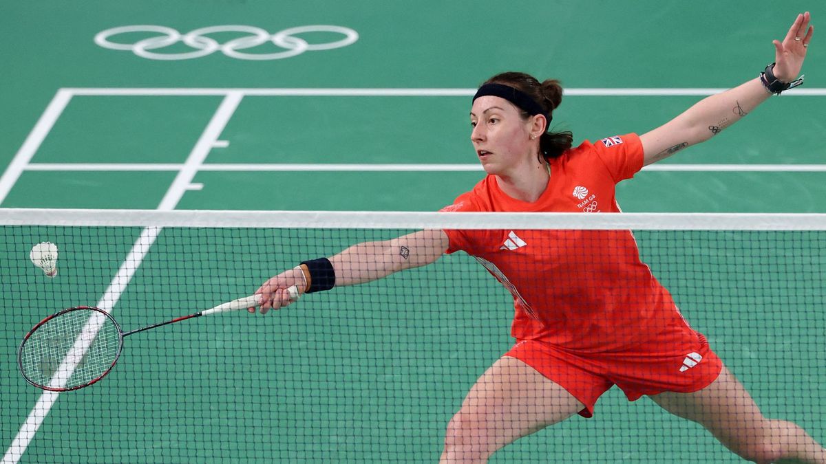
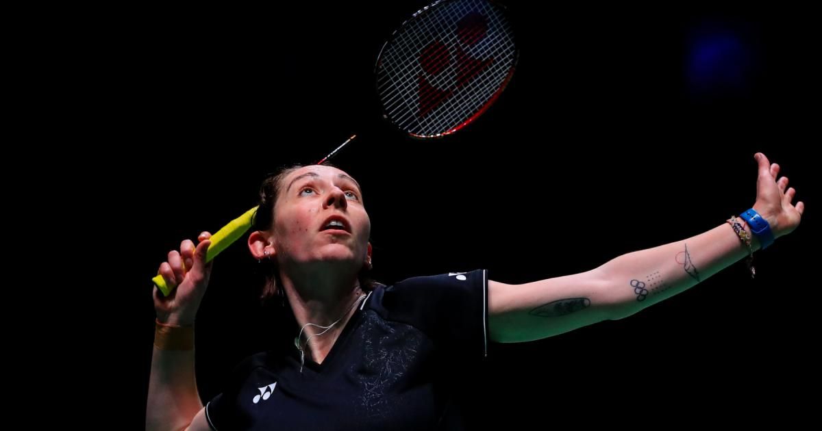
The wider sports photographs serve a different purpose. They show Gilmour in the setting where most fans see her: on court, moving fast, wearing competition kit and using her arms naturally. Tattoos can be visible in those pictures, but the images are contextual rather than detailed tattoo proof. Keeping that distinction clear makes the article more trustworthy and prevents a background mark from being over-described.
Why the collection feels like a career map
Gilmour’s tattoos do not follow one rigid style, but they do share a habit of being specific. A phone box on a bridge says more than a generic Scottish outline. A croissant says more than a plain Paris wordmark. Dots can hold several medals without turning the arm into a scoreboard. Even the text pieces have different audiences: one is for her to read, while the other is a private reassurance kept under socks.
That variety is what makes the collection feel lived in. Some tattoos are tied to a place, some to a tournament and some to a mood. They do not need to match perfectly because they share a reason for being there. The result is closer to a personal archive than a coordinated set designed all at once.
Ideas to borrow without copying
If you like Gilmour’s tattoos, borrow the method rather than copying the drawings. Start with a place you can identify down to one object, a career moment that still feels real or a phrase you would actually want to see during a hard week. Then ask your tattooer to translate that reference into a scale and line weight that will age well on your body.
The Olympic rings and medal dots are a good example of restraint. The landscape shows how a tiny scene can stay personal when it includes a specific detail. The croissant proves that a playful image can carry serious memory. The ankle phrase shows that the best placement may be the one nobody else sees. Those are all useful ideas without pretending your life is the same as an elite athlete’s.
The honest takeaway
Kirsty Gilmour’s tattoos are interesting because they are concrete. They remember Rio, Tokyo, Paris, the Gold Coast and the Scottish coast, but they also leave space for ordinary choices and private reminders. The collection includes symbols, landscapes, lettering and small objects without forcing everything into one theme.
The strongest lesson is simple: choose details that belong to you. A meaningful tattoo does not need a dramatic explanation, and a contextual photograph should not be mistaken for tattoo evidence. Gilmour’s ink works because each mark has a real anchor, whether that is a film collar, a phone box, a medal, a pastry or a quiet sentence on the ankle. That kind of real memory will always outlast a design picked just because it looked good on somebody else.