Athletes

Georgia Stanway’s 100-Plus Tattoos: Tiny Symbols, Big Football Memories

Georgia Stanway’s tattoos aren’t built around one giant sleeve. Small symbols, short bits of lettering, football memories, and other marks are spread across her arms and legs. Together they form a record of her life in football.

Stanway has said she has more than 100 tattoos, adding to the collection as her career moved from Manchester City to Bayern Munich, England, and Arsenal. Many designs are small enough to disappear under a shirt or socks, so they’re easiest to spot in a close-up or a relaxed photo after a match.

She has also taught herself to tattoo and has worked on team-mates. The story is not only about what’s on her skin, but how she treats tattooing as a creative outlet away from elite football. Here’s a look at documented pieces, while leaving the meaning of tiny marks open when it hasn’t been explained.

Georgia Stanway’s small arm tattoos are the heart of the collection
Georgia Stanway scattered forearm tattoos

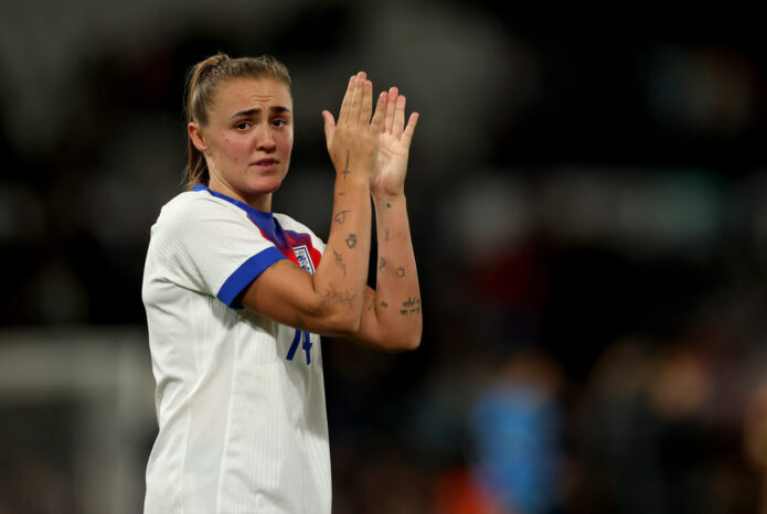
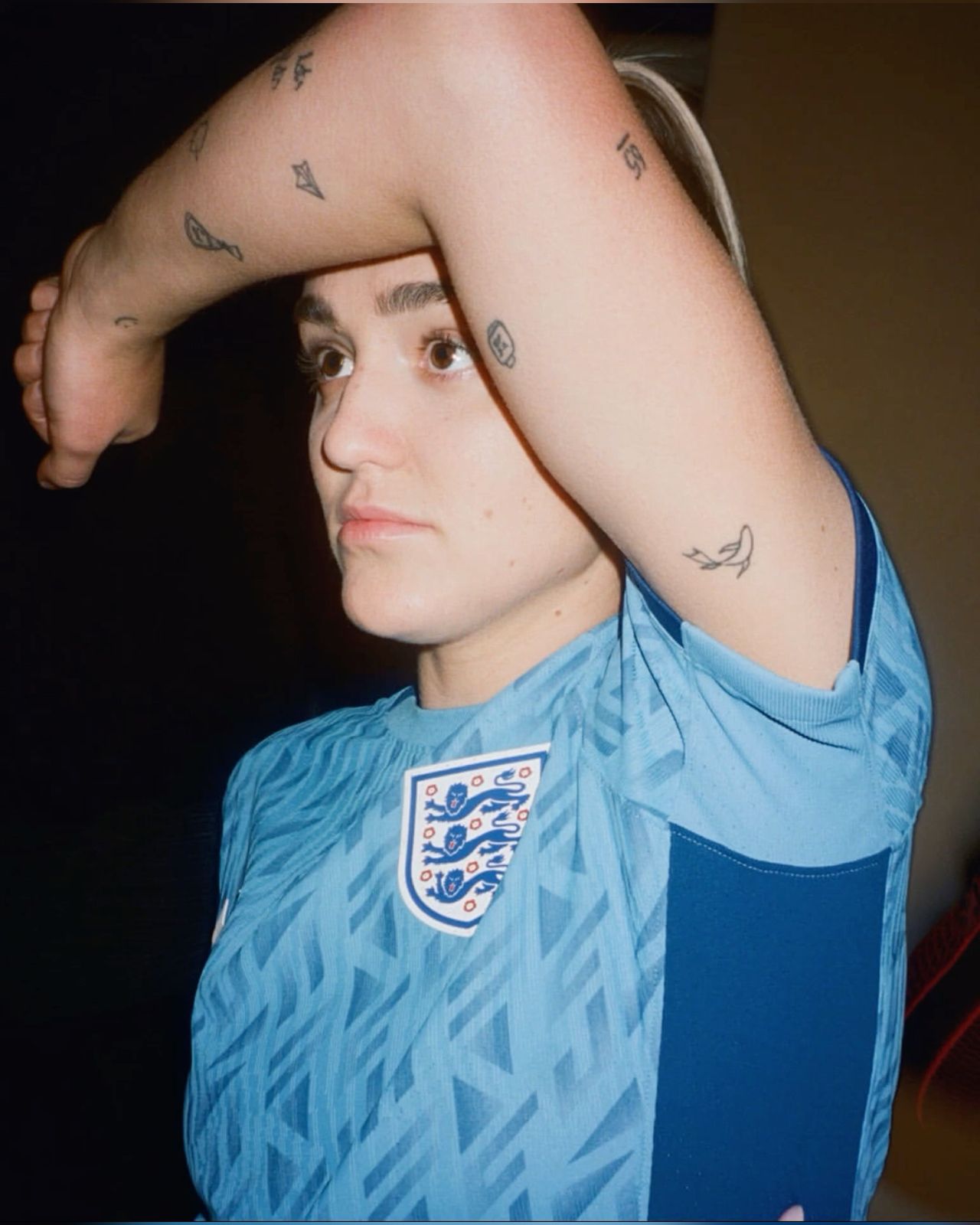
Most photos of Stanway’s tattoos begin with her arms. The designs are small, fine-lined, and spaced out rather than packed into one dark block. A close-up from an England photo shows little shapes on her upper arm and forearm, including simple outlines and symbols that look almost like doodles.

That patchwork look is central to her style. She likes small designs that can sit alongside one another over time rather than planning a huge piece from the start. One tattoo may be a personal reminder, another may be about football, and a third may simply be something she liked enough to keep.

It’s worth being cautious about identifying every tiny image. A blurry match photo can make a line look like a letter or turn a small icon into something else. The broad picture is clear: Stanway has many small arm tattoos, but the meaning of each isn’t always public.

The “Whatever the Weather” tattoo marks her move to Arsenal
Georgia Stanway Whatever the Weather forearm tattoo

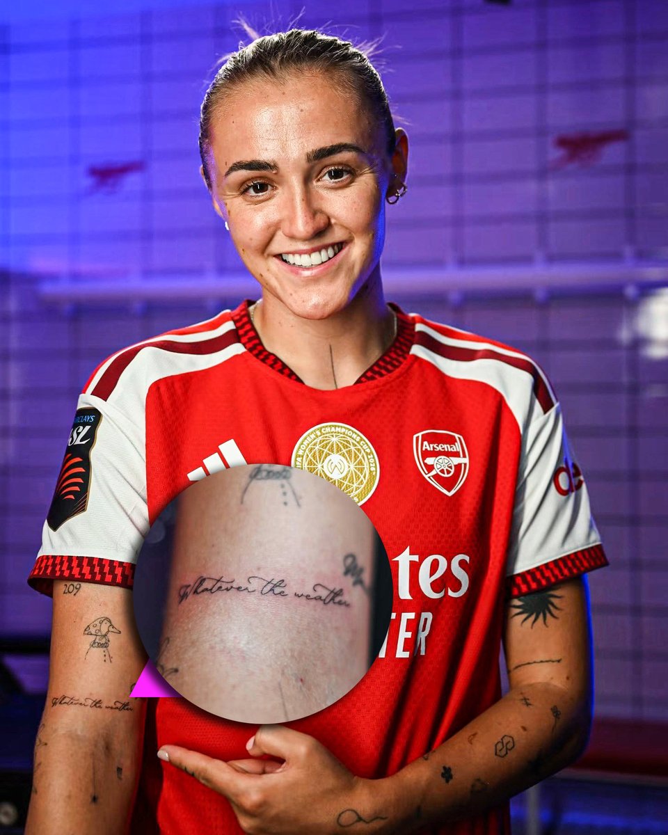
One of Stanway’s clearest tattoos is “Whatever the Weather” on her forearm. The phrase appeared around the time she moved to Arsenal and fits the attitude she has brought to the next stage of her career.

The loose script feels more personal than a block club logo. It stands on its own as a reminder to stick with something through both the good days and the difficult ones.

The timing gives it another layer. Stanway spent four seasons at Bayern Munich before returning to England, and the tattoo marks a transition between chapters. By then she already had a large collection, but this phrase connects to a specific football decision.

“HOME” sits beneath a small arch of stars
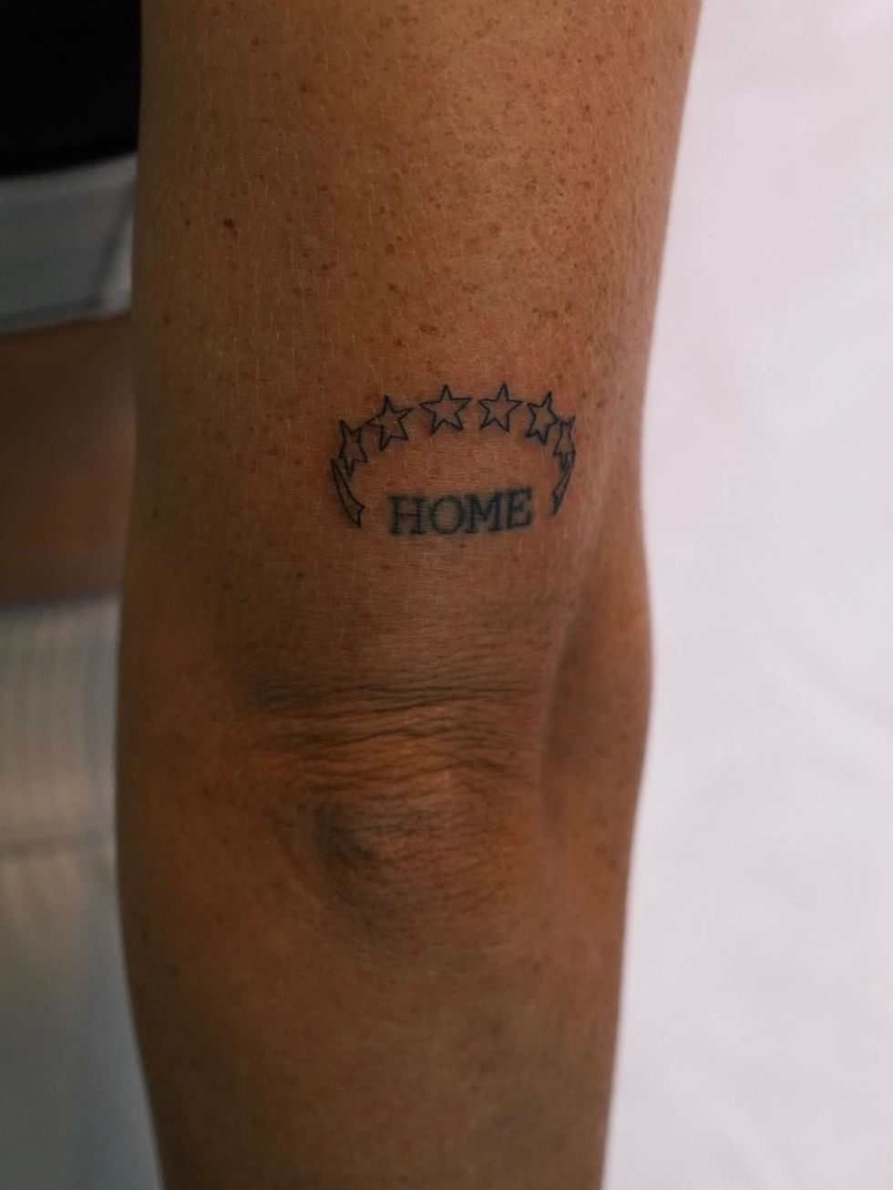
Georgia Stanway HOME stars forearm tattoo

Another clearly documented piece is “HOME” under an arch of stars. It sits on her arm just above the elbow in simple black lettering. The stars curve above the word, giving it the feel of a small badge or sign.

It’s tempting to settle on one meaning, especially with Stanway moving between England and Germany. But the design could work on several levels: family, the north of England, football, or the people and places that keep her grounded while she travels.

The stars are worth noticing, too. They don’t necessarily stand for a trophy. Visually, they finish the lettering and give the small tattoo a shape that reads from a distance.

Football memories show up as numbers and tiny milestones
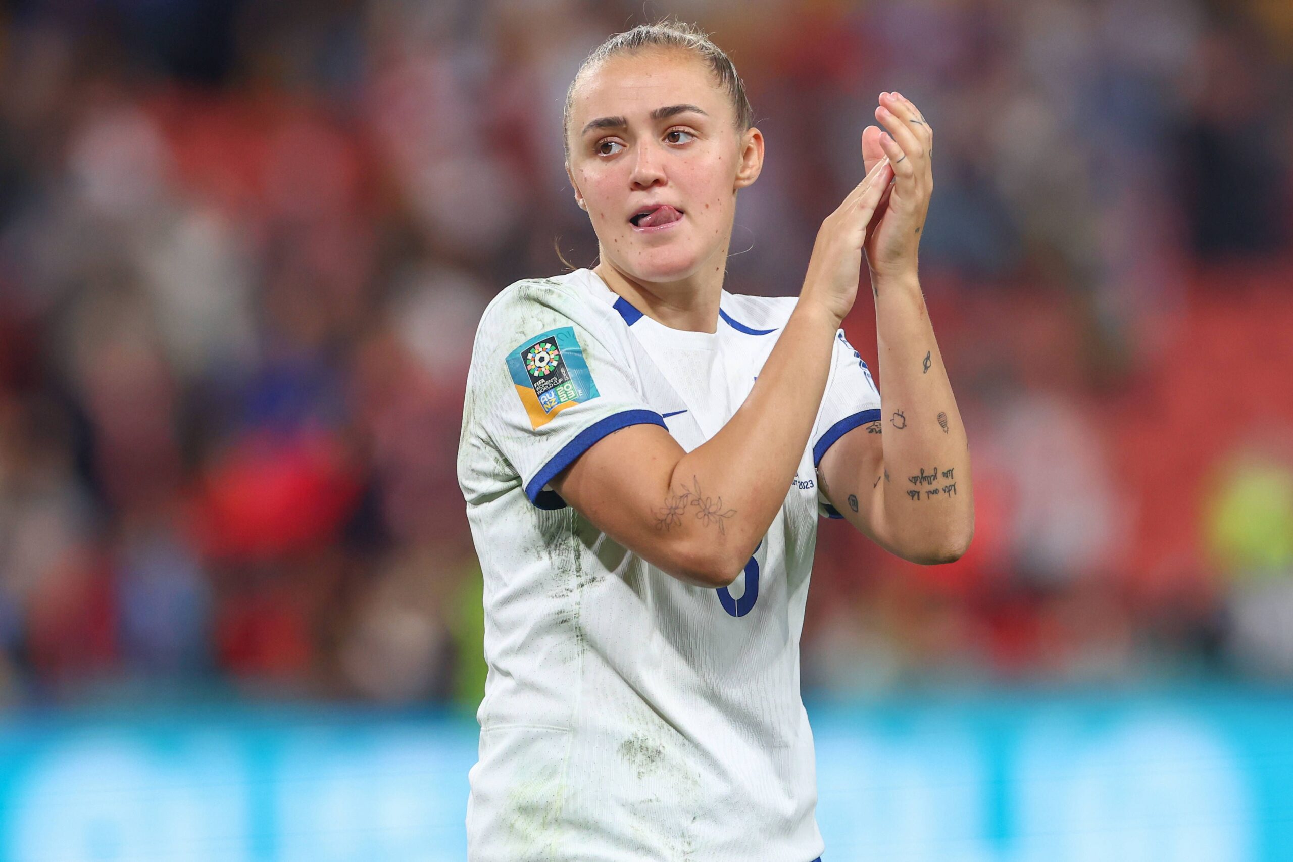
Georgia Stanway England arm tattoos

Stanway’s football tattoos often mark specific moments rather than general fandom. One well-known example is 19:32, the time the final whistle sounded in England’s Euro 2022 final win. It’s a detail only she may think about every day, which is part of why it works.

She has also shown the Roman numeral II on the back of her arm, representing England’s two European Championship wins. It’s a small mark for a huge achievement: two tournaments and a second victory that changed the story again.

Other football references include her number 31, which became closely associated with her Bayern Munich years. Photos don’t always make it clear whether a number is on her shirt or skin, so it’s safest to rely on what Stanway has explained and what close-up images show.

The Olympic rings connect the tattoos to her wider career
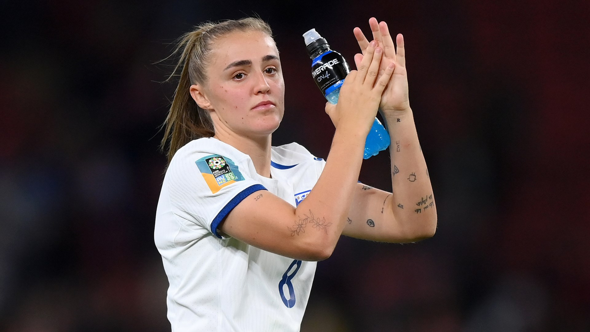
Georgia Stanway wrist and arm tattoos

Stanway also has the Olympic rings, a simple design linked to another part of her football journey. The familiar symbol needs little decoration and marks her experience representing Great Britain on a major stage.

This tattoo helps make the collection feel like a diary. The rings don’t try to explain the full tournament or recreate a medal; they simply mark that she was there. The same idea appears in the time tattoo and Roman numeral: a short visual cue carrying a much larger memory.

The rings can be hard to see in photos because her arms are often covered by sleeves, tape, or warm-up layers. One clear image is more useful than a dramatic portrait where the tattoo disappears into shadow.

Her legs give the collection more room. Bayern Munich photos show tattoos on her thigh, including floral details, a cherub-like figure, and the number 31. Compared with the small forearm marks, this area looks like a more deliberate group.

The number 31 is easy to connect to her Bayern years, but the surrounding imagery deserves caution. A photo can show a cherub, flowers, and lines without confirming a private story for each. The visual details are clear, even when the personal explanation isn’t.

That contrast makes the leg work interesting. The arms feel like a running list of small ideas; the thigh pieces have more weight because they can be viewed together. They still fit Stanway’s small-tattoo style, but have more room to breathe.

Stanway’s tattoo hobby changed how she sees the craft
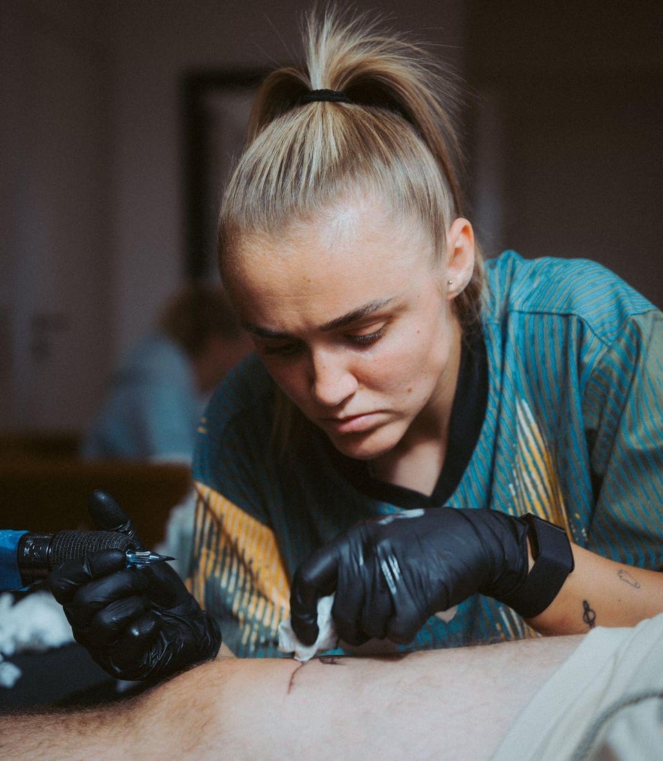
Georgia Stanway tattooing a client

Stanway’s interest grew beyond a personal hobby after she moved to Munich. She began practising with a machine on artificial skin before working on people. She has mentioned the added pressure of tattooing team-mates, knowing she would see the results at training every day.

That gives the rest of the collection context. Stanway isn’t only gathering tattoos; she’s learning how they’re made. Her own style leans toward small icons, simple line work, and a patchwork approach. The designs don’t need to match perfectly because each can arrive at a different time.

She has tattooed friends and team-mates, including designs related to their football stories. That doesn’t mean she did every tattoo on her own body, but it explains why the craft has become part of her life away from the pitch. As she said in an interview, “I’ve always had a love for tattoos.” The interest clearly goes beyond a passing trend.

Some tiny marks relate to family, home, or people around her. Others have been described as drawings or simple symbols rather than named designs. That’s normal for a collection this large; not every tattoo comes with a full explanation.

It’s more useful to see Stanway’s ink as a changing collection than a finished set. New marks appear, older ones sit alongside them, and certain tattoos only show in particular photos. Their small scale makes the overall look feel personal instead of staged.

Together, the tattoos tell a relaxed story. There are major career memories in the Olympic rings, 19:32, and the Roman numeral II, alongside tiny doodles, lettering, stars, and shapes she may simply have liked. That mix keeps the collection from feeling like a list of trophies.

Stanway’s tattoos are busy without looking over-planned. They build like a football career: one choice, one season, one memory at a time. Some have clear meanings; others are small pieces of ink only she fully understands.

The best photos show the tattoos clearly without making her look like a display stand. Close-ups of her arm, “Whatever the Weather,” the HOME design, her thigh, and match photos each reveal something different. Together, they show why her ink deserves more than one generic portrait.
Miles Chamley-Watson’s Tattooed Arms: Sleeves, Self-Belief and a Legacy in the Making

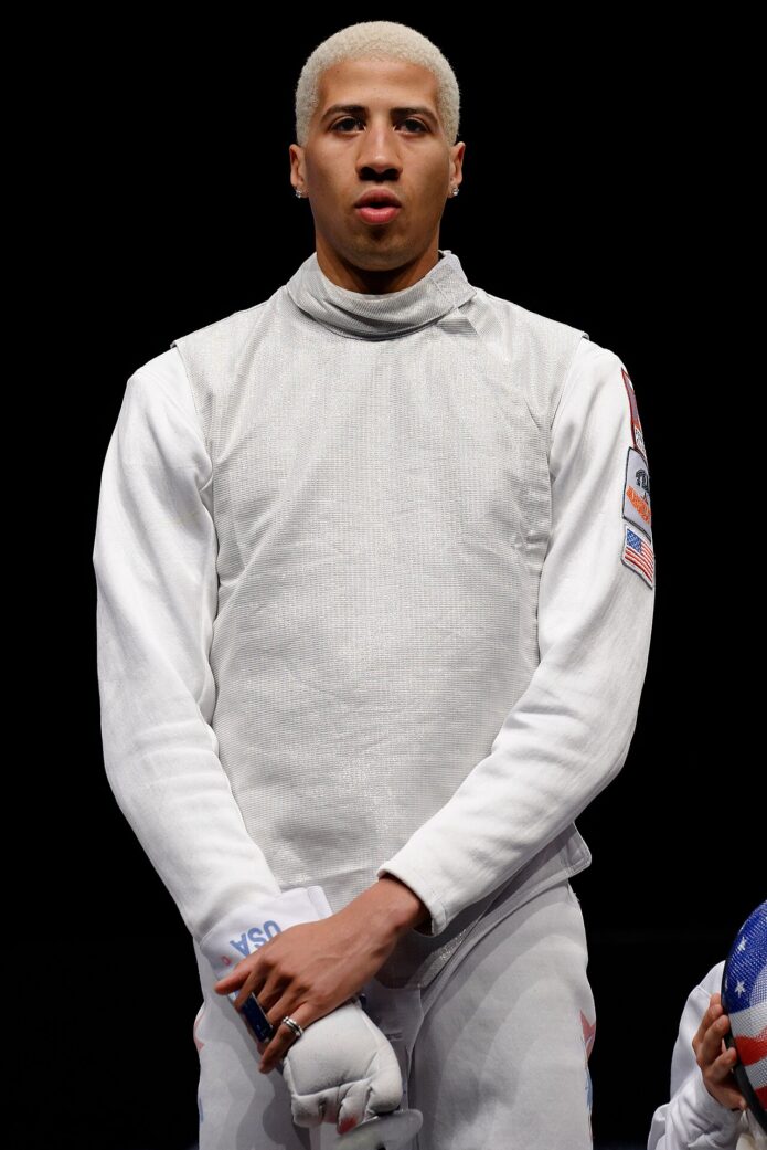
Miles Chamley-Watson’s tattoos are part of what makes him so easy to recognise. He is an Olympic fencer and model, and the ink on his arms stands out in fashion shoots, interviews and fencing photos, especially when he takes off the jacket.

There is no official inventory of every mark, so the clearest guide sticks to tattoos he has discussed or that are easy to see. GQ’s tattoo tour says his first tattoo came before the 2012 Olympics. TIME later described him as heavily tattooed and wrote about the personality he brings to fencing. Together, those accounts give a useful timeline without assigning a story to every small patch of ink.

The tattooed sleeves became part of Chamley-Watson’s fencing identity

Miles Chamley-Watson tattoos: tattooed sleeves

The first thing most people notice is the extensive work covering both arms. The sleeves stand out against the white fencing uniform; when Chamley-Watson lunges or lifts his weapon, the ink becomes part of the silhouette.

The arms do not look like one design running from shoulder to wrist. They seem to be made up of separate pieces added over time. In a wide portrait, the sleeve can read as one dark shape. A closer image shows different line weights, shaded areas and patches of open skin.

That distinction matters. Reporting confirms the size of the sleeves and their place in Chamley-Watson’s public image, but it does not explain every small symbol. If a mark is too blurred to identify, it is better to leave it unclear than guess.

His fencing gear also changes what is visible. Gloves, the jacket and the mask can hide parts of his arms. In a fashion shoot, the styling leaves more of the tattoos on show, which is why the sports photos are useful alongside GQ’s more controlled footage.

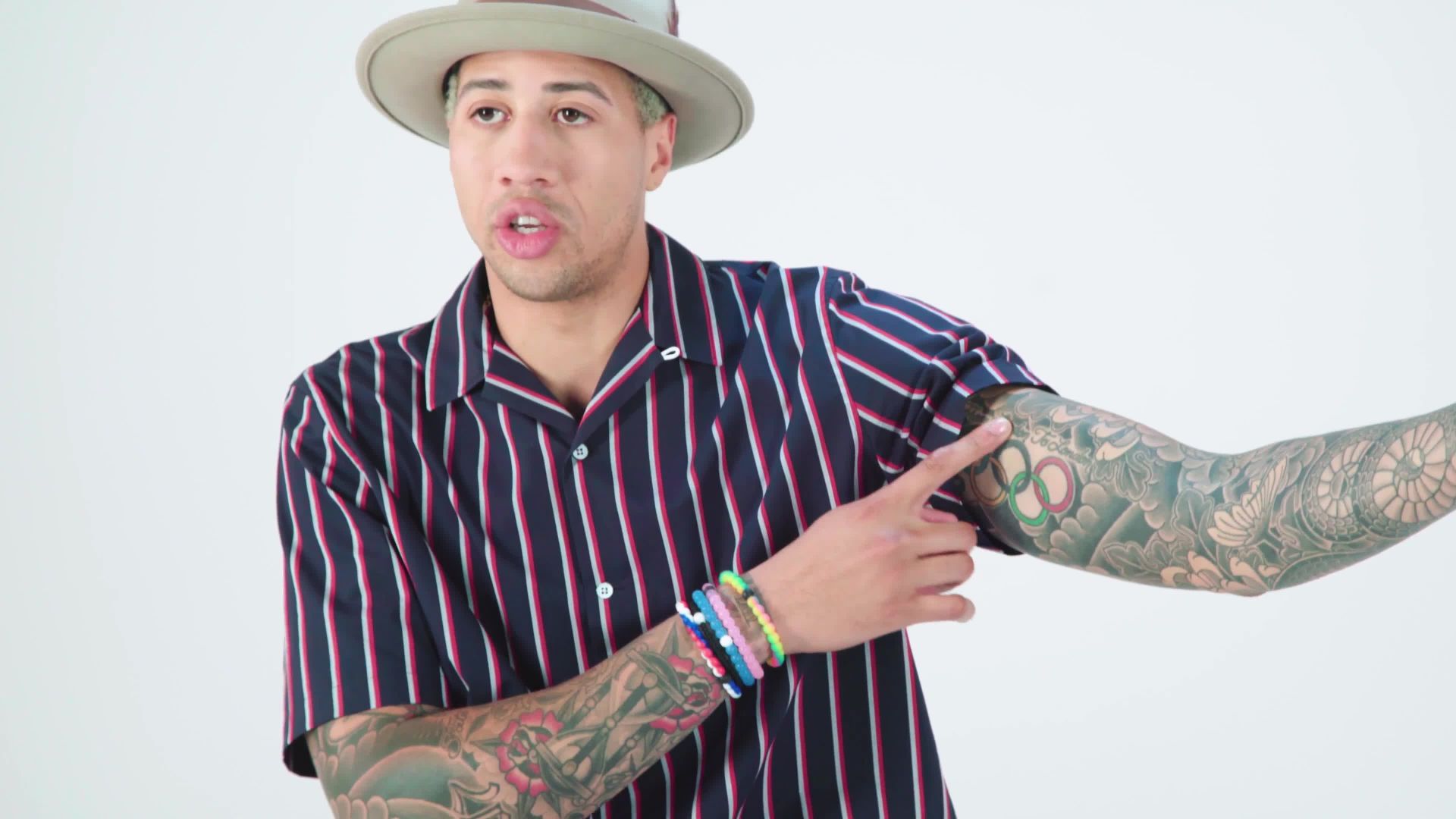
The GQ tour supplies a few details in Chamley-Watson’s own words. He points out writing on the inside of his arm and connects his first tattoo with London, where he grew up. He also shows “Create a legacy, not a moment” within the wider sleeve.

Those words make the arms feel more personal. One tattoo carries a connection to home; another states a principle. The rest of the sleeve gives them visual company. That is more useful than counting every shape as if it came with a published explanation.

His first tattoo arrived before the 2012 Olympic breakthrough

Miles Chamley-Watson tattoos: forearm and hand tattoo detail

In GQ’s tattoo tour, Chamley-Watson says his first tattoo came before the 2012 Olympics. That gives the collection a starting point, but it does not mean the full sleeve was already there. His arm work grew over time as his fencing and fashion careers developed.

The timing is notable because the tattoo predates his recognition outside the sport. It belongs to the years when he was building the athletic identity that later made him stand out in a discipline usually seen through white uniforms and formal poses.

A close photo is more helpful than a competition shot for the early arm and hand pieces. A wide frame shows the sleeves; a nearer one gives a better sense of where particular tattoos sit. The interview adds the context that he started young and continued adding work.

It is useful to keep the dates separate. His first tattoo came before the Olympic breakthrough, but that is not the date of every piece visible today. The sleeves seen now took shape across later years.

The London connection is a simple personal anchor. There is no need to add a dramatic story: he grew up there, got his first tattoo before 2012 and later built a much larger visual identity around it.

The sleeve is a group of separate images, not one flat block of ink

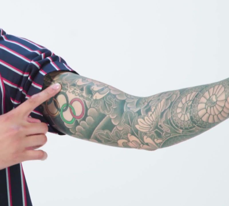
Miles Chamley-Watson tattoos: close detail of his sleeve and forearm tattoos

The close-up makes the sleeve easier to read. It shows overlapping lines, shading and ornamental shapes rather than one emblem stretched from shoulder to wrist. Some parts are dense; others leave skin visible. The mix gives the arm a sense of movement.

“Sleeve” is a useful description, but it is not a full inventory. A photograph can show that the forearm is covered without proving whether a small shape is a face, a bird or an abstract flourish. GQ’s tour is more informative because Chamley-Watson turns his arms for the camera and talks about the pieces he chooses to show.

The photograph establishes placement and design; his comments supply meaning where he has offered it. The other marks can stay descriptive. There is no need to invent a private story for every shaded patch.

The sleeves also change how people see him as an athlete. In full fencing kit, much of the ink is hidden under the jacket. Once it comes off, the contrast is immediate: the sport gives him one silhouette, and the tattoos add another part of his public identity.

The neck and torso details add another layer

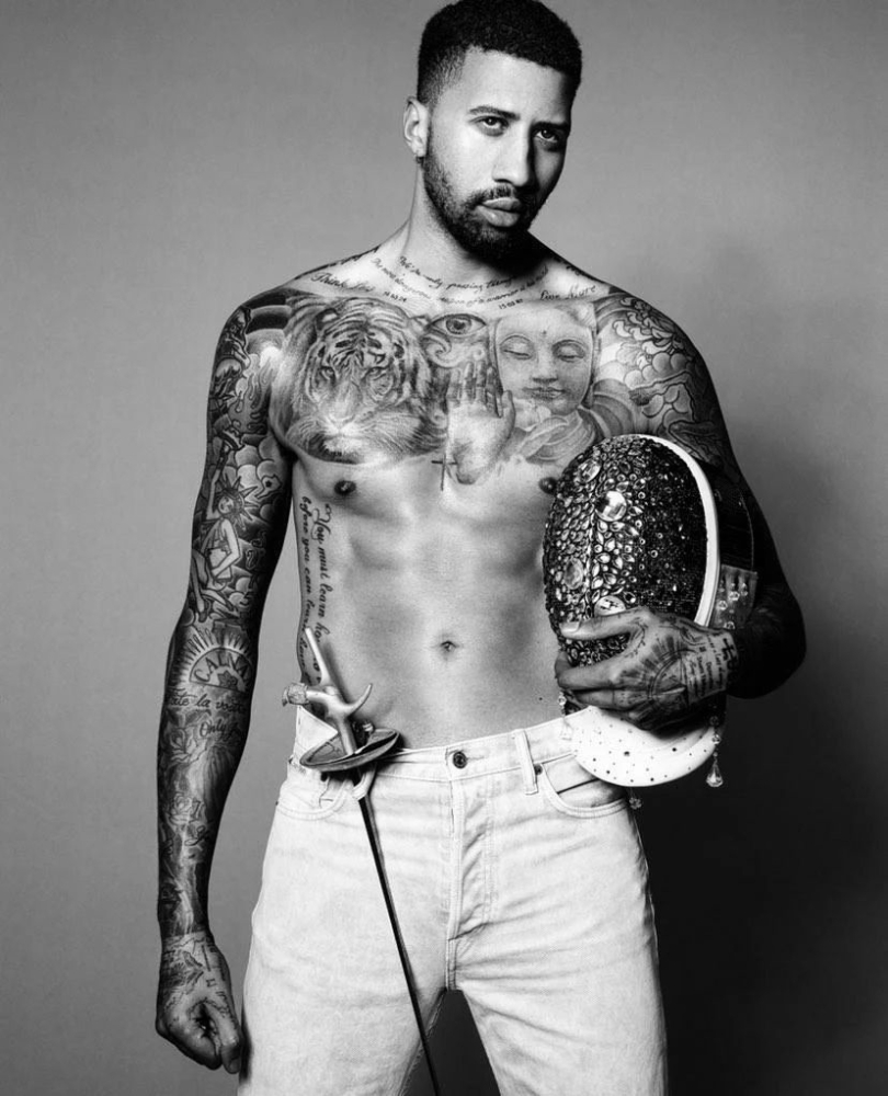
Miles Chamley-Watson showing his tattooed torso and arms

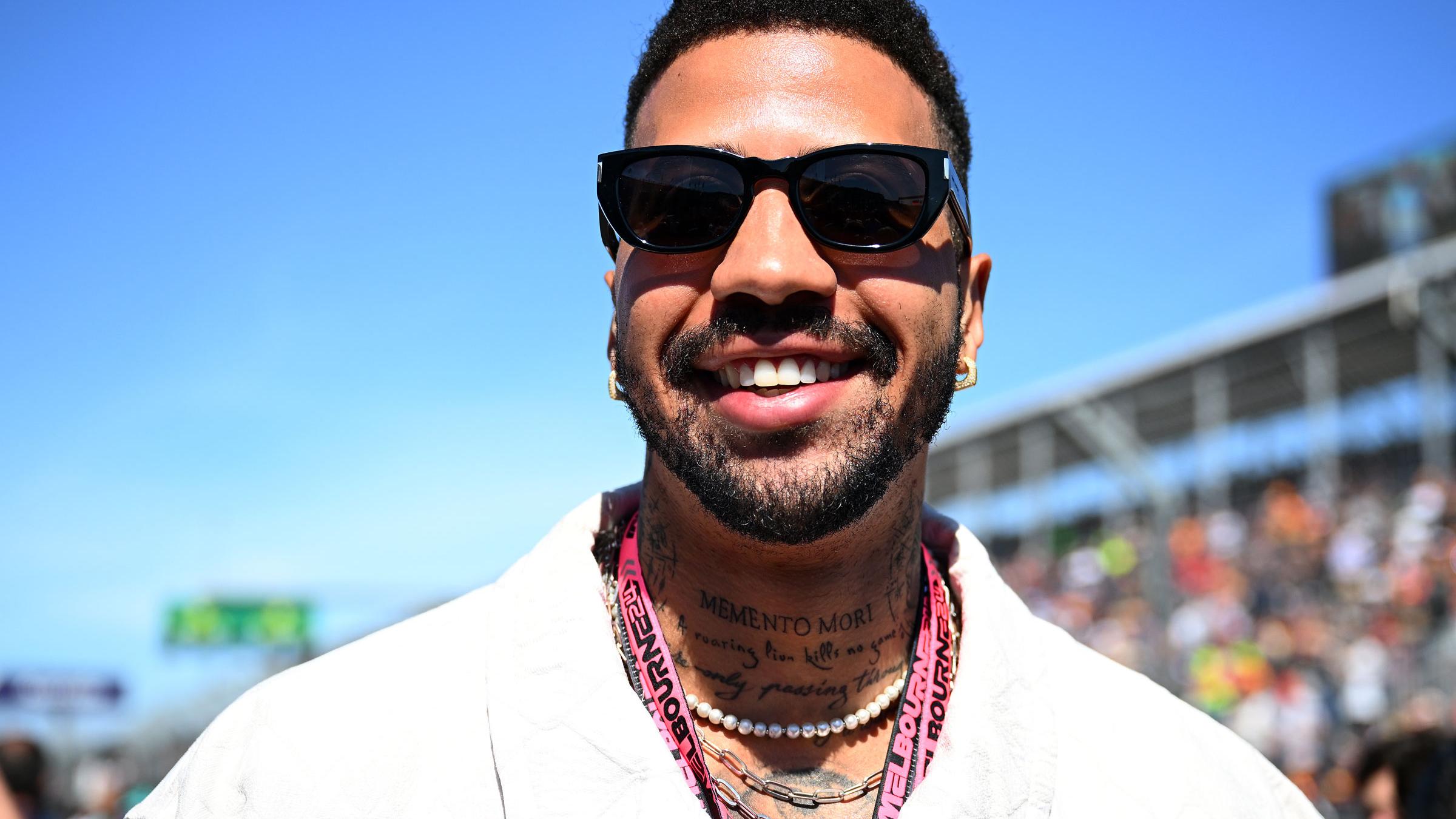
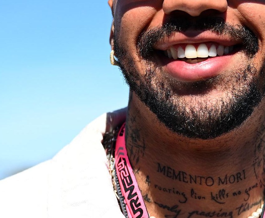
The arms get the most attention, but photos also show lettering around Chamley-Watson’s neck and more ink across his torso. The black-and-white portrait gives a better view of that wider layout and shows why a sleeve-only description misses part of the collection.

The neck lettering is easy to lose in action shots. A collar can cover it, and fencing gear hides even more. In a studio portrait, the words sit above the clothing and become part of the first impression.

There is no need to guess at the torso designs. A clear photo shows that they are there and how they relate to the arm work, but it cannot establish when every mark was added. That is a useful line to keep.

“Self-belief” and “Create a legacy, not a moment” give the arms a spoken vocabulary

Miles Chamley-Watson tattoos: visible neck lettering tattoo detail

Not every notable tattoo is an image. Chamley-Watson has pointed out words that express ideas he wants close. GQ shows “Create a legacy, not a moment.”; later coverage identifies “self-belief” as another tattoo.

Those phrases should not be blended into a generic motivational message. One is about leaving something behind; the other is a direct statement about confidence. They sit comfortably beside each other, but they are separate tattoos with different wording.

The words fit how Chamley-Watson talks about fencing, but a tattoo cannot prove that every career decision came from one master plan. What it does show is that some of his ink is deliberately textual: phrases he can read, remember and talk about.

That lettering sits well beside the dense sleeves. The images create movement and texture; the words give the collection something specific to say. Together, they make the arms a mix of pictures, patterns and personal reminders.

The tattoos change when the sport changes the view.

The same piece can look different when Chamley-Watson is fencing, posing or talking through the work in an interview. A raised arm stretches the skin; a bent elbow can fold part of a design into shadow. His jacket may hide the shoulder, while a sleeveless fashion photo shows much more.

A useful guide needs more than one kind of image. The full sleeve shot establishes scale, the forearm photo helps with smaller marks, and the close-up shows how the designs fit together. The torso portrait makes clear that the ink does not stop at his arms.

None of those photos provides a final count. They are views from different moments and angles, showing what was visible then, not necessarily every tattoo Chamley-Watson has ever had.

His tattoos are part of the way he presents himself.

Chamley-Watson has long mixed sport with fashion and performance. His tattoos shift the feel of the traditional fencing uniform once the sleeves and neck work come into view.

That does not make the ink only a styling choice. The London-linked first tattoo, the phrases and the timeline suggest a collection that grew alongside his career. Public image and private meaning can sit together without every design needing a dramatic explanation.

The simplest summary is still the clearest: he started getting tattooed before the 2012 Olympics, and the work later grew into extensive sleeves, neck lettering and torso pieces. Some words have a clear explanation; many smaller shapes are best left as visible details.

What the evidence actually confirms.

The main points are straightforward. Chamley-Watson has extensive tattooed sleeves, and he got his first tattoo before the 2012 Olympics. He connects that first piece with London and has shown phrases including “self-belief” and “Create a legacy, not a moment.”

The photos establish the scale and placement of the arm, neck and torso work. They also show why it makes more sense to describe the collection in groups than to name details the sources cannot confirm.

That approach leaves plenty to notice. The sleeves are detailed without needing a made-up backstory; the lettering gives the collection a voice, and the timeline gives it shape. Fencing photos show how the ink has become part of the way Miles Chamley-Watson is recognised.

Jeff Hardy’s Tattoos Tell a Story in Roots, Snakes and Chaos

Jeff Hardy treats tattoos as more than decoration. He has spent long sessions in the chair, designed parts of his own work and talked about getting tattooed with the same restless energy he brings to a match. The collection is large, colourful and a little chaotic, but certain ideas keep coming back: nature, movement, family, danger and personal control.

The clearest explanations come from Hardy. He has discussed the roots spreading up his arm and neck, the Japanese writing on his arm, the dragon he got at eighteen and the small matching mark he shares with his wife. Other pieces are easier to see than to explain. This guide separates the tattoos Hardy has described from designs identified in clear photos, so the details stay useful without inventing private meanings.

The roots climb from Hardy’s right arm toward his neck

Jeff Hardy snake and roots shoulder tattoo

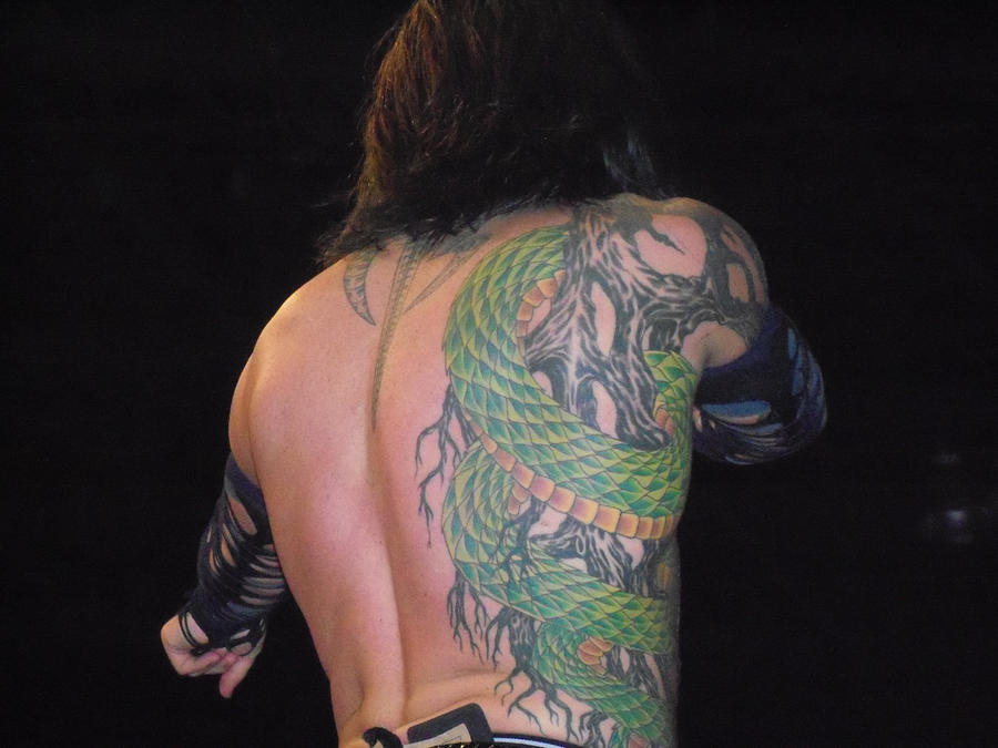
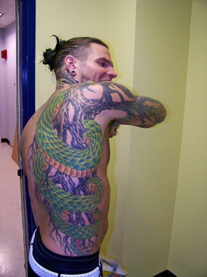
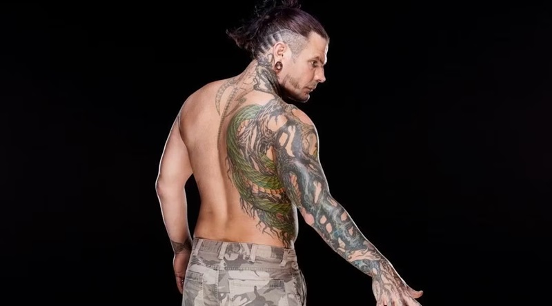
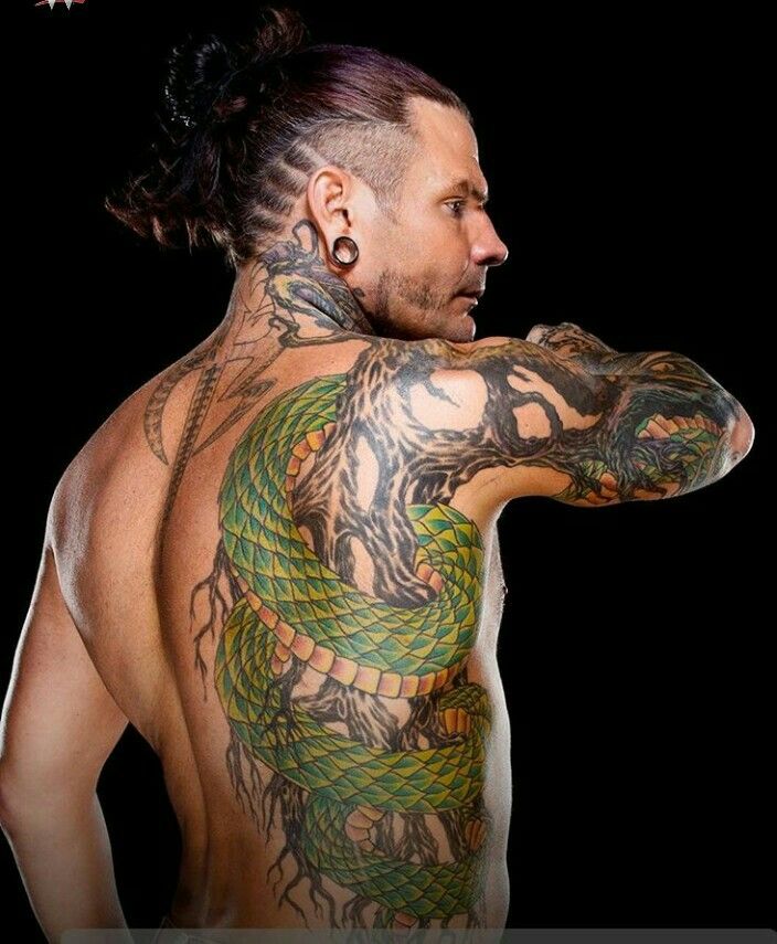
The roots are the most recognisable part of Hardy’s collection. They start around his right hand and arm, spread over the shoulder and continue toward his neck and side. In photos, the dark lines look like twisting branches rather than a uniform sleeve. They curl around the arm and leave patches of skin between the heavier sections, giving the design an uneven, living shape.

Hardy has explained the idea himself. He compares roots with veins: water moves through the ground as blood moves through the body. He has also called himself a landscaper at heart and said he enjoys plant life. The roots are more than a general nature motif; they connect his body to the earth. The design grew outward rather than stopping at a clean border.

The placement changes how the tattoo reads. A front-on wrestling photo may show just a strip on the arm, while a shirtless portrait reveals the lines reaching toward his back and ribs. Hair or a collar can hide the neck section. Several angles help show the full scale, especially because later work overlaps and surrounds the original lines.

Hardy said he wanted something different from the tribal bands many men were getting at the time. That puts the style in context without reducing it to a trend. The roots use heavy outlines, but they are neither a simple band nor a symmetrical emblem. They spread across the skin like a system, which fits Hardy’s interests in drawing, landscaping and making his own art.

Jeff Hardy snake and roots side tattoo

Japanese lettering and the unfinished dragon belong to Hardy’s early years

Jeff Hardy dragon and arm tattoos

The Japanese writing on Hardy’s right arm is one of the few tattoos he has translated himself. He said it means “health, good or bad, but hopefully good”. It sits in a heavily tattooed area and can be hard to see when his arm turns away. The lettering also shows how Hardy mixes words into larger images rather than keeping text separate.

His first tattoo was a dragon on the outside of his left leg. Hardy has said he got it at eighteen, when he still lived with his father, who disliked tattoos. The story has a humorous edge because Hardy got it behind his father’s back, but it also anchors the tattoo in the collection’s timeline. It came before the famous sleeves and larger designs.

The dragon remains quite different from the roots. Hardy has described it as an outlined design he might colour one day, while the roots expanded into a much larger system. In older photos, the dragon can look plain beside the coloured work on his upper body. That contrast is part of the collection’s history; not every tattoo was planned as a complete visual package.

It is tempting to assign a dragon a stock meaning like strength or fearlessness. Hardy’s own account is more specific: he talked about his age, his father’s reaction and deciding to get the tattoo anyway. The photo confirms the design and location, while his story explains the personal context.

The neck demons sit beside the roots, hands and wrist work

Jeff Hardy neck tattoos close-up

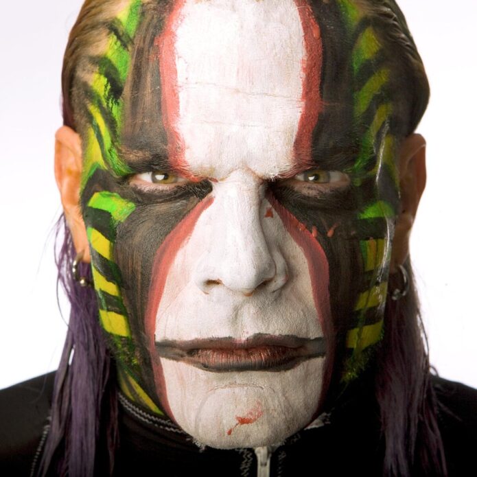
Hardy’s neck tattoos are easy to confuse with his face paint, which has also been part of his look for years. The permanent ink runs along the sides and back of his neck, while the paint changes from match to match. Close portraits reveal darker, demon-like faces beneath the jaw and near the neckline. From far away they can look like shadows, especially when his hair is loose.

Hardy has said the demons were not fully planned in advance. Once both sides of the neck were visible, he began to connect the images with control and the parts of himself he has had to manage. That does not make every later tattoo an addiction symbol; this particular context comes from Hardy’s own comments.

The neck is where his style becomes most theatrical. The roots climb up from his arm, while the darker faces sharpen the outline around his head. Add piercings, long hair and changing face paint, and the overall look is intense even before he enters the ring. It is useful to distinguish the permanent tattoos from the performance makeup.

Photos from different years also show why dates matter. Hair can hide one side, paint can obscure another and lighting can flatten the dark shapes. A close portrait of the neck is more useful than a full-body photo where the same designs shrink to tiny marks.
A close-up earns its place here because it lets readers see the neck work clearly.

Hardy’s back piece brings together the devil, flames, snake and octopus work

Jeff Hardy snake and roots back profile tattoo

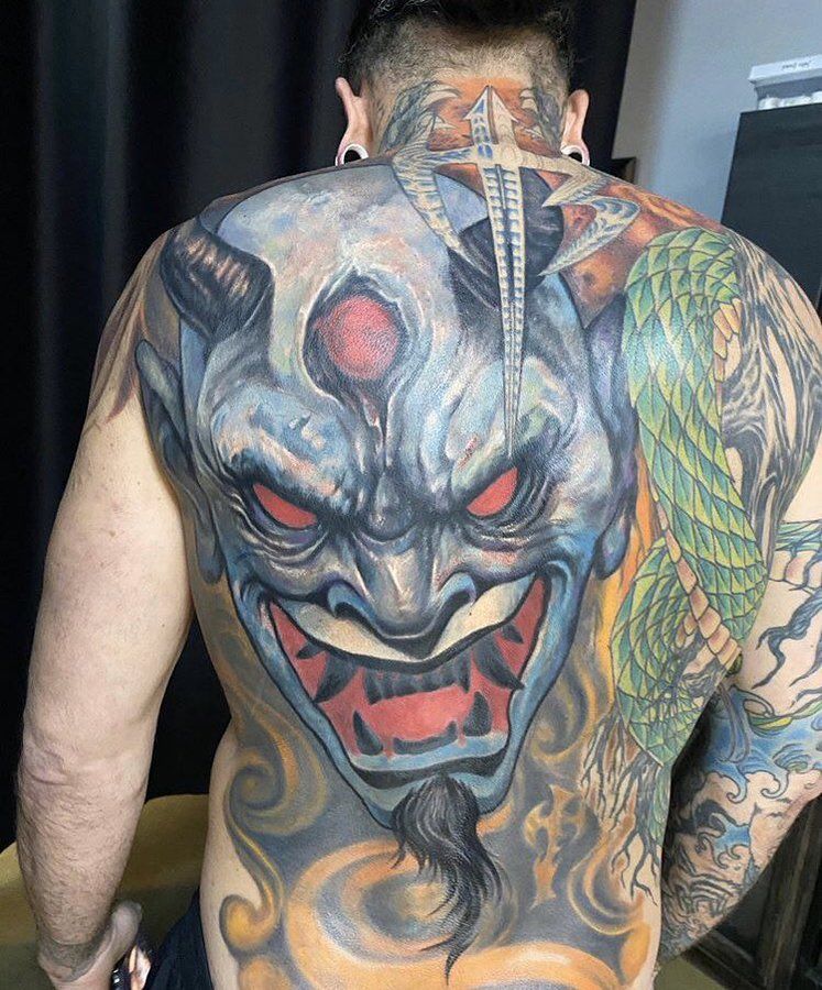
Hardy’s large back work is a later chapter in the collection. It includes a demonic face, blue and grey shading, flames and a green snake winding through the design.

Jeff Hardy full back tattoo with devil, flames and snake

It is denser than the early dragon and much broader than the original roots. The back gives the scene room to read as a full composition instead of another small symbol added to a busy arm.

When Hardy showed the back piece, he described it as a newer version of himself and spoke about how painful the sessions had been. He began the work earlier but could not finish it in one go. That history matters: a big tattoo can look complete in a photo even when it took several sessions.

The snake is connected to the roots on the right side of his body. Hardy said people had mistaken parts of the coloured roots for a snake, which helped inspire him to add a rattlesnake. He has also said he is afraid of snakes, so the design was not simply a favourite-animal tattoo. That tension between fear and fascination gives it some life.

The devil and flames are clear in the image, but that does not establish a biography for every colour or expression. Hardy’s comments support the idea of a major personal artwork and connect the snake to the roots. The description can stay visually detailed while leaving further symbolism open.

Hardy’s hand and wrist tattoos are smaller but more personal.

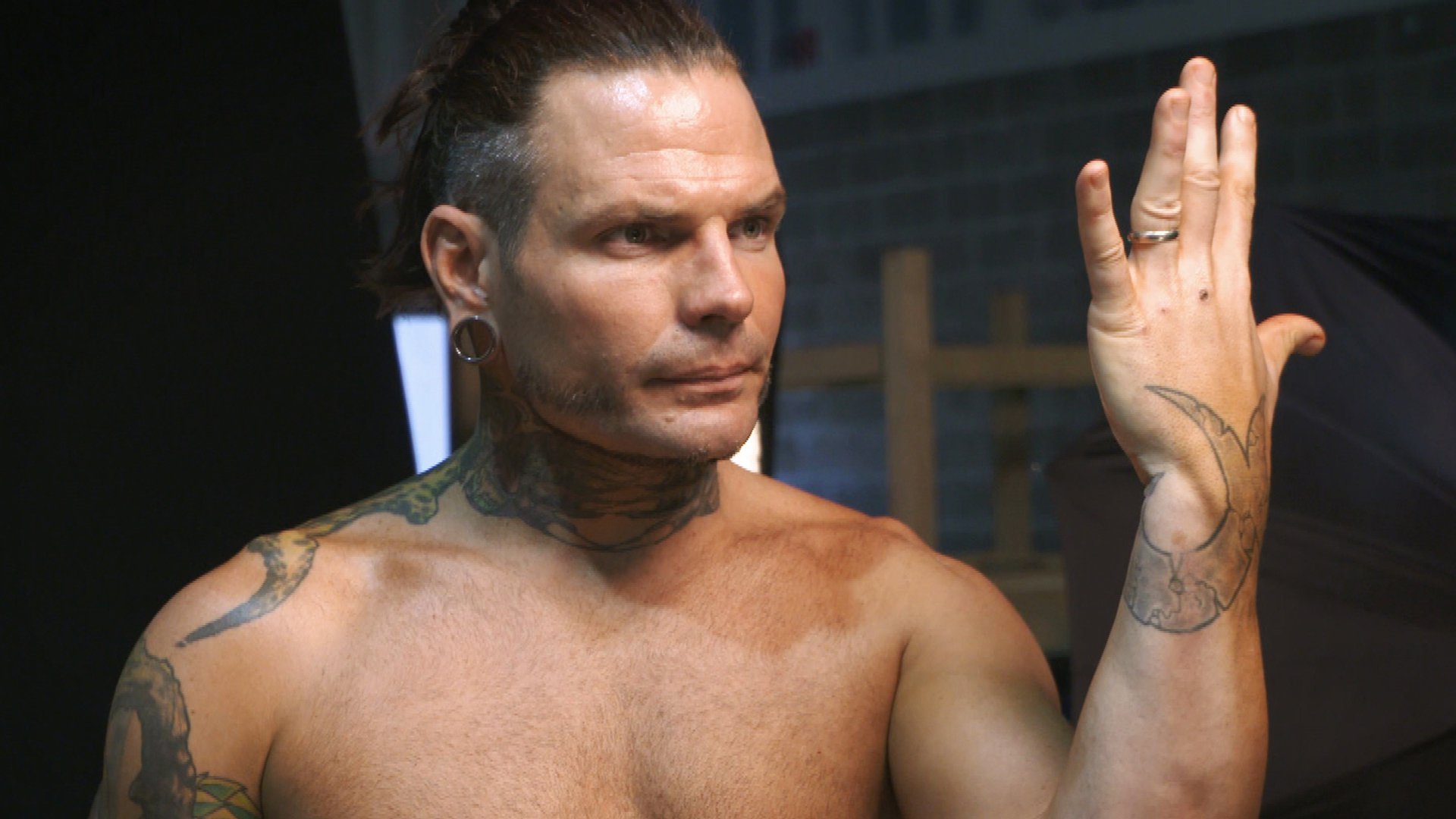
The marks on Hardy’s hands and wrist are easy to overlook beside the larger work. He has mentioned faint green lines around his right thumb and buying tattoo equipment because he wanted to try tattooing himself. Working on his right hand with his left was difficult, he admitted, giving those pieces a very different origin from professional studio work.

His left wrist has a combined cursive J and lowercase e, matching his wife’s first tattoo. Hardy said she wears the design on the back of her neck and that he put the same idea on his wrist so they would have a shared mark.

Jeff Hardy wrist tattoo

It is one of the clearest relationship tattoos in his collection because Hardy explained both the letters and the matching placement.

The hand tattoos also show how much scale affects visibility. A tiny symbol may be crisp in close-up and disappear when Hardy wears gloves, wrist tape or long sleeves. It should not be treated as a new tattoo every time another photo reveals a line. Dates, angles and image quality all matter for such small designs.

The octopus, bunny and smaller leg work add a stranger edge.

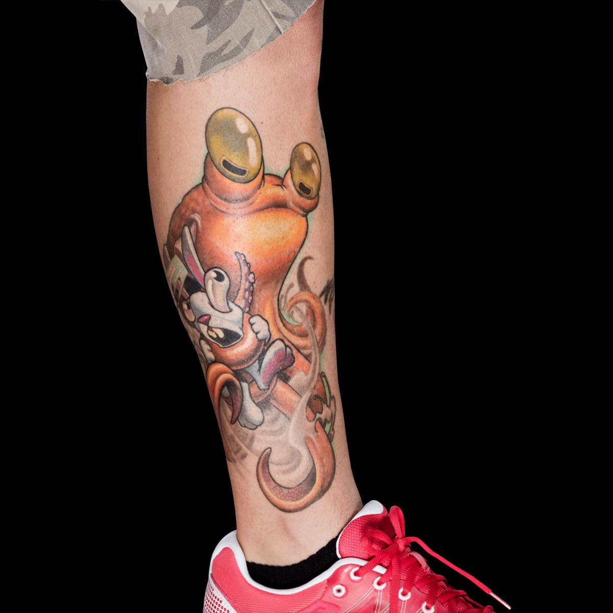
Hardy has also had an octopus tattooed around a bunny on his leg during an Ink Master appearance. It is playful and unsettling at once, fitting his habit of pairing bright colours with darker or surreal subjects. Reports say the session lasted close to six hours and was completed by Jesse Smith. The design is separate from the roots system, so it stands on its own rather than being grouped into a general sleeve.

Jeff Hardy octopus and bunny leg tattoo

This is where Hardy’s collection gets less predictable. The dragon came early, the roots connect to nature, the Japanese writing carries a clear wish for health, and the octopus and bunny bring a strange storybook quality. There is no reason to force them into one style. Hardy approaches tattooing like drawing on the body, and the designs feel like separate ideas gathered over time.

Together, the tattoos move from a first dragon on the leg to roots on the arm, Japanese lettering, neck demons, a large back scene, a snake and smaller marks linked to his wife and his own experiments. Some meanings are confirmed in interviews; some designs are simply visible in photos. That distinction is useful. Readers can appreciate the artwork without assuming every line has a published explanation.

What makes Jeff Hardy’s tattoo collection different.

Hardy’s tattoos feel personal because he talks about the choices behind them. He remembers getting the dragon at eighteen, explains the roots through veins and water, translates the Japanese writing and describes the matching wrist initials. He has also spoken openly about the pain, time and changes involved.

The photos show what words alone cannot. The back piece needs a full-back view; the roots need an arm or side angle; the neck demons need a close portrait; and the wrist marks need a tighter frame. Repeating one generic shirtless image would flatten the collection and hide the placements that make each tattoo worth discussing.

Some marks still cannot be confidently named from a distant shot, and that is fine. A careful guide can list the roots, dragon, Japanese writing, neck demons, snake, devil, flames, matching wrist letters and octopus scene without turning every shadow into a new design. Hardy’s explanations carry the story; the photos show the work, and remaining uncertainty stays clear rather than dressed up as fact.

Zlatan Ibrahimovic’s Tattoos: Names, Symbols and the Lion on His Back

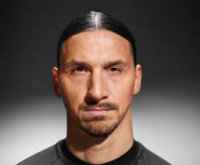
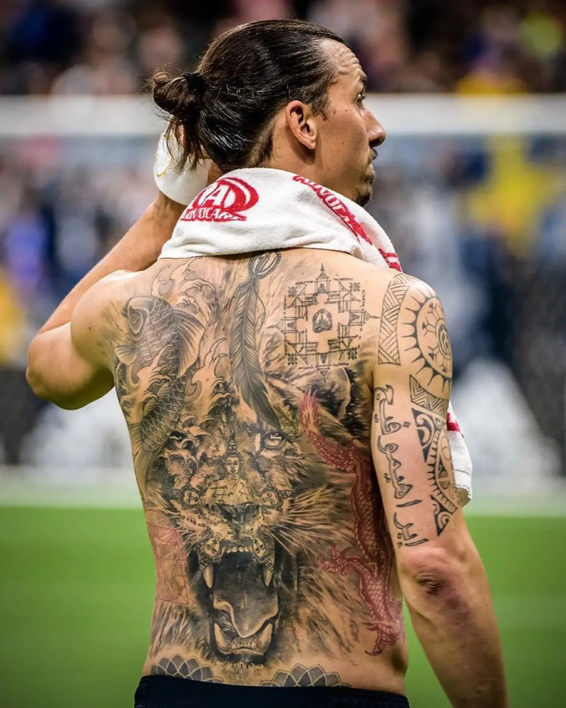
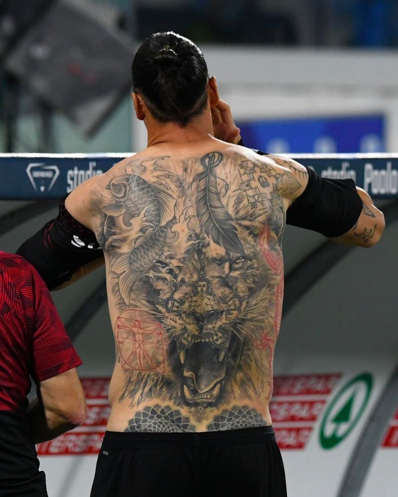
Ibrahimovic’s tattoos include family names, dates and Arabic lettering on his arms, a lion across his back and words on his ribs. In 2015, he also covered his body in names for a World Food Programme campaign; those markings were temporary. A single tattoo map won’t distinguish campaign writing from permanent ink on its own.

Sports reports and interviews add the context a photograph can’t. They connect the lion to his recovery, explain where names and phrases sit, and identify the World Food Programme markings as campaign writing.

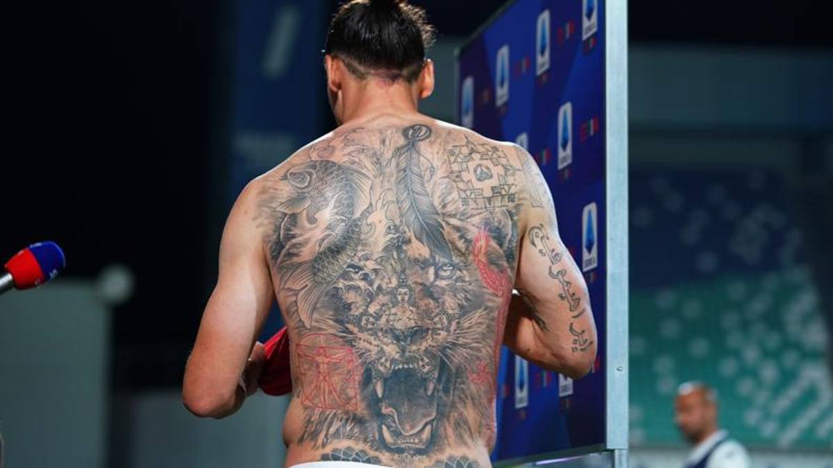
The lion dominates Ibrahimovic’s back

Zlatan Ibrahimovic showing the roaring lion tattoo across his back

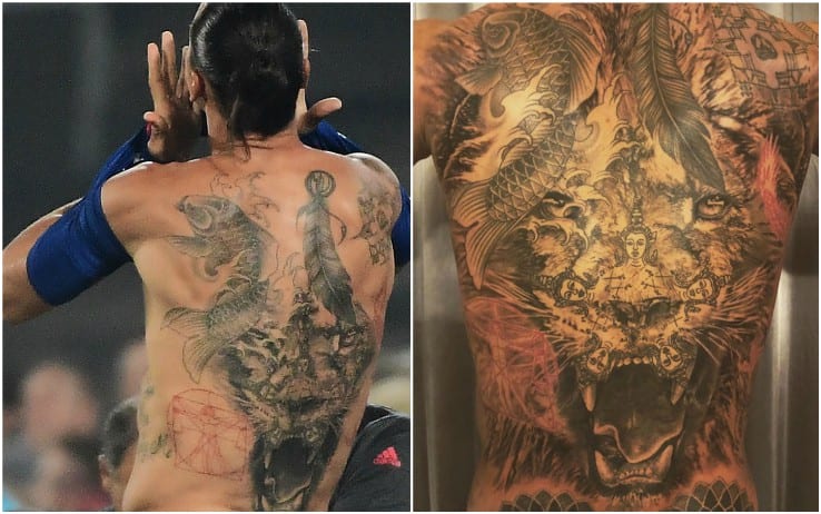
The lion covers much of Ibrahimovic’s back. Sports coverage has linked the image to his recovery from a serious knee injury and to the idea that a lion heals differently from a person. Vanity Fair Italia later described the back piece as a large composition incorporating earlier designs. The image should be read as a back tattoo at full scale, not a small emblem enlarged by a crop.

A lion invites symbolic readings, but the reporting connects this one to Ibrahimovic’s recovery, not to a separate story for every line in the back piece. Wide photos show the animal and surrounding designs, though smaller details are harder to read. The back tattoo therefore deserves a clear full view before individual marks are named.

Family names and dates sit beside the arm lettering

Zlatan Ibrahimovic showing the lion and surrounding back tattoo symbols

Inventories place Ibrahimovic’s surname in Arabic on the back of his right arm and his sons’ names, Vincent and Maximilian, on an arm. Other reports mention dates and family references on his hand and arms. The reports name the people and locations, making these family tattoos more than a broad label.

The Arabic letters are visible, but translating them requires a source beyond a photograph. Reports have identified his sons’ names; dates in softer or distant shots are harder to connect to a person or event. Without that context, it’s better not to guess.

The rib phrase Only God can judge me

The phrase Only God can judge me has been associated with Ibrahimovic’s ribs since the mid-2000s. Aftonbladet later reported that he had it removed with a laser. The piece was done at East Street Tattoo in Stockholm before a Sweden match; the removal report adds an important point to its timeline.

For readers consulting a tattoo guide, the date matters: an old photo can’t show whether the words remain on his ribs. The phrase alone doesn’t explain his beliefs. Coverage establishes what it said, where it sat and when it was removed.

The temporary names campaign was different from his permanent ink

Zlatan Ibrahimovic back tattoo detail

In 2015, Ibrahimovic revealed dozens of temporary names written across his body in a World Food Programme campaign. The names represented people affected by hunger. He used a football match and the shirtless reveal to draw attention to the issue; CulturePSG’s account of the press conference explains the campaign’s purpose.

Some event photos make the names look like a sudden new collection, but they were temporary campaign markings. They should not be mixed into a permanent count of Ibrahimovic’s tattoos. It was a public message about hunger, not another entry in his personal tattoo history.

What can be confirmed about the wider collection

Zlatan Ibrahimovic revealing the large tattoo composition on his back and torso

Other published inventories mention a koi fish, a feather, Polynesian-inspired work, playing-card symbols and additional torso designs. There is no complete official checklist. The lion, family names, Arabic surname and rib phrase have the clearest documentation; the campaign names were temporary.

Knowing what was permanent and when it appeared tells more than an exact tally. Coverage connects the lion to Ibrahimovic’s recovery, reports identify his sons’ names and Arabic script on his arms, and Aftonbladet documented the rib tattoo’s removal. That context gives a clearer picture than a number alone.

A broad shot of his back and torso can make all the ink look like one composition. Look closer, and there’s the lion across his back, family names and dates on his arms, and the rib phrase from a different period. Comparing dated photographs shows more than counting every patch of ink in one image.

At the 2015 match, Ibrahimovic used temporary names to draw attention to people facing hunger. They promoted the campaign, not a permanent chapter in his tattoo story. Later photos show his permanent lion, family lettering and older symbols.

Ibrahimovic hasn’t directly explained every design. Tattoo lists sometimes repeat a translation or symbolic reading, but that doesn’t make it his own explanation. Where he hasn’t spoken, reports can identify the design and placement; its personal meaning remains unknown.

The back shot and the 2015 campaign image capture two different things: his permanent tattoos and temporary publicity writing. Without the dates, readers could count those marks as one collection. Adding context keeps the family designs, the lion and campaign markings distinct.

DeMarcus Cousins tattoos: family portraits, tributes and home

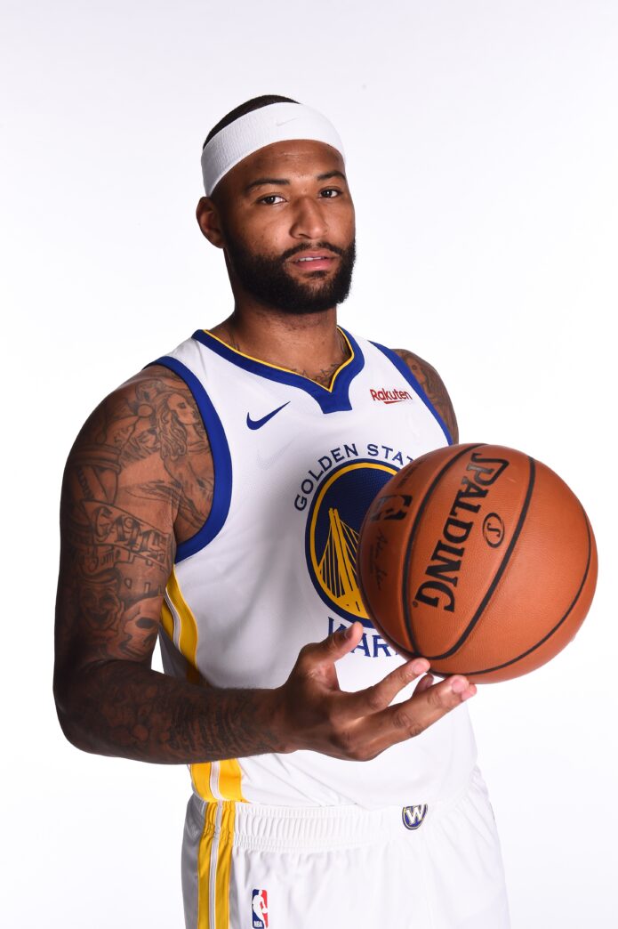
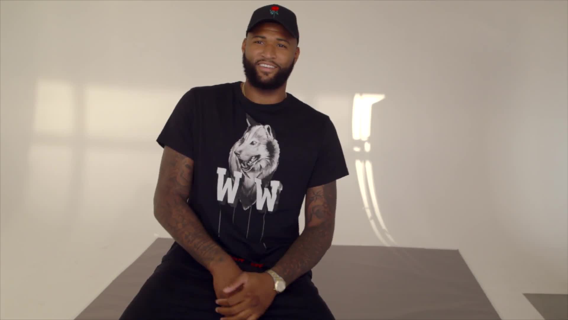
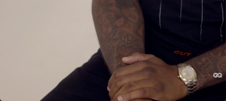
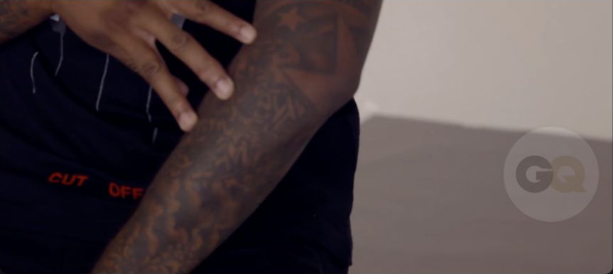
DeMarcus Cousins tells the stories behind several of his tattoos in GQ’s Tattoo Tour. He talks about Danny Pritchett, a friend he considered an older brother, a portrait of his mother, angels with his children’s names and the graffiti phrase Product of My Environment. They reflect family, friendship, basketball and home, with each design tied to a different part of his life.

Family and basketball tributes anchor DeMarcus Cousins’ tattoos

DeMarcus Cousins showing his tattoos during a GQ Tattoo Tour

Some of the clearest stories in Cousins’ tattoo inventory are the tributes he talks through in GQ’s Tattoo Tour. Danny Pritchett was like an older brother to him and died while playing basketball. The memorial brings their friendship and the sport they shared together.

His mother’s portrait honours the work she did for her children. Cousins calls her one of his biggest inspirations. The mama’s boy lettering puts his own bond with her into words.

The Danny Pritchett tribute

DeMarcus Cousins showing the Danny Pritchett tribute tattoo area

A close-up shows the portrait and where it sits. Cousins says Pritchett was like a big brother and passed out on a basketball court. That loss and their shared connection to basketball make the tattoo meaningful to him.

Cousins hasn’t said exactly when he got the portrait or shared much about Pritchett beyond their relationship and his death. That’s enough to understand the tattoo as a memorial to someone he considered family.

The portrait of his mother

DeMarcus Cousins showing the mother portrait tattoo tattoo area

Cousins says his mother worked hard to build a life for her children. He calls her one of his biggest inspirations, and the portrait honours that effort. It is a straightforward tribute to the woman who raised him.

Beside the portrait, the mama’s boy tattoo puts his relationship with his mother into words. The two pieces share a subject but remain distinct: one is her portrait, the other is how he describes himself.

Angels with his children’s names

DeMarcus Cousins showing the arm tattoos discussed in the GQ Tattoo Tour

Two angels carry the names Amir and Havannah. Cousins says they are his children and calls the tattoo another way of showing how much he loves them.

He doesn’t attach a separate religious meaning to the angels. The tattoo is best recorded as a tribute to his children, with Amir and Havannah’s names beside the two figures.

Product of My Environment

DeMarcus Cousins showing Product of My Environment graffiti lettering

Cousins describes Product of My Environment as a reminder of where he came from. He says the words bring back the struggles he faced and the things that helped him reach his current position.

The graffiti lettering gives the phrase its visual identity, while Cousins says it keeps his background and the path he took in view. Its meaning is about origin and memory, not just basketball.

Reading Cousins’ tattoos across time

His tattoos were added at different times, so no single game photo shows them all. A jersey or camera angle can hide portraits, names and lettering; newer ink can also change how earlier pieces look together.

When a tattoo disappears from a game photo, it may simply be hidden by a jersey; that isn’t evidence that it was removed. A dated close-up, read with Cousins’ comments, tells more.

What Cousins explains on the GQ tour

In the GQ tour, Cousins explains four designs: the Danny Pritchett tribute, his mother’s portrait, angels with Amir and Havannah, and Product of My Environment. The video also shows that he has many more tattoos, though he doesn’t name every one.

Cousins’ tour offers a detailed tattoo account of his main designs, but doesn’t name everything visible. Each named tattoo can be tied to a person or experience he identified; the rest may remain unclear until a better photo or explanation appears.

Other reported tattoos fill out the wider sleeve. A later inventory mentions a dream catcher inside his left bicep, a spider and cobweb covering an earlier basketball-and-crying-baby tattoo, and MISUNDERSTOOD on his right calf. It also lists WIN SOME LOSE SOME on the inner bicep, a crown with KING OF THE GAME, and a DANNY tribute near the wrist. Cousins doesn’t explain these pieces as fully as the four tattoos discussed on camera.

A secondary inventory says the spider and cobweb cover an older basketball-and-crying-baby design. Photos show the new tattoo but don’t explain why it replaced the earlier one. It is separate from the Danny tribute and his children’s angels, even if all three appear on his arms.

Family and friendship run through Cousins’ best-known designs. The Danny Pritchett tattoo remembers a friend who felt like a brother; his mother’s portrait and mama’s boy words honour her influence. The angels carry Amir and Havannah’s names, while Product of My Environment recalls the struggles and roots he has talked about. These are the stories his own tattoo tour supports with confidence.

The GQ tour moves from a close portrait to readable lettering and wider views of larger designs. Some shots also show pendants, which are jewellery rather than ink. Seen alongside Cousins’ explanations, the footage gives more context than a standalone social-media picture.

Later photos may clarify an older piece or show additions around the family tributes. Cousins’ own comments remain the clearest account of why he chose the designs he has named; new images add detail without replacing those stories.

LeBron James’s Tattoos Tell a Story of Home, Family and Basketball

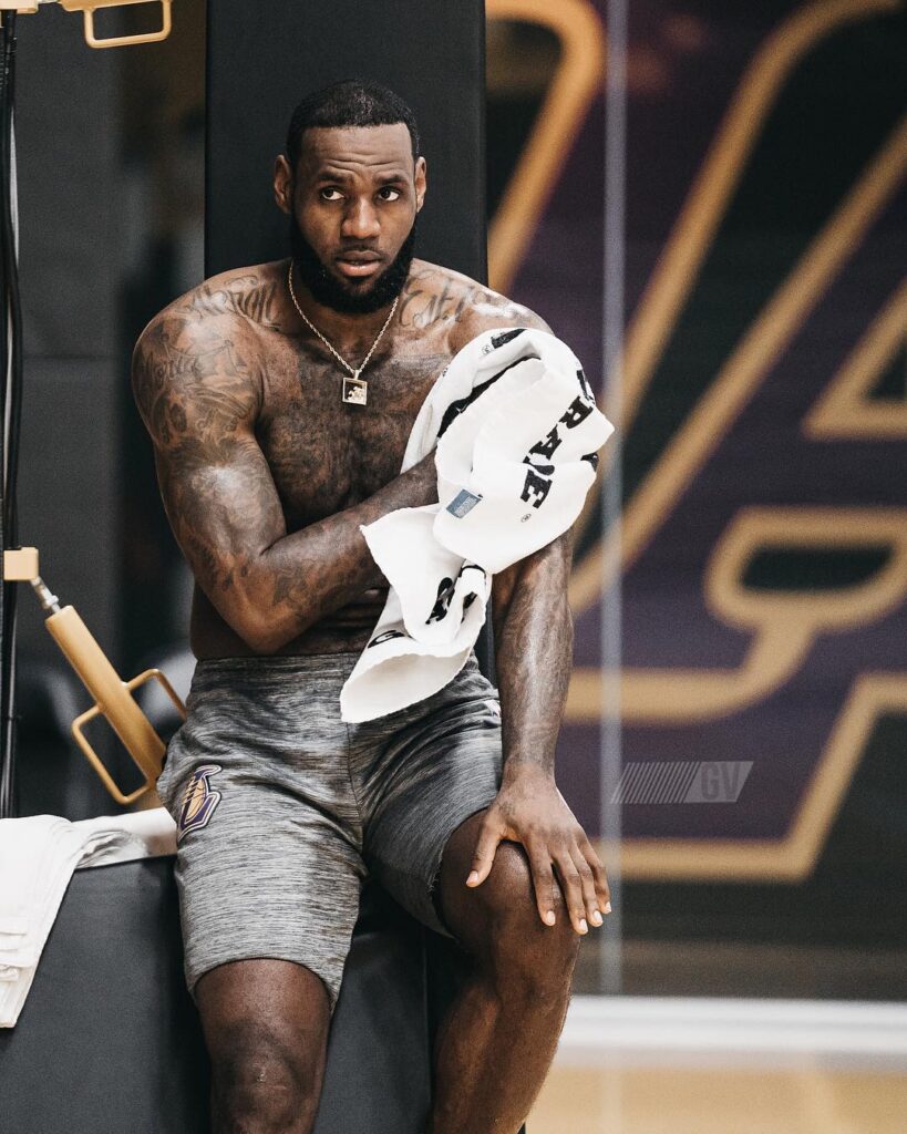
LeBron James has collected tattoos over years of playing, so photos do not always show the same set of designs. The back lettering is easy to notice; smaller pieces on his arms and legs can be harder to make out. Some tattoos have a clear story attached, while others are simply part of the larger collection.

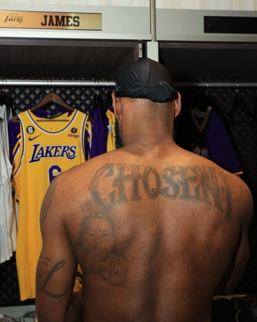
The “Chosen 1” across his back

tattoo detail

James also has “Witness” on one calf and “History” on the other. GQ described the pair in its 2014 profile. The available photos are too small or soft to show either tattoo clearly, so their placement is easier to confirm than their appearance.

Across the collection, exact wording and placement are often the clearest details. James has added tattoos over many seasons, and their appearance shifts with his pose, clothing and camera angle. A photo from one year may show a different arrangement from the next.

The words across James’s back are what people notice first. They sit high and spread wide, so a side view can hide one shoulder while a straight-on photo shows the full scale. This is much larger than a small signature; it is a full back composition.

There is also portrait work below it. A sharp photo can show the face clearly, but naming the person depends on reporting that identifies them. If a photo only looks familiar, the identity is best left open.

Akron brings the hometown story to James’s arms. The city name appears beside numbers, family names and short phrases. Arm tattoos can look crowded or widely spaced depending on how he is turned; game shots, interviews and celebrations all show different angles.

The lion tattoos share an animal, but they are separate designs. One sits on his chest and another appears on a leg or arm; placement, scale and the lines around each one distinguish them. The chest lion belongs to the larger chest work, while the other sits in a different part of the collection.

Family names and portraits seem to carry the most personal weight. Reporting identifies the family connection, and readable lettering confirms some names. A portrait alone cannot tell us every story behind it.

Some of the calf lettering is hard to read in distant game shots: you can see a dark strip, but not enough detail to make out the words. A sharper crop would help. When the letters are unclear, it is better to say so than to guess.

His tattoos have appeared at different points in a long career. A later photo may show work added around an older piece; that is a timeline, not a contradiction.

The broad themes repeat throughout: the Chosen 1 back lettering, Akron, lions, family names and portraits. The styles vary, but each keeps a person, place or phrase close at hand.

What you can see depends on the clothes and setting. A sleeveless jersey may show an arm but cover the chest; a studio portrait can reveal the opposite. No single photo shows the entire collection.

The full-back inscription is easiest to read in a straight-on photo. Akron shows clearly in arm close-ups, and family tattoos stand out when a picture shows the face or name directly. Details are easier to follow when the photograph gives each one room.

LeBron’s tattoos mix his public identity with family and hometown references. Photos show where the designs sit, while the stories behind them come from what he and others have shared.

Looking at the photos in order makes the additions easier to follow.

Away from the large back piece, the smaller tattoos bring the family story into view.

Family portraits give the collection its personal centre

LeBron James family tattoo detail

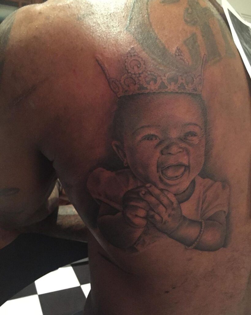
LeBron’s family portraits are more than decorative filler. The faces are clear in the photos, while names and dates add a personal timeline. They sit beside basketball and Akron references but speak to a different part of his life.

Akron and basketball references occupy their own space

LeBron James Akron tattoo detail

The Akron work ties the collection to home. Close-ups show the lettering on his arm, and the city name makes the hometown connection clear. It has a different look from the Chosen 1 back piece and the family portraits.

The calf lettering and tribute work complete the map

LeBron James calf tattoo detail

The lower-leg designs are easy to miss in a basketball photograph. A seated pose can hide the calf, and socks or shorts may cover it altogether. The Witness and History pieces sit on opposite calves, so clear views of each help show where they are.

The Chosen 1 back piece works as the main anchor:

The Chosen 1 design is large enough to define the whole tattoo map. It covers much of his back, hidden under everyday clothes and fully visible only in a shirtless portrait. A full-back image shows the composition better than a cropped shoulder.
The number one and the wording connect the piece to James’s basketball career, but it is not simply a jersey graphic. Its size and placement give it a personal feel, with surrounding details that suggest ambition and home. The exact private meaning should stay with what James has shared.

Family work brings the collection back to people:

James’s family portraits and names create a different mood from the basketball references. They appear on his arms and elsewhere, in smaller, more intimate designs. A close photo helps distinguish a face, name or date from the surrounding shading. The tattoos were added over time, not planned as one session.

These pieces make clear that James’s tattoos are not all sports branding. Akron, basketball and team references are public; family portraits and names turn the attention back to people close to him. They carry different stories, even when the same photo catches both.

Akron lettering keeps home visible:

The Akron reference is one of the clearest location tattoos in the collection. The city name is readable, and its placement on his arm comes through in wider photos; a close crop makes the lettering easier to see. Each view fills in a different part of the picture.

The lions and other large designs work the same way: the image shows the subject and placement, while interviews or profiles add context when James has shared it. Some pieces connect to home or family; others can simply be described by what they look like.

Small lettering and tribute details need their own images:

The calf lettering and tribute pieces are easy to miss in a game photograph. Shorts, socks and movement can hide the lower leg, and an arm may be out of frame. Separate close-ups show details the main back portrait cannot.

James has added tattoos over the years, sometimes around older pieces. A dated photograph may show a different arrangement from a later one. The clearest descriptions name the design and location, and leave uncertain meanings open.

That combination makes the collection feel personal, dated and visually clear.

Randy Orton’s Tattoos: From Tribal Work to the RKO

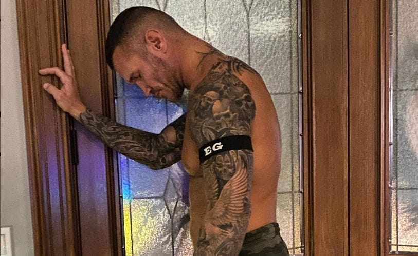
Randy Orton’s tattoos have changed as he has. He got his first pieces young, then later covered work he no longer related to. During time away from wrestling, he spent roughly 40 to 50 hours on the sleeves that became his signature: tribal lines, skulls, roses and lettering tied to family.

The collection can look like one giant sleeve, but the back and shoulders carry older tribal work while the arms have newer pieces. Some tattoos cover earlier designs; others connect the different parts. Orton has explained some choices, while other details have no confirmed private meaning.

The tribal design across Orton’s back and shoulders

Randy Orton’s tribal back and shoulder tattoo

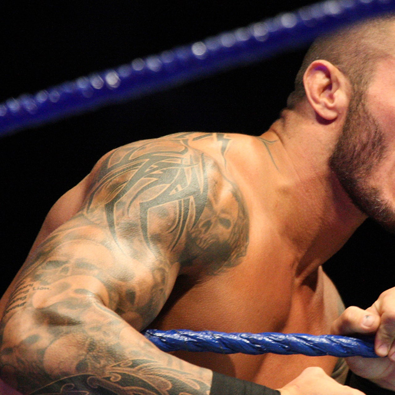
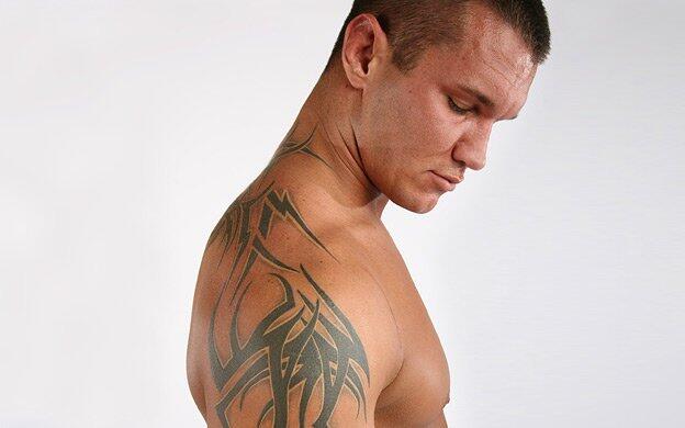
The tribal design across Orton’s back, shoulders and neck is one of his most recognizable pieces. Heavy black lines follow the shape of his body, wrapping over the shoulder blades and rising toward the neck. The pattern shifts when he turns or lifts his arms in the ring.

Orton has said some early tribal work had no deep story behind it. He was young, wanted tattoos, and later grew dissatisfied with parts of what he had chosen. That is why it is safer to describe the design than to assign it a symbolic meaning he never gave it.

The sleeves replaced and connected older work

Randy Orton’s tattoo sleeves and arm cover-up work

A serious injury kept Orton off the road long enough for extensive tattoo work to heal. He used the time to build the sleeves he had wanted for years. New tribal sections went around earlier designs, filling gaps and covering work he no longer wanted to show.

One of the earlier tattoos was connected to the United States Marine Corps. After his bad-conduct discharge, Orton said he covered it rather than keep displaying it. Older photos may show the original emblem; it is not fully visible in current images.

Photos from different years show the change. Before the sleeves were finished, they reveal bare patches of skin or an earlier emblem; later shots show skulls, shading and blackwork over the same areas. The tattoos developed over time.

Skulls and the Bible verse create the darker arm language

Randy Orton skull and script sleeve tattoos

Skulls appear throughout the arm work, framed by dense shading and ornamental lines. Orton has not given each skull its own meaning. They help tie older tribal patterns to the later additions and give the sleeves a darker look.

The Bible verse on the back of Orton’s right arm is more specific. It reads “Be sober, be vigilant, because your adversary the devil, as a roaring lion, walketh about seeking whom he may devour.” The passage is 1 Peter 5:8. It is a long piece of lettering, easier to read in a close photo than during a match.

The verse and skulls sit alongside each other, but Orton has not said they share one message. He has identified the Bible passage; the meaning of the other imagery is less specific.

The coloured rose is a family tribute

Randy Orton’s coloured rose tattoo

A small coloured rose stands out among the black-and-grey work. Orton has identified it as a tribute to his daughter Alanna Marie. Its colour draws the eye, and his explanation gives it a personal meaning beyond the usual associations people make with roses.

The rose mixes a family story with the bolder sleeve design. It is visible when Orton performs; only his own explanation tells us it is for Alanna.

Names, dates and the small hand tattoo

Some family names and dates are hard to make out in photographs. Tattoo lists also identify a small “Kim” with a heart on the middle finger of Orton’s left hand, connected to his wife. It is a more private-sized mark than the sleeves, and gloves or hand position can hide it.

Other family details are best described as reported family tattoos, rather than folded into an exact count. Orton’s collection grew in stages; some parts were covered, extended or blended into larger pieces. One event photo cannot show all of it.

How the collection changed during his wrestling career

Randy Orton’s back tattoo in a later wrestling-era photograph

Orton’s tattoos grew alongside his wrestling career. The early tribal pieces came first; the major sleeve sessions followed during time away from the road, when he could sit for long appointments and let the skin heal. Later photos show a more connected design, with less open space between the symbols, script and shading.

His ring gear leaves the arms, shoulders and upper back exposed, making the tattoos part of his entrance look. Arena lights flatten some of the shading, while close backstage shots bring out details that disappear in a wide television view. Each gives a different sense of the work.

What the public record can establish about Randy Orton’s tattoos

Randy Orton’s tribal back tattoo

Photos and Orton’s own comments establish the broad tribal back-and-shoulder piece, sleeves with skulls and lettering, a Bible verse, the coloured rose for Alanna Marie and smaller family marks. He has also said he covered early work he no longer liked. The meaning of every skull or filler line has not been made public.

Orton’s tattooed body has changed with age, work, family and regret. The sleeves are not a fixed design so much as a record of choices, including some he later decided to revise.

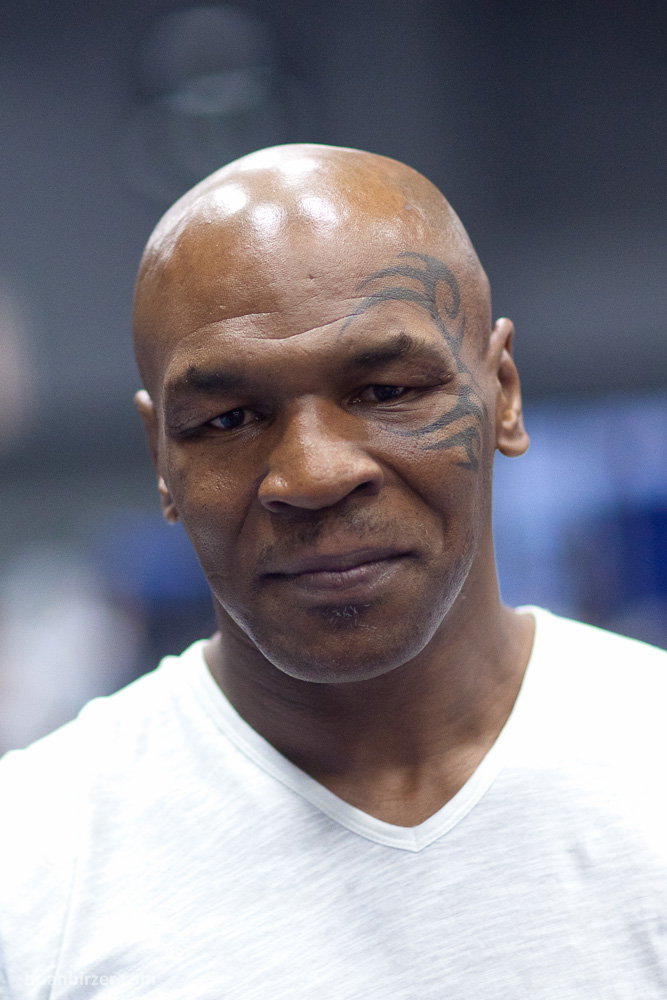
Mike Tyson’s Tattoos: The Warrior Face Mark and the Portraits Behind It

Mike Tyson is often identified by the black tribal-style tattoo around his eye, but it is only one part of his collection. Photos also show portraits of Mao Zedong, Che Guevara and Arthur Ashe, a tiger, a portrait linked to Monica Turner and a later memorial portrait of his daughter Exodus. The designs come from different periods, so dates help show which pieces were visible when.

Tyson has explained some choices in interviews and documentary footage. Other tattoos are known mainly through photographs and contemporaneous reporting. Those sources do not carry the same weight: his own comments tell us what he has said, while a photo shows what was visible at the time.

Tyson’s tribal face tattoo became his warrior mark

Mike Tyson’s tribal face tattoo, clearly visible around his left eye

The black curves sit close to Tyson’s eye and temple, so the design stays clear in both profile and front-facing photos. That visibility helped make it a familiar part of his public image. It does not, on its own, explain where the tattoo came from.

Whitmill’s authorship matters to this specific piece. His role later became part of a court dispute over reproducing the artwork in a film; that case did not make every photograph of Tyson free to reuse. For the tattoo’s history, the clearest details are its artist, 2003 date, shape and warrior association.

The tattoo that defines Tyson’s public image is a large tribal-style design around the left side of his face, crossing the temple and framing the eye. S. Victor Whitmill created it in 2003. Contemporary descriptions call the sweeping curves and pointed tendrils a face tattoo with a warrior association, rather than a portrait or a copy of a historical symbol.

Tyson has said he connects the design with being a warrior. Some accounts describe an influence from tā moko, but they do not establish that he received a specific traditional moko. A custom tribal-style face tattoo with a personal warrior association is more precise than calling it simply Māori or assigning it one universal translation.

The design has a documented artist history: Whitmill’s authorship was central to the court dispute over the tattoo’s reproduction in The Hangover Part II. The case concerned copying the artwork, not a right to reuse every photo of Tyson. A tattoo history can document what he wore without implying that the artwork belongs to the photographer.

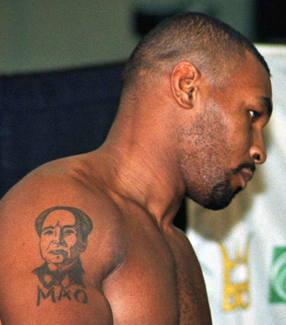
The Mao Zedong portrait reflects Tyson’s prison-era iconography

Mao Zedong portrait and MAO lettering on Mike Tyson’s upper-arm tattoo

In sleeveless photos, the Mao portrait is easiest to see on Tyson’s upper arm. The lettering below the face can be clearer than the surrounding shading, so it is better to follow what a particular image actually shows than to repeat a caption from an old list.

Tyson’s comments place the portrait in his prison years and give his stated reason for it: anger at society. They provide useful context, but they do not spell out every part of his response to Mao. Admiration, provocation and biography may all be in play; the sources do not reduce them to one settled explanation.

One of Tyson’s named portraits is Mao Zedong’s, on his upper arm. Biographical accounts connect it to his prison years, when he said he was angry with society and government. That background is documented, though it does not establish a separate meaning for every detail in the portrait.
Tyson’s interest in Mao also appears in later public comments and in his visit to the Chairman Mao Memorial Hall. That makes the tattoo look deliberate rather than random, but it is not a complete political statement. The reported details are its subject, placement and the context Tyson has shared.

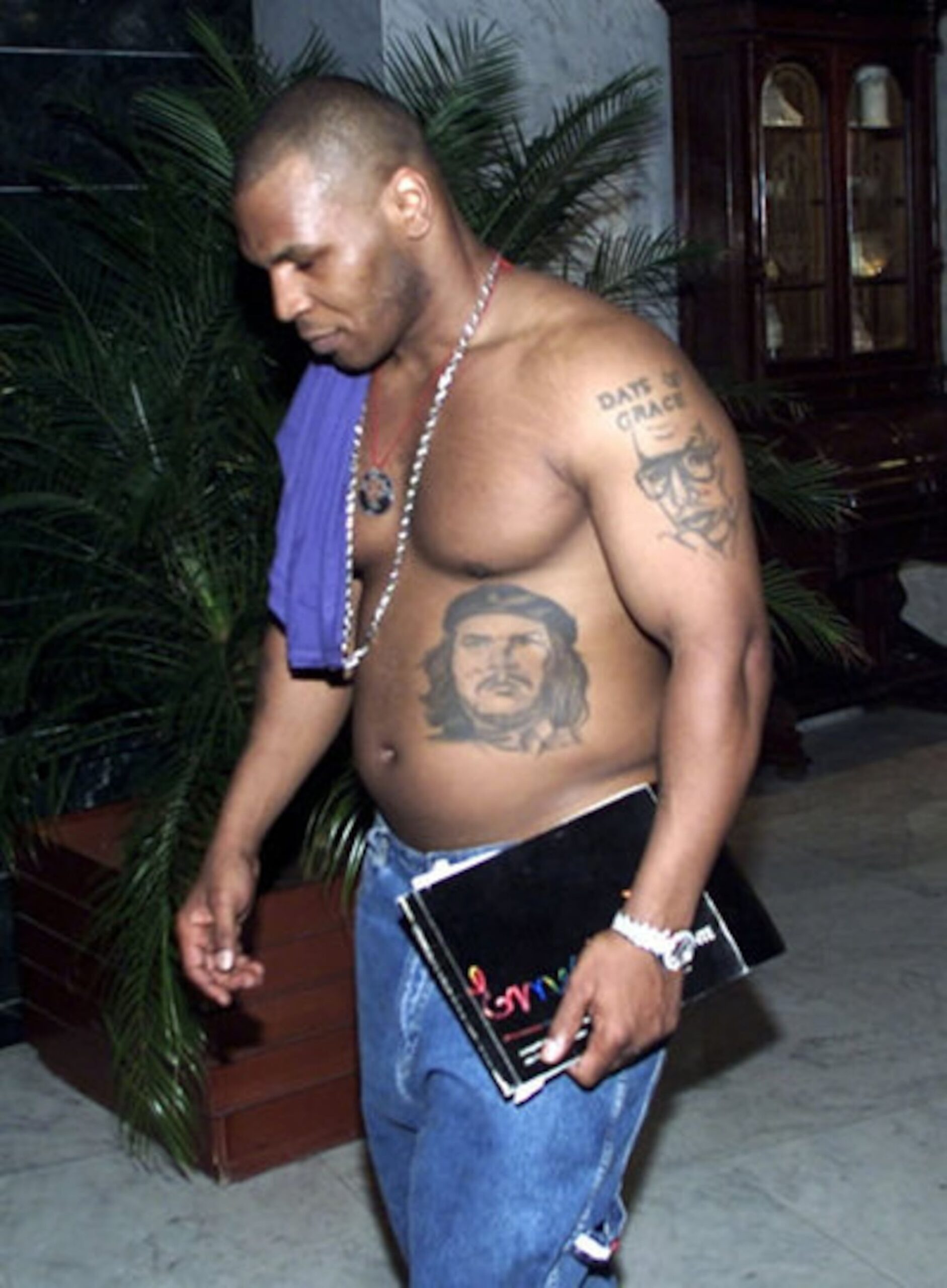
Che Guevara’s abdomen portrait is clearly documented

Mike Tyson showing the Che Guevara portrait design on his abdomen

The Che portrait sits on Tyson’s abdomen, so photos show different amounts of it. A shirtless image may reveal the features and shading, while a cropped interview frame can show only the upper edge. Older photos with uneven lighting make small details harder to read.
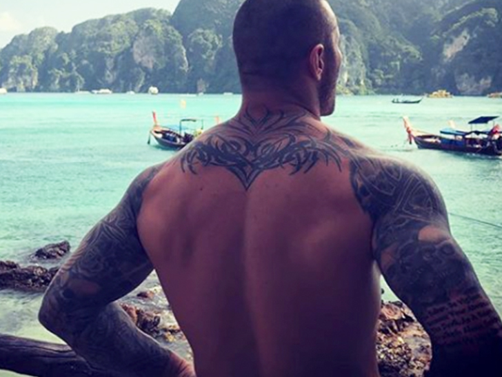
The portrait belongs to a particular period in Tyson’s life. It can be identified and placed broadly, with his prison-era comments providing context. The sources do not give a complete account of what the image meant to him over time.
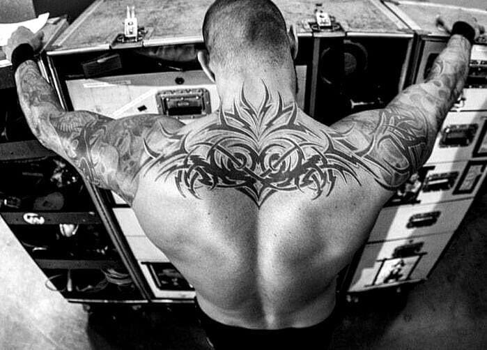
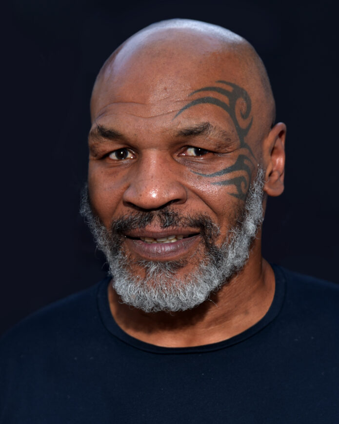
Che Guevara is another portrait linked to Tyson’s prison-era collection, usually placed on the left side of his abdomen. Tyson has spoken positively about Guevara’s willingness to sacrifice for others, giving the tattoo some documented context. His full personal interpretation is not on record.

A dated photograph shows the Guevara portrait as an image on Tyson’s body, not just a name repeated in a list. Lighting, clothing and image quality affect what can be seen, and a cropped frame cannot establish details outside the area it shows.

Tyson also has other portraits and family-related tattoos, including the Arthur Ashe, Monica Turner and Exodus pieces mentioned earlier. They are separate designs with their own histories; the Che portrait is easier to describe alongside a photograph that shows it clearly.

Reading the record

The public record is uneven. Interviews explain some tattoos, while others are documented mainly in photos and contemporary reports. Exact dates, changes in the linework and a complete count are not consistently available.

The face tattoo is the clearest identifier in photos. Smaller pieces on Tyson’s arms and torso can be hidden by clothing, camera angle or poor image quality. A dated, clear picture helps separate what is visible from guesses about a blurred shape.

There is no official catalogue of every tattoo. Future interviews, artist credits or clearer photos may fill in some gaps; until then, a precise description is more useful than a list that only looks complete.

How Dwayne Johnson’s Tattoos Have Changed Over the Years

Two very different stories shape Dwayne Johnson’s best-known tattoos: a Polynesian design tied to his Samoan heritage and a bull linked to his wrestling years. The bull has grown from its smaller 1990s version into a large skull design. Johnson speaks about the Polynesian piece in terms of family, culture and identity.

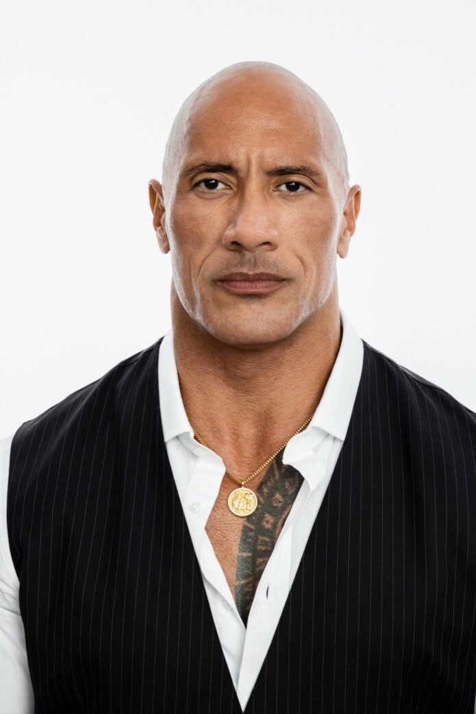
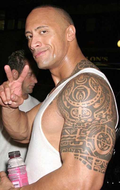
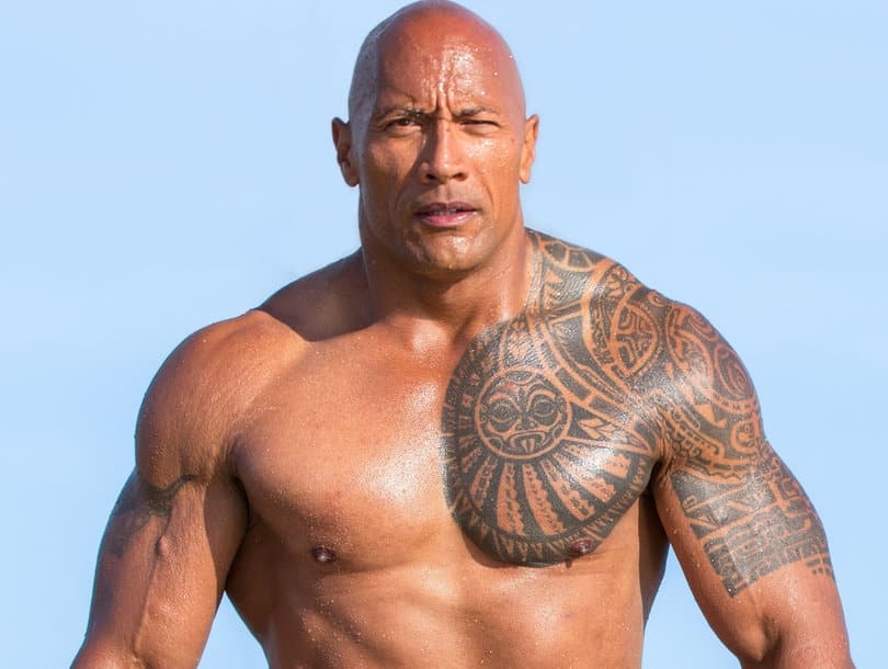
The Polynesian tattoo across Dwayne Johnson’s shoulder and chest

Dwayne Johnson Polynesian shoulder and upper-arm tattoo

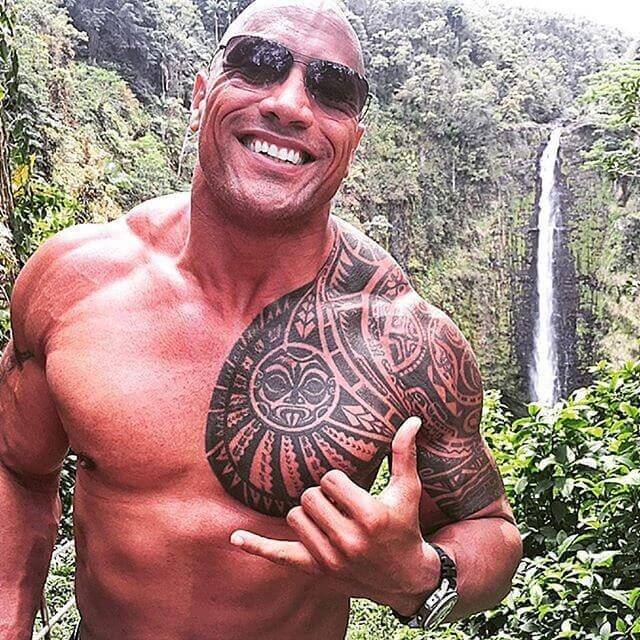
The Polynesian tattoo covers Johnson’s left shoulder, upper arm and part of his chest. He has connected it with his Samoan family and the values he hopes to pass on to his children. In a short film about the later bull redesign, he also described bringing his children to Hawaii so they could experience the culture themselves.

Black patterns, curved bands and geometric shapes follow the line of his shoulder and torso. Johnson has discussed the design as a whole in connection with ancestry, family and Polynesian identity. Online explanations often assign a meaning to every motif, but the sources do not support all of those readings as his own.

What is confirmed about its meaning?

Dwayne Johnson’s Polynesian shoulder and chest tattoo in a clear close view

Johnson has spoken about his Samoan heritage and wanting to carry that connection visibly. That supports describing the tattoo as cultural and family-linked. The meaning of each individual pattern is less certain; broad explanations of Polynesian tattoo traditions should not be mistaken for Johnson’s personal account.

The original Brahma Bull tattoo

Dwayne Johnson Samoan chest tattoo and Brahma Bull

The smaller bull began as a nod to Johnson’s wrestling nickname, The Rock, and to the bull associated with his zodiac sign. The Wrap reported that he got it on his arm in 1997. Older photos show a compact design high on the arm, before the later skull work expanded it.

The bull was tied to Johnson’s public wrestling identity from the start. That history is documented, but there is no evidence that he had the later skull design planned in 1997.

How the bull tattoo became a larger skull design

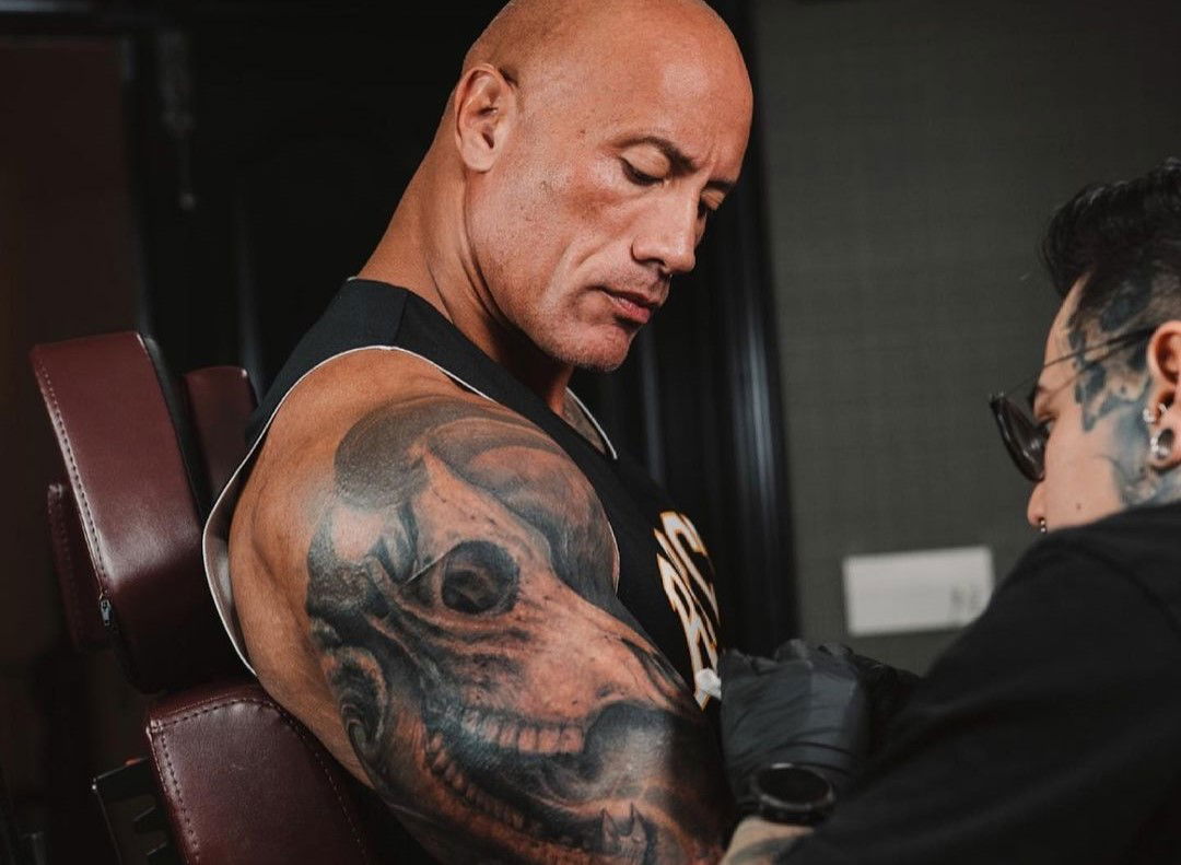
Years later, Johnson reworked the bull into a much larger black-and-gray design built around a skull. He documented the project with tattoo artist Yomico Moreno in the short film The Evolution of the Bull. The Wrap reported that Johnson chose the skull as the central image and wanted the piece to connect his personal history with broader ideas about life, death and the mysteries of existence.

Johnson was drawn to Moreno’s detailed, hyperrealistic style. Moreno first contacted him on Instagram, and they developed the design from there.

Why did the redesign take so long?

Dwayne Johnson’s Brahma Bull tattoo during the redesign session

Johnson said the redesign took more than thirty hours over several sessions. Moreno had to build around the existing bull, adding detail rather than starting on blank skin. Johnson described the work as challenging because it required precise shading and color on his skin.

The bull tattoo and Johnson’s Polynesian identity are separate stories

The bull and Polynesian design often appear in the same photographs, but they have separate histories. The Polynesian tattoo reflects Samoan heritage and family; the bull began with Johnson’s wrestling identity and was later reworked with Moreno.

The visual difference is clear: repeated patterns and open space shape the shoulder and chest piece, while the bull is a heavily shaded skull illustration. Seeing both in one photo does not make them the same project or give them the same meaning.

Artists linked to Dwayne Johnson’s tattoos

Moreno is documented as the artist behind the later bull redesign. Older coverage gives conflicting credits for the original bull. The Polynesian work is associated with Samoan or broader Polynesian tattoo traditions, but the available sources do not identify one artist for every part of it.

The clearest artist credit belongs to Moreno’s bull transformation. For the older designs, a specific name is harder to establish, so the attribution should stay limited to what a source confirms.

How the collection has changed

Johnson’s tattoo history shows a change over time: the Polynesian shoulder and chest piece, the original bull from his wrestling years, and then the larger skull redesign. The last piece grew out of the first bull rather than replacing its history.

Older photos show the smaller bull; later images document Moreno’s redesign sessions. Together, they show how the tattoo changed without making either image stand in for the whole timeline.

Frequently asked questions

What does Dwayne Johnson’s Polynesian tattoo mean?

Johnson has connected the Polynesian tattoo with his Samoan heritage, his family and the culture he hopes to pass on to his children. Public sources do not confirm a meaning for every individual motif.

What is the Brahma Bull tattoo?

It began as a smaller bull linked to Johnson’s wrestling nickname and identity. Later, tattoo artist Yomico Moreno expanded it into the larger bull-skull design.

Who tattooed the redesigned bull?

Yomico Moreno is the documented artist behind the later bull transformation and the short film about the project.

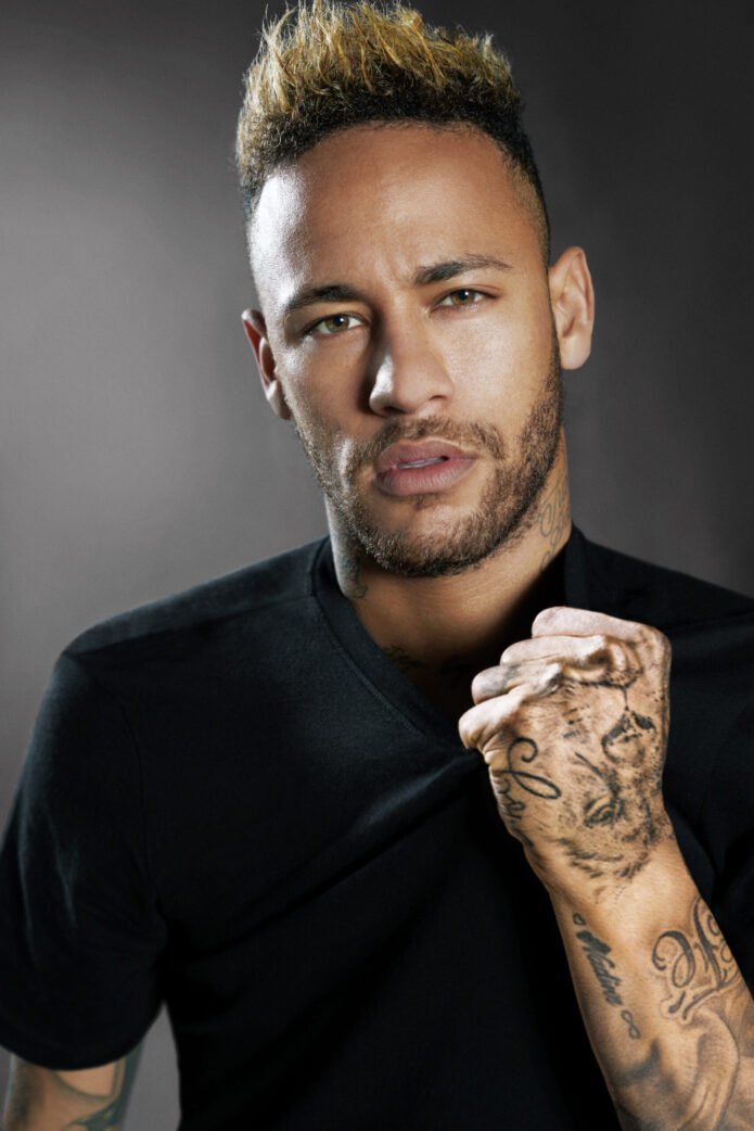
Neymar’s Tattoos and Family Tributes

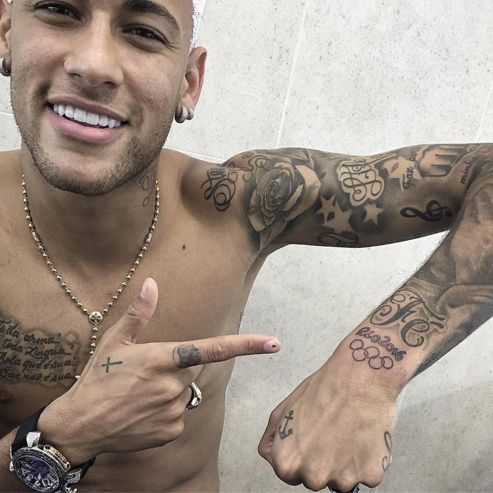
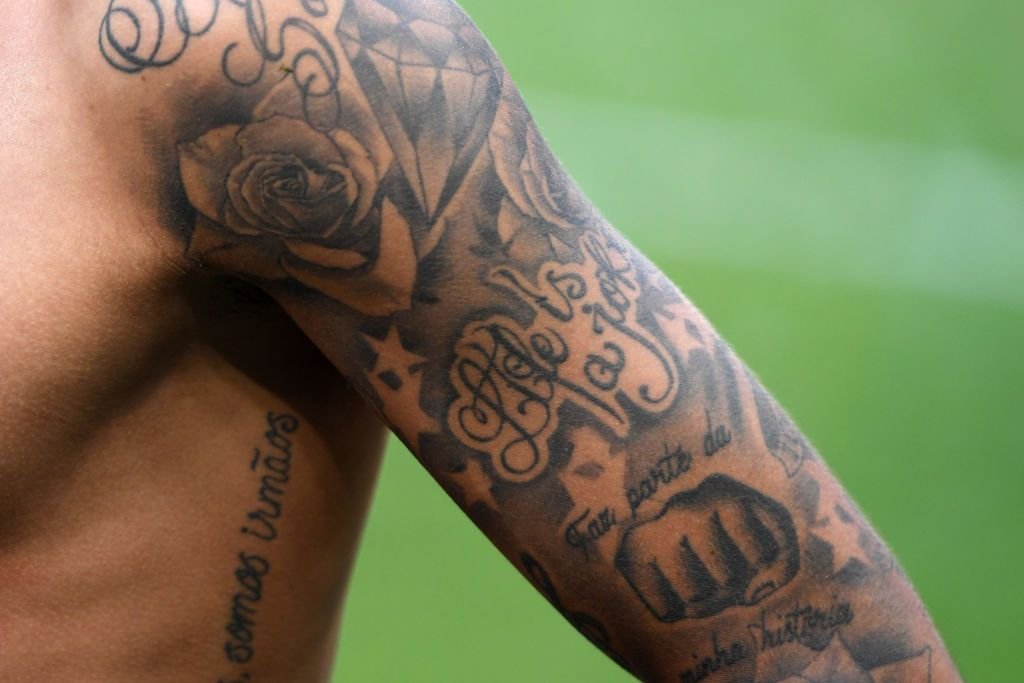
Neymar’s tattoos grew with his life: family names and portraits, religious phrases, football mottos and playful character art sit across his arms and torso. A child’s portrait shares space with dates and lettering; names appear beside images. Together, the pieces trace family, faith, football and home.

Neymar has added tattoos through different clubs, tournaments and family milestones. A photograph records one moment, not a final count. Some designs have an explanation from him; others can only be described from what is visible.

The first family names began with Nadine and Rafaella

Neymar wrist tattoos for Nadine and Rafaella

The names Nadine and Rafaella appeared early on his wrists: Nadine for his mother, Rafaella for his sister. Later photos show small hearts and an infinity mark around the lettering. These are clear family tributes, not just decorative script.

On the wrist, the names are small but easy to spot when Neymar celebrates or posts a close photo. They sit naturally beside the portraits on his arms, keeping the family pieces connected.

Chest lettering carries faith, family and the football mindset

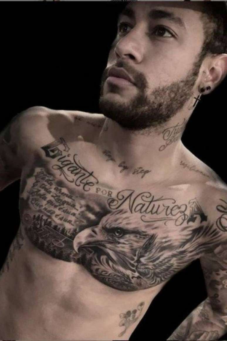
Neymar chest lettering and script tattoos

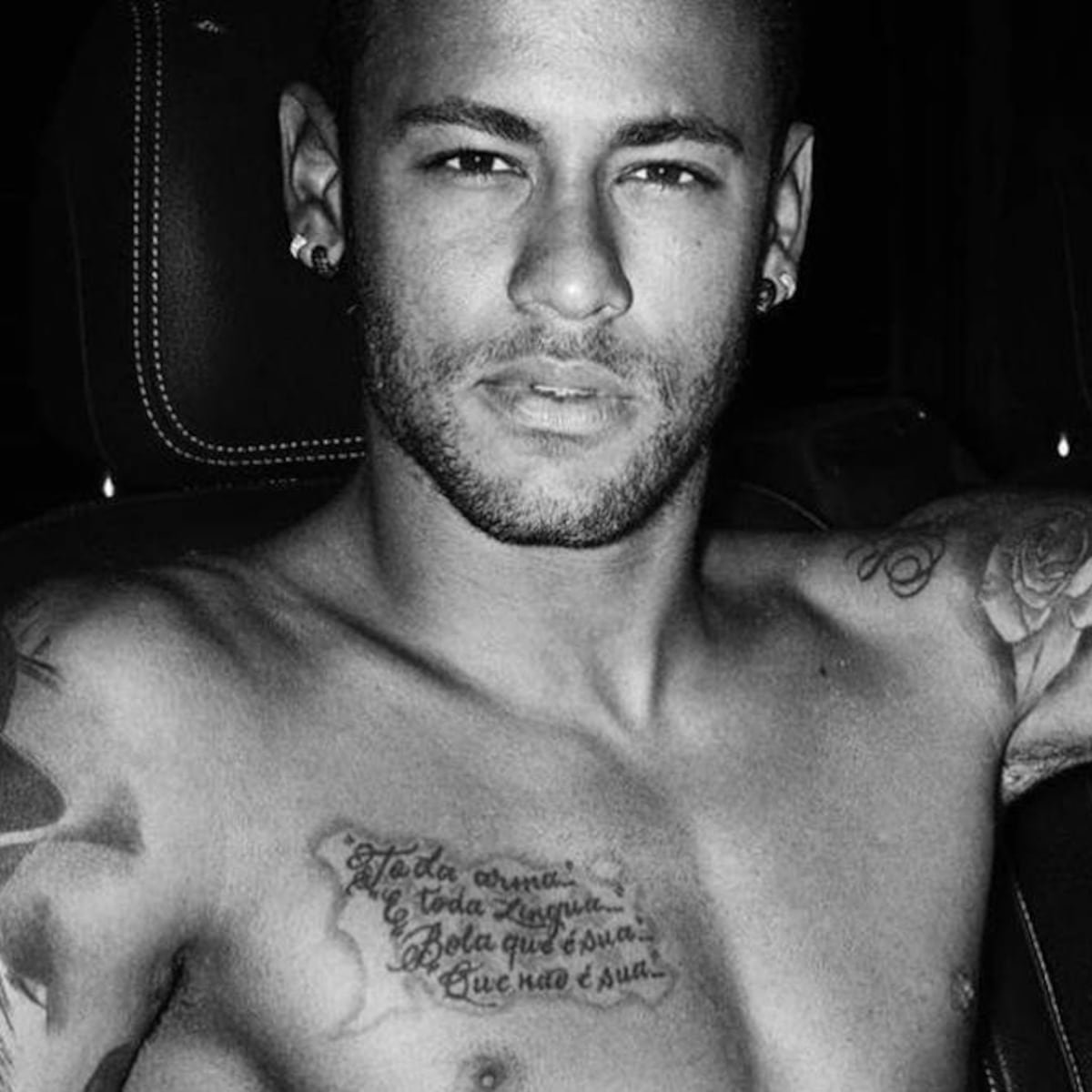
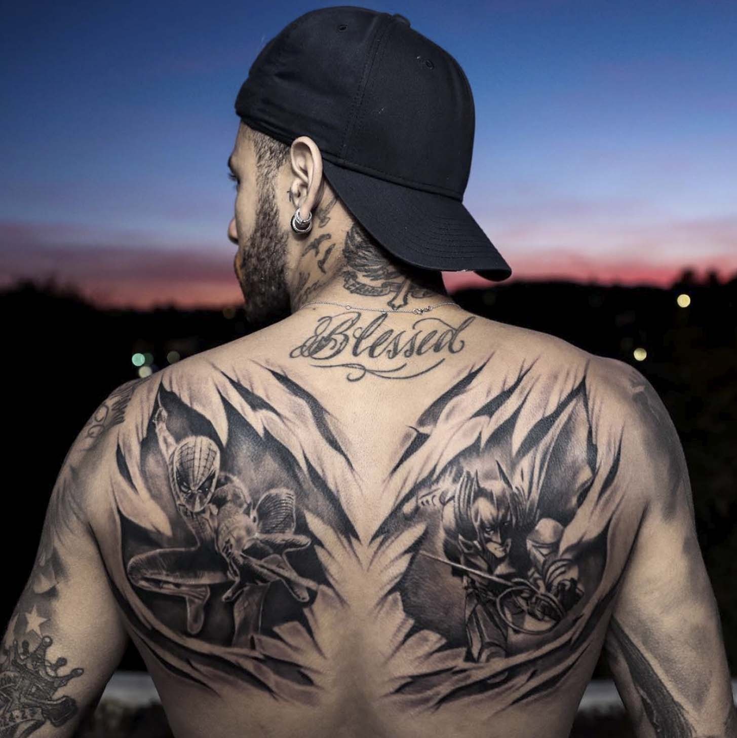
In shirtless photos, the cross with wings, “Blessed” and longer script stand out across Neymar’s chest and torso. Reports also mention prayer-like wording and phrases about perseverance.

Some lines follow the curve of his chest, so a turn or goal celebration can cut a phrase out of view. A still training photo often shows more of how the lettering fits around the other designs.

The words are easier to confirm than the story behind every religious symbol. Unless Neymar or a reliable source has tied a particular image to an event, that connection remains unknown.

Davi Lucca appears in both words and portrait work

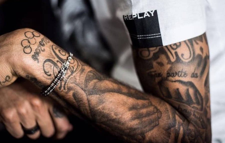
Neymar forearm tattoos connected with his son Davi Lucca

Neymar’s son Davi Lucca appears in a name and the date 24.08.11, as well as a portrait on the inner forearm. In one image, Davi raises a finger to his lips; the small gesture gives the tattoo a personal touch.

The date marks a family milestone, while the name and portrait add two other kinds of detail. A well-sourced account keeps them separate instead of calling all three simply a “son tattoo.”

Other arm lettering refers to Neymar’s father. When his forearm is bent, some letters become hard to read, so the exact layout can be uncertain in a photograph.

Rafaella’s portrait is one of the collection’s clearest faces

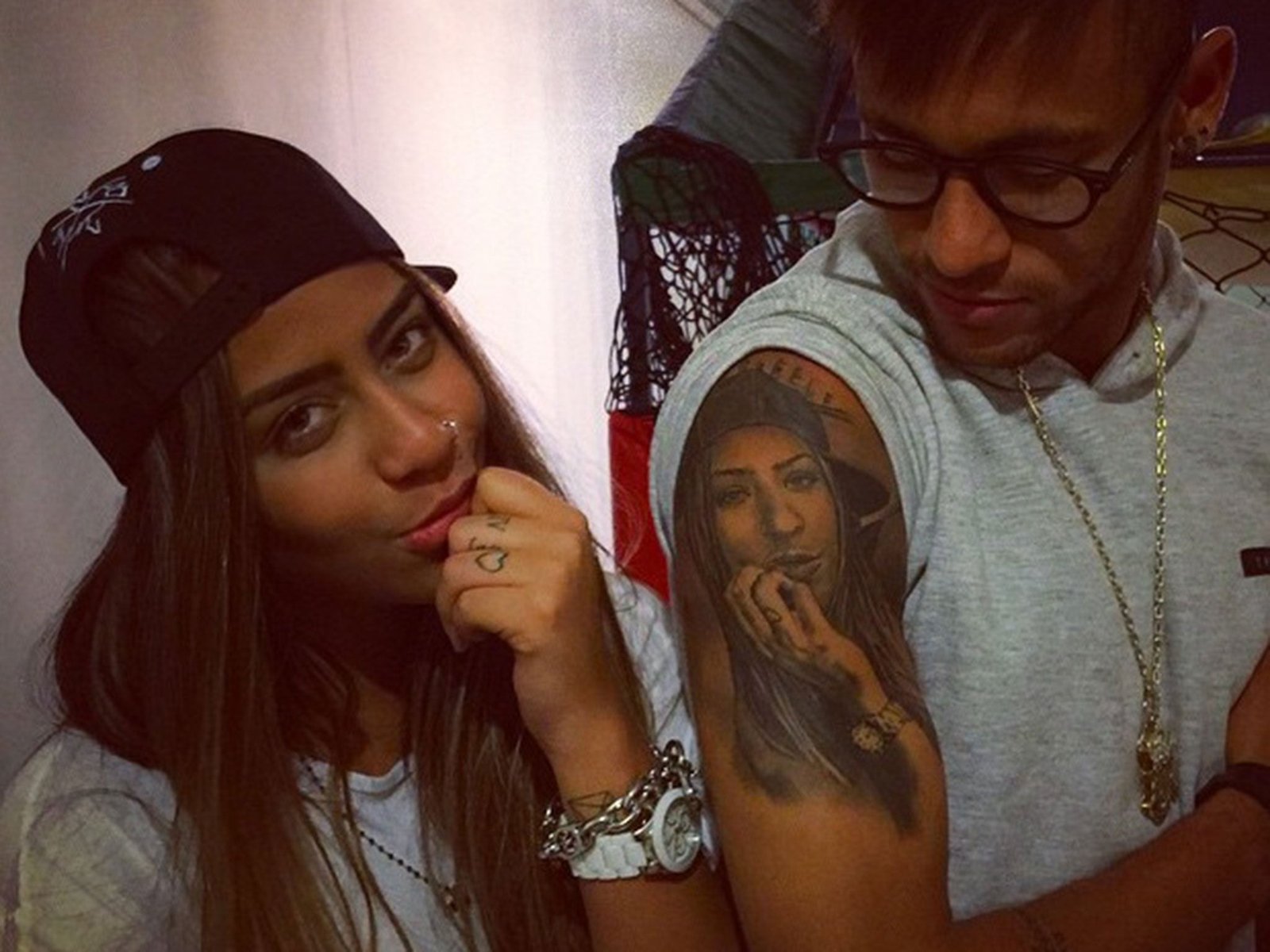
Neymar portrait tattoo of his sister Rafaella

The portrait of Rafaella is among Neymar’s most recognisable pieces. It relies on likeness, hair and shading rather than a name alone; coverage and Neymar’s own public family posts identify her as his sister.

Portrait placement affects how the tattoo reads. A straight-on forearm photo shows Rafaella’s face more clearly than a match shot, where the arm’s angle can stretch the image.

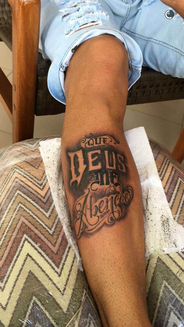
The shin lettering says “Que Deus me abençoe e me proteja”

Neymar shin tattoos reading Que Deus me abençoe e me proteja

In 2016, Neymar shared shin lettering that reads “Que Deus me abençoe e me proteja”, or “May God bless me and protect me.” The words are legible, and the translation was reported with the photo, making this one of the clearer pieces in his collection.

The phrase runs vertically with his leg, unlike a wrist name or a small symbol. It reads like a prayer alongside his football life. Related religious imagery is discussed with this piece, but that does not make every cross or line of script part of the same story.

“Ousadia e Alegria” turns a motto into a football-era marker

Neymar arm and hand tattoos including lettering and symbols

“Ousadia e Alegria” means “boldness and joy.” The phrase is associated with Neymar’s football identity and the attacking style he and his circle described in terms of risk, creativity and enjoyment. It appears among the lettering reported on his legs and lower body.

A lion tattoo on Neymar’s hand has been linked to his public image and a fragrance campaign. Other small marks include lettering and symbols that are hard to read in match photos: a bent finger can hide a word, and low resolution turns fine lines into a dark patch.

The family number and the child looking toward the future

Neymar chest and torso tattoos

The Roman numeral IV is reported as a reference to Neymar, his parents and his sister. It represents the four-person family unit seen throughout the collection’s names and portraits. That explanation is better documented than meanings attached to nearby small marks.

Another tattoo shows a child looking toward a favela, with dreams of a home, football and major trophies. It is often read as Neymar looking ahead while remembering where he came from, though reports do not always give the same date or artist.

Superheroes, animals and smaller symbols fill the gaps

Neymar’s wider tattoo collection

Spider-Man and Batman are among the reported character designs, alongside lions, eagles and other animals. They give the collection a playful edge. A general tattoo meaning is not proof of the personal reason Neymar chose an animal.

In a close photo, a portrait, word, date or character can often be identified. When Neymar or a reliable source has not explained a symbol, the visible design can be named without assigning it a private reason.

How many tattoos does Neymar have?

There is no permanent official count. Coverage has given different totals, and the number shifts as small marks are counted or new work appears. A dated record is more useful than one figure meant to cover his whole career, especially when a new family or football design may not yet appear in a full-body photo.

The lasting themes are easier to pin down than the total: family portraits and names, faith, Portuguese mottos, football ambition and playful popular culture. The pieces came at different points in Neymar’s life, so the collection feels more like a timeline than a sleeve planned all at once.