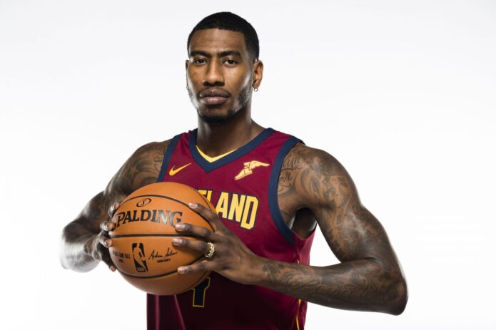
Iman Shumpert’s tattoos look different depending on what he is wearing. A basketball jersey can cover his shoulders and the inside of his arms; a shirtless portrait reveals dense work across his chest, shoulders and forearms. Smaller lettering on his hand needs a close-up. The collection makes more sense when the large areas and small details are viewed separately, rather than treated as one sleeve.
Photos tell us a lot about placement and style, but they do not explain the private meaning of every symbol. That is fine. The useful details are what a clear image can show: where the ink sits, how the designs overlap and how the collection looks from a wide basketball portrait to a tight hand shot.
The chest and shoulders carry the biggest visual pieces
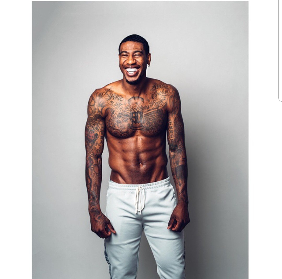
Shumpert’s tattoos are easy to underestimate in a jersey. Shirtless photos show the scale of the work across his chest, shoulders and upper arms. Dark line work, lettering and shaded pieces run into one another, but the area does not read as a single planned mural. It looks layered, with older marks beside newer-looking work and open gaps that are part of the overall design.
The chest is busy, but the available photos do not name or explain every shape. Tattoo lists can turn a blurry patch into a confident story; there is no need to do that here. The images support a clear description: dense black-and-grey work across the upper body, with script and graphic designs near the collarbones and shoulders.
The shoulder pieces stay visible even when Shumpert wears a vest or jersey. One side looks heavier and more filled, while the other has more lettering and open skin between designs. That slight imbalance gives the collection character. There is no reason to pretend both sides were planned as a perfect pair.
The chest is not just a background for the arm work. In wider photos, the torso designs connect the two shoulders and the arms pull the eye outward. A close crop can help with one detail, but it misses the way the whole upper body is arranged. The tattoos themselves are visible; their full personal story is not.
A second shirtless view shows how the arm work wraps around
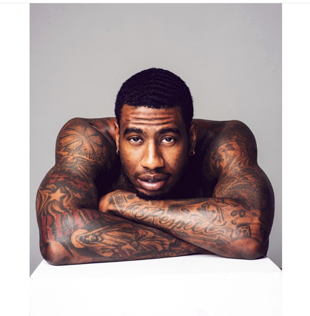
This second shirtless photo earns its place by showing another angle, not by repeating the first pose. One view makes the front of the shoulders clear; this one follows the ink farther around the upper arms and toward the sides of the torso. They show different parts of the collection.
Shumpert’s arm work combines broad shaded patches with smaller designs and words. The pieces do not all run in one direction, so the arms look built up over time rather than planned as a single sleeve. Some areas are dense with black ink; others leave enough skin visible to separate one design from another.
Older sports photos can hide much of this work. A jersey covers the upper shoulder, and the position of an arm can conceal the inside forearm. A good tattoo guide needs more than one angle; a covered section is not necessarily bare skin.
Reports mention lettering and symbols around the upper body, but the photos do not provide a reliable inventory of every word. It is better not to invent translations. The extensive arm coverage is clear; the meaning of each small shape is not.
The hand tattoos are small but easy to spot
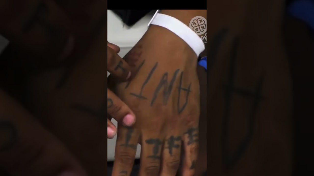
The hand close-up brings a different scale into the story. Lettering across Shumpert’s fingers is compact and dark, and it is easy to miss in a full-body photo. Here, the marks read as deliberate hand tattoos, not random shadows or creases from a jersey cuff.
The letters are commonly read as “ANTI,” though the exact view depends on which hand faces the camera. The important detail is placement: the ink sits on his fingers and hand, where it is more exposed than a shoulder tattoo. Hand tattoos can also fade and soften faster than ink in more protected areas, so older photos may look less crisp.
The public material does not establish a full personal statement behind the word. There is no need to make one up. The photo shows the lettering and its location, which is already enough to make it one of the most recognisable small details in Shumpert’s collection.
The hand work changes the balance of the larger pieces. His arms carry broad designs, but the finger lettering gives the collection a sharper edge. People may notice it in a close interview shot or courtside photo, then lose it again when the camera pulls back.
The arm tattoos form a busy mix rather than one neat sleeve
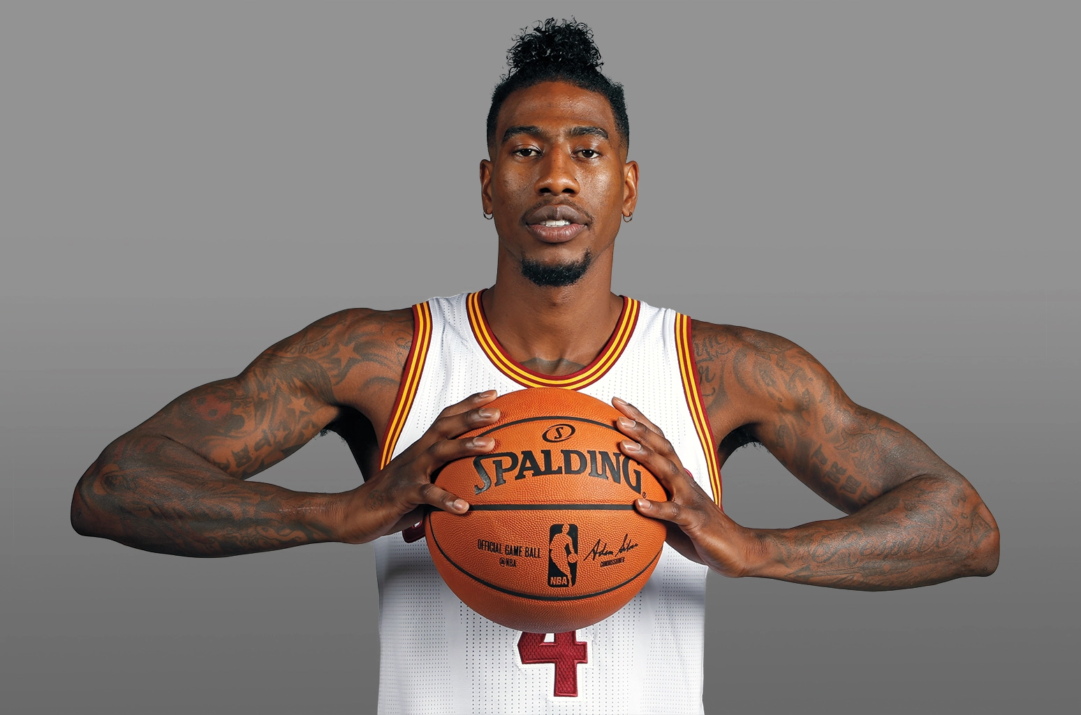
A wide basketball portrait shows just how much ink sits from the shoulders down toward the forearms. Dark shapes, curves, script and smaller symbols overlap on both arms. “sleeve” works as shorthand, but it should not suggest one matching panel. The tattoos have a more lived-in look, with different pieces sharing the same space.
The two arms do not appear identical. One has larger shaded areas; the other leaves more gaps around the lettering. That unevenness gives the designs some personality. They look like choices made at different times, not a uniform layout taken from one catalogue.
Shumpert’s basketball photos often show the tattoos through layers of clothing. Sleeves, warm-up tops and arm bands cover different parts of the work. A clear studio portrait is much more helpful than a game photo where only the outside of an arm is visible.
The designs are visually clear even when their meanings are not. A reader can be told where the lettering and shaded pieces sit without being given a fictional explanation for every symbol. The collection has enough detail without adding a dramatic story to each mark.
The basketball portraits make the shoulder lettering easier to read
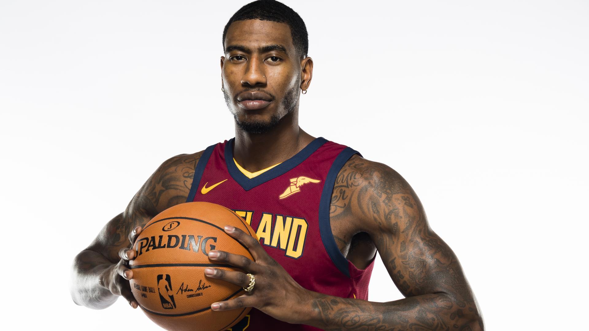
The NBA photoshoot gives the cleanest view of Shumpert’s shoulder and upper-arm lettering. The light is even, and the jersey leaves both arms exposed. It also shows why the tattoos form such a visible part of his public style: some sit high enough to show in a regular sports portrait, not only in a shirtless reveal.
Some marks look like script; others are closer to symbols or short blocks of text. From this distance, it is possible to describe their shapes without claiming that every word is perfectly legible. A photo can show writing even when it cannot confirm a translation.
The shoulder work appears alongside basketball imagery, but that does not make every tattoo a team tribute. His career explains the jerseys and courts in the photos; it does not prove that he chose a design for a particular franchise. Those links should be made only where a source supports them.
Together with the shirtless views, this portrait fills in the gaps around the upper arms. It gives a better sense of scale, spacing and placement than a generic headshot. The featured image can show Shumpert’s face without pretending it proves a specific tattoo.
Across the photos, the collection moves between different scales. The chest and shoulders carry the strongest visual weight, the arms add density, and the hand lettering is smaller but more exposed. The work looks as though it has been added over time, with several styles sharing the same body.
One generic sports portrait cannot show everything. It would hide the inside arm, flatten the chest and miss the finger lettering. Separate photos give each area room and make it easier to distinguish a clear tattoo from a dark patch caused by lighting.
6 thoughts on “Iman Shumpert’s Tattoos: The Ink Across His Arms, Chest and Hands”