codex

J.R. Smith Tattoos: Chest Portraits, Neck Lettering and More

J.R. Smith has one of basketball’s largest and most recognisable tattoo collections. He has said he stopped counting at around seventy, and the photos make that easy to believe: portraits, chest lettering, neck words, basketball symbols, stars and dense arm work all share the space. This guide focuses on the main designs, sticking to what Smith has said and what the images clearly show.

The tattoos accumulated over many years, not in one marathon sitting. An older photo may show open skin that was later filled, while a jersey can hide much of the chest or arms. The photos here are distinct views, giving a better sense of the overall layout than repeated crops of one picture.

Mama’s Boy and Black Jesus sit at the centre of his chest
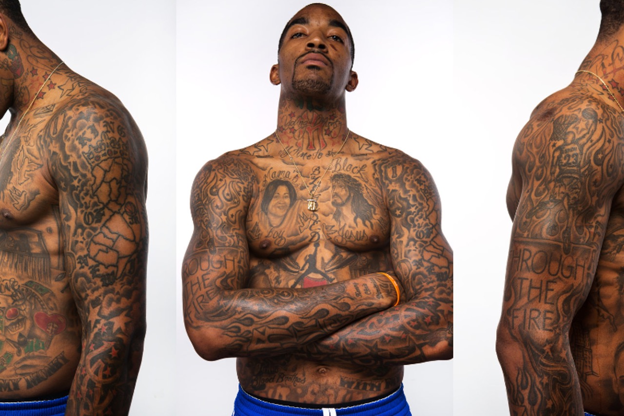
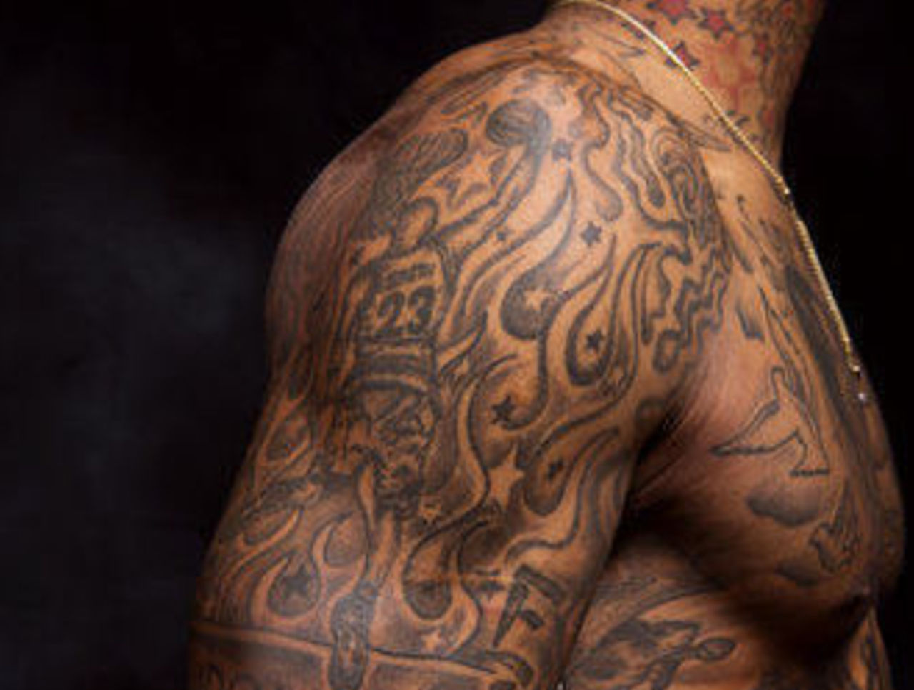
J.R. Smith tattoos: large studio view of the chest lettering, portraits and upper-arm work

Smith’s chest is a natural place to begin because it holds some of the designs best known from his shirtless photos. The words “Mama’s Boy” frame a portrait of his mother, and the piece is large enough to read without a close crop. It is not a hidden little mark; it is one of the main features of his tattooed torso.

Next to that family portrait is an image widely identified as Black Jesus. The religious portrait creates a different mood from the basketball-related words around it. In a wide shot the two can seem like one large patch of ink, but a clearer photo shows separate subjects, each with its own lettering and shading.

The family connection is among the more straightforward stories attached to Smith’s tattoos. He has talked about his mother’s reaction to seeing her portrait, so there is context without needing to add a bigger theory. The point is simple: his mother appears on his chest, with words that make the tribute clear.

More lettering fills the space around the portraits, including references to faith, family and Smith’s own sense of himself. Some lines are legible in the studio photo; others disappear into the shading. The image helps show how the portraits, text and black-and-grey work fit together, instead of reducing the chest to a generic shirtless shot.

His first tattoo was a basketball tribute that started the whole collection
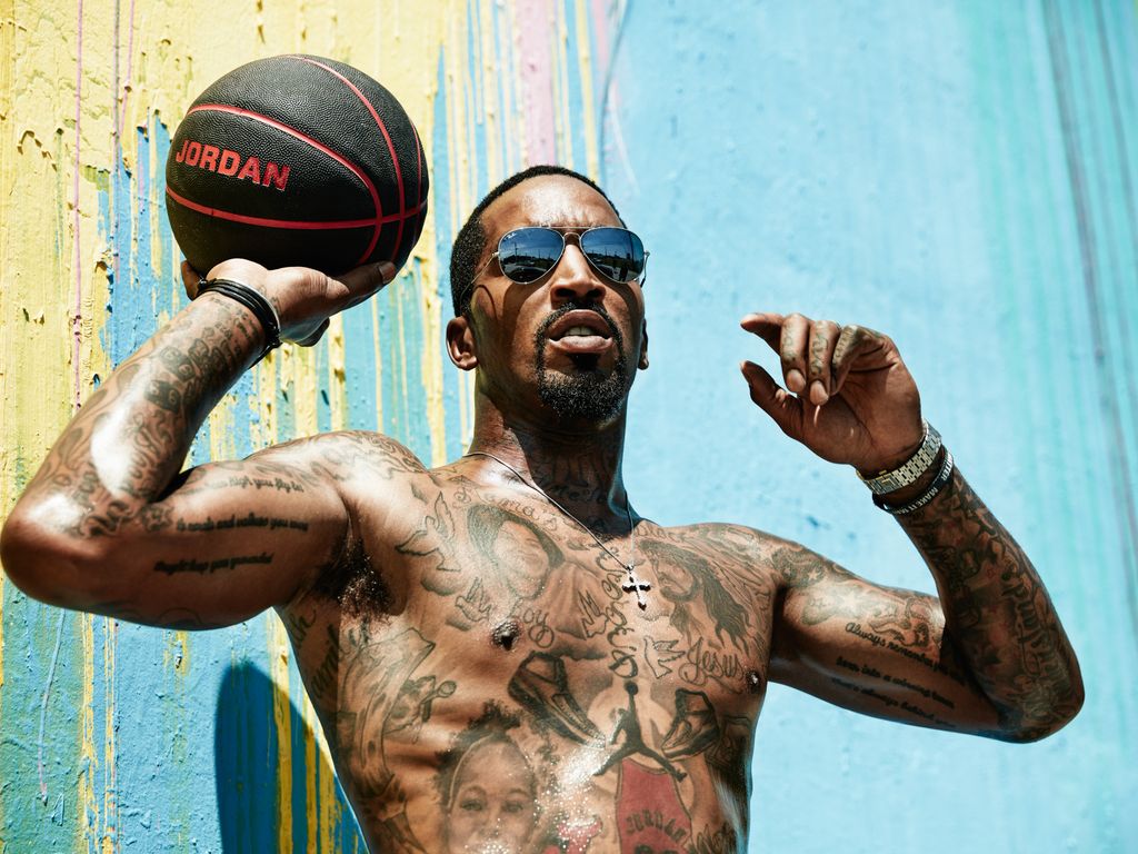
J.R. Smith tattoos: different editorial portrait showing the dense chest and arm layout

Smith has said he got his first tattoo at about fifteen. It showed a basketball player dunking and was personalised with his own name and number. That early sports design looks quite different from the portraits and dense sleeves that came later. It began with the game he hoped to play, and the rest of the collection grew from there.

The phrase “Through the Fire” is another part of that story. It appears alongside basketball imagery and is often linked to difficult periods in Smith’s life and career. The wording is clear enough to mention, but it should not be used to assign a life story to every other tattoo.

Look closely at his arms and the original sports theme now sits among script, stars and darker filler, added across different sessions. The work does not read like one sleeve planned all at once. It feels as if Smith kept adding pieces, eventually making the spaces between them part of the overall style.

That gradual process is part of the appeal. Smith has described choosing tattoos spontaneously, sometimes deciding what to get after he arrived at the shop. The result is crowded but personal. A tidy list of symbols would miss the slightly unpredictable way the collection came together.

Young Money and Swish give the neck its own basketball-era lettering
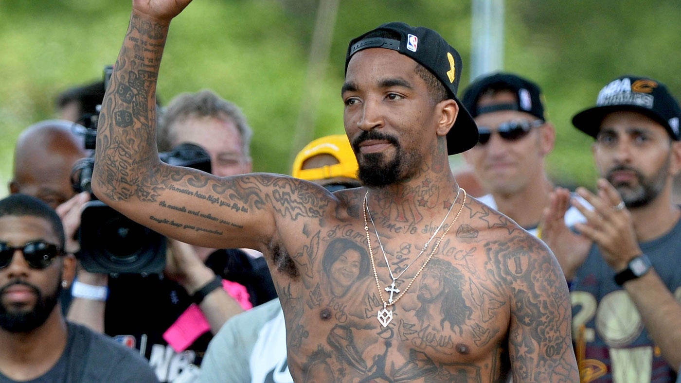
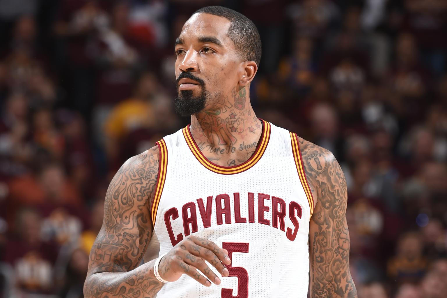
J.R. Smith tattoos: separate event photograph showing the neck, collar and upper-arm ink

The neck tattoos stand out in photos where Smith wears a jersey or a low T-shirt. Young Money sits high on his neck, with Swish added above it later. The lettering connects to his nickname and basketball identity, giving the words a personal-brand feel rather than the look of simple decoration.

The area also includes a New York Yankees logo, smaller stars and marks around his ears. Collars, chains and shadows can obscure parts of the design, and not every photo is equally clear. The description sticks to what can be made out and leaves unreadable script alone.

Placement gives the words extra weight. A forearm phrase might disappear under a sleeve, but neck lettering follows Smith into public view. It helped make his tattoos a familiar part of his NBA-era image. Close to the face, even a short word has a strong visual presence.

The neck also reflects how his collection grew. Early lettering and later additions do not always match in size or style, which is natural for tattoos collected over many years. It makes more sense to view the area as a timeline than as one finished logo.

The arms and shoulders carry the basketball symbols and smaller filler work
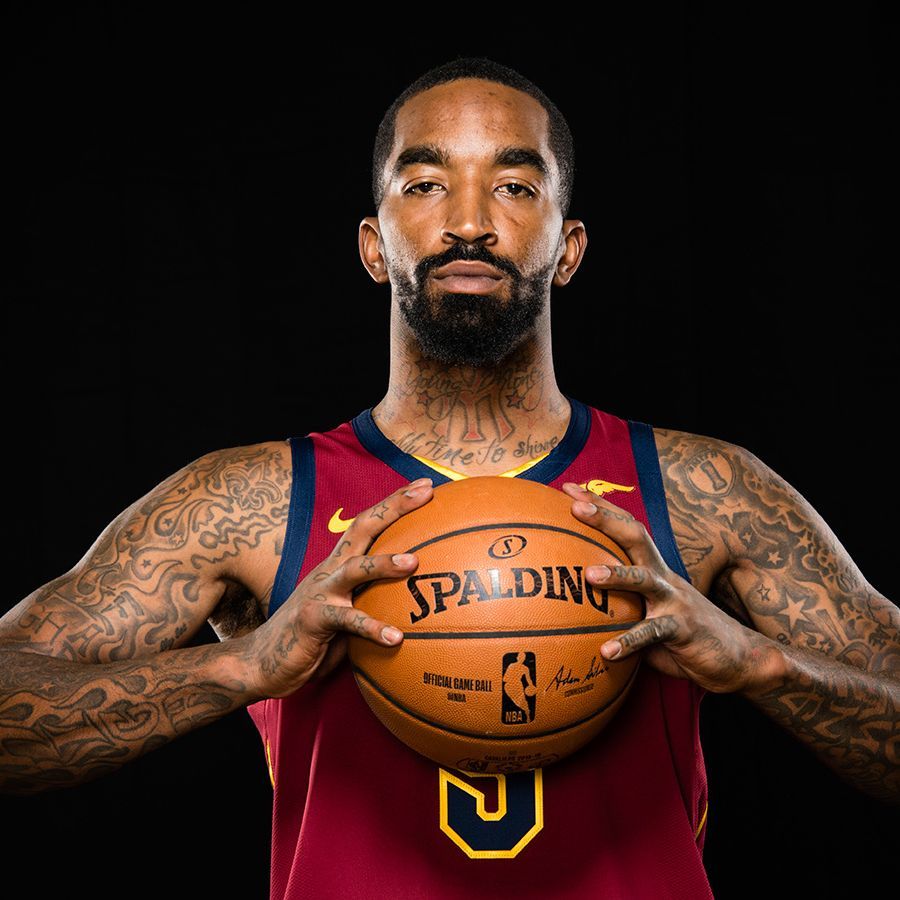
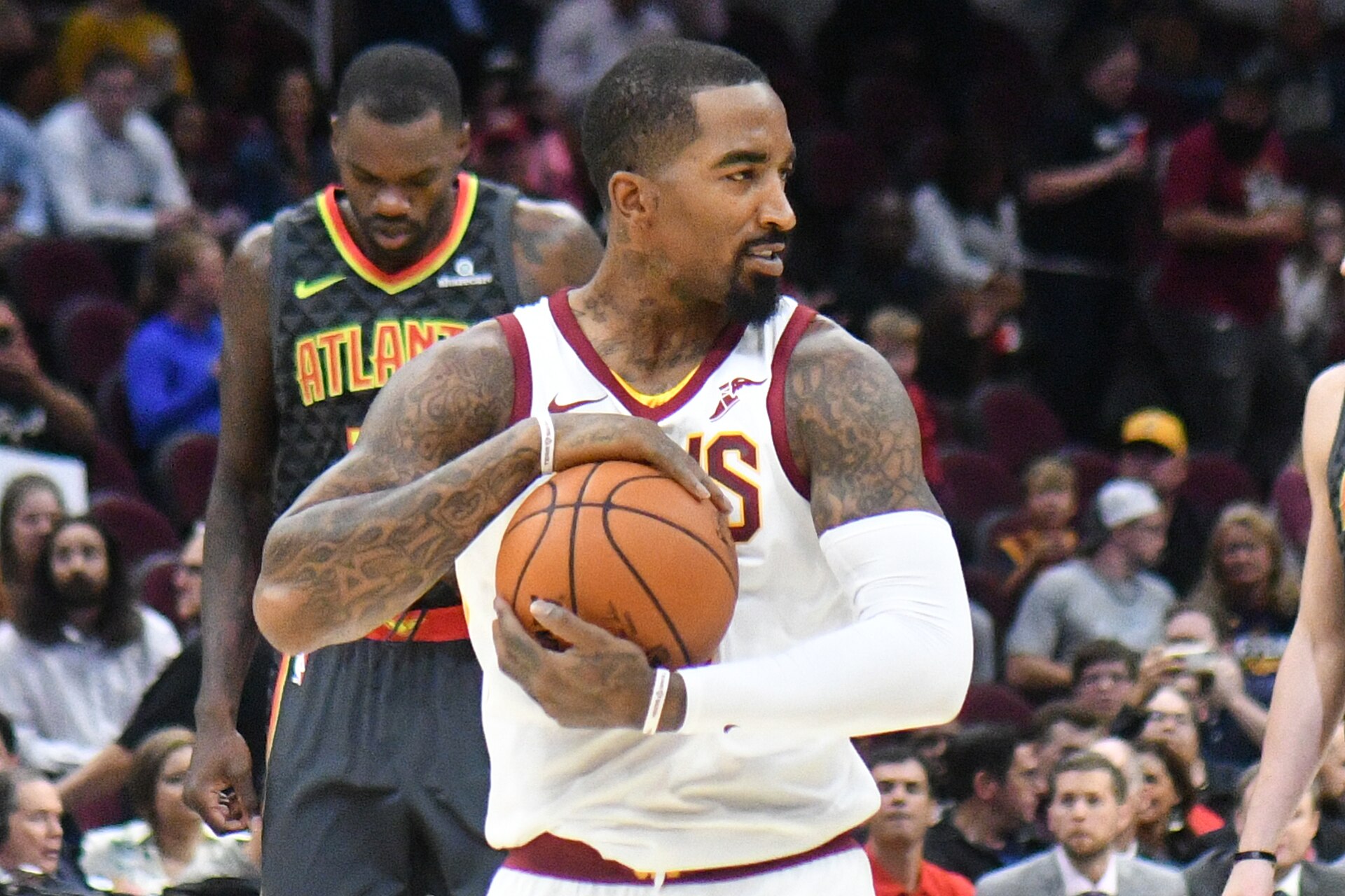
J.R. Smith tattoos: high-resolution jersey portrait showing the arm, shoulder and neck coverage

Smith’s arms hold details that can be hard to see while he is playing. Stars sit around the shoulders, script runs along the arms, and basketball imagery mixes with darker filler between larger designs. A straight-on portrait gives the overall impression; an angled view shows how the tattoos wrap around his biceps and forearms.

The sports references take different forms. Some are direct basketball images; others are numbers or words that make more sense alongside the rest of the collection. His own number appears in accounts of the work, and other pieces point to teams and places from his career. The arms feel more like a scrapbook of those years than one sleeve built around a single logo.

Smaller marks also sit near his hands and ears. Smith has had work added around the fingers and behind the ears, areas that can look quite different from one image to the next. A close portrait helps with the ear and neck pieces, while a wider shot shows how they relate to the larger arm tattoos.

The amount of ink is why several photos help. One can show the chest, another the shoulder, and a jersey portrait reveals what remains visible when clothing covers most of his torso. Repeating the same photo would make the collection seem flatter than it is.

Death Before Dishonor and the leg tattoos add a tougher note
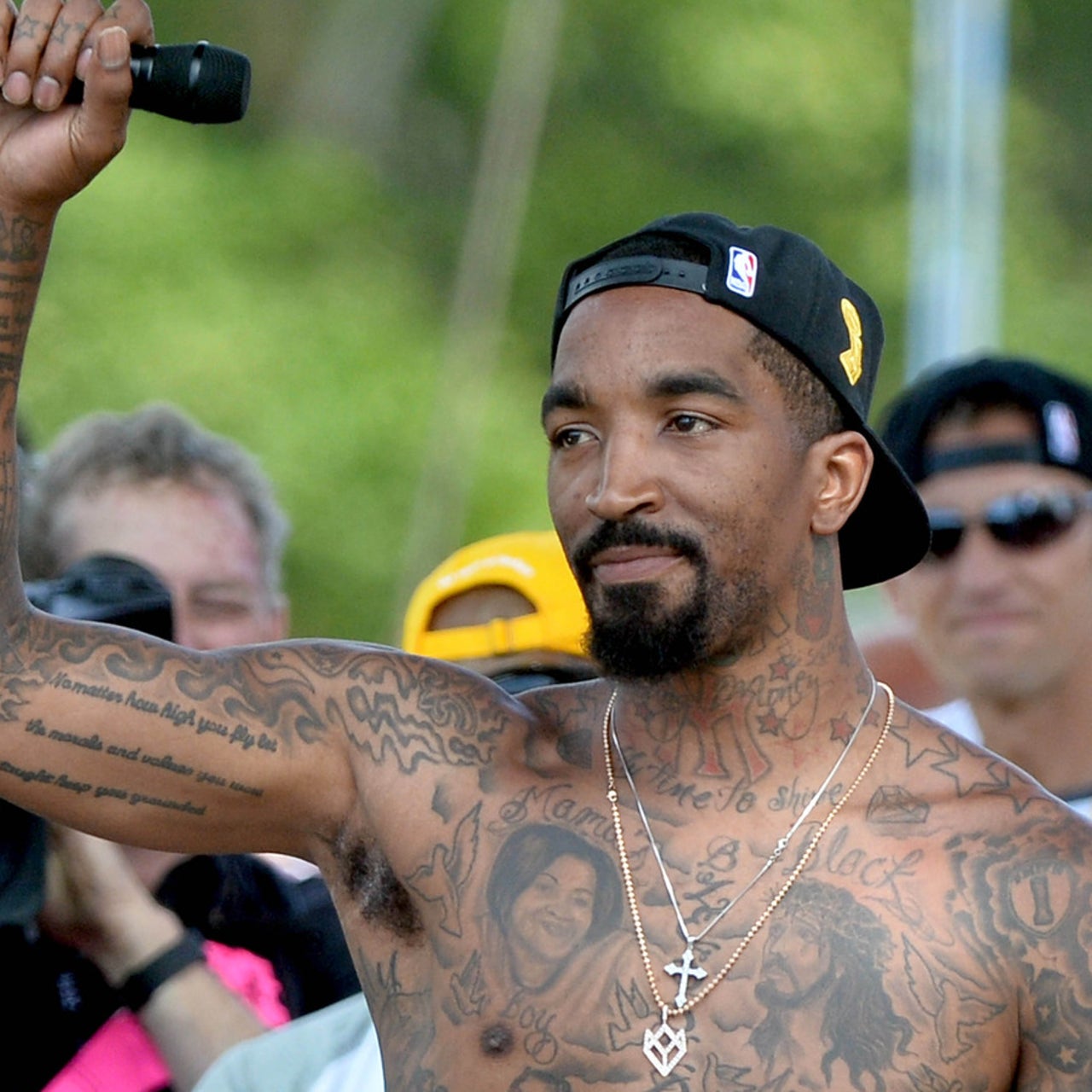
J.R. Smith tattoos: different high-resolution outdoor photograph showing the overall body coverage

Tattoo coverage usually places the phrase Death Before Dishonor on Smith’s thigh, apart from the chest portraits and basketball lettering. Its harder tone contrasts with the family tribute, much like the rest of his collection moves between sentimental portraits, faith, sports and blunt phrases without smoothing them into one mood.

Smith also has tribute work linked to people he admired, including a reported Nipsey Hussle tattoo. It helps to keep the timing in view: the collection changes, and photos from different years show different amounts of leg and torso coverage. The tribute can be mentioned while making clear which image actually shows it.

The lower-body tattoos are easy to miss because many of the best-known photos focus on Smith’s chest and arms. Parade pictures show more of his body art, but they are not always sharp enough to identify every mark below the waist. Confirmed lettering should be kept separate from smaller shapes that appear only as dark patches.

Taken together, Smith’s tattoos tell a pretty direct story about family, faith, basketball and his habit of adding another piece when he felt like it. He once said he had lost count at roughly seventy, so it is no surprise that no single photo serves as a complete inventory. Several clear, distinct views give the best sense of the work.

Some marks are still difficult to name with confidence, particularly around his ears, hands and lower arms. That is simply part of having so much ink. A useful guide can show the designs that are clear without turning every shadow into a new symbol.

The mix is what makes Smith’s tattoos stand out. His mother’s portrait sits near religious imagery, basketball references appear beside blunt phrases, and later work fills the gaps around older designs. The collection is busy without being meaningless; it reflects the people, teams and ideas that have stayed with him through much of his adult life.

His tattoos also became part of his public persona. Shirtless celebrations put his chest and arms on display, and league rules later drew attention to designs such as the Supreme logo. That attention does not explain every tattoo, but it shows how closely the ink is tied to the way Smith presents himself.

The clearest starting points are Mama’s Boy, Black Jesus, Through the Fire, Young Money, Swish, the stars, the basketball imagery and Death Before Dishonor. For anything beyond those, a sharp photo or a direct explanation is needed before calling it certain.

Smith’s tattoos and the NBA debate

The Supreme logo on Smith’s calf brought his tattoos into a wider discussion about branding in the NBA. The news video below covers that debate; it is separate from the family portraits, religious imagery and basketball references elsewhere in his collection.

More athlete tattoo guides

More photographs of J.R. Smith’s tattoos
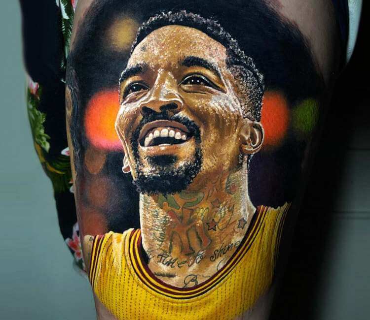
J.R. Smith’s neck and arm tattoos in a Cavaliers jersey.
A close photograph of J.R. Smith’s shoulder and upper-arm designs.
J.R. Smith’s visible shoulder and neck tattoos during a game.
J.R. Smith in action for the Cleveland Cavaliers.

Bobby Green Tattoos: The King Back Piece, Statue of Liberty and More

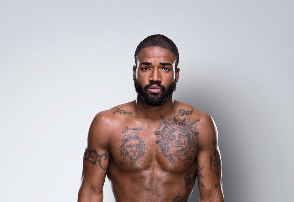
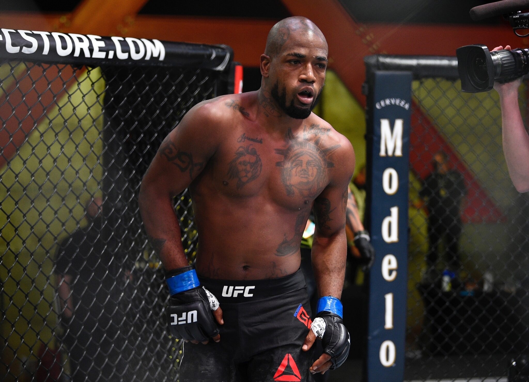
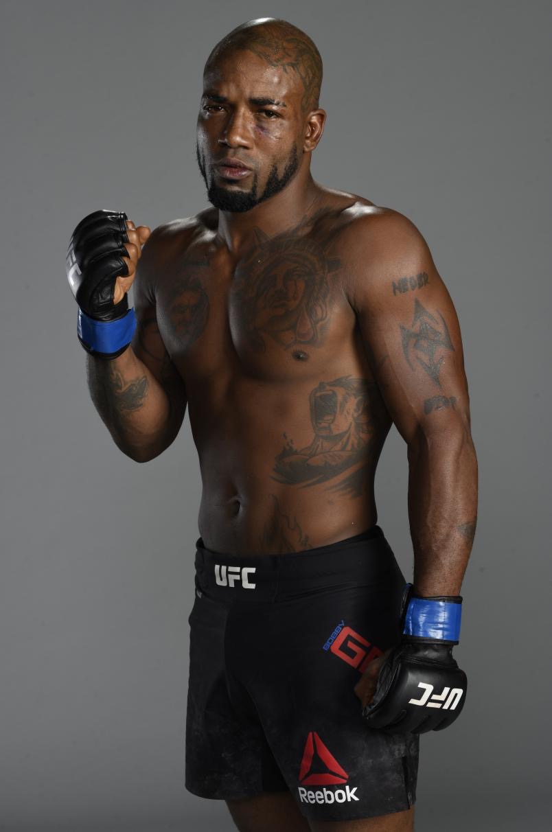
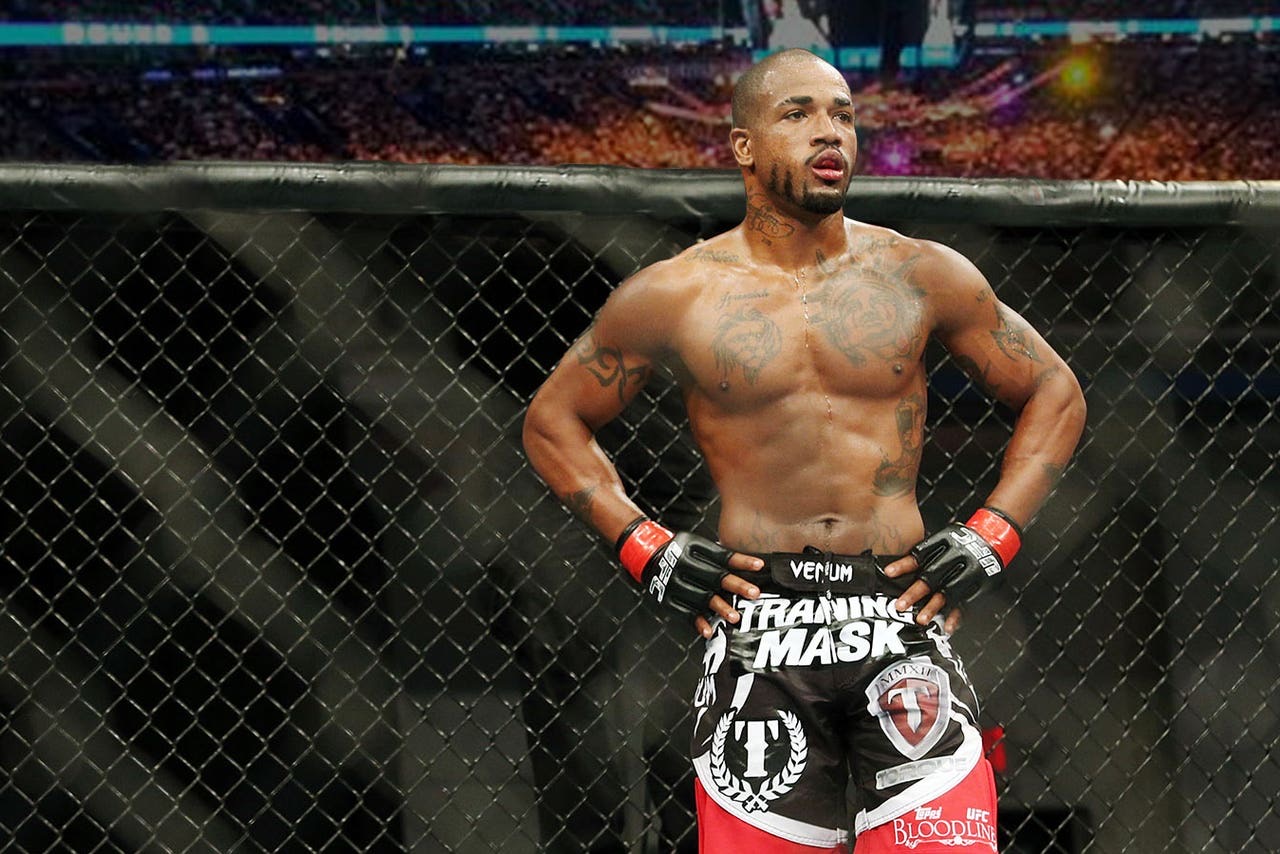
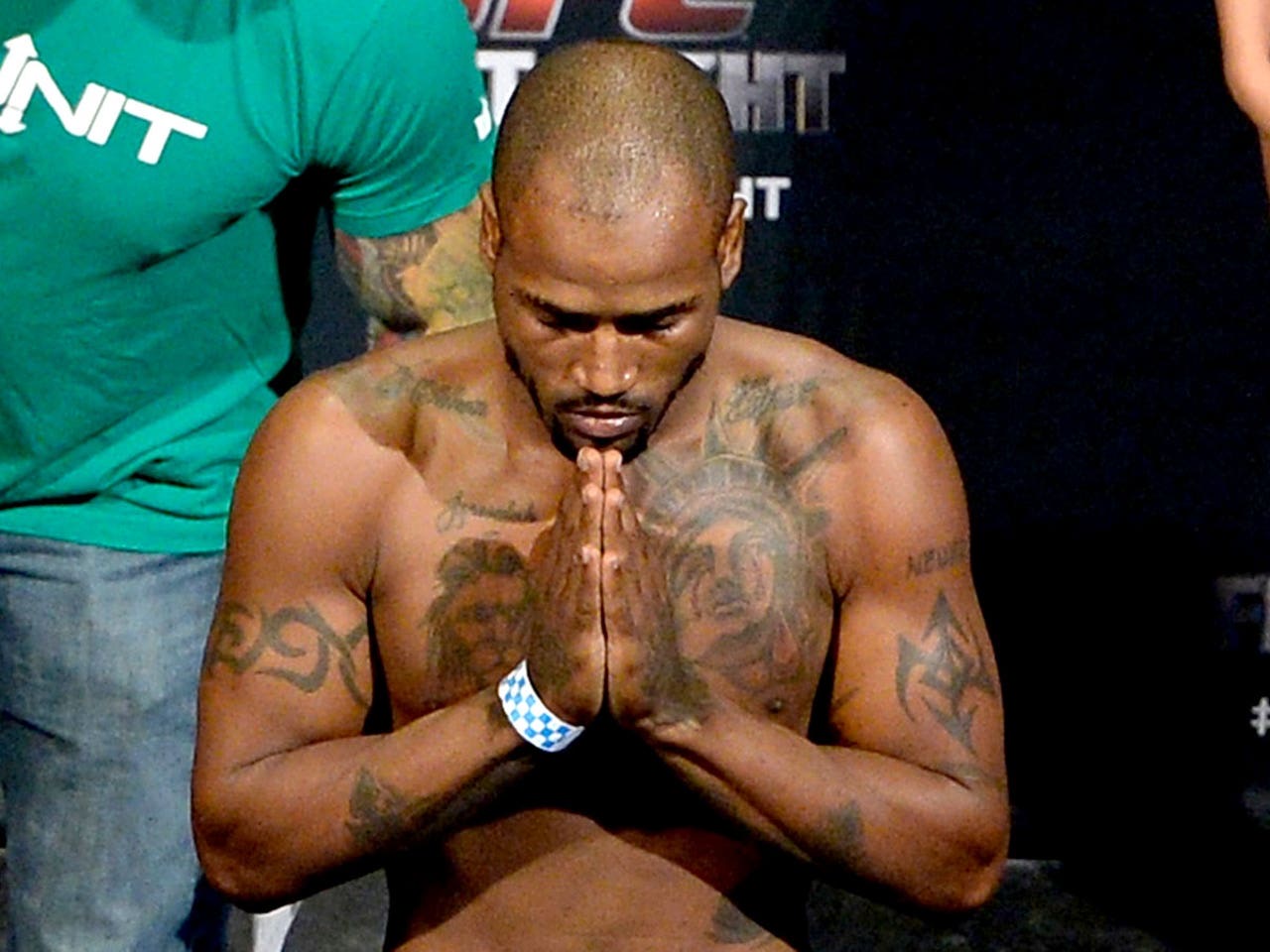
A quick fight photo only hints at how much ink Bobby Green has. The collection includes a crying Statue of Liberty across his chest, a huge King design on his back, plus lions, crosses, wings, flames, names and a dragon. Green has also spoken about the pain and regret that can come with getting tattooed, making the collection more than a catalogue of symbols. It reflects choices made at different times in his life.

Photos are important here because gloves, shirts and camera angles hide different areas. This guide groups the visible designs, treats separate tattoos separately and includes meanings only when Green or a reliable source has shared them.

Bobby Green’s chest carries the crying Statue of Liberty tattoo and lion work

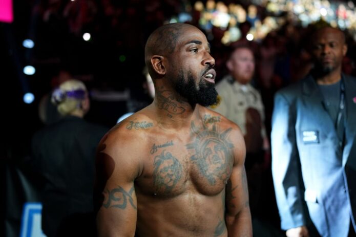
Bobby Green tattoos: sharp portrait showing the crying Statue of Liberty chest tattoo and nearby chest ink

The crying Statue of Liberty is often the first design people notice. It spreads across Green’s chest and is far larger than a small badge or filler tattoo. The face, tears and heavy shading give it a solemn look, while the surrounding ink keeps it from reading like a standalone logo. A clear chest photo helps because fight-night images can hide the lower edges beneath a shirt, towel or gloves.

The image fits the way Green has spoken about freedom and his life. There is no need to invent an elaborate meaning for every line: the familiar Statue of Liberty already carries weight, and the tears change its mood. It feels personal and lived-in rather than like a souvenir.

A lion is also reported among the chest and upper-body tattoos. It brings a different feel, with animal imagery and a sense of pride or toughness. It should be listed separately from the Statue of Liberty. They sit near each other, but they are different designs, and there is no need to assign them one shared meaning.

The chest photo also shows how Green’s tattoos follow the shape of his body. Dark outlines run over the pec and shoulder, while smaller marks fade toward the collarbone. That arrangement is easy to miss in a distant shot, which is why the close image belongs here instead of relying on the featured headshot. The crying face is what sets this version of the Statue of Liberty apart from a standard outline.
The huge King back tattoo gives Bobby Green’s collection its loudest piece

Bobby Green tattoos: large high-resolution photograph showing the back lettering and upper-body tattoo layout

Green’s large King tattoo makes the scale of his collection clear. The lettering covers enough of his back to become its main feature. Around it are reported crosses, wings, a halo and flames. Together they give the design a religious, theatrical feel without making it look like a neatly boxed mural.

The back has been worked on over time, so older photos may show an earlier version. With a piece this large, later sessions can deepen the background, sharpen a letter or join shapes that once looked separate. The wide image is useful because it shows the placement across the back rather than one cropped section.

The word King is tied to Green’s nickname, but the nickname alone does not explain every surrounding symbol. The cross and wings can be described visually, with any connection to faith stated carefully. A halo’s rounded lines and the flames’ sharper shapes create an interesting contrast, especially when he is photographed from the front and the back piece is visible.

This design needs room to read. In a tiny thumbnail the lettering would blur into a dark patch. The photo is a different view from the chest and arm images, showing why a heavily tattooed fighter needs several views rather than one portrait repeated throughout.

Bobby Green’s arm and shoulder tattoos are built from separate pieces

Bobby Green tattoos: different official portrait showing the arms and shoulder placement in clear light

No single design takes over Green’s arms in the way the Statue of Liberty does his chest. Smaller symbols, lettering, names and patterns spread across the shoulders and upper arms. Some photos show them clearly; others catch them at an angle or under arena lights. It is best to identify what the images support and avoid giving every dark line a backstory.

Reports mention names near the collarbones and shoulders, as well as flames along the sides of his torso. The flames visually connect parts of the upper body, but that does not make the chest and arms one planned sleeve. The tattoos look like they were added over the years, with different ideas placed in different spots.

An ESPN tattoo interview gives more personal context. Green talks about painful tattoos and regrets, which makes the collection feel less polished than a typical celebrity slideshow. Some pieces are statements, some are memories, and others reflect what he wanted at a certain point in his life. That mix feels more credible than claiming every design has one profound meaning.

This official portrait shows the arms clearly without looking staged like a tattoo catalogue. The contrast between the bold chest work and the smaller shoulder marks is easy to see. The light brings out their edges, and this is a separate photograph rather than a crop of the chest image.

Names, lettering and the smaller torso tattoos need their own close look

Bobby Green tattoos: separate Fox Sports photograph showing a different angle of torso and arm ink

Green has also been photographed with smaller names and lettering near his collarbones and torso. A wide shot can make those marks disappear, so they deserve a closer look. Lettering has details of its own: the font, spacing and placement all contribute to the design.

Some accounts link the tattoos with family, childhood and people in Green’s life. When a source clearly identifies a name or phrase, it can be stated plainly. If a chain, beard shadow or dim lighting blocks the letters, the description should stay tentative. A blurry image may confirm there is ink without proving exactly what it says.

The smaller torso tattoos are another reason a single photo cannot cover a heavily tattooed person. A wide chest image explains the overall layout; another angle can reveal marks near the ribs and shoulder. Each view answers a different question about size or detail.

The Fox Sports photo is a separate frame from the wider weigh-in image. It gives the side tattoos and lettering more room, while other photos cover the chest, back and arms. The layout makes the article easier to follow and gives each view a purpose.

The cross, flames and shoulder details fill out the wider body picture

Green’s tattoos include religious and symbolic imagery alongside sports and family designs. The cross and wing shapes on his back are among the clearest examples. Smaller flames and symbols around his shoulders and torso show up best when he is shirtless or wearing a low-cut training top.
The flames help explain how the tattoos are arranged, drawing the eye from his chest toward his side. On their own, though, they do not prove a separate story. Unless Green has explained a particular flame, it is better to describe its colour, direction and position than attach a dramatic meaning. The flame work is first of all part of the visual layout.
Green has discussed tattooing in terms of pain, regret and self-expression, which gives the collection a human edge. The process is not always carefully planned, and fight photos catch him in motion, with sweat, tape or equipment hiding parts of the work. A clean studio image and an event photo can therefore show the same tattoos quite differently.
Bobby Green tattoos: wide weigh-in photograph showing the chest, shoulders and side tattoos

Together, the images show the Statue of Liberty on his chest, lion work, a large King back piece, a dragon on his scalp, religious symbols, names and flames. They stay separate because each comes from a different photograph. The aim is to show more of the collection, not to enlarge and reuse the same shot in every section.

A dragon has also been reported on Green’s scalp, a less common spot than his chest and arms. It can vanish under his hair or a hat, so photos from different years may make it look new when the haircut or angle is what changed. The dragon adds a playful note to a collection otherwise associated with freedom, faith, family and fighting. There is no need to fold it into the meaning of the Statue of Liberty or the King lettering; it is a separate head tattoo with its own design and placement.

Other small marks may appear around his neck, ribs and hands, but they should not automatically be counted as confirmed tattoos. Sweat, shadows and image compression can make a crease look like a symbol. The clearest inventory names the major designs and labels uncertain details honestly.

The variety is what makes Green’s collection stand out. The crying Statue of Liberty is emotional, the lion is bold, the King lettering is oversized and the dragon is unexpected. Crosses, wings, flames and names fill the spaces between them. It is a busy collection, but it does not need one neat theme; it looks like a fighter’s body gathered stories and experiments at different times in his life.

Green’s comments about painful sessions and regret help keep the article grounded. Not every tattoo has to be called a masterpiece. Some are large and carefully photographed; others are smaller, rougher or partly hidden. A fair account describes what can be seen and where the photos leave questions. That candour makes the King back piece more interesting than a simple showpiece.

The clearest documented designs include the crying Statue of Liberty, lion imagery, the King back tattoo with cross and wing elements, the scalp dragon, names and lettering, flames, and the smaller religious symbols around his chest and shoulders. Five images are only a starting point for a collection this broad. Each one here shows a different area, so the reader gets a proper look instead of another generic portrait.

More athlete tattoo guides

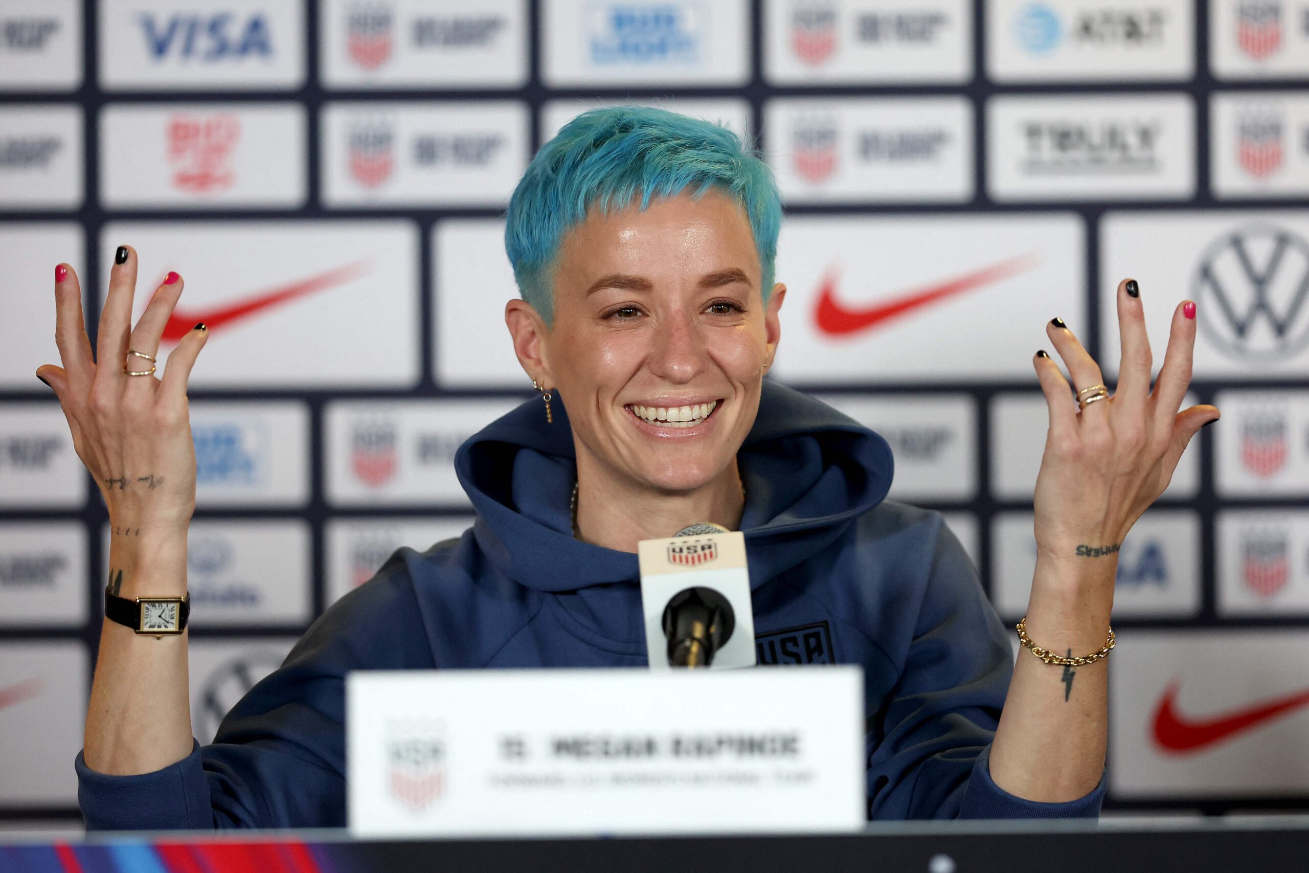
Megan Rapinoe Tattoos: Mammers, West Coast Girl and More

Megan Rapinoe’s tattoos range from small hand lettering and family names to colourful script and more visible designs on her arms and back. Some of the best-known are Nature ran her course, Mammers, Ma Barker, a shared W, a hummingbird, West Coast Girl, a flower and the words trust no one. A few meanings are confirmed; others are better left as descriptions of what the photos show.
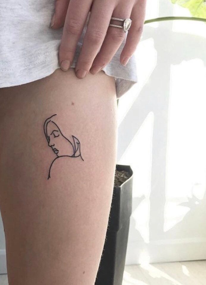
The tattoos can look quite different from one image to another. A close-up of her hand can make a tiny word easy to read, while a wider portrait shows how the designs fit together. The sections below keep those views distinct and use separate photographs instead of asking one image to prove everything.
Megan Rapinoe’s arm lettering starts with Nature ran her course

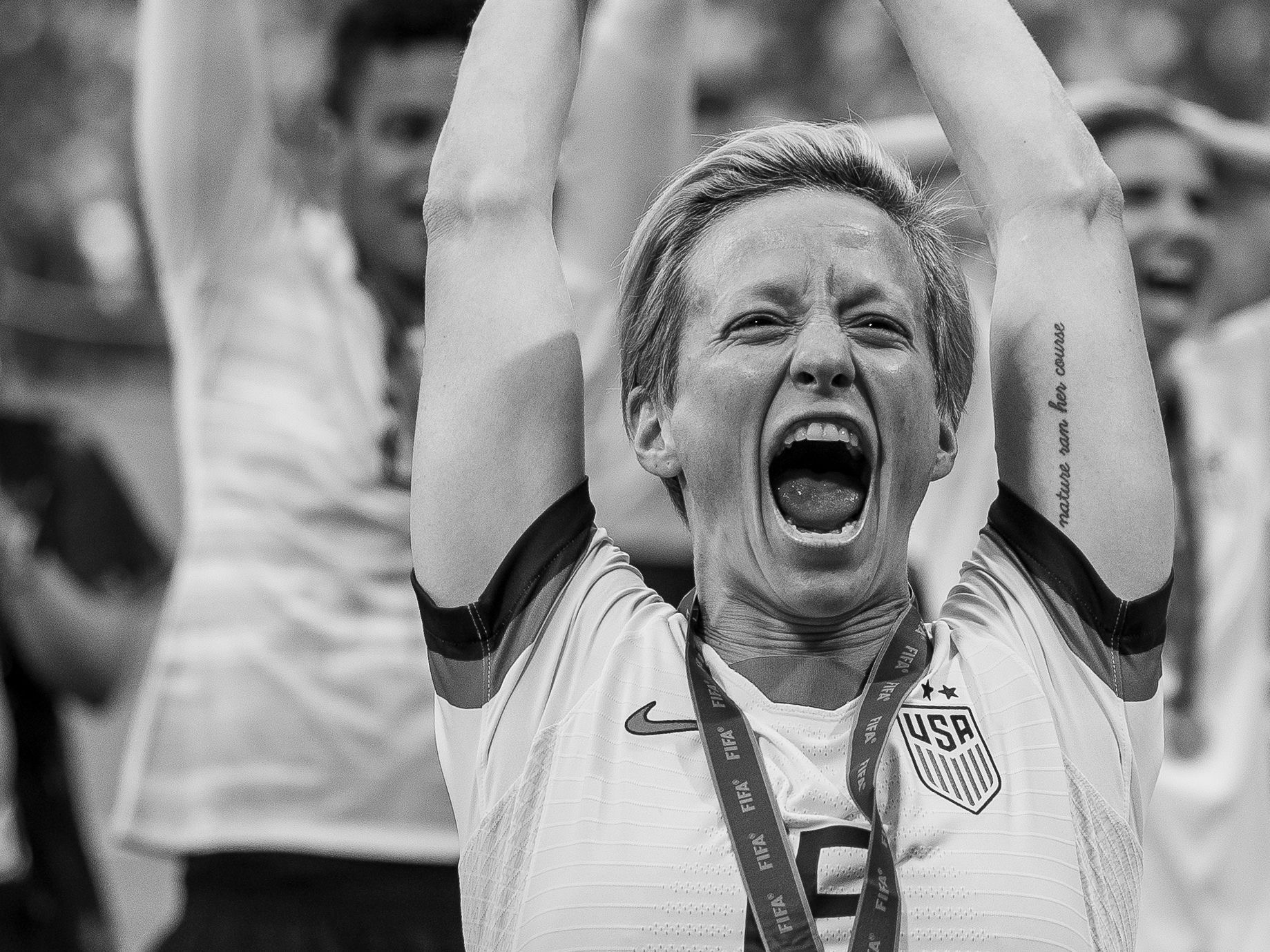
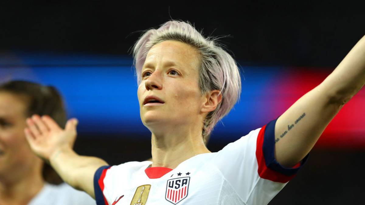
Megan Rapinoe tattoos: large clear photograph showing the Nature ran her course lettering and arm tattoos
The phrase Nature ran her course sits on Rapinoe’s inner arm and is one of the easiest tattoos to recognise in photos. The lettering is simple and legible, which suits the words. It already has a reflective feel without needing an elaborate explanation attached.
Rapinoe has described tattoos as a way to express herself, and this one feels personal rather than like a slogan taken from a flash sheet. It reads like a line she wanted to keep nearby. On her arm, it can appear in training shots, interviews and match-day photos when her sleeve is rolled up.

A clear image makes a difference because script loses its shape in a small thumbnail. This photograph shows the letter spacing, the direction of the words and where the phrase sits among the other ink. It also makes it easier to tell nearby designs apart from one long sentence.

Mammers, Ma Barker and the wrist marks are tiny but personal

Megan Rapinoe tattoos: wide high-quality portrait with visible arms and hand work

Two of Rapinoe’s most direct family references are on her hands. Mammers, a nickname for her mother Denise, is on one hand; Ma Barker, a name her grandfather gave her, is on the other. The designs are small, but their stories are clearer than the explanations often attached to celebrity tattoos online.

They can be easy to overlook when Rapinoe is holding a football, wearing tape or standing at a podium. A focused hand photo is more useful than a general portrait because the fingers and wrist are always shifting position. Even a little shadow can hide one of the letters.

There are other small marks around her hands and wrists. Some show up clearly in close-ups; others are too indistinct to identify confidently. The confirmed lettering is worth describing on its own, without turning every unclear shape into a dramatic story.

Brian Parrillo’s hand work shows how Rapinoe uses small designs

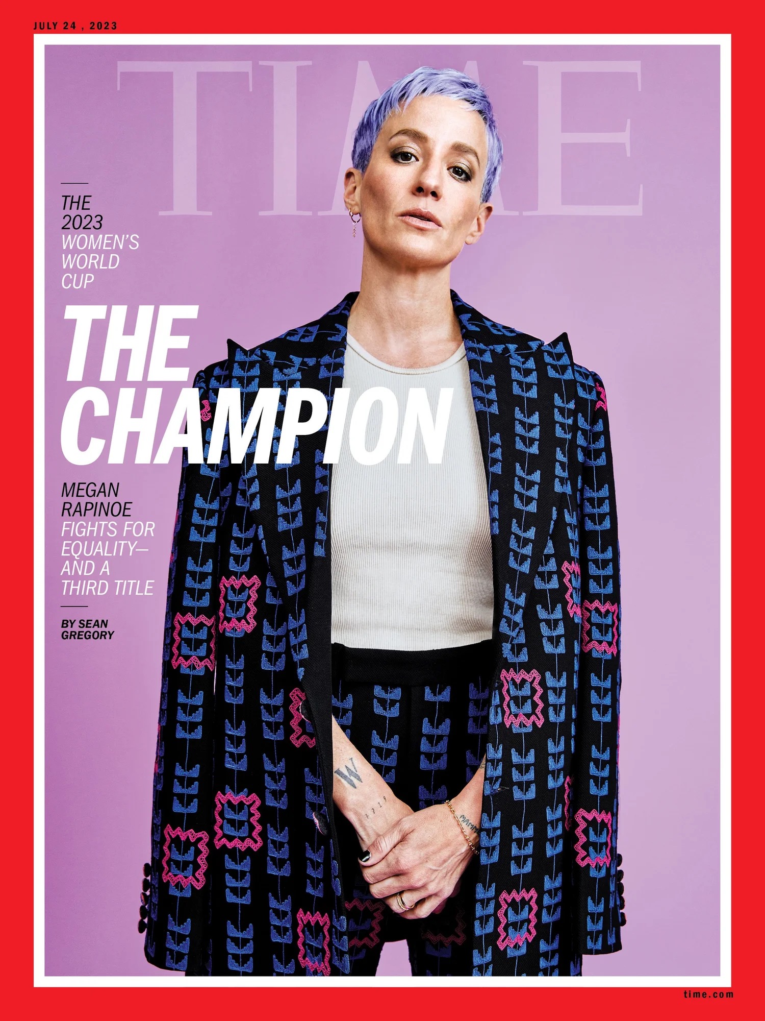
Megan Rapinoe tattoos: large sharp Time cover showing the hand and wrist lettering close up

Tattoo artist Brian Parrillo has shared images of Rapinoe’s hand and wrist tattoos, offering a clearer view than most sports photography. They show how the small words and symbols sit next to one another without forming a single continuous sleeve.

The W on Rapinoe’s right wrist is another simple design. She shares it with Sue Bird, and the compact letter stays visible without taking over the wrist. Matching tattoos can carry a lot without being complicated; here, the shared initial says enough.

The artist’s photos also show why size matters. A tiny tattoo can look crisp close up and nearly vanish in a full-body image. These views offer different information: one shows the design, another its placement, and a third how nearby marks sit together.

The hummingbird, West Coast Girl and flower keep the collection moving

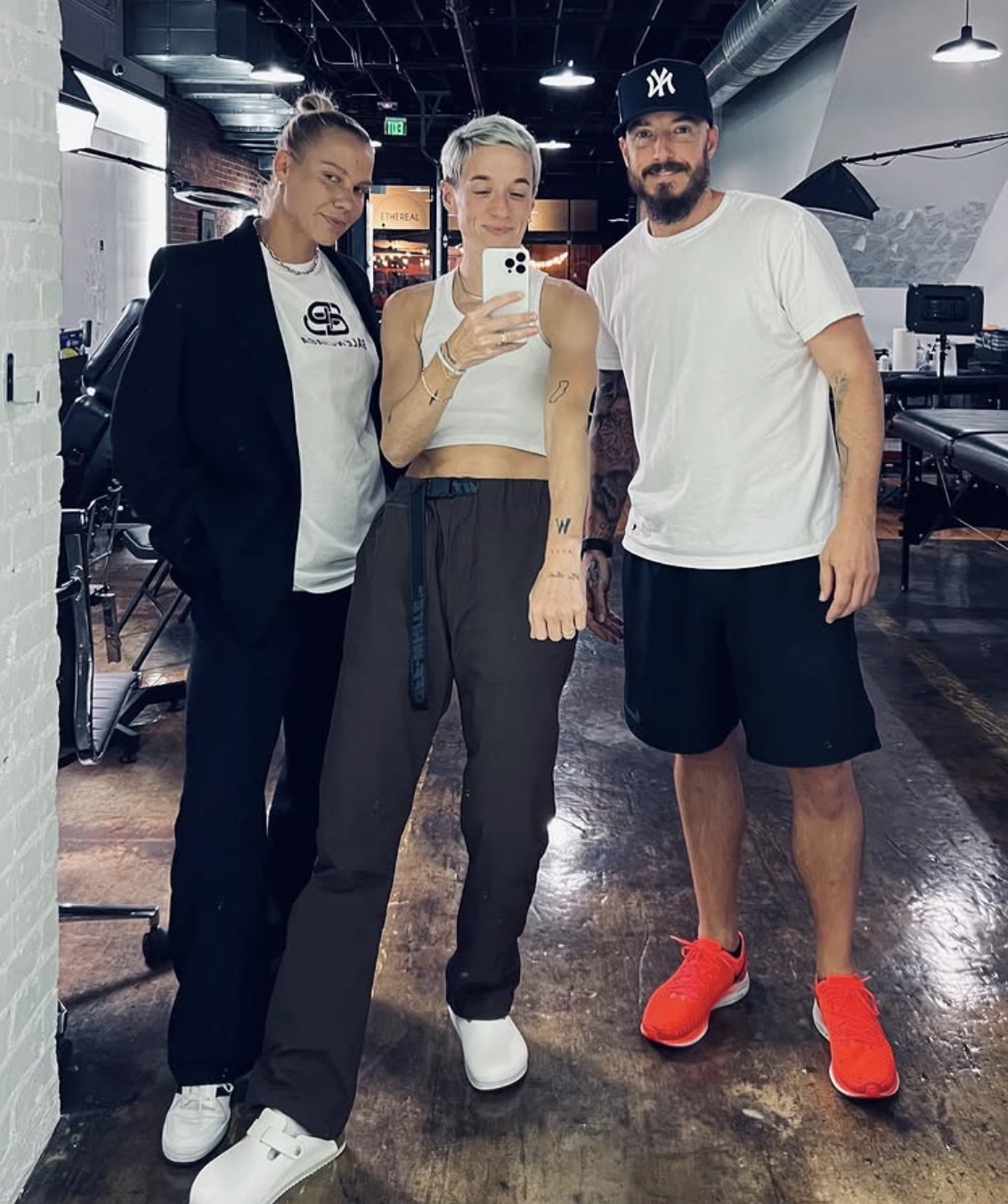
Megan Rapinoe tattoos: different high-resolution tattoo studio photograph showing the hand and wrist work

One of Rapinoe’s more recognisable larger tattoos is a hummingbird on her lower back. It matches the bird on her grandmother’s gravestone, giving the design a clear family connection. It is more delicate than the bold lettering on her hands, so it needs a photo that actually shows her lower back rather than a cropped fashion image.

Rapinoe has also been photographed with West Coast Girl in blue and pink script across her lower back. The colour gives it a different look from the black lettering on her arm and hands. Her tattoos do not all follow one palette or style.

A flower and the phrase trust no one also appear in accounts of her tattoos. The wording is worth keeping in quotation marks because it is what readers are looking for; the private meaning is less certain. A photo can show the design and where it sits, while a personal explanation would be needed to say more.

The bigger back and lower-body pieces need a wider photograph

Megan Rapinoe tattoos: separate wide photograph showing the tattoo work in context

Rapinoe’s hand tattoos are often the focus because her artist has documented them so clearly. A wider image adds context, showing how the smaller work fits with her arms, shoulders and back. The hands are only one part of the collection.

Some accounts list happiness and other small tattoos among her designs. They are harder to make out in older or distant photos, especially when clothing covers part of the area. The description should stay cautious: a visible mark can be noted, but a blur should not be turned into a confirmed design.

The wider view also helps with the timeline. Rapinoe added tattoos at different points in her life, and new hand and wrist pieces have changed the collection. One older photo cannot provide a complete current inventory, particularly when her career puts her in different kits and settings.

Why Rapinoe’s tattoo collection feels personal without looking over-planned

Megan Rapinoe tattoos: distinct large editorial photograph showing tattooed arms and body context

Taken together, Rapinoe’s tattoos move between family, friendship, place and self-expression. The hummingbird recalls her grandmother. Mammers and Ma Barker come from family nicknames, and the shared W links her with Sue Bird. Nature ran her course and West Coast Girl add phrases that feel distinctly hers.

There is no need to squeeze those designs into one theme. Some have confirmed stories, others have a clear image but no public explanation, and a few appear only in a single useful photo. That mix is normal, and it is more helpful than pretending every symbol has a secret meaning.

A straightforward way to describe the collection is to name each tattoo, say where it sits, show it in a genuinely different photo and add only the meaning Rapinoe or a strong source supports. The result can stay conversational while still giving readers the details they came for.

The smaller pieces around Rapinoe’s arms are easy to miss

The small tattoos on Rapinoe’s arms are less discussed than the words on her hands, but they help complete the picture. They appear in different settings: magazine portraits, football interviews, training photos and close-ups from her tattoo artist. Light and posture affect what can be seen.

A new photo does not always mean a new tattoo. It may simply show the inside of an arm that was hidden in an earlier image. Keeping the photographs separate lets readers compare placement without turning every change in angle into a false timeline.

The useful details are practical: which arm is visible, whether a design sits on the forearm or near the elbow or wrist, and whether it is lettering, a symbol or an indistinct patch of ink. Those questions make the description clearer and help keep it grounded.

These smaller pieces balance the larger family and back tattoos. They make the collection feel lived-in instead of planned as one matching set. Some are clear at a glance; others need a close-up and a little patience.

Megan Rapinoe tattoos: different large editorial image showing the smaller arm tattoo details

Rapinoe’s tattoos work because they do different things. Some are family shorthand, some are shared with people close to her, and others are simply words or images she wanted. The range comes through much better in these photos than in a generic celebrity portrait.

Dates matter, too. A hand tattoo photographed for a magazine may be newer than the back design seen in an old interview. Ink fades, new pieces appear and clothes hide different areas. A careful guide can stay specific while recognising that a collection changes over time.

In short, Rapinoe has meaningful lettering, family names, a shared wrist mark, a hummingbird tribute, colourful lower-back script and several smaller symbols. The clear photos let readers see those designs, while the writing sticks to the stories she has actually shared.

The family lettering deserves its own attention because the personal connection is especially clear. Mammers and Ma Barker are not vague motivational phrases; they are nicknames tied to people in her life. The hummingbird carries a separate memory through its connection to her grandmother’s gravestone. Keeping those tattoos distinct lets each story stand on its own.

The hand work has a different feel. A W, a short name or a tiny symbol can sit quietly beside the knuckles, only visible when Rapinoe turns her hand. That is why the studio photos are helpful. They add close detail without replacing the wider portraits.

There is also a pleasing contrast between the hummingbird and the directness of Nature ran her course. One is an image connected to family memory; the other is a sentence that reads like a personal line. West Coast Girl brings colour into the mix, while the smaller pieces keep the overall look from feeling too polished.

None of this needs a grand theory. Rapinoe’s tattoos can be seen as things she chose because they felt right at different points in her life. The sources identify the designs and explain some of them; the photographs fill in the rest, especially when a close-up catches lettering that might otherwise go unnoticed.

More athlete tattoo guides

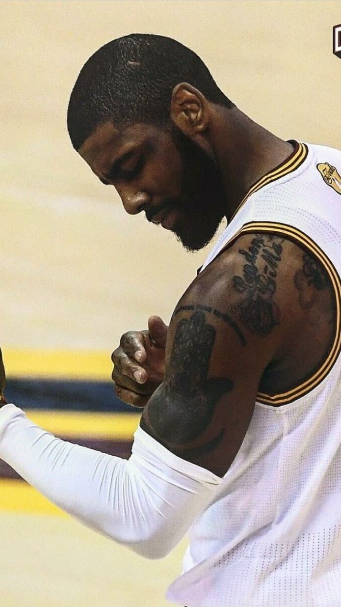
Kyrie Irving Tattoos: Hamsa Hand, Friends Logo and Family Ink

Kyrie Irving’s tattoos bring together family names, spiritual symbols, basketball-era lettering and a familiar sitcom logo. The Hamsa hand on his upper arm is the most striking design, while H&H, Elizabeth Irving, angel wings and Friends add more personal details. Each section focuses on a different part of the collection so the photos show what is actually there.

Basketball photos do not always reveal much of Irving’s ink. Jerseys, sleeves and camera angles cover different areas, making the same arm look nearly bare in one shot and heavily tattooed in another. The images below offer separate views of the designs that have been clearly shown or reported.

The Hamsa hand is Kyrie’s clearest statement piece

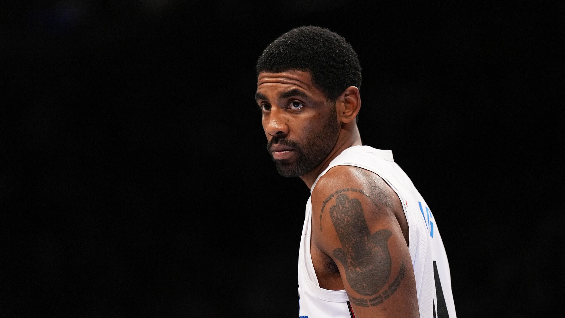
Kyrie Irving tattoos: large arm close-up showing the Hamsa hand, eye and lines of text

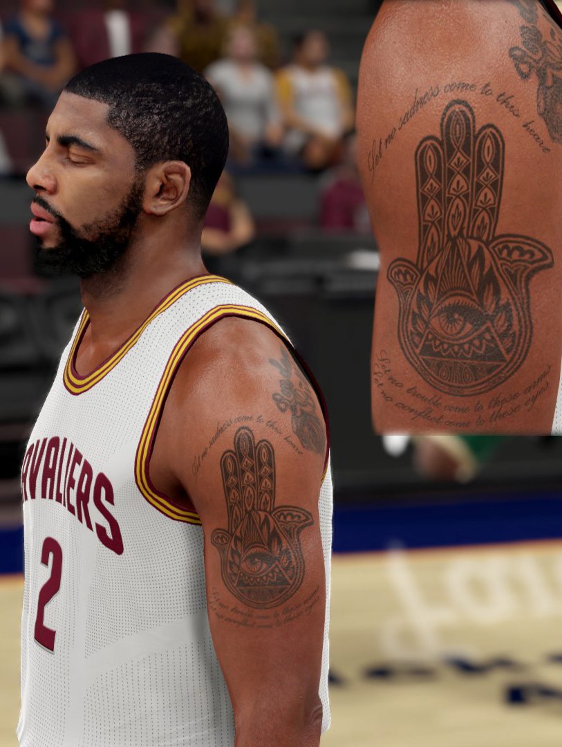
Irving’s Hamsa hand tattoo is easy to recognise because it covers a large area of his upper arm. An eye sits at the centre of the hand, framed by a detailed border that remains visible even under a jersey. Three lines beneath it refer to sadness, trouble and conflict, giving the design a personal feel beyond its strong visual shape.

The Hamsa, also known as a Khamsah, is commonly used as a symbol of protection. Irving has discussed the design in connection with a Nike shoe, bringing it into his public basketball story. The shoe graphic did not replace the tattoo; it adapted its central image into a design fans could recognise.

The lettering deserves a close look because a wide game photo can make it hard to read. The hand stands out from a distance, while the three lines beneath it show up best in a sharp close-up. This image serves a different purpose from the later game shots: it shows the wording and how it follows his arm.

There is no need to assign a hidden meaning to every line. The design itself, its association with protection and its use as inspiration for a shoe are enough context. The hand, eye and text work together, and the upper-arm placement brings the whole tattoo into view when his sleeve is rolled up.

The Friends logo is the tattoo everyone noticed at the press conference

Kyrie Irving tattoos: separate arm photograph showing the Friends logo in its television-style lettering

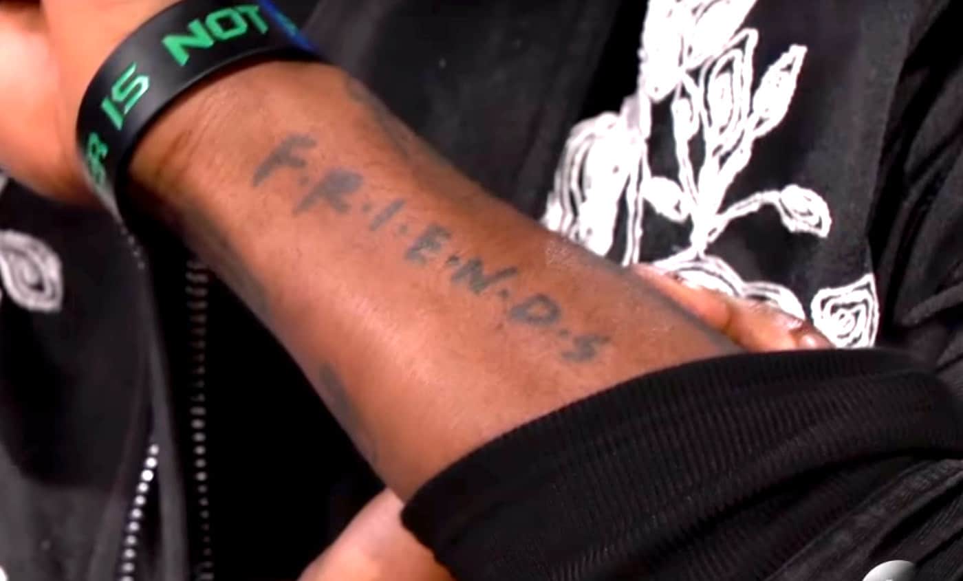
The Friends tattoo drew attention at a press conference, when Irving’s arm was usually covered by basketball gear. It uses the show’s familiar lettering, complete with the small dots between the letters. This is an unmistakable pop-culture reference; the photo makes the words clear.

Irving gave a straightforward reason for choosing it: he liked the show and later mentioned watching its marathons. That context keeps the tattoo from being overread. It is not automatically a secret message about a teammate or basketball; sometimes a player likes a series enough to put its logo on his arm.

The placement helps explain why people did not see it earlier. A jersey, sleeve or warm-up top can cover the forearm, while a short-sleeved interview shirt reveals it immediately. The tattoo became a news story because the press conference clothing exposed it, not because the design had just appeared.

It is a good example of a celebrity tattoo with a simple story. The logo, its location and Irving’s own explanation are all documented. A clear close-up shows the lettering better than a distant game photo, so it makes sense to give the design a section of its own.

Angel wings and the upper-arm designs bring family and faith into the mix

Kyrie Irving tattoos: high-resolution game photograph showing the upper-arm work and placement beneath a jersey

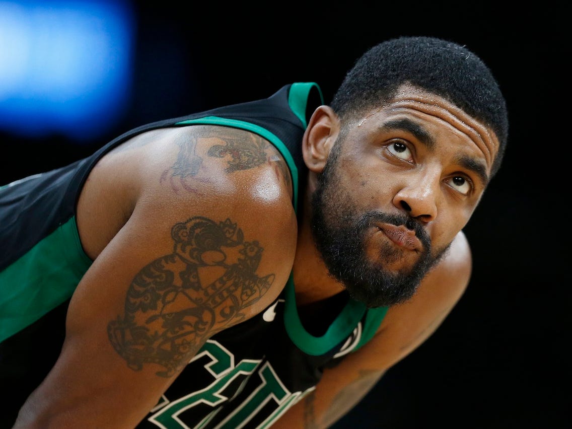
Irving’s upper arm includes angel wings and larger spiritual designs, distinct from the Friends logo. Coverage connects the wings with family, faith and protection, while his daughter’s name appears in a separate chest design. From the court, several tattoos can blend into one dark patch; other photos show them as individual pieces.

The wing motif appears more than once. His daughter’s name is often shown with wings around it, and other accounts describe a halo and religious details near his chest. They share a similar mood, but they are separate tattoos with their own placements and lettering.

Some of Irving’s arm designs are harder to identify from a single photograph. A game shot can show that the shoulder and biceps are inked, but a soft outline may not make clear whether it is a flower, a star or part of a larger image. Leaving that uncertain helps the documented designs stand out.

The upper arm is where several sides of his style come together. Protection, family, faith and basketball share the area, but the tattoos do not all look alike. The Hamsa is ornate, the wings are familiar imagery, and smaller marks connect the larger pieces.

H&H and Elizabeth Irving sit across the chest

Kyrie Irving tattoos: high-resolution game photograph showing the visible upper-body tattoo placement beneath a jersey

The chest tattoos carry some of Irving’s most direct personal wording. On one side, H&H sits above the phrase staying humble. The initials have been described as a reminder about happiness and humility, and the short line is easy to see when he is shirtless. It is compact, but its placement makes it stand out.

On the opposite side is Elizabeth Irving, his daughter’s name, shown in many published images with angel wings around it. The name makes the family connection clear, while the wings echo a protective theme found elsewhere in his tattoos.

The two pieces work well as a pair without matching. One expresses a personal principle; the other honours family. They sit on opposite sides of the torso, so a straight-on photo shows the full arrangement, while an angled view can reveal how the lettering follows his chest.

These tattoos are a reminder to rely on the meanings Irving has actually shared. The initials and his daughter’s name are documented, and the family connection does not need an invented backstory. The photos show the design; his own comments add context.

The older Olympic-era photographs show how much of the arm stays hidden in games

Kyrie Irving tattoos: distinct Olympic-era photograph showing the arm and side-body ink from a wider angle

Photos from Irving’s Olympic years help explain why his tattoos can seem less extensive when he is playing. A jersey covers the chest, a compression sleeve hides his forearm, and game cameras follow the ball rather than his skin. A vest or shirtless shot reveals more of his arm and side at once.

The Rio photo works as a wide view, not a guide to every symbol. It shows how the tattoos extend from his upper arm toward his forearm, though the smaller writing is not clear enough to translate. The image still adds useful context by showing the overall scale and how the visible designs fit into a larger layout.

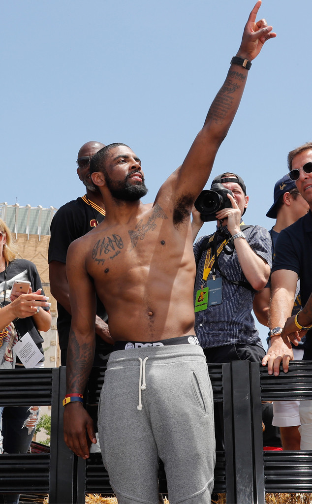
Irving has added and changed tattoos over the years, so older photos need to be dated. The Friends logo became a talking point in 2015, while the chest lettering and Hamsa were already visible in other periods. Without a timeline, a guide can make tattoos seem to appear or vanish for no reason.

Taken together, these five views give a fuller picture than a single game portrait. The Hamsa close-up explains the detailed arm design, the Friends image shows a pop-culture mark, the chest photo captures the initials and name, and the Olympic-era shot shows more of the overall placement. Several ideas share one body; the same generic sleeve is not being repeated in every section.

Smaller symbols sit around the better-known designs, but not all have reliable names or meanings. That is common with tattoos photographed at public appearances. It is more accurate to call something a visible symbol than to offer a confident translation from a blurry or partly covered image.

Across the collection, Irving’s tattoos touch on protection, family, faith and pop culture. The Hamsa is the most ornate, the names on his chest keep the work personal, and Friends adds a light, direct reference. None needs an elaborate theory to be interesting.

Dates help make sense of the photos, too. A 2015 press conference cannot document the whole collection today, just as a recent game image may hide older ink beneath a sleeve. Comparing different years explains why fans sometimes describe the same arm in different ways.

The clearest details are simple: the Hamsa is there, Friends is there, H&H and Elizabeth Irving are visible on his chest, and angel-wing imagery appears in the family designs. Other claims should be tied to a clear photo or a direct explanation. That keeps the guide informative without treating every shadow as a confirmed tattoo.

More athlete tattoo guides

Jalen Green Tattoos: Family Portraits, Dates and New Shoulder Ink

Jalen Green has about thirteen documented tattoos, ranging from family portraits and dates to faith symbols, a hometown number and newer relationship ink. Some of the clearest designs are on his thigh and forearms, while the shoulder and back make the collection seem much larger when he is out of a jersey. Looking at each area separately helps avoid treating every dark patch as one giant sleeve.

Basketball photos can hide a lot of Green’s tattoos. Shorts cover the thigh, sleeves hide the arm and game cameras rarely linger on his hand. Different images serve different purposes: a close-up can show a date or portrait, while a wider photo shows how the pieces fit together. The images here are separate photographs, not the same shot with a new crop.

The shoulder portrait and the Believe in Yourself lettering are newer chapters

Jalen Green tattoos: large indoor photograph showing the shoulder portrait and surrounding upper-body ink

Green’s shoulder drew attention when photos showed a large portrait tattoo reported to be connected with Draya Michele. It is a substantial design, not a small name tucked on his wrist, and it changes the look of his upper body when he is shirtless or wearing a cropped top. It is safest to describe it as a reported portrait linked with Draya and show the image that brought it into view.

The nearby words have also been reported as Believe in Yourself. The phrase is easier to read than many of Green’s smaller tattoos and gives the shoulder area a motivational note. It sits beside the portrait, so a close photograph helps readers tell the two designs apart.

This part of the collection has developed quickly compared with the older thigh and forearm work. New relationship or motivational tattoos can appear between seasons, while a game image may predate the finished shoulder. Dates matter: a photo can show what was visible at that time without proving the layout has stayed the same.

The portrait is also a good example of why tattoo guides need photos that show the body. A featured headshot can work at the top of a post, but it cannot show the shoulder lines or nearby lettering. This separate image offers the detail readers came to see.

The back and arm work make the collection look bigger than a few isolated symbols

Jalen Green tattoos: large sharp shirtless portrait showing the back, arms and layered tattoo coverage

Green’s back and arms carry more ink than a typical game photo reveals. The Esquire backstage portrait is useful because he is shirtless and turned enough to show his shoulder blades, upper back and arms in one frame. It does not identify every tattoo, but the scale of the collection comes through.

Larger designs sit beside stars, lettering and small symbols, so the body can look like one dark image from a distance. Up close, the spacing is clearer: some areas have room around them, while other marks cluster together. That range in size is part of what makes the collection distinctive.

Green has been photographed in sportswear, fashion clothes and shirtless settings, and each hides a different area. A jersey covers his back and chest; a vest can reveal the shoulders while covering the lower ribs. The tattoos can therefore look different from one event to another even when nothing new has been added.

It is best to name the designs that have been clearly identified and describe the rest by their placement and appearance. This back photo shows the arm and shoulder coverage without pretending every shadow has a confirmed meaning. That keeps the account detailed while staying within what the image can show.

The thigh carries the date, crosses, wolf and local 559 reference

Jalen Green tattoos: high-resolution action photograph showing the thigh date, crosses and wolf portrait

Green’s left thigh holds several of the collection’s most recognisable designs. Published tattoo breakdowns identify a butterfly and ladybird, three men on crosses, a wolf portrait and numbers that include 2002 and 12:27. These are individual tattoos, not one combined piece, even though they sit close together.

The numbers are generally read as his birth year and birth time. They run in different directions, giving the design the feel of a personal note rather than a large illustration. A clear leg photo helps here: an action shot can show that the thigh is tattooed, but a close-up separates the two number groups.

The three crosses bring a religious image into the same area. Sources describe them in Christian terms, while the wolf adds a more graphic, animal subject. The butterfly and ladybird are smaller and lighter, which makes them easy to miss beneath shorts or blur into nearby ink. Together, the thigh tattoos fill the area without becoming one solid block.

The number 559 refers to Fresno’s area code, giving the leg a hometown detail. Beside the birth numbers and faith imagery, it makes this one of the clearest places to see Green mixing personal facts with symbols.

Family tributes and the chest lettering sit close to the centre of his story

Jalen Green tattoos: different rooftop photograph showing the chest, ribs and arm tattoos from a wide angle

One of Green’s most personal designs is a portrait of his grandfather on the outside of his left forearm. Reports connect the piece with his Filipino family background and his closeness to his grandparents. A portrait needs a clearer image than a generic basketball photo because the face, hair and shading make up the design. Its meaning is the family connection, not a vague claim that every portrait represents inspiration.

Other chest lettering appears beside the shoulder and arm tattoos. Reports mention motivational words, small religious symbols and newer relationship references that have attracted attention online. Some sources identify the lettering clearly; other readings come from fans interpreting an image. Those should not be treated as equally certain.

That distinction matters with names and dates. Clear words can be described directly, while ink hidden by a chain or shirt needs more cautious wording. Green’s hairstyle, clothing and physique have changed over time, which can make old tattoos look new in heavily edited photos.

The rooftop portrait gives a broad view of his chest and ribs, but it cannot confirm every small detail. It shows how family and motivational tattoos fit the larger layout. The closer forearm and thigh shots add the more specific information.

The hand and forearm tattoos are easy to miss during a game

Jalen Green tattoos: distinct high-resolution game photograph showing the arm and hand tattoos under real playing conditions

Green has a peace symbol across his right hand, an easy detail to miss when he is playing. A ball, wristband or glove may cover it; an off-court photo brings it into view. The design is simple, but its position makes it noticeable whenever he gestures.

His forearm also carries the 8.3.19 date, a portrait of his grandfather and stars. The date is clearly photographed, though its private meaning is not as well documented as the family portrait. It is better to report the numbers and where they sit than invent an explanation Green has not shared.

A later game photo shows why different settings are useful. The arm tattoos can be seen beneath the jersey, but the hand and wrist are turned partly away. That image helps with placement but cannot replace a close-up. Each photo answers a different question.

A small Be Yourself tattoo has also been reported on his wrist. It fits alongside the motivational phrase on his shoulder, but it is a separate design. It is best described plainly: a short phrase in a small spot near other personal tattoos, without turning it into a life lesson.

Other marks show up in fan photos of Green’s arms and legs, but not all have reliable names or explanations. That is common for a young player whose look is still changing. A careful guide can list the clear designs and leave less distinct details open until a better image or direct comment settles them.

The timeline adds context. Older photos show some of the family and date tattoos, while newer ones reveal the shoulder portrait and more chest lettering. A difference between images does not automatically mean a cover-up or a new tattoo; hair, lighting and clothes can all change what appears visible.

The collection brings small facts and larger images together. A birth date sits beside a wolf, a city code appears near crosses, and a family portrait shares space with motivational words. There is no need to force them into one theme. They look like different parts of Green’s life, inked as those parts mattered to him.

The clearest documented pieces include the butterfly and ladybird, three crosses, the wolf, the 2002 and 12:27 numbers, 559, the peace symbol, his grandfather’s portrait, stars, Be Yourself and the newer shoulder work. Other details should stay tied to a clear photo. That gives readers plenty to see without claiming the camera has answered questions Green has not.

More athlete tattoo guides

Sophie Turner Tattoos: The Direwolf, W for Willa and More

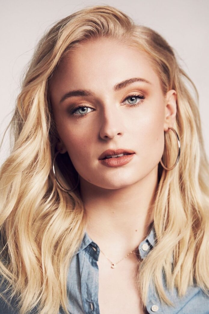
Sophie Turner has more than a dozen tattoos, from small family initials to bold Game of Thrones references. Her collection includes a W for Willa, a dog, the direwolf and The pack survives, the 07.08.09 date she shares with Maisie Williams, a north star along her spine and several smaller designs.

The tattoos reflect different parts of Turner’s life. Some reference the show that made her famous, some honour friends and family, and others are small drawings she simply liked. The photos below keep those designs distinct.

The W tattoo is a small family tribute

Sophie Turner tattoos: W for Willa

The single W on Turner’s arm is linked to her daughter, Willa. It is a simple family reference, and a close-up makes it easier to spot than a red-carpet photo would. The initial and its timing give it a clear place in her story.

The W tattoo is a small family tribute is easiest to appreciate in this close-up. The photo also shows where it sits as Turner moves or changes her posture.

The dog tattoo keeps the family theme close to home

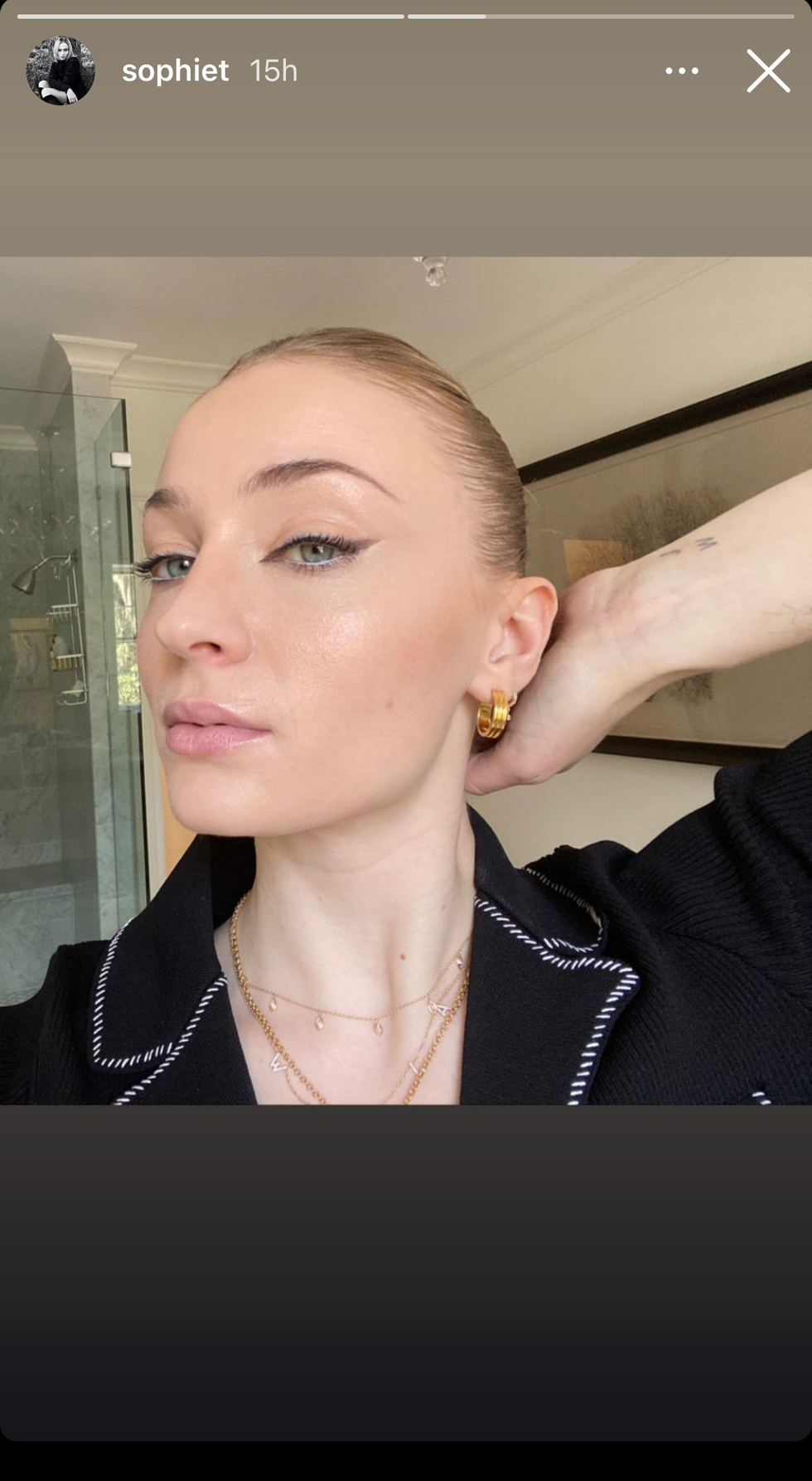
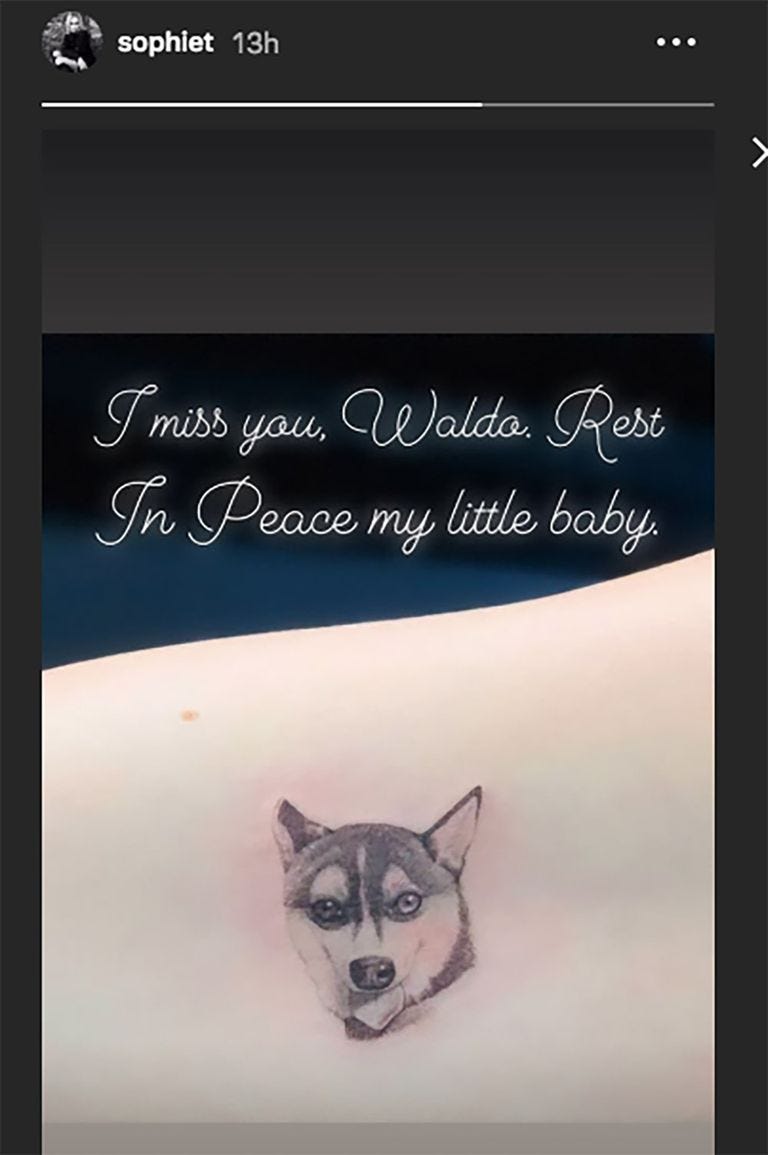
Sophie Turner tattoos: dog tattoo

Turner has a small tattoo of a dog among her better-known designs. It is a quiet pet tribute that can disappear beneath a sleeve. The image shows its shape and placement, without needing to attach a bigger private meaning.

The dog tattoo keeps the family theme close to home comes through best in its own photo. The close view makes it easier to see where the design sits when Turner moves.

Her smaller arm tattoos are easy to miss

Sophie Turner tattoos: small fine-line tattoos

Many of Turner’s tattoos are tiny: brief lettering, small symbols and fine lines that only show clearly in close-ups. A mark becoming visible in a new picture does not necessarily mean she just got it. The useful details are what can be seen, where it sits and whether Turner has explained it.

Her smaller arm tattoos are easy to miss is a good reason to use a close image. It helps show how the marks sit on her arm as she moves or changes her posture.

The spine and side tattoos give the collection a longer line

Sophie Turner tattoos: spine and side tattoos

Turner has tattoos that run down her back or sit along her side. The north star on her spine has been linked to tattoo artist Winter Stone. These placements need a full-length view because hair and clothing can cover the centre of her back.

The spine and side tattoos give the collection a longer line is clear in a full-length photo. The image shows the placement as Turner moves, rather than leaving the design hidden in a close crop.

The direwolf and the words The pack survives are her best-known piece

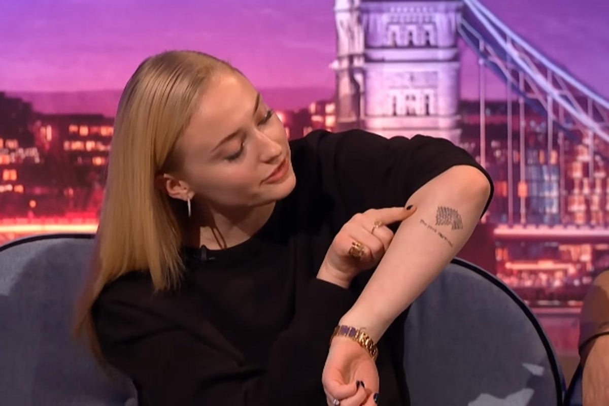
Turner’s best-known tattoo pairs a dotted direwolf with the words The pack survives on her forearm. She has said the phrase is both a personal motto and a nod to House Stark, rather than an intentional spoiler. The photo shows the wolf, lettering and placement together.

The direwolf and the words The pack survives are her best-known piece gets a dedicated image so readers can see the details and where it sits.

Turner and Maisie Williams share a 07.08.09 tattoo, marking the day they learned they had been cast in Game of Thrones. It is a friendship tattoo and a reminder of the show’s beginning, not a comment on its finale. Fans sometimes treat every Stark reference as a plot clue, but Turner has described the ink in more everyday terms.

Her other small tattoos are less fully explained. Some can be seen in social posts or close-up interviews; others appear only briefly in event photos. They belong in a visual guide when a clear image supports them, while a blurry glimpse should remain uncertain.

The fine-line pieces keep the collection feeling light. The W, dog and small symbols do not compete with the direwolf, while the north star adds a longer vertical line down her back. Their different sizes make them read as separate moments rather than one coordinated set.

Sophie Turner tattoos: direwolf and The pack survives

Placement changes when the tattoos can be seen. An arm design may show at a premiere but disappear beneath a long sleeve. The spine tattoo can appear in a backless dress and stay hidden in everyday clothes, which is why several photos help more than repeating one portrait.

The Game of Thrones designs have the clearest public stories, but they are only part of the collection. Turner’s family and friendship tattoos also explain the letters, dates and small images she chose. They keep the story connected to her life beyond the show.

There is a timeline in the tattoos, too. The cast date marks an early career moment, while the W belongs to a later family chapter. Older and newer designs now sit side by side, and a photo may show a different set simply because her outfit and the camera angle have changed.

That variety is what makes the collection worth a closer look. It includes fandom, friendship, family and little designs Turner liked for their own sake. Some are easy to read, some need a close-up, and others are visible without a public explanation.

In brief, the direwolf carries the biggest public story, the W and dog bring family life into the mix, and the spine and side designs add quieter detail. Each tattoo benefits from its own view, and the photos help readers see the differences.

Turner and Williams’ 07.08.09 tattoo marks the day they found out they were cast in Game of Thrones. It is a friendship piece tied to the start of the show, not its ending. That context is useful when fans read every Stark-related design as a plot clue.

The fine-line work softens the overall look. The W, the dog and the small symbols sit apart from the direwolf, while the north star creates a longer line along Turner’s back. The different scales help the pieces feel like separate choices.

The placements also affect how visible the designs are. A tattoo on her arm might appear at a premiere and vanish beneath a sleeve; the spine star can show with an open back and disappear under ordinary clothes. Different photos reveal different parts of the collection.

Her Game of Thrones tattoos may be the most widely discussed, but Turner’s family and friendship designs matter just as much. The letters, dates and small images point to her own relationships and memories, not only to the characters she played.

The initial for Willa is intentionally understated. A single letter can remain personal while still showing clearly in the right photo, and it leaves space for Turner’s other fine-line tattoos.

The dog tattoo is similarly small. A jacket can hide it, but the close-up gives it a clear place in the collection. Pet tattoos often work best when the image remains easy to recognise.

The north star gives the collection a vertical centre along Turner’s back. It is less prominent than the direwolf, but stands out in an open-back photo. Its placement is the clearest detail.

The Stark tattoo is more public because Turner has discussed it on television. The words are legible and the wolf makes the reference easy to recognise, while her personal-motto explanation is more useful than fan theories.

Looking through the images also shows how camera angles differ. Some are bright close-ups; others show more of Turner’s body from farther away. Each photograph offers a different view.

Turner’s tattoos combine stories she has shared with smaller designs that remain unexplained. The guide is clearest when it keeps those categories separate, uses a proper photo for each identifiable piece and does not guess at the rest.

The designs make more sense with their context beside them: W belongs with the family tribute, the date with the casting story and the direwolf with Turner’s explanation of the phrase.

A separate photo for each heading helps readers see what the words alone cannot. The arm images show the lettering, the back view reveals the spine tattoo, and the closer shots bring out marks that would otherwise be hard to notice.

Turner’s collection is not one single statement. It brings together memories, favourite references and small choices made at different times. That is enough to make it interesting without assigning a meaning to every line.

Action Bronson Tattoos: Daughter’s Name, Cars, Castles and Chaos

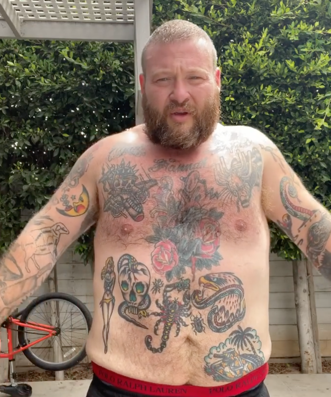
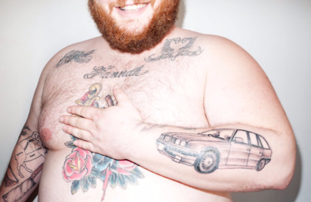
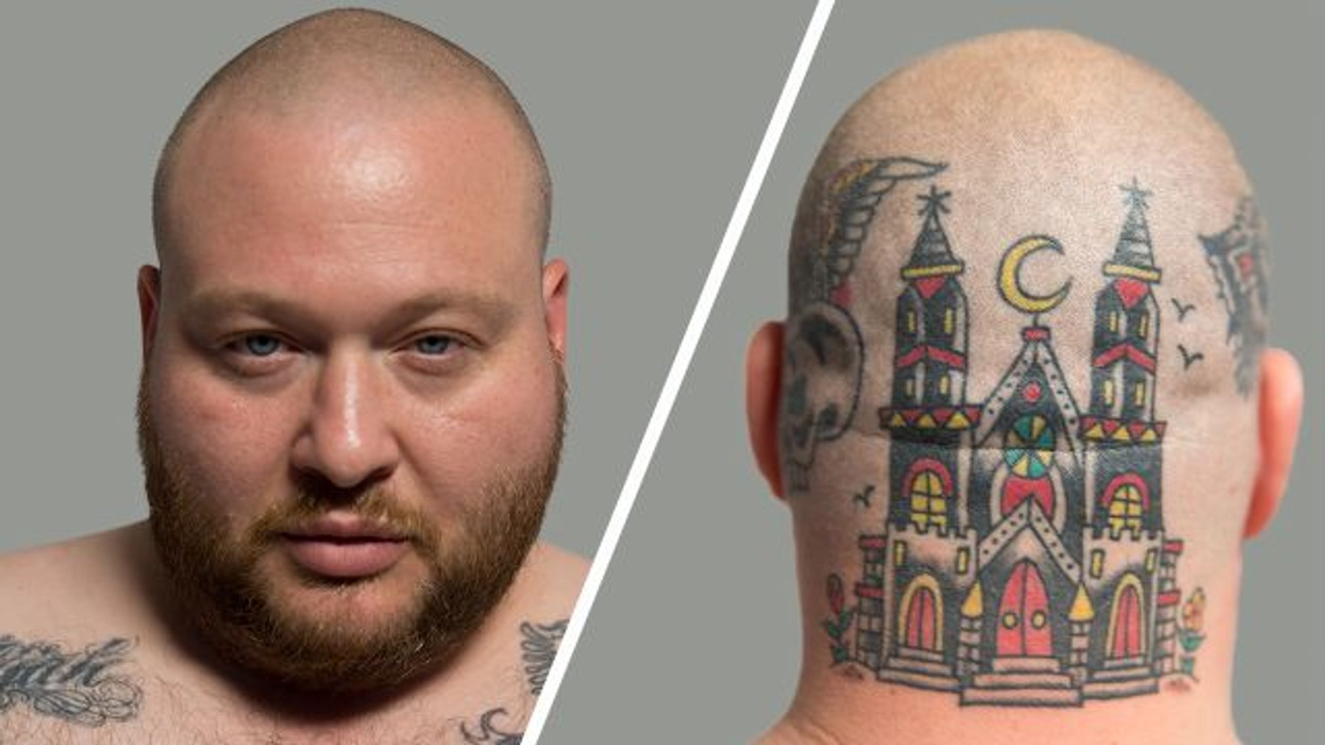
Action Bronson’s tattoo collection is hard to take in from a single photo. His daughter’s name crosses his chest, a 1995 BMW sits on his forearm, a huge castle covers the back of his head, and his legs hold a mix of animals, sports references and jokes. He has also spoken candidly about designs he loves, ones he covered and tattoos he considers bad decisions.

GQ’s tattoo tour gives the clearest personal detail. XXL repeats some of those stories and adds context around the head tattoo and gorilla cover-up, while an older GQ.co.uk interview identifies the BMW and smaller hand pieces. The descriptions below stick to those sources: a visible tattoo does not automatically come with a meaning Bronson has never given it.

His daughter’s name was the first tattoo

Action Bronson tattoos: 1995 BMW 5 Series forearm tattoo

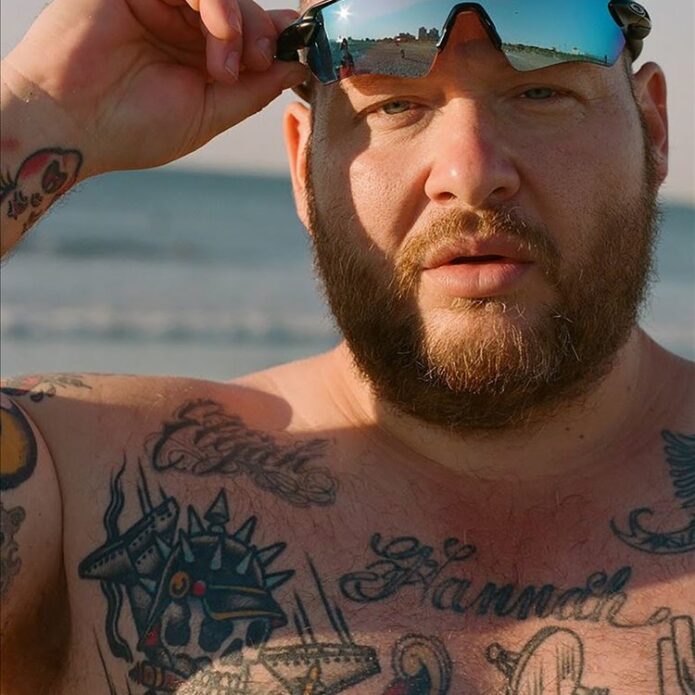
His daughter’s name was the first tattoo Bronson chose, giving his chest a clear starting point. It is a direct family reference rather than an abstract symbol. The name sits where it can be seen in a shirtless photo, while later work has grown around it. That first choice was personal before the skulls, flowers and traditional designs filled out his torso.

Bronson has said he waited several years after getting his daughter’s name before he began collecting more tattoos. The timing is useful: the chest lettering was not the start of a carefully planned bodysuit. It came first, and the larger collection followed through different interests, artists and stages of his life.

The chest is also a good example of why the tattoos deserve separate descriptions. Roses, hearts, skulls and animals can sit close together without sharing one meaning. Bronson explained the story behind his daughter’s name; the nearby designs can be described by their appearance and location without assigning them a private message.

The BMW 5 Series keeps a career milestone on his forearm

Action Bronson tattoos: chest and stomach tattoo group

The BMW 5 Series on the forearm is one of the most specific tattoos in Bronson’s collection. He has connected it to the first car he bought with money from rap. It marks a real point in his career, when music let him buy and modify a car he had long been interested in.

The forearm is a practical spot for the design: it can be seen without taking off a shirt and appears while Bronson performs, cooks or speaks to a camera. A close photo makes the outline easier to read than a full-body shot. His explanation tells us why this model matters; the image shows where it is and what can be seen.

Bronson often talks about engines, suspension and older cars, adding context to this tattoo. That does not mean every other automotive detail on his body has the same origin. It is best to keep this design tied to the explanation he gave rather than turn it into a theory about the whole collection.

The castle and skull designs cover the head and neck

Action Bronson tattoos: castle and skull head tattoos

The castle on the back of his head is his most dramatic tattoo by placement. Video coverage shows a large, colourful structure across his scalp and neck, with towers, windows and a moon-like shape. It reads like a fantasy scene rather than a small emblem. A rear view is essential because the design disappears when Bronson faces the camera.

Head tattoos change what a photo can show. A front-facing image may capture Bronson’s face and chest but miss the castle; a rear shot reveals the castle while hiding his hand tattoos. The eagle, skull and wolf mentioned in coverage should be described as separate pieces, not rolled into one vague head design.

The eagle has been discussed as a symbol of freedom, while the skull and wolf are mostly supported by visual descriptions. That distinction matters. Bronson’s own explanation is the best guide to a design’s meaning, but a clear photo can still show the colour, outline and placement of a piece he has not discussed at length.

Gorilla, Arabic lettering and hand tattoos tell smaller stories

Action Bronson tattoos: tattooed arm during performance

The gorilla is a cover-up, and Bronson has been candid about it. He disliked the tattoo beneath it enough to cover the spot with a gorilla. That history gives the design two parts: the original choice and the later decision to hide it. A cover-up should not be described as untouched original work.

His hands have smaller designs, including an alligator or crocodile and a Zeus. An older interview also mentions Arabic lettering and a tiny moustache on one finger. The marks can disappear when Bronson moves his hands or wears gloves, so a sharp close-up is more helpful than a stage photo. They also show that he has kept imperfect tattoos instead of making the collection fit a polished theme.

The hand tattoos are hard to date precisely. Bronson has added, changed and covered designs over the years. If a mark is missing from one photo, that does not prove it was removed; a dark spot near a knuckle is not enough to confirm a new design. The safest account sticks to what a clear photo or interview supports.

The leg tattoos carry dragons, wolves, eagles and a strange pizza tribute

Bronson’s legs are where the collection gets especially playful. Reports describe a DMT-style archer, a traditional dragon, a wolf, a bat with a skull, and an eagle on his knee that he jokes about as “Kneagle.” There is also a Godzilla-versus-Barkley tattoo tied to a poster he kept at home. The subjects draw from fantasy, sports, movies and humour.

A pin-up holding his dog Coco has also been described as a personal design. The relationship behind the image is the useful detail, rather than some universal meaning attached to pin-up tattoos. The photo shows the pose and placement; Bronson’s comments connect it with his girlfriend and dog.

The pizza tattoo is a different sort of joke. It combines Bronson’s face and his love of food in a deliberately silly design, pairing his likeness with a slice of pizza. It is easy to dismiss as a novelty, but it also fits the way he mixes cooking, rap, cars and humour in public.

Each tattoo works best as its own decision. Bronson’s ink ranges across family, cars, animals, music history and jokes. The clearest descriptions name a design, identify its location and use a source when explaining why it is there.

The variety comes through most clearly in the photos. His daughter’s name is legible, the BMW can be recognised as a specific model, and the head tattoo changes the outline of a portrait. The smaller hand marks and leg pieces call for closer views, especially when clothes or stage lighting hide part of them.

Action Bronson tattoos: Action Bronson portrait and pizza leg tattoo

That is why there is no single permanent count here. Bronson’s tattoos span his chest, forearms, hands, head, stomach and legs, and photos from different years show different stages. A later cover-up can change what is visible without erasing the fact that an earlier design was there.

The most useful descriptions stay concrete: name the tattoo, say where it sits, include the documented reason and show a genuinely different photograph. That keeps the writing lively without turning uncertain details into confident claims. Bronson’s own humour brings enough personality.

A tattoo can matter to Bronson and still be difficult to photograph. The daughter’s name matters because he has explained it; the model of the car is easy to identify. A tiny moustache or hand symbol might be visible without a confirmed backstory. That does not make it irrelevant; it just calls for a visual description.

The older interview is useful for the same reason. Bronson jokes about designs he regrets, while also confirming that a cover-up happened and that he remembers the original tattoo. The timeline can stay accurate without losing the humour; readers get both the funny detail and the factual one.

His tattoos reflect how he moves between different worlds. Bronson is a rapper, cook, television host and car enthusiast, and his designs borrow from all of those interests. They do not need to fit a single genre. Their variety is the story.

The page is easiest to follow by moving from chest to forearm, head, hands and legs. Each area adds a different side of Bronson, and each photo gives readers a better chance to see a real design rather than a generic portrait.

More athlete tattoo guides

Raheem Sterling Tattoos: The Rifle, Familia, Cross and More

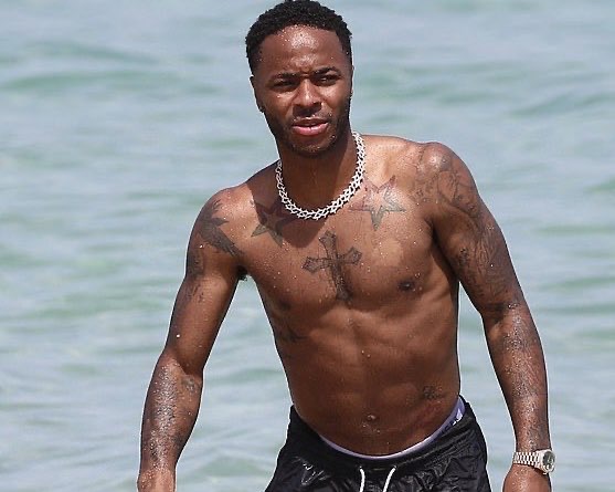
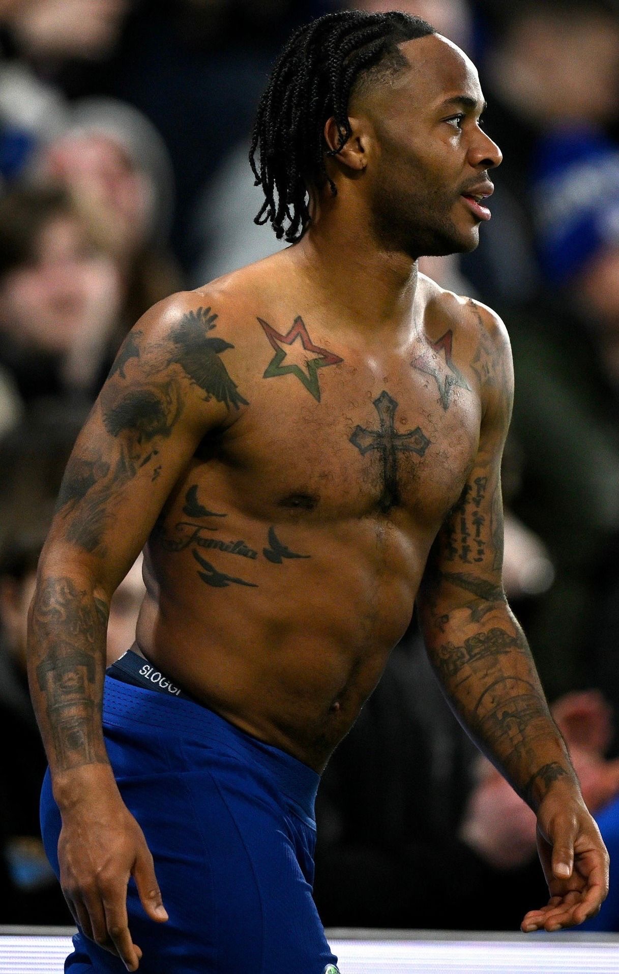
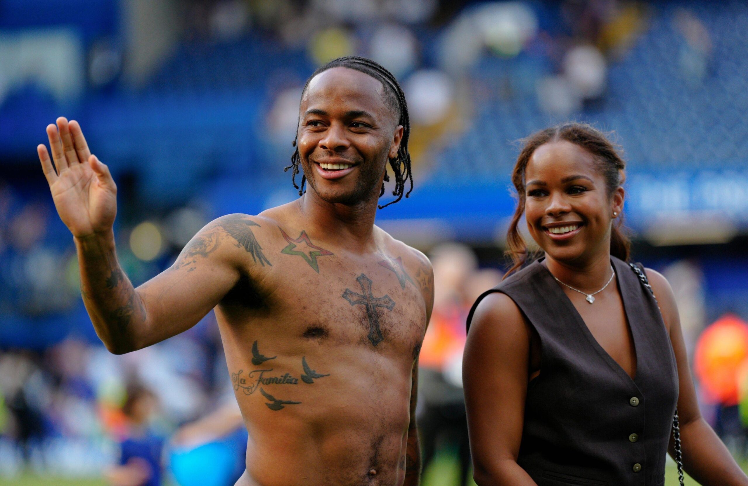
Raheem Sterling’s tattoos cover his chest, shoulders, arms and legs. The best-known designs include a cross, stars, birds, the word Familia, portraits, a tree, Wembley, a clock tower and a rifle on his right calf. Some have clear explanations; others are best described by what the photographs show.

Football photos hide much of the ink under shirts, shorts and socks. That is why the sections use different body views. A chest photo may show the lettering clearly, but it cannot also establish the details on Sterling’s calf, hand and shoulder.

Raheem Sterling’s chest carries stars, a cross, birds and Familia lettering

Raheem Sterling tattoos: large sharp photograph showing the stars, cross, birds and Familia lettering

Sterling’s chest gives a clear sense of how much ink he has collected. Visible designs include coloured stars, a large cross, flying birds and the word Familia. They form a busy arrangement, though each remains a separate tattoo rather than one giant image.

The stars add a lighter, decorative touch, while the cross is larger and more central. Birds bring movement to the chest, and the family lettering gives the area a personal focus. A shirtless photo shows the layout far better than a standard football portrait.

In match and celebration photos, Sterling’s shirt may be lifted or removed, but the angle can make the designs blur together. A closer image separates the stars from the cross and makes the lettering easier to read.

Familia is one of the clearest statements in his collection, and it does not need a complicated theory. The photo establishes the words and their location. His public role as a father gives the family connection context without requiring us to invent a more private story.

The cross and shoulder work sit in a wider football-and-family layout

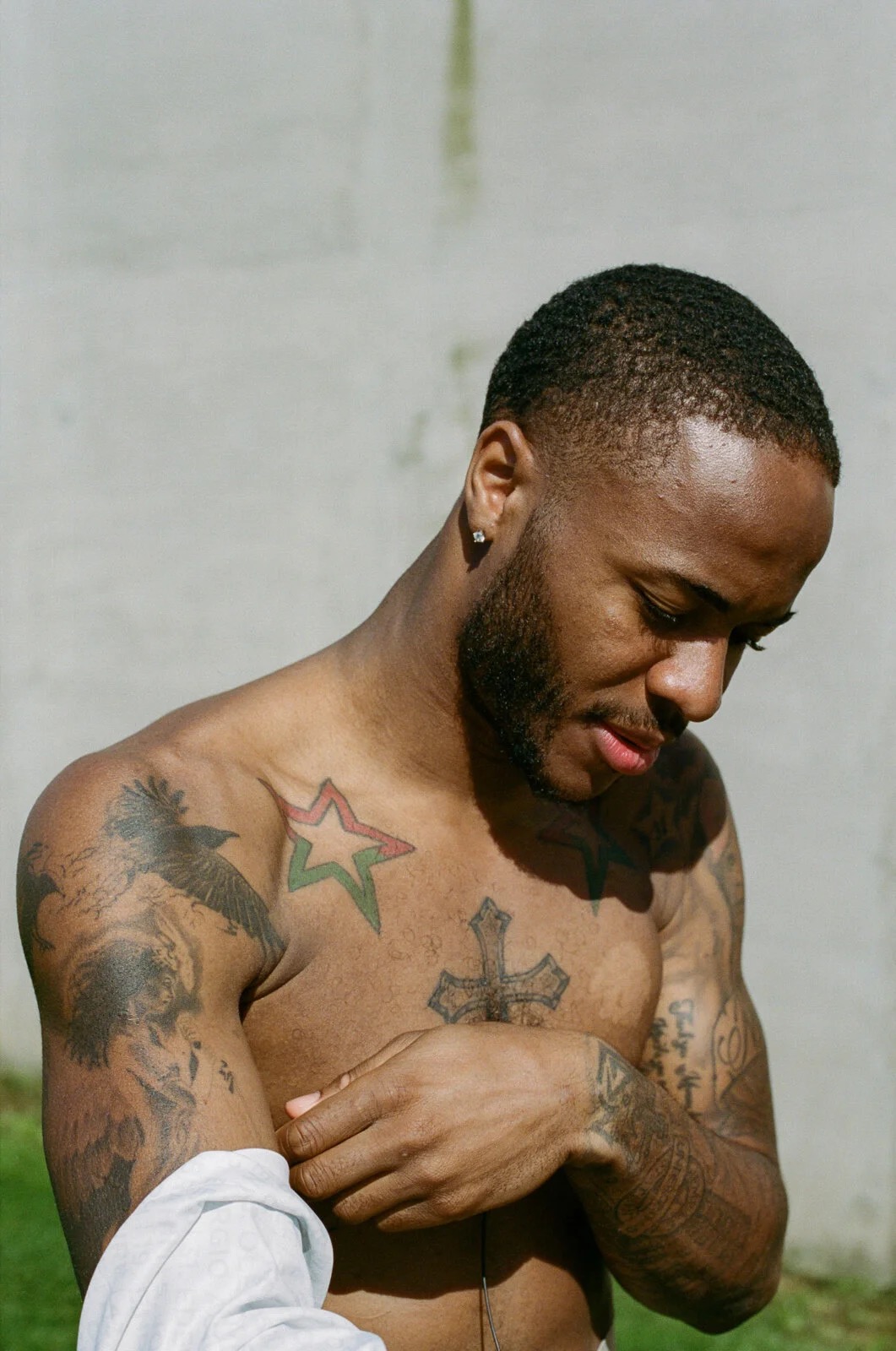
Raheem Sterling tattoos: different high-resolution shirtless celebration photo showing chest and shoulder ink

Smaller tattoos sit around the cross on Sterling’s shoulders and upper arms. This second shirtless photo shows how the work spreads when he raises his arms, while the first gives a more direct view from the front. Both angles help because a change in posture can alter the spacing and hide different edges.

Reports also mention small symbols, lettering and birds around his shoulders. Some details come from photographs rather than Sterling’s own explanations. A clear design can be named, but a shadow or partly covered mark should not be given a confident meaning simply to expand the list.

The collection grew alongside Sterling’s football career, and team shirts and training tops often cover parts of it. A stadium image may show the chest but hide the ribs, or reveal an arm while the collar obscures the upper lettering. The shoulder tattoos need their own photo because a straight-on portrait can hide them.

Together, the chest and shoulder pieces feel personal without following one style. Religious imagery, family words and simple graphic designs all share the space. That variety is more accurate than describing everything as one planned sleeve.

Portraits, birds and the tree tattoo bring family memories into the collection

Raheem Sterling tattoos: large tattoo-specific portrait showing the chest and surrounding arm work

Sterling’s collection includes portraits, birds and a tree design. These pieces have more detail than the tiny lettering near his wrist, so a sharp photo matters. Hair, sweat and stadium lighting can flatten the shading until a face looks like an ordinary dark patch.

The tree is often discussed as part of the family side of his tattoos. A tree can suggest roots and relatives, but the explanation should stay close to what a source confirms. The image shows its branches, trunk and placement; reporting supplies the family context.

Portraits need particular care. A clear photo may show a recognisable face, but it does not confirm who that person is unless Sterling or a reliable source identifies them. It is better to describe a reported portrait and where it sits than guess from a blurry image.

The portrait and tree work also show the range of styles in his collection. Beside the bold cross and stars are finer lines and softer shading. A separate tattoo photo keeps those details visible instead of burying them beneath the larger chest designs.

The rifle tattoo on Sterling’s right leg has a very specific personal explanation

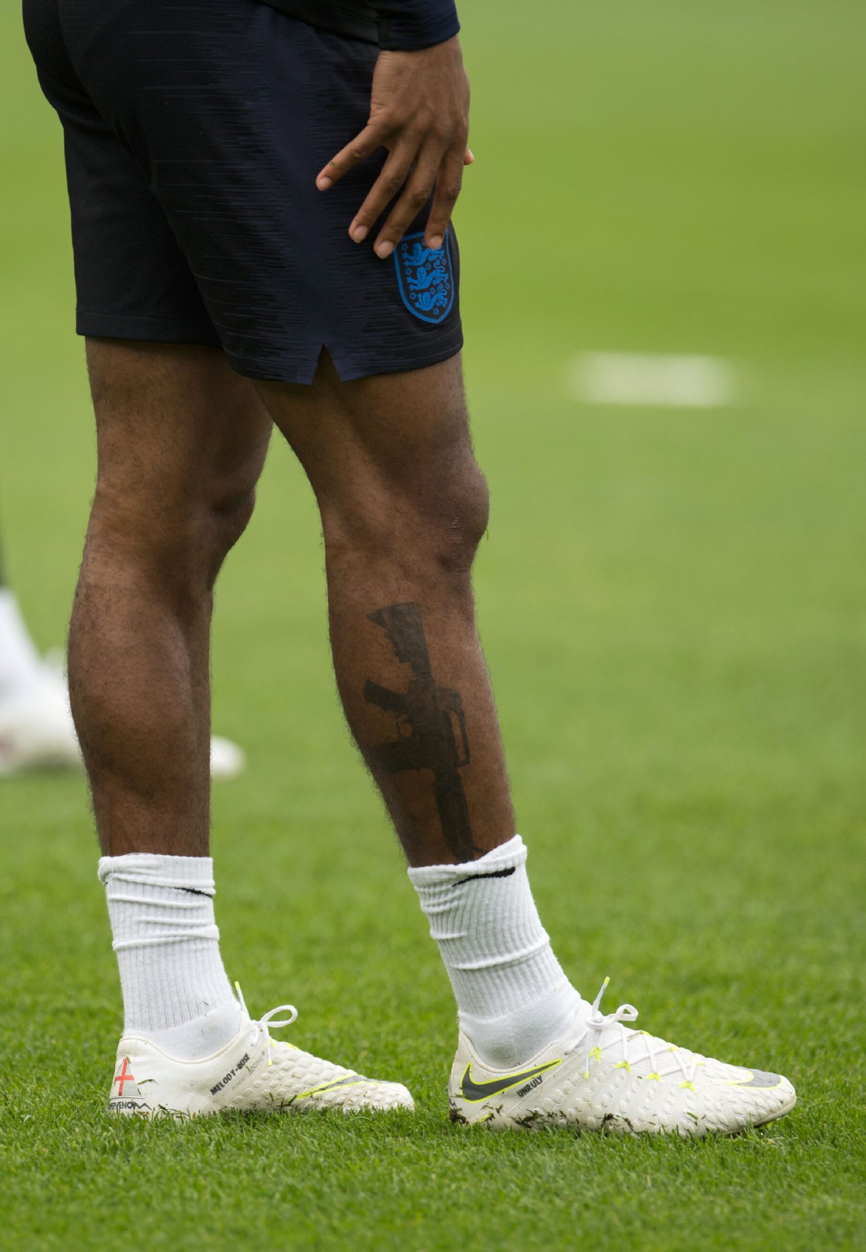
Raheem Sterling tattoos: distinct high-resolution photograph showing the right leg rifle tattoo

The rifle tattoo on Sterling’s right calf became the most controversial design in his collection. It was photographed during England training and quickly sparked debate about gun imagery. Sterling’s explanation is central: his father was fatally shot when Sterling was young, and he said he would never touch a gun.

He connected the rifle’s placement to football, explaining that he shoots with his right foot. The line was simple, but the personal history behind it was much heavier than the headlines suggested. Early photos showed the tattoo unfinished, another detail worth retaining instead of presenting the design as if it never changed.

The leg photo shows the black silhouette and its placement clearly. It is a separate calf view, not a generic portrait or a crop of the chest picture. That matters because socks, boots and shorts can cover the edges during a match.

The rifle tattoo should be described using Sterling’s explanation, not assumptions about violence or gang imagery. His account was direct, and the image shows the design. There is no need to attach a bigger moral lesson to it.

Sterling’s tattoos also include Wembley, a clock tower and smaller lettering

Raheem Sterling tattoos: very high-resolution training photograph showing the leg and surrounding football context

Sterling has also been photographed with a Wembley design, a clock tower and smaller lettering. Wembley has an obvious football connection. He has described it as a symbol of the dream he was living, giving the arm tattoo a more specific explanation than many smaller marks.

The clock tower is a compact design on his arm and can be difficult to spot while he is playing. Accounts also list family names and phrases, including words associated with his children. Since the photos do not show every design at once, each detail should be tied to the image that supports it.

A high-resolution training photo helps because the leg and boots provide context and scale. The angle also shows where the ink sits. It gives the article another distinct photo instead of reusing a shirtless celebration image.

The word Wembley is both personal and public: it points to a place and a football ambition, while the family lettering is more intimate. Sterling’s collection moves between those sides without needing one theme to tie everything together.

The smaller arm and hand tattoos complete a collection built over time

Raheem Sterling tattoos: separate high-resolution shirtless photograph showing chest, birds and family context

Smaller tattoos on Sterling’s arms and hands can appear or disappear from view depending on the photo. Some are clear enough to identify, including short words, symbols and marks near the wrist. Others blend into shadows or jewellery. That is common when a collection is mostly seen in sports and fashion photography.

Photos from tattoo artists and football coverage together offer a timeline, not a picture of one finished mural. Older images show the chest and early arm work; later views reveal more lettering and detail. A new angle should not automatically be taken as a new tattoo or cover-up.

Family life is another thread in the collection. Names, birds and Familia sit near football references such as Wembley. The designs use different styles, but many record people and moments that mattered to Sterling.

The clearest inventory includes the stars, cross, birds, Familia lettering, tree, portraits, Wembley, clock tower, rifle tattoo and smaller family marks. Six distinct tattoo photos give those groups room. The featured portrait remains separate, offering a face view rather than evidence for a particular design.

Sterling’s tattoos make more sense as a timeline. The rifle attracted attention because of its subject and placement, but the rest of the collection is just as revealing. Family names and birds appear beside football references, travel memories and small decorative designs. There is no single statement the whole collection has to make.

Image quality and framing matter here. Fine lettering can vanish in a small file, and a calf tattoo loses context when the leg is cropped out. Clear photographs give readers something specific to see instead of relying on general statements about Sterling’s style.

When Sterling has explained a tattoo, that explanation belongs in the guide. When a design is simply visible in a photograph, it can be described without adding a story. That balance gives readers a fuller view without claiming every symbol has a confirmed meaning.

More athlete tattoo guides

Kevin Hart Tattoos: Back Masks, Family Names and His Angel

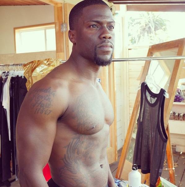
Kevin Hart has more tattoos than his usual red-carpet outfits show. His chest, shoulders, arms and back all carry ink, including family names, an angel, theatre masks and smaller symbols. The back piece is the biggest, but the mix of large work and small details gives the collection its character.

The photos here focus on different parts of the body. A headshot cannot show a back tattoo, and one shirtless image may not make the lettering easy to read. Several views, with a little context from coverage, give a clearer picture of Hart’s tattoos.

Kevin Hart’s chest tattoos include family names and a large angel

Kevin Hart tattoos: large tattoo gallery image showing Hart shirtless with chest and arm work visible

Hart’s chest is one of the easiest places to see the collection. It includes an angel and lettering connected to his family, including his children’s names. That personal detail does not need an elaborate explanation. A clear shirtless image shows how the words sit across his chest instead of letting them blur together.

The angel is the larger visual feature in the centre. Its shape anchors the chest, while the smaller lettering sits nearby. These are separate designs with different roles, and the photo also shows how chains, lighting and muscle definition can affect their appearance.

Hart has been photographed at the gym, on the beach and during tattoo sessions. Those images make the ink visible, but some are more useful than others. A wide shot shows how much of the chest is covered; a close-up helps readers make out the names and the angel’s edges. The family names need that sharper view.

The family connection is clearer than the meaning of many smaller symbols. Hart has publicly linked parts of the work to his children and relatives. Other marks can be described by their shape and location until he gives them a direct explanation. That keeps the article detailed without inventing a story for every line.

The comedy and tragedy masks cover most of Kevin Hart’s upper back

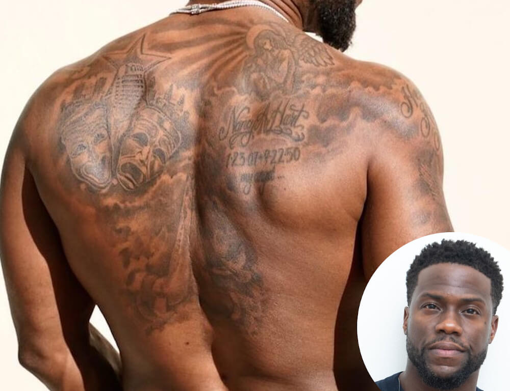
Kevin Hart tattoos: large back photograph showing the comedy and tragedy masks across his shoulders

Hart’s largest single tattoo is on his back: comedy and tragedy masks spread across the upper back. It is a fitting design for a comedian whose career centres on performance. The masks use black-and-grey shading and stretch across both shoulders, reading as one strong composition when he turns away from the camera.

Their contrasting expressions give the piece its focus. One face feels lighter and more playful; the other has a darker theatrical mood. The difference creates a clear centre without needing colour. A full back photo lets the masks read properly instead of reducing them to a small crop on an otherwise empty page.

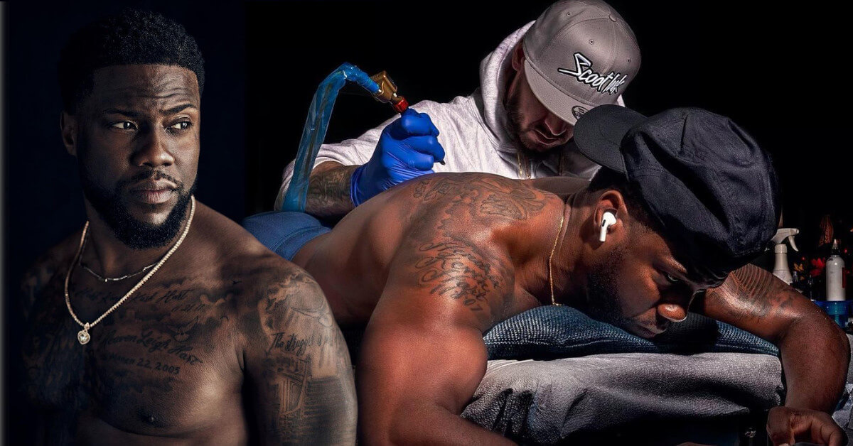
Hart revealed the tattoo during a workout-style photo session, and later pictures show how it sits beside smaller shoulder pieces. Coverage has also shown an artist working on his back, helping establish the timeline. The finished design developed over time rather than appearing all at once.

A generic portrait would not work for this section. The featured image can show Hart’s face, but only a separate back photo reveals the tattoo, its shading and its placement.

Hart’s arm tattoos sit beside the chest work and smaller symbols

Kevin Hart tattoos: different high-resolution beach photograph showing arms and chest ink

Small tattoos on Hart’s arms can disappear under a T-shirt. There is lettering, darker imagery and work that visually connects with his chest. A beach photo helps because his arms are uncovered and the strong light makes it easier to distinguish the individual marks.

The arms do not form one precisely planned sleeve. Some tattoos stand alone, while others sit close enough to look connected in a wide image. That is natural for a collection built over years. It is more accurate to identify what is visible and leave uncertain edges alone than to claim the whole arm follows one theme.

Hart has also been photographed during tattoo sessions, showing the work as it develops. One image may catch an artist working on his back with older tattoos still visible around the shoulders. That adds timeline context, but it does not prove that every surrounding mark came from the same appointment.

The arm lettering is another reason to use a large image. Compressed photos can make small words unreadable. A clear body shot shows where the text sits, while the article adds only the context supported by the available sources.

The shoulder and side tattoos fill in the gaps around the main pieces

Kevin Hart tattoos: separate high-resolution tattoo guide photograph showing shoulder and upper-body details

Smaller tattoos around Hart’s shoulders and sides fill out the upper body. Some sit near the collarbone; others are beside the angel or extend toward his ribs. They may not be as famous as the back masks, but they explain why a shirtless photo shows more ink than a short list of headline designs suggests.

Posture changes how the shoulder work appears. When Hart raises his arms, the skin stretches and the lines seem farther apart. When he turns or relaxes, the designs bunch closer to his chest. More than one angle is useful because a single pose can hide the placement.

Coverage and tattoo galleries identify the angel, family lettering and other shoulder designs, but not every small symbol has a confirmed meaning. It is enough to describe what is visible: an outline, a short word, a mark near the shoulder or a design running toward the side. That is more helpful than guessing.

The shoulder details also show why photos need different framing. Larger tattoos benefit from a wide view, while small lettering needs a close one. Both belong in the article and deserve a clear image instead of getting buried in one long paragraph.

Kevin Hart’s tattoo collection changes with each workout and studio photograph

Kevin Hart tattoos: different sharp shirtless workout photo showing the arms, torso and tattoo placement

Fitness photos often capture Hart’s arms, chest and torso all at once. That makes the tattoos easy to spot, but the details can flatten out. Sweat, hard light and shadow may make a design look darker than it does in a calmer portrait.

This workout image is separate from the beach and gallery photos. It shows the tattoos while Hart is moving and posing naturally, which helps explain why the layout can look different from a straight-on studio view. His chest may appear broader, an arm can obscure a shoulder and the back is usually out of sight.

Those changes do not necessarily mean Hart has added or removed anything. Clothing, posture and camera distance all affect the view. Where possible, a reliable account dates the photo and avoids calling every difference a cover-up. The overall layout becomes clearer when several distinct images are compared.

Hart’s tattoos have an easy, personal feel: family names, an angel, performance masks and smaller marks around his arms and shoulders. It is not one rigid sleeve built around a single idea. The collection appears to have grown as his family, career and interests changed, making the photos as useful as the design list.

The tattoos are easier to read as a timeline than as one finished mural

Kevin Hart tattoos: separate high-resolution tattoo-session photograph showing the back and upper-body layout

Hart’s tattoos did not all become visible at once. The back masks drew particular attention in later fitness photos, while the chest and arm pieces had appeared in public earlier. The timeline explains why older portraits can look less crowded than newer ones.

The family lettering belongs to the personal side of the collection, while the masks connect with comedy and performance. The angel brings in another mood, and the smaller shoulder marks bridge the spaces between. The designs can have different reasons; they do not need to add up to one polished statement.

The clearest visual inventory includes the comedy and tragedy masks, the angel, his children’s names and the arm, shoulder and side tattoos shown in close photos. Less distinct marks should remain uncertain. That tells readers where the evidence is clear and where the image does not show enough.

Hart has enough documented work to merit several body photos instead of one generic headshot. The featured portrait is separate, and the six tattoo images appear beside the sections they support. Together, they show his chest, back, arms, shoulders and the changing layout of his collection.

Framing matters. A full back piece needs enough space for the masks to remain recognisable, while a child’s name or a small shoulder symbol needs a closer view. Reusing one low-quality photo would make the collection look smaller than it is. The images here show distinct scenes rather than one file cropped in several ways.

Hart’s tattoos are easier to follow when the body is broken into areas: family and angel designs on the chest, theatre masks on the back, and smaller work around the arms and shoulders. The strongest meanings are the ones Hart or a reliable source gives directly. The designs themselves fill in the rest.

For readers looking up Kevin Hart’s tattoos, the simple takeaway is that there is plenty to see, and the designs do not all come from one session. The collection has grown along with his public life, family and training routine. It reads best when each group gets a clear photograph instead of being rushed through a short list.

More comedian tattoo guides

Corey Taylor’s Tattoos: Sun, Moon, Lyrics and Slipknot Ink

It is easy to underestimate Corey Taylor’s tattoos if you have only seen him in a shirt. The Slipknot and Stone Sour frontman has large work on his chest, lettering across his back, patterns on his arms, symbols on his lower abdomen and smaller pieces near his neck and wrists. Looking at each area separately keeps the photos and reported stories from blending into one vague list.

Some details come from interviews and tattoo features; others are visible in photographs. Taylor has also added and changed over many years, so an old concert photo should not be mistaken for a complete current inventory.

The sun-and-moon chest piece is the centre of the collection

Corey Taylor tattoos: tattooed arms during a live performance

Taylor’s chest draws the eye first: the main tattoo is broad and dark, far larger than a small flash design. Photos show a split sun-and-moon design across his upper torso, with the two halves meeting near the centre. It has the hard, unsettling look associated with Paul Booth’s work, but that connection should stay with this chest project rather than be extended to every tattoo Taylor has.

Older coverage sometimes called the piece unfinished, though it does not look like an abandoned outline. Black shapes, faces and colour already come together as a substantial image. Later additions and the edges make it feel like a work that developed over time. A stage photo can flatten or darken the chest compared with a studio portrait, so the image matters when describing the line work.

Taylor has spoken about the time and pain involved in large sessions, and the chest tattoo fits that account. It is not a small mark added in an afternoon. It covers enough of his torso to sit above the abdomen designs and change the look of his whole front when he performs shirtless. The sun and moon give the collection a strong visual anchor without requiring an invented meaning for every ray or shadow.

The chest piece sits among other tattoos rather than on its own. Photos show his arms around it, lettering below and small yellow faces closer to the waist. A close crop proves the central design clearly, but a wider frame is needed to show how Taylor placed different styles around it.

The back lettering, numbers and Slipknot imagery need a wider view

Corey Taylor tattoos: neck and arm tattoos during a live performance

Some of Taylor’s most distinctive lettering is on his back. Photos identify “Infant” and “Finite” around an infinity-like mark, with the red number “24601” below. The number is commonly linked to Jean Valjean’s prisoner number in Les Misérables. It is a specific reference, unlike the vague meanings sometimes attached to tattoos in unsourced lists, but visible text should still be kept separate from claims about every private reason behind it.

The upper-back work also connects with his band history. Coverage has associated the infinity symbol with Slipknot, while other photos show a panther-like image above the words and more lettering near his neck. Hair, stage lights and body angle can hide parts of the design. A view of the back, shoulders and spine is more useful here than a front-facing concert shot.

Farther down, reports and tattoo catalogues describe a dragon head, a suited figure and other black-and-grey illustrations. Those are useful visual descriptions, not confirmed personal explanations. Taylor’s interest in theatrical imagery, horror and literature is well known, but a photo cannot tell us whether each creature represents a specific part of his life.

The back also makes a single tattoo count unreliable. Older photos show fewer additions; later ones may reveal deeper shading, more lettering or a different hairstyle. A careful guide names what can be identified, gives its location and dates the photo when possible instead of implying the collection has remained fixed.

His arms carry tribal lines, symbols and working-musician scars

Corey Taylor tattoos: sun-and-moon chest tattoo and lower-abdomen lettering

Taylor’s arms are busy but do not read as matching sleeves. Photos show black tribal-style bands, illustrative figures, lettering and coloured shapes running from his shoulders toward his forearms. Microphones and short sleeves can hide sections, which is why several angles are more useful than one general portrait.

The two arms are not exact mirrors. One is more heavily filled, while the other leaves space around smaller symbols and words. Close concert photos help distinguish a broad dark area from a separate small mark. It is tempting to name every patch, but a motif should be identified only when the photo is clear enough to support it.

Tattoo inventories also list words such as “Truth” and “Dogma” on Taylor’s forearms, along with symbols linked in coverage to his family and music. These labels can help readers find the designs, but they do not amount to a biography. Photos establish that the lettering and symbols are there; they do not explain every line.

Taylor’s forearms have a practical history, too: he performs in sleeveless shirts and moves constantly on stage. Sweat, coloured lights and motion blur can make the same tattoo look different in separate images. A still portrait usually gives the clearest view; a concert photo shows how visible the designs are while he is performing.

The smiley faces, Sanskrit and smaller symbols change the tone

Corey Taylor tattoos: full torso showing the chest, arms and abdomen designs

Near Taylor’s lower abdomen are two bright smiley-face tattoos with writing between them. The yellow faces add a strange, almost cartoonish note to a collection otherwise dominated by skulls, tribal lines, dark lettering and dramatic chest work. One face has been described as pierced or marked by a projectile, giving the cheerful image a harsher edge.

The Sanskrit lettering between them is often translated in tattoo coverage as “darkness,” though translations need care. The writing is visible, but its exact wording depends on the source and whoever supplied the translation. The photo supports its shape and placement; it does not prove an English meaning on its own.

Smaller tattoos also appear on Taylor’s stomach, wrists and neck. Some are clear in a close-up; others blend into surrounding designs. Writing and symbols on his neck can disappear when he turns his head or wears a high collar. They change the overall feel, but should not be counted again every time a different angle reveals another line.

This mix gives Taylor’s collection a personal feel without imposing one style on everything. The chest leans into theatrical imagery, the back uses words and numbers, the arms mix patterns with illustrations, and the abdomen brings humour and script. The designs can be discussed individually; their variety is the point.

What can be confirmed about Corey Taylor’s tattoos?

The clearest record includes the split sun-and-moon chest piece, the back lettering and numbers, the different arm patterns, and the smiley faces with script on the lower abdomen. Other marks show in photos but have less explanation. That distinction makes the guide more useful: it can say what a picture shows and leave unconfirmed meanings open.

There is no need to turn every symbol into a secret message or claim one artist created the whole collection. Taylor’s tattoos came over time, through different sessions and visual ideas. The big pieces shape the body art; smaller words and symbols add details that stand out when a clear photo catches them.

Small designs also sit between the headline pieces. A wrist symbol may look like part of an arm pattern in a concert photo, while a close portrait separates it from the darker bands. The same goes for the neck writing and marks beside the chest and back work. They can be described without a made-up backstory: when an image is clear, note the shape, position, colour and date; when it is not, keep the wording modest.

Taylor’s collection also makes more sense as the work of a touring musician than as one perfectly planned sleeve. The tattoos arrived at different times, and photos range from stage lights to backstage mirrors, interviews and older publicity shots. That is why the article uses several views: one shows the chest, another the back, and another makes the smaller arm or abdomen work easier to see.

More musician tattoo guides