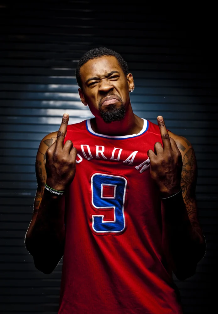
When DeAndre Jordan takes his shirt off, the tattoos cover both arms, his chest, shoulders, back and legs. Long lines of writing sit beside portraits, crosses and basketball references. The pieces don’t look like one perfectly matched sleeve. Together they feel like a map that grew with him.
DeAndre Jordan tattoos mix large black-and-grey shapes with long script and smaller details. The shoulders hold some of the widest images, the chest carries prominent messages, and the arms give you more to follow. The placements keep the collection from becoming a wall of unrelated ink.
Jordan has talked about tattoos tied to family, his Houston roots and his faith. Those subjects give the collection a personal centre. You don’t need to copy a cross, quote or hometown reference; start with the people, places or beliefs you want to carry, then find the right space for them.
DeAndre Jordan’s chest tattoos make the collection feel personal
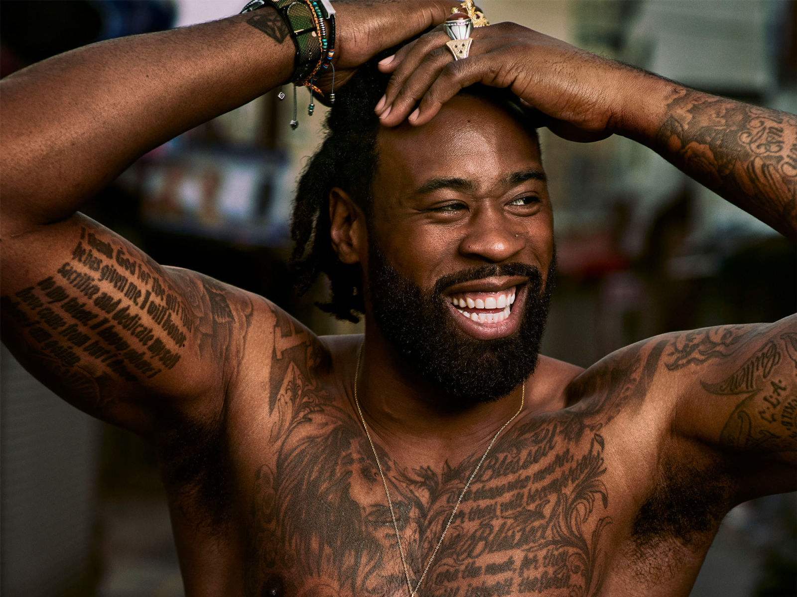
Jordan’s chest gives his collection a centre. Long writing stretches across a broad surface, while portraits and symbols add darker areas around it. In shirtless photos, you can see these sections together, and the mix reads as a story rather than a stack of separate flash designs.
The chest lets words and images sit side by side. A long quote can turn into a block if the lines are squeezed together; Jordan’s has room to read, with nearby artwork breaking up the text. That keeps the area visually full without flattening it.
Before planning a chest piece, decide if the main idea belongs in the centre, over one pectoral or across the whole front. A central image can work like an emblem, while a quote needs width toward the ribs and shoulders. The design should follow the shape of the body, not treat the skin like a blank sheet.
Step back from the reference photo too. Fine details can look sharp on a phone and disappear at normal distance. Clear outlines, spacing and a few darker areas help a chest tattoo keep its shape in everyday light.
His shoulder tattoos use large images and curved placement
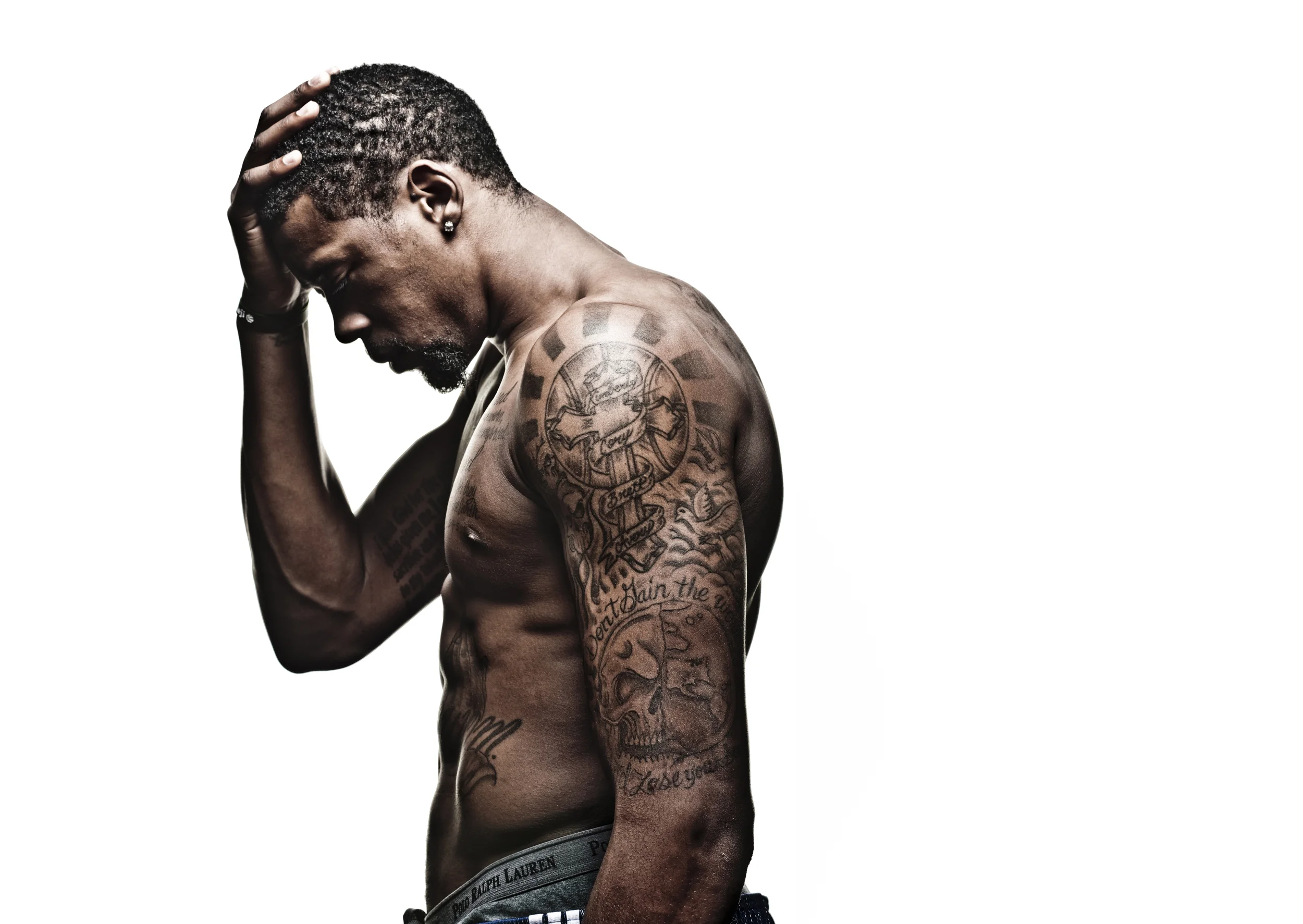
Jordan’s shoulder work is easy to study because the large images follow the curve of the arm. One shoulder carries a circular skull-and-banner design, with script and decorative shapes continuing down the upper arm. The round cap frames the main image; the lettering below it follows the arm rather than forcing a straight line.
Wrapping a design around a muscle can make it harder to read from every angle. Here, the central image has a clear focal point, and the smaller writing supports it. The arm turns, but the main shape still holds together.
If you want a shoulder tattoo with this scale, give the central image the space it needs first. A skull, portrait, animal or religious symbol may fit the roundest part of the shoulder, where it shows from the front and side. Then plan the lettering below it. Don’t force words into every open gap; a little bare skin can give the image room.
Ask your artist to test the design on a curved template. Lines that look straight on paper may bend oddly over the deltoid. The main face or symbol should point the right way, and the layout needs to allow the arm to move.
The arm tattoos carry Jordan’s faith and family references
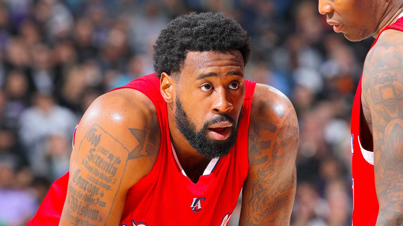
Jordan’s arms carry some of the collection’s most visible pieces. Long writing runs along an upper arm; the other includes images and symbols tied to faith, family and personal history. Because his arms show in basketball photos, the tattoos are part of how fans recognise him away from the court.
The subjects vary. One area may centre on a quote, another on a cross or portrait, while smaller marks connect them. They don’t all need to match; a shared line weight and black-and-grey tone can make different designs feel related.
A tattoo collection can come together over time instead of being planned as one complete sleeve. Jordan’s public photos show pieces with different sizes and spacing. The overlaps and gaps give the arm a lived-in quality, while the larger images still have room to read.
Before adding another piece, photograph the arm from the front, side and back. Ask whether the new design improves the flow or only fills an empty patch. A gap isn’t automatically a problem. It can give the eye a rest and help the more important tattoos stand out.
The Serenity Prayer tattoo works because the lettering has room
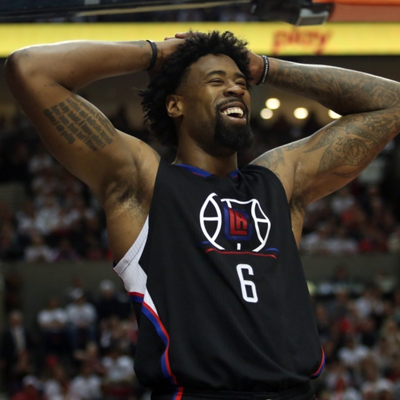
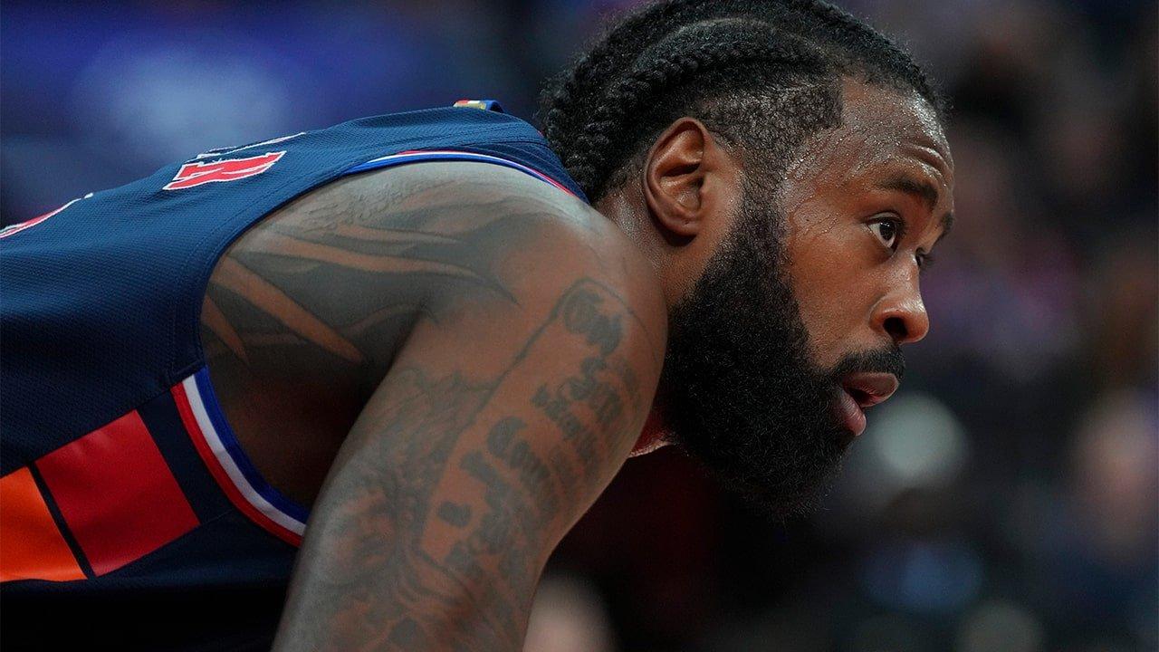
The Serenity Prayer is one of Jordan’s most visible arm tattoos. The lettering runs over a long stretch of skin, giving the words room. A quote this length needs careful spacing; if the lines sit too close, the tattoo may blur together as it ages.
A game photo shows the writing while his body is moving. Jordan bends and twists, but the text still reads as a vertical panel along the arm. That placement follows the arm’s length rather than fighting the folds in the skin.
A long quote brings a few practical choices. Pick lettering that will stay readable at the size you can use, and check the spaces between words before settling on the style. The artist can tune the letter shapes and rhythm, but the phrase still needs enough room.
The words already carry the meaning; the nearby tattoos add context. If your idea is a prayer, song lyric or family saying, let the text remain the main feature. Add flourishes only when they help the layout, and make sure the words can stand on their own.
His on-court tattoos show how the collection moves
Game photos show Jordan’s tattoos in motion and ordinary light. A jersey covers much of the chest, but the arm work remains visible. When he puts his hands on his head, the shoulders and upper arms enter the frame too. The ink changes with each pose.
Another court image shows a different mood from the shirtless portraits. The tattoos aren’t being posed for the camera, yet the larger shapes and script still read clearly. The arm ink has enough contrast to show at a distance, while finer marks reward a closer look.
Think about your everyday clothes when you choose a placement. A shoulder tattoo may disappear under a sleeve, while a forearm piece can stay visible all day. The best spot is one that suits how you live and how much of the design you want to show.
Most of the visible tattoos use black and grey, so the shapes and lettering carry the look. Colour can work just as well; repeating one or two tones across different pieces can help them feel related. Line weight, subject and placement can create that connection too.
How to plan a collection with the same personal feel
Start with the meaning, not a random picture. Think about the people, places or beliefs you want a tattoo to represent. Jordan’s collection includes family names, faith imagery, hometown references and longer phrases because those subjects matter in his life. Your list should come from your own experience.
Next, choose a placement with enough room. A small symbol may suit the wrist or upper arm; a quote needs a longer stretch, such as the outer arm, ribs or chest. A portrait needs enough space for the face to remain distinct. Let the detail set the scale.
Jordan’s larger pieces also show the value of building in stages. Place the most important design first, then let supporting work develop around it. Your artist can repeat shapes, shading or line weight without making every tattoo identical, leaving you room to change direction as the collection grows.
Check the layout in positions you actually use: raise your arms, sit, turn and put on a shirt. Look in soft and bright light. If the main image still reads and the letters have breathing room, you’re close. DeAndre Jordan tattoos show how much meaning gains when placement gives it room.
Jordan’s tattoos feel personal because they connect faith, family, home and the shape of his body. You can use the same approach without copying his designs: choose the stories that matter, make room for the main pieces, and let the collection grow with you.
The video below looks at the tattoo artist behind several NBA players, including DeAndre Jordan.