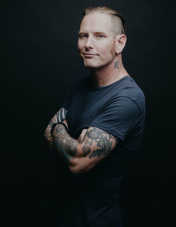
It is easy to underestimate Corey Taylor’s tattoos if you have only seen him in a shirt. The Slipknot and Stone Sour frontman has large work on his chest, lettering across his back, patterns on his arms, symbols on his lower abdomen and smaller pieces near his neck and wrists. Looking at each area separately keeps the photos and reported stories from blending into one vague list.
Some details come from interviews and tattoo features; others are visible in photographs. Taylor has also added and changed over many years, so an old concert photo should not be mistaken for a complete current inventory.
The sun-and-moon chest piece is the centre of the collection
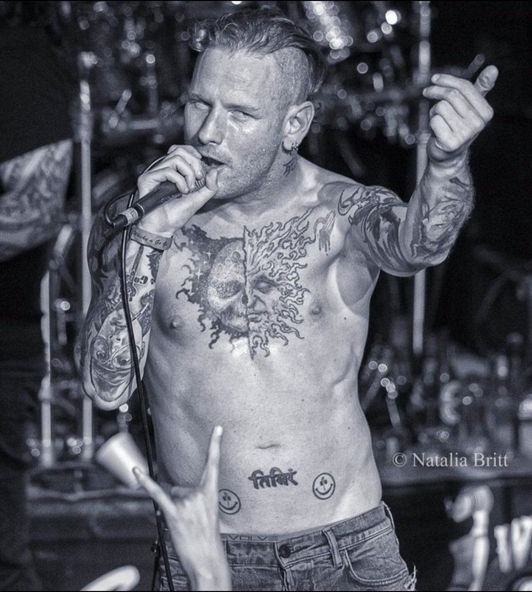
Taylor’s chest draws the eye first: the main tattoo is broad and dark, far larger than a small flash design. Photos show a split sun-and-moon design across his upper torso, with the two halves meeting near the centre. It has the hard, unsettling look associated with Paul Booth’s work, but that connection should stay with this chest project rather than be extended to every tattoo Taylor has.
Older coverage sometimes called the piece unfinished, though it does not look like an abandoned outline. Black shapes, faces and colour already come together as a substantial image. Later additions and the edges make it feel like a work that developed over time. A stage photo can flatten or darken the chest compared with a studio portrait, so the image matters when describing the line work.
Taylor has spoken about the time and pain involved in large sessions, and the chest tattoo fits that account. It is not a small mark added in an afternoon. It covers enough of his torso to sit above the abdomen designs and change the look of his whole front when he performs shirtless. The sun and moon give the collection a strong visual anchor without requiring an invented meaning for every ray or shadow.
The chest piece sits among other tattoos rather than on its own. Photos show his arms around it, lettering below and small yellow faces closer to the waist. A close crop proves the central design clearly, but a wider frame is needed to show how Taylor placed different styles around it.
The back lettering, numbers and Slipknot imagery need a wider view
Some of Taylor’s most distinctive lettering is on his back. Photos identify “Infant” and “Finite” around an infinity-like mark, with the red number “24601” below. The number is commonly linked to Jean Valjean’s prisoner number in Les Misérables. It is a specific reference, unlike the vague meanings sometimes attached to tattoos in unsourced lists, but visible text should still be kept separate from claims about every private reason behind it.
The upper-back work also connects with his band history. Coverage has associated the infinity symbol with Slipknot, while other photos show a panther-like image above the words and more lettering near his neck. Hair, stage lights and body angle can hide parts of the design. A view of the back, shoulders and spine is more useful here than a front-facing concert shot.
Farther down, reports and tattoo catalogues describe a dragon head, a suited figure and other black-and-grey illustrations. Those are useful visual descriptions, not confirmed personal explanations. Taylor’s interest in theatrical imagery, horror and literature is well known, but a photo cannot tell us whether each creature represents a specific part of his life.
The back also makes a single tattoo count unreliable. Older photos show fewer additions; later ones may reveal deeper shading, more lettering or a different hairstyle. A careful guide names what can be identified, gives its location and dates the photo when possible instead of implying the collection has remained fixed.
His arms carry tribal lines, symbols and working-musician scars
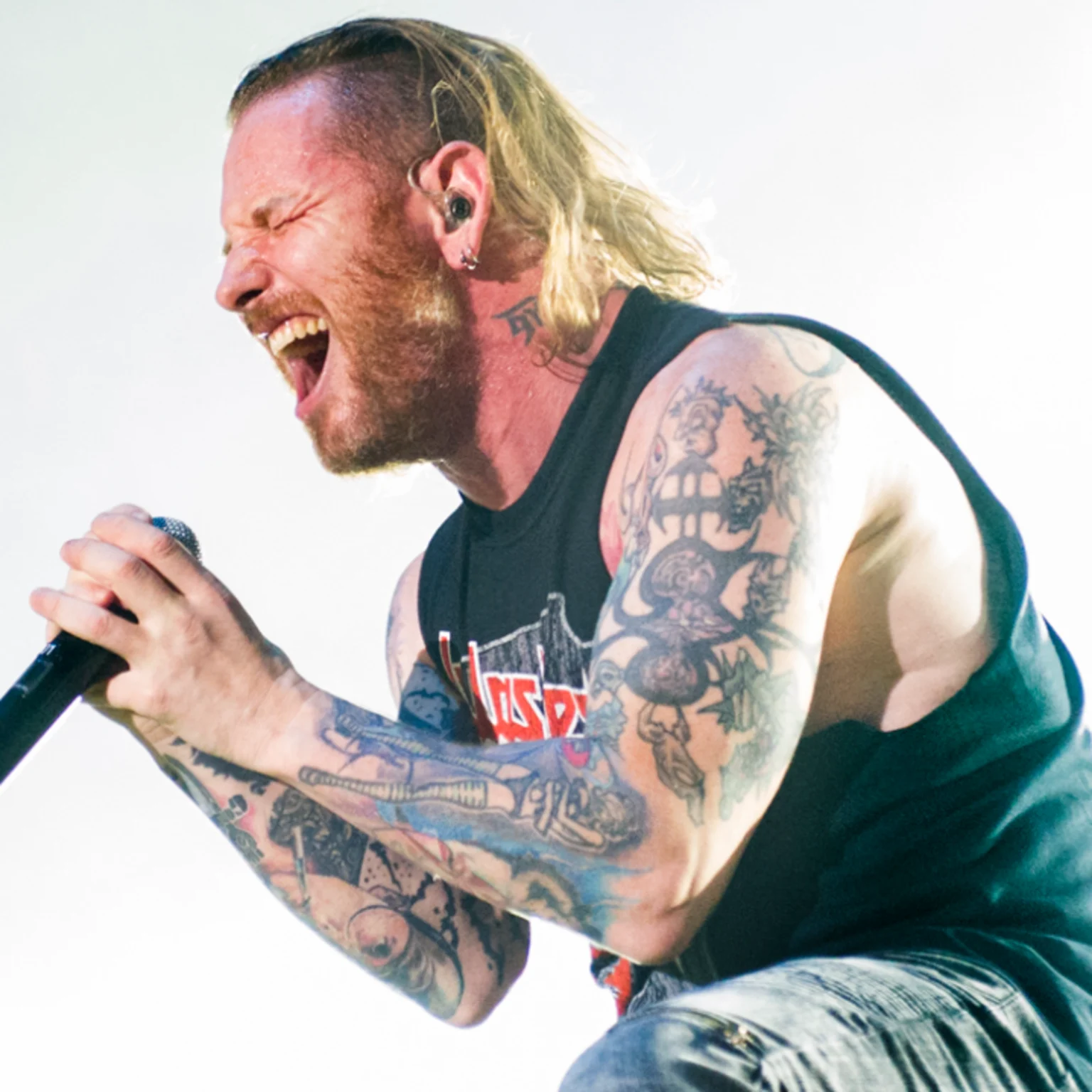
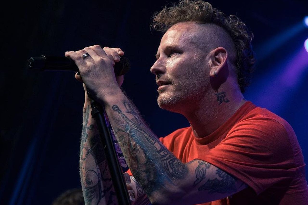
Taylor’s arms are busy but do not read as matching sleeves. Photos show black tribal-style bands, illustrative figures, lettering and coloured shapes running from his shoulders toward his forearms. Microphones and short sleeves can hide sections, which is why several angles are more useful than one general portrait.
The two arms are not exact mirrors. One is more heavily filled, while the other leaves space around smaller symbols and words. Close concert photos help distinguish a broad dark area from a separate small mark. It is tempting to name every patch, but a motif should be identified only when the photo is clear enough to support it.
Tattoo inventories also list words such as “Truth” and “Dogma” on Taylor’s forearms, along with symbols linked in coverage to his family and music. These labels can help readers find the designs, but they do not amount to a biography. Photos establish that the lettering and symbols are there; they do not explain every line.
Taylor’s forearms have a practical history, too: he performs in sleeveless shirts and moves constantly on stage. Sweat, coloured lights and motion blur can make the same tattoo look different in separate images. A still portrait usually gives the clearest view; a concert photo shows how visible the designs are while he is performing.
The smiley faces, Sanskrit and smaller symbols change the tone
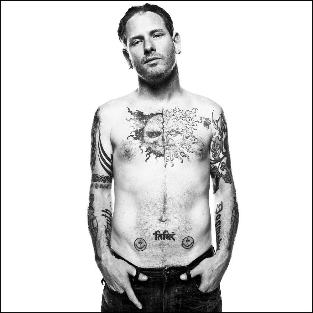
Near Taylor’s lower abdomen are two bright smiley-face tattoos with writing between them. The yellow faces add a strange, almost cartoonish note to a collection otherwise dominated by skulls, tribal lines, dark lettering and dramatic chest work. One face has been described as pierced or marked by a projectile, giving the cheerful image a harsher edge.
The Sanskrit lettering between them is often translated in tattoo coverage as “darkness,” though translations need care. The writing is visible, but its exact wording depends on the source and whoever supplied the translation. The photo supports its shape and placement; it does not prove an English meaning on its own.
Smaller tattoos also appear on Taylor’s stomach, wrists and neck. Some are clear in a close-up; others blend into surrounding designs. Writing and symbols on his neck can disappear when he turns his head or wears a high collar. They change the overall feel, but should not be counted again every time a different angle reveals another line.
This mix gives Taylor’s collection a personal feel without imposing one style on everything. The chest leans into theatrical imagery, the back uses words and numbers, the arms mix patterns with illustrations, and the abdomen brings humour and script. The designs can be discussed individually; their variety is the point.
What can be confirmed about Corey Taylor’s tattoos?
The clearest record includes the split sun-and-moon chest piece, the back lettering and numbers, the different arm patterns, and the smiley faces with script on the lower abdomen. Other marks show in photos but have less explanation. That distinction makes the guide more useful: it can say what a picture shows and leave unconfirmed meanings open.
There is no need to turn every symbol into a secret message or claim one artist created the whole collection. Taylor’s tattoos came over time, through different sessions and visual ideas. The big pieces shape the body art; smaller words and symbols add details that stand out when a clear photo catches them.
Small designs also sit between the headline pieces. A wrist symbol may look like part of an arm pattern in a concert photo, while a close portrait separates it from the darker bands. The same goes for the neck writing and marks beside the chest and back work. They can be described without a made-up backstory: when an image is clear, note the shape, position, colour and date; when it is not, keep the wording modest.
Taylor’s collection also makes more sense as the work of a touring musician than as one perfectly planned sleeve. The tattoos arrived at different times, and photos range from stage lights to backstage mirrors, interviews and older publicity shots. That is why the article uses several views: one shows the chest, another the back, and another makes the smaller arm or abdomen work easier to see.
4 thoughts on “Corey Taylor’s Tattoos: Sun, Moon, Lyrics and Slipknot Ink”