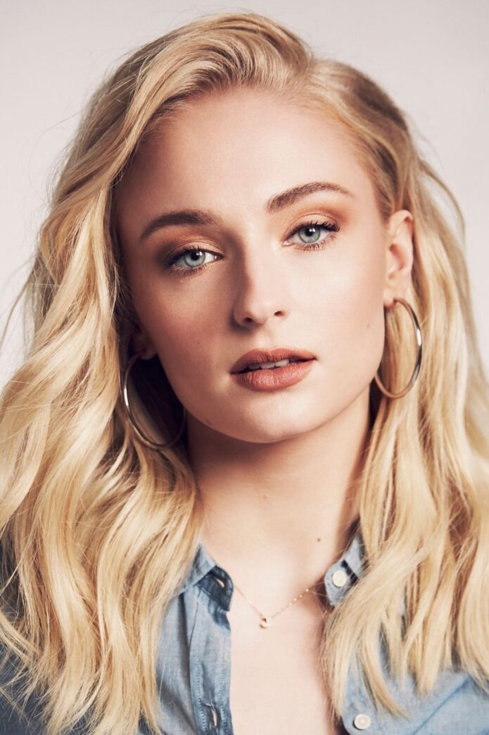
Sophie Turner has more than a dozen tattoos, from small family initials to bold Game of Thrones references. Her collection includes a W for Willa, a dog, the direwolf and The pack survives, the 07.08.09 date she shares with Maisie Williams, a north star along her spine and several smaller designs.
The tattoos reflect different parts of Turner’s life. Some reference the show that made her famous, some honour friends and family, and others are small drawings she simply liked. The photos below keep those designs distinct.
The W tattoo is a small family tribute
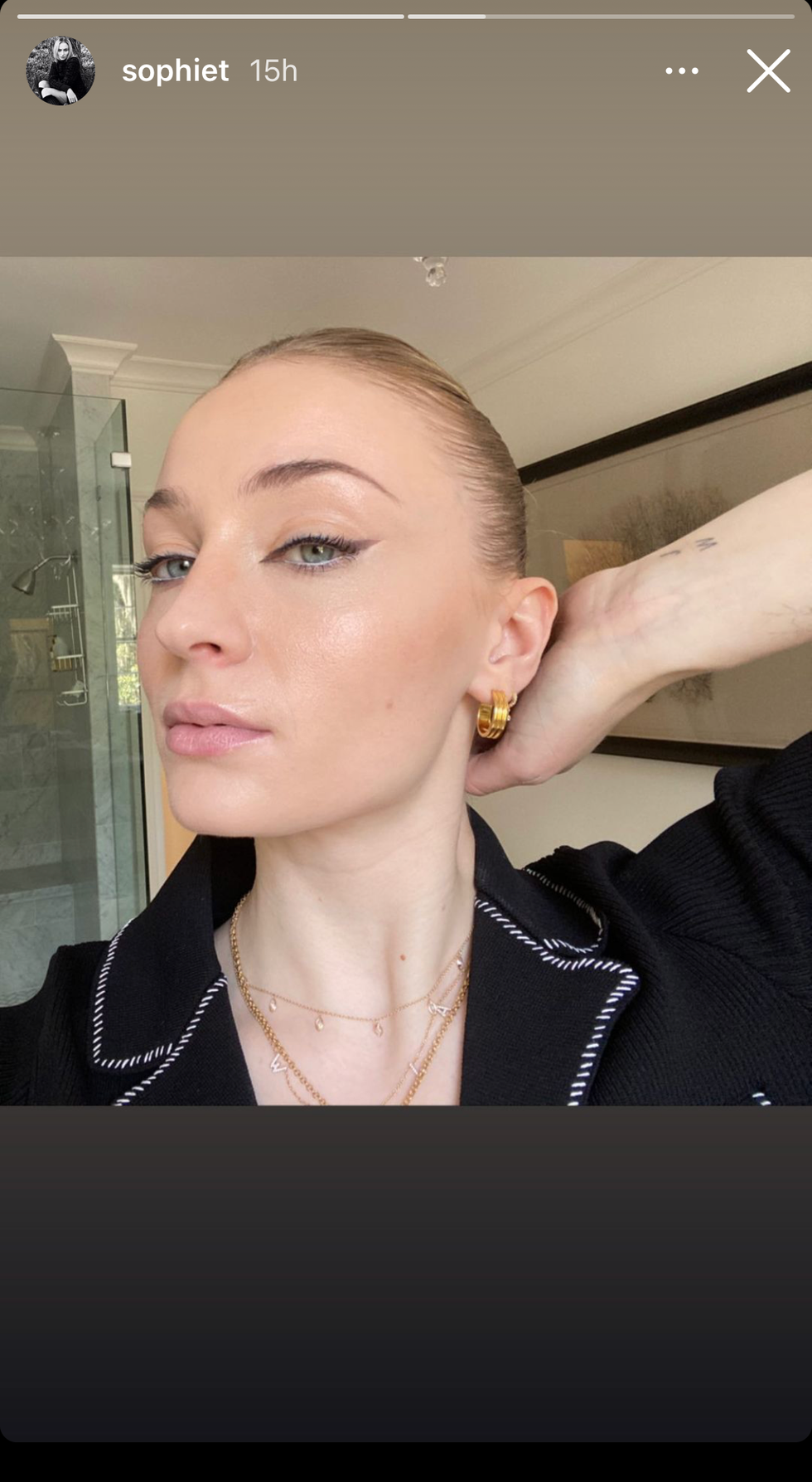
The single W on Turner’s arm is linked to her daughter, Willa. It is a simple family reference, and a close-up makes it easier to spot than a red-carpet photo would. The initial and its timing give it a clear place in her story.
The W tattoo is a small family tribute is easiest to appreciate in this close-up. The photo also shows where it sits as Turner moves or changes her posture.
The dog tattoo keeps the family theme close to home
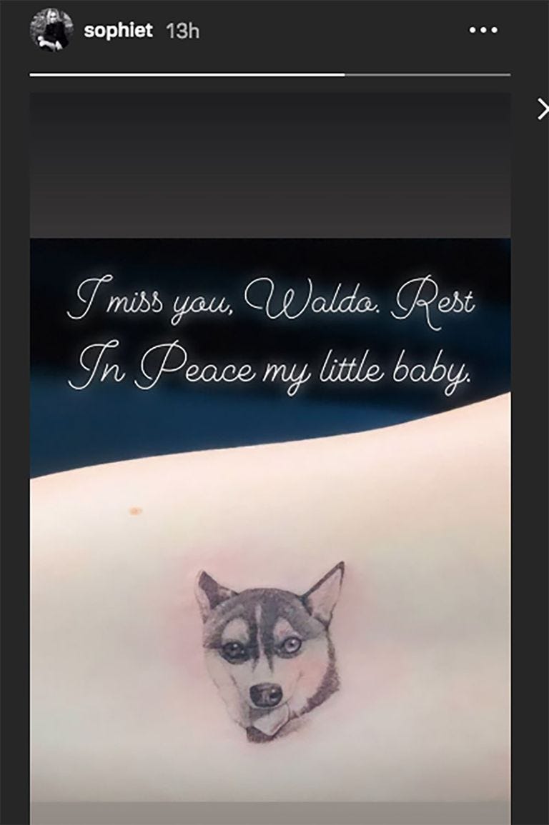
Turner has a small tattoo of a dog among her better-known designs. It is a quiet pet tribute that can disappear beneath a sleeve. The image shows its shape and placement, without needing to attach a bigger private meaning.
The dog tattoo keeps the family theme close to home comes through best in its own photo. The close view makes it easier to see where the design sits when Turner moves.
Her smaller arm tattoos are easy to miss

Many of Turner’s tattoos are tiny: brief lettering, small symbols and fine lines that only show clearly in close-ups. A mark becoming visible in a new picture does not necessarily mean she just got it. The useful details are what can be seen, where it sits and whether Turner has explained it.
Her smaller arm tattoos are easy to miss is a good reason to use a close image. It helps show how the marks sit on her arm as she moves or changes her posture.
The spine and side tattoos give the collection a longer line
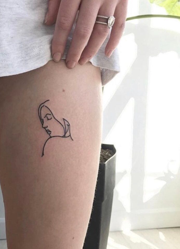
Turner has tattoos that run down her back or sit along her side. The north star on her spine has been linked to tattoo artist Winter Stone. These placements need a full-length view because hair and clothing can cover the centre of her back.
The spine and side tattoos give the collection a longer line is clear in a full-length photo. The image shows the placement as Turner moves, rather than leaving the design hidden in a close crop.
The direwolf and the words The pack survives are her best-known piece
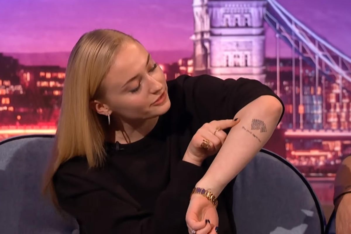
Turner’s best-known tattoo pairs a dotted direwolf with the words The pack survives on her forearm. She has said the phrase is both a personal motto and a nod to House Stark, rather than an intentional spoiler. The photo shows the wolf, lettering and placement together.
The direwolf and the words The pack survives are her best-known piece gets a dedicated image so readers can see the details and where it sits.
Turner and Maisie Williams share a 07.08.09 tattoo, marking the day they learned they had been cast in Game of Thrones. It is a friendship tattoo and a reminder of the show’s beginning, not a comment on its finale. Fans sometimes treat every Stark reference as a plot clue, but Turner has described the ink in more everyday terms.
Her other small tattoos are less fully explained. Some can be seen in social posts or close-up interviews; others appear only briefly in event photos. They belong in a visual guide when a clear image supports them, while a blurry glimpse should remain uncertain.
The fine-line pieces keep the collection feeling light. The W, dog and small symbols do not compete with the direwolf, while the north star adds a longer vertical line down her back. Their different sizes make them read as separate moments rather than one coordinated set.
Placement changes when the tattoos can be seen. An arm design may show at a premiere but disappear beneath a long sleeve. The spine tattoo can appear in a backless dress and stay hidden in everyday clothes, which is why several photos help more than repeating one portrait.
The Game of Thrones designs have the clearest public stories, but they are only part of the collection. Turner’s family and friendship tattoos also explain the letters, dates and small images she chose. They keep the story connected to her life beyond the show.
There is a timeline in the tattoos, too. The cast date marks an early career moment, while the W belongs to a later family chapter. Older and newer designs now sit side by side, and a photo may show a different set simply because her outfit and the camera angle have changed.
That variety is what makes the collection worth a closer look. It includes fandom, friendship, family and little designs Turner liked for their own sake. Some are easy to read, some need a close-up, and others are visible without a public explanation.
In brief, the direwolf carries the biggest public story, the W and dog bring family life into the mix, and the spine and side designs add quieter detail. Each tattoo benefits from its own view, and the photos help readers see the differences.
Turner and Williams’ 07.08.09 tattoo marks the day they found out they were cast in Game of Thrones. It is a friendship piece tied to the start of the show, not its ending. That context is useful when fans read every Stark-related design as a plot clue.
The fine-line work softens the overall look. The W, the dog and the small symbols sit apart from the direwolf, while the north star creates a longer line along Turner’s back. The different scales help the pieces feel like separate choices.
The placements also affect how visible the designs are. A tattoo on her arm might appear at a premiere and vanish beneath a sleeve; the spine star can show with an open back and disappear under ordinary clothes. Different photos reveal different parts of the collection.
Her Game of Thrones tattoos may be the most widely discussed, but Turner’s family and friendship designs matter just as much. The letters, dates and small images point to her own relationships and memories, not only to the characters she played.
The initial for Willa is intentionally understated. A single letter can remain personal while still showing clearly in the right photo, and it leaves space for Turner’s other fine-line tattoos.
The dog tattoo is similarly small. A jacket can hide it, but the close-up gives it a clear place in the collection. Pet tattoos often work best when the image remains easy to recognise.
The north star gives the collection a vertical centre along Turner’s back. It is less prominent than the direwolf, but stands out in an open-back photo. Its placement is the clearest detail.
The Stark tattoo is more public because Turner has discussed it on television. The words are legible and the wolf makes the reference easy to recognise, while her personal-motto explanation is more useful than fan theories.
Looking through the images also shows how camera angles differ. Some are bright close-ups; others show more of Turner’s body from farther away. Each photograph offers a different view.
Turner’s tattoos combine stories she has shared with smaller designs that remain unexplained. The guide is clearest when it keeps those categories separate, uses a proper photo for each identifiable piece and does not guess at the rest.
The designs make more sense with their context beside them: W belongs with the family tribute, the date with the casting story and the direwolf with Turner’s explanation of the phrase.
A separate photo for each heading helps readers see what the words alone cannot. The arm images show the lettering, the back view reveals the spine tattoo, and the closer shots bring out marks that would otherwise be hard to notice.
Turner’s collection is not one single statement. It brings together memories, favourite references and small choices made at different times. That is enough to make it interesting without assigning a meaning to every line.
2 thoughts on “Sophie Turner Tattoos: The Direwolf, W for Willa and More”