codex

Kevin Hart Tattoos: Back Masks, Family Names and His Angel

Kevin Hart has more tattoos than his usual red-carpet outfits show. His chest, shoulders, arms and back all carry ink, including family names, an angel, theatre masks and smaller symbols. The back piece is the biggest, but the mix of large work and small details gives the collection its character.

The photos here focus on different parts of the body. A headshot cannot show a back tattoo, and one shirtless image may not make the lettering easy to read. Several views, with a little context from coverage, give a clearer picture of Hart’s tattoos.

Kevin Hart’s chest tattoos include family names and a large angel
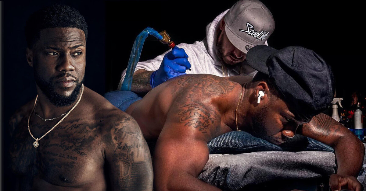
Kevin Hart tattoos: large tattoo gallery image showing Hart shirtless with chest and arm work visible

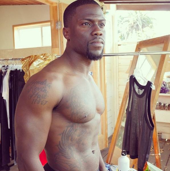
Hart’s chest is one of the easiest places to see the collection. It includes an angel and lettering connected to his family, including his children’s names. That personal detail does not need an elaborate explanation. A clear shirtless image shows how the words sit across his chest instead of letting them blur together.

The angel is the larger visual feature in the centre. Its shape anchors the chest, while the smaller lettering sits nearby. These are separate designs with different roles, and the photo also shows how chains, lighting and muscle definition can affect their appearance.

Hart has been photographed at the gym, on the beach and during tattoo sessions. Those images make the ink visible, but some are more useful than others. A wide shot shows how much of the chest is covered; a close-up helps readers make out the names and the angel’s edges. The family names need that sharper view.

The family connection is clearer than the meaning of many smaller symbols. Hart has publicly linked parts of the work to his children and relatives. Other marks can be described by their shape and location until he gives them a direct explanation. That keeps the article detailed without inventing a story for every line.

The comedy and tragedy masks cover most of Kevin Hart’s upper back
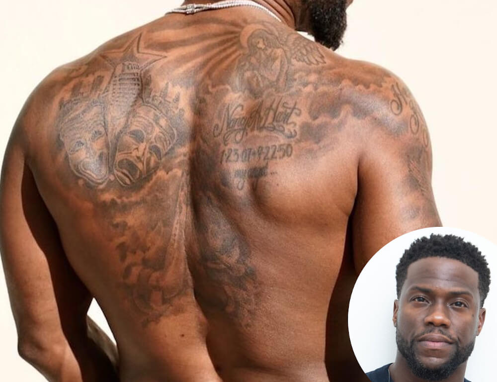
Kevin Hart tattoos: large back photograph showing the comedy and tragedy masks across his shoulders

Hart’s largest single tattoo is on his back: comedy and tragedy masks spread across the upper back. It is a fitting design for a comedian whose career centres on performance. The masks use black-and-grey shading and stretch across both shoulders, reading as one strong composition when he turns away from the camera.

Their contrasting expressions give the piece its focus. One face feels lighter and more playful; the other has a darker theatrical mood. The difference creates a clear centre without needing colour. A full back photo lets the masks read properly instead of reducing them to a small crop on an otherwise empty page.

Hart revealed the tattoo during a workout-style photo session, and later pictures show how it sits beside smaller shoulder pieces. Coverage has also shown an artist working on his back, helping establish the timeline. The finished design developed over time rather than appearing all at once.

A generic portrait would not work for this section. The featured image can show Hart’s face, but only a separate back photo reveals the tattoo, its shading and its placement.

Hart’s arm tattoos sit beside the chest work and smaller symbols
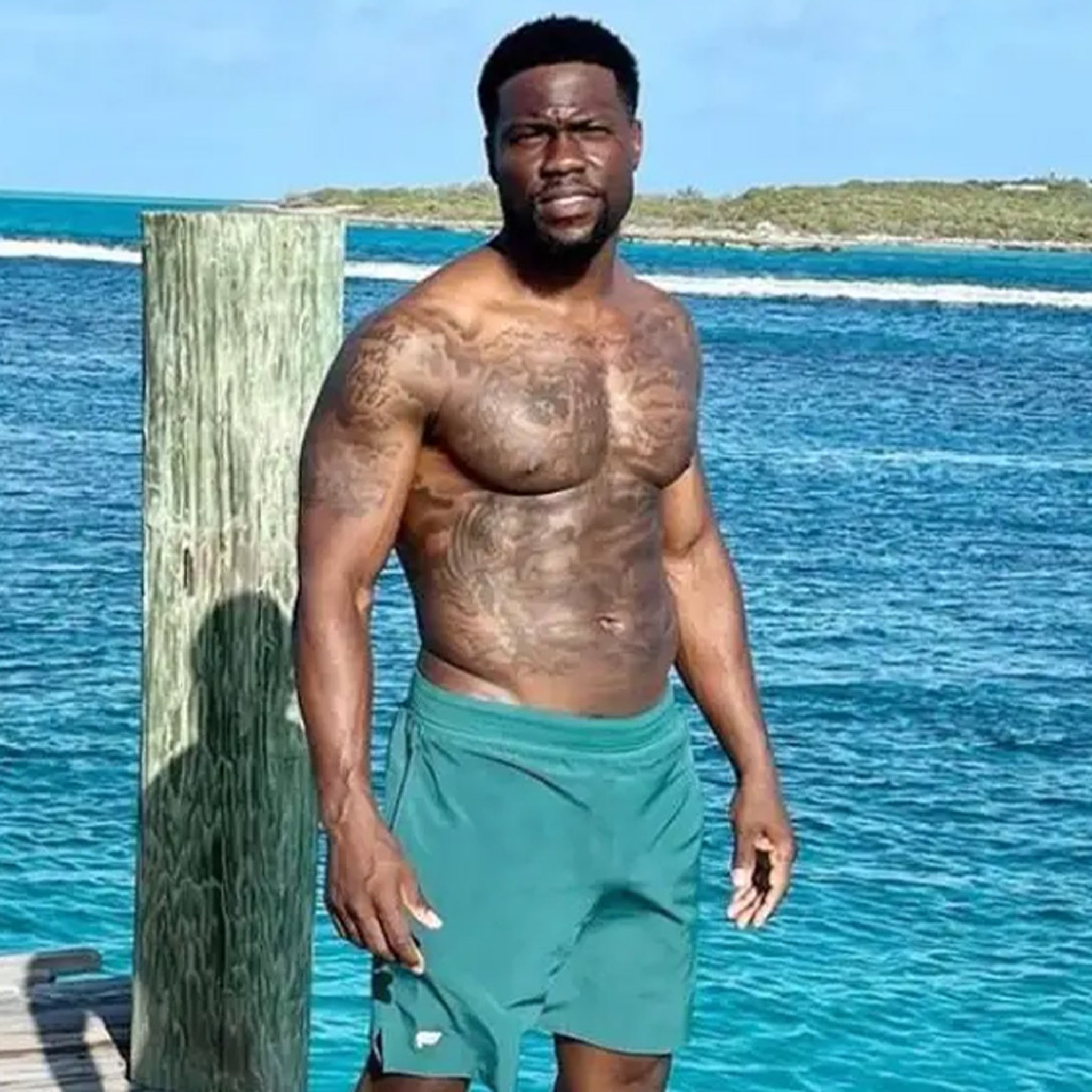
Kevin Hart tattoos: different high-resolution beach photograph showing arms and chest ink

Small tattoos on Hart’s arms can disappear under a T-shirt. There is lettering, darker imagery and work that visually connects with his chest. A beach photo helps because his arms are uncovered and the strong light makes it easier to distinguish the individual marks.

The arms do not form one precisely planned sleeve. Some tattoos stand alone, while others sit close enough to look connected in a wide image. That is natural for a collection built over years. It is more accurate to identify what is visible and leave uncertain edges alone than to claim the whole arm follows one theme.

Hart has also been photographed during tattoo sessions, showing the work as it develops. One image may catch an artist working on his back with older tattoos still visible around the shoulders. That adds timeline context, but it does not prove that every surrounding mark came from the same appointment.

The arm lettering is another reason to use a large image. Compressed photos can make small words unreadable. A clear body shot shows where the text sits, while the article adds only the context supported by the available sources.

The shoulder and side tattoos fill in the gaps around the main pieces
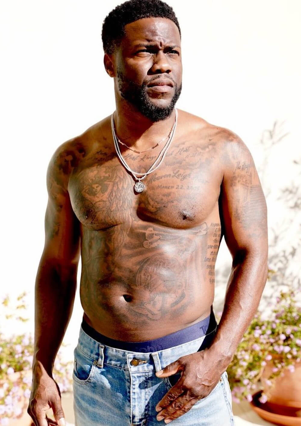
Kevin Hart tattoos: separate high-resolution tattoo guide photograph showing shoulder and upper-body details

Smaller tattoos around Hart’s shoulders and sides fill out the upper body. Some sit near the collarbone; others are beside the angel or extend toward his ribs. They may not be as famous as the back masks, but they explain why a shirtless photo shows more ink than a short list of headline designs suggests.

Posture changes how the shoulder work appears. When Hart raises his arms, the skin stretches and the lines seem farther apart. When he turns or relaxes, the designs bunch closer to his chest. More than one angle is useful because a single pose can hide the placement.

Coverage and tattoo galleries identify the angel, family lettering and other shoulder designs, but not every small symbol has a confirmed meaning. It is enough to describe what is visible: an outline, a short word, a mark near the shoulder or a design running toward the side. That is more helpful than guessing.

The shoulder details also show why photos need different framing. Larger tattoos benefit from a wide view, while small lettering needs a close one. Both belong in the article and deserve a clear image instead of getting buried in one long paragraph.

Kevin Hart’s tattoo collection changes with each workout and studio photograph
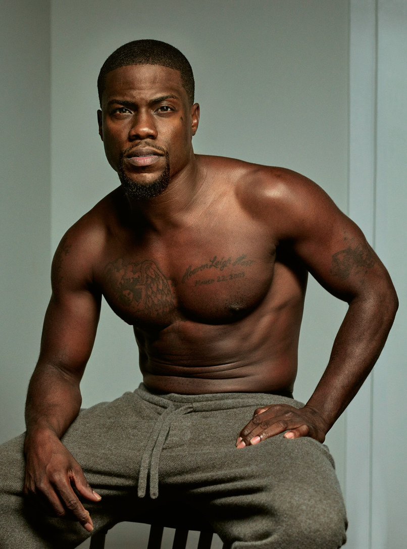
Kevin Hart tattoos: different sharp shirtless workout photo showing the arms, torso and tattoo placement

Fitness photos often capture Hart’s arms, chest and torso all at once. That makes the tattoos easy to spot, but the details can flatten out. Sweat, hard light and shadow may make a design look darker than it does in a calmer portrait.

This workout image is separate from the beach and gallery photos. It shows the tattoos while Hart is moving and posing naturally, which helps explain why the layout can look different from a straight-on studio view. His chest may appear broader, an arm can obscure a shoulder and the back is usually out of sight.

Those changes do not necessarily mean Hart has added or removed anything. Clothing, posture and camera distance all affect the view. Where possible, a reliable account dates the photo and avoids calling every difference a cover-up. The overall layout becomes clearer when several distinct images are compared.

Hart’s tattoos have an easy, personal feel: family names, an angel, performance masks and smaller marks around his arms and shoulders. It is not one rigid sleeve built around a single idea. The collection appears to have grown as his family, career and interests changed, making the photos as useful as the design list.

The tattoos are easier to read as a timeline than as one finished mural
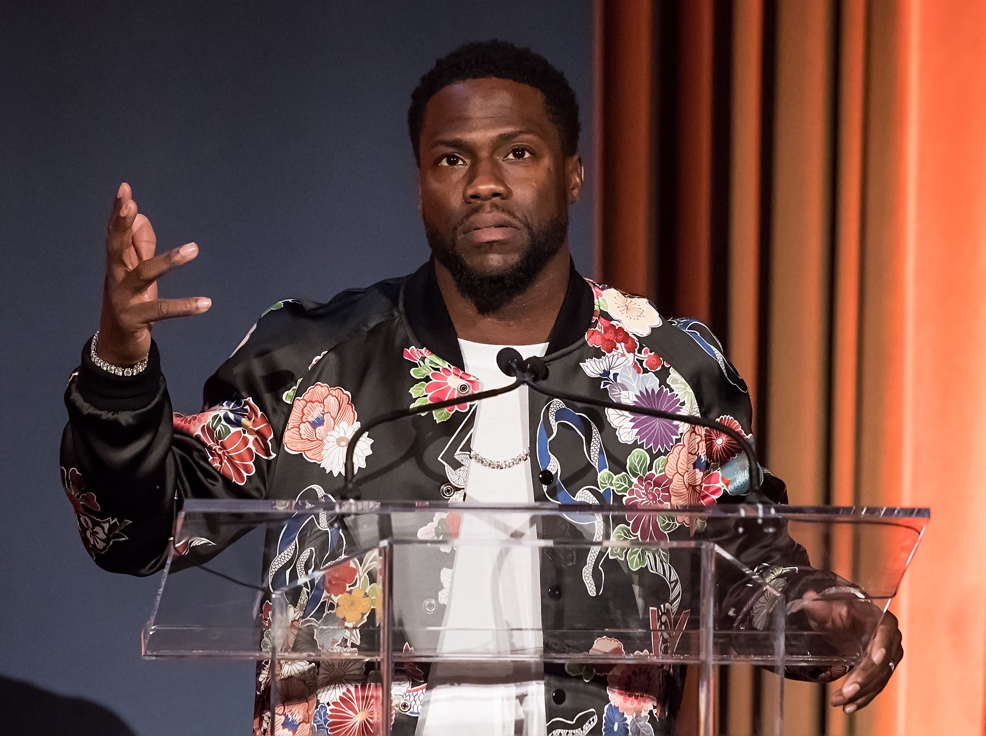
Kevin Hart tattoos: separate high-resolution tattoo-session photograph showing the back and upper-body layout

Hart’s tattoos did not all become visible at once. The back masks drew particular attention in later fitness photos, while the chest and arm pieces had appeared in public earlier. The timeline explains why older portraits can look less crowded than newer ones.

The family lettering belongs to the personal side of the collection, while the masks connect with comedy and performance. The angel brings in another mood, and the smaller shoulder marks bridge the spaces between. The designs can have different reasons; they do not need to add up to one polished statement.

The clearest visual inventory includes the comedy and tragedy masks, the angel, his children’s names and the arm, shoulder and side tattoos shown in close photos. Less distinct marks should remain uncertain. That tells readers where the evidence is clear and where the image does not show enough.

Hart has enough documented work to merit several body photos instead of one generic headshot. The featured portrait is separate, and the six tattoo images appear beside the sections they support. Together, they show his chest, back, arms, shoulders and the changing layout of his collection.

Framing matters. A full back piece needs enough space for the masks to remain recognisable, while a child’s name or a small shoulder symbol needs a closer view. Reusing one low-quality photo would make the collection look smaller than it is. The images here show distinct scenes rather than one file cropped in several ways.

Hart’s tattoos are easier to follow when the body is broken into areas: family and angel designs on the chest, theatre masks on the back, and smaller work around the arms and shoulders. The strongest meanings are the ones Hart or a reliable source gives directly. The designs themselves fill in the rest.

For readers looking up Kevin Hart’s tattoos, the simple takeaway is that there is plenty to see, and the designs do not all come from one session. The collection has grown along with his public life, family and training routine. It reads best when each group gets a clear photograph instead of being rushed through a short list.
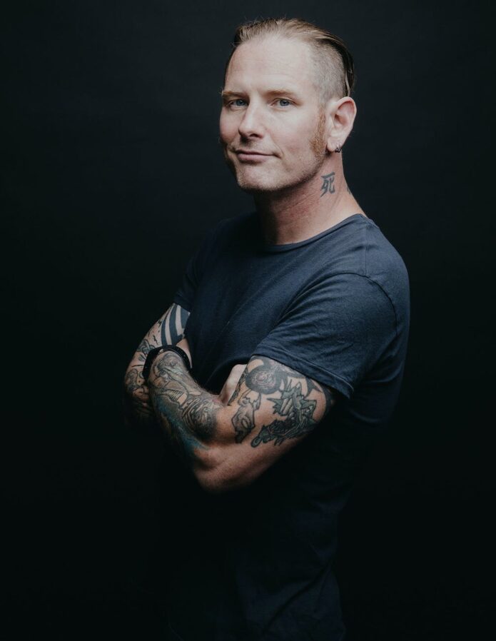
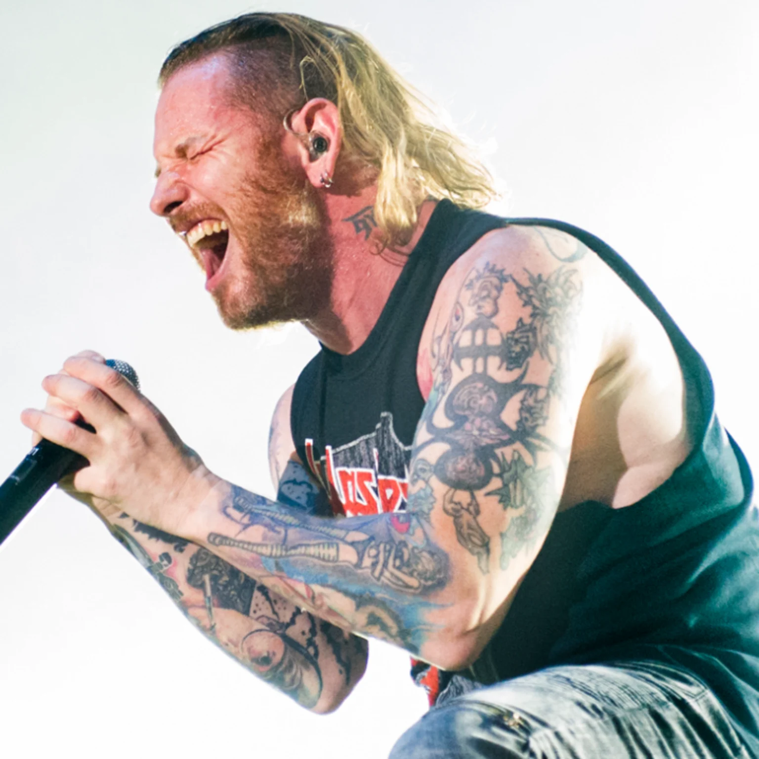
More comedian tattoo guides

Corey Taylor’s Tattoos: Sun, Moon, Lyrics and Slipknot Ink

It is easy to underestimate Corey Taylor’s tattoos if you have only seen him in a shirt. The Slipknot and Stone Sour frontman has large work on his chest, lettering across his back, patterns on his arms, symbols on his lower abdomen and smaller pieces near his neck and wrists. Looking at each area separately keeps the photos and reported stories from blending into one vague list.
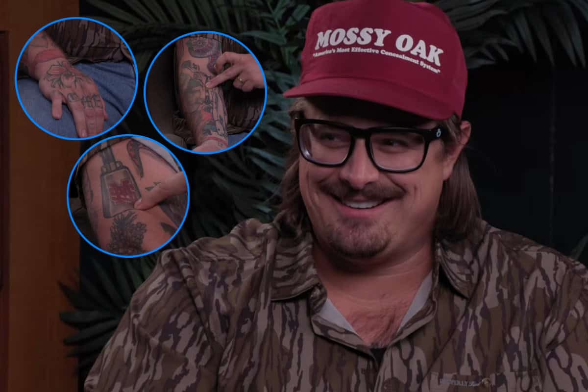
Some details come from interviews and tattoo features; others are visible in photographs. Taylor has also added and changed over many years, so an old concert photo should not be mistaken for a complete current inventory.

The sun-and-moon chest piece is the centre of the collection

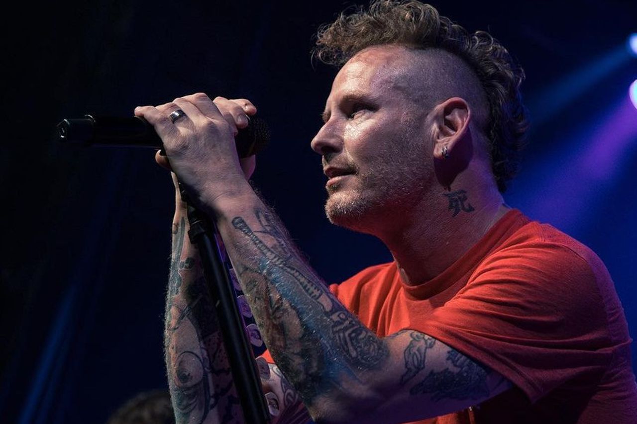
Corey Taylor tattoos: tattooed arms during a live performance

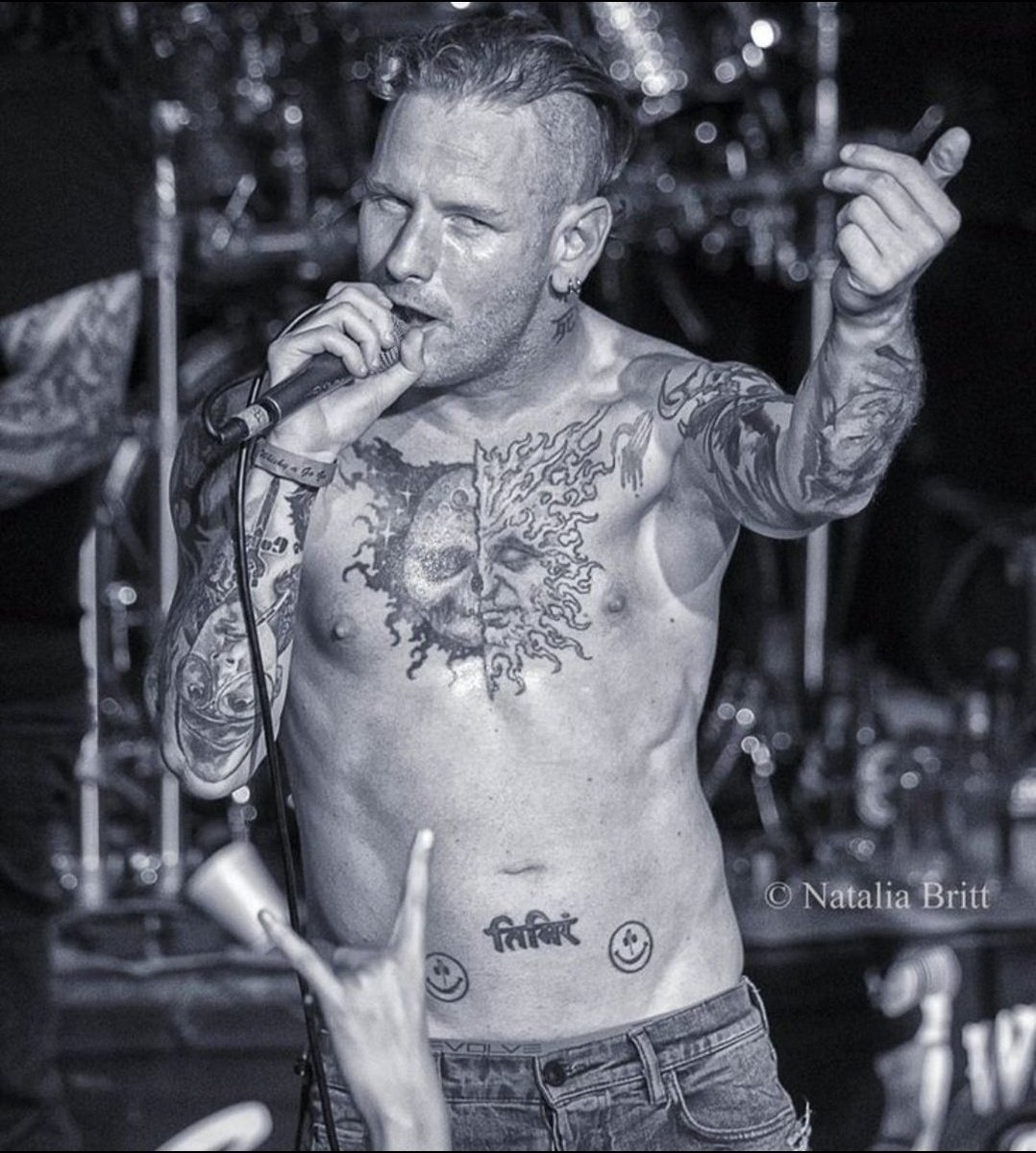
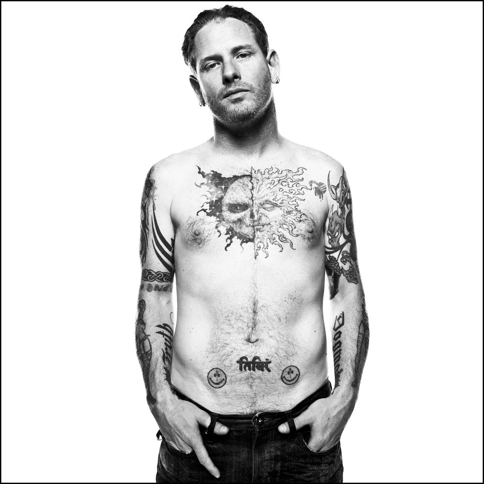
Taylor’s chest draws the eye first: the main tattoo is broad and dark, far larger than a small flash design. Photos show a split sun-and-moon design across his upper torso, with the two halves meeting near the centre. It has the hard, unsettling look associated with Paul Booth’s work, but that connection should stay with this chest project rather than be extended to every tattoo Taylor has.

Older coverage sometimes called the piece unfinished, though it does not look like an abandoned outline. Black shapes, faces and colour already come together as a substantial image. Later additions and the edges make it feel like a work that developed over time. A stage photo can flatten or darken the chest compared with a studio portrait, so the image matters when describing the line work.

Taylor has spoken about the time and pain involved in large sessions, and the chest tattoo fits that account. It is not a small mark added in an afternoon. It covers enough of his torso to sit above the abdomen designs and change the look of his whole front when he performs shirtless. The sun and moon give the collection a strong visual anchor without requiring an invented meaning for every ray or shadow.

The chest piece sits among other tattoos rather than on its own. Photos show his arms around it, lettering below and small yellow faces closer to the waist. A close crop proves the central design clearly, but a wider frame is needed to show how Taylor placed different styles around it.

The back lettering, numbers and Slipknot imagery need a wider view

Corey Taylor tattoos: neck and arm tattoos during a live performance

Some of Taylor’s most distinctive lettering is on his back. Photos identify “Infant” and “Finite” around an infinity-like mark, with the red number “24601” below. The number is commonly linked to Jean Valjean’s prisoner number in Les Misérables. It is a specific reference, unlike the vague meanings sometimes attached to tattoos in unsourced lists, but visible text should still be kept separate from claims about every private reason behind it.

The upper-back work also connects with his band history. Coverage has associated the infinity symbol with Slipknot, while other photos show a panther-like image above the words and more lettering near his neck. Hair, stage lights and body angle can hide parts of the design. A view of the back, shoulders and spine is more useful here than a front-facing concert shot.

Farther down, reports and tattoo catalogues describe a dragon head, a suited figure and other black-and-grey illustrations. Those are useful visual descriptions, not confirmed personal explanations. Taylor’s interest in theatrical imagery, horror and literature is well known, but a photo cannot tell us whether each creature represents a specific part of his life.

The back also makes a single tattoo count unreliable. Older photos show fewer additions; later ones may reveal deeper shading, more lettering or a different hairstyle. A careful guide names what can be identified, gives its location and dates the photo when possible instead of implying the collection has remained fixed.

His arms carry tribal lines, symbols and working-musician scars

Corey Taylor tattoos: sun-and-moon chest tattoo and lower-abdomen lettering

Taylor’s arms are busy but do not read as matching sleeves. Photos show black tribal-style bands, illustrative figures, lettering and coloured shapes running from his shoulders toward his forearms. Microphones and short sleeves can hide sections, which is why several angles are more useful than one general portrait.

The two arms are not exact mirrors. One is more heavily filled, while the other leaves space around smaller symbols and words. Close concert photos help distinguish a broad dark area from a separate small mark. It is tempting to name every patch, but a motif should be identified only when the photo is clear enough to support it.

Tattoo inventories also list words such as “Truth” and “Dogma” on Taylor’s forearms, along with symbols linked in coverage to his family and music. These labels can help readers find the designs, but they do not amount to a biography. Photos establish that the lettering and symbols are there; they do not explain every line.

Taylor’s forearms have a practical history, too: he performs in sleeveless shirts and moves constantly on stage. Sweat, coloured lights and motion blur can make the same tattoo look different in separate images. A still portrait usually gives the clearest view; a concert photo shows how visible the designs are while he is performing.

The smiley faces, Sanskrit and smaller symbols change the tone

Corey Taylor tattoos: full torso showing the chest, arms and abdomen designs

Near Taylor’s lower abdomen are two bright smiley-face tattoos with writing between them. The yellow faces add a strange, almost cartoonish note to a collection otherwise dominated by skulls, tribal lines, dark lettering and dramatic chest work. One face has been described as pierced or marked by a projectile, giving the cheerful image a harsher edge.

The Sanskrit lettering between them is often translated in tattoo coverage as “darkness,” though translations need care. The writing is visible, but its exact wording depends on the source and whoever supplied the translation. The photo supports its shape and placement; it does not prove an English meaning on its own.

Smaller tattoos also appear on Taylor’s stomach, wrists and neck. Some are clear in a close-up; others blend into surrounding designs. Writing and symbols on his neck can disappear when he turns his head or wears a high collar. They change the overall feel, but should not be counted again every time a different angle reveals another line.

This mix gives Taylor’s collection a personal feel without imposing one style on everything. The chest leans into theatrical imagery, the back uses words and numbers, the arms mix patterns with illustrations, and the abdomen brings humour and script. The designs can be discussed individually; their variety is the point.

What can be confirmed about Corey Taylor’s tattoos?

The clearest record includes the split sun-and-moon chest piece, the back lettering and numbers, the different arm patterns, and the smiley faces with script on the lower abdomen. Other marks show in photos but have less explanation. That distinction makes the guide more useful: it can say what a picture shows and leave unconfirmed meanings open.

There is no need to turn every symbol into a secret message or claim one artist created the whole collection. Taylor’s tattoos came over time, through different sessions and visual ideas. The big pieces shape the body art; smaller words and symbols add details that stand out when a clear photo catches them.

Small designs also sit between the headline pieces. A wrist symbol may look like part of an arm pattern in a concert photo, while a close portrait separates it from the darker bands. The same goes for the neck writing and marks beside the chest and back work. They can be described without a made-up backstory: when an image is clear, note the shape, position, colour and date; when it is not, keep the wording modest.

Taylor’s collection also makes more sense as the work of a touring musician than as one perfectly planned sleeve. The tattoos arrived at different times, and photos range from stage lights to backstage mirrors, interviews and older publicity shots. That is why the article uses several views: one shows the chest, another the back, and another makes the smaller arm or abdomen work easier to see.

More musician tattoo guides

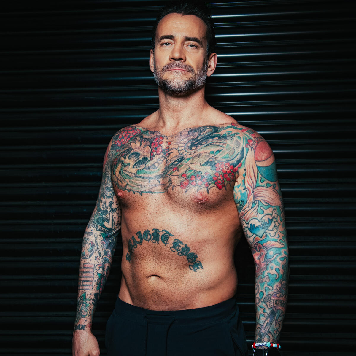
CM Punk’s Tattoos Tell Stories About Straight Edge, Punk and Luck

CM Punk has never treated tattoos as background decoration. He has described them as a way to show what matters to him, from straight-edge living and punk music to old friends, his dog and jokes with a story behind them. His ink spans his arms, stomach, shoulders, legs and chest without following one tidy style. Some designs are traditional flash, others reference pop culture, and some are personal marks he has explained in plain language.

That mix is what makes Punk’s tattoos distinctive. The larger designs get noticed first, but small details give the collection its personality: a lucky charm beside a serious statement, a comic-book character near a memorial or music logo. The most reliable way to describe them is to stick to what Punk has said and what the photos show, without assigning a deeper meaning to every symbol.

CM Punk’s straight-edge lettering is the centre of the collection

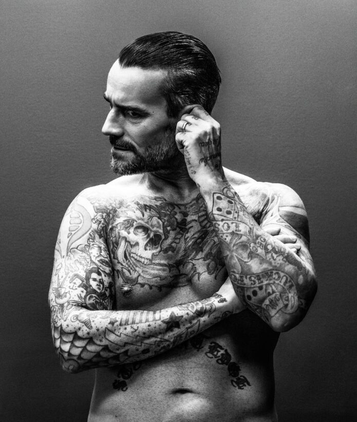
CM Punk tattoos: straight-edge stomach lettering and chest tattoos

The words “straightedge” across Punk’s stomach are probably the tattoo most associated with him. The wide black lettering is hard to miss, almost like a statement on a shirt. Punk has called it his most important tattoo, giving the placement meaning beyond its size.

The word refers to the straight-edge lifestyle, a punk-rooted choice to avoid alcohol and recreational drugs. Punk has described it as part of how he chose to live, not a temporary phase or a branding exercise. The stomach is close to the centre of his body, though clothes can hide it. When he chooses to show it, the message is immediate.

The bold lettering also photographs well. It is simple enough to read at a distance, unlike some of the smaller designs on his arms, and does not rely on colour or shading. The blunt look suits the way Punk has spoken about his beliefs; the subject is clear even without a caption.

The phrase should not be used to explain all his other tattoos. Punk also has jokes, cartoons, lucky symbols and family references that stand on their own. The stomach lettering is the clearest statement, while the rest of the collection shows his broader interests.

The Pepsi shoulder tattoo has a very specific story

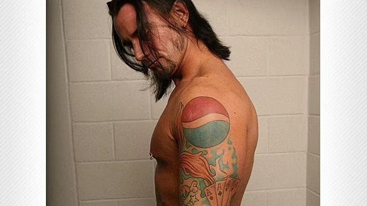
CM Punk tattoos: Pepsi shoulder logo and coloured upper-body tattoos

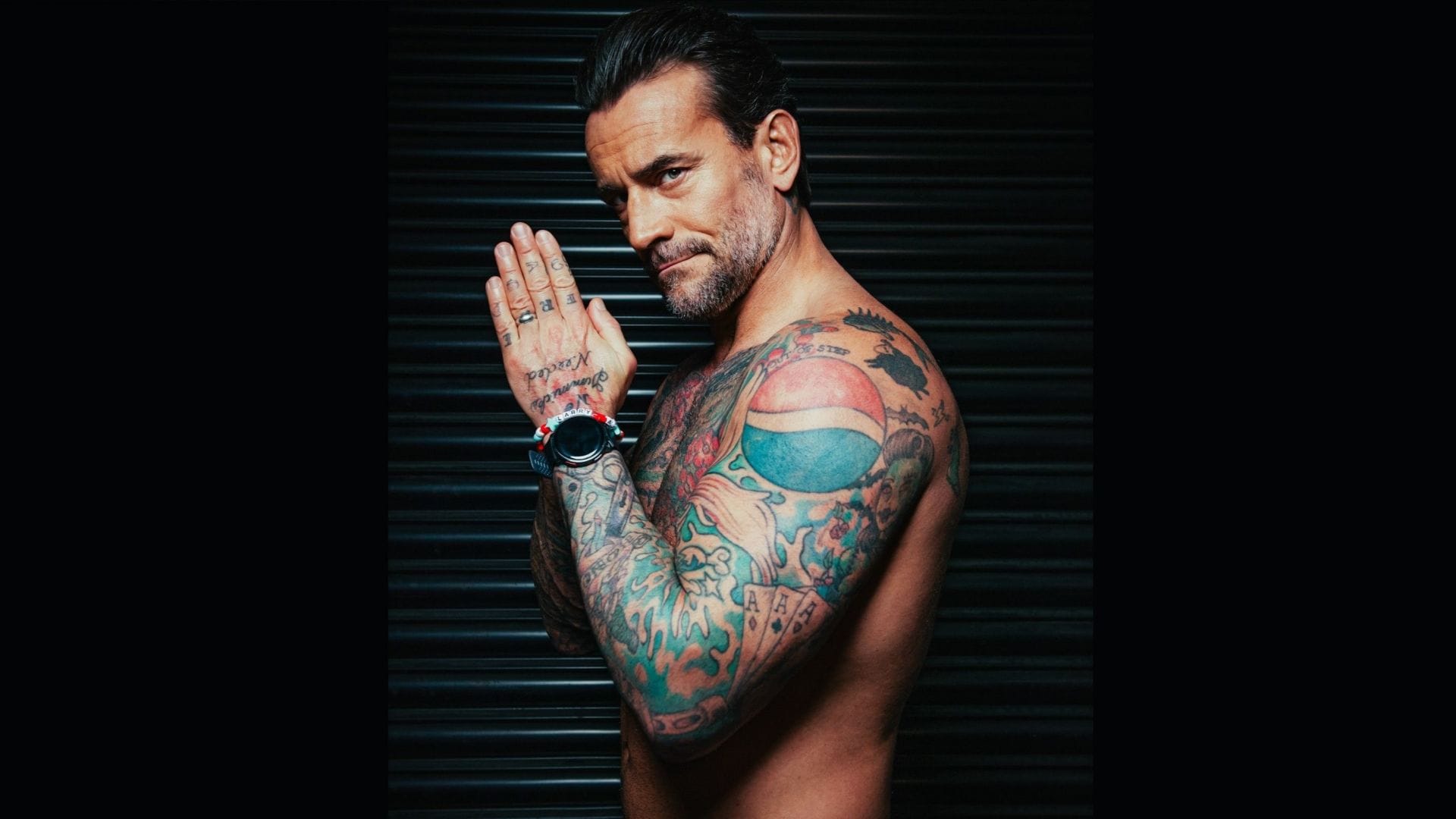
The Pepsi logo on Punk’s shoulder is one of his most recognisable tattoos because it looks ordinary until he explains it. He has said he saw a musician with a Coca-Cola tattoo and, as a Pepsi fan, decided he wanted one of his own. It is a funny, straightforward origin; no grand theory is needed.

The logo also plays off Punk’s straight-edge identity. Pepsi is a soft drink, and that contrast became part of the joke. What might look like a random pop-culture mark becomes a small nod to his choices at the time. Its bright circle stands out against the darker blackwork around it.

Coverage has also linked the tattoo to Punk’s friendships and wrestling circle, but his own explanation and Bruce Prichard’s later account are the clearest sources. It is a real tattoo, not a temporary gag for a photo, and it has remained part of the collection for years. Its meaning is lighter than the stomach lettering, which is part of what makes the contrast work.

The logo can look different from year to year. Camera colour, skin tone and the angle of the arm all affect how its red and blue sections appear. A close-up shows the circle clearly; a wider wrestling photo may make it look like a small patch among many tattoos.

The lucky arm mixes four aces, a rabbit’s foot and old-school symbols

CM Punk tattoos: four aces, lucky symbols, stars and traditional arm tattoos

Punk’s arm brings together several traditional lucky designs, with four aces among the best known. WWE’s tattoo feature says the cards honour Ace Steele, rather than simply standing for good luck. That detail matters: the classic image is also a tribute to a real person and relationship.

The same arm includes a rabbit’s foot, four-leaf clover, horseshoe and koi fish. Together they suggest a lucky sleeve, but they are separate tattoos, each with its own outline and spacing. Stars, anchors and a lightning bolt fill some of the gaps. The arm feels as though it grew over time, with individual designs placed beside one another.

The rabbit’s foot, clover and horseshoe are easiest to spot in older photos, though their exact positions can be hard to judge when Punk wears a shirt or wrestling tape. The koi adds movement and breaks up the cards and smaller symbols. Up close the arm reads like traditional flash; from ringside it can look like one dense patch of colour.

A paw print on Punk’s forearm is a quieter detail. He identified it as a tribute to his dog Callie, giving the design a specific story among the louder symbols. It is a reminder that small tattoos can carry clearer personal information than elaborate pieces whose meaning has never been explained.

The arm also includes a cobra, the word “spitfire” and other traditional shapes tied to different parts of Punk’s life. He has said the cobra and wording came after he left a gas-station job, while the Pepsi tattoo dates to an earlier period. Those details suggest a loose timeline without implying that every design was planned as one complete sleeve.

Punk’s comic-book and punk-rock tattoos are deliberately specific

CM Punk tattoos: Spider-Man, G.I. Joe and punk-rock leg references

Punk has a Spider-Man tattoo with the number 13 on his right elbow. It is playful, but it reflects a clear personal interest rather than a generic catalogue choice. The character is instantly recognisable, and the number gives fans another detail to notice when his arm is shown from the side.

The Operation Ivy logo on his left calf connects the collection to punk music. It is less visible than the arm tattoos because wrestling gear can cover the leg. When seen, it reads as a direct music reference rather than a general symbol of rebellion. Traditional stars, anchors and a lightning bolt use the same old-school tattoo language, while fitting beside the music and subculture references.

His forearm carries an Arishikage clan marking associated with the G.I. Joe characters Storm Shadow and Snake Eyes. Without that reference, the shape can look like an unspecified Asian-style symbol. Naming the fictional clan is more useful than guessing at a general meaning: it identifies the source and keeps the explanation grounded.

These designs do not resemble a sleeve built around one subject. Spider-Man, Operation Ivy and G.I. Joe come from different worlds, which is part of the appeal. Punk’s skin records things he liked, people around him and versions of himself he wanted to remember. The designs do not have to match perfectly.

The cobra and blue-and-red Pepsi mark reflect the same approach. One came during a period of change; the other began as a soft-drink joke. Their colours, sizes and origins differ, but each has a clear hook that makes it easy to recognise.

The chest skull and Virgin Mary design add darker imagery

Punk’s chest includes a dark skull design based on a Virgin Mary prayer card. WWE’s account describes it as an evil skull of the Virgin Mary and quotes Punk saying he liked the romantic quality of the artwork. That source gives more useful context than assigning a separate symbolic meaning to each flame, shadow or facial detail.

The chest artwork can be hard to document because shirts, jackets and wrestling gear hide much of it. One photo may catch just the top edge, while a shirtless portrait shows the full design. Those should be treated as different views of the same tattoo, not automatic proof of extra pieces.

The image also offsets the brighter tattoos on Punk’s arms. The Pepsi logo, lucky symbols and comic references feel lighter, while the skull is darker and more dramatic. His collection moves between different moods: a playful brand logo on one shoulder and gothic imagery on the chest.

The chest design sits near the stomach lettering, making their contrast part of the overall look. The skull is expressive and heavily shaded, while “straightedge” is plain text. One asks the viewer to study an image; the other delivers its message at once.

CM Punk tattoos: dark chest skull and Virgin Mary artwork

The smaller tattoos make the collection feel like a record of Punk’s life rather than a costume. The paw print for Callie is a good example. He explained the reference himself, and the design needs no dramatic memorial story: it is a small mark for a dog he cared about.

The four aces for Ace Steele carry a similar personal connection, although they are more visible. From a distance they look like lucky cards; with the story, they read as a tribute to a friend. That double meaning appears elsewhere in Punk’s tattoos.

Small stars, anchors, lightning shapes and lettering are easier to find in clear close-ups than in match photos, where tape, shadow and compression can hide details. A careful guide names only what the image can show, especially if a mark blends into nearby linework.

The overall pattern is not a single strict style. Punk tends to choose designs with a direct connection: a personal principle, a drink he likes, a band, a comic character, a dog, a friend or a period of his life. Some are serious, some funny and some deliberately strange. That mixture is what holds the collection together.

The most useful photos show the tattoos, not only Punk as a celebrity. A shirtless frame establishes the chest and stomach lettering; a close-up of his arm can separate the cards, lucky symbols, paw print and traditional filler. The featured portrait identifies him, while the body photos show the work discussed in each section.

Punk’s tattoos have become more or less visible as his career and clothing have changed, but their themes are still easy to follow. The collection is personal, funny and varied without needing one explanation. The clearest approach is also the most interesting: look at the design, note where it sits, use the story Punk has actually shared and leave unanswered details open when the image cannot settle them.

More athlete tattoo guides

G Flip’s Tattoos Are a Diary of Little Moments, Music and Mischief

G Flip’s tattoos feel less like one master plan than a collection of small memories, jokes, music references and designs picked up over time. The Australian drummer and singer has a mix of neat line drawings and words whose meaning becomes clear when they explain the story behind them.

In a 2025 Us Weekly interview, G called the tattoos “little moments and memories here and there.” That is a good way to look at the collection without forcing every design into one big theme. Tattoos cover both arms, continue onto the hands and include lettering across the back, with stories tied to a favourite Melbourne venue, their grandmother, drumming, friends and a song that mattered.

Forum sits above the wrist as a love letter to Melbourne gigs

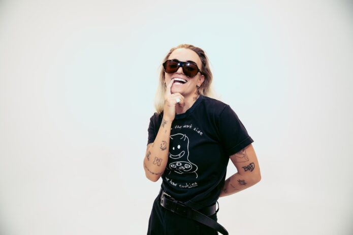
G Flip tattoos: high-resolution arm portrait showing multiple linework and lettering tattoos

The word “forum” sits just above G Flip’s left wrist. It refers to Melbourne’s Forum Theatre, one of G’s favourite venues. The tattoo sits close to the hand they use to play drums, and the simple lettering is easy to read.

A loose sleeve can hide the small word, but it comes into view when G turns their wrist toward the camera. The story is tied to a real music venue, not a general idea of performing. The hand-drawn lettering also fits the look of several other small tattoos.

G has connected the word with nights spent playing and watching shows in Melbourne. The venue became part of their working life in music. A small wrist tattoo can carry that kind of personal history without needing a large image around it.

The wrist lettering belongs to the musician’s working hand

G Flip tattoos: clear portrait showing lettering and small arm designs

Photos show how the placement shifts when G holds drumsticks or raises an arm on stage. The wrist bends, the word changes angle and nearby marks become clearer or harder to see as the light changes. A clean arm photo is more helpful for this detail than a distant performance shot.

It is a good example of G Flip’s casual approach to tattoos: legible, personal and tied to a real place, without trying to be a grand emblem. The memory behind it is specific.

Drum love, hearts and the tattoos that came from playing

G Flip tattoos: separate drum-shell photograph showing both tattooed arms

G Flip has described several tattoos as direct nods to drumming. The arm designs include small hearts and a drum-love reference, alongside fine-line symbols that show up best in a close portrait. Drums were G’s first instrument and remain central to their stage identity, so these pieces feel like reminders of where it all began.

The drumming references are easy to connect to G’s career because they are more than decorative filler. They point back to the instrument behind the live shows and the physical side of the music. Photos show separate groups of ink across the arms, so it is more accurate to describe each design than call the whole collection one sleeve.

One particularly good story involves G’s nana. G said their grandmother was treated like a queen, and part of the tattoo was done while G was performing. Holding still with one arm while singing and playing is exactly the kind of chaotic detail that suits the collection. The tattoo is about family, but the memory also includes the oddness of getting it during a show.

Music appears as small symbols rather than one huge sleeve

G Flip tattoos: separate arms-crossed portrait showing lettering and fine-line tattoos

G’s arms bring different styles together without looking like one uniform sleeve. A lightning bolt may sit beside a flower, a smiling face or a short word. Some designs are intentionally simple, like notes in a sketchbook, and the collection feels gathered gradually rather than planned all at once.

That gradual feel matters when reading photos. A long sleeve can make the smaller tattoos look like filler, even though many have their own stories. It is best to name what is visible, add the reported context and leave unexplained symbols alone. Photos show how much ink there is; interviews explain why some marks matter.

The Leon Bridges lyric runs across G Flip’s back

G Flip tattoos: separate portrait showing the different arm tattoo groups

One of G Flip’s largest text designs is a lyric from Leon Bridges’ song “River”, tattooed across their back. Unlike the smaller arm tattoos, the line is only visible when G turns away from the camera. That makes it feel like a personal phrase that happens to be permanently on display.

A back inscription needs a wider photo than a wrist tattoo. The lettering follows the body, and the surrounding skin affects how much of it can be read in each frame. The clearest details are its placement and the credited lyric; broader emotional interpretations should stay close to what G has said.

G has described the words as part of the emotional memory attached to the song. The line gives the back a clear horizontal shape while still fitting beside the looser arm drawings. It is a strong standalone piece, surrounded by smaller moments rather than forming one full-body mural.

Back lettering needs a different kind of photograph

G Flip tattoos: separate musician portrait showing additional forearm and wrist details

A front-facing portrait cannot show the full back tattoo. It may catch the edge of the lettering near a shoulder, but it cannot establish the whole line or its placement. A rear or three-quarter view makes the words easier to read without guessing at hidden letters.

The lyric is also a reminder to use the wearer’s own explanation when describing meaning. Someone might read any song lyric as a relationship message or a comment on sadness. G’s account gives the tattoo a more grounded context, while the photo shows its size and position.

“I love you,” 1961 and the smaller tattoos that make the arms feel lived-in

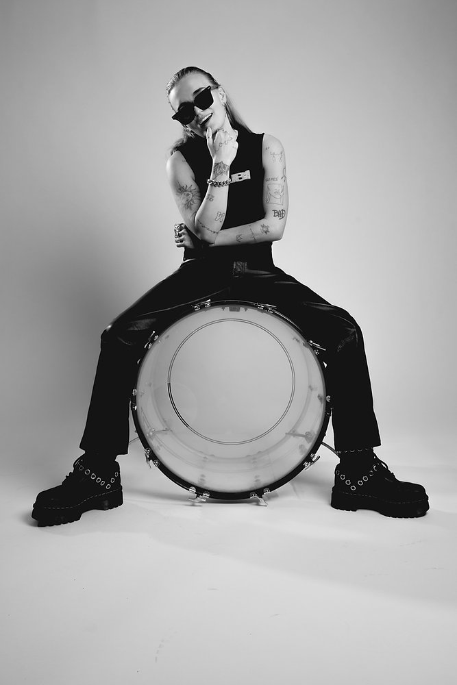
G Flip tattoos: distinct black-and-white drum portrait with visible arm tattoos

Among G’s more visible small tattoos are the words “I love you” and the number “1961”. They sit among simple drawings and symbols on the arms, and hair or clothing can cover them. Unlike the large lyric on the back, these marks often show up in casual portraits.

The smaller designs are where the collection feels especially personal. A date, a short phrase or a tiny drawing can sit beside a larger tattoo without competing with it. They also change what an arm looks like in a photo: one concert frame may show only a few marks, while a sleeveless portrait reveals a fuller group of lettering and fine lines.

The number is clear in photos, but its personal explanation is less well documented than the Forum story. That is fine: a tattoo can be worth recording because it is visible, even when the reason remains private. The same is true of the many small drawings across G’s forearms.

The collection keeps changing because the stories keep changing

G Flip’s tattoos are not a fixed checklist. New designs arrive through tours, friendships, songs and spur-of-the-moment decisions. Some are neat, some playful, and others only make sense after G tells the story. Even the tattoos done on stage become part of that ongoing diary.
That is why the best photos are not always the most glamorous. A rehearsal room, festival portrait or drum-session frame can show a different part of G’s arms and wrists. Each image can do one job: make a word legible, show the shape of a symbol or reveal how small pieces sit beside larger work. None needs to be stretched into a claim the photo cannot support.

Together, the collection moves from the Forum lettering near the wrist to drumming references, the Leon Bridges lyric on the back and the small words and symbols on the arms. The tattoos do not need to match visually. Each holds onto a person, place, song or moment G wanted to remember.

That mixture keeps the collection interesting: some tattoos are bold, some tiny, and their meaning becomes clearest when the designs and photographs are considered together.

More musician tattoo guides

Jeff Hardy’s Tattoos Tell a Story in Roots, Snakes and Chaos

Jeff Hardy treats tattoos as more than decoration. He has spent long sessions in the chair, designed parts of his own work and talked about getting tattooed with the same restless energy he brings to a match. The collection is large, colourful and a little chaotic, but certain ideas keep coming back: nature, movement, family, danger and personal control.

The clearest explanations come from Hardy. He has discussed the roots spreading up his arm and neck, the Japanese writing on his arm, the dragon he got at eighteen and the small matching mark he shares with his wife. Other pieces are easier to see than to explain. This guide separates the tattoos Hardy has described from designs identified in clear photos, so the details stay useful without inventing private meanings.

The roots climb from Hardy’s right arm toward his neck

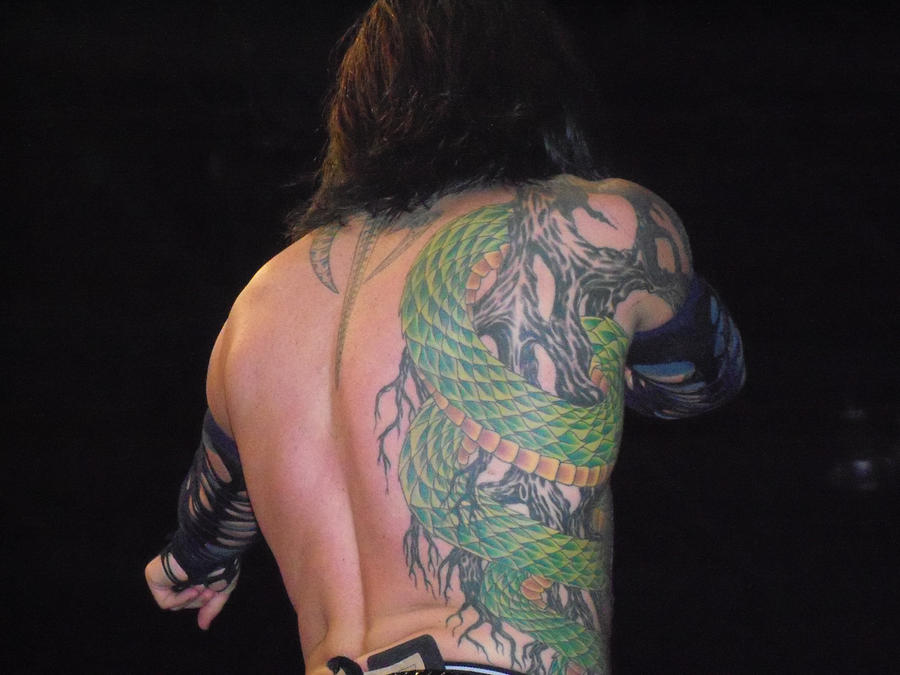
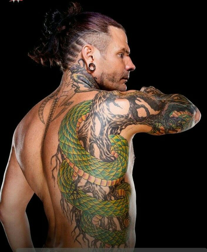
Jeff Hardy snake and roots shoulder tattoo

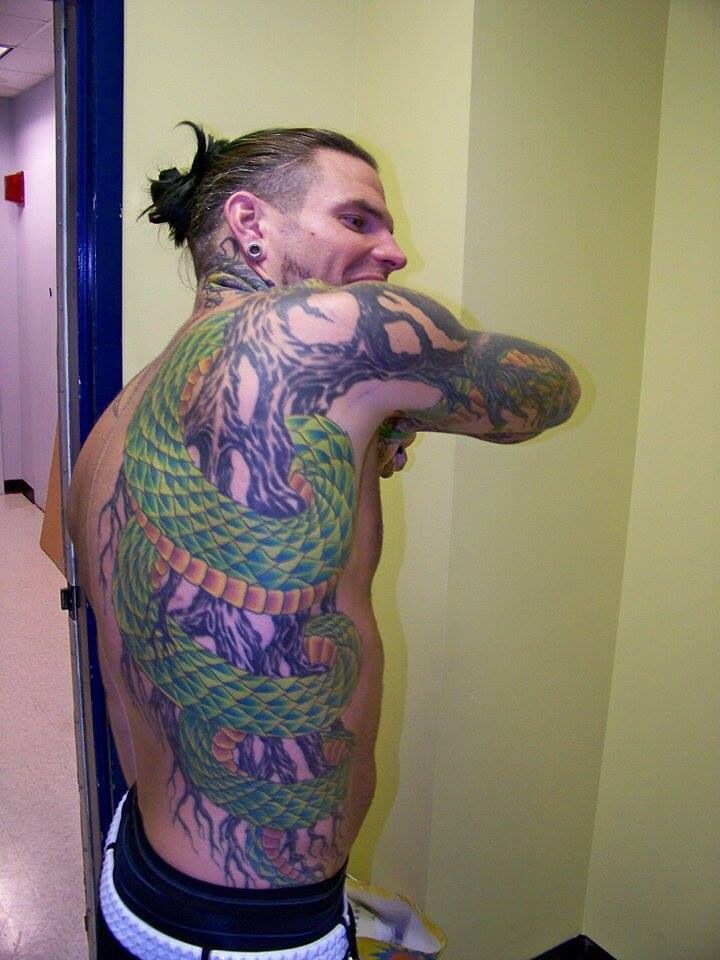
The roots are the most recognisable part of Hardy’s collection. They start around his right hand and arm, spread over the shoulder and continue toward his neck and side. In photos, the dark lines look like twisting branches rather than a uniform sleeve. They curl around the arm and leave patches of skin between the heavier sections, giving the design an uneven, living shape.

Hardy has explained the idea himself. He compares roots with veins: water moves through the ground as blood moves through the body. He has also called himself a landscaper at heart and said he enjoys plant life. The roots are more than a general nature motif; they connect his body to the earth. The design grew outward rather than stopping at a clean border.

The placement changes how the tattoo reads. A front-on wrestling photo may show just a strip on the arm, while a shirtless portrait reveals the lines reaching toward his back and ribs. Hair or a collar can hide the neck section. Several angles help show the full scale, especially because later work overlaps and surrounds the original lines.

Hardy said he wanted something different from the tribal bands many men were getting at the time. That puts the style in context without reducing it to a trend. The roots use heavy outlines, but they are neither a simple band nor a symmetrical emblem. They spread across the skin like a system, which fits Hardy’s interests in drawing, landscaping and making his own art.

Jeff Hardy snake and roots side tattoo

Japanese lettering and the unfinished dragon belong to Hardy’s early years

Jeff Hardy dragon and arm tattoos

The Japanese writing on Hardy’s right arm is one of the few tattoos he has translated himself. He said it means “health, good or bad, but hopefully good”. It sits in a heavily tattooed area and can be hard to see when his arm turns away. The lettering also shows how Hardy mixes words into larger images rather than keeping text separate.

His first tattoo was a dragon on the outside of his left leg. Hardy has said he got it at eighteen, when he still lived with his father, who disliked tattoos. The story has a humorous edge because Hardy got it behind his father’s back, but it also anchors the tattoo in the collection’s timeline. It came before the famous sleeves and larger designs.

The dragon remains quite different from the roots. Hardy has described it as an outlined design he might colour one day, while the roots expanded into a much larger system. In older photos, the dragon can look plain beside the coloured work on his upper body. That contrast is part of the collection’s history; not every tattoo was planned as a complete visual package.

It is tempting to assign a dragon a stock meaning like strength or fearlessness. Hardy’s own account is more specific: he talked about his age, his father’s reaction and deciding to get the tattoo anyway. The photo confirms the design and location, while his story explains the personal context.

The neck demons sit beside the roots, hands and wrist work

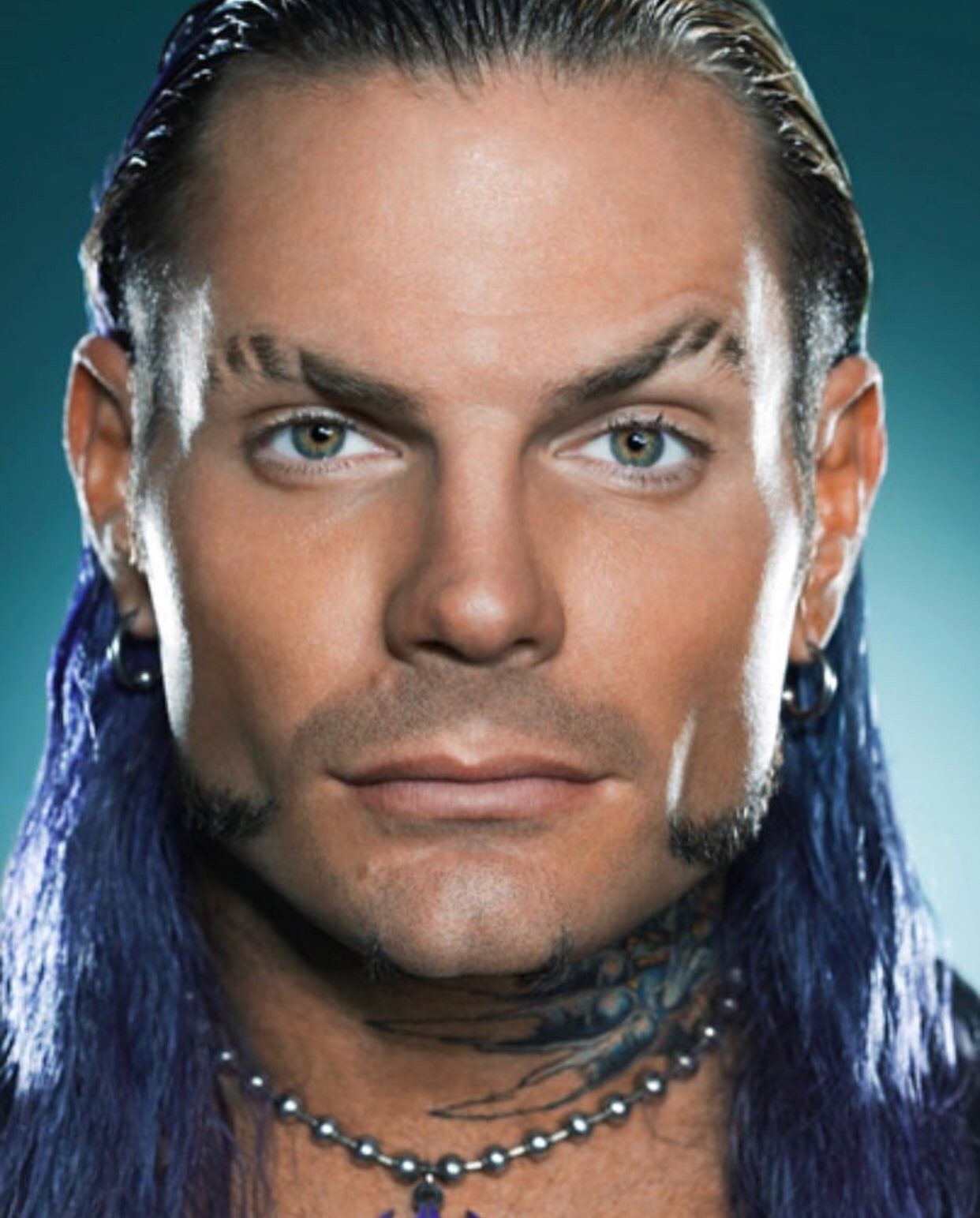
Jeff Hardy neck tattoos close-up

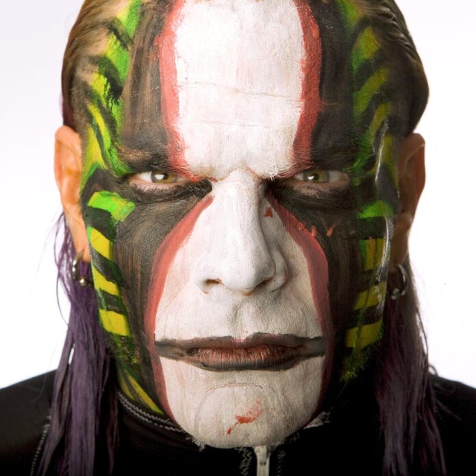
Hardy’s neck tattoos are easy to confuse with his face paint, which has also been part of his look for years. The permanent ink runs along the sides and back of his neck, while the paint changes from match to match. Close portraits reveal darker, demon-like faces beneath the jaw and near the neckline. From far away they can look like shadows, especially when his hair is loose.

Hardy has said the demons were not fully planned in advance. Once both sides of the neck were visible, he began to connect the images with control and the parts of himself he has had to manage. That does not make every later tattoo an addiction symbol; this particular context comes from Hardy’s own comments.

The neck is where his style becomes most theatrical. The roots climb up from his arm, while the darker faces sharpen the outline around his head. Add piercings, long hair and changing face paint, and the overall look is intense even before he enters the ring. It is useful to distinguish the permanent tattoos from the performance makeup.

Photos from different years also show why dates matter. Hair can hide one side, paint can obscure another and lighting can flatten the dark shapes. A close portrait of the neck is more useful than a full-body photo where the same designs shrink to tiny marks.
A close-up earns its place here because it lets readers see the neck work clearly.

Hardy’s back piece brings together the devil, flames, snake and octopus work

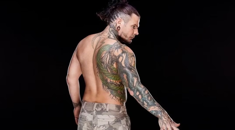
Jeff Hardy snake and roots back profile tattoo

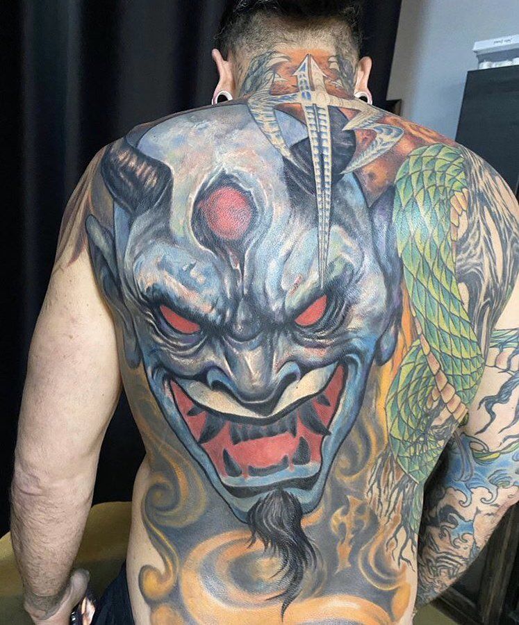
Hardy’s large back work is a later chapter in the collection. It includes a demonic face, blue and grey shading, flames and a green snake winding through the design.

Jeff Hardy full back tattoo with devil, flames and snake

It is denser than the early dragon and much broader than the original roots. The back gives the scene room to read as a full composition instead of another small symbol added to a busy arm.

When Hardy showed the back piece, he described it as a newer version of himself and spoke about how painful the sessions had been. He began the work earlier but could not finish it in one go. That history matters: a big tattoo can look complete in a photo even when it took several sessions.

The snake is connected to the roots on the right side of his body. Hardy said people had mistaken parts of the coloured roots for a snake, which helped inspire him to add a rattlesnake. He has also said he is afraid of snakes, so the design was not simply a favourite-animal tattoo. That tension between fear and fascination gives it some life.

The devil and flames are clear in the image, but that does not establish a biography for every colour or expression. Hardy’s comments support the idea of a major personal artwork and connect the snake to the roots. The description can stay visually detailed while leaving further symbolism open.

Hardy’s hand and wrist tattoos are smaller but more personal.

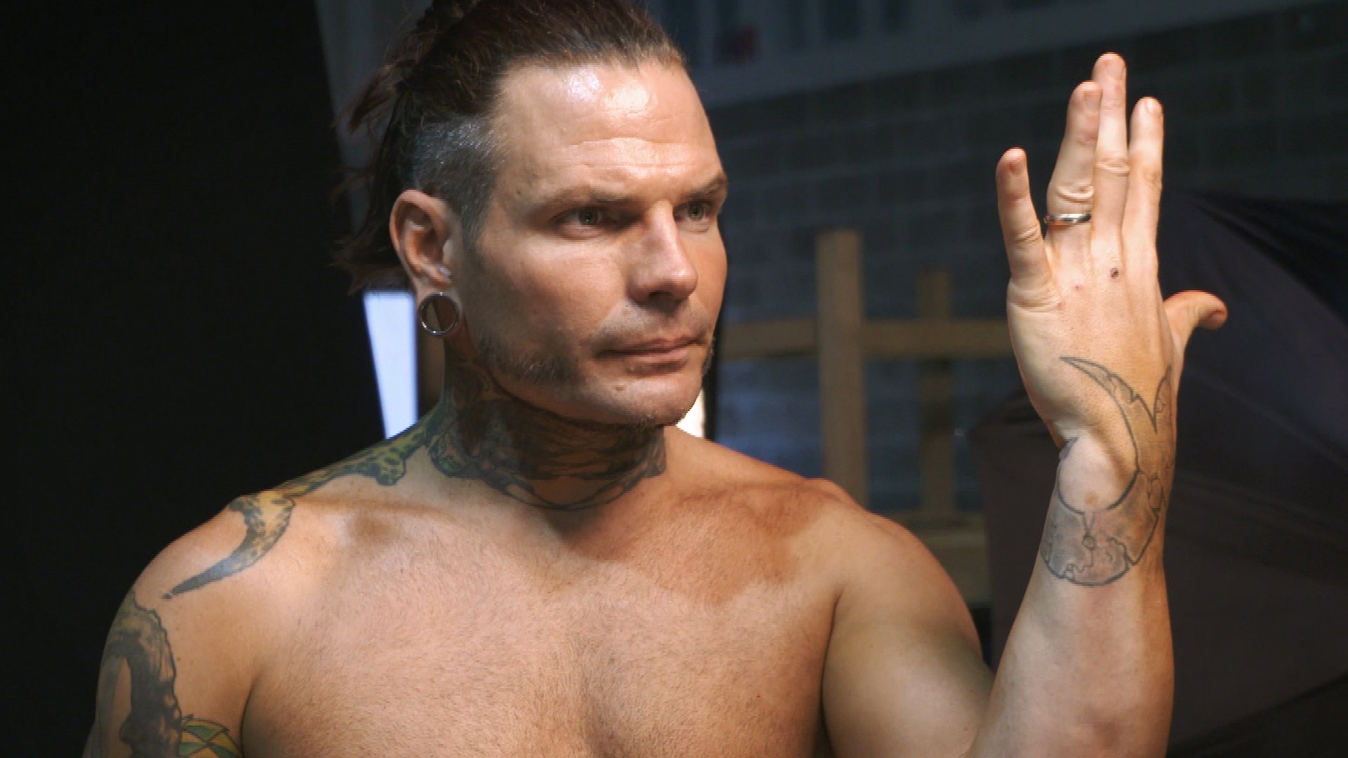
The marks on Hardy’s hands and wrist are easy to overlook beside the larger work. He has mentioned faint green lines around his right thumb and buying tattoo equipment because he wanted to try tattooing himself. Working on his right hand with his left was difficult, he admitted, giving those pieces a very different origin from professional studio work.

His left wrist has a combined cursive J and lowercase e, matching his wife’s first tattoo. Hardy said she wears the design on the back of her neck and that he put the same idea on his wrist so they would have a shared mark.

Jeff Hardy wrist tattoo

It is one of the clearest relationship tattoos in his collection because Hardy explained both the letters and the matching placement.

The hand tattoos also show how much scale affects visibility. A tiny symbol may be crisp in close-up and disappear when Hardy wears gloves, wrist tape or long sleeves. It should not be treated as a new tattoo every time another photo reveals a line. Dates, angles and image quality all matter for such small designs.

The octopus, bunny and smaller leg work add a stranger edge.

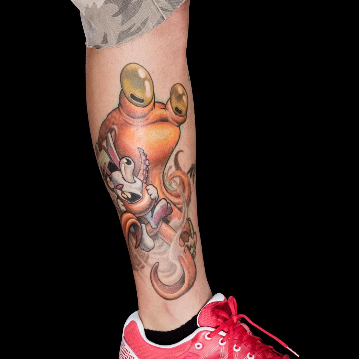
Hardy has also had an octopus tattooed around a bunny on his leg during an Ink Master appearance. It is playful and unsettling at once, fitting his habit of pairing bright colours with darker or surreal subjects. Reports say the session lasted close to six hours and was completed by Jesse Smith. The design is separate from the roots system, so it stands on its own rather than being grouped into a general sleeve.

Jeff Hardy octopus and bunny leg tattoo

This is where Hardy’s collection gets less predictable. The dragon came early, the roots connect to nature, the Japanese writing carries a clear wish for health, and the octopus and bunny bring a strange storybook quality. There is no reason to force them into one style. Hardy approaches tattooing like drawing on the body, and the designs feel like separate ideas gathered over time.

Together, the tattoos move from a first dragon on the leg to roots on the arm, Japanese lettering, neck demons, a large back scene, a snake and smaller marks linked to his wife and his own experiments. Some meanings are confirmed in interviews; some designs are simply visible in photos. That distinction is useful. Readers can appreciate the artwork without assuming every line has a published explanation.

What makes Jeff Hardy’s tattoo collection different.

Hardy’s tattoos feel personal because he talks about the choices behind them. He remembers getting the dragon at eighteen, explains the roots through veins and water, translates the Japanese writing and describes the matching wrist initials. He has also spoken openly about the pain, time and changes involved.

The photos show what words alone cannot. The back piece needs a full-back view; the roots need an arm or side angle; the neck demons need a close portrait; and the wrist marks need a tighter frame. Repeating one generic shirtless image would flatten the collection and hide the placements that make each tattoo worth discussing.

Some marks still cannot be confidently named from a distant shot, and that is fine. A careful guide can list the roots, dragon, Japanese writing, neck demons, snake, devil, flames, matching wrist letters and octopus scene without turning every shadow into a new design. Hardy’s explanations carry the story; the photos show the work, and remaining uncertainty stays clear rather than dressed up as fact.

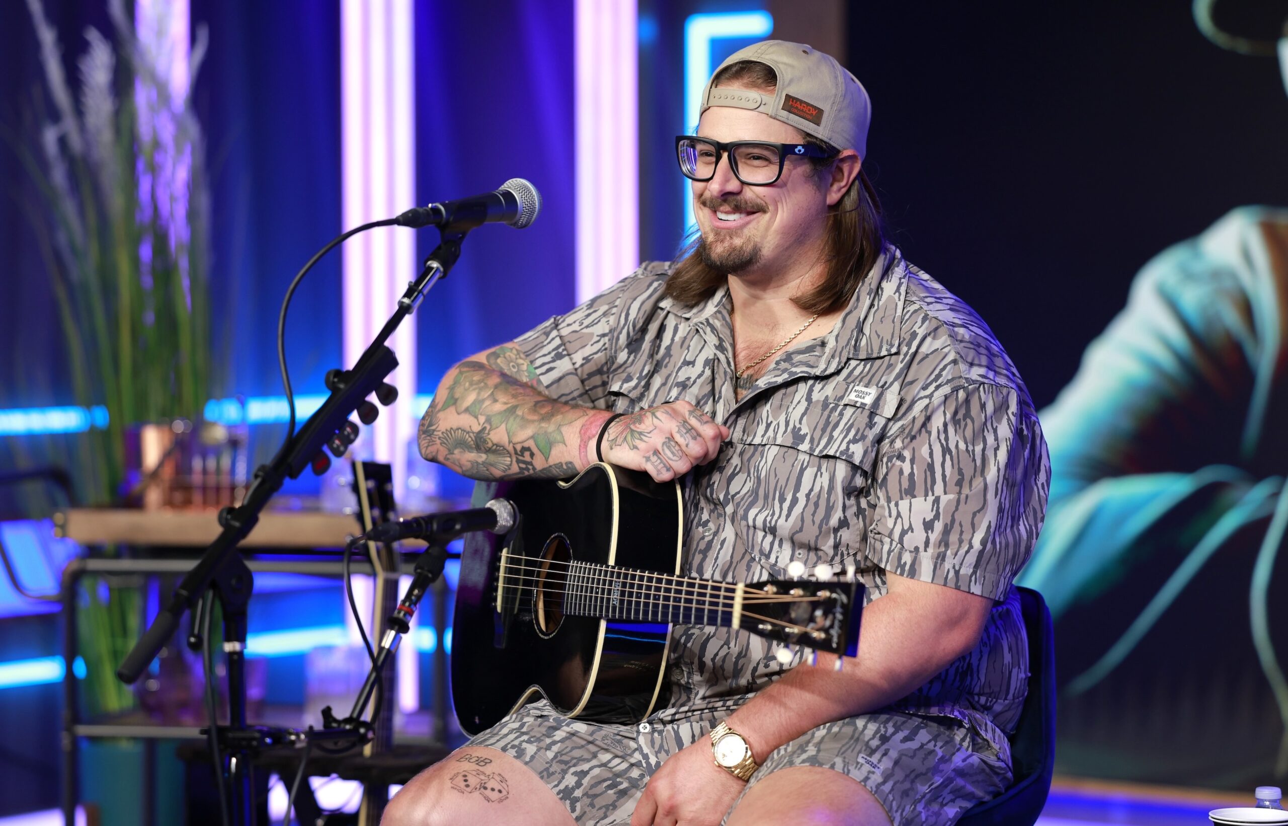
HARDY’s Tattoos Put Mississippi, Family and Travel on His Skin

HARDY’s tattoos make more sense as a collection of separate memories than as one planned sleeve. His arm brings together Philadelphia, Mississippi, family, school, local wildlife and places he has travelled. The result is colourful and busy, with magnolias, pine cones, a mockingbird, an Eastern mud snake, a Mississippi State cowbell and the word “home” across his knuckles.

HARDY has talked openly about many of the designs. In a conversation with Jimmy Fallon, he walked through the arm tattoo by tattoo; elsewhere, he called the flower on his hand his favourite because it is his wife Caleigh’s favourite. His leg work follows a different thread, with tattoos connected to places he has visited. The guide below sticks to those explanations without reading a secret story into every bit of shading.

HARDY’s first home tattoo was a Neshoba County Fair bracelet

HARDY tattoos: HARDY tattooed forearm and hand at a live performance

The red band around HARDY’s wrist represents the entry bracelet used at Mississippi’s Neshoba County Fair. He has called the fair one of the most important parts of growing up in his home county. The bracelet was the first tattoo on an arm he later dedicated to home. It is small beside the rest of the sleeve, but it gives the collection a starting point.

The colour is part of the memory. HARDY said the real bracelets change every year, so the red is not an arbitrary stripe. It recalls going to the fair as a child. He joked that it might help him get into a future year, but the reason is simple: he wanted to keep a local tradition with him.

The wrist makes a natural anchor. It shows when he holds a microphone or guitar, while the larger tattoos climb up his arm. A stage photo might catch only the band and part of his forearm; a closer view shows that the sleeve is more than traditional filler. It begins with a specific place.

HARDY has described the fair in warm, familiar terms: cabins, food, games and families returning year after year. The bracelet needs no extra symbolism. It already connects the tattoo to a real event from his childhood.

Magnolias, pine cones and the Eastern mud snake fill the Mississippi arm

HARDY tattoos: HARDY wrist, hand and forearm tattoo details

The arm becomes much more recognisable when its Mississippi references are separated. HARDY has pointed out magnolias, fitting for the Magnolia State, as well as pine cones and a mockingbird from the Southern landscape where he grew up. These are specific local details, placed together as memories rather than generic country decoration.

The Eastern mud snake is one of the most distinctive choices. HARDY has said it is his favourite snake and recalled seeing them around the swamp while growing up. He described the animal as rare and beautiful. That context matters: snake tattoos are often assigned a stock meaning about danger or transformation, but his reason was more direct. He chose an animal he knew from home.

Photos show the designs sitting beside each other. Leaves and flowers soften the darker sections, while the snake winds through the arm. They do not all face one way: some point toward the wrist, others wrap around the forearm or sit higher near the elbow. That variety keeps the sleeve from looking like a single printed illustration.

The arm needs more than one photo. A live shot may show its overall colour and density but hide the inside of the forearm; a seated portrait may reveal the hand and wrist while cropping out the upper arm. Treating those views as separate evidence gives a clearer record.

The stargazer lily is HARDY’s most personal hand tattoo

HARDY tattoos: HARDY flower and forearm tattoos in a clear portrait

HARDY has called the stargazer lily on his hand his favourite tattoo. He chose the flower because it is Caleigh’s favourite, a simple relationship story without an elaborate explanation. It is one of the softer designs in a collection that also includes snakes, skulls, sports references and bold lettering.

The hand placement makes the lily especially visible. It shows in photos when HARDY grips a microphone, points to the crowd or holds a drink. Hands are tricky to photograph, though: fingers bend, stage lights wash out colour and jewellery can cover part of the flower. A clear arm portrait shows more than a distant performance shot.

The lily also changes the rhythm of the sleeve. Its colour and movement break up blocks of lettering and darker images. It sits with the Mississippi designs, but the meaning is more personal. Not every tattoo on the arm needs to be about home, and not every local reference needs a family story attached.

HARDY has mentioned other small hand and arm tattoos in interviews and social posts. Some are recognisable; others blend into the surrounding ink. The lily has a clear explanation, while neighbouring designs are best described only when the photo makes them easy to see.

“Home” across the knuckles keeps the message blunt

HARDY tattoos: HARDY arm sleeve and thigh tattoos during an acoustic performance

The word “home” across HARDY’s knuckles is one of the easiest designs to spot. The lettering is direct, in keeping with the arm. He has said the sleeve is about Mississippi and his hometown, so there is no need to decode the word further.

The lettering shifts as his hand moves. When HARDY opens it, the word reads across his knuckles; when he grips a microphone, the letters break across his fingers. That can make it look different in concert photos even though the tattoo has not changed.

The word sits among more detailed pictures, including the flower and animal designs. It gives the eye a simple horizontal line, while the magnolia, pine cone and snake provide more intricate shapes around it.

It is also a good example of HARDY’s laid-back way of talking about tattoos. He does not present “home” as a complicated philosophy. The word says what it means; his comments and the photos make clear that it refers to Mississippi.
Mississippi State and the Rockets bring school memories into the sleeve.

HARDY has identified a Mississippi State cowbell and a reference to his high school mascot, the Rockets. They add school memories to an arm already filled with local and state imagery. The cowbell is a familiar Mississippi State symbol; the Rockets connect the sleeve to his teenage years.

Those pieces keep the arm from becoming a generic map of Mississippi. The point is not just that HARDY comes from the state: specific places and institutions shaped his life. The fair recalls one memory, the school mascot another, and Mississippi State represents a different kind of loyalty.

HARDY hand and arm tattoo close-up

Small designs can vanish in a wider photo when a sleeve, microphone cable or guitar strap blocks the view. A close portrait shows how they sit beside the flowers and animal imagery. That is another reason several different images work better than one generic stage shot.

His leg tattoos record places outside Mississippi.

The arm is mostly about home, but HARDY has said his leg tattoos follow a different idea. He has described designs connected with places he has visited, including Italy, Thailand, New Zealand and Australia. The travel theme is clear, though interviews do not identify every tattoo well enough to match each symbol with a specific country.

HARDY leg and arm tattoos during a live performance

That distinction is worth keeping. A visible dice or small thigh design can be noted as part of the leg tattoos, but it should not be labelled as the Italy or Thailand piece without a source. Travel tattoos can work like personal souvenirs, even when a photo cannot tell us which trip inspired them.

The leg work is often harder to see in live photos than the arm. Shorts, stage lights and movement get in the way. Seated performances or relaxed portraits tend to show more of the thigh, though a guitar or microphone stand may still cover part of it. Placement and timing should remain tentative when the image is incomplete.

The travel designs balance the collection. The arm looks back to Mississippi, while the legs hold reminders of places HARDY has reached through touring and life on the road. Those are different kinds of memories, and keeping them distinct makes the article more specific than calling everything a hometown tattoo.

The little details matter because the collection keeps growing

HARDY has many tattoos, but they do not all need the same kind of explanation. He has spoken directly about the fair bracelet, stargazer lily, Mississippi references and the word home. The leg work has a clear travel thread, though no source ties every design to a particular country. Other marks can be shown without assigning a meaning he has not given.

The sleeve keeps changing. New work can fill spaces between older designs, colours can soften and different clothes can reveal or hide the same tattoo. A current guide benefits from photos taken in different settings: a stage image may show the hand, a seated acoustic shot the thigh, and a close portrait the flowers and lettering.

The collection is not random filler. It brings together hometown pride, family, school memories and travel. The arm is the most organised group because HARDY deliberately dedicated it to home; the flower adds a relationship detail, and the leg tattoos take the story out on the road.

There is already plenty to say without making the ink sound mysterious. The strongest explanations come from HARDY himself. Photos then show the size, colour and placement. When a small mark is unclear, it is more honest to leave it uncertain than to turn a blur into a confident claim.

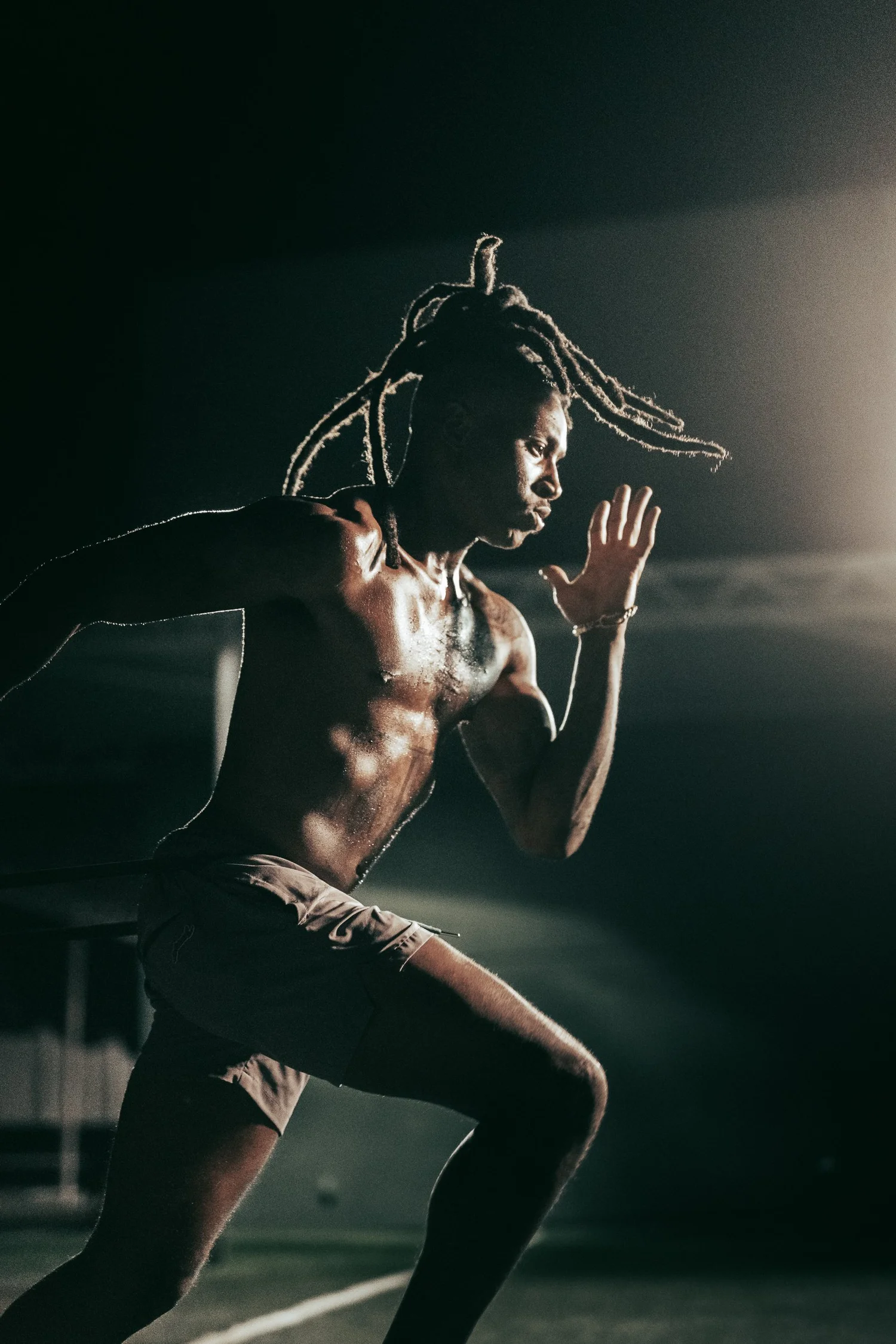
DeAndre Hopkins’s Tattoos Put Family, Peace and Personal Style on Display

DeAndre Hopkins’s tattoos combine family history, peace symbols and different artistic traditions. The collection includes a tribute to his father across his back, a tiger over his chest and shoulder, the word “Metta” on his arm and a watercolor peace sign on his hand. In his GQ Tattoo Tour, Hopkins talks through the designs with the curiosity he brings to his football style. He likes moving between Japanese and American art rather than forcing everything into one matching sleeve.

The halo and wings tattoo remembers DeAndre Hopkins’s father

DeAndre Hopkins tattoos: Distinct GQ frame showing Hopkins’s hand peace sign and shoulder work

Hopkins says his favourite tattoo honours his father, who died when Hopkins was a child. The design includes a halo and angel wings across his back. He has explained that the wings represent his father’s legacy and the effect he had on his life.

The placement was practical as well as personal. Hopkins said he tried to keep the tattoo from his mother for as long as he could, and putting it on his back made that easier at home. It began as something he could cover, even though it later became one of the most recognisable parts of his collection.

Back tattoos are difficult to document in a front-facing interview. A shoulder edge or single feather does not show the full layout. A clear rear photo matters because it reveals how the wings spread across his back, rather than making one visible section look like a separate design.

Hopkins has also said he got his first tattoo at fourteen. It was a signature-style design done by a friend, and he has joked about the quality of the equipment. That early piece came before the more planned work that followed. Not every tattoo began with a professional studio or a detailed concept.

A tiger chest tattoo brings Japanese and American ideas together

The tiger was designed to fit the shoulder and chest.

Hopkins says he came up with the tiger design and gave the Japanese tattoo artist a clear idea of the look he wanted. The result goes beyond a simple animal portrait. Stripes, flowers and surrounding shapes run from his chest onto the shoulder, so different photos show different parts of the piece.

He has said he enjoys switching between Japanese and American tattoo styles instead of making the whole collection uniform. The tiger is the clearest example: it draws on Japanese art, but sits within a broader mix of lettering, family details and newer colour work.

DeAndre Hopkins tattoos: Separate GQ frame showing the tiger chest and Japanese-inspired shoulder work

The tiger on Hopkins’s chest is among the boldest designs in his collection. He created the concept and worked with a Japanese artist experienced in tattooing tigers. Hopkins knew the style and overall look he wanted, while the artist brought their own experience to the finished piece.

The tiger reaches from the chest toward the shoulder, surrounded by flowers and patterns. In one photo the animal can seem like the whole tattoo, but the surrounding lines complete the design. A wide image shows the composition; the closer GQ frame makes the face and stripes easier to see.

Hopkins is open about bringing styles together. In the same conversation, he mentioned Japanese and American work, along with liking different eyes and viewpoints. That helps explain why the collection does not follow one visual language. The tiger can draw on Japanese art while sitting beside lettering and symbols from other parts of his life.

Sports photography can hide a lot of the chest. A jersey covers most of it, while a shirtless portrait reveals the tiger, flowers and work extending down the arm. The design has not necessarily changed when a game photo shows less of it; the clothing and angle have.

Metta and the watercolor peace sign hand tattoos show Hopkins’s interest in peace

“Metta” and the hand piece were meant to be seen.

The word “Metta” is on Hopkins’s arm, and he says it means world peace. The hand tattoo is separate: a watercolor peace sign that shifts from purple toward blue and green as the ink settles and the lighting changes. Hopkins wanted it on his hand so it would still show with a button-down shirt. The designs share a broad theme but deserve separate descriptions.

That distinction helps make the photos useful. The arm view shows the lettering, while a close hand photo gives the clearest look at the watercolor peace sign. A full-body portrait can show where both sit, but cannot replace a detail image of either one.

DeAndre Hopkins tattoos: Separate full portrait showing the tattoo collection across chest and arms

The word “Metta” sits on Hopkins’s arm. He says it means world peace, giving the lettering a clear purpose without needing a long theory. It is a small word, but its placement makes it visible among the other designs.

The watercolor peace sign stands out even more. Hopkins calls it one of his favourites and said it was his newest tattoo at the time of the GQ interview. He chose his hand because the design represents who he is and he wanted people to see it even when he wears a button-down.

He also notes that the colours shift in different light. The purple tones later appeared more blue-green. Colour tattoos do not look identical in every photo; lighting, healing and age can make the same ink seem warmer or cooler.

The peace sign is deliberately visible. The wings on his back began as something Hopkins wanted to hide from his mother, while the hand design sits where a sleeve or shirt cannot cover it completely. The two pieces show different sides of the collection: private remembrance and open self-expression.

Together, Hopkins’s tattoos are more than decoration on an athlete. The back holds his father’s memory, the tiger reflects his interest in art, and the peace designs express a value he wants people to see. The photos also have separate jobs: one shows the wings, the GQ close-up captures the tiger and hand work, and the full portrait shows how the areas connect.

Hopkins’s own comments keep the meanings grounded. He does not claim that every small mark has one grand explanation. He talks about styles, memories and the designs he wanted. That is enough: describe the placement, name the pieces he identifies and leave unclear details alone.

Smaller tattoos are easy to miss when Hopkins is in football gear. The peace sign may be partly hidden by a ball, glove or sleeve; lettering on his arm can disappear under pads and jersey fabric. A guide based only on game-day photos would make the collection look much smaller than it is.

Hopkins’s comments about drawing offer another clue to his approach. He says he enjoys creative expression and used to draw over tests and homework as a child, even when he had answered the questions correctly. The tattoos are not only designs taken from a catalogue. He talks about choosing a look, working with an artist and shaping the idea until it feels like his.

The Japanese influence is clearest in the tiger, but Hopkins says he likes different styles rather than treating one tradition as a rule for his whole body. The result combines clean lettering, a large animal, floral details, a peace symbol and the angel imagery on his back. Each area has its own look, and the tattoos share space on the same body.

DeAndre Hopkins shoulder and arm tattoos

There is a timeline in the collection. Hopkins got his first tattoo at fourteen; the tribute to his father came from a more serious family memory. The tiger reflects a later interest in design and collaboration, while the watercolor peace sign was the newest piece during the GQ tour. A photo from one period should not be treated as a complete current inventory without checking its date.

The father tribute should stay distinct from the peace designs. Both matter to Hopkins, but in different ways. The wings honour someone he lost and the legacy his father left; the peace sign reflects how he wants to move through life and what he wants people to see. Calling them all inspirational tattoos would erase the details that make each one specific.

The colour also varies between photos. Hopkins says the watercolor sign moved from purple toward blue-green over time. Studio lighting can make the tiger warmer, while a dark rear shot can soften the wings. Those differences are normal and do not mean a tattoo was replaced or redone.

Hopkins’s collection works because it is personal without relying on one style. A family memorial sits beside an animal design, lettering about world peace and a hand symbol he wants people to notice. The clearest photos show one area at a time, and the strongest descriptions stay close to what Hopkins has said.

That balance is especially helpful for a heavily tattooed athlete. Some designs are easy to see from the sidelines, while others appear only when he chooses to show them. A careful inventory can identify the tiger, wings, Metta and peace sign, explain their stated context and leave the smaller uncertain marks open.

More athlete tattoo guides

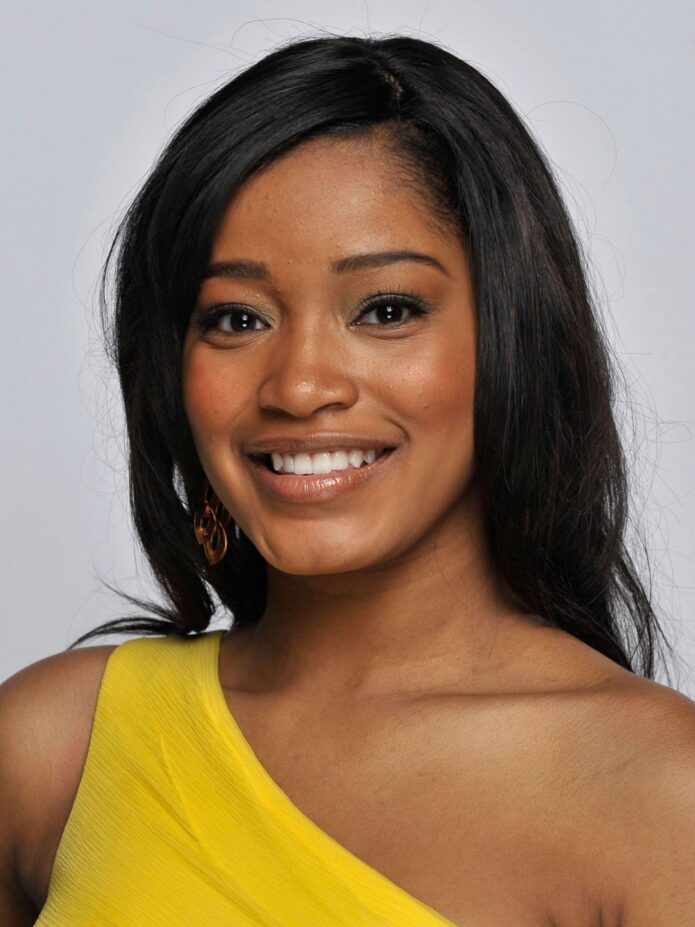
The Stories Written Across Keke Palmer’s Tattoos

Keke Palmer’s tattoos make more sense as individual choices than as one matching theme. The collection ranges from a large illustrated design on her side to short phrases placed where clothes can cover them. Photos vary in clarity, and seeing a phrase does not tell us why she chose it. This guide sticks to tattoo-specific images and Palmer’s own public comments, leaving guesses out.

Scale matters here. The side piece covers much of her ribcage, while the lower-back and under-bust tattoos need close framing to read. A red-carpet photo may show that a tattoo is there, but a dedicated image is needed to describe its lines or wording. Each section uses a separate photo for a different design.

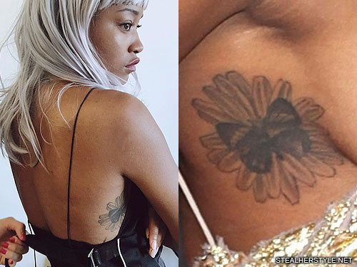
The butterfly and flower cover Palmer’s right side

Keke Palmer tattoos: large butterfly and flower tattoo on the right side of Keke Palmer’s ribcage

The largest clearly documented design here is a butterfly resting on a flower along Palmer’s right side and ribcage. TattooFilter describes flowers and butterflies on her side; Steal Her Style’s tattoo page identifies a butterfly on a flower and notes the black-and-grey treatment. The accounts agree on the main visual points: a flower and butterfly, placed along her torso, with the butterfly as the clearest shape.

The composition is clear, but its private meaning is not. Celebrity roundups often assign butterflies a familiar story, yet the sources here do not say Palmer chose this design to represent transformation, grief or a turning point. It can be described as a flower-and-butterfly image without claiming a personal explanation. Its size also sets it apart from her small lettering, covering a broad patch of skin when a garment exposes her side.

A 2025 report also drew attention to a large ribcage tattoo when Palmer wore a sheer Versace look to the Vanity Fair Oscar party. That helps establish that the side work was still visible years after the dedicated tattoo photo. The event image is not a close view of the exact butterfly-and-flower design, so it works as context for timing and placement rather than as evidence for the fine details.

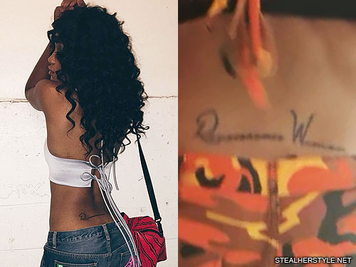
“Renaissance Woman” sits across the lower back

Keke Palmer tattoos: Renaissance Woman lettering tattoo on Keke Palmer’s lower back

Palmer’s lower-back tattoo reads “Renaissance Woman.” She clarified the wording publicly after people questioned what the script said. She also explained the idea: a woman with knowledge or ability across multiple fields. That gives the phrase better support than a reading based on a blurry event photo.

The wording fits Palmer’s work as an actor, singer, dancer, host and performer. That connection follows the explanation she gave when showing the fresh tattoo; it is not just a caption someone else invented. Still, the phrase is not a complete autobiography, and it does not prove every later project or public reinvention was planned around the tattoo.

Lower-back tattoos are often partly hidden by clothes, posture or distance. The dedicated image here makes the lettering easier to read than a general portrait would. The simplest description is also the clearest: these are the words, in this location. It is a typographic design, with the phrase doing the work rather than decorative imagery.

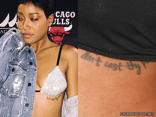
A proverb runs beneath the bust

Keke Palmer tattoos: Don’t cast thy pearls before swine quote tattoo beneath Keke Palmer’s bust

A separate tattoo sits beneath Palmer’s bust and carries the phrase “Don’t cast thy pearls before swine.” The close photo shows a line of writing, not decorative flourish. It is an old proverb, often used to mean that something valuable should not be offered where it will not be appreciated. No cited interview connects it to a particular relationship or episode in Palmer’s life.

That limit is useful because tattoo coverage often takes a familiar saying and immediately turns it into a personal confession. The words and placement are visible; a detailed private backstory is not. The phrase can be explained in general terms without guessing that Palmer meant a specific person, project or public disagreement. Readers get the wording without a made-up origin story.

The location also explains why this tattoo is missing from many everyday photos. Clothes usually cover the area, so it appears only in images with a particular neckline or crop. The dedicated photo is important: a face shot or general red-carpet image could not document a design beneath the bust. It is separate from the larger side tattoo and should be discussed on its own, rather than folded into one broad “body art” description.

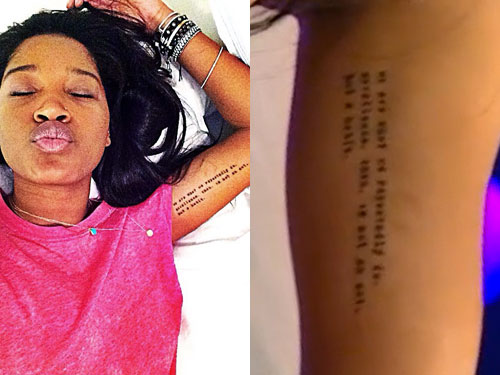
The inner-arm quotation is a different kind of lettering

Keke Palmer tattoos: Aristotle quotation tattoo on Keke Palmer’s inner arm

Palmer has a line tattooed on her inner arm that is often circulated as “We are what we repeatedly do. Excellence, then, is not an act, but a habit.” The dedicated photo records its placement and the wording used in tattoo coverage. Its attribution to Aristotle needs a small correction: the sentence is commonly associated with him, but it is a later summary of an idea from his writing, not a verbatim line from the surviving Nicomachean Ethics. That distinction avoids repeating a neat but inaccurate attribution.

Palmer has said the quotation resonated with her. That is useful context on its own: the words mattered enough for her to put them on her arm. There is no need to claim the tattoo predicts her career or explains every success. The inner arm can be shown when she chooses and covered in everyday clothes, unlike the side design.

The two text tattoos have different jobs. “Renaissance Woman” is a short self-description; the longer quotation is about practice and repetition. Both have room to be read, but remain visually simple. The exact wording is harder to make out in distant photos, which is why a close tattoo image helps. Each phrase belongs in its own section rather than serving as a catch-all explanation for Palmer’s collection.

Together, these four documented pieces show variety rather than one repeating motif: one large natural illustration and three text designs, on the side, lower back, beneath the bust and inner arm. Their visibility depends on clothing and camera distance, and the evidence varies by tattoo. Palmer’s clarification makes the lower-back wording especially clear; tattoo-specific images document the side design; and the other inscriptions can be described without inventing a personal story.

The placements also make the designs easier to understand together. The butterfly and flower cover a broad area, while the lettering needs a closer look. A wide photograph can establish the shape but may not show the words clearly, so the close-ups belong beside the sections that discuss them.

Palmer’s collection mixes decorative work with personal phrases. The flower and butterfly are visually detailed, the lower-back lettering is direct, and the quotations depend on getting the exact words right. None needs an invented backstory. The photos establish what is there, and the reported context goes only as far as the sources allow.

Older images are useful alongside newer ones, rather than as a permanent final count. Fading, styling or a cover-up can make the same tattoo appear different. Keeping dates and locations in view gives readers a more accurate guide than assuming every photo shows the same moment.

That balance keeps the article helpful. Readers can start with the larger shapes, then use close-ups to check the wording and placement. The page can be specific without pretending every mark has a documented meaning.

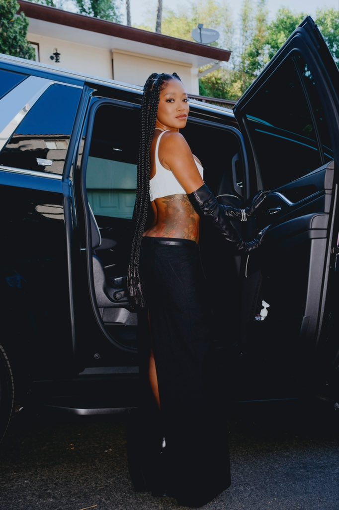
A later portrait confirms the side placement

Keke Palmer showing the side tattoo placement

A later public photograph confirms that the side tattoo remains part of Palmer’s visible tattoo map. It does not replace the closer image used to identify the butterfly and flower, since this wider view shows less detail. It is useful for scale and placement: the design runs along her torso and reads as a large piece rather than a small mark near the waist.
It is helpful to keep the detail photo and wider portrait together. The close image shows what the tattoo looks like; the newer photo shows how it sits with Palmer’s clothes, posture and styling. Neither needs an invented meaning attached.

More musician tattoo guides

Maxx Crosby’s Tattoos: Raiders Ink, Family Portraits and Sports Legends

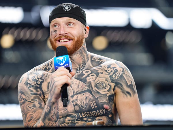
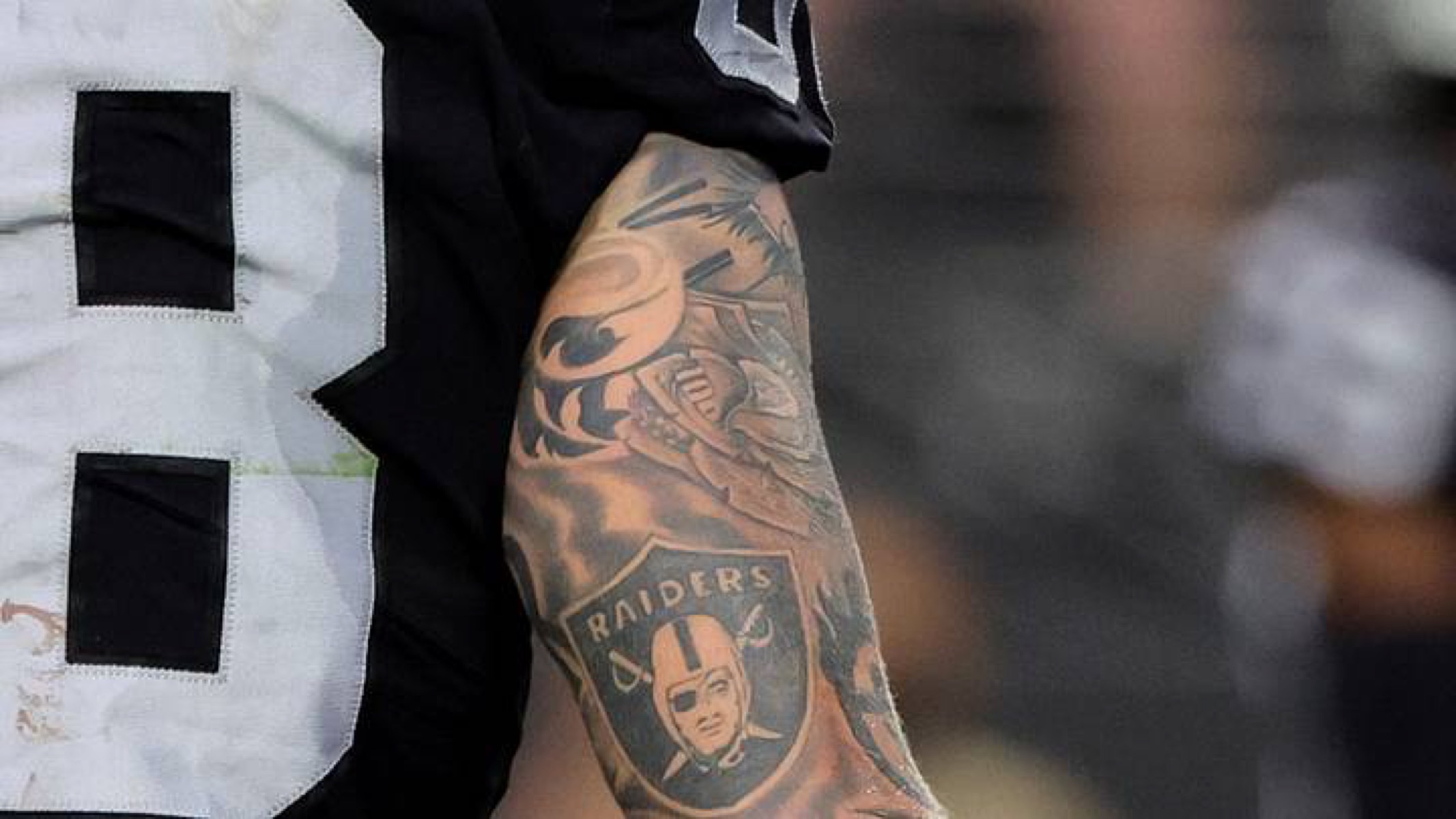
Maxx Crosby’s tattoos read like a scrapbook of the people and things he cares about. His arms carry Raiders imagery, family pieces and the early work that grew into a sleeve. Across his chest and stomach are sports legends, family references, roses, diamonds and the words “Be Legendary.” It does not look as though the whole collection came from one plan. Maxx has said the sleeve began as separate tattoos and gradually came together.

That gradual build is the key to the collection. In GQ’s tattoo tour, he talked through his first pieces, his great-grandmother, his mother and the portraits on his torso. Other reports cover newer tributes to Michael Jordan, Kobe Bryant and Muhammad Ali, as well as the Raiders designs on his arm. Each story makes more sense on its own than as part of one giant sports collage.

Maxx Crosby’s first tattoo was his name and birth year

Maxx Crosby tattoos: first wrist name and birth year tattoo

Maxx says his first tattoo was his surname and birth year, inked on his wrist when he was seventeen. He used his brother’s ID to get it. That small teenage choice feels a long way from the large chest work he has now, but it stayed with him as the collection grew.

The wrist tattoo also gives the rest of Maxx’s account a starting point. He does not describe his ink as a perfectly planned catalogue. He remembers when he got designs, who they were for and how the sleeve came together. The first one was simple: his name and the year he was born. It marks a personal moment, rather than the public image he later built as a Raiders defensive star.

Older photographs help show that early piece. A jersey cuff or athletic tape can cover the lettering, while an interview close-up may reveal it for a moment. It is not his largest tattoo, but it anchors the timeline: the other designs followed his first decision to put a private detail on his body.

The great-grandmother portrait was made for his mother

Maxx Crosby tattoos: great-grandmother forearm portrait

One of Maxx’s most personal tattoos is a portrait of his great-grandmother on his forearm. He has said she was very close to his mother and died while he was young, so the design was chosen for both of them. That gives the portrait a specific family story; it is more than a face added to a sleeve.

The forearm keeps it visible when Maxx works out, speaks with reporters or stands on the sideline. Other tattoos were added around it over time, but the portrait remains its own piece even when a photo makes the arm look like one continuous black-and-grey panel.

Maxx has talked about regretting some choices he made when he was younger and becoming more selective later. That does not take anything away from the earlier tattoos; it helps explain why the great-grandmother portrait stands out. A person and a story are attached to it, while some nearby marks are part of the sleeve’s gradual build.

The portrait is easiest to see when his arm is uncovered. Stadium lights can flatten the detail, and tape can cover the lower forearm. A dedicated tattoo photo should show the face and surrounding lines clearly, instead of relying on a distant action shot where the image becomes an indistinct patch.

His chest and torso carry tributes to Jordan, Kobe and Ali

Maxx Crosby tattoos: Jordan Kobe and Ali torso tattoo

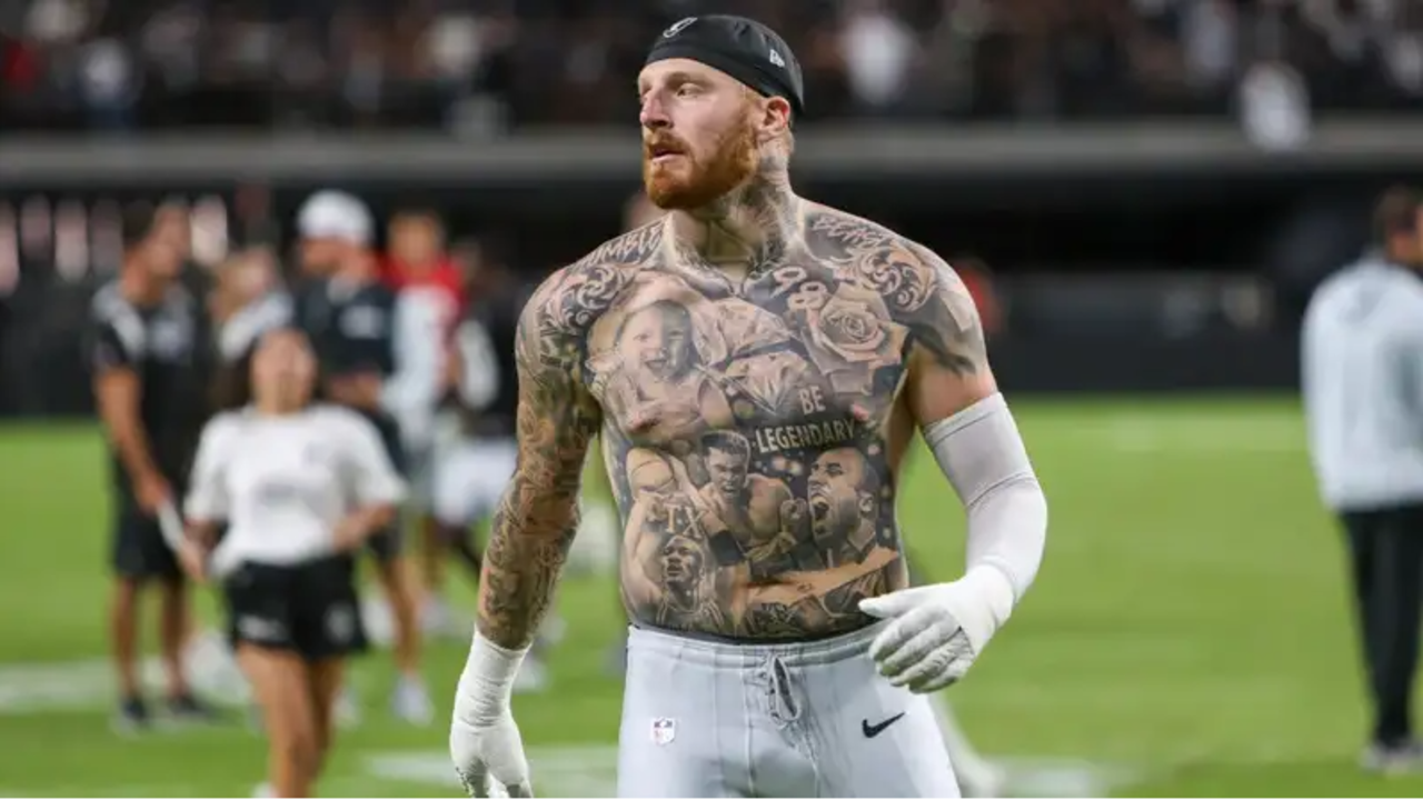
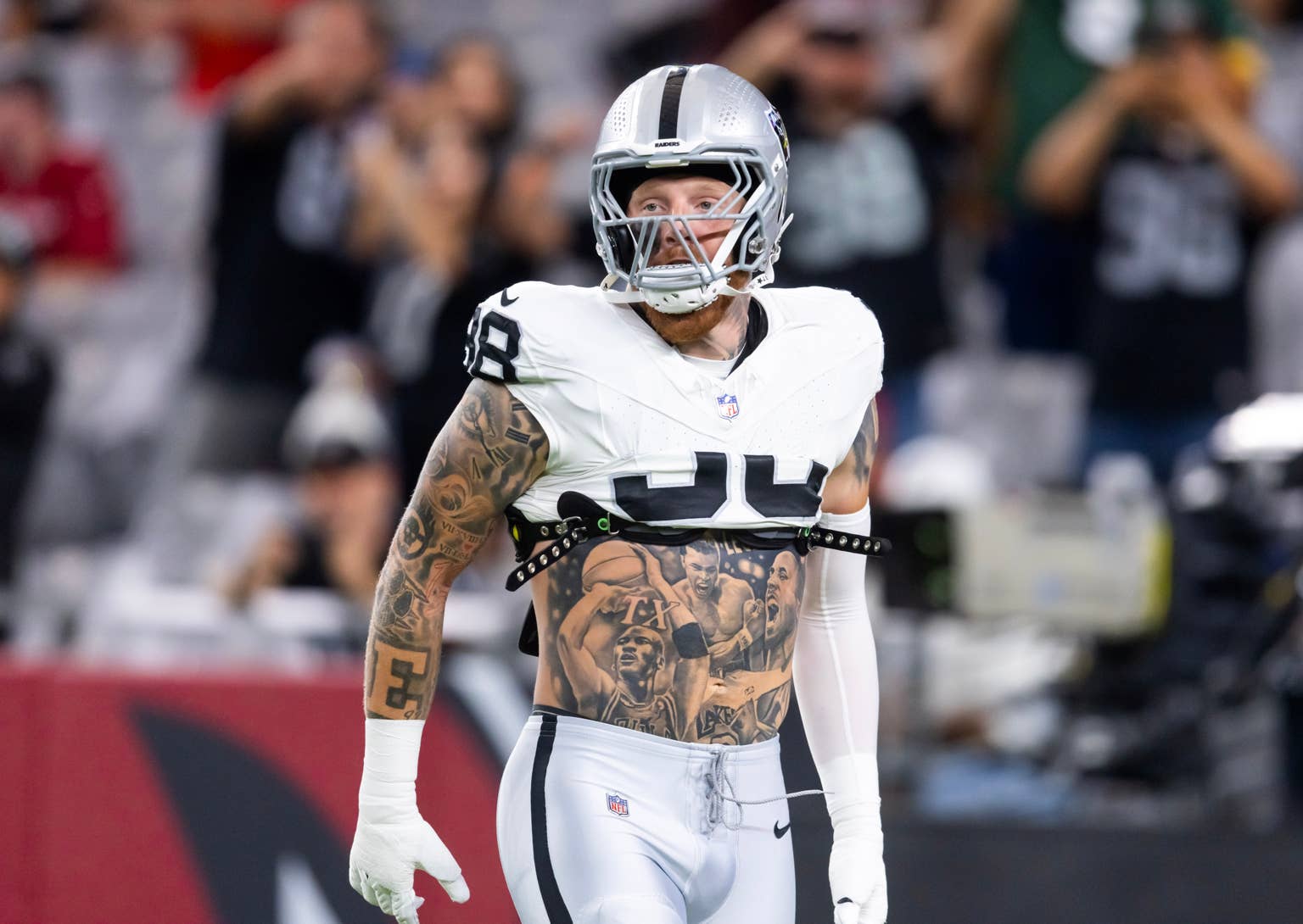
A major addition to Maxx’s collection is a torso composition honouring Michael Jordan, Kobe Bryant and Muhammad Ali. Their portraits run across his chest and stomach among shading, lettering and other details. Sports coverage describes the designs as tributes to athletes who influenced him; photos show how they sit with the words “Be Legendary.”

That phrase gives the composition a clear centre. It runs across the torso rather than sitting as a tiny motto, alongside the portraits and the number 98 linked to Maxx’s playing identity. A field photo can show the overall layout, while a closer interview image makes the faces and smaller shapes easier to see.

Roses, diamonds and a tattoo connected with his daughter Ella Rose also appear in reports on the newer torso work. These details are described as part of a family addition, not random filler. The rose works with the name, and the diamonds and shading help bring the portrait panel together.

This is where the timeline matters. Maxx has said his rookie-year sleeve looked terrible because he kept adding one random tattoo after another. The torso designs came later and have a more deliberate relationship: they are busy, but the portraits, words and spacing fit together. Later work helped connect areas that had been built separately.

The portraits do not mean every tattoo on Maxx’s body has one shared purpose. Sources are clearest about the athletes and the tribute to his daughter. Other faces and symbols can be seen, but should be described carefully when there is no direct explanation. It is possible to identify a portrait without inventing a speech from the person pictured.

The Raiders sleeve grew from random pieces into a team record

Maxx Crosby tattoos: Raiders sleeve tattoo

Football imagery is most obvious in Maxx’s arm sleeve. The Raiders shield sits on his upper arm among portraits, numbers, lettering and darker traditional-style work. Some game photos show the logo clearly; others reveal how much sits above and below it. The sleeve is more than a team badge: it combines his football identity with tattoos he chose before the arm had a finished shape.

Maxx has been open about how unplanned the early sleeve was. In GQ, he described his rookie-year arm as separate choices that did not yet fit together. That explains the contrast between the older, smaller pieces and the later large-scale work. The sleeve grew gradually, with new tattoos filling the gaps.

Other arm designs include a tree, Roman numerals, lettering and small symbols that show best in close sports photos. The Raiders shield has the clearest public association, but the other work makes the sleeve look like Maxx’s rather than a bit of team merchandise.

Photographing the arm has practical limits. Pads, gloves and jersey sleeves can hide large sections during a game. One sideline shot might show the lower arm but cover the shoulder; another might reveal the shoulder while the wrist is taped. Several photos are needed to understand the sleeve, since one image rarely shows the placements of neighbouring tattoos.

Maxx has also worked with Las Vegas tattoo artists, including Carlos at Hart & Huntington. That studio connection belongs to particular sessions; it should not be treated as proof one artist created the whole sleeve. The collection developed across years, and its artist history is layered too.
The smaller tattoos fill in the family and recovery timeline.

Not every meaningful tattoo is large. The wrist name and birth year, great-grandmother portrait and daughter reference mark family moments; the Raiders logo and athlete tributes reflect the public side of Maxx’s identity. Other small designs appear around his arms and torso, but the guide should separate what he has explained from what a photo only shows as a dark shape.

Maxx’s recovery is also part of the broader timeline. He entered rehab for alcoholism in 2020, and later coverage discussed a more focused approach to football and family. That does not make every tattoo a recovery symbol. It simply provides context for later family and motivational designs.

The words “Be Legendary” are a good example. They are easy to see and quote, but need no grand theory. The phrase works as a personal motto and as part of the torso design. The portraits add a sports context; the family tattoo brings in a more private one.

Across the collection, the story moves from teenage lettering to family portraits, from an early, loosely assembled sleeve to a connected torso composition, and from small pieces to the Raiders images fans recognise. The work is busy, but not meaningless. Each part has its own story, and the photos work best when they show the specific tattoos being discussed.

There is no reliable reason to assign the collection a fixed count. New work, cover-ups and added shading can change the total, while game photos rarely reveal every area. A more useful map includes the wrist name and birth year, great-grandmother portrait, Raiders sleeve, sports legends, family references, roses, diamonds and the central “Be Legendary” lettering.

That gives readers more than a quick list. It shows how Maxx’s ink developed with him, from rough early choices to later designs tied to family, football and ambition. The older and newer stages belong together.
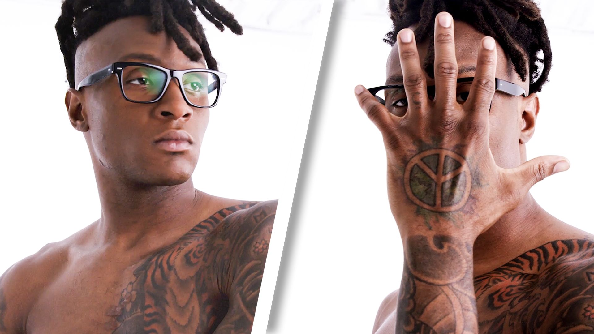
More athlete tattoo guides

Israel Adesanya’s Tattoos Tell Stories About Nigeria, Anime and Fighting Himself

Israel Adesanya’s tattoos are easy to notice, but they tell more once you look at them as separate chapters. His chest carries Nigerian imagery, childhood comics appear on his arm, anime designs cover his stomach, and newer work reaches up to his neck. Some stories are clear because Adesanya has explained them; others are designs he liked. He has not claimed every mark has a grand meaning.

In GQ’s Tattoo Tour, Adesanya said he got his first tattoo at 22 and kept his early ink quiet around his family. He has also said he sometimes chooses a design because it looks cool and lets the meaning come later. That relaxed approach helps make sense of the collection. The confirmed stories are interesting enough without assigning a message to every shadow or symbol.

The Broken Native tattoo puts Nigeria and Africa across his chest

Israel Adesanya tattoos: high-resolution chest and torso photograph showing Broken Native, Africa and surrounding ink

The phrase “Broken Native” is a natural place to begin. Large old-style letters stretch across Adesanya’s chest, making the words readable even in a fight photo. Below them is a black-and-grey design built around Africa, a lion-like silhouette and the outline of Nigeria. It is a substantial piece, with the feel of a personal flag rather than a small decorative tattoo.

Adesanya has connected the image with his Nigerian roots and his journey from Lagos to New Zealand. “Native” speaks to carrying one home while building another. He has also talked about his dance crew and the people around him before fighting became the focus of his public life. The chest placement makes the design visible; it is not tucked away as a private note.

The map, lion and lettering work as one chest composition.

Online descriptions sometimes reduce the piece to a map of Africa, missing how the elements fit together. The bold lettering forms a top edge, the continent gives the centre its shape, and the darker figure draws the eye inward. It is not a clean logo. The rougher shading suits both the phrase and the story behind it.
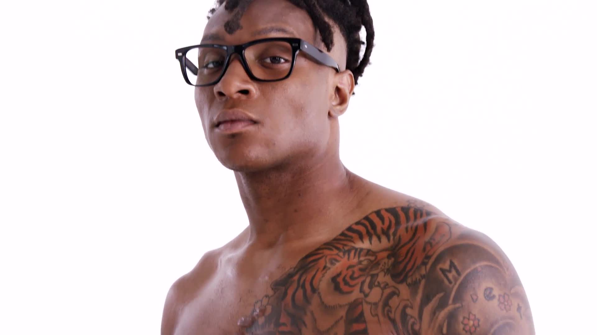
Photos taken at different times show why one view cannot do everything. A front-facing gym photo makes the words easy to read, while an octagon image shows how the tattoo bends with his chest and disappears toward the arms. Light and distance change how the ink looks. A careful description can name the visible parts without attaching meaning to every faint mark.
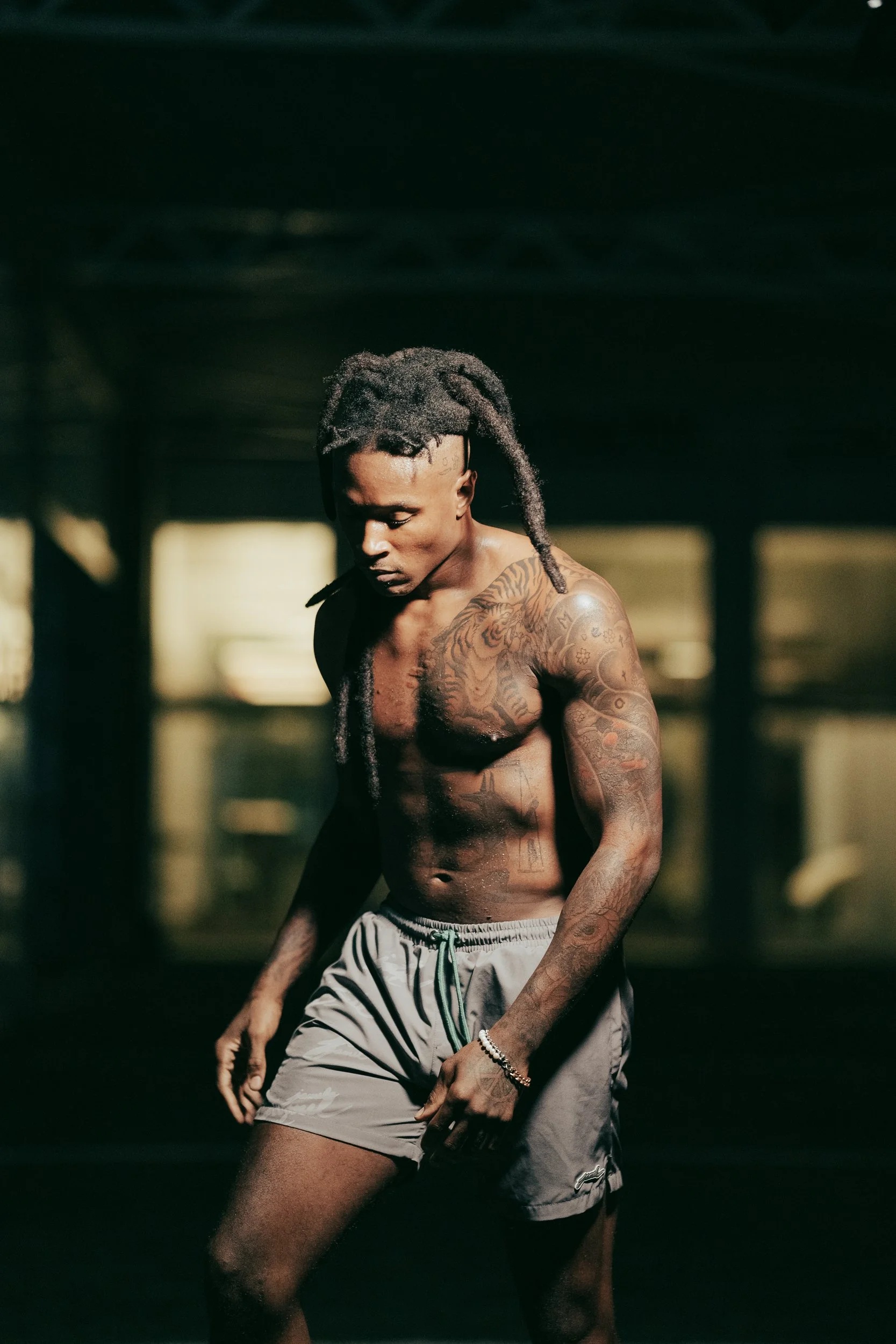
Deadpool and the anime tattoos make the ribs and stomach personal

Israel Adesanya tattoos: GQ Tattoo Tour frame showing the side and rib Deadpool tattoo

Adesanya’s side and stomach tattoos are more playful. GQ shows a Deadpool-style figure on the ribs, with swords and comic-book attitude running along his side. It is easy to miss in a fight photo, where his arm or trunks can cover parts of it. A shirtless studio frame gives a better sense of its size, from the ribs toward the hip.

Deadpool fits Adesanya’s own account of his tattoos. He likes the character; he has not presented the piece as a solemn tribute. The pose gives it some attitude without requiring a speech. A favourite character can still say something about a person, especially when they have liked it since before becoming famous.

Avatar and Naruto meet in the stomach piece.

The stomach design brings together two parts of Adesanya’s pop-culture world. He identifies the upper image as the Ocean and Moon Spirit from Avatar: The Last Airbender, while the lower section includes the seal associated with Naruto’s Nine-Tails. Adesanya has said Avatar’s ideas about mastering the elements resonated with his own training. That is more useful context than a generic caption calling it an anime tattoo.

Placement shapes the design too. The two spirits sit in the middle of his torso as a balanced pair, with the Naruto seal below. The area reads more like a stacked panel than one continuous illustration. Sweat, shadows and movement can blur its edges, so a clear photo matters before identifying small marks around it.

The stomach ink is detailed, but not every detail has a published explanation.

Online lists sometimes assign a meaning to every line of Adesanya’s anime tattoos. The confirmed account is narrower: he has discussed Avatar, imagination and the emotional pull of those stories, and has shown the Naruto influence. The reason for every surrounding shape is not equally well documented. The layout can still be described without filling the gaps with guesses.

Calvin and Hobbes give the bicep tattoo a childhood reference

Israel Adesanya tattoos: separate weigh-in photograph showing the chest lettering and stomach tattoo map

Inside Adesanya’s right bicep is a Calvin and Hobbes tattoo. Its story is simple: he read the comics as a child and liked what they represented. In GQ, he talks about imagination and how those stories stayed with him. The design brings a childhood interest into his adult life.

The bicep is a useful spot for this kind of image. The tattoo can disappear beneath a sleeve and show clearly when Adesanya raises his arm or poses for a fight photo. That contrasts with the chest lettering, which announces itself straight away. Some of his tattoos are public statements; others are quieter reminders that happen to be caught in photos.

Comic art sits beside the fighter’s working body.

The image helps because Calvin and Hobbes can become an indistinct patch when the arm is bent or the photo is compressed. A closer view separates the characters from the surrounding tattoos. The linework is lighter than his chest lettering, and the bicep gives the figures some space.

There is no need to turn the reference into a prediction about Adesanya’s personality. His connection to the comics is enough. It shows that he places a fun, familiar image beside heavier cultural and family work. That mix makes the collection feel personal rather than like a planned brand package.

The neck and hand tattoos show Israel’s newer visual language

Israel Adesanya tattoos: public reveal image clearly showing the eagle on the side of the neck

Adesanya has added more visible tattoos around his neck. A later reveal showed a large eagle tattoo on the side of his neck, its wings reaching upward and its head angled across the skin. People asked what it meant, but the photo confirms the design and placement more clearly than any private explanation. Unless Adesanya explains the symbolism, it is best to call it an eagle and leave the meaning open.

A neck tattoo changes the outline of his face and appears in interviews, weigh-ins and everyday photos. That visibility may be part of the appeal, but the timing alone does not tell us why he chose it. The practical effect is clear: the eagle is harder to hide and gives his head and shoulders a stronger silhouette.

Small marks and the word “Okenna” need careful reading.

Photos also show smaller lettering and symbols around Adesanya’s shoulders, hands and torso. The word “Okenna” appears across his upper chest in some training photos, while other images make nearby designs easier to see. A guide should separate readable words from shapes suggested by a blurry frame. The same care applies to hand tattoos that wraps, gloves or the camera angle can partly cover.

That is a useful way to approach Adesanya’s collection. The Africa and Nigeria piece has a clear cultural connection; Deadpool, Avatar, Naruto and Calvin and Hobbes are recognisable references, with some stories explained by Adesanya. The eagle and smaller recent designs are visually clear but less fully explained. Keeping those categories separate makes the writing more honest and the designs easier to appreciate.

Together, the tattoos range across heritage, imagination, humour and the physical life of a fighter. The chest says where Adesanya comes from; the ribs and stomach show stories he grew up with; the bicep keeps a childhood comic close; and the neck work makes his newer look unmistakable. His tattoos do not need one theme. Their variety is part of the story.

More athlete tattoo guides