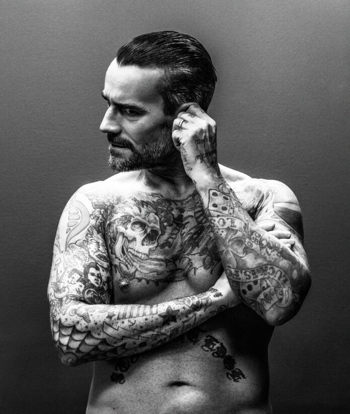
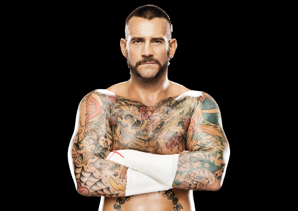
CM Punk has never treated tattoos as background decoration. He has described them as a way to show what matters to him, from straight-edge living and punk music to old friends, his dog and jokes with a story behind them. His ink spans his arms, stomach, shoulders, legs and chest without following one tidy style. Some designs are traditional flash, others reference pop culture, and some are personal marks he has explained in plain language.
That mix is what makes Punk’s tattoos distinctive. The larger designs get noticed first, but small details give the collection its personality: a lucky charm beside a serious statement, a comic-book character near a memorial or music logo. The most reliable way to describe them is to stick to what Punk has said and what the photos show, without assigning a deeper meaning to every symbol.
CM Punk’s straight-edge lettering is the centre of the collection
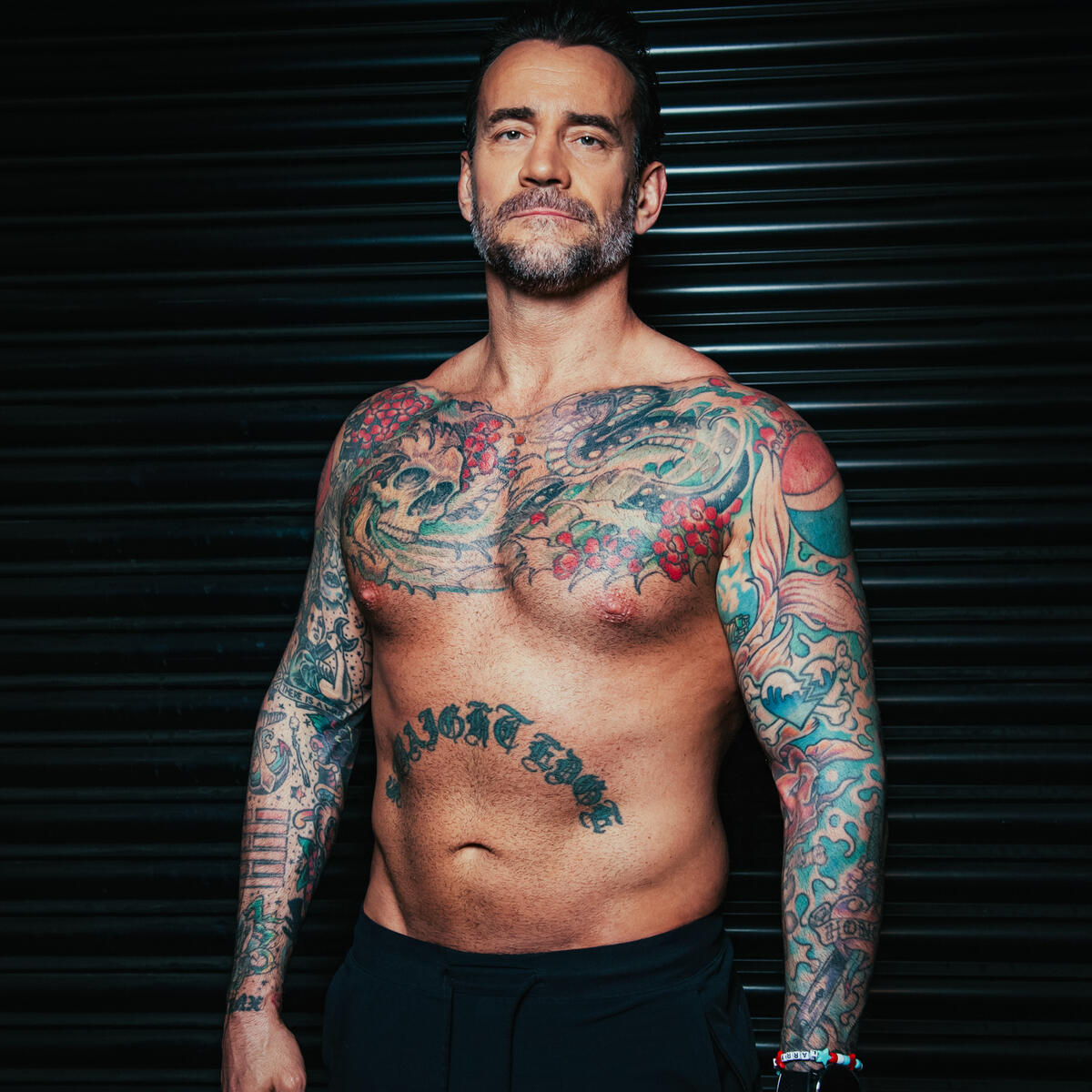
The words “straightedge” across Punk’s stomach are probably the tattoo most associated with him. The wide black lettering is hard to miss, almost like a statement on a shirt. Punk has called it his most important tattoo, giving the placement meaning beyond its size.
The word refers to the straight-edge lifestyle, a punk-rooted choice to avoid alcohol and recreational drugs. Punk has described it as part of how he chose to live, not a temporary phase or a branding exercise. The stomach is close to the centre of his body, though clothes can hide it. When he chooses to show it, the message is immediate.
The bold lettering also photographs well. It is simple enough to read at a distance, unlike some of the smaller designs on his arms, and does not rely on colour or shading. The blunt look suits the way Punk has spoken about his beliefs; the subject is clear even without a caption.
The phrase should not be used to explain all his other tattoos. Punk also has jokes, cartoons, lucky symbols and family references that stand on their own. The stomach lettering is the clearest statement, while the rest of the collection shows his broader interests.
The Pepsi shoulder tattoo has a very specific story
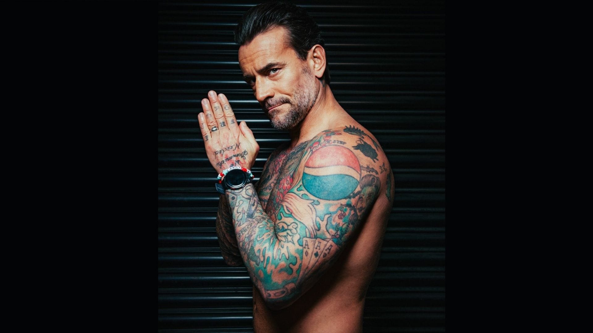
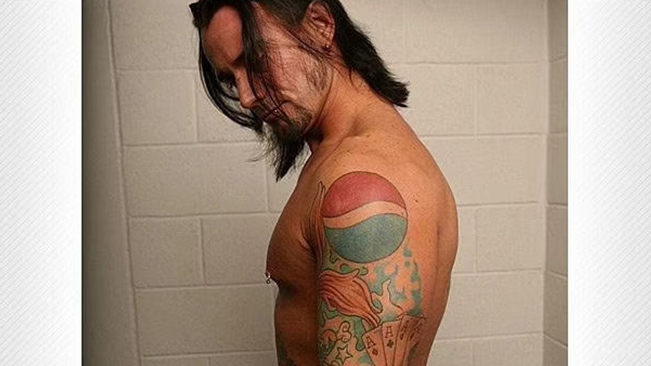
The Pepsi logo on Punk’s shoulder is one of his most recognisable tattoos because it looks ordinary until he explains it. He has said he saw a musician with a Coca-Cola tattoo and, as a Pepsi fan, decided he wanted one of his own. It is a funny, straightforward origin; no grand theory is needed.
The logo also plays off Punk’s straight-edge identity. Pepsi is a soft drink, and that contrast became part of the joke. What might look like a random pop-culture mark becomes a small nod to his choices at the time. Its bright circle stands out against the darker blackwork around it.
Coverage has also linked the tattoo to Punk’s friendships and wrestling circle, but his own explanation and Bruce Prichard’s later account are the clearest sources. It is a real tattoo, not a temporary gag for a photo, and it has remained part of the collection for years. Its meaning is lighter than the stomach lettering, which is part of what makes the contrast work.
The logo can look different from year to year. Camera colour, skin tone and the angle of the arm all affect how its red and blue sections appear. A close-up shows the circle clearly; a wider wrestling photo may make it look like a small patch among many tattoos.
The lucky arm mixes four aces, a rabbit’s foot and old-school symbols
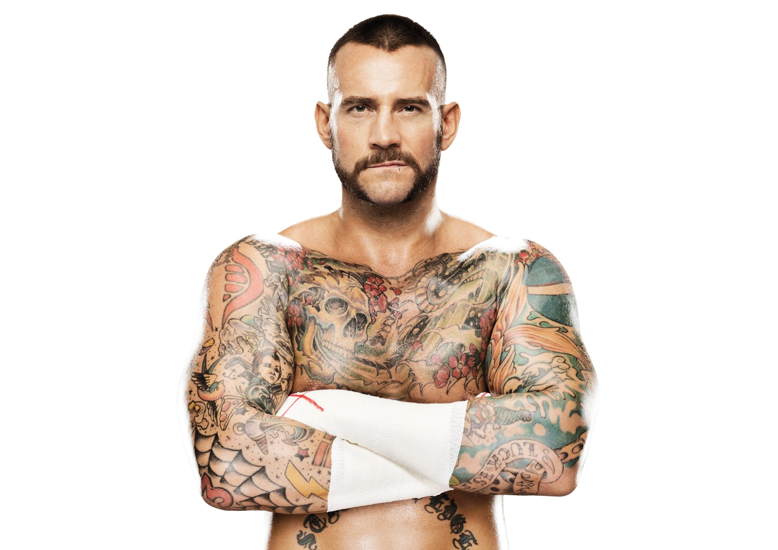
Punk’s arm brings together several traditional lucky designs, with four aces among the best known. WWE’s tattoo feature says the cards honour Ace Steele, rather than simply standing for good luck. That detail matters: the classic image is also a tribute to a real person and relationship.
The same arm includes a rabbit’s foot, four-leaf clover, horseshoe and koi fish. Together they suggest a lucky sleeve, but they are separate tattoos, each with its own outline and spacing. Stars, anchors and a lightning bolt fill some of the gaps. The arm feels as though it grew over time, with individual designs placed beside one another.
The rabbit’s foot, clover and horseshoe are easiest to spot in older photos, though their exact positions can be hard to judge when Punk wears a shirt or wrestling tape. The koi adds movement and breaks up the cards and smaller symbols. Up close the arm reads like traditional flash; from ringside it can look like one dense patch of colour.
A paw print on Punk’s forearm is a quieter detail. He identified it as a tribute to his dog Callie, giving the design a specific story among the louder symbols. It is a reminder that small tattoos can carry clearer personal information than elaborate pieces whose meaning has never been explained.
The arm also includes a cobra, the word “spitfire” and other traditional shapes tied to different parts of Punk’s life. He has said the cobra and wording came after he left a gas-station job, while the Pepsi tattoo dates to an earlier period. Those details suggest a loose timeline without implying that every design was planned as one complete sleeve.
Punk’s comic-book and punk-rock tattoos are deliberately specific
Punk has a Spider-Man tattoo with the number 13 on his right elbow. It is playful, but it reflects a clear personal interest rather than a generic catalogue choice. The character is instantly recognisable, and the number gives fans another detail to notice when his arm is shown from the side.
The Operation Ivy logo on his left calf connects the collection to punk music. It is less visible than the arm tattoos because wrestling gear can cover the leg. When seen, it reads as a direct music reference rather than a general symbol of rebellion. Traditional stars, anchors and a lightning bolt use the same old-school tattoo language, while fitting beside the music and subculture references.
His forearm carries an Arishikage clan marking associated with the G.I. Joe characters Storm Shadow and Snake Eyes. Without that reference, the shape can look like an unspecified Asian-style symbol. Naming the fictional clan is more useful than guessing at a general meaning: it identifies the source and keeps the explanation grounded.
These designs do not resemble a sleeve built around one subject. Spider-Man, Operation Ivy and G.I. Joe come from different worlds, which is part of the appeal. Punk’s skin records things he liked, people around him and versions of himself he wanted to remember. The designs do not have to match perfectly.
The cobra and blue-and-red Pepsi mark reflect the same approach. One came during a period of change; the other began as a soft-drink joke. Their colours, sizes and origins differ, but each has a clear hook that makes it easy to recognise.
The chest skull and Virgin Mary design add darker imagery
Punk’s chest includes a dark skull design based on a Virgin Mary prayer card. WWE’s account describes it as an evil skull of the Virgin Mary and quotes Punk saying he liked the romantic quality of the artwork. That source gives more useful context than assigning a separate symbolic meaning to each flame, shadow or facial detail.
The chest artwork can be hard to document because shirts, jackets and wrestling gear hide much of it. One photo may catch just the top edge, while a shirtless portrait shows the full design. Those should be treated as different views of the same tattoo, not automatic proof of extra pieces.
The image also offsets the brighter tattoos on Punk’s arms. The Pepsi logo, lucky symbols and comic references feel lighter, while the skull is darker and more dramatic. His collection moves between different moods: a playful brand logo on one shoulder and gothic imagery on the chest.
The chest design sits near the stomach lettering, making their contrast part of the overall look. The skull is expressive and heavily shaded, while “straightedge” is plain text. One asks the viewer to study an image; the other delivers its message at once.
The smaller tattoos make the collection feel like a record of Punk’s life rather than a costume. The paw print for Callie is a good example. He explained the reference himself, and the design needs no dramatic memorial story: it is a small mark for a dog he cared about.
The four aces for Ace Steele carry a similar personal connection, although they are more visible. From a distance they look like lucky cards; with the story, they read as a tribute to a friend. That double meaning appears elsewhere in Punk’s tattoos.
Small stars, anchors, lightning shapes and lettering are easier to find in clear close-ups than in match photos, where tape, shadow and compression can hide details. A careful guide names only what the image can show, especially if a mark blends into nearby linework.
The overall pattern is not a single strict style. Punk tends to choose designs with a direct connection: a personal principle, a drink he likes, a band, a comic character, a dog, a friend or a period of his life. Some are serious, some funny and some deliberately strange. That mixture is what holds the collection together.
The most useful photos show the tattoos, not only Punk as a celebrity. A shirtless frame establishes the chest and stomach lettering; a close-up of his arm can separate the cards, lucky symbols, paw print and traditional filler. The featured portrait identifies him, while the body photos show the work discussed in each section.
Punk’s tattoos have become more or less visible as his career and clothing have changed, but their themes are still easy to follow. The collection is personal, funny and varied without needing one explanation. The clearest approach is also the most interesting: look at the design, note where it sits, use the story Punk has actually shared and leave unanswered details open when the image cannot settle them.
2 thoughts on “CM Punk’s Tattoos Tell Stories About Straight Edge, Punk and Luck”